#thanks for liking my little stories
Explore tagged Tumblr posts
Text
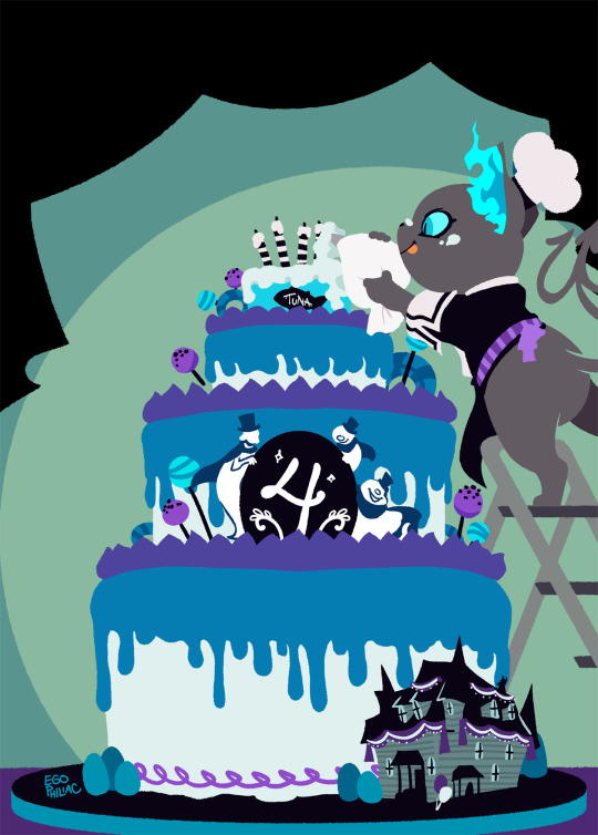
(almost) four years in, and I finally had time to draw something for the anniversary! woo! 🎉🎉🎉
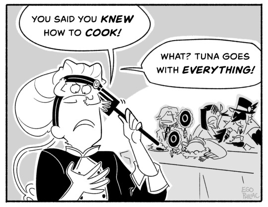
#art#twisted wonderland#twisted wonderland spoilers#because i need to talk for a minute about how the plot of the anniversary story so far is literally just#crowley jumpscares us in our living room to demand we make him lunch and yuu is just like 'i need to start locking the door'#oh twst you always know just how to get me#the qol updates though! CONVERTING SINGLE KEYS INTO 10-SETS YES THANK YOU OH MY GOD#SKIP LESSON TICKETS!!!!#3X BATTLE SPEED!!!!!!!!!!!!#SAVE TEAM BUILDS AND SUPPORT CARDS FINALLY AHHHHH#oh and some other stuff too but look i NEEDED these things#also master chef grim! he's so precious!#though he's not going to get a little sporty uniform after all?#grim canonically flies in the nude i guess#no it's okay chef grim is ADORABLE#if you zoom in on his card you can see little smoodges from his inexpert cake decoration 😭#which on the one hand is cute but on the other hand i'd been convinced he'd just slapped some frosting and candles on an actual can of tuna#anyway happy (a few days until the) fourth anniversary everybody!#i've been here since the beginning (preregistered during the dorm reveals babyyyy) and it REALLY doesn't feel like it's been four years#you know what they say: time flies when you're watching anime characters have emotional problems
3K notes
·
View notes
Text
tbh I really like the idea of married Adrien and Marinette adopting their kids. Both because it's kind of a flex on Gabriel and Emilie (who thought that the appropriate response to difficulty conceiving was to hunt down ancient magical artifacts and then create a magical son that they could puppeteer and control...... because adoption/surrogates were apparently.... beneath them. or something.) but also because I just think it'd be really cute.
Like, imagine Ladybug and Chat Noir, heroes of Paris, adopting Parisian orphans. imagine Marinette and Adrien struggling to get on the good side of a "difficult" traumatized child who used to spend their days in the foster system fantasizing about Ladybug and Chat Noir saving them without realizing the new parents trying to connect with them rn ARE Ladybug and Chat Noir. Imagine them fostering kids themselves and just being A+ stellar parents between Adrien's patience and Marinette's attentiveness and both of their affection. idk I just think there's a lot there and it could be sosososo sweet
#also ok. TO BE CLEAR: astruc has implied on twitter that sentimonsters are capable of reproducing. so this isnt like CANON or anything. BUT#........ what if they couldn't teeeheee!!!!! just for meeeee!!! for my little adoption aus!!!!!!!!!!! xoxoxo#(not that you can't adopt while also being able to conceive but yknow makes it more likely or whatever)#but yeah ive always been a big huge sucker for adoption and adoption stories and i want to gobble them up. thanks for coming to my tedtalk
5K notes
·
View notes
Text

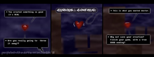
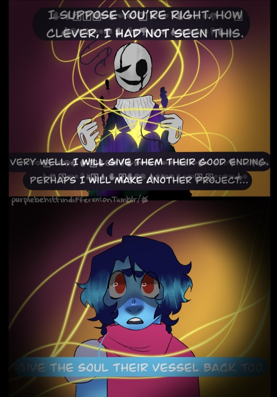
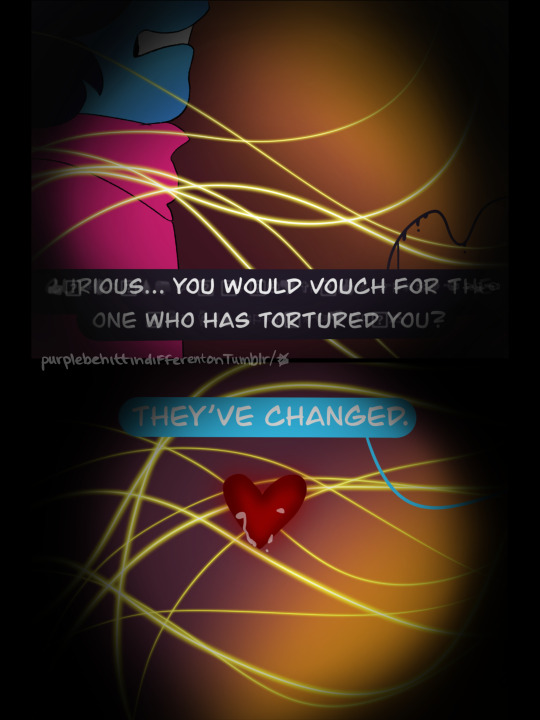
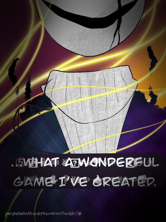
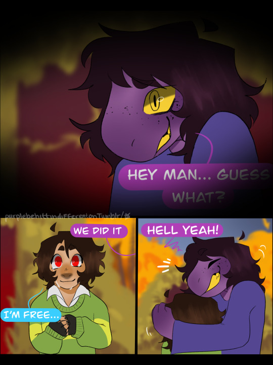
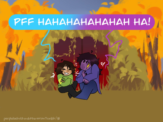
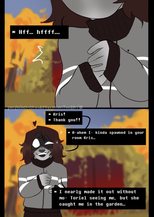
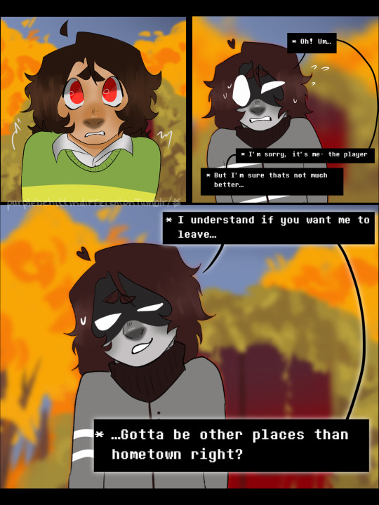
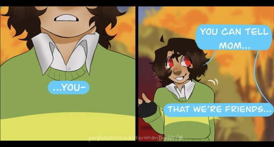
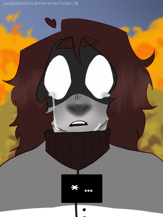
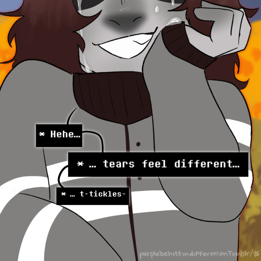
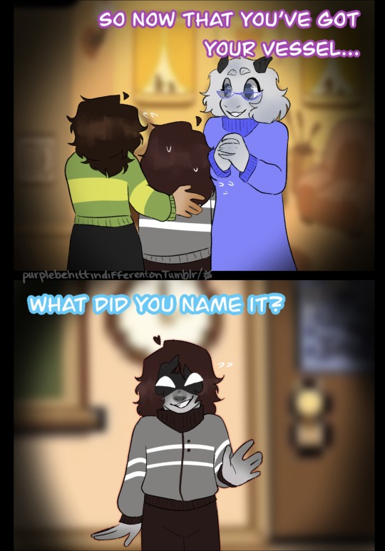
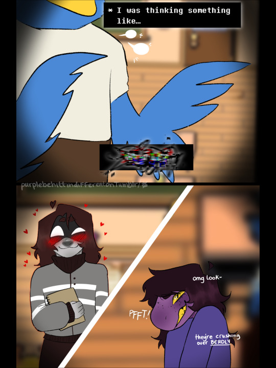
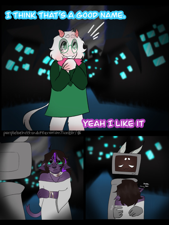
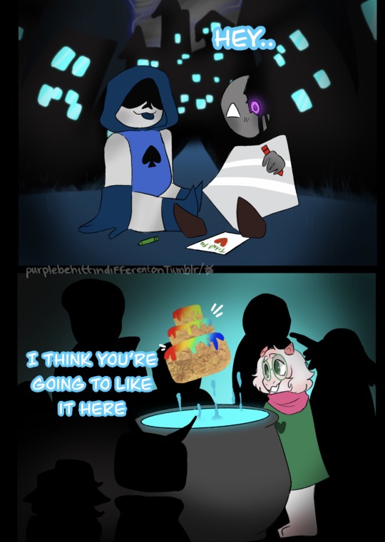
I have added a quirky comment here for the last year and a half, however now… I have no words.
jk I have all these words 👇
I know it is very bitter sweet, but this is the end of Reconnecting. Thank you all for coming along on this journey with me. I plan on making a behind the scenes video on my YT sometime soon. Feel free to send any asks you have I want to answer them all!
Please know I am not going to dissapear! I still plan on making content consistently, and my original comic RULE 5 is already underway, and if you’d like I’m certainly not against writing some exposition fics for Reconnecting 💜
masterpost
Prev (3::8) / This is the End 💜
#art#my art#deltarune#reconnecting#reconnecting update#here it is#you’ll never know the vessels real name hehehehhe#anwayyyyy#please send an ask I’m planning on answering them all#man I literally cried so much doing this#this story is so close to my heart and so much actually about me and my journey with my mental condition#I feel like a new chapter of my life just started with this one’s end#ANYHOO NO MORE SAPPY#thank you all for reading#I STILL TAKE COMMISSIONS#also I have really cute headcanons so like- ask for little stories I’ll write em#rule 5 is coming!!! I have a ton of concept art#and yknow I’ll still draw deltarune shenanigans#*SOBBING*
632 notes
·
View notes
Text
he's just admiring the view


(ghost's horse's name is Gob. it's short for Gobshite)

#thank you so much for all the love i never expected people to like my silly little cowboy#you guys are all so cute#i got 4 stories written and i cant wait to share them#ghostsoap#soapghost#simon ghost riley#john soap mactavish#cod#call of duty#cod mw2#yeehaw
2K notes
·
View notes
Text
Richarlyson: You're skinny sir, are you eating well these days?
Pac: Not really. To tell you the truth, I've been eating... I stole, together with my son, we stole some cupcakes from the Federation. I ate some, but I know chocolate isn't the best thing to eat, right?
Richarlyson: 12 kilos D:
Pac: 12 kilos?!? No– what? My god. My god... Am I malnourished, Doctovo? Am I- Am I malnourished?
Richarlyson: You weigh less than a pitbull, sir.
Pac: Less than the singer? Damn... [Laughs]
Richarlyson: [Hits Pac]
#Pactw#Richarlyson#Pac#QSMP#November 29 2023#Thanks again to sebbs for checking my translation!#Been meaning to post this clip for months#I think about it a LOT#Pac's got a very interesting relationship with food I'll say that much#The fact that Fit's gift to him – out of everything he could've given him – wound up being an infinite chocolate bar speaks volumes too#especially when you take this (and other moments) into consideration#The nature of hunger and food in q!Pac's story is very interesting#anyways if you've read this far in the tags#There is a fic on Ao3 that talks about this very premise :)#Doctovo#BTW 12 kilos is a little over 26 lbs#I like to interpret this as Pac being 26 lbs underweight rather than him literally being 26 lbs#both aren't super realistic but that's more realistic than weighing 26 lbs lol#Anyways please let me know if this needs any TWs
223 notes
·
View notes
Text
why Aurora's art is genius
It's break for me, and I've been meaning to sit down and read the Aurora webcomic (https://comicaurora.com/, @comicaurora on Tumblr) for quite a bit. So I did that over the last few days.
And… y'know. I can't actually say "I should've read this earlier," because otherwise I would've been up at 2:30-3am when I had responsibilities in the morning and I couldn't have properly enjoyed it, but. Holy shit guys THIS COMIC.
I intended to just do a generalized "hello this is all the things I love about this story," and I wrote a paragraph or two about art style. …and then another. And another. And I realized I needed to actually reference things so I would stop being too vague. I was reading the comic on my tablet or phone, because I wanted to stay curled up in my chair, but I type at a big monitor and so I saw more details… aaaaaand it turned into its own giant-ass post.
SO. Enjoy a few thousand words of me nerding out about this insanely cool art style and how fucking gorgeous this comic is? (There are screenshots, I promise it isn't just a wall of text.) In my defense, I just spent two semesters in graphic design classes focusing on the Adobe Suite, so… I get to be a nerd about pretty things…???
All positive feedback btw! No downers here. <3
---
I cannot emphasize enough how much I love the beautiful, simple stylistic method of drawing characters and figures. It is absolutely stunning and effortless and utterly graceful—it is so hard to capture the sheer beauty and fluidity of the human form in such a fashion. Even a simple outline of a character feels dynamic! It's gorgeous!
Though I do have a love-hate relationship with this, because my artistic side looks at that lovely simplicity, goes "I CAN DO THAT!" and then I sit down and go to the paper and realize that no, in fact, I cannot do that yet, because that simplicity is born of a hell of a lot of practice and understanding of bodies and actually is really hard to do. It's a very developed style that only looks simple because the artist knows what they're doing. The human body is hard to pull off, and this comic does so beautifully and makes it look effortless.
Also: line weight line weight line weight. It's especially important in simplified shapes and figures like this, and hoo boy is it used excellently. It's especially apparent the newer the pages get—I love watching that improvement over time—but with simpler figures and lines, you get nice light lines to emphasize both smaller details, like in the draping of clothing and the curls of hair—which, hello, yes—and thicker lines to emphasize bigger and more important details and silhouettes. It's the sort of thing that's essential to most illustrations, but I wanted to make a note of it because it's so vital to this art style.
THE USE OF LAYER BLENDING MODES OH MY GODS. (...uhhh, apologies to the people who don't know what that means, it's a digital art program thing? This article explains it for beginners.)
Bear with me, I just finished my second Photoshop course, I spent months and months working on projects with this shit so I see the genius use of Screen and/or its siblings (of which there are many—if I say "Screen" here, assume I mean the entire umbrella of Screen blending modes and possibly Overlay) and go nuts, but seriously it's so clever and also fucking gorgeous:
Firstly: the use of screened-on sound effect words over an action? A "CRACK" written over a branch and then put on Screen in glowy green so that it's subtle enough that it doesn't disrupt the visual flow, but still sticks out enough to make itself heard? Little "scritches" that are transparent where they're laid on without outlines to emphasize the sound without disrupting the underlying image? FUCK YES. I haven't seen this done literally anywhere else—granted, I haven't read a massive amount of comics, but I've read enough—and it is so clever and I adore it. Examples:


Secondly: The beautiful lighting effects. The curling leaves, all the magic, the various glowing eyes, the fog, the way it's all so vividly colored but doesn't burn your eyeballs out—a balance that's way harder to achieve than you'd think—and the soft glows around them, eeeee it's so pretty so pretty SO PRETTY. Not sure if some of these are Outer/Inner Glow/Shadow layer effects or if it's entirely hand-drawn, but major kudos either way; I can see the beautiful use of blending modes and I SALUTE YOUR GENIUS.
I keep looking at some of this stuff and go "is that a layer effect or is it done by hand?" Because you can make some similar things with the Satin layer effect in Photoshop (I don't know if other programs have this? I'm gonna have to find out since I won't have access to PS for much longer ;-;) that resembles some of the swirly inner bits on some of the lit effects, but I'm not sure if it is that or not. Or you could mask over textures? There's... many ways to do it.
If done by hand: oh my gods the patience, how. If done with layer effects: really clever work that knows how to stop said effects from looking wonky, because ugh those things get temperamental. If done with a layer of texture that's been masked over: very, very good masking work. No matter the method, pretty shimmers and swirly bits inside the bigger pretty swirls!
Next: The way color contrast is used! I will never be over the glowy green-on-black Primordial Life vibes when Alinua gets dropped into that… unconscious space?? with Life, for example, and the sharp contrast of vines and crack and branches and leaves against pitch black is just visually stunning. The way the roots sink into the ground and the three-dimensional sensation of it is particularly badass here:

Friggin. How does this imply depth like that. HOW. IT'S SO FREAKING COOL.
A huge point here is also color language and use! Everybody has their own particular shade, generally matching their eyes, magic, and personality, and I adore how this is used to make it clear who's talking or who's doing an action. That was especially apparent to me with Dainix and Falst in the caves—their colors are both fairly warm, but quite distinct, and I love how this clarifies who's doing what in panels with a lot of action from both of them. There is a particular bit that stuck out to me, so I dug up the panels (see this page and the following one https://comicaurora.com/aurora/1-20-30/):

(Gods it looks even prettier now that I put it against a plain background. Also, appreciation to Falst for managing a bridal-carry midair, damn.)
The way that their colors MERGE here! And the immense attention to detail in doing so—Dainix is higher up than Falst is in the first panel, so Dainix's orange fades into Falst's orange at the base. The next panel has gold up top and orange on bottom; we can't really tell in that panel where each of them are, but that's carried over to the next panel—
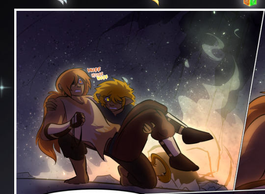
—where we now see that Falst's position is raised above Dainix's due to the way he's carrying him. (Points for continuity!) And, of course, we see the little "huffs" flowing from orange to yellow over their heads (where Dainix's head is higher than Falst's) to merge the sound of their breathing, which is absurdly clever because it emphasizes to the viewer how we hear two sets of huffing overlaying each other, not one. Absolutely brilliant.
(A few other notes of appreciation to that panel: beautiful glows around them, the sparks, the jagged silhouette of the spider legs, the lovely colors that have no right to make the area around a spider corpse that pretty, the excellent texturing on the cave walls plus perspective, the way Falst's movements imply Dainix's hefty weight, the natural posing of the characters, their on-point expressions that convey exactly how fuckin terrifying everything is right now, the slight glows to their eyes, and also they're just handsome boys <3)
Next up: Rain!!!! So well done! It's subtle enough that it never ever disrupts the impact of the focal point, but evident enough you can tell! And more importantly: THE MIST OFF THE CHARACTERS. Rain does this irl, it has that little vapor that comes off you and makes that little misty effect that plays with lighting, it's so cool-looking and here it's used to such pretty effect!
One of the panel captions says something about it blurring out all the injuries on the characters but like THAT AIN'T TOO BIG OF A PROBLEM when it gets across the environmental vibes, and also that'd be how it would look in real life too so like… outside viewer's angle is the same as the characters', mostly? my point is: that's the environment!!! that's the vibes, that's the feel! It gets it across and it does so in the most pretty way possible!
And another thing re: rain, the use of it to establish perspective, particularly in panels like this—

—where we can tell we're looking down at Tynan due to the perspective on the rain and where it's pointing. Excellent. (Also, kudos for looking down and emphasizing how Tynan's losing his advantage—lovely use of visual storytelling.)
Additionally, the misting here:
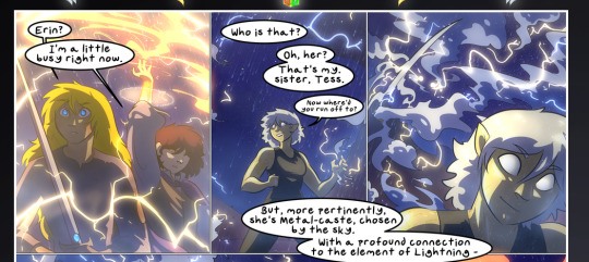
We see it most heavily in the leftmost panel, where it's quite foggy as you would expect in a rainstorm, especially in an environment with a lot of heat, but it's also lightly powdered on in the following two panels and tends to follow light sources, which makes complete sense given how light bounces off particles in the air.
A major point of strength in these too is a thorough understanding of lighting, like rim lighting, the various hues and shades, and an intricate understanding of how light bounces off surfaces even when they're in shadow (we'll see a faint glow in spots where characters are half in shadow, but that's how it would work in real life, because of how light bounces around).
Bringing some of these points together: the fluidity of the lines in magic, and the way simple glowing lines are used to emphasize motion and the magic itself, is deeply clever. I'm basically pulling at random from panels and there's definitely even better examples, but here's one (see this page https://comicaurora.com/aurora/1-16-33/):

First panel, listed in numbers because these build on each other:
The tension of the lines in Tess's magic here. This works on a couple levels: first, the way she's holding her fists, as if she's pulling a rope taut.
The way there's one primary line, emphasizing the rope feeling, accompanied by smaller ones.
The additional lines starbursting around her hands, to indicate the energy crackling in her hands and how she's doing a good bit more than just holding it. (That combined with the fists suggests some tension to the magic, too.) Also the variations in brightness, a feature you'll find in actual lightning. :D Additional kudos for how the lightning sparks and breaks off the metal of the sword.
A handful of miscellaneous notes on the second panel:
The reflection of the flames in Erin's typically dark blue eyes (which bears a remarkable resemblance to Dainix, incidentally—almost a thematic sort of parallel given Erin's using the same magic Dainix specializes in?)
The flowing of fabric in the wind and associated variation in the lineart
The way Erin's tattoos interact with the fire he's pulling to his hand
The way the rain overlays some of the fainter areas of fire (attention! to! detail! hell yeah!)
I could go on. I won't because this is a lot of writing already.
Third panel gets paragraphs, not bullets:
Erin's giant-ass "FWOOM" of fire there, and the way the outline of the word is puffy-edged and gradated to feel almost three-dimensional, plus once again using Screen or a variation on it so that the stars show up in the background. All this against that stunning plume of fire, which ripples and sparks so gorgeously, and the ending "om" of the onomatopoeia is emphasized incredibly brightly against that, adding to the punch of it and making the plume feel even brighter.
Also, once again, rain helping establish perspective, especially in how it's very angular in the left side of the panel and then slowly becomes more like a point to the right to indicate it's falling directly down on the viewer. Add in the bright, beautiful glow effects, fainter but no less important black lines beneath them to emphasize the sky and smoke and the like, and the stunningly beautiful lighting and gradated glows surrounding Erin plus the lightning jagging up at him from below, and you get one hell of an impactful panel right there. (And there is definitely more in there I could break down, this is just a lot already.)
And in general: The colors in this? Incredible. The blues and purples and oranges and golds compliment so well, and it's all so rich.
Like, seriously, just throughout the whole comic, the use of gradients, blending modes, color balance and hues, all the things, all the things, it makes for the most beautiful effects and glows and such a rich environment. There's a very distinct style to this comic in its simplified backgrounds (which I recognize are done partly because it's way easier and also backgrounds are so time-consuming dear gods but lemme say this) and vivid, smoothly drawn characters; the simplicity lets them come to the front and gives room for those beautiful, richly saturated focal points, letting the stylized designs of the magic and characters shine. The use of distinct silhouettes is insanely good. Honestly, complex backgrounds might run the risk of making everything too visually busy in this case. It's just, augh, so GORGEOUS.
Another bit, take a look at this page (https://comicaurora.com/aurora/1-15-28/):
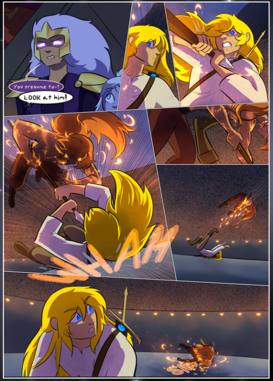
It's not quite as evident here as it is in the next page, but this one does some other fun things so I'm grabbing it. Points:
Once again, using different colors to represent different character actions. The "WHAM" of Kendal hitting the ground is caused by Dainix's force, so it's orange (and kudos for doubling the word over to add a shake effect). But we see blue layered underneath, which could be an environmental choice, but might also be because it's Kendal, whose color is blue.
And speaking off, take a look at the right-most panel on top, where Kendal grabs the spear: his motion is, again, illustrated in bright blue, versus the atmospheric screened-on orange lines that point toward him around the whole panel (I'm sure these have a name, I think they might be more of a manga thing though and the only experience I have in manga is reading a bit of Fullmetal Alchemist). Those lines emphasize the weight of the spear being shoved at him, and their color tells us Dainix is responsible for it.
One of my all-time favorite effects in this comic is the way cracks manifest across Dainix's body to represent when he starts to lose control; it is utterly gorgeous and wonderfully thematic. These are more evident in the page before and after this one, but you get a decent idea here. I love the way they glow softly, the way the fire juuuust flickers through at the start and then becomes more evident over time, and the cracks feel so realistic, like his skin is made of pottery. Additional points for how fire begins to creep into his hair.
A small detail that's generally consistent across the comic, but which I want to make note of here because you can see it pretty well: Kendal's eyes glow about the same as the jewel in his sword, mirroring his connection to said sword and calling back to how the jewel became Vash's eye temporarily and thus was once Kendal's eye. You can always see this connection (though there might be some spots where this also changes in a symbolic manner; I went through it quickly on the first time around, so I'll pay more attention when I inevitably reread this), where Kendal's always got that little shine of blue in his eyes the same as the jewel. It's a beautiful visual parallel that encourages the reader to subconsciously link them together, especially since the lines used to illustrate character movements typically mirror their eye color. It's an extension of Kendal.
Did I mention how ABSOLUTELY BEAUTIFUL the colors in this are?
Also, the mythological/legend-type scenes are illustrated in familiar style often used for that type of story, a simple and heavily symbolic two-dimensional cave-painting-like look. They are absolutely beautiful on many levels, employing simple, lovely gradients, slightly rougher and thicker lineart that is nonetheless smoothly beautiful, and working with clear silhouettes (a major strength of this art style, but also a strength in the comic overall). But in particular, I wanted to call attention to a particular thing (see this page https://comicaurora.com/aurora/1-12-4/):
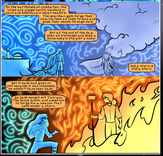
The flowing symbolic lineart surrounding each character. This is actually quite consistent across characters—see also Life's typical lines and how they curl:
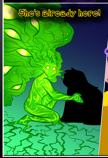
What's particularly interesting here is how these symbols are often similar, but not the same. Vash's lines are always smooth, clean curls, often playing off each other and echoing one another like ripples in a pond. You'd think they'd look too similar to Life's—but they don't. Life's curl like vines, and they remain connected; where one curve might echo another but exist entirely detached from each other in Vash's, Life's lines still remain wound together, because vines are continuous and don't float around. :P
Tahraim's are less continuous, often breaking up with significantly smaller bits and pieces floating around like—of course—sparks, and come to sharper points. These are also constants: we see the vines repeated over and over in Alinua's dreams of Life, and the echoing ripples of Vash are consistent wherever we encounter him. Kendal's dream of the ghost citizens of the city of Vash in the last few chapters is filled with these rippling, echoing patterns, to beautiful effect (https://comicaurora.com/aurora/1-20-14/):
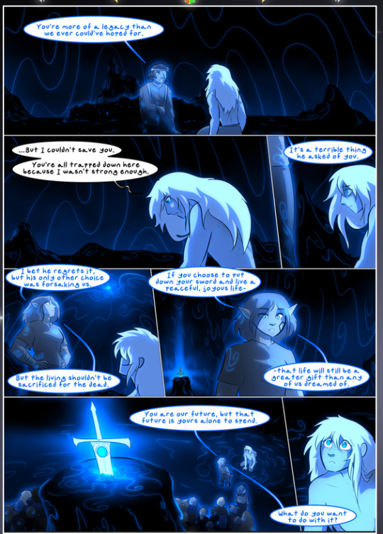
They ripple and spiral, often in long, sinuous curves, with smooth elegance. It reminds me a great deal of images of space and sine waves and the like. This establishes a definite feel to these different characters and their magic. And the thing is, that's not something that had to be done—the colors are good at emphasizing who's who. But it was done, and it adds a whole other dimension to the story. Whenever you're in a deity's domain, you know whose it is no matter the color.
Regarding that shape language, I wanted to make another note, too—Vash is sometimes described as chaotic and doing what he likes, which is interesting to me, because smooth, elegant curves and the color blue aren't generally associated with chaos. So while Vash might behave like that on the surface, I'm guessing he's got a lot more going on underneath; he's probably much more intentional in his actions than you'd think at a glance, and he is certainly quite caring with his city. The other thing is that this suits Kendal perfectly. He's a paragon character; he is kind, virtuous, and self-sacrificing, and often we see him aiming to calm others and keep them safe. Blue is such a good color for him. There is… probably more to this, but I'm not deep enough in yet to say.
And here's the thing: I'm only scratching the surface. There is so much more here I'm not covering (color palettes! outfits! character design! environment! the deities! so much more!) and a lot more I can't cover, because I don't have the experience; this is me as a hobbyist artist who happened to take a couple design classes because I wanted to. The art style to this comic is so clever and creative and beautiful, though, I just had to go off about it. <3
...brownie points for getting all the way down here? Have a cookie.
#aurora comic#aurora webcomic#comicaurora#art analysis#...I hope those are the right tags???#new fandom new tagging practices to learn ig#much thanks for something to read while I try to rest my wrists. carpal tunnel BAD. (ignore that I wrote this I've got braces ok it's fine)#anyway! I HAVE. MANY MORE THOUGHTS. ON THE STORY ITSELF. THIS LOVELY STORY#also a collection of reactions to a chunk of the comic before I hit the point where I was too busy reading to write anything down#idk how to format those tho#...yeet them into one post...???#eh I usually don't go off this much these days but this seems like a smaller tight-knit fandom so... might as well help build it?#and I have a little more time thanks to break so#oh yes also shoutout to my insanely awesome professor for teaching me all the technical stuff from this he is LOVELY#made an incredibly complex program into something comprehensible <3#synapse talks
777 notes
·
View notes
Text
To the ‘themes I am picking up on in Veilguard’ list, let's go ahead and add what I have a sneaking suspicion will actually turn out to be The theme:
— the world has changed and can never be as it was again.
— I have been changed and can never be who I was again.
— in this simple unavoidable truth there is endless grief and endless hope.
And I… may be getting a bit emotional about it haha. Let me show my work a bit:
if da:o is a game about people who are already dead or half ghosts in some form (through societal forces, psychologically, functionally, literally, in body, through the joining etc.) coming together anyway to save the world from being swallowed by total nihilism and despair (symbolized by the blight) through the power of love and friendship and also this sword/potential heroic sacrifice that I found, da2 is a game about people who have lost their homes and been set adrift finding and building new homes in each other (while completely failing to save the world. also through the power of love and friendship. as well as years of petty bickering <3 we must imagine kirkwall if not happy then worth having been because the love was there the love was there and that's the only sanctifying force we can ever have in this doomed world and city of ours), and da:i is a game about old stabilizing-but-unjust comfortable lies vs. disruptive but potentially liberating uncomfortable truths, and the power of friendship to help us distinguish the one from the other and navigate through them...
folks… I'm starting to think that veilguard might be a game specifically about moving towards recovery and acceptance after trauma — about how even in this flawed, severed, scarred state, what is here right now is worth loving and worth caring for. even in an imperfect and impermanent world and self, there is worth and joy. and of course the first real tragedy — and threat — of Solas is that he just cannot find it in himself to accept this and move on, to let go of what was, the regret won’t let him go or he won’t let go of it. which means that even though on the surface it’s Elgar’nan and Ghilan’nain (and the will to subjugate and violate they represent) who are the main villains, the real antagonistic force in this story beneath that is the Dread Wolf’s despair. A despair Rook must make an answer to by the end of the game, one way or another, compassionately or with righteous fury, triumphant or pyrrhic.
The world will change again and again and so will you — BUT the crucial element is that so will everyone else who exists along with you, you are fundamentally not alone in this existential truth. all we’ll ever have is each other and my god that is plenty, my god that is enough!!! Which is the second thing Solas just can’t accept, he keeps himself separate and completely alone out of an awful mix of fear and pride and feeling himself unworthy of anything else. Rook and the player want to save the world of Thedas because it’s where everyone we love lives, Solas wants to go back to the past because that’s the only neighbourhood where he can still visit those he loved — and the person he himself was, before. A very sympathetic and human instinct/trap to fall into when touched by trauma, I think, if only it wasn’t backed by godlike power, a fundamentally oppositional personality, and a catastrophic lack of therapy to make it literally everyone else’s problem too lol. It’s varric and solas’ banter about the man on the island and where meaning in a life comes from all over again, writ large and with detail work — and the added idea of ‘what if there are also other islands out there, though. With other people on them that you could find if you reach for each other’. Rook with the best of intentions has to make choices to which there are no perfect outcomes and live with what happens — and not cut themselves off from everyone else around them even when there is regret or shame. You get back up every day and you make a life with other people doing the same and you do your best, and that’s the only victory this world will give you. In the end, that is more than enough, that is essential. And I um. I love that. So much. It’s why some of the writing clumsiness on top can’t hurt me because this thematic spine is so solid and so beautiful to me. It’s DA2 all over again that way for me personally — I forgive this story for what it isn’t and couldn’t be, and I love it with my whole stupid open heart for what it actually is. Thank you for coming to my TED-talk and goodbye etc.
(For my fellow TLT heads out there — you know what this story is reminding me of most of all, actually? It has some big Nona the Ninth vibes down there in the deep. It’s about… the horror and unspeakable beauty that can only be found in liminality, and the role of love in making that basic fact of existence bearable. And also even more unbearable at the same time. I'm so sorry.)
#I told you all I was going to be extremely myself about this. I suppose we all hoped I was joking. even while knowing I was not#dragon age#dragon age: the veilguard spoilers#dragon age spoilers#dragon age: the veilguard#dragon age meta#solas#varric tethras#anyway. at the end of the day and despite everything varric won the 'I told you so chuckles' rights over solas in this philosophical debate#and isn't that enough in a way. I think so. the world and the story of the world is his legacy. people get to keep telling it#I want to say so much about how each of the companions play into the different aspects of this theme but I should uh#probably finish the game properly first haha#guys I literally opened my eyes this morning and wrote out most of this before even getting up. the pressure cooker brain is back#the lone brain cell in here boileth over with dragon age feels & thoughts#very little sends me deranged quite like this series I'm afraid. I'm just still so relieved that even if this story isn't for everyone.#it is for me. thank god. I needed it
126 notes
·
View notes
Text
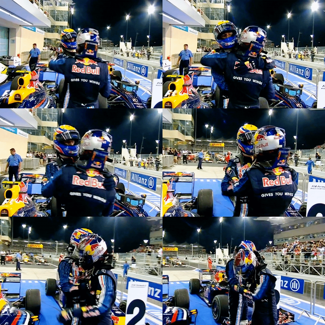
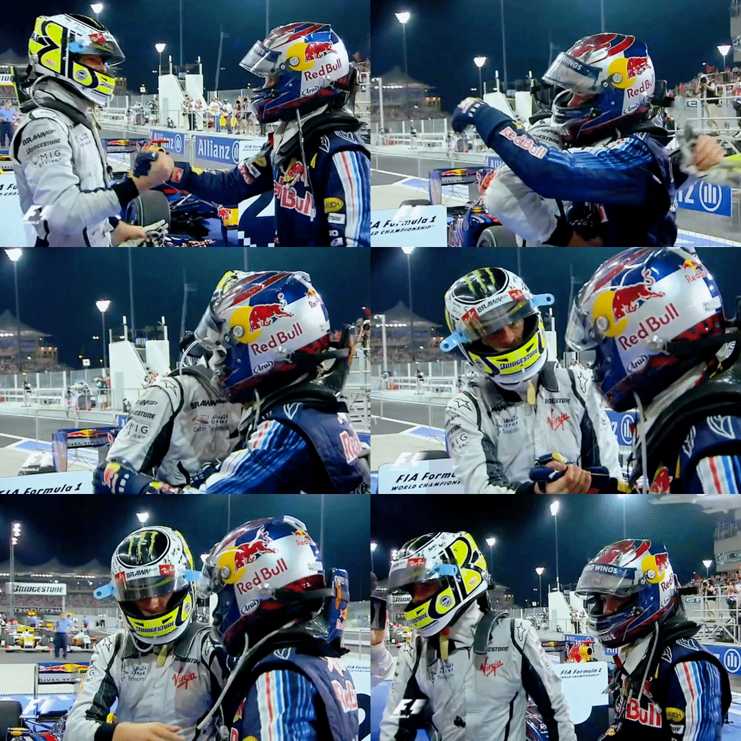
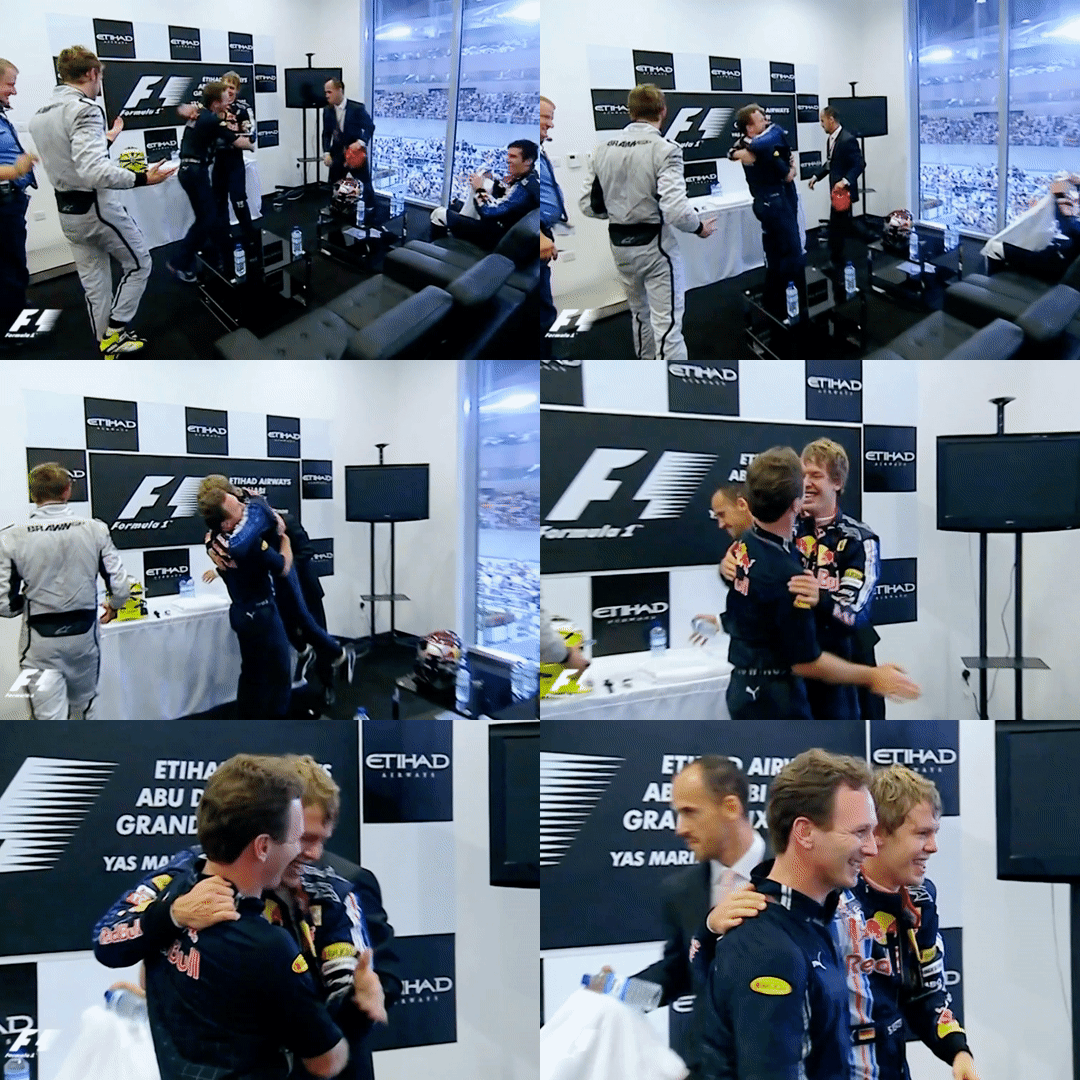
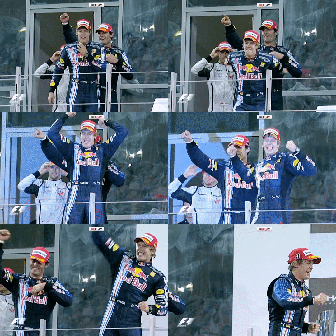
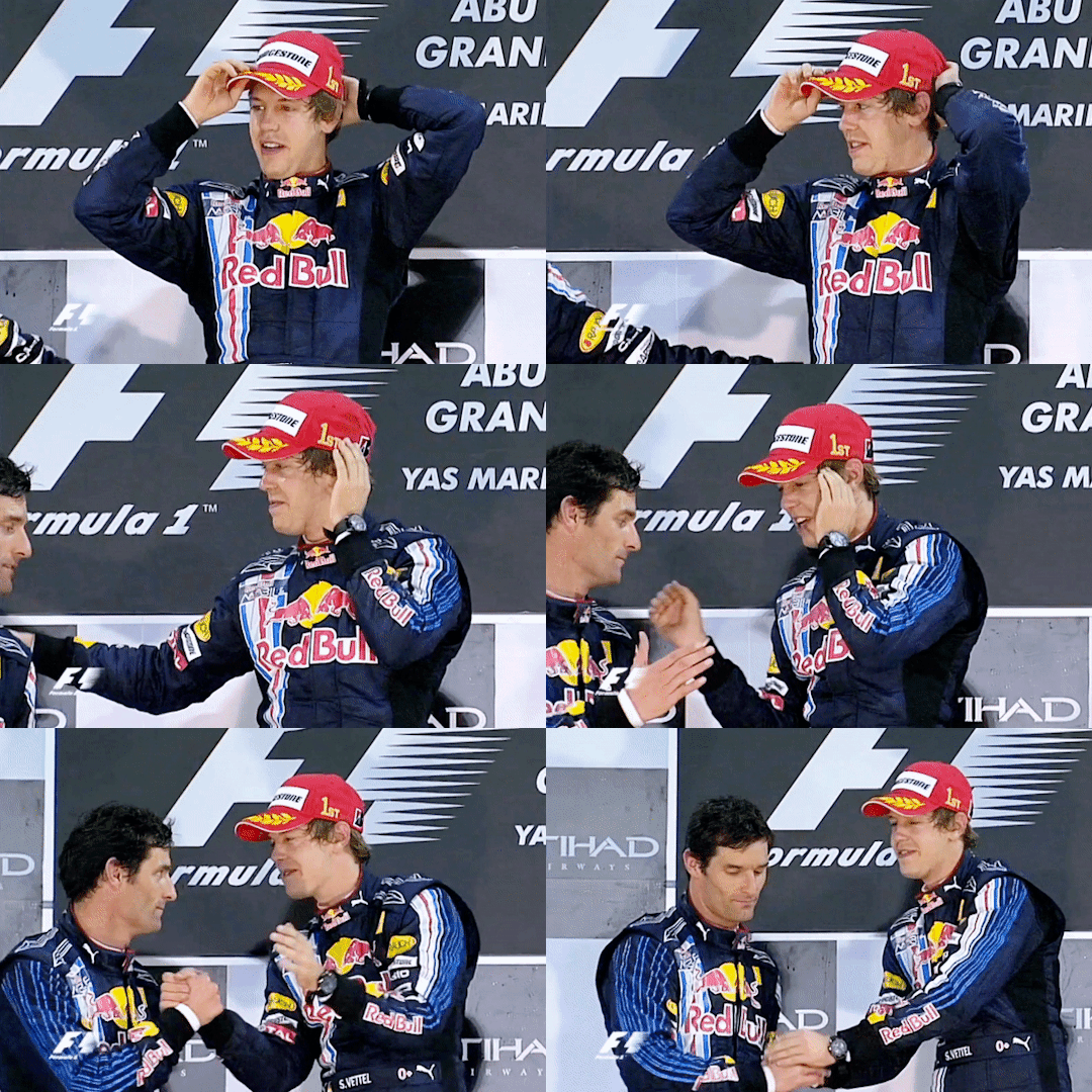
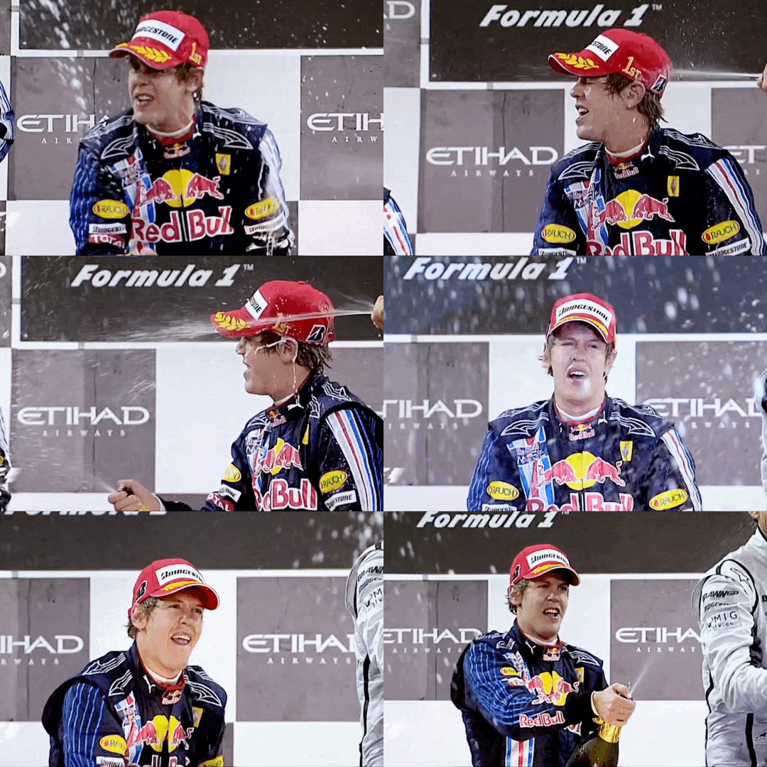
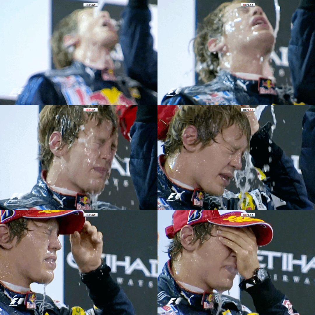
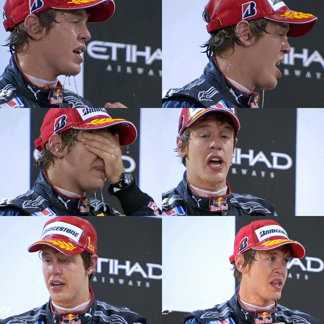
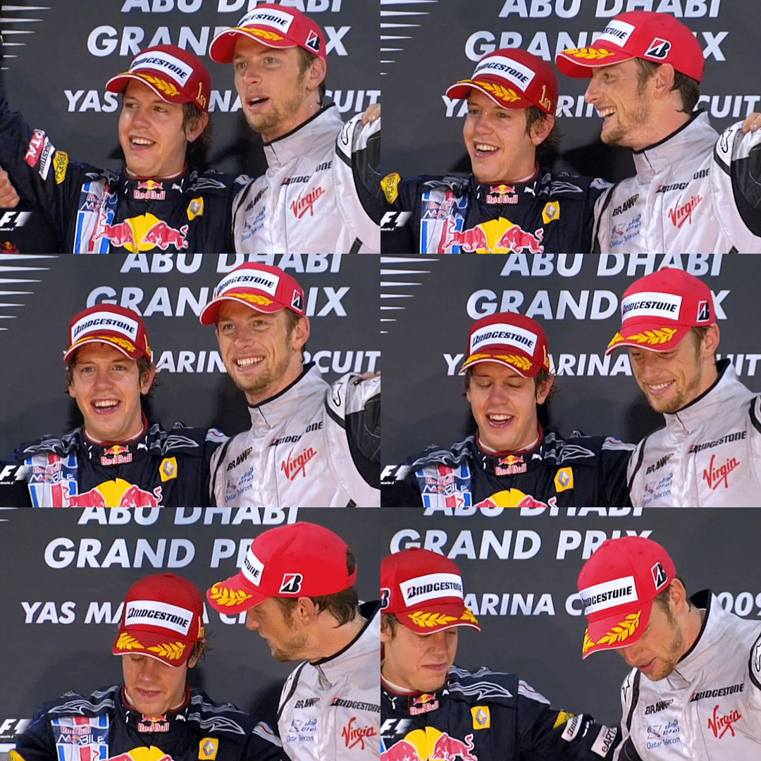
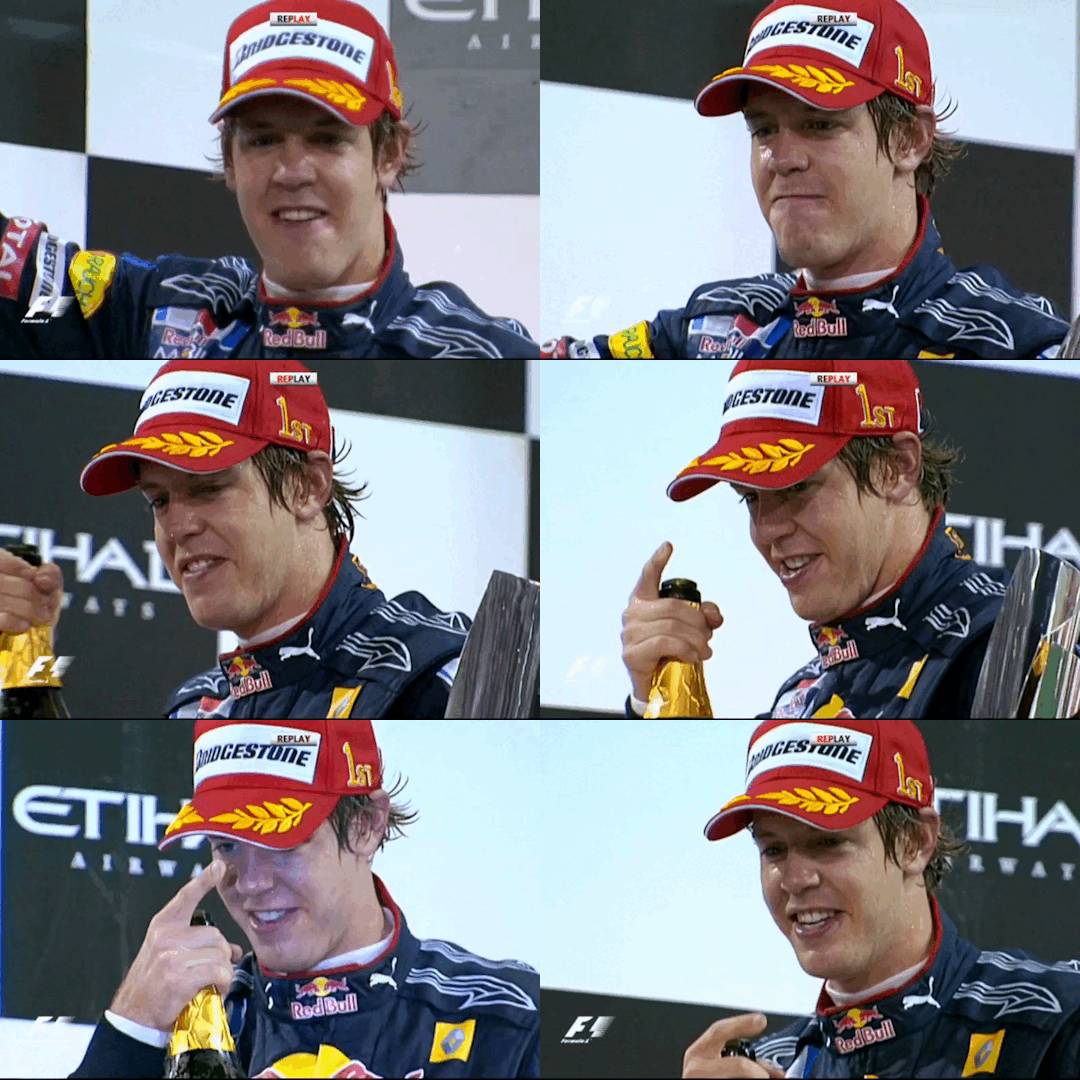
2009 Abu Dhabi Grand Prix - Sebastian Vettel(ft. Mark Webber & Jenson Button)
#fantastic podium!! maybe my favorite of this season?????#sebmarkson podiums are my fav ever nothing can top them#and both mark and jense were being so cute with seb this race aaaahhhhhhh <333333#theres something about seb that makes older men want to cuddle him and pick him up and pour champagne on him#haha thank you to dru for showing me seb getting drenched on this podium a few weeks and making me hype for this race!!#this race was very very good as well. like the last laps battle btwn mark and jense was insane#its very good when i already know the results of a race but the racing still makes me sit on the edge of my seat and scream a bit#i mentioned this before but i love how this race felt like an epilogue and it was nice to see everyone having fun and enjoying themseles#thank you everybody for joining me on another season journey!!! it been so much fun. ive really really enjoyed 2009#brawn is just soooooo cool to me. their story is insane!! im glad ive gotten to watch thru this season before the docu abt them comes out#but also very fun to see the beginning of rbr getting to the top of the field. every good result just felt so rewarding and worth it#anyways dont wanna do too much commentary abt it since ive discussed it a lot. onto 2010 next!!!! i shall miss you 2009#though i will say. it was rly interesting in this race to hear their team predictions for next season bcs a lot of it doesnt pan out#mark webber#jenson button#sebastian vettel#sebson#martian#sebmark#f1#formula 1#formula one#we do a little bit of f1#2009 abu dhabi gp#season: 2009
874 notes
·
View notes
Note
ouhh could u draw the strange beasties playing a video games


Hellooo mtsodie, here a some quick sketches!! They are playing the video games
#I think they are massive nerds#Sam more towards the mechanics and actual game design and behind the scene shit#And max. Max loves good ol fashioned cartoon violence and strategy/puzzle games but he can appreciate a good story anytime#They both play point n clicks and platformers and anything else under the sun that seems fun#Likee Mario#Sorry these aint the best most of it was doodled on my flight w little to no references… but i might revisit this idea cause its fun#Thanks for the ask!!#asks#doodles#sam and max
287 notes
·
View notes
Text
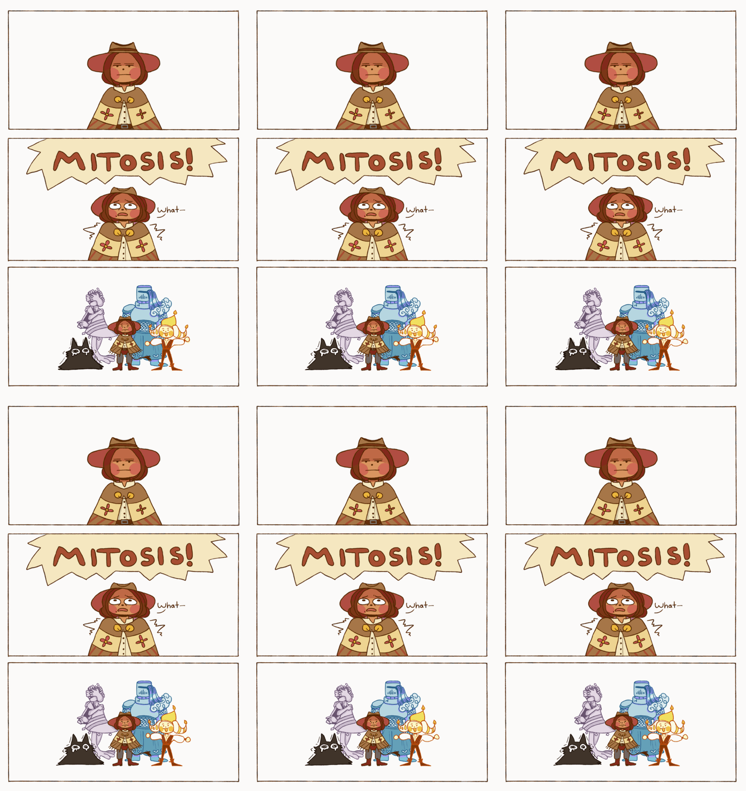
Party of one (divided into four)
#Fourfold Soul#Thing#QUIT#Ruth#Jolis#Finally I can offer some character names!#digital art#I have been hard at work in the character design mines for nearly two months.#I feel like a parent watching my child waddle off to kindergarten....ah...only yesterday you were a wee little mspaint sketch.#The title of 'Fourfold Soul' comes from the 'party' for this RPG being comprised of parts of yourself!#They all have a delightful array of personalities; and by delightful I do mean 'They are personal demons for a reason'.#It's a story about fighting alongside (and against) 'difficult' aspects of yourself.#This is also a story about redemption and reflection. Many other things too - but that is for another time.#(The clown pictured here is indeed the ignored clown from the last comic. Say hello to Jolis!)#If I had more time I would have added more animation and frames...next time...#I'm slowly getting back into my animation practice and experimentation. I will get more powerful! I promise!#Thank you all so much for all the love and support you have shown this project so far!#I was terribly nervous about posting the previous comic...the kindness it was met with meant a lot B'*)
223 notes
·
View notes
Text


there’s a lot of you here…
#to the new people um....hi#wow holy fuck that's a lot of you#so is that enough to count as an army? cause i call this meeting to order-#i love you guys#thanks for liking my fucked up little stories#MWAH😘#witch aunt talks✨
64 notes
·
View notes
Text

POV: you're a random Starly about to be caught unawares
I got @waywardstation's keychains and they're phenomenal! Some of my favourite keychains ever, look at these lil guys :D They went on a mini Survey Corps Expedition together


Home and sleepy...
A few more pics under the cut of Just Rei haha

Gracidea flowers perhaps....

he's just. a little guy!!!!! I love him
#one of my favourite genres of photo actually#i love bringing keychains around like they're little guys. bag buddies. companions#though rei tripped on the ground and got a scratch.... whoops ! oh well. it adds character#he got it while fighting that one Alpha Snorlax trust. there's a very Cool and Epic story behind that scar#this was such a fun and silly photoshoot haha#not pictured: me crouched low in the grass arranging keychains for best effect#(i was a little sneezy for an hour afterwards XD pollen/grass moment... worth it)#thanks so much wayward for them!!#rei pokemon#akari pokemon#trainer rei#trainer akari#pokemon legends arceus#pokemon#// merch#rei#akari#// tikposting
106 notes
·
View notes
Text
Happy birthday Mitch !!!
A wonderful day for the bestest raccoon boy !

I wanted to try and redraw one of the first ever pieces of fanart I made for Mage, and I’m so happy with how it came out !
#can’t believe it’s been like what#three years ??#three years since this little guy invaded my brain and showed me the way to more story driven audios#thank you so much for that mage <3#mage bunkshelf#mitch the raccoon boy#artists on tumblr#digital art#scribz’s art
57 notes
·
View notes
Text
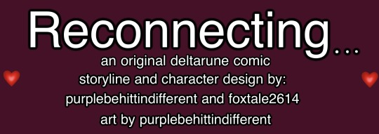
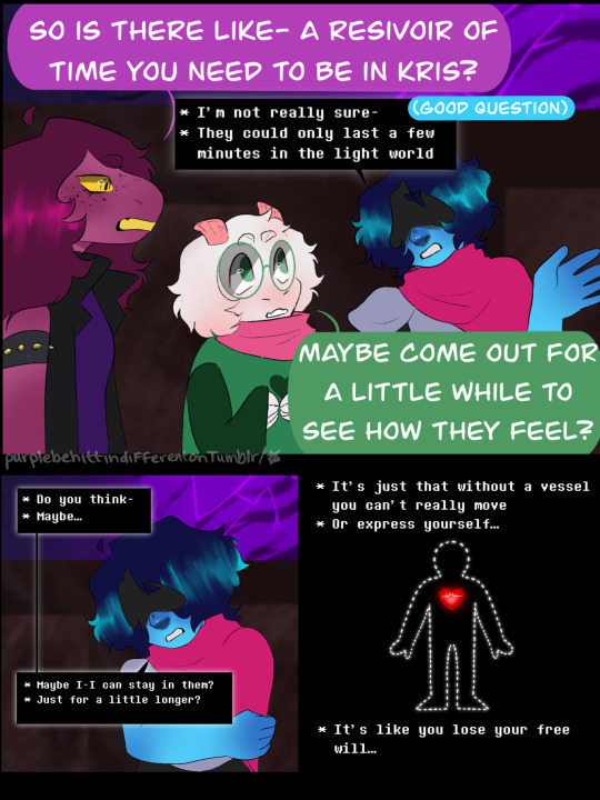


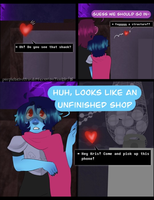
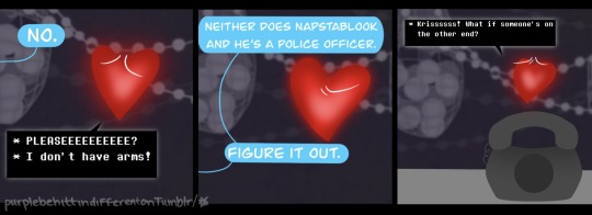

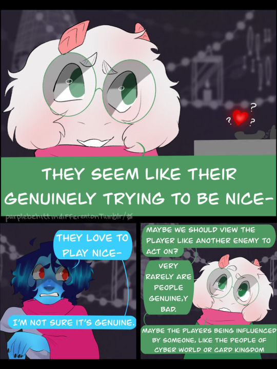
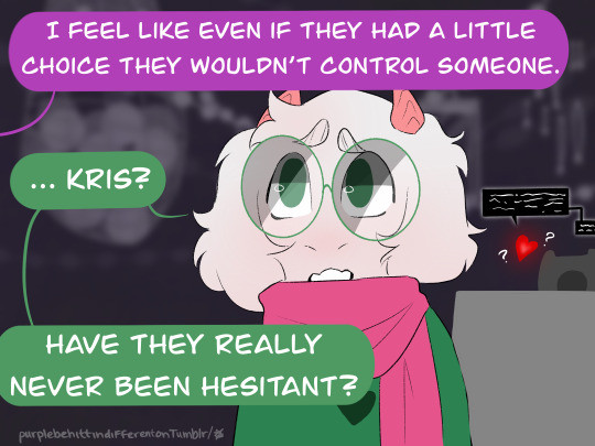


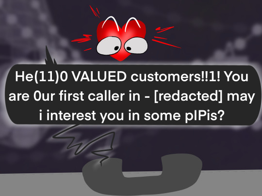
Hope y’all have got some kromer or this call might be pretty short.
masterpost
prev (ch:3::2) / next (ch:3:4)
(a quick thanks to my beta reader @prunpplee)
#art#my art#fanart#deltarune#reconnecting updates#reconnecting#dr#WHO IS THAT ON THE PHONE??!? WHAAAAAAA#funny story I actually foreshadowed this before ch2 even started lolll#have a wonderful Christmas everyone! I’m takin a BREAK NOW#ldisnofjwn#idk how I finished this so fast but I did#imma take a break by sculpting cause I like it#I love y’all#really I do I never expected to have upwards of 800 readers of my goofy little comic#thank you to all my wonderful readers as this story continues#and thank you to my magnificent beta reader prunpplee#and thanks to my co-writer who helped me plan this out months and months ago#💜#reconnecting update
470 notes
·
View notes
Text
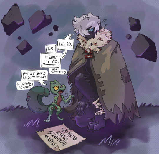
Thinking about how these two met. Get adopted, idiot.
More human!Echo.
#adopted as in “you are my sibling now; no take-backsies”#I just love the idea of Echo seeing this deranged little gecko and being like “Get away from me” and Treecko being like “Make me”#Grovyle's stubbornness overpowering Echo's festering anger is the best okay#Him choosing to love Echo despite their flaws and Echo in turn becoming a better person through exposure#Learning what it means to have a purpose; to have someone you care for so deeply that you'd protect them over valuing your own life#Echo yearning to see the past and all of its wonders because Grovyle has nurtured this new love through stories and old texts#A yearning to see the sun; the real sun and feel it's warmth because it's Grovyle's dream but having the strangest feeling of guilt#A guilt she cannot understand because it's buried deep inside and clouded in amnesia and pain and regret#I am emotional okay#another art post so quickly? yes#I blame everyone that left me nice replies and tags on my last human!Echo post#thanks for encouraging me to make more content I love you guys#Will try to write up some lore soon to share!!!#echo/human#echo/umbreon#pmd ocs#pmd grovyle#pmd2#pmd eos#pmd explorers#explorers of sky#my art
97 notes
·
View notes
Text
Sonic, the embodiment of freedom switching places with Metal Sonic and being able to realize and experience first hand how isolated and restricted Metal is. Unable to speak, limited body language and fingers unable to articulate anything outside of a clawing motion. Metal coming to and adjusting to experiencing the overstimulating experience of being a living breathing thing. Being called just Sonic and how right it feels... in a way. It feels right the way that looking at yourself through a funhouse mirror is right. It's still you, isn't it?
The tragedy of being created in the form of another. Predestined to never reach the heights of what you are capable of, chained down by the expectations of what you SHOULD be.
An embodiment of freedom made to be obedient. Bottled wind, stagnating in your containment.
You were made to usurp someone, to be superior but held back by your own programming. Held back by comparisons inherent to being a replica, gifted tunnel vision to achieve an unachievable goal.
So wrapped up in comparison that the only way you can see to break free from these expectations is to remove the person you were made in the image of. Become the ONLY 'you' there is.
What if its given to you. You are no longer the copy, you are what you were always meant to be. But the expectation is still there, and you are still falling short. What then.
#rambles#text#metal#metal sonic#sonic#squig writes#hiiii thank you @mintenby for asking abt my writing#this was more of a Discord Ramble of the concepts around a story I've been wanting to tackle but! still writing#''goal to beat/be Sonic but then still being loyal to Eggman- what happens when theres that conflict''#dont know what to call this little au/story! something about reflections/mirrors/etc bc of the one metal comic and the theme of copies#all writing will be tagged as squig writes in case you want to look for it or filter it out#i feel like id need to analyze metal in comics and neo's dialogue to get a better idea around him/his view of himself and struggles#and the OVA <3
96 notes
·
View notes