#strong sense of composition and light
Explore tagged Tumblr posts
Visit Tumblr Blog
Explore Tumblr blogs with no restrictions, modern design and the best experience.
Last Seen Tumblr Blogs


Fun Fact
Tumblr Inc. is funded by 13 investors.
Text
1K GIGI Prompts Collections 'Vivid Contrast: Abstract Woman's Profile' 6014 Free 10 pages out of 1000 pages
Get Free 10 pages MTMEVE00573G_274_0001 – 1K GIGI Prompts Collections – Vivid Contrast, Abstract Woman’s Profile 6014 10PagesDownload 1K GIGI Prompts Collections ‘Vivid Contrast: Abstract Woman’s Profile’ 6014 series provides two documents, one document is 10 pages of prompts in 1000 pages, available for free download. One document is the complete 1000 pages of prompts, this is a paid service,…
#abstract minimalism#avant-garde movement#emphasis on natural landscapes#expressive brushstrokes#oil painting#photo#simplified forms#strong sense of composition and light#stylized depiction#vibrant color palette#watercolor
0 notes
Text
Venus as the composite chart ruler


This is possible only if you have Taurus or Libra rising in the composite chart. If Venus is one of the dominant or strongest planets in this chart it can resonate to some extent, that is, if Venus is strongly aspected, if there are many Taurus/Libra placements or 2nd house/7th house placements.
This is a couple of two people who long for a relationship where love and justice abound, one where they feel they can fully love their partner and feel equally loved, and this is something they see perfectly next to each other. They are romantic, constant people who put the relationship as one of their greatest priorities. They feel very drawn towards each other from the beginning, there is a very strong physical attraction and a deep desire to be with each other in every sense of the word. A fascination with each other's body and core and a fervent desire to worship every part of their partner. A strong desire to let your guard down and allow yourself to feel the love of your partner, the pleasure running through your body and that thrill of giving your hearts completely, without fear or hesitation.
This couple will be in charge of making romanticism something habitual, something that their partner does not have to beg or ask for, they will be filled with love and gestures that, although they range from small to wonderful, will always be given from the heart. The love in this relationship will flow easily and over time it will only grow more and more. There is a strong surrender, a desire to surrender to the other and drown in their love, in the heat of their body, in that intensity of their hearts and lose themselves in the other's gaze, the one that makes their hearts beat in unison.
They are not looking for a “you and me”, they are looking for an “us” where both have the same importance, the same voice and above all, that they have the same thing that they give. Unity is important to them and they will always make it a priority to be there, in good times and bad, by each other's side. No matter the issues or the differences they may have, that will not make the love, affection or respect less visible, on the contrary, the love they have for each other is bigger than their ego, bigger than the desire to have the reason or even greater than that which makes them different from the other. They do not feel the need to rush the other or try to mold them into what they want them to be, rather from the beginning they are fascinated with what the other is as an individual. They both care that the relationship is something that they both feel comfortable with, but above all, something that fits with the vision of a positive relationship from the perspectives of both.
This relationship can bring out the cheesiest side of the other, they will feel delighted with the mere idea of seeing each other again, the simplest of the other's touches can make them slightly nervous, just like the first time. You may feel that your trust in love returns, you will feel that you can relate this word again with positive feelings and a lightness in your chest that invades you with peace and the certainty that you feel for the right person. Devotion will be seen from the beginning and it is no surprise that they see this person as someone who is worth the commitment, as someone they want to see by their side when they wake up and as the last thought before going to sleep.

💗Venus falling in the 1st house, this couple breathes love. They love how they are each other's everything, the way they transmit love through intertwined hands, small glances and those mischievous smiles that escape when their eyes meet. They love this magnetism that they feel towards each other, the one that prevents them from looking elsewhere, the one that seems to make their desire only grow and strengthen. Both of them love everything about the other person, the body and personality, light sides and those more tense. One of the things they most look forward to throughout the day is being able to spend time next to each other. They know they can be transparent with how they feel about each other, and this openness makes them feel safe, loved and reassured.
💗When Venus lays in the 2nd house, this couple loves that they both have details with each other that make them feel valued and truly loved. Both are filled with gifts and loving gestures. They love to feel the other close, they adore any kind of physical contact. They fall in love with each other like the other is capable of making them feel like they are the most precious thing in the universe, and they love how every minute together feels worth it. They deeply love that they have similar values in love, in how they see the same importance in romanticism and that it is not lost with the passage of time. They love how their love is the perfect mix of stability, reliability and a romantic fantasy that they are. protagonists.
💗The couple who has Venus in the 3rd house connect in a pleasant and unique way intellectually, which they love more than anything. Inside jokes, easy and tender verbalization of your love for each other and feeling the beautiful freedom of speaking authentically with the other. They love that the other is constant with their love reminders, messages, details, compliments and pet names, and not only that, but they feel that it flows better than with other people. Their vision of love is more positive since the other entered their lives and they feel that they see it in a very similar way. They love talking to each other and never stop getting to know each other more and more. They love that the other makes an effort to find ways to love them better or to know how they like to be loved.
💗Finding Venus in the 4th house, this couple loves the way their hearts race when they meet each other, and how they relax once they find refuge in each other's arms. They love the naturalness with which love unfolds, the kindness that their special one shows to them, the affection with which they interact with the other and how good it feels to love the other. They feel enchanted by each other's emotional world and that uninhibited way in which they let them enter and contemplate from their rawest intensity to the vulnerability that lies within them. Genuine care that makes them feel that it is safe to love and throw themselves completely into this relationship. They love those gestures that the other makes without realizing it that reflect the immense love they have for each other and the importance they give to their needs.
💗With Venus in the 5th house, this couple will feel that spark of motivation and joy when the other is around. They love who their partner is both outside and inside the relationship, they feel an enormous fascination and attraction towards each other. They are each other's biggest fans and love that their partner motivates and encourages them on those days when self-esteem is not so high. They can see the pride behind their partner's words and looks. This couple feels they can be playful and as expressive as they want with each other, and they love being able to fully enjoy each side of their special one. They enjoy an interesting, thrilling but above all adoring and romantic love. They feel a strong compatibility in both the love and sexual fields.
💗With Venus in the 6th house, one of the things this couple loves most is how even the smallest details, even the most trivial activities, become special next to each other. They love the naturalness with which they can express their love to the other, how easy it is to love the other in a dedicated and loving way. This couple loves being able to have small moments together, share hobbies or routines and add each other to their daily lives. It warms their hearts to see all the details that their special person has with them and how they make romance something common and not exclusive to important dates. They love seeing how the other reads between the lines and remembers little things about them.

💗When observing Venus in the 7th house we find a couple that constantly works on the relationship, they share values and their vision of love, which makes them feel really comfortable with it. There is a desire for both of you to get closer and closer, working on trust and giving as much love to the other as you receive. Strong unity and a strong identity as a couple, as they remain united in the face of adversity. They love the idea of seeing the other as their forever partner, as a future husband/wife, and as the companion to look at after a long day at work. They adore that romance and affection that naturally flows between them. Each other's presence fills their hearts and makes them feel happy immediately.
💗The love of the couple with Venus in the 8th house is like nothing they have experienced, they adore the intensity with which the other feels for them, the fervent desire that they awaken in the other and that way in which both crave to feel the other. another at his side, body to body, soul to soul. They adore the different pleasures they are capable of causing in each other, that power they feel when they are together and that reliable companion they see in their partner. They love that the other is able to make them feel truly seen, genuinely heard and madly loved. They will completely change each other's perception of love and since they become a couple, they can attract many changes to their partner's life.
💗With Venus in the 9th house, this couple will love this new vision that the other will give them of love, a profound change to the meaning behind loving and being loved. They will love that the other is their companion in all kinds of adventures, their support to carry out any idea and they will feel fascinated by the fact that they will see in the other someone from whom they can learn a lot. They deeply value that the other is open to trying new things to better connect with them and that they seek to experience and enjoy life alongside each other. Both will show love both in a spontaneous and genuine way, as well as in a deep and meaningful way, and that duality in their relationship will bring them a lot of happiness.
💗The couple who has Venus in the 10th house, they both feel fascinated to see how they both constantly seek to improve the relationship, how precious and positive the future together looks. They love to see in their partner a person who will support them unconditionally, who will be their pillar when things get difficult. They will both be fascinated with the person they and their partner become throughout the relationship, they love to see themselves grow and they adore their partner both inside and outside of the relationship. There is a strong and genuine admiration between them, one that is mixed with the deepest and most constant love. They both love the way they make each other feel capable of having everything they want.
💗Love for the couple with Venus in the 11th house feels relieving, as they love the freedom with which they can express themselves and their love with their partner. There is a strong sense of companionship with each other, they want to do things well, support each other and be more than a couple who loves them, a friend who supports and accompanies them no matter what they go through. They love imagining a future together, one filled with love, affection, and laughter next to the other, one that does not fade with the passage of time. They love each other's idealistic side, their individuality and will even feel inspired by the other. They are fascinated by the small details that make each other them.
💗A couple with Venus in the 12th house love that they can experience a deep, healing, unconditional love like none they had before. They love that their partner does not want to appear to the public but shows the other through meaningful actions how great their love for the other is. They do not want to keep up appearances, rather love the other with every part of their being. They are delighted by the fact that their partner makes them feel loved, completely, without judgment, without harshness. Their love is understanding, tender and quite emotionally intense. They love that the other helps them see themselves in a better light, to focus on the good in themselves, and they adore the healing and comforting quality that their relationship has in their lives.
#composite chart#astrology#venus#composite charts#composite chart ruler#venus as the composite chart ruler#venus in the composite chart
602 notes
·
View notes
Text

"Finally. Mine."
I have a lot to share about this drawing. I've detailed all my thought-process under the cut below :]
The idea is simple: I wanted to draw Magolor getting his hands on the crown, but surrounded with symbolisms of regret.
About the color palette:
Purple is the main color of regret in occident
It is complementary with yellow, the crown's color
Everything that is yellow has a connection to the crown
For the crown, it is obvious, its own self
For Magolor's eyes, they are the same yellow as the crown, as if you could see it reflected in his eyes. It represents his obsession, his ambitions, and most of all, the eyes are the soul's window. The moment Magolor put his hands on the crown, his soul wasn't his to control anymore.
The roses and the sand are detailed below
The roses:
From my research, I found that yellow roses were a symbol of regrets and asking for forgiveness in ancient greek mythology
It stuck with me, firstly because the color yellow is important to my drawing
But also because Magolor isn't a character represented by flowers
He's represented through magic or technology (like gears)
However, those roses do not represents him as a character, but his wish to be one day forgiven for all the wrongs the crown forced him to do.
Magolor is a liar and a traitor. In order to show his sincere apology, it had to be something that did not mirror his usal image (like magic and trickery and technology), but instead something that mirrored his feelings.
Thus, yellow roses.
The hourglass:
The hourglass symbolises time, by nature
Here, it represents the unforgivable nature of time. Mistakes cannot be erased, pain cannot be forgotten.
No matter how strong Magolor may regret his actions, he will never be able to take them back.
The last grain of sand falling means that he cannot go back on what he is about to become.
He sealed his fate, touching the crown signed the contract.
Overall composition:
The yellow roses and the crown follow a fibonacci curve
The crown resting at the apex. The most important point of the composition is the crown, because in this picture, Magolor is not the one in charge.
The hourglass is in the exact middle of the frame, disregarding the rest of the composition.
The houglass, time itself, represents balance, something eternal and abstract, perfectly symmetric
A mechanical beauty surrounded by a flower field
The stars of the galaxy in the background.
The very same stars Magolor wished to rule over, with the power of the crown.
He may have looked so close to accomplishing his ambition, however, much like the stars, there were still a billion miles more to go.
And lastly, the title:
"Finally. Mine." is meant to be ironic. Because there wasn't a single instant where the crown was his. As I said multiple times already, he is the one bowing to the crown.
Ok that's all I had say about what I thought about when creating this piece!!! XD
Now let me show you how I turned a quick doodle on a notebook into the finished drawing!!!
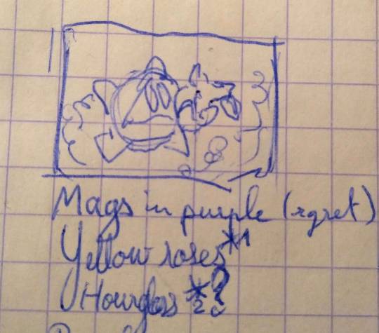
It started with simple notes I took while at work today, with a quick thumbnail.

Did a quick sketch on my pc as soon as I got back home, just to have a rough idea of the composition with all the elements

I went over everything now that I had the composition in order to have a better sense of proportions and perspective

I cleaned the lines. Those roses were so tedious to draw XD Originaly I wanted to do a very clean, sharp line art, but I changed my mind and settled with this as my line art

I added the flat colors. I didn't use a palette from somewhere, I went with my gut feeling all the way through XD I really like how Magolor's colors turned out!
And finally, the finished product. Added more vibrance to the yellow, added the light rays and the details in Magolor's eyes.

Extras of the finished drawing with the fibonacci curve on top of it :D
A job well done if you ask me :]
#magolor#kirby#princepinkart#kirby fanart#master crown#this post is so long lmao#man did I have a good time coming up with this drawing#I really like how it turned out#thanks to all the people who had the patience to read all the way through this post XD
241 notes
·
View notes
Text
Herzen (3052) ~ Your Love

Herzen represents your hearts content and where you vibrate on the frequency of love. This asteroid represents the heart. Today, we'll be going over more prominent aspects/placements in synastry, composite, and natal. In the natal chart, Herzen will show where you vibrate on the frequency of love and where you love the hardest. In synastry, we see where this love is ignited between the two. In composite, if there are prominent placements, then it shows where there is unconditional love within the relationship.
Herzen conjunct Neptune
Natally Herzen conjunct neptune shows a transcendental love that the chart holder possesses. They have the ability to love past flaws and worldly circumstances. They know how to love others from & for the soul because they understand we are all one.
In synastry, this is powerful because, again, we see unconditional love with no boundaries. The neptune person has no idea how much the herzen person loves them, although subconsciously, they feel it. They can have dreams and strong intuitive feelings of loving the other. This love has nothing to do with the physical but all with the oness they feel together spiritually.
In composite, this aspect tells the story of a relationship filled with unconditional and undying love. There is definitely a spiritual link between the two.

Herzen conjunct Saturn
Did you know saturn represents contracts? It only makes sense because of Saturn's will to bind things together. Not to mention, that libra the sign of contracts is exalted here. There is a strong connection of contracts & business whenever saturn is involved with something, that's why saturn is karma because when you make a contract with someone, you now both owe the other something. When saturn aspects herzen, but especially conjuncts the native has a contract to learn about the matters of the heart. They have come down to this dense,3d realm (saturn) to learn how to love unconditionally and vibrate on that frequency. In synastry this is the same except, the saturn person has a contract with the herzen person to learn about love, and saturn is here to teach herzen lessons about love. This energy is also reciprocated into composite. The relationship will be filled with trials & lessons about love.
Herzen conjunct Sun
Herzen conjunct Sun in the natal chart shows that the native is the physical embodiment of love, and their personality exudes this heart frequency. They can be very selfless, and it's important for them to not just love others but also themselves. People can love the light this person gives off. In composite, this shows that the source of the relationship is based on love; and when these souls come together, the vibration of the relationship is the heart. In synastry, they both love each other a lot and are willing to sacrifice certain things for others. This is a representation of unconditional love. Look at where this conjunction is taking place.
Herzen in 7h
In the natal chart, this shows that through partnerships/marriage, this is where your heart feels content. This native likely gives a lot in their relationships, and it's also important in relationships that their partners show them, unconditional love. They will likely attract partners who have a very big heart. Herzen 7h overlay in synastry can show the energy of love exists strongly within the relationship of these two. Their souls agreed to come together to gain love within their connection. Herzen person exudes this energy in the 7h person's eyes, and they love the Herzen under no conditions, and Herzen just loves the 7h person just because of the way they are. Similar to the Herzen 7h overlay in composite, there is unconditional love within their relationship.


While doing some research, I stumbled upon a page on Instagram called @extraasf, and their posts are SO inquisitive. They introduced me to this asteroid, and I had to know more. So go check out their page if you are into the more spiritual side of astrology! These are just a few descriptions of some random placements, but pay attention to this asteroid if it's closely conjunct to any planets/angles. I would also say look to see if you have this asteroid at any libra degrees (7°,19°) because this rules over relationships/contracts! Hope you guys enjoyed it, see you next week. 🌙

𝐵𝑜𝑜𝑘 𝐴 𝑅𝑒𝑎𝑑𝑖𝑛𝑔 |🫦| masterlist
#astro community#asteroids astrology#asteroid observations#asteroid astrology#asteroid#asteroid herzen#love astrology#astrology chart#astrology content#astrology#astro blog#astro notes#astrology community#forbidden astrology#hot astrology#astro observations#astro thoughts#astro chart#natal chart#astrology birth chart#birth chart#astroblr#astro content#astrology talk#astrology thoughts#astrology tumblr#astro talks#astro tumblr#composite chart#composite
437 notes
·
View notes
Text
Okay, guys, after reading a post by @centrally-unplanned I just took that ACX "AI Turing Test" that Scott Alexander did, and I am screaming, as the kids used to say.
You guys are way, way overthinking this.
I thought I would do better than average, and I guess I did; excluding three pictures I had seen before, I got 31/46 correct.
Not great if you're taking the SAT, but I feel like if I could call a roulette spin correctly 2 times out of 3 I could clean up in Vegas.
So, what is the secret of my amazing, D+ performance?
You have to look at the use of color and composition as tools to draw the eye to points of interest.
AI is really bad at this, when left to its own devices.
For example, here:

Part of the reason to suspect that this is AI is the "AI house style" and the bad hands that I literally only noticed right this exact second as I was typing this sentence. Even if the hands were rendered correctly, I would still clock this as AI.
The focal point of this piece ought to be the face of the woman and the little dragon she is looking at (Just noticed the dragon's wings don't match up either), but take off your glasses or squint at this for a second:
Your eye is being drawn by the bright gold sparkles on the lower right side of the piece. That particular bright gold is only in that spot on the image, but there's no reason to look there, it's just an upper arm and an elbow. The bright light source highlighting the woman's horn separates it out as a point of interest.
Meanwhile, the weird aurora streaming out of the woman's face on the left side means that it is blending in with the background.
In other words, the way the image is composed, and the subject matter suggest that your eye should be drawn here:

But the use of color suggests that you should look here:

That's a senseless place to draw the eye towards! It would be a really weird mistake for a human to make! In fact, I think there's a strong argument that the really close cropped picture of the face of the character is a strong improvement. It's still not a particularly good composition, but at least the color contrast now draws the eye to the proper points.
In fact, I would say that a good reason for my performance not being even better was this alarming statement at the start of the test:
I've tried to crop some pictures of both types into unusual shapes, so it won't be as easy as "everything that's in DALL-E's default aspect ratio is AI".
Uh...
So how about this one:
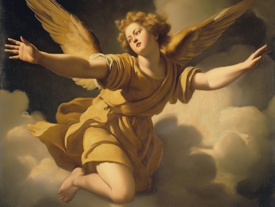
This is a lot better anatomically and in terms of the use of color and light to draw the eye towards sensible parts of the painting. The lighting makes pretty good sense in terms of coming from a particular direction and it also draws the eye to effectively to the face and the outstretched hand of the figure.
It's also a really flat and meaningless composition and subject matter that no renaissance artist would have chosen. What is this angel doing, exactly? Our eye is drawn to the face and hand, and the figure is looking off towards the left side, at, uh, what exactly?
But then I thought, "Well, maybe Scott chopped out a giant chunk of the picture, and this is just a detail from, like, the lower right eighth of some giant painting with three other figures that makes total sense"
This makes sense as a piece of a larger human made artwork, but if you tell me, "Nope, that's the whole thing and this is the original, un-cropped picture" I'd go, "Oh, AI, obviously.
All of the ones I had trouble with were AI art with good composition and use of color, and human ones with bad composition and use of color. For example, this one:

This has three solid points of interest arranged in an interesting relationship with different colors to block them out. I'd say the biggest tells are that the astronauts' feet are out of frame, which is a weird choice, and looking closely now, the landscape and smoke immediately to the right of the ship don't really make sense.
But again; I had to think, "Maybe Scott just cropped it weird and they had feet in the original picture."
Here's another problem:
StableDiffusion being bad at composition is such a known problem that there are a variety of tools which a person can use to manually block out the composition. In fact, let me try something.
I popped open Krita (Which now has a StableDiffusion plugin) and after literally dozens of generations and a couple of different models I landed on ZavyChromaXL with the following prompt:
concept art of two astronauts walking towards a spaceship on an alien planet, with a giant moon in th background, artstation, classic scifi, book cover
And this was the best I could do:

Not great, but Krita has a tool that lets you break an image into regions which each have different prompts, so I quickly blocked something out:

Each of those color blobs has a different part of the prompt, so the green region has "futuristic astronauts" the blue is the spaceship, the orange is the moon, grey is the ground and pink is the sky, which gives us:

Still way too much, so we can use Krita's adaptive patch tool and AI object removal to get:

I'm not saying it's high art, or even any good, but it's better than the stuff I was getting from a pure prompt, because a human did the composition.
But it's still so dominated by AI processes that it's fair to call it "AI Art".
Which makes me wonder how many of the AI pictures I called out as human made because one of the traits I was looking for, good composition, was in fact, actually made by a human.
187 notes
·
View notes
Text
Crowley’s Mayfair flat design (concept art) for season 1 was inspired by an art installation in the Royal Academy of Arts called “Sensing Spaces”; in particular this piece from Grafton architects.


This installation “aimed to evoke the experience of contemporary architecture within a neoclassical environment”. Especially the light “coming in” from overhead was the most important aspect.


Most poignant of all was to recreate the light sensation of both moon and sun simultaneously.
The spatial qualities of light and shadow shaped the installation by Yvonne Farrell and Shelley McNamara of Irish firm Grafton Architects. The architects suspended large wooden structures from the ceilings of two galleries to recreate the experiences of both sun and moonlight.

The structures by Grafton Architects, founded by Shelley McNamara and Yvonne Farrell, hover above Gallery IX and the Lecture Room, suspended from the roof lights above. In order to create a strong spatial tension between adjacent rooms and to set up different lighting scenarios, two dramatically different compositions have been made. Choosing only to work with the roof lights, both installations feature a series of suspended surfaces and forms that manipulate the light and reshape the space in two entirely different ways; one as an exploration of lightness, with what is referred to as a waterfall of light, and the other being the exact opposite, exploring weight, containment and the formation of carved-out space. In the Lecture Room, a series of dark, brooding and apparently massive solid forms obscure most of the existing ceiling and roof light, articulated by two relatively small, high-level ‘apertures’ or openings of light. In contrast to this, Gallery IX features nine blades, suspended in alignment with the gallery’s exposed trusses to reflect a balance of natural and artificial light filtered through the exposed roof light. While both installations drop down within the galleries to create an implied headroom of 2.5 metres within the 8.5-metre-high spaces, two entirely different relationships are established between the floor and the light. In the Lecture Room, the installation intensifies the perception of distance between the floor and the light, while in Gallery IX the hanging blades bring proximity and unity. By quoting American architect Louis I. Kahn’s statement that ‘to hear a sound is to see a space’, Grafton Architects allude to a consistent ambition in their work to make space tangible. As they put it, they seek to ‘make as much nothing as possible’, and to structure space through the careful orchestration of the passage of light and movement through the void. In response to what they refer to as an ‘amazing generosity of space’ within the Main Galleries of the Royal Academy, their installations set out to radically transform each visitor’s perception of the familiar. As such, between Gallery IX and the Lecture Room the architects have created two distinctly different scenarios which, when experienced side-by-side, set up a powerful spatial duality and tension that reinforces the qualities of the existing rooms while radically transforming them into something new. (for a complete 360 view of the rooms)


‘As well as enabling us to find greater pleasure in the spaces we inhabit, this exhibition will perhaps heighten our awareness of the sensory realm of architecture and thereby encourage the creation of a more rewarding built environment.’


From Michael Ralph: Crowley’s flat was the first piece of concept art he did before booking the job, and it stayed the same. He sent in seven pieces of concept art before he went for an interview, and four of them stayed exactly as they were – nothing changed from his original instinct. The idea of the apartment was for it to be almost a cement tomb but with a very high ceiling (hanging in mid-air) so there was a sense of light coming in from a very high level.
And just a piece I want to highlight: "manipulate the light and reshape the space in two entirely different ways; one as an exploration of lightness, with what is referred to as a waterfall of light, and the other being the exact opposite, exploring weight, containment and the formation of carved-out space."


In a way, the flat has always possessed a bit of light and shadow, something reflected in Aziraphale and Crowley's own essences.
#good omens#ineffable husbands#crowley#aziraphale#behind the scenes#good omens crowley's flat#sensing spaces#it is all about touch#and light#and them coexisting#good omens fun facts#set design#concept art
92 notes
·
View notes
Text
Composite chart observations 🍁
*none of the observations are guaranteed outcomes or are meant to be 100% representative of your relationship. These are just from personal experiences and observations
🍁Moon square ascendant - Could be that you guys initially were on different pages about the relationship. One person could have been more emotionally invested than the other. The other may have wanted something more surface level. Having the “what are we?” Conversation and still not understanding what you are.
🍁Mc square/opposite sun - something about the relationship makes people almost uncomfortable OR something about this couple is controversial. For eg there’s a big age gap. Can also seem like an opposites attract type of relationship. Like people couldn’t picture the two of you together yet here you are.
🍁Jupiter square ascendant - Jupiter is about growth and when it squares the ascendant, which represents the initial meeting of the two/how they come across, it tends to show a relationship that is stunted. It doesn’t develop into a next stage, of maybe something more serious.
🍁Pluto - ascendant aspects - Very transformative and full of growth, even in harder aspects, the relationship is there to teach you a valuable lesson, whether lasting or not. It is obviously more favourable with good aspects. This also indicates strong sexual tension and the two being very attracted to each other and drawn to one another.
🍁Harmonious aspects between moon and mercury - you both get each other on such a deep level. You just know what to say to each other and comfort each other when the other is upset. You feel like you can be yourself around one another and express yourself easily, without judgement.
🍁Venus - Uranus aspects - you bring a fresh perspective on love into the relationship. In harmonious aspects, you both know how to keep a sense of individuality in the relationship while still maintaining the connection between you two. You could find each other fascinating. Difficult aspects of challenging each others views on romance means it might be harder to come to some sort of compromise or agreement.
🍁Chiron in tenth house - the way you two heal and help each other grow could be something that people notice or they’ve witnessed the journey of it. You two might be noticeably different, especially emotionally, after entering the relationship. When in signs like cancer or Pisces, it emphasises on how nurturing the connection is that aids in the healing process. This couple has similar wounds around their reputation/what people think of them/validation and/or how to reach a certain level of success.
🍁Moon trine/sextile Mars - this is the “I’m your biggest cheerleader” aspect. I love this aspect because this person will encourage and motivate you to chase your dreams, desires, ambitions etc. it works well for both romantic and platonic relationships imo. There’s good support without feeling like the other person is overbearing or putting pressure on you.
🍁Gemini moon - oh this one gets such bad rep it kind of pisses me off sometimes. Aspects to the moon obviously make a difference but it’s not always a “two-faced” relationship or always on and off. There’s a playful, flirty nature to this couple who can communicate their feelings well with each other. It’s the perfect harmony of intellectual meets emotional. It’s a multifaceted experience to have a moon in Gemini with someone; you can go from a light-hearted conversation to a serious one whenever it’s required/needed without feeling like it’s forced due to Gemini’s ease for adaptability and duality.
🍁Saturn in fourth house - The sign is also important but in a general, Saturn can bring challenges to the couple who want to settle down or live together in some way, perhaps even start a family. There may be issues with one another’s mothers. But this can also be a rewarding relationship as if the couple withstands the challenges, they have a stable, open and strong foundation for their relationship, especially emotionally.
🍁Taurus Venus - soooo sweet and romantic and sensual. This is the type of couple that always finds a way to touch each other, whether it’s locking their pinkies together or leaning on each other, it’s one of my favourite Venus signs for composite charts. The one thing I’ve noticed is the undertone of stubbornness though with Taurus Venus, but it’s not drastic.
🍁Jupiter in harmonious aspects to Saturn (even conjunction) - wonderful balance here. Constantly helping and encouraging each other. Being a source of optimism and positivity when the other is down and knowing exactly how to lift the other persons spirits and encourage them to keep going. You empower each other to grow spiritually and probably career wise as well.
259 notes
·
View notes
Text
So last night me and my girlfriend went to see Les Mis in London and we were talking about how differently every production presents Enjolras and Grantaire's dynamic — whether it is one-sided longing, reciprocated, a bit overlooked or very much back and forth, etc etc.
Let me just being to say that last night's Grantaire was absolutely perfect. I could clearly tell there was a whole characterisetion that had been established and that came out in the little details. He was a skeptical Grantaire, yes, but there was more to it— almost a frustration in the awareness of his inability to avoid what is inevitably going to come. This Grantaire — ad this was a detail I loved— was truluy part of this group, lots of students had many interactions with him in a very familiar/comfortable way, and even the scolding that happened from time to time was light, not as repetitive and insistent as I've seen it before. Grantaire was very much part of that group, he had his own established role.
With Enjolras, let me just say that there were a lot of very interesting decisions that were made in terms his and Grantaire's positions on stage. There were multiple moments when the two would stand in a diagonal way— with Enjolras always being in the highest corner of the frame (either on top of the barricade or on the stairs of the Musain) and Grantaire being on the bottom corners, always diagonal to Enjolras, always a few steps away from the other students who were naturally drawn to their leader. This was truly a beautiful composition, it really helped to oppose them but also draw a connection between them.
Then, to go back to the E and R dynamic I was talking about before, at one point, my girlfriend said to me, "They are already dating in this". And let me tell you it made so much sense.
Grantaire's bits during Red and Black were acknowledge by Enjolras, but he didn't stand there glaring at him or trying to get him to sit down/put his wine away the whole time. It almost felt like Enjolras was used to this— not to him being, well, Grantaire, because that is obvious in every single production, but to him having his opinion on the Revolution, on their ideals, on Enjolras, on their friends— in this, it felt as if Enjolras had already acknowledged Grantaire's voice, had already understood it and kept it in the back of his mind, as a "i know you, I don't agree with you, but I know where you stand, because we've talked about this". That is why the scolding didn't feel as severe, why it almost felt as Enjolras didn't acknowledge him much during Red and Black, when in reality, he was always aware of what Grantaire was doing or saying, despite him being busy discussing things with the other students. There was a familiarity, I think, with the presence of the other.
(Of course Grantaire's staring at Enjolras when Marius was raving about Cosette and about a love so strong that comes without a warning and completely takes over you didn't go unnoticed, I feel like it deserves an honourable mention.)
And then. Then, when they were on stage at one point, right after Do You Hear The People Sing, there was a brief moment where Enjolras was the one being playful with Grantaire, gently shoving the flag towards him, and then at one point he leaned in, both of them face to face, Enjolras' mouth already open because he was singing— let me tell you I would suspect I was gaslighting myself, but since my girlfriend had the same reaction as me (our mouths dropped open) I feel better about affirming that it looked like Enjolras was going in for a kiss, then pulled away last second. Now, whether that was intentional or not, it doesn't really matter, does it? And regardless, I wouldn't exclude the intention behind it because we have seen several instances of Enjolras kisses on stage. I'm just saying.
Finally, the barricade. Drink With Me? The way Grantaire sang the line "is your life just one more lie?" Altered my brain chemistry, because I've never heard it delivered in such an intimate, betrayed way, the sorrow was there, the awareness that Grantaire was going to lose Enjolras and everyone else, the way he whispered the word "lie", in such a resigned, tired, hurt way. Like the two of them have had that conversation before. The way Enjolras grabbed his arm, and there was no surprise from Grantaire, no pause to think "oh he's finally acknowledged me", he only shook Enjolras' hand off him and walked away, he looked broken. And this is why we said this didn't feel like an unrequited sort of longing, or like Enjolras had not acknowledged him until that point, or like Enjolras was being stern and only focused on the Revolution, on the other students' morale. No, this felt like Grantaire finally giving up to the idea that this is going to happen, it's a "I wish you could change your mind" knowing that it won't happen, not because Enjolras doesn't care, but because they have had this conversation before and they've never agreed on it and this is now inevitable. The care was there, you could see it so clearly.
When the National Guard began shooting, Grantaire didn't even flinch. When all his friends died on the barricade, he slowly made his way to the same spot where Enjolras had been shot, looked over at the National Guard, yelled to catch their attention and let them shoot him— no attempt at fighting back, no "vive la république", because that is not the reason he will be killed— only a yell to catch their attention and the awareness that this is what it was going to be all along, the moment he'd lose Enjolras, his friends, he'd lose himself too.
Rant is over now, but I just want to say one more time how perfect this whole cast was, how perfectly put together the whole show felt— every scene made sense, everything flew, every actor clearly knew their character inside out. If you do have a chance to watch it, then do so, you won't be sorry.
#les mis#les mierables#Enjoltaire#exr#Enjolras#Grantaire#character discussion#this is just my opinion and how i have read their interactions#of course everyone sees it differently and that is okay!#i just loved this production and I was in awe the whole time
68 notes
·
View notes
Note
You've probably been asked this a million times, but how do you render? Or I guess a better question is how do you decide where to put colors because it's always so masterfully done!!!
For rendering, firstly: what is the mood I’m going for? For my Hero’s Shade piece, I kept the rendering rough, relying on rough brushstrokes and brushes with color jitter to create colored texture, and then leaving it alone before it becomes too refined. For my Zelda illustration, I kept it clean and dewy. I render based on intent, mood, and characterization.


To master rendering, I would suggest doing in depth texture studies. Below is an example of my student’s work where she’s in the process of doing this:

Mastering how to render different textures by doing exact studies from photographs of things such as: metal, fabrics, rocks, wood, etc will excel your rendering abilities.
BUT AND THIS IS SUPER IMPORTANT: the thing I notice about most artists with like godly rendering skills is that their rendering sometimes excels beyond their drawing abilities. Then they use their rendering as a crutch to carry their poor drawing skills: the drawing is like the bones, the architecture. If you have a poor drawing with excellent rendering, the piece will look good to the average enjoyer, but it will unfortunately fall flat to artistic peers.
In saying all of this: it’s super duper important to note that, when trying to make objectively appealing art, it has hierarchies of importance and I’ll tell you the order:
Perspective placement and proportion are the first part. It’s basically the drawing part! The architecture and bones of the artwork. The anatomy, the form, the silhouette, negative space, and overall design of the sketch, composition, lineart, etc, they all sort of fall under this.
Value is below this, and to master value I suggest master shading the sphere.

Highlight, direct light, core shadow, reflective tone, cast shadow, etc.
Color is below all of this. You can be wrong with color but not wrong with value is what’s usually said.
As for coloring, it’s a lot harder for me to explain other than to refer to how I use grays a lot. Color is a lot less step by step to explain you see, so I’ll try to explain, but I’m sorry if it lacks much sense! The reason why I’m able to get away with using strong/bold saturations without it being overwhelming is that I use the grays to carry the strong saturations. It’s important to remember that the human eye can get tired; it’s why we blink even when our eyes don’t feel dry. It’s a moment of pause, a moment lacking in stimulation. You have to have areas of high stimulation (high saturation, texture in rendering, sharp edges) paired with areas of low stimulation (low saturation, smooth rendering without detail, and lost or fuzzy edges). This is why I argue that art does indeed have rules, but only so much as our own brain and eyes have rules; it’s our brain and eyes that perceives the art, and our brains have a very broad and universal mode of operation. Same with art. That’s why art is objective and yet also subjective! But this is a tangent.
As for color, it’s again with mood, but I usually rely on contrasting colors more than anything: warm or cool for light or shadows, one is super saturated while the other is typically desaturated. Hope that makes sense! It’s all about balance: one element/color must have a foil to counter it. And when you chose your main colors, if you wish to add a few extra colors for dynamism, it’s your best bet to chose the colors right next to the main color you’re using on the color wheel. For instance, if you choose red and green as your color scheme, and you need more details in the green shadows as an example, use a combo of blue-gray variations to add more color and saturation variation. In contrast, for your red lighted areas, maybe I would use a light gray orange to introduce new colors in.
Idk if any of that makes sense, I’m not exactly the most gifted teacher when it comes to trying to break everything down, which is why I’m trying to learn how to teach 🤣 I’ll get the hang of it one day maybe 😆 Hope some of this helps answer how I personally approach it, and mind you it’s important to learn from actual masters who have been doing this for decades!
88 notes
·
View notes
Note
Got any tips in shading stuff in black and white digitally?
Hi Anon!
You're in luck! I'm currently wrapping up a book which is shaded digitally, so I've been thinking a lot about this recently.
How I do this is by no means the only way, so take from these tips as much or little as you want! When I add grays and shadows to a line art drawing, I try to think about these things:
Preparing the image
I like to work with a file that has a white background and a layer with only line art on top of it. Between these two layers I add new layers where I use the pen tool and bucket to fill areas with black, then I lower the opacity for that layer to get a value that I want.


This method works well for me, and for simpler pieces I don't need more than 3 layers with different values - light, medium and dark grays.
I work in Clip Studio. Here's a picture of the layers of a recent drawing. Each layer is actually completely black but you can see the opacity percentages by each layer. Lower percentage -> brighter value. This makes it super duper easy to change the value of a layer, no need to repaint it, just change the opacity!

Value composition
For the best result, do a couple of value sketches with a limited set of values and find something that works well for the image. Getting the values right is what will improve the image the most! Here's a quick tutorial on muddycolors. Muddy Colors is a very nice art blog to check out. Looking at grayscale storyboard drawings or value sketches are great ways to pick up on this too.
I try to group values when working with grays. Take this image for example:
The character in the foreground has mainly dark grays, which separates her from the background, which has mostly light grays. Then the windows are white and the roof black.
Value composition is a huge and complex area and I recommend anyone wanting to learn to be more conscious about their values and to do value sketches. Analysing art you think has good values is great too.
Shadows
Not every piece needs shadows, but they can add a lot to an image! I use three kinds of shadows when I work in grayscale.
Inked shadows - these shadows are added during the inking stage and usually show areas where light would have almost no way of getting there, such as under this tent.
Gradient shadows - these shadows usually represent something getting further and further away from a light source or an area that would bounce light. This tree receives a tiny bit of light from a campfire on the ground and moonlight that bounces on the ground and up, fading as we get higher up in the tree. But mainly I add these gradients in ways that look cool and will help the overall composition.
Hard shadows - these shadows appear when a strong light casts shadows and can be used on a shape or to cover something. Here's a werewolf with shadows on its back, which gives it a better sense of mass and is interesting visually!
You can also cover an area in shadow like this, where the tree casts a shadow down on the archer and the cliff.
Texture
I like to add a layer of noise as a finishing touch. In Clip Studio you can create a noise layer with Filter->Render->Perlin noise... Find a balance of scale and amplitude that works for the image, then change the layer mode to "Vivid Light" and lower the opacity of the layer to around 30%. I like how this looks, it's not super visible usually but helps make the drawing feel less artificial and digital.

I hope that helps! Here are some nice links too:
Muddy Colors
Android Arts
Gurney Journey - Read his books!
Happy drawing!
352 notes
·
View notes
Text
DTIYS RESULTS!
Honestly this was super hard to decide 😭😭 I ended up adding more honorable mentions slots and I’m still tempted to add more cuz you all did rly rly amazing! I wanna thank all of you for participating this was a super fun experience, now, with that said...
In first place we have @carrotkicks with their absolutely stunning piece! :)

I fell head over heels for the composition its really really unique and it works wonderfully! Their colors were gorgeous and very well balanced, they rly took the prompt and made it their own and it worked wonders :)!
In second place we have @j11nko with this absolute banger of an art piece!

OOO where do i even start, the lighting i think takes the cake here, completely made it look like they were bathed in gold, made the ambiance of it rly rly stand out, Cins coloring style has a way to make things rly look more vibrant and it showed especially clearly here :)!
In third place we have @afraid-of-the-deep-sea with this piece that had me staring for a solid ten minutes straight

His use of texture and the symbolism was SPECTACULAR are you SEEING THIS IM SICKKK, once again a VERY unique piece that rly took ownership of the prompt, absolutely stunning, the colors were wonderfully vibrant and the whole thing has a way of sticking to you, amazing job
In fourth place we have @maractius with this beautiful piece right here

ARE YOU SEEING THAT USE OF COLORS OUGHH, the coloring and rendering is insanely good, and their expressions are soso strong, literally obsessed w this, the way theres not a single stretch of canvas that isn't occupied in some way without making it look cluttered is rly rly interesting and well done, and the subtle shift in perspective is just the final detail that makes this an insanely good piece
And finally in fifth place we have @candiedfright ! With this absolutely lovely piece

Ouuu this is so pretty 😭😭 the way they arranged the piece gave it a rly strong sense of depth, which in turn makes this piece feel like something ripped straight out of a movie, the way they handled shading only adding to it, SUCH a gorgeous job they did amazing
Now! Onto Honorable Mentions! :)
In honorable mentions we have @tedlebred s stunning piece

Are you seeing that RENDERING OMIFHE obsessed, i love the way they implemented the flower details in their hair and their decision on the change of the setting, turning the prompt into a photograph and making the text into part of that new setting was a super clever choice that rly made their piece stand out :)
We also have @spiderbends with this rly wonderfully soft piece!

The change in pose was so fun and so well done, that coupled with the change in expressions to ones much softer completely changes the vibe of the prompt and turns into something you could almost call playful! Taking the text from something confrontational to something teasing, rly rly lovely job!
Up next we have @seukorei with this lovely piece!

Once again we have a change in pose that works beautifully to change the tone of the prompt, the shading and the colors chosen give this piece an almost melancholic atmosphere that manages to also be incredibly soft, truly wonderful job once again :)
And for our final honorable mention we have @lotus-pear ! With this pretty number

THE POSEE, ouuu you guys r killing me w these pose changes! The new closeness of the two characters gives it a much more intimate vibe, coupled w their expressions it does a lovely job at emitting a sense of trust and comfortability between them thats just rly beautiful to see! Rly love job
Aaaand that abt wraps things up! I wanted to add more honorable mentions but i already added more than i was intending to 💔💔 choosing at all was rly rly hard
I wanna thank everyone once again for participating this was truly a rly nice experience and you guys did an amazing job! :)!!
392 notes
·
View notes
Text
1K GIGI Prompts Collections 'Retro-Futuristic Robot: Vibrant, Detailed Digital Art' 6013 Free 10 pages out of 1000 pages
Get Free 10 pages MTMEVE00573G_271_0001 – 1K GIGI Prompts Collections – Retro-Futuristic Robot, Vibrant, Detailed Digital Art 6013 10PagesDownload 1K GIGI Prompts Collections ‘Retro-Futuristic Robot: Vibrant, Detailed Digital Art’ 6013 series provides two documents, one document is 10 pages of prompts in 1000 pages, available for free download. One document is the complete 1000 pages of…
#bold colors#emphasis on natural landscapes#expressive brushstrokes#geometric shapes#oil painting#photography#retro-futurism#simplified forms#strong sense of composition and light#vibrant color palette#watercolor
1 note
·
View note
Text
Pachydermion
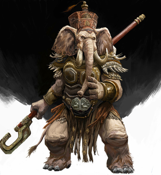
"Elephant Warriors" © ArtStation user CY, accessed at their gallery here
[The pachydermions appear in the Basic D&D Creature Catalogue and never again, seemingly memory holed in favor of the loxo from Forgotten Realms. Nowadays, with corporate synergy at an all-time high, the loxodons from Magic the Gathering are the elephant-people most associated with D&D. But I like the pachydermions, partly because they actually have a culture associated with them (you may notice I've complained about that not being the case for a number of these Basic D&D sapients) and partly because the three-weapon style with the trunk is such a cool mental image]
Pachydermion CR 6 LN Monstrous Humanoid This giant humanoid has the head and hide of an elephant. It wears ornate armor and carries three weapons, one in each hand and one in its long, flexible trunk.
Pachydermions are elephant-like humanoids found in warm regions of the world. It is said that a pachydermion never forgets, and while this may not literally be true, they have a deep respect for knowledge and long, detailed memories. Pachydermions never write any of their lore down, keeping it instead in the oral tradition, and storytelling is a common pastime for both entertainment and education. Pachydermion lore may contain secrets thousands of years old, and pachydermions charge a premium price to share their knowledge with members of other species.
Pachydermion culture includes a proud tradition of masonry, and pachydermions tend to live in stone cities in jungle clearings or carved into cliffsides. Living is communal, with all members of the clan sleeping in a central fortification that can be defended if necessary. Outbuildings are used for work or for storage. There is almost always a central pavilion in a pachydermion city, used for martial practice and oration. Pachydermions are herbivorous, and their cities are surrounded by food forests where edible plants are grown in high concentration. Their culture is matrilineal, and male pachydermions typically leave the city of their birth in order to marry into a new clan upon reaching adulthood.
Although they are not typically aggressive, pachydermions fight fiercely to defend their cities. Their long memories also accumulate long grudges, and they have been known to go to war to avenge some slight long forgotten by the other party. Pachydermions have thick hides, but tend to supplement them with metal armor. The trunk of a pachydermion is as strong and flexible as an arm, and they can and do wield weapons with their trunks. A three weapon style, with the trunk being used as the dominant “hand”, is common, and pachydermions prefer to use bludgeoning weapons in their trunks to make the most of their crushing strength. Some pachydermion warriors instead wield a two-handed weapon in both hands and a shield in their trunk, often making use of shield bash techniques to combine offense and defense.
Pachydermions advance by character class. Fighter and monk are common classes, and pachydermion spellcasters are often druids, focusing on the Earth or Plant domains, or psychics, harnessing the depths of the pachydermion mind to greater ends. They have lifespans equivalent to dwarves, with individuals surviving more than 400 years if not slain by violence.
Pachydermion CR 6 XP 2,400 LN Large monstrous humanoid Init +5; Senses low-light vision, Perception +16, scent
Defense AC 20, touch 10, flat-footed 19 (-1 size, +1 Dex, +4 natural, +6 armor) hp 59 (7d10+21) Fort +7, Ref +6, Will +9 (+7 vs. emotion effects)
Offense Speed 30 ft. (40 ft. unarmored) Melee masterwork warhammer +13/+8 (2d6+6/x3) or masterwork warhammer +11/+6 (2d6+6/x3), 2 short swords +10 (1d8+3/19-20) or slam +12 (1d8+6) Ranged masterwork composite longbow +8/+3 (2d6+6/x3)
Statistics Str 22, Dex 13, Con 17, Int 14, Wis 19, Cha 12 Base Atk +7; CMB +14; CMD 25 Feats Alertness, Great Fortitude, Improved Initiative, Multiweapon Fighting Skills Craft (masonry) +10, Diplomacy +8, Knowledge (history, nature) +11, Perception +16, Perform (oratory) +7, Sense Motive +13; Racial Modifiers +4 Knowledge (all) Languages Common, Loxo, Terran SQ martial training, never forgets
Ecology Environment warm forests and grassland Organization solitary, troop (2-6) or clan (4-20 plus 50% noncombatants) Treasure standard (Large breastplate, Large masterwork morningstar, Large masterwork composite longbow [+6 pull], 2 Large short swords, other treasure)
Special Abilities Martial Training (Ex) A pachydermion is proficient in all simple and martial weapons, light and medium armor. Never Forgets (Ex) A pachydermion gains a +4 racial bonus on all Knowledge checks, and can make Knowledge checks untrained. However, a pachydermion suffers a -2 racial penalty on saves versus emotion effects.
54 notes
·
View notes
Text


Part 2
Venus is one of the most important planets to understand in a composite chart, as most people (should) hold love within their bonds. Venus in the composite chart represents love, attraction, and the ability to form relationships. This placement can indicate how much love there is in a bond, how strong this love can be, and how strongly it can carry them through life. The position in the composite chart can tell how love will be expressed through the bond and what part of the native’s environment is most desired to be brought to the experience. It is not necessary to have a “good” Venus, as I personally don’t believe there are any bad positions, but a “good” Venus can make the relationship worth having.
I will be using the writings of Robert Hand from his novel “Planets in Composite: Analyzing Human Relations” to describe the meaning and significance of Venus in each composite house. Please always keep in mind that this is only one vital step to reading an entire composite chart and should not be seriously considered without viewing everything as a whole. This is just one piece. Enjoy!

7H Composite Venus
Composite Venus in the seventh house is a good indication this is a personal relationship based to a considerable extent on affection. There may be other reasons for this relationship, but love is certainly one of the most important. This position of Venus does not guarantee a successful relationship, but it does help. After the Sun and Moon positions, this is the one of the most important elements in the chart of a love relationship.
You will have a strong sense of shared emotion and feeling and a great need to share your experiences. You will think of yourselves as a unit, a couple, rather than as two single individuals. You will want to be together and do things together as much as possible.
The only danger that you should watch for with this position is that you may tend to be too accommodating; that is, you will try to agree with each other even when one of you has a legitimate grievance. Instead of expressing it, you will remain quiet for the sake of preserving the peace and harmony of the relationship. The problem is, if you do this often, eventually the friendly atmosphere wears thin, and all kinds of resentments boil out, with no way to control them. Do not let your desire for peace and harmony prevent you from confronting important issues. Speak your mind-it can’t seriously disturb a good relationship.
8H Composite Venus
With composite Venus in the eighth house, the love and affection between you will have an intensity that is often lacking in the other houses. This position does not guarantee that you will have a love relationship, however; it simply indicates emotional intensity concerning love.
Traditionally the eighth house is the house of death, although that does not always literally mean physical death. The eighth house has much to do with creation of something new as with the destruction of something old. So Venus in the eighth house represents the mingling of love and death, or more accurately, love and regeneration.
In a love relationship, the expression of love will be quite intense. With a powerful quality that will transform both of you in some fundamental way. You will experience love as a regenerative experience that makes you over into a new person. A sexual relationship particularly will have this intensity. Your love will not be light and gay but something very serious that involves both of you at all levels of the mind, body, and soul.
On quite a different level, the eighth house can also refer to joint finances and property. Venus promises material prosperity within this relationship. It is often said that Venus rules money, and although some people have questioned that, Venus does produce an ability to attract money, especially in the second and eighth houses. This is an especially good placement if the two of you ever require financial help from others.
9H Composite Venus
With composite Venus in the ninth house, love and affection tend to be intellectual issues that are discussed and pondered over rather than felt. The ninth house of the composite chart represents the overall life-view shared by the two of you-your collective attitudes and the nature of your intellectual exchange. Consequently there is a danger that you may over-intellectualize your feelings in this relationship. Love is a more distant experience rather than something felt and shared immediately.
However, in compensation, you both examine the nature of your feelings and are more capable than most people of understanding what you mean to each other. You are somewhat less likely to behave in an unconscious and inappropriate manner toward each other. You can communicate at a very high level concerning your relationship.
Love may become a philosophical ideal in this relationship, much as it was in the medieval code of chivalry. You tend to think in intellectual terms and to devote considerable attention to bringing about your ideals.
The experience of this relationship may also make both of you see more clearly and become more aware of the world around you. Venus in the ninth house can signify love as an agent of consciousness expansion. One or both of you will be exposed to a broader range of experience because of this relationship.
10H Composite Venus
The tenth house of the composite chart is an angular house, and therefore the effect of Venus is emphasized. Your experience of love within this relationship will very strongly affect the lives of both of you. The tenth house rules the purposes for which the relationship exists, the nature of its individuality, and its role in the larger society. On the psychological level, this relationship will aid both of you in discovering what you want to do with your lives. Loving each other should reinforce you and give you greater confidence in yourselves.
Partly because of this mutual reinforcement, you are likely to be very openly affectionate in the company of other people. They will regard you as a loving couple, or if you are friends, as having a very close friendship. This is a relationship that stands openly before the world and does not hide from the view of others.
At the same time, this relationship will teach you about the nature of love and how you relate to others on an intimate personal level. The only way you can learn what living with another person means is by doing so. That is one of the purposes of this relationship.
On a very different plane, the tenth-house Venus may also mean that you have come together for some purpose connected with the arts, entertainment, or luxuries. This may be either amateur or professional.
11H Composite Venus
Composite Venus in the eleventh house is one of the best placements for an intimate personal relationship. The eleventh is the house of friendship, and at the very least, Venus here will help to make you friends. However, the emotional depth of this relationship is not limited to friendship. This position can also be a sign of a deep love affair. In some ways it is better than a fifth-house Venus, because along with “being in love” you also love each other. That is, you have a strong abiding affection for each other along with that well-known, often short-lived feeling of intoxication.
The eleventh house is also the house of hopes and wishes, and Venus here is a good indication that the two of you have harmonious ideals. Because you both are seeking the same things, being together will help you find them. It can also mean that you idealize either the feeling of love or your attitudes about feelings. But if both of you are reasonably realistic about yourselves, you will experience this relationship as something beautiful and ideal, because the experience is based on truth.
The eleventh-house composite Venus is one of the best signs for a balanced and harmonious relationship of any kind.
12H Composite Venus
Composite Venus is one of the least difficult planets to have in the twelfth house. There are problems associated with it, but there are strong points as well.
This placement signifies that while you may have strong feelings or affection for each other, you may not be demonstrative about them. Other people may not even be aware of how you feel about each other. The twelfth-house Venus can be a sign of a secret relationship.
This is also the house of your own unconscious, of those areas of your lives and experience that you have repressed from your conscious mind. With Venus in the twelfth, your relationship may be influenced to a considerable degree by unconscious factors in both of you. It may be difficult to understand the dynamics of this relationship, and you may do things for no apparent reason. This can be either good or bad, of course, depending on what you do. In any case, you should try to understand what lies behind your relationship, if only to gain greater control over yourselves.
On the clearly positive side, this placement can help both of you overcome your ego-drives within the relationship. It enables you to give way to the other when that is desirable. You are able to think of yourselves as a unit and to subordinate your personal interest to your interests as a couple. This ability can eliminate many problems that will arise.
Find part 1 here!

ᡣ𐭩 star divider by @grungenglam ᡣ𐭩
#astrology#horoscope#composite#composite chart#composite venus#7H composite venus#8H composite venus#9H composite venus#10H composite venus#11H composite venus#12H composite venus
200 notes
·
View notes
Text
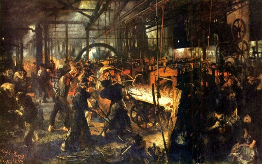
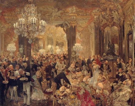
THE QUEST FOR REALITY; ADOLPH VON MENZEL
Adolph von Menzel (1815-1905) was a German painter and printmaker who portrayed life in 19th-century Prussia, historical events, and everyday scenes. He was largely self-taught, and his skills developed practically through lithography and drawing experience.
The Iron Rolling Mill, 1875
This painting captures the intense labour of steelworkers in a Prussian industrial mill. There is a detailed expression, both of the machinery and the workers, illustrating the social condition of working-class people during the Industrial Revolution and Menzel's turn from historical themes to contemporary issues.
The Dinner at the Ball, 1878
It is a portrayal of an elegant high-society scene, coupled with detailed portrayals of fashionable guests and luxurious surroundings, all of which bring out the Biedermeier style. It captures the 19th-century social life, proving Menzel's skill to render social dynamics and intimate moments.
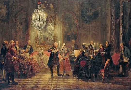
Frederick the Great Playing the Flute at Sanssouci, 1852
It portrays the tranquil scene of Frederick II music-making in his palace. The painting showcases Frederick's dual character as a ruler and as a musician, evincing cultural sophistication and the opulence of his court. The composition is the epitome of Menzel's great admiration for Frederick and his commitment to a history of Prussia done with emotional depth and realism.
Studio Wall, 1872
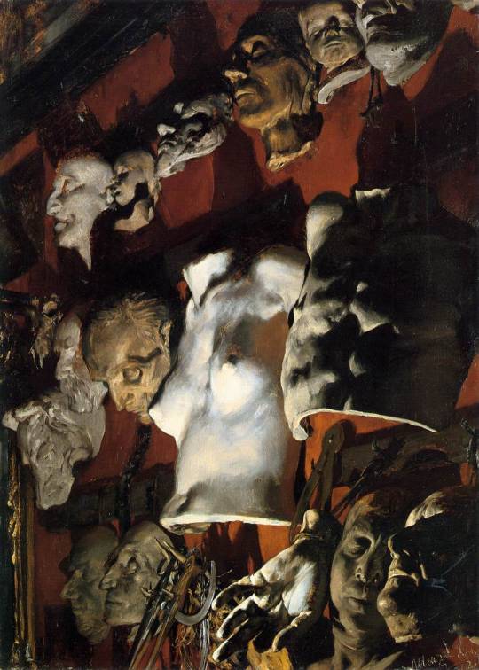
Menzel painted a nighttime view of his studio wall, with illuminated plaster casts, including death masks and classical figures. This work highlights Menzel's thoughts at the time; he had been ruminating over life and death and artistic posterity. It was a touching memorial to his friend Friedrich Eggers as well as a strong demonstration of his mastery of dramatic lighting.
The Visit From Death, 1844
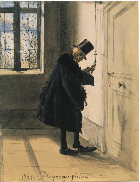
Death is depicted as a humble professional who is neither wrathful nor unkind. Just simply doing its job and has no ill will for those it visits upon. It even has a sense of respect, taking its clogs off before entering the home. Menzel followed up in 1845 with a hilarious painting that suggests that the arrival of Death isn’t so final after all!
The Balcony Room (1845)
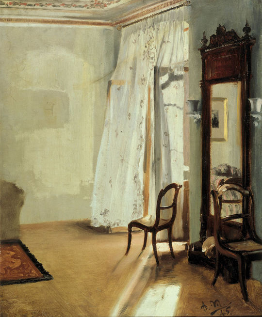
Inspired by his journeys to Paris, Menzel depicts a sparsely furnished apartment full of sunlight. This painting foreshadows impressionist techniques since it's totally oriented with light and atmosphere, marking an important turn in Menzel's career away from historical themes and toward contemporary genre scenes.
145 notes
·
View notes
Text
Day 17: Favorite manga art?
I don't have a definitive favorite but I'll go with this color spread because I find the composition to be incredibly well balanced. Even though there's a significant predominance of blues in a lot of the picture, the color balance still exudes a degree of warmth that allows the image to feel like a fresh but sunny morning, fitting for the subject matter of a family picnic. Speaking of color choices, I want to take a chance to talk about Endo's color design because I find it an interesting departure from how many Shonen mangaka approach the same facet of their art, and not only makes it stand out but quite frankly more pleasant to look at (so let's share more examples below).

One of the things Shonen manga tends to do when it comes to color illustrations is to just smack the reader in the face with extremely saturated colors; the blues can get quite deep, the yellows can border on neon, and reds in particular are always jumping out of the page. This is specially prominent in nekketsu series like Naruto, One Piece, My Hero Academia and so on. It makes sense, too; these series have hot blooded characters and conflicts solved through physical confrontation nearly every time, so to have agressive color choices is only appropriate. It's also, however, rather eye straining and in the worst cases not very well balanced.

In classical painting you're first taught to control the values of your artwork with greys. The image composition and lighting have to allow the viewer to understand the image at a glance even if it's in greyscale and you're squinting at it. The points with the most intense values are of course the points of interest in the painting, but good contrast is key and that requires parts of the picture using less saturation to let what's the focus of the artwork pop. You can desaturate frames of well lit movies and see this in action: it's why Godzilla Minus One could be so easily transferred to a black and white negative.
Good cinematographers take this in consideration from the onset.


Guess Masashi Kishimoto forgot that memo for this one.

To be clear, my goal here isn't to crap on other artist or the tonal choices that fit his respective work, but this is one of the examples of these choices and trappings being pervasive in Shonen. Those reds and oranges are plain blinding, and once desaturated you can see how poorly the silhouettes read. You can distinguish Kakashi and to a lesser extent Sasuske just fine, but Naruto and specially Sakura kind of just blend with the background. Fitting as it may be, it just gives a fairly cool composition a lot of visual noise when desaturated, and makes it eyestraining when colored. Now let's compare this with one of Endo's illustrations. Namely, that beautiful winter one.


You'd expect the prevalence of whites to just swallow Bond and Anya in her white coat but that's not the case. Between well chosen accents and contrasting shadows you can squint at it's greyscale version and the image still reads flawlesly. Moreover, while those reds pop from the pale yellows and blues it's not overwhelming either. They're more saturated than the rest of the picture, sure, but they're toned down just a notch and pushed slightly to the oranges which ensures they don't come across as invasive or overtly agressive. They just are a strong point of visual interest. Another example: notice how in this Yor themed color spread the reds aren't an explosive scarlet as if it was trying to look like Dario Argento's Suspiria . Instead, even though red is through the entire image it's not straining to look at... because they're very subtly inclined towards pink and purple.

Endo just tends to favor the colors slightly aiming for a colder palette even in ilustrations when the reds are important, which makes the colors feel more relaxed. And instead of using the most agressive blacks for the lines, they're either in varying hues of sepia or blue so they blend better with the rest of the colors. Both things can be observed quite well in this beach illustration. Some of those lines are actually fairly thick but they feel soft solely because the color isn't a harsh black and in fact changes dynamically across the image.

Or this special illustration of Yor in the Garden fopr Volume 8. The roses do stand out against the primarily green and blue of the rest of the illustration, but they're soft pinks and tranquil reds, with the yellows having fairly bright values but comparably muted hues.

Heck, even in the situations where yellow is the predominant color, blue (or rather, the calmness usually tied to it) is still a factor for the color mixing in more subtle ways. Endo could've gone for a proper, deeper blue or a different shade of yellow for the sky in this illustration but chose a middle point that doesn't break the color the balance in any sort of harsh way. So the logical choice was a fairly muted lime green.

There's more than one reason why Tatsuya Endo's work is often compared to Shoujo and it's not just the slowburn romance and women with actual agency as characters. His color choices forego the obvious, agressive boldness usually associated with the demographic of his series for something much more soothing to look at. Let's remember these techniques aren't remotely exclusive to him, but the constraint behind these choices makes them stand out by virtue of being calm instead of overbearingly bold compared to his peers.

Also, if you want me to break down these or other illustrations of his in more detail I'd be more than happy to.

64 notes
·
View notes