#some fun design details/insights!:
Explore tagged Tumblr posts
Text
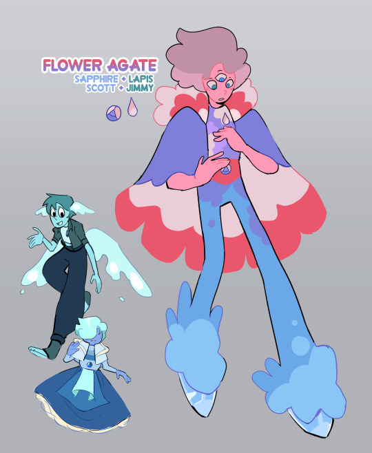
after reading @sixteenth-days's very lovely new fic chapter (go read here!) i just HAD to do a take on a flower husbands fusion design!
#flower husbands#smajor#solidaritygaming#gemcyt#mcyt#su#chris doodles#some fun design details/insights!:#it wouldve been pretty easy to make them another solid blue gem but#i wanted to go in a bit of a different direction with their design#flower agates are also typically pinkish/white and i wanted to translate that#it also makes flower agate feel like their own independent person#which is what happens when gems fuse anyways!#so i leaned more into the flowers part with the colors#i like to imagine it's also an expression of lapis and sapphire's love for each other#they express it by giving each other flowers and so their fusion#....looks like their love!#also the shoes are meant to be made of ice!#this keeps lapis's water element and gives flower agate the ability to skate/slide around#while not nessecarily giving them the full ability to fly#they can glide/float with the cape
2K notes
·
View notes
Note
For panel of the funeral, I think the guy behind the flowers on the coffin might be Asa? The head shape and face markings fit, and it'd be fitting for him to be there directly opposite Mitzi.
oh word, this guy, right?
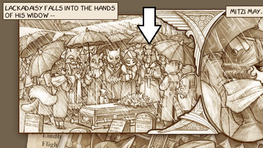
didn't spot that, i think you're right....ft. what i believe is asa's first appearance otherwise, for comparison:

design sure seems to match in structure and markings, even got the darker ears visible in the funeral pic. and definitely adding Placement relevance too like you say, to be standing opposite mitzi....with Maybe Mordecai between them.
#lackadaisy#really pondering ''how's mordecai know so much abt atlas's death but now have room to question whether marigold Knows Shit / Was Involved''#like naturally it may not have been ''yeah mordecai shot him'' but then what was The Private Affair. who was there. who Did shoot him.#or; as theorized; maybe mordecai shot atlas But is now questioning The Reason he thought atlas had to be killed in the first place#whatever that reason is; also being a mystery....and where ''he also blames mitzi for the situation'' fits in too; as well as Why....#it's a standing invite if anyone wants to share any insights / noticed/questioned details#making a murder mystery party out of it. foulplay.live voice just have fun; that's what murder is all about#it's also fun b/c it's so character relevant around here. been a real mordecai rennaissance. what are your emotional motivations bestie....#re: asa at the funeral; like the shape of / around the eyes might be slightly different#but that's a smaller detail and the design could've changed some when that appearance was posted at least a real world year later#like how mordecai's head shape silhouette also has subtly more wave to it by then#mitzi and mordecai murder mystery
14 notes
·
View notes
Text
Everybody NEEDS to listen to the new Wild Life retrospective on Imp and Skizz's podcast. They got Grian called in and they give so many cool insights into the series (and honestly say so many things I think people need to hear)
Highlights for me:
Grian designed each wild card to be weaponized and wanted everyone to take advantage of them. He goes over each individually and all the thought he put into them and all the work the backend team put into their execution. He's rightfully really proud of them. Him gushing about Trivia Bot and how excited he was to show his friends the "coolest snail ever" is particularly sweet.
Skizz says discovering each wild card was a LOT of fun. He says something like "I can't believe as an adult I get to have so much fun." Impulse is really impressed with the execution of each, citing stuff like making it rain when the time one activated and the passive mobs spawning in before being replaced, and how the little details like that built excitement and tension.
Grian says how he understands that some viewers maybe just want more seasons of the essentially the same series, ie six seasons of just Third Life, but it's more important to him that the Lifers get to experience something new and fresh. He also doesn't like comparing each series, preferring to consider each one as its own thing.
Impulse can't wait to do another Life series, Skizz is equally excited but tries to hold discussion about it back since he doesn't want anyone pressuring Grian, who is palpably burned out. Like, you can hear how tired this man is. Grian says there will probably be more series since everyone is still enjoying it, but he's not trying to outdo himself and not to expect him to keep escalating.
Skizz always tries to do something new each season yet feels like he always falls back into the same habits and dynamics, but not this time: he feels like he got to explore a new dynamic with the Spanners and had a blast doing it. He and Grian gush about how much fun they had with their "big brother trying to keep his little brothers alive" routine.
They have a grand time making fun of Impulse and his "Sweats". Impulse is unabashedly still hungry to win a series.
Impulse didn't want to kill zombie Skizz, because of the five minute cooldown, but Skizz makes clear that he was really happy with being a zombie, even if there was a lot of doing nothing in between summons. He says it means a lot to him that he got to help with the burden of facilitating the series, even just a little bit.
Grian gives good insight into his personal life strategy: he does some things to deliberately test his relationship with other players. Standing in the Danger Zone was a trust exercise, testing Jimmy and Scar. Jimmy and Scar failed.
Despite Scar failing the trust exercise, Grian heard the disappointment in Scar's voice about the Snail Bot thing and immediately caved, but he's really happy that it led them to in-canon reconciling and becoming strong allies again.
Grian's favorite moment was making Jimmy pay for the failed trust exercise by blowing up the bunker, particularly pleased with his one liner of "it was always gonna be like this". He says Wild Life as a whole has been the most enjoyable series for him, even though he didn't get to have as much fun as the other players due to knowing all the wild cards.
All three of them gush over the scene of everybody failing to kill Joel as he teleports around, laughing about how it was straight out of a movie or an anime. Impulse feels like Joel took his superpower to a new level, but Grian reminds him the he didn't have an army chasing him around trying to kill him. They're all super impressed with how the finale turned out.
Some of the powers were assigned (Cleo, BigB, BDubs, Scar, Lizzie), some were random (Impulse, Martyn). Some were based on players' names, others on their personal narratives, but coming up with ~16 different powers without including any that would just be exploited for cheap instakills was really difficult, which is why there were so many espionage ones. Hilariously, Grian was hoping Scar would accidentally kill Jimmy by punching him off a cliff because of their ritual of trying punching in the earlier episodes. He also gave Scar that power because he knew Scar wouldn't feel bad about killing people with it.
Grian chose to give himself the mimic so he could show people how their powers worked if he needed to, and so that it wasn't given to somebody else who'd have to spend the whole session figuring out the mechanics of 15 separate superpowers and potentially dying because of it. And because he thinks its the coolest one and he wanted it (lol)
All around there's tons of fun details and stuff in this episode of the podcast and absolutely everybody should listen to it all the way through.
#wild life smp#grian#impulsesv#skizzleman#trafficblr#life series#bonus: grian is still disappointed nobody died in the big desert explosion in third life#but skizz remembers it as one of the coolest things ever#its super cool listening to the card breakdowns too#and how intricately grian tailored them for his friends#and the answer to pretty much every <why did you do BLANK differently?> question is#he wanted his friends to have a blast every single episode ;u;#he asked everyone if they had a good time after every session...
2K notes
·
View notes
Text
❥ — maramaxxing:
.𖥔 ݁ ˖ becoming prissier and sexier 🥂👛🐈⬛˖ ࣪
❤︎ ྀི˖𓍢 my personal pinkprint to aligning with my princess agenda—style, mindset, and routines to embody my future self. as I pivot in life, this will be one of my final blog posts like this. i’m transitioning it off blogging and will now document everything in my video diary… 𐙚

🎀 self prioritization, boundaries, and independence - i come before anyone else. i have no children and my only commitment is to make myself happy.
🍨 shadow work - to reveal what has made me how i am (strengths, traumas, interests, fears), i’ve done so much reflecting on my triggers and responses to specific stimuli. it feels good to know that i’m getting to know myself. that says growth to me.
🎀 studying my birth chart - finding out how my placements, and which houses they’re in has really made my day to day interactions and experiences very insightful and fun to dissect.


🎀 so fab so glam lately - my vibe lately has been just g-l-a-m, glamorous. just oozing sex appeal and hyper femininity with a sophisticated twist. i can’t wait to document this on youtube.
🍨 bougie and sexy - black and satin have been a common theme for me. my aesthetic is naturally going in a very sultry direction along with animal prints, lace and diamanté detailing.
🎀 body mods - back dermal piercings, more ear piercings and super pretty tattoos, nothing too much just small and pretty embellishmentz!
🍨 fab color palette - brown, cream, soft pink, metallic accents (champagne gold, white gold), and leopard print. my everything.
🎀 gold n pink jewelry - this combo is so pretty on everything else so why wouldn’t be just as pretty on my personal adornments? ordered three gold and pink belly rings and i can’t want to mix the metals once my piercings heal.
🍨keeping a physical lookbook in my fashion diary - this year i’m not holding back. the looks are coming. the photos are coming. i want to document my fav looks, accessories, and details in real time. almost like personal portfolio.
🎀 sexy and grownifying my closet - investing in a luxurious, cohesive closet that says grown. gonna be using high heels and casual glamour to achieve this. the fabrics and cuts are extremely crucial too.
🍨 staple designer bags - if you know me you know i love designer purses. especially if they’re neutral colored and essential. i definitely plan on expanding my repertoire of bags.
🎀 customizing my wardrobe - i’m getting a sewing machine and i’m learning how to hotfix rhinestones to personalize and bedazzle anything i want to. i’m so so excited!
🍨 making my own jewelry - i’m so excited to talk about this! i’m making a kit of chains and threads along with beads and charms all in my color palette and i’m going to start popping out with so much custom made shit! body chains, waist beads, charm bracelets, just so exclusive + #prissy.
🎀 new makeup styles - been loving smoky eyes and black waterlines, overlining with a muted brown, lash clusters, rhinestones, and more sultry details.
🍨 interior lingerie - the goal is to have a boudoir that is just a sexy and alluring as my lingerie closet! sweet n sexy kitten! ❤︎︎


🎀 currently healing my gut - psyllium husk supplements, fiber, kombucha/prebiotic soda, chia seeds and an adequate amount of water have all become a part of my routine over the last month or so and i definitely feel different.
🍨 #prettiedup - bleach my hair, signature makeup routines, regular nail appointments (found a tech that i can rely on 🎀), korean skincare + african black soap, and anything else to boost my beauty.
🎀 got a personal trainer to maintain my “skinny bbl” look - i’m a tall girl with long legs and that with a tiny waist and round butt is so my look. currently training for it and i’m pretty happy so far. at this rate, by the end of march i’ll be at my goals.
🍨 building my vitamin and supplement routine - collagen, probiotics + prebiotics, maca, berberine, + some hum essentials.
🎀 my love of teas - cannot live without tea. it’s my favorite form of caffeine. and herbal teas always help me feel as if i’ve boosted my health. my favorite teas right now are green tea, matcha, and double spice chai. also love black, spearmint, and raspberry teas.
🍨 weekly digital detox - one day a week i go out of my way to avoid my phone. i simply rely on other things for entertainment, radio for music and try to interact with those around me.
🎀 hair extension wardrobe - tape ins in natural black and honey blonde, vixen sew ins with 30” bundles (i’m a tall girl so long hair to me is at least 26”)
🍨 cycle syncing - i’ve changed the way i eat depending on where i am in my menstrual cycle. i find my gut responds to the things i eat better. even with the time of day, being intentional with the way i live my life is so important to me now.
🎀 new personalized diet - high protein and low artificial sugar is pretty much what i’ve been following. what i typically eat in a day is berries, rice, oranges, lots of water, almond and peanut butter, etc. my fav sources of protein are grilled chicken, sushi, steak, salmon and eggs. of course i still like sweets they’re for sure few and far between.


🎀 trust in my intuition - it’s taken a while but i’m finally learning to trust myself. if my body is telling me to do something i do it, i don’t try to force what isn’t there, and i respect my mind by honoring the discerning abilities i was blessed with.
🍨 gratitude and thought reframing - so many things in my life changed for the better when i learned to flip my thoughts. in a glass half full fashion. it’s literally the law of assumption. i’m forever grateful for everyone and everything i have. and miss universe has only blessed me with more because i’m now so much more receptive.
🎀 no bull shit + not easily impressed - i literally have the shortest tolerance. i expect a certain standard of behavior from those that wish to be in my presence and this is because i give a certain level of care, consideration, authenticity and respect.
🍨 manifestation journal - my literal best friend. everything i write in my LOA journal comes true. i’m not exaggerating. i read it in the morning and tend to write in it before bed. i keep it right next to my bed along with some stickers and gel pens.


🎀 semipermanent beauty treatments - making appointments for lash lifts and brow microblading as we speak. also super interested in finding a great medspa in my area.
🍨 youtube #vloggingbabe🎀 - i finally made my long awaited comeback and i’ll actually be recording some of the things in this post on video. i love recording and editing. it feels like the best form of self expression to me right now! subscribe!
🎀 glam squad (esthetics, hair, nails) - i’m so anal about things being seamless and easy to remember. i like to go the same place for particular services and i’m determined to find a reliable hairstylist and esthetician that i can stay loyal to (i already have a bomb ass nail tech)
540 notes
·
View notes
Text
more insight on miles’ puerto rican heritage for your fics or fanart
- traditional quinceañeras (or as they are often called by puerto ricans quinceañeros) are really not that common anymore, most girls nowadays have pool parties or go on a cruise. if miles were to go to one of his cousins’ 15 birthday party, chances are it would be casual— no big poofy dress (his mom probably had one like that though)
edit: some people disagree on this. depends on how traditional your family and friend group is I guess, as well as which part of the island you’re from. on average, it seems to be a far bigger deal amongst some other latines. in my class in pr only 3 out of approx 30 girls had a big event like that. not a single one of my cousins had a traditional quince either so you could say I’m partly biased bc of my own experiences. i personally just had a big pool party
- plantains are a big part of our diet. also, pr being an island in the caribbean, coconut is in a lot of our desserts. if miles had to pick a favorite fruit I hc he’d pick either one of the two lol also please google our food, our food isn’t actually spicy so much as savory
- we “celebrate” thanksgiving like other americans. it’s about the only time we eat oven roasted turkey. for winter holidays (christmas eve/day, new years eve/day, three kings day/eve) oven roasted pork. chicken might be offered as a second option for people who don’t consume pork for whatever reason
- you’re pretty much taught how to dance as soon as you can walk. most of us have basic rhythms down. chances of miles dancing with his mom or friends at parties? astronomically high.
- the reason why our flag is everywhere, besides pride, is ‘cause it was illegal to own it. look up the gag law that prohibited us from even displaying it at our homes. so it’s actually an awesome detail in these movies
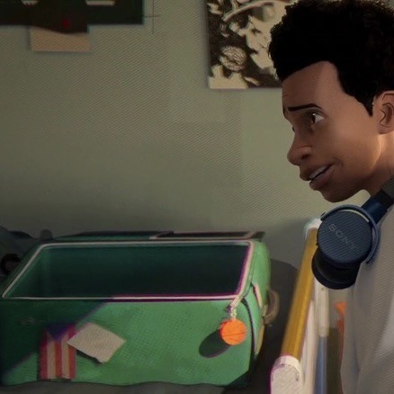
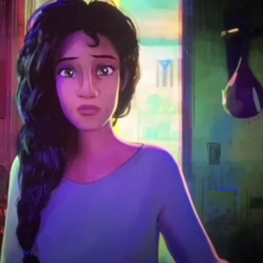
- this is my opinion/a fun fact but I feel like miles is basically an homage to black and puerto rican (specifically nuyorican) solidarity around the 70s-80s during the creation of hip-hop and rise of graffiti as a form of expression (you can easily read up on this or watch shows like the get down to learn more about this if you’re curious)
- whether you’re “nuyorican” or “from the island” spanglish is common so miles’ mixing english and spanish isn’t odd bc even rio does this as miles points out in the party scene. he isn’t a “no sabo” kid so much as someone with a strong accent. he understands his mom perfectly
- race ≠ ethnicity. there are plenty of black people in and from Puerto Rico, and miles’ pr family in the spiderverse films are designed to be for the most part afro-latine. so I wouldn’t really call him biracial
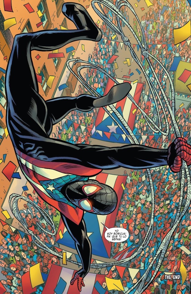
- the puerto rican day parade wouldn’t be a thing he skips, he’s gifted a special suit for it in a comic run. his puerto rican heritage is important to him!
#if you’re writing and need cultural insight i don’t mind messages hhhhh#what he represents matters a lot to me#spiderverse#miles molares#spiderman#punkflower#gwiles#flowerbyte
5K notes
·
View notes
Text
LC - YINGDU EP1 SPOILERS, TW - blood, death scenes
Yeah I logged in just for LC to sum up things in my DMs with Forest (love u), mostly about dives.
Still have too many ideas about how mechanics actually work, as well as abilities transmigration, so I'll focus on differences of dives and some things from previous seasons.

Scene with Vein.
In my understanding, the opening scene already includes 2 different developments of events.

1, where CXS, after being wounded, was led by LG into the room, while Vein went to pick up the gun. We see bloody footprints, traces on the table, but that's all.
2, where Vein is already standing at the closed door, clearly shows other events - a chair, other objects scattered on the floor, according to the blood prints, the body seemed to have been dragged + there are no prints on the tabletop.
What is also interesting is that the background is slightly different in both scenes, if you pay attention to the shelves on the left.
There is a difference in the photos too - the first version shows only a crack, the second - a broken glass.
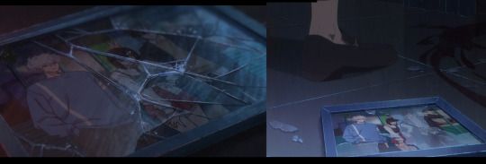
For me, the conclusion is that already here we see 2 different timelines.
Lu Guang's injury
In the first option, although Vein shoots at the door, he misses (time ~ 23:11), Lu Guang closes the door and is not injured
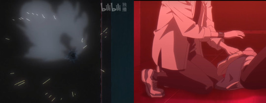
So , missing scene
We don't know what happened for about an hour. In the second version (cause it has stains on the floor, overturned things), the blood on the photo already speaks of the not shown scene. I doubt that Vein simply changed his mind and left, so Lu Guang had to "deal with" him.
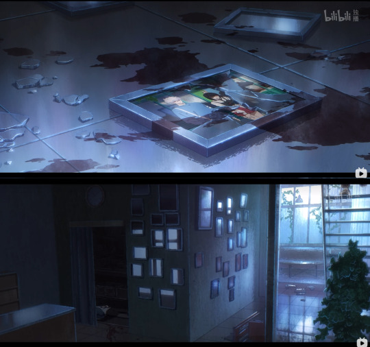
At this point, he himself is deeply wounded, but the most important thing is that in these shots we are shown his yellow eyes - this is already a dive in a dive, some kind of repetition of the events.

s2ep12
At the same time, this drive is different from the drive that was shown in the second season.
The blood pattern on his clothes is similar, but even if we exclude the fact that he doesn't look out of breath/in pain, there are other details.
- blood stains on his face - furnishings, of objects on the table - blood on hands (by the way, in the scene with Vein, when he raised his hands in front of him, both of his hands were covered in blood)

Lu Guang's watch
For us as viewers, the watch on his right hand is a familiar part of the design, he wears it on his right hand in both s1 and s2
So, after diving, the first thing he tries to do is check the time, and looks at his right hand.
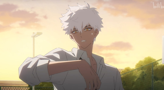
We still don't know the origin of his watch, since he didn't wear them in almost all the flashbacks. Except for the new one, where the watch is on his left hand.
Thus, Yingdu gives us a new diving point - April 12th (in addition to the dives on September 13).

Maybe the time of this dive will correlate with the time indicated in s2 (but with which there were no associated events)

Except for the poster, the watch on Lu Guang's left hand appeared in the flashback of CXS's death in s2, which probably separates this variant of his death from the ones shown in the scene with Vein, and perhaps the difference can give us insight into the timeline's chronologies later on.
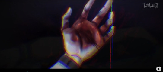
September and April
To be honest, this whole thing makes me very excited, because of the existence of the old theory about the broken time in April and September - I wrote about it in detail a year ago in that post
Emma, April-September and chronology
For me, this means that circumstances of the case, who the unknown victim was, although they have faded into the background now, will still be a key.
Pretty sure this has all been discussed, but thanks for reading. Let's all… have fun with the new season ~
#link click#shiguang dailiren#yingdu spoilers#link click yingdu#link click spoilers#I have a feeling that I myself have returned to the past
385 notes
·
View notes
Text
A home in life, a berth in death, a house of many mansions: the Necropolis fucks

Before the game came out the Necropolis was one of the top five places I was hoping they would let us visit in Thedas and I'm so thrilled it did not disappoint! The architecture, the atmosphere is impeccable, the reactivity everywhere (cleansing the Vault of the Beloved, the secret room that appears, the skeleton workers that begin cleaning different areas as the game progresses), the detail in everything. Did you know that in the room where you get the codex entry about the flesh-eating beetles, you can look down and see them running across the floor? Love it!
But the environment itself is only an aspect of what makes the Necropolis so much fun; the insight we finally get into Nevarran culture is possibly the most important thing that comes out of it. The only Nevarran we've really met before was Cassie (love her, she was not very informative, though), so to actually get to meet people who serve as stewards to one of the most sacred cultural rites is incredible and exactly what I wanted from this game. I loved discovering their unique perspective on magic, and how they handle their Templar Order.
It's also a fascinating lore point to discover that Emmrich can speak to the dead; we've never actually encountered a REAL ghost in DA, I don't think. There have been things which appeared to be pieces of once-living people, but it could always be explained by 1) weird magic causing them to live past their normal lifespan 2) a spirit acting as a dead person. Emmrich makes a distinction between speaking with real dead people and imbuing a once-living body/articulated skeleton with a spirit. This is so cool and interesting! And they've been doing this consistently and regularly, to talk to the late King Markus! All the magic applications in this game make the South seem so boring lol (but that's for another post).
And I love that the Necropolis itself is considered alive by the Watchers! It moves and rearranges its own configuration in accordance with some sort of unknown will; is it partially built inside the Fade? Is it imbued with magical energies, like Arlathan was? How old is it? Is the reason it functions this way because it's so old that it predates the separation of the Fade from the material world, or is it just that the Veil is thin there? Are the Lichlords the ones directing the Necropolis? How? So many interesting implications and questions brought up by just the building itself!
I think my favorite thing about the Necropolis and the Watchers, though, is how they present death. Most of the cultures that we've encountered so far in Thedas view death as a universally negative thing, but the Nevarrans celebrate its place in the cycle of existence. In the gardens, which are such a beautiful, peaceful location, there's a puzzle you can do where you have to turn on a series of meditation bells in a specific order to get into a treasure room; when you put together the poetry accompanying each bell in the correctly, they describe (metaphorically) the movement of a person through life and into death. It's such a gorgeous little detail, and I love the way the Necropolis is designed to encourage the player to think about death (it also folds in so neatly to Emmrich's personal plotline!), especially since it is so integral to the game as a whole (yet another different post).
Visiting Blackthorne Manor and picking up mementos in the Necropolis shows that, this death positivity is, in fact, a pervasive cultural attitude. Nevarrans believe that they have a duty to each other that persists after they die; that the body can keep being useful; that the living should honor the dead. It's such an interesting perspective that was missing from the DA series; people die all the time, and, of course, it's intended to make the player sad, but DA has never seriously discussed death, its implications, what it truly means or how it affects those left behind. They've never really made you sit and look at it as the player. There are some sad lines after Leandra dies in DA2, but it's mostly in the narrative to give Hawke a reason to hate blood magic and stuff. There's no funeral. There's a few lines from Gamlen, Hawke, and your companions, and then the game moves on. It's always like that; the game gives you a moment to be sad, and then it moves on. There's no mourning. But this game is partially about mourning! It's about people being gone, and it being too late; it insists you look at death and deal with it, and the Necropolis is the epitome of this.
The game asks the question over and over what you think the characters should do in response to their own losses, and the Necropolis represents are really interesting, nuanced, answer to that question. They're not gone; they're right there. They're still with you. You can go and visit them and celebrate who they were in a place that honors and cares for them, still. It's so beautiful and interesting and full of love, for the living and the dead.
I didn't even talk about Emmrich's plotline or the class differences in the Necropolis, or how everyone there is a weird goth nerd and I love it so much, but I think that's really the important point: the symbiosis. The living; the dead; the spirits; the corporeal, all finding a way to be together.
#dragon age#datv spoilers#veilguard#dragon age: the veilguard spoilers#veilguard spoilers#dragon age the veilguard#necropolis#nevarra#The Mourn Watch#datv#cw death#death#hmm this post is a bit messy because it's not exaaactly an essay?#there's a lot of stuff I like about the Necropolis!#so it doesn't all drive towards a central point neatly. but I did want to draw attention to some of the little details I love anyway
105 notes
·
View notes
Note
What art program do you use? sorry if you already answered something like this but im so mesmerized by the techniques you use in your art.
Thank you. No need to apologise; I don't mind answering this question because it's an excuse to walk through my latest image!
The concept for this piece is based on being perceived online through interpretations of posts and artwork, yet how artificial this can be. The relationship the viewer forms is more with the narrative of the work, and any insight into the artist through this feels highly awkward to me, which is precisely what I want to explore with this piece.
In this example, I wanted an attractive sitter to look like someone out of a new romantics music video or like an Enya video, because this genre and era of media is very aesthetically pleasing and nostalgic for me. I hold it as an unobtainable ideal— a hauntology. So, as wonderful as it is, it equally feels shameful and perverse because it's an aesthetic object of desire that I am contriving.
The sitter is holding one of my cartoon characters, Lauren Ipson, the protagonist of my Ersatz world project. A trope in writing is when a character acts as a self-insert of the author, and I'm conscious to try and avoid that with Lauren. I try to write Lauren as dry and sardonic yet also fun, dramatic, and friendly. I don't think of these as personal qualities of my own, but I imagine personal qualities bleeding into fictional characters is inevitable.
Yet Lauren Ipson feels much more alive a character to me compared to any attempt at self-portraiture or self-expression that I've done, which is very little because I'm not interested in constructing a perceivable identity. (I'm aware this text itself can be interpreted as self-expression; however, to me this is just another construct.)
So Is the sitter meant to be me, controlling Lauren? I'm definitely baiting the viewer to think this, and you can interpret it that way if you want, but really I don't think of the sitter as me at all. My intention is to show how it's all a facarde. The sitter is basically just as much a doll, a puppet, a mannequin as Lauren Ipson is, if anything more so.
There's a deliberate irony between Lauren's cartoon rendering and the sitter, who I wanted to render with more detail and evoke a modernist style. I'm inspired by Hans Bellmer and Dorothea Tanning with their work with dolls. However, despite that implied visual hierarchy, the more detailed sitter shares a similar, stilted vector construct to Lauren. They're both born from vector drawing after all. And it's further undermined with the way Lauren the doll looks directly at the viewer, as if she's alive, while the sitter looks to the side with a blank, almost dead-in-the-eyes expression.
Anyway, with that in mind, almost all of my work starts as a thumbnail sketch. Although I often draft digitally and am fine with doing that, I feel more confident doing it freehand on paper. Digital rendering feels more like a refinement process to me. Funnily enough, although I often prefer to sketch with physical materials, I'm anxious of refining or rendering with them.
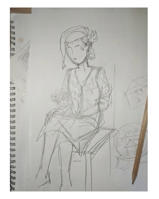
I like my designs to be very direct and conceivable, so a solid silhouette, pose, negative space etc. I often create a quick digital sketch with this in mind, either by tracing or referencing the thumbnail, although sometimes I skip this step and go straight to the rendered drawing. The aim is to establish a visual guide, dividing the drawing into various shapes for digital airbrush rendering later on.

With this composition, I made a second draft with more attention to details such as the face, hands and feet. Sometimes I'll use photo references if I'm struggling with posing or anatomy. These drafts are often blue because it's easier to render the black linework over a transparent blue sketch.

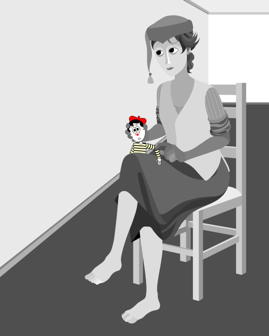
The chair took some time but was relatively simple to render. It uses the line tool set to magnetic anchor point, following two-point perspective vanishing points. I like two-point perspective because it feels sort of digitally native to me to have these impossibly perfect vertical lines. I also know the horizon line should be at eye level or something, but I just like the idea of the top of the chair to be perfectly horizontal.

Here I'm drawing the final rendered form. I use the stroke tool with it set as smooth as possible. Often I'll redraw lines over and over if it means getting certain curves to look right. Once the lines are drawn, I'll fill them in and remove the stroke, leaving just the solid vector shape. The shade of grey I use is done to simply denote the shape. It does not represent any kind of shading or anything; in fact, when I bring it into Photoshop, all these shapes are set to the same shade, but if I had that here in Animate as I'm drawing, it would be impossible to see what I'm doing. The red background is just for clarity.
Once it's all drawn, I'll make sure every shape is clean, overlapping nicely, and divided into its own layer. A composition can often be comprised of hundreds of separate shapes.
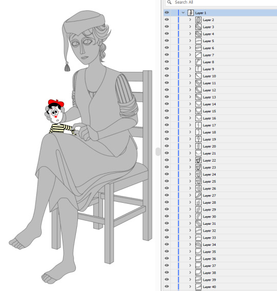
Each shape will be its own layer in Photoshop, which will operate as a clipping mask. The clipping masks act like masking tape or shielded off areas for soft brush opacity rendering, similar to the soft atomised rendering from an airbrush, just done digitally.
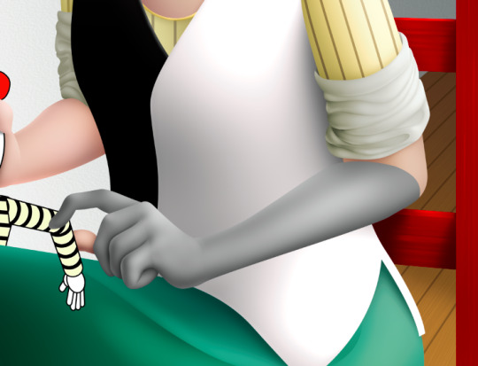
I follow very rudimentary painting techniques of simple shading, lighting, and bounce-back highlights. I follow a simplified Grisaille technique, focusing on strong values in greyscale before adding a wash of colour with a color gradient map set to layer style color. Sometimes my values can be a little off, but as long as the values are all consistently acting together, I can correct them with transparent washes or color curves. If the greyscale looks harmonious with all the forms clear, colour will likely work.
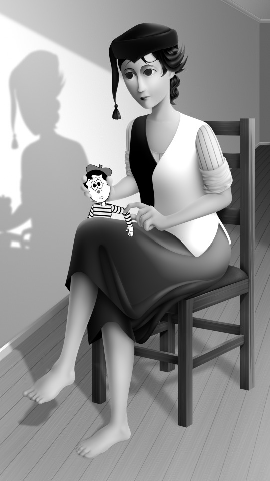
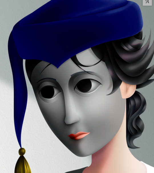
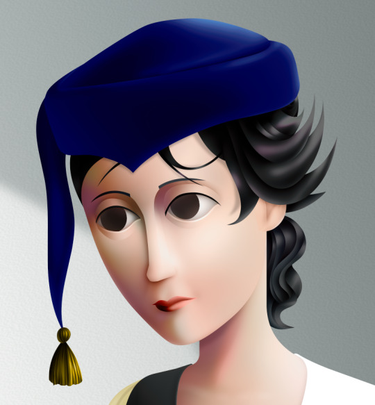
Proper digital painters will say this is an amateur process, with results that look mechanical and stiff, as colours in the real world all bounce together off different surfaces, resulting in colour harmonies. However, I don't mind the inharmonious nature of the colours, as I find the values give the composition enough harmony. I'm working digitally, so why go to all the effort to make it not look digital? It's interesting to me to have the red chair look blindingly red, the green skirt look blindingly green.
Colours can look boring without some form of harmony though, so I will add in blue-greens with the darker areas, more turquoise greens towards the highlights.
Skin tones are far more complex, however, as it's something that's more informed by realism. This is why kigurumi dolls with their plastic flesh look so artificial to the eye, because we're familiar with how light passes through flesh and skin and all the subtleties of colour that it picks up. This piece is the first time I've explored flesh tones, as typically I avoid all this by rendering skin as grey porcelain.
I needed to really up the contrast, with shaded areas becoming purples and highlights verging on washed out. Areas with more blood, like feet and cheeks, appear more orange and red. Areas closer to bone and cartilage, like the bridge of the nose, can look almost blue and green. Exploring these colour values and tints in the aim of natural tones was fun to do, and ironic given how blank the face is.

Although in the moment I feel very much like I'm rendering a realistic reality, when I step back, I'm reminded how stylised and unrealistic the painting actually is. It looks kind of insane, like everything is so uniform and overtly saturated. It doesn't feel present in a real space, despite the shadow and form implies one. But I'm not consciously thinking of these things, of style, as I'm working. To me, it's a process of world-building and problem-solving.
127 notes
·
View notes
Text
A few more observations on the second Walpurgis no Kaiten trailer, building on my earlier post. This trailer is so detailed and so intricate, I can really only watch it shot by shot in slow motion, otherwise I miss too much, otherwise it all goes by too fast.


The scallop shells on the handbag look similar to the scallop shell hand mirror that Homura is holding.


I can't decide if teapot on the table has the same pattern/design as the cup in this other shot. There are at least 2 tea parties in this trailer, and possibly more that we haven't seen yet.
Speaking of which, the angle on the stabbing shot suggests that the person is stabbing themselves in the arm--it looks like the salamander, representing Devil Homura's power, is trying to get to them, only to get stabbed by what appears to be a box cutter blade (??) and then it morphs into a cuff to try and control the person anyway. So I think perhaps Devil Homura will have a tea party of her own, though it's not clear to me yet if she's meeting with the green-haired girl in the glass dome or not. Or maybe someone else is meeting for tea and the salamander tries to sneak up on them when Devil Homura is not present. TBD.
Before the salamander becomes a cuff, though, it forms this lattice network first:

Oh, and you know where else the box cutter turns up? The box fan shot, of course. There is something sticking out of the middle left side of the box that looks suspiciously like a handle. And given that the box is all cut up enough to be taped together... well, that certainly seems like some kind of sabotage, doesn't it?
(SHAFT, are you giving us a magical girl whose weapon is a box cutter?? Or is this the Doppelganger Homura's answer to the salamander/dark orb? Either way, I'm here for it.)

The "fragile, handle with care logo" looks an awful lot like the cracked glass in this shot, too. Things are holding together, what is damaged is being repaired, but for how long??

Sayaka in the theater is literally experiencing a flash of insight, likely heralding a return of the memories Homura took from her at the end of Rebellion.


It seems like Sayaka is going to be in a unique position in this movie, since she is both magical girl and witch, and it sure looks like the witches are coming back (along with Walpurgisnacht!) It begs the question of whose side is she going to be on, and I suspect she'll be conflicted about that.

This other shot also suggests some kind of soul-searching, given that mirrors/portraits/stained glass on the walls were used to symbolize Homura regaining her memory in Rebellion. However, the books that are frozen specifically appear to be associated with the "book of witches" in another shot and the books piled up in the background behind Kyubey:

You can see one of the Anthonies (Gertrud's puffballs) in this shot along with other witches. Each page looks like an illuminated manuscript and/or possibly a card (?). You can tell Inu Curry had a lot of fun with this one!

There are madeleines in one of the jars behind Mami, which are associated with memory (cf. Proust's A la recherche du temps perdu) but the jar is closed and they are out of reach.

I'm really leaning towards this girl being an alternate Nagisa given the similarities between this shot and an early character design from Rebellion. (Either that or they just recycled the design, lol.) I can see the resemblance to the bear girl from episode 12, but somehow I think SHAFT is gonna stick to established characters/witches, especially given the witch book shot.

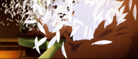
I think the exploding white feathers are from the same scene as Madoka-Doppelganger Homura waltz, and either represent Madoka regaining her memories or something going out of control and/or an interruption. TBD.
Anyway, that's all I got for the moment.
94 notes
·
View notes
Note
Several things: -LOVE your art, it’s amazing! Especially the one with Crowley and Aziraphale under the umbrella - which software do you use? Your art always look SO gorgeous (cheeky quote from GO right there lol) - how did you get so good at drawing?And thank you for encouraging other people to keep drawing and being so kind as I sometimes can’t help but compare my sketches to others and feel silly, but I guess it’s just a learning curve… Thank you so much for bringing your art to the world!😊
Thank you so much!!
I use Clip Studio Paint for drawing and Photoshop for small adjustments!
2. Haha thanks! Honestly...it's the hyperfixations. I managed to improve a lot in just a year because I've been drawing SO much cos there's so many shows and movies I became obsessed with that I wanted to create art for. So by drawing a lot I just naturally improved. For example these two Illustrations are just a year apart:
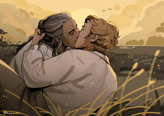
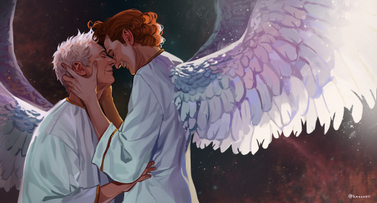
I actually didn't actively try to improve, it's been a while since I did proper studies (I just don't really have the time for it between freelancing and art school), it just happened.
But I can absoluetly recommend going on YouTube and look for some art tutorials if you actively want to start improving! There's some channels that helped me so much back then:
moderndayjames
Incredible shape language and super insightful tutorials on all kinds of topics! I learned so much from him.
Ahmed Aldoori
So many awesome tutorials on so many different areas of art. Love it.
Marco Bucci
Incredible tutorials on color theory and understanding how color works in general! Learned SO much from him!
Sinix Design
The OG tutorials I began learning from. I watched his videos religiously as a teen. I adore his painterly style and adopted it in some way, haha.
Ethan Becker
This dude sometimes drops these tiny art tips that just completely blow my mind and that I adopt immedietly. He's super entertaining but also such a great teacher.
And I can also recommend checking out this book by James Gurney if you want to get better at colors!
And for anatomy I highly recommend the Morpho books!
But improvement doesn't only come from drawing a lot. A lot of the time I don't draw for a while and just study the world and artists around me and suddenly I improved when I get back to drawing. Don't ever overwork yourself to the point that you don't enjoy what you do anymore. Take breaks and listen to your body!
I learned to try and not compare myself to other artists, which helped a lot. Through conventions and social media I made so many lovely artist friends and realized how we're all struggling in a very similar way. A lot of us don't even really know what we're doing most of the time, haha. But we help each other out, it's such a wonderful community. I think when you're not actively part of the community it tends to feel like other, more successful artists are some kind of art gods that have perfected the craft and never struggle. But believe me, all the artists you admire go through rough times all. the. time. Sometimes what they do feels easy and natural, other times (more often than not) it feels like you have to try and learn how to walk all over again and you start to doubt your abilities. I personally go through that so many times.
So what I'm trying to say is that instead of comparing yourself to the artists you admire, learn from them instead. Ask questions, befriend fellow artists, study the artists you enjoy and just have fun with it!
And finally I thought it would be fun to share some of my horrendous Johnlock fanart from a decade ago for some motivation:
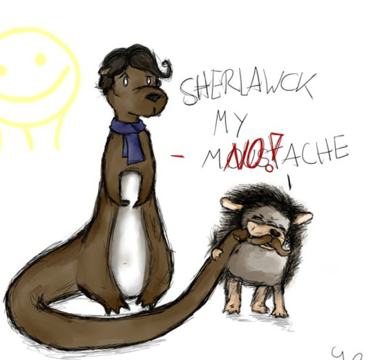
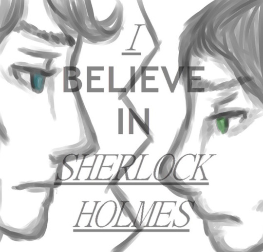

I hope my answer didn't overwhelm you, but I thoight it would be nice to give a more detailed answer!
Have a wonderful day and keep drawing! :)
473 notes
·
View notes
Note
Some random school doodles on sticky notes


I did these kinda quick (2-3 mins each)
I did these mostly from memory and added a bit of my artistic flare to them
Oh and also a bonus sheephead doodle

Heheh, I love this one very much ⬆️
SQUEALLLINGGGG SQUEAL SQUEALLIG
oh my god. I just KNOW these are so small. I remember drawing on sticky notes when I was little .. I’d love to do it again. I WISH I had these little doodles irl not only because they’re stunning but I KNOW THEYRE SOOO TINY!!! Starting with the backgrounds- omg. They all got their own and they’re all so fitting, even if the patterns are sorta ‘simple’. Each shape is PERFECT for them. The straight, organized lines for Sheep. Fun little dots for Sponge and intense zig zags for Insight. STARS FOR WHIMSY. ITS PERFECT and they look so intricate. Their name tags are amazing :’] they add such a nice touch and the bubble (is that the right word?) letters are just aaauuu so cool. How do I even begin on the design choices!!! Artistic flare is an UNDERSTATEMENT the designs are absolutely gorgeous!! SO. MUCH. DETAIL. The shading in the scales (like on Insight) is so so impressive. There’s like so much to point out omg. List of details I like: Whimsy’s lil neck stars, whimsy’s frill, the way you did the ‘plates’ on whimsy’s horns, Whimsy’s ENITRE facial structure, sheep’s fins, sheep’s glow scales, Spongy looks SOOO SOFT, Insights horns, insights scales (again), the way Insight looks so badass and menacing
Bonus Sheephead really ties this all together. The star of the show. I’m so baffled you only took MINUTES for these
TYSMMM FOR THESE AAAUUGGHFHH
40 notes
·
View notes
Text
MXTX Interview with Risa Wataya for Subaru Magazine P.5
Character's Allure
Risa: Among the cast, my favorites are the Nie brothers. Nie Huaissang and Nie Mingjue. As I read, I constantly prayed that Nie Shi (House Nie) would not fall.
Mo Xiang: Shocking! I have yet to see this kind of attitude toward the Nie brothers. In the place of Nie brothers, I deeply thank Risa! Nie Mingjue was created as a foil and reversed mirror image of the 'extremely socially adept' Jin Guangyao. Nie Mingjue is someone who would rather break but never bend. Jin Guangyao is someone who would rather bend but never break. One embodies unbendable justice. One is a cunning smooth operator. I thought about these two contrasting and contradicting kinds of characters and then created them (Nie Mingjue and Jin Guangyao). A cunning faker (*) like Jin Guangyao, once he meets a 'violent god' (**) Nie Mingjue would become absolutely powerless and can only flee. Their situation would be quite interesting should I continue to write it. Although for them, it definitely would not be a fun time.
(*: 狡猾 jiaohua: someone who is pretty/righteous on the outside but rotten inside, a faker, a pretty snake masquerading as a saint)
(**: 凶神恶煞 xioengshen esha: a powerful, brutal, violent god that is consumed by the slaying of evil so much he starts to do evil himself. Someone who should be good but is consumed by rage and violence and becomes no better than the evil he seeks to destroy)
Risa: Nie Huaissang is extremely smart. Nie Mingjue still acts even though his body has been split into multiple pieces. I absolutely love these brothers' opposing approaches to life.
Moxiang: The more the character personalities contrast with each other, the clearer their conflict and transformation is portrayed. It also makes the story even more compelling and exciting. Nie Huaissang was built on the foundation of Nie Mingjue as a character. They both use sabers as their weapons. Nie Mingjue is more or less straightforward inside and out. Nie Huaissang, on the other hand, looks weak and cowardly on the outside but is actually immensely insightful, patient, and crafty on the inside. The characters of Qinghe Nie Shi were actually complete quite early into the writing.
Risa: The characters of "Mo Dao Zu Shi" mature into different kinds of people depending on their relationship with their parents. In terms of lineage and family ties, what were your thoughts while writing?
Moxiang: I think the environment a person grows up in is a very important factor. The parent generation's joy and sorrow will create an increasingly greater impact on their children. Furthermore, children will inherit specific things from their parents. Only when you look at the profound yet incidental similarities between parents and children, you will see that family ties are something very real.
Risa: Some characters in the book had a very difficult childhood. Jin Guangyao, Xue Yang, and Wei Wuxian. One type of character experiences misfortune in their childhood and then grow to become bad people. One character, on the other hand, steadfastly holds onto his good heart no matter what. Both types exist in the same book.
Moxiang: To be honest, the character's childhood was the last thing I considered. My creative method starts with imagining the zenith of a character's life when they are shining brightly at the summit. Then I think about narrative developments leading to and from that moment, and then the character's childhood as the finishing touch. After that, I fill out details on their parent generation. The parents mostly act as supporting characters. Their designs are based on the main cast, to contrast or to complete.
For example, first, I think of what kind of person Wei Wuxian is. Then, I think of what kind of parents could have such a child. I base his parent's characters on his character.
Looking at it from within the story, it's that parents will inevitably influence their children. But from a structural writing standpoint, it's the children that influence the parents.
To be continued (We are about... half-way through the interview transcript)
Translator: Sythe / NPD Khanh
422 notes
·
View notes
Text
I wanted to talk about the Black Parade uniforms and it kind of turned into an entire essay. My ideas on the intention behind each costume and their cohesion as a group really evolved over the course of writing this, and I think it brought into focus a lot of things I knew subconsciously but hadn't articulated. I also noticed a lot of details I had never seen before. This has futher convinced me that 1) costume design and what you can say with it is really fascinating and 2) this is S-tier costume design of all time. And it's really long so I'm putting the rest under the cut.
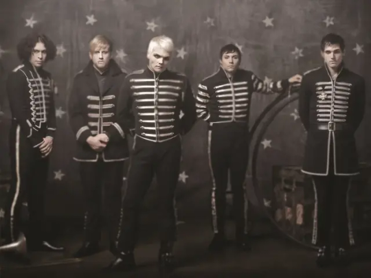
What I would have loved is a Weezer-style picture of the five of them standing side by side, full bodies visible, but unfortunately that doesn't seem to exist. They're either covering each other up, or posed in such a way that details aren't visible or cut is hard to compare, so I'll have to provide a variety of visuals. This weirdly blurry poster is the closest thing I could find to a Weezer picture, so take them in as a group and refer back as necessary. I want to start by saying, obviously, that they look amazing both individually and as a set. "Dark marching band of death" is a really fun concept that is very well executed. But this isn't their first time doing a look as a group - think back to Revenge for a minute, when they really started to think about their costuming as a band. Gerard has talked about how then, they were kind of closing ranks against the vitriol coming their way. They needed to feel like a team, a gang, and dressed like one. I think some of this mentality has carried over into the Black Parade uniforms - they're less defensive, (there's no bulletproof vests), but in taking on new, nameless identities they have removed themselves as individuals from the equation, which is protective in its own way. What's left are stage personas, and the more you look the more you see that these were designed by someone who is very familiar with the history of the band and how each member presents themselves on stage. It's absolutely genius costume design, because when everyone is in uniform, the little differences are more noticable and tell you so much about the intention behind each variation.
Before we really start, I have to confess that I have no history in costuming or even a lot of familiarity with marching or military bands. I can only say I find costuming interesting, so I've read a little about it, and I went to high school in America and almost all my friends were in marching band. Someone who is more educated in these things could probably give more specific insights and have a better vocabulary to talk about it, but do not underestimate me. I am deeply obsessed with MCR and got A's in English, so let's find some meaning in symbolism! But please remember that with all art, there is no one interpretation. And remember going forward that these costumes were designed by Colleen Atwood, based on sketches she was given by Gerard, so there's no telling what elements were brought in by her and what elements Gerard had planned originally. If anyone has sources on that, PLEASE let me know because I'm very curious about the design process.
Also, I'll be using the uniforms as they appear in the WTTBP video as the standard, with acknowledgements toward variations seen in posters and the FLW video. It's worth noting that in many live performances they wore different, less unique jackets, and often forewent the pants for black jeans. This is almost certainly because they were easier to perform in and they didn't want to subject the originals to the sweat and rowdiness of regular shows. Ok, here we go! Here are some pics to refer back to throughout.
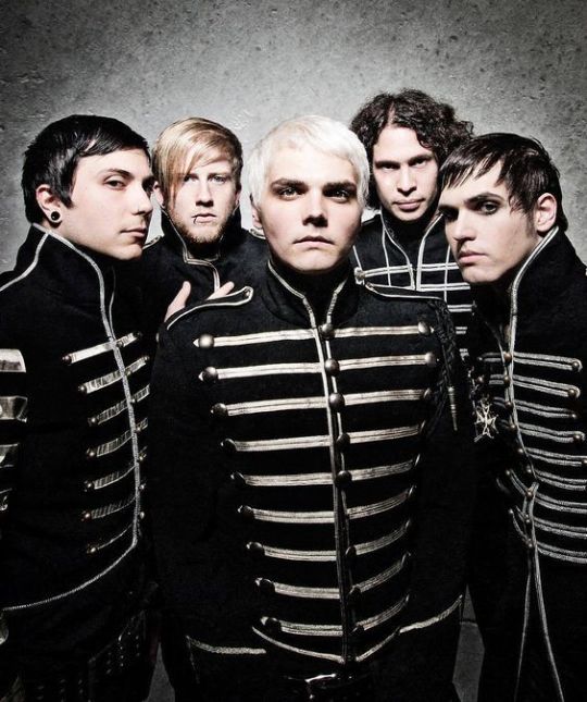
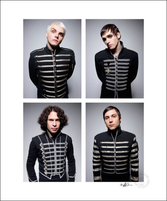
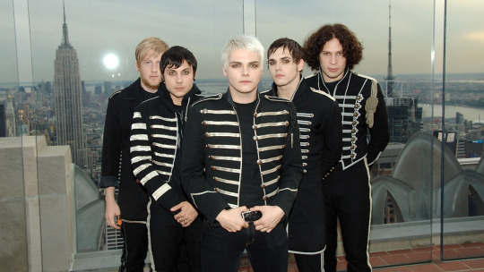
Starting with the band as a whole, I want to point out two things: first, marching bands evolved from military bands. The individual costumes vary in how "military" they look, but you can definitely see the influence when you look at them as a set. I imagine they leaned into that a bit because of the military elements on the record - the suggestion in Mama that the patient was a soldier, maybe even a war criminal. We also know they've done military aesthetics before, in The Ghost of You music video, and that the band was formed in response to 9/11. Suffice to say, the military is on the mind, and this is a continuation of that.
They also look a bit like skeletons. Obviously they would occasionally do the face paint, but the uniforms themselves suggest a ribcage with the horizontal silver lines, and at some angles the stripes on the pants also really contribute to the image. I know most people have already realized this, but I wanted to point it out explicitly because it took me an embarassingly long time to see it.
Alright, I'm gonna talk about them individually now, going from my personal least to most favorite. Taste aside, they're all individually really interesting.
5. Bob
(I can't find another good Bob picture, just scroll up to the blurry one)
It's not just because I don't like Bob, I genuinely like this one much less than all the others. It might be because it's less tailored - the others look much sharper, he looks almost rumpled in comparison. The lose fit might be because as a drummer, he needed better range of movement, but I'm not a drummer so I don't know. The cut of his jacket looks kind of naval to me, which is interesting. His stripes are also very minimal compared to the others. Overall, his looks the least like it's part of a set. I don't necessarily think they meant to set him apart, but maybe they did, considering he's the only non-original member (I'm counting Frank as an original member) and the only one not from New Jersey (which, I only point out because they ALWAYS point that out to people who mention they're a Jersey band. We're from Jersey, Bob is from Chicago.) Maybe it was a subconscious thing, or maybe as the drummer his costume was designed to make the most of what would be visible sitting and partially obscured by the drum kit. It does have a very dramatic collar. That's probably also part of the reason they gave him a more distinctive haircut for this - I'm not gonna talk about hair much, but it's worth mentioning. Overall, I don't have a ton to say about Bob because I don't think of him much (sorry, but not really).
4. Frank
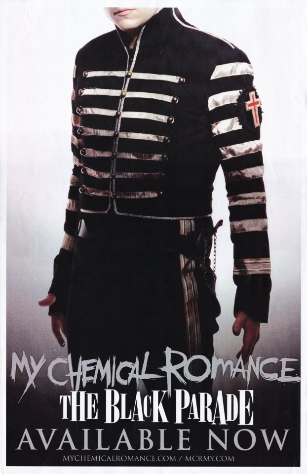
Frank's is really interesting. His is the least traditional-looking, which is why it's here in the ranking, but I like it and I think there's a good reason for that. Those stripes on the sleeve are a really strong look, and the material of the silver has kind of a tarnished/dappled look you can see better in other photos. I've seen people say it's a subtle camo pattern, but I'm honestly not sure - I think he's supposed to look a little less new and shiny. The blockiness of it widens him and gives him a lot of presence that might be lost if he was dressed more like the others, and it compliments his performance style well. That's particularly important in the WTTBP video - on that float, he simply doesn't have room to be as wild and energetic as his standard performance was at the time, so this uniform helps him stand out and draw attention to what thrashing he is able to do. As far as bucking tradition, he also is the only one without shoulder tabs (those little loops). There's something funny about that - those tabs are meant to hold loops and eupalletes that would signify rank, placement, or achievement, which apparently you could not give to Frank if you tried. I think this lack of traditionality is reflective of Frank's more punk sensibilities, having come up in the Jersey scene. His playing style evolved over time as he and Ray influenced each other, but at the start he was very much their punk guitarist and coming up in that scene continued to influence how he conducted himself as a musician. I think this uniform marks him as a non-conformist even within the group.
He also has that patch with a red cross on the sleeve, the only bit of color on any of them. I don't know what to make of that, maybe it's just for the Catholic vibes.
Honestly, Frank's feels the most like what people would expect from an "emo" marching band uniform. Especially considering the poster, where he's found a hole to stick his thumb through. I don't think he's wearing it in the video, but in that poster he has this belt with some kind of weapon?? Maybe?? We get it, he's a dangerous little man.
3. Mikey
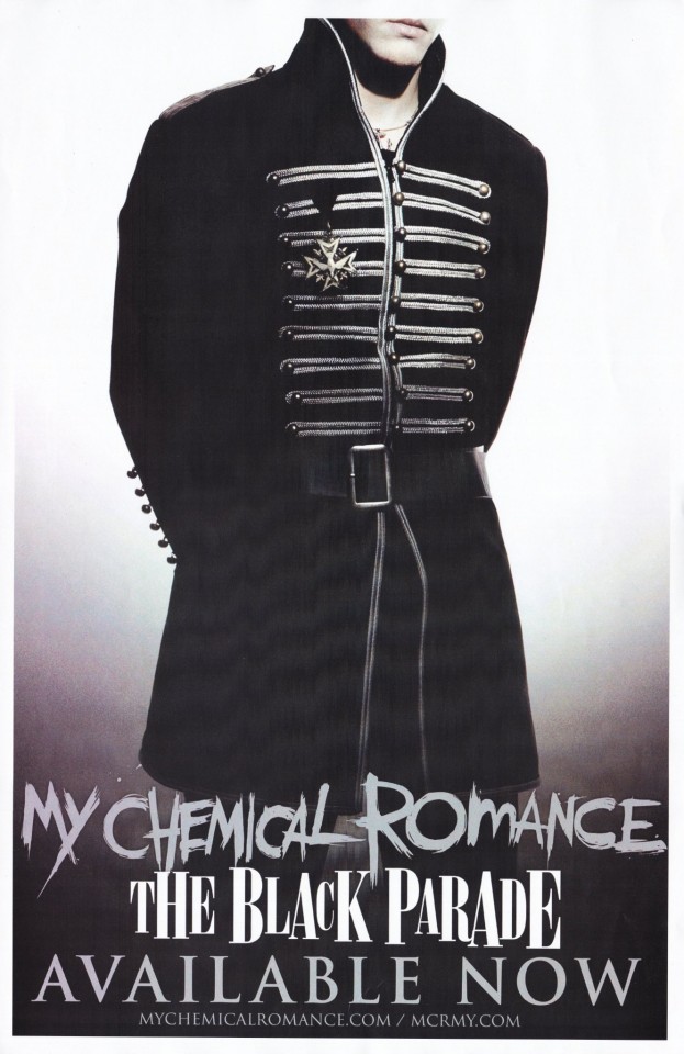
Mikey's uniform is by far the most military - it's not just the medal, it's also the cut of the jacket. And he's the only one with a fun little belt, which helps keep the silhouette look nice and tailored even though the jacket flares a little at the waist. We all know the medal is a reference to his death in The Ghost of You video (there's no way they didn't know we would make that connection) and it wouldn't surprise me if the rest of his uniform looks more military because it was built around that idea. But also consider Mikey's stage presence at the time - due to his discomfort on stage, he used to be really stoic, standing in the back, getting the job done with little showmanship. I think that presentation lends itself well to a classic military figure. Mikey is also pretty thin, and the long jacket and it's strong, solid construction keeps him from looking too Victorian-orphan waifish (especially with how pale they all are), and more like a dead soldier boy.
Additionally, Mikey's costume leaning so hard into the military side helps them look more military as a group. It keeps the association in your mind when you look at the others. Also, he's wearing a little necklace here, which I've never noticed before, is he wearing that in the videos?? I think it's an anchor, which is fun considering he died on a beach.
2. Gerard
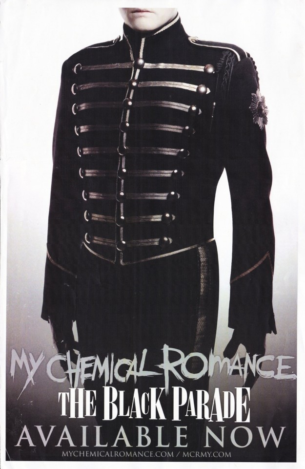
Yes, Gerard's is #2 in my ranking. I'm sorry, I might have a slight bias knocking it down from #1. But maybe not, let me defend myself when I get there. Anyway, Gerard's is the most classically marching band, which makes sense considering he's the frontperson. In fact, he has one of those braided loops on his shoulder we talked about earlier, demonstrating.....something, it seems to vary a lot, but we're probably meant to think leadership. He's not wearing it the WTTBP video, but it's there in Famous Last Words. He also has that fancy little star thing on the shoulder, which definitely seems to suggest rank. Otherwise, his uniform is very basic. He's the template that the others' uniforms are variations of. And it's a great look! He's also got nice big buttons compared to the others, three whole rows of them, which is a nice touch to make it look a liiiiittle more feminine. Because, of course, the back of the jacket is corseted, in a genious stroke of gender that puts the entire outfit in a new context. I think this is a good example of how Gerard likes to play with androgony by balancing masc and femme elements. The cut of his jacket makes his shoulders look wide and his waist narrow, but not so narrow it looks terribly feminine (just a little, taken on its own). A lot of this is achieved by the piping - notice how on Bob, Mikey, and Frank, the top row of piping (I might be using that word wrong but let's go with it. I'm talking about the silver stuff across the chest) is pretty much the same length as the bottom row? On Gerard, they start out wide way up on his shoulders and get progressively narrower at the waist. It's still a mostly masculine silhouette, but then you have the counter balance of the big buttons and his little white pixie cut, both of which lean just a little further toward femme than masc. It's an androgynous look that leans toward masc as a whole, until he turns around and, boom, corseted back. Showstopping. He also had those black leather gloves that give some nice formality, and maybe a touch of impersonality. They make it so that when he's in full uniform, the only skin you can see is that of his face. They're like an edgier version of the usual plain white marching band gloves.
1. Ray
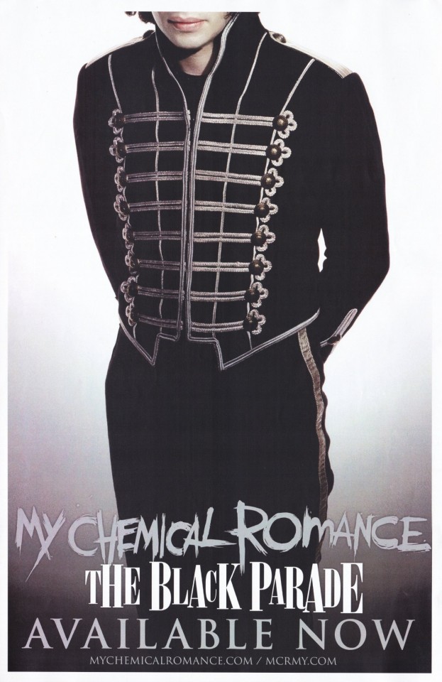
Going purely by aesthetics, Ray's is my favorite. It's the fancy one, most obviously distinct by the flourishes around the buttons on his jacket. He Mikey are the only ones with pure silver shoulder loops, and Ray has more silver piping on his jacket than the others. In some pictures he's wearing this really ornate knotted tassle thing? You can see it in one of the group pictures above. He isn't wearing it in any of the videos, which makes sense as it could be really annoying while playing. The cut of his jacket at the bottom also looks formal to me, but I'm not sure why. Overall, the ornanamentation could be a reflection of his playing style - the same caveat here applies to Frank, in that they influenced each other through their parnership as guitarists, (and Ray has a lot of influences from different genres), but at the start he was their metal guitarist, and the guitars in metal are often complicated and showy. And he's their soloist, they need to show him off a little.
Additionally, the construction here is giving him an absolutely wild silohette. Like Gerard, the piping on his jacket gets progressively narrower to suggest a smaller waist, but without the really long stripes at the top to make the shoulders look broader. Those vertical lines across the front add to the effect because they're curved inward - which is interesting, because everyone else's uniforms are composed of entirely straight lines and sharp angles. And his jacket is cut REALLY high on the side. I can't tell if Ray's pants are more high-waisted than the others, or if it just looks that way because of the cut of the jacket. You see the stripe of the pants go all the way up his hip, and since he's already tall with long legs, it really accentuates that. It's hard to tell, but I think his pants are even a little more form-fitting than the others. The other day I saw people commenting on a gif of Ray in the WTTBP video about how they never noticed how long his legs are - this is why!
We talk about how part of what makes Ray such a compelling performer is how he moves, and I think this costume was designed to compliment fluid motion. The tailoring and curves of the piping avoid making him look too rigid or blocky, as a marching band uniform could easily do, and the high cut of the jacket lets the line of his legs continue uninterrupted. Honestly, this is a favorite look for Raygirls (gender neutral) for a reason - I think they knew exactly what they were doing putting him in a pretty, well-tailored uniform that accentuates his movement. (Caveat here that I'm a Raygirl (gn) so I'm definitely biased, and they all look great in their uniforms, but I do think Ray's is.....uniquely flattering, and I don't think it was an accident).
Conclusions
So now that we've talked about all of them, I think we have some interesting contrasts to make. Gerard and Mikey both have very classic looks, but Gerard's is more marching band and Mikey's is more military. Mikey and Bob both have very military looks, but Mikey's has a much more solid construction. Gerard and Ray are both on the marching band side of the spectrum, but Gerard's is classic while Ray's is ornate. My favorite contrast is between the guitarists - Frank's is blocky and rigid and tarnished, Ray's is curved and fluid and shiny.
The interplay between similarity and contrast is what makes this so compelling as a group costume - just by looking you can tell who's the leader, who's the tragic figure, who's the outcast, who's the rebel, who's being spotlit.
In closing, thank you Colleen Atwood and Gerard Way for designing these and the rest of the band for wearing them, I will never get tired of looking at them.
#mcr#my chemical romance#the black parade#will probably come back and edit in more pics im out of time rn#gerard way#ray toro#frank iero#mikey way#bob bryar#i guess#see how many times i can misspell silohette#to some extent idk if anyone reads this cause its nice to have my thoughts organized but also if im nerdy enough to write it surely#some people will be nerdy enough to want to read it#*idc not idk#speaking of bob i cant see him without thinking of that post that called him b-slur bryar
31 notes
·
View notes
Text
My Thoughts on Veilguard (Spoilers for all)
OK. Now that I've actually had a night to sleep on it, here's my more detailed thoughts on Veilguard beneath the cut. Spoilers for everything, of course. Also this is long as hell so have fun, I guess.
I am genuinely feeling so overwhelmed with emotion at getting what was honestly a happier ending for Solavellan than I thought was possible within the established canon. So let me just start off by acknowledging that the last 10 minutes of Veilguard left me feeling a lot more charitable about it than the previous 80 hours I played did. If you want a glowing review, this ain't it.
Gonna try to organize this into a few categories.
Character Customization
This is embarrassing but I actually rage quit the game after spending about an hour in character creation and finding I could not get a Rook that looked anything like I wanted her to look. The problem for me really was the 3 head types that morphed together - I found that to be too limiting to get something that looked like a real human face to me. Eventually I settled on something and, fortunately, got used to it quickly.
Being able to make a vallaslin-removed, 10-years-older version of my Inquisitor was an absolute dream. I had a lot of reference pictures of my DA:I Lavellan, so this was simpler for me than starting fresh with Rook.
Backgrounds
I played as a human Crow mage. The Crow background story was hilarious to me because you're kind of a fuck-up. Viago addresses you as "Idiot" in his opening letter to you at the start of the game. (Viago can call me an idiot any time, for the record.) I was impressed by how much reactivity there was dependent on my background, though I understand that some others (especially Grey Warden) have even more options because they're so closely tied to the parts of the lore this story primarily focuses on. I'm excited to try some others if I can muster up the energy to play this game a second time (more on that to come).
Combat
Drastically more fun than another other DA game. Your mileage may vary if you like the turn-based stuff from the earlier games, but I do not. I played as a Spellblade, got some perfect unique and legendary gear to work with that, and had a blast. Melee mage with electric powers is my absolute preferred thing to be. I felt entirely overpowered by about 35 points into the talents and ended up turning up the difficulty a little because I was killing things pretty easily. But then, because the spec didn't really change much after I hit that sweet spot, I turned the difficulty back down because I was pretty bored with just hitting the same combos and blocks over and over again. So, fun, but still got old after 80 hours of it.
Companions
BioWare companions have a tendency to hit very hard or miss completely for me with not a lot in between. Unfortunately, I found Veilguard to have more misses than hits.
Harding. While I know a lot of people really love Harding, she wasn't ever someone I paid a ton of attention to in Inquisition so I didn't have strong feelings about her return. I was glad that her personal quests gave us some more insight into the Titans and the Kal-Sharok dwarves, both of which are mysteries I was very invested in. (More on my thoughts about how those things played out in the Lore/Story section below.)
Neve. I absolutely loved the idea of Neve. I thought her design was beautiful and unique - loved, loved, loved her hats. I loved the idea of this lady Sherlock Holmes but I was disappointed that her story didn't really feel much like a detective mystery to me. Neve also really got the worst of it in my save - she had the injury at the start, I saved Treviso, and Elgar'nan kidnapped her at the end. So, needless to say, our friendship was a little strained (or as strained as friendships are allowed to be in Veilguard, which is not very). However, Neve getting to say "THIS IS MY CITY" as she uses the Blight against Elgar'nan? Fucking chef's kiss 10/10 loved that shit. Good for her.
Lucanis. As a huge fan of the Crow stories we got in Tevinter Nights, of course I was looking forward to Lucanis. I adored Spite - what a fun idea for a demon archetype to explore. I found the idea of the experimentation with forcing the creation of specific demons and getting them to possess non-mages pretty interesting. I was so enraged that the story wouldn't allow Rook or Lucanis to point out how obvious Illario's betrayal was - I mean, come the fuck on, Zara is literally calling Illario "amatus" as she dies. You're killing me, BioWare. I romanced Lucanis, so more on him as a character and the romance in the Romance section below.
Bellara. I was really uncertain about Bellara at first. It was clear she was going to be "a lot." But she actually really grew on me over the course of the game, and is probably the companion whose friendship I appreciated the most. I loved her banters with Lucanis about cooking and her discussions with Davrin about the implications of the Evanuris being total dickheads. She was one of the few characters in the game who I ever saw attempt to grapple with this (what should have been) ENORMOUS reveal that the Elvhen gods were real and very different than history remembered them (more on that to come, too). And I'd be lying if I said that her utter revulsion at the idea that Solas and Mythal could have been lovers (something I did NOT want) didn't earn her a shitload of loyalty points from me.
Davrin. Davrin felt the most like what I would expect a Dragon Age companion to feel like. He slotted perfectly into the lore but also advanced important parts of it. He was a fantastic example of a heroic Grey Warden but also had ties to his Dalish roots. He and Assan were adorable and I loved their journey together. I really felt like he had the best head on his shoulders of anybody in Rook's team, while also having a personal mission that very directly influenced and pushed forward the overarching narrative of the story. This is what a good companion looks like.
Taash. Boy, did I have a difficult time with Taash. Listen. As a cis lady (though admittedly a bisexual one who has many complicated thoughts about gender), I don't feel that it is especially my place to critique Taash's personal story. So I'll just say that I was frustrated by how often they felt like an absolute child to me - in a way that truly left me wondering why the hell Rook recruited an immature teenager for her team. I found Taash's relationship with their mother to be equal parts frustrating and touching, and I think that's fine and probably good. I wish Taash had given their mother a chance to tell us more about people in the Qun who are non-binary. I was excited to hear that lore and sad that Taash cut her off. I am always glad to see stories like Taash's in very popular media because I think stories instill empathy in us and empathy goes a long way toward acceptance. I do wish, however, that Taash's story was spoken about in a more "Dragon Age-y" tone, versus using the exact words and concepts that we do in the real world. It took me out of Thedas at times to hear how they framed their experience.
Emmrich. A little torn. My god, I loved Manfred. I loved Emmrich most of the time too. I thought his personal quest was fun, hilarious, and creepy. Someone had way too much fun with all those horror zoom-ins during the cinematics, and I am here for it. I loved what we learned of the Mourn Watch and Nevarra - both things I was really excited to see in a game. I think my reluctance to fully embrace Emmrich is simply that much of the information he provides is so similar to the sort of information Solas gave us in Inquisition. And so many players hated Solas for that, whereas I expect Emmrich will be much better liked overall because he delivers his advice a lot more politely than Solas managed to. So I guess I do like Emmrich, but my Solavellan heart is telling me that's a little disloyal.
Overall, my biggest complaint isn't even with the individual companions or their stories but with the absolutely awful pacing that dictates how those stories play out. If I don't play this game a second time, it's because of Act 2. All the running back and forth to have what I have been derisively referring to as "picnics" with your companions really soured me on them in ways that I don't think is very fair to the actual characters. I wish I didn't have to go the map and teleport to get 2-3 minutes of dialogue with someone. I wish I could talk to them more at the Lighthouse. I do miss the conversation wheels where I could just ask for more info. Combined with the fact that, at times, it felt like this was all I was doing for the entirety of Act 2, they had just worn out their welcome for me and i was desperate to advance the main plot.
I also just did not need 2 separate pep talks from Varric effectively saying "get your team's shit together and it'll be better for your bigger goals." I know, Varric. I am playing a BioWare game. You are explaining a BioWare game to me in a BioWare game. I don't need that. I'm here to fix my companions' shit. I signed up for that. Again, that dialogue just took me out of Thedas, and especially when he said it a second time.
Romance
Absolute, fucking nothing-burger with nothing-sauce and no cheese. And I know that this is not just about who I picked - I have looked at plenty of the other romances and talked to my friends who romanced other people. This game just doesn't have it. Spice level is like a dash of stale black pepper. A few cute party banters when you decide to pair up with somebody, but that was really about it. This is gonna be all about the fics for those of you who really wanted more from these characters.
I think you would get this scene regardless of whether you'd begun to flirt with him, but I did really like the first private scene you have with Lucanis where you walk around the Treviso markets and he picks out food items for everybody in the party. It was a lot kinder and more thoughtful than I expected from an assassin character, so I guess that's probably why I went with him. I didn't feel strongly about romancing any of the companions and I ended up going with Lucanis because I knew I was going to save Treviso since I was a Crow and I figured it'd be a lot simpler to romance him in this save versus a second where I save Minrathous. How romantic, right?
To the extent the devs said this was the "most romantic" Dragon Age game so far ... surely they were only talking about Solavellan, right? 😭
Lore/Story
Whew. Strap in. Cause I am conflicted and I'm ready to throw all my problems at the wall / people on Tumblr who haven't stopped reading yet.
Let me start by saying a few things about what I think makes a satisfying resolution to a story. I do not think it is at all a bad thing if your audience is able to guess - mostly or partially - the direction a story is taking. I actually think that can be a very strong compliment to your writing and to the intelligence of the breadcrumbs that you've left along the way. I read everything. I read every word of every codex. I read every novel. I read every comic even though I hate reading comics. I like being rewarded by seeing the knowledge I've gained from that work reflected back at me in the game. That is Good Shit.
I was thrilled to watch headcanon after headcanon (mine and others) confirmed as lore in this game. It was deeply satisfying to go back and look at notes I had made while writing Ruins in 2016 and 2020 about which Elvhen gods corresponded to which Tevinter Old Gods and find that I had all but 2 of them correct. (I swapped Elgar'nan and Falon'Din and I'm not even going to count that against myself because how the hell was I supposed to guess that the Evanuris associated with the SUN was aligned with the Tevinter god of NIGHT, fuck off lol). Good breadcrumbs are so deeply satisfying in a story like this and I cannot be thankful enough that we got all these little hints along the way that were waiting for us to discover them and fit the puzzle pieces together.
The thing of it is, that there are places where I think those breadcrumbs were followed to their least interesting possible conclusions. And that makes me a bit sad because I think it's pretty clear that this game is meant to neatly tie a bow on this geographical part of the Dragon Age world, and it's therefore pretty unlikely that we are going to get much more information to fill in the important gaps in knowledge we still have about the Blight and the Titans in particular.
The more I played this game, the more confused I became about the origins of the Blight, and that was especially frustrating for me because I honestly thought I had it very clear in my head after playing The Descent DLC. The Blight was like an infection or an immune response within the Titans' bodies to the invasion of the Evanuris. It was a consequence of their actions but not something created intentionally. To the extent I knew that Ghilan'nain was messing around with the Blight, I thought it was a fascination she developed with what seemed to be a naturally-occurring phenomenon, and not something she had intentionally, actively created herself. I came out of Veilguard being completely unclear with which of those two things is true and I do not think it is possible or interesting for both to be true. It is entirely possible I have missed something (somehow, in my very slow playthrough where I read every codex as soon as it become available to me), but my lingering suspicion is that the writers of this game never entirely made up their mind about the Blight's origins either. And that's a sad note to leave on, like I said, because I don't know that we'll see much of it again.
As for the Titans, I did enjoy seeing more of that story - and especially from THEIR perspective, not just Solas' memories - through Harding. Their anger was so just and important and I'm glad we saw some of that. However. A couple of big misses for me on the Titans. First, given how alien and huge and intimidating the "inside" of the Titan was in The Descent I just do not like the idea of them having these physical, humanoid-shaped bodies like the one we see in the mountains. I wanted something more abstract than that because I wanted them to be something mythical and fundamentally unknowable. Also, the absolute nonsense of introducing this idea that "angry" lyrium is red lyrium - but don't worry, it's not blighted! It's a totally different thing! That missed me so hard. What an unnecessary complication of straightforward lore. If you want the lyrium to look different to reflect the Titan's anger make it a different color, make it spark, do literally anything except use an existing mutation that already means one very specific thing to your audience.
So the Blight and the Titans were the two places where the lore fell down a bit for me. But I also was simultaneously excited to see Elgar'nan and Ghilan'nain and also so underwhelmed by how mundane and "modern" (modern by Thedas standards) they seemed to me at times. I adored Ghilan'nain's model in particular. She was just as creepy, uncanny, body-horror as I have always wanted her to be. Both were fantastically acted. Absolutely no complaints there.
But in the same way that I wanted the Titans to feel suitably alien and distant from us, the players - the Warden, Hawke, the Inquisitor, Rook; people who did not live 10,000 years ago and cannot conceive of this world once being drastically different from how it now is - I wanted the Evanuris to feel SO far above us, so removed. They are not truly gods but they are so godlike in the scope of their power that I wanted them to look at modern Thedas almost like we were ants. The scope of their concerns should be so enormous that we are practically nothing to them. I found it wild when they called me Rook - that they cared enough to know my name? I didn't hate the idea of them grasping power wherever they could - with the Venatori, with the Antaam. But it just made them feel so much smaller than I had imagined. The fact that they called their dragons "archdemons" was a weird nitpicky sticking point for me. Surely they had their own word? Why would they stoop to adopting a word and a concept that never had a reason to exist in their culture?
Speaking of words, and names. I hated, hated everybody using Solas' real name. In my mind, the only people who should have gotten to do that were people who knew him as Solas in the Inquisition. That everyone else adopted it, versus calling him the Dread Wolf or Fen'Harel, whatever, really confused me. It felt so weirdly intimate to have people - even people who weren't party members, just fucking randos that are helping you - calling him Solas. I recognize that this probably a "me" problem and it would be more confusing for new players to have the same character referred to by different names. But still, the part of my Inquisitor who still lives in my heart wanted to just slap anybody out here going around using his name like it was theirs to use.
The exponential increase of the use of magic in the North of Thedas was both something I anticipated and also still way beyond anything I expected. We knew attitudes about magic were drastically different in the North. Dorian's character in Inquisition was a great way to prime us for that shift. Fundamentally, though, I believe Dragon Age as a series has always been concerned about the risks and the consequences of magic use. Those risks are not less in the North. It's simply that they find the risks more acceptable and have different customs and safeguards in place to facilitate the kind of magic use they want.
But I saw NO risks for magic use in Veilguard. No sense that the huge quantities of energy being pulled from a VERY TATTERED AND DELICATE VEIL were worrying to anyone. If magic has become easier to use because of the events of Inquisition and the Veil's weakened state, maybe I could believe that. But somebody in the game needed to say it out loud. Otherwise, I'm just looking at a world where magic is a net positive so how stupid and cruel do you have to be to prevent its use? It makes the already dubious morals of the Chantry and Templars entirely reprehensible in retrospect because apparently if you just let people do any magic they want at any time, everything's peachy!
It was difficult to anchor myself to any particular idea of whether this amount of magic use was normal for my Rook, because Rook - regardless of background - is from the North. They're not an outsider. Thus, I'm counting on someone who is an outsider - maybe Harding? - to comment on it, to contextualize it, to make it make sense to me from the perspective of the South, which has always been the player's perspective until this game. I never got that and I wish I had because it would have been so much more interesting and nuanced.
Similarly, it was so challenging to be thrust in media res into a Thedas where everyone (save one obstinate First Warden) was entirely willing to accept that the Elvhen gods were real and were the cause of all the bad shit happening in the world. Listen, I get it. 10 years is a lot of time. Maybe huge, fundamental paradigm shifts have happened in Thedas. Maybe people are willing to believe unbelievable things. But to see very, very little recognition of that from the characters we encounter was jarring. As I said above, I was glad that Bellara and Davrin were able to contextualize some of this in their conversations and I assume an elf Rook maybe has more to say on it as well, but it just wasn't enough for me. This was a place where I feel like we were asked to fill in too many gaps in time and in knowledge and I ended up with the sense that the writing just "had" to begin at this point because it had so much other ground to cover.
And that was the biggest problem for me - not exactly with lore but with pacing. Veilguard decided to wrap up so many of the fundamental mysteries we have been dealing with for 4 games. That is a huge order and it takes a lot of time. As I said, I took 80 hours to play this game. I think that is plenty of time to tell a story as complex as this one needed to be without me coming out of it feeling like I still have questions that should have been answered. Because the game "wastes" so much time, especially in Act 2, especially with some aspects of the companion stories, there just isn't enough room left to do what it needs to do with the main narrative. I also honestly think it could have been split across 2 games - not that any of us want to wait another decade to have these stories resolved, but maybe I would have if I'd known they would have been resolved a little more completely. And, again, I wouldn't be so sad about this if it didn't seem so obvious that we are done with Thedas after this.
Finally, I was so devastated by the lack of Thedas politics in this game. There were so many wonderful opportunities for factions and countries to be pissed at each other, to be working against each other for drastically different goals. I think of this as another core aspect of what Dragon Age games are about. Inquisition obviously was the most political of the games in that sense, because you really were a political leader more than you were a hero. But all 3 of the previous games were worried about this stuff - worried about who's in power, who is subjugated, how can the world be changed not only by people with magical ability but also by those who have deep beliefs about what Thedas should be. Magical power and political power are both very real and both crucial in the prior 3 games. In Veilguard, magic is power, simple as that.
I think this is linked, at least partially, to the decision not to include too many prior decisions and possible world states into Veilguard. And, hey, I do get that. As a player who started with Inquisition I found the Tapestry very intimidating. Three games' worth of choices is a lot to ask of even returning players, let alone new ones. I can't fault them too heavily for this because god knows how many more years in development it would've taken to make all that work. But that doesn't make me mourn the losses any less.
And now, really finally, here's a list of questions that I really don't need anybody to try to answer for me but which I cannot get out of my head and are kinda breaking the plot for me:
Hey so like, how was Solas (weakened state Solas at the end of Inquisition) capable of "murdering" Mythal? Like what power did he have that could have overcome hers? Even if he did have that power how COULD he kill her if he was still bound to her at that point? (I have always read that cutscene as Flemeth at least partially consenting to give Solas her power - not because I'm trying to give him a charitable read but because I honest to god don't understand how it's possible if she's unwilling.)
I think I'm even more confused about the orb/focus from Inquisition now. Obviously if he'd gotten it Solas wouldn't have had to take Mythal's power. But like, why did he have it in the first place? Was it something only he had? What was its original purpose? Cause the dagger seems to have taken its place in terms of importance/power level and containing the Titans.
How the fuck did Solas cleanse the red lyrium idol/dagger?
What happened to those Sentinel elves like Abelas? Where the fuck did they go? Whose side are they on?
What about the elves disappearing into the forest?
Still the stuff about the Blight.
I'm sure there's a lot more but I'll leave it at that because we've got to get to ...
Solavellan
Guys. I was so afraid of this game for so long. I'm not sure what I really expected or what had me so worried. I've always told my friends that the best ending I can imagine for Solavellan is the Inquisitor and Solas "dying on the same sword." What I meant by that was that I fully accepted their ending would be tragic (I truly saw no alternative) but I would be content if at least they died together - at least he didn't die alone.
What we got was honestly so much better than I wanted? LOL. Especially with Trick Weekes' recent clarifications. (Specifically, regarding where they are going: "She's speaking both romantically and literally. It won't be terrible if they're in there together." I AM DYING I AM LOSING MY MIND I'M SOBBING AND I'M SO HAPPY.)
I was screaming at my monitor - as I'm sure many of you were as well - "GO WITH HIM" when Solas finally gave in and bound himself to the Veil. I sobbed immediately, I woke up this morning and watched the cutscene again and sobbed again. I feel really grateful that this one ship in this one piece of media got such a tailored and thoughtful ending for it - especially knowing how many other choices from previous games had to be stripped away to make room for other things.
So, yeah. Given however many thousands of words I just put into this about all the shit I don't like? Still feeling pretty charitable right now because my girl Lavellan got the happy ending she so richly deserved.
(Side, and final, note: Jesus who made his wolf form look like that? Why would you do our boy so dirty?)
27 notes
·
View notes
Note
Hey, I'm not the original anon, and I think it's unfortunate that their ask has had such a negative impact, but I do kinda get where they're coming from and thought I might be able to add some insight. I've been following this blog for a bit and I do definitely think I'm developing a "feel" for which outfit will be in the lead (often strong, deep colors, silhouette that's attractive by modern standards). That's not necessarily a bad thing, and I don't think it called for a grumpy ask, but I can see anon's point, especially in the context of frustration with costuming in period productions, which often goes for a "historical vibe without being too weird for modern viewers" approach. But these polls aren't a competition, and it's fun to play fashion judge with them. Anyway, thanks for all the great work you do, have a good day!
hi dear anon! 💕
thank you for your thoughts on this, and I'm so glad to hear that you're enjoying the blog! ☺️☺️
in the time since this was sent, I have heard from the original anon again, so I will link that response here, as my response to them is similar to what I would respond here!
as I mentioned, it's definitely worth having a conversation about attention to historical detail in media! 💕💕 but I do fear it often comes down to factors like money and time, since – from what I've seen and heard – costume designers are often massively underpaid and underfunded, and frequently given insufficient time to complete the kind of work that historical detail requires
I don't doubt that some aspects of the skimping on historical details are down to making things more approachable to modern audiences, but also I think it's not a phenomenon that's particularly new. for example, check out this "1830" costume from 1910 or even a well-known film like It's a Wonderful Life where I'm always jolted from the dance scene that ostensibly takes place in the 1920s by the aggressively 1940s style of the dresses and hair (not a dropped waist in sight lmao) 😆😆
as I mentioned, I do truly hope that the blog might help people gain a better understanding of historical fashion, even if it is mostly for fun! and even if responses do trend toward more "modern" looking garments, I'm hoping folks still enjoy the exposure to a wide range of historical styles! ☺️💕 I'm still nowhere near an expert, but I can say that I myself have learned a ton since starting the blog! ☺️☺️
anyway, suffice it to say that this is a definitely a complex topic that is worth analyzing, so thank you for sending in your thoughts on it! 🥰🥰
53 notes
·
View notes
Text

Cetegandan concept sketches
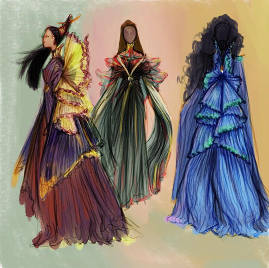
Wanted to try my hand at Cetegandan clothing. Not sure how Gem differs from Haut, though I'm leaning towards Gem being more flamboyant, space-grabbing and structured (left and right) whereas Haut is flowy-er and layered, with some lab attire with a both aesthetic and practical bent.
In general clothing styles try to evoke imagery of flowers, petals, and delicate layering. I'm playing around with incorporating butterfly shapes in the silhouette. (see swallowtail sleeves on far left). While the garments are light and flowy, very little skin is left showing. The clothing style is an elegant synthesis of Grecian drapery and certain elements from historic Japanese, Chinese, and Korean garments. My muse was also inspired to create a similar feeling to some of my favorite Star Wars costume design sketches I've run across. I also really enjoy having folds radiating out from a central point, or folding out like petals above and below a belt/waistline. Will probably do more studies to further explore the variety of ceta styles I've imagined.
tbh i imagine cetagandan womens clothing is actually a bit less colorful. maybe more whites and creams. But I just had fun messin about with butterfly colors
OH HELL YEAH TIME TO CITE THOSE SOURCES! :::
these specific designs pull from and synthesise shapes I found in
Roberto Cappuci Haute Couture 1987 "angel of god" or "Andgelo d'Oro" (angel of gold) depending on which pinterst image I reference

and
this dress by Issa Hesso from the Rebirth Collection

starwars concept art I enjoy:


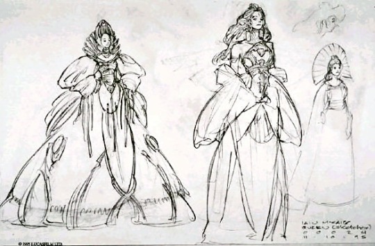
like fuck me this guys so good
you can find more by searching: iain mccaig padme amidala concept art
overall pretty happy with how these turned out :D! Feel like I successfully captured the space-elf-fairy vibes I was going for. If you notice any cannon clothing details I left out, or have your own creative ideas on how you imagine cetagandan cloting to look, feel free to leave a comment! I love hearing other people's insights :). Particularly curious how ceta clothing may have changed between occupation time period and modern miles-era ceta clothing. Given their heavily artistic bent I could imagine fashions may change wildly year to year decade to decade. But also given how long they live, perhaps the mainstream styles is actually less malleable? If so what are the common themes that are preseved?
thanks for reading!
#fanart#lois mcmaster bujold#scifiart#vorkosigan#vorkosigan fanart#vorkosigan saga#Cetaganda#scifi fanart#scifi concept art#concept art#visual development#concept design#character design#concept sketch#ceta#gem#haut#hautefashion#bujold#cetgandan empire#costume design#costuming
263 notes
·
View notes