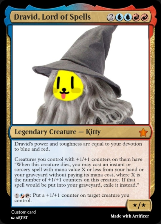
#so this is a 4-color set i guess lol
Explore tagged Tumblr posts
Photo
-
Fancy coincidence, I just made some cards that synergize great with this!
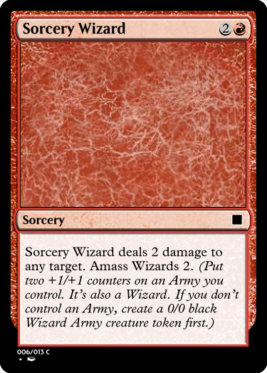
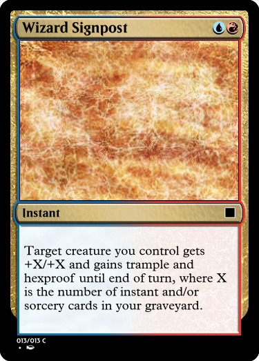
They’re part of a signpost set based around the amass mechanic. When it comes to getting +1/+1 counters on creatures, it’s hard to get more efficient than amass!
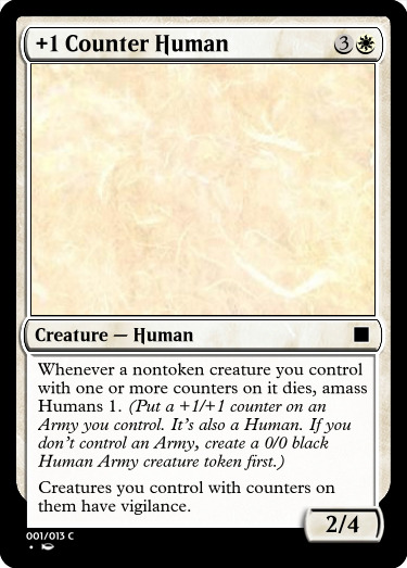
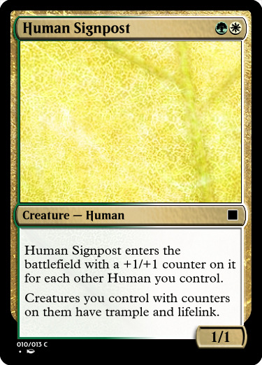
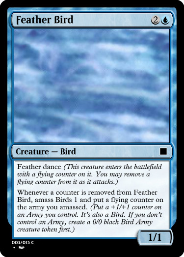
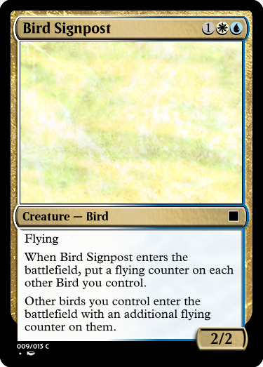
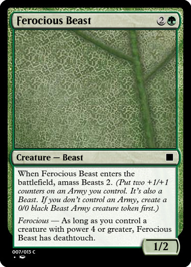
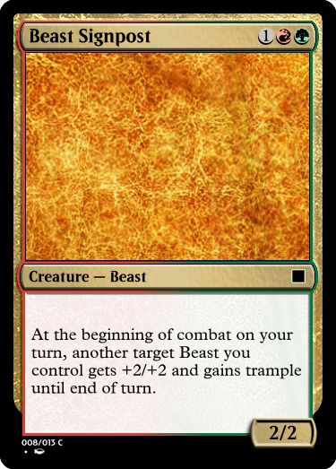
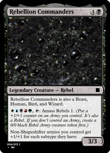
And this whole thing was inspired by me wanting to make skeleton army cards to celebrate the annual SKELETON WAR!
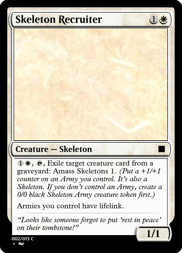
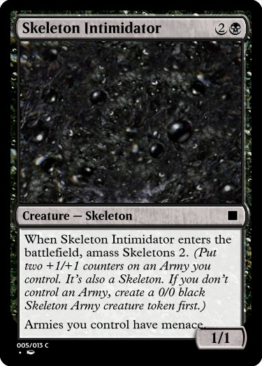
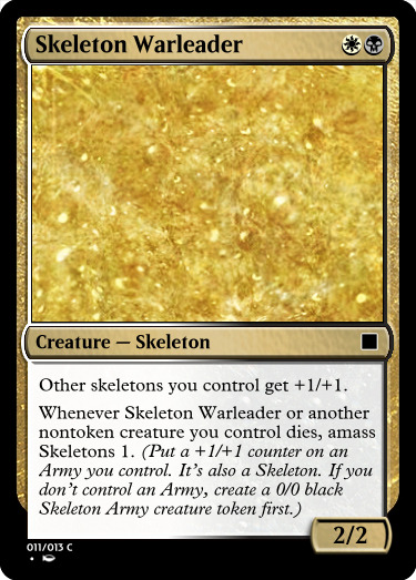
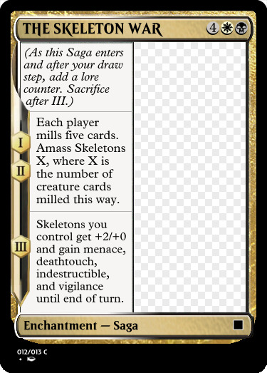
#asks#god FUCKING damn it the text on Skeleton Warleader doesn't capitalize skeleton#also it should really say 'Skeleton creatures' not just skeletons#that's important for dependencies that make continuous effects apply in the correct order#actually i don't know how that would work#what would happen if you gave a noncreature permanent +1/+1 and then turned it into a creature?#i think it would still have the effect on it right?#anyway#i really like the new change to the amass mechanic#when i saw that amass always made zombies i was like#'wait so they'll never use amass again unless there's another zombie army?'#'what about a soldier army or something?'#so now they fixed it!#still always black though which limits the flavor#also the way they changed it means you can stack multiple subtypes on your army#which inspired Rebellion Commanders#also i planned to make a proper 5 archetypes but i came up with 4 good ones and black just didn't fit anywhere#so this is a 4-color set i guess lol#also returning mechanic: feather dance!#also thought about making THE SKELETON WAR a battle but i didn't know what the back side would be#and making it a saga works too#custom cards
0 notes
Text
-Okay but some of the fears that Color has are in fact the same fears that Nightmare has when it comes to Killer.
Like, Color is worried that Killer's so blindly loyal to Nightmare for whatever reason that he wouldn't even think of complaining if he hated it. And at the start that was something Nightmare probably expected. His henchmen should be loyal and obedient and not ask questions nor complain. But now, after years of learning and bonding and softening up significantly he wonders sometimes if that's still the case.
Nightmare knows Killer well, perhaps better than most, but he's not exactly an open book. Especially when it comes to his own wants or needs. More often than not when he makes a request it's intentionally silly or unreasonable for laughs, like asking if they can take Dust to the nearest pet store and try to trade him in. Very rarely does he want something strong enough to make it known, both to himself and others, like asking to keep the first cat he found.
So.
If he hated this. If he truly struggled and fought and agonised with himself about the position he's in and the work he's doing and the life he leads.
Would he say it? Would he realise that was how he felt? Would he even consider saying no was an option?
If Nightmare asked him to do something he really genuinely did not want to, would he just do it anyway because he doesn't believe he has a choice in the matter?
The only way of finding out (besides making a blatantly difficult request of him, which Nightmare is not willing to do) is to simply wait and trust that Killer will tell him if something is wrong. Which... is not exactly foolproof or easy.
But it's part of why Nightmare hates to be around Color too much, because deep down he's more than a little worried that Color could be right and he doesn't know how to fix it.
#UTDR#UTMV#Dadmare#This was a thought I had and drafted like months and months ago and forgot about#Little ideas about how to fit Color into a dadmare scenario I guess#Cool people who make Color posts don't look I'm probably doing a terrible job with your boy lol#He's not worried about the others in regards to this because Dust has never had a problem disobeying him#And Horror and Cross set out ground rules for themselves right from the start about what they would not do (murder)#He's never sure about Killer though. how do you begin to tell someone they don't have to listen to you if they don't want to#How do you tell if it worked?#Realistically Killer has and does disobey Nightmare he just hides it well#''I got caught out and ganged up on during that fight'' when really he peeled off to go talk to Color out of sight#''they must have heard we were coming. there was nothing we could do'' when one of them got distracted and they fucked up a job#''we've always had that cat. they're just shy so you don't see them very much'' when he brought home another stray in his jacket#<-That one happens a lot and Nightmare is beginning to suspect on it#But he never sees more than like 4 or 5 of them at a time so he can't prove anything#Whether it's sheer luck or Killer has trained his cats to do a Parent Trap bit on him nobody knows for sure#Anyway this has cooked for long enough time to release it into the wild#Go my post
62 notes
·
View notes
Text
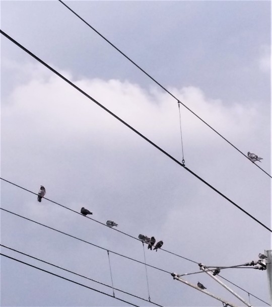
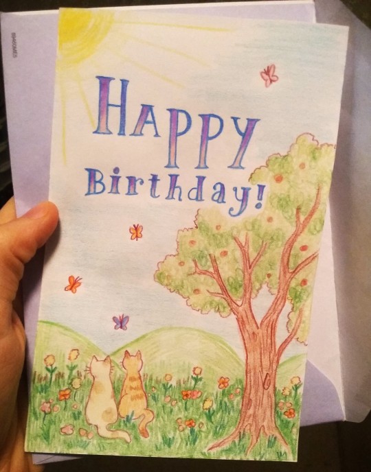
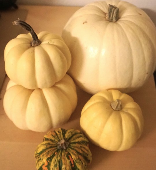
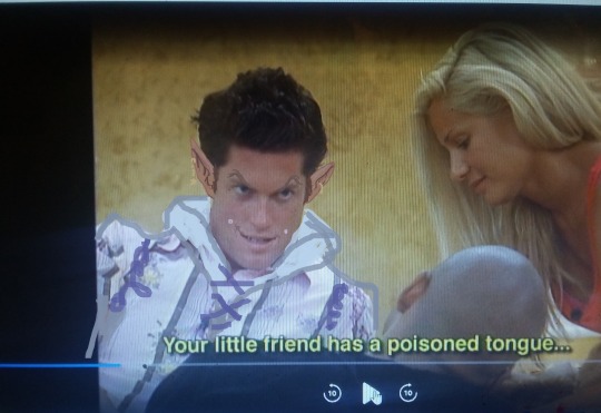

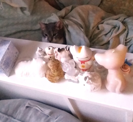
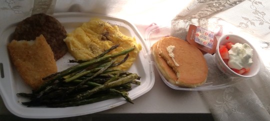
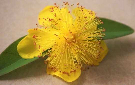
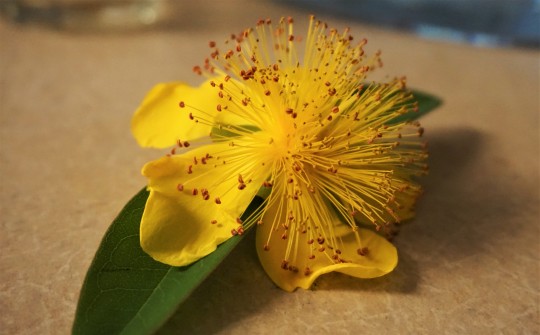
Various images of things
#image commentary in tags once again since they don't allow captions anymore and I feel weird using the alt text for that --#1. PIBBINS.... cheering clapping hooting hollering glorious applause everytime I see a pigeon in public#2. Birthday card that I drew for someone. .. kittys...#3. 2023's annual haul of tiny white pumpkins.. i get at least one white pumpkin every year around fall when they have pumpkins in stores#because I just love the color and texture ... bright white and smooth and cold and round.. kind of like a volleyball or something#4. A brief adventure into watching big brother (only earlier seasons of course as I hate all reality shows post like 2013 or something when#they became overly focused on social media and overproduced memeable phrases more.. like even though ALL reality shows have always#been extremely fake and annoying and mindless it's like..... newer stuff seems A Different Kind Of Fake or something) since whenever#I'm sick sometimes I find weird mindless things like that to watch (that one time I had bronchitis I watched all of Flavor of Love in my#half awake illness stupor and now everytime I heat up canned minestrone soup (mostly all I ate that week) I think of flavor flav since#thats just a weird brain connection I have now lol) ANYWAY.. I was sick and watched like 2 seasons of this and then thought it was too#uninteresting and obnoxious to continue (more like 1 and a half since I skipped the rest of one once only boring people were left) BUT this#one guy had a very mischevious looking face and he also said a few things (like the above captioned speech) that sounded like dialogue#some fantasy character would say.. so I took a screencap of him and edited him into a mischevious wizard i guess.?? idk I was sick lol#~your little friend has a poisoned tongue~ is just a very unexpectedly serious sounding wording for some random normal#frat dude looking guy to say while casually chatting on a reality tv show in like 2008 or whenever that was filmed lol#5. FLUFFY CLOVERS!! I'd never seen them be furry and soft before?? inchresting..#6. Noodle sitting in bed with the cat figurines looming above him... the council of kittys...#7. McDonald's full breakfast platter + asparagus + strawberries & cream (also of course this is old and I am now boycotting mcdonalds etc)#i try to group the images somewhat consistently like.. winter stuff with winter stuff or summer stuff with summer stuff#but I have so many random pictrues floating around on my computer that I never post that sometimes some are not organized or just#thrown into a set because there's nowhere else for them. Like the pigeon picture is from like 3 years ago for example lol#8 & 9 - I think I've posted these before but I just find them very interesting looking flowers. whenever they happen to be blooming#I'll pick up a few when I'm out on walks or etc. ... poof ball looking things#photo diary
9 notes
·
View notes
Text
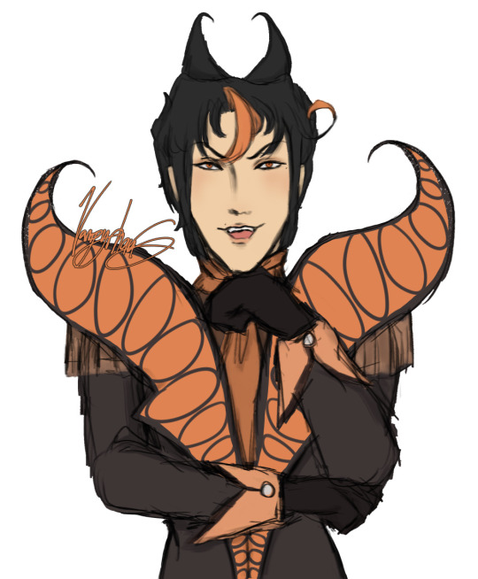
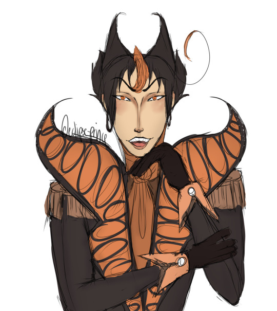
[ New (2023) | Old (2019) ]
Get redrawn, stupid
#art#my art#oc#my oc#oc art#oc: max erade#ace attorney oc#redraw#it’s been 4 years…….#that’s so crazy to me#it genuinely doesn’t feel like that much time has went by#also both use the same colors for the most part lol#I guess the color export settings I had in the newer one made it more vibrant compared to the original
6 notes
·
View notes
Text
BATMAN AND ROBIN (2023) #14 by Phillip Kennedy Johnson and Javier Fernandez! rambling about the new team and arc!! a jumping-on point for anyone wanting to read recent Bruce and Damian comics 🦇🐥
setting the stage with action!! mystery and intrigue!! expectations for further character exploration for Damian!!
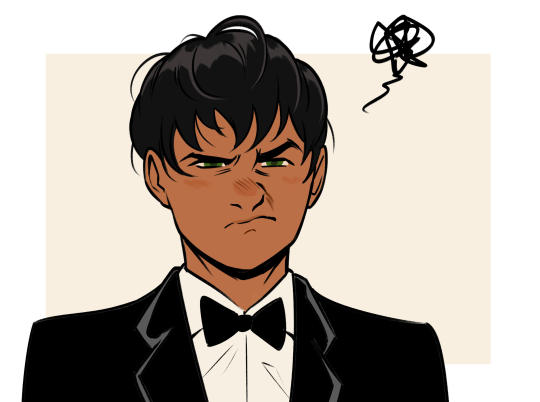
if that's not enough to pique interest, here's a rendition of one of the many cute grumpy Damian panels
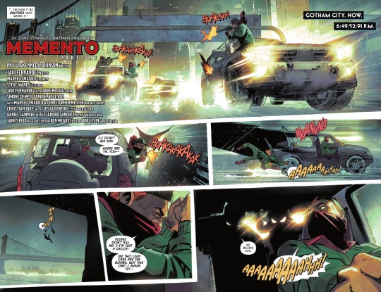
first of all THE OPENING ACTION SCENE OH MY GOD (this splash page hello!!)
i love...the collaborative effort in comics...it shines through right from the start, especially when it involves traditional inks 😭
using this single panel as an example from Fernandez’s ig:
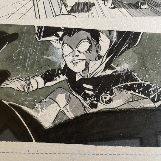

Fernandez lays out most of the groundwork in his inks - the fully inked silhouette of the driver in the foreground, the shading suggesting the lighting, the white ink/paint lined and splattered for the rain!!
then off to colors with Marcelo Maiolo!! he elevates the panel to emphasize how it's a shot from within the vehicle looking out the windshield - the lightly tinted inks, the bright lighting from headlights, and the slight window sheen + bokeh!!

one more similar example, with comparison by the man himself - Fernandez already implying the glare, scraping white against Batman and Robin's silhouettes. then punched up with Maiolo's colors/lighting!! WOW!!
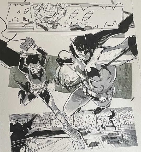
OKAY SORRY ONE MORE along with Steve Wands’ consistently lovely lettering, Fernandez included his own sfx in his inks of this page!! not sure how often he does it past this, but SO cool!! ever since seeing Juni Ba's sfx lettering in his inks, it's such a sick extra detail to me 😭
ANYWAY i can go on about what i love about each panel for this scene but gotta move on from the explosive intro of Batman and Robin to the more grounded side of Bruce and Damian (which ends up being just as explosive)!! 🥺
there's small details carrying over from Williamson's run like Bruce making Damian vegan meals and Damian creating comics; otherwise, we have a much more engaging writing of the two almost reminiscent to Tomasi and Gleason's run!

one example being his attitude towards a fancy event interrupting his and Dick's patrol in Batman and Robin (2009) #20

the first line from Bruce and Damian's disregard for a fundraising event is a bit of head scratcher to me when Damian is plenty compassionate, BUT for the sake of a jumping-on arc for new readers it’s a clear point of reference for Damian’s character - a kid who believes more in Batman and Robin work than what could be done outside of those masks. it becomes a matter of how Damian's perspective might change around this subject and how he'll take action in helping outside of Robin 🤔

another similar Tomasi-esque moment is Damian's snark about his grandfather lol, a sentiment that carries over from Batman and Robin (2011) #1


PKJ references his Ra's al Ghul story from Gotham City Villains Anniversary Giant! especially curious when the final line by Talia is "...you will see my father again", when Ra's is currently dead. a fun lil callback or also a convenient nod to future plans? 👀
NOW THE MYSTERY AND INTRIGUE OF IT ALL...


Bruce's attention is caught by this man shouting "You sit atop the wheel" which i'm guessing is in reference to the Wheel of Fortune, especially if we're going by a literal interpretation of the rich and poor (depicting the group among tents and carts).

i'm really reaching here, but wondering if Bruce calling himself “Jack” at some point is also related to the arcana. the only relation i could find is the Page of Wands, and the Jack once being referred to as a "knave"
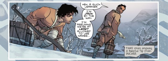
EDIT: an anon reached out to inform me that Bruce called himself “Jack” during his training! seems to be first introduced in Batman: The Knight (2022) #4

THE REVEAL OF THE NEW VILLAIN, MEMENTO...the first page opens on a deceased person's face, and the last dialogue is "We will see your face again." AND OH BOY WE CERTAINLY DO! 😭
the flames casting a harsh light against the plaster (or stone??) of Memento's mask, and how he looms over Bruce...SO EERIE...
FINAL RAMBLY THOUGHTS
Damian being colored with noticeable melanin...🥺 i can only assume this was a deliberate choice made by PKJ since the editors haven't changed, and for the past issues Damian's colors have been independent to the colorists - the only edit being after Rex Lokus gave him green eyes in #5 but were returned to blue in #6 (for consistency ig). along with the classic teen asian haircut, this feels intentional on PKJ's part and i hope Damian will continue to be colored brown here and other books 🥺👉👈
one of the things PKJ teased in an interview was the idea of Damian wondering if he even wants to still be Robin, much less Batman (begging this is where main canon Damian gives the Batman mantle up lol). so presenting Damian here as someone absorbed in that life makes me wonder what triggers those thoughts - is it going to be this incident or later? more currently, will Damian be able to protect the civilians that Bruce entrusted him with? especially after getting familiar with a few, however reluctantly?
anyway, a banger first issue that leaves you with just enough crumbs to know what you're expecting but still beg for more: what's the mysterious new group/villain, and their connection to Bruce? will Dr. Bashar and the Wayne grandparents have more to do with the story? how will this all affect Damian outside of being Robin? Talia and Ra’s?? so many questions!!
#rambling#damian wayne#i'm hilariously busy now but really wanted to give some attention to the new arc!! it's new reader friendly!!#this is ofc a Damian focused ramble but Bruce SHINES in this!!#there’s a scene of him in action that screams Bruce and Batman being one and the same + a reminder how badass he is 😭#anyway not sure if i’ll have the bandwidth for rambles past this…staring at my final two boy wonder ramble drafts…#but i hope people take the chance to pick this up!
457 notes
·
View notes
Note
Hiiii I'm new to your blog :)) I saw it a while back and was recently reminded of your blog, lol!
I really like Noel :> 👉👈 I just wanna smooch him. Just once. (Maybe) (probably not gonna stop at one) but I'm curious what his creation was based off of. Like, did you make him bc you wanted to draw a streamer yandere? Or did a certain scenario cross your mind and thus started his creation.
I hope you're having a good day/night!
(One more smooch for Noel again)
This is a really good question!! If it weren’t for this I’d’ve forgot a lot of this stuff lol
I think I’ve always had vague ideas about the 'yandere' trope and how it can be incorporated into our contemporary setting, I guess? I thought it would be interesting if publicity was sth that was leveraged against the victim. Then there’s also the idea of a universe where yandere-ism is normalised, and I was very into the thought of an influencer that makes content like how to kidnap your first victims, 10 Beginner Mistakes You May Not Know about Blackmailing, lifestyle vlogs about a very very morbid lifestyle etc etc. idk i just think it'd be funny lol.
I actually remembered something about his design as well. I’ve had this very half-baked idea of an OC for a long while, and the only remarkable things about him was that his name was Noel and he had a weird hairstyle. And since i had both of these ideas sitting around, i thought it'd be convenient to just combine them maybe???
ive managed to dig up his ref sheet from like 3-4 years ago and 💀💀💀💀 the art was SO rough ive touched it up abit or else i can't stand to post them now lol

I don’t really remember why his hair was changed but I think i kept the parts of 'unconventional color' + 'pastels'. BUT I do remember that I got the idea for a tri-colored letterman jacket because I saw someone on the street wearing something similar LOL (but it didn’t have the same colors as Noel’s one).
and to be completely honest i still kind of like this noel's design a little bit... maybe i'll reuse him again somewhere hah (getting all my mileage out of him fr LOL)
#ask#cupids-dove#noel posting#i think that ref sheet might've been one of the first times i experimented with drawing everything on a single layer#which explains the crust#and my non-existent sense of color
224 notes
·
View notes
Text
My life with level 2 (part 1)
I'm making this post to share some things about my life and give an idea about what my support needs are
1. Every morning I wake up sealed in my cubby bed, an enclosed bed that keep me trapped inside so I dont wander and hurt myself or roll out and have a meltdown (common things that happen with me and regular beds). It's also soft so I don't potentially bang my head against something hard. you're probably wondering well how do I go to the bathroom at night. That brings me to my next point.
2. Every morning after opening up my cubby bed either my mom, dad, caregiver, or occasional close friend takes me to my changing station in my room and begins to change my diaper. Thats right I was NEVER able to potty train and due to EXTREME sensory issues I am unable to change myself. This means I need constant super vision as I always need someone to change me, also calm me down if meltdown, etc. I simply have no way to tell I need to go, 1 or 2, till its much too late. So yeah diapers are an all day thing not just at night.
3. I'm older then 20 and my parents are l now my legal guardians for life, and if they can't do it I have friends that will step up. I'm not sure exactly what this means legally but I take it to mean Im basically still a kid to them on like, every level. They respect my intelligence but they still set the rules. One that always kind of gets people mad but then they understand is the fact that I have child safety internet settings on my tablet and phone, I can't access most social media websites and I'm not alliowed YouTube only YouTube Kids. This is because my parents and close friends agree that these teenage boys from a nearby town were trying to make me an "lol cow", basicallly a target for online harassment and bullying and trolling me because I was special needs and active on social media. Tumblr with my parents having the username and password and log ins and they check it every day is all I get. My friends and parents show me things from TikTok and Youtube that they think i'll like so I don't miss out. Oh yeah and I would binge watch horror and terror content on youtube, something that a lot of autistic people do apparently, however I mentally can't handle it. I wake up and freak out and hit myself all night and lose sleep for a week and end up in a mental hospital cause I'm hurting myself and not sleeping. Not fun... at all. I had unrestricted internet access as a teenager and I'm glad that part of my life is over. My parents do however let me eat cannabis edibles every day so its not like they're over protective, just protective in the way I need.
4. My parents are my emotional coregulators and I rely on them heavily, a lot of the time just to know how I'm feeling. I break down emotionally frequently and if my parents or a select few of my friends aren't there to cuddle me and rub my back the right way, I FREAK out and start hitting myself cause my brain is a bit nutty I guess. I'm needy with those I love to a rediculous degree. I'm a lot better, still not great, at self soothing. Self soothing is an oxymoron for me. I kinda need to be with somebody to be told to calm down, encouraged to come out my shell, praised when I do something good, and just having a hand to hold. My mom is rubbing my back encouraging me to write this out like I said I wanted to do.
5. I need to stim, constantly. I'm always rocking, fidget toy and plushie in hand chewing on my chewing laynyard, you get the idea. I also need audio and visual stims which I get in the form of watching bright colorful little kid shows on my tablet like Blues Clues and Daniel Tiger. I think this is why people don't think I'm smart but its just who I am and what my needs are.
I think this is a good starting point, I'll make a part 2 later.
65 notes
·
View notes
Note
You probably have already made a post about this (in which case I apologize for bothering you) however I really love how you render and color! Do you have any tips?
Hiiii so I probably indeed already answered something like that but it’s probably time for an #update + realized i can put pictures and it would probably help actually. Slay okay.
THE BASICS: have brushes you like. I have my faves, they’re in my #brushes tag (click below), you might also see them on the screen of my paintings in wip lol. Typically i thicken them up for rendering AND, now this is integral to my liking of rendering these days + the look: COLOR JITTERING. In procreate that’s tap brush -> color dynamics and i adjust the stamp & stroke jitter in the « hue » category. I have my fave brushes quadruplicated as thicker No Hue, 3% color jitter, 5%, 13% depending on the desired look. What this does is give intrinsic interest, variation and depth to your colors, and that way you can have more fun when colorpicking. This will come back again later.
STEP 1: a lineart you like. Doesn’t have to be clean tbh some of my fave linearts from current works were quite messy. ALWAYS colored.
STEP 2: on a layer underneath the lineart, put down flat colors. See what % of color jittering brings you the most #joy. I will do flat colors or i will sometimes already define some areas of light and shadows.
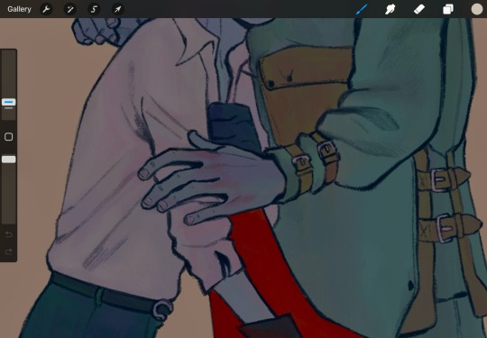
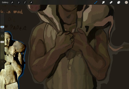
^ you can see the subtle color jitter in the « white » of the shirt and the green of that first image. Second is to show the already defined areas; if i know i want a different hue on here. something else for some pizzazz: tint a color with an adjacent one. not really visible in these screenshots but in matador, at some point, i added an orange tint to burakh's sleeve, the one closest to the red cape.
STEP 3: the shadows. On the same layer as above (you can duplicate it before this so you can always come back to it later if you need to redo), put down your shadows; the trick: COLORPICK FROM A PIXEL WHERE THE COLOR OF YOUR LINEART AND THE COLOR OF YOUR FLATS INTERSECT. You might have to recolor your lineart (use the « alpha lock » feature of your layer or something of the sorts) until you’re satisfied; i typically redden it in the face and hands.
STEP 4: put down the highlight. I typically do highlights the complimentary color as the shadow: if shadow bluer, the highlight is redder (-> pinker), etc.
STEP 5: now this is the scary part. Before proceeding if you’re #scared, group your lineart and colors, duplicate the group and merge one of them so you can always come back to them unmerged. MERGE YOUR LAYERS. You heard me. Merge lineart and color. From then on…
STEP 6: render. Render, render… PATIENCE… est mère de sûreté bien sûr. Here’s my secret: I NEVER BLEND. I ALWAYS COLORPICK. COLORPICK where two colors meet and you’ll have the perfect transition color.
tip: always have an all-black layer set to color mode above all layers that you can toggle on and off to check your values.
This is more of a fun thing i like to do even if i haven’t done it often: use some hints of a geometric brush to add interest when using an « organic » brush (or vice-versa, I’d guess, but i rarely render with geometric brushes). Exemples again:
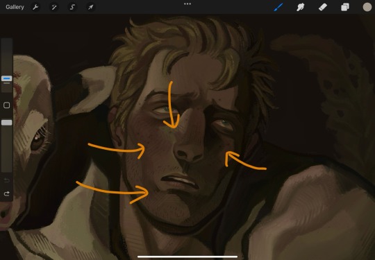
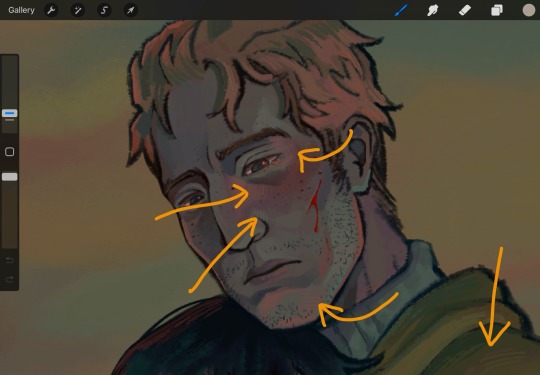
And well Das Preddy Much It… Your Turn Now….. and because i realize a short demonstration is better than a long speech, have a speepvideo of the two pieces I’ve used as exemples one after the other (matador first to 44 seconds in, moschophoros second). the very beginnings are cut because we’re focusing on the above steps.
Your turn……. To play.
#allô (answers)#anonymous#faq#<- we'll guess...#brushes#<- the ones i use in there#rendering#tutorials#<- eeeeeh........
76 notes
·
View notes
Text
Finale Thoughts
The show stuck the ending far better than I thought it would and when compared to the preceding episodes it knocks it out of the park. That being said, I think because the bar was so low going in, that it makes this episode feel spectacular when really every episode should have done this well, at minimum.
Solo Lessons and Ares Battle
I'm so happy they included the one-on-one training sessions with Luke since its so essential to foreshadowing. I also liked the setting in the woods but why was it like autumn/fall in the flashback lol? However, I think that did unintentionally add a dreamlike quality to the scene which I did really like so whatever I'm here for it.
That being said I do wish these scenes were in episode 2/3 alongside the other chb stuff instead of being a flashback in the finale because it makes it just so on the nose that Luke's the traitor. However, the shot panning from Luke's extended sword to Percy's on the beach ate I can't lie.
Honestly it may have been interesting if they had established some of the solo lessons early on in episode 3 and then done periodic flashbacks to expand on them throughout the series. That way, its not so obvious that Luke's the traitor in the final hour and we also get cool transition shots and establishing that Percy is thinking about what he's learned from his lessons with Luke.
#Relieved that the Ares and Percy fight was not a single sword strike and then cut to black. Glad we had some action. Still think we should've pushed the limits much harder tho.
Oh but Percy's wave did go hard. They actually made the wave much bigger than what happened in the book and now I'm just sitting here wondering why we couldn't see some more of this instead of 10,000 cut to black scenes every time Percy uses his powers.
I wish we had gotten this Ares's reaction from the book when he lost: "The roar that followed made Hades’s earthquake look like a minor event. The very sea was blasted back from Ares, leaving a wet circle of sand fifty feet wide." Show Ares's reaction seemed so anticlimactic in comparison.
And no curse???? huh??
I know Ares was like "we're enemies 4 life now" but the curse and dialogue from the book goes so unbelievably hard: “You have made an enemy, godling. You have sealed your fate. Every time you raise your blade in battle, every time you hope for success, you will feel my curse. Beware, Perseus Jackson. Beware.”
Why couldn't show Ares say that??
Olympus, Zeus, & Poseidon
[Insert aw, she's ugly John Mulaney Meme]
sorry Olympus could've should've been prettier.
Like Olympus in the book felt a lot more wondrous and lush and colorful. But in the show it seemed so dull. Idk if its cause the "war's happening" or whatever it was just bland. a wash of dull-looking cgi and then an instant cut to the Big Palace.
Lance Reddick's Zeus was amazing tho. He had that godly presence I've been waiting for.
And Toby Stephens's Poseidon? oh I loved it.
I especially loved their conversation in greek.
I still wish however they would have done effects on the gods' eyes. Like glowing with energy or something when they get emotional. I felt like I was waiting to see electricity burst from Zeus when he was yelling at Percy.
And so it turns out that the reason why they changed it to Percy missing the deadline in the show was to create a situation in which Poseidon surrenders a war for his son.
And listen, if this scene existed in a vacuum I'd be so here for it. I guess a part of me can't fathom the solstice being anything other than a hard deadline. I enjoy the scene without context, within context I have mixed feelings about it.
But the "do you dream?" convo between Percy and Poseidon. Oh my god no notes. I loved it.
Some more book dialogue that I wish made it: “You did well, Perseus. Do not misunderstand me. Whatever else you do, know that you are mine. You are a true son of the Sea God.”
Luke's Betrayal
Okay here's where we get some high highs and low lows.
Some things I sincerely liked:
The setting. Fireworks going off in the background. The lantern illuminating the side of Luke's face with the scar. So visually nice.
Luke actively trying to recruit Percy! I've always joked that if Luke was just a little smarter he would have tried to persuade Percy to join his side rather than immediately kill him. And I do like that the show went this direction.
While I do mourn the loss of the scorpion them battling via swords is a great subversion of the sword mentor/mentee dynamic they share. It makes the scene tense and fast pace.
And its all of the above that makes me wonder why we didn't have more of this throughout the show: talking while battling, visually appealing and dynamic settings, unique visuals, etc.
I love how triggered Luke was at Percy's mention of meeting Hermes. I still hate how much Hermes introduction bogged down the show but damn if it didn't lead to one singular funny moment.
Percy getting a hit in on Luke and then immediately apologizing
"I didn't think you'd give the shoes to Grover." Oh that was cold.
Walker and Charlie deserve their flowers and more they were fantastic and carried.
Now things I DIDN'T like:
I don't like how Percy pieced it together with the information he did have... which honestly isn't a lot in the show? If he was going to figure out that Luke was the traitor I would've have had Luke show more of his bitterness like he did in the book. Like the fact the show never even mentioned Luke's failed his quest loses the entire element of Percy succeeding an "impossible" quest and being celebrated while Luke only got a scar and a chip on his shoulder from his failed one.
Luke's scar shoulda been worse idc.
Percy should have been mortally wounded. That's where we run into an issue with there being no scorpion because yeah, a fatal sword injury probably would've been a bit much to depict. I also 10000% think that Luke is enough of a baby to get his daddy issues triggered and then try to off Percy for it even if his original intention was to recruit him.
Also the fact that you see Luke raise his sword for a damning blow and then the very next day you have Percy like "I don't think Luke was trying to kill me." and Chiron agreeing? asdlkfjsdlkf WRONG.
Also, sorry, I don't like that Annabeth was there.
But if you're gonna have Annabeth there, her reaction to Luke betraying her and trying to hurt Percy should've been way more severe than a solemn "I heard everything."
She shoulda been crying, questioning, yelling even if she had suspected him. It's one thing to suspect it, it's another to see the person you consider your family to actually prove it true.
(And this isn't on Leah! It's 100% on the directors cause what was the thought process here? Her brother figure betrays her and she's like :/)
And sure, in the book Annabeth isn't actually all that surprised by Luke's betrayal when Percy tells her about it... but we also never got to see her initial reaction to it. Percy was out for 2 days.
Just, if book Annabeth had been there, she would've been so emotional and that's okay!! let Leah show off her chops!
Sally
I mourn book Sally. I mourn her arc. I mourn the power of Sally unapologetically petrifying Gabe with Medusa's head.
One of the most iconic storylines from the book and it was sanitized in the show to the point that it lost all sense and meaning.
Honestly one of the biggest disappointments of the show for me.
Other
I love the fact that a flower is the searcher's license for satyrs its just so silly and sweet.
I love Annabeth sincerely hugging Percy but also using it for strategizing purposes it feels very on point for her.
Also her braids at the end!! so sweet!
I am very very bitter that Percy didn't see the fates. This + the changes made to Sally's characterization and arc... the show truly doesn't get it.
224 notes
·
View notes
Text
tag 9 people you want to get to know better!
tagged by @yourlocalegotisticalqueerishere thanks for the tag!
Last Song: currently listening to ICU by Citizen Soldier (at the time of starting this post). before that it was Gone Too Soon by Daughtry. at the time of finishing and posting this, i am currently listening to Lucky One by Simple Plan
Favorite Color: dark purple. always dark purple. dark purple my beloved <3
Currently Reading: nothing atm because i haven't had the chance to make another trip to the library, but the last book i read was The Meaning of Birds by Jaye Robin Brown! Very sad but very good. I've also recently read Stars, Hide Your Fires by Jessica Mary Best, The Many Half-Lived Lives of Sam Sylvester by Maya MacGregor, and I Wish You All The Best by Mason Deaver! I very much enjoyed all 4 of them, but I will say that The Many Half-Lived Lives of Sam Sylvester was definitely my favorite :)
Currently Watching: rewatching Star Trek: Discovery with my dad (and introducing my mom to it at the same time), watching Only Murders in the Building with my mom for the first time, and my dad and I just recently finished watching Star Trek: Lower Decks. plus my mom and I are always in a perpetual rewatch of Legends of Tomorrow and/or Arrow (though they've been on pause a little bit lately). now I'm just waiting for The Walking Dead: Daryl Dixon: The Book of Carol to come back in late September lmao, among other shows
Last Movie: uhhhh I'm honestly not entirely sure. I think it might've been either Heart of Stone or Kingdom of the Planet of the Apes, but I could be wrong about that
Sweet, Spicy, or Savory: definitely savory. i do love salt lmao. i do still have a bit of a sweet tooth but nowhere near as much as i used to, and now it's mostly reserved for white chocolate and other vanilla-flavored things lmao
Relationship Status: i am so, so incredibly, painfully single and i do not see that changing anytime soon unfortunately
Current Obsessions: uhhh, i guess my usuals? Citizen Soldier, of course, Legends, The Walking Dead, Star Trek. those are like. the main ones, idk.
Tea or Coffee: neither. i can't stand to drink either of them, they both taste nasty to me ngl. just let me have apple juice and i'm set
Last Thing I Googled: uhhhh ngl i think it was 'savory definition' just to make sure my "i love salt" comment would make sense LMAO but before that it was the 4 books I've read recently to make sure I was getting the names of the authors correct
andddd idk if i actually have 9 people to tag but i'll do my best.
No pressure tags: @forthehonorofgrey @chocolatemilk25 @for-forever21 @lochjhessmonster @lola-andheruniverse @justpalsbeingals @marimacha-tonto @mari-the-alien and anyone else who wants to! (just pretend i tagged you lol)
72 notes
·
View notes
Text
“I checked the drinks… Princes’ outfits are up to code… Grimmy’s with Ryoko right now… I didn’t forget anything, did I?”
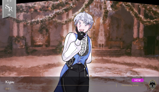
“Okay. Ready as I’ll ever be…! Let’s make this ball a success!”
Set to Home Screen: Are you ready? I’ll wait for you, if you need me to.
Home Transition:
1: Woah… The chandeliers are so bright and sparkly… 12 arms from the bottom bowl, which are four more than the one in the Mirror Chamber, but the top… Ah, sorry!
2: Deuce called me Lady Kiyuu earlier, which really made me happy. I would have worn a pretty dress, but these clothes are a lot warmer and comfier. I think I managed to make myself look feminine either way!
3: Kalim’s really enjoying talking to the attendees. He seems to be getting friendly with everyone, including people from RSA! Must be because he’s familiar with hosting parties.
4: So many attractive people are here… I wonder if I’d be bothering them if I said I wanted to take a picture of them…?
Home, after Login: This ball is really fun! If I lean back on this wall and squint, it just looks like a blur of blue, white, and gold. I think it’s nice that there’s a time these schools can merge like this.
Tap Home:
1: I’m excited to vote for the Belle of the Ball! Huh? Oh, no, I never had any intent to participate. I just enjoy seeing pretty people.
2: Ah, what? Oh, I’m just reviewing my notepad to make sure I’m not forgetting any etiquette. I’m doing perfectly well, so far! I reviewed it before I entered too, but just in case, you know?
3: Oh, no, wait, Grim’s gonna devour the entire table of finger foods at this rate. I’ll be right back!
4: I know I’m supposed to be helping the princes out, but I’m not sure if I’m doing a proper job here… Hm? You think I’m doing pretty well? Mm… Hehe, thanks!
5: It’s a little bit harder than usual to catch the attention of the attendees here since there’s so many people… Well, I guess I just have to find better ways to make my presence known!
Glimmering Soirée is a twst fan event hosted by: @starry-night-rose!!
Groovy Lines: Unlocked
Notes and stuff under cut!!
Groovy art coming soon!! maybe. hopefully. i have the sketch done so hopefully i can finish lol. I slightly tried imitating the twst shading style, but idk.
I searched up men’s victorian era clothing and ended w making this design. few obvious design changes in the end (color) result, mostly the gloves.
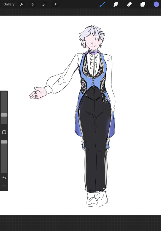
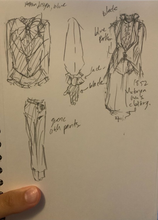
Here’s the pic without the SR thing! And the sneak peak for the groovy (which i rlly tryharded on so maybe i should’ve listed it as an ssr but whatevs i’ll leave that to my friend + ryoko because ryoko deserves that ssr title)
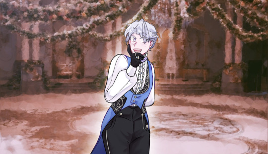
And tag list for my friend who rlly wanted to be tagged in Kiyuu stuff (if you wanted be added, just tell me!!): @kathxrat-01
#skribleedoodlz#twst stuff#twst kiyuu#glimmering soirée#I had a lot of fun drawing her!!!!#rendering the buttons and the silver stuff were so hard tho..#metal……#EITHER WAY SUPER FUN#cant wait to finish the groovy!!!#WILL include ryoko btw because i adore ryoko#and they come in a set they are THE ramshackle duo#would love to add grim in the bg too.#possibly tho i’d have to add to the sketch#twisted wonderland#twst#twst oc#twst yuu#skribleeoc#twst fan event
74 notes
·
View notes
Note
LITA MAY LITA MAY LITA MAY
Ok ok so I have like a bunch of questions feel free to ignore BUT
I) she has a tail. Is that a Kraang feature or do all the turtles in your universe have tails and hers is just extended?
II) Uh pink? Pink like Kraang? Did she choose her life colors, or???
III) Is. Is she. Is she autistic too
IV) Draxum-Hamato sooooo what does she call them? Did they argue about nicknames? Also was it Donnie’s choice to include Draxum’s name as well
V) Lita in the comics???
VI) Is there a reason her shell isn’t smooth like Donnie’s?
VII) What does she call Renet?
VIII) Ninpo question mark?
IX) Pupils! I love the way you draw her pupils. Is there a reason or is it just fun
X) Does she have a certain resistance to Kraang mind digging? Like that thing they did to interrogate Raph in the movie? To read his memories?
XI) So the cloak/scarf thing is Leo, the purple accents and stripes are Donnie, and the kneepads are Mikey. Any Raph references in her clothes?
Apologies if you’ve answered these before and I just didn’t see them! Have a good day and give Lita one too for goodness sakes girl’s had it rough already
1. It’s more of a Krang feature. I do love when the turtles are drawn with tails, but I didn’t do it from the beginning, and so for consistency sake in the EW universe I’ve held off. Maybe one day I’ll just say “fuck it” and give into the urge to give them all cute little tails. But even if I did, Lita’s would be much longer than any of the family’s (except Raph’s hypothetical tail lol).
2. Lita being albino and pink in the IDW comics pretty much made that Krang connection for me lol. I didn’t have to reach too hard with her design. She leans into it.
3. I have her personality very close to Leo’s canon personality, so she’s more on the ADHD side. She does have some sensory issues with sound, which a lot of ppl with adhd have (👋🏻). But being raised around the quiet and solemn Time Masters Sanctum it’s like really noticeable. When she visits the family, it can be very overwhelming, but rather than shutting down, she gets insanely riled up and can’t contain herself. It works though—everyone is more than happy to let her ramble on.
4. She never met either of them but Splinter of course would’ve been Jiji and Draxum would’ve been just Grandfather. Nothing too out of this world lol. And yes, Donnie chooses to embrace Draxum’s name.
5. Sorry idk what exactly this is asking. Like yes? Lita May is based off IDW Lita, from the comics 😅 sorry if I’m missing the question.
6. She is a spiny soft shell like Donnie, but yes, her spines are significantly more pronounced, thanks to, you guessed it!
7. Master Renet, or Aunty Ren in a more causal setting.
8. 🤫 we’ll see (I’m still trying to think of something cool and not too OP lol)
9. Her eyes are just for design fun, and to link her to Donnie some more!
10. That’s gonna be another big 🤫, but less because I haven’t decided and more just for the big spoilers! 😜
11. She’s kinda got two outfits atm and I think I might end up merging the two. Her simpler outfit of just her wraps and mask are very Raph coded, so I wanna figure out some sort of middle ground with the two.
#rottmnt#rise of the tmnt#rottmnt doomed future#rise of the teenage mutant ninja turtles#baby mayday#rottmnt separated au#separated au#Sep!au infodump#sep!au doomed future#ask slushie#rise Lita
143 notes
·
View notes
Text
My !!!! Opinions <333 on the cast
1. Ragatha (the lesbian ever lol)
OBSESSED WITH HER
she's brainwormed into my head she's spinning in it
2. Jax
obsessed with him he is so iconic I love his devious sadistic streak, he's comedic with it
3. Zooble !!!!! THEY'RE SO COOL AND SWAG
I love everything about them, I love their chillout
the forced therapist tm setting, I love their way of being, their body and issues with body dysmorphia I love their standoffishness
I love !!!!! Them :3
4. Kinger (no opinion)
Cool guy with bugs and a shotgun
Higher than Pomni cause he so silly
5. Pomni (no opinion)
Reminds me of a friendly chiwawa, her eyes go big a lot. Really cute! Gummigoo plotline is really friendly.
The self proclaimed saviour sometimes I guess.
6. Gangle
I really don't like how much she's trying to mask, and how much she's trying to force a smile on her face?
I understand her character, but she really does remind me of Pinkie pie in that episode a lot.
I understand it's not really what she feels, but she's sort of pathetic.
And that's coming from.
Me.
The ending made me uncomfortable.
I want to give her a hug, but for the first time in... forever I understand what pity feels like.
Gummigoo: I LOVE HIM MY BOY!!! 10/10
Princess something pink cutiepie: 10/10 I ship her with Ragatha, they need to kiss
Ghost of the mansion girlie: 10/10 I ship her with Ragatha, they need to kiss
The gloinky Queen: 10/10 I ship her with Ragatha, they need to kiss
I have the last 3 humanised in an au btw,
I think Ragatha needa to have three side stories dedicated to dating these three specifically.
The Gloinky Queen gives like.
Old fat lady with six kids and lots of face.
Dunno whether to call it acne just like. those bubbles or so, maybe darker skintone.
left by husband etc.
Since she's rll colorful in digital circus maybe she should have like, a reallyyyy colorful rainbow puddle carrying bag or so?
That she's bought once and like, really loves that Ragatha notices.
I just need my girlie Raggs in a hoodie and with a bow and a ponytail and maybe sportswear on her merry way to date some ladies what is so hard to understand ????????
I think in a human au Jax would like, put a bug in someone's drink 😭🙏
at least once.
he's way more chill since they keep him non-violent via torment forces <3333
I need Zooble on a scooter
like the thing that looks like a skateboard with a stick in front on top of which there is two handles you hold and push forwards.
later a motorcycle.
I need Kinger in a garden
I need Queenie making him tea, and them reading under a tree.
I need Pomni taking her dog out to a park.
I.... gangle sigh.
I hate her, but she can be....... doing manga I guess.
on some off-day from work she's got, with lots of ideas pinned to a pinboard.
and stories she's carefully crafted in her head over the years.
smiling, because she gets to at least start.
and everytime she goes outside she pretends she is fine and has a mask on her face or so
#tadc#the amazing digital circus#tadc ragatha#tadc kinger#tadc gangle#tadc jax#tadc pomni#tadc fandom#tadc gummigoo#tadc gloinks#tadc gloink queen#tadc princess loolilalu#tadc queenie#tadc ep 4#tadc thoughts#tadc loolilalu#tadc ship#tadc zooble#tadc martha#??? is that what the ghost lady is called i dont remember her name guys help ToT#ragatha x gloink queen#ragatha#ragatha x loolilalu#ragatha x martha#martha mildenhall#ragatha x martha mildenhall#tadc martha mildenhall
28 notes
·
View notes
Text
i watched sonic movie 3 today (finally)
here is my thoughts about it (under the cut (SPOILERS!! (i made the names colorful so it won't be boring much (bad grammar, obvi))))
-----
(here after the cut (not related)) (no spoilers here!)
there was 2 women sitting next to me in cinema and they had a shadow plushie it was the cutest thing ever ><
and i got biolizard lego set, he is such a cutie (my finger tips hurt lol)
it was over all good today, i had fun, i didn't even got mad at bus which is surprising considering the bus was full to the brim and i had to stand up pretty much the whole day (it was so worth it)
i guess i was expecting kinda like sa2, heroes, shadow 05 and shadow generation mixed lore for the movie since they been working on shadow's lore for decades now
but it was alright
i think if they make movies 4 hours instead of 2 they can explain the lore better (yes, i would watch)
i was kinda confused about the whole thing like, how is gerald alive and over 100 years old?? what happened to maria being ill?? shadow is a frickin meteor?! does that mean there is no black arms or does it prove that black arms exist? so there is no deal with black doom? will rouge ever be part of the movies? i mean if she does, she missed her role of reminding shadow of maria and make him doubt himself, there is not really a point of team dark now in my opinion (unless sonic heroes type of thing happen); and i didn't really understand the point of maria tbh, in games its like, oh she was ill gerald took her to space to treat her and low gravity made her illness slower and created shadow to heal her, but since her illness isn't mentioned yet, what would be shadow's purpose tho? is it to make power for GUN? like why did they kept him? and why maria lives on earth and not in space? and why the hell is gerald is bad guy now? i thought he tried to help people, what happened now? i never seen him good once in the movie not once, he was selfish and had an ego, he is just like eggman now and i hate it
---
but if we forget about games and every shadow related thing ever made out there, yeah its a good movie, it still is good even though the lore is confusing
i really think making movies longer will be better cuz like this, too much is going on and i can't catch on
AND WHATS AMY'S POINT NOW?? why now? couldn't you guys bring her sooner?
and im really mad they didn't shoot maria and instead blowed up the lab, idc if there are kids here i want shadow's canon event to be same in every alternative universe
but... it was over all good, i really liked chaos :3 and shadow's scenes, especially sonic's and shadow's scene
20 notes
·
View notes
Text
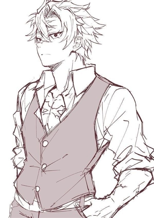
Bring your child to work day・*.:+
Sanemi AU x GN! Reader DRABBLE!
S/n = sons name
I started writing this story back in nov 2022 I abandoned it and came back to it March 2023 erased the ending and rushed it so sorry if this isn’t up to par I’m just trying to get this out of my drafts lol. Now a few pointers
★ Sanemi is OOC I just think that it would be really cute to picture him in this sorta dynamic.
★I tried to keep it gender neutral as possible this is also my first time writing a gn story so feel free to give me any possible feedback
★also as I always say this isn’t proof read AT ALL!! so there might be a ton of grammatical errors idrc HAPPY READING
There are only 3 characters who are color coded
Y/n sanemi and s/n
“Are you sure you’ll be fine taking him with you I mean he’s only 4, He won’t be too much of a distraction for you?”
y/n said while doing their sons hair making his curls pop out a little more.
“He’ll be fine we’re not doing too much in class today anyways” sanemi sighed as he was getting dressed for work. “You’ll be good for daddy right?” y/n asked s/n while looking at him in the mirror. “MMHM” s/n said happily. Y/n was a little nervous at first about this whole ordeal when sanemi brought it up but all the doubt disappeared when y/n saw how giddy their son was to spend time with sanemi this was also the first time their son is going to be around a bunch of people at once, let alone a bunch of teenagers. how will he react? “he’ll be fine plus I’m there if anything does happen, which nothing will so stop worrying, You act like we’re going to war or something” sanemi chuckled as he patted his partners shoulders. “I know I know I guess I’m just a little worried” they sighed “for nothing, we’re gonna head out inna bit I have to get to work early. where is the little guy so I can put his shoes on?” “IM RIGHT HERE DADDY” his son squealed excitedly “LOOK”. sanemi sighed, a soft smile appearing on his face. “your shoes are on the wrong feet you dork c’mere” Y/n packed everything sanemi needed for Haruto in his book bag so he wouldn’t get bored. “are you all set and ready to go?” sanemi said while picking his son up into his arms. “Have fun you two” y/n waved at the two before they left.
Sanemi got to class 1 hour early so he could prepare his classroom for the day. students started rolling in and filling in their seats, two of his students ran into his classroom one slapping the other repeatedly. “INOSUKE STOP HITTING TANJIRO FOR THE LAST TIME I WILL NOT REPEAT MYSELF” Inosuke gruffed as he plopped into his desk. “hey sir, who is that child sitting in your chair? if you don’t mind me asking” Tanjiro asked pointing to the child as his classmates started to quiet down since they all wanted an explanation. “He’s my son. I decided to bring him in with me today he won’t be too much of a distraction” sanemi said as he started gathering all of the papers on his desk into a neat pile. The class all became strangely quiet so he looked up to see what was wrong “yes?” He said as he quirked his eyebrow. “YOU HAVE A CHILD??” they all yelled in Unison. “FORGET ABOUT THE CHILD YOU’RE MARRIED??” Zenitsu yelled freaking out. “Is that a problem?” sanemi started to get angry. “I just feel bad for the sorry sack who decided to tie the knot with you” Inosuke said bluntly. Sanemi threw an eraser at the boys forehead. “Before we get started on today’s plan how about I let him introduce himself to you all” just before the boy was about to speak everyone zoomed in on him making him feel so small, he hid behind his daddies leg. “it’s okay remember how we practiced in the car do it exactly like that okay don’t be shy” sanemi said as he pushed him up front, everyone weirded out about how soft he got for a sec-. “h-hello my name is s/n and I’m 4 years old” he showed everyone on his fingers. All of the girls in the classroom started cooing at the young boy. “AWWW HES SO CUTE” they shouted. “thank you” s/n said blushing at his shoes, he ran back to his dad and hugged him. “You did good, now go sit down for a little bit alright daddy has to do his job okay” “okay” s/n said shyly as he ran back to sanemi’s seat.
The rest of the day went smoothly as s/n opened up throughout the day and became more talkative. During passing periods Haruto would run to the other teachers classrooms to greet them. He ran up to the first classroom and walked in. “Uhhhh mr Iguro Theres a Child standing in the door way” one of his students said confused. Iguro was about to tell the child off before he raised his eyebrows in confusion. “s/n?? What are you doing here?” “I’m with daddy today he let me come to work with him today” he basically shouted happily “I see, well im in the middle of teaching right now how about you come back later okay? “Okay see you later” on his way back to his fathers class he stopped by Uzui’s class, they were all circled around a bowl of fruit quietly drawing it on their own. “I LOVE DRAWING CAN I DRAW TOO?!” The entire class was startled by the broken silence. “s/n??, What are you doing here kid? And what a flashy way of entering a room” Tengen said smiling at the kid ear to ear “I’m here with daddy” “of course you are but where is he? “In his classroom” “well I’m kinda in the middle of a class kiddo so how about you run back to your father and I’ll catch up with you later, how does that sound” “OKAY BYE BYE” just as he was about to run off again sanemi scooped him up “there ya are punk, you can’t go running off like that especially not at my job,what if principle Ubuyashiki caught you before I did huh?” “Sorry daddy I went to go see uncle Oguro” “let’s go eat lunch y/n packed you something delicious” sanemi said “YAYYYY”.
overall he enjoyed being at work with his father and seeing what he did daily. Some of the kids would chat with him which he loved of course and even colored with him. The class fell in love with him very much only knowing him for such a short while. I liked today Do you think I can come to work with you tomorrow daddy?” “Of course you can.” Now let’s go home I’m sure y/n can’t wait to hear all about your day today”
©Boul3vvard. ALL RIGHTS RESERVED. SO ANY FORM OF PLAGIARISM OF MY CONTENT WILL NOT BE TOLERATED.
#sanemi drabble#sanemi fluff#demon slayer sanemi#sanemi shinazugawa#sanemi x reader#demon slayer#kimetsu no yaiba sanemi#sanemi x you#hashira x reader#kimetsu sanemi#shinaguzawa genya#kny genya#demon slayer genya#tanjiro kamado#zenitsu agatsuma#demon slayer inosuke#anime edit#anime art
156 notes
·
View notes
Text
Krita tutorial the way I know it.
Basics: What is where.
Gimmicks.
Specific advice on specific tools.
Basics: What is where.

Upon opening the program this is what you're met with. First of all, must comment: The layout is HEAVILY editable so you can just drag menus anywhere you want, even leave them floating amidst the sheet you're drawing on.
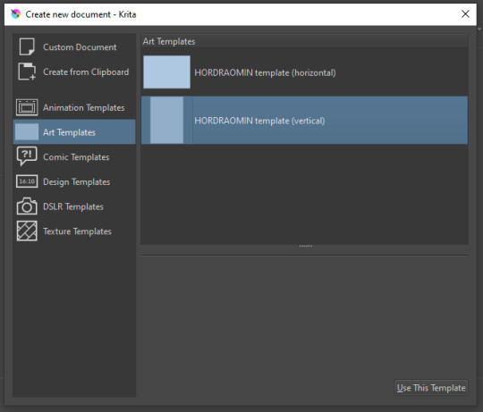
You can create custom art templates, I have two o'mine here as both have my signature background color.
As well, you can edit the custom document settings, as in what size you want it, what resolution, even the initial content of the image. As well you can create from clipboard: Just copy some image from your browser and Krita will recognize it (useful for making meme edits lol).
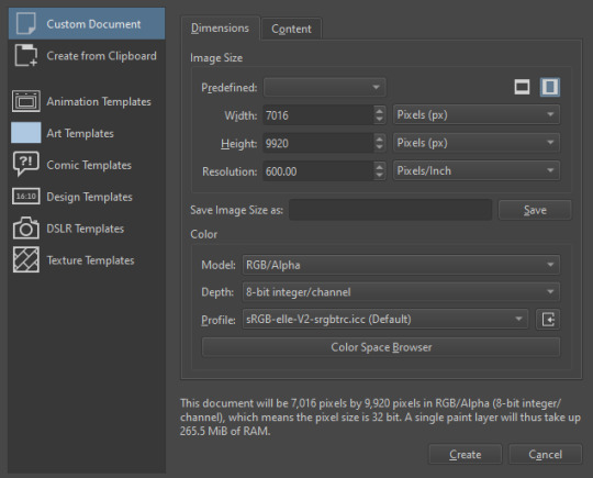

Now, once you have your file, I will show you what is where.
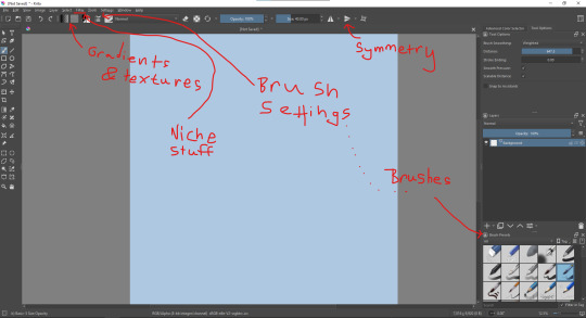
Brushes:
Brushes are easy to edit and there are tons of free bundles to download online. I myself only got one bundle, Jackpack (bit hard to find now due to original source being lost, it is still available but bit tricky to come by).
There. Are. Tons.

Some of these are my custom brushes for calligraphy in neography, you might even guess which ones. You can edit existing brushes, make new ones from the ones you've edited without changing the original, and all sorts of stuff (more below in the third chapter).
There are numerous packages of brushes once you enter Krita, but only one/two are available when you first open it. To unlock them all, click here:
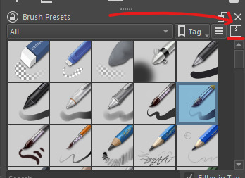
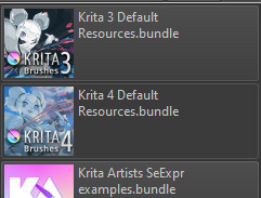
And make sure all bundles are dark gray in color (example of both dark and light below).
Now Tools Options: those will pop up depending on what tool you're using.
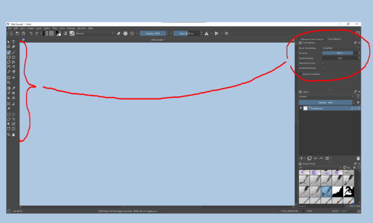
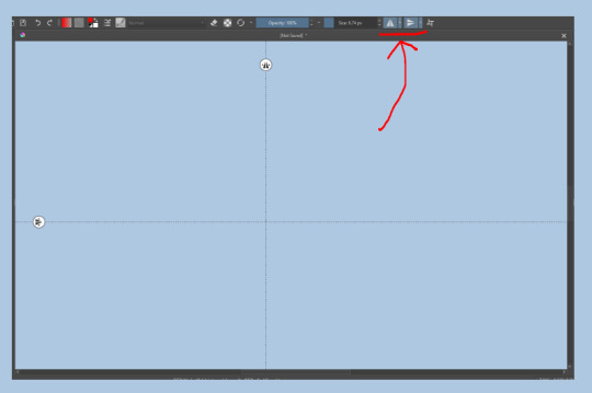
Symmetry: Fun stuff. You can drag the lines depending on how you need them and then center them back to the center of the screen if needed.
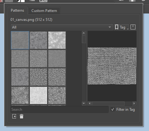
Gradients and Textures also have their tools options, you can play with those to get the feeling what they can do (more in third chapter).

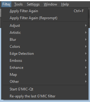
The Filters tab is useful too. Blurring, motion blurring, color mapping, artistic filters and all that: Quite fun.
Gimmicks.
Krita allows you to customize your workspace freely. Floating menus, tabs, anything you want. It has quite many drivers at that-
To access the workspace templates, go to Window and choose Workspace.
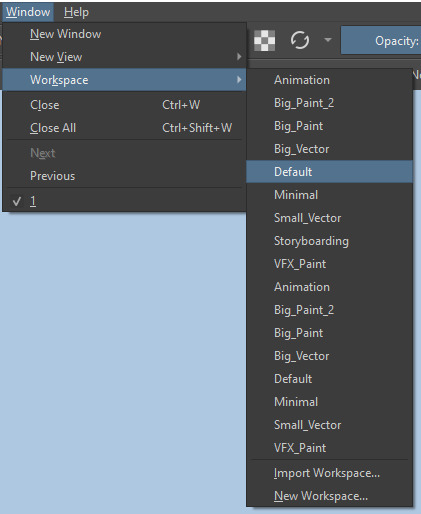
Krita allows for copy-pasting any image onto the sheet. Though, for me it sometimes crashes if I accidentally copy-paste text into it without choosing the Text tool first.
The software allows for both raster and vector work. It is basically Photoshop sharpened to be used by artists primarily.
There are some interesting mechanics regarding the Eraser (default bind E).

You can use it with any brush, allowing for textured erasure/quick work. Good for sketching.
You can use it on gradients (given there's a transparent point on the gradient preset).
There's a Multibrush tool:

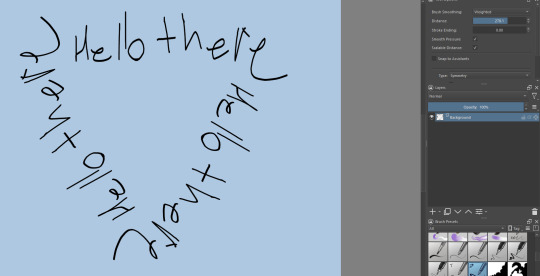
People say Krita is good for animation but my brain can't wrap around it yet honestly @~@.
The keybinds:
B - Brush tool.
E - Erase tool option.
M - Mirror (useful for checking accuracy from a new angle).
Ctrl - Color pick (when used with brush or other color-using tools).
Shift+L.Mouse+drag - Changes the size of the brush by dragging left and right.
Ctrl+E - Merge layer with the one below.
Ctrl+G - Group selected layers.
Ctrl+A - Select whole sheet.
Ctrl+Shift+A - Deselect everything.
F - Bucket tool.
G - Gradient tool.
Ctrl+S - Save document.
Ctrl+Shift+S - Save As document.
Ctrl+N - New document.
Ctrl+O - Open document (will be seen in a new tab on top of the sheet).
Ctrl+C - Copy selected layer or selection.
Ctrl+X - Cut selected layer or selection.
Ctrl+V - Paste copied/cut layer or selection.
Q - Multibrush tool.
R.Mouse - Interesting thing: Opens up a quick selector for brushes and colors you've already used in the piece.
1 - Zoom 100%.
2 - Zoom to fit the piece vertically.
3 - Zoom to fit the piece horizontally.
4, 5, 6 - Turn 15 degrees (4 and 6) or undo the turning whatsoever (5).
Ctrl+I - Negative filter applied to layer.
Ctrl+U - Color editing on the layer.
Ctrl+Y - Soft proofing mode (for color mistakes and stuff like that, mostly annoying for me tbh).
Ctrl+T - Transform selection/layer.
Ctrl+R - Square select tool.
Ctrl+J - Lasso select tool.
Honestly you can just hover your mouse over tools and see their shortcut binds, as well. Or edit them in Settings.
Specific advice on specific tools.
Brush:
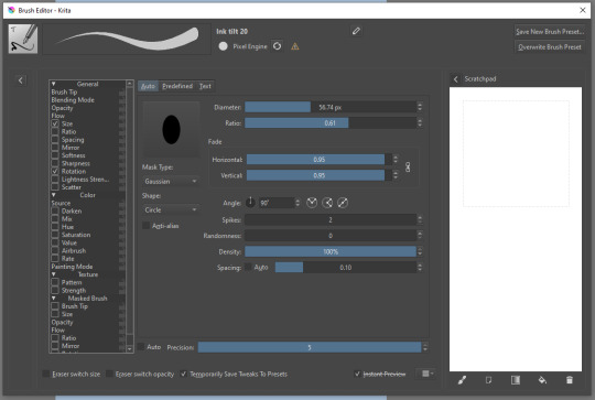
Brush editor is a great tool for making custom brushes, and it even has a sratchpad to test them out. Lots of settings, but no need to be afraid; Most of them you might never use on purpose.
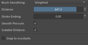
Use Brush Smoothing for great and pretty lines in lining pieces or making calligraphy.
Gradient:
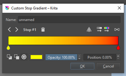
The four icons to the right top are:
Mirror gradient.
Arrange by lightness value.
Arrange by color value.
Space the stops evenly.
Click the gradient to add a new stop. The three things to the left are:
Make the stop use Primary Color.
Make the stop use Secondary Color.
Make the stop use a fixed color.
305 notes
·
View notes