#so the old designs were kinda ugly lol
Explore tagged Tumblr posts
Text

Doing some fantasy designs for a personal project. I really like drawing these, maybe I should do proper drawings for them (these are old already.)
#original art#original character#Actually these are remakes of old ocs I had#I made them when I was like... 15 or smthing#so the old designs were kinda ugly lol#the brunette guy is my fave#His name is Lucian!
288 notes
·
View notes
Text
homecoming crush
platonic! bertholdt x annie, RBA, slight hitchannie but isn’t the main focus, bertholdt kinda has a romantic partner (you can imagine it as you 🤭) but it’s not the main focus
modern au, high school au, crackfic but not really, annie has comphet, bertholdt is jokingly using the phrase ‘ur so in there’ not seriously lol, also im not a lesbian so im sorry if this isn’t totally accurate to the experience for queer women 😭, i just feel that annie would have romantic feelings for women lol
a/n - i sent this idea to another blog before and just now writing it so if that blog sees this randomly, hi 👋🏽 im the anon who sent you this scenario heehee

The air feels so much more crisp after a school event.
Football games, school dances, morning of a field trip.
Annie can’t find the reason why she came here. She feels awkward in the dress she’s wearing and she’s not even wearing the right shoes. She didn’t even know there were designated shoes for certain outfits until Pieck told her she looked like the protagonist of an old Disney channel show from 2008. All jokes of course.
Annie never lets it get to her. But right now, she is a 16 years old girl in a dress too tight around her growing body and in her old dirtied tennis shoes she wears everyday. Never has it ever occurred to her that looking like an old Disney channel star was a bad thing. Annie has never felt ugly, or pretty for that matter, in her life until now. And it is the most excruciating thing she has ever experienced. Ugly doesn’t even begin to describe how she feels. The eyes of her peers she never cared about are all of a sudden all on her and suddenly she has every reason to care about them now. Her hair is in a low bun and the only makeup she has on is lip balm.
It is homecoming night. The gymnasium has been turned into a starry night in Paris. Armin Arlert had been stressed about it the weeks leading up to the dance. Complaining to Mikasa in their shared history class how it seems like no one apart of the leadership committee actually wants to stick to the theme this year. Annie just felt stressed out listening to him. Perhaps this is the reason why Annie said yes to him when he had asked her to be his date for homecoming, perhaps this is the reason why she’s even in the old sweaty gym anyways outside of school hours.
She wasn’t planning to go. School events weren’t really her scene. But Armin, sweet old Armin who is practically a parents wet dream, needed a date. He practically deserved this just for somehow turning the old sweaty, stinky gymnasium into a romantic Parisian night sky. Who was she to say no? Armin was already on his way to earning the class presidency and later in life, he’ll probably earn the real thing. Compared to herself, quiet, drawn into the background, made to be forgotten - Armin could possibly be the best thing for her. When he asked her out to be his homecoming date, she tried to imagine a life with him, that this date would go really well and they’ll be boyfriend-girlfriend, high school sweethearts. They’d go off to different colleges, maybe go through a weird separation, but eventually find their ways back to each other, get married, have a few kids, grow old together - the whole shindig. The key word is tried though, she tried to think about it working; something in her can’t bring herself to even muster an image of it.
Dread stirs inside her as she realizes she might’ve been stood up. Well, technically she wasn’t, as she did arrive to the event with Armin in hand. But he was nowhere to be found, as he was running around trying to prevent his perfect homecoming dance turning into a disaster. Not only does she feel ugly, but now she feels embarrassed by the fact that she came to this stupid dance for no real reason. She could’ve said no and it wouldn’t have made any difference. She should’ve realized it beforehand. Of course the head of leadership would be busy at a school dance he was in charge of. She wants to cry, she feels stupid about it. It’s so stupid how badly she wants to cry right now. This stupid insignificant dance has done emotional damage to her own being.
Annie’s never felt this alone in her life. Some stupid song is playing and people are moshing around the star football player Reiner Braun as they lift him into the air, or as she knows him, the guy who she used to beat up when they were kids. She watches from a distance, twinges of nostalgia tugging at her heart at the sight of her old friend being celebrated for once in his life. She knew how his home life was and he knew how hers was; they have virtually nothing in common except not liking their home lives. But hey, at least Reiner Braun is dancing tonight and Annie Leonhart is in the corner.
Hitch from her Math class is there too. She’s jumping and shouting with the rest of the crowd, celebrating her old friend. She has her heels in her right hand and she has this big smile on her face and doesn’t feel embarrassed about taking a high school dance this serious, probably from the booze or probably because she’s still in high school, or probably because she didn’t have a bad home life holding her back. I bet Hitch doesn’t feel ugly, Annie thinks.
She can’t feel ugly looking like how she looks right now, at this moment; under the fake starry lights in fake sweaty gym Paris, her gums are showing as she smiles this big toothy smile and her eyes are crinkled like crescent moons, and the baby pink of her dress just further extenuates her whole entire being; this is what beauty is, Annie thinks - a girl laughing and dancing.
Hitch catches Annie staring at her, and her smile just gets even wider as she keeps her eyes on the quiet girl from her math class. Annie returns her eyes and just continues to watch her dance, and she feels a little awkward about it but it sure does beat watching Armin and Jean trying to keep the cardboard Eiffel Tower upright.
Annie doesn’t know much about Hitch. All she knows about her are all the observations she’s made while sitting behind her in Math this school year. How she’s often scolded and told that this isn’t a beauty salon every time she reapplies her lip combo, and how she still continues to do whatever she pleases, how she always has ‘tea to spill’ as she calls it to Mina (Annie secretly listens), how she always plays games on her laptop instead of taking notes, and how she often smiles at Annie when she catches her glance in the hallway, and even if they never talked outside of math class, their conversations being limited to geometry, she still thinks to smile at her, pulling at Annie’s heart, and that’s gotta mean something.
Oh god.
Annie can feel her heart in her throat.
She runs to the nearest exit for a breath of fresh air but instead, runs into a slightly disheveled Bertholdt as he’s trying to hide the fact that he’s been doing nothing but smoke and wait for a drunk Reiner to be done so he can finally go home.
Bertholdt is a bit frightened by Annie’s abrupt appearance, hiding his cigarette in the process thinking Annie was going to be a staff member.
“You scared me!” Bertholdt sits back down against the hood of his dad’s car.
Annie calms down at the sight of her childhood friend. Bertholdt hiding outside makes her feel less bad about her hiding in the corner while their childhood friend gets all the glory. At least they’re both losers.
Annie doesn’t say anything to Bertholdt but goes and sits with him.
“Can I get a cigarette?”
Bertholdt looks at Annie a little surprised. He carefully takes out a cigarette for her, making sure to not mess up the formation, and gives it to her.
Annie puts the cigarette in between her lips, not taking her eyes off the double doors separating her and Hitch.
“Light.”
Bertholdt takes out a candle lighter out of his pocket to light Annie’s cigarette, Annie looks down at the enormous lighter and looks to Bertholdt for an explanation.
“Sorry,” he says while trying to fit the candle lighter into the pocket of his suit, “I’ve been outside this whole time and my lighter ran out of fluid.”
“I’m so fucked Bertholdt.” Annie says, her eyes solemnly closing for a moment. “I’m so insanely fucked.” her sad cerulean eyes open back up, looking at those dreadful double gym doors again.
Bertholdt’s eyebrows furrow in worry. This isn’t the Annie he knows, the Annie who he’s known since they were 7, the Annie who can only express herself through labored sighs and punching Reiner, the Annie who he hasn’t had a proper conversation with since the summer and has made it her lifeline mission to completely ignore the two boys who’s she somehow manages to create a meaningful friendship with. What could fuck up the Annie Leonhardt, who Bertholdt hasn’t even seen angry, let alone sad, let alone happy, this bad to the point where she is expressing her fucked up feelings to an old childhood friend?
Hitch, Hitch from math class is what fucks her up, Hitch and her stupid fucking moshing is what’s fucking Annie up, Hitch and her lip combo, Hitch and her stupid gossip, Hitch and her stupid smile.
“Uhhhh..” Bertholdt doesn’t really know what to say as he starts looking at anything else but Annie, “did Armin do something?” he asks, knowing she went to this dance with Armin in hand. He doesn’t know what else could fuck up her night like this, he hasn’t talked to her in months and he’s desperately looking for answers.
“No. I wish he did.”
“Well what didn’t he do?” Bertholdt still doesn’t know what to say or how to comfort his old friend. He’s literally searching up on his phone how to comfort an old friend and typing out Reddit right afterwards because he doesn’t have the time to read PsychologyToday.com’s whole ass article.
“He did nothing.”
“I’m sorr-“
“He literally did nothing. He was just running around trying to make sure that the fucking lights didn’t go out and the speakers wouldn’t malfunction. As soon as we came into the gym, he’s running right to Jean fucking Kierstein to lecture him about whatever the fuck those leadership nerds even worry about.” Annie is starting to shake and tear up a bit. Bertholdt awkwardly places his large hand on her shoulder, literally doesn’t even try to soothe her, just places his hand on her shoulder.
“I feel so fucking stupid. I don’t even know why I said yes to go to this dance with him just so he can run around doing whatever the fuck he’s doing. I don’t even know him like that.” Annie holds her head in her hands, knowing damn well it isn’t Armin turning her into a crying mess.
“All I did was stand in the fucking corner while the ‘star quarterback’ Reiner Braun was having the time of his life.” Annie is just now finding things to be mad at, trying her hardest to avoid these feelings she can’t possibly be having right now. She knows she’s not mad at Reiner or even Armin, but that foreign ache in heart is trying to find someone to blame.
“Is it Reiner you’re upset about?” Bertholdt softly asks.
Annie doesn’t respond as she quietly cries into her hands.
“I get how you feel. I know me, you and Reiner haven’t been close friends since freshmen year but I really did miss when we were all close. Now all I talk to is Reiner. Sometimes it feels like I don’t even know Reiner.” Bertholdt mindlessly says, his thoughts drifting back to when it was just them three, unburdened by the possibility of becoming strangers, old stories to tell their future children about. He starts to ponder about the old days, when the three of them were still kids and had all the time for each other. Now, Reiner is being celebrated for the star athlete he is and the pasts of his childhood is outside, smoking fakedeep cigarettes and talking about their feelings. It’s gayer than Annie.
“But honestly,” he starts to confess, “I don’t think Reiner really knows me either. And Annie,” his eyes flicker to her, “i don’t think I even know you, Annie. We haven’t talked in a while.” Bertholdt said without thinking, the words slipping out as if they’ve been waiting for the perfect moment. Deep inside he knows they’re outgrowing each other; he knows that the versions of Reiner and Annie who would spend weekly nights at his house whenever their parents became too much to deal with are long gone. The versions of themselves who knew each others deepest secrets and the most embarrassing, the versions of themselves that they’ve only given permission to each other to see; the versions of themselves they’re not sure other people would ever get the pleasure to witness.
And yet, Annie and Reiner weren’t the only ones who’ve changed over the years, meek and timid Bertholdt has changed as well. And he at least has the courage to try and keep this lifelong friendship lifelong. He owes it not to just himself but to them. He knows what they have is special, a bond that transcends lifetimes and he wants to keep it that way.
“I mean the new and growing and developed Annie! I’d love to get to know new Annie!” Bertholdt frantically explains just in case Annie understood what he said the wrong way.
“It’s not Reiner, or even Armin, it’s Hitch.” Annie admits, her voice heavy trying to move past her throat, leaving a guttural admission; Annie hasn’t fully comprehended what Bertholdt was trying to say but it made her feel comfortable enough to show Bertholdt who she really is, what she’s realized tonight.
“Dreyse?”
“Yeah.” Annie sighs.
“Well what about Hitch-”
“I like girls, Bertholdt.” Annie finally spits it out. These foreign feelings that slowly crept up to her just from seeing Hitch Dreyse dance has manifested into this very moment, where she’s quite literally sobbing into the palms of her hands because she thinks it’s the worse thing in the world - to love a woman and to be loved by a woman. Tears only rush out once more once she realizes it feels so right, that it’s something she could actually dream about, something that’s so natural to her.
Bertholdt doesn’t know what to say. He isn’t really equipped to deal with situations like this. Now he’s searching up on Reddit how to react when your former friend comes out to you. But school Wi-Fi always sucks, and Reddit isn’t loading. So he says the next the best thing.
“I mean, I like girls too.” Bertholdt admits like it’s wrong for him to like women. He’s a bit shy about it as he bashfully rubs the back of his head thinking about a certain girl he’s been texting back and forth for the whole entirety of the dance he’s been outside.
Annie looks up at him, a little sick from the cigarette smell in the palm of her hand and her light eyebrows furrowed while her eyes widened in awe of Bertholdt’s awkwardness.
“You’re so brave Bertholdt.” Annie says sarcastically and chuckles softly, a light smile gracing her lips.
Bertholdt returns her smile, his nerves relieved as he suspected his friend felt better.
“Me and Reiner were gonna go get some burgers after this. You wanna join us? We can talk about girls together?” Bertholdt places his large hand behind his even bigger head, rubbing the back of his head bashfully.
“Please,” Annie doesn’t mean for it to sound desperate, but she’s just now realizing how hungry she is and she misses her two only friends.
Bertholdt’s lips curl into a small smile, subtly changing the subject just so Annie won’t feel too bad, “Yeah, now we’ll have to wait on Reiner’s fat ass, you know how he is.”
Annie scoffs, “don’t get me started, he was crowd surfing when I was in there. I’m not sure how they could even hold his fat ass up.”
Bertholdt lets out a calming laugh.
For a moment, they sit in a comfortable silence. The night air feels cooler now, less suffocating, full of hope and wonder similar to the morning air of a field trip.
“Thanks, Bertl,” Annie says suddenly, her voice calmer than he’s ever heard it.
He looks at her, surprised, “For what?”
She wants to say some corny shit like ‘for accepting her,’ but Annie has expressed herself far too much than she would like too tonight.
“For being here,” she says like it’s second nature, her gaze still fixed on those damned double doors. “and for staying outside with me while Reiner gets all the glory.”
Bertholdt looks back at up, “Yeah, well he’s deserved it.” He praised his best friend, compensating for calling him a fat ass a few minutes prior.
“At least we’re losers together.”
“Holy shit, is it fucking hot in there!” Reiner comes rushing out like he’s escaped hellfire, huffing and puffing as he put his hands on his knees.
“Finally, it took you long enough,” Bertholdt stands up, going up to Reiner to pat him on the back. “Come on, we’re starving.”
“We’re?” Reiner looks up to find the we’re in question and finds Annie awkwardly looking back at him, a little frightened from his sudden appearance and intrusion of her little moment of vulnerability. Reiner notices her eyes a little worn out, like she’s been crying. He doesn’t say anything. He’s just glad she was here with them.
“Oh hi Annie,” he cheeses at her, “you’re coming with us?” he questioned, hoping for a yes.
“Yup,” she gets off from the hood of Bertholdt’s dad’s car, and makes her way towards her designated seat she used to always sit in (behind the passenger seat). Reiner and Bertholdt follow her.
Bertholdt begins to play the static noise he calls music and Reiner tries to change it but Bertholdt keeps his foot down about how it’s his car, his music. Reiner offers to pay for gas and Bertholdt complies, but as soon as Reiner plays ‘Better Now’ by Post Malone, he immediately revokes his radio rights, even passing on free gas. Annie would rather listen to the static noise Bertholdt calls music than Top 40.
She casts one last look at the double doors from the back of her window, and she solemnly thinks about Hitch and her stupid smile, Hitch and her stupid lip combo, Hitch and her stupid dancing. Annie still doesn’t know what to do with all of her feelings. But for now, eating burgers with her two childhood best friends and talking about girls together will have to do.
And somehow, that’s more than enough.

“I don’t know man, I think I really have a shot with Historia. Even Ymir thinks so.” Reiner says to Bertholdt. He’s eating Annie’s leftover fries she never finishes as Bertholdt and Annie give each other a knowing look. A look that doesn’t know whether they should let Reiner know that Historia is a girl kisser.
Ymir and Bertholdt are a lot closer than some people think, and there’s only a few lesbians in this whole entire school for Annie to flock to so she keeps her options known.
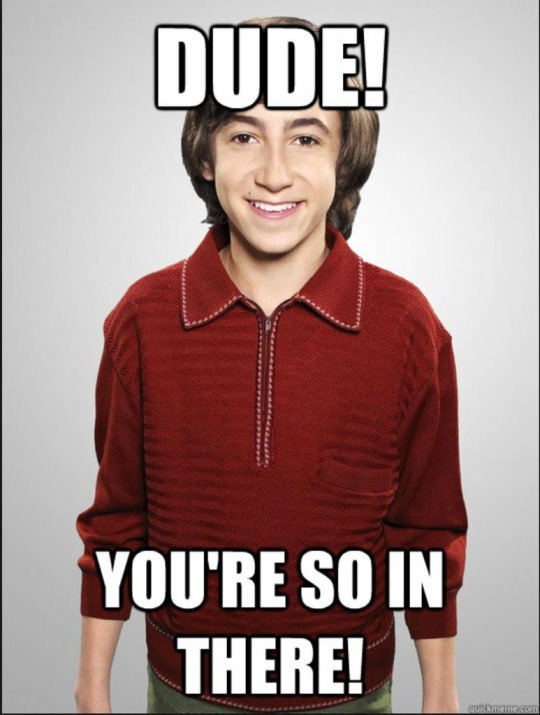
“You’re so in there, dude.” Bertholdt chides Reiner, not wanting to out Historia while also attempting to encourage his best friend. He’ll ponder whether this is fucked up or not later when he’s about to go to sleep.
“What about you, with your little thing going on with that 53 year old man?”
Annie lets out an unexpected laugh that would originally be a huff through her nose in the last, not even letting Reiner know she thought he was funny at times. Reiner looks at her, a surprised smile on his face.
“Shut up,” Bertholdt retorts, “53 year old man or not, I’m still in it.” He jokes, looking down at the goodnight text from the girl he’s been talking to the whole night. His eyes glint in love, sending her a goodnight text back.
“Yeah, me too.” Annie says sheepishly, a bit embarrassed.
Reiner looks to her laughing a bit, smiling as this is the first time he’s ever seen Annie embarrassed. “Who’s the lucky boy?”he slightly laughed.
Bertholdt begins to laugh at the mention of a boy.
“Girl actually.” Annie admitted in an elated tone, contrasting her usual deadpan nature.
Bertholdt gave Annie a surprised look, a proud smile decorating his face as he was happy she was more comfortable about who she was.
“Oh? Then who’s the lucky girl?” Reiner has the same smile on his face, not even questioning Annie’s sexuality, like he knew this whole time.
Annie slightly laughs to herself, a big smile painted on her own face, her porcelain skin blushed and warm, “I…was lying, there is no girl,” Annie’s ears perk up at the sound of the door opening, Hitch Dreyse coming in with her own group of friends. That toothy grin is painted onto her face and her curls are starting to unravel out of her bun, her face is flushed from the bottle of booze someone had snuck in and from how much she danced tonight; “Yet.” she finished her sentence.
“Weirdo, weirdo, weirdo,” Reiner jokingly chants at Annie’s lie.
Annie flips him off and shakes her head unseriously, “Shut up dumbass.”
Bertholdt audibly laughs at Reiner and Annie’s bickering, shaking his head in disapproval.
“Oh god you’re so in there, Annie.” he joked, adding his own 2 cents to their banter, already knowing who she was talking about. Reiner and Annie laugh at Bertholdt’s comment.
He missed this; his childhood comes back to him in a burger joint after homecoming, he’s trying to make it poetic but all he can think is how much he’s missed this.
So he takes the long way home when he’s dropping off both Reiner and Annie. They’re in his dad’s old minivan and it smells like the time Reiner threw up in the back seat and all the windows are down. All 3 of them are sharing Reiner’s dying penjamin and Ribs by Lorde is playing. It’s one of those nights where summer creeps back into fall and it’s warm, and the wind feels good against her skin, and their old hometown of Liberio starts to look too good to leave. It’s the way everything starts to look like an oil painting when you’re looking out a car window; with the night sky being the canvas, emphasizing the street lights blending together in warm hues, and the familiar houses they’ve walked/drove past their whole entire lives combines into an array of colors that paints nostalgia. Annie can feel tears in her eyes and it makes her feel free and it’s pathetic but Hitch Dreyse would never feel pathetic and she looked so beautiful tonight and she loves her friends.
Her face begins to warm up as Bertholdt slowly pulled up to her house, driving slower than usual, not wanting this night to end.
“Thanks for the ride.” Annie smiled at both him and Reiner. She left the car, a bit awkward coming down from her high.
“Annie,” Bertholdt called out to her. She looks back, Bertholdt and Reiner’s eyes being red from the dying penjamin. She smiles, just knowing they’re gonna say the stupidest shit she’s ever heard.
“We’re proud of you, Annie.” Bertholdt told her. “Thank you for telling us that you’re gay.” Reiner puts his hands together and bows his head at her.
“Yeah, yeah.” She rolls her eyes at them. She began to walk away.
“Annie!” Bertholdt called out to her one more time, driving up so she can hear him.
Annie looks back once again.
“Don’t be a stranger, okay?”
Annie chuckles lightly, “Okay,” she waves him off, “now go home already freaks.”
Bertholdt and Reiner wave goodbye and Annie sees them drive off. She began to make her way towards her home, entering quietly. It’s close to 12 am and Annie’s glad she wore her dirtied sneakers instead of the “right shoes.” She’s a bit bloated from the burgers and the girl talk, her dress a bit tight and uncomfortable. She looks in the mirror as she got ready for bed, her eyes a bit red and a small smile still decorating her usual stoic features. She’s still a bit high off of Reiner’s pen and she takes in her features.
And for the first time, she feels pretty. Maybe it’s the way the light redness and slight hood in her eyes accentuates the blue in them, maybe it’s the way her aquiline nose hooks so elegantly, maybe it’s the way she feels tonight, maybe it’s the way Hitch smiles at her.
She feels like an old Disney movie protagonist and her arc of loving and accepting herself has come to an end. She’s in bed and she’s looking up at her ceiling, no longer feeling stuck, like she wants the ceiling to crash onto her, and she just thinks about going off to college, getting a job that would be enough, creating a life with Hitch, meeting new people and having weekly dinners with Reiner and Bertholdt. She thinks about adopting children, and loving them to the point where they’ll always feel like this and never have to feel shame.
And Annie takes the first step.
She pulls out her phone, enters the passcode, goes into the Instagram account she forgot about, and she goes to @/hitchdr3yse, the first account that popped up in her search history. She’ll feel embarrassed about it in the morning, but she quickly follows her, watches her story, pausing at a mirror selfie she took of her in her dress, and she almost swipes up to send this message but she decides against it, because than she’ll feel really embarrassed.
But she has no reason to be embarrassed. Because when she hastily sends Hitch a message: hey, I saw you at the dance and I wanted to say you looked really..” she wanted to say beautiful, gorgeous, the light of her life, but than she realizes it may be too creepy so she goes with “you looked really cool. I was wondering if you would wanna hangout sometime?” and when she hits send, she sits up quickly and puts her face warm with blush into her pillow, and screams.
But than she hears the joyful ping of Instagram, matching the smile on her lips when she reads hitch’s text message: ‘OMGGGG YESSSSS!!!!:D’
And Annie likes her message, and tells her she’ll see her in geometry on Monday. She takes a quick screenshot of her text with Hitch, and sends it to the group chat labeled, ‘zaaaa boyzzzzzzzz’ that hasn’t been active since the summer.
She sends the screenshot, and she feels a little shy when Reiner and Bertholdt read it. It instantly receives both hearts from both of them, and she breathes through her nose and lets out a chuckle from their responding text messages.
@/armoredbraun - YEAHHHHH GEDDIT ANNIE RAHHHH ‼️🤝
@/bhoover You’re so in there Annie 😭💪🏽💪🏽

hope you enjoyed!
#annie leonhardt#bertholdt hoover#reiner braun#rba#hitch dreyse#hitchannie#hitch x annie#hitch dreyse x annie leonhardt#annie leonhardt x hitch dreyse#bertholdt hoover x annie leonhardt#annie leonhardt x bertholdt hoover#reiner braun x bertholdt hoover x annie leonhardt#platonic beruani#beruannie#bertholdt x annie#armin x annie#attack on titan#RBA fanfiction#aot fanfiction#aruani#wlw yearning#wlw aot#armin arlert#aot scouts#aot warriors#pieck finger#porco galliard#annie is a certified girl kisser yams told me himself#platonic RBA#bertholdt x reader
18 notes
·
View notes
Text
i never played Concord nor had interest in it but i felt an insatiable drive to redesign all of its characters before the game shut down ever since i saw how absolutely dripless they were


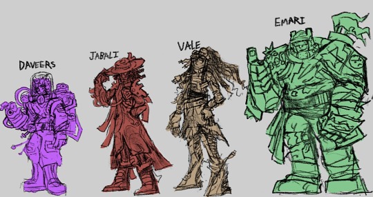

anyways here’s my scuffed ass sketches of the gang. i was originally going to finish these all before the game’s shutdown but i was so stuck on Teo that it took 6 extra days rip me. also i cant draw guns. these are all first drafts so expect them to change a bit if i feel like drawing em again
more info on these designs below (warning i yap a lot)
Itzi (i am not calling her “It-Z” cuz it reads rly weird and i can imagine someone bri’ish calling her “It-Zed” it’s so dumb): Wanted to make her more of a goofy lil gremlin creature, like some combo between a jerboa chameleon and raptor, to make her more appealing and interesting, imagine being shot to death by this silly little scamp. Everyone loves Ivy Deadlock for her gremlin charm so maybe they’d love Itzi too if she had that as well. Her chest has a hole in it containing the weird ball she throws to teleport and shit, because a Concord critique by TBSkyen said that a character’s powers should appear on their physical design or whatever, also to show that she got mutated in a freaky space storm
Bazz: nothing about her reads as “agile deadly knife-throwing assassin”, especially with that annoying puffy bright red coat, she looks completely stupid running around doing backflips with that thing on! So i made it a more sharper mysterious black coat she wears like a cape to give her that sense of shadowy agility like a phantom thief, which she keeps all her carbon steel knives all neatly stored in. Gave her a slight diamond motif on the coat and the glasses because it felt elegant and sharp. Thought her hairstyle kinda fucked hard so i kept it but made it a bit more pointier and added a little stylish side swoop.
Lennox: i actually love this guy’s voice acting and the slightly manic goofy personality it had but his design did NOT fit the voice, so fuck it im making him even more of a lizard man than they were trying to do. His self-healing ability is him shedding a bit of skin after it took damage, and his “splodey knife” is probably a back scale spine he yoinks out of his back that can explode because it’s a biological property of his species for some reason. I do not know what clothes to give him
Lark: Discarded all semblance of a humanoid silhouette to make them even more of a weird mushroomy alien. I don’t really have much to say but i can easily see them slithering around like an octopus on land but faster. Their gun would look way more like some organic fungal creation
Haymar: not much changes here but i wanted to make her more mystic and “wizardy”. The “fireballs” she uses as her main ammo are now a floating bead necklace rotating around her neck (kinda like that zen robot from overwatch) and her clothes now have more of a slight flame motif, along with more of a mystic vibe. Got rid of those ugly ass mustard sneakers too of course
Daw: gave him more turtle motifs to match his “turtle-esque” gameplay style by giving him a protective hoodie and turning his “healing pad” pack into a bulky turtleshell backpack (he’s also wearing a turtleneck sweater shirt underneath the coat lol). His coat is somewhat translucent like shiny plastic cuz i thought it would look neat, tried to ditch the goofy-ass jumpsuit thing he had by giving him a belt to separate shirt and pants. Not too sure if i made him appear enough as a medic as that’s his main thing, the coat and gloves could probably help but idk, but i adjusted his personality presentation to be more easygoing and warmhearted with the closed-eyes so maybe that could give a healer energy.
Duchess: old ladies who know how to kick ass are rly cool. her whole thing’s making walls and constructs out of this golden gooey energy but nothing in her design tells you about that, so i decided to give her a cape/cloak made of that same golden essence so that it’s more apparent on what she can use it for, it also makes her appear more like royalty which was prolly what they were going for. Kept the haircut cuz that beehive thing was very goofy but it fits the vibe of everything else
Roka: she looked like a blowup sexdoll version of Master Chief which is… very cursed, and it tells nothing about her being able to fly around and stomp on people, so i made her bug themed! She’s like a cross between a wasp and dragonfly, the bulletproof wings are rocket-powered and can fully rotate the other direction to give her a forward boost of momentum to stomp people with her slightly more exaggerated boots, they also neatly fold away when she’s not flying. She’s rockin’ that tokusatsu hero look, it gives her a lot more energy to her personality.
Daveers: hated drawing them and i feel unsatisfied but i do like what ideas i had for them. Gave them more of a “sketchy mad scientist” vibe and personality with a shit-eating grin and all that, also tried to give them a “test tube contraption” thing going on by having their helmet be entirely glass and there being tubes and bottles all over their baggy jumpsuit full of poisons and chemicals. Gave them a spray-can backpack that stores all their toxic sludge tho im not too sure if it fits the rest of them or not… whatever. Tried giving them a chemical burn mark on one half of their face but it’s blending in with the hair rip
Jabali: he’s a healer whose powers come from “his own pulse”, but the weird pacemaker thing on his heart is the only way of knowing that so i made him waaaayyy more heart themed! His cool-ass hat’s got a blood cell design on it, his coat’s got a vein pattern, his shoulder pads look like aortas and arteries, i think his dreadlock ponytail could also match the aorta look. I seriously felt that vibe of the cool badass black guy with the glasses and coat and wide tippable hat needed to be enhanced even more, he had all the ingredients to be one stylish mfer but they weren’t mixed in properly, depressing.
Vale: i was racking my head on what to do with her because the only thing going on with her was “sniper” and “bionic legs”, but i decided to make her a “scrapper” like what they called Emari in that one short by turning that “burlap sack hobo” look she originally had into more of a defining feature as something recycled from a bunch of scrap she collected. Turned her “how do you do fellow kids” backwards hat into a slick bandana that has her sniper goggles attached to it, made her braids/dreadlocks into a cool ponytail befitting of a sniper though i wished i decorated them with more stuff other than the power plugs at some of their tips, like nuts and bolts acting as hair beads. Her bionic legs are also more heavily emphasized here, she’s like 70% leg like Byakuya Togami Danganronpa and that makes her a bit more taller than most, i can see her running around with them rly fast also they have large springs in them for extra jump (also they matched those spring like curly tips in her og hairstyle)
Emari: tried to make her bulky armor even more like it’s made of scrap like the “scrapper” she is, tho since i kinda suck at mechanical greebling she looks very cluttered and hard to read. I tried putting cute little stickers and graffiti on her armor to give her more of a fun-loving vibe despite her imposing build, felt like she’d decorate her armor for fun. Gave her helmet a visor to give her some cool toughness and added lil things on it reminiscent of bear ears cuz her silhouette needed a lil something. Problem i have with drawing her is that her silhouette ended up looking too similar to 1-0FF’s redesign, it really needs some fixing cuz it’s pretty damn rough.
Kyps: she could’ve served so much cunt but she didn’t, so i needed to change that. To match her invisibility powers as a spy i themed her off of chameleons and mirrors — i un-balded her for improved silhouette by giving her a hairstyle similar to a chameleon tail (tho it also looks like a glass Prince Rupert’s drop and mirrors are also glass), gave her “earrings” similar to mirror handles, made her coat a lot longer and have it slightly reminiscent of fractured or cut glass, give it a coattail like a chameleon tail, and tried giving faint patterns on the clothes and especially the tied that gives a sort of “shimmery” kinda vibe??? She’s reminding me a lot of Inteleon right now
1-0FF: actually my favorite out of the redesigns, he was so tricky to do but i think i got him pretty right. Wanted him to appear even more of a friendly recycling bot toughened up by constant battle, replaced that menacing eye of his with a friendly smile on a screen (that i took from an app icon from my ipad out of laziness lol) and gave him little symbols of recycling like little sprout iconography and a recycling symbol heart, though as contrast to all that i gave him scars and battle damage so you know he kicks ass. Still wanted to keep the trashcan look so his head kinda resembles those trashcans with the spinny rotating lids, tried my best to make the rest of the body also trashcanny. Turned that vacuum gun of his into a megaman-type arm gun because why did they make it a separate component that’s so stupid.
Starchild: turned him from a rip-off Guardians of the Galaxy character into something more like a rock monster guy since his main ability's called Diamond Skin and it does.... guess what. I put crystals on different parts of his body and I thought about the "hair" on his body being made of those weird fuzzy kinds of crystals (realized it was a missed opportunity to give him chest hair rip). Wanted to make his name "Star Child" a lot more literal by inspiring him off of a shooting star, which is why I gave him that plume of smoke for hair. Since he's a (former) proud tribal warrior guy I wanted his design to lean more heavily into that by giving him tattoos that are like geometric stone carvings??? and giving him clothes and jewelry that give a sort of non-existent tribal culture vibe, his clothes also have a sort of bismuth pattern to them.
Teo: okay this fucker was the reason why I did not finish this. His design was so unimaginably boring that it was very difficult to come up with a "twist" for him while still having him be the standard shooty guy. Days later I immediately thought "Space Dandy" and decided to make him be way more flamboyant with a pompadour as his main feature, befitting of the "goofy space adventure" vibe this game tried and failed to capture. In my head his backstory was that he was raised from birth to be a regular ass disposable space soldier, leaving the army much much later to pursue a quest for self-identity... the identity he chose for himself being that of an over-the-top galactic popstar. I imagine his "Smoke Bomb" ability being glittering colorful smoke instead, like a popstar entering the stage out of artificial smoke clouds.
okay I'm tired. i am cooler than playstation. goodbye
22 notes
·
View notes
Note
Your art reminds me so much of the game Hades, but like, the women have realistic bodies and unique faces and ur not afraid to make a character actually look rugged in a way that so many big name artists don’t even bother… no shade to the game I’m just a picky artist who loves women in more shapes than just Hollywood Skinny 😂
This is a major compliment btw. Your art is always so beautiful and I just love your character design
Hey, thank you!! Honestly I had some peeves with Hades when it came to actual... Eh, diversity, but they've tried to do it better for Hades 2. Hephaestus and Hestia do at least have some different bodytypes (and they've been a massive controversy on twitter, of course...)


However there's also some faces that were a bit more unique in Hades 1 that have been... pretti-fied for 2? (Aphrodite looks more anime-y in the new one, Demeter had a stronger jaw and looked older on the first one). I admit I'm a bit terrified of how BAD the discourse has got whenever any videogame has anything but hyperattractive standard people
But I get you. Sometimes I feel like things would be easier for me art-wise if I just... Limited myself to the good ol' Hollywood Skinny. I'd def get less comments or asks of people pissed at me for drawing "ugly people" (jfc). I'm also aware that my more "conventionally-attractive" (mind the quotes) characters do tend to get more attention. Hell, Yxala used to receive more love before I started to seriously work on her bodytype. People love "muscle mommies" up until there's more than 1% body fat or they look actually old in any way lol
I'm sorry if I come out too harsh, finding out someone made an entirely new account to bypass a block to keep talking shit to me because Yxala has a belly kinda put me in a weird mood about this stuff!!
#like i actually have so much more to improve too#but oh gods it's a bit scary when even the barest minimum gets you harassed to no fucking end#people have been giving so much shit to hadestwo because hermes looks asian#YOU KNOW THE GAME WHERE THE ART DIRECTOR IS ASIAN????????????#aaaaaaaaa gods kill me
23 notes
·
View notes
Text


Digimon Data Squad (Savers) - Episode 37
This show has the worst battle choreography and it's so distracting. They keep inexplicably fighting one on one when they could, ya know, be using team work? Even when the benchwarmers (anyone who isn't Gaomon or Agumon) chime in, they still attack one at a time like it's a turn based video game or something. So cringey. JUST ATTACK ALL AT ONCE! USE STRATEGY!
Anyways, that wasn't this episode's only flaw. The animation was scuffed and ugly again for most of the runtime. Luckily the scene where Masaru reunites with Agumon looked fine. Just wish things were consistent!
Notes:
Whatever team animated this episode was so horny for no reason. Look at the difference here:


Miki's cleavage was so exaggerated that they had to censor it for the dub. Other female characters got the same treatment, but she was the most obvious. Pretty gross cuz the girls have been so sidelined and now they're just eye candy? -_- c'mon now
The weird shading is also back. I swear, this "art style" affected a lot of mid-2000s shows. I wonder where it came from?
Most of the episode was really dull fighting but then we got a flood of exciting moments towards the end. I was already annoyed at that point so I didn't really feel any hype unfortunately. We got: ultimate for Falcomon, Belphemon awakening for real, and Agumon's rebirth.
I'm glad that Tohma was pretty much instantly forgiven with no "miscommunication" BS to pad things out. Didn't really enjoy that subplot so seeing it wrapped as quick as possible was nice.
I seriously doubted if Falcomon would ever get an ultimate, so that was a small relief. Took long enough! Ravemon's design is pretty boring. Kinda looks like he's from a super sentai series. I know his name is from "raven" but I want someone to draw him with rave sticks lol.
I'm grateful we got a little bit of Koromon but it was suuuper short. Also, I guess we get to skip Botamon for reasons. Hearing Agumon's voice come out of Koromon felt kinda strange.
Lots of Rosemon abuse this episode. They need to give her more wins >:(

I'm sorry to say, but Agumon's talking about fried eggs every two seconds is getting very old. (Also, it makes me hungry lol. Very rude).
The original made it ambiguous whether Kurata is alive or not which I think made things more scary/intriguing. In the dub they took a moment to confirm he's, in fact, still alive. WEAK.
10 notes
·
View notes
Text
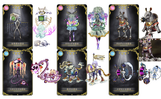
I have mixed feelings on the witches, I'm gonna go through them all.
Renata and Ren: It just doesn't feel like the minor bits match up. There's too many bits that are just slightly too different. Like the screen shape and the bone colour and style. Am I being nitpicky? It just doesn't feel like the witch and doppel are linked. Or that they wanted to make this design for the witch and didn't really care that it didn't look like her doppel. I suppose I like how the witch is more organised than the doppel cause my gripe with it is that it feels a little like the parts don't mesh well. Like, what is going on with that pink bit it does not work. On its own, the witch is good. Fine, pretty, but a little bland and simple. As a design taking from the doppel, I think it kinda fails. Too much was changed.
Cyan and Hinano: Ehhhhhhhhhh I think they just made her worse?? Like, there's so little changed cause the doppel is so witch-like anyway but the changes they did do make her look worse XT the bright tubes are ugly and I dont understand the moth-ear-thing additions. Also the skirt is worse too lol. I miss the gas mask though I understand if that was added for Hinano but you can keep it on the witch c'mon! It's just like they removed all the best parts...
Don Rocinante and Sasara: Ehhhhhhhh here we go again. It looks stupid. C'mon she looks so stupid. Not in an uncanny, scary way, she looks so dumb. I included the doppel attack where she does get legs and that was silly but not as much as this one. Otherwise so little is changed mehhhhh. I liked the doppel so you kinda ruined her for me, thanksssss
Shalimar and Emiri: This is one I'm on the fence on. Design on its own, I really like. She's spooky and weird and the colours are great. I have to main issues. 1) does a 13 year old need such a sexual feeling witch and 2) does she link to her doppel well. The thing with curvaceous or sexualised witches is ones like Roberta I know are okay cause she was in her 30s when she became a witch. You could say some like Candeloro are sexualised cause she's got the booba and stick thin waist, it's kinda hard to deal with... I'm also finding it hard to judge cause I don't know if it suits Emiri, I don't know her character very well. So we'll just move on. If I drew it I would make her less adult-looking My other thought when looking at her beside her doppel was 'if this doppel came from this witch I would hate the fact it uses so little of the witch'. So switching it around, im a little mad they used so little of the doppel. It's like they had the idea for the body and wanted to use it and were like 'oh yeah! the doppel!' so stuck it on as a tail... Also the flower things on the doppel arent in the witch at all ughh. If she was just a new witch on her own id love her...
Vayu and Shizuku: Wow! One I actually finally like now! I think she looks super beautiful, the additions work! But she's not perfect... Just like Emiri and Shalimar, I don't see the doppel working if the witch came first. Why is her handbag now the head? It feels like the teapot(?) head on the witch came out of nowhere. But it's nowhere near as bad as Shalimar. She might be my favourite. I've always been 50/50 on Vayu and she improves that score.
Aodamo and Natsuki: This one's a bit boring... it just feels like they stuck on some additions and called it a day. I think if she was stood up straight I'd like her more... Love the teeth on the horn thing. Skirt is fine. Legs look awkward. Sad they removed her puffy sleeves, doesn't make sense as why the doppel would add that aspect.
Overall, it is a little annoying how clearly some of these are just super easy asset copies of the doppels with no effort put in... I think that's fine for say, Vayu as I think the doppel incorporation makes sense. She's a four legged beast so Shizuku is now riding her. But ones like Don Rocinante, Cyan and Aodamo seem like 5 minute attempts. I'm disappointed. Happy to see witches though, I'm only critical because I care about witches being good
28 notes
·
View notes
Text
Okay I'm finally sitting down to properly watch the PJO series so here's an episode-by-episode live blog I guess. (Fair warning, I haven't read the books since I was a teenager, I am a smidge of an apologist for the films, and my favorite adaptation so far has been the musical.)
Episode One:
All of the actors are doing a really good job, I especially like Sally.
The costume design for both the monsters and the humans is pretty killer. I want Percy's sweater.
I also love the little seaside cabin and want to live there!!!
This is such a mild gripe BUT as someone with dyslexia I wish there was a better way to visually depict it without like, doing the swapping letters thing cuz that's just not what it's actually like at all.
Gabe maybe feels a little too funny. Like I'm supposed to hate him and think it's justified that he deserves to be turned into stone at the end, this version of him is really.....toned down, and his banter with Percy and Sally was fun to watch. I should hate him, but really he just came across as unpleasant. Less abusive asshole and more "old married couple who share interests but can't communicate without shouting" you know?
Loved Grover's little "I'm 24 actually" lmao that was great.
Not a fan of Percy immediately recognizing the Minotaur within a millisecond of it appearing before the audience even got a good look at it. Like, I just sat there thinking "how can he even see it?" rather than feeling scared of a big monster barreling at them.
The action is uh....fine? Feels a little lackluster. Or kinda....divorced from the rest of the show weirdly?? Idk it makes me feel like I'm watching a movie of a movie if that makes sense?? But we'll see where they go with it. (I know banter during a fight isn't realistic and people make fun of Marvel for it, but like...it helps to have at least a little talking. We don't wanna be Man of Steel.)
I feel like there's been a few "slightly out of sync ADR" moments but they weren't too distracting.
Pacing into Sally saying goodbye felt a little long, kinda took the shock of her dying out of the scene, but the actress REALLY sold all the emotional beats so I'll forgive it.
I LOVE the credits sequence!!! Reminds me of the designs on that one box set of the books in a really cool way.
Episode Two:
Oh yes the ugly ass neon orange shirts are here bless!
FUCK YES THAT'S DIONYSUS BAYBEEE!! My ONLY note is that he def could have turned up the energy a little, but that's probably just bcs I love how loud and unpleasant he is in the musical and I also know how unhinged this actor can be.
Chiron is such a delight <3
I like the cabins too, way better than how I imagined them as a kid reading the books lol
Oh, I can see why the new fans fell for Luke so hard.
Grover assuming a human being squished would be like an old banana is very funny. Felt very book-humor in a good way.
Clarisse!!
Oh damn actual disabled half-bloods, very cool!
Minor but I can't actually tell what Percy did wrong with the bow? Weird editing I guess.
Aside from that I actually love a good "fuck up" montage, I honestly wish it were a little longer.
Probably doesn't matter but I don't get having them burn the food after they've started eating? I thought that was a before you sit down type thing.
Percy burning the blue candy to try to talk to his mom was sweet tho T_T
"real friends" hahahaha.....yeah.......about Luke.......
yay! hazing!
Oh I love Annabeth already >:D
Thalia.....is pronounced differently than I thought....?
(I'm sorry I'm too much of a fan of 'Tree on the Hill' for this exposition dump. That shit hits harder when coming from Grover.)
Percy giving Annabeth the "actually I suck and my self esteem is riding on this so like pls don't ask me to do anything hard T_T" talk is just, so good lmao
ofc he doesn't know what's going on Annabeth you didn't tell him anything
Okay the action is a lot better when it's between the actual characters and doesn't involve a 3D monster, though I still had trouble following all the hits Percy was taking.
Oooh I can see why people did so much art of Percy being claimed that was a good shot.
FUCK YEAH TELL HIM YOU'RE SALLY JACKSON'S SON
(I hope they kept the Oracle in the attic...)
Okay I have to go do some things and then I'll be back for more!
29 notes
·
View notes
Text
I get impressed by @weirdsillycreature 's re-desgins
So I decided to re-design lim again and make him look more better than his old version
(Don't tell him that I said this but I think his old design were look like a cheap version of an incredibox scratch mod to me 😅)
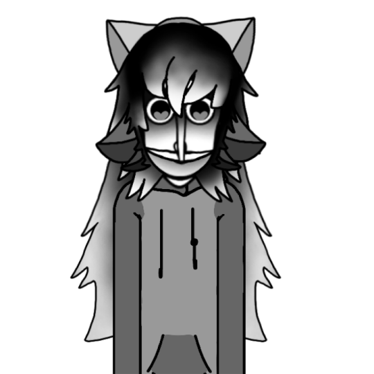
That's more like it lol
+ I add him a third bow that actually looks like a bow XD

Also I finally wrote his full story too
Enjoy~
↓↓↓↓↓↓↓↓↓↓↓↓
Lim is an orphan with his oldest sister, he's been adopted and left out a lot as a kid, his good first step dad were passed away and his brother who suppose to take care of lim were traumatized lim with his step brother and step mom, then kicked out from the house, lim's step aunt and oldest sister helped him a little but then the aunt have to put him to adoption again, luckily his oldest sister go with lim to protect him, then lim got adopted again by a family with 3 daughters, the parents were gone work but the daughters were nice to lim, sadly they were way older than lim so they grow out and have to live on their own before lim did, then due to an unknown accident, lim put on adoption again, on the moving days this goes like this, on this times, lim's oldest sister always helped lim about his education and health, until one day they got adopted by an unmarried couple, apparently these two were not lovers but live together as roommates, due to lim's traumas, the new step dad desired to sign lim to parent therapy so lim can feel parent love faster, for now he got two mothers who helps him but far away, and one day the step mom(roommate one) left saying lim were too much to care and she has her life above, that hurt lim a lot since he were like 15, after years at age 17 lim started a job in brimfero laboratory as a janitor for money, he did not like there but he needed the money, but the salary they giving him were barely enough and that got lim pissed so badly, so one day he desired to steal the tests tubes of brimfero and sell them to gain more money so him and his family can move to a better home, but lim got caught by John and mason near the woods, due to lim betrayed the laboratory, John order mason to beat him up and snitch his eyes shit, mason hesitate at first but he doesn't have a choice, so he did, then John takes mason's metal pipe and stab it thru lim's chest before leaving him bloody dead there, lim's death were reported on the news and lim's family were shocked, but after an hour the news reported that lim's body were now missing, that confused everyone ofc, suddenly lim woke up his head in a rock inside the woods, still bloody and looks like how he left like, he didn't understand how he's still alive but whole trying to get up he start to float a little, lim panicked and make a off move that causes him to fall and crack his neck, that caused his head to fall but oh..how is he still alive? Lim were shock, he hold his head in his hands and place it back on his neck, then he realize he break his joints too and doesn't die at all, he were kinda amazed but scared, he didn't wanna face anyone, he were undead and also so ugly looking in his current situation, he float to an abandoned house and looks at himself on the mirror, he start ripping the snitching off his eyes and take the Metal pipe out his chest, then snitched the bloody hole on his chest and re-build his body, while exploring the house he found two ribbons (which he's currently wearing on his head) and use the ribbons to tie his hair up, after all that he start living there, far from home he get his food and needs by stealing and also start drinking and doing cocaine, he even got caught ones in a stranger street (which a lot miles away from where he died) they put him on a mental hospital for some months and after that lim start to live on the abandoned houses and different streets, due to his fear of going back, he sometimes visits his grave and also that's how he killed that 5 victims who were burning down his grave.
(Sorry if there any typos-)
#incredibox#orin ayo#breakthrough#tragibox#incredibox breakthrough#incredibox e.v.a.c.u.a.t.e#incredibox orin ayo#incredibox fanart#incredibox oc#wekiddy
22 notes
·
View notes
Text
whoops almost forgot-
Its my tmnt iteration’s birthday!! (Wooo!!)
So I thought to celebrate, I’ll share some early designs and stuff of my turtles :)
Starting out, the first ever drawings of them (old art warning lol)
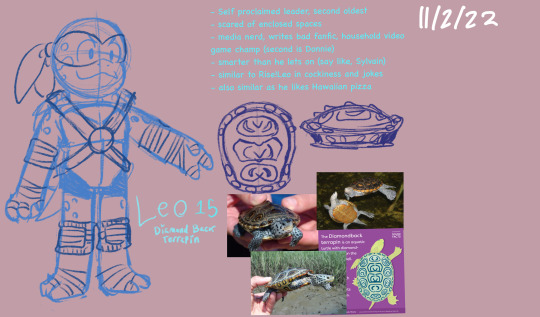
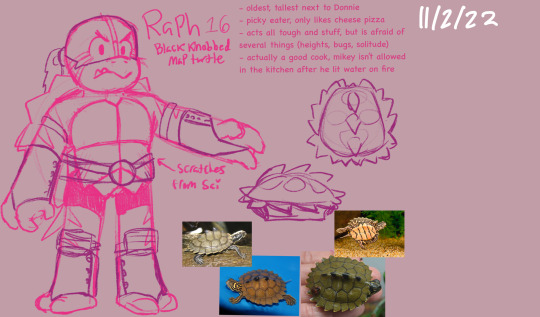


They are so ugly………….. imo Donnie is the most ugly- gladly he’s one of my favorites now 😭 it just took soooo long to figure out how to draw him right
For bit, Raph was the oldest! But I decided later it’d be much more fun for him to be the second youngest, and have Leo and Donnie be the eldest “twins” (they like to say that, but their birthdays are a month apart at least, with Leo’s being first)

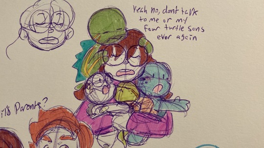
This drawing marks the idea of the tmnt comics are etc being canon in their universe! I’m honestly surprised i haven’t seen anyone else with this idea, not to say I’m safe from being completely original lol- but as you can see, they’re big fans lol, and so are their human parents. speaking of, there’s their mom!
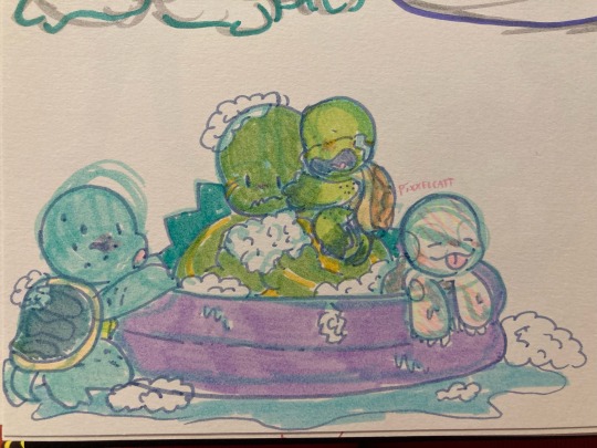
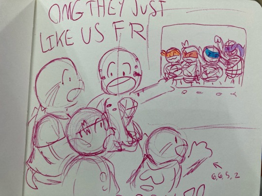
I dunno if I ever mentioned it, but they specifically grew up watching tmnt 2012 :) (and obviously everything afterwards) tho they were familiar with the ninja turtles a little already (how could they not be), watching that show freakin blew their tiny little minds like BWOOSH-
Also I just really like that swimming pool bath doodle lol

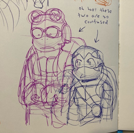
Oh yeah. These guys are Impostor Syndrome characters too
I guess I kinda forgot about that whole entire piece of the plot- whoops
#sorry that’s all!!#I’m on mobile so I could only add 10 photos 😔#tmnt impostor syndrome#tmnt#teenage mutant ninja turtles#tmnt au#pix’s art dumps
47 notes
·
View notes
Text
So, @lomotunes2008 , I haven't got around to designing Margot yet, but dammit, I couldn't wait any longer to post these facts about her story I came up with:
On the other end of Chug Town Trackside Towers is Chuggington Airport, a new location I will introduce in my headcanon (loosely based on what I saw in my dreams once or twice lol.)
Speed Fleet are the most common chugger here. It has a big station where passengers and parcels are transfered, and is the terminus of a newly built monorail line that goes all the way to Buffertonia.
Margot is one of the monorails on trial. Only up to four would be chosen to by Vee to stay.
Poor Emery was very hurt by Margot's mean words - but it wasn't Margot saying he was bad at his job that broke him - she also said his face looked like a pig, his swaying horns and buffers make him look like a ugly caterpillar, (Ooh, deja vu...) and that his eyes make him look like an ugly alien, because he has heterochromia. (Emery's left eye is green, and his right eye is blue)
And of course, he wasn't the only chugger she tormented; she called Chatsworth a wimp when she honked as loudly as she could at him, causing him to jump and overturn his hopper car.
She called Olwin a fat old fusspot because of her large streamlined body, and how upset she was when she got covered in sand from Chatsworth's car tipping over.
She called Old Puffer Pete a rusty, weak piece of junk and that he was the most useless, pathetic, and ditzy chugger she had ever seen, because he is the oldest in Chuggington and always gets the youngster's names wrong.
She finished off with I quote: "What's a smelly steamer like you still doing around?😒 Go find a scrapyard!😈"
Pete: 😨
What a bi🤬🤬🤬.
She then passes Hodge and Eddie and calls Hodge similar insults, due to the fact he is a 'hodge-podge' of scrap metal. Eddie, with his wrench clutched in his fist, shouted just what he thought of Margot insulting his faithful work companion, but alas, she was already leaving them far behind.
Margot is also very impatient and honked at everyone yelling at them to work faster, whether they were in her way or slowing her down in any way, shape, or form or not, kinda like Emily when she was bossy little b🤬tch in the S8 episode "Emily's Adventure."

Margot literally yelled exactly this at the start of her journey at The Airport, when the station porters were loading up her passenger's luggage, and honks at them, which only caused them to bump the trolley and drop everything, and the passengers, disturbed by her horn, were very angry; monorails are supposed to be quiet!
She then honked rudely at Wilson and Brewster hauling a heavy stone train from the quarry, telling at them to hurry up, even though they were not in her way or anything whatsoever because she is a monorail so they don't run on each other's tracks at all. Brewster thought Margot was the rudest monorail he'd ever met and Wilson was very cross.
But Margot thought 'it made them work harder'.
What a f🤬🤬🤬ing stupid 🤬🤬🤬🤬.
She even insulted Koko's speed claiming she could go three times faster than Hanzo, let alone her. Koko was fuming.
So yeah, she was indeed just being an absolute menace to society and causing confusion and delay overall lol, and Emery was especially miserable. He meets up with the main trio (and my yet-to-be-revealed main oc) in The Depot later and told them what she said to him. Already angry with Margot, they convinced Emery they need to tell Vee about her appalling behavior and overcoming the pain, he agrees.
But of course, they weren't the only ones to complain to Vee about Margot, and long story short, Vee was not happy, and indeed, there was nothing for it but for Margot to be sent away in disgrace. All the other chuggers and monorails went off back to work as normal, and Margot was put back on the wagon, and taken straight back to the Buffertonian production plant she came from by Dunbar. Did she ever change her ways? We may never know...
#chuggington#chuggington oc margot#Margot#chuggington oc#chuggington original character#chuggington original characters#chuggington headcanon#chuggington headcanons#margot the monorail#menace to society#chuggington emery#Emery#Chuggington Airport#Chuggington Monorail#This will become a fanfic later ;)#“YOU MUST WORK HARDER!!!”#lol Thomas reference
7 notes
·
View notes
Text
small edits of the epilogue designs of the main 5
(not including Eda, Lilith and Vee, I think they look okay and I honestly dunno what to change with their designs)
btw these are all gonna be edits of the renders from the owl house wiki, because my drawing skills are too ass to draw designs from scratch
Luz:
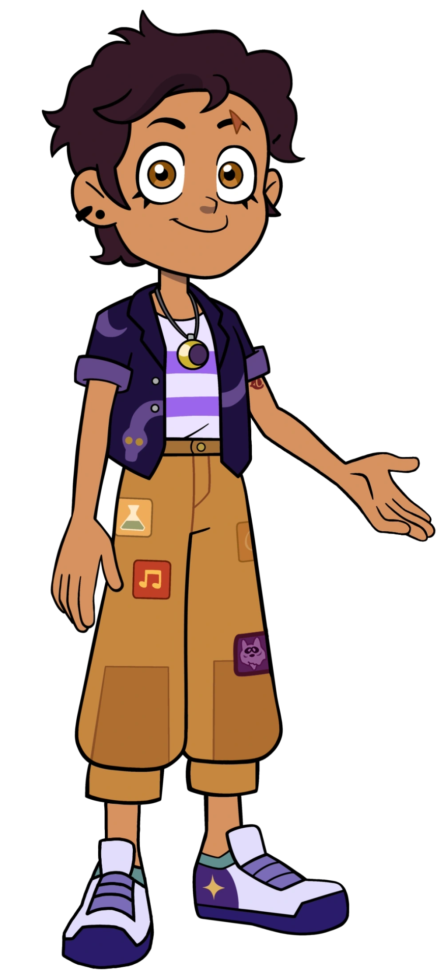
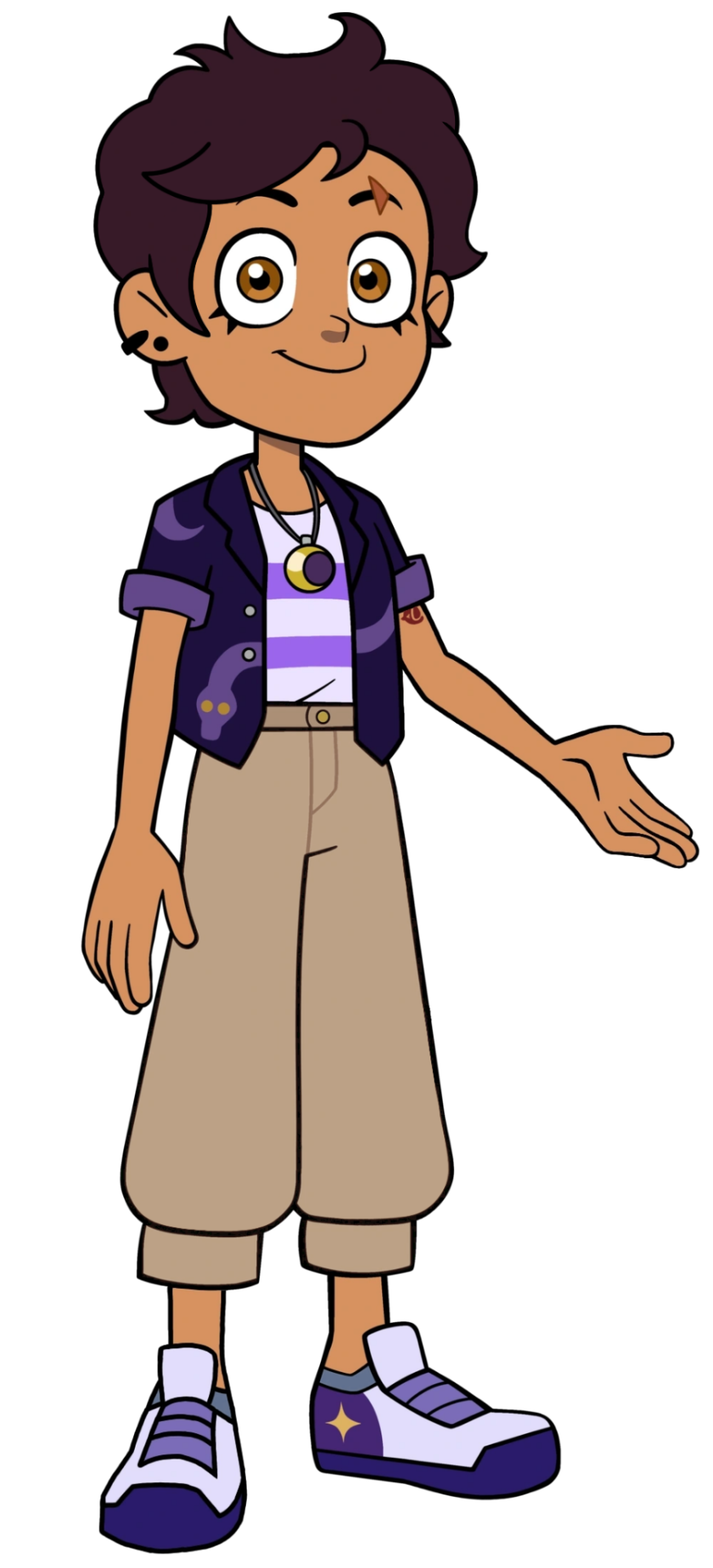
'ight, I gotta get this out right off the bat – I fucking hate Luz's ugly as fuck pants
everything else in her outfit looks great – I love the snake on the jacket (and how it kinda blends in with the stripes on her shirt), I love her wearing the striped shirt she was wearing in the pilot and I love that she's wearing Amity's old necklace, but the pants are just the worst. this shade of yellow looks like shit, doesn't fit with the rest of the colors (apart from maybe her eyes and part of the necklace, if you wanna stretch it) and those dumb patches just make her legs look busy/cluttered. so, I removed all the patches and made Luz's pants beige, similar to the ones she wore at the end of season 2 (that whole look was honestly really good, sad it was only used for a couple episodes).
oh and I also slightly tweaked her hair because it just looked weird to me. I dunno why, but both her slicked back hairstyle in s3 and the epilogue hairstlyle always looked off to me, and I can't quite put my finger onto why.
Amity:
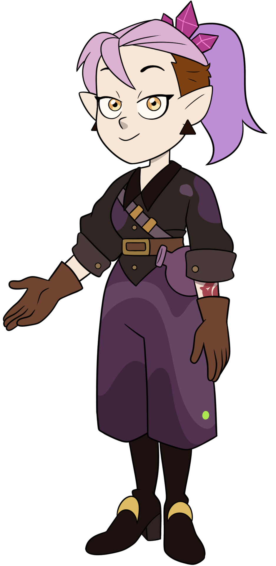
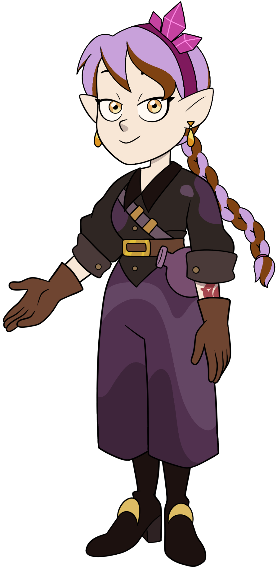
I made a post on my sideblog a while back where I explained why I thought the hairstyle Amity had in the epilogue didn't really fit with how I interpreted her overall hair change over time. basically that whole post boiled down to:
Amity with a high ponytail/high bun/etc. – represents Amity under her mother's control (since Odalia has almost the same hairstyle)
Amity with her hair down or with a low ponytail/low bun/etc. – Amity is no longer doing what her mom says, she's making her own choices now
so seeing her go back to having a high ponytail in the epilogue just didn't sit right with me. and that's why I decided to give her a braid. since Willow cut her hair short and no longer has two braids, I thought it'd be nice to instead give a braid to Amity. I also wanted to try and make it a two-colored braid, since I didn't really know how else to incorporate her brown hair color to the hairstyle (I didn't want to just go for the simple "make one side of the hair purple and the other brown").
I liked how the Grom crystals were added into this design, I thought it was a pretty nice callback to the episode where the whole Grom dance happened, and so I kept them in my redesign as well – putting them as a part of a headband.
the remaining changes are super minor – I made her pants slightly longer, since them being knee-height looked kinda weird to me, and changed her earrings from these big, black (and kinda ugly lol) triangles to the ones she wore in "Reaching Out", so there would be a bit more yellow in the design to match Amity's eyes.
Willow:


this one doesn't have that much changed to it. I kinda wanted to do something with Willow's hair, but in the end decided against it, since I think her short hair, while looking a bit too simular to Luz's debut hairstyle, is still pretty cute.
I really liked the gold glasses she got in season 2, and so I made her glasses here gold as well. not only because I like them better, but also to make it match with her yellow top.
I see that they tried to do this whole asymmetrical thing with her legs – one leg has a knee pad and the other doesn't, one leg has a sock and the other, again, doesn't – and I'm not against it, but the fact that Willow only has one sock just looks off to me. so I gave her her second sock back, but made the other one yellow, to still kinda keep the asymmetry (and to, again, add more yellow to the design, so it wouldn't just be her top and bracelets).
...also slightly changed the main color of her shorts, because that shade of green looked ugly to me.
Gus:


(this one has even less changes than Willow lol)
my man just straight up lost all his blues
if you go to the owl house wiki and open the page with Gus' designs, you'll see that all of them have some shades of either blue or teal, and occasionally green in them (with the exception of his Halloween costume, that became his season 3 outfit, which is mostly pink-red). and since illusion coven's color is light blue, it makes sense to add the colors of his coven to Gus's outfits. but in the epilogue bro's just covered in yellows and browns, with the only blue being his pants. so that's the only thing I changed – made his vest and glasses blue, to return at least some of his illusion magic's color to him.
the outfit itself looks alright, he looks a lot like a teacher, which is what he is by the time of the epilogue (though it is weird that, despite being 16, he looks more like he's in his mid 20s lmao). I'm not entirely sure why he's suddenly wearing glasses here though, since I don't remember him ever mentioning having eyesight problems or even wearing contacts before (but maybe he did mention it and I just don't remember, I dunno), but eh, whatever. he looks alright with those, so I didn't remove them. but yeah, apart from the lack of blues in his outfit, Gus looks the best out of the main 5.
Hunter:
(had to enlargen his png with a random ai, idk why the one on the wiki is like 5 pixels large, who tf made it so small lmao)

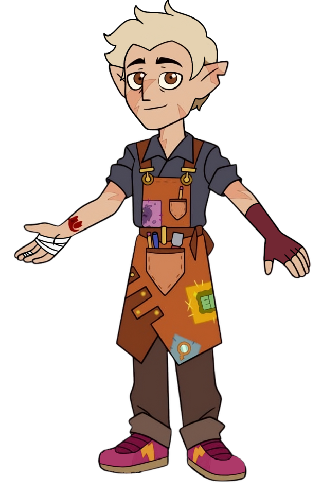
yeah, so, uh, the obvious question here... why does Hunter look like Caleb again?
wasn't his whole thing supposed to be how he's not just another Grimwalker? not just another copy of Caleb? not just Caleb? isn't that's why he decided to cut his hair, and specifically his Caleb-like fringe, to not look like him (and to simultaneously not look like Belos)? he even looks at himself in the mirror at one point in TTT, before he gets possessed by Belos, and says "I like who I am now" or something like that, I don't remember the exact quote.
and then Hunter not only gets his Caleb Hair™ back, after Belos possesses him, but he also gets Caleb's brown eyes after Flapjack brings him back to life, now making Hunter look EXACTLY like Caleb! which, correct me if I'm wrong, isn't this exactly what Belos wanted? a perfect copy of Caleb??
at first I thought that by the time of the epilogue he'd cut his hair again or style it differently, to not look like "Caleb 2: electric boogaloo", and so I just tolerated how he looked in FTF and WAD, thinking "eh, alright, he obviously won't cut his hair again anywhere in these episodes, everyone's busy with making Boiling Isles normal again, it'll probably be somewhere at the very end of the show, when everything's good again". and then, lo and behold – he did not, in fact, cut his hair, and he's still just Caleb™...
cool
ignoring his hair – the design itself looks nice. I especially like the addition of Abomination, Illusion and Plants patches he sewn onto his apron, and, unlike Luz's pants patches, these actually work pretty well with the whole look, plus it's nice to see him add small things that represent his friends to his outfit (only one of Luz's patches represented anyone, which was Amity with that Abomination patch, and then it's just two random pictures that don't really represent anyone)
the main thing I wanted to change was his hair, just like with Amity. judging by this concept art it does seem like they wanted to give Hunter different hair, to not make him look like Caleb 2.0. (dunno why they decided against it though, that was pretty dumb of them).
so I basically just took the first hairstyle here and slapped it onto Hunter. apart from that, the only things I changed were that I made his sneakers pink (since his Grimwalker eyes were pink and I kinda thought I'd bring a bit of that color back here) and added some accessories to his arms – a glove on one hand and bandages on the other. I couldn't give him two gloves, since the right one would cover the Flapjack tattoo, so instead I put some bandages from splinters there (inspired by the same concept art where I traced the hair from).
-----
and that's it.
again, I didn't do anything with the timeskip designs of Eda, Lilith and Vee, because I think they generally look okay and I don't really have any ideas on how I'd change them. as for every other character's new looks – I really don't care that much about them lol. Camila and Boscha look good, King barely changed, so he's pretty good too, and everyone else I barely even remember.
18 notes
·
View notes
Note
OMG so i watch a youtuber unrelated to ST and in it, she reacted to david and lily's home tour for architectural digest, to judge their interior design taste
and it was so funny, she had some insights into how david is a classic 'male actor' (aka a puppy in human form who is desperate for attention and has a certain ironic energy about him lol) and also when it came to the parts with them together, she was like 'have these two met? is this their first meeting?' hahahhaa
because the vibes were just so fucking weird haha
also david had a fridge in the bathroom for his beers and a cold plunge, which we will judge him for.
so yeah there was always weird vibes. and if i judge my judgement on that as good, i will say... finn and noah? status officially unknown, but chemistry and attraction? oh honey they dont even know what to do with it. byler = sublimation hahah
I have no insight to either of them! I kind of want to watch now because despite not knowing jack shit about interior design, I love judging rich people's houses and taste.
Oh my god, a fridge for beer... in the bathroom? Why? David, David. That is theee straightest thing I've ever heard. Is there no stereotypical man cave so his only escape is the bathroom and his bathroom beers? 🤣
Halfway through this I decided to watch what I think is the video? Not a reactor but the real video and it's so... weird. Oooh they have strange energy. Not digging it or their house I don't like it THAT IS NOT WHAT I EXPECTED THE BATHROOM TO LOOK LIKE. My man cave straight man beer hoard jokes and then in reality it looks like Marie Antoinette's damn frou frou apartment holy what. THAT MAN did not design or request aaaany of that. The whole house. No way. He's dripping with sarcasm the entire way through. Almost half mocking? Nothing about that house looked comfortable. I'm not saying it was ugly - just I don't believe people actually can live there.
Maybe the white tiger room. That was actually kinda my style. WAIT now I'm watching the tour of his old apartment and I actually love it? Like a lot (I'd do it with more color though). It looks like A PERSON LIVES THERE - it's still bougie hipster actor but he's got stuffff he's got belongings and real plants and thats what was so sad about the other one, and he had more chemistry talking to himself than with his now former wife to compare tours. Hmmm.
Anyway. Chemistry. I know it was one highly polished, staged video but they had bizarre energy. Comments said they had "first date vibes" and yeah, I could feel it 🤭 Awkward. But our boys... I'm imagining them give a home tour like this and I feel like the chemistry would be miles different. Can you imagine Finn's awkward humor and Noah laughing at everything he said, and Noah getting all hyper specific about something to end his ramble with his "...and, yeah." To which Finn's "totally, totally. These light fixtures are so, like, awesome and rad you know" leaves them both cracking up. I can picture the tour perfectly, with their little in-joke asides as they just start a side conversation about nonsense out of context, never explained. I know them, I can picture it 😉
2 notes
·
View notes
Text

-07.28.23-07.30.23
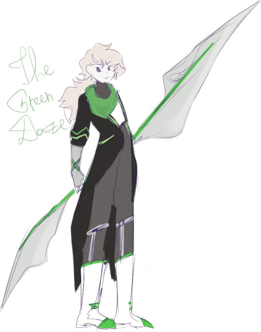
decided to redesign my librarians a little bit and think what they would do if they get out of the library...they're so fun (the last guy isn't a librarian but he was so ugly i had to fully redesign him) i don't remember if those librarians were custom made or not (except i certainly remember that the first one wasn't) but uyhhuhuh yeah
in-game and pre-L corp sketches i made...2 years...ago...

each one separately with some lore under cut,..,.,.,.,.,,,
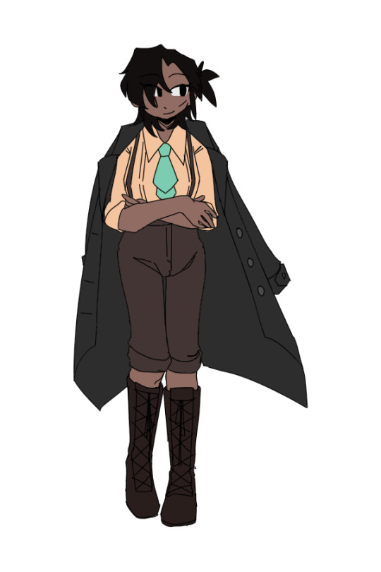
galina(she/her) before L corp had a funny case of being an urban legend just bc she killed people with her poems as an experiment a lot. yep. she can kill people by mentioning them in her poems and that's how she ended up parentless and went emo. but then not long after trying to stop being emo she got into L corp. where she kinda managed to try and be normal. doesn't write stuff much after her legend-retirement, but she's okay. (her lore is goofy but i like it and im leaving it that way)
after the library she became a fixer with narae, another librarian she got really close to.

narae(she/her) used to be a 6 grade fixer with her brother, mckenna, and sullivan, their good pal, who had a little brother that he also brought to office quite a lot. the siblings got tired and retired from being fixers and then boom they got invited to work at L corp. and they decided why not. mckenna died, but narae managed to restore from this in the library times.
as someone who actually knows how offices work, she started an office with galina, going back to business. sullivan's brother, tim, also ended up as a librarian after narae asked really nicely to unbook that random index proselyte. no-one knows where sullivan is, he just went missing one day and tim got into some bad influence. but tim probably also joined their new office, he wanted to become a fixer like his brother before.
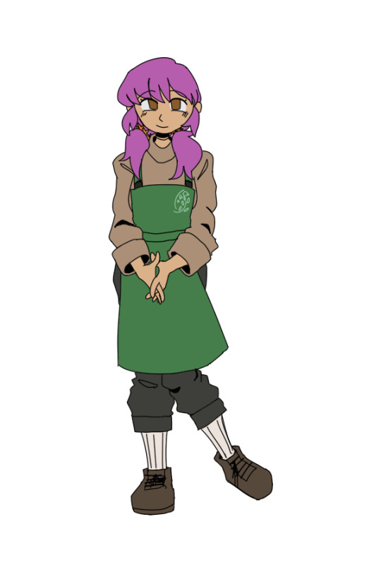
'rittany(she/her) used to be a member of a funky syndicate. wasn't really enjoying her life there. she was almost killed in her childhood and saved by the green daze, who knew people who really wanted a child so kinda gave them her and they went along with it happily. she was trying to repay them all those years of care out of her own desire but ended up working for a shitty syndicate and got a little lost on what she's doing. then got a job offer from L corp and gladly changed her job.
she never was that good at violence, and didn't enjoy seeing such... i think after the library she ended up working at the flower shop and slowly getting some cash to go back to the district, the street, the house she used to live in, to see if her family is still there, see if they're okay.
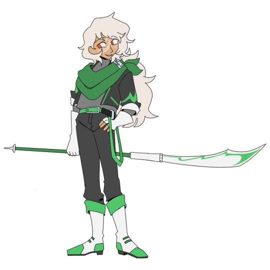
orion, or the green daze(he/him) is just. a guy. literally. just a colour fixer bc i really wanted to have fun designing a colour fixer and that's it. he's a silly gooper with a kind heart but no actual sense of responsibility. saved a child and gave it away and disappeared. that's him. the guy. i just like roasting him for no actual reason i need to give him lore... but at least new design is cool!! the old one was so random lol.
(im very happy about giving him this new eye colour for betelgeuse, orion's alpha, being a red supergiant, and a silver(bluish) clip on his scarf-bandana-idk-thing with a dog for sirius(bc canis major is considered orion's dog), and changing skin tone was a great decision because making most characters white is very boring as it turns out and also his slight outfit style change makes me RAWARRHGRHG really cool one)
i wonder if he's alive...and what he's up to if he is...
#project moon#library of ruina#lor oc#galina (lor oc)#narae (lor oc)#'rittany (lor oc)#orion (lor oc)
8 notes
·
View notes
Note
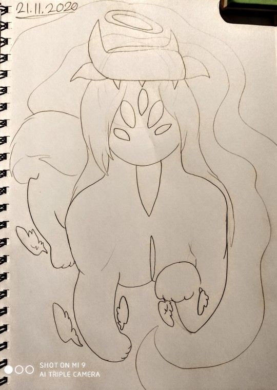
Hiiii Me again <3 Could we have crumbs of Grandefel maybe 🥺👉👈 would love to know more about herrrrr. Angle of all time. Id like to know anything tbh but just as a prompt to get you started, how did you come up with her design ?? Its super interesting and I really love the colorssz
Hiiiii<3 (twirls my halo) she is so THE. My poor.. Intended protagonist girlboss..
Oh boy her design? Let's say she really grew into it. Like the earliest art of her I have is sso ugly I'm sorry Grande but I did not have a handle on that thang. She had such Pug vibes. I think this'll be an interesting post?
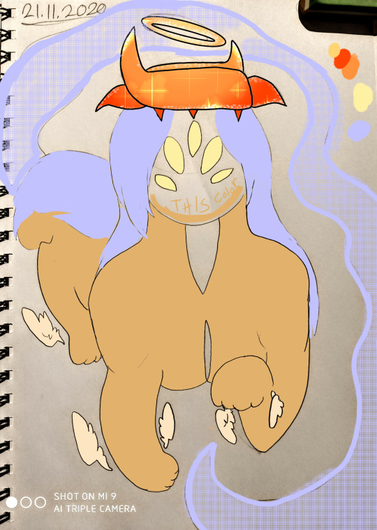
This is the beginning of it all. Unfortunately I don't have a super insightful answer to how I came up wi her, bc the Og* angels were literally me going HeeHoo with a pencil. (*Certain specific angels I designed in relative succession to each other before I had a handle on how I want to design angels. The so called Ogs are Lamera, ZZZ, J'aimekiel, Grandefel, Kxxxtr, Ngah and Combfa. Everyone after this was designed a notable amount of time later and with much more "process" to them)
I have some thoughts but it's fuzzy and vague? Okay. So I thought I should definitely do one lion (esque?) at least bc *points at old religious art of angels* and they just have those Vibes to me, ykno? I associate angels with certain things that I try to employ in the story's characters (to an extent). Grandefels vibes were.. Guardian, maybe a tad like a sphynx, just ykno, a huge feline statue like entity who guards something and is like a scary immovable force ig? I wanted some ethereal aspects to it, and lots of teeth (hers aren't visible here but the whole underside of her body opens up to a huge ass mouth with teeth everywhere). Now, initially I was gonna have her hair be lilac but turn bright blue in some situations but I WAAAY preferred the blue on her. She's supposed to have Blue flames mixed with galaxy vibes. Like if blue flames were a puddle and that puddle was a lion's mane. And it was all. Cool and semi-physical
Onto how her design adjusted overtime.
I think most firstly I stopped drawing the grooves on her body that would open up to reveal the Teeth, I mean I do still allude to them vaguely but I figured the way I was doing it at first looked kinda.. Eugh? Another thing I quickly started changing was her hair texture. Originally I wanted it to be completely straight and smooth and flowing but it looked way more interesting and more galaxy esque with it being bubbly and cloudy. I guess my initial thought was that I wanted it to look like it was flowing out of her head? Like some water?

^water vibes
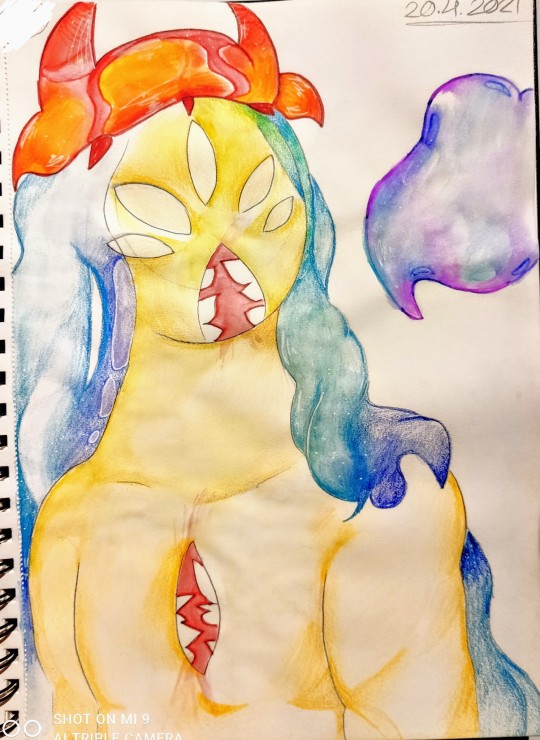
Getting there
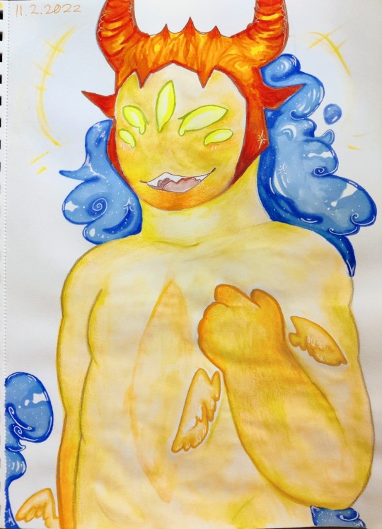
Galaxy vibes^
(This anthro drawing also demonstrates the way I nowadays moreso "allude" to her hidden mouth but the anthro version here isn't too close to Canon otherwise since I gave her face an actual normal mouth too lol)
Oh yes, and the crown is another major change!

I think my first notable adjustment was made here (note also the flowy hair). If gotten an amino commission (No money, just amino coins lol) of her and really liked the way the artist drew her crown so I took after that and started slowly changing it. It took me a while to be satisfied with, though. In the very beta version, it was supposed to be like a ring/circle. If you look at the older drawings up there, you can see that one horn is meant to be drawn on the "front" and the other behind. It's like if you looked at her from straight up, you'd see the three dimensionality of it, being more like an actual halo instead of one solid headgarment. I do still really like this idea, however I just think it looks better as it is now. I also had a fair bit of finagling with the side horns, frankly I always found them ugly so I'm finally happy with how they look (just realising I haven't drawn her in a bit, so, the anthro pic is the most accurate to her current design if we ignore the uh.. Anthro-ness lol)
One more thing! You don't see her halo too often in these, but it's intended to be drawn tilted. It's not straight (just like her), and tilts a bit down on one side. In universe this is kinda viewed as an imperfection and she used to be ashamed of it. The irl explanation for it was that it couldn't fit straight between the horns, with the way I'd formed the crown, and so I kept it that her halo just is that way! It fits oddly between her crown and I think that's neat!
Apparently on that last picture I decided to draw the halo straight, though? Cringe... :/
Now if you'll excuse me this post made me want to make more art of her
#Ask#Grandefel#Character design#character development#Angel oc#Design breakdown#(sorta?)#I too love her colors! She's so funky to draw!
11 notes
·
View notes
Text
THOUGHTS ON: BARBENHEIMER
Finally got the chance to see both (specifically, Barbie, Oppenheimer, and then Barbie again) and I'm glad I did! Watching them back-to-back was certainly an experience and I'm not even joking when I say they really made me think about life and all that it entails.
As someone who grew up on the old animated Barbie movies, I had a lot of fun watching the new film, especially when it came to all the doll jokes and references had me laughing more than once (Magic Earring Ken, anyone?). Kinda mad they didn't have any references to the animated movies though, or at least none that I'd noticed.
Speaking of Ken, wasn't sure about him being the villain at first, but I can see what they were trying to do and I thought it worked pretty well all things considered, that Kens have just as much of a right to live alongside the Barbies as the Barbies do them and not just in the shadows of each other. If this film is anti anything, I'd say it's anti-Patriarchy as well as anti-Matriarchy. Preachy, sure, but understandable. Really, I'm more annoyed with how this apparently went over so many people's heads even with how blatant it was; seriously, President Barbie even says the message of the film after the Kens fail, so how anyone could've misinterpreted it is beyond me! The only thing that comes to mind is when the Narrator says that the Kens will be treated just as well as women are treated in the real world, and to be fair, that statement alone can be interpreted in a lot of ways depending on certain factors, but I don't know, I feel like that should be a wake-up call more than anything.
Barbie herself was also really interesting, though throughout the film, I found myself wondering if she was meant to be the Original Barbie with an upgraded look or just a random Barbie who's basically just an amalgamation of all the others (like she says, she's what everyone else thinks of when they think of the doll). Either way, this certainly adds a whole new layer to the relationship between her and Ken because keep in mind, when the film says that Ken was created for Barbie, they mean it literally.
Going into a bit of history here, Ken Carson was created in response to the backlash Barbie was facing two years after her own creation for the horrific crime of... *checks notes* being single. Since then, Ken has had a few jobs of his own, but it's still nothing compared to Barbie's—this even becomes a joke in the Life in the Dreamhouse series, where the Ken in that series worships the ground Barbie walks on. Probably literally. This man didn't even get his own car until 2012! Then there was the whole seven-year break-up incident because Ken apparently didn't want to put a ring on it (yeah, Barbie has in-universe lore and it goes hard!) so keeping all this in mind, it's no wonder Ken seems to be as attached to Barbie as he is in the film, all while also struggling with his own identity as an individual.
Yes, I probably am looking too deep into a children's film about dolls coming into the real world. This is my life now.
The Mattel scenes were definitely one of my favorite things about the film, especially with how dedicated the CEO is when it comes to his job and how he genuinely wants what he believes is best for everyone, but my favorite part are definitely the scenes with Ruth, which absolutely had me crying! And hey, glad to see I was at least partially right! She made an appearance, just not in the scene I thought it was going to be (also, apparently the sweet old lady on the bench isn't even Barbara, it's costume designer Ann Roth).
Narrators also tend to be hit-or-miss for me, but I thought it worked really well in this film! I especially loved how self-aware the story is and how if you're going to try and make Barbie look ugly, Margot Robbie isn't the way to go. And the cutaway to Depressed Barbie? Hilarious, but now I low-key want that to be a thing lol! And just the world in general was super fun!
Honestly, if I had any complaints about the film, it would absolutely be the pacing. Sasha in particular seemed largely unnecessary and her turnaround to at least tolerating Barbie happened way too quickly, even if she did only want to help for her mom's sake. It would've been nice if the film had had at least one or two scenes where she realizes that while the Barbie brand has its issues that deserve to be addressed, it's also not as bad as what she'd originally thought it to be. And also, it would've been great to just see more of this world in general; after all, Barbie and Ken only spend time in LA for less than a day, and even then, it's only for a few hours at most.
Basically, I wish the film had been longer, but what we got was still great.
As for Oppenheimer, I never really have much to say about biopics, but I love history in general and am always fascinated when it comes to warfare and all of the ethical questions that come with it. This is also the first Nolan film I've actually watched, so I knew this was going to be an interesting time, at least. Let me start by saying that the special effects with the bomb dropping and tense silence afterwards were beautifully done and I thought the use of black-and-white for some scenes and color for others was a really nice touch too, as well as the fact that the film went beyond just WWII and that we get to see Oppenheimer deal with the guilt he'd faced afterwards. I also always forget that Einstein would've still been alive during the time most of the film takes place, so his appearance was certainly a surprise, but a pleasant one nonetheless. I was also wondering in what context the "I am become Death" line would come up, so the fact that the film actually addresses that it comes from Sanskrit rather than suggesting it originated from Oppenheimer himself was such a great detail! Overall, a great film about a very complicated man!
4 notes
·
View notes
Text


Digimon Data Squad (Savers) - Episode 31
It got...uglier somehow?? 😭 I can't take these episodes seriously looking like this. Everything was over-shaded and the angles were weird and they did all these strange close ups.
This episode also just had a weird horny energy that I didn't like (if you're gonna be horny at least look good! lol). We've got upskirt shots, gainaxing, giantess stuff, and Nanami acting all seductive towards Tohma. It kinda feels like they were like "a female villain? We know just what to do with her episode" 😏
Notes:
Only 12 year olds should have Nanami's "I'm smarter than everyone in the world so life is boring now" mindset. It's cringe. On the bright side, Tohma called Nanami out and was like "erm actually, my friends have their own strengths." I was proud of his character development 😭
So far, I think this arc has been really weak, I'm not interested in any of the villains, including Kurata. The only thing keeping things exciting is the new digivolution reveals :/
I feel like Masaru has been a little flanderized at this point. He's just in the background being a big dumb lunk. He was always a big dumb lunk, but at least he had plenty of straight men to play off of, now they're just letting him go off. Yoshi hasn't done anything interesting in forever too :(
I wonder where they're going with Tohma's inner turmoil. In this episode he shows he can use Masaru's fighting style successfully but then he's mad about it? I get that he's jealous of Masaru for being the big hero, but I wonder what the lesson to be learned from that is? I think he should just get over it lol
Allow me to demonstrate the ugliness of this episode:

See how weird the shading is? This dude's always getting the worst shots lol. As usual, the digimon looked fine.
I paid more attention the opening this time and saw...Dukemon? Interesting...(royal knights?) Also, no sign of Falcomon getting an ultimate yet
I probably would have liked Nanami back when I was an emo middle schooler, not gonna lie. I did like the poses she did prior to digivolving, that was kinda fun

Something throws me off about BioLotsumon's design, I think maybe giving her two staffs was a bit much, there's just a lot going on visually. She's kinda giving Sailor Moon villain of the week with her afro, bright red lipstick and lotus pod crown.
I think snake lady!Nanami kinda looked better with her censored top in the dub ngl.
The fact that Nanami had a shocked look when Tohma rejected her was such an eye roll. Like...gurl. Did you really think that would work?
So I guess we'll get the other two villains' (IDK what to call these people lol) stronger digimon forms next. -sigh- I just want one decent looking episode.
Edit: I forgot to mention. Nanami's motive is revealed and it's just "I was bored"!??!?! WEAK.
#digimon data squad#digimon savers#digimon#anime#if you don't understand my TV Tropes speak I'm sorry
7 notes
·
View notes