#so i fixed the colouring and i photoshopped out the extra stuff that was in the way of me appreciating him
Explore tagged Tumblr posts
Text
The Hot Fix Week. Progress. Part 1.
Right now, all three assets are ready, but the overall quality of all the assets was definitely lacking - So I decided to dedicate an extra week towards the overall quality improvement, in order to improve the asset quality.
Before doing extra work on the characters, I decided to quickly show all my work to my professors in order to understand what I should work on: The weakest project this whole time was Jacob, since his clothes were poorly made, and he did not have any proper face textures. The gun looked alright, but I could have added more details to it. Based on the feedback, the stalker needed revision work on his cape and chest.
I started with Jacob. Despite I worked a little on the character alongside other stuff in order to improve his quality - he still lacked in many things. I began working on the clothes - thanks to the prior practice with the Stalker, I had better ideas in terms of how to do his clothes.


To create his utilities and clothes, I combined some various effects together in order to get something that I wanted from each piece of the model. While I used some references for some works, for others I just applied simple effects and masks to deliver the textures. To do the knife holster, I used some references of knives created by Polish Custom Knives (2024) for a Red Dead Redemption 2 (2019) game since I enjoyed the colour and texture of the items.

Now it was time to work on a head, and here I have encountered a series of issues.
I was suggested to use realistic textures in order to make the character's face look fitting, but I have found a series of issues with such an idea:
First, the character does not have a realistic sculpt, making it slightly harder to make it look natural.
Second, I have no prior experience in doing that. I have no idea what kind of workflow it would require me to do this. I did try to look for tutorials on how to do it (special thanks to Elvis Morelli (2024 for the workflow tutorial), but based on what I have seen - the workflow in order to do it is quite complicated.
youtube
Third - The character does not have a familiar UV unwrap just like any other realistic face. Because of that - simply transferring and adjusting the textures in Photoshop will not work well.
Finally, even if I achieved a good quality realistic texture on this mesh, while also making it look good in Unreal Engine, I still had the rest of the mesh to worry about - by having a hyperrealistic head, with good textures, the rest of the clothes would look way off.
Based on such conclusions, the task of using hyper realistic materials was too much hard for me, so I decided to avoid trying to make it super realistic and instead - try do some simpler workflows within the Substance Painter. In order to grow, I need to get out of my comfort zone, but by trying something completely different for me for the first time the final results will not be great. I will be trying to achieve realistic graphics through the use of MetaHumans and a study in hyperrealism - but not with this character.
Instead, I found a Adobe Substance 3D (2020) tutorial, created by Character Artist Magdalena Dadela which I liked and decided to give it a try.
I followed the tutorial most of the time: I followed the advice of using various skin materials from the Substance 3D Assets page as a base mesh, in order to create skin texture. Then I began using multiple colour levels in order to construct various shades on the Jacob's face, while also using the dust and cloud brushes. When I did not know what I was doing - I just followed the tutorial 1 to 1, until I figured out what she was trying to do. After that - I came back to the layers and adjusted them in order to get what would work well on the character.
The only difference between my production and the tutorial is the fact that I applied the effects based on how it would look on the character, rather than trying to follow Dadela to the maximum: Afterall, I am doing a 30-year-old human, who spends a good chunk of time outside, not a fantasy character!


Upon finishing with the shading, I went back to the blender to weight-paint the model. I decided to do it again since I did not enjoy some of the weights on the model. Just like before, I did the weights by transferring them from a naked muscular body (so that clothes would have a better weight generation) and fixing issues with tools that I had post the transfer. In order to fix some animation issues, I had to manually erase all the weight data from bones (like when shoulders could control head rotation), but it's mandatory work on the rig.
Now the mesh was ready for Unreal Engine.


References:
Polish Custom Knives. (2024). LARGE EXCLUSIVE TACTICAL SURVIVAL CLASSIC BOWIE KNIFE INSPIRED BY THE GAME 'RED DEAD REDEMPTION 2. Pinterest. [online] Available at: https://www.pinterest.com/pin/843439836495445040/ [Accessed 8 Aug. 2024].
Rockstar Games (2019) Red Dead Redemption 2 [Video game]. Rockstar Games. Avaliable at: https://store.steampowered.com/app/1174180/Red_Dead_Redemption_2/ [Accessed 8 Aug. 2024].
Adobe Substance 3D (2020). Substance Academy Series: Texturing a character in Substance Painter | Adobe Substance 3D. Youtube [online] Available at: http://www.youtube.com/playlist?list=PLB0wXHrWAmCyxQQSMWfYuTRT1pntzCjY7.
substance3d.adobe.com. (n.d.). Substance 3D Assets Homepage. [online] Available at: https://substance3d.adobe.com/assets.
0 notes
Photo


royal family 👑
#mick schumacher#f1#formula 1#mercedes#off season 2022#i felt like there was stuff taking away from these pics#so i fixed the colouring and i photoshopped out the extra stuff that was in the way of me appreciating him#LOOK LOOK I DID SOME EDITING HAHAHAHAH
231 notes
·
View notes
Note
I like both. But for now I would prefer to learn the cinematic way. Thank you again. You are the best.
hey hey, sounds rad, I'm gonna obviously put it all under the tab but I'm gonna explain how I go from this

to this

I'm not going to explain my sharpening or how I make gifs if you do want to know that here is the sharpening and basic colouring tutorial and basic gif tutorial
alright, lets gooo.
so first off for my 'cinematic' style it kinda just comes down to very pure colours and very very dark and contrasting blacks. especially because this interview has a pretty neutral base colour so there's not a lost of 'fixing' here
this kind of all comes down for me to he 'levels' adjustment layer because this, is what that does in one click.

so I'm mostly going to be explaining how that works. it comes down to the little pipets you see here on the left side

these three help you pick your darkest and lightest part of the picture photoshop does half our work so. the top pipet is your blacks and the bottom your whites. the best way I can explain the picking out your darkest and lightest points is with this

the yellow are the points id click to pick my darkest points and the green my light points.
it's normally easiest to find your darkest points in gifs so what I normally do is grab the black pipet and grab my darkest point which makes the colouring alone imediatly go up in contrast and also semi fixes the basic colours.
(what happens is what the gif does above! where on the right side you can also see how your sliders adjust instantly to how photoshop read your file)
then I play around with the sliders. if you move the right slider the black goes up if you move the white goes up. I just play around with it until the contrast feels right. this is what my levels slider looks like

now you have a gif with deep blacks but no solid dark colours yet so now I normally just grab the vibrance an dup it to smth like +50 or higher and dont touch saturation. and this is what my gif looks like with just levels and vibrance.

then if you're lazy and wanna keep it easy and still have a basic nice colouring you can stop there but I normally go into my fav lil toy in photoshop 'selective colour'.
now I'm not going to run down every tab in selective colour but for this colouring specifically I know there's blue in his fireproofs and obvisouly red and yellow in his face.
so with selective colour I make sure these colours are upped. and for my 'cinematic' style I make sure my blacks and whites are also high up.
so after playing around with selective colour, this is what I have. this is just two layers of basic selective colour. (if you want me to share every laer of selective colour pls tell me n ill gif it so u can see)

then sometimes I stop right here but id like it to be a bit like deep so im gonna use channel mixers (which is kinda hard to figure out but just play with it and see what you vibe with) to make the base a bit more neutral so then we have this

and then I'm just gonna trow one more selective colour on top and we're done
we've got this and I'm pretty happy with it but id play around with the blacks a bit, id prob go back into levels and play around with curces and brightness/contrast for these but thats all extra stuff

but yeah this is how I do my 'cinematic' colouring
if you've got any more questions feel free to ask em and I hope this was clear and useful!
27 notes
·
View notes
Text
part 5/6
5th part of my Black Sails scraps and doodles from 2016–2021. Not in any particular order.
And of course, please do not steal and repost elsewhere! But if you do get inspired, feel free to make your own interpretations :D
This time I have black and white Walrus study, Monsterman gifs, discarded inktober doodles, vane-jack-anne and jack-anne-max and max-eleanor moments, surprise collars, not-so-relaxing-asmr, daddies, another gazing lesbian, curious tentacles, biker girls, more speed with "black sails" and “oh no!” (I swear these are not as sexy as the list might make it sound...)
Under the cut, because this is a very long post again.
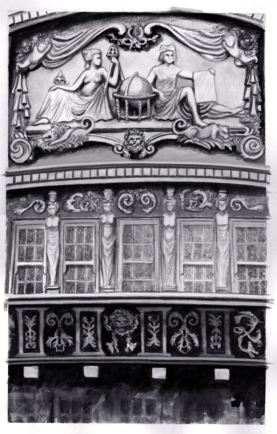
Above is the drawing I made for the Flint on “STAGE” pic (2020), although I think I already fixed some of the perspective mistakes after scanning it. I wanted to study the Walrus’ balcony but didn’t really have proper pictures so had to guess some parts. Also at this point I think I didn’t even want to draw Flint in yet.
I mentioned in the art post that I was listening to Lordi’s “Would You Love A Monsterman” but it was also because it had the same working music and inspiration as my very old project of making a drawn(!) gif serie with the lyrics (because I didn’t want to make a fan vid... lol) and since that has been on hold for a few years (I mean, I started it right after season 2 aired and ended and then continued it while the s3 was going on...) and I really really wanted to share the idea already after sitting on it for so long xD
And I’m mentioning it now again although I won’t share all the notes because there’s just too much stuff... and the timing is off in the gifs and text a bit hard to read at some points, but you’ll probably get the idea!
Here’s a couple of the gif drafts and experiments from the “monsterman-gif” project I had (somewhere between 2015-2016-2017?):
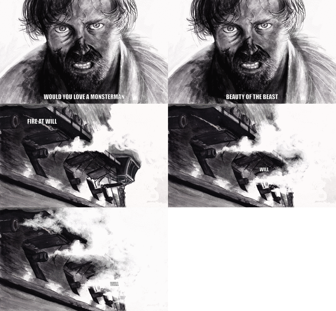
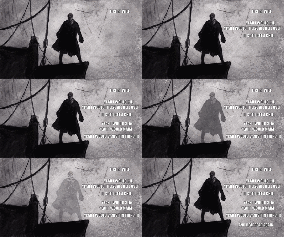
(Also, I copied the menacing Flint from the drawing above when I was planning the set up for the “STAGE” art! :D)
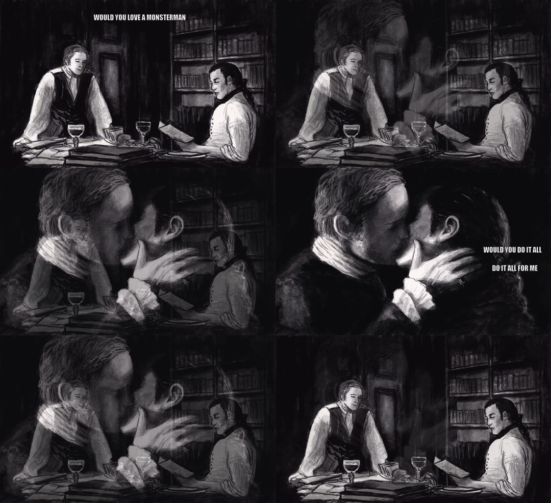
(all of these were pencil / water-soluable graphite sticks + water and black watercolour drafts before I continued them on photoshop)

(hmm, I think I had a different version of this gif somewhere but it’s buried somewhere in the wip folders...anyway)
There reason I didn’t share them earlier is because I wanted everything to be ready and then... just didn’t do it. Also s3 and then s4 aired and I wanted to include something from there but things spiraled into even more complicated so I just left it to brew, lol). The whole thing is like 80% ready with the 10-11 gifs so maybe someday I’ll share the rest of it.
Next, some old inktober doodles (2017):
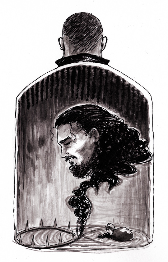
The prompt was “poison”. I liked the upper part but not Silver’s face and the bottle’s bottom with the spiky crown and pearls (and infinity loop) felt somewhat clumsy. I’m not even sure what I was thinking with this piece...
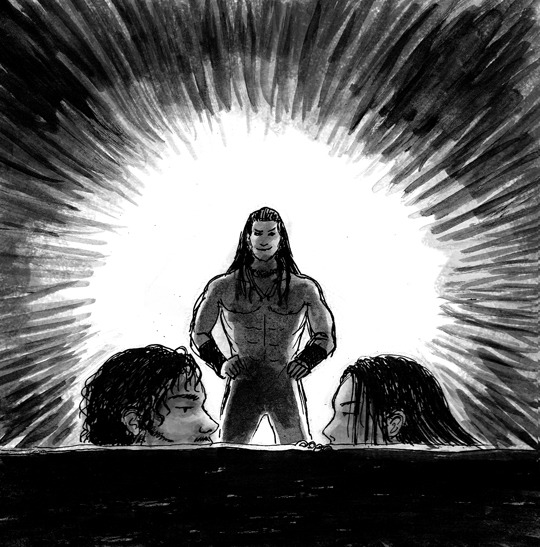
Another inktober, prompt “underwater” and in this case of course “underwater training” as Vane is teaching Jack and Anne to swim and dive and guerilla attack ships. I liked the idea but not how Vane turned out and I didn’t want to start over, lol.
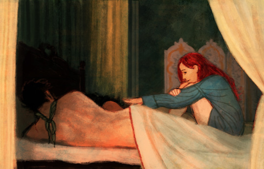
An early version of the “G’morning, love” (posted in 2019). At first Anne was wearing a shirt but I wanted them all to be bare and open with each other. Although Jack’s scarf stays on, lol! Working title was also “AnneToulouse” because there’s a painting called “Sleeping” by Henry de Toulouse-Lautrec and I wanted to catch that mood a bit. Around the same time I was also working with the “LaundressFlint” aka “Would you still recognize me?” (posted in 2020).
Next, experimenting with “slices”, like how much story can you fit into a tiny slice?
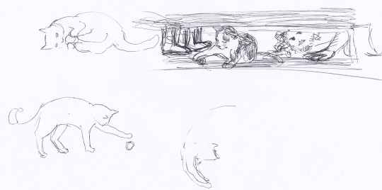
“Betsy come here!” early sketches. Silver peeking under the desk and Flint’s boots as he caught them. There was also slightly NSFW-version, although I shared it only on discord, I think:

(I wasn’t quite happy with Silver’s face and run out energy to fix things...)
Next, the ASMR AU, 2020. (yeah it was my prompt that I submitted to the challenge... and couldn’t resist illustrating... ¯\_(ツ)_/¯ )
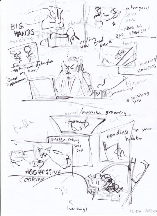
The messy idea and further planning:
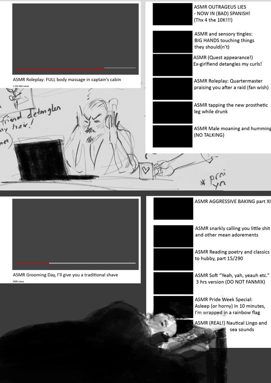
Still a few more doodles on this post!

Plans for “I will be your Daddy” or The Next Top Daddy for Vane (2019)
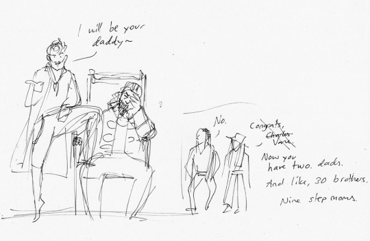
The “like, 30 brothers” that Anne mentions here are the other pirates and captains in the room and the nine step moms (or well, ex-step moms?) are the Blackbeards (ex)wives lol.
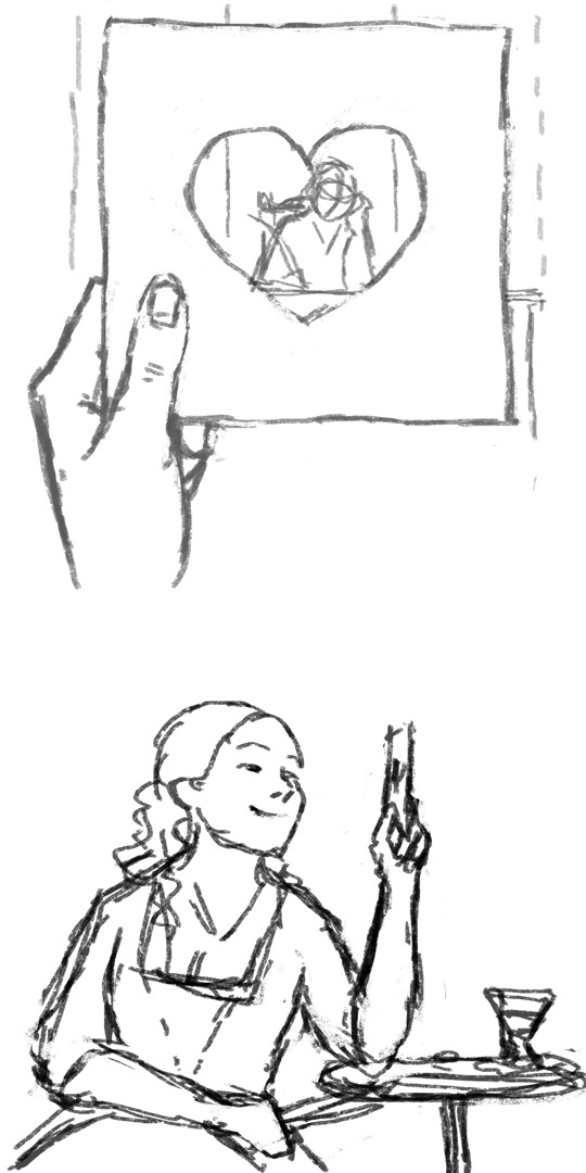
awww, this was a nice maxanor piece! I actually like Max’ face here more than in the final result (2017)...
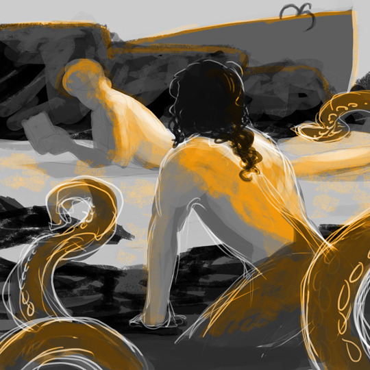
Above, the first idea sketch for the Merbutt piece and the original colour scheme (2019).
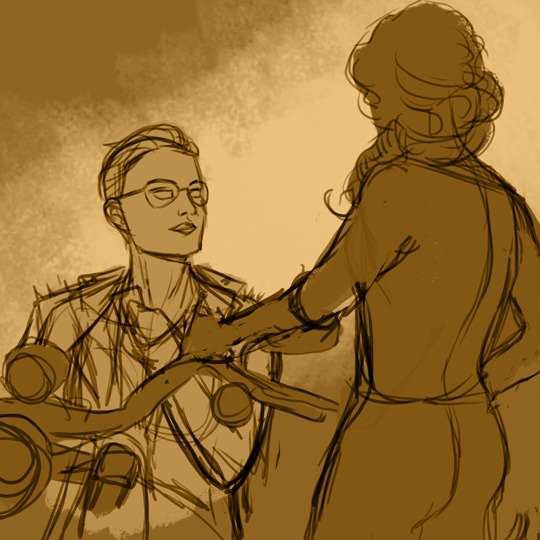
Above, an early sketch about Eleanor and Max (finished in 2020) and tbh I liked this composition and style a bit more but for some reason I got caught up honing too much and thinking too much about heights, perspectives, where to put their hands etc... Eleanor had a short hair here and this had more a rockabilly mood.
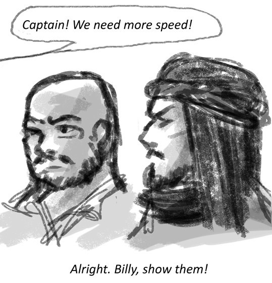
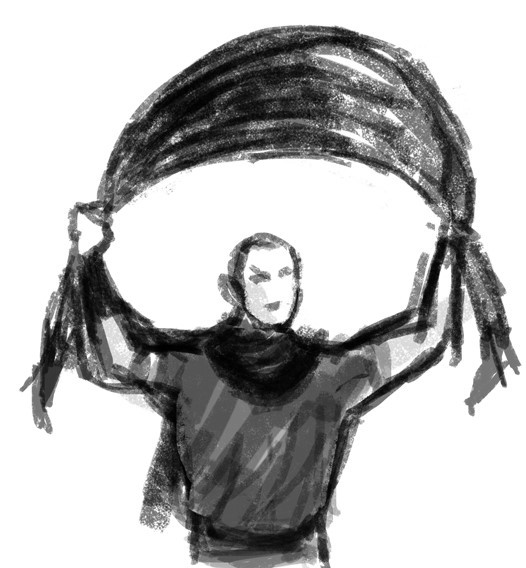
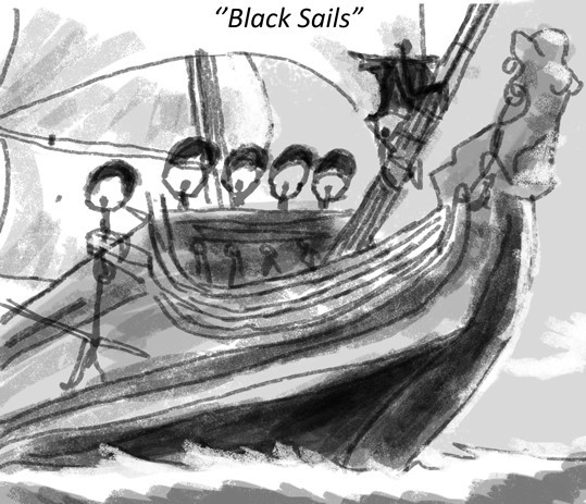
first(?) sketch for the “black sails” shenanigans (finished in 2018). I really liked Flint’s ninja style and in the last pic’s sketch there’s also someone holding Flint’s coat/cape to be an extra-extra “sail” lol. Tumblr flagged the finished art post at the time, because of the Walrus’ figurehead and her shapes but luckily the appeal went through...
Last pic for this post!

draft for the drawing where Flint accidentally cuts Silver’s hair while they are training sword fighting, oh noooo~
So as you can see, sometimes my drafts are very loose sketches and sometimes very heavy with thoughts and inspiration (so much so that they end up in the never-ending-pile).
Thank you for checking this out, I hope you had fun! :D
#black sails#black sails doodles#actual doodles this time#and wips#tag for Block Spoils doodles#<- in case you want to black list these
36 notes
·
View notes
Text
#showyourprocess
To continue supporting content makers, this tag game is meant to show the entire process of making creative content: this can be for any creation.
From planning to posting, share your process for making creative content!
RULES - When your work is tagged, show the process of its creation from planning to posting, then tag up to 5 people with a specific link to one of their creative works you’d like to see the process of. Use the tag #showyourprocess so we can find yours.
I was tagged by @thosefookinavacados to show the process behind this Megan Harry edit. I had lots of fun reading yours!
1. Coming up with the Idea
So remember when Harry followed Megan so many people I saw where like waprry so true bestie 🙏🏽 so since then I was like him should do a Harry Megan edit.
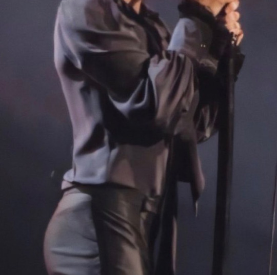
So then few days back I saw this picture of Harry and I was listening to Body and I'm like damn okay 👀 so I put it in my list of edits to make and then later decided to do it.
2. The Editing
Lol so I wasn't planning on doing this on PicsArt I had my Photoshop open and stuff but then when I started in PicsArt it got over there itself lmao. So uhm basically I started with like a red background and edited it a bit? After that I went ahead and got my fonts which I had saved and added that. This font is Lemon Milk.
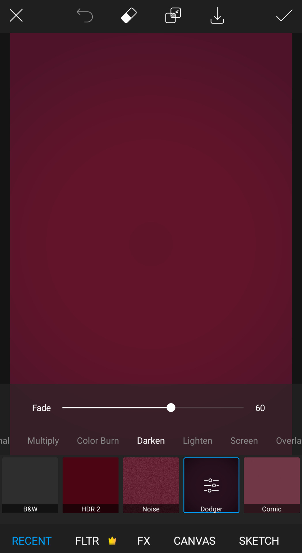
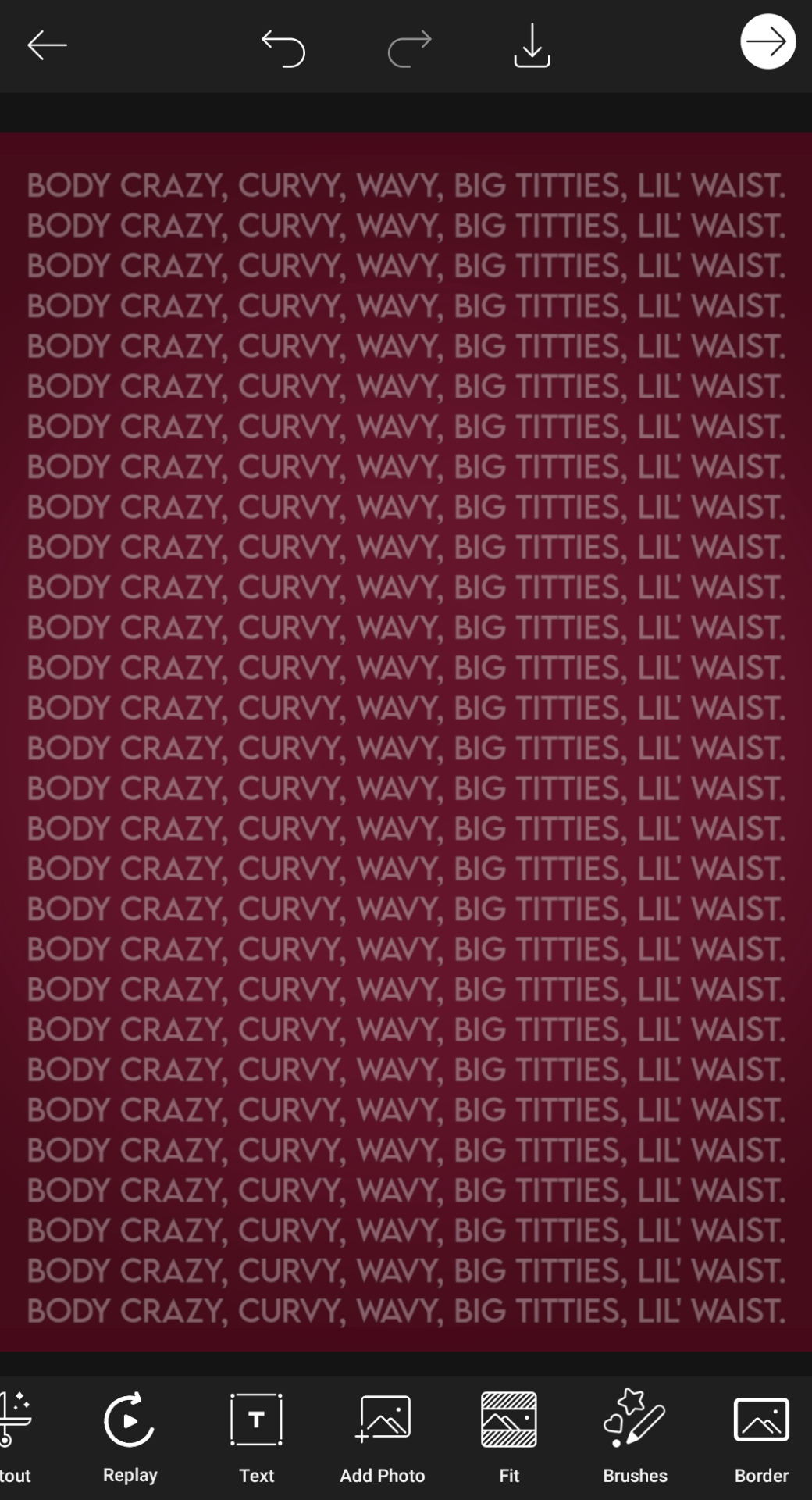
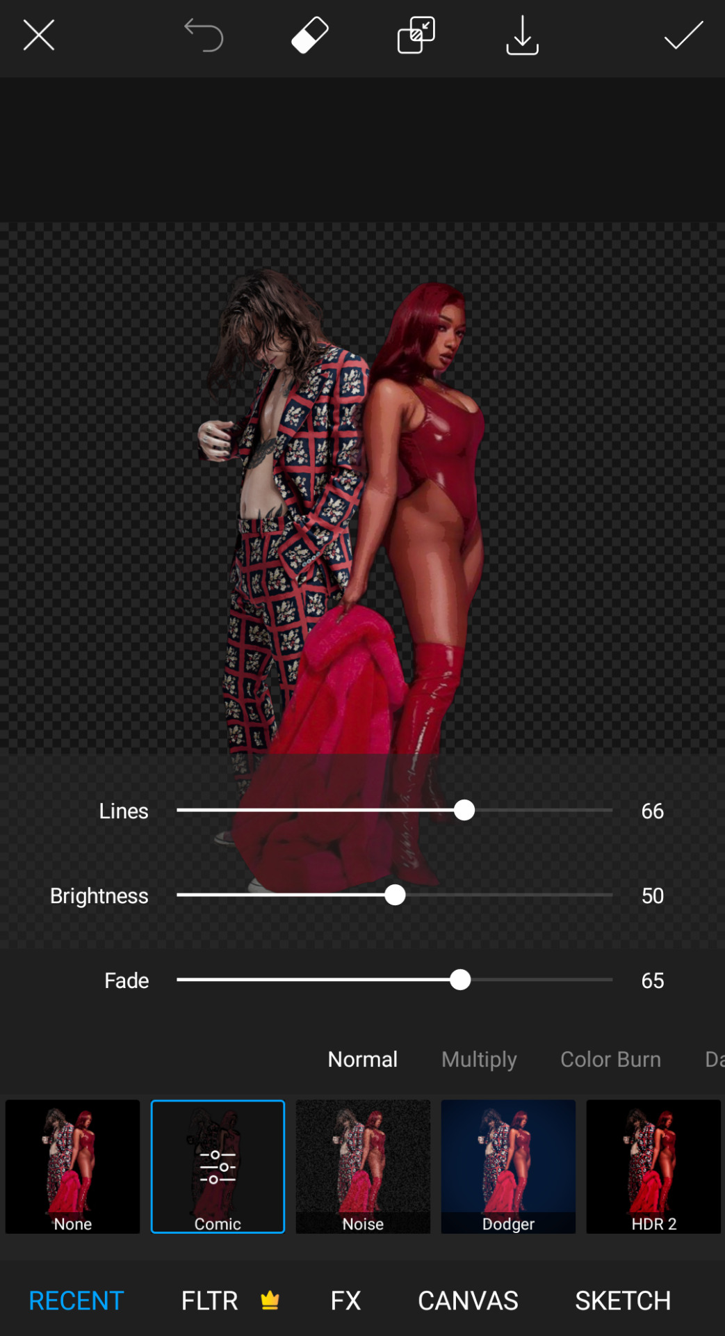
After this I like slowly started adding rest of the stuff? First I like tried to picture all of it in and see what I wanted and then made them separate so I can fix things if I didn't like them. So I first did cut out that picture of Harry and Megan (it was a struggle to find a Harry picture which I thought would fit) and edited it a bit. Then did all the separate fonts. The 'body' font is Fairfax Station and the Artist names font is Michaello.
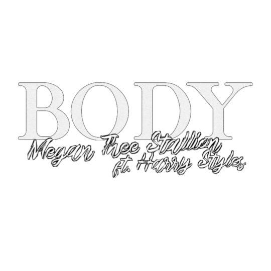

After this I just put them all together? I did make more like adjustments and stuff with size and colour.
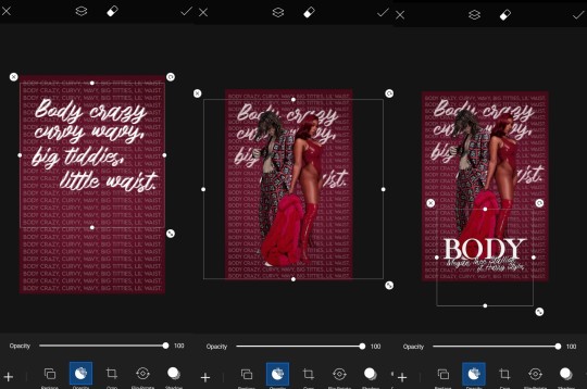
And the I just added like some finishing stiff like extra and was pretty much done! It came out better than I thought so I was like lol no need to use Photoshop.
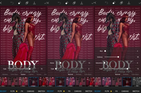
And yup! That was it!

I really liked how this came out. Thanks again for tagging me these are so much fun!
I'll tag:
@zi-shu for the harry icons you made for me!
@gayndrew for this walls edit! (I also love the wmi one! love your brain)
@cloudslou for this miss you edit (I love the idea so much)
@stormyhale for this poster edit of Louis (everything you make is so amazing thank you so much for your edits I love them so much)
@badreputatiom for this edit you literally just posted dhdjdk I love it so much!!!!
@lanwangiji for this zayn edit which is still one of my all time favourites!
@essercipertuttienonperse for these louis ticket edits!! (so pretty!)
#thanks for the tag i love these so much#also!!!! maria lol i just saw your tag rn! take your time hope you are well#just letting you know i love all of you so much!!!!!#tag games#show your process
9 notes
·
View notes
Photo

Hey guys! 😊 I’ve written this tutorial on how I edit my screenshots! It’s maybe a bit (a lot) more detailed than I originally intended, but I hope it gives you some new ideas/tips/tricks! 💗 (included below: how i fake reshade xD)

So I’m gonna start with this unedited screenshot of Felicia. 😁 I don’t use Reshade in my game, too much hassle. :P Instead, I use overlay textures and Photoshop actions to make my shots look pretty~ 😁
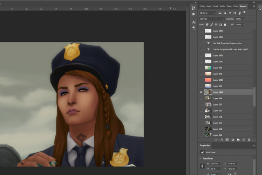
Here’s what that shot looks like after I’ve dragged it onto my echo_base.psd (the file I use for all my Winter Echo posts). I resize the shot only after bringing it onto the psd (but for this one, I’m leaving it at the original size). For Winter Echo panels, I use dimensions of 1011x608px at 72dpi.

Here’s what the shot looks like after I’ve turned on my four overlay texture layers above it. I have a large collection of these because I use them in my illustration work. Most of my textures I get from Adobe Stock (or make myself) but you can find a lot of great free ones on google images by using search terms like “gradient texture” or “overlay texture” (to get the best ones, change your image search settings: Tools > Size > Large). Here are the four I’m using for Winter Echo without their overlay effects applied:


And here are the specific overlay settings I’ve applied to each one:

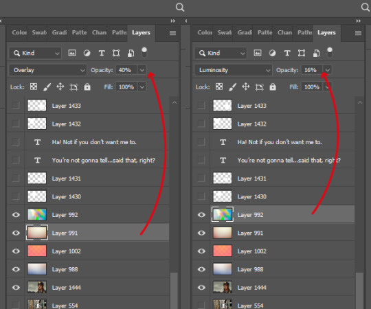
This requires a bit of trial and error! If you use this method you’ll probably end up mucking around with the overlay effects and opacity a lot because the results will vary according to the textures you’re using and the lighting in the shot underneath. These specific textures and their settings took me a while to settle on and I’ve used a variety of others in the past. 😊

This brings me to the Actions Panel! xD If you use a lot of lighting and colour adjustments on your shots, actions are a really good way to record them so you can apply identical effects to each shot. The shot above has had my “WE Indoor New” and “WE Colour Adjust” actions applied. But that doesn’t help you much, so here’s what I’ve actually recorded for those actions:
Photo Filter

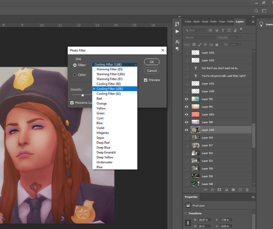
First step is always Photo Filter. Sims shots tend to come out a bit too warm imo, so I usually apply a Cooling filter (LBB is slightly purple).
Exposure
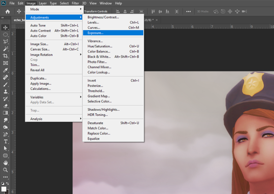
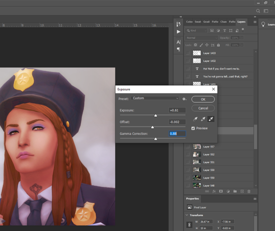
Exposure is a bitch to adjust because it will often have wildly different effects in different lighting. So I usually only adjust this a little, and let my textures do most of the lightening/brightening. You can get some very interesting effects with this though (e.g. I used to increase the offset a fair amount to make my shots look more dusty/soft).
Colour Balance

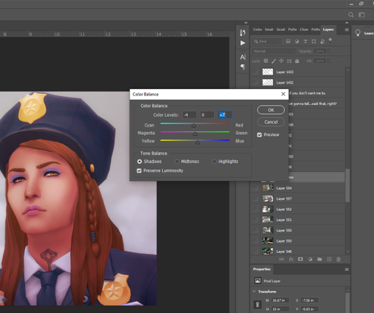
Again, my textures and photo filter are doing most of the work here, but I always add a bit more blue to shadows, and sometimes a bit of yellow to highlights just to take some redness out of skintones.
Levels

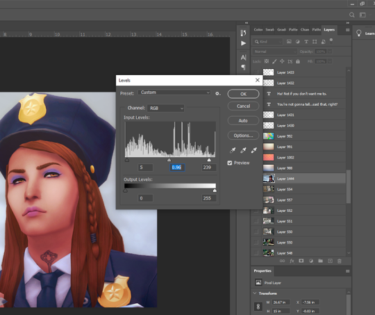
I use this instead of brightness/contrast. Just to make whites a little more white, and blacks a little more black, because sometimes my textures can make them a bit dull. Adjust as you like!
Noise

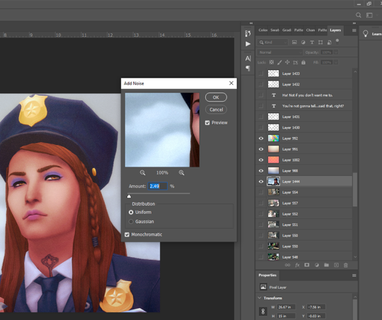
I used to use an overlay texture for this, but I like the consistency of Photoshop’s Noise effect. 😊 Don’t go nuts with this! A tiny bit of noise goes a long way. xD (and also, a higher noise level that looks good on a close up will make your wide angle shots look like a blurry mess, trust me 😅)
That’s all the effects I use in my recorded actions! Next step is...
Dodge & Burn
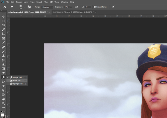
I only use this on shots that need a little extra depth, and only on faces/hair/clothing. Mostly I use the dodge tool on the T-zone of faces and the burn tool (with a large, soft brush) around the sides of faces. Keep the exposure very low to control how much shadow/highlight you’re adding. (You might also want to work on a duplicate layer for this step, in case you end up hating the result and wanna go back to the original xD)
That’s pretty much it for how I edit my shots! Obviously I haven’t gone into the tiny editing things like smoothing really angular edges, fixing clipping, etc or we’d be here all day. 😅 But here’s a little bit extra about how I make my speech bubbles:

I use Photoshop’s Rounded Rectangle tool on a new layer...


The corner radius can be adjusted in this panel. If you can’t see this panel, you can find it under Window > Properties.

Then I use the Polygonal Lasso tool (right-click on the Lasso tool to find the Polygonal Lasso) to draw a triangle on a new layer, and fill it with white.

I merge the two layers (the rounded rectangle layer & the triangle layer) and bring the opacity down to around 75-80% (depending on the shot in the background - if there’s a lot of detail behind the bubble, it needs to be more solid so the text stays readable). I’ve added text afterwards in this example but I always put the text in first, so I know how big the bubble needs to be and where to place it. I keep all these bubble and text layers in the psd until after they’re posted, so I can easily make edits as needed. 😊 (but I don’t keep them forever, because I’d have thousands of layers by now and the psd would take 10min to open 😅)
I hope that was all easy enough to follow!! If you have any questions at all about any of this stuff, or need help with Photoshop in general, please feel free to leave me a comment or shoot me a message! I’m always happy to help 😁💗
83 notes
·
View notes
Photo




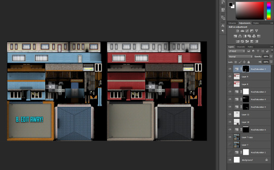

RABBIT HOLE RECOLOURS AND RESCRIPTING TUTORIAL
Are you having difficulties getting the outrageously coloured rabbit holes to fit into your moody emo town? Or would you like to make your high street look like a Skittles factory had just exploded? Despair no more! Release your inner MacGyver and DIY!
Programs you need: S3oc S3pe Photoshop or Gimp (DDS plugins for Photoshop -> this and this, Gimp has this feature built in already)
// Disclaimer: This tutorial is picture and text heavy. I hate having to have bazillion different tutorials open because everyone always assumes you know what you are doing and I keep on closing tabs by accident, so this tutorial will run you through each and every step with (far too much) detail because I’m a simpleton and I need both pictures and text when learning new stuff! I have divided this into digestable parts, so you can skip ahead down the tutorial if you are familiar with some of the steps such as cloning. Pictures above are numbered and each step is explained below.
1. CLONING A RABBIT HOLE
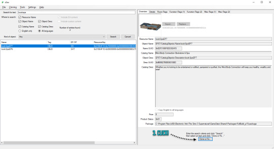
1. Open S3oc, click Cloning and Normal objects.
2. Click Tools and Search, type in keywords such as bookspa or hospital. If you still can’t find what you are looking for, then the other option is to just scroll down the list of items and try locating the rabbit hole you need.
3. Once you have found your rabbit hole, click Clone or Fix.
4. Tick all the boxes I have ticked.
5. Edit the Catalog Name and Description, these are the things you see in game when you browse through the items and stuff. If you are not fussed, leave them as is.
6. Change the file name here (Some guides mention changing it, some skip it, but I have changed mine and nothing exploded so far!) and click Start. A window pops up asking where you want to save your package, I usually create separate folders for my projects on my desktop as I don’t want to accidentally mix my .DDS files with other rabbit hole files and stuff, but if chaos is your thing just save wherever.
2. RECOLOURING A RABBIT HOLE
7. Locate your newly created rabbit hole clone .package (You can create a backup copy of it somewhere if you think you will mess up somehow) and open it with S3pe. Look through the IMG tags and find a LOD image like this. Right click and Export to file. If you are organized like I am, you can save it in your project folder with your package file... Or place it wherever because of whatever method of madness you use when editing your files. I’m not your mother. Do whatevs.
8. Now depending on which program you use, open the .DDS file in Gimp or Photoshop, if you get a pop up window just go with default size and no mipmaps. This is the step where you let your creative juices flow and take over. Want to change everything? Or only one colour? Depending on the rabbit hole you have chosen to edit it could be a really simple one click thing fix, or if you picked a more complicated one like I did, you are going to spend some time on this step. I added my before and after picture edits I did in Photoshop as an example.
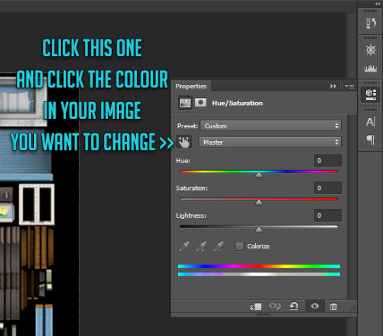
// Photoshop Tip! I’m not familiar with Gimp, so I’m not sure how well this works in there, but I abuse the hell out of Hue/Saturation and the colour picker in Photoshop to get rid of and edit the colours. Press the little hand icon in the Hue/Saturation pop up box and click the colour you want to change in the image and it picks it for you, then just use the three sliders to change your colours, easy! Be careful though! Sometimes it changes too many areas in one go, so you might have to use marquee tool to isolate the bits you want to edit so rest of the image doesn’t change (While using marquee tool you can press either Shift or Alt at the same time which allows you to add into or remove from your current selection!). Or use masks. Up to you. Then once you have selected the areas, create a new layer and hit the Hue/Saturation button and it will only impact the areas you have selected. Play with layer settings if you end up adding separate colours on top, for example my red paint layer looked best with linear light and 80% opacity.
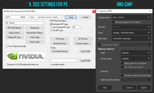
9. Once you are satisfied with your colours and you have merged your layers, this next step is different with Photoshop and Gimp. With Photoshop you can use Save As option while with Gimp you have to use Export As. Either way, save or export over/replace the image you originally opened using the .DDS settings shown (Please correct me if I’m wrong with Gimp settings as I don’t really use it!). If you have been saving as psd or changing the file’s name, make sure the name is now EXACTLY the same as when you exported it earlier. However, I’d urge you to do backup copies before overwriting the file, in case you have coloured something wrong or if you think you might want to change something after doing a test. Just you know, to save you some hassle if shit hits the fan.
10. Back to S3pe, you will now replace the image you previously exported with the edited one. Click Resources (or right click the IMG file on list you are replacing, both ways work), Import from file and pick the newly edited file, click ok on the prompt. Your old IMG file should be crossed out on the list and new IMG added (Once you save the crossed out one simply disappears). Depending on what kind of edits you did to the LOD IMG, you have to repeat exporting, editing and importing each and every IMG file corresponding to the changes you did with the first one. Be extra careful with matching the colours between the IMG files, otherwise you get some funky rabbit holes when zooming in and out! For example for my rather edit heavy LOD image I had to edit another 5 IMG files all in all in the end (Different wall bits, bit of carpet, window trims, roof!).
3. MAKING IT BASE GAME COMPATIBLE
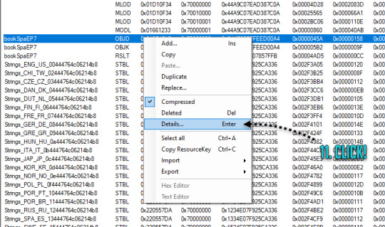
11. Done with your IMG files? Still in S3pe, locate OBJD file on the list, either hit enter or right click for Details.
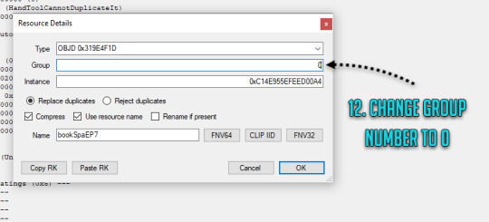
12. Change the group number from whatever to 0. Save your package.
You are done and your rabbit hole is ready to go in game! Drop it with your other .packages in your Mod folder and test it, in edit and live mode in game. Are some parts of the building still showing old colours or are they changing drastically when you zoom in or out? It’s not the end of the world! You must have forgotten to edit one of the IMG files or the colours are not matching, double check that all the bits you edited in the first image match with rest of the IMG files. Even if you got the colours right there will be a slight chance due to how Sims 3 renders items, so don’t panic unless IT’S REALLY BAD! Just look at how other nonedited Sims 3 stuff renders and compare how yours behaves. // But wait! Maybe you want to make it a default replacement rather than a new individual rabbit hole like my tutorial does? For default replacements, follow this guide.
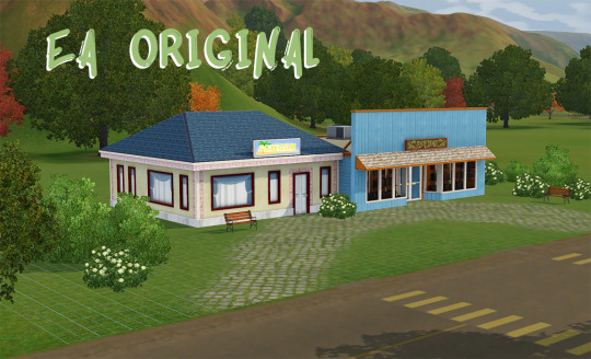
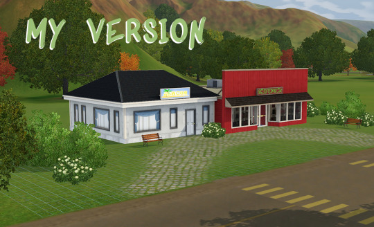
4. CHANGING THE RABBIT HOLE SCRIPT (OPTIONAL)
Like the look of your rabbit hole building, but don’t think it looks like a spa or a bookshop? Is it giving you a hospital and science lab vibe instead? Again, no need for anxiety! You can fix it! Sort of. It should work but be wary! If you use lets say the Annex script, you got to have University EP installed to make it work. Without the right expansion, you can’t have special careers. Just keep in mind that some scripts may not work with some buildings due to the specific animations and stuff, so test it before you release your masterpiece in the wild.
13. Open your .package in S3pe, locate OBJK file and right click Edit OBJK.
14. Replace the String bit with one of these scripts from the following list. Commit to changes and save your package. You are done!
Bookstore Sims3.Gameplay.Objects.RabbitHoles.Bookstore
Business and journalism Sims3.Gameplay.Objects.RabbitHoles.BusinessAndJournalismRabbitHole
City hall Sims3.Gameplay.Objects.RabbitHoles.CityHall
Criminal building Sims3.Gameplay.Objects.RabbitHoles.Hideout
Diner Sims3.Gameplay.Objects.RabbitHoles.Diner
Grocers Sims3.Gameplay.Objects.RabbitHoles.Grocery
Hospital Sims3.Gameplay.Objects.RabbitHoles.Hospital
Mausoleum Sims3.Gameplay.Objects.RabbitHoles.Mausoleum
Military Sims3.Gameplay.Objects.RabbitHoles.MilitaryBase
Movie studio Sims3.Gameplay.Objects.RabbitHoles.MovieSet
Police station Sims3.Gameplay.Objects.RabbitHoles.PoliceStation
School Sims3.Gameplay.Objects.RabbitHoles.SchoolRabbitHole
Science Sims3.Gameplay.Objects.RabbitHoles.ScienceLab
Spa Sims3.Gameplay.Objects.RabbitHoles.DaySpa
Sports stadium Sims3.Gameplay.Objects.RabbitHoles.Stadium
Theatre Sims3.Gameplay.Objects.RabbitHoles.Theatre
Vault Of Antiquity Sims3.Gameplay.Objects.RabbitHoles.VaultOfAntiquity
Subway Sims3.Gameplay.Objects.RabbitHoles.Subway
Fortune teller caravan Sims3.Gameplay.Objects.RabbitHoles.GypsyCaravan
Equestrian center Sims3.Gameplay.Objects.RabbitHoles.EquestrianCenter
Annex Sims3.Gameplay.Objects.RabbitHoles.Annex
Hospital & science combo Sims3.Gameplay.Objects.RabbitHoles.ComboHospitalScienceLab
School & stadium combo Sims3.Gameplay.Objects.RabbitHoles.ComboSchoolStadium
Book & spa combo Sims3.Gameplay.Objects.RabbitHoles.ComboBookstoreDaySpa
City hall, police & military combo Sims3.Gameplay.Objects.RabbitHoles.ComboCityhallPoliceMilitary
Business & bistro combo Sims3.Gameplay.Objects.RabbitHoles.ComboBusinessRestaurant
And I think that’s it. Let me know if you know a better way or I have made an error in this tutorial! Or if you want to fight me, I will meet you behind the mall by the bins for some asskicking.
#the sims 3#ts3#simblr#ts3 tutorial#ts3 rabbit hole recolour tutorial#ts3 base game compatible tutorial#ts3 cloning tutorial
165 notes
·
View notes
Text
Okay, so are you continuing the comic or what?
Hello there comrades,
So yeah, last few months I’ve been (once again) trying to get back into the groove. So far, I'm cautiously optimistic. I didn't want to just openly declare that I was restarting the comic since... well, some of you know how that went the last few times.
I've managed to add 8 completely new pages to the comic, as well as edit a few of the older ones and the new run of Vreakerz is currently 26 pages long. Furthermore, I've made some changes to my drawing process. As some of you might still know, I used to to draw both traditionally and digitally.
My old process looked like this (excluding the writing process):
1) sketch a few rough versions of the page based on the script on paper;
2) pencil and ink the page;
3) clean the page;
4) scan the page;
5) try to fix some of the errors;
6) colour the page;
7) add the dialogue and finishing touches.
Then, once I started using the new Cathedral 3D model, it changed a bit:
1) sketch a few rough versions of the page based on the script in Photoshop
2) add in 3D scenes from Blender;
3) Print the page with the 3D elements in blue colour (to filter out later);
4) sketch the rest on the printed paper;
5) pencil and ink the page;
6) scan the page;
7) try to fix some of the errors;
8) colour the page;
9) add dialogue and finishing touches.
While this did improve the architecture in each shot as I intended, it added some rather cumbersome extra steps. Furthermore, I often find myself disagreeing with an earlier layout choice once I put the dialogue in and I sometimes just suddenly think of a more interesting focal point for a panel, meaning I want to move the 3D scenes around as well. This of course is rather difficult when you’re working on actual paper with printed out scenes.
In short, this approach was on the right track, but it still included too many drawbacks of my old approach.
So, Since the latest page (http://vreakerz.angrykitten.nl/Stories/read/26), I've gone completely digital. It was quite a step for an Indian Ink lover like me, and I still have to figure a few things out, but overall I'm very happy with the result. I was especially concerned that I would not be able to capture the slightly jittery ink lines I get when inking traditionally, but I think I'm on the right track.
My process has become considerably quicker and having everything digital has the -huge- advantage that you can change things around while already past the sketching phase. Of course, I still enjoy drawing traditionally, so although I’ll be doing Vreakerz entirely digitally from now on, I’ll probably still draw some pen and paper pieces every now and then.
So, that’s pretty much it for the update. Follow me on Twitter if you want to keep up to date with what I’m doing. I’ll try to upload stuff to Deviantart and Tumblr as I go.
1 note
·
View note
Note
I think you've already talked about this before but I couldn't find the post on your Tumblr, so I was just wondering what your process was for making animated gifs. Like what methods you use to make them, what software you use, etc? Also, what parts do you find most fun or difficult or challenging? I've started making some animated gis, and while I don't know if I'll ever be nearly as prolific as you are, I was interested in learning more about them.
Oh hey! Thank you!! I don’t think I’ve ever gone through the process of how I make gifs in detail before, mainly because I don’t use Photoshop so I just assume my advice won’t be helpful to anybody. I don’t know how helpful this will be to you, but I’ve done a little step by step walkthrough of how I make a gif with a few general pointers thrown in. I was gonna try and keep it brief but it turned out much longer…..sorry.
I’ve put what I find most difficult and fun at the end, so you can just skip to that if you want.
As for the rest, here goes….
So, background: I taught myself how to make gifs using Serif Photoplus X2 because we used their products in highschool. Then a few years later, I updated to Photoplus X7 (made hardly any difference though). Serif doesn’t even make the Photoplus range anymore (they still sell X8 but it’s rubbish and crashes a lot, and their new product Affinity doesn’t even let you make gifs!). I’ve tried to use Photoshop in the past and everyone says it’s better, but I’m stuck in my ways like the stubborn old woman I am.
Anyways, when I want to make a gif I start off by capturing screenshots for the frames. I’ve always used GOM Player and their “Burst Capture” option to do this. GOM Player lets you choose the format your images are saved as and where you want the frames saved to. I have a special “captures” folder for temporarily storing the files in. So for example, these are my frames:
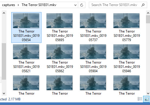
A good general tip for making gifs with any software is to use the best quality video you can find. Most of the stuff I make is with 1080p or 720p quality. I find it helps when it comes to colouring and making the gif look clearer.
Once I have my captures, I copy them into my animation “canvas” (or SPP file) which has a base colouring I’ve already made on it. It’s kind of like a PSD on Photoshop. I select my captures and drag them onto the canvas which looks like this:
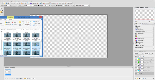
The canvas is 1080p, the same as the captures but everything will be resized later. I originally captured 100 screenshots here, but I’ve decided to use only 40 in the end because I want to make a 540px width gif. If I used all 100 frames for a 540px gif it would end up being way over the 3mb limit and it wouldn’t work on Tumblr.
Now this is where the time consuming work comes in for me. Once my captures have been copied into the SPP file, they actually become layers which I have to turn into gif frames (if that makes sense). So at the moment they look like this
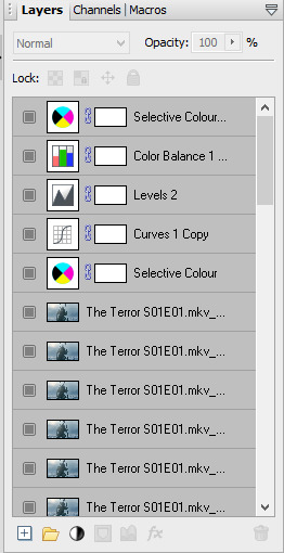
But I don’t have any actual frames yet at the bottom of the screen. So what I do next is go to the layers tab at the top of the screen and click “hide layers”, making them all invisible
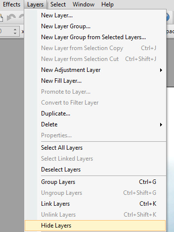
Then basically what I do next is create a frame at the bottom and assign an individual capture to it by clicking the little grey square (making it visible again). So as you can see, my first frame is for my first capture/layer. The next frame will be the capture/layer on top of that.

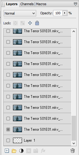
So yeah, that means I create each frame individually. It’s veeery time consuming but you get quicker at it the more you do it (it’s also faster to do on a laptop touch pad rather than a mouse.).
Once I’ve created all my frames, I reselect the colouring layers at the top so they’re visible on every frame. It should look like this

Next, you need to crop your gif and resize it. I want my gif to be 540px by 270px so I put 54.00 and 27.00 into the crop feature to get it accurate. This allows me to crop the canvas into the right dimensions.
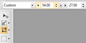
Once I’ve cropped the canvas, I then go to the Image tab at the top and click “Image Size…” and set the image size to 540px by 270px. I usually ignore the Print Size bit.

540px is the best size for a full width Tumblr gif, anything bigger or smaller will make your gif look blurry. This gifset is a good guide for making sure Tumblr doesn’t blur or crop your gifs.
My gif is almost ready to be exported. But I want it to look clearer, so I sharpen all the layer/captures (yes, individually again). I have no settings for sharpening, but I find using the standard “Sharpen” effect under the “Effects” tab is enough.
Once I’ve sharpened everything, I get to the colouring and exporting which is the biggest challenge for me. Photoplus’ options for exporting gifs are limited, so the only decent export options are these
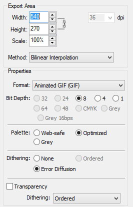
“Web-safe” and “Ordered” makes the gif look like this
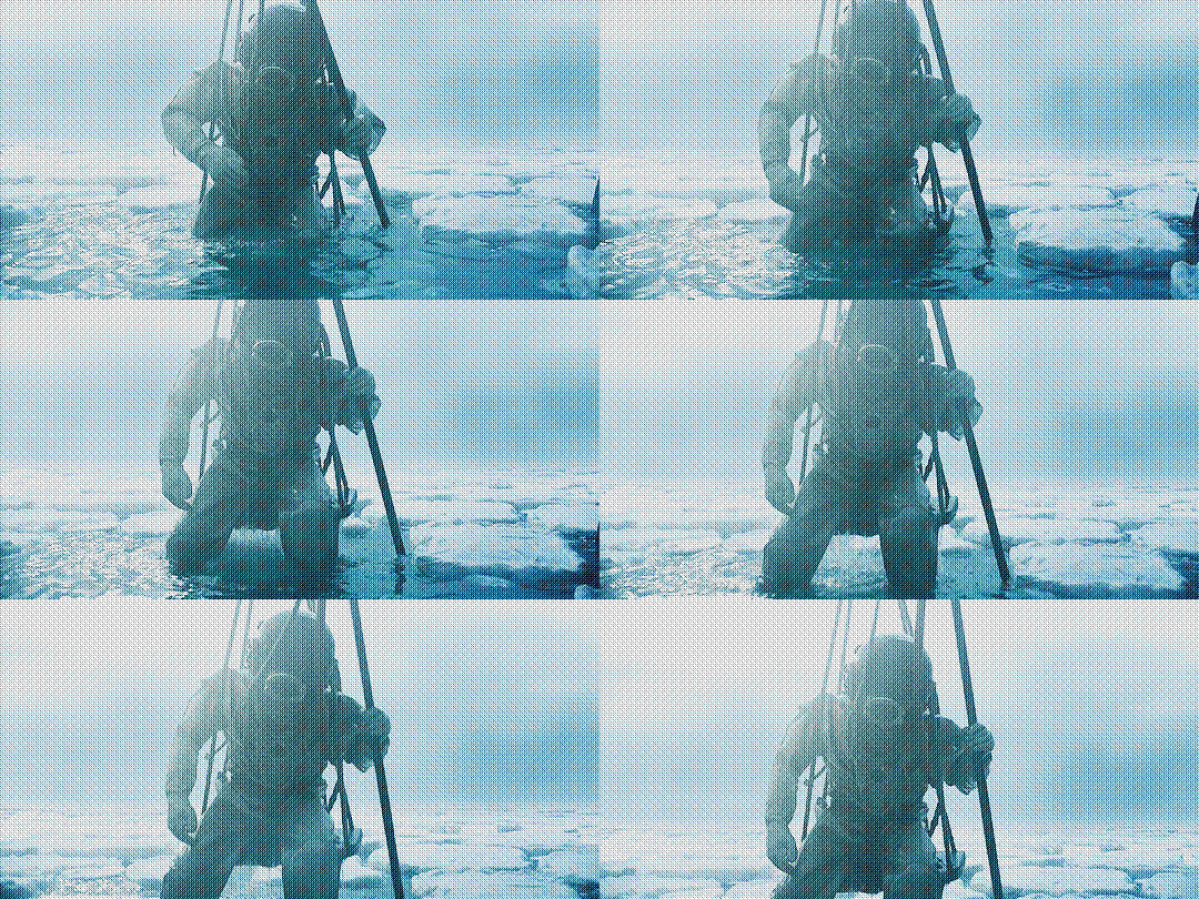
“Optimized” and “None” makes it look like this. Okay, but the background looks low quality and patchy

“Optimized” and “Error Diffusion” is the only one that to me, looks the best quality. That’s probably why it produces the bigger file size too (the gif below is 2.78mb)

But there’s other downsides to Error Diffusion which I’m still trying to figure out to this day. Like how it makes parts of the gif “glitch” (that’s the only way I can describe it) or look extra fuzzy. The only way you can fix it is by playing around with the colouring. And by “playing” I mean adjusting and previewing until you want gouge ur eyes out :)
I think that’s why I like giffing The Terror so much, because the film they used has a grainy texture to it, making it easier to hide all my Error Diffusion sins. Though there’s been many times I’ve posted something and hoped no one’s noticed all the mistakes.
Some general tips for colouring
Unless you’re going for a certain effect, emphasise on the colours that are already in the shot. In my gif above for example, I turned up the blues and cyans.
Use Levels or Curves instead of Brightness and Contrast.
Zoom in on your gif to spot any Error Diffusion glitches.
Be mindful about whitewashing POC, especially if you’re following the pastel gif trend.
Look at how other people colour their gifs and use PSDs for reference but don’t rely on them too much.
Colouring can increase or decrease the gif file size. If you need to get below 3mb, try toning down super vibrant colours. If the shot you’re giffing is dark, make it a bit darker. If it’s light, make it a bit lighter.
If all else fails, just make the gif black and white.
Reading all this back makes how I make gifs look like a nightmare lmao. But I’ve been doing it this way since like, 2012 and i love it. I started out making very bad Star Wars and Lady Gaga gifs but as time has gone on and I’ve gotten better, I’ve found I enjoy making things for smaller fandoms much more. I like that if I want a certain set or edit on my blog, I can just go and make it (with varying degrees of success) instead of waiting for someone else to do it.
You appreciate the work that goes into making a movie or show when you make gifs too. Like, you notice subtle little things in the actors performances or something the cinematography is trying to convey. You get to revisit a scene in detail and then share it with everybody else and if you’re lucky, watch them scream in the tags get some nice comments.
There’s lots of other stuff I like about making gifs but I’ve rambled on far too much so I’m just gonna shut up for now. But I think I’ve covered all the important stuff. I don’t know how much of a help I’ve been (there’s still stuff I don’t understand myself) but if there’s anything else you want to know just drop me a message. Good luck with your own gifs!! I’m sure you can do a much better job than me!
#Ask#unspeakablehorror#phew! this is a full on essay i'm sorry#gif making#Serif Photoplus#photoplus#long post
22 notes
·
View notes
Text
Web Designing Company - Hiring A Web Designer Verses Graphic Designer

Today, the internet designing company has become a wonderful source of relief for all those business owners who find it difficult to execute the efficient promotion in their products and services. The Internet Designing Services provided by different applications firms are of immense help such small business people.
A website designing company hires the web designers as well as the picture designers. The web designers hired by means of a web design company are well aware about all sorts of programming methods which are critical to be able to highlight a web site in the most effective possible manner.
These web designers offer you efficient Internet Designing Services that include features that are capable of adding an extra tint of sophistication and functionality into a site.
The picture artists on the other hand are not entirely aware about all of the programming techniques that are required so as to offer a brand new outlook to a website. The basic working of a picture designer includes example (fine or digital art examples including painting), magazine design and publication layout, cloth design (rugs, fabrics and upholstery), print design and advertisement design (theories for promotional initiatives and silkscreen printing for clothing), video effects and editing (editing and shooting of corporate video and business video in addition to special effects and animation). A picture designer isn't that much capable of designing that the codes that are required for designing.
The task of a web designer is absolutely different from that of a graphic designer. A web designer is included with creating web pages for the internet. A website designer designs the graphic display of images and content that are further displayed on the internet at the kind of web pages.
A web designer uses different applications such as HTML, CSS, XHTML, Java Script, PHP, Photoshop, and images such as JPG. The work of an internet designer is much more inclined towards the technical side. In contrast to this job of a web designer, the job of a picture designer is extremely succinct. A graphic designer could be unable to offer a shape to each notion of yours.
The Web Designing Services offered by different applications firms include the working of the web designers as well as the picture designers. There are some firms which depend on hiring just the web designers for many of the major programming activities. This is because the web designers not just hold the technical expertise but may also be aware about all of the tricks which need to be implemented in order to enhance the rank of a certain website.
Best web design company florida is much more efficient in boosting your thoughts to reality. He or she can actually provide a better shape to your ideas when compared to the usual picture designer.
I, personally believe that in case you prefer to make an excellent web site for the promotion of one's firm, then you can always trust that the net designers. If your business can be an online one, then your Web Designing Services made available from a perfect web designing business can assist you to achieve immense quantity of popularity worldwide.
Good Web Design
What is Web Design?
An internet site is your final outcome of a Web design. The Web site stays on a internet server where electronic files are stored. The Internet site presents the contents and interactive features or interfaces to the person in the shape of Web pages.
The way the data requested is shown on the user is par of the Web design process. Additional controls are embedded as a way to produce more technical media like cartoons, sounds as well as other styles.
Whats New? The Clouds of Course!
Everyone wants something new every once in awhile and yet some want a fix of something entirely distinct. At the domain of the web, that's quite a common occurrence with the many innovations that are always appearing and with them all, none may be as exciting since the move in to the clouds.
In case youre most people around who don t understand CSS and have no time, or care, on howto complete one for the blog, then your next action for you would be to obtain a place in which you are able to download one at no cost.
Thank heavens there are plenty of websites available that offer them away at no cost. The only issue is, that since you are maybe not usually the person who created it, you will be susceptible for their own layouts and whims.
One of those websites that provide free CSS of trendy web layouts is The open-design Community (TODC). The Open Design Community is just a hub for open source web site designers from around the world offering tens of 1000s of XHTML and CSS based free website site design templates offered for downloading. So, please don't hesitate to take a minute or two and surf through the designs our fabulous designers have filed and determine whether you could get the job done for you! And remember they are liberated!
Bad Web Design
Below are a few features that could really mar the overall notion of your website. It is crucial to take notice of their very frequent mistakes web designers commit. You may be able to apply some tips into creating an efficient web designing which may be simple but can invoke your projected image. Backgrounds that are grey in color with default gifts so many issues most especially with the pages readability.
Avoid color combinations which could render the characters unreadable. Backgrounds are mostly effective if it is left simple and will not restrict reading. Texts have to be readable. Stay away from modest characters. Maintain the links colored gloomy just as much as possible because ordinary users are used with along with.
DIY Web Design
Do-it-yourself design projects are proliferating from the internet nowadays. There are a lot of web sites that practically teaches you everything to do without hiring a web designer. A do-it-yourself website design applies absolutely for young professionals who are only starting to learn stuff in business or seeking to reformat the existing business that they are running.
DIY web site design offers you total control on the job and over the site that is precisely why its only gaining recognition. It takes the job out of dealing with advisers, contractor, designer landscaper and the likes. In DIY design, your ideas are sure to be heard and taken attention to.
You have to express your personality and personality. Because at the end of the afternoon, it still will become your website, attempting to sell your goods. This has solved persistent issues with webdesigners that are truly enthusiastic in their job who can become too sensitive to your small correction or observation of his work. Do it yourself web designing surely saves you money and energy and time.
Benefits of Web 2.0 Software
Web 2.0 software are the current trend in website design. Many Internet businesses and users are embracing web 2.0 for the added features. It has also increased functionality. It has taken to a fresh wave in just how web sites must be built, designed and implemented hands-on. It generates the users like blogging, download, RSS feeds etc..
These developments give added excitement to internet experience. It's stated that Web 2.0 organizations websites get higher ranking in search engines, for example Google, yahoo and others. Online 2.0 benefits are countless. You can find photos, albums, help maps and guides for planning your own traveling abroad.
It has dramatically altered the quality of societal interaction worldwide. Blogs proliferate. Marketing online prices much less. And it has generated networking success stories. Web 2.0 gives you full control over your business while still adding smaller but very useful features to it.
Website design is obviously not giving the people with the following plain slice of text. Go as per the old expression"beauty is in the eye of the beholder". This beholder is the visitor of this web site that you're going to create.
Whilst a skilled web site designer you ought to have mastered all of the skills necessary to create refined and attractive graphics, colors and contours put in excellent balance to capture the attention of this visitor together with drawing his focus into the many crucial sections of your own website.
Your job as a website designer is always to take advantage of colours, text and images and interpret into a visually appealing layout, logo, banner, and button system.
As a professional site designer, you need to chalk out a well-devised approach for creating the website. To begin with, you need to understand the specific business necessities of your client and set out the basic structure of the website.
In order to decrease the cost of the create, the website designer should be equipped with web templates that are predefined. Having this feature in your armory, that you really don't need to really go hog-wild with the layouts for the reason which you aren't designing a website by means of tinkering.
Internet Marketing (Part two )
Begin a site. Blogs have become a popular for se's. If you proceed and launch a site, then join it in your primary website, publish cubes of information and then float RSS feeds. Should you choose these afterward the majority of the various search engines may locate you much faster.
Design some duplicates of digital novels that you can send to every one. You can write for courses or articles online that could possibly be submitted everywhere. Then, create your own write-up in a manner that you can utilize them in any potential sort of networking, whether online or offline.
1 note
·
View note
Text
GIF TUTORIAL
i’m finally getting around to giving the people what they want!! i hit 2.5k like 3 weeks ago and asked you guys what you would like me to do in honour of that...the resounding answer was ‘gif tutorial’ !!!!
so!! in true dnp fashion i’m merely here to give the people what they want and the people have demanded a gif tutorial, so here it is!
we’ll be learning to how to create this gif right here!

please keep in mind that this is how i make gifs!! everyone does things slightly differently and what i say and do may not match up with other people or your own personal style and that’s okay! editing is all about creative freedoms and you may use this as a basic starter so that you can branch into your own thing or you might really like how i do things and use the same methods. point is, it’s perfectly okay either way!!
right so!! let’s get the basic bullshit out of the way! i use ps cs6 but it’s basically all the same, so this should work perfectly fine no matter what ps you use.
1. we’re firstly going to choose our video to gif. for this tutorial, i’ve chosen pinof 10! pick a moment you like and get the timestamps from when the moment starts and finishes. i usually get a second before and a second after to make sure i’ve got it all!!


2. we’re now going to copy the url of the video and go to clip converter. clip converter basically is going to give us an mp4 version of our little timestamps so that we can put them into photoshop and make gifs from them! paste the url of the vid into clip converter and press enter once. once you’ve done that follow my settings and press start
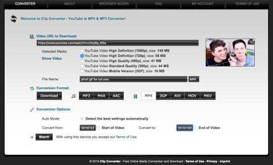
(of course you can name it whatever you want and put whatever timestamps you want in!!)
once it’s done converting, it’ll give you a download of your mp4 clip, which you’ll click!
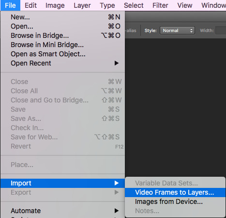
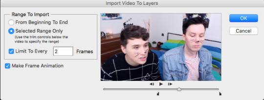
3. now open your photoshop. go to file, import, video frames to layers, like shown and select your video
once you’ve done that, put these settings in and trim the clip to your liking (the little black place holder things trim the clip!)
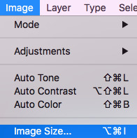
4. okay so!! we now have our gif imported and open on photoshop! we have to make it much smaller because right now it’s like...huge (that’s what she said hehehe)
simply click on image at the top of your computer and press ‘image size’, like shown
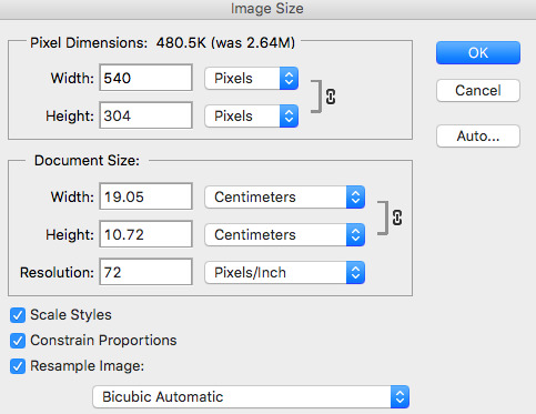
then make your settings like shown
5. so that’s done!! now, we have to change the pace of our gif to be a bit slower. i make my gifs real slow apparently but,,,,,personal preference man. click on the first frame of your gif and then scroll to the end of the frames of your gif. hold the shift button and click the last frame. this will select all your frames. press the little arrow thingy near the time of the frames. this will allow you to change the pace of your gif. press other and change the timing of the gif to whatever you want! i make my gifs like 0.07 normally but for this gif, i made it 0.09 because they’re moving so fast and it was giving me whiplash. anything under 0.1 is great!!
6. cropping time! you don’t have to crop your gif if you’d like, but mine is a little big for me, so i’m going to and show you how to do that! so basically press the cropping tool and put in the measurements you’d like, as i’ve done.


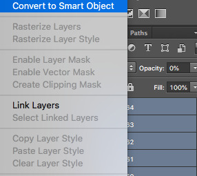
7. now we’re ready to convert our gif to the timeline method! select all your frames again, like before, as well as your layers. selecting your layers is the same as selecting your frames, so nothing new there, don’t worry! once everything is selected, press this lil guy.

once our gif is in the timeline method, right click your layers that should all be selected and turn them into a smart object, as shown!
8. righty-o! we’ve done all the boring, dumb shit! time to use an action to make our gif look a little nicer and sharper! i really can’t be assed showing you how to use an action in here because i suck and this is long as fuck as it is but!! i am nice enough to link you to a basic tutorial on how to use actions and how to download them! you can find that here! right so, i use a certain action on all my gifs and then edit it slightly, which i’ll show you! you can find a download for the action i use here !!!
i play that action and now my gif looks much nicer! however, it’s not quite the way i like it, so i push the gaussian blur layer to the bottom and i adjust the strength of it to this!

9. i lied. now we’re up to the fun part!! colouring!! colouring is my best friend and i love her dearly!! technically you could stop now and save your gif and be done but....that’s boring as fuck!
right so, colouring really, truly is your own preference, loves. you can do whatever you like, you do NOT have to follow what i put here. this is simply the colouring i chose for this gif. i do literally whatever i feel like every time i make a gif, so it’s forever changing!
i gave a bit of thought to what kind of colouring i’d do in this tutorial. did i want to do something extra basic and like...no colour changing? did i want to do something wildly vibrant? and then i decided not to do either of those things! so today, i’m going to teach you how to create a soft, almost pastel blue/purple colouring for the ap room *cough* set *cough*!!
firstly, here is the adjustment panel where all the tools you need for colouring reside !!

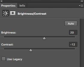
we’re firstly going to start with the boring crap,,,,,so i lied again....oops. firstly, we’re going to adjust the brightness, the levels and the curves. here are my setting for each, if you’d like to copy them!


here’s how the gif looks without all our colour layers!

10. and now all that crap is done, i promise it’s actually the fun stuff!! selective colour is where all the magic happens! i sometimes do two, three or even four selective colour layers, depending on just how heavy the colour changing is going to be in my gifs, as well as using hue/saturation, colour balance and gradient maps!!
firstly, we’ll start off with our first selective colour layer! here are my settings for it (sorry for all the pics rip)


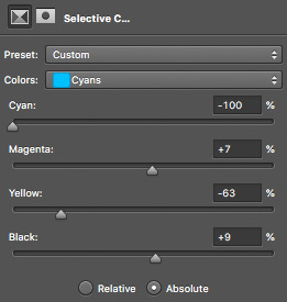
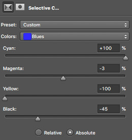
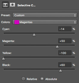
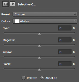
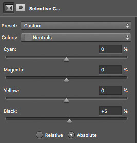
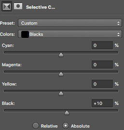
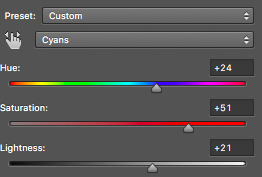
once you’ve got all those sorted, onto a hue/saturation layer! this basically drastically changes the colours, if you’d like it to but it’s not quite as accurate or smooth as a selective colour layer, so i only really use it for small things or if the colour i’d like can be acchieved nicely with it. i didn’t change anything in the master setting, but here are my settings for the things i did change!

aaaaaaaand now we do another selective colour layer! i’ll just show you the layers i did change...everything else, leave as is!!
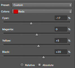
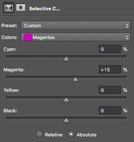
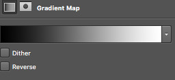
11. next is a few gradient maps and a layer of vibrance!! i promise, we’re almost done!! i add a bunch of probably unnecessary bullshit to my gifs but i like how it looks with all the extra stuff so!!! yeah!! make your first gradient map black and white, as shown and set the opacity to 10%
next step is to create a vibrance layer! when making a bright, colourful gif, i use about two or three vibrancy layers. i never EVER adjust the saturation, only the vibrancy. adjusting the saturation makes everything too heavy and it just looks kinda icky to me. the first layer, i normaly adjust the vibrancy to 100% and the rest being between like 20-50%, depending. i just thought i’d tell you guys because that’s vital if you’re making bright gifs!
we however are not, so i only adjusted the vibrancy to +14%, leaving the saturation alone....nasty saturation !!!
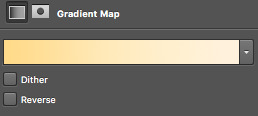
aaaaaaaaaaaaand finally, we are up to our last adjustment layer!! it is yet another gradient map oops. this gradient map is a light golden colour and i downloaded it in a pack somewhere ages ago. i do not remember where and i know that photoshop’s default gradient maps don’t have something like it so if you’d like, you can definitely just skip this last layer!! it’s not vital, i just think it gives the gif a nice touch!
for reference, the gradient map looks like this and i set it to 6% opacity!
12. that’s it!! the gif is complete! go to file, save for web and press on that! you might have to wait a little bit for it to load...photoshop is a really shit program sometimes, guys. once it loads you’ll see all these confusing settings. simply copy what i have here!

this is also the moment i realise my gif is over 3mb and go to fucking smack my head against a desk. tumblr basically has a thing against gif makers and will NOT allow gifs over 3mb to play once posted. this can be fixed though! i’ll show you how to shorten a gif right now because well...if you followed this tutorial, you’re stuck in the same boat as me and need to know how to fix it!!
so basically save your gif as is right now! now, we’re going to open the gif we just saved into photoshop. go to file, open and select your gif. it’ll open as a frame animation which is perfect! now, delete whatever frames from the start and end that you think you can live without. never delete frames from the middle because that’ll just disrupt the gif altogether. the less frames, the better!!
i got my gif down to 40 frames by deleting the first 15 frames of the gif and the last like 6 or so. now go back to ‘save for web’ and save this shorter gif as a whole new gif! this should be under 3mb. if it is not, go cancel the save and delete some more frames!
once that’s done....you’re done!!! congratulations!! you’ve made your very first gif, my dear!!!! here’s the finished labour of your hard work!!
i hope i wasn’t too confusing and i hope you now have a sound understanding of how to make a gif! if you’d like me to make another tutorial on something specific related to gifmaking or even to do with edits and edit-making, just send me an ask and i’ll see what i can do for you! happy giffing, loves!!
#i spent my entire day on this holy fuck#making tutorials takes fucking TIME !!!#but i've finally done it and i hope you guys get something out of it!!#i love you all !!#thank you for 2.5k <3#photoshop#yeahps#gifs#gifmaking#gif tutorial#completeresources#itsphotoshop#i have no idea how to tag this can u tell??#my gifs#my tutorials#hi im posting this now because there are people#gbfhbdfbghgthjdfbh
125 notes
·
View notes
Photo
welcome to the first episode of THE BLOGCHELOR starring me !
this has been in production for MONTHS and i am here to deliver for mutuals and non - mutuals alike , this is FREE TO JOIN FOR ALL . i will be doing this fortnightly or monthly ( depending on my schedule ) with at least 5 BLOGS reviewed for however way they will take my perspective to improve and grow for the better. feel free to take it or leave it.
THE RATING WORKS ON THE RANGE OF 5 / 5: with 1 as has so much room for potential and improvement , 3 as passable and your blog works as functionally and practically as it should , and 5 as with flying colors that your blog works but with good extras. READ FULL CRITERIA DESCRIPTION HERE.
01. @msscre . fandomless oc by pax.
ACCESSIBILITY / NAVIGABILITY. ★★★★★ With this kind of theme having maximum number of 4 links , I like how the first thing your blog immediately showed me is the links because the boxes and font color just pops out. You did what you can with limited url slots and the navigation page for everything makes it easier for everyone to browse through since they’re all redirected pages. ➤ GENERAL ADVICE FOR EVERYONE : In my opinion , it’s better to have a good balance and choice of usage between redirected pages and custom pages. Too much use of custom pages for the aesthetic can be annoying for a potential partner browsing your blog because most people just want to read your content and not to be kept redirected to different pages , especially if they’re incoherent with no uniform choice of design. Worst combo to send your potential partners away since they can also feel lazy not to read your content. Yes , people do that and it’s not their fault since the human brain has limited attention span. Too much redirected pages works if you want simple , straightforward navigation but it wouldn’t hurt to add a little flair sometimes. This flair can be from the custom page and redirected page mix usage or from how your content is formatted too.
VISUAL IMPACT / AESTHETICS. ★★★★ Absolutely love the consistency in your theme color palette ! Neutrals and red as highlights is a good duo. Everyone is entitled to their own tastes of their representation and interpretation of their muses , though might I suggest that the color of your highlights be a little lighter ? The theme and fonts are neutrals and dark , so it will help the eyes adjust and find the emphasised content you’re aiming to be read if your highlights are light or medium light so not to deviate with the theme’s aesthetic. However , I don’t feel your font for the header though ... seems a bit off for me but it’s just a difference between preferences , no biggie. ➤ GENERAL ADVICE FOR EVERYONE : It’s always good to have a good choice of what font goes with what. In my case I use a lot of font sizes and properties to complement the theme with the format or the actual font used. Usually I do cursive and straight combination , not one over other overpowering each other. Google Fonts with html codes and stuff is your best friend.
SUBSTANCE / INFORMATIVE. ★★★★ Good info on the biography and verses since they have whatever pumps the blog alive. I don’t know if it’s in your intentions but a PERSONALITY section is good too in supporting your psychological evaluation stats page since mostly , numbers don’t really make sense to humans. They’re more of the qualitative type , makes it easier for them to understand if you link those numbers to words of brief description of your muse’s behavior and attitude. This is especially crucial for OCs to have as one of my preferences so I’ll know if our muses can clash for fun or just clash without sense ... you can gauge what an interaction can be just by reading the other’s personality section and see how it helps with the plotting and relationship dynamic.
READABILITY / LEGIBILITY. ★★★★ The colour of the highlights is what I’ve said earlier but overall , the font colors are good since I can read them.
BRANDING / WOW FACTOR. ★★★★★ The mysteriousness with the PERSONALITY section gone can be a pro and con sometimes and since I read your about page , there’s suspense in how you came up with her name because it’s really thought - evoking. I associate your muse with a greek figure and it gives me something to think about especially as it can help me pinpoint a plot for us , if ever. I also appreciate the stats page like they’re very unique with some stats I’ve never seen before so it makes up for the substance as well. There’s visual - spatial intelligence , etc. which makes your muse unique due to that analysis. Little details matter.
02. @jollynephilim . supernatural’s jack kline by dipper.
ACCESSIBILITY / NAVIGABILITY. ★★★★ Might enhance a bit with positioning since some of the links are scattered on top of the side header WHO IS IN CONTROL which makes it hard for me to ignore in a visual - wise focus. You can also experiment by using other symbols or images since the links are eye - catching due to animation.
VISUAL IMPACT / AESTHETICS. ★★★ I’ve been very familiar with this kind of theme since I am guilty of being tempted to use the same , although this one has become mainstream so I am very used to seeing the same formula over and over again. Something new might be good or an innovation of the original theme though it doesn’t mean you should sell your soul to photoshop or html masters. The background edit is well - appreciated since it blends with the dark color palette you chose. You can make your theme a little bit refined with the bars by changing their gray rose ( ?? ) background to something continuous since the way I view it on my browser , I can see where the background picture of the bars started and ended. ➤ GENERAL ADVICE FOR EVERYONE : Being continuous and blending are two elements useful in visually enhancing one’s blog. It shows unity and consistency. Be careful in integrating too much of the links or headers in the background because it can get to the point that it’s annoying to find or read through bleeding colours of the theme and other factors.
SUBSTANCE / INFORMATIVE. ★★★ Love the profile , brief and concise. Can do something more with adding a few rare info that will make your Jack stand out from others ... Nevertheless , I like how informed I am with the BACKGROUND since for someone who hadn’t caught up with Supernatural , it works.
READABILITY / LEGIBILITY. ★★★★★ Readable. However the highlight color concerns me since it doesn’t complement the background color palette because the blue sticks out , but other than that , it works.
BRANDING / WOW FACTOR. ★★★ Add a bit more on the info and finding a selling point on a BRAND that will classify your Jack as their own. Like putting out something new that will make your muse distinguishable from other duplicates. Additionally , I’ve seen your threads or opens and they are very intriguing since they give rise to questionable exploration of sensitive topics , which is good since it’s a different approach to Jack’s character.
03. @kidhnter . supernatural’s claire novak by heather.
ACCESSIBILITY / NAVIGABILITY. ★★★★ Everything is accessible except the ask box. Hopefully you can fix the codes for that.
VISUAL IMPACT / AESTHETICS. ★★★★ I’ve been guilty in trying the same formula in themes , but you get a star instead of three for bonus in using a complementary color palette. However it gives me the signal that it’s playing too safe so you might like to consider using dark or light shades of one font color if one color is your drift. The black starry header sticks out for me , and you can edit it to even or level out the gradient since it seems cut off in the middle in my view. Being continuous and consist are qualities in keeping an aesthetic alive.
SUBSTANCE / INFORMATIVE. ★★★ Fun facts or trivias are really appreciated since I use the same formula depending on which muse I have , so I really like that cute bit. But I can’t give an overall review since your page is still incomplete which is totally understandable. ➤ GENERAL ADVICE FOR EVERYONE : One of my biggest pet peeves that turn me off is when people have blogs but don’t have much in their pages. I understand that they haven’t found the time to complete them because real life comes first , but at least give me a little information especially if I don’t know your muse and I’m not too interested to look them up in my search bar , sorry. I’d rather read someone’s writing that’s not copy pasted from wikia than actually reading on wikia because it gives me an insight on how this person writes. Do they focus on content and details ? Do they write in purple prose or straightforward ? Things like that are analysed whenever I read someone’s about pages. Usually before I release a blog out in the wild , I complete my pages as soon as possible with deliberate planning because I don’t want to advertise an EMPTY blog.
READABILITY / LEGIBILITY. ★★★★★ Very readable since everything is organised and categorised through the theme’s menu and aesthetic appeal plus function.
BRANDING / WOW FACTOR. ★★★★★ Gold and black makes a statement , take advantage of that color scheme and remember the starry background of your bars. I love the BIKER BARBIE bit because it has its charismatic appeal and different format on how usually people do that. BIKER BARBIE brand is iconic for claire and I can see where you’re coming from , but from an analytic perspective , it’s also a clash of character for claire but harmoniously it works out. Good job , makes it easy for me and very distinguishable to remember your brand that makes me think that Ah , this is the BIKER BARBIE claire.
04. @crackedfaith . supernatural’s castiel by vix.
ACCESSIBILITY / NAVIGABILITY. ★★★★★ Very thought out due to the number of links and the flow of the story of your blog through the order of the links. ➤ GENERAL ADVICE FOR EVERYONE : Content is not the only thing you should plan writing for. The moment you have the blog is the same moment you’ve already started writing your interpretation which is seen in the way you presented your blog through graphic edits , links , pages , etc. Content is not the only thing that tells your character’s story , your blog does too and that’s why it’s important to pay attention to details.
VISUAL IMPACT / AESTHETICS. ★★★★ This theme sure as hell takes your time coding so I really appreciate and love how you made it your own. I feel , because I used the same theme in different occasion and it’s a pain to code but totally worth it. I love the colours very much ... They give an outer - worldly vibe but at the same time , very much Castiel. ➤ GENERAL ADVICE FOR EVERYONE : Visual impact and aesthetics may affect your branding and people’s impression of you and your muse , but it does not define you. Always remember that. It does give identity though so like I said , pay attention to even the tiniest details because you never know who reads your blog. Visual impact and aesthetics also affect readability levels , take note of that one since overly coded and overly aesthetic blogs can repel writers who can’t read shit due to lots of glitters on the blog and all other many stuff going on that they can’t understand.
SUBSTANCE / INFORMATIVE. ★★★ Since you haven’t completed your about and verses pages , I cannot say it works but I appreciate that the guidelines are already set. Very , very critical piece to put in the blog because it is what dictates if you will write or will you not write with others.
READABILITY / LEGIBILITY. ★★★ Don’t know if you can change the font but as much as if you can , do it. The main chubby font works on the container but it doesn’t work on the sidebar. I had to squint my eyes to make out the words because of the heavily color gray. Try using lighter shades for font color and other styles as well. Google Fonts is your best friend.
BRANDING / WOW FACTOR. ★★★★★ Very iconic. GRACE/LESS tagline is such a catch for me , it’s really great. The background also has an impact on me because it reminds me of the cosmos , of the time of The Fall scene , and I love how you incorporated the sense of falling in your graphics.
05. @sanguinebite . van helsing’s verona by demi.
ACCESSIBILITY / NAVIGABILITY. ★★★★★ On the side and easily seen. Clean cut , just pops out next to sidebar.
VISUAL IMPACT / AESTHETICS. ★★★★ Can do a bit more with the font used on the sidebar and its format. I love Times New Roman and its use in this theme. Maybe try experimenting with shades of black and gray and consider giving other colors a chance for highlights so people can see what you’re emphasising through bold , italic properties. Other than that , overall theme is a choice that works. The cursor is cute and the edit on the sidebar photo looks cool , so extra points for those two.
SUBSTANCE / INFORMATIVE. ★★ Kind of empty , but the rules are established so that’s appreciated. It helps that I know your muse but what if other people don’t know ? I suggest doing a temporary info scribbles on the pages or just a simple TBA / WIP.
READABILITY / LEGIBILITY. ★★★★ Readable , I don’t have to squint so much so that’s a good thing. It depends on the device used about the font size , but try making the font size a bit bigger for the body since it’s too small for me.
BRANDING / WOW FACTOR. ★★★ Older than Rome itself holds great potential to immortality vibes of branding material , it’s a good tagline I like. Maybe you can link your muse to a roman figure and create a brand from there. Qualities also help you think about a good brand as well as your muse’s history. Who or what reminds you of your muse ? What can you take from there and make it your own ?
2 notes
·
View notes
Photo


To carry on with this project I had to enlarge my tile maps that I made previously. The reason for this is because I made the original designs inside one tile each, which were 64 x 64 pixels. The problem with this is that if I tried to implement it into unity like this the platforms would be way to small for the game, because the playable character is also 64 x 64 pixels so the game character would be the same size as the platform. To fix this issue I used the selection tool to highlight what I wanted to enlarge and then moved it to another tab on photoshop. I made the new tab with the same settings as the previous one with 64 x 64 pixel grids, I did this because one 64 x 64 pixel grid is around 1 metre and character is around the same size so by looking at the grid with all the 64 x 64 cubes on it gave you a good idea of what the size needed to be. To change the size of the pixel art I needed to select it and press ctrl + T to make it possible to scale up and down.
A problem I found while doing this is that when I was making the tiles previously I had some extra parts on there that I never noticed and it was from where I tried to get rid of parts I didn't need, but instead of rubbing them out I just covered them over with the same colour as the background using the pencil tool, but when I would need to put it onto unity and make a level you would see these grey patches next to the levels, when I didn't need them to be there. I realized this while sizing up my pixel art and I rectified it by using the colours on the tiles and slightly changing the shapes of some of the platforms, but some had to be completely redone because there was to much stuff around them to remodel the design.
0 notes
Text
Week 8- Filming Canvas
In this week… We had our shoot for Canvas on the 9th and 10th of August.
Before shoot day, we had immense work and planning to do moreover we also found a female actor called Resha to be Kiara, she’s a budding actor and herself the age of Kiara and she liked our plot and the character she got with this we also found a male actor to play the role of Avinash by a teacher in school who goes by the name Sushant Dabholkar plus we came to know he is a former bollywood dancer and has worked in famous films such as Devdas and Bhool bhulaiya. To play the role of Ayaan (son) we found Priteesh Sharma, Janhavi’s brother apt and enthusiastic for the role.
In between planning and all, one of the days we scheduled to do a location recce of the garden however Vedant was busy at the moment so Keyosha, Janhavi and I went ahead and got all the visualization of costume, camera, location spots, and other things ready as we after this check we directly come during the shoot, hence we thoroughly checked and skimmed through everything.

Last few changes and plans being made before shoot
For the last few planning and shopping to do before shoot, Keyosha and I went ahead to settle and arrange all the production needs which where the basics such as purchasing of stationary to be able make our own diffusers and reflectors, bottle of glycerin so the actors can use it to moistened their eyes and make it teary for the shots which are emotional and need them to cry however sadly no nearby pharmaceutical had glycerin but eventually our actor Resha had it and was kind enough to share it, printing the documents for our crew, sir and the actors script for our actors to refer and be vigilant about when they perform. As planned we were to have our shoots in three different locations and we divided them into two days to avoid any burden on us and our cast as we needed to have rest to be able to perform the next day.
The other team was helpful and hence we delegated minor tasks of making the reflectors, diffusers, getting the extra pair of hair clips and most importantly needed Vedanti to get the bruise pallet as out of all she had the makeup pallet with all the ideal colours needed for the bruise look plus she helped as she knew the technique.

Preparations before departure to first location
Other than that my team and I had to look into the details which directly impacted on filming and regarding our casts although a thorough check on the checklist was enough as to make sure we all carry the responsible belongings and be prepared at the spot.
Amongst all this, we still continued learning the photoshop but only the primary or basic most windows, such as the file, edit, image, layer and etc. Alongside we had a revision on component 4 too.
Counting the last few hours to our shoot was exciting me as much as nerve-wrecking as we knew our pre-production was much stronger, better and efficient than last times however we had professional casts and didn't want any mishap during the shoot which would delay or be a hurdle in between however the monsoon weather was a huge concern.
9th, August 2019- Day 1: Garden & House shoot
9th is a Friday, we had school and however all of us had our lectures ending early and for that, we got permission from the school to attend our lectures and leave for our shoot and that is what we did. Although we had quite some time for our actors' call time and so during this time, we organised our required items for day 1 and day 2 into two different bags and for the things needed for both shoots we kept it with us in our personal bags. The day 2 bag was packed and left at school, as that shoot was on the next day moreover we could estimate our shoot end timing would extend by a few hours by keeping in mind the external factors of weather, punctuality of actors or location managers hindering our shoot. At the time of planning in school before reaching the garden, we divided ourselves into halves while Keyosha, Tanya and I worked upon sticking the pages(book lines to be highlighted by Preeti) into old giveaway books which we’d reuse as our property meanwhile Vedant,Diya and Paarth got along to make the diffuses.

Styling casts hair to as per character needs
As our last minute tasks got done, we all headed towards the garden location and start preparing and arranging things around so no time is wasted when the actors arrive and we can start shoot dot at the right time.
Our crew and sir arrived the location on time however the actors were a bit late, meanwhile they came sir instructed us about the workings of the lights and once the actors arrived we then introduced ourselves, our course and our project to them once again with everyone around so each and everyone is aware their task and of the plot of our story. It was important for the actors playing Preeti and Kiara to know their characterization and personality in order to portray their emotions along for which, while they got ready I helped them with the hair, jewellery and for make up they wanted to do by themselves hence I recommended them what the shades and style, to suit the character plus side by side prepared Resha to play Kiara while Keyosha did the same with Poorvi who played Preeti.

With the team, close up shot and need of glycerin to help moist eyes and get the teary-eyed sensation
As the actors prepared, I personally organized their costumes for each costume,jewellery and properties to be kept aligned and next to their bags so when the there’s the costume change there is no hassle in the house looking for things rather I and Tanya come with the actors and they change within minutes and soon their hairstyle is fixed and a touch of make is done to make the look perfect and we don’t waste too much time in that interval, sir and the other members went down to the garden area to assemble and once they settled and we began shooting as early as possible because the weather appeared fine and there didn't appear any sign of rain. However, we carried a bag of a few towels and an umbrella for precautionary purposes as rain here is very unpredictable.
We had quite a few shots were taken at this location and as an impromptu idea, Keyosha thought to have 360-degree handheld shot while the two actors stand parallelly facing towards each other. At that time for a moment the wind gushed across our faces with so much force, it literally pushed us steps behind and had out reflectors and diffuses flying away but in some time it stopped and the shot was executed and captured beautifully within a few takes.

360 degree hand held shot
Things went smooth and having the shot division help of the shot division takes the shots required with certain sudden changes as per the wind or other factors of natural sunlight. Moreover as I strategized to previously pair and settle the costumes for the actors, we saved in a lot of time in between and as the actors were done shooting in one costume they changed within a few minutes and slight touches on the face and fixing of hair was all it needed for them to be ready for the next part of the garden location. Staying organized there also made me calmer as I wasn't panicking regarding anything going wrong I had a lot of times read through the master breakdown and had assembled their costumes as the sequence the scenes will be shot.
During this location of the shoot, we also had a scene where Kiara caresses Preeti’s badly hurt face and speaks a few words of wisdom and love to motivate her. For this makeup to be done, I had Vedanti beside to help me with the bruise make up look on Preeti, this scene was to show the bruises on Preeti’s face due to tortures faced by domestic violence. Moreover in this glycerin was used by both and it helped ignite emotions better as it was an extremely emotional scene needed both of them teary-eyed which was helped by the use of glycerin and the act looked real.

Bruise make up look
We presumed the shoot after a small break due to heavy winds and we then had been successfully taking all shots however suddenly the rain was immense and without any call the sky being dark hence we packed up from the location quickly because if the costume gets drenched we’ll have major costume continuity errors.
Move ahead to take a break before leaving for our next location, at the house for the shoot. Vedanti was the assistant editor was responsible for the food and beverages for the cast, crew and sir. With that we packed bag of the actors and were pretty sorted as I didn’t allow anyone to scatter clothes around hence Keyosha leading the actors, Janhavi, Tanya and Vedanti went forward to try and previously establish the shots we would take their meanwhile the rest of us stayed back a little longer as I did a last quick survey of the house to see if we have forgotten anything,as we didn’t we too left for the house shoot location.

Touch up to male actor’s face for appropriate appearance on camera
At the house shoot, I found the house spacious and found my own corner to settle the bags of the actors and other bags and all the production stuff meanwhile Tanya too helped me assemble and organize the costumes, jewellery, makeup and hair stuff for the actors according to their scenes to be shot. While assembling, our male actor Sushant to play Avinash entered and we broke the ice by introducing ourselves and project. While Keyosha and sir talked to the male actor briefing him about the plot and how his nature and emotion should be put forward. As soon as I was done with assembling I went and helped Priteesh also known as our Ayaan with to prepare him for the role he had and how his reaction should be
The actor playing Avinash had difficulties memorizing the lines and getting the emotion hence needed a little more likewise we gave and cooperated Kiara and Preeti’s shots till then and once the male actor was ready we halted the further scenes with Kiara and Preeti which required em-meting deep emotions and completed Avinash and Preeti’s scenes.

With Tanya fixing hair and jewellery before the pillow fight scene
We were nearing towards the end of day 1, and the last few shots were of the pillow fight scene between Preeti and Kiara, during this scene Janhavi’s mother helped me get matching and aesthetic pillow covers for this shoot. This scene was supposed was to have feathers flying depicting it from the playfulness and force of pillows however we didn't get permission to do so from Janhavi’s parents as is dirty the room to which I came up with an alternative to have the fight with pillows without any feathers and go forward with as thought through before.
During this scene of Preeti and Kiara, we planned an intimate scene however not showing anything inappropriate as we are aware it’s for an educational purpose. However, we needed both of them to get close to each other’s face for an intimate seen but only till it's close and not any further, although both of them have never been approached with such a scene or topic hence they felt extremely uncomfortable to perform it with our male classmates around. Hence Vedant and Paarth had to move out till we didn't get the right shots this made me realise and learn performers get conscious too but it is important to take it up as a challenge and make only certain changes than quitting it. Within a few minutes then we got the right shots, as gradually both became comfortable and were less conscious about the environment.

Holding lightstand to avoid it from falling preparing to change light colour according to scene requirement
With this as Resha had to leave she took the posters shots before completing Preeti’s solo scene. However a few adjustments had to made to Kiara’s top as it looked simple and that’s when I got an idea to make look appealable by making her wear a leopard print scarf gotten by Janhavi I wrapped it around her neck rather than doing the usual jewellery complimenting which is done too often and from there we went forward shooting pictures for the posters and this time the pictures were taken by Vedant as he wanted to try his hand at cinematography.
Everything’s going even and fine and we were only left with the last scene for day 1. Which was Preeti’s solo scene of shivering and panicking to the action of Avinash who in the background is screaming loudly and throwing utensils around abusing her. The scene felt extremely emotional and realistic when Poorvi used glycerin which helped her eyes moisten and get the teary eye look and she being an actor from the industry performed phenomenally well and we were done within a few minutes as we got the correct shots making the scene beautiful and heartbreaking to watch.
Vedant capturing shots for poster
And the day 1 shoot comes to an end with all scenes completed successfully and the pictures for posters were taken too which came out pretty. Moreover I was glad and happy with the effort I put in, the hardwork and teamwork my team up along with sir who keeps guiding and correcting us at every stage, special thanks to Diya and Paarth from the assistant team to treat shoot as their own and constantly help us and make sure we are calm and composed.
10th, August 2019- Day 2: Library shoot
From receiving good wishes from everyone on putting a good show up yesterday, we are once again excited to pull it off better here as the library is the base to our plot.
The day began with everyone meeting in school and gathering the day 2 bag which had all the required necessities and the other items from the day 1 bag like the documents, sweat spray and a few more little things. However I reached the library directly due to delay in traffic and with managing travel and traffic our crew and sir were at the location, we walked in and showed everyone the interiors of the library and discussed the cinematography and lighting as we had planned then we had the other team and suggesting to better it. Our actors Poorvi and Resha were stuck in traffic too and took time to come but in between the interval, Tanya helped me organize and unfold things in the bags with all the production requirements, properties, and costumes too because we had consecutive days of shoot the actors handed over their costume bags to us. Meanwhile, sir, Keyosha, Janhavi, Vedant, Diya and Paarth looked further in the placements of cinematography,lights and characters to do the marking to save time and work efficiently.

Tear drop shot from top angle view
While doing this we had our actors arrive and from there Keyosha and I took in charge to inform and notify but about their characteristics and plot to be shot in this location moreover, then I too guided them with their costumes and how the hair and makeup should suit the location and the activity their character is doing. As they got ready, on the other hand, the shoot began for the scenes in which no actor had to be on the frame, such as the teardrop falling on the next scene. With our actors ready, we began our shoot with Preeti hesitating to highlight a text however Kiara joins her and completes the highlight, in this manner, it can be looked upon as Kiara filling in Preeti’s loneliness moreover from there we were constantly shooting so get as many shots within the duration we had.
We had a continuous use of glycerin tear gel for our actors to portray the emotions especially the sad ones through their teardrops and with this I learnt how a little quantity of the gel is strong enough to moisten the eyes and get it teary to create the effect also that it dries quickly so I with the bottle had to be vigilant by being close to the actors so they can add the gel again when it dries for the next take while I had to be careful with not being seen in the camera frame. More specifically I understand is, as an actor to get hold and maintain an emotional scene is really tough as hence we were instructed to be silent so not disturb the actors as they got into the mood and with this the tears play an important role because if I were a bit late with the glycerin the emotion needed may have swayed away. We had individual shots with both our actors, a few with them together and these changes meant a lot of costume change and lighting change because for different scenes and we had different spots in the library to be shot.

With team, capturing shots of Kiara reading and getting teary
At this moment after so many shots being captured we took a break and made sure our actors are energized for the next scenes. Besides lunch, our crew also discussed further shots and if any improvements to be made, luckily as I was organized and everything ready to be put to place before the shoot starts.

Glycerin to rescue to get the emotional scene fitting
At last we came to the end, shooting our final scene which was heavily crucial and had to be filled with immense emotional expression, so while the characters changed and got into the mood, sir and us got into setting the location with lights and this scene was to show the night interior scene when Preeti and Kiara are attacked by goons hence we had Paarth,Vedanti and Tanya stand by the window pile holding opaque the rugs making sure the natural light to not intrude meanwhile Diya held the blinder in front of the light stand to create the light distortion on the faces of Preeti and Kiara who were shown to be hiding behind a wall. With the burning of Loban, cones were interesting to create the smoke and mist however we had to deal with it carefully as it was burning and very smokey unlike our last years incense sticks which was milder to create smoke. Seconds before the first shot I had to spray the sweat spray bottle water as we needed both of them panicking and sweating badly due to tension, I was helped by Poorvi who’s experienced regarding to spray on the sides of the forehead,neck and T zone only which makes the scene look realistic plus again glycerin had a huge impact on the scene for the particular shot which required them teary.
Progressing to take the shots, we took a few and when we checked through to confirm we realized a few things and instantly the changes were made, firstly the outfit of Kiara’s was’nt very appropriate to which I thoroughly checked through other clothing’s which would be a good replacement but nothing was there to which the last option left was I exchange my top with hers for the time being, which did get me puzzled as deep down I knew I needed her in a blue top however now in that scene she was in a red and white mixed top but nothing could be done as it was our last resort. The change to be made was the portrayal of emotion was’nt to the mark and we needed them to be more expressive hence sir took charge and from a bit far in an angry tone read the dialogues of the goons which helped the actors feel their character and situation more deeply and with that we also got the ideal shots.

Viewing and keeping an eye on the set and costume continuity
We checked all the shots taken from the start and loved the output moreover with this we were done with shoot and it was pack up time, hence we thanked and bid adieu to Poorvi and Resha for their time, effort and guidance into helping better our project through their acting and skills. As Keyosha announced pack up we all very happy and we got packing up our stuff meanwhile I too packed up the actors bag and make sure no one leaves their belongings here and during this time I myself felt emotional as it was my last shoot with my team,however the other team’s shoot was left and we had edited on hold but shooting with my team was done and recalling all our fights and agreements made me visualize how far we have come and grown better as individuals and as a team. Alongside we were glad that both our actors enjoyed shooting with us and appreciated our effort more specifically the idea of our story as it was something very new and they hadn’t shot for something this similar and this appreciation got a glee on our face.

Final scene to shoot for the day and journey for this group
The actors left and my team sat to clear all expenses then and there meanwhile the other team helped us get the minor stuff packed and look around to see if anything was forgotten. Debts cleared, bags packed and we all left a smiling face and immense memories, knowledge and learning from the library to get going home and getting a long nap to rest ourselves and relieve the beautiful thoughts from the shoot and be prepared for the post-production procedures.
0 notes
Text
Spending far too long making maquettes for characters I could’ve just drawn
It’s true, I could have just drawn out my cast and been done with it in 2 days max, but, that’s boring. I’ve done enough character drawing in this project already and my hands were getting withdrawal symptoms from clay. These dudes took me way longer than I anticipated, used up far more clay than I prepared for and on one occasion, made me cry, yet I had so much pure, child-like joy making them that I really don’t care.
Here we go lads
Base Structure
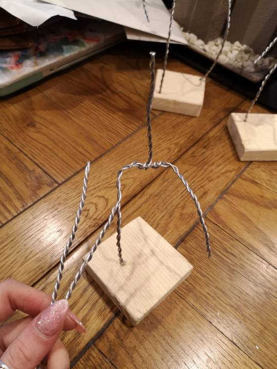
cuttin wood, twistin wire, glueing wire in wood, making a skeleton
I cut up some little almost squares of wood (don’t judge me, I’m terrible with a hand saw and I really couldn’t see a big enough pay out from whipping out an electric one) and sanded the edges down so my hands wouldn’t die. I then proceeded to do one of my least favourite model making activities and twisted together a bunch of wire so I could start making some little skeletons.
I didn’t have any sketches for the crew members that weren’t Steve, only a vague idea of what style I was going for so this was terribly planned. HOWEVER, I just went for the classic one little one and one big one which spoiler worked out super well.
I drilled holes in my poorly cut bases and used some Araldite to secure those bad boys in there. I didn’t attach the arms to the rest of my skeleton yet because I had no idea where I wanted them yet and thought that waiting until the tinfoil body shape was sorted would help me out a wee bit.
I was correct! putting the tinfoil on first made figuring out the arms way easier, however, they aren’t exactly securely in there so let’s pray to the maquette gods that that won’t be an issue later on.
Super Sculpey time
Because of my loose-ish arms and incredible ability to mess something up if it’s not rock solid, I decided to shove down a relatively thin layer of clay over my tinfoil and wire friends and bake it so I could just build over solid foundations. They currently look absolutely horrifying but I’m really happy with their proportions both in themselves and to each other which I didn’t expect to happen. I’m also digging that I decided to go with interesting stances and not just a stood up and rigid kinda thing.
If whoever is marking this somehow remembers my blog posts about making the maquette for Greg during that stop mo project, you will recognise my skills for using various glassware from my poor Mother’s cupboard to help to support my chaps and hopefully save them from imminent death in the oven.
I then realised I completely forgot about all the extra bits on Steve and set to work fixing that with a power drill up the bum, through the head, even more twisted wire (still hate it) and some extra tin foil padding. Also, once I added the tail thing, I realised that his bottom half was no where near as fat as I wanted it to be, and it would have been way to much mass to do in just clay so I went ham with that foil.
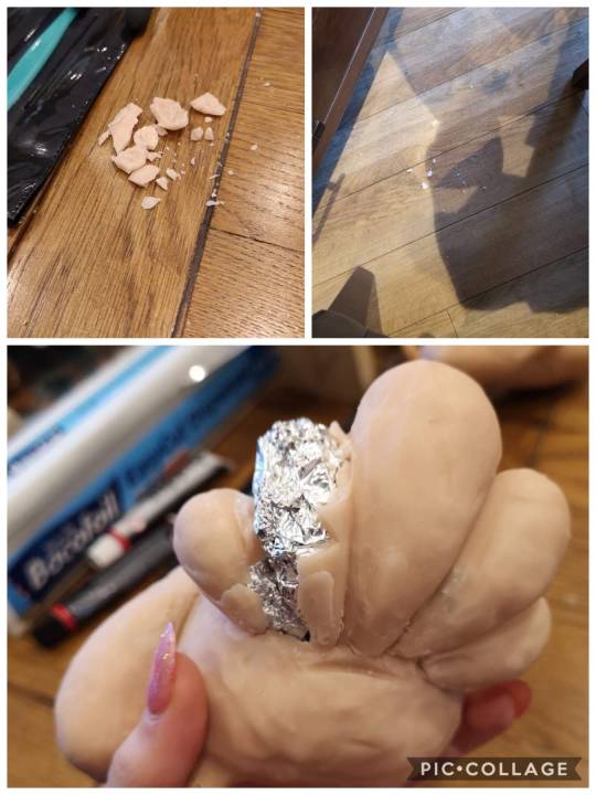
This is when I cried.
I just dropped him while working on the face and it was a moment. I refused to pick him up to assess the damage for 5 solid minutes, so all I was going on was an awful smack sound, a pile of crumbled clay and a concerned look from my Dad who happened to be in the room at the time. Thankfully, I was being dramatic and the damage wasn’t even too bad, I had him right as rain in 15 minutes and a little extra oven time.
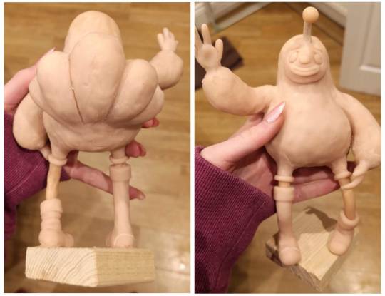
Here he is! all fixed and honestly better than he was pre death drop.
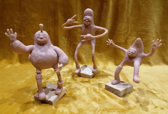
I’m aware that the lush yellow blanket draped over a piano stool is a wee dramatic from a WIP shot, but this is when I read the email about the stop motion work experience and I needed a good shot of these fellas to send in.
Anyway,
I’m actually so proud of this trio. Yeah non of them can stand up on their own and they are currently secretly propped up in some way, BUT, for something I did literally no planning apart from random brain waves here and there, they’re turning out wicked.
Painting
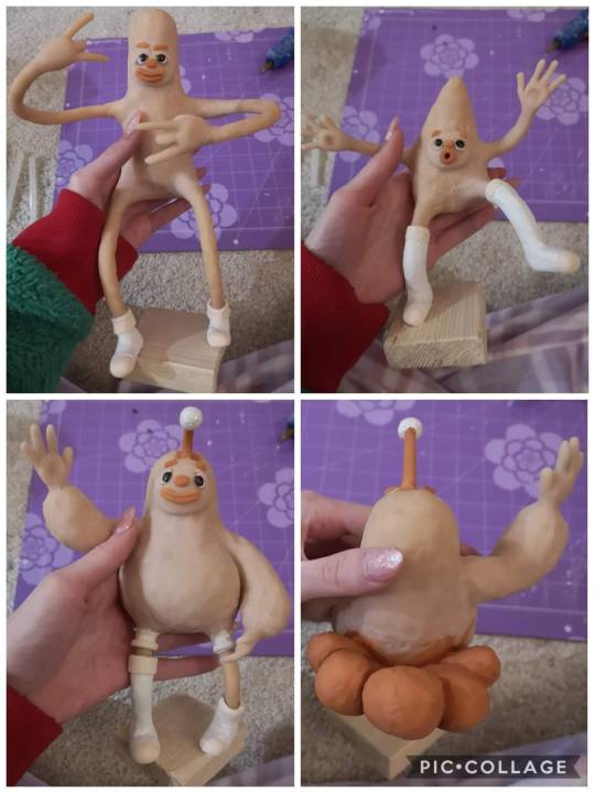
I wasn’t going to paint them, because they’re just maquettes and I had told myself that I was already spending way too much time on these chaps but I just hated the full skin tone look. It just gave me the absolute chills. Also, I’m currently thinking that I want to use actual fluffy fabric where I want these just to be fluffy and it would just look so wrong if I had a different coloured fabric over a block tone body soooooo here we are.
I kept them all on the same colour scheme and I’m actually really happy with how it turned out. I stuck some glitter onto Steves weird ball thing just because I found it in my draw like 2 days and I wanted an excuse to use it and I fully love the result. I did have concerns about their mouths looking rate weird, but with a lick of paint i’m living for it.
Getting around trying to texture clothes with clay
I did indeed end up going with my fabric idea.
I popped to my nearest wilko, found a cheap pillow that I kinda liked the texture off (it had two fabrics so I had to go for it, I love options), and cut it up like a mad man. I used good ol’ hot glue to attach it and during the process got so much white fluff everywhere that I don’t think my parents want me coming home from Norwich anymore.
Steve looks fab, but, I’m an idiot and did the fluffy fabric before some the smoother, less gets-in-your-way stuff, so I’m going to have some real fun trying to hot glue that down around this fur.
For example, this is the order I should’ve done the fabric in, but hey, I learnt and I’m now a better person.
I decided to leave sleeves and trouser legs off my little guy because not only did I like the diversity, but he was too little anyway and he would’ve become just a bundle of dead pillow.
I love how they look now, and The fur is just beautiful.
Giving them a base for no particular reason
Since they can’t really stand on their own and looks good together anyway, I decided to make just one big base that they could stand upon.
I made the smart person decision to paint around their crystal white feet with the soul sucking black before I glued them down so that I could really get those angles going for a pretty finish.
I glued them down with hot glue which worked way better than I thought it would. Originally I was just using the hot glue to temporarily hold those suckers down while I drilled and screwed nails into the underside but after realising how difficult that would be with their very very delicate limbs, I risked leaving it with just hot glue and it’s proper secure.
Shockingly, the two puppets that had both legs on the ground were the worst balance wise, and I could see their ankles cracking and bodies tilting the longer I left them to stand on their own. My mum had the fab idea of shoving some dowel under them, so I painted it black and used far too much hot glue to make sure my lads didn’t die. It actually worked really well and is way more subtle than I thought it would be.
The finished gang
vimeo
Cast sheet
It’s basically the non-animated version of my turnaround. I took a bunch of screen shots, shoved them into the photoshop document lovingly provided by Jon, and made it all fit while putting my tetris skills to good use.
Conclusion
It’s been 7 days of solid hard work, including through Christmas eve and day (can I get some points for dedication here), and they’re finally finished! Yes, I did exactly what I said I shouldn’t do and got so caught up in a minor aspect of the bigger project that I spent too much time on it, but I absolutely loved doing this. Maquette making is one of my favourite parts of this course and I do not regret a second of this. Sure they have their flaws, like two of them can’t stand without a pole on their bum and most fingers have fallen off and been glued back on, but I love them. This has to be one of my proudest achievements since Greg, so I’m so ready to take this project further.
Also, i’m rate proud of my cast sheet for the character bible.
0 notes
Text
Ocado Reflective Analysis
Working with Ocado has been an amazing opportunity as it has allowed me to understand what it would be like working for an actual company, in terms of only having a short time to deliver a whole project. I both enjoyed and struggled with this project.
After having Ocado deliver the brief to the whole class, I started doing research on them to help come up with an idea for a concept. I started off by looking at their website to see what kind of world foods their deliver, as well as looking at all their social media to explore how they engage with their customers. I also took note of what kind of colours they used (mainly being green) and knowing people that order from them made it a bit easier for me to come up with ideas for the content. My partner and I decided that instead of picking just 1 country to focus on, we should show the customers a variety of countries that Ocado get produce from so that we don’t come across as bias to certain countries, and having a bit of knowledge, we figured out that a lot of customers are presently surprised at how good the company is and we wanted to put that into perspective.
I don’t think there was any problems that occurred at this point and everything was running smoothly. My partner and I were on the same page about everything and we both put in about the same amount of work.
I created a storyboard based on what ideas my partner and myself came up with, which I drew on paper and included colour so that we didn’t go into the editing blindly. I chose this because I’m confident in sketching and drawing on paper more than I am doing in from scratch digitally. This meant that it was successful as we had a lot to learn about that we had no knowledge of so we didn’t have extra work on our hands that didn’t have to be necessary.
We didn’t have any communication issues as we were both as committed as each other so we always made sure to talk about the next steps of the product whether it be in class or on snapchat. We decided to split up some of the work load. As he is good with words, he wrote the script and I enjoy using Photoshop so I did all the photo editing so that we had everything ready and just needed to put all the parts together when we meet. Now looking back this was kind of problematic as there was a few times after I had finished editing the images and after attempting to put it together, my partner would say that he didn’t like how it looked and I would have to start over again. Granted, his opinion was right but the fact that we didn’t meet that often and still had to do work separately without really consulting each other made putting it together stressful for reasons that could have easily been avoided. Looking back I would have liked to have spent more time together doing the work instead of doing it separately so that we could make sure that we both agree on certain things before wasting tame on something that wouldn’t be used in the final project. I have learnt that I need to be better in taking charge in situations so that problems like this don’t happen again. In all honesty I don’t like blaming other people for things that go wrong if it was something I could have fixed or prevented by myself.
Time management and organisation were big parts that contributed to the project and having both the ACE and connections & perspectives on top of doing all the stuff for Ocado made it very difficult to keep on track. I personally struggle with sticking to a timetable that I have written for myself so I am still going through trial and error to find a balance for my coursework. Although there was so much on everyone’s plate, I think that everything went very well in terms of having an outcome for both the ACE and Ocado project before they were due.
The main issue we faced was not knowing how to use after effects and being sort of taught something that wasn’t going to be used at any point in our project during class. We used After Effects and Audition for the final outcome. My partner had most of the knowledge for using Audition and we both used a mix of Lynda.com and trial and error to teach ourselves how to use After Effects. We also had laptop problems as my partner’s laptop couldn’t run After Effects and I had most of the Adobe programs on my laptop. On top of that and only being able to work on one laptop, I always had to make the effort to go to him to do the work which meant that he often slacked a bit because he had the option to do other things around his room instead of working. Another small problem we encountered was not asking what the specifications meant. I jumped to the conclusion that this advert was for TV, YouTube and on the sides of websites. Turns out it was meant to be for mobile apps which caused problems when it came to presenting out product in order to get feedback as I has to change dimensions and rearrange everything so that it could be presentable.
The feedback wasn’t terrible but it wasn’t good either. As we hadn’t finished or even added sound to it, the judges from Ocado said that the idea was good but there were a few things we had to make clear; making sure the target market knows that deliveries are around England mainly and not worldwide delivery. They also said that it was quite hard to give feedback to a group with a product that was so far from being finished. They spoke to our module leader after and said that we should have spoken to them more about selling the current work we had produced instead of making promises of it being “amazing” once we had finished. If I was doing this solo I wouldn’t have promised because I sort of understand their point of view as words don’t show results but actions do.
Even though this has been a pretty stressful experience. I’ve gained a lot of knowledge; working in industries (in terms of time management), using After Effects, presentation skills, and working with exterior clients. I have also learnt that I am good and understanding a brief in ways that I can think outside the box but also still in a way that fits what is needed. I think my choice in partner was a slight mistake. Not that we didn’t work well together as a team and came up with good ideas, but he was pretty self-centred and cocky about everything he did and if someone didn’t like it he sort of ignored their opinion as he does what he wants and not what other people say even if it’s beneficial to him.
0 notes