#so I have to find a way to simplify them further while still being recognizable
Explore tagged Tumblr posts
Visit Tumblr Blog
Explore Tumblr blogs with no restrictions, modern design and the best experience.
Last Seen Tumblr Blogs


Fun Fact
Tumblr.com rank in the US is 25.
Note
so in a number of ancient cultures it was inappropriate, unacceptable, and probably even an executable offense to look directly at the emperor with the idea that they have divine right to rule or they're descended from the gods or whatever.
Space Emperor Tim of many names had made it no longer an executable offense but his planets still find it very disrespectful for anyone, besides the royal consorts, to look directly at their baby space emperor. They actually appreciate and approve that he wears a mask, so clever and considerate of their baby emperor to restrain his divine glory in such a way! He's also a babie and so it's inappropriate and unacceptable to the empire for anyone to go around and have actual realistic images of their emperor or his equally babie consorts around everywhere. Instead all images of the imperial group is very stylized or they all incorporate the emperor's mask on not just him but also his consorts/bodyguards/whatever they are to him on whatever planet. Further, even on just one planet there are a lot of different ideas of what makes someone or something beautiful but fortunately for C4 all shades of human skin tend to be perceived as a color usually used on something to make it seem extra cute, and their relative smallness make all of them, especially Bart with the fluffy hair, the equivalent of kirby in the eyes of the empire, smol, adorable, probably able to destroy everything but you forget because, again, smol and adorable.
That being said, all the merch, from statues to commemorative spoons, tend to be recognizably probably a human in a mask and that's as close to being identifiably any member of the C4 that they typically get.
Tim has put in protocols just in case someone tries to visit the empire while impersonating him or any of his friends. So far no one has tried but if Damian ever goes to the empire as Robin he's going to inadvertently be dealing with some trouble. Or he may get written off as a baby cosplaying as their beloved emperor and Damian will be extremely pissed off because people are being condescending and cooing at him for the respect he's displaying towards their beloved emperor.
It would be hella cool if some of the planets gifted YJ a variety of masks. Perhaps the team ends up with a collection of different styled masks (with various beauty standards and styles) as the planets' gesture of gratitude, respect, and reverence. Some are styled similar to discowing, but others have wildly complex designs or simplified ones.
It'd be cool to see various designs, colors, concepts, etc. The regular Robin mask is used most often in fanart, but perhaps they play around with mask designs.
I think Damian would enjoy learning about different animals species on the planets. Maybe Tim entrusts upkeeping planet ecological systems to him at some point
155 notes
·
View notes
Note
how do you beanify the silly’s I’ve been trying with my oc it never turns out quite right (idk why) could you do a tutorial? (You dont have to ps awesome art!)

If ur wondering this is the oc he’s so dumb I love him
i don't have a whole lot of energy to draw something out right now but i can provide examples and my thought process!
so the main thing is figuring out what details are the Key Factors of the design, and what can be simplified to hell and back, like:

with my forsaken noob design, the main thing i draw from their actual design vs their bean is their hair and colors- at the cost of losing a lot of their clothing details. i wanted to make sure they were still recognizable as noob, while also still being able to add my own personal spin to it.

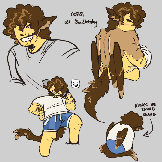
same thing with shedletsky! key details i kept were the wings, tail, and hair patterning, at the cost of a lot of colorization details and scarring- and clothing details but that's because i'm lazy lol. his design is overall very simple, so not much needed to be sacrificed
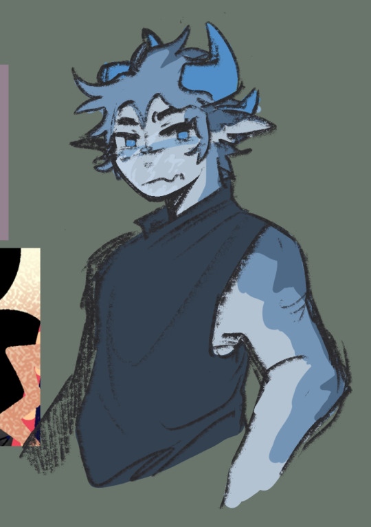
with rocket, the key details i kept were his horns and tail, as well as his goggles, and scarring on his arm/torso leading up to his face. certain hair elements were kept, mainly to ensure he wasnt bald lol. i traded a looooot of small details to make them more simplified or straight up non-existent
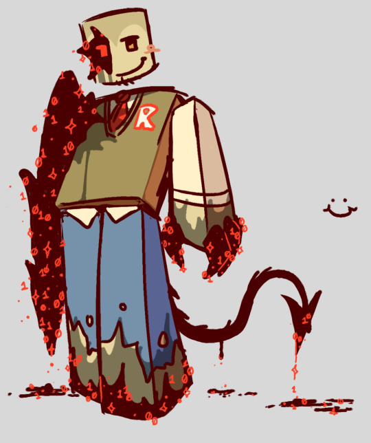
so the image on the right is, funnily, an already simplified design for john doe. but i simplified it wven further by removing a loooot of the additional detail work and simplifying the shapes used. i still made sure certain details carried over (his tail and various corrupted areas), and did still try to find a way to incorporate certain clothing details (his tie and the little hint of the shirt beneath his vest).
i cant add more pictures but i hope you get the gist!!
i think it also helps that i just... like making silly, simplified art ^^; it's a similar process as like... chibi-ifying characters i suppose, but getting rid of details to simplify instead of just drawing them Small. you want to really focus on what you think your characters defining features are and hone in on them, while being able to part way with some of the others. at least, that's how i do it :]
#razchat#if you still need help and are willing to wait i can try to make an actual tutorial ^^;#also your oc is so darling.... absolutely wonderful#if any of this is worded weirdly. sorry. i just woke up from a nap 😭
7 notes
·
View notes
Text

I’ve been absolutely OBSESSED with Cult of the Lamb recently, like seriously it’s been the only thing I’ve been thinking of.
And since I’m cringe I wanted to draw my ocs in the style. I mean what better why to celebrate a game about cults then drawings my characters who are apart if another cult in the style aldjsks
#I think I got the style down pretty well#design language??? I still need some work on lol#same with color pallets#the more I play the game the more I’ll understand their crafting choices#I don’t think mine are bad but they’re still a bit over dressed#so I have to find a way to simplify them further while still being recognizable#but I think they’re cute sgfutdht#the symbols on them are also important 👀#still need to do research but it’s a start skfhdjkdn#cult of the lamb#cotl#cult of the lamb oc#pjo ocs#percy Jackson#percy Jackson oc#where the wisteria grows#aubrey blake#izabell del toro#wisteria witherroot
225 notes
·
View notes
Text
Sokabe’s wider Role in the Story
Taken it’s been many solid chapters since he has disappeared from the manga, I thought it fitting to have a closer look at the role Sokabe used to have in the story.
I miss Sokabe. As long as he was still around in the manga, the dynamics in Team Tosaki (and the fractions bordering next to it) were still uncertain and it was always fun to witness how they would develop next. Since Sokabe is gone this energy has become kind of... stale. If you have a great antagonistic character don't make them leave too early.
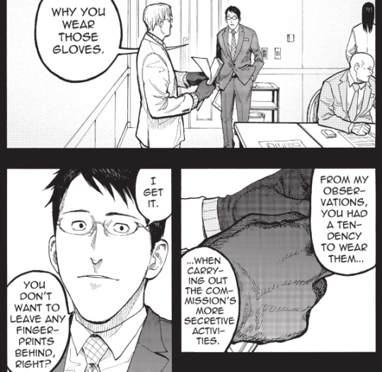
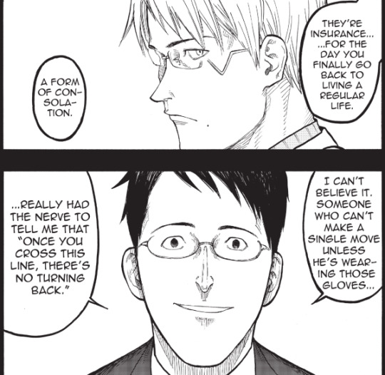
What makes a character an antagonist in this manga’s mess of motivations and ambitions set on the grey scale though? I always viewed him to be the different side of the same coin as Tosaki: Just as much driven by ambition, just as ruthless in his approach. All while showing to have enough patience and foresight to plan in a long time manner, thus becoming an element one couldn’t dismiss in its potential to bring in unexpected positive or negative dynamics that carry gravity. And yet: Despite his wish to win over Tosaki’s position of job, Sokabe proved himself to be reliable, the messenger link keeping Tosaki connected to his position once his place on the hit list had forced him into hiding. Gradually Sokabe earned his part in the story and the periphery of Tosaki’s team: For a long time he kept providing support and information despite Tosaki’s fall from favour in the eyes of their superiors.
Proving to stay useful like this might have been fuelled by Sokabe’s own ambition, but Tosaki never made a secret he viewed him with contempt, letting this bias influence his treatment of him. Yet he had no hesitation using him whenever it was convenient – demanding him to participate in risky tasks like digging up information about Sato’s background (that at this late stage of the manga might prove to be crucial). Sokabe openly stated it would bring him into trouble should it be known that he had shared this knowledge. So, motivation aside, Sokabe deserves respect and at least some recognition for remaining this patient when constantly getting confronted with this kind of capricious whims.
I also have the impression he genuinely felt supportive towards Tosaki’s goals up to a certain point. Because that’s it: Sure, he had a rivalry dynamic with Tosaki going on, but once matters got serious and counted, Sokabe always proved to be reliable. Yet Tosaki made the impression he was not only taking Sokabe’s help for granted but at the same time acted dismissive towards him. Everyone would grow tired of that at some point.
Chapter 53 reflections: Tosaki getting a call from his mysterious secretary, speaking with them. Once upon a time, I was hoping for mystery secretary to show up for real in some panels. It felt like they could have been an interesting addition to the plot, bringing all kinds of fresh dynamics into it. Because given the fact Sokabe later explicitly pointed out that he hired one, instead of just getting a nebulous phone call informing him about what Tosaki had done to the secret data, it didn’t seem random. I could only assume their presence had gotten introduced for some kind of reason.
But, with this plot thread leaving left hanging empty and leading to nowhere since many chapters, I guess we won’t hear any more concerning that subject. Which would be a missed chance, really. With Sokabe framed in the position of an antagonist towards side Tosaki, it would have been interesting to see him humanized a bit, by showing that despite his unapologetic approach and motivation he still had people in his life caring about him –like a subordinate he got along well with- instead of going the safe and convenient route and showing the baddie is liked by none. It would also have added an interesting layer on his repeated comparisons with Tosaki (them looking vaguely alike is no coincidence), showing that both men might be able to commit heinous deeds but at the same time are able to care for people in their lives. Proving like this that the capability to commit evil acts wears no easily recognizable face (but that it sometimes may wear glasses).
Sokabe pointing out Tosaki’s inability to let go of the wish to return into the familiarity of his old life despite already having wilfully committed heinous deeds is framed as him being the antagonistic part here. But honestly, keeping in mind the atrocities we already saw Tosaki commit: Sokabe has a point here. With the manga speeding on Tosaki’s redemption in his final chapters, instead of following the more time-intense path of the gradual betterment he already had started walking -even going so far as to retcon his repeated threats towards Izumi as holding no weight- the story also tried to make a point that Tosaki is supposed to be the lesser evil than Sokabe. Which he really isn’t. Both were willing to use the suffering of ajin used for experiment for their personal gain, with the difference that Tosaki tried telling himself he did it for a good reason, using the illness of his fiancée Ai as an excuse, even though she once told him explicitly she didn’t wish for him to go down an questionable path should he ever feel pressured to do so. Sokabe on the other hand uses no such excuse, ironically appearing as the one staying more true to himself here by not explaining away his readiness to go down dark paths for the sake of reaching his own goals.
Soon after the glove panels the action in the main timeline intensified fast and Tosaki suddenly saw the need to kill Sokabe, getting wounded deadly himself in the process. All this for the sake of trying to prove that Tosaki never had been a real threat to Izumi and had been on her side all along. Frankly? It would have been more impactful if Tosaki would have been on Izumi’s side despite him intimidating her in the past, despite him holding data about her able to reveal her status as an ajin should she ever stop standing in his favour. That would have been a meaningful redemption. Tosaki already showed potential for change and even regret – seeing him earn a change would have felt more rewarding than seeing him being forced by canon to backpedal on his past flaws entirely, on top of this being allowed to find a quick solution in death, escaping any incoming conflict caused by his acts for good. Through the story he proved ready to act ruthless for the sake of reaching his own goals many times. On a more complex note, this also made it more meaningful once he lessened his harsh treatment towards Izumi, him starting to treat her more humane: Implying that though he stayed ready to keep using other ajin, interacting on a daily base with her wasn’t letting him stay unaffected. This slow redemption and thus humanization of his was one of the more engaging parts of the manga, and I’m disappointed that after a strong start it got rushed, letting it end in a manner not feeling true to what we encountered at the beginning.
What we got instead was a rushed solution for the sake of redeeming Tosaki quick. During the Iruma base arc, we’ve seen Sokabe imply he knew about Izumi’s status as ajin and that he would have been ready to use this as a threat to keep her in line, once Tosaki would have been out of the way. So, in other words, we’ve seen him do the exact kind of intimidation Tosaki used against Izumi. But instead of acknowledging Tosaki’s past flaws, it was retconned as him never having possessed intentions to reveal information about her at all, his threats supposed having been empty all along. More, Izumi no longer was allowed to hold conflicting feeling towards the man who gave her a second chance at a point life had already robbed her of everything (at that time out of purely self-serving motivations, not because he cared about her personally, make no mistake) but at the same time had the habit to threaten her into compliance: The manga lets her claim she “knew all along” about his threats being empty, letting her thank him instead for everything he “did for her”: Thus reducing her struggle to stay safe in an hostile environment that could turn on her any time as her playing along in a connection of mutual convenience she never had the need to feel in danger. All of this for the sake of rushing the final confrontation between Tosaki and Sokabe into a quick solution: Reducing Sokabe from skilled schemer to moustache twirling cartoon villain who is suddenly wielding a narcotic gun, oh so heroically getting taken out by Tosaki, who went from ruthless opportunist who slowly experienced a change of mind to a player only holding a bluff of cards in his hand, never having needed the redemption he already had started earning. For the sake of protecting sudden damsel in distress Izumi (female characters only allowed to act badass when convenient) who is no longer allowed to hold her own complex motivations and grievances, but now got reduced to another prop supposed to support Tosaki’s softened origins. (Sadly the story isn’t giving us time to dwell on this, as she is already kept busy again with having to cater towards demanding and ungrateful manchildren who are making no secret they’re taking her for granted.)
I can only assume letting the started redemption of Tosaki -his mending of his relationship with Izumi- letting reach its organic end would have taken too much development. Time the manga wasn't willing to give this plotline, so it got speeded along by simplifying and outright retconning already established circumstances. These three characters would have deserved better. But sadly it is unlikely we’re getting much more on that front: Tosaki getting wounded deadly erases the question how his and Izumi’s complicated relationship might develop further. (Him letting his fiancée join in death also erases the question what she would have said finding out her boyfriend went against her wishes to not engage in questionable actions should circumstances ever pressure him. On top of this him justifying his actions by stating he committed them for her sake only.) With Sokabe also dead he no longer poses an uncertain force towards what is left of Team Tosaki – be it as a potential threat or as source of unexpected support, making the final showdown between these manga’s two opposing sides less uncertain and thus sadly much more predictable.
5 notes
·
View notes
Text
Chase Koeneke’s Top 10 Handheld Games of 2018
2018 could’ve been a bummer of a year. The game I was most excited about – Fire Emblem: Three Houses – got pushed to 2019. We were getting a new Pokemon game...but it was based on a mobile game and was fundamentally changing the formula I loved. And outside of Smash Bros., there was little left I was anticipating.
And yet, 2018 turned out to be a fantastic year in handheld gaming. I got a turn-based strategy game that’s up there with any Fire Emblem game I’ve ever played. That Pokemon game ended up being pretty great! And there were a bevy of unexpected indies that kept me entertained all year long. Here are my top 10 handheld games from 2018 (as well as a few honorable mentions).
Honorable Mentions: Mark of the Ninja Remastered, Gris, Kingdom Rush Vengeance, Donut County, West of Loathing

10. Minit (Switch, PS4, Xbox One, PC)
I like to take my time in games – fully exploring worlds, talking to NPCs, reading item descriptions. In that sense, Minit, a top-down Zelda-style game that only allows you to play in one-minute sessions should be my nightmare. But it’s not. In fact, I really liked it. Minit’s limitations freed me from my thinking and made me engage with the game on its level. In a world dominated by GPS and a games’ landscape dominated by easily accessible maps, there’s something refreshingly challenging having to commit the area to memory and make plans on not only what to do next, but how to make it there in time.

9. Golf Peaks (iOS, PC)
I’m bad at real golf, but golf video games, especially the ones that don’t try to meticulously recreate the sport, are my jam. Mario Golf on the Game Boy Color is one of my favorite games ever. Golf Story was one of my favorite games last year. And Golf Peaks takes that crown in 2018. Golf Peaks expertly mixes golf, card and puzzle mechanics to make for a uniquely pleasing combination. New obstacles are layered in world by world and get increasingly bizarre, until what you’re playing is barely recognizable as golf. Golf Peaks feels meticulously crafted, and it makes for a difficult, but rewarding experience. Unfortunately, because it’s so bespoke, it’s a finite experience, and once you’ve completed it, there’s little reason to revisit it. A new world has been added since the game’s release, but after completing it in less than an hour, I’m back to waiting for more.
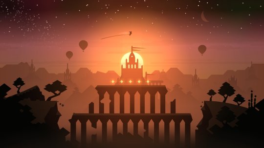
8. Alto’s Odyssey (iOS, Android)
Alto’s Adventure was one of my favorite games of 2015, a gorgeous and fun take on the infinite runner genre. Alto’s Odyssey further refines the formula by adding in even more things to do. The silky-smooth jumps, grinds and backflips return, along with the sublime wingsuit power-up, but they are joined by Tony Hawk-style wall rides that add a new dimension to the game. With uniquely skilled characters to unlock and upgrades to literally and figuratively grind for, Odyssey will keep you busy for a long time. It’s one of those rare phone games that’s good for play sessions both long and short, and its action never gets old.

7. Final Fantasy XV: Pocket Edition (iOS, Android, Switch, PS4, Xbox One, PC)
I was intrigued by Final Fantasy XV on the PS4, but ultimately bounced off its combat and general milling about. Pocket Edition fixes both of those issues and lets me enjoy what I really like about the game: its story and its characters. The miniaturized version of FFXV has turned it into a linear game with simplified controls (touch controls if you’re playing the phone version). The way it retains quite a bit of the themes and depth (and voice acting) of the original game despite streamlining it never ceased to impress me. And weirdly, playing Pocket Edition has actually reawakened my desire to play the original game. I want to see this treatment given to other Final Fantasy games.

6. Florence (iOS, Android)
Florence is not a game I would traditionally play on a phone. It’s not an infinitely replayable, puzzling experience like Threes or Drop7 or even a Kingdom Rush. But it is an experience, and one I deeply appreciated. Florence made me feel more than any other game this year, and it did it in a game that takes only about a half hour. It tells a mundane, yet impactful story about relationships. It’s beautiful. It’s funny. It’s tragic. But most of all, it’s real, and it uses its touchscreen controls to great effect to make you feel like you are an active participant in the story. It’s somehow simultaneously abstract and extremely specific, and I think it’s something everyone should witness.
5. Pokemon Let’s Go Pikachu/Eevee (Switch)
This is the Metal Gear Solid 2 of Pokemon. Let me explain. In MGS2, you play as Raiden, and you learn that you are being put through a similar adversity to the original MGS’ Shadow Moses Island in the hopes of turning you into another legendary hero like Solid Snake.
In Pokemon Let’s Go, things start familiar enough to anyone who’s played the first generation of Pokemon games (particularly, Yellow). You get a starter, you battle your rival, you face Brock and Misty and the other gym leaders and you stumble into and interrupt a nefarious Team Rocket plot. It’s all there. Except then you run into Blue, who is the real rival from the first generation of Pokemon. Which means your rival isn’t your rival. And you aren’t you. It’s fascinating and I ended up loving it.
Mechanically, it’s a weird mix of adding from more recent games while also stripping away complexity. Mega Evolutions are in. Held items are out. HMs are out. Steel, dark and fairy types are in. And there are some brand-new mechanics like catch combos that are a fun and new way to engage with Pokemon. It’s not all rainbows (I’m still not sold on the GO-style catching system,) but I hope the next mainline Pokemon game takes a little inspiration from these games. And I hope they remake Gold and Silver in this style too.

4. Holedown (iOS/Android)
Holedown became my go-to phone game for most of 2018. While you can beat it in a manner of hours, the game is so addictively fun and replayable with its final, seemingly endless level that you’ll be happy to dive back in again and again to improve your score. Holedown is satisfying in every sense of the word. Endorphins rush when you see and hear massive streams of balls ping-ponging off walls. Hitting the perfect angle to keep the combo going higher and higher is intensely gratifying. It’s so easy to play and understand, and yet you’ll be learning new tricks after your hundredth attempt. Holedown rules. Play Holedown.

3. Super Robot Wars X (Vita, PS4)
OK, this one’s a bit of a stretch. Super Robot Wars is not available in the US last I checked (though it is available in English.) Also, I did not play its handheld Vita version. Instead I played it on the PS4. So, on one hand, this game doesn’t really belong on this list. On the other hand, I love Super Robot Wars X so much, so it’s staying.
This was my first dip into the series and immediately found it to be an incredibly dense and confusing experience. It’s a turn-based strategy game like Fire Emblem, which sounds right up my alley, but the number of things to account for is staggering. To list all its mechanics would be a daunting exercise. Slowly, but surely, I learned to engage with more and more systems until finally, I felt like I could see the code, that I had entered the Matrix. I suddenly knew strategy game kung-fu. The game would set up almost impossible odds and, sometimes after an insane amount of consideration, I’d find a solution. I could boost the range on one weapon for the one turn I need it. Or maybe that shield I’ve never used would actually come in handy here. Oh wait, this pilot has a special skill I could utilize. The solutions are always there, you just have to look for them. It’s a beast of a game, but one I became utterly mesmerized with.
2. Dead Cells (Switch, PS4, Xbox One, PC)
I jealously watched early access PC players make run after run on Dead Cells. I heard people extol the game’s virtues on countless podcasts, and then, finally, the game released on Switch and I too could experience its splendor. And boy, did it deliver. Dead Cells bends over backwards to tailor the game experience to you. It allows you to choose what and when to unlock new skills, letting you further customize your arsenal as you play. It accounts for novice players who need to take their time getting through its sprawling levels while also providing options for crafty veterans who are able to speed through its content. And yet, as much as it caters, you’ll inevitably get to a point in your run where the game says “OK, now we’re going to test you.” I have failed that test every time. I have not beaten Dead Cells. But I am damn sure ready to try again.

1. Into The Breach (Switch, PC)
Where Super Robot Wars X is a turn-based mech strategy game on a macro scale, with an inconceivable amount of systems and options to deal with for your double-digit army of robotic fighters, Into The Breach stuffs all the same intensity into a comparably tiny grid and only a trio of battlers. It maintains the perfect amount of complexity, making every unit, every weapon, every move and every choice matter. It’s the ultimate chess game. And just when you think you’ve wrapped your head around its mechanics, it hands you a new team of mechs that plays completely differently. Runs are short, but meaningful, and the optional challenges (that let you unlock more new teams) push you out of your comfort zone to learn new strategies. Not only is it my favorite game of the year by a country mile, it might be one of the best games of all time.
#goty#gotggoty2018#chase koeneke#minit#golf peaks#alto's odyssey#final fantasy xv pocket edition#florence#pokemon let's go#holedown#super robot wars x#dead cells#into the breach
5 notes
·
View notes
Text
Inquiry 2 - “Crescendo”
Background
I am taking six classes this semester, and five of them deal specifically with art/design. Most of them have to do with the context and ideation behind art, and I really enjoy these because they provoke some interesting ideas. The philosophy class I’m taking, aesthetics, especially likes to deal with art as a way to portray things that you wouldn’t usually be able to - kind of seeing it as an alternative to speech for things that speech or writing fails to evaluate.
Although yes, most of these are about art, I find that there are a lot of parallels to the world of design. The obvious one is that design is visual communication, but I like to take it deeper than that. I’ve always loved putting meaning into my work on a deeper level, even in something as subtle as the colors (in some for-fun works, I made my name the hex color #bada55 just for giggles), and perhaps, for me, that’s where I find the art in design.
Anyway, these classes have prompted a lot of interesting discussions with friends of mine, and one of them led to us trying to paint a color without using that color - instead working off of how that color feels visually. Our pieces relied more on shape and composition, and it turned out to be a really interesting thought experiment and produced some pretty cool abstract works:
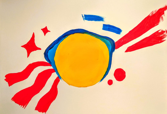
So imagine my surprise when the next day our workshop was to create something based on how music made you feel! I included this not to take away from the workshop, but because I think the color exercise was really when my concept for Crescendo began - how to make something visual in a way we’re not used to.
Concept
Conceptually I wanted this project to build on the aforementioned background, but doing that in a class about adventuring didn’t sound very challenging. Usually that means it’s time to seek out a more interesting angle, so I thought: why not make unconventional branding? Usually a brand has to be made with purpose in mind, but in a class about adventuring, surely it’s appropriate to pursue expressive and conceptual branding instead.
The Brand
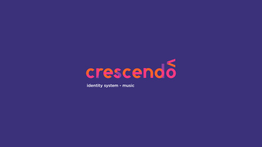
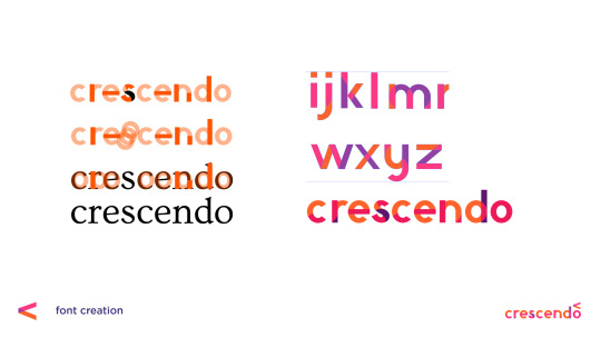
Crescendo is what I called my made-up concert hall. I thought a music arena might be a good choice because usually they don’t need to advertise themselves too heavily - the focus is on the musicians visiting, because everyone has heard of the venue already. Crescendo is a music theory term meaning to get louder, notated by an angle bracket of varying lengths, so it seemed like an appropriate name and unique marker.

When we did do the “digital mixtape” exercise in class, I found that I reused a lot of visual elements, no matter how the song changed, largely transparency, lines, and circles. What I find interesting (and incidental) is that music notation is largely made up of the same. Most notes are lines and circles, with differing fills to notate length of the note. I decided to use these three design elements to build my branding, and this decision was made before the font was attempted.
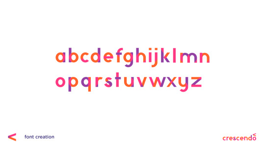
Not Quite Futura
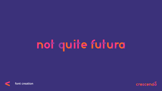
So believe it or not, this actually isn’t my first kind-of-a-joke font...
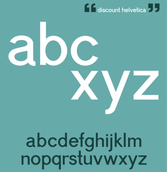
A year or so ago I partially designed a font I nicknamed “Discount Helvetica” for a poster about modern design. Neither font is really intended to be popular or necessarily a real font, but both allow for an in-depth personal study of how type works. At worst, if I ever do decide to make a real font, I’ll know from experience what details to pay attention to. Thanks to the first font being a much more complicated grotesque, I didn’t have a whole lot of difficulty with “Not Quite Futura.” Most of it was just shapes. Despite the name, this was not made by looking at Futura at all. The proportions were based on the serif Ovo, as it was still fairly rounded, but quite readable.
Once I did all of this, however, the transparency created by the shapes to make the letterforms just... wasn’t pretty. To some degree I had to pick and choose which overlaps to keep. The end font hints at how it was made, but it doesn’t give away everything, probably for the best.
Promotional Media
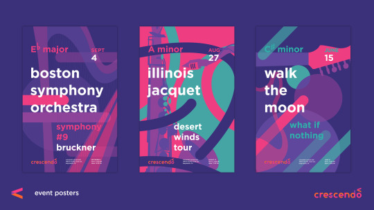
I don’t think it has been much of a secret that I love Josef Müller-Brockmann‘s work, and Swiss modernism in general, but that’s because it makes a lot of sense to me. The way this style portrays music has always resonated with me, so it was definitely a thoughtful decision to build off of that for my own work. Fortunately my color scheme and shapes and use of transparent layers definitely keeps the posters distinct.
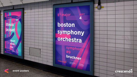
It’s important also to consider the context. These posters are something I imagined hanging in a really large frame (much larger than the printed ones I could bring in to class) - the kind of thing you see in malls or subway stops. A viewer should be able to look at these and recognize an artist they love and the style of the concert hall.
While definitely this project didn’t seek to be especially conventional, it is worth noting that this strategy of eye-catching, but stylistically memorable posters is something I’ve seen in the real world before. In Melbourne, Australia, which I’ve spent a little over a month in, many of the train stations have poster campaigns that you get accustomed to. You do not even have to read it to recognize the “Dumb Ways to Die” train safety campaign. You see a cute figure being chewed on by a shark and remember to avoid that yellow line. It seems to function well there, so my choice in using a recognizable style over hitting the viewer in the face with the logo is based somewhat in experience.
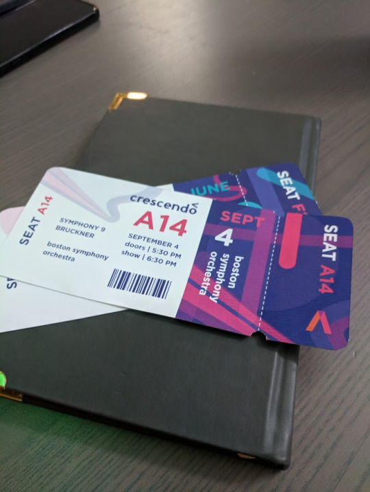
The tickets turned out to be one of the most fun parts, which surprised me. There was something really satisfying about holding them in my hand, and they are definitely the kind of thing I would want to keep to remember a concert by. I did get a comment that they look kind of like plane tickets, but I think I will just attribute that to the fact that I’ve been in considerably more planes than concerts. ;)
Taking it Back to the Screens
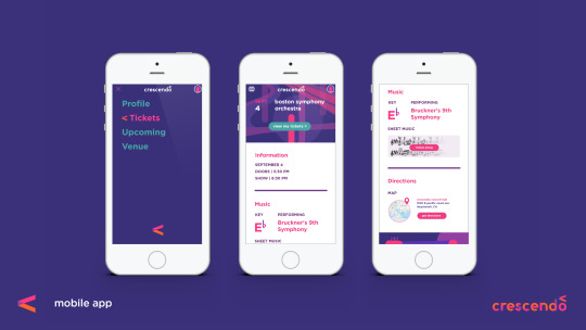
The great thing about conceptual branding as an idea, though, is that it can truly be applied to anything, including interaction, and that is an area I hope to explore in future adventures without question. To kind of illustrate the possibilities, I did a very brief mockup of an app to keep track of your tickets to Crescendo’s shows, but the point was more how this concept of line, circle, and transparency, can inform interaction elements, even the little things we might not think of.
A really great real-world example of this is the loading icon on Google Home’s setup app, which I will link to as I don’t think I can get the gif on this post. Those colors and shapes are all throughout their branding. They could have left the loading icon as some typical spinning wheel, but instead took the opportunity to make it something personalized that still reminds the user of their identity. That’s the world I tried to step into, and why I think simplifying branding down to shape, opacity, and color has an appeal. You can do a lot more with branding that starts simple than something that is confined to a logo. Probably something to keep in mind for the identity systems class next semester.

In this screen you can kind of see how my branding is influencing the hamburger menu we’re all so used to. Firstly I made the hamburger a little more rounded. There aren’t many squares in any of my brand materials in this project, so I tried to round out the form without losing the idea that it’s a menu. I also had the idea that when clicked on, interactive elements would then gain color and transparency, kind of like how music comes to life when someone touches an instrument.
Looking Back
Did it work? I will admit (and hopefully this doesn’t shoot my grade in the foot here) that this isn’t something I’m most proud of. I think I can do better, but I had one week and I think sometimes the deadline requires choosing a less-than-inspired idea.
However, I don’t think the experience wasn’t valuable, as I learned and thought about a lot along the way. There are aspects of interaction and conceptual unification that I had never considered before that got to be explored. I got to practice with designing a font, and further embed conceptual elements into that. I have really flashy tickets to concerts that don’t exist. Oh, and it was fun? Even if I wasn’t in love with the idea, there were lots of new things to explore along the way as I fleshed it out anyway, and I think that’s really the point.
As for if it is effective or not, I think it’s cool that most of the people I asked who professed to be really into music said the concept resonated with them visually.
1 note
·
View note
Text
Review: The Blazing World

The Blazing World, director Carlson Young’s debut feature, seemed to shoot for the stars, but unfortunately was a failure to launch. I can’t understate how much I wanted to see this film succeed. Partially, this was because I think horror films written and directed by women are often some of the most brilliant, but everything about The Blazing World’s description sounded promising. After witnessing the death of her sister at a young age, Margaret Winter (Carlson Young) finds herself slipping further and further from what seems to be reality and eventually finds herself in a nightmarish and bizarre world, where she must navigate the deepest recesses of her trauma and grief.
The one thing I can say for the film is that it was visually striking during moments. Certain stills, if pulled from the film, would make better pieces of art than the storyline they string together in my opinion. The neon lighting and intricate set design do their parts to create bizarre and ethereal settings, placing us in a similar headspace to our heroine. The soundtrack was another slightly redeeming feature, with scores from Tchaikovsky’s Nutcracker and other whimsical musical pieces guiding us through the world of the film and its characters. However, the rest of the film falls utterly flat. The film obviously attempts to draw on many iconic stories as well as other filmmakers with such instantly recognizable styles. To name a few, it heavily incorporates aspects of Lewis Carroll’s Alice’s Adventures in Wonderland, as well as (I would say nods to, but some aspects feel directly lifted from) Guillermo del Toro’s Pan’s Labyrinth (2006) and Henry Selick’s Coraline (2009). However, much like Alice herself, the film gets totally lost in references to the aesthetics and devices of these other works without seeming to retain any of the message or emotion that made them special. It’s being pulled in so many different directions, it can’t seem to decide what it wants to be. While inspiration and pastiche have always been a part of filmmaking, The Blazing World seems to want to draw from everything at once without ever really diving into the implications of any of it. Ultimately, it lays all its eggs in the aesthetic basket- but even still, the writing and performances are so disruptive it seems to spoil even the visual side of things.
Young’s performance as Margaret lacks nuance and feels static throughout the film, but the writing also does nothing in her or her costars’ favor. The dialogue is clunky and even corny at times, and the pacing is absolutely all over the place, lingering excruciatingly long in some places and opting to ignore others altogether. All of this being said, I think that the film’s greatest failure is in its portrayal of mental illness. Supposedly an examination of the complex issues and influence of grief and trauma, The Blazing World navigates them with very little grace and, at times, I would even say borders on offensive. It plays heavily into the trope of the individual driven to a psychotic state by a traumatic experience, but does little else to actually pick apart that hugely complex and sensitive issue besides placing the character in a conveniently romanticized and simplified story. The supposed exploration of trauma throughout the film felt more like a cheap prop contrasted against the ambitious visuals. By the end, these issues are neatly resolved in a way that feels completely inauthentic and even insulting to those who have experienced anything like them in real life.
I went into The Blazing World with my expectations high, and even throughout the film, when I could see little in the way of it being able to redeem itself, stuck around for some sort of miracle, but instead it only continued to crash and burn.
-G.
0 notes
Text
Binu Binu’s Soaps Combine Korean Bathhouse Culture with Modern Design
The following post is brought to you by Squarespace. Our partners are hand picked by the Design Milk team because they represent the best in design.
In a day and age when looking after one’s mind and body is the ultimate in self care, Binu Binu is a brand of modern soaps inspired by the age old ritual of the Korean public bath. Like the spaces themselves, these soaps are based on the idea of daily ritual, intergenerational bonding, and the infamous Korean scrub treatment “Seshin,” an incredibly vigorous exfoliating treatment found at the baths. “Binu” means soap in Korean, and was chosen for its simplicity as well as the fact that it’s not an immediately recognizable word or associated with anything in the English language.
Binu Binu founder Karen Kim used Squarespace when launching their website to help create a beautiful online presence right from the start. The clean lines of their templates were in line with the brand she was beginning to form, and the other services the all-in-one platform offers would help build her business as it grew. We talked to her about Squarespace, Korean bathhouse culture, and why you might want to pick up one of their Scrub Towels!
Photo by Binu Binu
Up until starting Binu Binu, Kim had been working in New York’s fashion industry with a focus on product development, editorial, and buying. Doing so gave her the opportunity to come to know so many brands and designers with fascinating stories who had created their own creative worlds, and it got her thinking.
“I got to the point where I just felt that it was the right time to create my own products and put them out there, as a way to share my vision with others. I think I always had an obsession with soap. One of my earliest childhood memories is of being scrubbed to the bone by my grandmother, watching what I thought were bruises disappear with just a bar of soap and determination. I thought it was magic.” she said.
Photo by Vera Mishurina
“Later on, on a trip to Korea with my mother and aunts, we would visit the public bathhouses every day and I loved how it was contrary to North American spa culture – which seems focused on the self and the idea of luxury. The Korean bathhouse (“jjimjilbang”) was more about a communal, everyday wellness ritual that was social, intergenerational, and seemed to lack vanity and self-consciousness. I found that to be so refreshing and wanted to bring some of that mood to Binu Binu. To me, a bar of soap represents something universal, ancient, with the simple aim of becoming clean. So Binu Binu was born from the idea of a simplified soap and water routine (the opposite of the complicated 10-step skincare routines popular in K-beauty brands) as well as a celebration of Korean bathhouse culture,” Kim explained.
Photo by Lauren Shooster
Once she decided to follow her passion for soap and culture, Kim dove right into the process of figuring out just what she wanted Binu Binu’s soaps to represent.
“Each soap starts with a story, and the formulation and ingredients flow from there. A lot of the inspiration for the collection comes from strong female role models in Korean culture. For example, the Haenyeo Sea Women are sea divers on Jeju Island who dive tank-free for the catch of the day. Many are in their 60s, 70s, and 80s, and are still out there every day in the icy cold water. Because seafood is such a large part of the economy, Jeju is a matriarchal society led by these incredible women. Our Haenyeo Sea Woman Soap, an homage to these women, has sea salt, seaweed extract, refreshing peppermint essential oil and is a bluish grey color, like the water,” she shared.
Photo by Vera Mishurina
“While doing a deep dive into the history of Korean cleansing and purification rituals, I learned about Shamans in Korea, women who perform purification rituals to cleanse the mind and body prior to conducting ceremonies to heal you of whatever ails you. It’s a practice that persists even today. So we developed a Shaman Black Charcoal Soap, inspired by the use of charcoal in these purification ceremonies. It’s our most popular soap,” Kim said.
Photo by Lloyd Stevie \\\ Styling by Lauren Shooster
Kim makes all of the various soaps by hand in their Toronto studio using the cold press method, which involves combining lye with oils and letting the mixture harden and cure for four to six weeks, to best retain natural oils known to benefit skin. The base of every batch contains “boricha,” the well-known Korean roasted barley tea. Every 100% natural bar is fragrance-free and does not contain palm oils, synthetic detergents, artificial colorants, parabens, sulfates, or animal products. So you know this is a product you can feel good about purchasing and using in a multitude of ways.
Photo by Vera Mishurina
Of course Kim uses her own soaps, and has the other soap-related wares Binu Binu offers in her bathroom. Each product has been thoughtfully designed and put to the test to be both a functional and beautiful addition to your bathing space.
“I like to cycle through various soaps, whatever I’m in the mood for – lately it’s been our new Creamy Clay Complexion Soap. I absolutely love using clay in soap, as I find it adds a really nice richness to the lather as well as adding a beautiful color. The Hibiscus Clay Facial Soap is always a perennial favorite, since my skin can be somewhat dry the extra shea butter makes this really gentle and moisturizing,” she says of her favorites.
Photo by Vera Mishurina
Of her other go-tos, Kim said, “My other must-have is our Seshin Korean Scrub Mitt and Towel. I love to exfoliate and this is just such a satisfying way to do it, where the results are immediate. A Korean scrub at the jjimjilbang is an amazing eye-opening experience. You leave feeling cleaner-than-clean and wondering how you could have ever walked around with so much extra baggage, so to speak. I became obsessed with the little cheap and cheerful neon-colored striped scrub mitts they use, so I designed an elevated, neutral-toned version for the line so you can scrub at home in the bath or shower. The towel version is to reach your back if you don’t always have a friend present to scrub it for you.”
Photo by Lauren Shooster
When Binu Binu’s soaps are paired with their Marble Soap Dishes you can see just how well both complement one another. To create them Kim works closely with artisans who specialize in marble bath wares – everything from sinks to counters to full-on marble free-standing bath tubs. Together they design and develop the dishes, selecting the various stone varieties for each batch as they go.
“I love the combo of our Marble Soap Dishes with our soaps. Working with natural stones is endlessly fascinating, because each piece is truly unique and beautiful. The ones with swirl patterns that speak to me make their way into my own personal collection. I’m partial to the Blue Marble, a glossy teal with white and sepia tones that looks like the Earth from space, and the Green Onyx, which is translucent and almost ethereal – like it glows from within.”
Photo by Vera Mishurina
You can’t help but be struck by each bar’s gorgeous angles and almost monumental aesthetic. It turns out that their sculptural qualities are just what drew Kim specifically to bar soaps in the first place.
She said, “I knew that I wanted to create a shape that was pared down, with clean edges and no extraneous details, but also something archetypal and iconic that wasn’t commonplace. Our bars can stand upright like a column, and can also fit perfectly in the hand. By shifting from a more ubiquitous flat rectangle to a monolithic shape, it turns an everyday object into a little sculptural object for the bathroom.”
Photo by Lloyd Stevie \\\ Styling by Lauren Shooster
We’re crazy about everything Binu Binu creates, so we asked Kim what’s on the horizon for the brand in the foreseeable future and what she’s most excited about.
She answered, “So many new things! One that we are most excited about is our biodegradable soap case for travel. It’s inspired by vintage designer soap cases, but modernized – definitely not something you would find in a drug store aisle. I think being able to simplify a toiletry bag is important. Instead of traveling with a million little bottles, you can pack a beautiful, discreet case (bonus: since the soap is solid, it’s TSA approved). It launches in October, just in time for the busy holiday travel season. Moving forward further into the future, our focus is on gradually building a world of modern bathhouse-inspired products that are also beautiful objects in and of themselves.”
Photo by Lloyd Stevie \\\ Styling by Lauren Shooster
Like many first-time business owners, Kim was less intimidated by Squarespace than other available options, which was a main factor in choosing them for Binu Binu’s website. Their abilities matched well with her burgeoning brand’s needs and left room to grow as a business, even offering tools that might help along the way.
“When I first started my business, I was drawn to Squarespace because it enabled me to effortlessly create an e-commerce site that was simple, yet considered design and functionality. I found that I could customize as I go, which is important to any new business as its needs change. At first we started with the Galapagos template, and now we use the Pedro template. I appreciate the flexibility, ease, and clean design principles that Squarespace keeps in mind.”
Ready to get to work on your own site? Take the first step with a Squarespace website. Use coupon code DESIGNMILK at checkout to get 10% off your first purchase.
via http://design-milk.com/
from WordPress https://connorrenwickblog.wordpress.com/2019/09/23/binu-binus-soaps-combine-korean-bathhouse-culture-with-modern-design/
0 notes
Text
Design Your Website to Sell While You Work
Design work is very time consuming. But it’s not just the labor you put into building websites that takes time and concentration.
Because the projects you work on typically have a short shelf life, you’re constantly having to find new gigs, woo potential clients, and sign them onto your service — which is like another job in and of itself. So, when do you find time to look for more work when you’re so busy actually doing it?
You could set aside time on the weekends to work on drumming up new projects, but that’s the last thing you want to do. Imagine spending that time booking new business and then being too burned out to get started with any of them? That’s no good.
You could, of course, do it during the workweek. It would just require you to dedicate otherwise billable hours to non-billable work and cut into your business’s profitability.
Without hiring someone to handle sales for you, what’s the solution?
It’s your website.
Here are some things you can do to design a website that relieves you of at least some of the burden of finding and selling to new clients.
1. Design for Your Niche
One of the best things you can do as a web designer (or any creative freelancer, really) is to carve out a highly specific niche. For instance, you could design websites for:
Real estate agents
Female-owned businesses
Restaurants in your city
The more targeted your audience, the easier it will be to sell to them (and to build their websites).
I’m going to take this one step further as I don’t just think it’s enough to choose a niche to design for.
I think your own website should be reflective of your niche. More specifically, it should be designed to look like a website your client would want as their own. What better way to sell a prospect on a website than to show them that you know exactly how to build the solution they need?
The Modern Firm is an excellent example of this:
Visit the website and you’ll notice:
The company name sounds like it should be working for law firms.
The design is super buttoned-up — traditionally-structured, muted color palette, and minimalism at its best.
Copy is professional, honest, and straight to the point.
In other words, this website looks and sounds like one that its target clientele would want for themselves.
2. Answer Their Questions
Think about how much time you spend dealing with objections as you talk to prospective clients. That’s either because their expectations haven’t been set properly before meeting with you or they’re a bad fit.
If you use your website to answer those questions, though, you can significantly decrease the amount of time you spend on sales calls with prospects.
One way to do this is to explain in the simplest terms what your clients get. Here’s how I handle this for prospective copywriting clients:
I was frustrated that I had to explain over and over again to prospects what it meant to create optimized content. The question continued to come up on calls, so I decided to just provide the answer on my website.
I now no longer get questions about my services. Prospects hop on the phone with me and ask how much they have to pay to get started. It’s been a huge time-saver.
As a web designer, it might not be as simple as to say, “You’ll get a 10-page website, built using X theme, optimized for speed with caching, etc.” When it comes to websites, you’re just delivering too technical of a product.
So, for you, I’d suggest taking the same basic principle of “answer their questions”, but tackle them with an FAQs like Eternity does:
They’ve done such a great job of providing simple and straightforward answers to the kinds of questions I’m sure all of you get. Not only will this decrease the amount of time people have to spend with them on sales calls, but it’ll help weed out bad-fit clients.
3. Create a More Impressive Portfolio
There’s absolutely no question that your website needs to include an awesome portfolio of websites. Just make sure that any samples you include in your portfolio:
Are 100% something you’re proud to show off;
Are relevant to your target audience;
Are consistently designed.
Here’s what I mean:
Bluetext is in the business of creating digital campaigns (including web design) for clients. Although they build solutions for a couple dozen industries, they keep their portfolio well-organized, grouping sample work based on category.
For example, this is what their “Cybersecurity” portfolio looks like:
Notice how well put together this portfolio is — everything is clearly labeled, designed in a similar style, and is impressive to look at. It also helps clients in quickly see the potential for their specific business without the distraction of other types of websites getting in the way.
4. Establish Trust
As a web designer, you have to build trust with clients if you want them to pay top-dollar for your services. While you can certainly do that throughout the web design process, why wait? Use your website as a vehicle for establishing trust now.
One way to do this is with your portfolio.
Another way to do this is by including testimonials or, at the very least, logos from clients who are happy to connect their brand to yours. Interactive Strategies uses a dedicated banner on its home page to show off brands who’ve trusted them:
If you don’t have a client base with recognizable names, or you’re still working to amass an impressive list of clients, don’t worry. You can use other trust marks to establish trust now as Direction.com does:
Prospective clients can see all of their awards and certifications in one place — and it’s definitely something to marvel at.
5. Simplify Next Steps
If you’ve been doing this for long enough, I bet you can anticipate what prospective clients’ next steps are after they’ve visited your website.
For my business, I know that they’ll see my site and then reach out for pricing. However, I know that I can’t actually answer that question during a first phone call. I have to review their needs, business, industry, and a whole host of other details before I can provide a quote.
So, I give them two options:
Fill out a contact form if you have further questions;
Schedule a 15-minute call with me through Calendly.
There’s just one caveat to the phone call though. I don’t get on the phone with anyone until they fill out my questionnaire (which their “Thank You” email sends to them). It asks them everything I need to know to provide them with a quote.
That way, when I do get on the phone, I’m fully prepared to talk about my process, explain final questions, and give them a number.
I would suggest building out a similar set of contact options (e.g. contact form and scheduler, chatbot and scheduler, chatbot and email, etc.), so you can spend less time going back-and-forth on the phone or over email and instead get them a quote and contract right away.
Design Your Website to Sell While You Work
Would you like to stop spending so much time on job boards, social media, and in search trying to find new clients? You already know how to build websites to help your clients sell their businesses, so why aren’t you doing the same for your own?
Add Realistic Chalk and Sketch Lettering Effects with Sketch’it – only $5!
Source p img {display:inline-block; margin-right:10px;} .alignleft {float:left;} p.showcase {clear:both;} body#browserfriendly p, body#podcast p, div#emailbody p{margin:0;} Design Your Website to Sell While You Work published first on https://medium.com/@koresol
0 notes
Text
Design Your Website to Sell While You Work
Design work is very time consuming. But it’s not just the labor you put into building websites that takes time and concentration.
Because the projects you work on typically have a short shelf life, you’re constantly having to find new gigs, woo potential clients, and sign them onto your service — which is like another job in and of itself. So, when do you find time to look for more work when you’re so busy actually doing it?
You could set aside time on the weekends to work on drumming up new projects, but that’s the last thing you want to do. Imagine spending that time booking new business and then being too burned out to get started with any of them? That’s no good.
You could, of course, do it during the workweek. It would just require you to dedicate otherwise billable hours to non-billable work and cut into your business’s profitability.
Without hiring someone to handle sales for you, what’s the solution?
It’s your website.
Here are some things you can do to design a website that relieves you of at least some of the burden of finding and selling to new clients.
1. Design for Your Niche
One of the best things you can do as a web designer (or any creative freelancer, really) is to carve out a highly specific niche. For instance, you could design websites for:
Real estate agents
Female-owned businesses
Restaurants in your city
The more targeted your audience, the easier it will be to sell to them (and to build their websites).
I’m going to take this one step further as I don’t just think it’s enough to choose a niche to design for.
I think your own website should be reflective of your niche. More specifically, it should be designed to look like a website your client would want as their own. What better way to sell a prospect on a website than to show them that you know exactly how to build the solution they need?
The Modern Firm is an excellent example of this:
Visit the website and you’ll notice:
The company name sounds like it should be working for law firms.
The design is super buttoned-up — traditionally-structured, muted color palette, and minimalism at its best.
Copy is professional, honest, and straight to the point.
In other words, this website looks and sounds like one that its target clientele would want for themselves.
2. Answer Their Questions
Think about how much time you spend dealing with objections as you talk to prospective clients. That’s either because their expectations haven’t been set properly before meeting with you or they’re a bad fit.
If you use your website to answer those questions, though, you can significantly decrease the amount of time you spend on sales calls with prospects.
One way to do this is to explain in the simplest terms what your clients get. Here’s how I handle this for prospective copywriting clients:
I was frustrated that I had to explain over and over again to prospects what it meant to create optimized content. The question continued to come up on calls, so I decided to just provide the answer on my website.
I now no longer get questions about my services. Prospects hop on the phone with me and ask how much they have to pay to get started. It’s been a huge time-saver.
As a web designer, it might not be as simple as to say, “You’ll get a 10-page website, built using X theme, optimized for speed with caching, etc.” When it comes to websites, you’re just delivering too technical of a product.
So, for you, I’d suggest taking the same basic principle of “answer their questions”, but tackle them with an FAQs like Eternity does:
They’ve done such a great job of providing simple and straightforward answers to the kinds of questions I’m sure all of you get. Not only will this decrease the amount of time people have to spend with them on sales calls, but it’ll help weed out bad-fit clients.
3. Create a More Impressive Portfolio
There’s absolutely no question that your website needs to include an awesome portfolio of websites. Just make sure that any samples you include in your portfolio:
Are 100% something you’re proud to show off;
Are relevant to your target audience;
Are consistently designed.
Here’s what I mean:
Bluetext is in the business of creating digital campaigns (including web design) for clients. Although they build solutions for a couple dozen industries, they keep their portfolio well-organized, grouping sample work based on category.
For example, this is what their “Cybersecurity” portfolio looks like:
Notice how well put together this portfolio is — everything is clearly labeled, designed in a similar style, and is impressive to look at. It also helps clients in quickly see the potential for their specific business without the distraction of other types of websites getting in the way.
4. Establish Trust
As a web designer, you have to build trust with clients if you want them to pay top-dollar for your services. While you can certainly do that throughout the web design process, why wait? Use your website as a vehicle for establishing trust now.
One way to do this is with your portfolio.
Another way to do this is by including testimonials or, at the very least, logos from clients who are happy to connect their brand to yours. Interactive Strategies uses a dedicated banner on its home page to show off brands who’ve trusted them:
If you don’t have a client base with recognizable names, or you’re still working to amass an impressive list of clients, don’t worry. You can use other trust marks to establish trust now as Direction.com does:
Prospective clients can see all of their awards and certifications in one place — and it’s definitely something to marvel at.
5. Simplify Next Steps
If you’ve been doing this for long enough, I bet you can anticipate what prospective clients’ next steps are after they’ve visited your website.
For my business, I know that they’ll see my site and then reach out for pricing. However, I know that I can’t actually answer that question during a first phone call. I have to review their needs, business, industry, and a whole host of other details before I can provide a quote.
So, I give them two options:
Fill out a contact form if you have further questions;
Schedule a 15-minute call with me through Calendly.
There’s just one caveat to the phone call though. I don’t get on the phone with anyone until they fill out my questionnaire (which their “Thank You” email sends to them). It asks them everything I need to know to provide them with a quote.
That way, when I do get on the phone, I’m fully prepared to talk about my process, explain final questions, and give them a number.
I would suggest building out a similar set of contact options (e.g. contact form and scheduler, chatbot and scheduler, chatbot and email, etc.), so you can spend less time going back-and-forth on the phone or over email and instead get them a quote and contract right away.
Design Your Website to Sell While You Work
Would you like to stop spending so much time on job boards, social media, and in search trying to find new clients? You already know how to build websites to help your clients sell their businesses, so why aren’t you doing the same for your own?
Add Realistic Chalk and Sketch Lettering Effects with Sketch’it – only $5!
Source from Webdesigner Depot http://bit.ly/2LgBzPU from Blogger http://bit.ly/2VxH40s
0 notes
Text
The Launch of a Refreshed Icon
When Taylor Hack joined a RE/MAX brokerage in 2013, he was recently licensed and launching a new career. Experienced in the mortgage and auto industries, he thought his skill set would serve him well in the real estate business.
In choosing a company, Hack wanted the advantages of a leading brand, a global network, a collaborative environment, a sky’s-the-limit mentality and a forward-thinking culture. He found it all at RE/MAX—and, specifically, at RE/MAX River City in Edmonton, Alberta.
“I stepped into a winning atmosphere from the start,” Hack says. “I know you’re influenced by the company you keep, so I wanted to keep company with top-producing agents. I wanted to learn from the best. Plus, the RE/MAX mindset rewards people who innovate and share great ideas. And that’s what I’m all about.”
Fast-forward to 2017, and Hack’s career is flourishing. His results have climbed in each of the past three years, and he’s already a member of the RE/MAX Hall of Fame and Titan Club.
“RE/MAX is a major factor in my success. The brand is incredible. When you tell clients you’re with RE/MAX, they have confidence in you and the service you’re able to provide,” he says. “That’s a huge advantage for me when I’m competing for business. The RE/MAX attitude is service-oriented and innovative, which helps me as an agent.”
Charging Ahead Innovation is a prevalent theme at all levels of the RE/MAX network. It’s demonstrated by the entrepreneurial, full-time agents and brokers. It’s part of the organization’s global vision. It’s evident in aggressive digital and social marketing strategies. It’s apparent in disruptive business expansions such as Motto Mortgage, which launched in October 2016. And it’s a clear priority for corporate leaders.
“We’re an established brand with 44 years of history, but still have the mindset of a start-up,” says Adam Contos, who shares co-CEO responsibilities with real estate legend Dave Liniger. “The rebellious spirit that launched the brand is still very much a part of our culture today. You see it everywhere.”
The spirit of constant innovation has helped lift RE/MAX to its status as one of the industry’s elite brands. In addition to being the only network to top 1 million U.S. transaction sides last year, RE/MAX is No. 1 in brand name awareness (according to an MMR Strategy Group study of unaided brand awareness) and has a global footprint unmatched in the industry, with a presence in more than 100 countries and territories.
The power of the brand is most evident in the industry-leading productivity of its agents. In the 2017 RISMedia Power Broker Report on the nation’s largest brokerages, RE/MAX agents averaged 16.2 transaction sides each—a figure more than double the 7.5 average of all other agents in the survey.
Productivity is a major edge in a fiercely competitive industry, especially when an agent is competing for the business of a quality-conscious buyer or seller.
“We have the best agents; it’s really as simple as that,” says Dave Liniger, who co-founded RE/MAX with his wife Gail in 1973. “We’ll always be the go-to choice for both top producers and new agents who aspire for greatness. We’re ideal for people with fire in their belly and a drive to learn, whether they’re new to the business or not.”
The result when professionals like that come together is that nobody in the world sells more real estate than RE/MAX, based on closed residential transactions. With five consecutive years of growth in agent count, the global real estate leader has no intention of slowing down.
In fact, a recent change will add to the network’s momentum.
A Refreshed Icon A RE/MAX “brand refresh,” revealed at the 2017 RE/MAX Broker Owner Conference in August, impacts all visual aspects of the brand—from yard signs and office signs to logos, and even the iconic RE/MAX Balloon itself.
“We’re charging full steam ahead with the refresh,” says Contos. “This will be a significant upgrade for the entire network. The new designs look great on yard signs and work brilliantly across mobile, social and digital platforms.”
The refresh is a natural, evolutionary step that helps great brands stay current and relevant with customers, preferences and delivery channels, Contos adds. The strategic, data-driven process took nearly two years and incorporated the opinions of more than 20,000 consumers.
Jennifer Atkisson-Lovett, a Hall of Fame broker/owner with RE/MAX of Stuart in Stuart, Fla., was all-in on the designs from the moment she saw them.
“I love the new look,” says the 22-year RE/MAX affiliate, who leads an office of about 40 agents. “It’s light, it’s fresh, it’s more contemporary and modern. It connects to the traditional branding while showing how RE/MAX continues to look forward.”
Brad Whitehouse, co-broker/owner of the multi-office RE/MAX Professionals in metro Denver, is equally enthusiastic.
“I’m really excited about the refresh,” says Whitehouse, a RE/MAX Hall of Famer who joined the network in 1995. “It’s great to see such a cool, modern version of the iconic balloon, and I love that it’s a very recognizable version of what people already know. It’s going to be a huge success.”
Importantly, the refresh was developed from a position of strength. Leaders have emphasized that it’s “an evolution, not a revolution.” The intent was to enhance and modernize the brand, not change its identity.
“We’re at the top of our game. The refresh takes something great and makes it even better,” says RE/MAX President Geoff Lewis. “It retains the strength of the past, and at the same time connects the brand to the tastes and preferences of today’s consumers.”
Whitehouse sees the refresh as a natural step for a forward-thinking brand.
“The RE/MAX brand is always evolving, and the logo redesign is a big part of it,” he says. “The redesign shows everyone—consumers as well as people inside our industry—that RE/MAX is moving forward with more energy and creativity than ever.”
Disrupting Another Industry When the leaders at RE/MAX see a new opportunity for broker/owners, agents and clients, they act quickly. That’s part of their no-limit mentality—and the brilliance of a top brand willing and able to evolve.
So in October 2016, RE/MAX Holdings, Inc. launched its newest industry disruptor and the second member of its family of brands: Motto Mortgage.
The complementary business provides a way for an owner of a real estate brokerage to provide a one-stop solution, via a Motto Mortgage franchise, for both homebuyers and borrowers. The broker operates two completely separate businesses—generally within steps of each other—in which real estate agents help find clients the right house, and loan originators work with multiple wholesale lenders to help secure financing.
The concept is simple: Focus on transparency and compliance, anticipate the wants and needs of consumers, and simplify the process. It’s yet another innovation from a company renowned for embracing new concepts.
Several RE/MAX brokers are among the first Motto Mortgage owners.
“We’re part of something dynamic and truly groundbreaking,” says Jack Fry, owner of Motto Mortgage Center in Wyomissing, Pa. “This is a smart step for my business. This would’ve been a massive undertaking to start from scratch myself, but the support from Motto Franchising made it possible.”
Opening New Doors for New Agents RE/MAX has long been home to experienced agents; a place where agents come after learning the ropes elsewhere. When they felt ready for the big time, they’d make the leap.
Currently, RE/MAX agents in the U.S. average 15.2 years in the industry, and 8.6 years with RE/MAX.
But in the past few years, more newcomers are seeing RE/MAX as a smart place to begin their careers. Passionate, driven and confident, they’re embracing the productive, collaborative environment in RE/MAX offices throughout the network.
Take Corey Casper of Texas, for example. A millennial now in his mid-20s, Casper served in the U.S. Army for five years before joining RE/MAX 1 in Cedar Park, Texas, in 2013.
“When I left the Army, I didn’t have a passion for typical nine-to-five jobs,” Casper says. “I wanted a career I could put all of my energy into and see a real, tangible result from my work.”
Casper’s life took a turn when a friend suggested real estate might be a good option for him. Casper hasn’t looked back since. He’s become a successful agent with a thriving career.
“I’m so glad I chose real estate as my career and joined RE/MAX. I feel a sense of fulfillment with every closing and every happy client. I can’t believe I’m fortunate enough to have this opportunity,” he says. “With all the competitive advantages at RE/MAX, why would you start somewhere else?”
Big Advantages in Digital, Social No longer a “nice-to-have,” a comprehensive social media campaign and digital strategy are an essential “must have” for any modern marketing plan. RE/MAX, LLC is an active player in the social and digital space, with effective behind-the-scenes and consumer-facing programs that benefit agents, offices and the brand as a whole.
A few highlights:
Big Benefits Social: Having a social presence and not staying on top of it is worse than not having a social presence at all. RE/MAX makes it easy for agents to post regularly. The “We Are RE/MAX” Facebook page offers a steady stream of professionally produced social graphics, consumer tips, videos and other resources. Agents enjoy similar support on Instagram, LinkedIn and even Snapchat.
Digital: By analyzing trends and other signals, RE/MAX digital initiatives reveal where a customer may be in the buying/selling process, so agents can then reach out with tailored messaging. Personalized ads for specific circumstances go a long way in furthering the conversation, building trust and establishing connections. The process lays the groundwork for lifetime business relationships that go far beyond a single home sale or purchase.
Big Initiatives Social: RE/MAX, LLC—in collaboration with the award-winning Camp + King creative agency—is constantly innovating on social media. A new social portal at remaxhustle.com enables RE/MAX agents to socially connect with consumers in fun, engaging ways. A few examples: They can present customized, digital “Welcome Mats” to new homebuyers, and they can provide real estate tips through a system called “First Flight.” Huge impact. No cost. Tiny investment of time.
Digital: The comprehensive digital media plan includes search, display, retargeting, video, content, social advertising, app prospecting, and more. RE/MAX digs deep into data to pinpoint how different marketing efforts impact brand awareness, lead generation and agent results. One initiative involves data-crunching techniques for audience segmentation, with resulting messages tailored to individual demographic, interest group or population segments. RE/MAX has even partnered with BuzzFeed to create content specifically for millennial and Gen X consumers.
Lead-Driving Machines The RE/MAX online presence attracts millions of visitors and generates an average of 3,000 referral-fee-free leads sent to RE/MAX agents every day.
remax.com The RE/MAX flagship site, remax.com, is real estate’s most visited franchisor website.*
global.remax.com Displays listings in more than 80 countries, with results displayed in over 40 different languages and almost 60 different currencies
theremaxcollection.com Promotes high-end properties to millions of qualified buyers
remaxcommercial.com Features properties from around the globe in all areas of commercial real estate— industrial, land, multi-family, office and more
RE/MAX Mobile App A convenient way to browse properties on mobile devices. Agents can brand the app with their own information.
And there’s more… RE/MAX offers a series of free, turnkey sites provided to agents and offices. Modern, robust and completely customizable, sites are available specifically for agents, teams, offices and multi-office brokerages.
For more information, please visit www.remax.com.
*Source: Hitwise January-December 2016 report of all U.S. real estate franchisors among websites in the “Business and Finance – Real Estate” category
Paige Tepping is RISMedia’s managing editor. Email her your real estate news ideas at [email protected].
For the latest real estate news and trends, bookmark RISMedia.com.
The post The Launch of a Refreshed Icon appeared first on RISMedia.
from News | RISMedia http://ift.tt/2vFCwc8 via IFTTT
0 notes
Text
How to: Research
These days people are eager to be noticed on their social media. Sometimes it's a joke they thought might be funny. Sometimes it's an impulse reblog. Sometimes it's spouting off a rant on a trending topic. One thing remains unpopular: critical thinking. Critical thinking determines the difference between wanting to be noticed and wanting to be right, as the two very rarely correlate. To avoid the awkwardness of being exposed in your ignorance it would do you a service to not only research what you know you don't know, but also to think critically about what you read and what you THINK you know. Before research, yiu need to address you personal bias. Much like a metabolism everyone has one and everyone's is different. You are not expected to manage a way to completely remove your bias, but yiu are expected to acknowledge it's existence and put it aside in order to do proper research and even then, outside "unbiased" and otherly bias input is critically important in providing context that could alter the interpretation of other facts. This does not mean you have to contribute to anything or anyone you do not support or that you must believe them but listening to new information, whether for or against your own bias, can add important info. Bias comes in a variety of forms too and they aren't always easily recognizable so it helps to understand what are biases that exist and see if any apply. After acknowledging and setting aside you bias, you can start to research the topic. Teachers used to tell my classes "don't use Google or Wikipedia" to which i say bullshit, use critical thinking. Their main argument behind that guideline is that Wikipedia can be edited by anyone and Google is a mixed bag of fiction and nonfiction. While that's true, they are still valid sources to seek out other more reliable resources if you know what you're doing. Wikipedia is as simple as seeking the sources they refer to in the articles. Of course you want to make sure that is also a credible source which takes us to the Google part. So if you are researching something you'll know a number of keywords that you'd use in your search. Bias can be found in the vocabulary and phrasing of your searches. For example, if i am looking to find information on the variety of sex chromosome combinations, searching "sex chromosomes" is going to yield weak resources. I would need to narrow my criteria, the words and phrases im using to search. What would be a better way of triggering content relevant to my topic is involving more keywords, perhaps more like "diversity of sex chromosomes" or "variety in sex chromosome pairing" etc. So now you're getting content, websites listed that have keywords you used, but what is reliable? This is where the most critical thinking is required. There are different kinds of reliable resources but they may be found in different places, such as through Wikipedia. While the Wikipedia article itself is written potentially with bias, going back to the cited sources and reading for yourself in depth can clarify what may have been misinterpreted or completely ignored. Generally you can rely on site sources that end in .gov and .edu but if we know anything about bias is that it has no limits so even these sources require a certain level of critical thought and devil's advocacy. You must also pay attention to the dates. Sources >5yrs old are questionable as we are constantly learning more. While sites ending in .gov and .edu should be reliable sources of info, they aren't immune to bias. These kinds of sites often defer to "studies" which are usually scientifically informed investigation of a theory or subject. However researchers can be influenced by bias as well, and further more a study can be deemed invalid due to a number of reasons such as population size/variety of the subjects or other poor methodology. For a quick example: Let's say i was researching the correlation between oral health and apple consumption to research the validity of the popular "an apple a day keeps the dentist away" phrase. If i only test subjects who's bloodline has never shown any oral health issues then i have allowed a bias to corrupt my results. The same goes if i ONLY used subjects that had noted oral health issues in their bloodline. Either way the results will be skewed one way or the other. It may also help to research the researchers to see if they are reliable. I want to take a step back now to personal bias and unpacking "what we think we know". We are put into school at an incredibly young age when we are starting a critical cognitive growth spurt. We are fed a lot of information about the world around us as though it is concrete irrefutable information when reality is that things are not that simple. However things are simplified for the sake of quick absorption. Boy blue girl pink, that kind of oversimplification is obviously subjective content but all the same people default to it because it's all they have known where as centuries ago, those colors were different. If you really want the avoid your own ingrained bias, you really have to break down all you think you know according to what you have or have not personally experienced. If you have personally experienced something, though does not make you an ultimate authority, it is much more credible than relaying info that was force-fed to you in 6th grade back in 1998. When i care to be accurate/have the energy to pursue truth, there are several things i keep in mind: 1 nothing is simple. if something is referred to as being "simple" it's probably not and they likely left out what they didn't know. 2 nothing is forever. sources expire, things change, etc. 3 nobody knows everything 4 a lot about our world and how we live it is subject to the bias of those in control 5 your knowledge is limited by your experience and exposure. treat it that way and be humble. 6 challenge yourself bc you are less likely to piss yourself off than others are and you'll be able to answer their challenges easier if you practice with yourself first 7 Never ever assume. To assume anything is to deem yourself and ultimate authority on something even if that is not your intention, and also throw back to #1 even if it seems like a simple easy "everyone can agree" assumption remember that nothing is simple. If your would like to exercise your critical thinking in a less stressful forum than researching heavy topics you could try logic puzzles. Upgrade your mode of thinking. It takes practice but you can do it. Do it before that autonomy is taken from you. This is a suuuuuper watered down rant on researching for the simple person but research is very complex. I took a research course in grad school for a semester and let me tell you it's hard developing a research proposal that has no foreseeable bias while still being comprehensive to a broad audience. New sources are encouraged to write at a 5th grade reading level to make the info accessible to a broad audience but researchers don't have that kind of option otherwise their write ups would be so long to bring everyone at a 5th grade level up to speed. That being said, more effort can be put in by each individual and whike nobody is expected to be perfect, everyone is capable of doing research beyond the first thing that pops up on google.
0 notes