
Don't wanna be here? Send us removal request.
Statistics
We looked inside some of the posts by susanpallmannhitegd-blog and here's what we found interesting.
Average Info
Notes Per Post
17
Likes Per Post
17
Reblog Per Post
0
Reply Per Post
0
Time Between Posts
1 month ago
Number of Posts By Type
Text
17
Last Seen Tumblr Blogs


Fun Fact
China blocked Tumblr because of pornography and censorship problems in 2013.
Text
Final, Reflection

And so, what has most certainly been my most demanding class to date comes to an end, and what a journey it has been. My first response is a sigh of relief that it’s over - not because it wasn’t enjoyable, but because it was in every way a full design workout, and I am exhausted. Over the course of the semester, we were given full opportunity to chase the most experimental, unconventional design ideas we could dream up, and for the final adventure the time to see the concept through.
My final adventure, I think, was especially interesting, though, as it was decidedly not a passion project by the end. The initial inquiry was not one of my favorites, and I was genuinely surprised by the positive response to it at first. However, after being encouraged to explore the idea a little further, I did see the conceptual merit of the idea, and so although I did not feel connected to the project, it was the one I felt compelled to do. For that reason above all, it was the most challenging project I have embarked on, and probably for the same reason, it may be the one I grew the most from as a designer and programmer.
More than once I had moments where I regretted wanting to be a designer and developer, or even regretted pursuing web at all, but each time I had to push through it and get to work in spite of how I was feeling, and I know I’m all the better a designer for it. It also taught me that sometimes there is an obligation outside of my feelings with design. This was the project that would do the most good in the world, I think, so it deserved to be seen through.
Overall this semester taught me a lot about creativity, experimental design, and ethical responsibility to design for a better world. It stretched me past where I thought my abilities rested and allowed me to dive deeper into the ideas and subjects that interest me most, and for that I will be forever grateful... right after I take a nap.
1 note
·
View note
Text
Inquiry 7 - I Can’t Cook
For this inquiry, I attempted to tackle the issue of food insecurity and malnutrition in college students by informing what healthy eating looks like, and explaining how to get this intake in a cost-effective way. I also took into account that my target audience is one that as a generation struggles immensely with depression and anxiety, so I tried to include recipes that are up front regarding effort and time commitment to make the task feel less daunting.


1 note
·
View note
Text
Inquiry 6 - Lost Places
With midterms picking up, I wanted to use this project as an opportunity to unwind, and venture inward for a change. At the same time, I hoped to create a way for me to further explore the world of illustration as I begin to get my feet wet in that arena.
My inquiry was a series of illustrated postcards themed around a road trip I took this summer. However, rather than focusing on a representational portrayal of these places, I elected to present rather how the memories feel to me. While this idea of memory post cards is something I want to turn into an ongoing series, the three I chose to do for this week are unified by a common aesthetic I find interesting and want to hold on to.
Driving across the country has, for me, become a symbol of my experience moving out and settling into a city I’m not familiar with, building a home out of the unfamiliar and unknown. In a similar way, when I go on a several day road trip, I have to find rest in places that don’t feel homey at all - sketchy motels and dark gas stations. They’re often places you would expect to see people, but the fact that they are vacant gives off this chilling mysterious feeling. It’s a weird real-life surreal experience, and I wanted to capture that memory.
This is why the cards are unified in color and contrast, but leave outlines and remnants of sketches visible. The memories aren’t representations of what the experience really was, but a shaky, dream-like perspective. For this project, I alone am the intended audience. While no doubt the imagery evokes a response from anyone looking at it, it’s specifically designed to remind me of the surreal corners of life and the cross-country journey I experienced this summer.


1 note
·
View note
Text
Inquiry 5 - <3 Parks
This project focused more on web marketing strategy by approaching the user’s realization of the campaign goal as a storyline-based navigation. The imagery was conceptually derived from a summer project and illustrated to allow for interesting web effects such as parallax (visible at supportzoos.com). Otherwise the website was kept minimal and warm to make the message approachable and easy to find. This cause also has a special place in my heart as I volunteer out in the Jefferson Memorial Forest on Saturdays.


1 note
·
View note
Text
Inquiry 4 - Perspective
The planned concept for this project was to represent how mental illness affects function through interaction that is purposely difficult to use. Although I was not really able to explore more disruptive interaction in this week, the project does provide a framework for that in future expansion.
Much of this project split my interests and focus design-wise, which is also why the current product might look a little simple if one does not consider all of the 3D modeling and coding behind it. In fact, using typical white-space conventions, this project utilizes over 750 lines of code.
The discussion we had in class about storyline was used in this project as well. The overall experience of the user clicking through any given module was of course considered, but even minor elements like the hamburger animation were storyboarded.


1 note
·
View note
Text
Inquiry 3 - Details that Delight
This project was a cross between two concepts that already fascinated me, built up and developed over time as I sat in traffic on my way home. The first concept that I had started playing with was the idea of a message that only becomes legible as the user interacts with it, although in my mind at this stage this looked more like a website or a popup book. The other concept that I was interested in was how things that look like ordinary decoration can be used for much more, especially to communicate. I keep a note page on my phone/laptop for ideas as they hit me, so I hurriedly wrote down parts of this idea at red lights and traffic stops, adding or changing it until the idea very much resembled my final product.

The design process ended up being the most difficult part, because making a message that can adapt into two messages, and having this idea inform a typeface design takes a lot of concentration, and even more reattempts as first designs didn’t work out. This was further complicated by the fact that technically the letters are occupying the negative space, which has to always be available to cast light. What I ended up really needing to divide up was the dark parts with no dots. That is, if a dot and no dot are overlapped, the no-dot “wins” out, so I actually have to think harder about the space around the letters, not the letters themselves.


The actual production and assembly were much less difficult, as they relied almost entirely on just following my design. That said, the assembly stage is also what made apparent any flaws or areas that need more thought if this project were to become a full adventure, but I’m sure that’s why these are experimental inquiries! Things to consider for future development, should this project move forward, are how can this be applied in more places, maybe as a way-finding system? How can something meant to be read by hand be more stable? How does automated spinning improve (or not improve) it? The great thing about this project at its current state is that it can easily be adapted into a bigger system, and as far as my two starting concepts go, there’s a number of ways this can evolve and expand in application.


1 note
·
View note
Text
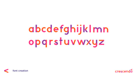
Inquiry 2 - “Crescendo”
Background
I am taking six classes this semester, and five of them deal specifically with art/design. Most of them have to do with the context and ideation behind art, and I really enjoy these because they provoke some interesting ideas. The philosophy class I’m taking, aesthetics, especially likes to deal with art as a way to portray things that you wouldn’t usually be able to - kind of seeing it as an alternative to speech for things that speech or writing fails to evaluate.
Although yes, most of these are about art, I find that there are a lot of parallels to the world of design. The obvious one is that design is visual communication, but I like to take it deeper than that. I’ve always loved putting meaning into my work on a deeper level, even in something as subtle as the colors (in some for-fun works, I made my name the hex color #bada55 just for giggles), and perhaps, for me, that’s where I find the art in design.
Anyway, these classes have prompted a lot of interesting discussions with friends of mine, and one of them led to us trying to paint a color without using that color - instead working off of how that color feels visually. Our pieces relied more on shape and composition, and it turned out to be a really interesting thought experiment and produced some pretty cool abstract works:
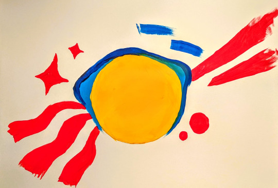
So imagine my surprise when the next day our workshop was to create something based on how music made you feel! I included this not to take away from the workshop, but because I think the color exercise was really when my concept for Crescendo began - how to make something visual in a way we’re not used to.
Concept
Conceptually I wanted this project to build on the aforementioned background, but doing that in a class about adventuring didn’t sound very challenging. Usually that means it’s time to seek out a more interesting angle, so I thought: why not make unconventional branding? Usually a brand has to be made with purpose in mind, but in a class about adventuring, surely it’s appropriate to pursue expressive and conceptual branding instead.
The Brand
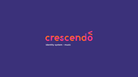
Crescendo is what I called my made-up concert hall. I thought a music arena might be a good choice because usually they don’t need to advertise themselves too heavily - the focus is on the musicians visiting, because everyone has heard of the venue already. Crescendo is a music theory term meaning to get louder, notated by an angle bracket of varying lengths, so it seemed like an appropriate name and unique marker.
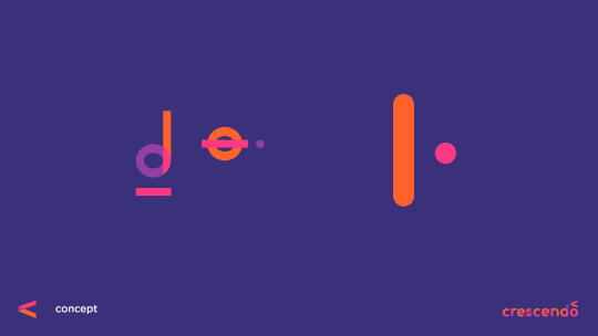
When we did do the “digital mixtape” exercise in class, I found that I reused a lot of visual elements, no matter how the song changed, largely transparency, lines, and circles. What I find interesting (and incidental) is that music notation is largely made up of the same. Most notes are lines and circles, with differing fills to notate length of the note. I decided to use these three design elements to build my branding, and this decision was made before the font was attempted.
Not Quite Futura
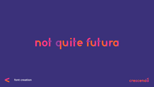
So believe it or not, this actually isn’t my first kind-of-a-joke font...
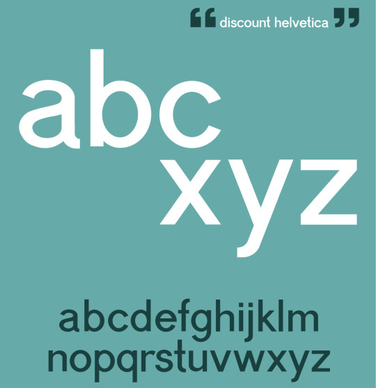
A year or so ago I partially designed a font I nicknamed “Discount Helvetica” for a poster about modern design. Neither font is really intended to be popular or necessarily a real font, but both allow for an in-depth personal study of how type works. At worst, if I ever do decide to make a real font, I’ll know from experience what details to pay attention to. Thanks to the first font being a much more complicated grotesque, I didn’t have a whole lot of difficulty with “Not Quite Futura.” Most of it was just shapes. Despite the name, this was not made by looking at Futura at all. The proportions were based on the serif Ovo, as it was still fairly rounded, but quite readable.
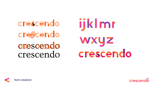
Once I did all of this, however, the transparency created by the shapes to make the letterforms just... wasn’t pretty. To some degree I had to pick and choose which overlaps to keep. The end font hints at how it was made, but it doesn’t give away everything, probably for the best.
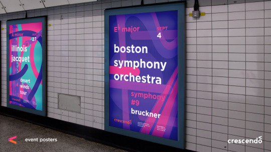
Promotional Media
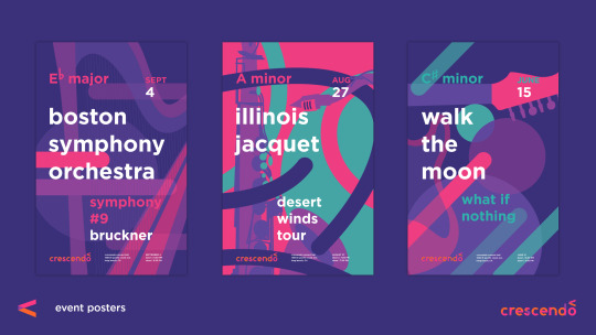
I don’t think it has been much of a secret that I love Josef Müller-Brockmann‘s work, and Swiss modernism in general, but that’s because it makes a lot of sense to me. The way this style portrays music has always resonated with me, so it was definitely a thoughtful decision to build off of that for my own work. Fortunately my color scheme and shapes and use of transparent layers definitely keeps the posters distinct.
It’s important also to consider the context. These posters are something I imagined hanging in a really large frame (much larger than the printed ones I could bring in to class) - the kind of thing you see in malls or subway stops. A viewer should be able to look at these and recognize an artist they love and the style of the concert hall.
While definitely this project didn’t seek to be especially conventional, it is worth noting that this strategy of eye-catching, but stylistically memorable posters is something I’ve seen in the real world before. In Melbourne, Australia, which I’ve spent a little over a month in, many of the train stations have poster campaigns that you get accustomed to. You do not even have to read it to recognize the “Dumb Ways to Die” train safety campaign. You see a cute figure being chewed on by a shark and remember to avoid that yellow line. It seems to function well there, so my choice in using a recognizable style over hitting the viewer in the face with the logo is based somewhat in experience.
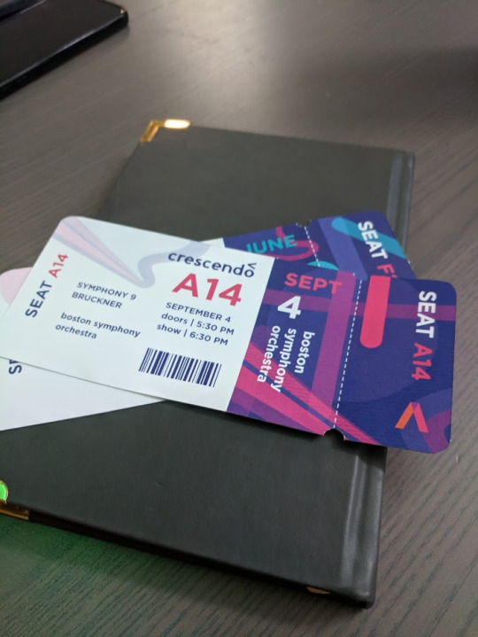
The tickets turned out to be one of the most fun parts, which surprised me. There was something really satisfying about holding them in my hand, and they are definitely the kind of thing I would want to keep to remember a concert by. I did get a comment that they look kind of like plane tickets, but I think I will just attribute that to the fact that I’ve been in considerably more planes than concerts. ;)
Taking it Back to the Screens
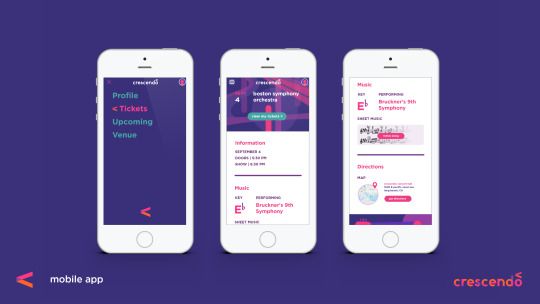
The great thing about conceptual branding as an idea, though, is that it can truly be applied to anything, including interaction, and that is an area I hope to explore in future adventures without question. To kind of illustrate the possibilities, I did a very brief mockup of an app to keep track of your tickets to Crescendo’s shows, but the point was more how this concept of line, circle, and transparency, can inform interaction elements, even the little things we might not think of.
A really great real-world example of this is the loading icon on Google Home’s setup app, which I will link to as I don’t think I can get the gif on this post. Those colors and shapes are all throughout their branding. They could have left the loading icon as some typical spinning wheel, but instead took the opportunity to make it something personalized that still reminds the user of their identity. That’s the world I tried to step into, and why I think simplifying branding down to shape, opacity, and color has an appeal. You can do a lot more with branding that starts simple than something that is confined to a logo. Probably something to keep in mind for the identity systems class next semester.

In this screen you can kind of see how my branding is influencing the hamburger menu we’re all so used to. Firstly I made the hamburger a little more rounded. There aren’t many squares in any of my brand materials in this project, so I tried to round out the form without losing the idea that it’s a menu. I also had the idea that when clicked on, interactive elements would then gain color and transparency, kind of like how music comes to life when someone touches an instrument.
Looking Back
Did it work? I will admit (and hopefully this doesn’t shoot my grade in the foot here) that this isn’t something I’m most proud of. I think I can do better, but I had one week and I think sometimes the deadline requires choosing a less-than-inspired idea.
However, I don’t think the experience wasn’t valuable, as I learned and thought about a lot along the way. There are aspects of interaction and conceptual unification that I had never considered before that got to be explored. I got to practice with designing a font, and further embed conceptual elements into that. I have really flashy tickets to concerts that don’t exist. Oh, and it was fun? Even if I wasn’t in love with the idea, there were lots of new things to explore along the way as I fleshed it out anyway, and I think that’s really the point.
As for if it is effective or not, I think it’s cool that most of the people I asked who professed to be really into music said the concept resonated with them visually.
1 note
·
View note
Text
Inquiry 1 -”DoDate”
DoDate
The concept put simply is a mobile game that turns the monsters of our life into much more approachable visual monsters for our game characters to fight, equipping them for battle along the way with encouragement and good preparation practices. The target audience is late high school and college age, but it is hoped that it is still usable for people outside of that age range, as I think people of any age could use a little help with getting things done.
Prototype link: https://projects.invisionapp.com/share/HPPZ87J2TMB#/

Process
The idea for this project didn’t really come from putting two categories from the matrix together. Instead, it hit me around 3 AM while I was trying to sleep, and I wrote it down immediately. Fortunately it pretty easily fit into several categories, and aside from being very ambitious, seemed perfect for the experimental “adventures” we are embarking on.
Although it hit me randomly, that does not mean it was without background.I previously had a conversation with some of my friends in which someone expressed that they “wished they had the natural motivation I do.” What that friend didn’t realize about me is that my motivation and work ethic is the result of years of effort and task-managing practice. This made me wonder: how many other people in the world never try motivational strategies because they think you have to have some innate drive to do them or haven’t found a new way to visualize problems?
Because of this background, I decided to keep my friends involved in my process, from start to finish, interviewing 4 of my closest ones. At this stage it was important to recognize that everyone has different needs and has different ways of being motivated. What works for me might not work for other people. That’s why I turned my friends into “personas” or categories of hypothetical users, each from very different backgrounds (and countries!).

The first thing I set out to do was come up with a versatile character design. Your character is supposed to represent you, and it felt important to be able to represent personalities well - another opportunity to use those personas, who in my case had a visual appearance to work with on top of specific needs. Although I couldn’t viably animate this project, I did try to develop my initial character design with potential for animation in mind. It’s important to note that the character base shown is not the only one that would exist in a full project, as it does not take into account a number of disabilities. The only reason I made just the one is that all of my friends are able-bodied. I can’t stress enough that the final product would be much more customizable and absolutely inclusive.

The character design process itself was interesting. I would not call myself an experienced illustrator by any means, but it’s a skill that I would like to break into more. I have already been doing a lot of research on in the last 2 or 3 months due to the illustration-based web project I did last semester: https://www.supportzoos.com/ so luckily my reading list was already well stocked for this week sprint.
However, while the previously linked project was started in Photoshop, that clearly would not really be the best way to go for this project. I did block in the forms of the avatars in Photoshop, but I quickly moved the effort over to Illustrator. Once I had a functioning base, it really didn’t take that long to make characters for all of my personas.


The next thing I really thought through was game mechanics. At the end of Web Design a year ago, I was encouraged to keep learning about web design if it’s what I love doing, and I really took that to heart. I have an online library now just full of links to web resources. Last semester I read through the entire W3 Schools library on JavaScript, and made sure I could practice what I was learning at my internship.
While I definitely did not have the time (or the right programming language) to make this a functioning app, this understanding of programming logic, which does not really differ strongly from language to language, would let me think through how the game would functionally work. The prototype could visually show how it will work, but I would also be able to explain the logic to a developer, which I think would be important going forward with this project.

I decided to go with a sort of “open world” style game even though the actual things the character can do are simple because it gives the user more choice over when and how they go about their battles. The idea is to make the user feel in control of the things they go up against in life, and I don’t know that this idea comes across if the user is stuck on a path with impending monsters in the distance.
To further make the user “in control” I also had the idea to add a silly question to the end of my quest creator. Sure, most of the input of your to-do list isn’t fun, but being able to add some little personal touch, like choosing horns, reminds you it’s a game.
The UI was strongly designed with user mood in mind. Quest creator had to be simple so putting in tasks doesn’t feel like a chore. Soft, warm colors were utilized with rounded, approachable shapes. All of it is designed to make the user more at ease, because the real life things these monsters represent are scary enough.

I originally wanted to include so much more in my prototype. I think it may have accidentally come across as “humble-bragging” when I apologized during my presentation for not having more, but the apology was sincere. I felt like I’d produced the bare minimum for a proof of this concept, but that it could go so much further. Unfortunately the prototype process of something with infinite paths like a character creator is just... the worst. It’s a ridiculous amount of iterative panels and linking each of them is a pain. In contrast, it would take a fraction of the time to code, which is why I know that the idea is viable even if a fully functional prototype is not.

In the end I had something like 85 different pages to link in InVision and it took quite a while, even using hotspot templates from page to page. I also kind of messed up and had to relink 16 pages I had done incorrectly the first time around. Still, I think being able to user the character editor was additive to my proof of concept and better conveyed my intended experience, so I will say the effort was worth it, even if my next inquiry will be simpler.
I should mention that somewhere during the prototyping process I got frustrated with the amount of panels and my ever so loving friends used my own philosophy against me, suggesting that this project is my monster to fight.

In conclusion, I sent the prototype back to those four friends to see what they thought, and I’m happy to say that it was really well received. Most said they would definitely use an app like this, which is already a step towards helping motivate my peers to achieve their goals.

However, if this did become a real app, retention of users would likely come into question. It’s not an addictive game, and it isn’t intended to be. My thought is even if the user only uses it a handful of times, they’re still building up the planning and goal-conquering mindset through memorable interaction, something that I hope will stick around long after the app is deleted.
1 note
·
View note
Text
Final Reflection
I’m so sad that this is the only web design course offered. Website design and user experience were something I hoped I would enjoy when I started the course out, but now it’s an area I’m highly considering specializing in - even if it means doing so by independently seeking out more learning on the subject.
With website design, even more emphasis had to be placed on functionality. While publication and poster designs both do require a sense of legibility to get the point across, with web (and especially when done from scratch) the failure to consider function can completely defeat whatever aesthetic value is there. More simply put, it needs both the left and right brain, and honestly something that utilizes both is what I want out of a career.
Although I came into the program with a lot of background with the internet in general, a lot of new understanding was achieved through this class. For example, responsive, adaptive, or fixed web design was a concept I hadn’t even thought of. And, although it was an early and less focused on subject, looking at what really successful websites are like vs those that are less so was incredible helpful. My look into good web design was still in mind as I designed my final website for project 6. It also encouraged me to continue researching trends in web design, coming to realize that gradients, bright and warm colors, parallax, and similar responsive animations are really in style online (some, such as parallax, not even for the first time!). This is the first class, I think, to really encourage me to keep exploring outside the in-class work, and I think that’s a sign that it captures my curiosity unlike anything else.
Besides, where better to learn about designing for the internet than from the internet?
In terms of further exploration, while of course all that has been mentioned is going to be an area of focus moving forward, I’m also curious how certain web design concepts - like adaptive design - can apply to print design. For example, if I had a grid-based design for one publication, and then needed to adapt it to a completely different ratio, is it possible (or viable) to code something to adapt it for me, following my pre-set design standards? It’s an interesting idea, and I’m excited to see where the future - quickly blurring print and screen together - takes us.
1 note
·
View note
Text
Project 5 Reflection
This project was a massive break from form for me. I’ve noticed that in most things, but especially in web design, I can tend to lean towards a very corporate look, which I can only assume stems from my love for Swiss International design and other grid-based systems (and that translates well to website design anyway). However, this project was an attempt to step outside all of that, and outside my comfort zone, and I think with that intention in mind it was a massive success.

I only had around 30 seconds to dedicate to my process during my presentation, so I’d love to show a little more of that here. I originally wanted to do a paper cutout style for the whole thing, believe it or not. However, I had heard rumors that not one, but two other people wanted to do exactly that for the same law. I decided to scrap that whole idea (no pun intended), and go for something I really haven’t done before - clay! (Ironically enough, someone else made a clay Bigfoot too, but that’s alright!) So Bigfoot was made with around $15 worth of Sculpey clay from Walmart.


As I did mention in my presentation, this model wasn’t even fully complete, and the final imagery would have to be heavily touched up in Photoshop. Fortunately, my skill in Photoshop has grown exponentially this semester, and I was happily up for the challenge.

I even channeled a hint of that papercut idea into the final banners.
But now onto the final pieces, the use of more playful typography and bright colors was a serious stretch for me. I tend to use more cool tones (those my colorblindness effects less) or serious colors, making exceptions for bright primaries when it fits with modernism.
I don’t usually like... pink.

But damn if it’s not growing on me now.
I think my favorite part about this project was that I had a concept from the beginning (Bigfoot’s stripes and a similar stripe pattern for the website), and that I stuck with it. This gave me the immense freedom to be playful with everything else about the website, from Bigfoot’s design to the “happy-meter” on the “About” page. I’m taking 6 classes, and having a project where I can be experimental, playful, and fun was a huge stress relief for me.
Overall this project served most strongly as a reminder to continue to branch out, and an encouragement to further pursue web design even when this class is over.


1 note
·
View note
Text
Project 4 Reflection
I seem to say this with each project we do, but this one once again was especially interesting to me. I have a decent background in the internet (I even met my boyfriend there several years ago), and a lot of that background knowledge of what makes a good website was there for me subconsciously as we brought our wireframes to life. As I mentioned in my presentation, I had the added challenge (although it was more of a pleasure) to work with brand standards. Fortunately, since the standards were primarily designed for print, I still had a fair range of freedom, which I think was a great introduction into working with a brand standard.

I also noticed, when using this, that the original website had not even followed the brand standards itself! I personally felt that bringing the wireframes and standards together was an easy and maybe even happy marriage. I was very pleased to hear that I seemed to be taking to this naturally, as web design is one area I would love to potentially specialize in someday.
As I adjusted my wireframes to fit my added content, as well as brought in imagery to liven up the otherwise-corporate atmosphere, I did have to make a few changes to my initial sitemap, so I also took that as an opportunity to present the map more clearly than I had before:

This is more of an aside, but it was also a fun experiment for me personally to utilize something similar to Swiss International style in my website. That kind of modernism is somewhat of a love of mine, and this project (especially in using corporate standards) was ideal for expressing that. Still, I had to balance it out with imagery, as Goodwill is not meant to be cold, corporate monotone, and I’d like to say that my final design expressed that better than my wireframes did.

(Home page, emphasizing donations.)

(Programs demonstrating a modular, view-as-you-please user experience.)

(Contact us page designed for a mostly store-location-based company, but one that’s with the times.)

(Learning how not to leave the shop page drab and all white, feat: my new attempts at photoshop.)

(Apparently everyone’s favorite drop-down, a last-minute, but immersive add.)

(Condensed news page that keeps information simple and doesn’t overwhelm the viewer with template hell.)
And lastly, some final mockups of my website on a screen:


1 note
·
View note
Text
Project 3 Reflection
This project was especially exciting for me, because it was the first solid glimpse into the process of creating a website. Project 2 certainly detailed the needs for an overall vision, but this project got into functionality and technical elements – things we’ve also been learning how to create in codecademy through HTML. Much to my surprise, this part also came much easier to me than the Photoshop mockups did.
Interestingly, Adobe XD shares some functionalities with Microsoft Powerpoint. Although this is not the proudest part of my background, before I could afford any of the expensive Adobe software, and before I began design school, I used to design logos and icons in MS Powerpoint, taking advantage of its vector and Bezier pen tool. I used this program for years, and I got very familiar with its functionality. It also had some fairly intuitive smart-guides that made laying out similar elements (such as images) really efficient. Adobe has very similar features and nearly identical keyboard shortcuts. I’ve picked it up very quickly, and quite honestly, it’s everything I have ever wanted out of a design program.
That tangent aside, the wireframe process was a lot of fun. I knew going into designing that while I do want to be at least somewhat knowledgeable in most areas of design, web design was one of my main interests. Having never tried it, however, I was fully prepared to realize it’s not as fun as it looks. Fortunately, I really do love what we’ve done so far, and I can definitely see this potentially becoming an area of specialization down the road.
Now, on to the design. For my nonprofit I chose Goodwill KY (http://www.goodwillky.org/).

There were a few reasons behind my choice – first of all, it’s a nonprofit I’ve contributed to before, and thus more personally connect two. Secondly, although it’s a well-known charity, the website is definitely a mess, so there would be plenty for me to do for this project. And lastly, I really wanted to integrate the idea of working within Goodwill’s identity system, which I would later realize is even published online.
The first part of the project was to draw out and revise the site map. The original was, in my opinion, very difficult to navigate. I tried to put the site through what I call the “mom test.” I tried to image my mom going through that website and trying to find something, and I could just picture her getting frustrated as the navigation took her in circles, and items that should have been related were in completely different areas. In fact, some repeated links, such as “Jobs,” took you to two different pages altogether!

So my first course of action was to merge anywhere I could. I put financial information together, and knowing I could design a page with plenty of information cohesively, I merged several pages into one. I also aimed to make the navigation links a little more up-to-date (hopefully to match my prospective re-design visually).

For the wireframes, I wanted to really illustrate a push for function. While there will certainly be plenty of text-heavy pages (similar to the blog page), I decided that it would be more illustrative of my design to show different types of pages and how they would fit within my overall system. Additionally, since I planned to merge many different pages into single new pages, it seemed ideal to demonstrate how my invented pages would play out.
Beginning with the home page, I started with modernizing everything. No more weird rounded-rectangular text frames, or dated 3D buttons in varying colors. The goal here was professional and uniform. Goodwill’s logo was somewhat of an inspiration here, as well.

Everyone who sees that blue/square/futura theme recognizes it. The website should reflect that, without being tacky. A big change to the home page was making donations more front and center. Before, although they had a “1-click donation” feature, it was hidden in a dropdown menu in the navigation, and it really needed to be more accessible. Of course, the fun information, like their blog, would still be fitting on the home page, but it could play less of a role than it was. I put the most important, sought-after information in the navigation bar, and the lesser (but still important) information in the footer – especially things like tax and finance information.
The blog I completely streamlined. Before, there was a “news center,” a blog, and several unlinked webpages solely dedicated to blog-like stories that, for some reason, just weren’t in the blog. It made more sense to keep all that in one place. For this page, given the depth of information, it seemed like a good idea to let it be “view as you please” style viewing. The page would initially load just the most recent entry, but the viewer would be able to scroll down and click a button to view the next entry. This would probably improve load time and let the viewer be far less overwhelmed.

The contact page presented a unique issue. While most websites list information like emails first, I had to keep in mind that Goodwill is primarily a place you go to to donate or shop. The location of its centers is very important, so that got listed first. However, the company can’t afford to lose touch with newer generations, so it was also important to additionally list social media and a in-site email function. This way, anyone can connect with Goodwill in the way they are most comfortable, leading to more connections made overall.

The programs page is arguably the most of an investment. To understand my solution best, it’s helpful to know how it was before. Originally each program Goodwill offers was on its own page. Despite this, none of those pages linked to the websites of those programs themselves. The pages were also very wordy, and if someone were unsure of which program they wanted, they would have to be doing a ridiculous amount of reading. To make all of this easier, my design brought all programs onto one page in snapshot modules. The modules would show up as a grid, and when clicked, display a larger window below (as pictured) which gives more information. All modules have a brief snapshot of the information to give the viewer some idea of what it’s about, but not so much that the user is waist-deep in nonprofit jargon that they just give up. The interaction allows the user to choose what they want to see, and close it if it’s too much. Also, it fits with the 3-column theme running on the contact page and in the footer; this visual consistency keeps the viewer knowing where and when to expect things to be, which should help them not get lost.

The shop is a simpler page. Previously, Goodwill had a Cafepress shop off-site which would cause user dropoff. To prevent this, and since I believe Cafepress has an embed plugin, I thought a in-site shop made a little more sense. In retrospect, and following the peer critique we did, I think I would implement a similar button to that used in the blog section (view as you wish), instead of trying to have it scroll behind the footer – a function that isn’t very consistent with the rest of the site.

Overall the focus was to make everything easier to find and a little more up to date. The website needed to be made a little more appropriate to its branding, and I believe my wireframe gives it that consistency. I made donations more front and center, and emphasized the really important aspects of a great cause to come up with my design.
And since we have begun project 4 just a little, I’m able to say that the wireframe process has set me up quite nicely for the start of the next part. Having found the corporate identity guide online, between those specifications and my wireframes, I have a really strong start on my hands.

(I am so sorry, I did not mean to get this wordy. I had a lot to say about the process on this one!)
1 note
·
View note
Text
Project 2 Reflection
Now that we have wrapped up Project 2, I think I can safely say the learning curve is incredibly steep when it comes to web design. I’m happy to say that my winter break has set me up nicely for this class, though, as during that time I actually spent several weeks learning some coding basics from my dad, and familiarized myself better with Photoshop – both being areas I had little to no experience in before.
Fortunately, since we did not have to make this project actually functioning and coded, it was a much easier introduction to wrapping my head around how to design a website. Now three semesters into design courses, that’s an area I think we’re all much more comfortable with, and that transferred really well to creating a Photoshop mockup.
On the subject of using Photoshop, I know that I and many of my peers struggled with designing there (instead of InDesign, for example), especially when it comes to working with raster images. However, I did find that I could be much more pixel-accurate, which I’m willing to bet is really important when we get to the coding step.
I started by deciding on what I really wanted my website to be about. I knew that a lot of my peers were going to be doing portfolio websites, and while I will want one of those eventually, for this project I didn’t think that would be the best way to show my “2 truths and a lie.” So instead, I decided to make it more of a personal adventure blog, and include things like my bucket list and my 1 second everyday video. The next step was to write up a brief kind of sitemap sketch.

I started my design in InDesign, just so I could better explore what options I had with the page elements I had planned without a loss of text quality or damage to my imagery.

The other plus side of beginning with InDesign is that transferring my different layers to Photoshop forced me to be incredibly organized with my layers. Buttons I designed in InDesign had to be exported as PNGs and named carefully so they would get put in the right layer group in Photoshop.

Fortunately, most everything transferred without many issues. There was one incident where an image appeared overly pixelated once exported, but this was resolved by exporting it at a higher DPI and manually shrinking it back down in Photoshop. I think the most surprising element of my workflow for this project had to be trying to have the whole file on a single canvas. In InDesign we typically make tons of pages, especially for testing iterations and getting to the best possible design. Here, not only is it limited to one page, but all of the web pages have to be on that page too. This challenge demanded a strictly organized layer system, both with groups and names – something I historically was never the best at.

But, the end site was very neat, and the files behind it were too. I can definitely see where keeping an organized system will be beneficial when we make the jump to coding things ourselves, so if there’s anything I’m taking away from this project, it’s the necessity of a neat workflow, especially in web design.


Finally, there was the presentation and critique. I had the luck of having already presented my 2 truths and a lie in my public speaking class earlier that day, so I’d warmed up for presenting pretty well. I did run out of things to say pretty quickly, which I think in part is because my website was a pretty simple design. I aimed to make it pretty straight forward, and easy to navigate without explanation, but I do think finding more to say is an area where I can improve when it comes to presenting.
The way we did critique this project was amazing. Last semester I really enjoyed getting peer feedback on my projects, and found it really helpful to hear others’ opinions. This time we did the critique through a Google form, and it went really well, in my opinion. I got a lot of helpful feedback personally, and was happily surprised by the positive responses I got. It’s a really great way to look at what I am doing well, and what I could be doing better in for future projects.
1 note
·
View note
Text
I Straight-up Love the Grid
I think if there was any single turning point for me this semester, it was the day when the grid just clicked. A couple of things got me to that epiphany, but I do remember the moment it all came together, because I wrote it in my lecture notes that day:

At this point we were already too far into the typographic poster for me to apply this new learning the way I wanted to. As disappointing as that was, it compelled me to use the grid in every project after, both in this class and in Intro. My grid usage especially drew inspiration from Swiss International works following a presentation I gave about Josef Muller-Brockmann. This movement in particular put emphasis on typography in its relation to the grid, and that was, in my opinion, precisely the direction I needed.
So naturally, when we were given Exercise 3, tasked to design 5 related grids, I was ecstatic. I’ve been very surprised to discover I have a serious passion for organization and grid structure, and I enjoy every opportunity to come up with a new systematic way to lay things out.
For this exercise, I started by copying some layouts I had done over the semester onto paper, and noting characteristics I liked about them - if they had good white-space, or an unusual ratio I might borrow from.

From there I progressed to InDesign and began setting up a layered grid. I did a similar process for Project 2, and it ended up being more adaptable than I even needed it to be. For a process book with a large range of varying content, that level of flexibility will be much more important.

The basic grid started like this. I knew I liked a certain font size and typeface from last semester’s process journal, and the column spacing I had used was actually pretty good, despite not knowing the “rules.” So for this grid I chose three columns to start with. From there I placed flow lines. I like the visual effect of making each “section” progressively larger or smaller - it seems to create a sense of movement, and it keeps things from getting too boring despite following a grid.

However, not everything I do may follow a three-column grid, so I also added a two-column grid, and a general 1x1″ modular grid. The final thing looks really complicated, but the reason I have all of these layers is so I can turn them off as I need to. At least for this project, I would never use all of the grid lines pictured at once.
Now this looks like an overly complicated way to do things, but there is a reason to have such a detailed grid.First of all, if I fill the page with grid, I feel less inclined to fill it with content, which makes it easier for me to approach having a lot of white-space, which is a definite aim in the design. Secondly, the grid always changes a little when I actually get content in place. It’s easier to delete a grid line I’m not using than to try and add a new one to the whole design.


Once the design really gets going, I find the grid allows for a lot of room to breathe, a very clear hierarchy, and in general a nice flow. After the amount the grid intrigued me this whole semester, I’m glad we got to do an exercise about it.


Our final assigned reading is chapter 11, which focuses on design education - specially how other students are exploring typography at their colleges.This may be the most interesting chapter yet to me, as a lot of what was pictured reminded me a lot of our class and the works we’ve been producing. It’s also interesting to note that it seems college is where the really exciting, experimental designs happen. Those go on to find more practical applications in the real world, but college is when the crazy is free to happen. It’s unconventional, and weird, and outside of context completely nonsensical, but it’s so, so beautiful. I’m immensely inspired, and given that the creative briefs are included in the depictions, I think I may want to try a few of those “assignments” on my own, just for fun. As the semester draws to a close, I’ll confess I’m saddened that the exciting and experimental work we’ve been doing has to end, but perhaps - looking at these other “assignments” - perhaps they do not have to end at all.
1 note
·
View note
Text
Reflections & Fresh Starts

It’s finally finished! This week saw the conclusion of project 2, complete with an in-class critique and guest viewers. I think there was a collective sigh of relief once we could call it over. That is not to say it wasn’t a fun project (it most certainly was!), but there is some very strong satisfaction to saying a job is done. I think my only regret about the critique itself was that we did not get much opportunity to give each other feedback, like we had with our posters last project. I found that a really valuable experience last time; in fact, it was directly instrumental in the creation of this project.
Now that it is over, I can really look back and reflect on the project’s process, and it’s truly amazing to see how far these zines came from being a vague concept just a month ago. I touched on my zine’s process a little during the critique presentation, but as those were supposed to be fairly short, I did not really go into the depth I would have liked to.
I did mention in the presentation that my choice of Futura as a typeface was largely based on the posters of my peers from the previous project. Of the top three I chose, 2 were on Futura. I myself had done Mrs Eaves, and for this project I wanted to try something a little less traditional. Futura fit the bill, but at this stage it was kind of like a first date. I knew I liked the look of Futura, and something about how my peers had portrayed it fascinated me, but I didn’t know anything about it, really. So naturally research had to be my first stage! That was where I discovered that Futura was more than just a geometric sans serif; it was very much an expression of futurism by Paul Renner. This ended up becoming my entire theme, so if that doesn’t exhibit the importance of research, I don’t know what will!

I remember the next thing due were our plans for the photoshoot and some early spread layouts. Keeping in theme with the futuristic idea, I knew pretty early on that the classic retro astronaut look would be perfect. I did not realize what kind of undertaking making such a costume would be, but I was committed to the idea. Although I now know how much work it was to create such a costume (and that I could only breathe in it for a few minutes), I am glad I decided to stick by the idea, because the visual power of the imagery really boosted my zine, in my opinion. It really fit the theme I was going for quite beautifully, and to see that I had such a strong concept so early on in the process is quite encouraging.
That photoshoot even ended up being a central part of my cover by the end of the project, even though I had only intended for it to be on one spread to begin with, and that leads me to another discovery about this project. I fully expected the cover of the zine to be the easier part, and to undergo the least amount of changes. This was not because I thought the design of my cover was especially good (I did not even have a design yet); it just seemed like it would be the element I would be most sure about. Quite contrary, it was probably one of the last and less “sure” aspects of the whole zine, only coming together in the last two weeks.

And the before/after comparison is outright shocking. Thank goodness I had gotten my content finished early enough to really put time into the cover.
I really feel that this zine expresses a lot of what I learned all throughout this semester, not just the things discovered during this project. The critique of my first poster was, as I said, an essential part of this zine’s design. My zine used a very strong grid structure, as I’ve touched on in a previous blog post - this was entirely because the grid was one of the best elements of my typography poster design. Many of my design choices were inspired by or thought of during the last project as well. The work of tracing Futura letters in light ties directly to our first exercise. My colors in both my first project and this one (admitting that they may not be coming across the way I see them) are a subtle nod to the wonderful colors I saw at Brad Vetter’s studio during that field trip. I use large green letters in my specimens and colophon pages, and while they carry a different function, I kind of see them as a reference to the drop cap letters we saw in the really old books at Special Collections. It all got tied into this project, and for me that gives it all more meaning. The process itself was rigorous, but this too was something the semester has really pushed me to be better at. I think I have said before that this class might be the most challenging for me design-wise, but I also feel that it may be the class where I see the most progression. I have grown more than I really thought was possible, even over the course of just two projects, and that is indescribably exciting.
The reading for this week is chapter 10, which talks about the process (this is really why I chose to reflect on my process for project 2 in this entry). It details design tasks, and the steps to reach a solution professionally, and I was surprised how many parallels there are between the process it details and what we are doing in class. The way our projects are set up, we are given a design challenge, and through some steps we develop a solution. Looking at the variety of choices, styles, and themes in the zines we collectively created as a class demonstrates the many ways a specific problem can be solved through design. Even though we all followed a similar process and time frame, there were incredibly diverse outcomes, and that made for a really fun critique. I think watching my classmates present their work was another invaluable experience to hold on to for the future.
On that note, presenting my own work was pretty scary. I am not very experienced with public speaking at all (I was even home-schooled through high school, so I got even less than most inexperienced college students), so the idea was decidedly intimidating.
... but it went much, much better than I was expecting it to. Typically when I have to give a presentation, it is about a subject I don’t have too much interest in, and perhaps don’t know well, but I distinctly recall during my presentation, I got to the part with my poem. Knowing I had written it to be humorous, the nerves really disappeared in that moment, and I was able to read it clearly. I was delighted to see my audience laugh at the right parts, and clap when I was finished, and that’s what makes me believe that when I know my work intimately, and have pride in it, I can present it well. I am sure that with more practice I will get better at public speaking, but I think there is also something to being able to look at this magazine I spent a month on - see people viewing it and smiling, or laughing - that gives me the courage to talk about it. When I’m presenting my work, it stops being public speaking, and instead it is an interaction, between me, the audience, and my work. I think that presenting like that for the first time really opened a door for me mentally, and now I see a new area with a lot of potential for growth, and I’m excited to see where that takes me, especially in the years to come.
Now it is on to project 3! We are starting by generating grids for our process books. Fortunately, I have come to absolutely adore the grid this semester. Between this and my other classes (including history of graphic design), my use of the grid has really improved exponentially. It is really a design element I’m passionate about, and as of project 2, I’ve found it is uniquely fun to use to develop visual systems. It is a little intimidating to jump into a new project after spending a month on one I had grown familiar with, but I am glad I get to start it off with a method I deeply enjoy.
1 note
·
View note
Text
Fun Fact: If you rearrange ‘printing’ it spells regrets. ... Just kidding.
This week’s reading is on Chapter 8 and 9. Chapter 8 talks a lot about digital design. While some of it is just about designing for digital viewing (and the considerations that come with that), it also talks about how designing for print on a screen can be challenging, and that’s something that relates very strongly to this class. I remember last semester being told the computer is a liar. I think I was a little skeptical at the time, but I’ve come to fully embrace that, especially this year.
In terms of the zine project in particular, Adobe InDesign has a feature where you can choose to view your spread in “actual size.” For a while I was using this tool to hopefully gauge my body copy sizing... until one day I held up my mock-up zine to the screen. To my horror, “actual size” was actually an inch smaller than the real size. (I did find that zooming in once would get me the real actual size, but realizing how much I’d trusted a size that was all wrong was definitely a wake up call.) For the rest of the project, I would hold my mock-up zine up to the screen, trying to envision it in print whenever possible. This was also helped by the 3 or 4 print critiques we had. It is so so helpful to be able to see a physical, print version of something. If there is anything I’ve learned this semester, it’s that.

That isn’t to say printing is without its problems either! Just to name a few of the struggles I or my peers have had so far, there’s pagination, color export errors, misalignment of double sided pages, and the outright cost of it all! There has been a great deal of troubleshooting for printing the final zines (in fact, that is the majority of my process right now, as what remains in the zine itself is minor adjustments). Many of those issues are slowly being worked out, I’m happy to say. Color export errors are mostly the result of a messy workflow on my part. The misalignment, thankfully, was not on my end, and I have the tools to fix it.
In terms of cost and pagination, though, I have worked out a system to help keep the cost of making three copies to under $10. I’ve shared this idea with my peers, but it really requires a good understanding of how pagination and double-sided printing works to be successful. In the image shown above, I’ve placed two spreads on one 18x12″ page. The spreads are already paginated, so all I have to do is place the paginated spreads on my larger pages. However, the order is very important.

The natural tendency is to place pages 2 and 15 on the same page as 1 and 16, but 2 and 15 need to be on the back of the cover pages. You almost have to pretend that 14 and 13 and 16 and 1 aren’t even on the same page, because otherwise it can be confusing. However, as long as everything is centered (both horizontally and vertically) the same on every page, the whole job will only cost you 4 pages, rather than 8.
The next chapter deals with moving text, such as the opening scenes of movies. This is a little harder to relate to our class, because most of what we are doing is for print, which cannot have moving images on it (or at least, not with today’s technology). However, my mind did go to my experimental portrayal of Futura for this project.

The creation of this image was very much movement. I had to draw the letters in front of a camera to create such an effect, and I imagine that the same method could have interesting applications in film as well. Time, I imagine, adds a fourth dimension to design in a way I haven’t even begun to consider, and that really excites me. In my Intro to Graphic Design course, we are designing a 3D display, attempting to apply what we’ve learned in 2D to a 3D world. The difficulty with this is understanding that a third dimension almost adds a third layer of subtle details to consider. In flat design, we consider up, down, left, and right. In a 3D world, we must also consider close and far, and I think that can be difficult to wrap the brain around when you aren’t used to it. So then, to imagine adding before and after to that mix... there’s so much to consider, but I bet it also adds another level of power if it is designed well.
While I may not see too much of the 3D or video world in this class, it’s an area I’d love to explore further, perhaps in future studies.
1 note
·
View note
Text
Something Old, Something New, Something Borrowed, & Something Blue

(I have way too much fun coming up with the titles to my entries; it’s actually criminal. If unfamiliar, the phrase is actually a British custom for weddings, but I found that it uniquely fits the clock depicted above, too.)
So to start off this week’s blog post, I want to tell the story of my little clock shown above, because it has proven to be quite a fantastic tale.
I knew from the start of this project that I wanted to be within a 50s retro-futurism theme, and that had inspired my personification photo-shoot plans and overall color quite a lot. This theme would need to be worked into my metaphorical image, and that’s where I started to struggle quite a bit with ideas. I listed out concepts and half-baked ideas I did like in hopes that I might be able to mesh a few together into something worthwhile, and that is where I thought up using either a clock or a calendar (instruments to measure or observe time) to represent the future. However, I did want to take the meaning a little deeper than that. Just using a clock is pretty lame (in my opinion). One theme I see pretty often in 50s-style (futurism or just everyday) is a “slice of life” look. There are lots of images of 50s-style bedrooms and kitchens; everyday places, but very simple. That’s why I thought I might be able to make a setting that gave the clock/calendar a room to be in. Maybe the clock could be on a nightstand? Who knows? I also, of course, wanted to tie the typeface into it somehow, but at this point I was thinking more along the lines of editing them in somehow in Photoshop.
Unfortunately what I thought was the deadline was quickly approaching, so I needed to get this done. As I have a job outside my full-time student life, finding the time (ironic as that is, I suppose) to get this put together was difficult. To add to that, the store I wanted to buy a clock from was closed on Sunday, further complicating this. Instead, I ended up going to the Walmart across the street from my workplace with low hopes. As it turned out, however, they had this perfect retro blue alarm clock with classic bells on top. It was incredibly old-fashioned, and even [sort of] close in color to my color scheme. So I bought it and brought it to work with me.
While at work (whenever the lobby wasn’t too busy), I worked on setting up my image. I printed the calendar on my boss’ printer, and taped it up next to a shelf. As I set up the clock, however, I was surprised to realize that the numbers on its face are actually in Futura. (Something old, something new.) I didn’t know this before I bought it, and frankly I can’t believe my luck.It matched the calendar perfectly. I snapped a few photos on my phone and loaded them onto my laptop.

Now the walls of my workplace are godawful; I mean they are bad. To add to that, there is that terrible wood paneling - it is really something. Now when I compare it to my Photoshop job, I honestly cannot believe I was so successful in removing it, but I did manage, and the new image was exactly what my zine needed.

Satisfied with my result, I put the clock back in the packaging it came in and promptly returned it to Walmart. (Something borrowed, something blue.) That’s $8 I cannot afford to lose.
I just thought I’d include that anecdote, because I think it’s going to be one of my favorite stories looking back on college someday. Now, on to the design!


I was actually pretty apprehensive about making such extreme differences in contrast (completely black for the light-writing, but so bright on pages like the specimens). I wasn’t sure they would flow together well at all, even with a pretty structured grid system. However, upon printing them all out in black and white, I came to see that it has a really wonderful effect when you flip through it like a magazine. Although we weren’t expected to bind them yet, I don’t like to design without knowing what I’m doing, so I lined up my black and white printouts like they would be bound, and as I flipped through the pages, especially from white to black, I found that the stark contrast really captivated my view, and grabbed interest instantly. Rather than seeing pages of monotony, there is an excitement that comes with being met with a completely unexpected color, and I’m really, really excited about this effect.

This printing also demonstrated the appropriateness of some of my choices for a zine about Futura. For instance, I was delighted to see that my light-writing printed out spectacularly well (and that’s even on a sub-par printer). The roundness of the clock image, as well as the stark square shape of the calendar page was also perfect for showing off such a geometric typeface. Although this effect was not directly intentional (more the result of my eyes visually perceiving “that looks nice”), it really adds to the magazine and boosts the continuity to a better degree. It adds more layers to my images’ meaning, and that is a really great effect. Also like my progress during my poster for project 1, seeing the thing in black and white was uniquely insightful for examining my contrast. I was concerned that the wall of my clock image might be too light, but upon printing I was able to see that it holds a nice mid-tone that helps the black and white feel less estranged. There are a lot of details working together so far, and I’m very pleased with how that has come out.
Don’t mistake my pleased tone for satisfaction, though. There are certainly several details that need to be worked out, and I’ll no doubt be playing with it quite a bit before it is due, but I am glad that what is there for now is working, because that frees me up to look into even more detail for its completion.
Printing did also show me some errors I had not considered. For instance, as most of my projects have been for simple viewing (things like posters, or book covers), I had not considered at all that my design would be folded, and that titles aligned to the inner seam would kind of get swallowed up by the pages.

(Left shows before my edits, right shows after tweaking.)
This week’s reading is about typography technology. We’ve been exploring this all year (from drawing fonts to visiting print shops to laser-cutting), but it is another solid reminder that the computer is a powerful tool. After all of the drafts I’ve printed, it’s so fantastic that I can get back on my laptop and correct kerning this late in the project. I don’t have to start over, or redesign the whole thing - I can just click a button and it’s done. Besides just being easier, this allows for me to really hone in on the details of my zine design, which is really the stage I’m at right now!
1 note
·
View note