#sketch layer under cut
Explore tagged Tumblr posts
Photo

screenshot redraw of them crazy kids!

#lockwood and co#anthony lockwood#lucy carlyle#george karim#idfk whats goin on with the colour in this one fellas i just went where me heart took me#n my heart is a silly billy#my art#sketch layer under cut
72 notes
·
View notes
Text
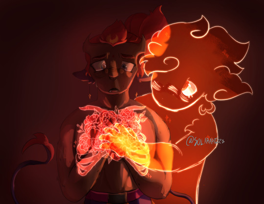
“I know that you mean so well— but I am not a vessel for your good intent.”
For @pittdpeaches of their fanfic A Garden Across our Collarbone which you should soooooooo read
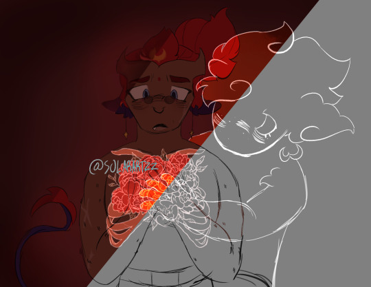
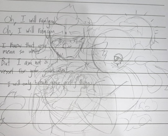
#Layers and og sketch under cut#Ouhhhhhh you wanna read their fics so bad ouhhhhhhhh#Lmk#lego monkie kid#little heavens and sun melting eyes and freckles ough what the fuck#Lmk mk#lmk qi xiaotian#lmk red son#lmk Spicynoodles#spicynoodles shipping#spicynoodlesshipping#sols art#fanart#lmk fanart#collapses
202 notes
·
View notes
Text

guess what game i Played recently?


#dense art#undertale#sans undertale#im realizing some layering errors but i dont care enough to fix them#under cut is the sketch and a version thats just my sona cause i accidentally made him adorable lol
1 note
·
View note
Text
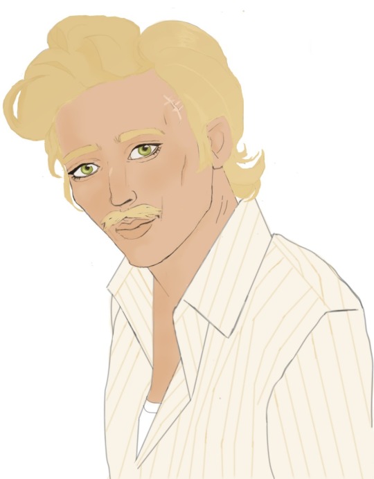
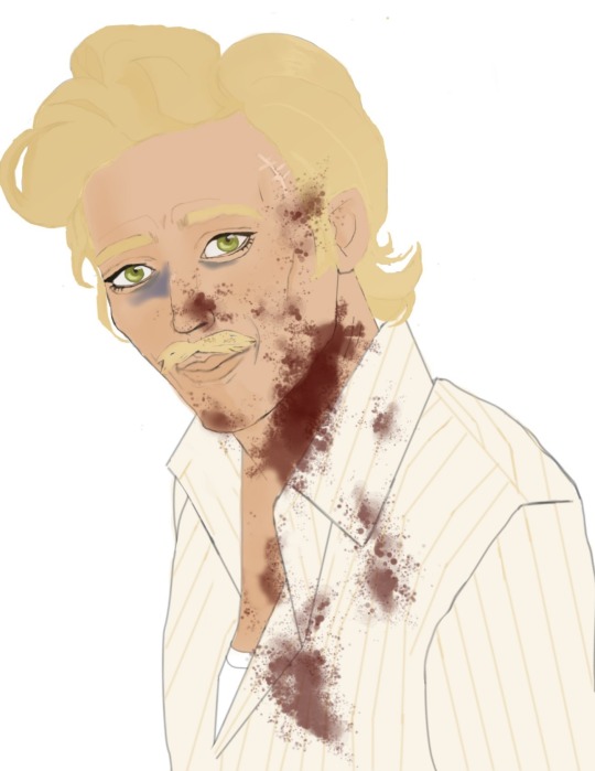
I did it!! I drew something good (for my standards)
Courier six before and after having a little encounter with some Legion assassins
#truly sometimes less is more#self reminder:#few layers no multiply no overlapping#just Blending#no lineart only clean sketch#palettes of colors#prev chosen and tested#took a ref photo and didn't stay obsessively loyal to it#look at the shadows in the photo#....maybe i have to add some blood if i can do it and put the ver with blood under cut#it is courier six afterall#tommy field#my oc#ross tries art#tw blood
0 notes
Text

KISS KISS FALL IN LOVE! 💍💐‼️
my piece for the @aaweddingzine which is now open for leftovers!
extra stuff/commentary under the cut | like what i do? support me on ko-fi ❤️💜

i also ramble a lot more on the behind-the-scenes pdf for this zine that you can also get with your purchase >;^] i also drew some nifty matching icons for the zine! (hint: it's time for divorce)
you know me, i'm incredibly klapollopilled, of course i'm drawing these two suckers for the wedding zine! <3 something about klapollo marriage makes me incredibly emo so i'm very glad for the opportunity to go all out so i can be EXTRA emo about it 😈

if i remember right, i think this idea came to be when i thought about the image of klavier bursting into tears as he lifts up apollo's veil and it all went from there LOL (also so psyched i get to draw him in a barong tagalog <333)

everything got so much more ambitious, though, from that initial idea! i drew like what (i am counting the number of characters in the spread right now as i type) 40-ISH CHARACTERS ALL IN ALL?! (WHAT THE FUCKDFGDHJ) and i even had to cut out some of the characters i originally had in the sketch 😭 (sorry gumshoe, kay, and seb/eustace ....)

i drew this like a year ago and i'm still so proud of this piece! i don't think i can achieve this level of rendering again, it's been so long i forgot how to do it LMAO

(also i can never reopen the file for this thing again bc it makes clip studio want to dieeeee DFSGHDJ so many layers ...)
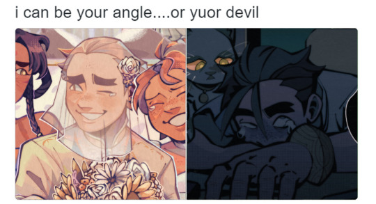
another thing, i was working on this in tandem with my piece for the mea culpa zine; do you know how funny it is to draw apollo having such a happy moment and then draw him dying 😭 the contrast, the whiplash
that's all i have to ramble about i think, i'm so so so amazed at this zine bc my zinemates truly made some spectacular pieces of art! :"^D if you have the chance, please do check it out! 💗
#ace attorney#apollo justice#klavier gavin#klapollo#trucy wright#rayfa padma khura'in#nahyuta sahdmadhi#aa judge#phoenix wright#miles edgeworth#thalassa gramarye#datz are'bal#vongole#mikeko#ema skye#simon blackquill#aa taka#vera misham#juniper woods#athena cykes#described#id in alt text#sunnysidedraws#sunnysidezines#ace attorney zine#apollo x klavier#klavier x apollo#kyodoroki#juat realized i can also post this on my phpne since i got the drafts saved wahoooo
3K notes
·
View notes
Text
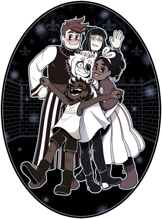

As the flash hits your eye, you feel something crashing into you from all directions. Below you is obvious, Bonbon situated themself to bump into you while the picture was taken. You look to your right, and Mirabelle’s cheek is pressed up to yours. On your left, Isabeau’s sheepishly hugged you to his side. There’s a hand in your hair, too, and it feels like Madame Odile. [...] “We need a souvenir of this trip,” Mirabelle adds. She rushes to the ground to pick up the picture and snort-laughs as she looks at it. “Oh no, Siffrin looks like we’re holding him hostage!” — Curtain Call, Chapter 9, by @openphrase123 (Link in the replies)
2024 October 22nd
Fanfic fanart fanfic fanart!! When I read the "hostage" line, it invoked such a clear image in my head of Siffrin tensed up like a startled prey animal that it got added to my list of things to maybe draw immediately.
Dooon't think about the words 'left' and 'right' in that quote too hard. I know how to read I prommy. :) (I did Not process those words and lost the coin flip in the composition phase...)
Close-up and ramblings about the cans of worms I unleashed upon myself under the cut
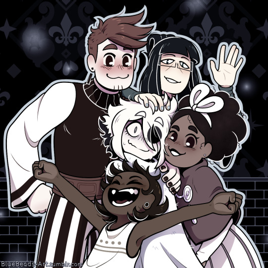
Time taken on this was [head in hands] 48 hours and 37 minutes.... That bloated number has two culprits:
1) I got a new tablet! My old one was 10 years old. Its plastic was melting and the electronics had ghosts in 'em, so it needed the sweet release of retirement. However, I had just gotten to the line art phase when the switch happened. Clumsily getting used to the new one during the most precise phase of the process did devastating things to my perfectionism.
2) I made a GRAVE mistake with how I chose to color this. I wanted to keep the grayscale layers for accuracy instead of just slapping a B&W filter over the colored version, so all the colors come from gradient maps, color balance layers, overlay layers, and raster layers clipped to other layers. Listen. I'm used to working with lots of layers. I like keeping things separate so I can edit them more easily. But this is the worst layer system I have ever created. Going from color to B&W requires toggling exactly 20 layers & folders on or off. There are 87 visible layers total. This file lags when you edit it. I've never wanted CSP v1.13 to have layer comps more in my life.
Not helping matters was Isabeau. I said he was the easiest to draw in my last post, but he took that as a challenge, apparently. It's a simple fist-on-hip pose, why was that so hard!?! His face gave me grief too.
Odile's lil' wave got added at the end of the line art phase. I've never added to a sketch that late in the game before, but I felt bad about how little screen area she got, haha. Girl, I tried, but this composition was not kind to you.
Giving Isa, Odile, and Siffrin skin colors felt cursed. Well... "color" is maybe a stretch for Sif. The pallor from being affection-jumpscared isn't helping. In the dev's nose reveal post, they said that Siffrin isn't white but is white-passing, so BOOM albinism headcanon. Like c'mon, they wear a big hat and have most of their skin covered because the sun is a deadly laser when you have little to no melanin and idk if sunblock exists in-universe. Heck, maybe most Islanders have it, their whole religion is about the night sky so maybe they're nocturnal. This makes perfect sense. :)
#in stars and time#in stars and time spoilers#isat#isat siffrin#isat isabeau#isat odile#isat bonnie#isat mirabelle#fan art#2d art
3K notes
·
View notes
Text
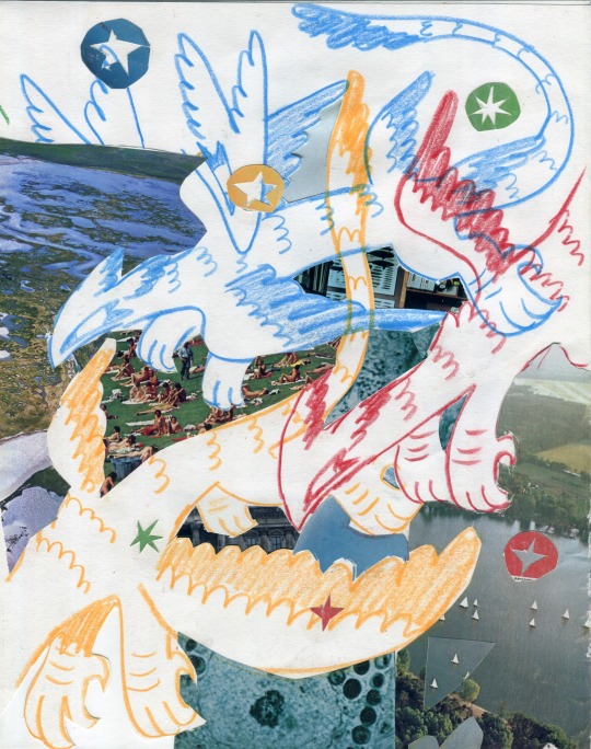
Untitled collage, sold in the FC25 art show 🕊️
ID: Scan of a mixed media collage featuring colored pencil sketches of three feathered dragons in red, blue, and yellow. The sketches are layered with various found magazine clippings such that it appears the dragons are flying high over a vast landscape of diverse imagery, including a field of people laying on blankets, sailboats dotting a large river, and cellular activity under a microscope, among others. A handful of small stars cut out of bright colored paper are interspersed throughout the image. (end ID)
716 notes
·
View notes
Text
Wow first of all I'd just like to say thank you for all the love I got on this inverted ballpoint pen piece in the last few days!! 🥺

I got the inevitable wave of people asking me how I made it and lucky for y'all I had to take a lot of progress pictures to make this so I'm making a post about how I drew this!
See more under the cut!
Starting off of course we have the sketch of our subject in pencil
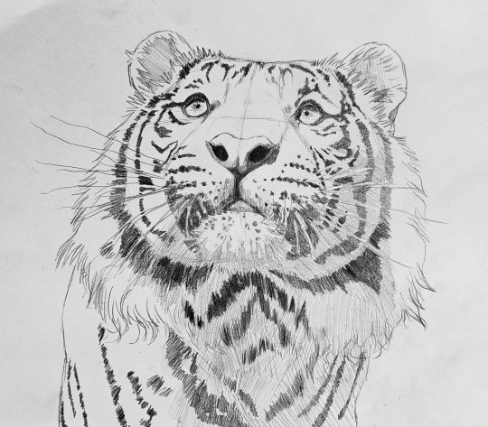
Then, following the inverted version of my reference image I slowly start building up layers of inverted colour. What I'm drawing irl is on the left, and the inverted version of that is on the right.
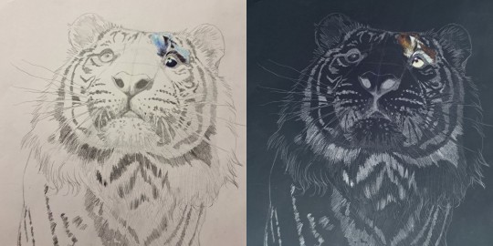
You can tell I was nervous at first not wanting to mess it up lol
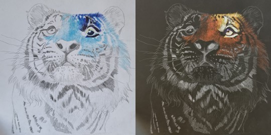
This piece really helped me grasp the importance of undertones in a way I never have before
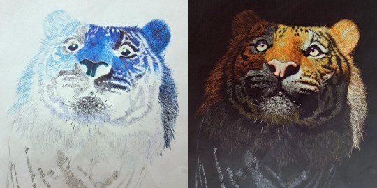
Here I started getting Really excited about how it was gonna turn out I couldn't believe I was making this with my own 2 hands
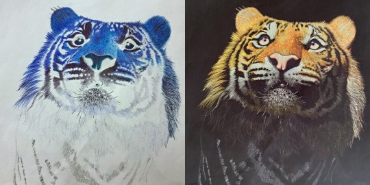
Believe it or not working in inverted colours with ballpoint pen is actually 10x easier than working in normal colours because with ballpoint pen once you've added too much ink you can't undo it you can't make it any lighter, but when you're going to invert the image at the end it's a lot more forgiving because the dark areas become the bright areas when it's inverted!
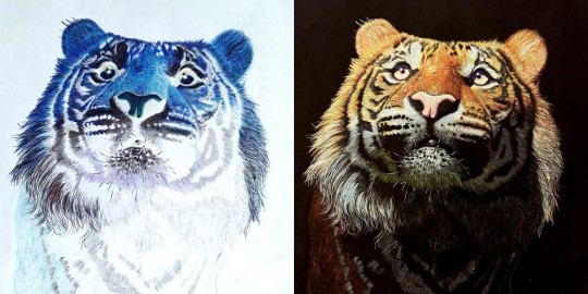
Don't get me wrong though it took a lot of focus and like brain power to draw in inverted colours, it was like learning how to ride a backwards bicycle, it took all my concentration to not follow my brains natural instincts and muscle memory when it came to creating the colours I wanted to create 😵💫

Nearly finished at this point, just needed some colour adjustments
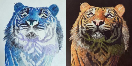
The final check for the colours before I added the finishing touches and scanned the final piece and voila!!

You have an inverted ballpoint pen tiger 🤯 It's really not as hard as it looks, it's just a lot of layering and a lot of patience 🙏🙏
I had like 15 more progress pictures but unfortunately I can only upload 10 pictures in a post so I tried to order them in a way that showed the most key points in my process 😅 If you have any questions feel free to ask I love helping out fellow artists learn new skills!!
#artists of tumblr#artist#ballpoint pen#ballpoint pen art#traditional art#tiger#drawing#pen art#art process#my art#how I drew this#art tutorial#kind of#darkmasterofdragons#wild cat#big cat#panthera tigris#inverted art
687 notes
·
View notes
Note
Bro! Imagine the tuplar crew reacting to their artist s/o drawing layers upon layers of sketches of them, ( Including 🔞 sketches of them 😏)
as an artist i heavily fw this 👅 thank you for your request!! (gender neutral reader, nsfw under the cut!)

anya ۶ৎ
this girl was scavenging in your room looking for one of her favorite shirts she'd left she last time she spent the night
and then, she came upon your desk, which was littered with sketchbooks and stray papers
you were incredibly talented; you could masterfully draw someone with only a singular glance at them, your painting style reminded her heavily of the renaissance era, your eye to detail was unbelievable, and so, so much more
so she wasn't surprised to see some sketches and paintings of her—she had even posed for some!!
however, what she was surprised about, was seeing the...more suggestive works
her cheeks warmed considerably and her eyes widened as she held up a sheet of A3 paper, a beautifully messy, colored sketch of her sitting on a wooden chair and playing with herself filling the page
she had to admit, she looked exceptionally beautiful, her hair mussed up and sticking to her sweaty flushed skin, the soft, small rolls of her stomach as she hunched forward, the dusky pink of her lips, her nipples, her cunt that was leaking slick, the slick that was dripping off the chair...
"wow..."
and yet another one!
a small piece of mixed media paper, with a painfully detailed drawing of her lips and plump breasts—her lips permanently parted as if captured mid-moan, an index and thumb pinching her left nipple, her dark hair falling over her shoulders
needless to say, she put those drawings right the fuck back and left—she was too embarrassed to ever bring them up to you
although, she would love to have you draw her while she was masturbating in real time...
GOODBYE I RLLY WENT ALL OUT
curly ۶ৎ
"what's all this?"
curly thumbed through your sketchbook, his eyebrows raised in pleasant surprise as he studied the several drawings of him
then, he picked up a smaller, newer looking sketchbook, and on the first page...
"huh."
curly tilted his head as he looked at the explicit drawing scrawled across the page, one that featured him leaning against a wall, hunched over as he squeezed his thick, heavy cock, a single drop of cum leaking from the reddened tip
he actually admired himself, he looked amazing!
his thick muscles flexed, his dark eyebrows furrowed, and oh my god, his ass!
he flipped the page, a messier sketch filling his sight
he wasn't really sure what was going on, but it was obvious the main focus was his big, swollen dick that had cum spurting from it
his forearm was sprawled across his eyes and his lip curled slightly
he laughed, feeling himself harden a little
"y/n!! i didn't know you drew me so often!!" he ran downstairs to the living room where you were perched comfortably on the couch, waving your sketchbook in his hand to your immediate embarrassment
daisuke ۶ৎ
daisuke didn't know much about how often you drew, it was typically him who was showing off his art
he was looking through your drawers to find a pencil, when he came upon a small sketchbook
his eyes widened, he was so excited to see what you'd been cooking up!!
he opened the book to a random page, a drawing of him looking out the window with earbuds in scrawled upon the surface
he admired it, the way you captured his calm, smiling expression, the cheerful, quiet atmosphere of wherever he was
he flipped to the next page, and the next, and the next, grinning at your skill until...
"!!"
he was quite shocked to see a sketch of him fucking a pocket pussy
his cheeks were flushed red, his skin was glazed with sweat, his eyes were squeezed shut in nothing but pleasure
he swallowed, breathing heavily and trying to figure out what to do with himself
after a deep breath, he smiled widely and put your sketchbook back, making a mad dash to his bag to show you the drawings he made of you
"hey y/n!! i draw you a lot too!"
"huh??!"
jimmy ۶ৎ
didnt know how to feel about seeing the abundance of drawings of him
on one hand, he was extremely egotistical about it
'that's right, my perfect s/o just loves to draw me'
on the other, why?
why would you want to draw him?
his eyes studied the pages as he flipped through them
there was him sleeping, him drinking from a glass, him...?!
his eyes widened as he took in your work, quickly melting into a smirk
it was him, crawling towards the viewer, with his dick in his hand, pulling back his foreskin to reveal his drooling tip
"goddamn..." he whistles lowly as he flips to the next page, the content being him taking you from the back on his worn couch, the rest of the house in the background in obvious disarray
his sick grin, the way your face was buried into the cushions, the grip he had on your ass...
it made him so, so hard
surely if you showed him these drawings earlier it would've been a fun, shared experience
"y/n, you wanna explain this?"
now only god knows what he's gonna do with info
swansea ۶ৎ
was just confused
"is this me? ..yeah."
his eyes were squinting and his eyebrows were furrowed the entire time he gazed upon the pages upon pages of him
it warmed his heart a little, he couldn't deny
he laughed slightly at one particular drawing, you kissing his temple and him holding his signature frown
the whiplash he got from the next page could've sent him to the emergency room
it was him, drawn from the perspective of someone on their knees, (especially so regarding the contents), looking down with a grin and holding his dick towards the audience
"right."
he sets your sketchbook down, yet not back in the spot he found it, and goes back to sit on the couch with you
he'd never bring it up but with the way that drawing was simply...there on your desk told you all you needed to know
im sorry his is so anticlimactic but i honestly feel like he'd see one explicit drawing of himself and just leave 😭
#mouthwashing x reader#anya x reader#curly x reader#daisuke x reader#jimmy x reader#swansea x reader#anya smut#curly smut#daisuke smut#jimmy smut#swansea smut#for jimmy's section i was a bit inspired by bichianti hehehe#mouthwashing smut
411 notes
·
View notes
Text
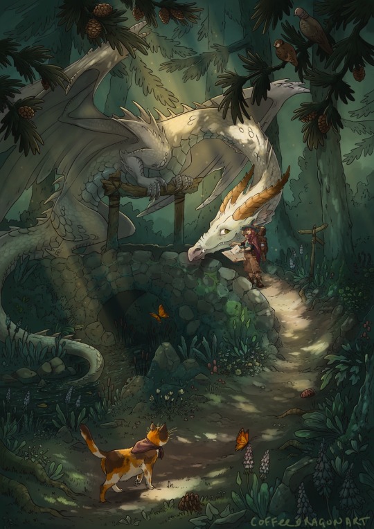
🧭
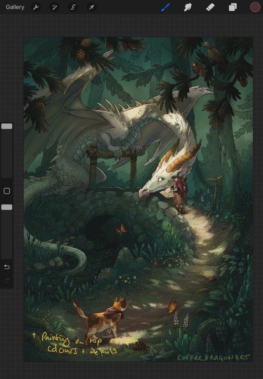
As she looked at the map and back at the forest, Callidora groaned. The path was supposed to branch somewhere around here, but it didn’t.
‘I am NOT lost.’ She muttered, re-tracing the path on the map. The cat didn’t believe her, chirping as it rubbed against her boots.
She looked around. There wasn’t supposed to be a bridge there. The path must have looped back on itself somewhere. The map must be outdated. Maybe some more light would help, there was slightly less overhead foliage near the bridge. While she angled the map this way and that to make the most of the dappled forest light, the birdsong had faded. From the corner of her eye, something moving in the trees was making the light move and bounce.
Callidora didn’t have time for this. She growled into the gloom. ‘If you’re going to lurk, you may as well come down here and help!’
She tried not to flinch as the dragon slid into view, positioning itself on the bridge. It was at least polite enough not to emerge right in her face, or go right for the pounce, but she had felt a little braver before she noticed the cat had hung back several steps, watching butterflies.
‘Are you lost, witchling?’ Its eyes flashed as it leaned closer, claws digging into the old wooden posts. Callidora took half a step back, then pulled herself together.
‘I’m trying to get to Stony Creek’, she said, holding up the map. ‘I was directed to follow the path here, cross here and take the turn by the tree, but I’ve been turned around,’ jabbing at each mark on the map for emphasis.
The dragon squinted at the tiny map, sharp gaze following the witch’s finger.
‘See, you’ve gone a little bit wrong right there. You should have taken the path by the TWISTY tree, not the BENT tree.’ The dragon said, carefully pointing at two places on the map with a clawtip. ‘If you cross this bridge, it does loop back to the main path and you can start over. It’ll take you less time than going back the way to you came, and you should get there before nightfall. But,’ The dragon settled back on its haunches, blocking the path. It showed too many teeth as it grinned down at her.
‘You’ll have to pay the bridge toll.’
————
Aiming for a bit of a storybook feel.
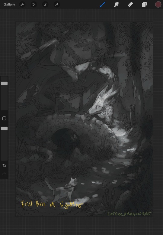
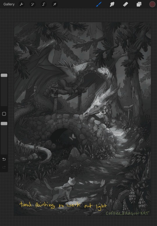
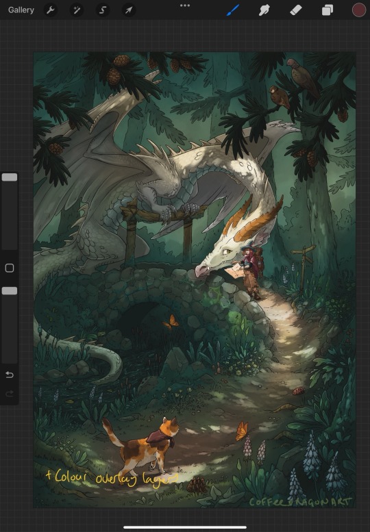
Had fun with this one, even in the sketch phase I knew I wanted to paint that splotchy lighting coming through the trees, and it was nice getting into the fiddly bits of the lines. Tried something different starting with the greyscale, initially tried painting normally but I was getting stuck between finding colours I liked and getting the ‘non-standard’ lighting to look how I wanted.
Ended up using a bunch of overlay layers,but only after trying to learn how to use gradient maps in procreate made me want to pull my hair out. This one had an extended ugly phase while I figured it out.
WIP snaps under the cut.


495 notes
·
View notes
Text
Today is Dungeons & Daddies’s 5th Anniversary!

I haven’t been listening for nearly that long but the podcast and all its characters means a lot to me. Happy Anniversary!!!
Throwing the cropped sections under the cut because there’s a lot of stuff going on and I know Tumblr likes to throw half the pixel quality out the window. And also so I can ramble a bit about this piece!!!
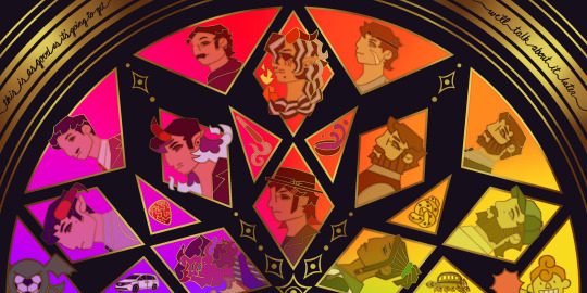
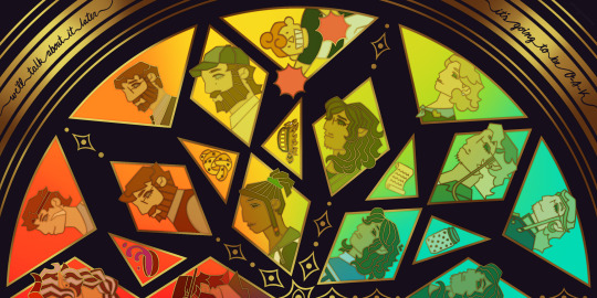
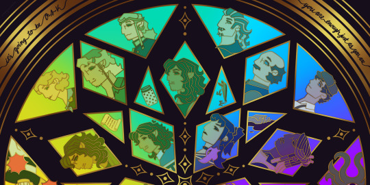
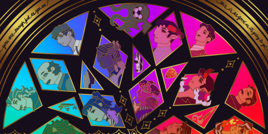
This piece has been months in the making, possibly an entire year. And by that I mean I’ve had a sketch of the comp scribbled on my whiteboard for ages because I wanted to save this specifically for 5th anni art. Now onto design stuff!
(First off a random thought: I really love how the garlic knot came out, I kind of want it as an enamel pin.)
I knew I wanted to make this a stained glass piece since the beginning, but I was also going to add flowers at one point but quickly dropped the idea. It felt like too much and I also didn’t want to fuss over flower language assignments for everyone. I was also going to add Doodler tentacles, but also dropped that idea pretty early. Kind of on accident, right at the end, I figured out how to make it even more stained glass-like but taking a duplicated lineart underneath the regular layer and turning the brightness all the way down, then setting it to overlay and adding a guassian blur. It’s very subtle but it adds that tiny bit of depth that makes it look more real. As for shading on the lineart/gold, I tried adding more highlight on the characters who died but once I evened everything out it wasn’t as noticeable anymore so I���m throwing that thought here so the attempt at least known lol.
The order of characters only changed a little bit from my original comp, I flipped the Wilsons and the Oaks so the rainbow could work. As for the anchors, specifically in season 2, I lined them up to the teens since the season 1 anchors lined up with each dad:
Tony —> Scary: his death was the beginning of Scary’s betrayal arc and also Willy killed him.
Guitar Pick —> Taylor: it’s not really aligned with Taylor at all, but the anchor was with Glenn so I put it next to his blunt.
Scroll —> Normal: was only because it was the last left to give him, but there’s the whole scene of him and Hermie in the Green Room so it still works!
Garlic Knot —> Link: one of two that he broke, but the more significant of the two with him telling Grant he never wants to see him again.
Small notes on the season 1 anchors: I put the layer of mold in the overnight oats but you can’t really tell with the overlay. And to make the supper bowl more interesting I added the fantasy sodas mix they dumped into it. The lure of actually drawn before so I just traced my own art lol.
As for the other smaller triangles, it took me a bit to figure out what I wanted to put there. I didn’t even think of adding the vehicles until two days ago but I’m so glad I did. I don’t really have my own take on the mascot version of the Doodler (yet?) so I borrowed the design from one of the stickers in their merch shop. Teeny was terrifying as just a front facing head so I made him cute again.
In the outer circles, I put what I felt was the most significant quotes for each family. I really wanted to use “It’s okay to be angry, it’s not okay to be cruel” but it was just a little too long.
That’s all I can think of! If you read all the way through, thank you for indulging me in my excitement to gush over this piece.
#dndads#dungeons and daddies#dndads fanart#dndads s1#dndads s2#dndads glenn close#darryl wilson#henry oak#ron stampler#jodie foster dndads#nick close#nicholas foster#nicky swift#grant wilson#sparrow oak#lark oak#terry jr#taylor swift dndads#lincoln li wilson#normal oak#scary marlowe#hermie unworthy#bill close#paeden bennetts#barry oak#willy stampler#meryl streep dndads#robert wilson#hildy russet#stud stampler
2K notes
·
View notes
Text
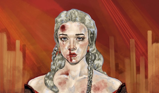
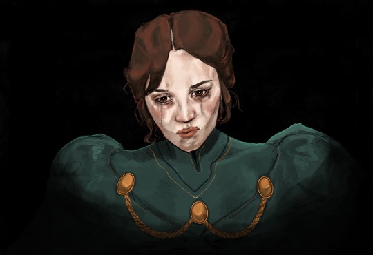
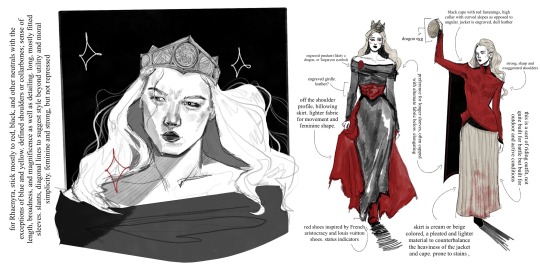
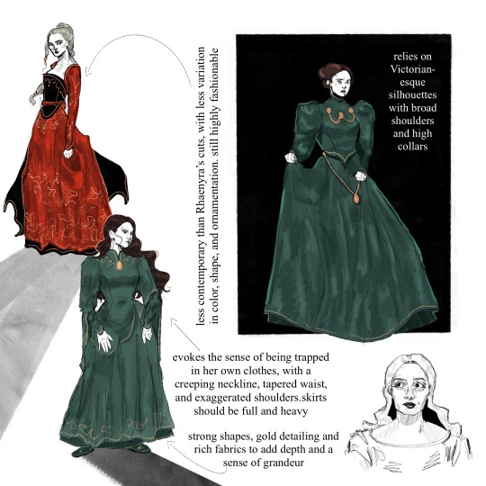

This technically applies to my Stepmother AU in which Alicent is around six years older than Rhaenyra, and occupies a wicked stepmother role as opposed to ex ‘friends-to-first loves-to-enemies’. Despite lacking the foundation of shared girlhood, both find simultaneous comfort and rivalry in one another, and undergo a gravitational pull. A young Rhaenyra’s eagerness to participate in swordplay and political affairs at a young is accommodated for, and she grows up with a sword in one hand and the weight of experience in another, which further helps pave her way to the throne.
Alicent’s Costuming
Alicent’s clothing is almost entirely bottle, emerald, or forest green. While there is layering present in her skirts and jackets, the accent should always be a darker green than the base color. The fabric is deep, rich, and retains an undeniably high-quality luster. Look to velvets and silks. Gold embroidery lingers around her sleeves, neck, and hemline to elevate the coloring.
Metallic embellishments should be almost military-like, and appear heavy. Contribute to the imagery of chains or shackles in addition to her status
Draws inspiration from historically accurate stiffness and Victorian shapes, with a tapered waist, imposing, puffy sleeves, and a high neckline. Despite inaccuracies, this shape is evocative of someone elegantly and conservatively feminine, repressed, and capable of exerting power over others. Reference a classic, trussed hourglass shape. Skirts should be notably heavy and full; may make noise in movement
The coloring and shapes remain relatively consistent but lack variation; this is to demonstrate a lack of freedom and exploration, as well as an adherence to conventional feminine roles
Despite these limitations, her costuming should always be put-together, coordinated, and unquestionably fashionable. Tight sleeve cuffs may be accompanied by a more traditionally medieval fan sleeve
Shoes should stick mostly to slippers, or flat designs
In this AU, her hair leans more towards a dark brown instead of auburn, as her show counterpart. This is mostly due to faux-book accuracy and to simplify the sketch process, since keeping her hair darker in comparison to Rhaenyra’s lighter hair translates more easily in uncolored renderings.
Keep her hair either in a tidy bun or pulled back and loose; avoid too many intricate shapes, braids, or styles. Occasionally, the hair will hang loose. Lean into medieval or royal headpieces, clips, coverings, etc.
Rhaenyra’s Costuming
Rhaenyra’s clothes are primarily black and red, occasionally accented or substituted with neutrals such as beige, white, or gray. Exceptions may include blue or yellow, but she generally stays in this color palette.
Strong focus is drawn to her shoulders and neckline, sometimes with embroidered or embellished detailing. She often has strong, angular shoulders in her dresses or jackets, occasionally theatrically pointed. Off-the shoulder necklines emphasize her collarbones and a certain broadness.
There should be decent variety in her clothing; there is a hypothetical outfit for every occasion and more (for battle, for riding, everyday, formal, feasts, everyday, etc.), and most should be composed of multiple pieces and utilize generous layering. This includes under-fabric, belts and corsets, jackets and doublets, draped fabric for aesthetic purpose, and even functional capes.
Most of her clothes should provide visual aid for movement; additional fabric to her skirts, for example. Her clothes should be highly stylized but still easy to move in. In riding and battle gear, it is presumed that she wears pants and boots under her skirts, even if they are not visible.
Shoes lean more into boot cuts, still practical but should have a sleek and uniform quality to them. When she walks, she should make some kind of noise. Shoes should usually be black or potentially red, the latter for decorative purposes.
Overall her style should be more contemporary and lean into the fantasy element. She’s not opposed to oriental details or showing skin, and her costumes should reflect both couture-height drama and period-reliant aspects. Longer lines and diagonal hems mean she is not as devoted to an hourglass shape, and her high collars should always be decorative in some respect.
Keep her hair long and mostly loose, sometimes pulled back. Small braids should be implied as incorporated. Occasional hairstyles feature complicated braids. With the exception of highly decorative braided styles, simple buns should be avoided unless accompanied with very high necklines.
Avoid headpieces that are not either a) her crown or b) ceremonial.
#rhaenicent#rhaenyra targaryen#alicent hightower#house of the dragon#hotd#rhaenyra x alicent#asoiaf#my art#thinking about how their character and costume designs are so communicative and are designed with each other in mind. for example havijg bc#the strong shoulders and embroidered necklines keeps them connected although imo they could’ve played around with it a lot more#I just have a lot of thoughts about them ok
1K notes
·
View notes
Text
TMNT OCxCanon Comp Final Round
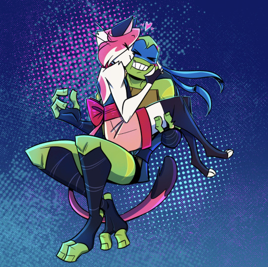
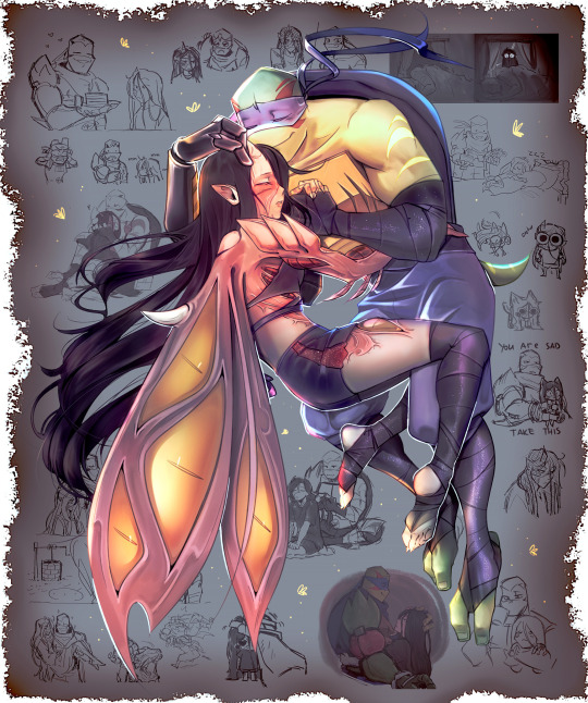
Learn more under the cut!
Tomiko Kaneko
@mishacakes
Leo, chaotic friends in teens, dating in late teens/beyond
Tomiko is a bakeneko yokai, Leo is a mutant ninja turtle. Their dynamic no matter what stage in their life is silly and teasing, sincerity hidden under many layers of masks, carefully crafted personas, and irony. Despite all that they’re fiercely supportive of one another, growing closer without ever losing that friendship.
https://mishacakes.tumblr.com/post/728276247302569984/full-tomiko-references-tomiko-is-a-genderfluid
>>>>>>>>>>>>>>>>>>>>>>>>>>>>>>>>>>>>>>>>>>>>>>>>>
Ana
@mrabubu
Rise Leo. Dating.
A young girl, Ana, once a friend to the turtles, had feelings towards Leo. She showed him the care and acceptance he long needed, which, in the end, melted his heart. During the Kraang invasion, she was taken away and turned into Kraang zombie, after which was presumed dead. But 10 years later, she still had feelings for the blue turtle, and those feelings were strong enough to retain her consciousness and humanity, helping her to find Leo after all these years. Now reunited, Ana’s living in the resistance’s base, struggling with being half Kraang, and now being the one in need of care. But Leo is determined to do anything in his power not to lose his loved one ever again.
https://www.tumblr.com/mrabubu/755268260842373120/so-i-did-kinda-sketch-ref-for-my-kraang-character?source=share6.
>>>>>>>>>>>>>>>>>>>>>>>>>>>>>>>>>>>>>>>>>>>>>>>>>
325 notes
·
View notes
Text


The OUAW brain rot continues.
I love their designs! And I wanted to have a little fun figuring out how I want to draw them, with my own little tweaks and self indulgent details. :)
Originally, I only meant to draw Frost, to figure out what kind of body type I wanted to give him. Then I ended up drawing the whole part, partially as a reference to myself. Also got their canon heights on a chart and put them all together for fun and for reference. c:
Some design tweak notes under the cut, if anyone’s curious! These aren’t redesigns or whatever, I just had some ideas in mind while sketching them in a way that fits my art style.
Design notes copied directly from my server:
🔥Gid THICK BOY. He's not really a bodybuilder but he exercises and is very muscular. And he eats! A lot. So, thick boy. Scars from all the fighting. The wrists and ankles are because of his past.
I like giving his hair and beard a lot more fire. Body hair also glows fiery, it's just less bright.
🐊Kremy I figure he's the skinniest of the group after Torbek. Most of what I did is a happy medium between references of alligators, the official art, and just my art style. Mostly game him scale patterns, more alligator-like feet, and changed the tail a bit, but it's hard to tell from this angle. Not much body definition because he's a squishy magic user and a gator lol
🐯Frost Fit but not defined. Kinda thick-ish, since he's a tiger, so there's loser skin and thick layer of fur. Digitigrade because I say so.
☹️Torbek Not much changed, mostly gave him more tubes, gave him bald patches where they connect to his skin (and didn't make those are infected looking as I imagine tbh), made him fuzzier, and gave him bigger ears because I like em. Also you can't see it in this angle but I like giving him a small fuzzy tail.
🐾Gricko Fit arms, but he doesn't exercise, so he gets a bit of a tummy. Scars because of his interest in monsters, and his various accidents. Wilder hair. Freckles and moles because I say so. Decorated hair (including feathers from Hootsie!)
🍄Twig Not much really?? Went by her description, the plushie and an emote of her that exists. Made her chubbier because I wanna. Originally made her hair all curls…might go back to that. Also freckles because cute.
Do you have your own headcanons for details of what they look like? :)
-- [BTW I do commissions]
#legends of avantris#once upon a witchlight#gideon coal#kremy lecroux#morning frost#torbek#gricko grimgrin#twig toadspring
695 notes
·
View notes
Note
do you have a favourite part of the rendering process? I love your art, and I'd love to know what part you have the most fun with :3
awesome question! in terms of the entire process, i really enjoy sketching. i have so many layers in my files of just random idea dumping, i love the free-flowing nature of it :D.

(a bit more process under the cut!)
when it comes to painting, the period of time after i've established the overall colors + light/shadow is my favorite.


i love merging all my layers and experimenting around with painting the details/textures :D. it's easy to get carried away in rendering detail tho, so i make sure not to zoom in too much so i don't paint too many details that dont really matter. art in general is just super fun to me so it was hard to narrow it down lol. thanks for the ask :]!
293 notes
·
View notes
Text
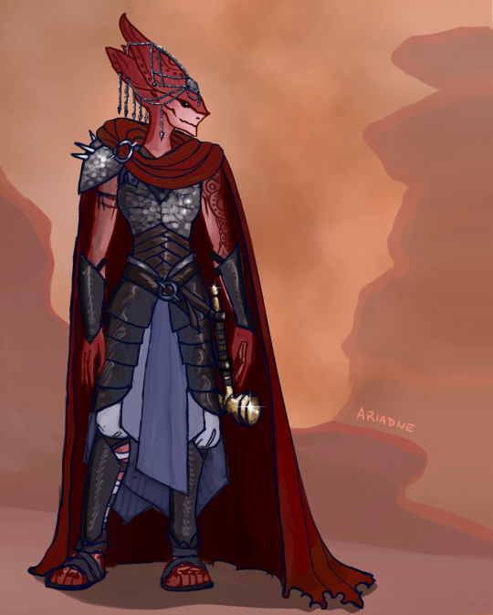
Rashinna of the Golden Hammer
aka Leader of the Volition and overall badass. I was a little more organized than usual when putting this together and decided to try a couple stills with some outfit layers below.
@revvethasmythh come get your girl :)
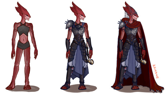
Some further details under the cut:
Would she probably wear a better cloth layer underneath the breastplate and pauldron? Yes, but sometimes a girl's gotta show off her tats. Her armor was inspired by the official WizKids depictions.
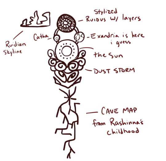
Her arm tattoos are: a rock formation silhouette on her collarbone, a stylized Ruidus on her deltoid, the sun below and Catha in between; a small Exandria is on the reverse side out of sight, stylized dust clouds and dust-devils, and an old map for a tunnel system from her childhood which has long since collapsed. We can pretend this is the sketch she gave the tattoo artist lol:
#this was super fun to do and a nice distraction today#rashinna#ruidus#critical role#ariadne draws CR#c3#c3e88#op
265 notes
·
View notes