#showcase mockups
Explore tagged Tumblr posts
Text

Showcase Mockups / Supply.Family / Box Packaging / Mockup / 2024
Download
#showcase mockups#supply.family#box#packaging#mockup#2024#cardboard#printed matter#psd#stationery#tape
28 notes
·
View notes
Text

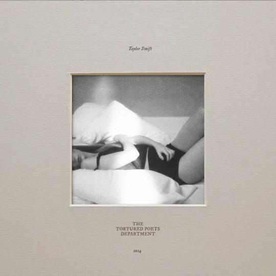
i have been saying since day one that a bit of depth and texture would have done wonders for this album cover and once again i was right
#did something extremely similar for folkmore once#and might make a full mockup of ttpd in this style#i really dislike the cover pic but this was for showcase purposes so it's okay
108 notes
·
View notes
Text
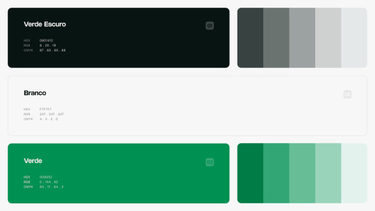
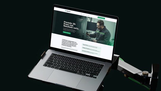
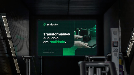
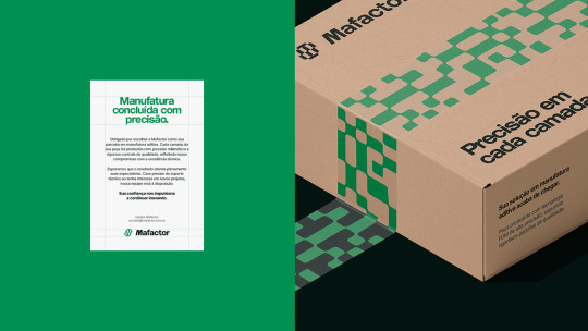

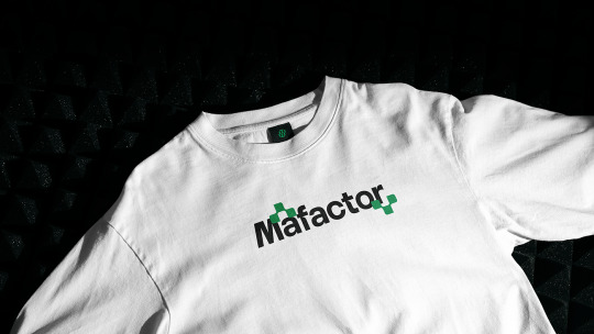

Mafactor Brand Identity
Mockups used in this project ⚡ mockupcloud.com
Design by gaos.com.br
#brand#branding#mockup#mockupcloud#free#stationery#identity#freebie#mockup cloud#template#showcase#print#psd#download#inspiration#portfolio#cards#envelope#graphics#assets#scene#paper#advertising#creative#business card#texture#letter#a4
12 notes
·
View notes
Text


Download Here: https://www.behance.net/gallery/223566647/Poster-Mockup-LT4
Elegant A4 Poster Mockup Showcase your design with this clean and refined A4 poster mockup. Featuring soft, realistic shadows and a minimalist layout, it’s perfect for an elegant and professional presentation. Simple to edit with smart objects and designed for efficient file size.
Included in the download:
3 PSD Scenes
Resolution: 3000x2000px / 300 dpi
Easy Editing: Smart Object feature
Well-Organized: Layered and structured files
Help file (.txt Notepad)
#poster mockup#paper mockup#flyer mockup#brochure mockup#leaflet mockup#branding mockup#frame mockup#advertising mockup#print mockup#ad mockup#signage mockup#wall mockup#visual mockup#urban mockup#campaign mockup#marketing mockup#street mockup#presentation mockup#showcase mockup#creative mockup#editorial mockup#design mockup#minimal mockup#aesthetic mockup#clean mockup#professional mockup#realistic mockup#studio mockup#layout mockup#typography mockup
0 notes
Text
Open Hardback Book Mockup
Free open hardback book mockup allowing for a neat presentation of two inner page layouts. The download file is provided in Photoshop format and comes backed with smart object layers for seamless editing. Continue reading Untitled

View On WordPress
0 notes
Text
Ok ok so, the other day I skateboarded to the grocery store and it made me think Tim Drake would have absolutely had a skateboard with himself as Robin on it. Cities and towns LOVE to capitalize on their cryptids and urban legends (from someone who grew up in a cryptid centric city) so ofc as soon as The Bat hit the streets there would be unregulated merch of him, bc who’s gonna stop them??? The anonymous vigilante??? Absolutely no shot.
Anyways. Back to my point- young teenager Tim was known as the Robin with a skateboard (it’s a hobby, a way around after he lost Redbird privileges, he loves it) and even designed his Redboard specifically with the Robin logo, so ofc when he sees the shitty little Gotham City Sk8s store by the park has a board with HIS Robin on it, he has to have it. Look me in the eyes and show me a teenage boy with enough money who wouldn’t buy themselves on usable merch.
The headcanon brain worm got to me and I ended up designing and doing a 3D mockup of the thing (complete with the badly designed freebie sticker that came from the store with purchase), if it continues to munch away at my focus I might even write a fic abt it later kdjfkmdkdks (also tumblr said my gif file was too big </3 so y’all get a lil mp4 instead Ou<)
Still image showcase and original design art below the cut >:P


#Batman#dc robin#Tim drake#tim drake wayne#my art#digital art#3D art#skateboard#artists on tumblr#dc#dc comics#Red Robin dc#Robin dc#I love him so much.#only in gotham#Gotham
731 notes
·
View notes
Text
@decidedly33 this has somehow become an inspiration circle... rb can max has come home to roost!
"...All that to say, corporate wants us to promote the seasonal flavors."
Max has his chin propped on his hand, half awake in the meeting room as their marketing lead clicks through a slideshow.
He's not sure why he needed to be here at Milton Keynes, at seven in the morning, just to be told he's going to be holding a different colored Red Bull can.
His eyes are drifting back shut when the next slide clicks over, and then they're suddenly wide open.
Liam makes a strangled laugh next to him, and Christian looks like he's trying very hard to keep a straight face.
"Are you fucking serious?"
Max doesn't mean to blurt it out- it just. Happens.
The slide has different mockups of their racing suits, in vibrant colors.
Liam finds his voice.
"Mate- no way. Are we actually wearing those? We're not actually wearing those."
He's looking at Christian for the last bit, voice wavering.
Christian presses his lips together, eyes sparking.
"You're wearing them."
Max blinks. He's staring at the screen, hoping that if he keeps looking at it, it will magically change to anything else. It doesn't. He's still looking directly at a racesuit mockup with his name on it, eye searingly orange. The APRICOT pasted across the right side, wrapping around mock-Max's ribs- it's mocking him.
He looks their marketing rep directly in the eyes.
"This is worse than the lederhosen."
Liam snorts as Christian winces.
"Max, don't say that-"
"No, it definitely is-"
------
GP ruffles Max's hair as he's hunched over his breakfast plate, and Max groans, because he knows where this is going.
"You excited to be orange today?"
Max is not excited to be orange. He misses the navy suits already.
Now he's an apricot.
"This is cruel, GP. I do not know what I did to deserve it."
GP snorts as he sits next to Max, setting his own plate gently on the table, followed by-
"Mate."
"I'm representing the brand, Max."
Max glares at the stupid orange can. He's going to see that shade everywhere. The whole team has been drinking them, as part of the push to showcase their "seasonal flavors".
Apparently, Max thinking of the original can as an extension of his own hand for over ten years hasn't been enough.
He groans, dropping his head against the table as GP pats his back.
"Cheer up Maxy, at least you've got some variety in your fireproofs now."
What.
------
They're maroon. The sponsors stand out on the sleeves, but he's still got a giant bull charging down his right tit, white against the maroon of the fireproofs. Marketing has left no stone unturned.
Max glares at them, willing himself to develop laser eyes and burn them to ashes.
Nothing happens, and the offending pile sits there on his bench.
Mocking him.
------
Liam looks hilariously terrible, which makes Max feel slightly better. The orange- or rather, apricot- color isn't doing his blonde any favors.
Max tugs at a sleeve as he stands inside hospitality, sulking. Liam is also sulking. The marketing department had thought it best to make the fireproof a surprise, so there's not been any kind of press announcement beyond a teasing "apricot in Zandvoort, anybody?" on the teams social media accounts.
He sighs, looking down at the suit. It's going to stand out weird next to the McLaren boys, but at the same time- it's hard to mistake a human sized Red Bull can.
"Hey Max?"
Max turns to look at Liam, whose young eyes are filled with pain and despair.
"Yes?"
"If you could go back in time, knowing you'd have to wear... this. Would you still pick Red Bull?"
Max looks back down at his feet. Even his racing boots are white and maroon.
He thinks of Mercedes, and of Ferrari. George and Kimi have looked defeated since day one of the season, and Charles and Lewis... They've all heard the radio messages.
Still. None of them are bright orange billboards.
"Nope."
Liam nods sadly.
"I'm bloodsworn. Why did I do that."
Max makes a face. He'd be more sympathetic- but he's also bloodsworn, so. Moot point.
------
Charles is staring at him on the truck as they get ready for the drivers parade. Max has been pretending not to notice for the last five minutes, but he can feel his gaze like ants on his skin, finally turning his head to meet his eyes, snapping.
"What?"
Charles holds up his hands in surrender, cheeks pink. Maybe the Ferrari suits are hot this year, or he hasn't had enough water.
"Nothing! Nothing. I uh- I like the new suit. Very... orange."
"It's apricot."
His eyes widen the same time Charles' do, and there's a disgusting feeling crawling up his spine as the words come out of his mouth. Charles is grinning.
"So, you will be respectful when the boys remind everyone that theirs is papaya, yes? Because it is clearly not all just 'orange'."
"Leclerc."
Charles snorts, clapping a hand over his mouth, and Max gives up, sighing.
"Yeah, whatever. Papaya, apricot... it's all fucking orange, mate."
------
In Max's defense, he's not thinking about the stupid suit when he jumps with the trophy- he's amazed that his pile of scrap metal survived to the last lap, absolutely baffled that he's standing in first place- he doesn't often get excited for wins anymore but this one is special, here at home.
So maybe he's excited. Maybe he jumps in the air, running to his mechanics.
It doesn't mean he deserves to be turned into a meme.
The fans feel otherwise. Max has three posts sent to him from Victoria by the time he can check his phone, and 18 messages from Danny, along with a six minute long voice message from Lando he's absolutely not listening to. There's also a single laughing emoji from Checo, which is really just salt in the wound, at this point. Max is going to make them send him one to wear anyways.
The most recent message from Dan just reads-
They're calling you starfishstappen, by the way. Max Verstarfish.
Max takes a deep breath. Shuts his phone off.
Dramatically drops onto the bed, screaming into the pillow, arms flopped wide on either side of him, legs dangling off the end.
Like a fucking starfi-
#ficlet#immediately after this he finds out they're doing the spring edition can for the next race#and he's LAVENDER#crackfic
82 notes
·
View notes
Text
More Foodfight! Material DISCOVERED

That's right, I'm back. Just like I prophesized in my last post, yet another treasure trove of Foodfight! goodness has been uncovered, and this might be one of the strangest to date...that's right, official Foodfight! Cinnamon Sleuth Cereal was sold at Albertsons back in 2007, over five years before the movie finally came out!
Okay, not really, but I had you going for a second, right? So, this IS a proposed packaging design for actual Cinnamon Sleuth cereal, but it never went into production, it never made it to stores and there was certainly never any actual cereal to be eaten. This, among several other designs and a collection of behind the scenes material, was sent in recently by a Foodfight! crewmember, who explained they were mockups created to show off possible tie-in products. I'm not sure why they chose Albertsons for these mockups but it's likely they were in talks with them at the time and wanted to show off designs including their branding. In any case, I just had the Cinnamon Sleuth box printed because I thought it'd look cool next to my collection of Foodfight! merchandise, and I wanted to see if anyone would be convinced this really existed.
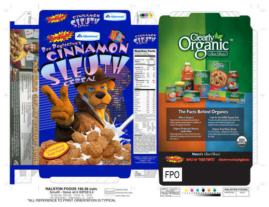
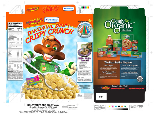
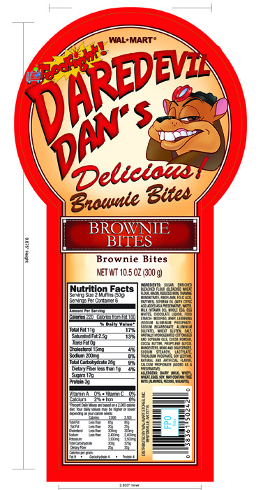
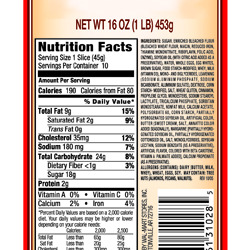
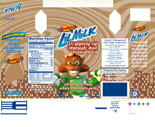
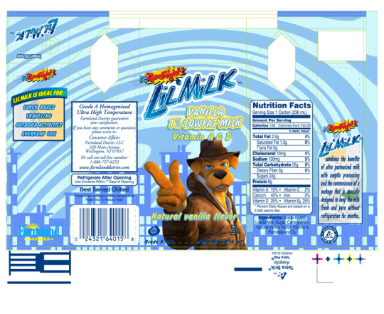
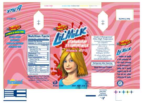
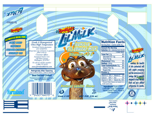
I've included all the designs above in case you want to print your own- there are several more including another cereal, brownie packaging and milk cartons. Curiously, the milk cartons have Farmland Dairy logos on them, with Farmland Milk actually appearing in the finished film at several points. I'd say this confirms my theory these mockups were created to show to companies they were already actively working on deals with, but I can't say for certain that was the case.

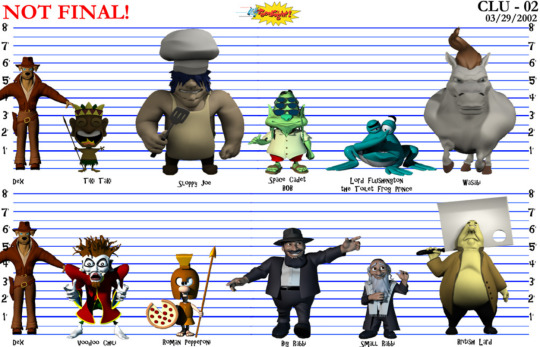

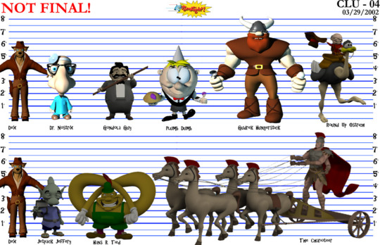


Equally curious are these character sheets from 2002, seemingly showing off almost every model created during early production. There are so many fascinating layers to this- Sunshine is still a human instead of a catgirl, showcasing a very different model to the one seen in the initial trailer, and Maximilius Moose is still a dog named Panzer Pup, both aspects that were changed once the decision was made to change Dex to a dog. However, it may be that Dex's human design was edited out and replaced after the fact, given Dex's model here appears to be the one from the finished film (you can tell by the weird hands). In any case, it's fascinating to get a closer look at all these characters- while the majority of the models for the main cast were found recently (see my last post for more on this), there are a bunch of side characters here we've only seen brief glimpses of before, including the Pringles man and the scantily-clad Cherry Waifer. The most fascinating to me however are the Red and Yellow M&Ms- I've read through their scene in the movie's script, I've seen multiple versions of the storyboard, even rough layout animation in the workprint, and it's only now I'm FINALLY getting to see their actual character models and how they would've looked in the Foodfight! artstyle. Sure, they more or less look exactly as they did in M&M commercials that aired around the same time, but it's still amazing to actually see these characters modelled and rendered after analyzing so many different iterations of the scene as it went through development.
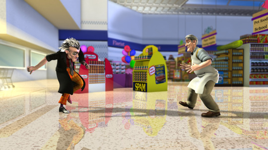
The crewmember in question also sent a folder containing over a hundred stills which while at first glance appear to be from the finished movie, are actually subtly different in multiple ways- usually lighting, facial expressions, or background textures like the sky or color of a hill. A lot of these are labelled "fix" which makes me speculate if after the movie was completed, the crew went back and tried to touch up the animation to make it look more appealing before release. Is there a slightly better looking version of Foodfight! somewhere out there in the world? Who knows, but really it would've been like trying to polish a turd. The movie was already ruined by then, and I don't think any number small changes would've done much to salvage it. However, that does bring me to my next interesting point...
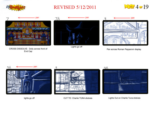
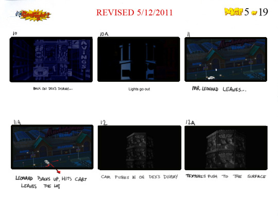
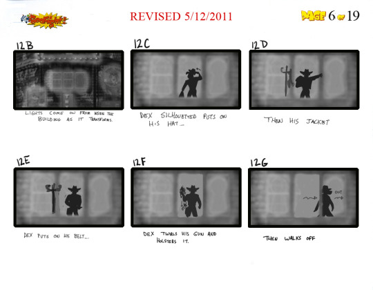
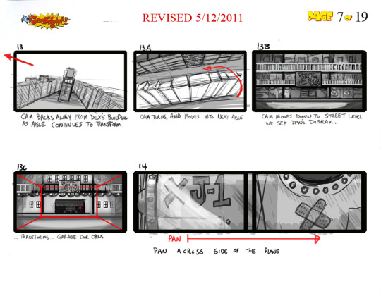
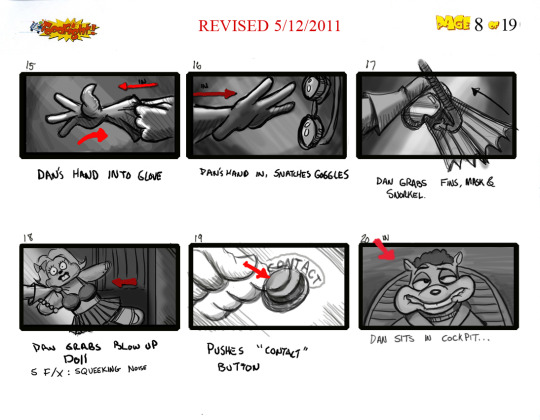
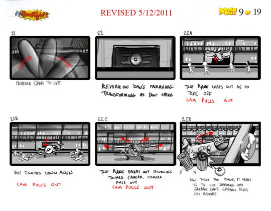
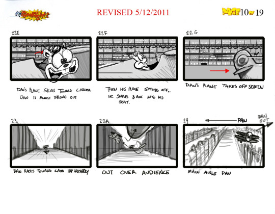
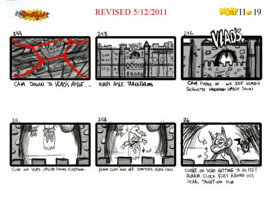
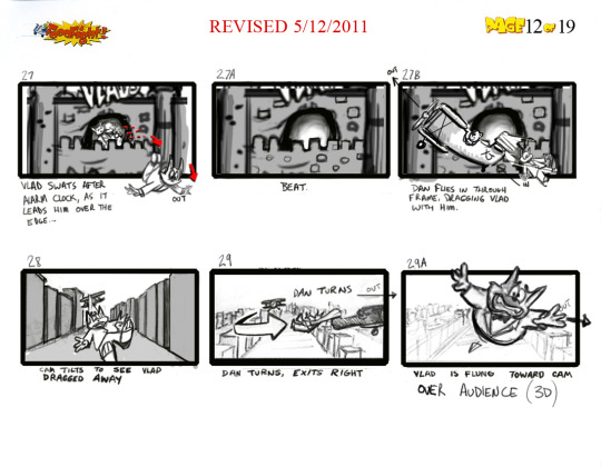
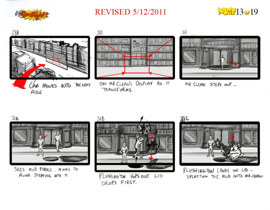
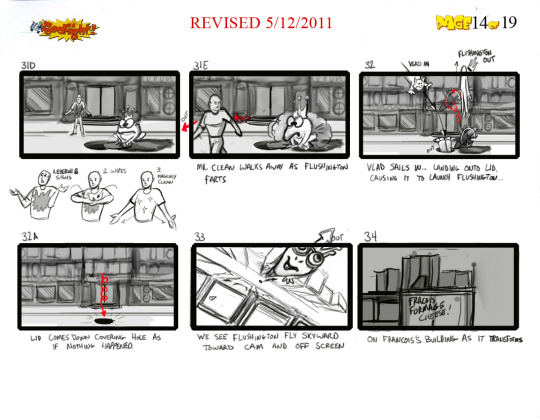
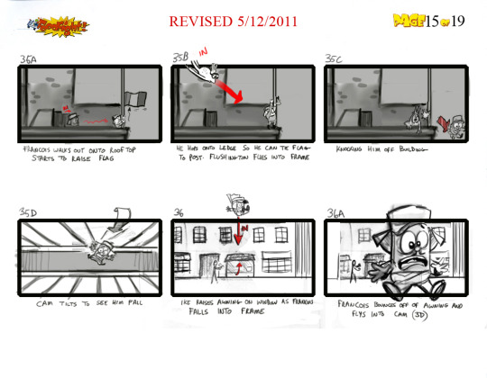
There are also storyboards dated May 2011, depicting an alternate opening to the movie giving a much more cinematic introduction to the main characters. It's crazy to think they were still working on storyboards so late in production, but there IS actually a reason for this. I unfortunately can't upload the entire sequence due to this site's image limit, but what you might notice are a lot of characters being described as "flying over the audience", "flying into the camera" or knocking things "into the audience", with some of the boards having "(3D)" written in parenthesis next to them. It's my belief that very late into production, Kasanoff wanted the movie to be 3D, made popular by the then-recent Avatar, and this new opening sequence full of flashy 3D effects was drawn up to show off what they could do with the technology. It's not clear if any of this was ever actually animated, but imagine going to see a movie that advertises itself as 3D but only the first minute contains any 3D elements. Of course, Kasanoff requesting this is only speculation on my part, but given how the movie was ruined by the crew having to cater to his whim of directing the whole thing with motion capture (made popular by the then-recent Polar Express) it's no stretch to assume the 3D opening sequence was a similar situation.
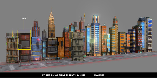
There's a ton more that was sent to us as well, so much so that I could never hope to talk about all of it. However, it should be on archive.org at the time of writing this if it isn't already, and you can now access everything Foodfight! related through the official Foodfight! collection on there!
That's right, so much Foodfight! material has been uploaded over the past year that the Internet Archive gave it its own archive, allowing you to find everything in one convenient place (including my scans of the novelization and Deluxe Sound Storybook). It'll also be updated periodically whenever something new is found, so it'll always be the home to all things Foodfight!. Whether you're wanting to take a look at some concept art shown in ROTTEN: Behind The Foodfight, read through an early draft of the script, or check out something I've talked about on my blog, it's all here at your fingertips.
I don't think there's ever really going to be an end to the depth of the Foodfight! rabbithole. I thought I was done a year ago when I finished analyzing the novelization, and look at everything that's been found since then. Every time I think I'm out, this movie pulls me back in. So...in my next post I'll FINALLY show off my collection of Foodfight! merchandise and talk about what this movie means to me, but that doesn't mean it's the end for this blog. Whenever I say I'm done with Foodfight! I end up jinxing it, so if I try to conclude things now in a few months some CD will show up with a bunch of lost footage on it, I'll get mailed concept art of a bunch of characters we've never seen before, or it'll turn out Larry Kasanoff was actually D.B. Cooper the whole time. So as long as there's something new to discuss, as long as there's a Foodfight to be fought, I'll keep updating this blog from now until forever. You better duck when they launch the cream pies!
173 notes
·
View notes
Text


I'm always delighted when I see people showcase their constructed scripts through logo mockups so I made a Hollow Knight one in Ngneéṭömee!
I took inspiration from Vyaz calligraphy for this particular very fancy very serif-y font, the last picture shows the glyphs as they'd usually be written.
93 notes
·
View notes
Text
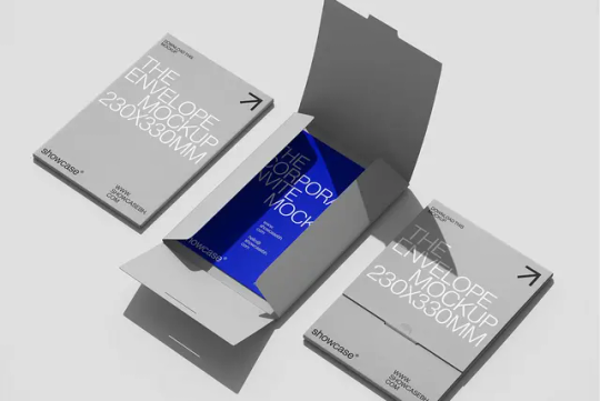
Showcase Mockups / Supply.Family / Brandkit (04) / Mockup / 2024
Download
#showcase mockups#supply.family#brandkit#04#mockup#2024#cover#envelope#folder#packaging#paper#printed matter#psd#stationery
23 notes
·
View notes
Text
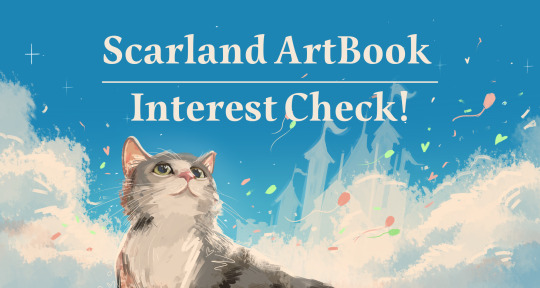
It's my great joy to announce the plans for the Scarland Art Book fan-project! 🌸
-----
🔥 UPDATE: YOU CAN FIND US NOW ON @scarland-artbook
-----
What's this about?
It's an artist collaboration, to create a compilation of illustrations, concept designs, sketches, and thought processes that mockup the development of theme park design.
This project will be centered around showcasing Scarland's architecture, landscapes, and experiences along with the designs of its products, costumes, advertisement, rides and everything else that is so carefully crafted for a park.
Who's organizing?
Yours truly @ink-ghoul, along with @berrysquared, @septictech, @cocoabats, @kazehita, and @peanutbutter255 with support from Elle, Reshie, Blods, Void and Myra.
How can I join the project?
The process will be the same as a fan-zine, we will open application forms in the near future! keep an eye on that!
🔽 We would love to hear your opinion on this idea, please let us know by answering this form (closes on July 9)
More news coming soon, reblogs appreciated!
#hermitcraft#goodtimeswithscar#scarland artbook#interest check#few notes:#this will be a digital release (unless we discuss plans for physical prints which is a whole more things to plan)#FOR FREE#THIS IS A LOVE LETTER#my art
668 notes
·
View notes
Text


Glx Brand Identity
Mockups used in this project ⚡ mockupcloud.com
Branding by be.net/khabibii
#brand#branding#mockup#mockupcloud#free#stationery#identity#freebie#mockup cloud#template#showcase#print#psd#download#inspiration#portfolio#cards#envelope#graphics#assets#scene#paper#advertising#creative#business card#texture#letter#a4
9 notes
·
View notes
Text

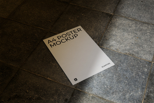

Poster Mockup. Download Here: https://www.behance.net/gallery/223566285/A4-Poster-Mockup
Elegant A4 Poster Mockup Showcase your design with this clean and refined A4 poster mockup. Featuring soft, realistic shadows and a minimalist layout, it’s perfect for an elegant and professional presentation. Simple to edit with smart objects and designed for efficient file size.
Included in the download:
3 PSD Scenes
Resolution: 3000x2000px / 300 dpi
Easy Editing: Smart Object feature
Well-Organized: Layered and structured files
Help file (.txt Notepad)
#mockup#poster#template#design#frame#advertisement#flyer#showcase#photo#presentation#brochure#urban#leaflet#branding#paper#poster mockup#paper mockup#flyer mockup#brochure mockup#leaflet mockup#branding mockup#frame mockup#advertising mockup#print mockup#ad mockup#signage mockup#wall mockup#visual mockup#urban mockup#campaign mockup
0 notes
Text
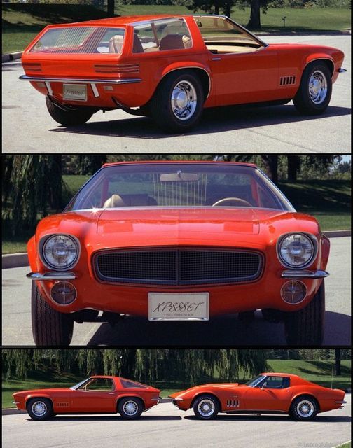
XP-888GT
In the late 1960s, GM's Oldsmobile division was working on a secret project called the XP-888GT, a two-seat sports coupe that shared the Vega platform but featured a unique design and innovative modular roof system.
The car was smaller than the Corvette and a little bigger than the Opel GT (it's in the middle pic of the three of them), with an aggressive front end and a sleek profile.
The XP-888GT's most striking feature was its interchangeable roof system, which allowed for six different configurations, including a targa top, fastback, and mini-wagon. This concept was ahead of its time and would not see production until the 1987 Nissan Pulsar Sportback.
Despite the enthusiasm from Oldsmobile and the completion of a full-scale fiberglass mockup, the XP-888GT project was canceled in December 1969. The reasons behind the cancellation remain somewhat uncertain, but it may have been due to the termination of a similar Pontiac project, concerns about market demand, or the impending smog and safety regulations.
Although the XP-888GT never made it to production, it remains an intriguing piece of automotive history that showcases the innovative spirit and bold design ideas of GM's Advanced Design Studios in the late 1960s.
44 notes
·
View notes
Text

Touhou OC ~ 🫖
Name — Vermillion Dream ~ Tea Time Fairy
Species — Fairy
Ability — Making anything taste sweet
Vermillion Dream is a Fairy that resides in/near several human settlements in Gensokyo. Unlike other fairies she doesn’t enjoy pulling pranks or tormenting humans which results in her being seen as a goody two-shoes by other fairies.
It isn’t uncommon to see her playing tea time with younger humans, fairies or youkai along with hosting fancy parties and delivering gifts in the form of treats she makes. Although she can make a plethora of things taste sweet she mostly uses her ability to ‘substitute’ ingredients for her recipes, which has led to a few incidents of mysterious food poisoning.
Same protocol as last time the art style I used here is meant to be a mashup of ZUN'S style alongside my own so there are elements of both.
I imagine that Vermillion's danmaku/spell cards would have a sort of dessert theme to them. I hope I was able to showcase that in the in-battle mockup I doodled at the side. The bullet patterns are based off thumbprint cookies

#art#jpgcakezz art#artists on tumblr#oc#original character#touhou project#touhou#touhou oc#jpgcakezz ocs
41 notes
·
View notes
Text
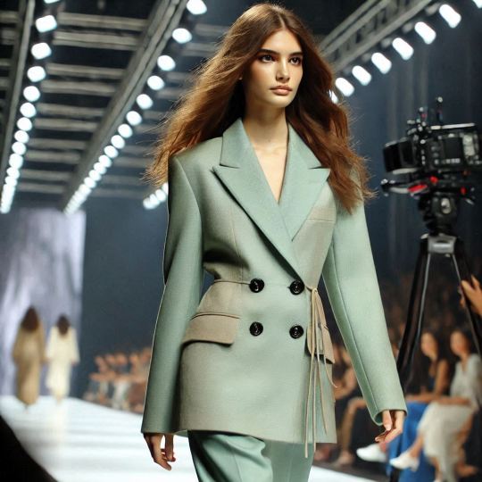
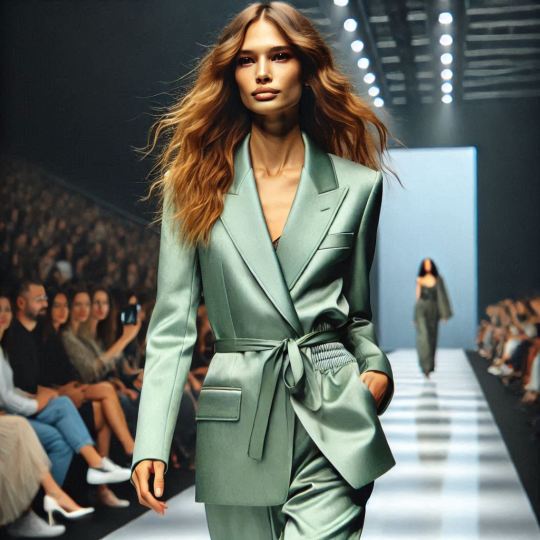
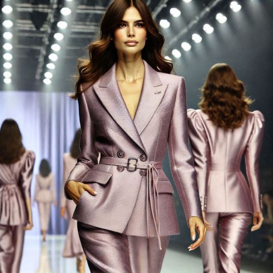
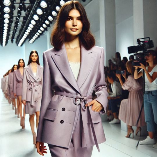
Fashion Runway Styles
Discover the art of clothing mockup, graphic design, photo editing, and image creation with this striking visual masterpiece! From enhancing details to crafting imaginative compositions, this project showcases a seamless blend of creativity and technical expertise. Whether it’s bringing a vision to life, elevating brand aesthetics, or creating visuals that captivate, this work represents the power of design in transforming ordinary images into extraordinary art. Perfect for campaigns, branding, or storytelling, it’s a celebration of innovation and style. Let us help you turn your ideas into stunning visuals! #PhotoManipulation #GraphicDesign #ImageCreation #PhotoEditing #PrintDesign #FloralDesign #DigitalPrints #CreativeDesign #coat #apparel #fashion #mockup
#artificial intelligence#branding#artists on tumblr#fashion#fashion model#high fashion#runway#fashion show#couture#haute couture#coat
4 notes
·
View notes