#shoutout to my *amazing* blob figures
Explore tagged Tumblr posts
Text
Wow it’s been a hot minute since I posted.
Anyway have some storyboards I found for an old Mother 3 animatic/animation.


#mother 3#mother series#art#wip#animation wip#personally i think they’re great#might pick it up again#it’s never left my head i also just never had the time to actually make it lol#shoutout to my *amazing* blob figures#10/10
8 notes
·
View notes
Photo

@logicheartsoul Thank you so much for the kind words ^^ And certainly - thank you for your interest and for asking! I love working with ink so I’m happy to talk about it :D
How I got into it
It's only been in the last maybe five or so years that I've actually started to pay more attention to art supplies. In the case of ink, it really started with fountain pens. Long story short, one of my professors was really into them and let me try one of his vintage pens, and I was vaguely interested. Then my best friend really got into them, and I tagged along to a fountain pen show (shoutout to Scriptus Toronto!!). From there it was a slow burn over a period of months from “this is neat” to “WOWWW OKAY I GUESS I’M REALLY INTO THIS NOW”. It was a (relatively, for me) quick entry once I discovered the online fountain pen community. These people are incredibly passionate, highly articulate, and best of all, document EVERYTHING. I found the ink reviews especially spectacular and that’s probably what hooked me the most.
A few other things that helped in the appeal factor:
I have a tendency to grip writing implements excessively hard and exert a lot of unnecessary pressure when writing or drawing with more conventional pens (ballpoints etc.) A number of people mentioned that fountain pens helped them to alleviate this because generally you don’t need/want to apply pressure when using them. I’ve found it has helped.
I've always been interested in forms that combine words and images, and this merges literary and artistic worlds in a very clear way.
I’ve been on a long personal journey of wanting to incorporate much more Chinese/Taiwanese/East Asian heritage and cultural traditions into my work. Thus, I've been gravitating towards things emphasizing brush, ink, water, elements of calligraphy and... not sure if spontaneity is the word I want, but things that help me overthink less when I draw, and get better at letting go.
How I work with ink
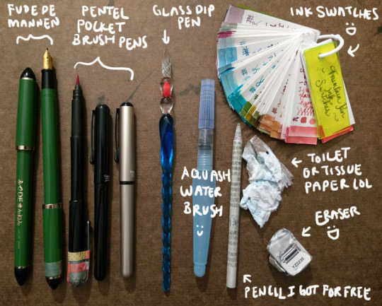
My (main) tools

Fude de mannen: This is basically a fountain pen that mimics a brush for Asian calligraphy. It has a bent nib that enables you to change stroke thickness by varying your hand angle. I love this pen so much I got a second one so I could have a different colour; the washi tape helps me tell which one it is. You can see more of it in the video interview I did with PindotPress.
Brush pen: A pen that is a brush. lol. A number of companies make them; I use the Pentel Pocket Brush because it's the first one I tried and I liked it a lot. It's smooth, has great line variation, and the tip has yet to fail me. (Although the cap started falling apart, hence all the tape on my first one lol.) I currently have three: one for permanent black, one for permanent red, and one because I couldn’t resist buying a coloured version of the pen (I have Diamine Earl Grey in it right now).
Glass dip pen: These dip pens are pretty but what is super awesome is that they are super easy and fast to clean. I can quickly switch between multiple colours of bottled inks. The grooves in the nib hold ink, so you need to slightly turn the pen as you go to access all the ink. You can also get a wider stroke by slanting the pen and using the side of the glass nib. It's not that easy to control your lines, but I actually like this because it creates a lot of happy accidents. And “oops well damn" accidents, but like I said I’m trying to cultivate the whole “learn to let go" mindset.
Waterbrush: Basically a brush that carries its own water reservoir. I’ve used a few different brands but I find I like the Pentel Aquash small the best. Some people fill them with ink like a brush pen, but I’ve not really done that. (I did it once with a different brand that was harder to open/refill and I got mad.) I use it to paint with the inks.
Pencil I got for free: Unless I really am just doodling, I usually draw base pencils of some sort, even if it’s just a very rough, light sketch or a quick thumbnail on another sheet of paper. Every so often I get an inquiry asking what special kind of pencil I use, but I’m afraid they’re just normal pencils rolled with recycled newsprint. I got free samples like a million years ago and I have been using them forever. (I think I’m finally down to my last three.)
Eraser: I’ve been trying a few different ones but it takes me forever to work through an eraser. You want it to be able to pick up the lines without requiring you to scrub and take the ink too or destroying the fibres of your paper. This one actually works pretty well. If you’re really curious you can see the non-destroyed packaging here! lol
Toilet or tissue paper: Something to pick up the water. This is my "undo button” in real life when I’m painting/using the waterbrush. Also I drown everything with water so it’s very important.
Ink swatches: Every time I get a new ink I make a sample and add it here. It’s great for colour palettes and when I’m looking at other inks and trying to decide whether to get it or not (e.g., is it different from everything I already have? My definition of “different” is very generous...). I don’t actually have all these inks; some were samples from friends. I’ve found I tend to gravitate towards very complex, nuanced neutrals. (This sounds so sophisticated but when you see them all it once it's like. Oh. Apparently I like shades of grey, brown, and other hard to classify "muddy" or in-between colours lmao. But more on that in a bit.) Lately I've been getting glittery inks because they're fun and they add a magical dimension to the physical piece.
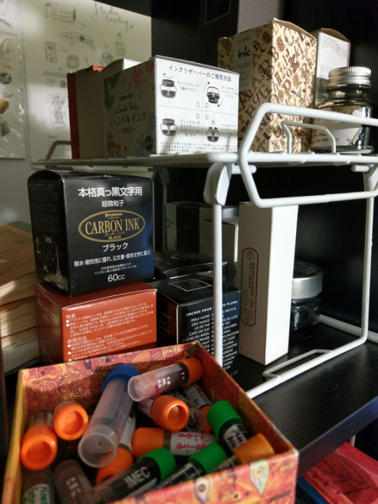
Here is my current selection of inks - on the shelf to the immediate left of my laptop and my head as I am typing this right now. The box at the bottom left is all the samples.

My approach
In my mind, I broadly classify my approach into two categories: “dry” and “wet”.
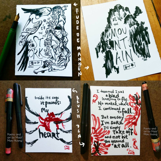
"Dry" - ink only, no water. I have pretty unsteady hands and hate "inking" - if we think of inking as an exercise in achieving a "clean", controlled line drawing with consistent line width/stroke thickness, neatness, etc. So I love pens that support me in what I think of as controlled loss of control - wide variations in brush width and stroke character. Brush pens and fude de mannen pens are perfect for this. They have lines that offer a wide range of dynamic, organic, and textural opportunity. My Inktober illustrations fall into this category. A few examples below, followed by links to the full set.

Inktober 2017 - fude de mannen
Inktober 2018 - brush pen
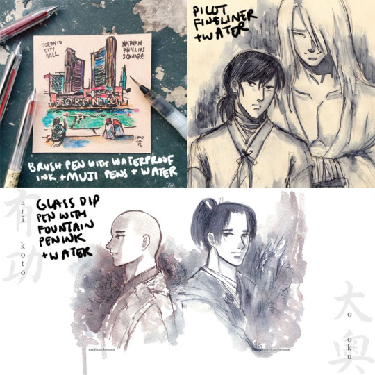
"Wet" - Basically I blob water around. Depending on when I do it (before, with/during, after the application of the ink), you can get different results. The water causes the ink to bleed, semi-watercolour-like, and can be used for shading, environmental effects etc. For obvious reasons, this works best with non-waterproof inks (which the vast majority of fountain pen inks are), but you can do this even with waterproof inks. Just let the ink hit water before it has a chance to soak into the paper and you can get cool effects :D. And you can also do it with other pens too, not just fountain pen inks. Examples:

Tiles of Toronto urban sketch series
Raizen and Hokushin doodles
Arikoto from Ooku
As you might imagine, this is really great for on-the-go drawings, because you just need a pen (or a couple of pens) and a waterbrush.
The “wet” approach is also where the very complex inks that look "boring" (greys, taupes etc.) are just complete magic. When the dye elements separate, other colours emerge, and you get really wonderful textural effects and rings of colour where the ink pools and dries. Diamine Earl Grey is a colour I've mentioned several times that I LOOOVE because it separates into blues, browns, purples, even pinkish tones. It's a gorgeous ink. You can see some examples and closeups here.
Another colour that does this really powerfully is Sailor Rikyucha. It’s a dark tea brown-green that separates very easily into pale blue-greens and more and has amazing tonal and textural qualities. The Tendril Wreath illustration here really shows this.
For the most part I look at things I like and then experiment to figure out what happens. After working with the same tools for a while, you get a sense of how the different elements might react and respond naturally. The Genjimonogatari series employs both dry and wet extensively and is an example of the experimenting and playing I’m doing - I keep finding new aspects to the inks I thought I knew, and making “interesting” mistakes. And trying to fix them as I go with varying levels of success, haha. But I’m always learning!
One more thing about this hobby
I feel compelled to finish with some talk about the pure aesthetic appeal, or the MULTIPLE LEVELS OF FUN I get out of these inks. Not just the colour, not just how the ink behaves, but... the name of the ink as well! Some inks do this more effectively than others. Similar to how the presentation of a dish is part of the experience, the name of an ink adds so much to my enjoyment of it. My least favourite ink names are [standard adjective]+[standard colour name]. My favourite ones are really convoluted with literary and poetic references, I just love them hahaha. Asian fountain pen inks I find tend to do this especially well - partly because of how much you can pack into how few syllables, I suppose. It makes me sad that a lot of sites don’t include the original names, often referencing them with just a number, though I understand it is difficult to translate. But I learn a lot with these names as a starting point! For example, Zhenjing, which I mentioned recently in the Kurama “Light” illustration, took a bit of back and forth with my parents to look up the source and then to interpret the complex line of poetry. It was a fun and fascinating exercise.
A great name can’t save an ink I don’t like, but a good name elevates an ink I do like even more, and it can be really inspiring for making stuff. For example, take Pen BBS Mirrorflower Watermoon. I adore the colour of this ink - it's a very subtle grey-pale green with silver flakes. I used it heavily in the Hokushin fanart “Northern Deity” (you can see it here with photos of the sparkly).
The name is actually highly recognizable if you're familiar with classic East Asian literature/poetry. I read it out loud to my parents with no context other than "this is the name of one of my favourite ink colours" while they were eating dinner and they both said at the same time, "I know this! DREAM OF THE RED CHAMBER!" lmao. It's a very Buddhist idiom or phrase referring to the illusory nature of things, likening it to the reflection of a flower in a mirror or the reflection of the moon in water.
I hope this was interesting and helpful! ^^
#art supplies#logicheartsoul#replies#reply#fountain pen ink#ink#waterbrush#brush pen#fude de mannen#art by Maiji/Mary Huang#how I work#process
21 notes
·
View notes