#screencapping coloring etc
Explore tagged Tumblr posts
Text
honestly as someone born in ‘05 that gets weirded out seeing idols the same age as me - which is why i will tune in to xikers comebacks but i don’t really watch their content same with some other grps - let alone idols that are younger i really don’t understand the way some of these people defend fully stanning CHILDREN let alone people 10+ years younger than them
#like yeah i’ll gif the xikers members that draw my eye the most#<< just in mvs really bc like i said i don’t really watch their other content#but a im literally the same age as them and b i still debate it for a While before i actually go into the process of downloading#screencapping coloring etc#like zaynab said it’s a long dedicated process to go out of your way to gif smth#i just don’t get it#theo.txt
1 note
·
View note
Text
i need to change my icon to jellylorum. it’s time
#idk what good screencaps there are of her though#if anyone has suggestions i will take them now#(probably aiming for 1998/other replica stuff. i love tecklenburg jelly but she’s not my color palette unfortunately)#sick and tired of people treating her like an afterthought!!!!!!!!!!!!!!!!!!!!!!!!!!!#>:(#if jellylorum has only one fan then it’s me. if the world is against jellylorum i am against the world etc. etc.
13 notes
·
View notes
Text
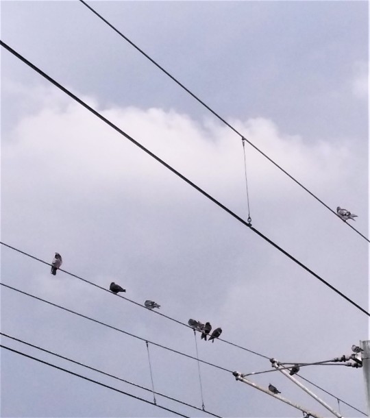
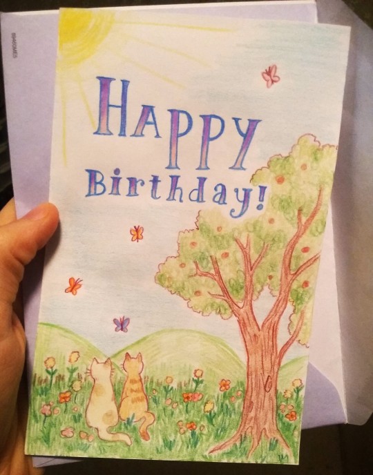
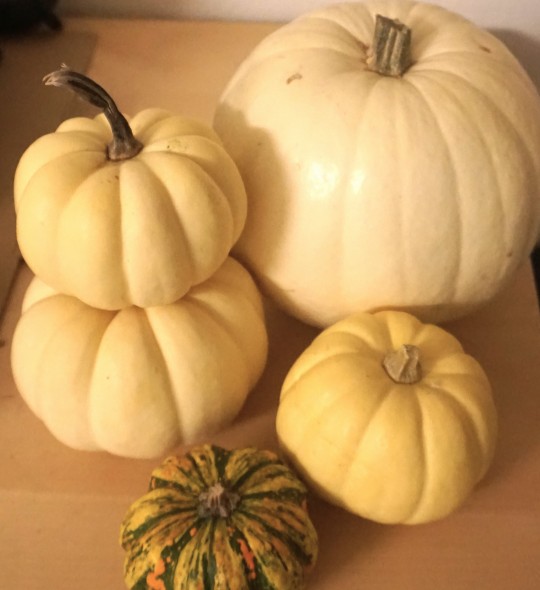
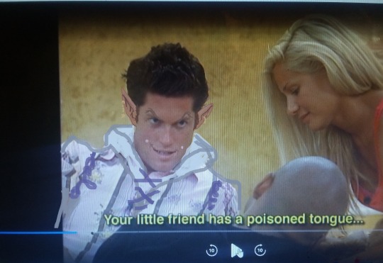

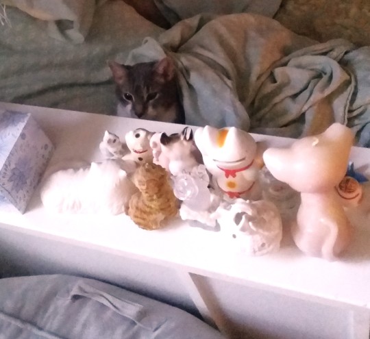
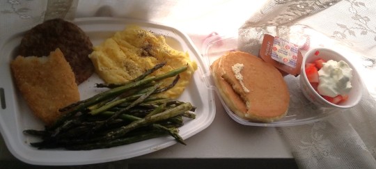

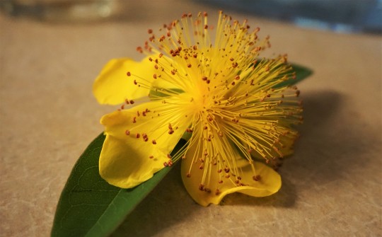
Various images of things
#image commentary in tags once again since they don't allow captions anymore and I feel weird using the alt text for that --#1. PIBBINS.... cheering clapping hooting hollering glorious applause everytime I see a pigeon in public#2. Birthday card that I drew for someone. .. kittys...#3. 2023's annual haul of tiny white pumpkins.. i get at least one white pumpkin every year around fall when they have pumpkins in stores#because I just love the color and texture ... bright white and smooth and cold and round.. kind of like a volleyball or something#4. A brief adventure into watching big brother (only earlier seasons of course as I hate all reality shows post like 2013 or something when#they became overly focused on social media and overproduced memeable phrases more.. like even though ALL reality shows have always#been extremely fake and annoying and mindless it's like..... newer stuff seems A Different Kind Of Fake or something) since whenever#I'm sick sometimes I find weird mindless things like that to watch (that one time I had bronchitis I watched all of Flavor of Love in my#half awake illness stupor and now everytime I heat up canned minestrone soup (mostly all I ate that week) I think of flavor flav since#thats just a weird brain connection I have now lol) ANYWAY.. I was sick and watched like 2 seasons of this and then thought it was too#uninteresting and obnoxious to continue (more like 1 and a half since I skipped the rest of one once only boring people were left) BUT this#one guy had a very mischevious looking face and he also said a few things (like the above captioned speech) that sounded like dialogue#some fantasy character would say.. so I took a screencap of him and edited him into a mischevious wizard i guess.?? idk I was sick lol#~your little friend has a poisoned tongue~ is just a very unexpectedly serious sounding wording for some random normal#frat dude looking guy to say while casually chatting on a reality tv show in like 2008 or whenever that was filmed lol#5. FLUFFY CLOVERS!! I'd never seen them be furry and soft before?? inchresting..#6. Noodle sitting in bed with the cat figurines looming above him... the council of kittys...#7. McDonald's full breakfast platter + asparagus + strawberries & cream (also of course this is old and I am now boycotting mcdonalds etc)#i try to group the images somewhat consistently like.. winter stuff with winter stuff or summer stuff with summer stuff#but I have so many random pictrues floating around on my computer that I never post that sometimes some are not organized or just#thrown into a set because there's nowhere else for them. Like the pigeon picture is from like 3 years ago for example lol#8 & 9 - I think I've posted these before but I just find them very interesting looking flowers. whenever they happen to be blooming#I'll pick up a few when I'm out on walks or etc. ... poof ball looking things#photo diary
9 notes
·
View notes
Text
gonna show u guys a little opalescent highlight hack i threw together today
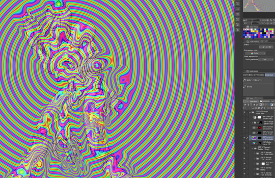
rainbow gradient above your main figure (i usually have all my main figure folders/layers in one big folder, so i can clip gradient maps + adjustments to it!). liquify tool to push the colors around a bit. STAY WITH ME I KNOW IT LOOKS STUPID RN I'M GOING SOMEWHERE WITH THIS
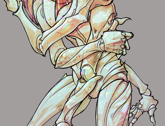
THEN: set it to add/glow (or the equivalent in ur drawing program), lower the opacity a bit, and apply a layer mask. then u can edit the mask with whatever tools you like to create rainbow highlights!!
in this case i'm mostly using the lasso fill tool to chip out little facets, but i've also done some soft airbrushing to bring in larger rainbow swirls in some areas. it's pretty subtle here, but you can see it better when i remove the gradient map that's above everything, since below i'm working in greyscale:
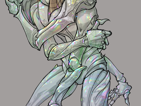
more granular rambling beneath the cut!
u could also just do this with a brush that has color jitter, but what i like about using layer masks for highlight/shading layers is how simple and reversible it makes everything. i can use whatever brushes i want, and erasing/redoing things is super low stakes, which is great when i often approach this stuff with a super trial-and-error approach.
example: have u ever thrown a gradient w multiple colors over an entire piece, set it to multiply etc, and then tried to erase it away to carve out shadows/highlights? it's super frustrating, bc it looks really good, but if u erase something and then change ur mind later, u basically would have to like. recreate the gradient in the area u want to cover up again. that's how i used to do things before figuring out layer masks!! but masking basically creates a version of this with INFINITE undo bc u can erase/re-place the base layer whenever u want.
anyway, back to rambling about this specific method:
i actually have TWO of these layers on this piece (one with the liquified swirls shown above, and another that's just a normal concentric circle gradient with much broader stripes) so i can vary the highlights easily as needed.
since i've basically hidden the rainbow pattern from myself, the colors in each brushstroke i make will kind of be a surprise, which isn't always great -- but easily fixable! for example, if i carve out a highlight and it turns out the rainbow pattern in that area is way too stripey, i can just switch from editing the mask to editing the main layer and blur that spot a bit.
also, this isn't a full explanation of the overall transparency effect in these screencaps! there's other layer stuff happening below the rainbow highlights, but the short version is i have all this character's body parts in different folders, each with their own lineart and background fill, and then the fill opacity is lowered and there's multiply layers clipped to that -- blah blah it's a whole thing. maybe i'll have a whole rundown on this on patreon later. uhhh i think that's it tho! i hope u get something useful out of this extremely specific thing i did lmao
12K notes
·
View notes
Text
USEFUL SITES FOR ROLEPLAYERS
Thought I'd make a list of some useful websites for those of us who enjoy roleplaying and what have you here on Tumblr and whatnot.
roleplay formatter: Made by the awesome @rpclefairy. I honestly can't recommend this one enough. Great for adding color, changing the font size, and the whole shebang with bold + italics + underline + strikethrough. 10/10 always use
fsymbols + emojipedia: These are both great for making your tags fancy and whatnot.
alt codes: This is genuinely great for teaching you how to make the symbols with your keyboard for everyday use so there's that. It's especially useful if you and/or your muses speak a second language so that's a bonus.
text color fader: *marge vc* I just think gradient effects on text is neat. *end marge vc*
list of colors (wikipedia): Has a list of an infinite number of colors and their hex codes. Very useful if I do say so, myself. But that's just me.
screencapped.net: Great for getting all sorts of screenshots for making icons, GFXs, promos, and whatnot.
fancaps.net: Also great for getting all sort of screencaps for making icons, GFXs, promos, and whatnot. My only complaint is that it's a little annoying to navigate so here's the proper links to movies, tv shows, and anime.
photopea: Great if you can't afford Photoshop and/or don't like using GIMP.
hakuneko: It's not so much a website as much as it is a program. You can download manga, comics, webtoons, doujinshi, etc. for making your icons, GFXs, promos, and whatnot. It's also just a great way to read stuff and catch up on everything.
Feel free to reblog and add more. <333
#roleplay resource#roleplay help#roleplay community#roleplay#roleplaying#rpc#rpc help#rp help#rp resources#rp resource#roleplay resources#rp
7K notes
·
View notes
Text

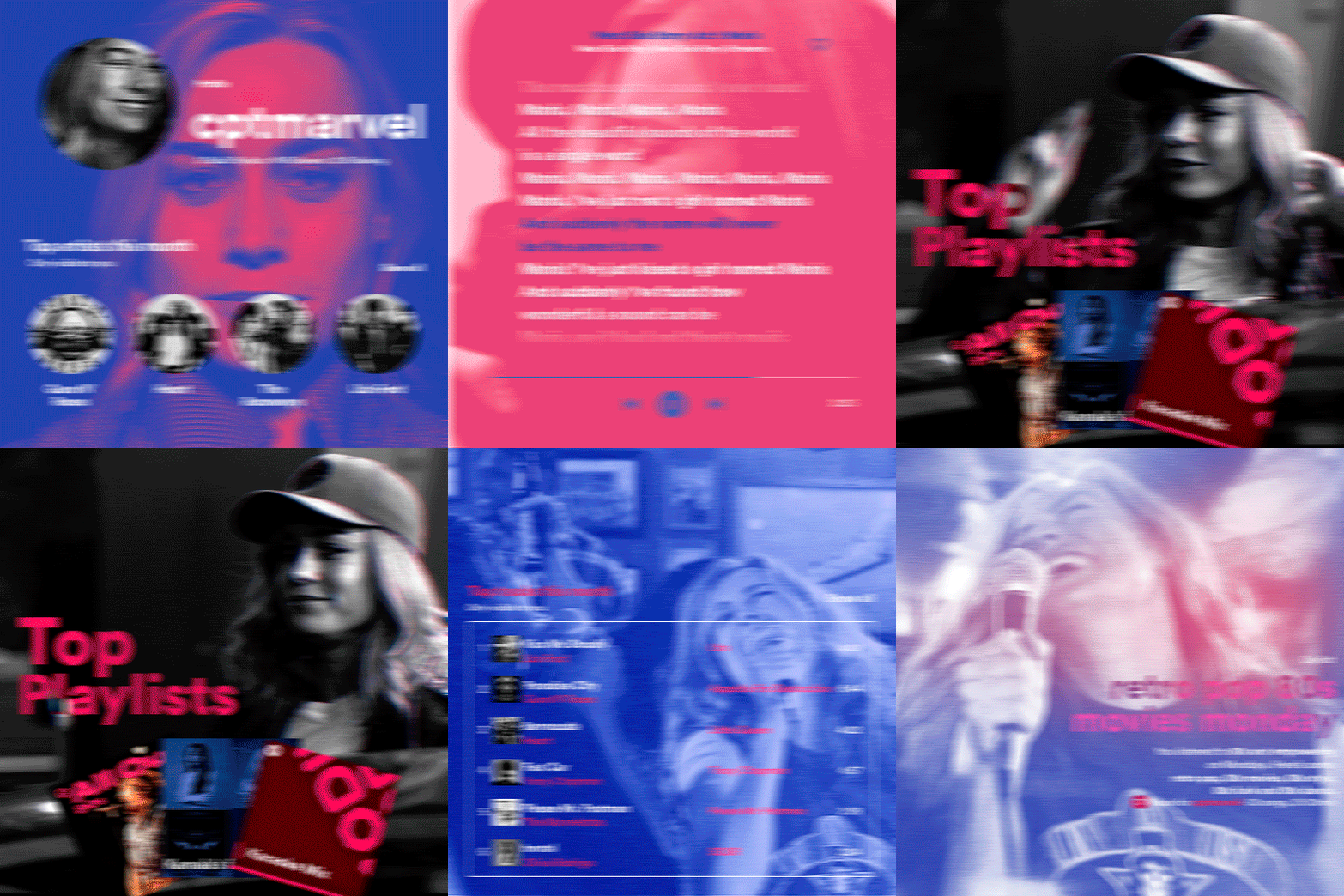
hi! someone requested me to do a tutorial based on this gifset!
this tutorial requires an intermediate knowledge of gifmaking. i won’t teach you how to do gifs from scratch, there are other tutorials for that out there.
[tutorial under the cut]
THE BASICS
AN INTRODUCTION
first off, the gifset in question is based on this gifset by @/eddiediaaz and i got permission from them to explain the process. i won’t be sharing the template because it’s a near replica of theirs (that isn’t shared to the public) and i don’t feel comfortable doing so, but you can recreate it by yourself just like i did!
also, ESL, so please pardon any mistakes.
THE FONT
Circular ST (Medium & Black). download it here & here.
CLIPPING MASKS
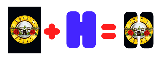
clipping masks are the way i put images and gifs inside of shapes. i used that method in the first and second gif of the Spotify gifset as you can see here. what does a clipping mask do? basically, it links two or more layers together in a way it follows the “shape” of your base layer. ie, everything that is shown follows the “shape” of your main layer and nothing more. your base layer can be anything: a shape, an image, a gif, a text, an adjustment layer, really everything. let’s see an example:
CLIPPING MASKS & SHAPES

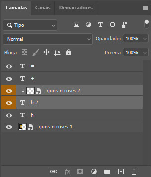
the original image (Gun 'n' Roses logo) is intact, as in, it’s not cut like a circle, something that cannot be undone. instead, everything outside the limits of the blue circle is just hidden. if i delete the base layer (the circle layer), the original image will appear as it originally is, as an rectangle. talking about layers, let’s see my layers panel (some things are in Portuguese, but i think you can understand):
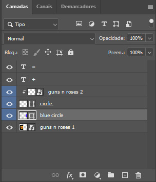
notice the little arrow pointing downwards to the “circle” layer. that is the clipping mask symbol. the base layer always needs to be below what is being clipped. if the base layer is deleted, the chain is broken and every layer clipped will now act independently and have its original shape. you can have as many clipped layers as you want. you can also have multiple chains going on in a .psd, each one with its own base layer. to clip a layer, you just need to press ctrl+alt+G or cmd+option+G while having the layer you want to clip selected (NOT your base layer). or, you can go to LAYER > CREATE CLIPPING MASK.
CLIPPING MASKS & TEXT
let’s see the same example, but with text instead:
A TIP
because adjustment layers are clippable, you can completely gif by using clipping masks. this is very useful when you have more than one gif inside a canvas and don’t want an adjustment layer to affect everything besides a certain layer/element.
let’s take my first gif of the Spotify gifset as an example.

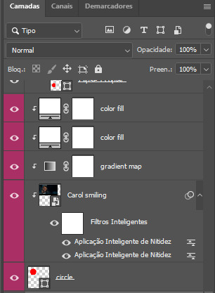
the circle is the base layer. the “Carol smiling” layer is my gif converted to a smart filter. above that “Carol smiling” layer, there is a black and white gradient map and two color fills of white so i can achieve the coloring you see. all those layers are clipping onto the circle layer, making my now b&w gif have the shape of a small circle as well. those layers are in a folder in the .psd of my first gif, so i don’t have multiple files sitting on my PC to assemble just one gif. i could have giffed that small gif separately and pasted it onto my canvas as well, but i like to do this way so i can adjust everything i want in real time instead of redoing a gif over and over every time i want to change something.
HOW TO MAKE EACH GIF
all gifs are 540x540px.
THE FIRST GIF

the first gif has 6 elements. the elements are: a big gif serving as a background (a close-up of Carol), a smaller gif inside a circle (a b&w gif of Carol smiling) as a profile picture and four static images for the featured artists. i giffed as i normally do (loaded screencaps, resized the gif, sharpened the gif, etc) for my background gif. to achieve the coloring, i’ve added a gradient map (layer > new adjustment layer > gradient map) purple to pink. to the profile picture, i made a 160x160px circle in the top left corner. the color of it doesn’t matter. the next step is a matter of taste: i giffed the smaller gif in the same .psd thanks to clipping masks that i explained earlier, but you can do it in a separate canvas too. for the featured artists, i made four circles with 98x98px each. for the images, i had to check Spotify for their selected PFPs. after that, i googled “[band/artist] spotify” to find the images. the PFP of bands and artists in the Spotify app are displayed in black and white, so you might have to make them b&w if you happen to find them only in color. to make the artists PFPs pop a bit more, i transformed them into smart filters and added a bit of sharpening to them (intensity 10 x radius 10). you can adjust the colors and the brightness if you want, too. the sizes of the texts in the gif are: 58px (username), 20px (top artists of the month), 15px (name of the artists), 12px (only visible to you + show all + profile) and 11px (following and follower numbers).
SECOND GIF
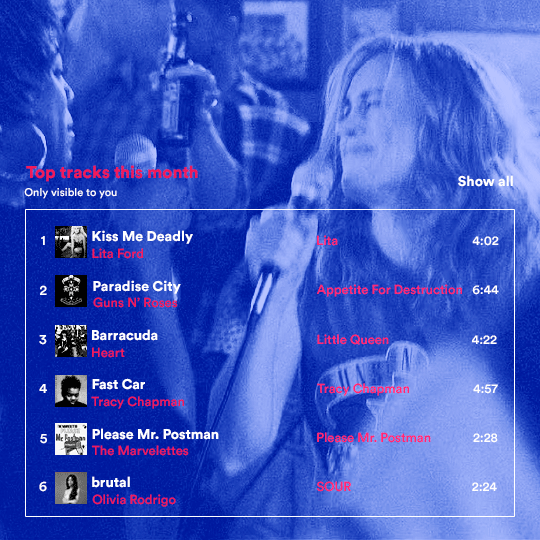
for the chart, i created a black rectangle (490x308px) that i set its blending mode to lighten (thus making it transparent) and i added an internal white stroke. i added the text and the little squares next to the top 6 numbers. the font sizes are: 17px (top tracks this month), 11px (only visible to you), 14px (song title, show all, top 6 numbers), 13px (artist/band, album title, length of the song). i added the album covers — that i made b&w — by clipping images onto 32x32px squares. for the coloring, i added a gradient map (dark purple > light purple).
THIRD GIF

there are three types of playlists in this gif: a Spotify original playlist, a playlist made by a user and a Mix. you don’t have to follow this formula if you don’t want to, but in the case you do, here’s how i did it: browse Spotify for an original playlist of theirs. chances are, if you google the playlist’s name, you can find its cover on Google Images. at least, i found the “All Out 80s” cover that i used in my gifset. you can also create your own. for the user playlist, just pick four songs and find their (album) covers, also on Google. create a square canvas on Photoshop and make four squares, each in one quadrant of the canvas. paste your images onto your canvas and clip the images to each square. then, add a gradient map (black + whatever color you want) to all those images and title your playlist (font size: ). save that collage as a PNG and load to your gif canvas or merge all the layers+transform into a smart filter and drag the smart filter layer onto your gif canvas. now, the trickiest one. while you can invent your own Mix, i wanted to use a real one, but i had no idea on how to find them. thanks to reddit, i discovered that, if you search “made for you” on Spotify, you will find their Mixes! some of them are very whacky and specific! i just picked the Mix that made the most sense for Carol from that (gigantic) list. before doing the next step, i would advise you to google the name of the Mix you picked to see if you are able to find the cover of it with good quality. i wasn’t able to find mine (Karaoke Mix), so i just screenshotted my Spotify app, pasted that screenshot into Photoshop and cut the Mix cover and pasted that onto my canvas. the quality wasn’t great, so i transformed the cover into a smart filter, added a bit of gaussian blur and then sharpened it (intensity 10 x radius 10). the color wasn’t what i wanted either, so i used Hue/Saturation to change the hue. because the original image for the Mix was smaller than i wanted and i stretched it to make it bigger, the quality of the text and the Spotify logo was botched. i painted over the Mix cover and created a text with the font i linked earlier to replace its now pixelated title. i also painted over the little Spotify logo, found a logo in the internet and pasted over the Mix cover about the same size of the original logo. to achieve the “3D effect” of the gif, i made my b&w gif, the base. then, i duplicated all layers and added a gradient map (black > pink) and merged all the layers of that duplicate. i made a second replica of my gif, now with a different gradient map (black > blue). i set both replicas to the ligthen blending mode. you will notice that the replicas will "disappear" and only the original b&w gif will remain. if you move the replicas a bit, that colored border will appear. this doesn't work much in very bright gifs without a lot of dark areas, btw.
FOURTH GIF

this gif used an altered (by me) version of this template. (i changed the fonts to match the rest of the gifset, too.) for the color text effect, you will have to gif with the timeline bar. take your gif’s length and do the math to find how many frames are ⅓ of it. take your lyrics’ layer and cut it into three equal parts or close to it by using the scissors icon in the timeline panel. in each third, change the color of just one line, line by line. when you play your gif, the colors of the lyrics will change like in Karaoke. you can do the same thing with frames iirc, though. i explained the timeline method because that’s the one i used in this gifset and use in general gif making. for the coloring, i added a gradient map. to make the colors pop a bit more, i add two gradient maps: the first one is in black and white, the other is in color. that adds depth to the blacks and darker colors of the gif.
FIFTH GIF

like in the Top Playlists gif, i wanted for my Daylist to be real as well. to achieve that, i listened to my Carol Danvers companion playlist (that you can listen here) for a long time until my Daylist refreshed itself. (Daylists refresh in certain times of the day — don't worry, Spotify will tell you when.) then, i just copied what it told me — the title and the genres i listened to generate such a Daylist, plus the genres i should check it out. you can invent your own Daylist if you want, but because it is generated by AI, i find very difficult to mimic its crazy titles, but you can try! you can also search in the web for other people’s Daylists if you want, but usually people don’t tell you what they listened to to get those playlists and nor what was recommended for them to listen to and i, at least, find that information important for the gifset. be aware that Daylists aren't available for every country yet (like in mine), but i found a way to work around that. the browser Opera GX offers a free "VPN" — not exactly a VPN, but it works close enough — so you can set your location to the US and listen to in-browser Spotify. i recommend not log into Tumblr while using Opera's VPN as there is a myth (that could easily be true!) that Tumblr terminates people's accounts that use a VPN. font sizes: 43px (daylist title), 13px (text), 12px ("daylist" & "made for"). for the flare effect, i searched for flare overlays on YouTube and downloaded one of those videos with 4K Video Downloader, a free software. i loaded the overlay into Photoshop and added a gradient map (purple > pink) over it, thus changing its color. i pasted the overlay onto my b&w gif and set its blending mode to screen. voila!
that's it! i hope you liked it and that i was able to express myself well. if you have any questions, feel free to contact me, i love helping people about their gifmaking questions! 💖
#*#*tutorials#gifmaker tag#dailyresources#usergif#completeresources#alielook#userairi#userhallie#userbess#userrobin#usershreyu#userzaynab#tuserju#tusermalina#tuserheidi#usertina#userabs#userbuckleys#usermagic#userjoeys#antlerqueen#userarrow#flashing gif tw
401 notes
·
View notes
Text
HEY! YOU!
You've probably heard by now, but from March 4th to 10th 2024, Help Gaza Children will be sending all their donations to families in northern Gaza, where food prices have skyrocketed even more than in the south. Their goal is $25K by the end of the week; at the time of writing this post, it's about halfway a quarter way there! (OG post about it) [EDIT: my mistake, I misinterpreted the numbers in the original post; evidently I cannot do arithmetic anymore]
This is their notion site, which has their donation link as well as additional info, their FAQ, important updates, and proof of purchases from donations they’ve gotten in the past. You can also donate directly to their paypal here.
As such, I'll be open for sketch commissions up from now (March 7th, 2024 ~02:20 PST) through March 10th in exchange for proof of donation to Help Gaza Children!

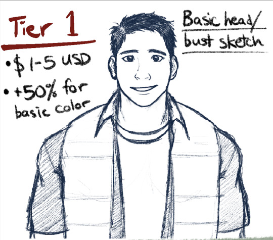


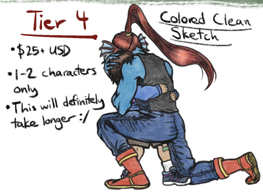
BASIC OVERVIEW:
Tier 1 - Basic head/bust sketch for $1-5 USD, +50% for basic color. Up to 3 characters.
Tier 2 - Basic screencap resketch for $5-15 USD, +50% for basic color.
Tier 3 - Posed sketch for $15-25 USD, 1-2 characters ONLY.
Tier 4 - Colored clean sketch: $25+ USD, 1-2 characters ONLY.
RULES:
Please provide a visual reference or detailed description of the character(s) you want drawn (and depending on the tier, a screencap or pose/expression you want to go with it)
DO'S: OCs, humans and human-like creatures, other creatures that don't have a lot of mechanical or anatomical detail (as in, I can TRY to do mecha stuff, but I think you and I will both be better of if I don't lol; can ask for further details)
DON'T'S: any NSFW stuff, real people currently alive (as in, historical figures in the setting of historical fiction may be okay, but other things may not be; can ask for further details)
If you've made your donation in a currency that is not USD, I'll give you something of equivalent value according to the tier based on whatever the conversion is at the time that I look it up. If one or both of our economies crashes spectacularly in between the time you send it and the time I look it up, I'm very sorry in advance
DISCLAIMER 1: I reserve the right to decline a commission for any reason; however, if this ends up being the case, I may reach out to you to see if we can come up with a middle ground that suits us both.
DISCLAIMER 2: I don't anticipate being able to do a lot of these, as I've got a full-time job that's in the ballpark ~80+ hours a week with really weird hours. That being said, depending on how far this goes, turnaround time will probably be ~2-3 months, give or take...something. I'll update you monthly until it's done.
FOR PERSONAL, NON-COMMERCIAL USE ONLY!
If you're interested in nabbing a sketch from me in exchange for your donation, email a screenshot (devoid of any personal info please) of your donation receipt and details of your sketch request (e.g. reference, tier, etc.) to [email protected]. For your donation to count for a sketch, it must be made after I wrote this post! (March 7, 2024 ~02:20 A.M. PST)
If you are NOT interested in nabbing a sketch from me, feel free to donate anyway!!
(And if you've got any questions about anything feel free to email, DM, or send an ask!)
#palestine#gaza#helpgazachildren#orv#undertale#commissions#donations#if this inspires even one extra person to donate that wouldn't otherwise have known about it I'll consider that a win#anyways I don't really expect this to go very far outside my circle if at all#so I'd appreciate some help in spreading the word#especially about the main fundraiser#these drawings are really secondary to the whole thing#but if you want to donate AND help a sad partially-art-blocked artist get unblocked! here is your opportunity!#if this goes somewhere I might do it again with other links#otherwise I'll just keep donating privately
791 notes
·
View notes
Text
Agatha All Along deep dive: episode 9 part 2
(Wandavision entries: [1][2][3])
(AAA entries: ep1 [1][2][3][4] ep2 [1][2][3][4] ep3 [1][2][3] ep4 [1][2][3][4][5][6][7][+1] ep5 [1][2][3][4][5] ep6 [1][2][3] ep7 [1][2][3][4][5][6] ep8 [1][2][3][4][5][6][7][8][9] ep9 [1][2][3][4][5][6])
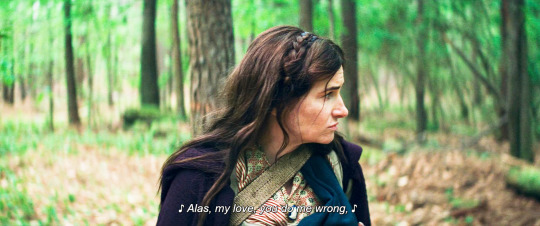
I'm glad nicky came up with a cool new tune because according to period movies and shows greensleeves is the only song anyone ever knew
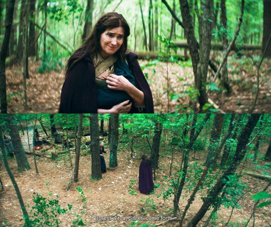
look at that meek little smile, ughhhh. nicky is like two days old and this asshole has already figured out he's the perfect prop for her murder sprees. and these poor women are calling her sister and are willing to help too.
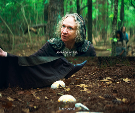
the spell is te accipimus in circulum, we accept you in the circle, and yes that makes me cry a little. we accept you in our community. and the spell is yellow air magic, which sounds like the most empathic kind if Lilia is any indication.
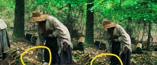
that's interesting, you can't really tell that well from screencaps but go rewatch the scene, this witch is making mushrooms grow with yellow magic instead of green?? is it just a spell (she is holding a book) or have I been getting it all wrong and color has nothing to do with the type of magic one has?
or maybe??? the color depends on the coven you're in?? the salemites all had blue magic for example. and now that I think about it the stone circle is a protection spell but it's not red/orange.
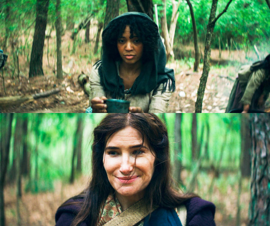
the meaning of this scene is so glaring dear lord. agatha was never going to give these women a chance to prove that yes, there are people out there who could love and help and accept her. she has shut herself up to that possibility a long time ago.
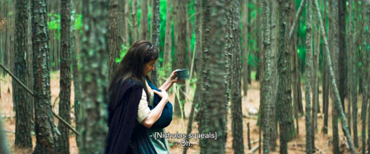
and she stole the soup too. awful.
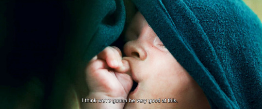
I've seen all the different theories about nicky needing to feed on witches too, or nicky needing soul sacrifices to survive because he's the son of death etc. we don't have enough evidence to prove anything yet, but personally I headcanon nicky as a totally normal kid, that makes this story even more tragic.
and aww that baby suckling on the little pudgy fist
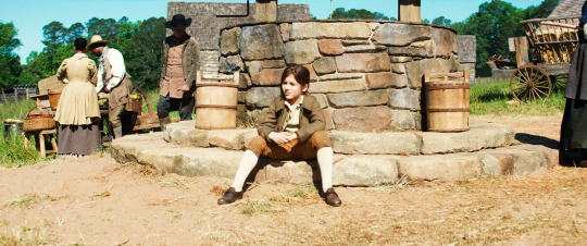
nicky doesn't look that happy about what he's been asked to do, does he?
we establish that nicky was sickly (maybe he was born with some internal defect that rio temporarily patched up?) we also see him steal the bell agatha will use for her Road scam in the future.
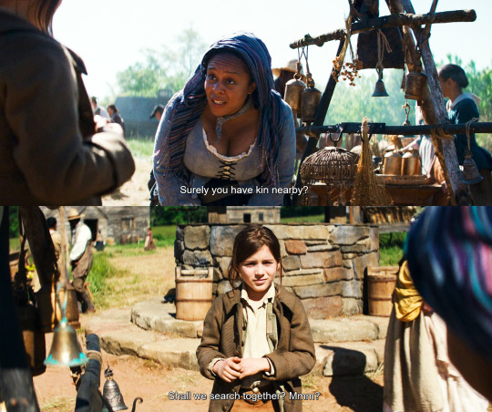
and we meet yet another witch being kind and wanting to help.
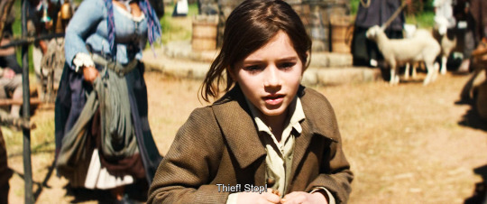
agatha: I love this six year old so much I'm gonna make him accessory to murder
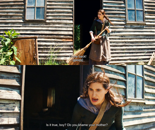
dO yOU ShaME YouR MOtHER
and the big fake gasp too. as usual this bitch has conned a whole community
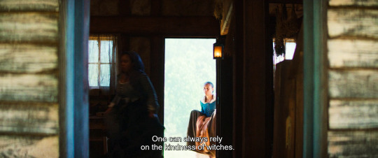
like, she's convinced herself that other witches are bad and are after her WHILE relying on witches's good hearts to con and kill them. what sort of mental gymnastics???
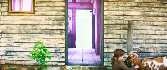
color goes from yellow to purple. nicky waits outside while his mom commits murder, it's not a good look on agatha. completely fucked up, actually.
(I'm terrified that the goat will end up being an agent of mephisto or something idiotic like that, lemme tell you. I hope they're just keeping it for milk and company.)
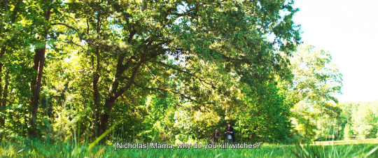
and here's the million dollar question. nicky has seen his mom kill literally since he was born, and now he's old enough to start realizing what that means.
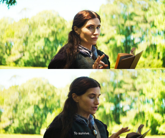
oooh I know that look, that's agatha when she's put on the spot. she avoids his gaze, she can't be sincere with him.
and of course she's teaching herself spells from a book. nerrrrrrd
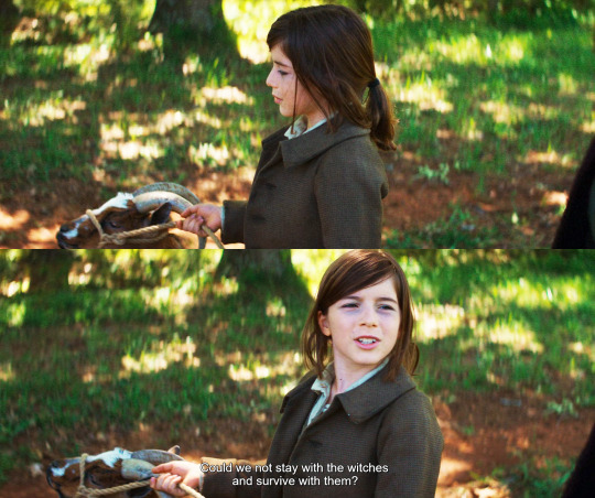
nicky, bless his soul, appears to give it a good thought and then offers a practical suggestion. I guess he wouldn't mind to have a roof on his head and some friends too.
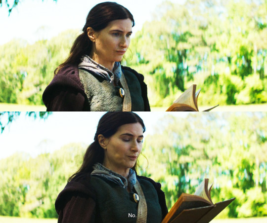
GREAT acting from kathryn here. the quick OH SHIT face followed by the super final NO, with her jaw so rigid. in typical agatha fashion, when she's upset she becomes avoidant.
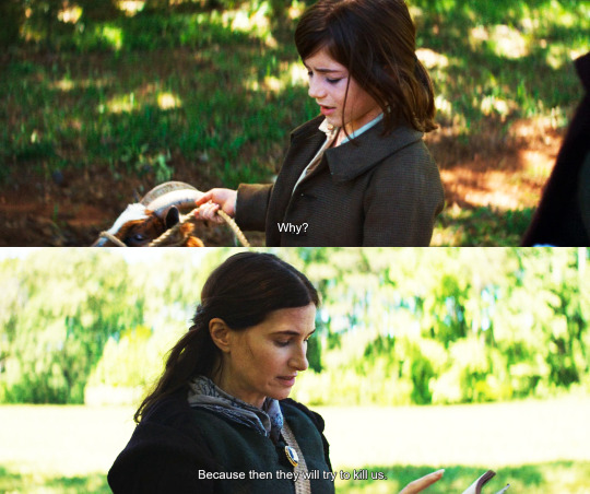
this is evanora's legacy. despite agatha's immense love for nicky, she is passing all that pain down and inflicting it on him.
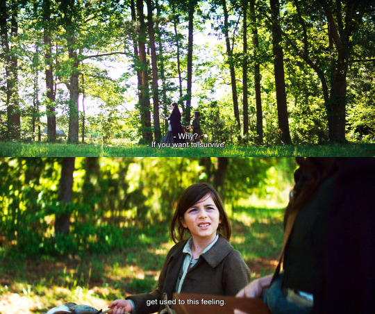
remember when she called billy a survivor? this is the greatest asset in her opinion, the one she wants to teach her son. the truth is, she is angry at witches because she is scared of them, she's scared of being targeted again. but look at that kid's dark circles, I can't believe she's making him sleep in the woods, sick as he is!
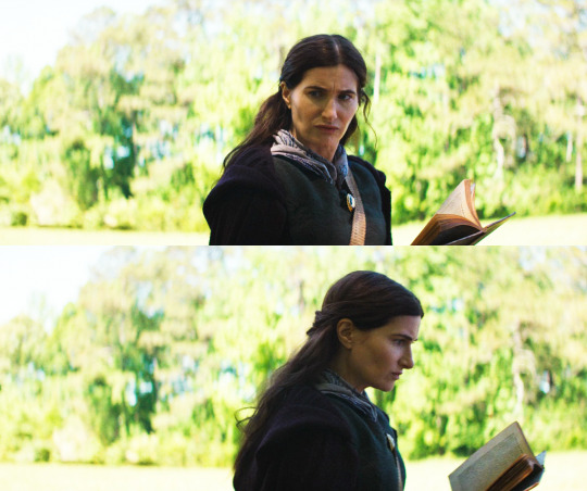
really really fantastic subtlety. agatha wants to sound wise and strong, but she looks scared, uncertain, guilty.
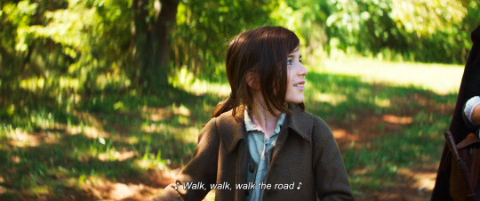
see how nicky looks at agatha while he sings? he's checking to see if she's noticing, because his mom likes music and likes his voice. he's afraid he has upset her and wants to make her smile. he tried to reason with her, and now he tries to soothe her. this is what happens when you have an immature parent, a child will want to help, they will try to fix things. they'll end up parenting their parent, and it should always be the other way round.
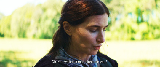
agatha takes the bait. she's relieved that the conversation has moved to a safer subject. but oh, this script is so good. this is a mostly innocent, mostly sweet remark, but with a possessive undertone. don't forget that you are mine, she says.
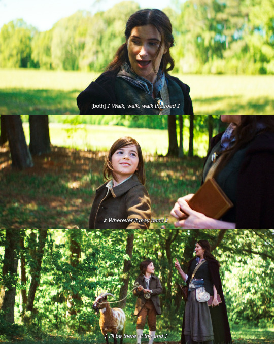
and still, the love is real. even in a fucked up situation like this, these moment of happiness are precious and genuine and will linger on. look at how adoringly nicky looks at his mom, she's literally the sun and center of his small world, and that's how agatha likes it: she created nicky because she needed someone who could be hers without any baggage or consequences. but it turns out that raising a child is not a cheat code for love, it's one of the most difficult, most significant and impactful decisions a human can make.
go to episode 9 part 3
151 notes
·
View notes
Text
GIFMAKING TUTORIAL: PHOTOPEA (for Windows)
Screencapping
Gif Width/Size Limit/Ezgif
Loading Frames
Cropping and Resizing
Rasterize/Make Frames
Sharpening
Coloring (not detailed. Links to other tutorials included)
Exporting
Obligatory Mentions: @photopeablr ; @miwtual ; @benoitblanc ; @ashleysolsen Definitely check out these blogs for tips, tutorials and resources, they're a gold mine. Finally I recommend browsing the PHOTOPEA TUTORIAL / PHOTOPEA TUTORIAL GIF tags. DISCLAIMER: English is not my first language and I'm not an expert on what I'm going to discuss, so if anything's unclear feel free to drop another ask.
1. SCREENCAPPING -> PotPlayer (the one I use) or MVP or KMPlayer
INSTALL PotPlayer (tutorial)
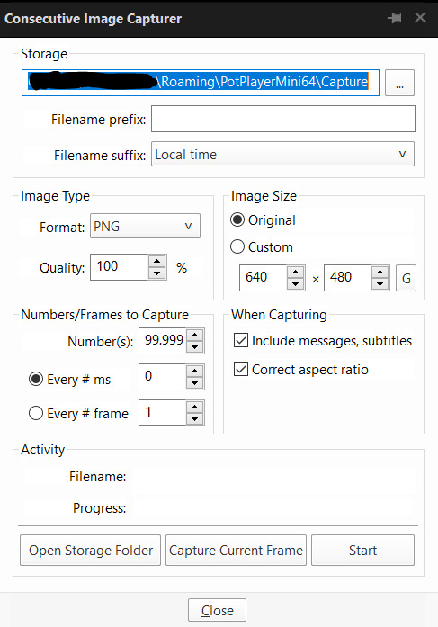
Play your movie/episode and press Ctrl + G. The Consecutive Image Capturer window will pop up. Click Start to capture consecutive frames, Stop when you got what you needed.
Where it says "Image Type -> Format" I recommend picking PNG, for higher quality screencaps.
To access the folder where the screencaps are stored, type %appdata% in windows search, open the PotPlayerMini64 folder (or 32, depending on your system) and then the Capture folder. That's where you'll find your screencaps.
Admittedly MVP is a lot faster but I prefer Potplayer because it generates (at least in my case) higher quality screencaps. MVP kind of alters the hue and it made it harder for me to color my gifs. Still, if you're interested in how to use it, I recommend this tutorial.
As for KMPlayer, every tutorial out there is outdated and I couldn't figure out the new version of the software.
2. GIF WIDTH/HEIGHT, SIZE LIMIT, EZGIF OPTMIZER
At this point you should already know how big your gifs are going to be. Remember the ideal gif width(s) on tumblr are 540 px / 268 px / 177 px. These specific numbers take into account the 4 px space between the gifs. No restrictions on height. Here are some examples:



You can play around with the height (177x400, 177x540, 268x200, 268x268, 268x350, 268x400, 540x440, 540x500, 540x540 etc) but if you go over the 10 MB limit you'll either have to make your gifs smaller/delete some frames.
OR you can go on ezgif and optimize your gif, which is usually what I do. The quality might suffer a little, but I'm not really (that) obsessed with how crispy my gifs look, or I'd download photoshop.

Depending on the gif size, you can decrease the compression level. I've never had to go over 35. It's better to start at 5 (minimum) and then go from there until you reach your desired ( <10mb) gif size. Now that I think about it I should have included this passage at the end of the tutorial, I guess I'll just mention it again.
3. LOAD YOUR FRAMES
File -> Open... -> Pick one of your screencaps. The first one, the last one, a random one. Doesn't matter. That's your Background.
File -> Open & Place -> Select all the frames (including the one you already loaded in the previous passage) you need for your gif and load them.
(I recommend creating a specific folder for the screencaps of each gif you're going to make.)
WARNING: When you Place your screencaps make sure the Crop tool is NOT selected, especially if you've already used it and the width/height values have been entered. It will mess things up - I don't know why, could be a bug.
You can either select them all with Ctrl+A or with the method I explained in the ask: "when you want to select more than one frame or all frames at once select the first one, then scroll to the bottom and, while pressing Shift, select the last one. this way ALL your frames will be selected".
WARNING: Depending on how fast your computer is / on your RAM, this process may take a while. My old computer was old and slow af, while my new one can load even a 100 frames relatively fast, all things considered. Even so, I recommend ALWAYS saving your work before loading new frames for a new gif, because photopea might crash unexpectedly. Just save your work as often as you can, even while coloring or before exporting. Trust me, I speak from experience.
Now you can go ahead and delete the Background at the bottom, you won't need it anymore.
4. CROPPING AND RESIZING
Right now your screencaps are still smart objects. Before rasterizing and converting to frames, you need to crop your gif.
Technically you can rasterize/convert to frames and then crop, BUT if you do it in that order photopea will automatically delete the cropped pixels, even if you don't select the "Delete Cropped Pixels" Option. Might be another bug, unclear. Basically, if you crop your gif and then realize you cropped a little too much to the left or the right, you can go ahead, select the Move Tool (shortcut: V) and, after selecting ALL YOUR FRAMES, move them around on your canvas until you are satisfied. You won't be able to do this if you rasterize first and then crop, the excess pixels will be deleted. I don't know why, I found out by accident lol.
CROPPING
(Cropped pixels: the gray/opaque area outside of the selected area. That area disappears once you press enter and crop, but the pixels are retained, so you can move the frames around and reposition them as you like. In this case I could move the frames to the left and include Silver's figure [curly guy in the foreground] in the crop)
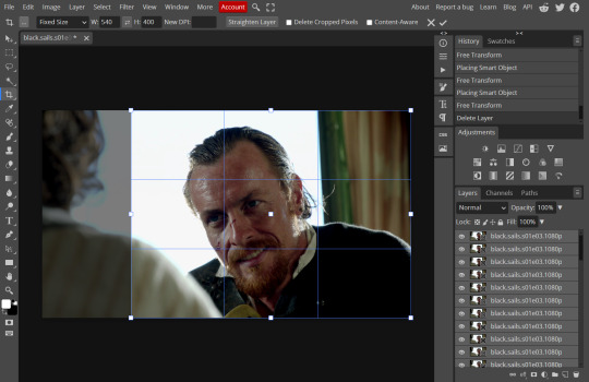
After deleting the Background, you will need to select all your frames (using the Shift key), use the C shortcut on your keyboard to choose the Crop tool. Or you can click on it, whatever's more convenient. Once you do that, a dropdown menu is going to appear. You need to select the "FIXED SIZE" option, as shown in the following screencap.
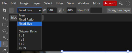
Once you do that, you can type in your desired width and height. Do not immediately press enter.

Your work area should now look like this. Now you can click on one of the white squares and enlarge the selected area until the edges are lined up. You can then move it around until it covers the area you wish to gif.
WARNING: to move the big rectangle around, you're gonna have to click on a random point of the work area, PREFERABLY not to close to the rectangle itself, or you might accidentally rotate it.
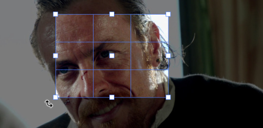
See? When your cursor is close to the selected area it turns into this rotating tool. Move it away until it reverts to your usual cursor, then you can start moving the rectangle. Press Enter when you're satisfied with the area you selected.
RESIZE
This isn't always necessary (pretty much never in my case) - and it's a passage I often forget myself - but it's mentioned in most of the tutorials I came across over the years, so I'd be remiss if I didn't include it in mine. After cropping, you'll want to resize your image.
IMAGE -> Image Size...

This window will pop up. Now, should the values in the Width and Height space be anything other than 540 and 400 (or the values you entered yourself, whatever they might be) you need to correct that. They've always been correct in my case, but again. Had to mention it.
5. RASTERIZE & MAKE FRAMES
Now that your screencaps are cropped, you can go ahead and convert them.
LAYER -> Rasterize (if you skip this passage you won't be able to Sharpen (or use any filter) on your frames at once. You'll have to Sharpen your frames one by one.
Photopea doesn't feature a timeline and it's not a video editor, which makes this passage crucial. When you select all your smart objects and try to apply a filter, the filter will only by applied to ONE frame. Once you rasterize your smart objects and make them into frames, you can select them all and sharpen them at once. Unfortunately this also means that you won't be able to - I don't know how to explain this properly so bear with me - use all smart filters/use them in the same way a photoshop user can. For example, you can sharpen / remove noise / add noise / unsharp mask... but you can't act on those filters in the same way a photoshop user can. When you work on smart objects you can change the blend mode - which is critical if you decide to use a filter like High Pass. If you simply apply a high pass filter on photopea you won't be able to change the blend mode and your gif will look like this (following screencaps). Or rather, you will be able to change the blend mode by clicking on the little wheel next to "High pass" (circled in green in the 2nd screencap), but you'll have to apply the filter to each frame manually, one by one.

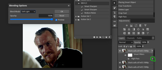
Then you can rasterize/make into frames, but it's extremely time consuming. I did it once or twice when I first started making gifs and it got old pretty soon haha.
Layer -> Animation -> Make frames. This passage will add "_a_" at the beginning of all your frames and it's what allows you to make a (moving) gif. As I said in the ask, if you skip this passage your gif will not move.
6. SHARPENING
Some people prefer to color first and sharpen later, but I found that sharpening filters (more or less) dramatically alter the aspect of your gif and already brighten it a bit (depending on your settings) and you may end up with an excessively bright gif.
Now, sharpening settings are not necessarily set in stone. The most popular ones are 500/0.4 + 10/10, which I use sometimes. But you may also need to take into account the quality of the files you're working with + the specific tv show you're giffing. I've been using different settings for pretty much every tv show I gif, especially in the last couple months. Some examples:

followed by
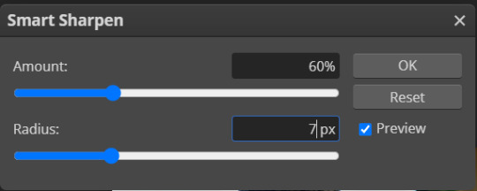
OR
AMOUNT: 500% RADIUS 0.3px followed by AMOUNT: 20% (or 10%) RADIUS 10px
You'll just need to experiment and see what works best for your gifs.
Some gifmakers use the UNSHARP MASK filter as well (I think it's pretty popular among photopea users?) but it makes my gifs look extra grainy, makes the borders look super bright and it clashes with my coloring method(s), so I use it rarely and with very moderate settings. Something like this:

Again, depends on the gif and on what you like. I've seen it used with great results by other gifmakers!
REDUCE NOISE
Sometimes - and this is especially the case for dark scenes - your gif may look excessively grainy, depending on how bright you want to make it. Reducing noise can help. Keep it mind, it can also make it worse and mess up the quality. BUT it also reduces the size of your gif. Obviously, the higher the settings, the more quality will suffer.
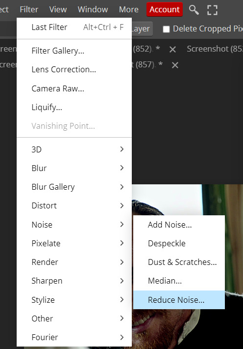

These are my standard settings (either 2/70% or 2/80%). It's almost imperceptible, but it helps with some of the trickier scenes.
ADDING NOISE
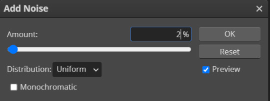
Adding noise (1% or 2% max) can sometimes help with quality (or make it worse, just like reduce noise) but it will make your gif so so so much bigger, and occasionally damage the frames, which means you won't be able to load your gif on tumblr, so I rarely use it.
You'll also want to create ACTIONS which will allow you to sharpen your gifs much faster.
HOW TO CREATE AN ACTION ON PHOTOPEA
The Action Button (shaped like a Play button as you can see in the following screencaps) may not be there if you're using photopea for the first time. If that's the case click on the magnifiying glass next to "Account" (in red) and type "actions". Press Enter and the button should immediately show up.
Once you do that, click on the Folder (circled in yellow)

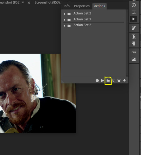
and rename it however you like.

now click on New Action (circled in red). now you can press the Recording button (circled in green)
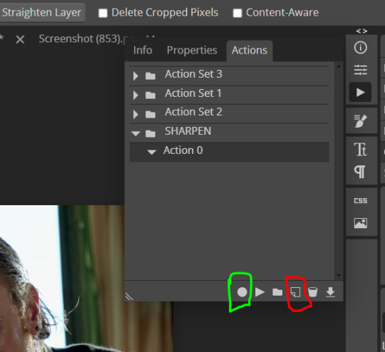
Now
FILTERS -> Smart Sharpen
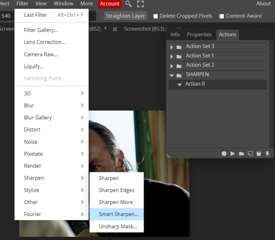
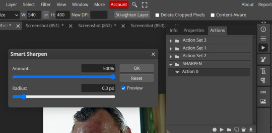
and you can enter your values. Then you repeat this passage (WITHOUT pressing rec, WITHOUT pressing new action or anything else, you just open the smart shapen window again) and, if you want, you can sharpen your gif some more (10%, 10px, or anything you want.)
Maybe, before creating an action, experiment with the settings first and see what works best.
When you're satisfied, you can PRESS STOP (it's the rec button, which is now a square) and you can DOWNLOAD your action (downwards facing arrow, the last button next to the bin. Sorry, forgot to circle it) .

You need to download your action and then upload it on your photopea. When you do, a window will pop up and photopea will ask you whether you wish to load the action every time you open the program. You choose "Okay" and the action will be loaded in the storage.
When you want to sharpen your gif, you select all your frames, then you click on the Play button, and select the Action, NOT the folder, or it won't work.

Actions can also be created to more rapidly crop and convert your frames, but it doesn't always work on photopea (for me at least). The process is exactly the same, except once you start recording you 1) crop your gif as explained in step 4, 2) convert into frames. Then you stop the recording and download the action and upload it. This won't work for the Rasterize step by the way. Just the Animation -> Make Frame step.
7. COLORING
Now you can color your gif. I won't include a coloring tutorial simply because I use a different method for every tv show I gif for. You normally want to begin with a brightness or a curve layer, but sometimes I start with a Channel Mixer layer to immediately get rid of yellow/green filters (there's a tutorial for this particular tool which you will find in the list I mention in the link below)
[Plus I'm not really an authority on this matter as my method is generally... fuck around and find out. Two years of coloring and I still have no idea what I'm doing. 70% of the time.]
Simple Gif Coloring for Beginners -> very detailed + it includes a pretty handy list of tutorials at the bottom.
8. EXPORTING
Now you can export your gif. Some gifmakers export their (sharpened) gifs BEFORE coloring and then load the gifs on photopea to color them. I'm not sure it makes any difference.
FILE -> EXPORT AS -> GIF
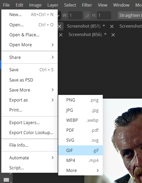
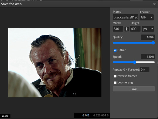
(not colored, just sharpened)
As you can see, unlike photoshop the exporting settings are pretty thread bare. The only option available is dither - it sometimes help with color banding - which, and I'm quoting from google for maximum clarity:
"refers to the method of simulating colors not available in the color display system of your computer. A higher dithering percentage creates the appearance of more colors and more detail in an image, but can also increase the file size."
SPEED
When you export your gif, it will play at a very decreased speed (100%). I usually set it at 180/190%, but as for every other tool, you might want to play around a little bit.
GIF SIZE/EZGIF OPTIMIZER (See Step 2)
And that's it.
P.S.: worth repeating
Save your work as often as you can, even while coloring or before exporting.
#photopea#my inbox is open if you have any questions <3#image heavy under the cut#photopeablr#tutorials#gif tutorial#allresources#photopea tutorial#completeresources#gifmaking
417 notes
·
View notes
Note
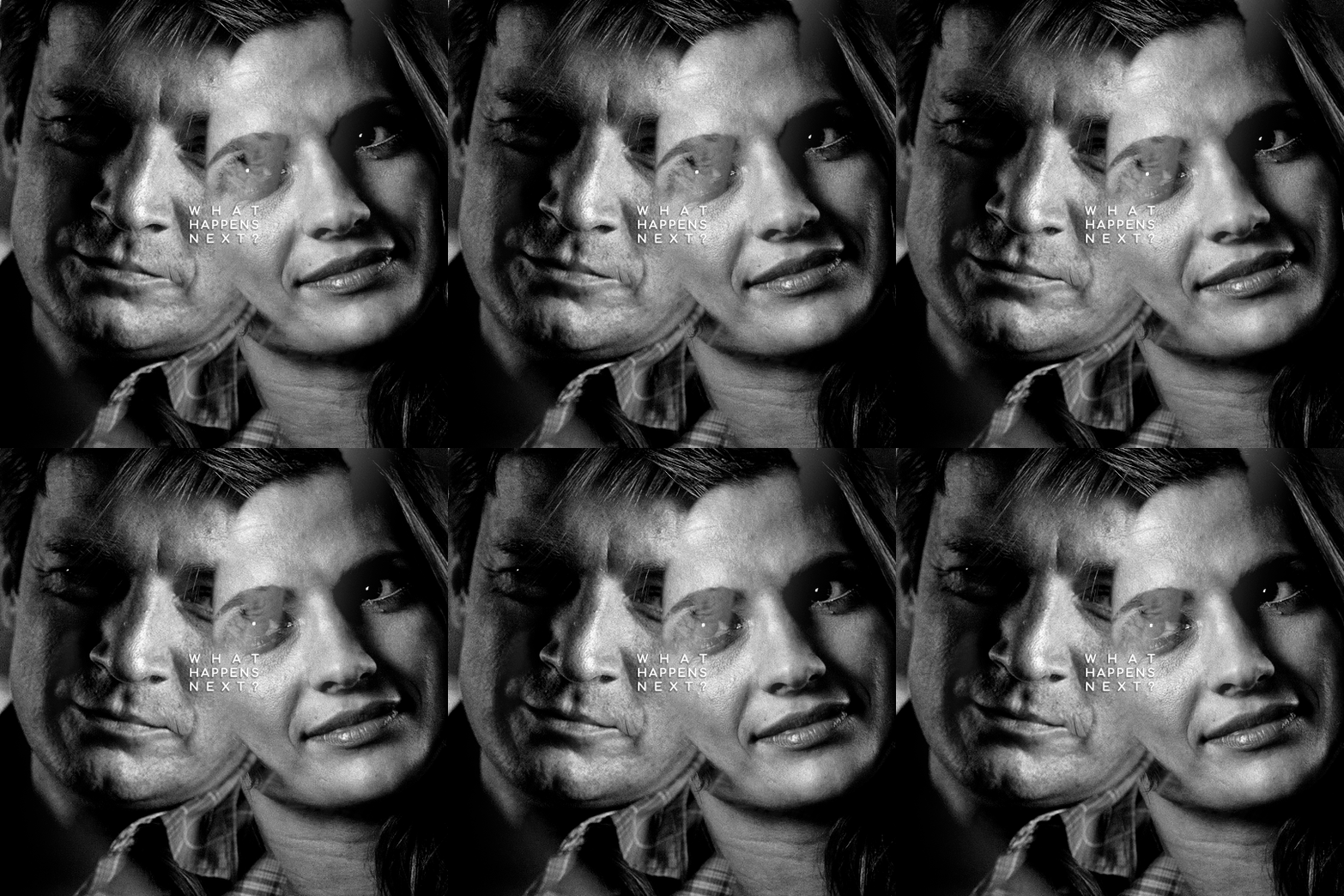
Hello! I just saw your last Caskett gifset for usergif and i loved it, can i aks how did you make the old film look/filter?
Hi, Anon! I used an overlay which I got from here :) I don't know if you're familiar with overlays but here's what I do:
SMALL OVERLAY TUTORIAL
First I make my gif as I usually do and in that gifset this was the base I was working with (a gif with 37 frames):
So, next I take screencaps of the overlay I'm using and I make sure it's got the same number of frames, in this case 37. Now I put my overlay screencaps above my gif and this is what my photoshop looks like:
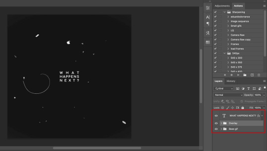
Notice how I placed my overlay between the text and the base gif. The text thing is optional but I liked the text to stand out.
Now, as you can see this overlay's background isn't completely black but gray, and I didn't want that. I added a Selective Color layer and increased the "Black" in the "Black" tab to +100. This is how it looks now:
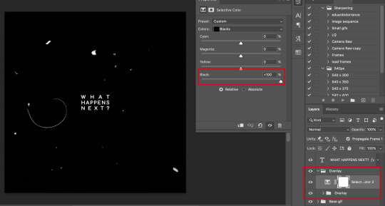
The difference is noticeable right? Well now onto the last step. I went to my overlay group layer and set the Blending mode to Lighter Color and the Opacity to 50%.
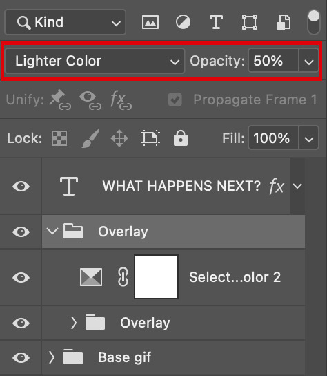
This step depends on your personal preference so feel free to play around with the Blending Modes and the Opacity and see which ones suit your gif best. With those settings I got my final gif:
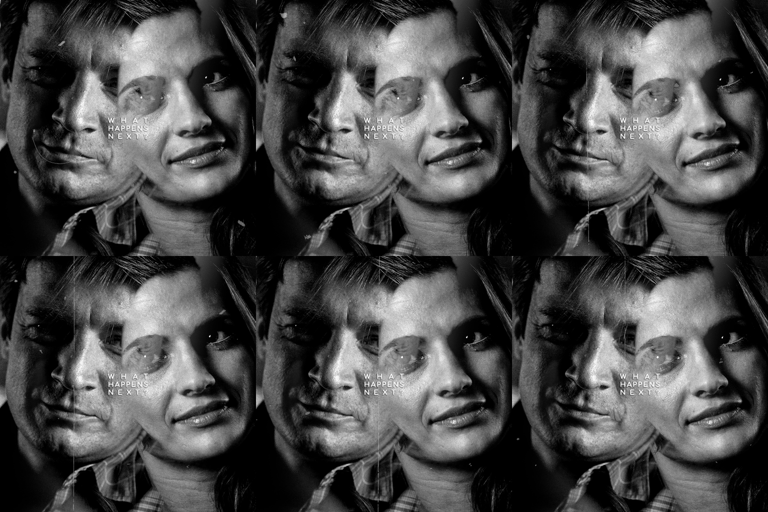
And that's how I work with overlays! There are so many nice overlays in youtube you just have to use keywords like camera, vhs, old video, lightleaks, etc. Overlays can completely change your gifs and turn a simple gif into a beautiful and complex one!
#ask#Anon#ps tag#tutorial#userabs#alielook#uservivaldi#userelio#userbuckleys#userrobin#tuseruta#userahri#userbeani#userchibi#carolook#usermai#usertenacious#userwintersoldado#usercats#usermels#tuserheidi#tusermels#chaoticresources
67 notes
·
View notes
Note
Hello!
I absolutely love your edits and gifs. I was thinking about making edits/gifs too but I'm not sure where to start : ( Would you be able to share some resources? Or any tips you have for someone that's just starting out? I'm not even sure where to download the videos from :/
Thank you in advance!
hello!! omg thank you so much for liking my gifs 🥹🫶🫶
Of course! In this post I'll share some tips that I think are helpful when making gifs, specially from asian dramas (mostly chinese and korean)!
Where to download k/cdrama videos?
dramaday (korean media only)
mkvdrama (korean, chinese, japanese, thai etc)
avistaz.to (they have the most complete catalog of asian dramas but you can only have access to the files if you register and they open for registration only every now and then so if you want to join, you have to have a invite or wait till they open)
2. Where to make gifs?
Mostly, the gifs on this website are done using Adobe Photoshop but I think for the past few years there is a lot of users who use Photopea which is an online (and free) version of photoshop.
3. How to make gifs?
Well, I think there's a some ways of making gifs but the 2 most common are through screencapping and using vapoursynth. Before I knew how to use and install vapoursynth I used the screencap method a LOT so I totally recommend you to begin giffing using the screencap method before you try other ways of giffing. Also, with this method, you can use on both Photoshop and Photopea.
In this gif tutorial made by @kylos you can learn how to install the program mpv to take screencaps and how to make gifs using the captures.
There's this complete guide on how to gif made by @cillianmurphy that is very helpful.
Also, this comprehensive giffing tutorial by @redbelles is great!
But if you want to know how to gif using vapoursynth (if you are an MAC user), i totally recommend this how to install post and COMPREHENSIVE GIFFING TUTORIAL (vapoursynth + ps cc 2018) post, both from my beloved @dingyuxi 🫶
If you don't have Photoshop and want to make gifs using Photopea, I think this and this tutorials will be great for you.
4. How to color?
Coloring gifs is something very personal to each gifmaker but if you want to know how to start doing it, i recommend you these tutorials:
becca’s mega coloring tutorial by @nataliescatorccio
coloring tutorial by @magnusedom
simple gif colouring for beginners by @kinnbig (specially focused on east & south east asian skin tones)
Finally, I recommend you looking at the resource directory from @usergif because they have a collection of tutorials and resources that are very handy when making gifs!
If you have any particular question from how I gif, I will gladly answer!
200 notes
·
View notes
Text
commissions~
among other things, i'm looking to save money to buy a pair of nice crutches. i'm an intermittent mobility aids user, and i used to use a cane, but because of problems with my hands i find the more structured support of a crutch useful.
i will paint any wrestler(s) from any promotions, within reason (i.e. i am probably not going to paint more controversial wrestlers).
i like to paint from references - photos or screencaps. it's a great way of immortalising something your chosen person did, or a wrestling move you really liked.
we can discuss colours, themes, etc, particularly things like underpaint colour. i like to use red, but you can ask for it to more truely reflect the picture or to use a different color entirely ~
studies - £25


bigger paintings - £35
these just have more detail and take more time. they can include more options for personalising the backgrounds or, like with the painting i have of rhea ripley, doing something a bit different.


dm me to inquire. tips welcome. if you like my art but can't buy a painting, a reblog would be amazing, or even potentially you can leave me a tip on ko-fi (same username)
#grave commissions#gravepost#wwe#aew#darby allin#wheeler yuta#bray wyatt#malakai black#rhea ripley#nick jackson#matt jackson#danhausen#maxwell jacob friedman
82 notes
·
View notes
Text
Okay, Matrix plagiarism case postscript
One thing I didn't answer is how she got the Wachowski's timeline wrong. I still don't know, but it appears she essentially shifted their lives back a decade
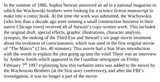
She says less than a decade ago they were running a construction business, but actually, working at a construction company is what they were doing in 1986. In 1976 Lana and Lilly were eleven and nine years old respectively. I can't explain why she messed this up, beyond having to age them up a decade for the story to work
But this screencap also brings up another thing she mentions repeatedly that I didn't mention - the smoking gun in her claim is that...the Matrix ripped off her words verbatim for its opening crawl. The opening crawl...to The Matrix.
Huh?
So her story is - and unsurprisingly the timeline here is jumbled, for instance, citing production interviews from 1997 when the film wouldn't enter production until 1998 - the original version of The Matrix contained a Star Wars-style opening crawl, and this was the most directly plagiarized part of the film.

She claims this opening crawl was, in fact, in the theatrical release of The Matrix and only removed when it came to home media, because she. Because she called the FBI on the Wachowskis for stealing the idea of opening crawls from her
The theatrical cut does differ from later versions slightly - most infamously the Wachowskis made the green color filter much more green in the second DVD release, to make it consistent with the style of the sequels - but if there was a opening crawl mandated by the studio, nobody but her has mentioned it, and I find it hard to believe critics wouldn't mention it.
Because this is Dark City. She's clearly confused The Matrix with stories about the studio's meddling with the 1998 film Dark City.
Dark City was the dystopian sci-fi film that had a opening narration explaining the whole plot foisted on it by the studio, and critics mentioned it. Basically every review mentioned it (some even suggest covering your ears or muting the film the first time you see it, at least until the Director's Cut removed it). Meanwhile, reviews of The Matrix praised its opening from the very beginning: how it drops you right into things and lets you find out about its world as Neo does. It's just not possible that the theatrical release has a opening crawl no one mentioned when I can pull up full comparisons of theatrical vs first DVD vs second DVD vs Bluray. Whatever story she read either was about Dark City, or was a Wachowski saying in passing "yeah the studio wanted us to add one but we didn't".
Another thing I didn't touch on is just how much it hypes her up as a untouchable genius of cinema. For instance, she claims to have come up with the effects of The Matrix in 1983 too
(one funny part is how little she brings up The Terminator at all? She just threw it in as a bonus I guess)

I looked up how they did the bullet time effect in particular and...it would have been impossible in 1983. It's not just high speed photography; it's entire banks of cameras, placed in the right place by computer previsualization, their sequence programmed, and with all the elements composited together by CGI. Even stylistically - the true creator of the effects cited Akira as a influence, and Akira the movie didn't exist in 1983. Neither did the type of Hong Kong action film that heavily influenced it. I guess it would be possible to write down "someone goes really fast and we depict it like they slowed down time", concepts of a plan etc
But like.

She's destined to be one of the most profound master writers of the 21st century. This is a book proving she's never written anything. It has a pitch for The Third Eye, it has a second film treatment tacked on at the end, and it has copyright registrations for her sequels to Terminator and The Matrix. M. Night Shyamalan's character in Lady in the Water was destined to be a great writer too, but he actually wrote a book. He didn't put out a book with a decades-old synposis that was never finished & reams of legal documents and a bio saying, I'm one of the greatest authors of all time. Because who needs writing when you have destiny, God, and the ancient superrace living in the Pyramids on your side?
This is my for real last post on this since I ended up just depressed about it in the end. I think the worst part is, she knows she lost. But she still goes to the press telling a story she knows isn't true, and people believe her. Some of it is transphobic - "stop saying it's a trans allegory when they stole it"; some of it runs with the Christian oppression narrative (full disclosure, I was inspired to look for her book again bc while looking up another crank, I saw an interview with her in the sidebar of a religious website); but a lot of it is just people who innocently want it to be true.
One of the few pieces debunking her story is on a website called Black Excellence - it doesn't even have a byline - said this:
"There are many people, especially Black people, who wanted the story to be true. It symbolized a Black person, especially a Black woman, finally winning against the system. When Sophia Stewart spoke about how mainstream media would not give her the time of day because almost all of them were owned by Warner Brothers, some Black media embraced her. Blogs spread her story, especially the initial story on Globe that contained errors about the case.
"But the story is not true. Sophia Stewart did not become the richest Black person in the country. But that did not deter her from going on several shows and publications to tell her story."
She took advantage of people's urge to root for the underdog against a corporation - and seized on a lack of mainstream coverage to claim her story was being suppressed. But it just isn't true. Also yeah she ridiculously claims that Warner Bros owns every news website and newspaper and that's kind of funny I guess. Well, that's it. I'm never doing this again
72 notes
·
View notes
Text
I know this is just a silly bad quality random screencap of a screencap that I found on facebook lol, BUT it's a succinct enough image to easily describe the concept in a quick/accessible way hopefully :
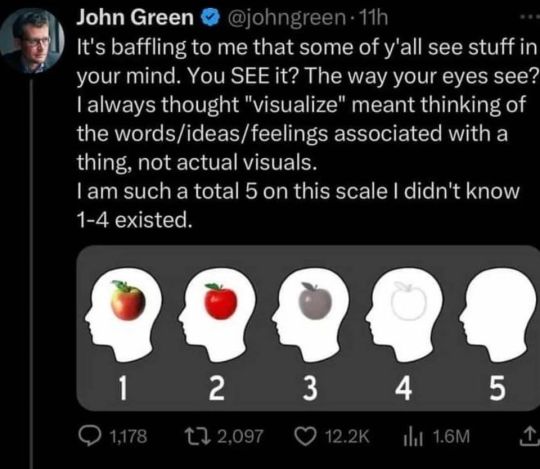
-
(and of course, feel free to elaborate in tags, etc.! (especially elaborating about other senses as well.. can you "hear" in your mind just as well as you can "see"? taste? etc.) It's an interesting topic to me, as someone who's like a 4.5 at MOST lol. I'm curious what option will be the most common :0c )
#tumblr polls#hrmm... a little poll perhaps.. about a subject I find interesting.. since this image came across my facebook today#still really not feeling that well. no longer shaking violently and such but I still feel weird and weak much more than usual#They did say my markers for like infection or inflammation were elevated but that they werent sure of the cause so hopefully#it's nothing too serious. they did also say a lot of different things can cause that thing to be higher than normal but didn't go into spec#fics of what. maybe some of them are relatively benign or something. I still havent felt much back to normal since#I got really sick that one time though. I feel fine on and off but then little bouts of feeling weird and sick happen. hrmmm#ANYWAY.. looking for small ways to be productive. such as little doodles on evil ipad or editing game videos#or posting polls or cat pictures or some other like not very labor intensive things#I WISH I COULD FOCUS on writing HHRGGhh... I need to finish my game.. it would be so freeing.. a project that's been looming#over my head for like 5 years even though througouht that 5yrs I've probably spent a total of 3 months working on it lo.. ANYWAY#I still partially really cannot beleive that people CAN see stuff in their heads. There's always part of me that's thinking like. well mayb#e everyone DOES see the same exact thing but we just describe/conceptualize it so differently that we think we're talking about#different things when we're really not. But I have been assured by people I've talked to about it that they can GENUINELY really see#stuff in their heads like as vivid as an actual picture in real life or something. And the other senses are neat too. Like for exmaple I#can hear in my head much better than I can see imagery. I still CANNOT hear vividly like as if I were listening to actual music out loud..#but I think it's developed more than my sight. AND interesting how this varies the creative process. a friend I was talking to on the phone#said they write by literally just watching stuff play before them like a movie. where my process is COMPLETELY different. AND that affects#the content/what details we focus on as well as our individual styles of writing have differences that can be traced back to that.. hrmm
547 notes
·
View notes
Text
🍸 Harry Crosby headcanons
18+ -helluva lot of nsfw under the cut but interspersed with a lotta fluff and domesticity…to me that’s the appeal of this man, cannot be separated one from the other: the unassuming sweater wearing vet at the block party is also a man of hidden depths.
Long promised and woefully incomplete, the word count was getting out of hand so I’m tossing it out, there’s more where this came from. Not edited so, apologies
Entirely co-written by myself and my comrogue @crazymadpassionatelove , enhanced and bedazzled by chats with @ab4eva including special additions from other guests who commented under my announcement post, credit is given at each specific point for their contributions
|screencap cred grabbed from: @hawkinsfuller
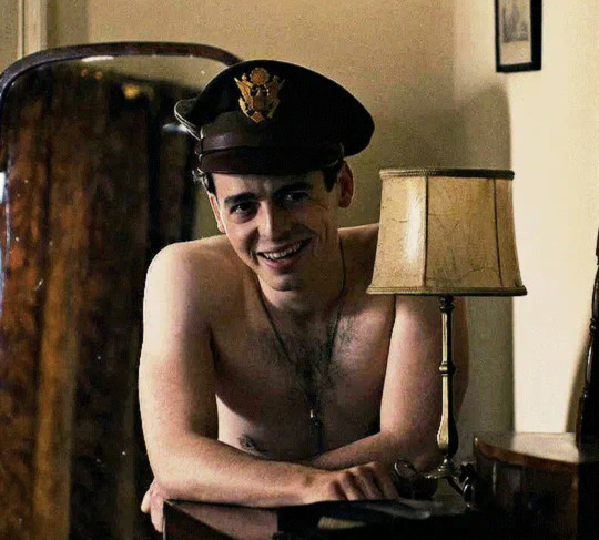
First off let me say it’s been ages since I read A Wing and A Prayer. I remember loving it, loving him and I cannot stress how much I respect and admire the real Harry Crosby and his Jean, the Missus of our dreams.
This is purely for fun, a heavy mix of both Boyle’s portrayal and a tad of Crosby’s real life vibes as taken from his accounts by me. Sometimes you gotta take historical figures’ virtues in one area -say navigation and math- and translate it to the more suggestive aspects of life -say, how to find a clitori- *gunshot*
Because this man’s biography is the most oral-leaning, drink-your-respect-women-juice book ever. Ok, almost ever. For a wwii book at least. Uhem so -I am prejudiced, sue me.
See, sometimes it’s the quiet, stressed ones with a self consuming desire to please who have the cozy sweaters and the attentive appreciation for your interests and the stubby fat schlongs and the propensity to keep you in suburban comfort all your days
The compulsive drive to call you “button” and be on time for church and thank you for your scrambled eggs each morning with eager kitchen countertop oral before waking you children up with annoyingly soft catchphrases they’ll recite fondly at his funeral: “rise and shine” etc
Also back to the perfectly respectable schlong for just a moment -This is a Thing! Justice for the perfectly adequate plug stoppers, not everyone needs a rolling pin, who can resist giving head when the head is the same gorgeous color as his lips?!
Mr Crosby is skipping off to lecture college kids about literature post-war with a pep in his step that you put there without fail, you can’t help it, it’s as essential as the matching “his and hers” coffee mugs you bought during your honeymoon
Cookies slightly burned cuz you’re busy as bunnies in the bathroom while the kids ride bikes in the cul-de-sac is a Crosby staple
This is a man who as husband keeps you well supplied with mixers and microwaves and cute little nighties and also loves your brain -SCORE.
Loves to gift you with bath oil and fun stuff to smell good. He's into lavender. It benefits him in the end, loves to sit on the edge of the tub and just talk with you for ages
Croz’s go-to distresser is to have Jean sit on his face until his vision spots
She knows as soon as he walks in the door. Fixes him a Shirley Temple, takes him by the hand to the bedroom and …..boom.
De—stressed
As for the ptsd nightmares? He just barely starts to thrash in his sleep and Jean is rolling that man over and taking matters into her own hands
You’re Jean now, you do realize that don’t you? It was never ever going to be anyone but Jean
This man leaves love letters on your pillow, in your apron pocket, in the dash of your car anywhere at all that you’re likely to be. All of this even though he’s gonna be home by six that evening.
Also, hear me out: lots of evenings he just lays down next to you for ages, facing each other on your sides, absentmindedly mapping your body with his calloused palms and fingering you for ages while talking about Persuasion.
Actually gives a shit about your opinions too, and not in the way of wanting to argue them. When you make a good point his eyes get even droopier and he grabs your neck and…
“You're one smart cookie Mrs Crosby”
“My clever, wise, beloved…”
Honestly though, deep connections and the ability to go vulnerable, and if those moments are often concluded with little laughs to shake off the moment -it doesn’t diminish it
Can actually talk about dying to you, not in a morbidly preoccupied way, but he can face it and admit it and be vulnerable enough to acknowledge the likelihood
Then get on with what needs doing
He appreciates how well you grow to know him, and he in turn makes a lifelong study of you
Also, this man is so highly attuned to your well being.
Yes you have to put up with his stress but for you? He will man-up repeatedly and without thought. He doesn’t even think twice about just up and leaving whatever situation is tiring you. did you see him hop up to get the fuck outta that bar fight? Yeah so, you’re bored? Tired? Stressed? It’s not even machismo it’s just a homebody not giving a fuck with the subtext of “my wife and I would like to go home and read and cockwarm”
Often gives the shiftiest excuses to army buddies and coworkers just to go home and hang with you, swears he has to repair that squirrel feeder -or that an alligator is in his swimming pool, “sorry guys maybe drinks next week”
Don’t tell the guys but…HE PAINTS YOUR TOENAILS
Maybe some of your high school friends snickered about Harry Crosby way back when. Making googly eyes at you and barely getting out the most stammered greetings? Bookish and a little clumsy at times?
Ha, you won in the end
He comes home in one piece, that beautiful schlong still intact
you prayed for that ok?
“Lord keep my husband safe -- and his girthy manhood in tact as well�� …for the babies you’re hoping for of course...just that… kneeling in silk pajamas each night, adding this addendum with a blush but was always faithful to keep it in your prayers
Sometimes you have that thought in church as well...so you has to take a couple deep breaths and calm yourself...it's because you want children...not because you’re already so sprung off this man's dick after only a couple weeks of married life.
weeks that feels like a lifetime ago now, by the way
Prim and lovely Jean Crosby staring off into stained glass worlds thinking of having her tight little hole tugged open and her guts rearranged, it’s even worse than her thoughts prior to the wedding, because she’s had the experience, then suddenly it was ripped away
And she’s empty and scared to death for him
She gets asked to sing at the funeral of a lieutenant who never even got off the ground during a training flight,
work and church and such are hopeless distractions
Wanders through the department store wondering if every other wife misses this way, does everyone feel the same primal ache?
Dear Jean Crosby terribly worried she’s a freak yet entirely unrepentant for it
But ya know what’s probably funny? Across the ocean Harry Crosby is sometimes so direly missing his wife in the carnal way that he just about spaces out too, and god knows there’s zero privacy anywhere and the showers are the showers but like???? it’s just a no-go most times and everyone gets very confused when he’s in this mood?? Not at all suspecting baser distractions are what’s at play. Somehow someone figured it out, maybe he actually snapped a little about having five seconds to himself while reading a letter and they’re like
OH
And somehow there seems to suddenly be five minutes or so when NO ONE but Crosby is in the showers?!
It only takes him two minutes to get there but he needs to stand there catching his breath and clutching at his heart while he thinks of Jean sprawled beneath him
This is probably Douglass’ doing? Because he’s a good dude, he doesn’t underestimate Croz AND he’s a dirty little bastard himself
“Fellas, the man got himself a wife while half of you guys are virgins? Of course he has urges?”
In a quiet, rare moment, Gale bends his ear -Harry is so modest and low key...unlike some folks *looking at you Bucky*- “So, uh, where'd ya say you and the missus went off to before ya came here?“
Gale’s gotta casually open the door for this conversation “Lots of good sights to see? I, um, haven't done much traveling myself”
It takes Croz a few conversations until he realizes just what Gale means, until then there’s a lot bewildered eyebrows at the inquiry and bashful appreciation for the interest: “Major Cleven I-I already told you, sir, we had a little cabin in the Alleghenies for a week?“
He's been telling Jean about Major Gale Cleven, about how she'd really like him. Gale is a good fella. He tells her about all their "travel talk"
Until one day Jean writes back: “Oh honey, that Cleven of yours is a virgin”
Whether Harry divulges to Gale anything he learned about ladies in that little cabin in the mountains writhing before a fire on a bearskin rug, that first time Harry actually didn’t stop and ask if Jean was dying every time she made a noise but instead, kept going until her cried properly built and she screamed…
well, it was probably an abbreviated account that mostly consisted of “wives are just wonderful people, Major Cleven” with a far off look in his eyes
Gale leaves him to it after all- Harry was married for like 3 seconds before he left, It's literally either playback of the last horrific mission or thinking of the curve of her spine
He gets the dreamiest look on his face, eyes all shiny, mouth a little slack
Somehow these two can be so passionate and yet it’s so wholesome and good and angelic?!!! It’s the allure of them
Because it’s all in these gentle and safe and good boundaries? Like it isn’t complicated and yet it’s not simple and it’s neither settling nor is it turbulent. something to be said for “doing it right”
They genuinely thank God for each other, they’re so sure it was always intended to be just them
I have 1k of headcanons just for the homecoming ok? Y’all will have to request those separate
But once home:
The eye contact they make at social events?? It’s a whole language, the most loving and adorable thing ever
He may not be a real gem of a singer but he’s an excellent hummer. so much gentle humming around the house while he’s fixing the stove light or rocking a baby to sleep or-
You know what I mean don’t you? Some men can just humm and you’re instantly wet? No I don’t mean humming a Billie Holliday tune
I mean humming when you make a new reaction to his incessant fingering while he’s reading, makes him look away from the page and arch a brow, highly inquisitive puppy dog look on his face, reading glasses pulled down.
*a new spot? After all this time? Must investigate further*
This man, when in his element, is a goddamn tease, he’s impossible, he’s goofy, he makes sex the joyous sacrament its supposed to be every damn time and he ain’t shy to remain stark naked for ages
Praise kink for miles in that, once you’ve praised him, he will keep doing whatever earned it for the next two hours. Brace yourself
He can recite your favorite literature passages (he knows them and took pains to memorize them by your tenth anniversary) when he’s gently plowing you from the back with his hand on your neck and your ear lob in between his teeth
He’s a biter my friends -gotta keep quiet somehow, can’t scar the passel of children y’all made, after all
So many excuses given to kids about “mama and I need to talk about the mortgage” -very rarely is mortgage even thought of once the door is closed and locked
But that brings us back to the early days, it’s one thing to know someone so well after all those years but the early days?
Two Virgins named Jean and Harry went straight from the chapel to fucking like Bunnies before he went to war
Harry had done his research tho. All that reading…
Harry Crosby totally ate his wife out on their wedding night.
even though he’d never really seen a full vagina before
he’s a bit methodical, yeah? At first? with a hint of overly flustered and terribly delighted
So I’m just picturing him like hunkering down there, tentative but firm hands on your thighs: “to get my bearings, honey pie” as he takes in the lay of the land
because there’s a lot happening down there on a lady, ok? -there’s petals and more petals and slippery slopes and little buttons and a tiny hole that has to be for pee, no way he’s supposed to go in that one?! but, but she doesn’t have another? Well the backdoo- no can’t even think of that. Oh god ok, ok, vaginal opening, -I guess that’s a vaginal opening?! and due north, a little button that makes her squeak when I touch it. ok ok, might as well start there…
I can see him with a metaphorical pencil behind his ear, ready to jot down notes
Jeanie finally sighs and grips him by the ears and hauls him up for a kiss and just grinds against him and insists it’s lovely
“just kiss me, silly.” she says to him after awhile.
“Mmm, I do like kissing you, Jean” he grins back
he’s naturally kissing his way to her boobs and staying there a lovely long time but she starts pushing at his dark head, *hint hint* lower down her belly and lower, and lower and he’s so caught up he doesn’t even realize it until there’s a sweet little patch of curls under his chin and he looks up with the oddest expression of curiosity and doubt on his face only to be met with Jean’s expectant eyebrow
She wouldn’t want me to?—-*ah, she just face planted me in pussy, ok then*
Lapping at it with the biggest grin, there may or may not have been some noise complaints
the whole apartment complex just knows he’s a good husband, never would peg him as a stud if you met him in the hallway but, Jean sure takes forever to say goodbye to him in the mornings so he must do something right
All the neighbors just can't help but be happy for those two kids
They cook them food and leave the casserole dishes on the landing so they can savor each other for as long as possible before he leaves
Next Sunday they show up at church like dutiful little Americans and they’ve got hickies everywhere and his cheeks are a permanent pink, Her knees are red and raw under her church dress
I feel like maybe they get a little adventurous as their time together draws to a close? Maybe they break a dining room chair? She's too mortified to put it out on the curb
*saves it for 50 years*
Some of those wedding china ends up in pieces on the floor. Can't explain to her aunts why they don't have a full set all of a sudden
i really hope he never loses that occasional hair trigger premature ejaculation tendency.
Sometimes it even shocks him, “O-Oh...shoot”
The last day together is a dismal and precious night
The poor man probably laid there on her sweaty boobs after blowing his last load with the saddest *fml* face on as he processed it being, indeed, his last
But HOMECOMING!
and now the war is over they can set up house and make babies
A small breeding kink, after all, these men marched home from war and basically were told "get a job and let's repopulate for all the boys we lost!"
It’s so damn primal when you think about it but under the veneer of the starched and polished 50’s
Croz can't think straight in that tight little hole, let alone think of the ramifications of another baby
“Give it to me, give me another, come on Harry, we've got an empty space in the Christmas card anyway, think of it!! fill me up baby oh godddd Jesus bless your pretty dick-*
it’s the most mundane reasons and he still busts a nut like she’s some filthy vixen and not his sweet and slightly too optimistic wife
frantic love making with a sweater and socks still on, too
Jean is a writher because the longer they are married the longer he lasts and soon she’s come and he just keeps going and she cannot keep quiet then and he’s too big to ignore or calm down between, just thick enough to always be tugging just right and she fully sobs from it sometimes
Often she’s trying to cup herself?!? Fully spasming and shaking and curling in but his strong forearm is over her belly and his lips on her ear
This man is a god at spooning sex
she is so cock feral when she falls pregnant it almost alarms him
The books didn't say anything about this?! He's exhausted and dehydrated and his classes are suffering as a result
Wants to ask Egan if he encountered this phenomenon
His war buddies become a new father support group
"Hang in there pal, only three more months"
They’ll be in the kitchen just chatting before dinner, she wants to tease him. Scoops a little cherry pie filling onto her finger. He licks it and sucks it off -- bites the finger too, in the background dogs are barking and kids are running amuck
As the Crosbys you’re in for a life of very benign but nauseatingly idyllic Christmas parties.
Snow globes, y’all
Sweaters, spiked eggnog and very well thought out gifts
Harry is the sort to carry Jean's purse when they are out shopping and she is trying on clothes. He also has no problem going and buying her sanitary napkins at the drugstore when she's on her period, because it's completely normal and there's nothing for anyone to be embarrassed about. Basically, he is just stupidly in love with her. He's like a puppy who will always follow, but she doesn't take advantage of that fact (credit to:@noneedtoamputate)
He is Harry “Have You Met My Wife?” Crosby back home, too, it’s even worse when he gets tipsy and his confidence grows and good luck shutting him up about how beautiful she is
This is the sorta man whose kids only learn Daddy was a goddamn boss during the war when they’re outta college, a very casual “oh yeah, that was sort of a thing, pass the salt.”
It’s canon this man cut his own son’s hair all his little life, propped him up on a little stool in the back yard and got to trimming -some of the only times the boy ever heard of those devastating missions
Imagine? Same man who used to take you out on the porch into the night air and rock against his sweater when you were a baby and wouldn’t settle is the same man who bombed the hell outta Fortress Europe
He’s the kind of man whose kids are so enamored over how both sides of the coin could settle in the same man, they end up making a documentary about him
Now I also need you to think of this man at bath time in the early 50’s -Shirt sleeves rolled up, top two buttons on his pristine white button up shirt popped with a peak of chest hair showing through, his curls getting steamed by his kids bubble baths
He’s got the prettiest slightly hairy forearms, y’all -according to Jean at least
Gives himself a bubble beard to make his kids laugh, will stay on his knees watching them play for ages, fully participating
His white shirt gets fully transparent with all this splashing and Jean has to really keep her mind on what’s next when she can so easily see his hair and pretty little nipples pebbled in a chill under them. Stops her whining about water on the floor in seconds.
Harry’s already hushing her and mopping it up with a towel anyway
The Crosby kids will have memories of their idiotically in love and enthralled parents who loved being parents, wrapping their baby selves snuggly into towels and setting them on the counter and just cracking up over how cute they looked with their chubby and shiny widdle faces poking out of terry cloth
Jean and Harry spend a lotta time doing that, they just love their kids, ok?
Brushing their cute little Croz curls
Jean can’t say no to a single one with their sad puppy eyes their daddy gave them
Sometimes they sit the kids in front of the fireplace (they obviously needed a house with a fireplace after that honeymoon) and line them up. Talk about them as if they aren't sitting right there. "Honey, look at those gorgeous eyes -- and his smile! Oh my, who do these cuties belong to?"
But it’s not all placid domesticity. Picture this:
Crosby with a mega phone, organizes a neighborhood Easter egg hunt. He's in charge, his aviators on, taking this so seriously
There are maps, he’s planned this for weeks, some of those traits and skills he picked up during the war come back at the oddest times
this gets even more intense if any of the war buddies are there
Harry writes letters to them strategizing, they all come and bring their own kids
It makes the local paper for being one of the biggest Easter egg hunts the state has ever seen
Night falls, children fall asleep and there are still some eggs left. Armed with booze and flashlights, the boys go out to collect the rest
Harry and Jean don't collect any though, they end up in a bush necking somewhere
Bucky gets very adamant about finding them and Brady is just as adamantly begging him not to
But Major Egan cannot be stopped, he rallies his men, hopping on the kids’ bikes and scooters
Everyone heckling each other in the dark suburban neighborhood
"Ya lost your touch Buck, keep up will ya?"
They all end up in a schnapps induced heap in the Crosby's backyard, long limbs all folded up on too small equipment
Jean and Harry leisurely stroll back up the street under lamp glow to their house where everyone is feral and collapsed and calling loudly for their hosts
Sharing soft little smiles and picking twigs out of each others hair
They tuck these idiot men in on the couches and floor, blankets, sleeping bags and dogs
Hear me out: Jean is the only human able to talk a belligerent Bucky out of his thirtieth beer
She has that sweet way about her that makes every person wanna be a better man for her
When he finally gives in and throws his arm over her little shoulders and swears she’s a good woman, Harry is there with the pan and the aspirin and the blanket
She makes them all the most perfect hangover breakfast the next morning, gingham checked apron stretched over swollen belly
Harry nuzzles her belly when she stops at his plate to dish up the eggs
Everyone wants to gag over how perfectly content these two are but that would be a waste of the best breakfast in the USA
And if Jean happens to make the best baked goods on the block - Croz is making sure everyone knows just who’s muffins those are on the bake sale table. Or if she wants to pursue a career or education? Harry is her biggest cheerleader, doing anything and everything to support her and being sure that everyone knows how incredible she is at what she does. (Credit @blurredcolour)
They may be the sweater wearing, block party and Sunday school couple but don’t think anybody gets away with being snide to Mrs. Jean Crosby -there will be comeuppance, even if it’s just an exquisitely literate verbal evisceration.
There's even more often a roaming band of local kids who kick the shins of everyone who's mean to Mrs. Crosby, because she gives them sweets and feeds them when they're hungry and cleans up their scrapes when play gets too rough and -if Mr. Crosby hands out a comic or two to the boys that "accidentally" tripped some bloke who was harassing his wife, well. All is fair in love and war. (Credit to @promptedwordsmith)
When in the summer of 49 the Crosbies get a swimming pool dug? It might as well be considered public property.
not just the kids who are attached to the crosbies, though. your home is a constant revolving door of visitors - including a bunch of ex-servicemen. if it's not bucky lounging in the pool, or rosie painting the fence in his shirtsleeves because he wanted to be helpful, then douglass is smoking a cigarette in the yard while trying to make you laugh. ev is asking harry to show him how to read this goddamn map bc they're supposed to be taking a trip to the grand canyon in a month, and bubbles is over for dinner every other night. even brady sometimes shows his face, if only to carp at harry for getting them lost over france that one time while working the barbecue because you asked him to. when you and harry bought the house with an extra room you weren't sure you would ever use, you didn't expect it to be occupied as often as a popular hotel. if anyone ever had any bad intentions toward the crosbies, they're definitely rethinking it. those that don't...well. being in the air corps teaches one all sorts of creative ways of getting back at people. (Credit to @fidelias)
Imagine all the different skills the Crosby kids (_and their neighbor friends who never seem to leave_) learn from these guys?
“Oh yeah, Bucky Egan taught me how to swim while wearing his aviators…”
In other words:
Harry Crosby went home and built himself a little Norman Rockwell Camelot and then opened the doors of the kingdom to his buddies and -that’s as it should be.
And that’s not even mentioning how the Air Force and the CIA walked up to his front porch and interrupted a backyard ballgame to ask him for his help
It sucks to be super smart and needed when all ya wanna do is teach literature, go camping and help keep the church life going
But still
Jean sure looked good in Pakistan, the kids enjoyed a new culture and Harry likes to say he may have done some good
#mota fanfic#masters of the air#harry crosby#Harry Crosby fanfic#Harry Crosby x reader#mota headcanons#masters of the air fanfiction#anthony boyle#hbo war fanfic
200 notes
·
View notes
Photo
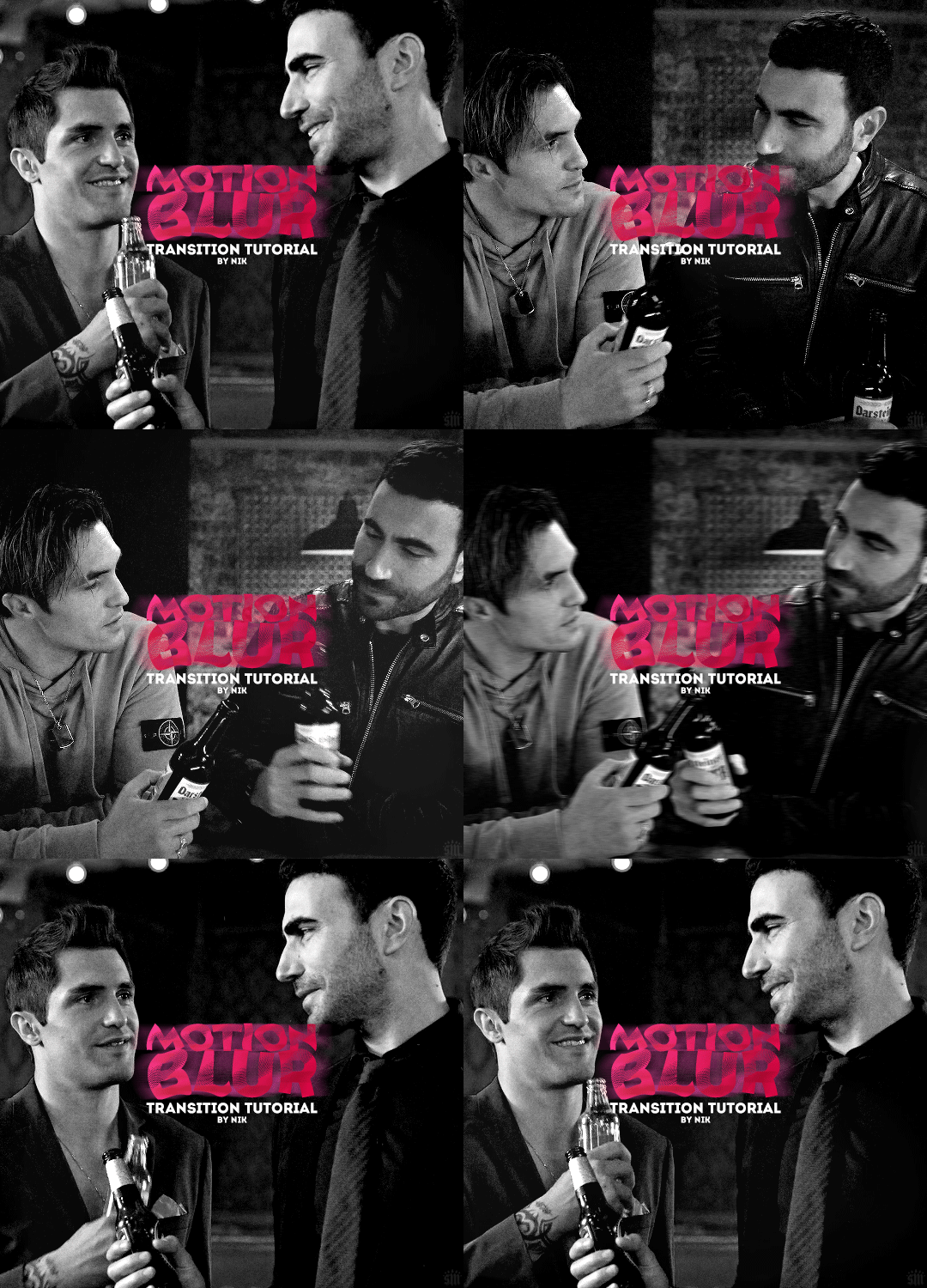
HOW TO: Do a Motion Blur Transition Using Timeline or Frame Animation
Hi! Someone asked me for a tutorial on the transition effect in the second gif of this set (also featured in this set and the text on this set). So, here it is! This is one of the easiest and least tedious of the gif transition effects in my opinion — and I’m going to go over how to do it both in Timeline and Frame Animation (using the screencap method). Disclaimer: This tutorial assumes you have a basic understanding of gif-making in Photoshop.

PHASE 1: PREP
This phase applies to both the Timeline and Frames method!
1.1 – Prepare your caps. (New to gif-making? Check out my basic tutorial here!)
The key to this kind of gif is making sure your final gif, with all the transitions, won’t be too long or too big of a file to post (Tumblr’s limit is 10 MB).
If your gif is going to be big like mine (540x500px), you might want to keep your total frames between 50-60. I decided to try getting away with a whopping 70 frames total... because I like to test fate (spoiler: my final gif ended up being 9.6 MB 🙈). Since my gif is transitioning between two scenes, that means each scene was 35 frames.
If you aren’t doing screencaps like me, just make sure your clips are equal in length. And if you’re transitioning between more than 2 scenes (like the Mando example I linked at the beginning), you’ll have to use shorter clips/fewer frames per scene. In my Mando gif, each scene was 16 frames and my final gif was 64 frames.
1.2 – Crop, sharpen, color, etc. as you would. For this, since you’ll probably have 2 more more sets of coloring, just make sure your coloring is only being applied to the appropriate gifs. The way I do that is by aligning my adjustment layers with my gif as you can see in the screenshot in 1.3 below.
1.3 – Arrange your frames or clips. If you’re working in Timeline, drag the clips/layers of your second gif so they’re immediately after the ones of your first gif. I like to keep things separated in Groups:

Note: I’m keeping my text layers separate because I don’t want the motion blur to affect them. But if you wanted to make your text transition from one word to another, you can either follow the same steps I’m about to show you and apply them to your text layers, or simply merge your text layers with your gif and adjustment layers, so they can all get the motion blur filter applied to them!
If you’re working in Frames, simply paste the frames of your second gif after the frames of your first gif. Again, you can either keep your text separated or part of the motion blur.
METHOD: TIMELINE
T.1 – Divide the Timeline. Using the Scissors Tool, you’ll want to divide each gif so there are 3 small segments at the beginning and end. (3 is my go-to, however, for my Mando gif, I actually only did 2 segments because each section was already so short.)
Now there are two options for this:
OPTION 1: Simplest, 00:01 Seconds Each, Makes Duplicate Frames
You might be wondering, why on earth would I want duplicate frames? You wouldn’t, usually. But this method only causes the duplicates to happen on the blurred frames, so it’s not noticeable at all! However, if you’re like me (read: Type A) — just knowing there are duplicate frames may bother you. If that’s you, go to Option 2.
Each of these segments are the absolute smallest Photoshop will allow, a duration of 00:01.

Sometimes Timeline won’t let you cut things that short (for me, this typically only happens at the end of a clip). So my work around is to cut the segment so it’s 00:02 seconds long, then drag the clip until it’s as small as it can be. Here’s a gif showing that process:

You can see that after I dragged the clip so it would be 00:01, I also dragged the big clip over so it would still continue as normal. Timeline is neat because, even if you divide a clip, each segment can be dragged back to its full length.
OPTION 2: 00:02 / 00:01 / 00:02, No Duplicate Frames
Timeline works in a weird way... when you move forward one frame by clicking the right arrow, you don’t always see movement in your gif. And if you don’t line up the clips properly with the movement, it can create duplicate frames. The easy way to fix this is by making the 3 segments 00:02, 00:01, and 00:02 seconds respectively. This goes for the segments at the beginning and end.
You can see the duration of each segment and an example of how the gif doesn’t move on certain frames in this gif of my workspace:

T.2 – Apply the Motion Blur filter in varying distances or strengths. Now that we have all of our segments, it’s time to apply the blur. Motion Blur is under Filter > Blur > Motion Blur!

This is the window you’ll see when you click it:

Note the fields where you can change the angle and distance.
The angle is basically the direction in which you want the blurred effect to stretch. I always do 0 because I want my gifs to blur together horizontally — I just think it looks smooth. You can play around with it if you want to get a different effect!
The distance is what I like to refer to as the strength of the blur. But really, it’s distance because it’s how long the blurred effect is being stretched.
The rule of thumb here is to apply the filter in a gradation. The part at the beginning of one gif should go from strongest (greatest distance) to weakest (least distance). The part at the end of one gif should go from weakest to strongest.
I keep things easy to remember and do 20, 15, 10 for the beginning and 5, 10, 15 for the end. The reason the numbers aren’t the same is because I don’t want the end of Gif 1 (which is blurred 15px distance) to be the same as the beginning of Gif 2 (which is blurred 20px distance). If they’re the same amount of blur, I don’t think the transition looks as smooth.
Here’s my entire timeline and the strength of blur I used for each of the transitional clips:
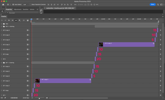
T.3 – Export That’s it! Convert from Timeline to Frames, export your gif, and there you go!
Reminder, if you decided to do Option 1, you’ll have duplicate frames, and therefore more frames than you started out with when you initially imported caps.
METHOD: FRAMES
F.1 – Apply the Motion Blur filter in varying distances or strengths. In Timeline, we created segments. But in Frames, each frame acts as one of those segments — so we don’t need to divide anything. We can just get straight to the filter!
Now, disclaimer: the way I’m working with Frames right now is with the adjustment layers merged with the frames. I typically work in Timeline, so I colored in Timeline and then converted into Frames for this. However you work, just make sure the coloring from one part of your gif doesn’t affect the other part.
Anyway, here’s where to find Motion Blur again:

And here’s what the window will look like:
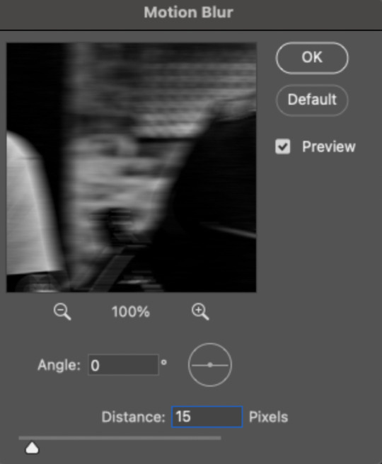
Now just apply the filter in increasing and decreasing degrees. In case you didn’t read the Timeline section, I’ll paste exactly what I said there:
Note the fields where you can change the angle and distance.
The angle is basically the direction in which you want the blurred effect to stretch. I always do 0 because I want my gifs to blur together horizontally — I just think it looks smooth. You can play around with it if you want to get a different effect!
The distance is what I like to refer to as the strength of the blur. But really, it’s distance because it’s how long the blurred effect is being stretched.
The rule of thumb here is to apply the filter in a gradation. The part at the beginning of one gif should go from strongest (greatest distance) to weakest (least distance). The part at the end of one gif should go from weakest to strongest.
I keep things easy to remember and do 20, 15, 10 for the beginning and 5, 10, 15 for the end. The reason the numbers aren’t the same is because I don’t want the end of Gif 1 (which is blurred 15px distance) to be the same as the beginning of Gif 2 (which is blurred 20px distance). If they’re the same amount of blur, I don’t think the transition looks as smooth.
Here are all my frames and the strength of the blur I used for each of the transitional frames:

Note: I wanted to mention again that I kept my text layers in a separate group and didn’t apply the transition to them:

F.2 – Export Finished! Easy peasy!
EXPORTING TIP
If you’ve read my other tutorials, you already know this tip — but since I’m part of Discord servers where members are encouraged to share embed links to their creations, I often rearrange the order of my frames before saving them. (This tip is also handy for making sure the best frame of your gif is visible for Tumblr users who turn off auto-playing gifs.) In this case, I made frame 27 my new frame 1 because I didn’t want my embed preview to look like a blurry gif. Everything will still be in the same order, but anywhere your gif is paused, the best frame will be displayed!
Anyway, that’s it! If you have specific questions about this tutorial, my ask box is open. Hope this helps! <3
#gif tutorial#completeresources#usershreyu#useryoshi#userelio#userannalise#userzaynab#userives#usermarsy#usertreena#usercim#userrobin#userkosmos#usersalty#userhella#alielook#userk8#uservivaldi#resource*#gfx*
894 notes
·
View notes