#same colors (in places) & composition inspired by page 1 & the theme is similar
Explore tagged Tumblr posts
Text
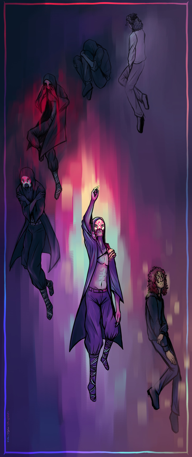
and everything that's here is rising in tone and saturation it's an aching, it's a violence, it's a longing to erase the separation
a companion piece to Cicadas, of sorts. closeups under the cut:

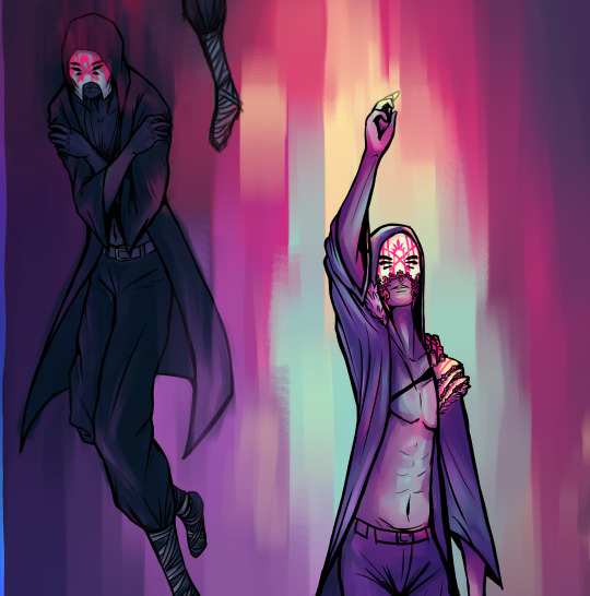
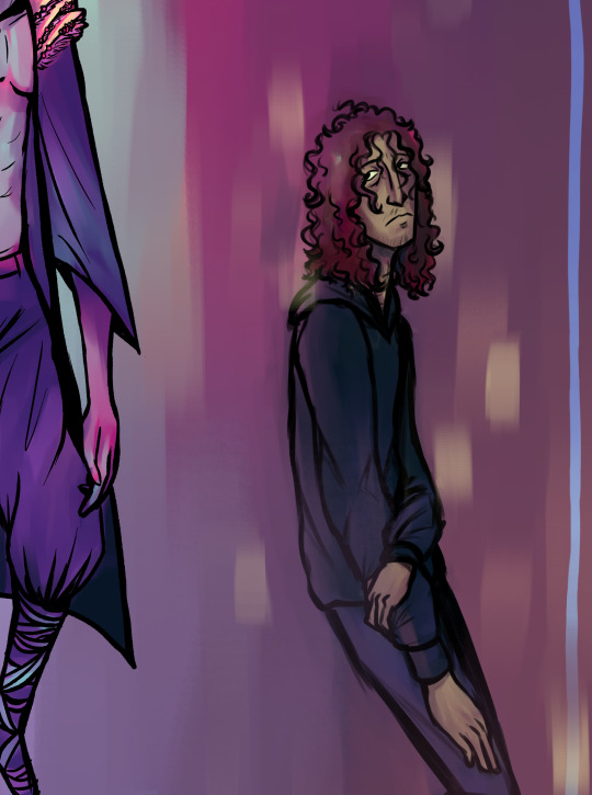
#sleep token#sleep token art#sleep token fanart#sleep token vessel#sleep token him#bygone art#bygone beloved#eyestrain#eyestrain tw#ask to tag#this one took more time than i'd like to admit. i'm usually pretty quick with my art because i tend to get consumed by the process#but this time i was consumed by other things as well. i suppose it's good that i decided to take it slow#crywolf's new song (tenebrescence) inspired me to finish this. lyrics from it are also in the caption#also to stress it further this piece is connected to Cicadas in a way#same colors (in places) & composition inspired by page 1 & the theme is similar#Cicadas is about how every vessel is expendable and how there's always someone before and after and there always will be#this is about the change of a specific one. he was someone before and he will be someone after#and he'll be himself again. a different himself than he started as but himself nonetheless#it will be okay but it will be different but it will be okay#the intense feelings (good and bad) coming from your being someone else will go away but you will be okay and you will be you#ah fuck my eyes hurt#bygone lore
67 notes
·
View notes
Text
spam’s character design tips!
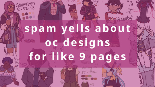
(various designs I’ve done! adopt characters belong to their owners, I only include them here as examples and claim no current ownership.) *disclaimer: it was 9 pages before i added pictures so i’m not inaccurate
If you would rather read this as a Google Document, please click here! (The document has more examples as well!)
Hey! My name’s Spam and I write Danganronpa: A Stormy Last Hurrah! You may also have seen my art for various stories and users around the Internet, including RATS: 252 Chances at Redemption and the Alca Ronpa series! You may ALSO also have seen my character designs, including those for ASLH as well as certain characters in Alca Ronpa and Kill the Joker: AnotheR Game! I sell adopts fairly frequently as well and have miscellaneous designs floating around the web, so I figured I may as well write something about my process. This is mostly oriented towards human OCs! So hopefully this helps someone!!
Before starting this guide, I’d like to give credit to gaiacseas/gokuhara’s “How I Design OCs: Do’s and Don’ts”! When I was designing the ASLH cast, I found myself coming back to this guide again and again. A lot of my points are the same as theirs, but I talk a bit about my own process, especially when it comes to characters that I revamp and redesign.
All uncredited art was done by me, including character designs. Characters belong to their respective owners. All other art is credited.
So let’s get started!
CONCEPTS
The first thing I’m going to say is that my character designs, especially those for myself, take absolutely FOREVER. I usually go through many, many pages of concepts and color tests before I find something I’m satisfied with. It’s a long and very constructive process, and if I’m designing a character for someone else, it can take weeks before we can find something we’re both satisfied with.
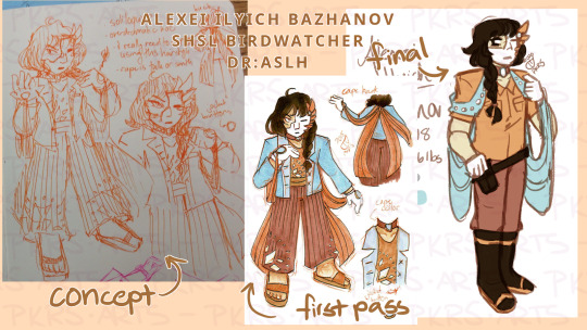
Alexei Ilyich Bazhanov, ASLH’s SHSL Birdwatcher, was a design-first character, meaning that I came up with his design first and built his personality around it. Although to be fair someone who constantly wears a feathery halfmask in public is inevitably bound to be kind of dramatic, so there’s only so many ways his personality couldn’t be influenced by his design. However, his design took a bit of a downgrade from his initial design to his current iteration, largely because of his initial design’s similarity to Tatsumaru Harai, ASLH’s SHSL Kabuki Actor.
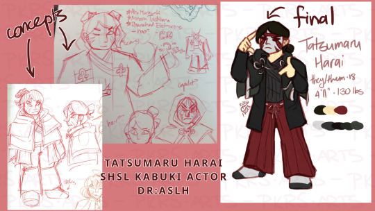
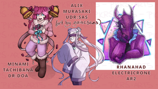
In Tatsumaru’s concept sketch, you can also see the inspirations I cited for their design! I don’t consume much media, so the characters I cite as reference are often OCs in my friends’ stories. Here, I cited Minami Tachibana (Danganronpa: Dead on Arrival), Alix Murasaki (Ultimate Danganronpa: Supernova at Sea), and… Rhanahad Electricrone (Alca Ronpa 2), for some reason. I… actually don’t remember how or why any of those influences connect to Tatsumaru at all? Actually, for almost all of the ASLH characters, I scribbled down some notes on design influences and proceeded to ignore them. So maybe don’t listen to me actually. But design influences are good! Just don’t straight up copy them.
ANYWAY, as you can see, Alexei and Tatsumaru both had longish coats with balloon pants. However, I had better reason to keep these traits for Tatsumaru than Alexei, because kabuki acting actually uses these elements in its costumes. Thus, it made more sense to change Alexei’s design, although I do think that he would still actually wear that original outfit. It’s very himcore.
The point is that this ended up in many, many more drafts of concept sketches until I found something I was satisfied with. Like, six pages. It was kind of insane. It’s worth it in the end to make a polished product, though!
BODIES
(Admittedly, I’ll be the first to admit that I’m not the best when it comes to drawing distinct body types. It’s a weakness of mine that I’m getting better at, but I’m still not great at it.)
The #1 tip I can give here is to use shape language! This is what people use in pretty much all Western cartoons - ever think about how hard it would be to take Bill Cipher seriously if he was a circle? gaiacseas goes over shape language and silhouettes in far more depth in their tutorial, so I really advise looking at it! The basics are:
CIrcles/ovals convey softness and gentleness
Rectangles convey solidity and strength
Triangles convey sharpness and distrust
Combine shapes to modify the image your character conveys!
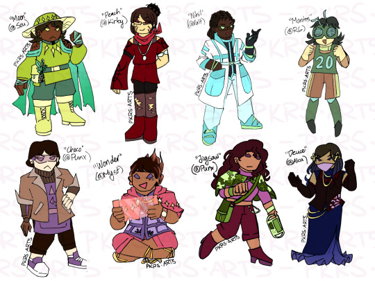
Also, just a tip: if you’re designing a cast of characters, please don’t just make them all the same body type! In real life, if you got any random sample of people, they’re not all going to be the same body type. Diversifying your body types helps a lot to distinguish characters from each other, too. Imagine if all of these characters had the same proportions as each other - even though they all have distinct outfits, you would have a much harder time perceiving them as different people.
If you’re going to draw characters of a body type you’re unfamiliar with, good for you! But first, take the time to look up guides on how to draw those body types. Studying real people also helps a lot to understand the vast varieties of body types. Just look at this picture of Olympic and Paralympic athletes from the 2016 Rio games - there’s already a ton of variations in “muscular” depending on what their sport is, and each athlete is optimized to their sport! It’s like that for literally everyone on Earth with literally every body type. There’s millions of ways to be skinny (bony? lean? malnourished?) or fat (most fat around their stomach, arms, legs?) or muscular (tall like a basketball player, dense like a weightlifter?) so make them count!
Also consider making characters with disabilities! My commentary on this as an abled person is fairly limited, but I will say to please note that what you think you know about disabilities is not necessarily true. This is in regards to their experiences having a disability, but can even apply to things you don’t think about - the wheelchairs most wheelchair-bound people use are not usually medical wheelchairs, for example. Research!!
On a related note, please don’t make racial caricatures or draw all your characters with the same facial features. People of specific ethnicities tend to (but not always) have certain features that are common to people across a regional area, but that’s no excuse to veer into drawing in the same way old racist cartoons are illustrated in. Again, there’s plenty of guides to help with learning about these! Or just look at the people around you and draw real people as practice. You’ll find the world is much more diverse than you think.
And speaking of references!! I’ve seen a lot of really good guides these days for drawing different body types and features! Go check them out go check em go!!
sdkay’s guide on drawing different facial structures (original post was deleted)
kenzandfriends’ guide on drawing fat people (original post was deleted)
nsfwbutts’ guide on drawing fat people (guide isn’t nsfw but their blog is so this is a reblog)
mel-lion’s guide on drawing black features
chuwenjie’s guide on drawing East Asian faces
“world of averages” - composite images of thousands of portraits of people from different places (re: certain facial features being common to certain ethnicities!)
calvin-arium’s guide on drawing characters in wheelchairs
Honestly if you’re looking for help just literally google “how to draw [character trait] and I GUARANTEE you there is a guide out there for you. While people not belonging to the demographic you’re drawing will probably not notice if you don’t portray groups accurately, those who are part of that demographic will be absolutely delighted.
MOTIFS
Motifs are a really neat way to make your character stand out in a crowd, especially if those motifs have meaning behind them! I mostly do this for adopts, but one of my favorite designs was Ophelia Zhang, a character I designed and proceeded to do absolutely nothing with.
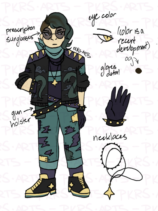
She’s Medusa-inspired, as is obvious because of the snake motif on her jacket and the green hair/yellow eyes combination! Maybe you didn’t notice it until I pointed out, but now that I did, it raises intrigue about her character and her connection to the myth, doesn’t it?
Aside from Ophelia, most of my (own) characters aren’t very motif-heavy, but I like having common themes and patterns that run throughout their outfits at least. It just makes the outfit blend better. Some examples of this include Claude Bates, ASLH’s SHSL Violinist, and Chiyo Kumoshita, ASLH’s SHSL Cellphone Novelist.
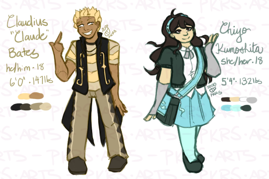
Nonstandards are a great way of making a character Become Their Motif! Claude is based on snakes, specifically grass snakes - he’s got beady eyes, fangs, a grass snake pattern on his pants, and the combination of weird vesty jacket thing and striped shirt creates a belly scales effect. HOWEVER, he’s also got violin motifs! Most obvious are the f-hole patterns on his coat, but a more subtle thing is that his shirt has 5 stripes - a music staff (which sheet music is written on) is made of 5 lines!
(“so spam shouldn’t he have only 4 stripes on his shirt, for the 4 spaces on a music staff” shut up i realized i messed up his design too late. my orchestra director is going to kill me)
Chiyo, on the other hand, has a distinct cloud motif! This primarily is to match her surname (雲下 are the kanji for “clouds” and “under” respectively), but the other reason Chiyo has a cloud motif is because of ASLH itself - ASLH is loosely themed around the Shakespeare play The Tempest, and Chiyo, being ASLH’s protagonist, gets a “clear skies” motif. Neat!
OUTFITS
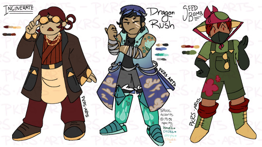
(“Incinerate” is the base for Puppet from Kill The Joker: AnotheR Game!)
There is SO MUCH that can be said about outfits and how I design them. The #1 tip I have is to look at what other people wear, and then decide what it is about that outfit you like so much! If you go somewhere where people are dressed differently from what you’re used to (a distant city or a foreign country), take notes! For me, some elements I come back to a lot include collared shirts, sweaters, oversized overdecorated overcoats, and cloud/sky patterning.
So here’s a little about what makes outfits distinct from each other!
Colors:
Bro this is SO IMPORTANT. There’s a lot that can be said about color theory, and gaiacseas says more than I do on the topic, but basically color conveys a lot about the character. Muted colors convey a muted personality, and brighter colors convey a brighter one! As gaiacseas says in their guide, however, this sets up a great way to subvert expectations about your character.
Protip! If you’re having trouble with a color scheme, just color pick from an existing picture! I don’t have any examples of this on hand, but I do know that sunset pictures are very yummy and I have a lot of pink/orange colored designs. Coincidence? I think NOT.
The number of colors you select is of course up to you, but personally, I don’t use too many individual colors for ease of creating reference images. Of course, realistically, no one’s going to wear clothes the exact same color as each other. Unfortunately for that realism, I am lazy and don’t want to color pick 10 colors, so this is how I live.
Layering:
This is the absolute #1 best way to build texture and silhouette in your characters! Step one, find a funky garment. Step two, find another funky garment. Step three, put them on top of each other. Step four, PROFIT.
The easiest garments to do this with is of course jackets, but they certainly aren’t the only garment that can be layered! Layering is just a matter of looking at clothes you would not usually wear together and going “I wonder what would happen if you wore this together?” In real life this is usually a disaster. But in the world of art and hypotheticals everything is fair game and NOTHING makes sense!
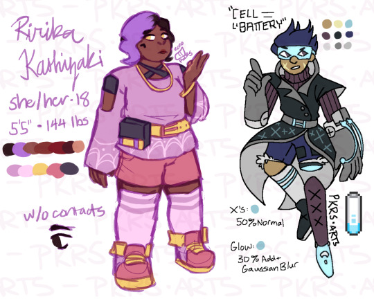
Patterns:
For when layers just don’t cut it! As far as patterns go, they could tie into motifs or just be a nice pattern. For example, Mal Jenkins is a painter, so the patterns on his sleeves, pants, and bag are based on Monet’s “Water Lilies”.
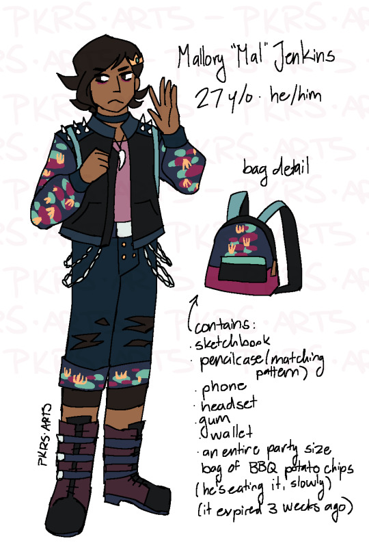
On the other hand, patterns could just be a pattern or recurring motif! The world is your oyster!
Materials/textures:
When combined with layering, clothes of different textures and weights can add a lot to a design! I mentioned before that I like designs with jackets, let’s look at a couple different hoodies! Featured here is Tristan McRae, ASLH’s SHSL Video Game Designer, and Hayato Kikuchi, Ultimate Parkourist (submitted to rebootmon’s Danganronpa: Zetsubou Panic!!).
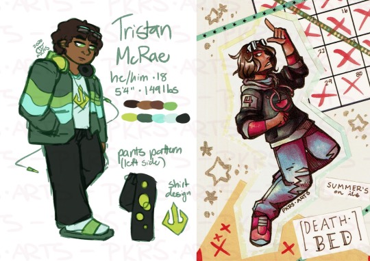
You can see that Tristan’s jacket is made of much thicker material than Hayato’s, which is very baggy and loose. This already makes their designs a lot more distinct from each other! (They’re also wearing totally different colors so that helps too.)
Other textures I like to do include adding holes (like Spring from KTJ:ARG has holes in her coat), adding things onto fabrics (like Tsukino Chisaki, ASLH’s SHSL Flight Student, has studs on her coat and boots), and adding visible stitching (like Brendan Valdez, ASLH’s SHSL Flight Student, has patches on his coat).

Clothes:
Having a general idea of what clothes actually exist is a very good start! Such as:
Tops: t-shirts, collared shirts, long sleeve/short sleeve shirts, tank/tube tops, cold shoulder shirts, blouses, sheer mesh shirts…
Bottoms: Skirts, gym shorts, denim shorts, jeans (with and without holes), leggings, culottes, kilts...
Dresses: Prom dresses, casual dresses, ball gowns, formal full-length gowns…
Undergarments: tights, fishnets, garters, long socks, short socks, gloves, bras/bralettes...
Coverings: Hoodies, cardigans, overcoats, denim jackets, capes, ponchos, vests, suit jackets…
Shoes: Slippers, flip-flops, sandals, high heels, sneakers, athletic shoes, slip-ons, boots...
Accessories: Hats, barrettes, hair ties, jewelry, bags, headbands, belts, chains, suspenders, buttons, glasses...
So from there it’s just mix and match! Keep in mind the different styles of clothing as well - you can swap out things like collars and edges to create variety! There’s different types of boots, different types of skirts, different kinds of bags. The sky’s the limit!
No, I Meant Like Clothes Inspiration:
Oh. Again, keep an eye out for specific art inspirations! If you see a cool character design or outfit on social media, bookmark it! Just remember not to copy clothes exactly, because that’s called art theft! I have a storage Discord server where I keep screenshots and links of art and outfits I come across while scrolling social media.
I find that the best original outfits are a combination of different outfits. Take certain elements that you find cool in each outfit , then add a few elements of your own and stick them all together! It might take a few passes to work as cohesively as you’d like, but keep trying! The best outfits that take inspiration should look so seamlessly blended and original that they should only look like the references if you compare them to each other.
I also have a few characters inspired by songs, so sometimes I’ll incorporate the motifs of MVs for those songs into their outfits. I don’t really recommend this unless you’re 100% prepared to be called out on where the outfit came from, and I ESPECIALLY do not recommend lifting the outfit exactly. Again, that’s art theft.
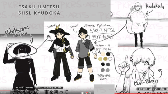
Isaku Umitsu, my SHSL Kyudoka, is based on the Hitotsume-sama, Bun-chan, and Kulukulu characters from utaite Eve’s music videos Literary Nonsense and Outsider. Looking at them side by side, the inspiration is obvious, but when taken out of context, it shouldn’t be the first thing that comes to mind unless you’ve watched Eve’s videos 100 times (like I have) (take my computer from me please).
References:
As for references! Here’s just a couple that I found digging through my Tumblr!
My main blog’s fashion tag!
moatdd’s layering how-to! This changed my life when I saw it.
OSF Costume Rentals - period accurate clothing!
leaf-submas’s hat and skirt style guide, feat. Napstablook!
Jfashionmagazines - Japanese street fashion!
If your mutuals have fashion tags or pages, that’s a good place to dig through as well! They almost certainly have different styles than you do, so you’ll get exposed to a lot of different styles!
Outfits are a lot of fun and my favorite part of designing characters! Hopefully it will be for you too! :D
REDESIGNING CHARACTERS/NEW OUTFITS
Ever got a character design you love, but then decided you weren’t feeling anymore? Or got a character from someone you ended up hating? Or you found character art from 5 years ago and decided you hated it? YEAH ME TOO TO EVERY SINGLE ONE OF THOSE!!
ASLH has four characters who were adopts: Ririka Kashizaki (SHSL Nail Artist), Sentarou Sekisada (SHSL Seat Filler), Hirono Ekyou (SHSL Oendan), and Ryouji Atsui (SHSL Caterer)! For a “complete from scratch redesign” I’ll be talking about Ryouji, who was converted from an attempt at design to a fantroll to an original design!
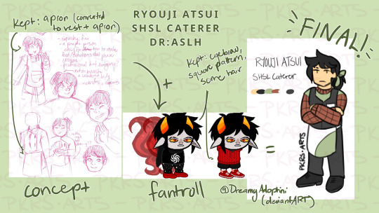
As you can see, I had a lot of trouble with Ryouji’s design. (It probably didn’t help that I didn’t finalize his personality until basically the prologue though lbr.) I didn’t really know what I was doing, and though I had the concept for the vibes I was shooting for, nothing seemed right. Around the same time, I bought an OC design from my friend Marti, and I was having so much trouble I was like “y’know what let’s just fuse the two”.
My process for redesigning OCs, especially when doing something like humanizing a nonhuman character, is to pick the certain traits I’d like to keep and change the rest. For Ryouji, the elements of his concept art I wanted to keep were parts of the outfit (the apron and vest) and the elements of the fantroll I wanted to keep were his eyebrow scar and the squares pattern on the jacket. Thus, when redesigning him, I made him have all of these elements! This was probably one of my favorite designs to make ever, and I’m really glad other people seem to like it too.
Weirdly enough, as soon as I finalized his design for his first reference, his personality almost immediately materialized. Which really just goes to show how much design can influence character personalities.
(Fun fact, drawing Ryouji’s reference was the first time I drew his final outfit, so I’m extremely grateful it turned out as well as it did.)
Other characters, like Hirono, only need a quick outfit touchup. I loved Hirono’s design already, and it fit with what I had in mind with her personality. All I did to change her was the same process I use to make any other outfit, see above. She’s an oendan, so she gets a hapi coat and school uniform… though, honestly, that original outfit is still super cute. I should draw it again sometime.
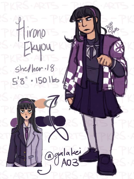
Most of the characters that I redesign as heavily as I did Ryouji are fangems and fantrolls that I buy from my friends, because I know that they understand my mighty need to redesign things. I try not to redesign adopts I get from other sources because I don’t know how the people I bought them from would feel about my editing their design too heavily; Sentarou and Ririka fall into these categories, so when I got them I mostly changed their outfits.
For me, it feels weird to redesign already-existing human OCs, but it’s also not impossible - Tristan, for example, used to be white. No I’m not going to show you the sketches for that and all you need to know is that it sucked, mostly because I was having a lot of trouble making him look nerdy but also nonthreatening. I think how he looks now is a good balance. If you ever get stuck redesigning a character, a race or gender swap (if either is possible tastefully) can go a really long way, and can even subvert expectations about a character! Just keep in mind dynamics and messages as well - if you have a strong violent woman and go “hey she should be trans”, that’s really not the best stereotype you would probably want to display in your work. Be mindful!
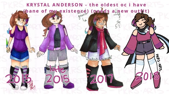
2015 (og design) => later 2015? (RWBY AU) => 2017 (AR3) => 2018 (DE:OPH
CAST BALANCE: DESIGNS
I wasn’t going to talk about this but then I decided I was gonna talk about it! I mean this is kinda a guide for Danganronpa characters, but this applies to any cast that is presented in a group. The characters in ASLH fall into a few different categories:
Created for beta ASLH: Chiyo, Amal, Tsukino, Ririka, Kanemori, Tristan, Tiana, Claude, Iris, Aster
Created for current ASLH: Ryouji, Sentarou, Alexei, Tatsumaru
Preexisting characters: Hirono, Brendan
The largest problem I had putting all the cast members together was revising outfits so that, as seen with Alexei and Tatsumaru above, designs wouldn’t be too similar. For the most part, I had vague ideas of what I wanted for each appearance; even the characters whose designs materialized fully-formed (like Tiana and Brendan) were edited slightly for cast cohesion.
I wish I could say I was responsible in developing all 16 characters’ designs at once so I could keep an eye on their design consistencies, but I would be lying. Instead, I finalized them and then posted them one by one. This was a double edged sword. One, I couldn’t go back and readjust colors or designs without making a whole new reference (which I actually did for Tatsumaru). However, because I was able to take a birds-eye view of my cast, I could see what design elements I needed more of - ESPECIALLY for color scheme! You’ll notice that a lot of the first row in my cast pic is very dark and grey-dominant, so I made a conscious push to include more colors in the second row of characters.
My one regret is not doing more talent-related designs. For a majority of the ASLH cast, you wouldn’t be able to tell their talent from appearance alone. In some cases this would have been impossible anyway (how do you convey to a Western audience a SHSL Cellphone Novelist through design?), but the only really distinct and obvious talent related designs are probably Tatsumaru (who probably doesn’t count because kabuki acting is maskless); Claude; Iris Sumitama, the SHSL Honors Student; and Kanemori Shionaga, the SHSL Football Player. Can you guess who they are?
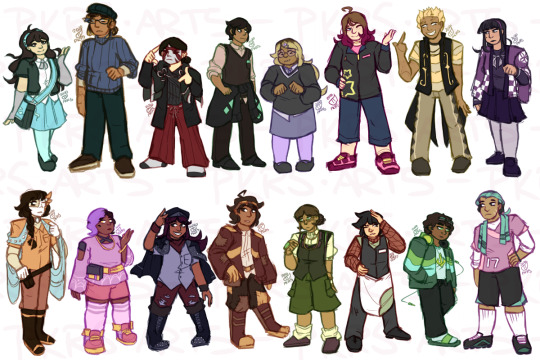
Also, Alexei’s outfit should have been more extra. I still regret not making it so.
TOO LONG, DIDN’T READ
Go look at gaiacseas’ thing.
I do at least a page or two of concept art before settling on a single design.
Pay attention to body types!
Motifs can make a character look really cohesive and thematic.
Pay attention to what you like in outfits, too!!
Color schemes give an at-a-glance idea of your character’s personality.
Layering creates distinct silhouettes and can be done with more than just jackets!
Varying materials and textures makes the same garments look distinct from each other.
Making interesting outfits is as easy as mixing and matching garments.
Find outfit inspiration, but don’t plagarize!
To redesign characters, take the elements you like and shift everything else until it looks the way you want it to!
Balancing cast designs is a tricky process; going one-by-one is possible but has its ups and downs.
A LAST NOTE
In general, when you make a character whose life is different from yours - especially those belonging to marginalized communities - for the love of GOD please do some research about the experiences those communities have. It is a very bad idea to make them into a mouthpiece for your views of the groups. (SHSL Activists that are portrayed as unreasonable SJW strawmen irritate me to no end.) If you don’t feel you can portray a character respectfully, through either drawing or writing them, either a) research and listen to people of these groups so that you can or b) don’t do it, and maybe reevaluate yourself and figure out what about making this character makes you so uncomfortable.
Which isn’t to say that you have to be 100% perfect at everything, of course. In general, so long as the misinterpretations are unintentional, people belonging to the groups you try to represent tend to be pretty happy that you’re trying at all. You have no idea how happy I am to see agender representation in fanganronpa casts, especially because the Danganronpa OC scene likes to stick to hard gender binary balances. So it is worth it if you want to try it!
GOOD LUCK
And happy character creating!
If you enjoyed this document, please consider buying me a Ko-Fi or checking out my commissions! Or, of course, read Danganronpa: A Stormy Last Hurrah.
#tutorial#art ref#tips#character development#danganronpa#danganronpa oc#dr#fanganronpa#fangan#my art#my ocs#not aslh#spam speaks#long post#q
13 notes
·
View notes