#rpg maps
Explore tagged Tumblr posts
daftpatience · 2 months ago
Text
Tumblr media
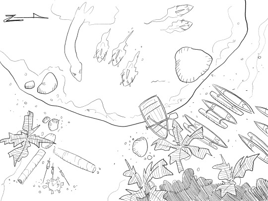
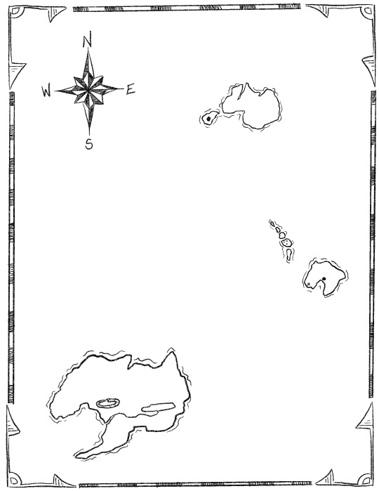
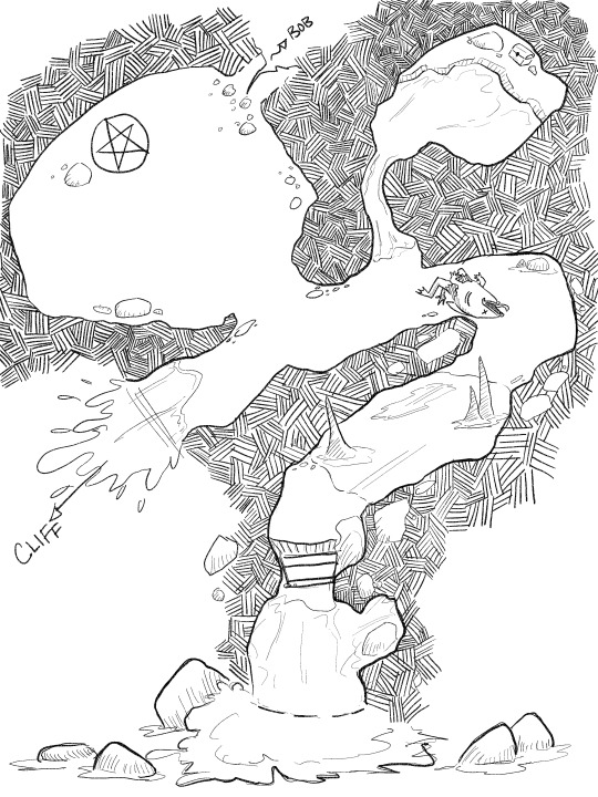
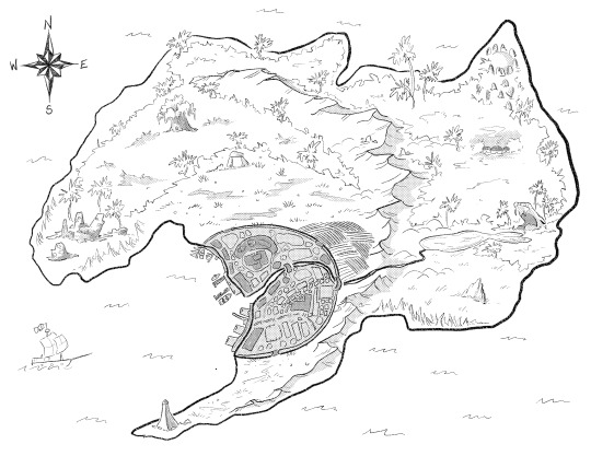
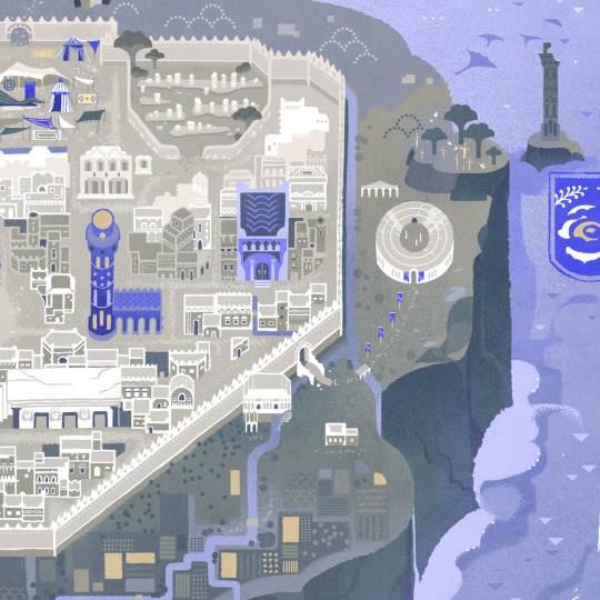
ive been sitting on these files until they were no longer spoilers to my friends so now i can share them! i made a little rpg map set with a couple of puzzles for a oneshot based on the library of babel >:) they're free/pwyw on my ko-fi!
70 notes · View notes
kleioscanvas · 1 year ago
Text
Tumblr media
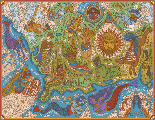
A map of central and western Genertela, showing the major deities of Earth, Sea, and Air.
One of my pieces for Martin Heldson's brilliant Ships & Shores, which you should definitely check out and includes high-res labelled and unlabelled version of this and other maps.
169 notes · View notes
mapdoctor · 1 year ago
Text
Tumblr media
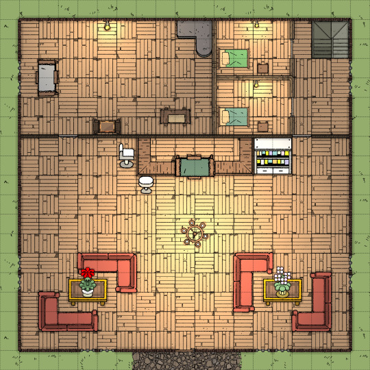
Hamlet [25x45]
I believe that everyone needs a good, peaceful hamlet map that has a place for fights! I made some variations that can be very usable, such as burning houses, rain, haunted, a big chasm across the hamlet, a caravan market, and more.
Patreon get 1000+ maps for just 5$ per month!
Roll20
66 notes · View notes
smcadam · 4 months ago
Text
Tumblr media
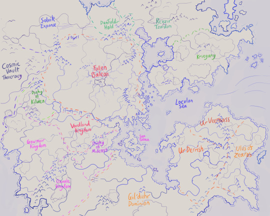
Working on a sketch for a dnd setting game, trying to do a European, Mediterranean region this time around. Not sure if the sea is too... balanced, so any advice is appreciated!
Nations are, from the top clockwise, Revzir Tzardom, Kriegany, Ur Veernass, Ullus of Zeaos, Ur Derrish, Gild'duh Dominion, Oxvale Kingdom, Duchy of Midcrest, SanTalma, Vardland Kingdom, Gowmuir Kingdom, Duchy of Kilwen, Cosmic Vault Theocracy, Solvik Expanse, Fallen Baleon, Duntuldir Hold.
4 notes · View notes
worldmapsss · 6 months ago
Text
Map #2
Tumblr media
Here's another map! As per usual, these are free to use. :D
Lakes and rivers are in blue, mountains are drawn on, darker sections of land are forests, white indicates snowy terrain, and yellow indicates a desert. Capital cities are stars; smaller cities and other important towns are dots.
smaller, numbered maps of each kingdom's cities beneath the cut!
Tumblr media Tumblr media Tumblr media Tumblr media Tumblr media
5 notes · View notes
nivenus · 2 years ago
Photo
Tumblr media Tumblr media
I figure since I’m back on Tumblr I ought to post some content.
Here’s my original design for the CSCSS Ribiera, a Bumblebee-class Light Star Freighter owned by Lasalle Bionational. I designed the ship for my players in my ALIEN Roleplaying Game campaign, On a Pale Horse.
I envisioned the Ribiera as a smaller freighter than the Nostromo, though with a similar crew complement. Rather than hauling bulk commodities like petrochemicals, fusionable fuel, or mineral ores, Bumblebee-class freighters specialize in freighting small to mid-sized payloads with a higher profit margin. Of course, it’s the company that benefits the most from that.
As you might notice from the name and the shape, I drew some inspiration from the Firefly-class in the Firefly/Serenity universe, though I tried to make it bulkier and more angular to keep with the general aesthetic of the ALIEN universe.
89 notes · View notes
mad-duke-ttrpg · 1 year ago
Text
Tumblr media Tumblr media Tumblr media Tumblr media
I have been dabbling in drawing maps for my current 5e campaign! I draw them myself with procreate and a brush called "xerox pencil" :D
I may have to lay a hex grid over the battle/encounter maps, even though I've been trying to avoid it :p The detailed island map (needs to be labelled) is for the next big island POI my players are sailing to: an ancient major port island of trade-focused Yuan-Ti that are trying to heal from the evil and vile ways of their villainous ancestors.
7 notes · View notes
just-rpg-ideas · 10 months ago
Text
Tumblr media
2 notes · View notes
seedlinggames · 2 years ago
Text
Tumblr media
I made this map using a tool I made called Procedures to Discover the Path Ahead. You can find it here: https://seedling.itch.io/procedures-to-discover-the-path-ahead. You can use it for gm prep, or to build a world as you go at a table in a gm-less game, or as a solo worldbuilding game. I built it so that as you progress away from your starting position, you become more likely to encounter strange and dangerous places, as well as reach a possible destination. It also has a random table of legumes, which people seem to like:
Tumblr media
23 notes · View notes
awindinthelantern · 1 year ago
Text
D&D idea: scale up maps
Making viable terrain maps of vehicles is tough in D&D. Trains, ships, and other modes of transportation are firmly scaled for humans, designed in units of two feet or less, while terrain maps are firmly more-than-human in scale, laid out in units of five feet square to allow and account for free movement of arms of characters, whether that means swinging a longsword, drawing a bow, or the full-bodied casting of a spell during combat. This discrepancy provides for problems when making combat maps for confined spaces such as ship cabins or train cars. On American and Continental European trains, passenger coaches are roughly ten feet wide, which would only allow for a map of two squares wide, leaving little room for maneuvering during fights. British trains, even smaller, are eight feet nine inches wide. A ship's cabin might be five feet by seven feet to twelve feet square, again providing virtually no room to fight in. The obvious solution is to simply avoid staging fight in the cramped quarters of transportation, but what if the plotline calls for it?
The solution: Scale up the maps. Treat each square on a map as 2 feet square or 2 1/2 feet square, and treat the entire map as difficult terrain, which makes sense given that transportation quarters are not empty but filled with furniture which require negotiating around. On a normal map of five foot squares, difficult terrain involves halving a PC's movement speed, rounded down. On a scaled-up map non-difficult terrain would allow a character to travel vast distances, but treating it at difficult terrain limits their speed back to a normal level, allowing them to move on the scaled-up map roughly the same distances they would on a normal map when unencumbered. A train car map built on two-foot squares works out perfectly for an American train, whether a coach, with two seats on either side of a central aisle, or a diner car, with four-person tables on either side of a central aisle.
3 notes · View notes
thelostbaystudio · 2 years ago
Text
Skyrealms map print test
and details of the map - art by Bordercholly
Tumblr media Tumblr media Tumblr media Tumblr media Tumblr media
7 notes · View notes
kleioscanvas · 1 year ago
Text
Tumblr media
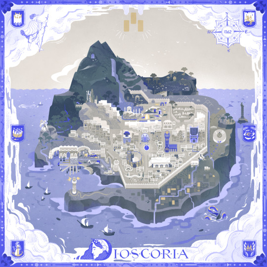
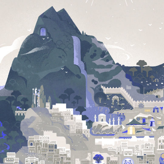
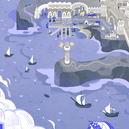
A map of the Mirrorsea Bay, with geographical features represented by their local deities. Another one of my fav pieces for for Ships & Shores I can finally share!
182 notes · View notes
mapdoctor · 1 year ago
Text
Tumblr media
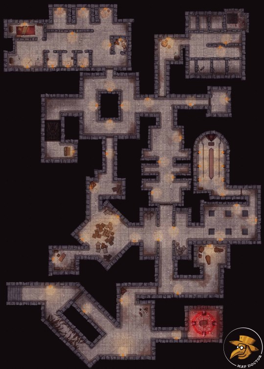
Cultist Dungeon [35x49] As you progress deeper into the dungeon, you may encounter treasure chests filled with rations, scrolls, or other weird items! You find a ring with a goofy familiar who can’t stop talking and insulting other party members. What do you do?
My supporters get Hi-Res maps, a total of 10 map variations, PDFs for print, and Foundry modules.
8 notes · View notes
arkenforge · 2 years ago
Text
New Year, New Toolkit – Public Update v0.4.1.150
Howdy folks! There’s a change in the air. after the release of the v0.4.0 and v0.4.1 updates, we got a lot (I mean, a LOOOOOT) of feedback about the changes we made. It’s safe to say that most of them were quite negative, and we agreed with a lot of it.
The current v0.4.1.0 Toolkit was designed with the wrong ideas in mind. It was a workhorse tool that could let us more easily create our content internally, and it was a tool that could allow new features to be easily added through the Hand’s simplistic menu system. There’s one major thing we didn’t design for: the user. We spent all our time building a tool for us that could do the things we wanted it to, we ended up with a UI that we could easily work with (since we designed it), but was scary and intimidating to new users, and required multiple tutorials to start understanding where to even begin.
We’ve spent the last year fixing that.
After a year of pretty solid development, we’re ready to fully unveil the new Master’s Toolkit to you. It’s got all the great new features from the v0.4.1.0 Toolkit and more, but in a form that’s much easier for all users, new and existing, to jump in and understand. We’ve assembled a collection of some of the fanciest new features below. The full patch notes will be listed after.
We’ve also assembled some tutorials for you to get started with, which can be found here: https://youtube.com/playlist?list=PLkNo24w-R8iIwUUOixmR3aS27NWbFcLRp
And finally, all active and expired trials have been reset. If you weren’t a fan of the last version of the Toolkit, feel free to jump in and give this one a look. You won’t be disappointed!
Ok, let’s dive in!
A New UI
We know, we know. “Arkenforge changing their UI? We’ve been down this road before.” And while yes, that’s true, as we mentioned above this time it’s 100% for the better!
The first thing you’ll notice is that there’s no main menu. We’ve moved to a similar system that virtually every other map builder and VTT uses – a side panel. Now all Toolkit functionality and content can be easily accessed from the side panel.
Tumblr media Tumblr media
The side panel has two tiers, with a third tier showing the available options. This design is significantly cleaner than the old design. You can easily see what’s going on, and what options you have available to you.
We’ve chopped off the Hand
The Hand was a programmer’s dream. Any option could be added to any of the menus in seconds with a single line of code. Unfortunately, each option you selected would bring up its own popup slider. If you selected something, you had no concept of what its current state was, and you couldn’t easily adjust multiple values at once. This was one of the major issues that we’ve tried to solve with this update, and we’d like to think that we’ve succeeded.
Tumblr media
You can now easily see the values of your selected content without needing to open up 20 different popup sliders. It’s also much easier now to see all of your available options!
The Wheel, but straightened out
As we mentioned in the post about our v0.4.0 update, the Wheel was a much beloved feature that provided an easy way to manipulate content, but became too limiting for the raft of new features that we were bringing out. We’ve now added in the Quick Access Menu, a row of buttons above your selected content that can be used for simple manipulations, and to quickly access the side panels for more advanced manipulation options.
Tumblr media Tumblr media
Each button in the menu can be enabled/disabled and reordered to best fit your needs.
Tumblr media
You’ll also notice a shortcut icon at the top of every side panel menu. Enabling this will provide a link to that menu in the ‘quick access menus’ section of the Quick Access Menu.
Widgets
Those users from the v0.3 days may remember the widgets of old. These were simple panels that could be turned on or off as needed, that provided core functionality to the Toolkit. After two years of v0.4, we’ve brought them back :)
Tumblr media
Widgets can be found along the top of the screen. If you want to disable or recolour any, you’ll be able to to so from the Widget Settings panel. We’ve selected a small set of widgets for this initial release that should provide most of the functionality needed for the standard user. Those widgets are:
Map Functions
Fog of War
Time of Day
Map Levels
Bookmarks
Player Screen
Ping
If you’d like to learn more, we have a video available here: https://youtu.be/QldOgyG7yQ8
Layer Stack
One of our most heavily requested features over the years has been a layer stack – the ability to see all content that’s been placed on the map. We’ve held out in the past due to optimisation limitations, but with our huge new Toolkit optimisations we’ve finally been able to add it in!
Tumblr media
On top of showing all content on your current map level, the Toolkit will even point them out for you if you hover over them! Any content here can be selected by clicking on it, and you can hold Ctrl of Shift to multi-select from the list. Finally, we’ve added a handy search bar at the top so that you can only show specific content.
New Effects System
Our Effects system in v0.4.0 was a big hit, and we’ve been really keen to expand it. The UI left quite a lot to be desired, so we’ve come up with a new system that will make managing effects on your content a breeze!
Tumblr media
All effects active on an object will now show in a list. You can easily view and modify the properties of any effect, and enable/disable and remove them as needed.  You may have noticed that we’ve added the ability to stack multiple of the same type of effect! This can lead to some fin behaviours, especially if multiple float effects are in play.
On top of this new system, we’ve added a whole bunch of new effects for you to play with:
Blink. Makes content appear and disappear at regular intervals
Line Scroll. Tile scroll, but for lines
Pulse, Scale up and down at regular intervals
Light Flicker. The current flicker effect for lights that you know and love
Light Blink. Blinks the light on and off, like a broken halogen light.
Sound Trigger. Triggers an assigned SFX when the trigger condition is met
MP3 Support
Another of our long-awaited features. We’re incredibly happy to say that you can finally import your own mp3 files into the Toolkit! No more conversion to OGG or Wav
These are just some of the new improvements we’ve made to the Toolkit! | Hit the link below to also read the full Patch Notes for the update! https://arkenforge.com/new-year-new-toolkit-public-update-v0-4-1-150/
7 notes · View notes
nivenus · 2 years ago
Photo
Tumblr media Tumblr media Tumblr media Tumblr media Tumblr media Tumblr media
The layout of maps I created for Van Buren Station, the location of the first scenarion in my ALIEN RPG campaign On a Pale Horse. Van Buren Station is a helium-3 mining outpost owned by Lasalle Bionational, in low orbit over the gas giant KG-452 in the WISE J182831.08265037.7 system.
24 notes · View notes
damage-cloud · 2 years ago
Text
Tumblr media
Return To Zork Design Map
3 notes · View notes