#remove white background photoshop
Explore tagged Tumblr posts
Text
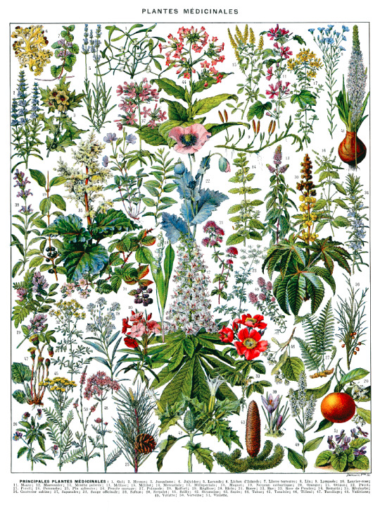

#art#dark academia#light academia#botanical academia#floral art#flowers#black and white#botanical drawing#anna attempts photoshop#removed the background on these sooo long ago took forever
20 notes
·
View notes
Text
How To Clipping Path Services Provider - Prices Start from Just $0.29
Path Edit Provider offers top-quality Clipping Path Services starting at just $0.29 per image. Here's how we ensure the best results:
Upload Your Images: Simply upload the images you need edited to our secure online platform.
Specify Your Requirements: Indicate the areas of the image that require clipping paths and any additional editing instructions.
Expert Editing: Our team of experienced professionals meticulously applies clipping paths to ensure clean and precise cut-outs.
Quality Assurance: Each image undergoes a thorough quality check to ensure it meets our high standards.
Download the Edited Images: Once the editing is complete, you can download the polished images directly from our platform.
Our clipping path services are perfect for e-commerce, advertising, and any application requiring clean, professional image cut-outs. Choose Path Edit Provider for affordable, high-quality photo editing.
#photo editor#cut out shape from image#cut out image#photo cut out service#quick cut out#quick cut out photoshop#cut out background#cutout pro#Clipping Path#clipping path service#background removal#Photo background removal#White Background#Transparent Background#Change Background#Remove background#Object Removal
0 notes
Text
Chiho Saito’s 1999 Revolutionary Girl Utena Original Illustration Collection
IT’S HERE. IT’S DONE. IT’S FINISHED. NOW…IT’S YOURS. Happy Holidays, my friends.
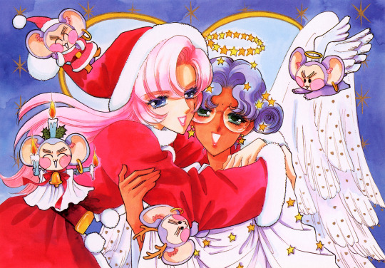
Vanna here! I have posted some already about this project, and the responses I got, public and otherwise, have been absolutely incredible. Y’all have been reblogging and hyping this before it even finished…I haven’t felt so encouraged about an Utena project since the musicals! (Yes, streams soon, I promise.) You can read the other post to get more details, and catch my post here with more details about the process if you’re interested. The long and short of it?
This is the first artbook I ever scanned. I did it in 2001. In Photoshop, using multiple scans per page that took hours to process. But it was 2001. A half megabyte file that was 1250px wide was considered extremely hardcore and impressive. That’s just always been the business I’m in when it comes to Utena art, you know?
It’s now the latest artbook I’ve scanned, and so much of the process, and effort involved, is unchanged. What has changed, is the result. Welcome to your new desktop background. Your new phone background. Your new poster print.
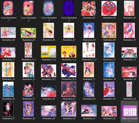
What I’ve done here is attempt to create definitive digitized images of Chiho Saito’s work as offered by this book--I have removed the print moiré of the original scans, and used my literal decades of experience to try and tease out as much information from them as possible. Without being physically in front of the original artwork (which is a thing I’ve had the great fortune to get to do) this is The Most Chiho Saito you are ever going to get. I’ve tried my best to make sure there is a way to get it that works for everyone:
Do you just wanna scope 'em out? Look at some disaster gays? Grab your favorite one or two? This is the path for you! Check out the ‘compressed’ (not very) 10k ‘web friendly’ (not really) copy at the Bibliothèque, the media archiving wing of the Something Eternal forums at Empty Movement*. All the following links are also available from here. Do you want these copies? All of them? Don't just grab them individually, friend. This batch is 375MB and can be downloaded as a zip of the individual files here on our Google Drive.
Do you like digital archiving? Are you looking for a copy that preserves the archival quality of the effort but sits nice and comfy in a single file? This is for you. A minimally compressed 10k, 513MB version worked into a PDF is now up, shiny and chrome, on the Internet Archive. Do you like the idea of the minimal compression, but want the individual files in a zip? Yep I did that too, here's the drive link.
Are you looking to print these in a larger size? This is probably the only reason on Earth you’d ever want them, and yet a bunch of you are going to go straight for these. Here are the zero-compression JPG full size copies, most of them are 15k across, like simply a ridiculous size. Pick your fave and download it from our Google Drive!
I am genuinely really proud of this work.** I was able to tease out so much new detail from these…her incredible layering techniques, the faintest brush of her highlights, and the full range of her delicate hand at whites and blacks… details commonly lost in digitization. I sincerely hope you find something here that you’re looking for, as an artist looking for inspiration, as a weeb looking for a desktop, as an archiver excited to see incredible 90s manga artwork saved forever in the digital realm. I feel like I have already said so much about them, and could keep going, but you know what? This work speaks for itself. Enjoy, use, explore, and definitely tell us what you think!
We love y’all. ~ Vanna & Yasha
* AHEM ASTERISK AHEM
You might be wondering what any of that is. Something Eternal? Biblewhatawhat??? EmptyMovement.com? You might even have done a double take at the word ‘forum.’ And you should!!!
I have a confession. This artbook was my ‘side project’ as I worked on this, *the main project.* For a couple years I’ve been banging around with a new domain, and originally I had other plans for it, but Elon Musk ruined my Twitter and Discord is well along on its way to enshittification, and well….we joke on the Discord a lot about ‘reject modernity, embrace forums’ and you know what? We’re right. So Yasha and I are putting our money where our mouths are once again, and doing something insane. We are launching, in 2023, a website forum. Obviously, this is not the official ‘launch’ per se, but I cannot announce the artbook without directing you to the forum, since it sits on the attached very cool gallery system. Oops! Told on myself. Another post more focused on the forum will be forthcoming, but if you are just that motivated to get in right away, you absolutely can! (This will help stagger new arrivals anyway, which is good for us!) If you would rather wait for the ‘official’ launch, by all means that’s coming, including a lengthy screed about how and why we’re doing this. In either case, remember: this is a couple weebs trying to make internet magic happen, we are not website developers by trade. Give us grace as we iron things out and grow into this cool new website thingie…hopefully along with some of you! :D
If you do join up, naturally, there is a thread about this project!
** If you like this kind of content, consider helping us pay for it! We do have a Patreon! If you’re wanting to use these in some public-facing distributive way, all we ask is for credit back to Empty Movement (ohtori.nu or emptymovement.com, either will work.)
I would like to say ‘don’t just slap these files on RedBubble to get easy money’ but I know that saying this won’t effectively prevent it. Y’all that do that suck, but you’re not worth letting it rain on the rest of this parade. :)
#revolutionary girl utena#utena#rgu#sku#empty movement#chiho saito#90s manga#digital archives#manga aesthetic#shoujo kakumei utena#utena art
2K notes
·
View notes
Note
ok i have to know
HOW do u make the egdes so… perfect?? like not a pixel of the original image/white pixels appear on the sides of the pngs. and u do it so fast???? how???
I usually just drag the image into remove.bg, it's free and pretty good!
When I want to make high res pngs I use photoshop. I don't know if it's the most efficient way, but this is what I do: 1. drag image into PS, 2. use the automatic eraser tool on the image background, 3. make a new layer with a colored background and place it before the layer with the image (to see any areas that are not yet transparent), 5. switch back to the image layer and use the regular eraser tool to clean up the edges and any stray pixels, 6. remove the layer with the colored background, 7. save as png.
270 notes
·
View notes
Text
Photoshop Tutorial #1 - Change Background & Add Reflections
Before & After


You will need
Photoshop
Internet Access
I was inspired to make this tutorial after facing a dilemma in my game. I wanted my sims to swim in Brindleton Bay, but, shock horror, the water there is not swimmable. Luckily, I know how to change the background of my screenshots to make it appear as though it is - and I'm going to bring you through the process of how!
Starting off, in game, I brought my sims to Tartosa and got my desired shot. Then, heading over to Brindleton Bay, I got some shots of the horizon that I wanted as a backdrop.
Here's a picture I took:

Okay! Let's open up Photoshop!
For reference, I have Photoshop 2024, but most if not all of the features I've used should be included in older versions too.

Here's our image! Now I'm selecting the Background layer in the layers panel and press CTRL J twice to create two duplicates.
I'll turn off the bottom two layers for now, (by clicking the eye button, for newbies) and go to the properties panel. this should be on the right hand side, above the layers panel, but if it isn't, simply go into window > properties to switch it on.
With the layer selected, I click remove background and voila! Photoshop has... er... done her best to remove the background (she sometimes gets it wrong, but at least it's a help)
You'll see that a layer mask has been created. (circled in image).

If you haven't used layer masks before, the only important thing to know is that black will erase and white will add.
So with my brush tool (shortcut B) selected and set to black, I can go around the image and erase all of the parts I don't want.
If you have a steady hand and a tablet/cintiq you can do the same job a little quicker with the lasso tool (shortcut L) by selecting any unwanted area and simply pressing delete
Once I've removed all that needs to be removed, I see that there's a little slice of her hair that needs to be added. I can change the brush colour to white and paint it in.
Done! Easy!

Okay, let's switch off this layer for now, and switch on the one beneath it.
This is the layer I want to make look like the Brindleton Bay sea. So I'll make sure to pull an image of the water up as reference for colour.
This time I'm going to create a layer mask using the polygonal lasso tool
It's easy.
Find the lasso tool in the tool panel on the left of screen (the third icon from the top - or by pressing L on your keyboard)
Left click & hold, and a menu will pop up. Select the polygonal lasso tool.
Click around the area you'd like to mask, in my case, the sea. Tip: if you hold down the shift key while clicking, you will be able to create perfectly straight lines.
Click on the layer mask button at the bottom of the layers panel (pictured)
Everything except the selected area should disappear!

A small thing here, but I don't want the reflection of the rock in the water in my picture. I'll select the layer (not mask), take the eyedropper tool (shortcut i) with the sample set to all layers, and use a soft brush (B) to paint it away.

Next I'm using adjustment layers to edit the colour of the water, to try and make the blue turquoise paradise look more like the horrible green bog water of the bay.
You'll find these next to the mask button in the layers panel.
For my picture, I'm using hue/saturation for the colour and levels for the light. you can fiddle around with any of the adjustment layers to find what works for you.
I've shown the adjustments I've made for my specific scene below, just for reference.
When I'm happy with the colours/lighting, I select all adjustment layers (shift + L click to select multiple), then right click and choose create clipping mask. This is to ensure that the adj layers don't affect any other parts of the image, just the area I want it to.
And there! My water is looking sludgy, just like I wanted.

Okay! I've decided that I'd like some texture in the water. It always annoys me that sims water looks so flat. So here's where Pinterest enters the story.
I like Pinterest because unlike Google, the majority of the images are not watermarked. You're also slightly less likely to find AI slop.
I wanted some water ripples, so I searched for something like Water Texture, found one I liked, and dragged and dropped it into my photoshop file.
From here, I transformed it (CTRL + T) by resizing & rotating the bounding box, then grabbing the corners while holding CTRL to create some kind of perspective that works for the image.
I didn't bother bringing it all the way to the horizon, because I intend to fade that out with a gradient anyway. I had to sacrifice the bottom of the image for the sake of correct perspective, but that's fine. I will crop that out later.
With the texture layer selected, set the blending mode to soft light. It blends nicely!

Now! Another layer mask! These are our friends
With the texture layer still selected, I create a layer mask.
This time, because I had nothing in the image selected first, the layer mask will appear white. That just means nothing has been masked yet.
With it selected, I find the gradient tool (shortcut G) if you press G and the paint bucket tool is activated, simply navigate to the tool panel on the left of the file, hold the paint bucket tool down and select gradient.
I'll change the colour to black, and make sure I have the foreground to transparent gradient selected.
Other settings are pictured.

I'll drag the gradient over the area I want to mask. In this case, the top of the water texture to make it appear as though it's fading away towards the horizon.
(Doubly make sure you've selected the mask, not the layer while performing this action.)
Looking good!
Time to drag the layer above your adjustment layers and create a clipping mask again.

Alright! Let's do the background.
I'll drag that image of Brindleton Bay that I took earlier into the file.
I want to place it below my sea layer, and above that original background layer (I am going to leave that untouched for insurance reasons)
Then, using the move tool (shortcut V) I'm simply going to move it to the correct place. Basically I just want the horizon lines to match up.
Tip: hold the shift key to drag an image in a straight line.
Enter to confirm.
You can see that the sky is now unfinished, but it's such an easy fix. I'll just select the sky colour with the eyedropper tool, then use the paint bucket tool & brush tool to fill in the sky.
Done!

Now - note that the sea doesn't quite blend in with the background. To fix this, I'm going to take my eyedropper tool (shortcut i) and select some of that dark green colour beneath the mountains.
I will create a layer (+ button on the base of the layer panel) and drag it above that sea texture layer I created earlier.
Then I'll create a layer mask to clip it to the sea.
I'm grabbing that gradient tool again (G) and creating a nice gradient on the horizon.
The horizon line is a little sharp, in my opinion, I want it more faded. So, using a soft brush (B) and that same green colour, I'm going to create a new layer & place it above that green gradient, this time I'm not clipping it.
Holding down the shift key, I'm going to draw a straight line right across the horizon. This helps to blend it all together a bit better.

Now! for Reflections!
Firstly, I'm going back to that sky layer with the Brindleton Bay mountains, and I'm going to duplicated by pressing CTRL + J
I'm dragging it above the sea layer, but below all of the other clipping masks. This will automatically create a clipping mask for the new layer.
Next, I'm going to edit > transform > flip vertical
With the move tool (V) I'm moving the image upwards so that the horizon lines meet and it looks like the lighthouse and mountains are reflecting in the sea.
Note: make sure auto select is off while using the move tool on a layer that lies beneath several others.

This leaves a little bit of a mess on the bottom on the canvas, which can be fixed by creating a layer mask & the gradient tool set to black, and dragging a gradient over the bottom of the image until it blends nicely into the sea.

With the mountains reflection done, I'm going to move onto the people.
I'll turn that top layer that I worked on earlier back on.
Then I'll duplicate it (CTRL + J)
Right click on the layer mask of the duplicate and select Apply Layer Mask from the dropdown. This simply bakes the layer mask into the image. Usually I try to edit non-destructively as much as possible, but in this case it's fine to destroy.
I'm going to rename this layer Reflection
With that new, reflection layer selected, I'll go to Edit > Transform > Flip Vertical, just like before.

I want to add a little water/shimmer effect to their faces, so I'm going to Filter > Distort > ZigZag
I'll just mess around with the settings here until I find something I like.
This is optional, obviously, I've done reflections in edits without doing any of this, but it just adds something a little extra to water scenes, I think.
Here's a time I didn't do that.

anyway, my sims are looking a bit crazy now, but it's fine, because I'm going to, you guessed it, add a layer mask and gradient.
But first, using the lasso tool (L) I'm going to draw around one of the characters and drag her into place. I can move the bounding box around a bit to make her shoulders meet in the right place.
Then I'll do the same for the other character.
Tip: Hold CTRL while moving, warping or resizing something for a smoother, more precise experience.

Now, I'm doing what I said I would, and I'm creating that layer mask. We know how to do it by now, right?
Make sure everything is deselected first by pressing CTRL + D
Create layer mask
Select Gradient (G) set to black
Drag gradient over bottom of reflection (If you ever need more precise gradients, you can select the round gradient at the top of the file. I needed it to blend the reflection on the right more, because the characters are not at an even height.)
In the Layer panel, change opacity to 20% (or whatever you like) and hit Enter to confirm

Using Crop (shortcut C) I'm going to crop my image, cut off that pesky strip at the bottom and just basically make the framing of the picture a little bit nicer.
And viola!

I could edit this image more, throw in bounced light, splashes etc etc but I'll leave it like this.
The only thing I will add in is a little lens flare to indicate sun, so again, I'm taking to Pinterest and searching for one that works.
Tip: make sure the background of a lens flare image is completely black. Otherwise it will be harder to use.
Below is the one I have chosen.
I'm simply changing the blending mode to screen, moving it and resizing it with the transform tool (T), and fiddling with the opacity until I'm happy.


That's it!
I made a video running through this whole process, with all of my shortcuts in the bottom right hand corner so that you can see exactly what is happening.
youtube
If there are other tutorials you'd like to see in future, please let me know!
And I'm more than happy to answer any questions!
Good luck <3
#sims 4 tutorial#editing tutorial#sims editing tutorial#sims 4 edit#photoshop editing#photoshop tutorial#sims 4 community#simblr#Youtube#sims 4 photoshop tutorial
183 notes
·
View notes
Text
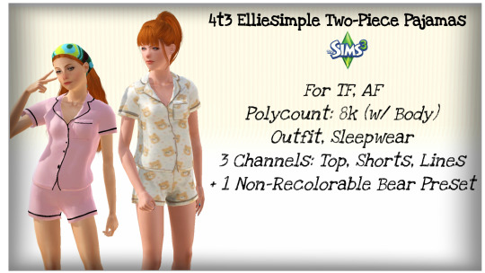
4t3 Elliesimple Two-Piece Pajamas
UPDATE: SEE HERE FOR NEW NOVEMBER 2023 RE-CONVERSION; THE LINK IS THE SAME!
Finally, my first successful conversion...! Hopefully...
I have a pair of pajamas in real life just like this set, and I wanted to bring it to The Sims 3! In addition, I felt teens had limited clothing options, so I made sure to convert it for them, too!
I'm definitely a huge perfectionist, so I feel like I have to get everything right when I make/convert something. I hope there aren't any serious / overt issues with the CC!
Ages: Teen, (Young) AdultPolycount (with Body): 8kFull Outfit, in Sleepwear CategoryThree Channels: The Top, Bottom, and the Lines2 Presets + 1 Non-Recolorable Bear Preset*
Begrudingly* so, I've added one (and only one) swatch; if I was any good at Photoshop, I would have made the patterns on it an overlay, but there are small dots and a few other details that made it even more difficult to remove the white background, and the magic wand tool haaaates me. It's cute anywayyyy!
Picture of RGB Mask:
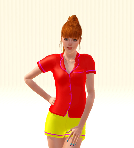
It looks wonky in CAS, but fine in-game!
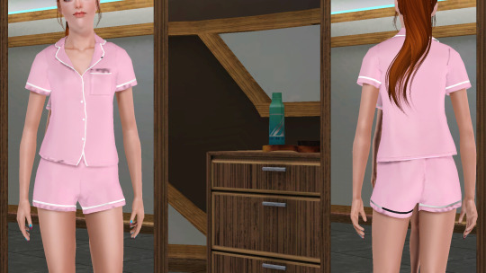
All credits go to Elliesimple! Original download page!
Download: SFS
or
Download: Simblr.CC
@katsujiiccfinds @xto3conversionsfinds @pis3update
CC Used:
Acc Nails: Long Nails by LorandiaSims3
Hair, Ponytail: Anto Milano, Retexture by Ifca-Sims
Hair, Long Wrap: Simpliciaty Ruby, Retexture by Ifca-Sims, Mary Jane DR
Eyes, Default: Simtanico's Dragon Age: Inquisition V2 Eyes (DAIV2) I've edited them to add the teeth replacements from OEM!
Eyelashes and Various Makeup by S-Club
Eyelash Mesh Terminator by Slamyy (S-Club's eyelash remover just removes the eyelash texture from face overlays, not the actual mesh, and thus can conflict with other face overlay defaults, such as eyes or teeth. Also helps with the Mac x64 issue).
Skins: Kurasoberina Primer Default and Ephemera Natural Light
Background is Kewai-Dou's camera photoshoot set! :)
891 notes
·
View notes
Text
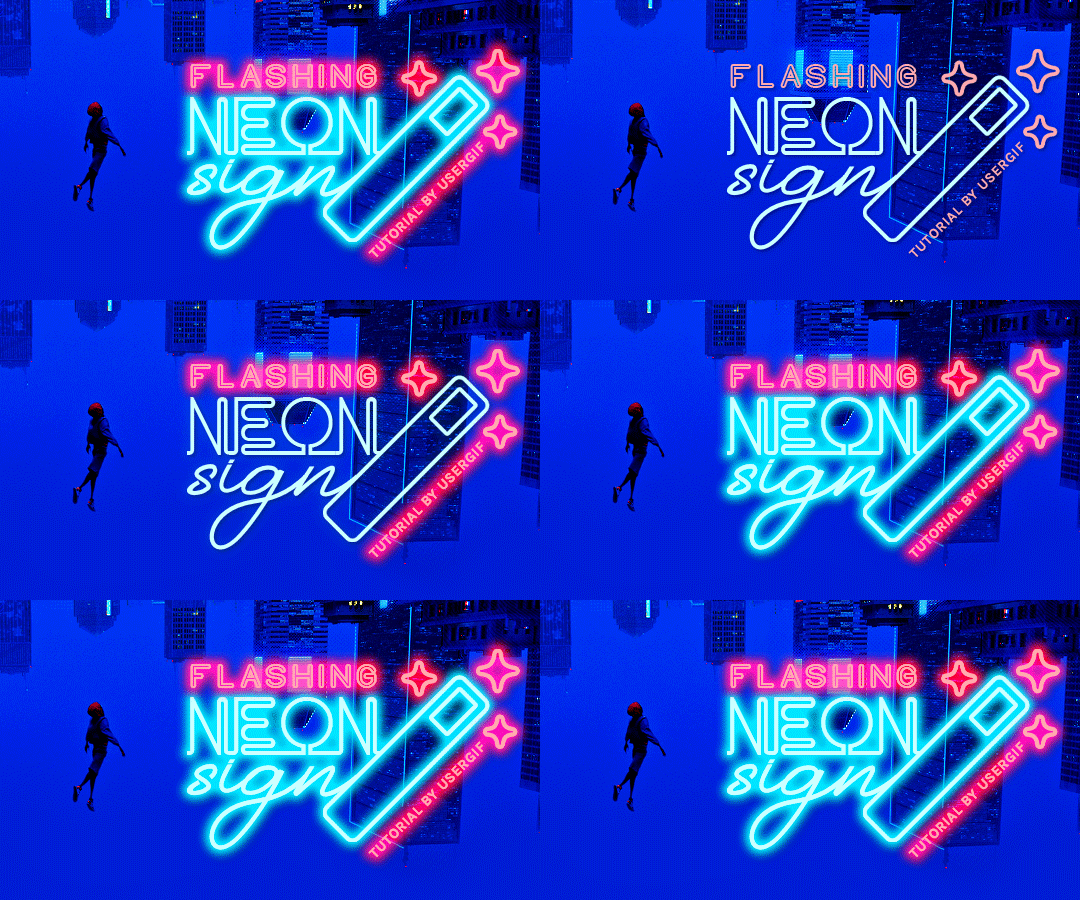
HOW TO: Make Animated Neon Text
Hi! No one asked for this tutorial, but this is one of my favorite typography effects as of late — so I thought I'd share how I do it. You can see this effect in the first gif of this *NSYNC Celebrity set and the last gif of this Anthony Bridgerton set. Disclaimer: This tutorial assumes you have a basic understanding of gif-making in Photoshop. It's also exclusively in Timeline and uses keyframes for the fading effect seen on the blue text.

PHASE 1: PREP YOUR BASE GIF
1.1 – Choose a dark scene. This effect looks best contrasted against a dark background. You can definitely do it with a bright background, but just like a neon sign irl, you only turn it on in the dark/at night — so keep that in mind!
1.2 – Determine the length of your clip. Depending on how much you want your text to flash or fade in, you'll want to make sure you have a scene long enough to also allow the text not to flash — reducing the strain it takes to actually read the text. For reference, my gif is 48 frames.
1.3 – Crop, color, etc. as you would. New to gif-making? Check out my basic tutorial here!
PHASE 2: FORMAT YOUR TEXT
Before we animate anything, get your text and any vectors laid out and formatted exactly as you want them!
2.1 – Finding neon sign fonts. It's easy as going to dafont.com and typing "neon" into the search bar!
2.2 – Fonts I used. Neon Glow by weknow | Neon by Fenotype | Neon Bines by Eknoji Studio
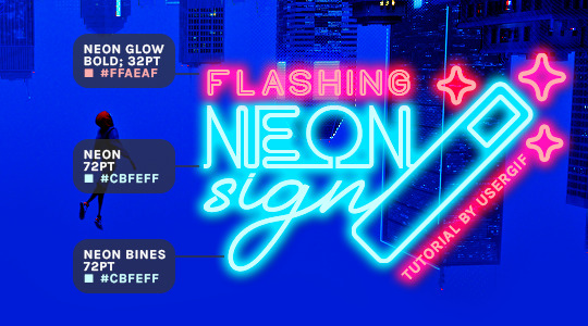
And to not leave my fellow font hoarders hanging, the font for "tutorial by usergif" is Karla (it's a Google font) 🥰
2.3 – Group your text layers. (Conditional) If you plan on having multiple text layers like I did and you want them to appear connected (like how the last letters of "NEON" and "sign" intersect with the wand icon), I suggest putting the layers into groups according to color (the shortcut to group layers is Command+G). If you don't group your text and just apply the outer glow settings to each individual layer, you'll end up with something like this:
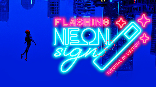
—where you can see the glow overlap with the line, instead of the smooth connection you see in my final example gif. I'm using 2 colors for my text, so I made a group for red and a group for blue.
2.4 – Apply Outer Glow. Right-click your text layer (or your group if you have several layers) and select "Blending Options" to open the Layer Style menu. Check "Outer Glow" and feel free to play around with the settings until you like the way your text looks!
Your outer glow color should be darker and more vibrant than the color of the text itself. The text should be within the same color family but much brighter and, sometimes, almost white (see Step 2.2 again for my text colors).
Here are the settings for the Red Glow (the glow color is #FF3966) and Blue Glow (#00F0FF):
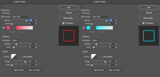
These aren't always my exact settings but they're pretty close to my standard. I always set the blend mode to Hard Light and usually have the opacity at 100%.
For every gif I use this effect on, I like to play around with Spread and Size. Spread will make the glow look denser and "expand the boundaries" (source: Adobe) and Size will diffuse the glow and blow it out so it covers a larger area (Adobe says it "Specifies the radius and size of blur").
2.5 – Duplicate your text layer/groups and remove glow. We're only going to be animating the glow on our text, and since doing this affects its opacity/visibility, we want to preserve the base text by creating a duplicate.
I just hit the Command+J shortcut to duplicate my groups and delete the Outer Glow effects, making sure that the "No Glow" version is above the "Glow" version:
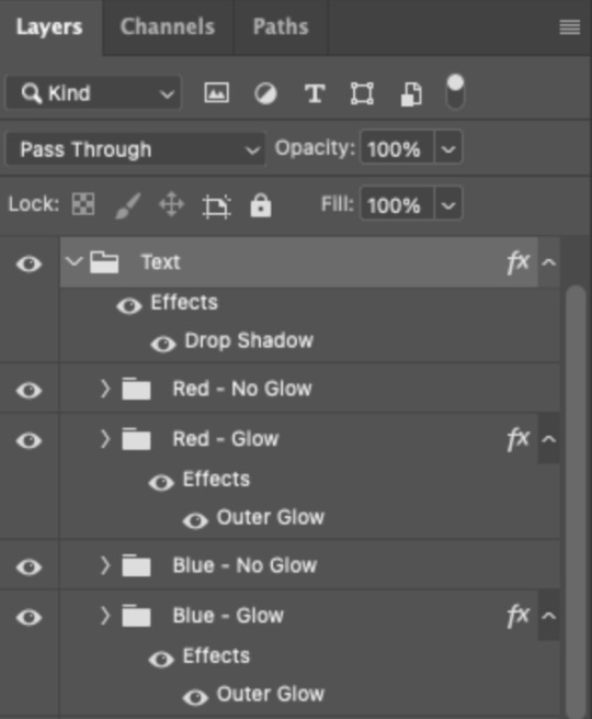
I also put all these groups into one group called "Text" for organization and so I could apply a drop shadow to all the elements for better visibility.
PHASE 3: CREATE THE FLASHING EFFECT
This is for the effect you see on the RED text in my gif!
3.1 – The 0.03-Second Rule If you've read any of my animation tutorials before, you're probably already familiar with this rule. In my experience (and for reasons I can't explain), Video Timeline pauses every 0.03 seconds (try clicking the forward button a few times, you'll probably find a "duplicate" or paused frame). So, keep all your layers a duration of 0.03-second increments (e.g. 0.06 or 0.09 seconds can also work) and align them on the Timeline at 0.03-second intervals. If you don't follow this rule, you'll get duplicate frames when you export, resulting in a choppy final gif.
3.2 – Trim and arrange your text layers. Only on the layers/groups WITH the Outer Glow effect, trim them into several segments of varying lengths where the glow will be "on" (visible) and leaving spaces where the glow should be "off."
Typically, I'll have a mixture of 0.06 and 0.03-second text. That's when the glow will be visible. Between each "flash" of visibility, I've got a 0.03-second blank space, baby *pen clicks* and I'll write your name:

The layers shown above are arranged with a few flashes and two long segments of no flashing. This is the order and duration of each segment shown above (purple = visible segments):
0.06 blank, 0.06 visible, 0.03 blank, 0.03 visible, 0.03 blank, 0.03 visible, 0.03 blank, 0.24 visible (the long bit where "FLASHING" doesn't flash at all), 0.03 blank, 0.03 visible, 0.03 blank, 0.12 visible
(I only did this for the text that says "FLASHING" to give it a glitching effect. The other red text keeps the glow visible starting at the first long segment.)
PHASE 4: CREATE THE FADE-IN EFFECT
This is for the effect you see on the BLUE text in my gif!
4.1 – Animate using the Opacity Keyframe. Again, we're only touching the layers/groups WITH the glow effect. If you only have one layer of text, you'll find the Opacity Keyframe by clicking the film reel icon:

If you're working with groups like me, you'll find it in the Timeline panel under the group when it's expanded:
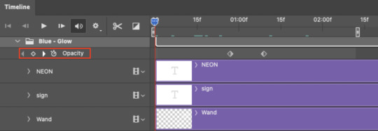
As you can see, I already added my keyframes (lil diamond babies). And luckily, it's super easy to do!
4.2 – Add the ending Keyframe first. We're starting at the end because our layers/groups are already at 100% opacity. Drag the playhead (the blue arrow attached to the red vertical line) to a spot where you want the glow to be 100% opaque — this is where the glow will be fully "on" or visible. [Again, follow the 0.03-Second Rule. You will get duplicate frames regardless when using keyframes (this will be explained in the note in Phase 5), but abiding to the rule will mitigate the amount of dupes you get.]
Then, click the clock icon by "Opacity" to place a keyframe:
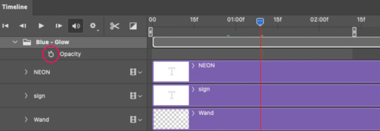
4.3 – Add the starting Keyframe. Go backward from the ending Keyframe you just placed (I went back 0.12 seconds — but you can play around with the duration of the fade, just keep it a multiple of 0.03):
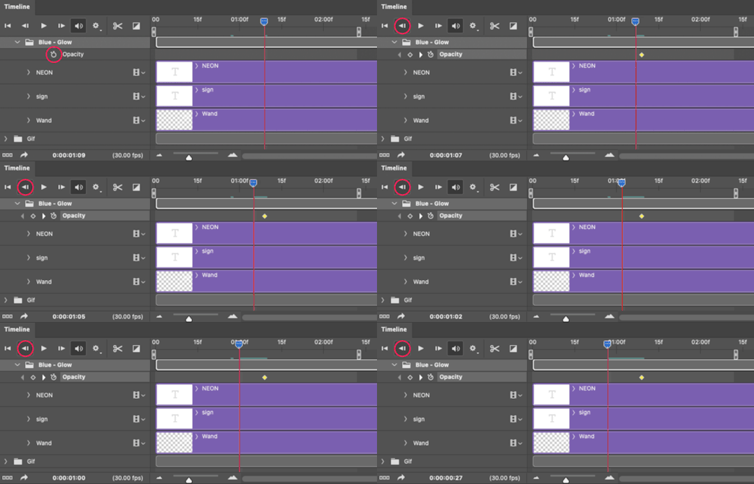
And drop another keyframe, this time by clicking the diamond icon by "Opacity":
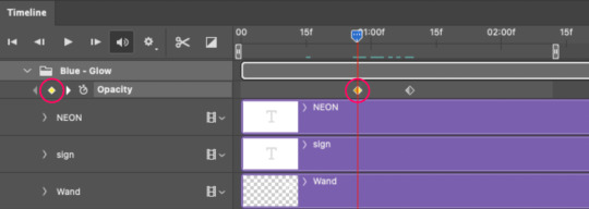
4.4 – Reduce the opacity on the starting Keyframe. Keeping that keyframe you just placed selected, go to the layers panel and reduce your layer's/group's opacity to 0%:
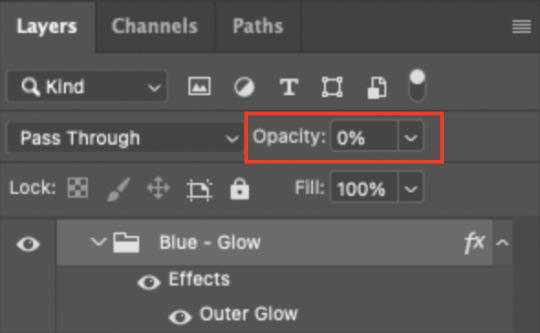
Now, this Outer Glow will slowly fade from 0% to 100% opacity.
And just for a visual aid, here's where my fade-in keyframes are in relation to my flashing segments:
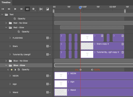
To refresh your mind, the 0% Opacity Keyframe starts when "FLASHING" is visible for 0.24 seconds (the first long segment of visibility).
With these keyframes, you'll get a smooth fade-in à la ✨light switch with a dimmer✨
PHASE 5: EXPORT
Yay, we're finished! Convert from Timeline back to Frames and export your gif!

NOTE: If you only did the flashing effect and followed my 0.03-Second Rule, you shouldn't have any duplicate gifs. BUT if you included the fade-in effect using keyframes, you WILL have duplicate frames. 'Tis the nature of keyframes. 🤷♀️ I had 4 extra frames where the fade-in starts, which I deleted. So, as always, I recommend checking your frames when you convert from Video Timeline back to Frame Animation — and manually delete any duplicate frames.
Sorry this tutorial is so long 🙈 I over-explain so you're not just mechanically copying steps, but understanding the WHY behind each step! Thanks for bearing with me
If you have specific questions about this tutorial, feel free to send a message to usergif and I'll try my best to help! :)
More USERGIF tutorials • More resources by Nik • USERGIF Resource Directory
#typography#gif tutorial#completeresources#usershreyu#useryoshi#userelio#userzaynab#userives#usertreena#usercim#userrobin#userkosmos#usersalty#userhella#alielook#uservalentina#uservivaldi#*usergif#*tutorial#by nik#flashing gif
807 notes
·
View notes
Text
Tutorial: Manga Banners
Basic Manga Text Change/Coloring/GIF creation in PS
Hey, so as promised making a very basic tutorial for making banner gifs in photoshop for fics/drabbles/layouts, etc.
I'm going to keep things super simple here for beginners.
END RESULTS↴

(NOTE: This gif I made will be used for an unreleased story of mine so please don't use this exact gif/images but you are free to follow the tutorial to create your own).
All I ask is if you find this helpful to REBLOG! :) No need to credit me.
For this tutorial you will need ↴
Photoshop
At least 2 manga panel images (non-transparent*)
Optional: Manga fonts. I mostly use CC Wild words (speech bubbles) & Manga Temple (narrator boxes)
Basic knowledge of photoshop layout/where tools are.
*this tutorial is essentially the same if working with transparency but if you do work with transparency you will need to have knowledge of clipping masks which i do not cover here.
Tutorial ↴
(optional) Prepwork: so i didn't think to include this do this but you are going to need to crop and resize your image. make sure the width is either 540 or 1080px. This is the recommended width for pictures in tumblr. Height can be what you want it to be. This is done image > image size (make sure the link-chain is pressed for aspect ratio)
Step 1
This is what you want your setup to look similar to. Delete locked background layer.

Steps 2 & 3
Make a new layer. It might be helpful for beginners to re-name all their layers so instead of "Layer 2" you might name this ⇢ "White fill layer or Text cover up". (doubletap layer name to change it).
Use rectangular marquee to select text you want to change. If you are just replacing a word or two you dont need to white out everything. But you could choose to cover up all if you wish. I just wanted to remove "senpai".

Steps 4 & 5
Use Paint Bucket Tool to fill in selection area with white (make sure the new layer you made is selected when you do this).
Select Text Tool. There is no need to make a new layer as once you are done typing it will become a text layer. I used CC Wild Words bold font for this for emphasis. If you do multiple lines of text use a new text layer for each line.

Step 6 - Optional Step - Highly recommended if you did multiple lines of text.
Rasterize Type by right clicking the layer. This is an optional step. I tend to do it out of habit and rasterizing lets you use the move tool to give you exact px distances between other rasterized elements but nothing we are doing requires this tbh and if you do decide to do it you can't go back and edit text.
If you did multiple text layers you cause space them out evenly using the move tool (zoom into 200%-400% if necessary to get exact pixel distances). Tip: Manga text is centered in the bubble and leaves a good distance away from the edge.
When you are done ctrl/cmd to select all text layers then right click and merge the layers. This is so incase you have to move the text layer for whatever reason they are all on one layer now, evenly spaced and you won't accidentally mess that up.

Step 7
Create an exposure layer (half filled in circle in layer bar for menu). This is important as it can lighten/darken image to make the colors we will add later pop by playing with the sliders for each setting.

Step 8
Apply exposure settings. On the right-hand side there will be 3 slider bars. The screenshot shows my settings but your settings will vary depending on the image. The one that gives the biggest benefit for manga is Gamma Correction which affects the midtones to make them lighter/darker and adds better contrast to the image so it doesn't look as muddy, often in black and white images it is easy for midtones to look muddy. Offset affects mid to dark tones of an image. Exposure affects midtones to highlights to make brighter or darker, overall use this the least. TIP: If you want to make an image brighter or darker you usually want this to apply equally to the overall image so then you would create a brightness/contrast layer instead. most manga images skew muddy and need a midtone and dark adjustment rather than highlights. the better the manga scan images the less adjustments you will need.

Step 9 - Optional
Apply a gradient map (half filled in circle in layer bar for menu). This is optional. a Gradient map adds gradient but preserves the shading in the image so essentially adds a gradient to the shading. I do this in black and white. But if you are happy with how it came out in the exposure phase you don't need to.

Step 10 & 11 -
Apply a gradient (half filled in circle in layer bar for menu). So when you add a gradient there are a ton of preset color combos you can use or you can create your own. I think this one is a preset but can't remember. I like a diagonal gradient from light to dark depending on where the light source on the image is but it is completely up to you. I tend to set the gradient angles near these 4 settings: -145, -45, 45, 145 depending on what corner I want the lighter part in.
One thing to note is brighter colors work better with a darker background. Lighter backgrounds can get washed out. One you add this as you can see it will be solid color.
*note* once this layer is applied any edits such as moving text, etc. around you want to do to the lower layers beneath it click the "eye" button to hide the gradient (same for the map) or there's a good chance it will move the gradient layers around and not the layer you want.
Change layer blending mode. By default it's set to "normal". You can play around with these. Depending on the effect you want and whether the image has darker or lighter colors will decide the blending mode. My typical blending modes are screen, overlay, hard light, vivid light or pin light. You can duplicate this gradient layer and play around with multiple settings and opacities to create something you like.

Step 12 - Optional
Add a Brightness/Contrast layer (half filled in circle in layer bar for menu). Brightness/Contrast on this step will look wildly different than if you added it right after the exposure step. It's not necessary but if you want more overall contrast or brightness then you can add it.
You can see my settings below on the sliders on the right-hand side.

Step 13
Create new layer for highlights. (also good check point to see how your layers are organized).

Step 14
Select the brush tool and ensure brush settings are a soft round brush with a hardness of 0% for the highlight effect. (if you click the brush image you can see my settings better)


Step 15
Select the dropper tool and pick a color from the gradient image. I usually pick the darkest colors available as it will have the best dodge effect for highlights. Since this is pink/redish I only have one highlight color but if you were doing a green/blue gradient you would pick the darkest from both. (ignore the purple here its not being used)


Step 16
Create highlights with brush tool. Do a few tests placements randomly around the image for positioning and then swap the blend mode to either color dodge or linear dodge. I usually do color dodge. You will get awesome highlights like below. You can play with the sizing of the brushes and opacity to decrease the effect.

Step 17 & 18
Export as PNG. Do this even if you want to make a gif as I always recommend a clean canvas for gif making. If you want to be done here and don't want a gif thats fine too. File > Export > Quick Export as PNG (do not save as jpeg/gif you will lose image quality).
Repeat for second image. You don't need to open a new file unless it helps you to not get confused. You can just make a new layer and paste your new image into that layer (if you just right click copy the file in the window/finder folder you can directly paste it into a layer in PS) and use the transform tool to resize. However you can totally just open the image in PS. The benefit of same canvas is you save yourself some time as you can just duplicate gradient layers/adjustment layers and move them. But this is kinda more advanced so if you aren't comfortable with photoshop just make a new image.

Step 18-19
Create new file/open one of the PNG in PS (more advanced can just create new layer, select image, then copy > copy merged and paste on new file for each. Otherwise open one file, create a new layer then copy the other file. The bottom later will be the first image in the gif.
Create Frame Animation on the timeline window. (if the timeline window does not appear then window > timeline) *note* if this is your first time working with the window it may be set to "create video timeline", if that's the case create it then from the frame menu (in step 23 theres an example of where this is) select "convert to frame animation".
If done correctly your setup should look like the below with two images. One for each layer and one for each frame.
MAKE SURE PROPAGATE FRAME ONE BOX IS CHECKED IN THE LAYERS WINDOW.
lmao, not to be dramatic but this ensures most effects you would add to frame 1 (which corresponds to layer 1) is applied to all frames. I'm not too sure its super vital for this super basic gif I'm showing you but its better to get in the habit of always having it checked. otherwise it will fuck you over later down the line in my next tutorial where I show how to add frames to gifs.

Step 20
Select both layers, then select both frames (ctrl/cmd) and finally select tween from the timeline window. It is the multi-faded dot option on the bar below.

Step 21
Add Frames to Tween. Tween is the fading effect adding more frames is the longer the fading effect is. I added 20 for this step, you can play around and add more or less.
Once you do that you can see 20 new frames being added onto the timeline. This will not automatically add new layers, this is fine. Frames and layers don't need to be a 1-to-1. (Another reason why propagate frame 1 needs to be checked as you can still adjust those layerless frames by adjusting frame 1's layer)

Step 22
Adding delays. Automatically the delay on every frame is at zero. But especially if you have text you want people to be able to read that so you need to add in a delay. Your delays can be in increments of 1/10th of a second. I add a 1 second delay to the first frame only.

Step 23
Select and Copy the first frame and then select the last frame and Paste. A paste window will appear in this case we want to paste after selection. I circled where the menu for frames are. (sorry used a different gif as an example so ignore everything but the circled menu)


Step 24
Adding additional delays. I add a 1 second delay to the last two frames.

Step 25
Add more Tween I added 5 frames this time as we want the transition to be much quicker to reset the image. You can see frame 23 in the previous step are now frame 28.
You can add more images in than 2 and follow these steps to add tweening.

DONE! Now to save.
Step 26
Export your gif. File > Export > Save for Web (Legacy) and the screen below should pop up. Here are the settings I use for gifs. You can play around with it but I really wouldn't lol. (again ignore image size, this is from a different gif) it will also tell you how big in file weight your gif is. This isn't something you have to worry about for something simple but the bigger the image size and the more transitions/images you use the more frames you will have. Reducing image size (make sure chain link is on like in the below) will take off more sizing then removing frames will and I would recommend that. But tumblr allows 10MB MAX per gif so just something to keep in mind.

Let me know how this was! If you have questions just drop me an ask. ❤
#✩𝓀𝒾𝓏𝓏𝒶𝓉•𝔱𝔲𝔱𝔬𝔯𝔦𝔞𝔩𝔰#✩𝓀𝒾𝓏𝓏𝒶𝓉•𝕘𝕗𝕩#gfx#fic banners#tutorials#resources#photoshop tutorial#manga edit#edits#fan fic writing#fic writing#anime edits#manga edits
121 notes
·
View notes
Note
hi! would it be possible to post a tutorial of how you created the shapes in this set /post/753222419295158272 thank you :)
sure I made the gifset a while ago so don't have the psds saved but i decided to make a new gifset with a similar shape effect and show you how i made that :)
tutorial below the banner/cut

first start by making and colouring your base gif as you'd like. for the example i'm making today i'd like a pink gif.
for simplicity i'll put all the colouring layers in a group so it is easier to see what's going on with the shapes, but this is not a step i usually take.

once you've got your base gif ready search for the image/shape you would like to appear on your gif. in this case i searched for glinda's crown :)
make sure the image has no background and save it. if needed go to https://www.remove.bg/ and remove the background from the image then save it.
open your saved image in photoshop and drag it onto your gif. typically i drag it on the gray area outside the image canvas so it will land in the centre of the canvas.


if the image is too big resize it by using the transform function (ctrl +t)

right click the image layer and go to "Blending Options" (you can also do this by double clicking the layer (but not on the layer name as this will prompt renaming the layer)


go to color overlay and change the colour to white with blend mode normal and click ok

convert the new image layer to a smart object by right clicking and selecting the relevant option

change the blending mode of the new smart object to 'difference'

go back into blending options now and change the color overlay to the desired colour with the blending mode set to 'color'

at this point you can also add a stroke and drop shadow


this results in the below result

i noticed a bit of background missed from remove.bg

so i now add a layer mask and mask over the errant mark


and that's the basics of how to make a shape like the one in the gifset you linked. you can now add any text or other embellishments you may like.
a few other tips:
play around with your stroke settings, i did this a lot when making the so highschool gifset (e.g. i think the basketball one used the centre option)
the stroke option will outline what doesn't have a solid fill. to get each part of the basketball outlined like it is in the gifset i used an image like the first one below where the lines on the ball were also transparent to get the strokes i wanted (if that makes sense). if the whole image was solid, like the second image the outline would just be a circle basically.

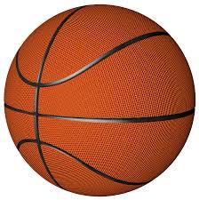
in most cases the method i showed here is the best method, but for the so highschool book image i did something slightly different where instead of doing a straight smart object i also duplicated the shape on top with all the details left in. i applied the same effects to the bottom layer as above and on the duplicated layer also set that to difference and added a color overlay like the above


gives a result like this:

you can tweak how this looks a bit by using a selective colour layer clipped to the top layer. i wanted a bit more definition on the hat so i ended up with this after tweaking the neutral and blacks channels

overall my advice is to experiment and see what you like as that is what i basically do :)
#asks#resources#ps help#usergif#allresources#yeahps#completeresources#resourcemarket#dailyresources#tutorials#photoshop tutorial#*mine#i hope this helps/makes sense
52 notes
·
View notes
Text
Hey you!!! Do you wanna make a silly, little guy in my style? Well now you can!!!!!


Here are some free-to-use linearts of my versions of the Fake Peppinos and Peppino Clones from Pizza Tower! Link to Drive with all versions here!
There are five different linearts; Tall Fake, Wide Fake, Peppiclone, Baby Fake and Baby Peppi! (tho the last two are technically mostly the same but shh)
And each variation has four versions, so at least one should hopefully work regardless of your art program! (Except traditional, sorry traditional artists kjgfsl)
There is: PNG with white background, PNG with transparent background (marked with 'Trans'), Photoshop Document (marked with 'PS'), and an MS Paint friendly version (marked with 'Paint')
Please Read Before Use!
I have a few rules when using these, so please follow them! If these rules are broken, I reserve the right to ban anyone from using them or revoke free use entirely. Just be respectful, please!
These are free to use - but if you would like to support me or give a tip, I have a Ko-fi right here!
Please do not remove my signature!
Please credit me when posting your own versions - I am SmallTimidBean on most sites, but if posting to a site I am not on, just say SmallTimidBean on Tumblr (also probably credit McPig/Tour De Pizza for the og concept!)
You may edit the lineart to add features (tails, horns, wings etc) or change features (the expression etc) - just keep in mind, if you are going to edit very heavily, then consider drawing your own version first!
Please do not use for commercial use - IE Making designs to sell (aka adoptables)
Please do not use in AI databases, or for AI bots
Please do not use for hate or bigotry
Please do not draw anything sexually explicit on these - I don't mind what you do with your clones outside this lineart, but I don't wanna see that on my art Imao (Also, two of these guys are literal babies)
Adding Body Horror or Gore aspects is fine, - those come with the territory of being a clone - just be sure to use the appropriate content warnings!
While these are based on clone characters from Pizza Tower, they do not have to be used as such - any characters you make with these, are yours to do with as you wish!
I encourage you to draw your new clones after you have created them! I would love to see them in YOUR style, not just mine!
And have fun!
Hopefully that's everything! I do plan to make versions with additional features and maybe even a version with all features to mix and match - but I do not have the spoons for that right now, so check back later!
Please let me know if there are any issues, or if you have any questions or suggestions for me!
#what the hell do I even tag these as#I don't know so I simply will not#I don't want this to spread too far anyways I am nervous#but I am doing it scared#so please be nice to me#pizza tower#lineart
88 notes
·
View notes
Note
hey, can i please ask what dimensions you use to make your header gif? (I THINK you used to have that thing where you have a little circle gif inside the header as well. If you don't mind sharing how to do that I would appreciate it! If you didn't, please disregard haha)
hiiii!! sorry this took me so long lmao but yes! this was my header for a while and i basically had the circle gif act as my icon (so i just hid my icon under edit appearance) so i'll walk you through how to make it!
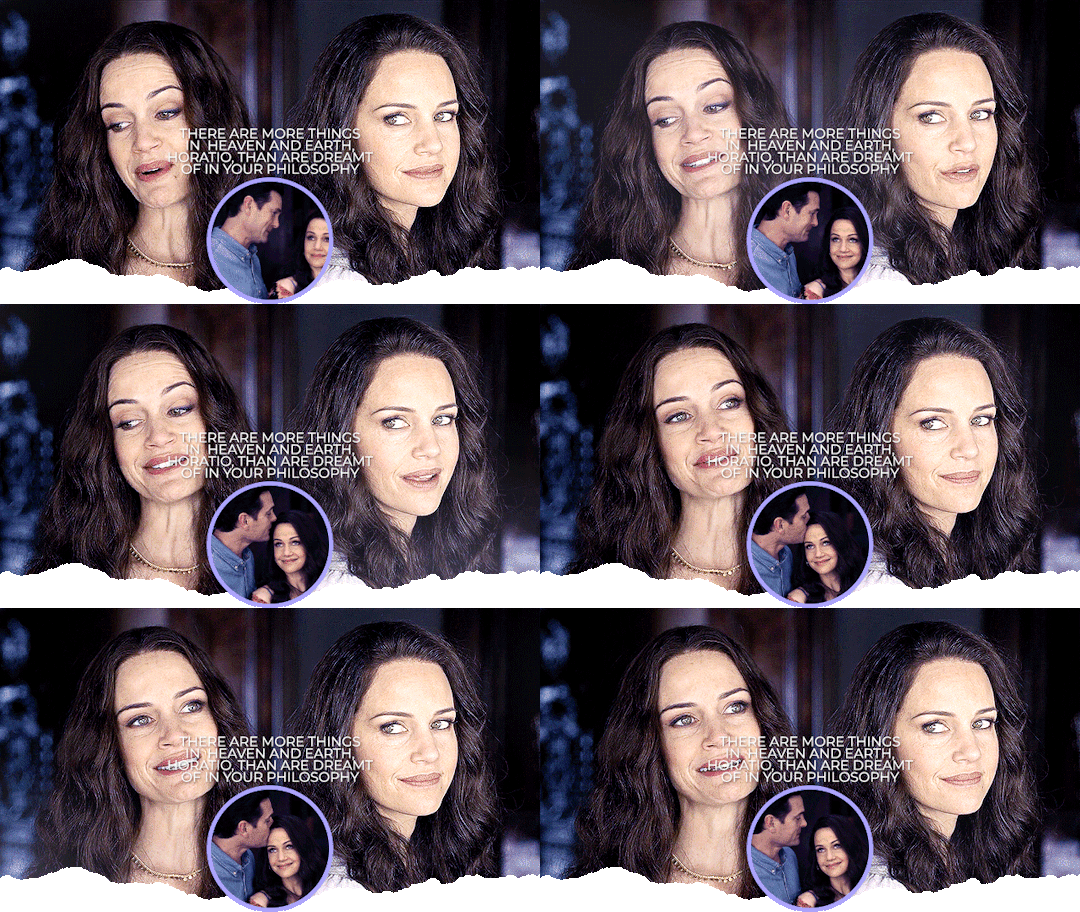
ultimately, the header contains 3 separate gifs: liv on the left, liv on the right, and hugh and liv in the circle. i find it easiest to make the gifs all separately first and then bring them all together on what will become the header's canvas,.
i crop, sharpen, color, and then convert each of the 3 gifs into a smart object and plop them onto the header canvas. the dimensions of this one are 640x360 but i believe the header dimensions have changed and are now 580x326 (that's what my current one is) but idk i never had an issue using the larger dimensions so you can try both out and see what you like best!
the original dimensions for the 3 gifs themselves were: 640x360 for the two large gifs and 368x184 for the circle. the circle gif doesn't matter quite as much, just make sure it's at least a few pixels larger than the circle you create when you get to that step!
so once all 3 gifs are turned into smart objects (if you don't know how to do this, when you're in timeline, highlight all your layers and right-click -> convert to smart object. this just makes the whole gif into one layer and they're easier to work with and adjust as necessary.
when i'm blending gifs together, i like to set the background/first layer of the gif to black. it helps when you're blending and your layer masks get really close together and instead of going to a transparent background, it goes to black and i think it gives it a cleaner look. this really is just personal preference and completely optional though!!
anyway, i brought over the two main liv gifs first and played around with where i wanted each one. this is what i have once i figure out the positioning and set both layers to screen.
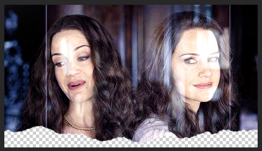
then you want to add a layer mask to each gif. select each layer separately and press this lil guy at the bottom off your layers panel:

when i'm blending, i pretty much exclusively use a soft round brush. size depends on what i'm blending and the dimensions, but hardness is always set to 0%. on a layer mask, you're going to use either black or white. black removes parts of the gif, white will bring them back. it's a very low-stakes way of getting rid of areas you don't want while not having to worry about deleting too much.
once i'm happy with the blending, this is what my layers ended up looking like (with the black layer beneath), but this will vary depending on your gifs and positioning!

the next step is the ripped paper effect at the bottom (if that's the vibe you're going for). you could theoretically do this with any kind of brush. i just like the look of it so it's not such a harsh transition on my mobile theme from the header to the background color.
these are the brushes i use but i'm sure you can google something to the effect of "ripped/torn paper brush photoshop" and find plenty others.
go ahead and group both of your gifs, your base layer, and any other coloring layers if you didn't color them before transferring them to this canvas. to do this, select all applicable layers and press ctrl+g or right-click -> group from layers.
now select the group and add a layer mask the same way we did with the gifs using the little icon at the bottom of your layers panel. your layers should look like this now:

once your brushes are loaded into photoshop, open up the brush tool by pressing 'b' and select the brush you want to use. i usually try a few different ones out just to see the different edges. you may have to adjust the brush size and make sure the hardness is set to 100% if applicable. before using the brush, make sure the layer mask itself is selected like in the above screenshot and your color is set to black.
when you hover over the canvas with your selected brush, you'll be able to see where the top edge will rest. i keep mine pretty close to the bottom -- i think the highest up this particular one goes is about 50px from the bottom. you should end up with this:
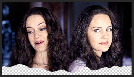
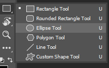
onto the circle/icon!! i truly just ended up eyeballing this size-wise. go ahead and call up the ellipse shape tool. to do this, right click on the shape tool and select ellipse like so:
colors are totally up to you, but i like my shit color-coordinated so i believe i color picked the bottom circle (the outline) from liv's purple dress in the right gif. once you have the ellipse shape tool equipped, click anywhere on your canvas. the dimensions i used were 150x150 but of course feel free to experiment. for a perfect circle, both numbers do need to be the same.
using ctrl+t (the transform tool) drag the circle to the vertical center of your gif and right to the very bottom so it's hanging over into the transparent part. this is what will make it look like your actual icon on your mobile theme.
next, create another circle. i'd recommend using black for this one, but it really doesn't matter. the dimensions for this one are 140x140 (10px less than your outline circle), but again, this will vary depending on the outline dimensions. i liked the thickness of a 10px difference, but you can always increase or decrease that depending on your preference. this circle is going to be the base for your icon gif.
again, use ctrl+t to vertically center your circle and bring it all the way to the bottom just like you did with the outline circle. as long as they're placed/snapped to the exact same location, you'll have a perfectly consistent outline.
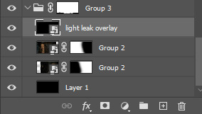
go ahead and bring over your icon gif, already sharpened, colored, and converted to a smart object. make sure this layer is directly above your black circle. on your gif layer, right-click -> create clipping mask. ctrl+t to move it to the same location as the circles and adjust it to your liking.
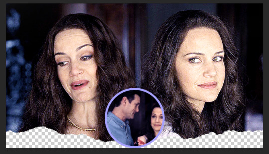
of course, it's completely up to you if you want to add text or overlays or not, but i figured i'd share what i did in case you're curious! (click to enlarge)
and for the overlay, i just grabbed a video off youtube of different light leaks. i only wanted it to be on the two main gifs and not the icon gif, so i plopped it into that group we made and put it at the top, over everything else, and set it to screen like so:
and that's pretty much it! if you have any questions about the tutorial (or anything else) just let me know!! i'm more than happy to help 🥰
#answered#gracegordongreene#my tutorials#gif tutorial#gifmakerresource#chaoticresources#completeresources#dailyresources
78 notes
·
View notes
Text

* ( ❀ ˆ꒳ˆ˵ ) ♡ Ꮺ 𝗧𝗜𝗡𝗬𝗧𝗢𝗪𝗡𝗦 — 𝖯𝖠𝖭𝖦 ! 𝖵𝖤𝖱 𝟣 & 𝟤 ੭

— introducing pang , the latest psd template from tinytowns ! enjoy the aesthetic of tu.mb.lr's music player but hate the way it changes into the mobile player on your actual blog ? fret no longer ! tinytowns has got your back with pang version 1 : a psd duplicate of tu.mb.lr's music player , preview under cut ! ❀ want something a little fancier ? version 2 is styled to match tinytowns' header template super which can be found here while also offering multiple customisations like a cloud play icon or a star play icon ❀ moderate photoshop knowledge is needed if you plan to use a gif image , but other than that the template is relatively straight forward + help is always available through ask ❀ download link for both versions , fonts used + helpful tips are below the read more along with some credits ❀ please consider liking + reblogging if you found this resource helpful ( ˘͈ ᵕ ˘͈ ♡) ~
❀ VER 1 PREVIEW.

very plain jane , matches tu.mb.lr 's music player ( disclaimer : neither of these templates actually play music ! )
❀ DOWNLOAD.
version 1 template - here
version 2 template - here
poppins font - here
first font is sant joan despi .
❀ EDITING TIPS.
the white color fill needs to match the color of your posts : to change this you must double click the white box on the color fill layer + it should take you to a window to change it. the same goes for the blue music player background in version 1 specifically ( there is a different process for version 2 ) or you can remove the white background but the stroke layers may look a little funny .
to change the blue background on version two you must change it through the shape fill ! the same goes for the gradient switch
❀ CREDITS.
sparkle icon - Sparkle icons created by SeyfDesigner - Flaticon
cloud icon - Cloud icons created by Freepik - Flaticon
star icon - Star icons created by Smashicons - Flaticon
folder icon - Folder icons created by Good Ware - Flaticon
headphone icon - Headphones icons created by sonnycandra - Flaticon
flower icon - Flower icons created by Freepik - Flaticon
#supportcontentcreators#photoshop#free rpc#free rph#rph#rpc#photoshop templates#muse template#photoshop template#pinned template#ps template#template psd#template#resource#rph resources#rpc resource#free resource#free psd#rph template#rpc template#tinytowns#m: template#m: resources#m: super series
395 notes
·
View notes
Text
Clipping Path Services Provider & Cut Out Background | Photo Editing Company
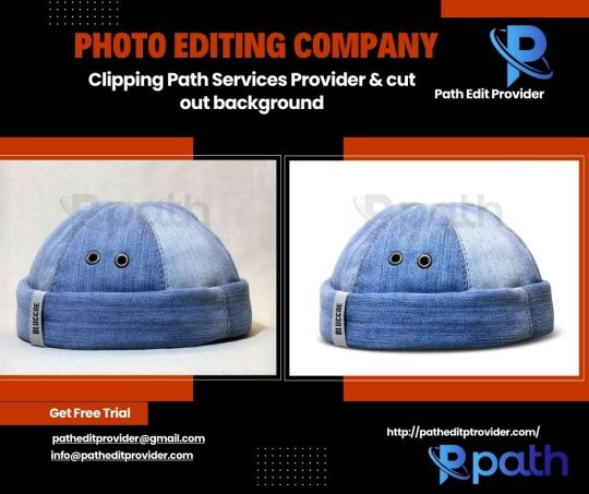
Email: [email protected] Gmail: [email protected] Website: www.patheditprovider.com
#Clipping Path#clipping path service#background removal#Photo background removal#White Background#Transparent Background#Change Background#Remove background#Object Removal#cut out shape from image#cut out image#photo cut out service#quick cut out#quick cut out photoshop#cut out background#cutout pro
0 notes
Text


Wayne Edson Bryan, Long Haul, 2025, digital collage/study for painting created with 26.1.0 Adobe Photoshop. No generative ai tools were used.
https://www.instagram.com/wayneedsonbryan/
I’ve been experimenting with real paint. Applying black acrylic to white cardboard > photograph it on a scanner > digitally remove the white background & add 3D volume by accentuating highlights & shadows > change the color to whatever I want & add drop shadows so they float > and finally, digitally stack the brushstrokes & drips in new arrangement. Potentially, I could make entire paintings this way, one brushstroke at a time.
#art#contemporary art#artists on tumblr#pop surrealism#drawing#wayneedsonbryan#pop art#surrealism#humor#graffiti#emoji#video games#cartoon art#technology#advertising#abstract art#fan art#pop culture#painting
10 notes
·
View notes
Note
hii, sorry if you've answered this before but what do you use to make your edits ? your stuff is so cool it's inspiring me to try it out for myself hdkghdkgj,,

oh my gosh tysm 🥺 i really appreciate this but ill just get straight into the list! underlined = link , highlighted is website names
sorry for the long post i ended up yapping.. tldr photopea, ezgif, lunapic, alphabetiser, nameberry, magic baby names, baby centre, sekaipedia, pinterest, tumblr, . also at the bottom is a tutorial on making stamps & some templates
for basic editing i use photopea - https://www.photopea.com/ , if its too confusing you can also try ibis paint but its too confusing for me. i click "new project" and then use the dimensions i need ( tumblr banner = 1280x720 , twt banner = 1500x500 ). i can also make basic photopea functions tutorial if you need it bc a lot of people find it difficult to navigate. i dont have any specific favourite layer blends but i recommend light colours -> use the section under "lighten" , dark colours -> use the section under "darken" , blacks and whites -> use the section under "difference". of course once ur more comfortable u can just do whatver layer blends u want ^ ^
for gif editing / merging (layouts, pixels, blinkies) i use photopea's layer -> animation -> merge settings, however if that doesn't work i use ezgif - https://ezgif.com/ , specifically the gif maker.
for adding animations to stamps, i use lunapic's animations tab - https://www6.lunapic.com/editor/?action=animation-examples . i also used to use this website a lot for old layouts before i knew how to use photopea. below i highlighted my fav settings (3x for sizing)


for npts i use alphabetizer - https://alphabetizer.flap.tv/ to organise name lists. if you use this make sure to turn ON "ignore case" in the side menu!! it sorts capital letters as normal, and then i delete the capital letters later when formatting a post. for names i use websites like nameberry, magic baby names, and baby center. not sure how to explain it but i just get a feeling that a name suits a character ^ ^. as an example in all of these i used "orchid". for titles and pronouns i just use my imagination based off the character's wiki page.


for resources: i find proseka transparents online at sekaipedia - https://www.sekaipedia.org/wiki/Characters , or at @prosekaipng or @sekaitransparents . i find frames and pngs on pinterest or tumblr, and use unscreen to remove the background of gifs and remove.bg to remove the background of any image i cant be bothered manually removing. when i need to do touch-ups myself i use photopea
i find colour matches for layouts on pinterest, and then edit the shit out of them until it looks close enough to a colour palette (example below of some colour editing i've done recently). most of the things i do are extreme changes but i started off by making subtle changes in my old layout posts on lunapic, which i still sometimes do today like in the last example from a post currently sitting in my drafts i havent finished. ( ̄  ̄|| )
(this is how i found out my emu photopea file didnt save btw so excuse the missing elements ...)


for overlays, btw i use A LOT OF THESE, and also lots of custom PSDs. a psd is basically a colouring file you overlay on top of something, and are similiar to smart filters. in photopea you can click "image -> adjustments -> (whatever)" and apply that to one singular image, and these are called smart filters because you can transfer them to other images by individually dragging them. OR you can click "layer -> new adjustment layer -> (whatever" and this is a PSD because it automatically applies to all images. in photoshop, there are no "smart filters" iirc. i use a combo of smart filters & psds & overlays. i find overlays sometimes on pinterest, but mainly on tumblr. my favs below. use layer blends on these!!

for stamps i use templates in photopea using a raster mask. you can find templates on tumblr and deviantart, majority of tumblr dumps are from deviantart, so i focus on using deviantart myself and finding original stamp works on tumblr rather than reposts. some accounts i recommend are caterpillar-with-a-crayon and dixons-graveyard. remember to credit artists!!
to do this, first open a template in photopea using either " file -> open " or " open from computer " . next select the magic wand and select the inside of the stamp. next open a new layer using the blank page (second from the right, bottom right, next to the trash can below the layers) and use the brush tool to colour in the selection from earlier. it may look like an eraser, or any other icons shown in the menu. right click and select the brush tool, then hold down to colour it in. you should have something now looking like the fourth slide, with a stamp template on one layer and the colour on a layer above it.
to make the raster mask, de-select the colour by clicking anywhere in the dark grey surrounding the canvas. while on the colour layer, select "layer" (fourth from the left, next to "image" and "select, menu in the top left), then select "raster mask" -> "from transparency" . your coloured layer will then split into the colour surrounded by black, and a white version of the colour. both connected with a chain.


now, create a folder above your stamp template by clicking the button shaped like a file (bottom right menu, 3rd from the right, between a sheet of paper and a circle cut in half). now, click on the RIGHT split from the layer (the white colouring) and drag it onto the folder. it should stick there. now, anything you put inside that folder will fit the stamp inside! remember to turn OFF the red layer by click the eyes next to the layer. this wont affect your raster mask. i used an image and the text tool.
you can also do more complex things involving stamps but this is a basic tutorial ^ ^.


15 notes
·
View notes
Text
Written version of @thornowl's baking texture-based items for 4t3 conversion tutorial. (Part 2)
Tumblr's pics limit suxxx... Anyway, first part is HERE.

STEP 5: BAKING ALPHA.
Create new image for alpha. select TS4 body group.
Select TS4 body group. Go to Node editor, in the Image texture node change Color socket to Alpha and connect it to Color socket of Diffuse BSDF:

13. Select TS3 body group, In the Image texture node change your old image, that we used for bake, to a new image:
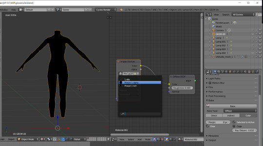
14. Use Shift + click to select first the TS4 group and then the TS3 group:

15. Go to the Render tab, settings are the same as the previous one, press Bake and wait:
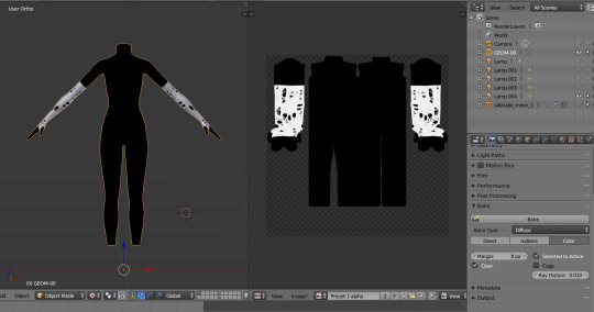
16. Fuck yeah, we are ready... at least for one swatch (I have 20 of them, but that's not important right now). Now we need to save that image and remove with it all the black stuff from the texture in Photoshop.
STEP 6: CREATING MULTIPLIER AND MASK IN PHOTOSHOP.
Open your both baked textures. in my case alpha image is having transparency, that isn't normal:

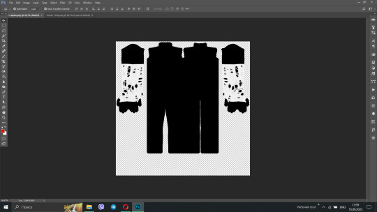
2. You can easily fix it, just use paint bucket tool with black color (#000000) for the background :
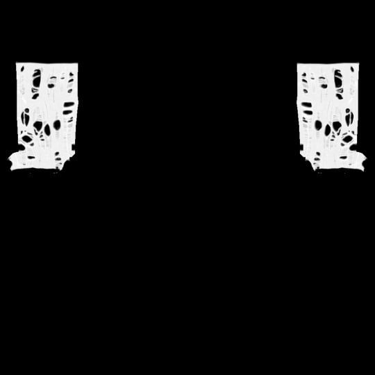
3. After that, open your multiplier and create mask for the layer: Open Layer tab → Layer mask → From transparency:
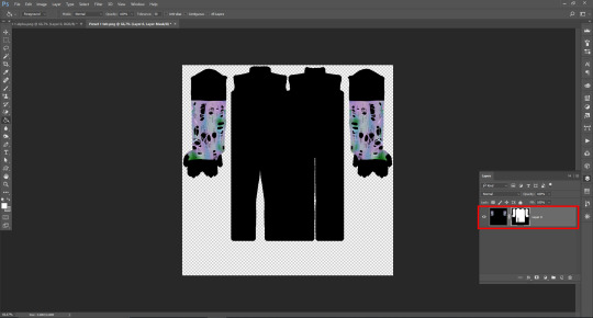
4. Open the Channels tab, our mask is supposed to be the fourth channel, Select it and make visible:
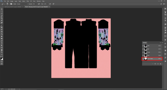
5. Open fixed alpha image, select it with Ctrl+A, copy and paste:

6. I actually saved the original texture, as additional non-recolorable preset, but you need to make your stuff recolorable. And I tweak the texture with Black&white and Curves, so I can make it gray and created mask with Match color adjustment:

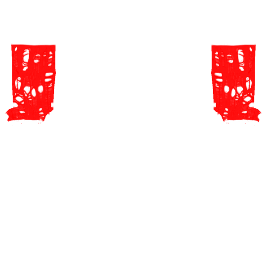
7. I don`t want to create specular and normal map for this but you can check tutorials for it on @sims3tutorialhub, but I created simple thumbnail with this template. After that I opened TSRW, created project from afAccessoryGloveBurglar clone and imported all textures. For whatever reason, TSRW doesn't show texture-based accessories (like gloves and socks), so you need to check it in-game.
It's the end of the tutorial! I want to thanks @thornowl for creating original video and wish all beginner (and experienced) creators the best of luck <3
86 notes
·
View notes