#remove duplicate text
Explore tagged Tumblr posts
Text
#Here's the cleaned-up version of your text#with hashtags#duplicates#and ratings removed:#---#**Mac Miller**#UFC309#Strictly#Serrano#Bluesky#ENGvRSA#$catex#Onama#Llontop#Ruffy#Tatum#$XDC#Gracie#MissUniverse2024#boybandsforever#Martinez#Ramirez#Jayce#LeBron#Boxing#Allison#Pogba#Romero#Wynne#Dianne
0 notes
Text

^ iterator projection tutorial!! ^
this post follows on from this one made by @prismsoup, intended to cover my slightly more extended process (including post-processing)
step -1 : pre-requisites
this tutorial is designed around clip studio paint for PC because its what i work with. its probable that whatever other program / platform you're using has these features but under different names
i use a rainworld typography font for text. find it here (or do it yourself)
i use scanline textures as a part of this. find them here
step 0 : select a base image

maps, blueprints and diagrams are favourable due to lots of detail without it derailing into noise. get experimental though, my favourite one came out from a picture of a nebula, and another from a friends factorio screenshot
step 1 : binarise & flip
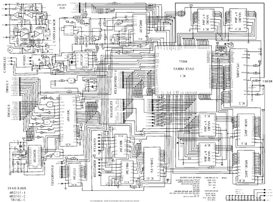
this command can be found under edit > tonal correction (D) > binarization. this forces every pixel in the image to be either black or white. adjust its sensitivity to your liking
step 2 : remove background

add in a black layer below (not just paper layer, as will become important later). wand select the background colour and delete it. if the remaining colour is black, CTRL+I to invert it to white
step 3 : add details

replace any text with rainworld font or simply remove it. add in blueprints or other complex decals (drawingdatabase is a decent source). during importing remember to binarise (after resizing). for "lower layer" elements such as contour lines create outlines for higher layers to retain clarity
step 4 : add multiply layer(s)
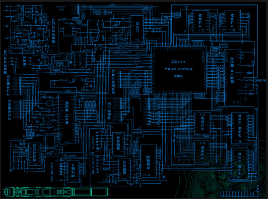
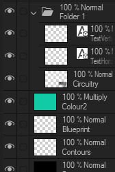
if you want to have multiple colours, put everything in the "higher" layer into a folder and set the top multiply to clipping above it
step 6 : post processing setup

copy all existing layers, create a new folder on top, and paste into that folder. right click the folder and "merge selected layers" set the resultant layer to add(glow). copy+paste and hide duplicate for now. from filters > blur apply a guassian blur with a strength of 130-170 (this creates the base bloom layer). set opacity to ~50%
step 7 : chromatic abberation
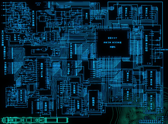
unhide not-blurred layer. guassian blur with a strength of 2. duplicate again. select top layer and move 1px up and 1px left (with arrow keys). CTRL+U then change the hue by 30. select bottom layer and move 1px down and 1px right, CTRL+U then change hue by -30.
stronger chromatic abberation can come from stronger gaussian blur and more change in hue
step 8 : scanlines

add the scan lines on top, invert so that they're white and set to add(glow). copy a multiply layer over it and make sure clipping is on. decrease layer opacity to ~10%. if it does not cover the whole image initially, paste more in and merge them together into one layer
tada! you now have one iterator projection. if you want to give it an extra affect, re-import the final PNG and filter > distort > convert to panorama. set distortion to 10 and scale to 101 (note that this drastically blurs the image)
259 notes
·
View notes
Text
Chalk'd UI - Lovestruck Update [26 July 2024]
Before downloading this new update, please remove old versions and clear any caches!
Main Mod Page & Patreon post
Current version: Lovestruck EP + July 25 emergency patch
+ Updated for the Lovestruck EP patch and the follow-up emergency patch. Now requires the latest UI Cheats Extension v1.42.1.
+ Added dark mode for the new Cupid's Corner panel and its phone icon 💘 Also updated the Social Bunny phone icon.
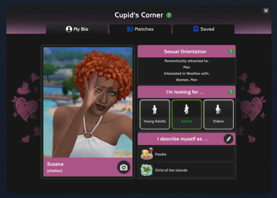
+ Updated CAS & GUI files to fix the loading issue and include the new Romantic Boundaries panel and Copy button. Now entering CAS should no longer stops your game.
+ Updated Game Options file to include the new Safe for Streaming UI in the Music tab.
+ Updated several Live Mode related UIs and fixed the issue of not being able to access the Simology panel and getting an empty Aspiration selection menu.
+ Added more phone icon overrides for other mods. Will be found in its own SFS folder to pick & choose.
Basemental mods (18+)
adeepindigo mods
SimRealist mods
// Mod Compatibility Info
With TMEX's new searchable menu mods, there are now more files that conflict with his mods which I've separated and placed in the Additional Files folder for you to remove and avoid conflicts. If you don't use his mod(s), you can keep the Standalone files and only remove the TMEX_Compatible files to avoid duplicates ^^ If you want to use his mods, remove the conflicting Standalone files. You can find out more in the README text found in the folder.
Thank you for your patience 💞 will be back in a day or two as I work on the Sims 2 UI and release it!
let me know if there are issues in case I missed it ~_~
452 notes
·
View notes
Text
Friday, July 21st, 2023
🌟 New
We’ve launched a new badge you can earn for viewing 601 or more posts on Tumblr in a day!
We’ve also launched the new activity view redesign on iOS, the same as what we built on web.
On desktop web, we’re running an experimental new version of the site navigation, which some users are seeing. This is a big change! Please send any constructive feedback you have to Support as “Feedback”. We’re reading through every piece of this feedback.
We’re also experimenting with a new design refresh for the direct messaging conversation window on web. Please send in feedback about that as well if you have any!
Also, we’re experimenting with new additions to the For You feed that aim to help get exposure to blogs that aren’t getting as much attention and engagement as more established blogs.
You can now edit posts with polls in them, and you can remove the poll, but you can’t edit the poll options themselves after the post has been created.
You can now upload WebP images in posts.
🛠 Fixed
Fixed a bug in the post editor that was allowing multiple native videos to be uploaded in the same post, and in reblogs, which could cause errors and the post being lost.
🚧 Ongoing
We’re aware that posts have been marked with a “Mature” community label incorrectly, and the appeals process failed. We’re working to resolve these issues ASAP and ensure it does not happen again. We’re truly sorry about this, it’s not acceptable for us to mess up this process.
There is a bug in the Android app causing it to crash if certain gifts are earned. We have a fix for this coming in the next version of the Android app.
We’re aware of a bug in the activity view in the iOS app which is duplicating the blog name in the activity text. We have a fix coming in the next app version here, too.
🌱 Upcoming
We’re working to add the ability to report ads specifically because they contain flashing images, so we can take action on them faster.
Experiencing an issue? File a Support Request and we’ll get back to you as soon as we can!
Want to share your feedback about something? Check out our Work in Progress blog and start a discussion with the community.
1K notes
·
View notes
Text


𝐇𝐀𝐙𝐄*
Multimuse version of 𝐃𝐑𝐄𝐀𝐌𝐄𝐑* and 𝐆𝐇𝐎𝐒𝐓𝐋𝐘*.
✧ Features: A more in-depth carrd design prioritizing information, so you'll have plenty of room to write all the important stuff. Highly customizable but may require more patience when editing due to the amount of unique elements. Tested to be mobile friendly but that may vary by device. Contains a customizable sticky header, a page for guidelines, two variations of a muse roster depending on if you want to use a more complex or simplified roster, a bio page that you can optionally use (and duplicate for other muses), a page for connections & a page for npcs. There are small quad-style image galleries in different sections, and there should be plenty of room for you to resize images to fix the block style of presentation when your text runs over. If you have any issues or questions about editing the carrds, you are more than welcome to ask me here on my tumblr and I will try my best to help you!
✧ Terms of Use: Like / Reblog if you use, please. Do NOT use this for illegal content or to promote hate (this includes "burn books" and callout / vent blogs). Do NOT remove the credits or make them invisible somehow. Edit as you wish, but no matter how much you change it, do NOT claim it as your own!
✧ Price: $6 for early access , now FREE / pay what you want as of February 9th. If you want to help a girl out with a tip, I'd greatly appreciate it 💗 ( Important Note! This template requires Pro Lite or higher to use due to the number of features included ! )
【 DEMO ✧ DOWNLOAD 】
important info below the cut, please read !
1.) The default muse roster is the gallery style one with images. The simple one does not display in the demo. If using the template, if you want to use the simple roster instead of the more complex one, change the link at the top navigation from "#muses1" to "#muses2". You may want to delete the entire section of the roster you don't end up using to save space.
2.) If you choose to use the bio page for your muses, you need to make copies of it with unique sections. If you have a lot of muses, you may need to make a separate carrd just for your bios to save space and loading time. To do this and use the bio template in this carrd, use this template for a second carrd then delete everything else beside the bio, create new sections as needed (don't forget to add the section breaks), and link to the second carrd from the first. If you need more in-depth guidance with this, I will happily help you.
#[my carrds]#[made by mari]#[my templates]#carrd template#rp template#rp carrd template#rp resources#free rp template#free carrd template#premium carrd template
81 notes
·
View notes
Text
okay. im pretty sure i got every unique thing link says in BOTW. link has about ~1500 unique sayings though some of them are different just by punctuation. duplicates are removed. use it for whatever you need, reference or fanfic or something idk lol
i did it all manually ctrl+Fing through the .xmsbt files for multiple headers so if i made any errors sorry. the order of the dialogue flow is scrambled in these files. and shoutout to MrCheeze
biggest thing i got from doing this is a better understanding of link’s voice/tone. link’s voice seems to be blunt and casual, but he clearly cares a lot. he also asks a lot of questions
2K notes
·
View notes
Text
V3 Survey suggestions
With Version 3 coming out, there will also be a survey. I'm sure many of you have had many ideas for how to improve the game, so before we forget any of them, let's compile them here
Please add your own additions to this post! Don't be shy!! It will let people consider them and put them on their own survey answers too!
I'll start:
New things in LADS:
Orbit playback feature - to allow us to replay directional orbit stages that we've already cleared
A "Sleeping next to him" quality time feature that lets us listen to the LI breathing. Maybe with a bedtime story that we can collect through gameplay or the chocolate shop too
An "Eating with him" quality time where you... eat with him
An alarm clock feature where we can set an alarm and our chosen LI will say good morning to us. Also maybe reminder alerts to work out and go to bed
The Kiss interaction in the cafe that the Chinese server got
More Zayne animations
More animations with visible MC interacting with the boys
Let us exchange large ascension crystals for smaller ones
Let us exchange duplicate plushie/kitty badges for something useful
Add EXP to memories used in battle after a win
Let us replay text messages so that we can choose different options
Let us replay special login greetings that autoplay during special events
Let us save our voice/language preferences for each individual LI
Make in-game friends more meaningful with interactions, power ups, etc. Such as borrowing a friend's cards for battles or having their main LI rescue us when we almost fail in battle
Have the LI acknowledge when you've made several attempts at the same Deepspace trial and encourage you further. Also congratulate us more often 🥺
More things to do in LADS:
More combat modes, especially stages we can clear daily that don't need the highest level cards and will give us diamonds
Make Abyssal Chaos harder so that the boosts actually mean something
More mini games, especially the ones that have already appeared in the game
More ways to earn diamonds through gameplay
More interactions in the cafe
Add different locations to the homescreen (for example, the LI's homes)
More Sylus cards
Improve existing things in LADS:
improve voice direction so that the voiced lines don't need to be artificially sped up
Improve English translations to line up more closely with the original scripts and the other translations
Increase/remove the weekly cap for chocolate, especially now with 5 LI
Increase/remove the directional orbit key limit
Increase the drop rate of bounty hunts
Let us permanently set our MC's appearance in the cards/battles
Let the servers get new content at the same time so the NA server doesn’t always get spoiled by other servers and the official twitter
Outfits:
More casual/comfy outfits for Zayne because he deserves it
Give us Zayne's Exclusive Tutorial outfit!
PLEASE code Zayne to choose his black shirt + sunglasses outfit less often!!
Give us the dress Sylus talks about - the one with the night sky over a river
#some of these things were what I wrote on the V2 survey but they're still important#love and deepspace#zayne love and deepspace#sylus love and deepspace#rafayel love and deepspace#xavier love and deepspace#caleb love and deepspace#to add to survey
82 notes
·
View notes
Note
I LOVE this set and i was wondering if you could pls explain how you did the text, including how you added texture to the ripped text and the highlighting/circling/etc of words? thank you for posting your beautiful gifs 😊
thank you!! 🥺 & of course! (photopea tutorial)
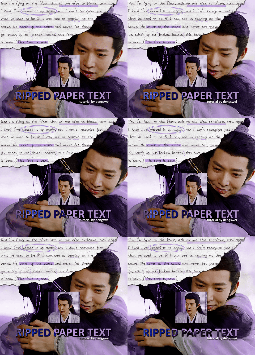
the majority of the texture for the ripped paper effect i can't really take credit for it's on the paper it's self all i did was make the paper white (because the texture was yellow) and used curves to darken the texture), i got the texture from one of photopea's templates but it seems their whole template section has changed drastically and no longer has like anything i used to see before ???? so i'll just share both versions here:
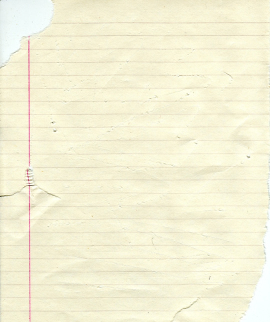
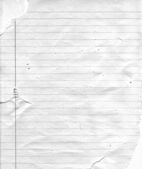
(original & my edited version)
for the ripped parts i just played around with this brush set in the plugins
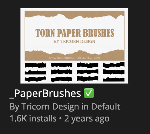
once i decided which of the paper brushes to use i had a new layer and used it where i wanted, so top left in the gif above, i clip masked the paper texture (and the adjustment layers as well) onto it so you get that ripped effect (if you don't like or want to add to that you can always use the brush tool again (or the erasure tool) set as the paper brush to add or remove sections i did this a lot when i realised certain words i wanted to show weren't on there (also changing the size of the paper brush when wanting to add a little bit or take a little bit away was a massive help)
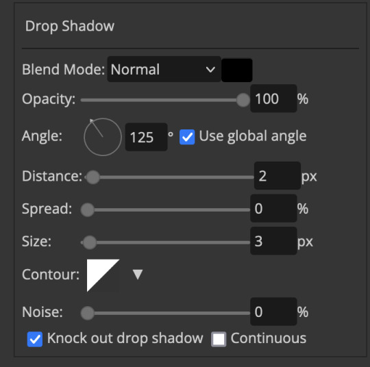
i also always add a drop shadow to my paper textures, the settings i used is mostly the same EXCEPT for the angle for all of the ripped paper (it's also my text drop shadow settings) because depending on how the ripped paper looks you might have to change the angle
also i know in the screenshot below it's on but make sure the use global angle is off if you're going to have multiple different angles of drop shadow in your one gif (so if you want your paper texture on 125° but anything else on 60° the global angle needs to be off but if you want them the same then you can keep that on, which is why it's on for me because the angle is the same for both the text & the ripped paper) (and by text this isn't the text on the ripped paper, there isn't any drop shadow on the text itself there, just to clarify this was for my "ripped paper text tutorial by dengswei" text)
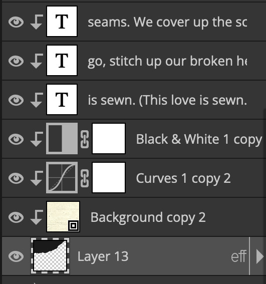
as you can see i also clipped my "handwriting" text to the paper layer this is so it stayed on the paper rather then going onto the gif itself (and it saved the fiddly part of masking it away & it felt more authentic this way too)
i found for me it was easier to seperate the text line by line so i knew exactly which part of the text was on which and if i wanted to change anything either it being a typo, changing the paper texture, or wanting a different word on a different line it was easier that way because it didn't end up messing up all of the text (though you don't have to do it that way, it's just what worked for me here)
font i used was: vag-handwritten (a default photopea font)
all of the next part needs to be above the text on your ripped paper:
for the highlighting, circles, and the lines it's pretty much all the same, i chose the colour which matched the gif (so say purple), for the highlight used the rectangle select & colour fill tools and set that to multiply & then played around with opacity (for most of my highlighting it's set to 50%), for the circles it was the same except the circle shape tool (no fill just stroke) set to purple, set to multiply, with 100% opacity (i found the circles looked better with 100% on some gifs depending on what colour i used), & then duplicated it once or twice and then just moved each circle to where i thought it looked best & the double lines is also the same using the line tool, set to multiply, & playing around with the opacity, & positioning them where i like
for the squiggly lines, the hearts, the 3 small doodle lines at either side of a word, & any other doodles i had on there i doodled them myself with my drawing tablet (you probably don't have to use a drawing tablet i just found it easier that way) using the free pen tool and then did the same thing set it to multiply and played with the opacity
if the colour you choose looks too dark or too light with it set to multiply either try a lighter/darker colour, try out something else like lighten, or screen, or increase/decrease the opacity more (i found i had this issue with the yellow being hard to see on the white paper so i used a darker yellow and kept everything at 100% opacity rather than 50%)
hope that helps! and please if anything is confusing or you want to ask any more don't hesitate to ask i know i ramble on a bit and it can sometimes get a bit confusing 🤣 or if there was anything i missed feel free to ask again 🥰
#replies#edwinas#mine | tutorials#gifmakerresource#photopeablr#photopea tutorial#photopea tutorials#gif tutorial#gif tutorials#usergif#tutorial#tutorials#photopea has so many great default fonts i just spend hours searching through them i barely download fonts now 🤣#i hope i didn't miss anything#also i don't know why the paper textures & my screenshots posted this way i had them side by side#okay they're side by side on mobile but not desktop ??? but mobile doesn't have the read more okay
97 notes
·
View notes
Text
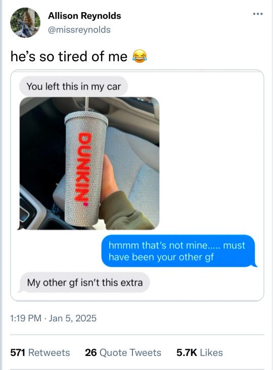
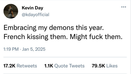
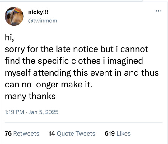
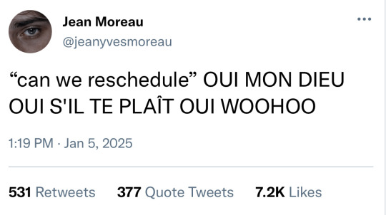
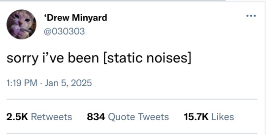
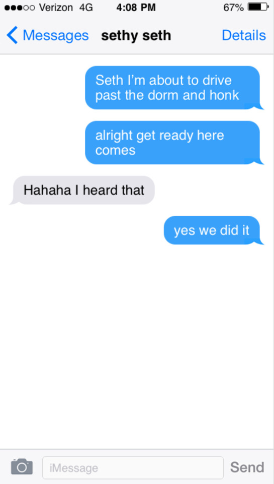
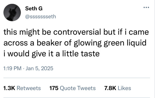
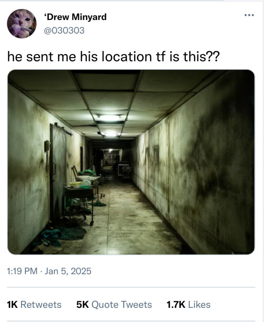
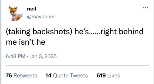
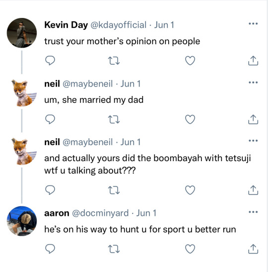
Foxes socmed AU!
Also real quick, since I started making these I’ve realised just how many fab fab creators are doing these too that I haven’t read all the way through (yet), so if you are one of those creators and notice that I’ve accidentally posted a duplicate of a tweet/text exchange you’ve already done and want me to take it down, please just let me know! Never my intention to copy anyone, I get my inspo for these from Twitter and Insta so any crossover is completely accidental - always feel free to drop me a message if there’s anything you’d like me to remove ❤️
(Part 1 with links to all parts)
#the foxhole court#all for the game#aftg#tfc#kevaaron#andreil#jerejean#aftg socmed au#aftg social media au
118 notes
·
View notes
Text
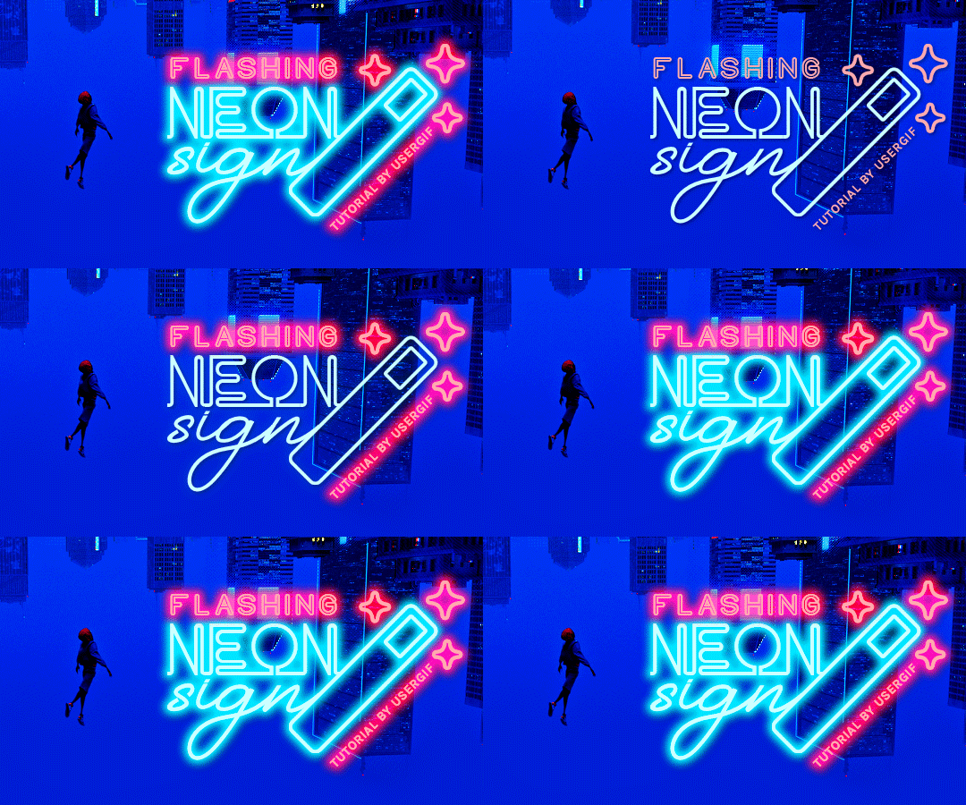
HOW TO: Make Animated Neon Text
Hi! No one asked for this tutorial, but this is one of my favorite typography effects as of late — so I thought I'd share how I do it. You can see this effect in the first gif of this *NSYNC Celebrity set and the last gif of this Anthony Bridgerton set. Disclaimer: This tutorial assumes you have a basic understanding of gif-making in Photoshop. It's also exclusively in Timeline and uses keyframes for the fading effect seen on the blue text.

PHASE 1: PREP YOUR BASE GIF
1.1 – Choose a dark scene. This effect looks best contrasted against a dark background. You can definitely do it with a bright background, but just like a neon sign irl, you only turn it on in the dark/at night — so keep that in mind!
1.2 – Determine the length of your clip. Depending on how much you want your text to flash or fade in, you'll want to make sure you have a scene long enough to also allow the text not to flash — reducing the strain it takes to actually read the text. For reference, my gif is 48 frames.
1.3 – Crop, color, etc. as you would. New to gif-making? Check out my basic tutorial here!
PHASE 2: FORMAT YOUR TEXT
Before we animate anything, get your text and any vectors laid out and formatted exactly as you want them!
2.1 – Finding neon sign fonts. It's easy as going to dafont.com and typing "neon" into the search bar!
2.2 – Fonts I used. Neon Glow by weknow | Neon by Fenotype | Neon Bines by Eknoji Studio
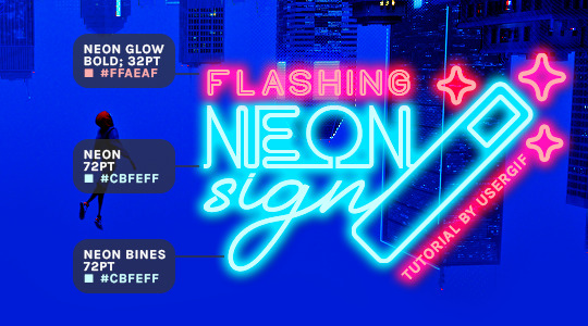
And to not leave my fellow font hoarders hanging, the font for "tutorial by usergif" is Karla (it's a Google font) 🥰
2.3 – Group your text layers. (Conditional) If you plan on having multiple text layers like I did and you want them to appear connected (like how the last letters of "NEON" and "sign" intersect with the wand icon), I suggest putting the layers into groups according to color (the shortcut to group layers is Command+G). If you don't group your text and just apply the outer glow settings to each individual layer, you'll end up with something like this:
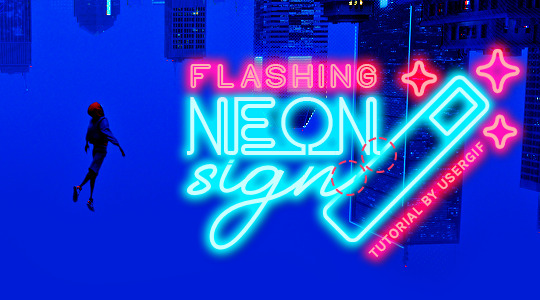
—where you can see the glow overlap with the line, instead of the smooth connection you see in my final example gif. I'm using 2 colors for my text, so I made a group for red and a group for blue.
2.4 – Apply Outer Glow. Right-click your text layer (or your group if you have several layers) and select "Blending Options" to open the Layer Style menu. Check "Outer Glow" and feel free to play around with the settings until you like the way your text looks!
Your outer glow color should be darker and more vibrant than the color of the text itself. The text should be within the same color family but much brighter and, sometimes, almost white (see Step 2.2 again for my text colors).
Here are the settings for the Red Glow (the glow color is #FF3966) and Blue Glow (#00F0FF):
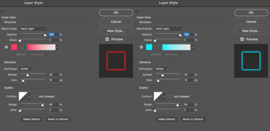
These aren't always my exact settings but they're pretty close to my standard. I always set the blend mode to Hard Light and usually have the opacity at 100%.
For every gif I use this effect on, I like to play around with Spread and Size. Spread will make the glow look denser and "expand the boundaries" (source: Adobe) and Size will diffuse the glow and blow it out so it covers a larger area (Adobe says it "Specifies the radius and size of blur").
2.5 – Duplicate your text layer/groups and remove glow. We're only going to be animating the glow on our text, and since doing this affects its opacity/visibility, we want to preserve the base text by creating a duplicate.
I just hit the Command+J shortcut to duplicate my groups and delete the Outer Glow effects, making sure that the "No Glow" version is above the "Glow" version:
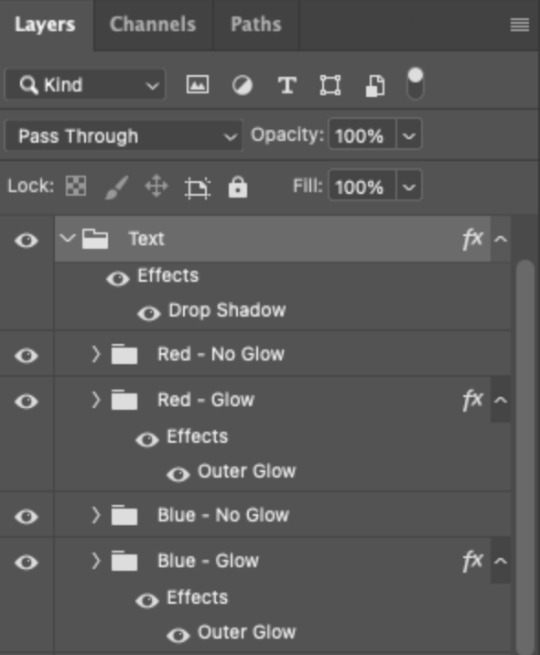
I also put all these groups into one group called "Text" for organization and so I could apply a drop shadow to all the elements for better visibility.
PHASE 3: CREATE THE FLASHING EFFECT
This is for the effect you see on the RED text in my gif!
3.1 – The 0.03-Second Rule If you've read any of my animation tutorials before, you're probably already familiar with this rule. In my experience (and for reasons I can't explain), Video Timeline pauses every 0.03 seconds (try clicking the forward button a few times, you'll probably find a "duplicate" or paused frame). So, keep all your layers a duration of 0.03-second increments (e.g. 0.06 or 0.09 seconds can also work) and align them on the Timeline at 0.03-second intervals. If you don't follow this rule, you'll get duplicate frames when you export, resulting in a choppy final gif.
3.2 – Trim and arrange your text layers. Only on the layers/groups WITH the Outer Glow effect, trim them into several segments of varying lengths where the glow will be "on" (visible) and leaving spaces where the glow should be "off."
Typically, I'll have a mixture of 0.06 and 0.03-second text. That's when the glow will be visible. Between each "flash" of visibility, I've got a 0.03-second blank space, baby *pen clicks* and I'll write your name:

The layers shown above are arranged with a few flashes and two long segments of no flashing. This is the order and duration of each segment shown above (purple = visible segments):
0.06 blank, 0.06 visible, 0.03 blank, 0.03 visible, 0.03 blank, 0.03 visible, 0.03 blank, 0.24 visible (the long bit where "FLASHING" doesn't flash at all), 0.03 blank, 0.03 visible, 0.03 blank, 0.12 visible
(I only did this for the text that says "FLASHING" to give it a glitching effect. The other red text keeps the glow visible starting at the first long segment.)
PHASE 4: CREATE THE FADE-IN EFFECT
This is for the effect you see on the BLUE text in my gif!
4.1 – Animate using the Opacity Keyframe. Again, we're only touching the layers/groups WITH the glow effect. If you only have one layer of text, you'll find the Opacity Keyframe by clicking the film reel icon:

If you're working with groups like me, you'll find it in the Timeline panel under the group when it's expanded:
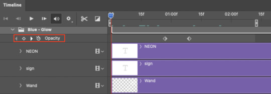
As you can see, I already added my keyframes (lil diamond babies). And luckily, it's super easy to do!
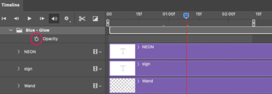
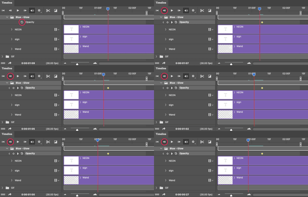
4.2 – Add the ending Keyframe first. We're starting at the end because our layers/groups are already at 100% opacity. Drag the playhead (the blue arrow attached to the red vertical line) to a spot where you want the glow to be 100% opaque — this is where the glow will be fully "on" or visible. [Again, follow the 0.03-Second Rule. You will get duplicate frames regardless when using keyframes (this will be explained in the note in Phase 5), but abiding to the rule will mitigate the amount of dupes you get.]
Then, click the clock icon by "Opacity" to place a keyframe:
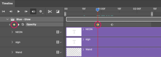
4.3 – Add the starting Keyframe. Go backward from the ending Keyframe you just placed (I went back 0.12 seconds — but you can play around with the duration of the fade, just keep it a multiple of 0.03):
And drop another keyframe, this time by clicking the diamond icon by "Opacity":
4.4 – Reduce the opacity on the starting Keyframe. Keeping that keyframe you just placed selected, go to the layers panel and reduce your layer's/group's opacity to 0%:
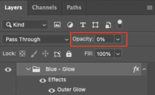
Now, this Outer Glow will slowly fade from 0% to 100% opacity.
And just for a visual aid, here's where my fade-in keyframes are in relation to my flashing segments:
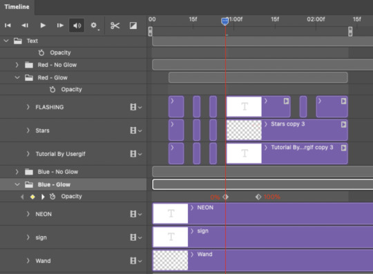
To refresh your mind, the 0% Opacity Keyframe starts when "FLASHING" is visible for 0.24 seconds (the first long segment of visibility).
With these keyframes, you'll get a smooth fade-in à la ✨light switch with a dimmer✨
PHASE 5: EXPORT
Yay, we're finished! Convert from Timeline back to Frames and export your gif!

NOTE: If you only did the flashing effect and followed my 0.03-Second Rule, you shouldn't have any duplicate gifs. BUT if you included the fade-in effect using keyframes, you WILL have duplicate frames. 'Tis the nature of keyframes. 🤷♀️ I had 4 extra frames where the fade-in starts, which I deleted. So, as always, I recommend checking your frames when you convert from Video Timeline back to Frame Animation — and manually delete any duplicate frames.
Sorry this tutorial is so long 🙈 I over-explain so you're not just mechanically copying steps, but understanding the WHY behind each step! Thanks for bearing with me
If you have specific questions about this tutorial, feel free to send a message to usergif and I'll try my best to help! :)
More USERGIF tutorials • More resources by Nik • USERGIF Resource Directory
#typography#gif tutorial#completeresources#usershreyu#useryoshi#userelio#userzaynab#userives#usertreena#usercim#userrobin#userkosmos#usersalty#userhella#alielook#uservalentina#uservivaldi#*usergif#*tutorial#by nik#flashing gif
807 notes
·
View notes
Note
hi! would it be possible to post a tutorial of how you created the shapes in this set /post/753222419295158272 thank you :)
sure I made the gifset a while ago so don't have the psds saved but i decided to make a new gifset with a similar shape effect and show you how i made that :)
tutorial below the banner/cut

first start by making and colouring your base gif as you'd like. for the example i'm making today i'd like a pink gif.
for simplicity i'll put all the colouring layers in a group so it is easier to see what's going on with the shapes, but this is not a step i usually take.

once you've got your base gif ready search for the image/shape you would like to appear on your gif. in this case i searched for glinda's crown :)
make sure the image has no background and save it. if needed go to https://www.remove.bg/ and remove the background from the image then save it.
open your saved image in photoshop and drag it onto your gif. typically i drag it on the gray area outside the image canvas so it will land in the centre of the canvas.


if the image is too big resize it by using the transform function (ctrl +t)

right click the image layer and go to "Blending Options" (you can also do this by double clicking the layer (but not on the layer name as this will prompt renaming the layer)


go to color overlay and change the colour to white with blend mode normal and click ok

convert the new image layer to a smart object by right clicking and selecting the relevant option

change the blending mode of the new smart object to 'difference'

go back into blending options now and change the color overlay to the desired colour with the blending mode set to 'color'

at this point you can also add a stroke and drop shadow


this results in the below result

i noticed a bit of background missed from remove.bg

so i now add a layer mask and mask over the errant mark


and that's the basics of how to make a shape like the one in the gifset you linked. you can now add any text or other embellishments you may like.
a few other tips:
play around with your stroke settings, i did this a lot when making the so highschool gifset (e.g. i think the basketball one used the centre option)
the stroke option will outline what doesn't have a solid fill. to get each part of the basketball outlined like it is in the gifset i used an image like the first one below where the lines on the ball were also transparent to get the strokes i wanted (if that makes sense). if the whole image was solid, like the second image the outline would just be a circle basically.


in most cases the method i showed here is the best method, but for the so highschool book image i did something slightly different where instead of doing a straight smart object i also duplicated the shape on top with all the details left in. i applied the same effects to the bottom layer as above and on the duplicated layer also set that to difference and added a color overlay like the above


gives a result like this:

you can tweak how this looks a bit by using a selective colour layer clipped to the top layer. i wanted a bit more definition on the hat so i ended up with this after tweaking the neutral and blacks channels

overall my advice is to experiment and see what you like as that is what i basically do :)
#asks#resources#ps help#usergif#allresources#yeahps#completeresources#resourcemarket#dailyresources#tutorials#photoshop tutorial#*mine#i hope this helps/makes sense
52 notes
·
View notes
Text
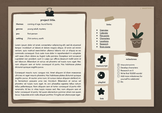
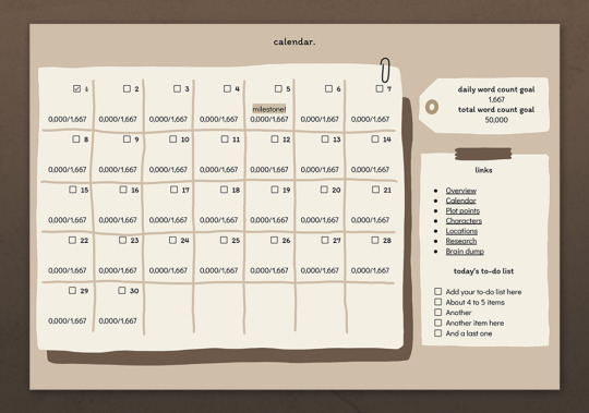
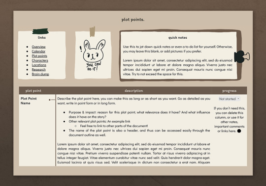
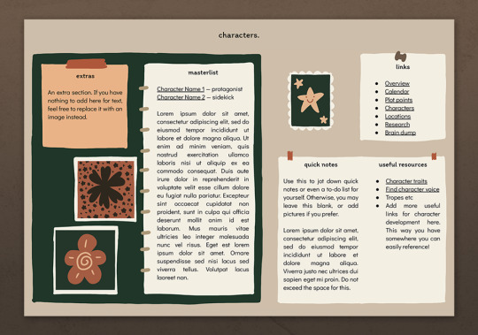

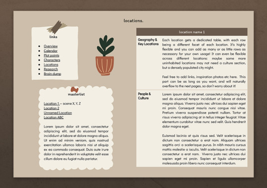
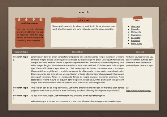
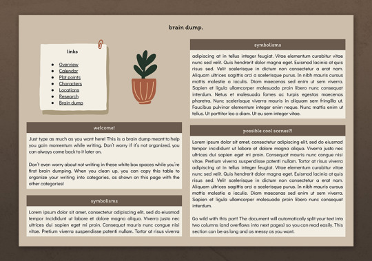

— introducing 011: COTTAGE TALES + [ link ]
a nanowrimo / novel planning google doc template with a cute, doodle-like aesthetic that is warm and inviting to cheer you on during your writing journey! this template contains a lot of functional elements, and is also made to accommodate any long and large amounts of writing and planning. all illustrations in this document and the sticker pack were hand drawn by me! this premium template and a full page-by-page preview can be found in the link above or in the source link.
features:
10 unique 7.25" x 10.5" pages with 9 unique illustrations hand-drawn especially for this template
a dashboard page with story overview and general milestones
a calendar page with word count milestones as well as a daily to-do-list to help you manage your story planning all in one document
plot points, locations, research and brain dump sections that can easily accommodate any amount of texts, including long prose that may be necessary for all your planning!
individual character sheets that can be easily duplicated and copied for more
a hand-drawn sticker pack featuring 30 PNGs that you can use to replace the placeholder images with to personalize the template — see last image for all stickers inside
terms of use:
you may edit to your heart’s desire. Change the colours, replace, add or remove elements and images etc.
you may remix pages with pages from my other templates.
you may not remove the credit from the templates.
you may not copy, sell or redistribute my templates whether wholesale, in part (i.e. taking out certain pages) or remixed (i.e. modified).
you will also receive an additional guide with images on how to use and edit google doc templates! if you have any problems or issues, feel free to leave an ask or join our discord server, where you can additionally find server-exclusive google doc templates that you may also find useful for your writing!
I hope you enjoy this template and have fun writing with it, and likes + reblogs are always appreciated. if you ever want to talk about you wips, please reach out to me; I'd love to listen! ♡
429 notes
·
View notes
Text
Ukifune
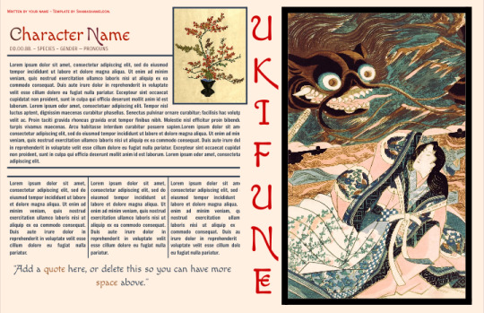




Altough vaguely inspired by ukiyo-e art, don't let it fool you, as this bad boy can take many shapes and appearances. It's F2U.
In here you have a lot of space for text, the pages can be easily duplicated and you even have a pretty little menu, as a treat. It's been done completely on tables with some images here and there, so, of course, you can edit this from your phone if you are patient enough. Feel free to edit it as much as you want to suit your needs and preferences, as long as you don't remove the credits I won't go after you.
#google doc template#google docs#character template#original character#oc rp#rp doc template#rp resources#muse document#muse template#roleplay template#ukiyoe#japanese traditional art#ukifune#single character
57 notes
·
View notes
Text
Thief.
Hi @nonvme how are you?
I usually solve such issues in personal messages with the authors to give them the opportunity to simply apologize and not repeat their mistakes, but this situation has upset me a lot, because I wrote to you in the comments a few months ago, but you never answered me (your private messages are closed).
You steal my textures and call it your own, as well as sell it on your patreon without any permission and credits.
Let's start from the beginning.
1. https://www.patreon.com/posts/sakira-skin-and-67386343

“credits: obscurus-sims, lamatisse, and google lol” — absolutely no mention of me, it's amazing, because it's almost entirely my texture.
“Do not claim as your own, I work way too hard to have somebody else try to claim my stuff“ — It's so nice to ask to respect your work when you don't respect someone else's.
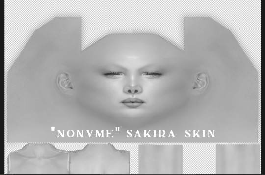
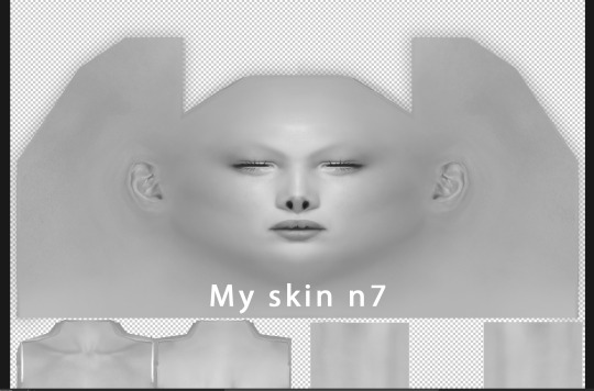


Do I need to comment on something? She just took my skin n7, added a couple of details on face and called it her own. And she put it in early access on her patreon to make money on already free сс. She listed other authors in the credits and didn't mention anything about me.
2. https://www.patreon.com/posts/precious-skin-75050799
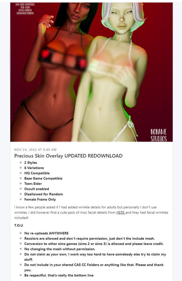
“Do not claim as your own, I work way too hard to have somebody else try to claim my stuff“ — and again. The duplicity of this man never ceases to amaze me.
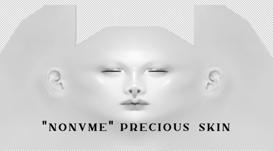

Here she changed a bit more, but she used my skin's face as a base. And again, no mention of me in the credits.This time she didn't mention credits at all, but I see at least @obscurus-sims details.
3.

“Credits to Slephora, Obscurus, and Pinterest for all respective bits and pieces” — okay.
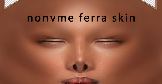
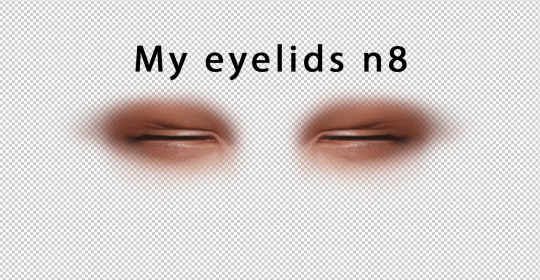
And again, no difference. The textures are identical.
Honey, if a person wants to use my eyelids, he just uses it. There is no need to put my cc in early access again, which has been free for three years.
I want to say that I create my textures completely from scratch, without using EA blanks. Absolutely all the details on my skins are created by me. And as an artist, I can say with confidence that it is impossible to create a texture that will match someone else's pixel by pixel. It's impossible. Moreover, most of my textures are completely drawn by me. What refs from the Internet is she talking about? Did you take refs out of my head? By Bluetooth?
@nonvme you can still apologize and I won't hold a grudge against you. Just apologize and remove my textures from your page. If you had answered me a few months ago and corrected your mistakes, then I would not have written this post and would not have spoiled your reputation. But you didn't answer me.
I'm sorry that you all had to read so much text. I hope your day is going much better than mine.
P.S. I had to re-post to remove some 18+ pieces from the skins.
UPD 15/06/23
Guys! Thank you so much for all your words of support! This is really very important to me. I didn't even expect you all to support me so much. I don't have enough words to express my gratitude to all of you 😢❤️!!!
Nonvme deleted CC that included my textures, and also promised not to use it anymore. It's enough for me to forget about this incident and don't contact patreon support.
I want to add that any author who makes his textures from scratch knows every pixel of his texture. The author of the original content will know if you have used his texture, even if you have somehow modified it. If you steal other people's textures and you haven't been caught yet, it only means that the author hasn't seen your page/cc yet, because he can't monitor the entire Internet. But one day he will find out about you, do not doubt.
1K notes
·
View notes
Text
About the blog:
This is created just for fun to poll people on their opinions on ships, because shipping culture is something that I find fun. Please stay civil and remember that the block button exists.
I run multiple other blogs, including @do-you-know-this-baby and @aretheyqueer
Submission rules:
You can submit any show/movie/book/game etc.
Pedophilia and incest is not allowed, this includes adult/minor (except smaller age differences) and loli/normal-sized. I am otherwise lenient with it. Sometimes I mess up, so just let me know and I may remove the post. I don’t consider myself a proshipper, and will sometimes deny ships for my own comfort. I am anti-harassment, though (should be common sense lol).
I'm not posting Harry Potter, Hazbin hotel or Helluva boss characters. Also no mcyt aside from roleplay/story-telling where they have different names/completely separated from the CC. Why these are banned is in the last tab of this spreadsheet.
This blog is lgbt+ friendly, of course.
Feel free to send me an ask if you’d like to ask questions or have a suggestion, or something else to say.
Other similar blogs (none are affiliated with me):
@do-you-ship-this-comic-ship
@do-you-ship-this-book-couple
@worlds-worst-ships
@are-they-queerplatonic
@shouldtheydivorce
@new-proshipping-polls
@rpfshippingpolls
Submission rules:
Submissions can be sent through the form below!
No real people (see above for mcyt rules)
No adult x underage or loli x normal (see above for rules)
No harry potter & hazbin/helluva
One ship per form, but you can send in multiple forms at a time.
There are currently a lot of submissions so it'll take a while to get through all of them, but your submission could show up at any time since I don't really go in order as much as I should. I'm currently posting 4-5 times a day.
I also sometimes miss duplicate submissions so if your text isn't included, I apologize! Feel free to let me know and I'll add it.
Here is a spreadsheet with all published ships and their votes, if you prefer it over the blog search feature, or want to check something easily. It also includes denied ships. It hasn't been updated in a good while, though.
Fandom jail
Fandom jail is for fandoms who bother me too much but don't deserve to be banned forever. This means polls featuring these characters will be put on hold. The fandoms currently in jail are:
None!
Other events
Currently accepting submissions for:
Mini tournament polls
"Ship it or rip it?" polls (unknown start date)
Tags used:
#anime ; #cartoons ; #movies ; #tv shows ; #books etc
#not a poll ; #not a ship
#asks
#fanart friday (feel free to send me fanart you want to be featured)
#crackship poll and #april fools for joke polls
#tournament poll
140 notes
·
View notes
Text
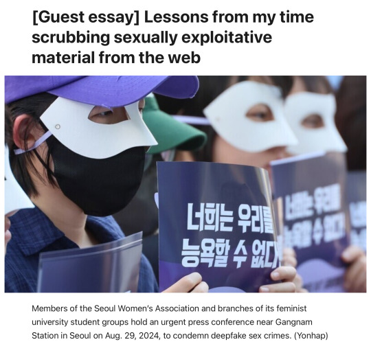
editorial from the english version of the Hankyoreh
archive link
plain text
Before focusing on my master’s thesis, I worked for a brief period for an organization supporting victims of cyber sex crimes. My job was to put each and every case of illegally filmed footage assigned to me through a search engine and if I found that the images had been uploaded to certain sites, I would beg the operator of that site to take those images down.
The process of searching and subsequently scrubbing illegally filmed footage probably isn’t what most people would expect. There is no advanced AI that categorizes footage based on the faces of victims, lists the sites the footage is uploaded to, and sends automated requests for the deletion of such posts. Instead, employees and volunteers divide each reported video frame by frame, put each fragmented frame through search engines, organize each site the footage is posted to on a spreadsheet, collate the sites for verification, find the site operator’s email or contact channel, and write a message that read, “This video is illegally filmed footage so we ask that you remove it from your site. If it is not removed, the South Korean government may take action against the site pursuant to relevant laws,” translate it from Korean into English and then send it to the operator.
This happened daily. Sometimes, you would have to go through 100 or 200 cases a day. I’ve assigned a nickname to this procedure: “The Illegally Filmed Footage Removal Protocol that Seems Absurdly Advanced, But Basically Follows the Same Grueling Procedures as a Sweatshop.”
The biggest challenge when fighting digital sex crimes is their overwhelming breadth and scale. It was impossible for us, as we sat in front of our computer screens, to estimate which far-out depths of the internet any of the footage had reached.
Even if we painstakingly found 20 posts using a particular photo and saw that every post was erased, the next day we would see the photo spring up in 40 different posts. Websites distributing illegally filmed footage make various backup sites with different domains to make sure that sites are up and running even if the main site is taken down.
Many of the sites in question have servers based abroad, so even if you sent a beseeching email citing South Korean laws, they simply could just pretend that they never saw the email.
The terror of that vast scope goes beyond distribution and duplication. While deepfake pornography has been in the news recently, photoshopping a real person’s face onto a pornographic image has been a crime for some time now.
The difference is that producing such images used to be time-consuming and technically challenging, requiring the “manual” manipulation of images. But the new tool of AI has made it easy for anyone to instantaneously create deepfakes in a dizzying variety of formats.
Another frightening aspect is that anyone with access to photographs on social media can choose victims at random. And since the images are “fakes” created by AI, the perpetrator can deliberately duck the guilt of harming a real person.
Deepfake creation has spread so rapidly because it gives perpetrators a perverse sense of power over their victims — the ability to create dozens of humiliating images of someone from photographs scraped off Instagram — while also enabling them to ignore victims’ suffering because the images aren’t technically “real.” In short, deepfakes represent a game-changing acceleration of the production cycle of sexually exploitative media.
Those images spread far too fast for the handful of employees at nonprofits to keep up with. Facing such a vast challenge, permanent employees began to drift away, and their positions were once again filled by people on short-term contracts.
Lee Jun-seok, a lawmaker with the Reform Party, said during a meeting of the National Assembly’s Science, ICT, Broadcasting and Communications Committee that the 220,000 members of a deepfake channel on Telegram was an “overblown threat” and estimated that, given the percentage of Korean users on Telegram, only about 726 of the channel members are actually Koreans.
But what does it matter whether there are 220,000 Koreans on the channel or just 726?
Let’s suppose there aren’t even 726, but just 10 people in the group — they could still produce 220,000 deepfakes if they set their mind to it. Those images would then be copied and circulated beyond their point of origin and around the world, perhaps remaining permanently in some dark corners of the Internet without ever being deleted.
That’s the nature of sex crimes in the digital age.
So assuming that the criminal potential of this technology remains the same regardless of whether the channel has 220,000 members, 726 members or even just 10, I can’t help wondering what Lee thinks would be an acceptable number of deepfake purveyors that would not constitute an “overblown threat.”
37 notes
·
View notes