#quick and easy to edit your pictures for instagram
Explore tagged Tumblr posts
Text
"My thoughts will echo your name"| Esteban Kukuriczka

CHAPTER II: "Startin' up a fire"
Playlist:
Liar- Camila Cabello
Only love can hurt like this- Paloma Faith
Favorite crime- Olivia Rodrigo
T.W: Slow burn; angst; couple’s argument, some ssexy thoughts. Word Count: 2.2k


That night after the party, Y/N laid in bed wide awake, all she could see whenever she closed her eyes where swirls of light brown hair accompanied by those gorgeous eyes of Esteban; she took a deep breath and looked to her left seeing Lucas fast asleep and bit her lip. All in all, he wasn’t a bad man, he had loved Y/N back together when they met, her being a utter mess. They used to get along so well, always that witty banter and laughter whenever they did anything and everything together, the smallest situation was a date to them. Somewhere along the way they had lost that, Y/N didn’t know if it had been after he graduated law school and started working, or if it had just been the routine of living together, but as of about six months ago, they had nothing to talk about. She tossed and turned, before deciding to just give up on sleep altogether and get up, she had some pictures to edit anyway. She threw an old big t-shirt on, before walking to the kitchen and making herself a cup of tea as she turned her laptop on.
Little did Y/N know, that Esteban was across town in no better situation than her, he stared at the ceiling, the movie of the night’s events replaying in his head and he groaned. -Why of all the women he knew, of all the ladies that were at that party did he have to find himself swooning over his best friend’s girlfriend.- He felt quite guilty about it to be honest, but he couldn’t help what he felt. Kuku couldn’t be imagining what he sensed between them, the spark was there, that chemistry, it all came so easy around Y/N, her name sounded so good when he spoke it as well. And those eyes, those gorgeous hazel eyes, they were so deep and earnest, Esteban knew nothing could be hidden from them. He groaned covering his face with a pillow, feeling himself growning restless, he got up and went to take a shower before heading to the kitchen to get a glass of water. He needed to get his mind of Y/N as soon as possible. As he rested against the kitchen counter taking a sip, he found himself looking through Instagram until he stumbled upon what seemed to be Y/N’s photography account; of course she was also talented, did she have no flaws?.
As he went through the photos, he came across a couple of black and white portraits, one seemed to be of Y/N with her hair short, it really suited her -though Kuku started thinking that everything would suit her- next to that one, was a portrait of Amelia, he would recognize that face anywhere, he double tapped his friend’s photo and bit his lip. As Y/N sat at the kitchen table, dark room, her phone screen lit up with an IG notification, who could be on there at 5 in the morning?; she looked down at the little message bubble and felt the heat crawl up her cheeks, the notification read “kuku.esteban liked your post” it was one of her artistic account’s posts, -how had he come across that one- she opened the app and tapped on the profile looking at her screen for a while, debating whether or not she should hit the follow button, she finally did and closed her eyes. Kuku’s eyes widened, he didn’t expect her to reach back out, he got into her DM’s and typed a quick “up so late?”.
“Couldn’t sleep, what about you?” Y/N bit her lip, it felt wrong, as it had when they were talking on the bench at the party, maybe what felt wrong was what she felt while talking to him. Sure enough, her screen soon lit up again “same, mind wouldn’t shut up :/”, he took a deep breath and muttered “oh fuck it” he went through his contacts and called Y/N waiting for her to pick up, he almost hung up a couple of times.
“Hey insomnia partner” the girl greeted him on the other side, and everything felt quieter in his head. “couldn’t shut the mind up, huh? I wonder what might have been going through it” she said quietly playing with the hem of her shirt.
You, he thought “so many things to be honest, it’s nice knowing I’m not alone” he smiled biting his lip it’s nice knowing it’s you. “For example, I was thinking about those pictures you got on Instagram, you’re really talented Y/N” the girl could feel the heat rushing to her face once more “I mean it, it’s hard getting that kind of emotion on a portrait, I think I’ve chosen the perfect teacher for my new adventure”. They talked for so long that Y/N didn’t even notice when the sun had come out.
~~~~~
Few days later, Y/N waited for Esteban to show up at the park where they had agreed to meet so that she could show him some photography tips. Fidgeting with her hands far more nervous that she had expected to be, though it was true they had been talking more and more everyday, by text and through the phone, on those late nights when Lucas was still working and Y/N was left to have dinner and go to bed on her own, kuku had been a steady companion. She was lost in deep thought when Esteban approached her from behind and placed her the coffee order she had told him was her favorite on one of their chats in front of her face “Penny for your thoughts sugar?” The tall guy said softly as he sat down.
Y/N smiled taking the cup and took a sip of the hot beverage “Hazelnut caramel latte, you remembered?” she looked up at him, smile still plastered on her face “just thinking” she shrugged “how have you been?” Esteban took a long sip of his coffee looking at every single detail on her face. Lucky bastard you are Lucas he thought to himself as she spoke; absolutely taken by the way her eyes fluttered shut when she took a sip from her coffee, as if she needed to focus all her senses on the smell and taste of the drink, the soft noises that escaped her as she drank, making the guy spiral down into a dark train of thought. The past few days he had found himself constantly thinking about the blonde woman sitting across from him on the grass and how good she would surely look naked beneath him, how hot and yet sweet it would be to hear his name coming out of her in soft moans; wondering how would her hazel eyes look darkened by lust. He found himself being snapped back into reality by Y/N’s hand waving in front of his face. “Earth to kuku” she chuckled “where did you go? I’ve been talking to you for like five minutes dude”.
He rubbed the back of his neck quite embarrassed “sorry sorry, I got distracted��� he smiled sheepishly. Y/N smiled nodding softly as she looked at him- how can a grown man look so adorable and sexy all at the same time? god I’d like to photograph him some time-. “Ok, so I’ve been going through your photography on instagram, how do you get such raw emotions from people? how are you able to draw emotions from places? that is baffling to me, honestly woman, how can one be so talented?” Y/N blushed hard looking down, no one had ever praised her work so much before.
“I don’t know really, I just capture what I see, I guess emotion’s just there, with people, you just need to capture them while they just are, not make them pose, posing drives everything out, but I don’t think my work is that remarkable to be honest, not enough to support myself at least” she smiled softly; as Esteban finished his coffee she took her camera and snapped a few pictures of him “like this for instance, you look like you could be Vogue’s next cover” she smiled showing him the picture she had just taken.
And that’s how the afternoon went on, shared between laughs, chats and pictures. Y/N kneeled behind him to show him how to frame a shot, her head landing right on his right shoulder “and now, once you’ve found what you like, you hold yourself still, and press the button” she said softly looking more at the guy’s profile than the picture, biting the inside of her lip;- had he always smelled this good? perfect mix between musky wood and something sweet she couldn’t place, oh lord she could nuzzle her face in his neck all her life- The hazel eyed woman cleared her throat moving away a bit and smiled “just like that, see? not so difficult, you’ll get the hang of it in no time.”
Esteban had caught her looking at him through the corner of his eye and had to hold back from kissing her and took a deep breath “with a teacher as good as you, no doubts”. He needed to pull it together, Y/N was Lucas’ girlfriend, it’s his best friend he was talking about- pull it together Kukuriczka, this is not funny anymore.
~~~~~
As Y/N made her way back to her place, she sent the pictures from that afternoon to Kuku, having her camera linked to her phone.
Y/N/N 🤞:This way, you can go back to these later on, when you want to check your first work ;)
Y/N/N 🤞: I had a really good time today by the way, thank you, I really needed to get out of my place, those walls can get trapping.
Esteban looked down at his phone smiling at the texts like a damn school boy and quickly texted back.
Kuku 🤭: thanks for the pictures, and I’m also glad that I could help you feel better, always happy to help a damsel in distress 🤭
He mentally cursed himself for that stupid reply. As Y/N got home, she uploaded the portrait oh him to her instagram with the quote “deep in thought @kuku.esteban” she smiled and put her phone down going to take a shower letting the warm water run through her body. As the blonde woman was going through her after shower ritual, humming softly to the music she had playing from her phone, she heard the slam on the front door and closed her eyes knowing Lucas was home, and probably in a bad mood.
“Where are you Y/N!?” he called out, the angry tone evident in his voice. Y/N walked out of their bedroom in her pjs and looked at him her face rid of all emotion as she could sense the argument coming her way, god knows why now.
“Hey babe, how was your day?” she said in the most agreeable tone she could master.
“How was my day? It was great until I saw your fucking picture on Instagram, what’s that about you going out on a lil coffee date with my best friend? Do you think I’m fucking stupid?” She looked at him, her eyebrows quirked up in disbelief.
“Are you serious right now? Not like I owe you any fucking explanations, cause you’re not the boss of me, but Kuku and I went to the park because he wants to learn some photography, and knowing I’m a photographer he wanted my help. Also, can’t I get along with one of your friends? You should know better than to accuse me of cheating, you of all people, when I forgave the things I did to be with you Lucas! what cheekines you have” Her tone getting louder and louder as her blood boiled hotter in her veins.
“Oh please Y/N you must really think I am in fact stupid, that, or you’re the dunce, because I could see the way Esteban was looking at you at the party! he was all but undressing you with his eyes all night!” he crossed his arms over his chest.
“At least someone was if what you say’s true! you haven’t even looked in my direction in over six months!” she finally cried out, feeling surpassed by the situation and tired, just completely exahusted of the arguments being the only kind of interactions they had these days. “Why don’t you just fucking go to your parents, or wherever you fucking want tonight, cause I honestly don’t wanna stare at your face right now!” As soon as those words left her mouth and she saw Lucas turn around so easily and slam the door again on his way out she regretted it. She knew she had just pushed him into Alma’s arms with what she had said, not that it took much for him to run back to her, as much as Lucas had sweared that was over years ago, she never fully trusted it, and as bad as their situation was, she still loved the man for some reason.
Y/N sat down on the staircase holding her knees to her chest trying to protect her heart in any possible way, she wanted to run, she needed to run, but she had no idea where to, all she could think about was Esteban’s kind eyes and warm smile, and how much she’d like to be in his embrace tonight.

Taglist:
@madame-fear @cyliarys-starlight @castawaycherry @luceracastro @espinasrubi @lastflowrr @koiibiito @candycanes19 @nperoconelcositoarriba @lxdyred @deepinsideyourbeing
#esteban kukuriczka fics#esteban kukuriczka fanfic#esteban kukuriczka x reader#lsdln x reader#lsdln cast#lucia <33#creative-heart#fanfiction#fluff#angst#kuku fics
22 notes
·
View notes
Text
Book Launch Checklist: Everything You Need to Make Your Release a Hit
by: Ricky Patterson
12/28
Alright, family—your book is finished, it’s polished, and it’s time to share your hard work with the world. The excitement is real, but let’s keep it 100: a successful book launch isn’t just about publishing and hoping for the best. You’ve got to plan, prepare, and make noise so your book gets the attention it deserves. If you want your release to be a hit, here’s the ultimate Book Launch Checklist to guide you every step of the way.
1. Get Your Manuscript Right
Before you even think about launch day, make sure your book is tight. You don’t want to drop anything less than your best.
Edit and Proofread: Don’t skip this part. Whether you’re working with a pro or doing it yourself, editing is crucial. Get your grammar, structure, and flow on point. You want your readers to be hooked from the first page.
Formatting is Key: Your book’s look is everything, whether it’s digital or print. Make sure it’s formatted professionally so it reads smoothly and looks sharp on every device and page.
2. Design a Cover That Pops
Your book cover is the first thing people see, and trust, they’ll judge it. Make sure it’s on point.
Work with a Designer: Unless you’re a designer yourself, it’s a good idea to hire someone who knows what they’re doing. Your cover needs to speak to the heart of your book.
Get Feedback: Don’t be afraid to ask for opinions. Show it to friends or fans who know your work to see if the design matches the vibe you’re going for.
3. Pick the Right Launch Date
The timing of your release can make a huge difference in how your book performs.
Avoid Busy Seasons: Don’t drop your book in the middle of a bunch of big releases or major holidays. Find a window where your book can shine without being overshadowed.
Give Yourself Time: You don’t want to rush it. At least 6-12 months of prep is ideal to get everything together, from marketing to reaching out to influencers.
4. Build Your Author Platform
Before you drop your book, you need a strong foundation. Build that platform so you can easily connect with your readers.
Create Your Website: Your author website is like your home base. Make sure it’s clean, professional, and showcases your book. Include a buying link, your bio, and media info.
Get Social: Update your social media profiles to reflect your author brand. Post regularly and interact with your followers. This is where your tribe will come from.
Email List: If you don’t have an email list yet, start one now. Offer an exclusive preview of your book or behind-the-scenes content to get people to sign up.
5. Get Your Marketing Materials Together
A book launch needs a solid marketing plan. Don’t just post one picture and hope for the best—be intentional.
Create a Press Kit: Have a press release ready, plus images of your book cover, your author bio, and a few sample interview questions. This makes it easy for media outlets to talk about your book.
Write a Killer Book Description: You need a description that grabs people’s attention and makes them say, “I need to read this!” Keep it tight and to the point.
Social Media Content: Plan your posts in advance. Share teasers, sneak peeks, and quotes to keep your followers engaged.
Book Trailer (Optional): A quick, professional book trailer can go a long way in getting people excited. This is optional, but it could help get your book in front of a larger audience.
6. Reach Out to Reviewers and Influencers
Reviews are the lifeblood of a successful book launch. You need to get people talking about your book, and you want to do it early.
Send Out ARCs: Advanced Review Copies (ARCs) are critical. Send them to bloggers, reviewers, and influencers in your genre at least 6-8 weeks before the release date.
Connect with Influencers: Look for influencers on platforms like Instagram, YouTube, and TikTok. Offer them a free copy in exchange for a review or shout-out.
Collect Testimonials: Reach out to other authors or people you admire for testimonials to include on your site and promotional materials.
7. Engage Your Audience
Your readers are your biggest supporters, so make sure they feel included every step of the way.
Run Giveaways: Giveaways are an awesome way to get people excited. You can give away free copies of your book, swag, or exclusive content.
Host a Launch Event: Whether it’s virtual or in-person, a launch event is a great way to connect with your readers. Do a live reading, Q&A, or panel to celebrate the big day.
Create a Launch Team: This is your squad. Get a group of your biggest supporters to help promote your book by sharing posts, leaving reviews, and spreading the word.
8. Invest in Paid Advertising
Sometimes, a little extra push can go a long way. If you’re serious about getting your book out there, paid ads are a smart move.
Facebook/Instagram Ads: These platforms give you the ability to target your ideal readers based on interests, demographics, and behaviors. You can create custom ads that fit your budget and goals.
Amazon Ads: If you’re selling on Amazon, use Amazon’s ad platform to increase your book’s visibility.
Google Ads: This is a more advanced option, but Google Ads can help you reach a larger audience, especially if you want to promote your book beyond social media.
9. Stay Active During Launch Week
Your book is officially out—now it’s time to make noise and keep the momentum going.
Promote Every Day: Don’t go silent after launch day. Keep posting, sharing, and engaging with your audience on social media and through your email list.
Respond to Comments: Interact with readers who post reviews or comment on your social media posts. Show them love, because they’re showing you love.
Monitor Sales and Reviews: Track how your book is doing in terms of sales and reviews. If things aren’t picking up as expected, try adjusting your marketing strategy.
10. Post-Launch: Keep That Energy Going
The launch isn’t over just because the book is out. Keep pushing!
Ongoing Promotion: Continue to promote your book through social media, newsletters, and ads. You don’t want the buzz to die down too soon.
Schedule Future Promotions: Think about running promotions like discounts or bundles to give your book a second wave of attention.
Keep Collecting Reviews: Reviews are important long after launch day. Keep asking for reviews, testimonials, and shout-outs.
Final Thoughts
A successful book launch is a marathon, not a sprint. With the right plan in place, you can turn your book into the next must-read. So take your time, get your marketing materials together, and always keep the focus on your readers. Your book is a reflection of you and your hard work—now it’s time to let the world know. Let’s get it!
www.theblackauthorhub.com
2 notes
·
View notes
Note
hi kyle, please explain your process of making graphics! <3
hi anon! I definetely will, I'll walk you though how I get to a graphic like this:
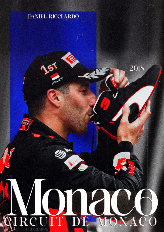
(warning, half of my process is just 'throw it at the wall, see what happens' so like, idk how easily explainable it is.)
first off, I get all my inspiration from pintrest, instagram graphics artist and random stuff I find. inspiration is everywhere and I always keep a notebook with me where I draw/write what I come up with.
all my photo's are from pinterest and google, I dont sell these, if you're going to please make sure the photo's you're using are free use.
all my fonts come from dafont.
the program I use is photoshop.
now, I'm going to break up my editing process into 7 parts.
inspo
images
editing
colouring
font
colour blocking
textures
hopefully it's clear enough
gather inspiration.
so I really like this and this edit I made before and they're pretty easy so I wanted to make a new one.
but normally if I wanna make an edit I scroll through my poster/edit inspo pintrest board which you can find here.
normally if I dont have such a clear way I want to go I'd make some sketches to see what works and how to get the idea out of my brain.
2. gather images.
I wanted to make a Danny one so its not to hard to find stuff as I have a specific search for this edit but I also have a growing archive of folders of drivers full of pictures ive found over time that I'd normally go through to find good stuff.
when you use google please remember to click on 'tools' and select 'size' and big otherwise you'll cry because of the bad quality
this is the picture I wanted to use for the danny edit.
I thought this would work well because it has depth and so will show the colour blocking well, it also has the flag and the shoe which is clearly recognizable.
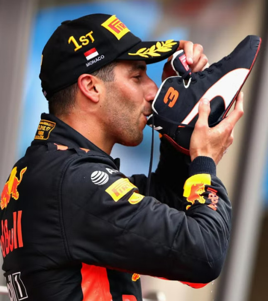
3. trow it into photoshop baybee.
this is going to be hard to explain but I basically jsut fuck around. most of the time I kind of know what I want to do and the way I want to go but one of the first steps is always to raserize the layer.
I also make sure to copy the original picture for later so you have the same picture twice
I do this so i can be lazy and go to quick actions and remove the background because then, I get this.
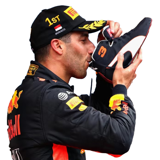
without basically any work. (it's almost never perfect so after I let photoshop do it's work I fix up the parts that need it.)
this is what your layers should look like fter.

that lil black and white thingy is really useful and if you select that and go over it w the erase tool it doesnt permenantly change anything.
next thing I do is smart sharpen to spice it up, here is the sharpening settings I use.
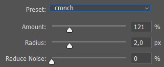
a small problem with this picture is that it's to small for an A4 size (which is what I'm making it on) so I need to extend the background a little. which I do in the laziest way.
I select the most of the top of the picture I can and copy paste + extend it out. like this:
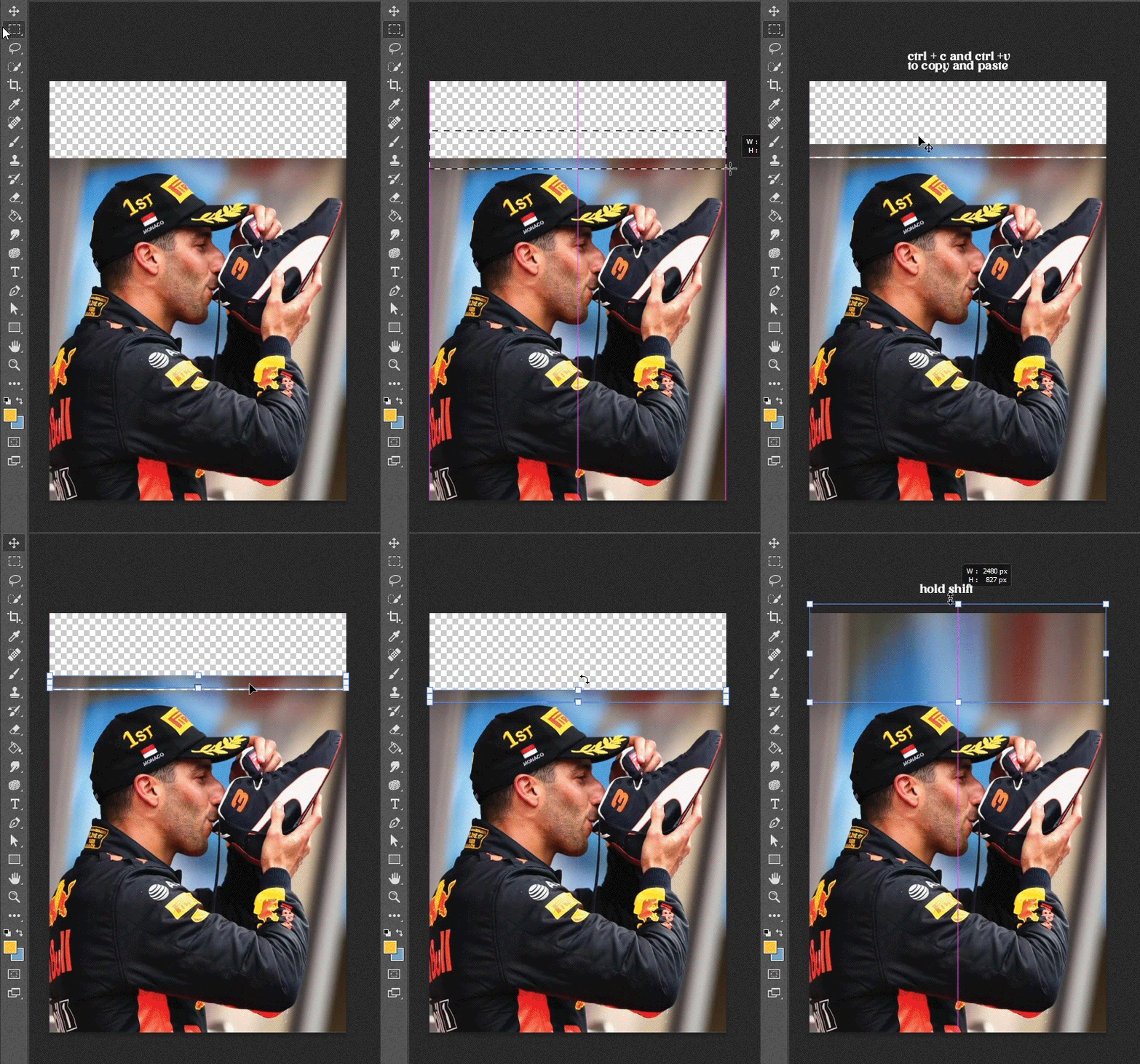
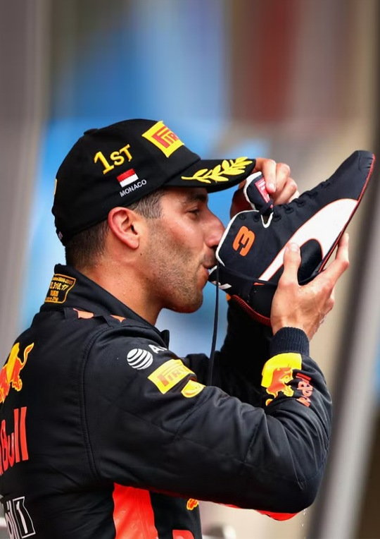
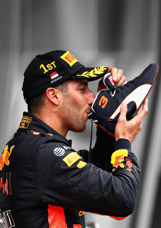
then, for this edit, I'm gonna add a black and white filter to the background so everything behind daniel is in black and white with an adjustment layer. I do this to keep the focus on our subject and remove any and all focus from the bg.
I also add a guassian blur to the bg to once again, keep the focus on daniel.
this is the before and after of that.
now, kinda boring right? yeaaah so now onto
4. colouring
first off CLIPPING MASK IS YOUR BESTIE!!!. if you right click on the adjustment layer and click on clipping mask it will ONLY grab the picture right below it, this way it wont affect everything else you've added to your edit.
anwyay. this is the fun part, and the only way I can explain it, is fuck around, see what you wanna do and what works.
I always add, levels, curves etc to just deepen the blacks and add some contrast. heres the before and after of that.

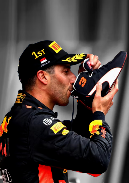
for this edit I kind of wanna focus on the contrast of blue and orange, kinda like the seb one but a lil different so what I'm gonna do is add hue/saturation and remove the yellow and blue from the picture.
you use this adjustment layer by grabbing the little hand and selecting the colour you want to change.
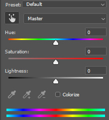
so I'm gonna play around and remove the blue and yellow from this picture. here's the before and after of that.

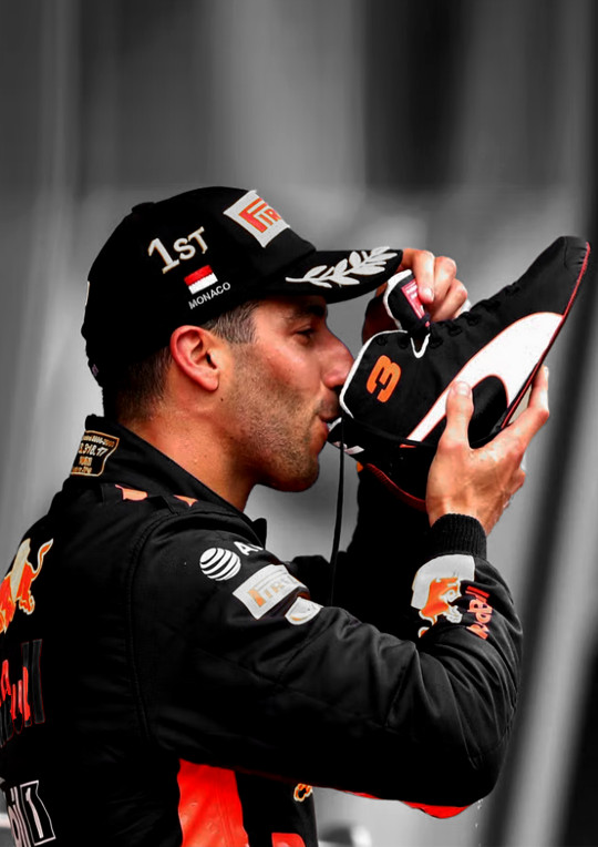
now I'm going to add selective colour, i wanna up to an extreme the reds in the suit. this is kinda hard as you'll obviously grab his skin with that too so I'm gonna use that black little mask on this too, it already exists when you add an adjustment layer
it's that little white box, if you select that and ue the erase tool you can basically remove that adjustment layer in places you want to, this is what it looks like on my layers and on the picture.

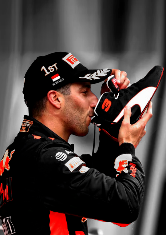
I want to upp the red even more then this so I'm gonna copy paste that layer two more times and THEN add a non erased selective colour and play around with the depth of the skintone until I'm happy with it.
now I'm almost happy with the colour, I want it to be a bit more blue so I'm gonna go to 'colour balance' and play around with that a little more.
this is the before and after of all that

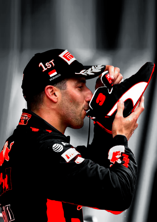
then I'm done with the colouring on the picture itself. I'm also gonna put all my adjustment layers into a folder to make my layers less busy
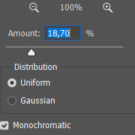
I'm also going to add noise to both the BG and front picture. it just gives a bit more texture and grain that I like
5. typography!
now the stressful part lol.
I know what I'm gonna add so that makes it easy. the name of the race, place and year. this is hard to explain, I know where I'm gonna put everything because off the other edits so it's just about finding a good font.
for this I'm not gonna fuck around with shapes and text layers and adjustments etc. if you want me to explain that please ask away that's just a whole other 5k worded essay.
I know what kinda font I wanna use at first already these choices have to do with a few things which is basically one questions I ask myself:
is there a vibe that already exists around the race and/or win and how do I translate that into the font? (is it fancy, cool, magical, incredible, bold etc etc)
here's an example of how a font can change the vibe
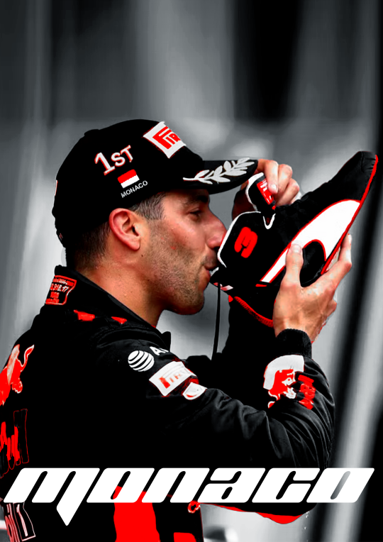
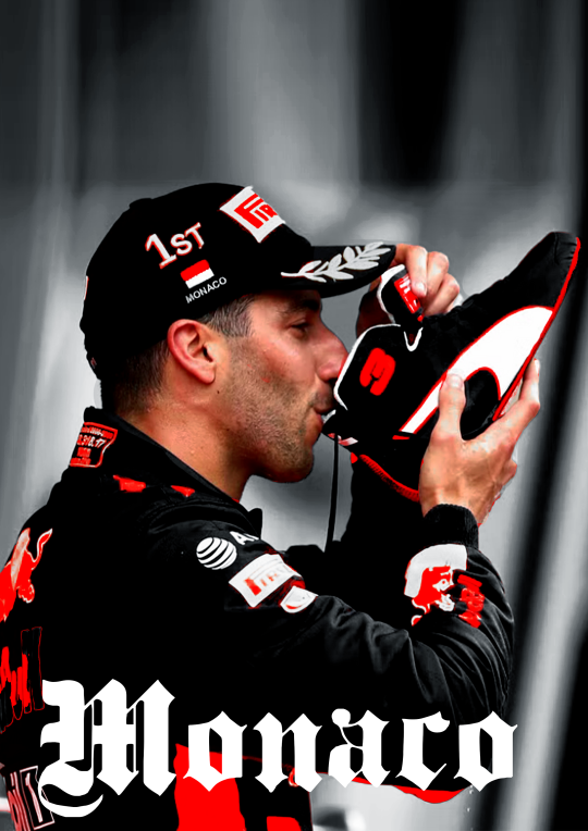
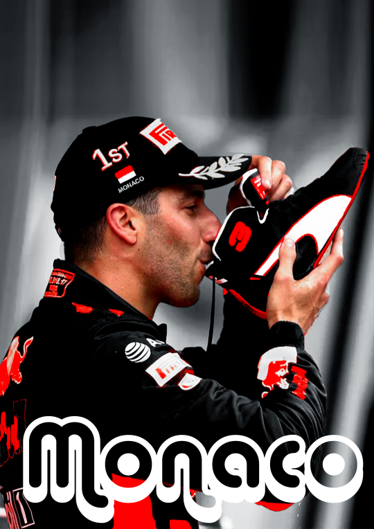
so the vibe I want to go with for this edit is fancy smansy n stuff so I'm thinking of flowly maybe 1930s vibes this is the font I ended up with
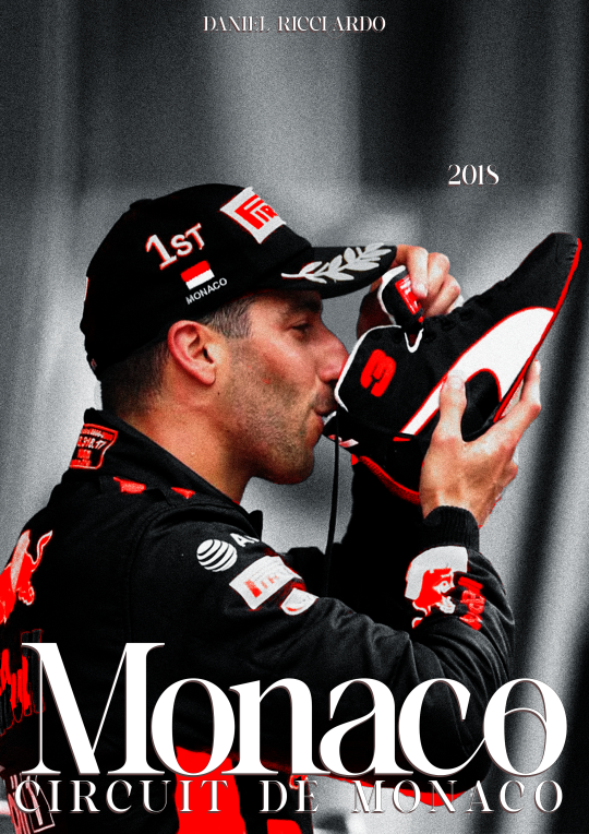
I'm still gonna move the place around but the idea if there.
(I change and play around with my text a lot so, again, ask if you want me to go deeper into this)
6. colour blocking
now for this edit I'm going to add a box of colour, I do this if I want to add a bit of an oomph and contrast to it, I like what I have now but I want to add some contrast to make the colour and him pop even more.
this is petty easy I'm basically just going to add a colour box behind him, I'm gonna do blue as well, thats the opposite of red on the colour wheel AND its the other colour red bull is associated with, also colour theory and all that etc.
I'm also going to add gaussian blur and noise to add some texture and use and overlay. heres the diff in with and without that to show the use of it.
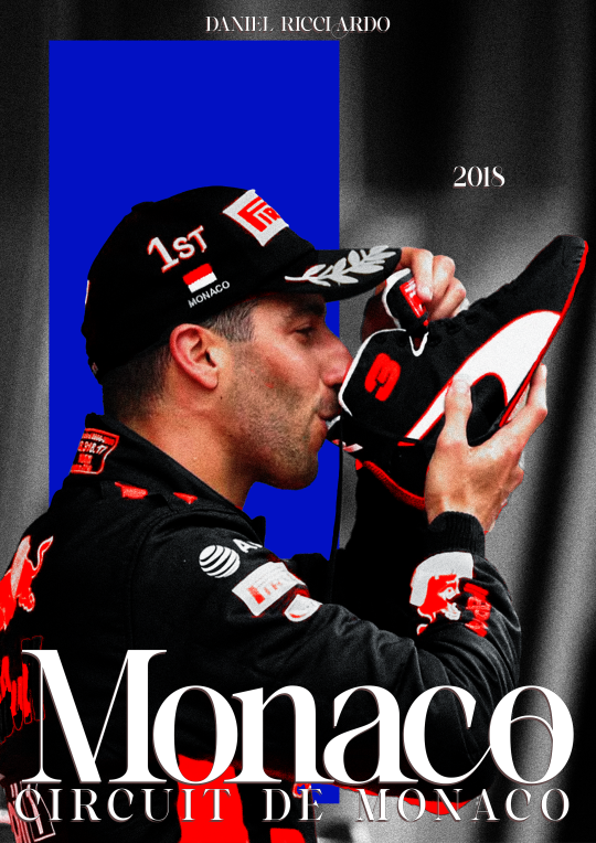
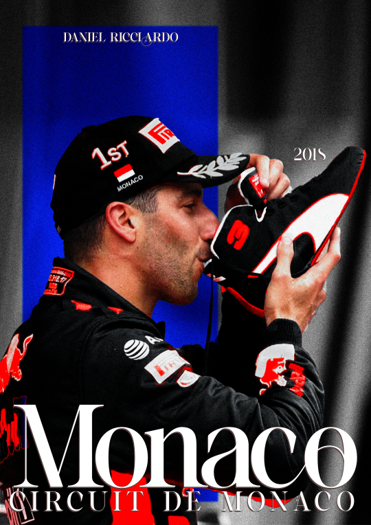
at this point I'm also going to move the text around (as you can see) to make it fit better with the added box
7. texture
the moment where it starts feeling like its finished.
for this edit I kinda want to add some photo texture and more grain. here are the textures I used:

I added these and put it on a screen overlay layer and added some adjustement layers to tweek the last few things.
you can find different textures on google, pinstrest and some awesome artists have texture packs you can pay for w just a few bucks. for these, again, if you're going to sell your work MAKE SURE ITS FREE FOR USE!!!
THATS it!
I add my watermark and maybe fix a few little things but thats all and then I'm done, I reccommend playing around and seeing what works for you.
enjoy and have fun <33
33 notes
·
View notes
Note
hiiii mel <3 i’m.. thinking of starting to write for nct.. mostly jaemin.. and i more or less have an idea for formatting but it’s been a really long time since i’ve had to do graphics for fic’s (like the banner and stuff!) and i was wondering if you had any tips for that? like where to find good pictures (solid backgrounds seem like the best choice for not clashing with the lettering, a problem i ran into unfortunately…) and also is there any particular place you get your fonts from? if you aren’t comfortable answering that (or any of this!) then that’s totally ok and feel free to just give general advice or ignore this completely :]
now i leave you with renjun… https://www.instagram.com/reel/C117-m9JGuo/?igsh=aXI1YmZ6M2YycHg1
hiii! under the cut!
so you've already got a good idea with using solid backgrounds for fic headers to make it easier for the text to show up! i source pretty much all my images from the groups/idols' official social medias. i just caution you not to take screenshots of say, instagram uploads, because this will degrade the quality of the image. either download it from twitter or wherehaveyou, or from an updates account like neocatharsis or wayvment here on tumblr! another word of caution: DO NOT DOWNLOAD TEASER IMAGES/PHOTOSHOOT IMAGES FROM CONTENT CREATORS WHO MAKE EDITS TO THE IMAGES, SUCH AS CHANGING THE COLORS, UN-WHITEWASHING, ETC., WITHOUT THEIR PERMISSION. THAT IS THEFT FROM OTHER FANS. updates accounts like neocatharsis and wayvment simply reupload the original images posted by the entertainment company/idol in the exact same form without making changes to them. editors make alterations to the image and that new image is their own creative work, separate from the original one posted. you need the editor's explicit permission in order to use their edited version as a fic header.
i do all of my editing on my phone for my fics (except for the thin section dividers that i use, which i make in pirated photoshop cs6 so i can get specific dimensions, 540x2 pixels, and make the gradients super quick in a way that i know how to do. there may be a super easy way to do this w an app on ur phone too, that's just how i know how to)
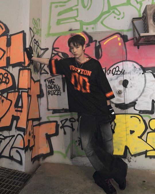
anyway, if i have a photo that i really like, that i just knowwwww matches with the image of the guy in the fic in my head or smth, that i just rlly want to use but has a busier background, sometimes i'll use the portrait editing settings on my phone to blur the background a little bit and that makes the text a lot more legible (i have a samsung but im 99% sure iphones can do this too)
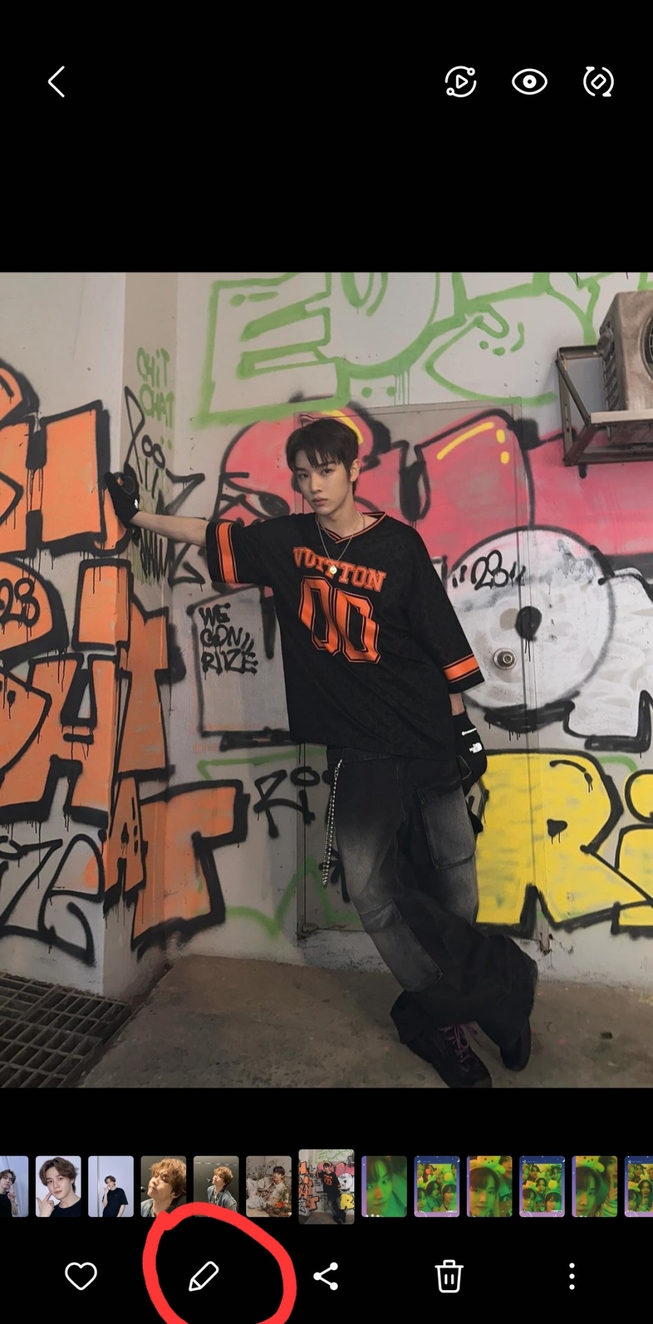
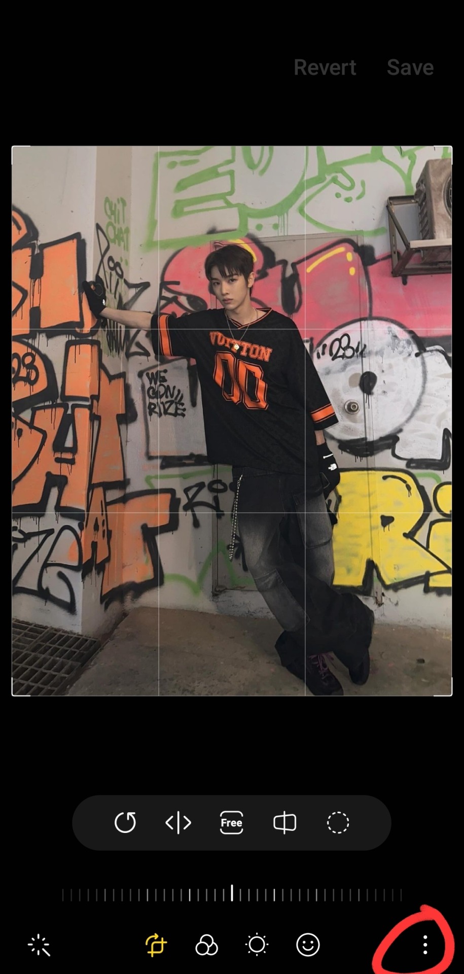
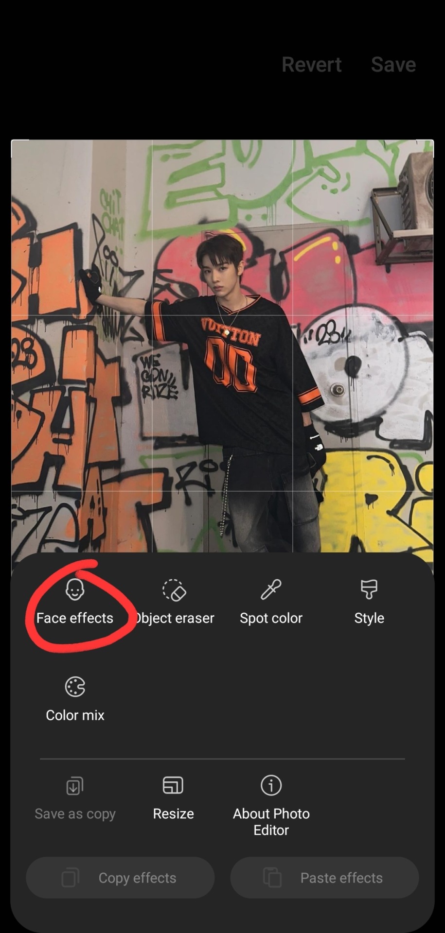
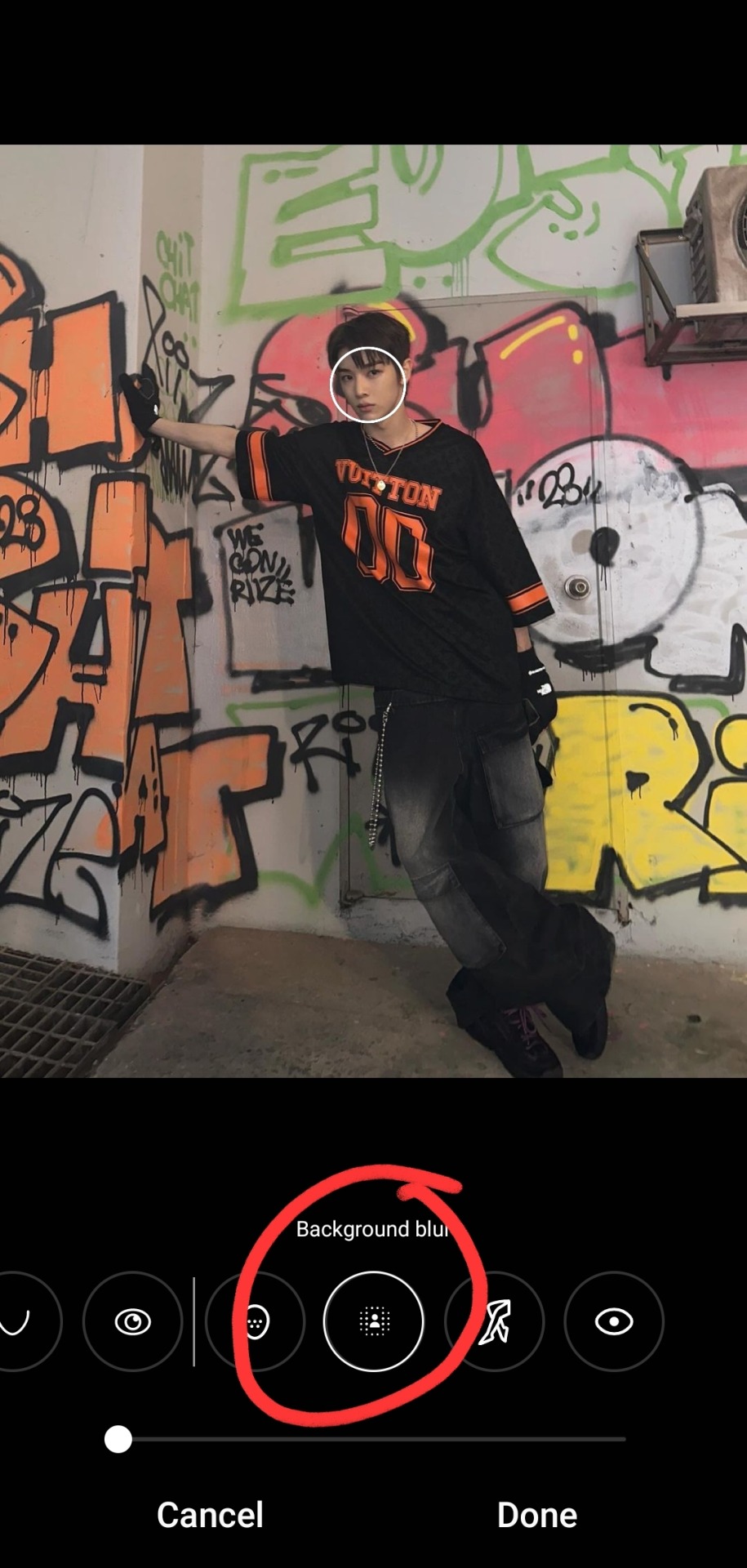

i typically don't bump it past 1 or 2, or the edges of the blur start looking a bit harsh, and i find that i don't really need more than this for the text to pop against the background anyway!
as for putting the text on the photos, i've the used the app phonto for years! it's completely free, doesn't put any watermark on your photos, comes with a bunch of fonts pre-installed, isn't super ad-heavy (it has a rlly small banner ad all the time at the top, and only shows u a skippable 10s ad when u save a finished photo), and you can download fonts from the internet to install straight into the app!

my favorite free font website is dafont.com, i literally will spend hours just browsing on there looking at fonts to download lmao. anyway here's how i find fonts for stuff and download, install, and use them with dafont and phonto:
once you have phonto downloaded, open dafont.com
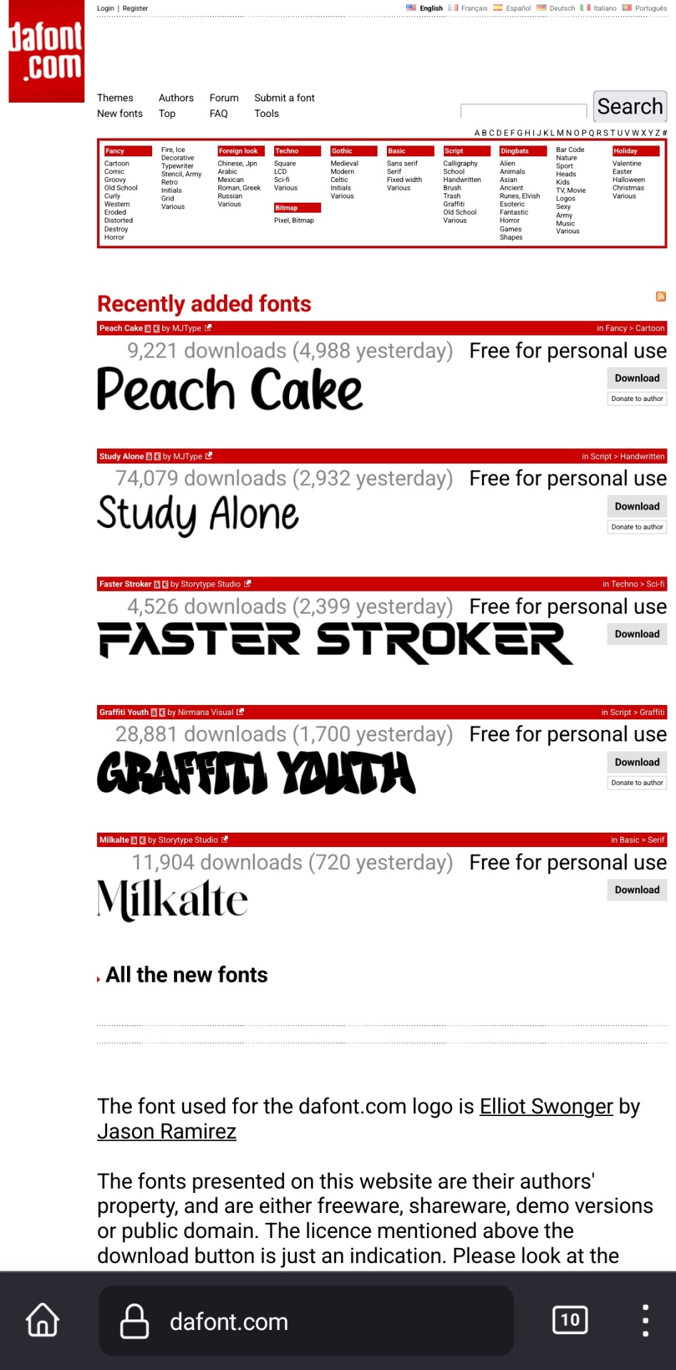
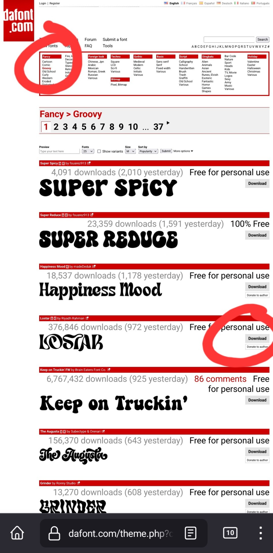
up at the top, it has a bunch of different categories of fonts. for this example, i chose fancy > groovy, and then on this first page, i liked this font called "lostar" (there's also a search bar up there, but it only searches font names, not kinds of fonts, so if you're looking for a groovy-feeling font and you searched "groovy," only fonts with the word "groovy" in the name would come up)
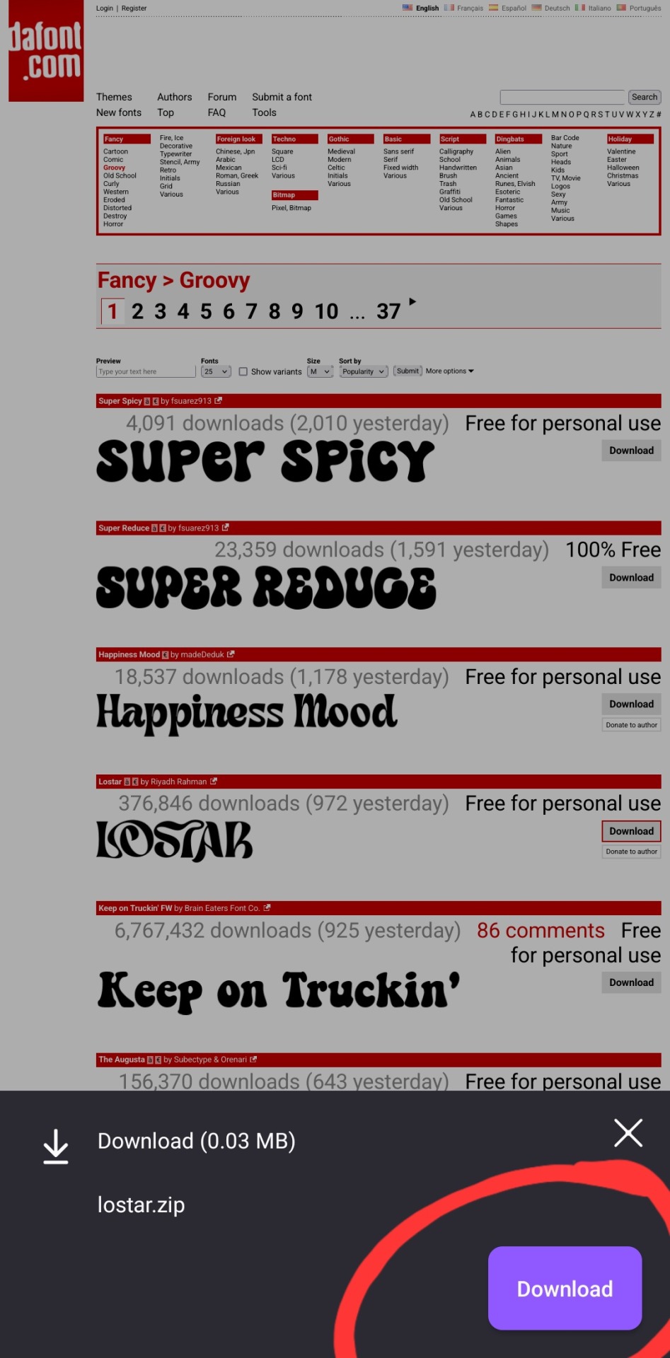
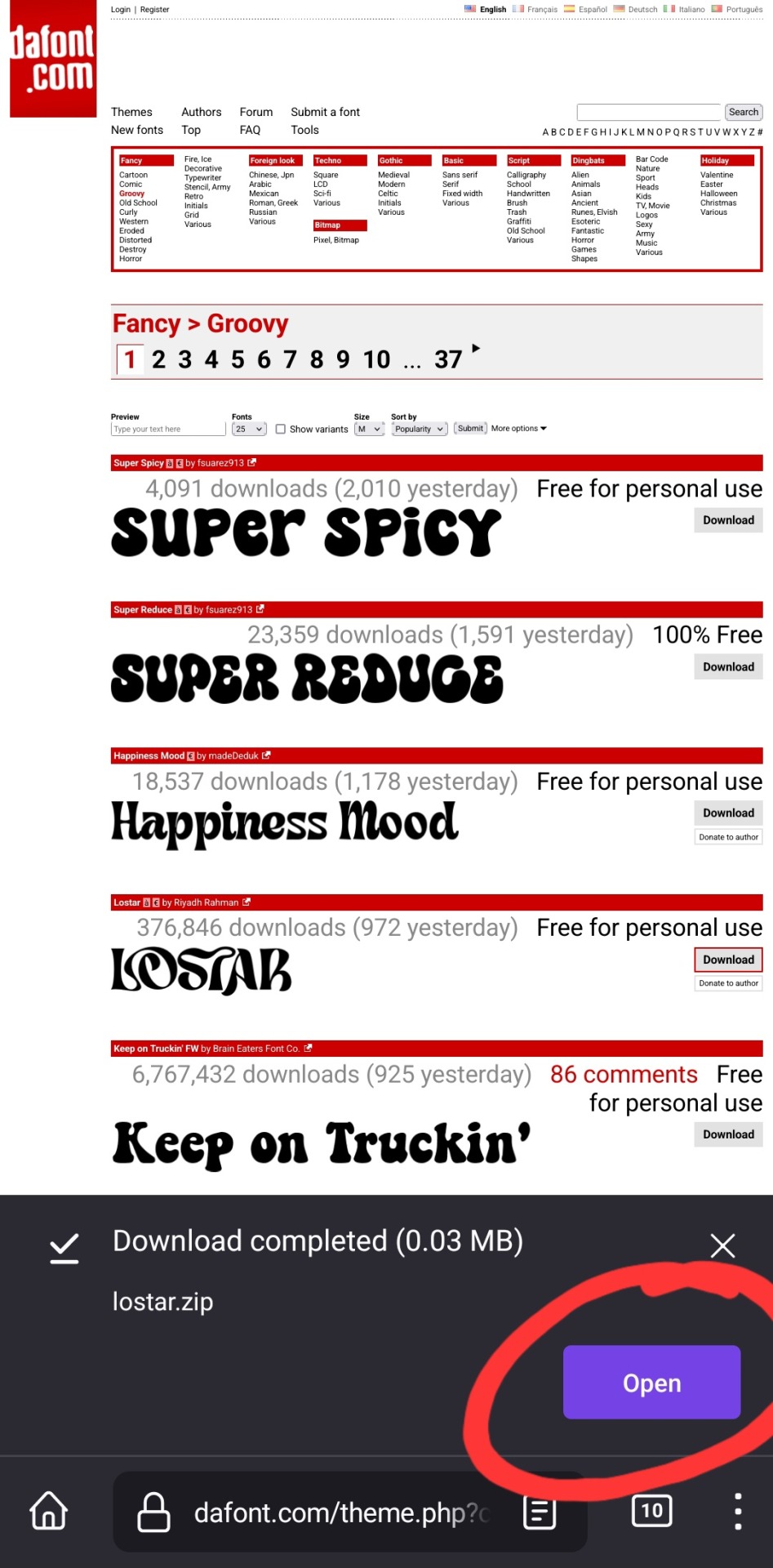
i then press download, and open in my browser (i use firefox btw, which is why it looks like this lol). make sure you're opening the .zip file with the phonto app (it opens directly into into phonto on my phone, you may have to choose to open the .zip file using the phonto app from several options, instead of your phone's file explorer or some other app on your phone)

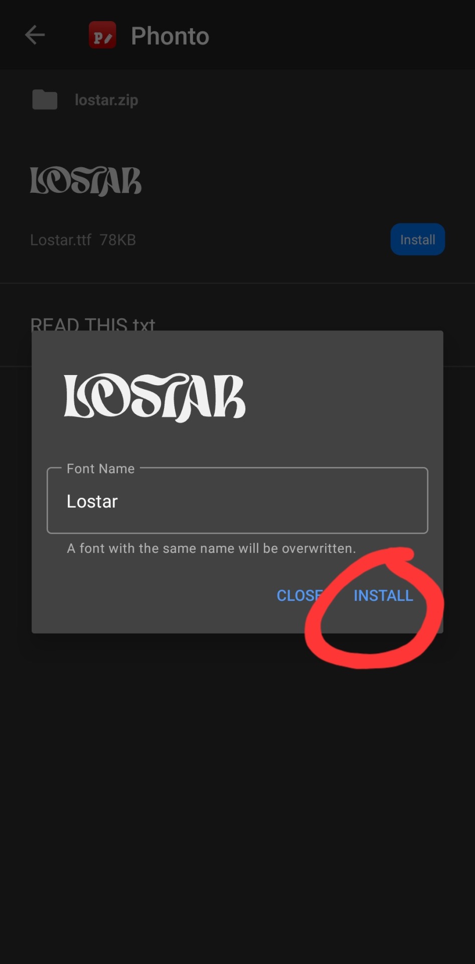
in the phonto app, you have to click install, then install again (it gives you the option to rename it, but i just keep the original font name bc why would you rename it?).
that READ THIS.txt file is a message from the font maker, it's the personal use license for the font (most of the fonts on dafont.com are free for personal use ONLY, and these .txt files that are contained in the .zip files are notes from the font makers telling u what u can and can't use the fonts for. generally, as long as ur not a business, u should be good this is not legal advice, please read them. also there's usually little thank you notes from the font makers in here as well!)
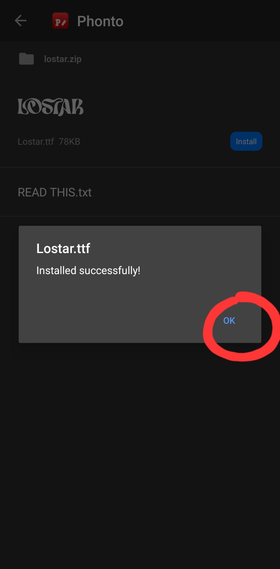
click ok.

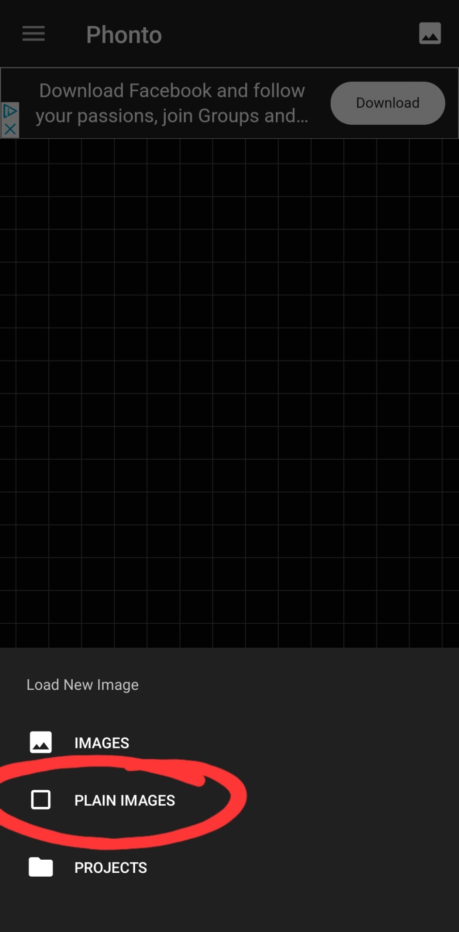
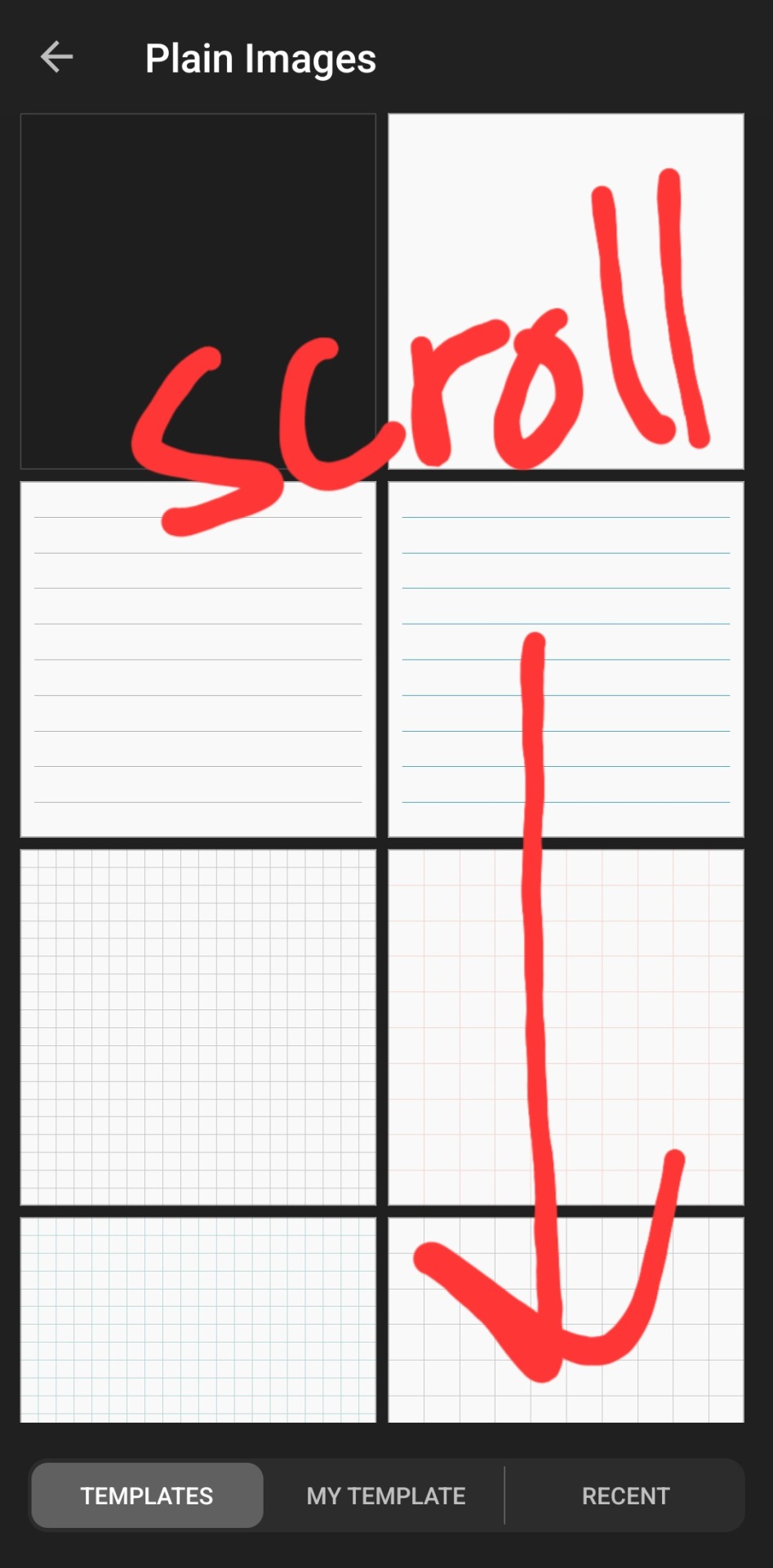

then you've got to slap some text on an image. you can choose an image from your camera roll, use one of their plain images, or open a pre-saved work-in-progress. for this example i used one of their premade gradients to make it easy
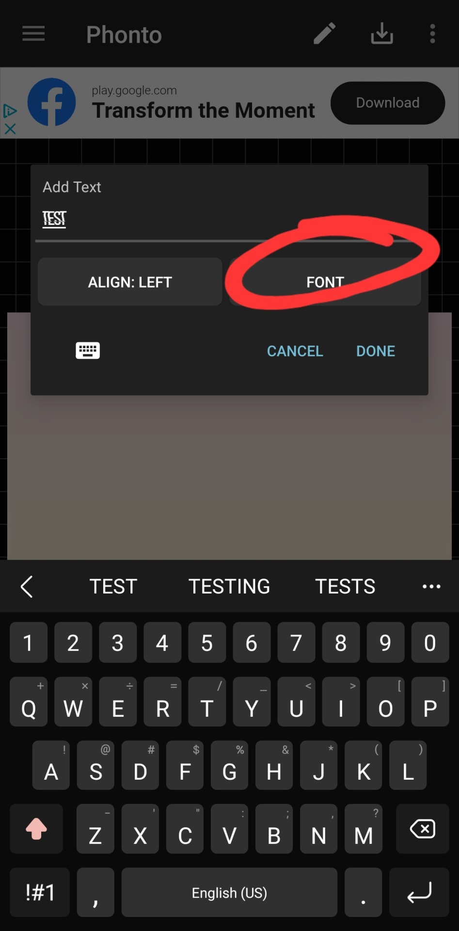
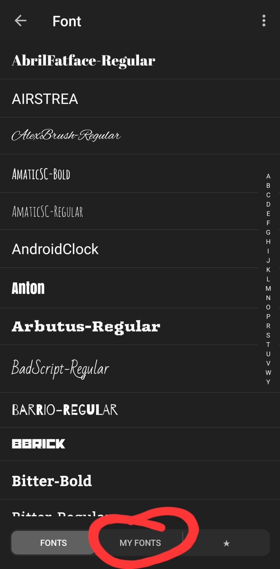
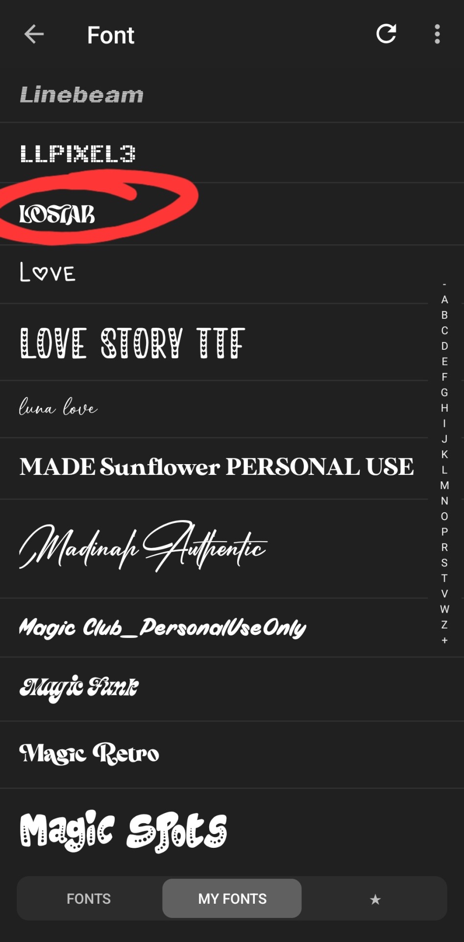
type whatever it is you want, click font. the left tab is the pre-installed fonts, the middle tab is the fonts that you've downloaded from elsewhere. here's the lostar we just got!

oh can't see it.
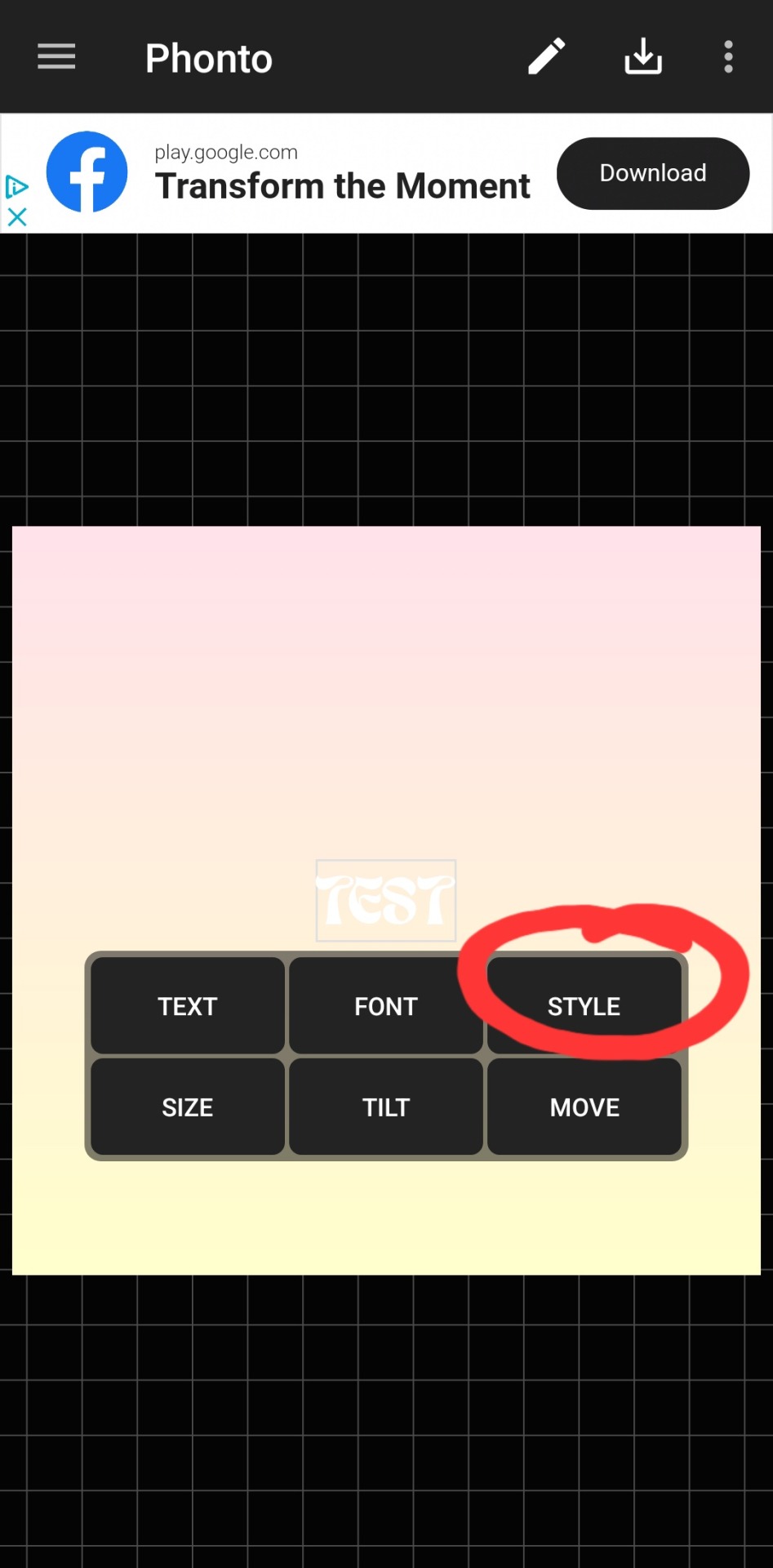
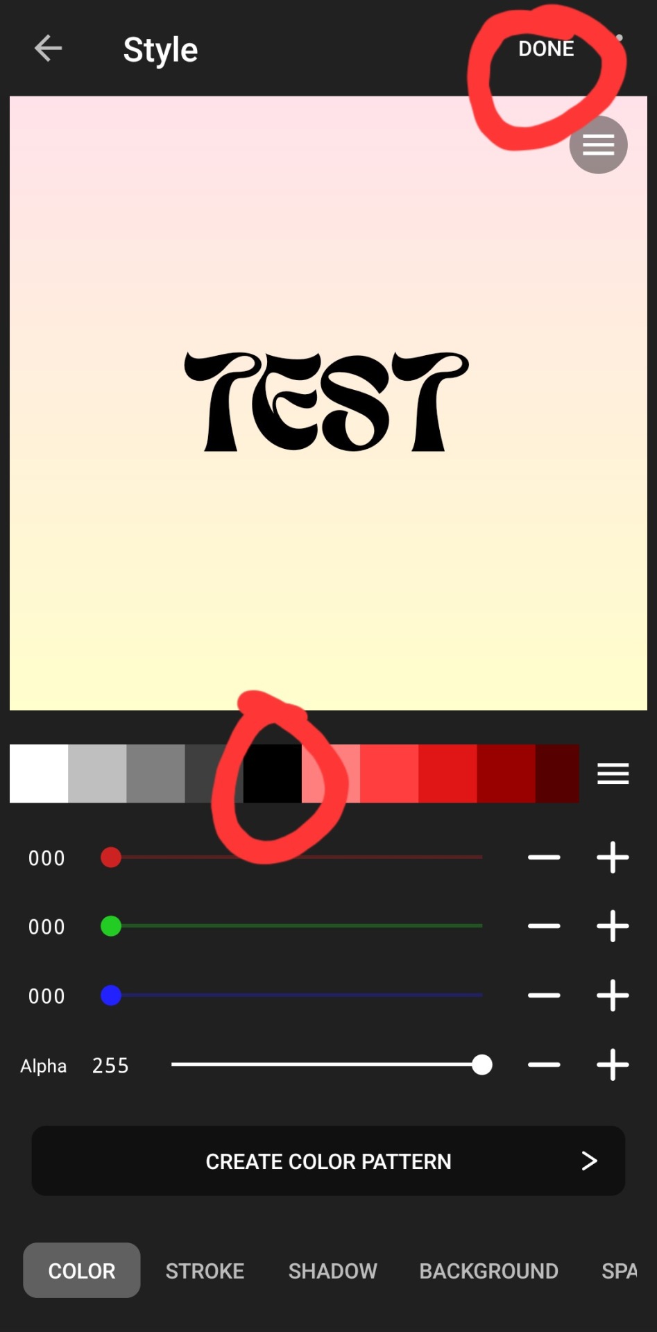
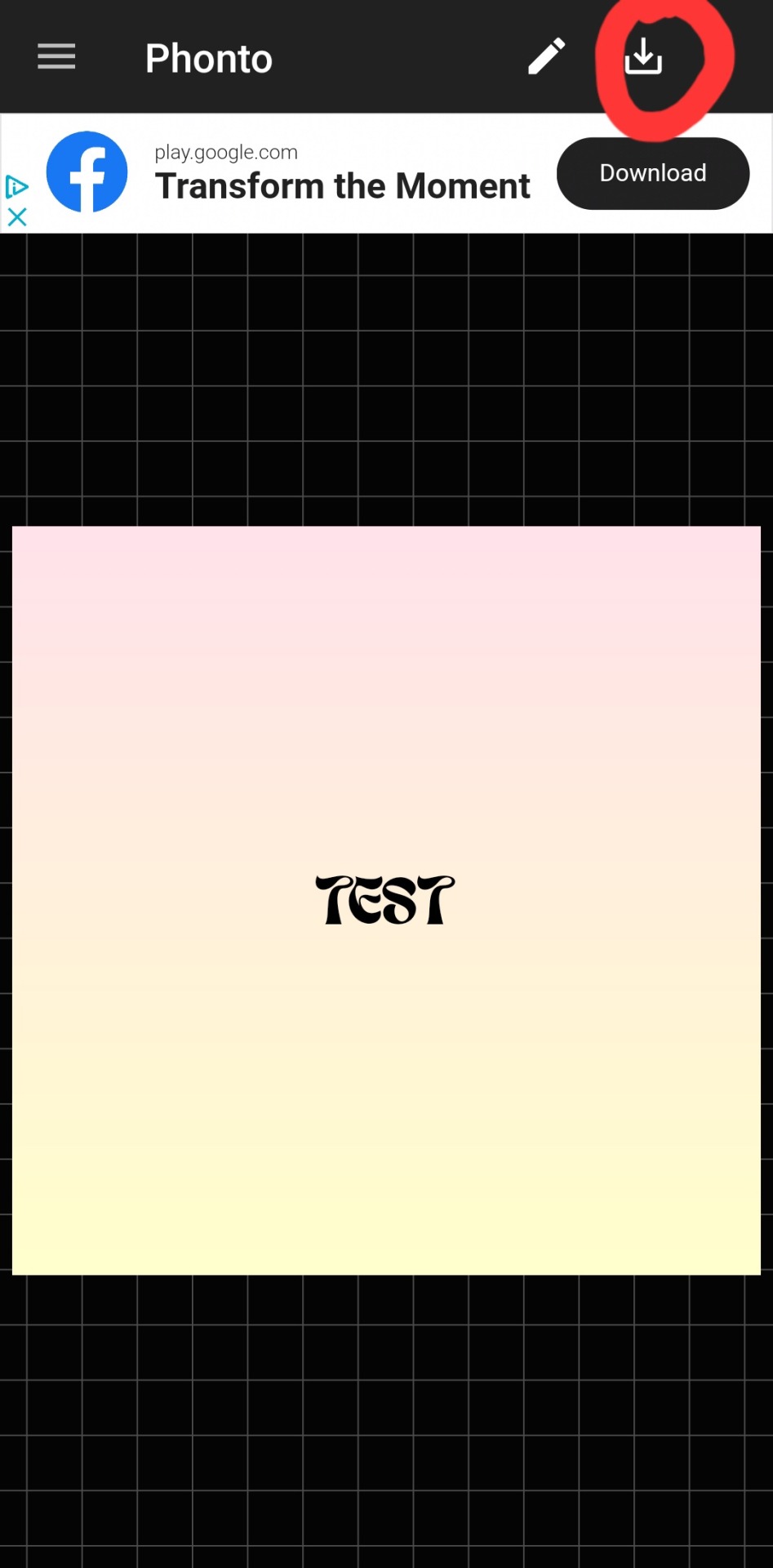
there we go! how fun! i'll probably use this in a fic header in the future. download button in the top right.
#hope this was helpful!#i don't mind sharing this stuff#i didn't invent fic headers or dividers or literally any of this lmao#answered#anonymous#talk#text#mine#writing tag#i suppose.....since its about my fics.........sorta...idk dude#also the renjun cheekies 😭😭 thank youuuu
3 notes
·
View notes
Note
In response to your questions about the timelapse videos, here are my two cents. Engagement doesn’t usually give you anything on tumblr other than a bump of serotonin, but it can lead to commissions or sales if you provide an easy link and are chill about it. But people are touchy about the word “engagement.” They want to feel like a community or maybe a cultural salon, rather than part of an extractive media process.
Your most successful process videos are going to show a satisfying finished piece at the end and give people time to look at it and go “wow.” So for most art some editing will be necessary to get there in a short video.
Another thing I should bring up is that the music you used for that sketch video was pretty grating. If you’re going to use music, i’d suggest finding something more relaxing. Just because the video is sped up doesn’t mean the sound has to be frantic.
Your painting process is so interesting, and your art is great! People here love cats with all their hearts and mostly really enjoy art. I wish you all the best!
Hi anon, thank you so much for your input! I really appreciate it, and I'm still getting used to actually getting responses, after trying to get it noticed for 10+ years (this isn't my first tumblr blog).
There's a lot going on with trying to share my art in the current internet ecosystem, probably something a lot of artists are dealing with. I'll try my best to describe what's going on on my end.
I don't like the term engagement either. I am trying to share my art through four main platforms at this time: Instagram, Tiktok, YouTube, and of course our precious hellsite: Tumblr. So my use of the term is more from the vernacular being used on other platforms, with what seems to be a kind of agreed upon use by artists of "this is what we have to deal with, so might as well lean into it." Maybe I'm mis-interpreting that (not surprising).
So far, Instagram is where I get my art noticed the most and has lead to the most sales/commissions/financial support. I think this has to do with the cat community that has formed over there. Tumblr definitely has its cat lovers, but I think a lot of them are over on IG so that they can follow internet cat celebrities and the like (I'm one of them!). So things like engagement and trends will dictate how I share my art with at least algorithm-led platforms. Also all of the cat people and friends I've met at shows regularly have Instagrams, not that that's a reason to be on there.
I agree that I should add time of the video at the end to show the piece to give it time to be seen. This can be easily accomplished if I make sure to take a photo of the art and include it in the video. I haven't had the best record of doing this due to my own ADHD and the pace at which these sketch paintings are being made.
Most of these recent sketch paintings were made back in August during CatCon on the spot! It's a crazy thing to do and I haven't seen anyone else do something quite what I'm doing, which is I guess part of my marketing for conventions and shows. So, sometimes I forget to take a picture at the end, but I'm getting better at including it in my process. And yes I call them sketches because they're fairly quick (I aim for 30 minutes for a 6"x6") and I don't get to add all the details I would like to if time was available. (I'm currently working on a new 3"x3" fully detailed piece of a famous internet cat, I've spent an hour and a half on it, and it's not done yet!)
Part of the timelapse question is not just to see what people prefer to determine how much time I should put into editing, but also how much effort I should put into digital storage. I have a couple different ways of recording footage, and the main way I've been doing so is with my iPhone. And so when I'm at events that I fly to, like CatCon, sometimes I'm having to transfer videos from my phone to an SD card until I can get home and get the footage onto a larger storage device. This can be tricky especially if I don't make sure to clear my phone storage before going to an event (something I'm adding to my list!) However, if I use the timelapse feature already available on the iPhone, then that makes editing and storage even easier for me later. I used this a lot with my Black Cat October series. But this timelapse footage doesn't look as good (maybe) and I don't have the option to do other edits later. Which then comes to the question for myself, am I really going to go back and make another edit for these sketch paintings? Perhaps the answer is timelapses for sketches, and full videos for fully detailed paintings.
And thank you for your input on the music part! The reason for the music in the last video was because of what's trending right now. Sometimes IG will save a copy of the video I posted with whatever music, so I had reused it in today's post. I think I'll make sure to use something more soothing/calming going forward just for tumblr, because you all have a special place in my heart.
Usually I'll open TikTok and do a separate video save to have a hi-res copy with music, but since I had recently created a shop on TT I only have commercially available music. Maybe I should take the shop down anyways, I'm really not sure if it'll help my art get notice or sell more stickers. I'd rather manage sales from my website anyways, but I feel like I should at least give it a try. You're welcome to tell me your thoughts on that!
I could go more into detail about my process for just uploading videos, but I feel like this is already getting TLDR. So feel free to let me know if you want me to ramble some more! I'd love to get input on that, as well as get an idea of what other artists are doing since I have no idea what I'm doing!
3 notes
·
View notes
Text
Cut Out Images Online for Free
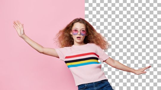
Do you often want to remove a background from a photo? Whether to create product shots, social media post pictures, or just because, PhotoCut's artificial intelligence-powered background remover makes removing backgrounds fast, easy, and free. You can quickly eliminate unwanted backgrounds, achieve great images, and even retouch your photos with ease using just a few clicks. And if you are an e-commerce business owner or just a social media addict or someone looking to get creative, PhotoCut has an online background remover that will help you out! PhotoCut can also help you make face cut-outs.
Enjoy Quick Photo Cutout and Redesign in Seconds
Say goodbye to manual, time-consuming image editing and hello to speedy automation with the background remover of PhotoCut. In seconds, this AI detects and removes the background on your photos, leaving only what matters most. Whether this is a product shot, a portrait, or an image with more intricate details like hair or fur, PhotoCut manages high precision. Strip away unwanted backgrounds and add personality with text, stickers, or filters, and make it the best for posts, e-commerce, and more.
Cut Out Photo Backgrounds Automatically with One Click
Who needs to hit a single button to remove the background? This is how this process goes with PhotoCut's easy, AI-powered automated background remover. You merely upload your image, may it be a product shot, portrait, or landscape, and PhotoCut will immediately detect the object and eliminate the background instantly. The AI technology is powerful enough to handle tricky edges such as hair, animal fur, or intricate details. You will have a clean cutout in seconds, ready for further editing or use. With the background removed images, you can create album covers using PhotoCut.
This all-in-one click functionality ensures you save time and makes the process reach all and sundry so that you do not have to be one of the professional photographers or graphic designers.
Effortlessly Create High-Quality Transparent PNGs
The image you've prepared can then be exported as a transparent PNG file by removing the background from your picture, and PhotoCut does that. It is especially great for e-commerce product listings, design work, or even social media posts since the transparent PNGs are easy to layer over any background, but you can also adjust it to have a white background if you need it. This is an all-in-one digital photo editing tool that can be easily adapted by content creators, online sellers, and any person who uses digital images in general. You can add multiple PNG images to your Instagram story.
Prepare Product Photos for E-commerce with Ease
To have quality images of products is, in itself, the difference in online sales. Clean, high-resolution photographs may appeal and be appealing to customers and eventually push for sales. PhotoCut's background remover is among the best tools for all e-commerce businesses looking for clean background product images. Whether they operate on Etsy, eBay, or websites with their products, they can always use PhotoCut and do away with pictures that have a poor and messy background.
Removing the background will help you place your products on clean, neutral backgrounds or customize them according to your branding. Elimination of unwanted items from the photo is another bonus added by PhotoCut to help you keep your product shots neat and focused. More so, its editing tools allow you to adjust lighting, blur the background, or add effects to make your product images stand out. With these improvements, you can ensure that your product photos are impactful and ready for any online store or marketplace.
Customize Image Cutouts for Social Media
For you to gain success in the area of social media, it goes well with the visuals. Even when you're putting pictures on Facebook, Instagram, or Pinterest, using the background remover from PhotoCut to make your post remarkable can be achieved when removing the background of selfies, product photos, or some pets.
After you have removed the background, you can make your cutout picture more exciting by adding funny stuff such as text, stickers, filters, and so on. From making promotional graphics to creating memes and simply playing with photos, PhotoCut helps in the designing of unique shareable content. You can easily get the best images that you can create in a matter of minutes without the requirement for some advanced designing skills because the tool is so easy to use. You can try out virtual hairstyles with PhotoCut and remove the background.
How to Cut Out Images Online with PhotoCut
Starting with PhotoCut's background remover is simple. To illustrate how to cut out images online, take the following step-by-step guide.
Click “Cut Out Image Now”: To begin, visit the PhotoCut website and click on the "Cut Out Image Now" button to access the background remover tool.
Uploading Your Image: After clicking on the tool's page, upload the image you would want to edit. You will be required to either drag and drop the image onto the tool or choose the image from your computer.
Let PhotoCut Work Its Magic: Once the files are uploaded, PhotoCut AI can be expected to detect and separate the background of the images within just seconds. Even more impressive, it will not leave behind a messy, imprecise edge-even around the hair or fur.
Download Your Cutout Image: Once the background is removed, you can download your image in PNG format. The result will have a transparent background, ready for further editing or use.
Edit Your Image: If needed, you can use additional editing tools within PhotoCut to add text, adjust lighting, or even change the background entirely. You can also save and share your image with ease.
With these simple steps, you can easily cut out the background from any photo and create stunning visuals in no time.
Why Choose PhotoCut for Cutting Out Images?
There are many reasons why PhotoCut is the perfect tool for cutting out images online:
High Precision
PhotoCut’s background remover uses advanced AI technology to ensure high precision. It meticulously works by removing the background without letting even the finest hair strands, fur, or any edge disappear. Whether it's cutting out a portrait, product, or a pet, PhotoCut keeps your images sharp and clear.
Easy to Use
One of the best things about PhotoCut is its user-friendly interface. The tool is not meant to be used by graphic designers, and it's super intuitive. It makes everything streamlined so you can quickly get the results you need without any hassle. Upload your photo, let AI do its magic, and download your cutout image.
Supports Multiple Formats
PhotoCut also supports popular file formats, such as PNG and JPG, so you have the freedom to work with multiple kinds of images. It also supports product photos, portraits, and any other images, ensuring compatibility with the most common image formats.
Free and Accessible
PhotoCut offers free background removal. This service is free, and everyone can use it, regardless of whether one is a business owner, content creator, or simply a hobbyist. It does not require the need to pay for expensive software or hire a designer to achieve professional results.
Conclusion
PhotoCut provides easy and fast ways to cut images online with its AI background remover. It may be that you will use it to create images of your products for sale, create social media posts with eye-catching images, or experiment with different looks- PhotoCut makes it super simple and accessible. Boasting high precision with user-friendly interfaces and supported various formats, PhotoCut is the ultimate tool if you need to remove the background and enhance those amazing visuals. PhotoCut also has an Image Stretcher feature to make your photos look better. Give it a try today to make your photos shine a bit better!
FAQs
Q1. How accurate is PhotoCut’s background remover?
Ans. PhotoCut's AI technology is extremely precise and can recognize and remove backgrounds with very high accuracy. It works very well on photographs that contain intricate edges, for example, hair, fur, or even fine details. Provided that your uploaded photo is clear and well-lit, that's when the magic happens.
Q2. Can I use PhotoCut to remove the background from any photo?
Ans. Yes! PhotoCut removes backgrounds from many photo types: portraits, product photos, selfies, and so on. Whatever content you need for social media or you want to get product images ready for an e-commerce store, PhotoCut helps handle all different kinds of pictures.
Q3. How can I download my cutout image?
Ans. After removing the background of your image, you will get the result downloadable in a transparent background PNG file. In that case, you could just layer it over various other backgrounds or use this picture for design projects, as needed. Alternatively, it would be possible to opt for a white background.
Q4. Does PhotoCut support all file formats?
Ans. PhotoCut supports the most common image file formats: PNG and JPG. They are very popular for both personal and professional projects, so it is easy to include your cutout images in your workflow.
Q5. Is PhotoCut free to use?
Ans. PhotoCut’s Background Remover is free-to-use software. You upload and edit all the photos you want freely without hidden fees or memberships.
0 notes
Text
How to Use a Collage Maker and Photo Editor to Enhance Your Photos
In the age of social media and digital photography, capturing moments is easier than ever. But taking great photos is just the beginning—enhancing them with a collage maker and photo editor can take your images to the next level. Whether you want to create eye-catching Instagram posts, design a photo montage, or simply enhance your pictures, a powerful collage maker and photo editor can help.
This guide will show you step by step how to use a collage maker and photo editor to transform your photos into stunning visual stories.
Step 1: Choose the Right Collage Maker and Photo Editor
There are many collage maker and photo editor apps available, but choosing one with the right features is key. Look for an app that offers:
A variety of collage layouts
Filters and effects for enhancing photos
Editing tools like cropping, brightness adjustment, and color correction
Stickers, text, and overlays for creative customization
High-resolution export for clear, professional-quality images
One such app is Collage Maker & Photo Editor, which combines all these features in an easy-to-use interface.
Step 2: Select and Arrange Your Photos
After installing the app, start by selecting the photos you want to include in your collage. Follow these tips for the best results:
Pick a theme – Choose images that tell a story or share a common theme (e.g., vacation, birthday, fashion).
Select high-quality photos – The better the image quality, the better your final collage will look.
Choose a layout – Most collage maker apps provide multiple grid styles and freeform designs. Pick one that complements your photos.
Once you've selected your images, arrange them within the collage template. You can resize and reposition them to create the perfect composition.
Step 3: Edit and Enhance Your Photos
A photo editor helps refine each image before finalizing your collage. Here’s how you can enhance your pictures:
1. Adjust Brightness and Contrast
If your images look too dark or washed out, tweak the brightness and contrast settings to bring out details.
2. Apply Filters and Effects
Filters can give your collage a consistent aesthetic. Whether you prefer a vintage look, vibrant colors, or a soft pastel effect, applying filters can instantly enhance your images.
3. Remove Blemishes and Unwanted Elements
Use the retouching tools to remove blemishes, red-eye, or distracting objects in the background.
4. Crop and Rotate Images
Ensure your images fit well within the collage by cropping or rotating them for better alignment.
Step 4: Personalize with Stickers, Text, and Backgrounds
Now it's time to add some creative flair! Most collage maker and photo editor apps allow you to:
Add text – Overlay captions, quotes, or event details with stylish fonts.
Use stickers and emojis – Fun stickers can make your collage more expressive.
Change the background – Customize with solid colors, gradient effects, or even a blurred background for a professional touch.
Step 5: Save and Share Your Masterpiece
Once you’re satisfied with your edited collage, save it in high resolution to maintain quality. Then, share it on social media platforms like Instagram, Facebook, or Pinterest.
Most collage maker and photo editor apps allow you to export directly to social media, making sharing quick and effortless.
Final Thoughts
A collage maker and photo editor is an excellent tool for enhancing your photos and turning them into visually appealing stories. Whether you're a social media enthusiast, a business owner, or someone who loves capturing memories, using these tools can make a big difference in your images.
Try Collage Maker & Photo Editor today and start creating stunning photo collages effortlessly!
0 notes
Text
Integration of Digital Marketing with Media Creation.
Digital marketing deals with the strategies for promotion of products or services through various social media and search engines, email, while media design provides creative assets that bring these strategies to life. Visual graphics, banners, and videos form the core of any social media marketing campaign, thereby helping induce user engagement and capture a moment’s attention.
Visual Appeal in Ads: Graphic design is highly crucial in creating attractive content visually. Therefore, it catches attention and attracts people in social media and in marketing campaigns. It applies creativity together with strategic design principles in creating images, infographics, banners, and animations of interest to the target audience.
Video Marketing: Video editing, actually, is fundamental for crafting powerful content which piques the interest and pushes engagement on YouTube, Instagram, and other social platforms. Shorter videos require longer periods for creation when using different formats such as Instagram Reels and TikTok, which require visual information, conciseness, and preferences by the audience. Precise video editing guarantees fluidity and beauty in terms of visuals, maintaining a steady flow of conversation that will captivate any viewer.
Brand Identity: Cohesive branding elements, from logo to banners and templates, form the backbone of having a solid, recognizable online presence. A well-designed logo acts as a cornerstone to brand identity, showcasing values and making it more easily identifiable. Banners and templates merely take the identity across the different digital mediums of expression so that the visual language is consistent.Consistency in branding elements reinforces brand trust and recall among audiences. Social media posts, emails, and ads templates bring a uniform aesthetic and can save time while at the same time projecting professionalism.
Integration of SEO and Media Design.
The amalgamation of SEO and media design is crucial for the development of an integrated digital marketing strategy. Improving online visibility and facilitating user engagement require the involvement of both SEO, or
Search Engine Optimization, and media design. Their potential collaboration is therefore outlined:
Optimized Visual Content: Optimize all images-actual visual elements, such as infographics, banners, and social media posts-so that they are SEO-friendly. One should use proper file names, alt text, and image descriptions. This maximizes the ability of search engines to index that material, thereby allowing users who look for relevant topics to stumble upon it. Infographics can explain complex topics, engaging users to share information. The design should include text-based words and well-tagged images for searchability purposes.
User Experience (UX) and Engagement: Ensuring that designs are mobile-friendly can improve site usability, which is a ranking factor for search engines. Clean, easy-to-navigate websites that also load quickly (thanks to optimized images and media) will rank higher in search results. By using engaging media like videos and well-designed graphics as well as rich, interactive elements can add more time to the website for its visitors. It is another sign to search engines that your site serves good content.
SEO for Video and Multimedia Content: Videos are a potent tool in media design but require SEO optimization. Therefore, this means a video transcript, a descriptive title, an SEO-friendly thumbnail, and using keywords in video description and tags. Furthermore, images and videos can delay the page loading process, thereby affecting the SEO rankings. Image compression and video optimization in media design are critical for quick loading times.
Consistent Branding Across Media and SEO: Your media design should work to show your strategy for SEO. Take, for example, branding colors; using specific fonts and pictures with your brand can be used as targeting for specific keywords in your SEO strategies; this will ensure that both elements complement each other perfectly for further brand recognition and better rankings. For long-term content, such as blog posts, case studies, media design is the key to making them enjoyable readings. Rich images, charts, and other elements make the content not only more readable but also shareable.
How effective is choosing my service for your business?
Choosing my services for your business is one of the most effective ways to get your brand standing out online. As a graphic designer, video editor, and digital marketer, I combine creative media design with strategic marketing. With visually appealing graphics, engaging videos, and SEO-optimized content, I help businesses stand out in a crowded digital space.
When media design meets digital marketing, I can guarantee that your business is going to notice not just attention but actual engagement as well as conversion. It might be beautiful visual identity creation, an engaging social media campaign, or optimizing your website for better search rankings; my holistic approach is always very integrated, so creativity flows seamlessly into strategy. The bottom line improves brand recognition, increases customer loyalty, and can actually measure business growth.
Read More : http://akshayc.infinityfreeapp.com/2024/11/26/integration-of-digital-marketing-with-media-creation/
1 note
·
View note
Text
Food Social Media Post Design: A Comprehensive Guide to Mouth-Watering Visuals

Food speaks to everyone. It arouses feelings, starts discussions, and forges memories. Social media platforms serve as a virtual table for food enterprises, bloggers, and aficionados to display their culinary masterpieces in the current digital era. The key to making an impression in this crowded area? Outstanding design for food-related social media posts.
The subtleties of producing visually appealing and captivating culinary social media posts will be covered in this book. From platform-specific advice to design principles, you’ll learn how to create posts that not only look nice but also increase engagement and conversions.
Why Food Social Media Design Matters
Social media is mostly a visual platform. Because the food niche is dominated by sites like Instagram, Pinterest, and TikTok, a visually appealing post can determine whether someone scrolls past or pauses to swoon over a picture. This is why design is so important:
First Impressions: Users spend less than 3 seconds deciding whether to engage with a post. An appealing design hooks them instantly.
Brand Identity: Consistent and well-designed posts build brand recognition and loyalty.
Engagement: Posts with compelling visuals get more likes, comments, and shares, increasing reach and visibility.
Sales: For food businesses, mouth-watering designs can lead to direct sales, as users are enticed to try the featured dish or product.
Key Elements of Food Social Media Post Design
High-Quality Images
Food photography is the foundation of a great post. Use natural lighting, a clean background, and a high-resolution camera or smartphone.
Showcase texture, colors, and freshness. For example, a glossy drizzle of chocolate or steam rising from a hot cup of coffee can evoke a sensory experience.
2. Color Psychology
Colors influence emotions and appetite. Warm tones like red and yellow stimulate hunger, while green suggests health and freshness.
Maintain a cohesive color palette that aligns with your brand’s theme.
3. Typography
Use fonts that are legible and complement your design. For example, script fonts work well for rustic and cozy vibes, while sans-serif fonts convey modernity.
Highlight key messages like discounts or special menu items with bold text.
4. Composition and Layout
Use the rule of thirds to position your subject in a visually pleasing way.
Leave enough negative space for captions, logos, or call-to-actions (CTAs).
Balance elements to avoid clutter.
5. Brand Elements
Incorporate your logo, brand colors, and tagline into the design. This ensures brand recall and distinguishes your posts from competitors.
6. Call-to-Actions (CTAs)
Encourage users to engage. Examples: “Order Now,” “Try Our New Recipe,” “Tag a Foodie Friend,” or “Click to Shop.”
Tools for Creating Stunning Food Social Media Posts
Graphic Design Software
Canva: User-friendly with customizable templates for food posts.
Adobe Photoshop and Illustrator: Advanced tools for professional designs.
Crello: Similar to Canva, with food-specific templates.
2. Photo Editing Tools
Lightroom: For color grading and enhancing food photos.
Snapseed: Free mobile app for quick edits.
VSCO: Offers filters that elevate food visuals.
3. Stock Image Platforms
Unsplash and Pexels: Free high-quality food images.
Shutterstock and Adobe Stock: Paid platforms with a wider variety.
4. Video Editing Tools
CapCut: Easy-to-use mobile editor for short food videos.
Final Cut Pro and Premiere Pro: Professional video editing software
Platform-Specific Design Tips
1. Instagram
Instagram is the go-to platform for food content. Its visual nature demands high-quality, aesthetically pleasing posts.
Grid Aesthetic: Maintain a cohesive theme across your posts. Use similar filters or color schemes for consistency.
Stories: Use vertical designs (1080x1920 pixels) with interactive elements like polls or stickers.
Reels: Showcase recipes, behind-the-scenes shots, or customer reviews in engaging short videos.
2. Pinterest
Pinterest is ideal for food blogs and recipes, as users often search for inspiration.
Vertical Pins: Use a 2:3 aspect ratio (1000x1500 pixels) for better visibility.
Text Overlays: Add readable text describing the recipe or dish.
Rich Pins: Include metadata like ingredients and cooking instructions to make posts more useful.
3. Facebook
Facebook is versatile, catering to both casual browsers and serious buyers.
Wide Images: Use a 1200x628 pixel size for posts.
Event Promotions: Create posts for food festivals, happy hours, or special menus.
Groups and Pages: Share exclusive content like recipes or cooking tips to build a loyal community.
4. TikTok
TikTok thrives on authenticity and creativity.
Short Videos: Showcase quick recipes, plating techniques, or food hacks.
Trendy Music: Pair your videos with popular songs to increase reach.
User Engagement: Use hashtags like #FoodTok or #EasyRecipes for better discoverability.
5. Twitter
Though not image-focused, Twitter can amplify your food content.
Clear Images: Use 1600x900 pixel dimensions for shared images.
Engaging Captions: Pair your design with witty, concise text.
Threaded Posts: Share step-by-step recipes in a thread format.
Tips for Designing Viral Food Posts
Focus on the Hero Dish
Highlight the most visually appealing part of the dish. For example, the perfectly golden crust of a pie or the vibrant greens of a salad.
2. Use Motion
GIFs and videos outperform static images. Capture actions like pouring syrup, slicing cake, or flipping burgers.
3. Incorporate Trends
Follow food trends like “rainbow-colored dishes,” “minimalist plating,” or “mukbangs” to stay relevant.
4. User-Generated Content (UGC)
Feature customer photos and reviews. It builds trust and adds authenticity to your brand.
5. Seasonal Themes
Create posts around holidays or seasonal ingredients. For example, pumpkin-spiced everything in fall or red and green-themed posts for Christmas.
Common Mistakes to Avoid
Overcrowding
Too many elements can confuse the viewer. Keep designs clean and focused.
2. Low-Quality Images
Grainy or poorly lit photos undermine your brand’s credibility.
3. Ignoring Mobile Optimization
Most users view social media on their phones. Ensure text and visuals are legible on smaller screens.
4. Inconsistent Branding
Random colors, fonts, or styles can dilute your brand identity.
5. Lack of Engagement
Posts without CTAs miss the opportunity to connect with your audience.
Case Studies: Successful Food Social Media Campaigns
Domino’s Pizza
Their campaign, “Pizza Turnaround,” used social media to share behind-the-scenes improvements in their recipes and processes. High-quality visuals and engaging stories resonated with audiences, boosting sales.
2. Starbucks Seasonal Drinks
Starbucks consistently designs posts with visually appealing, seasonal themes. Their Pumpkin Spice Latte posts, featuring vibrant colors and cozy vibes, dominate social feeds every fall.
3. Tasty (BuzzFeed)
Tasty revolutionized food videos with overhead shots, quick steps, and vibrant visuals. Their signature style is now instantly recognizable.
Final Thoughts
It takes a combination of technical expertise, strategy, and creativity to produce visually appealing and captivating food social media postings. You can create articles that not only look delicious but also generate significant interaction and revenue by concentrating on excellent images, well-considered design components, and platform-specific best practices. Recall that sharing stories and connecting over meals is important. Allow your audience to learn about the history of each dish, ingredient, or recipe through your artwork. Gaining expertise in food social media post design can boost your online visibility, regardless of whether you’re a food blogger, restaurant owner, or enthusiastic home cook.
#social media posts#social media design#social media post design#poster design#graphic design#food poster#food design#graphypix
1 note
·
View note
Text
Hello, my name is Olivia Langone. I am a sophomore at CCRI, double majoring in business, and criminal law. I decided to take a social media class as an extracurricular class. It was supposed to be something easy and fun. As I continued to read through the first chapter of the textbook, I realized how quickly I was interested in the many things that come with social media. All the different aspects that I will be learning will be amazing. I use social media as a positive way to show children and young adults that they are not alone and that they can be helped if they use my acronym. I represent Woonsocket for a beauty pageant, and social media is so crucial to all the work and performing that I do on a day-to-day basis.
Social media is a very positive and negative thing. There is a way that it can help people of all ages. Spreading news, sharing information, teaching people, allowing relationships to form, meeting new people, advertising, videos, pictures, updates, and so much more. However social media can begin to be a very negative thing as well. There are cruel people all over the internet and all over social media. They hide behind their screens and make others feel they are less than others. Some people over-opinionate and make others feel their opinion is the only right one. There is bullying, racism, sexism, and so much more all over social media. Social media is a very hard thing to define because there are so many things that can go into the definition. In my opinion the definition, compared to what we see are two different things. If I were to define social media in my own words, I would say it is the online gateway to public content and applications. A place that is open to the whole public world.
When it comes to social media, I would say that I would characterize myself as an addict. Hard to admit, but it is true. Being someone who does beauty pageants, posting on social media allows everyone to see any and everything that I do. It allows me to promote my community service initiative to those who follow my journey with me. However, whenever I am bored, I am quick to open my phone to see what is new on TikTok, Instagram, Facebook, and Snapchat. I also use Facebook so often because that is where I give my family all my life updates to keep in contact with them. I also make TikTok often as it is something that I have fun doing. I like social media for positive reasons I am addicted. However, the negative aspect is not something I like to see, however, there are a lot of negatives that I see day to day, and I just scroll past them to not give them any time or energy out of my day.
I believe that my strengths in social media are understanding, at least personally, how it can be used in a few different ways. I would like to learn more ways, however, the promotions, the advertising, the fun, the endless scrolling, and the chatting, are very familiar to me. Having your perspective on things and using them to your ability are your strengths. Just like the video I watched, being personally aware of your strengths even if you suck at other things is important too. However, my challenge is understanding what goes into social media. The time that people take to edit videos, content, etc. I am challenged by the thought of why people use it for negativity. Why do people use it to bring others down, threaten, or even cyberbullying, knowing that it is an online format that the whole world can see?
In this course, I want to learn about different aspects of social media. What makes certain things viral, will social media ever crash, will social media continue to increase daily? Social media is something that I think will never die. When I became the age of 14, I got my first phone, it was a Flip phone. When I was 16, I got my first iPhone 8. It has been years since then. I work at a restaurant and a summer camp, and I see little kids ages 6-13 with phones. Scrolling on TikTok, sending snapchats, texting others, and taking pictures. It continues to amaze me daily on how these little kids get younger and younger and use social media even more. Beyond this class, I still want to follow and track how social media becomes more and more popular as the years go by, and new applications continue to come out. As someone who uses Facebook, and Instagram often, I also want to see how I can grow and continue to promote my community service initiative.
1 note
·
View note
Text
Incoming rant about entitled influencers:
Not to chat about a non-issue but do you ever think about the etiquette that we (at least previously) have had surrounding taking photos in public - especially around fucking infuencers
The whole etiquette thing we have around photo-taking in public has changed hugely. You know, the one where we move around people taking photos, maybe wait to the side or try not to enter the frame, perhaps run past with a quick apology? That one. That I think we see less of now, likely for a number of reasons.
The first one being - people used to use film cameras, one shot and your done - or at least a few limited shots - ones you can’t look at immediately and check the quality.
The second one - everyone’s got a camera in their back pocket, along with their photo album, their wallet, their encyclopaedia, their phone book, their map, their Walkman. And everyone uses them all the time for a quick selfie or a pose in from of the Eiffel Tower or Big Ben, even for things that we might not have ‘wasted’ film on previously. Even with a digital camera, not everyone has one, certainly not everyone has one where ever they go. Even if you did have a digital camera, the space you have on there is likely smaller than on your phone, especially if it’s not one of major quality.
The third being that I think photos have begun to hold less meaning. We each have so many of them, all stored away digitally. How often do we keep the candids that capture the perfect moment that you can laugh about years down the line? How often do we keep the photos that aren’t ‘instagram worthy’? And even if we do, how often do we make them physical, tangible, to store away on a shelf like a little piece of your heart?
Nowadays we are so exposed to photo-taking it’s not a big deal anymore. Not only are we not worried about limited use of film, or the fact we can’t check them. We know we can take a hundred photos of a single moment and have instant, easy-editing access to them. Hell, we can even take a photo that records a couple of seconds of the moment just in case it doesn’t focus on the perfect millisecond.
So no wonder this previous ‘etiquette’ perhaps isn’t so popular anymore. Not when we can all acknowledge photo taking is far less about a specific, special moment than it used to be. And who can blame people when it’s photo taking on the underground, or in the gym, or perhaps on a busy, narrow pathway? Something that we may not have wasted film on so often way back when?
I’m not saying we shouldn’t respect our fellow man and stay out of each other’s photos or give each other enough space. But I’m sick of seeing influencers flounce around with their entitlement as if they can’t just take the picture/re-record the video again. Hey, they could even go to a quieter more private spot if they are being interrupted so much. No one owes you that ‘recording in public space’, not when you have multiple takes on it, not when you’re hogging an area for 15 minutes at a time. Realise that you need to respect people going about their day to day too.
0 notes
Text
How to Remove Background from an Image for Free in Seconds

Are you wondering how to eliminate backgrounds from photos? You could be a business owner trying to enhance your product photographs or a blogger wanting to create stunning pictures for the header of your next blog post There are plenty of tools to assist you in getting the task accomplished.
Read on to learn about seven online tools to assist you in removing backgrounds from images swiftly and quickly.
Tools that can help you get rid of the background of an image
1. iOS 16 background removal
The new iOS 16 comes with iOS 16 removing the background from images is now easier than ever before thanks to the innovative and imaginative Removing Background from Image feature!
The feature is accessible via Photos, Screenshot, Safari, Quick Look, the Files app, and much more.
All you have to do is hold and tap the subject or element and it will be lifted off the background! Then you’ll be asked to copy or share the image. The background is not included.
2. Adobe Express
Adobe Express combines the power of Photoshop with the convenience of Canva. If you’re looking to modify your Instagram image or design a fresh invitation flyer or event poster, Adobe Express offers point-and-click online photo editing that competes with the best of the world’s tools.
Adobe Express is available as an online or mobile app making it easy to use while on the move. It also comes with professional editing tools and design tools that can make your newly created image look the best.
3. Microsoft Office
Did you know that you can eliminate backgrounds from photos within Microsoft Office? Yes, Microsoft offers an automatic background removal option for its users.
To remove background images on a Windows PC, just open the image you wish to edit. In the toolbar, click Image Format> Remove Background. Or Format -> Remove. Background.
For those using Mac open the image, and then click on the Picture Format tab. Then, select Remove Background.
4. Photoshop
For those with more knowledge, Adobe Photoshop is a fantastic tool to remove background images. With Photoshop you’re in greater control over your results and can create incredible content.
Utilize Photoshop with Adobe Photoshop to enhance the Instagram photos shine. Remove the background for a banner on a website to create a cleaner photo of the product. There are endless possibilities once you take the background off an image using Photoshop.
Features:
Photo Background removal Services can be manually or automated.
Custom-designed backgrounds using the Brush tool
Professional edge refining equipment
Professional photo editing tools for professionals
How do you remove the background of the image (easy and cost-free method)
Here’s a brief overview of how to get rid of the background from a photo for free with Adobe Express.
To access Adobe Express, simply launch the application within the browser to upload the picture you’d like to modify. Backgrounds will be automatically taken away.
Click Customize to fine-tune the cutout or apply filters, colors, and effects.
Explore Adobe Express’s preset template options to make your picture stand out more. This is, for instance, if you’re using your image to create posters or flyers or for your Instagram Story.
There’s also a variety of design elements to choose from including bokeh borders illustrations as well as overlays and textures which can elevate your work to a new level. Although most templates are available for free, certain choices may only be offered as premium plans.
Icons and geometric shapes are a fantastic way to bring visual interest to images. With the aid of Adobe Express, they’re easy to include. Just select the Shapes tab and choose a shape you’d like to apply. Drag and drop them in place.
If you want to add text simply click Text, and then select from a variety of exciting pre-sets.
When you’re pleased with the design, you can download the design or share it directly with social media.
Read full article here: https://dailybusinesspost.com/how-to-remove-background-from-an-image-for-free-in-seconds/
0 notes
Text
Crop Images Online Using PhotoCut for Free
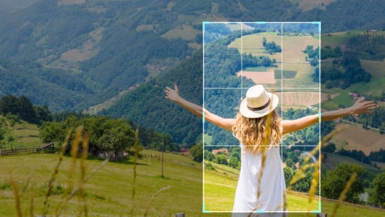
Are you in need of cropping your images to a specific size or shape? Look no further than PhotoCuts free Image Cropper! With our user-friendly tool, you can easily crop your images in just a few seconds. Plus, you have the option to crop multiple images simultaneously. Take your image editing to the next level with PhotoCut!
How to Crop a Picture?
Upload
To begin, please upload your images to our online cropping tool. Learn how to capture stunning photos for your Depop listings.
Crop
To begin, select from the available ratios or customize the crop ratio to suit your needs. Additionally, utilize our photo crop editor for additional adjustments.
Furthermore, you have the option to share your PhotoCut account across multiple devices.
Download
To complete the process, download and export the cropped photo. This step is essential in creating a stylish and eye-catching Poshmark header.
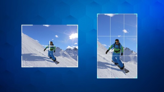
Is your photo cluttered with unnecessary elements? No need to fret! Our Image Cropper tool can assist you in removing those distractions and enhancing your image composition. With PhotoCut's Image Cropper, you can easily select the desired image ratio and customize it to your liking. Experience the power of PhotoCut for furniture AI-crafted photography today.
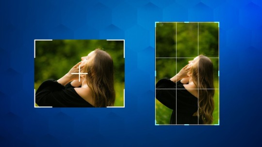
Creating perfectly cropped images for social media has never been easier with PhotoCut. Whether you are looking to update your Facebook cover photo or need an image that fits the golden ratio, PhotoCut allows you to effortlessly crop your images in just four simple clicks. Experience the convenience and precision of our AI Image Generator today.
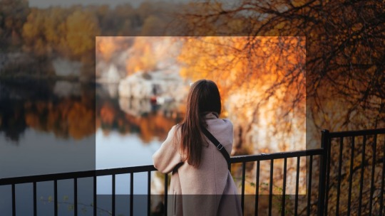
Do not worry about losing image quality when cropping with PhotoCuts photo cropper. This tool is both free and easy to use. Additionally, it offers a peach background option for added customization.

PhotoCut's Image Cropper allows you to effortlessly crop your photos to any desired dimension. You can even create unique shapes such as circles or squares by cropping your images. Batch editing is made simple with our Image Resizer feature.
Cropping multiple images can often be a time-consuming task, but with PhotoCuts Image Cropper, this process is made quick and efficient. With just one click, you can batch-crop images, saving you valuable time. Say goodbye to tedious editing tasks and streamline your workflow with PhotoCuts Image Cropper.
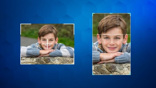
Utilize PhotoCuts Image Cropper to easily crop images anywhere, selecting from a variety of preset crop ratios and effortlessly adjusting the size and orientation of your images. Learn how to remove backgrounds in Illustrator with these simple methods.
Image Cropping Has Never Been Easier
PhotoCuts Image Cropper allows you to effortlessly crop images for various purposes. Are you wondering how to create a transparent background in Photoshop?
Crop PNG
Easily crop PNG images without compromising their quality and export them with transparency. Learn how to remove background images in HTML.
Crop Photo for Instagram
Easily crop your photos for Instagram with a 1:1 ratio in just a few simple steps. Learn five effective methods to remove the background from your images using Photoshop.
Crop Pictures into Custom Shapes
Enhance your presentations by cropping images into custom shapes such as circles, squares, triangles, and more. Learn how to remove backgrounds in PowerPoint with ease.
FAQs
Q1. How do you crop a JPEG picture?
Ans. Follow the steps given below.
Upload your JPEG picture to our online Image Cropper.
Choose the size you want and adjust the pixels.
Click on Apply, share, and save your cropped image.
Q2. How can I crop a picture faster?
Ans. Use PhotoCut's Image Cropper to cut pictures in just a few clicks. No need to download anything!
Q3. How do I cut out part of a picture?
Ans. Open PhotoCut, choose the size you need, adjust the cut size, and click on Apply.
0 notes
Text
Mastering Image Cropping with Online Tools: Your Complete Guide
In the realm of digital content creation and image editing, the ability to crop images efficiently is essential for achieving the desired visual impact. Online Image Crop Tool like “Online Image Crop Tool” and “Crop Image Online Tool” offer convenient and user-friendly solutions to crop images quickly and precisely. Let’s explore the art of image cropping and how you can leverage these tools effectively.
Why Use Online Image Crop Tools?
Image cropping is the process of removing unwanted areas from an image to improve composition, focus on specific elements, or resize for different platforms. Here’s why online image crop tools are valuable:
Accessibility: Online tools are accessible from any device with an internet connection, eliminating the need for software installation.
User-Friendly Interface: Most online crop tools feature intuitive interfaces, making them easy to use for individuals of all skill levels.
Quick Editing: Crop tools allow for immediate adjustments, enabling you to refine images efficiently without complex editing software.

How to Crop Images Using Online Tools
Choose a Reliable Tool: Select a reputable online image crop tool such as “Online Image Crop Tool” or “Crop Image Online Tool.”
Upload Your Image: Upload the image you wish to crop. Many tools support various image formats including JPEG, PNG, and GIF.
Adjust Crop Selection: Use the crop tool to select the desired area of the image. Drag the corners or edges of the selection box to refine the cropping frame.
Preview and Fine-Tune: Preview the cropped image to ensure it meets your expectations. Make adjustments to the crop selection as needed.
Apply and Save: Once satisfied with the cropping, apply the changes and save the cropped image to your device or cloud storage.
Benefits of Using “Online Image Crop Tool” or “Crop Image Online Tool”
Convenience: Crop images anytime, anywhere using a web browser without the need for specialized software.
Cost-Free: Most online crop tools are available free of charge, making them accessible to individuals and businesses on a budget.
Time-Saving: Crop images quickly and efficiently, streamlining your workflow for digital content creation.
Preserve Image Quality: Online crop tools use advanced algorithms to maintain image quality even after cropping.
Tips for Effective Image Cropping
Follow Composition Rules: Use techniques like the rule of thirds or golden ratio to guide your crop for balanced and visually appealing results.
Consider Aspect Ratios: Adjust the crop ratio to suit different platforms or publication formats (e.g., square for Instagram, wide for website banners).
Leave Breathing Room: When cropping portraits or objects, leave a bit of space around the subject to avoid a cramped appearance.
Experiment with Perspectives: Try unconventional crops to add interest and emphasize unique aspects of the image.
Practical Uses of Image Cropping
Image cropping serves various purposes across different industries and applications:
Social Media: Crop images for profile pictures, cover photos, or post thumbnails to optimize visual appeal on social media platforms.
Web Design: Use cropped images to create sliders, galleries, and hero images that enhance website aesthetics and user experience.
Photography: Fine-tune compositions by cropping photos to highlight focal points or remove distractions.
Marketing Collateral: Crop images for flyers, posters, and advertisements to emphasize key messages and draw attention.
Conclusion
Mastering the art of image cropping using online tools like “Online Image Crop Tool” or “Grayscale Picture Online” empowers you to enhance your visual content effortlessly. Whether you’re refining photos for personal projects, professional presentations, or digital marketing campaigns, these tools provide the flexibility and precision needed to achieve compelling results. Embrace the power of online image cropping to elevate your digital creations and captivate your audience with polished visuals.
0 notes
Text
Tailoring Platforms to Your Niche and Crafting Winning Profiles and Posts
In today’s digitally-driven world, social media platforms have become indispensable tools for individuals and businesses alike. Whether you’re an aspiring influencer, a budding entrepreneur, or a seasoned marketer, understanding the nuances of each platform and how to optimize your presence is crucial for success. With the advent of AI-powered tools like Piepie.AI, navigating the complex landscape of social media has become more accessible than ever. In this comprehensive guide, we’ll delve into the best social media platforms for different niches and provide expert tips on how to optimize your profile and posts to maximize engagement and reach.
Introduction to Social Media Optimization (SMO)
Before we dive into the specifics of each platform, let’s first understand the concept of Social Media Optimization (SMO). Similar to Search Engine Optimization (SEO), SMO aims to enhance your visibility and presence on social media platforms. By optimizing your profiles and content, you can attract more followers, increase engagement, and ultimately achieve your goals, whether it’s building brand awareness, driving website traffic, or generating leads.
Identifying Your Niche
The key to successful social media optimization is understanding your target audience and selecting the platforms where they are most active. Different platforms cater to diverse demographics and interests, so it’s essential to align your presence with your niche. Whether you’re in the fashion industry, the fitness niche, or the world of technology, there’s a social media platform tailored to your audience.
Choosing the Right Platforms
Instagram: Ideal for visually-driven industries such as fashion, beauty, and food, Instagram is a powerhouse for showcasing products and lifestyle content. With Piepie.AI’s advanced video generation capabilities, you can create stunning visuals and captivating videos to stand out in the crowded feed.
YouTube: The go-to platform for video content, YouTube is perfect for educational, entertaining, and tutorial-based content. Whether you’re a fitness guru sharing workout routines or a tech enthusiast reviewing the latest gadgets, Piepie.AI can help you create professional-looking videos that resonate with your audience.
LinkedIn: Targeting professionals and businesses, LinkedIn is invaluable for networking, building authority, and sharing industry insights. Leverage Piepie.AI to create thought-provoking videos, presentations, and infographics to establish yourself as a leader in your field.
Twitter: Known for its real-time updates and concise content, Twitter is ideal for news, trends, and quick updates. Use Piepie.AI to create eye-catching GIFs, short videos, and engaging polls to spark conversations and increase your reach.
TikTok: The fastest-growing platform for short-form video content, TikTok is perfect for reaching younger demographics and showcasing creativity. With Piepie.AI’s AI-powered video editing tools, you can create trendy and shareable videos that go viral in no time.
Pinterest: A visual discovery platform, Pinterest is perfect for inspiration, DIY projects, and product discovery. Utilize Piepie.AI to create visually stunning pins and infographics that drive traffic to your website or online store.
Optimizing Your Profile
Regardless of the platform you choose, optimizing your profile is essential for making a strong first impression and attracting followers. Here are some tips to optimize your profile across different platforms:
Profile Picture: Use a high-quality, recognizable profile picture that represents your brand or persona.
Bio: Craft a compelling bio that concisely describes who you are, what you do, and what value you provide to your audience.
Username/Handle: Choose a username that is easy to remember and consistent across all platforms.
Link: Include a link to your website, blog, or other relevant pages to drive traffic and conversions.
Keywords: Use relevant keywords in your bio and posts to improve discoverability and searchability.
Creating Engaging Content
Once you’ve optimized your profile, the next step is to create compelling content that resonates with your audience. Here are some tips for creating engaging content:
Quality Over Quantity: Focus on creating high-quality content that provides value to your audience rather than churning out mediocre posts.
Visual Appeal: Use eye-catching visuals, such as photos, videos, and infographics, to capture your audience’s attention and stand out in their feeds.
Consistency: Maintain a consistent posting schedule to keep your audience engaged and build momentum over time.
Interactivity: Encourage interaction and engagement by asking questions, hosting polls, and responding to comments and messages promptly.
Variety: Keep your content diverse and engaging by experimenting with different formats, such as videos, stories, carousels, and live streams.
Leveraging Piepie.AI for Social Media Success
With Piepie.AI’s advanced video generating tool, you can take your social media optimization efforts to the next level. Whether you’re creating promotional videos, educational tutorials, or entertaining content, Piepie.AI empowers you to unleash your creativity and captivate your audience like never before.
Customizable Templates: Choose from a wide range of customizable templates designed to suit various social media platforms and content types.
AI-Powered Editing: Harness the power of AI to automate video editing tasks, such as trimming, cropping, and adding effects, saving you time and effort.
Professional Results: Create professional-looking videos that rival those produced by professional videographers, without the need for expensive equipment or technical expertise. Analytics and Insights: Track the performance of your videos with built-in analytics and insights, allowing you to optimize your content strategy and maximize engagement and reach.
Conclusion
In conclusion, social media optimization is a powerful strategy for enhancing your presence and achieving your goals on social media platforms. By understanding your niche, choosing the right platforms, optimizing your profile and content, and leveraging tools like Piepie.AI, you can unlock the full potential of social media and propel your brand or persona to new heights of success. So what are you waiting for? Begin enhancing your social media footprint now and witness your audience expand rapidly!
0 notes
Text
Creating/Buying Business Card
First, I decided to explore how the designing and purchasing process of a company online works. With the internet as open and accessible as it has become, I thought this would be the best place to start. With the websites having templates, examples, providing suggestions etc, they offer a lot of help for first time users. Using this process first, will allow me to take forward what I learn into making my own, from there deciding which I prefer and why. I will experiment with how successful each are, by taking them to exhibitions and gathering opinions. For them to b successful they should be eye-catching, include relevant information the viewer can use and accessible as possible to a wide audience.
I looked up some of the most reliable brands to use, and Canva was one of them. Practising with their suggested methods I found this to be an easy website to use, and I loved the options they offered. Here I will document my process of making a card.
—————
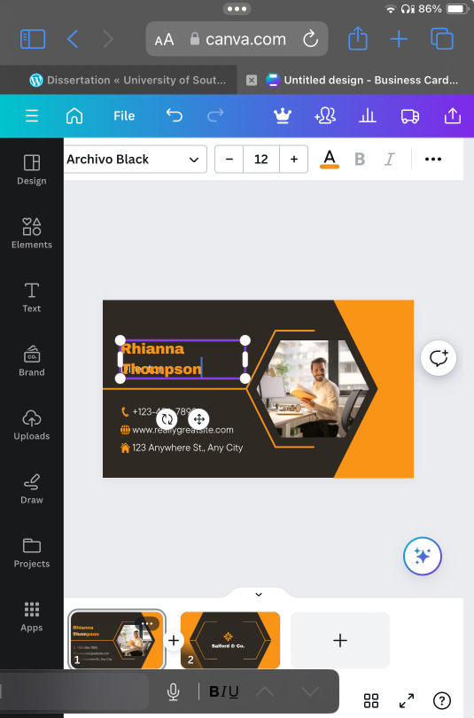
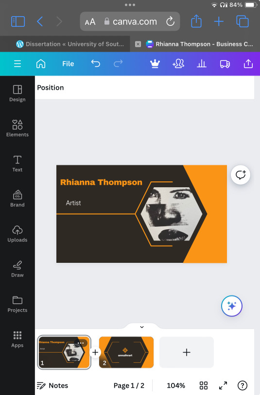
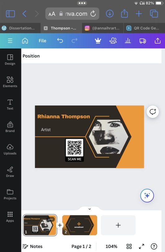
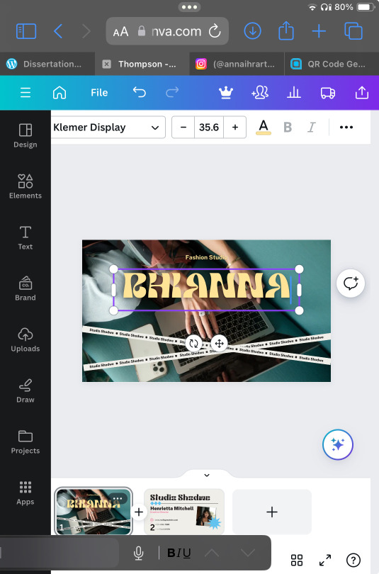
For my first attempt I loved this brown and orange, exactly what I wanted with the warm tones and colours I personally am drawn to. I felt the layout was simple, readable and had the space or relevant information I wanted to add. It had a place for pictures, so I added a piece I mad a while ago, which I feel expresses my mot used methods of creating; screen printing and collages making. I decided that including a QR code would be a modern way of linking my instagram account, where I would prefer people contact me through, as well as offering them a place to view my art without pressure. This is a common practice I find is used when looking at posters, cards, billboards etc. It is a quick and efficient way for a viewer to find your website, account etc without having to look for it themselves.
However, the more I worked with this design the less I liked how it was coming together, so I decided to look into more designs they had available. I loved how the green one looked, however as I wrote my name I realised that style was not accessible as the readability was poor, even for me who wrote it. I quickly moved on, because although I can decide the font and change it, I did not think it was worth the hassle , when there is such variety on the sight.
—————
On my next attempt I loved the combination of the colour and the off white, cream-like background. I felt the topography was readable and large enough to make sense. After some editing, I included all the detailed I wanted to, including my name, contact details and links to my social media. In total, this cost me 15 pounds with free postage, which is not too bad for a site that is mostly free.
0 notes