#putting them together like this made me realise my art style has evolved from what it was at the beginning of the year haha
Explore tagged Tumblr posts
Note
Could we have a brief tutorial on how you manage your simple pencil-like style, if you don't mind? I have no intentions of copying your work, but I would love tips on making quick but still neat and cute drawings.
// Sure thing! I'm not out here keeping any secrets lmao. The brush I use is the real pencil on CSP, but the derwent pencil on procreate is similar. also I use an iPad and apple pencil, i found they made it a bit quicker but obviously an investment that isn't necessary. Though if you have one, one way to speed up is that if you tap the side of the pencil twice it switches to the eraser.
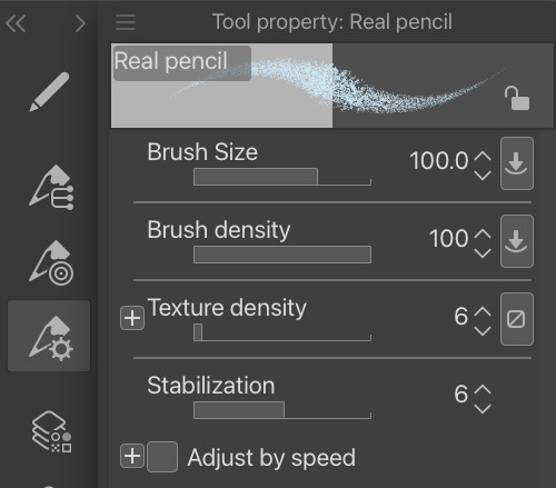
here are the general settings i use. when I sketch, the brush size is 50, and when i line the brush size is 30 - also I put the stabilisation up to 100% for lines. obvi use multitude of different brush sizes for colouring.
I sketch with any random mid tone and start like this, then fill out the torso
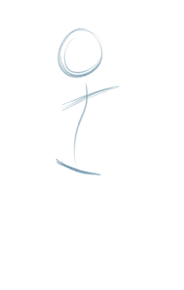
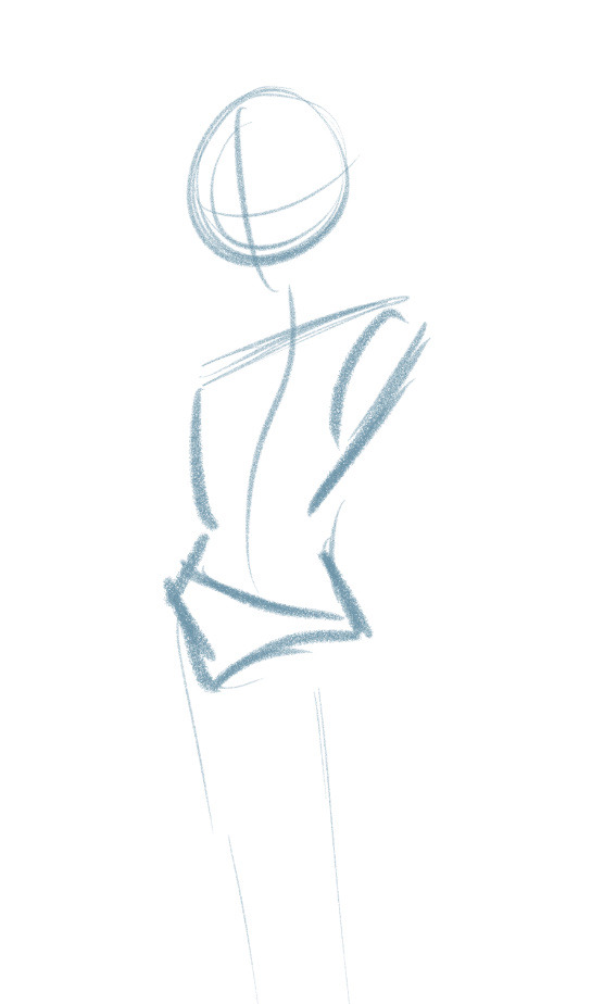
Sketching is always fairly messy. Point is to not give a shit about what it looks like, just get the vibe down.
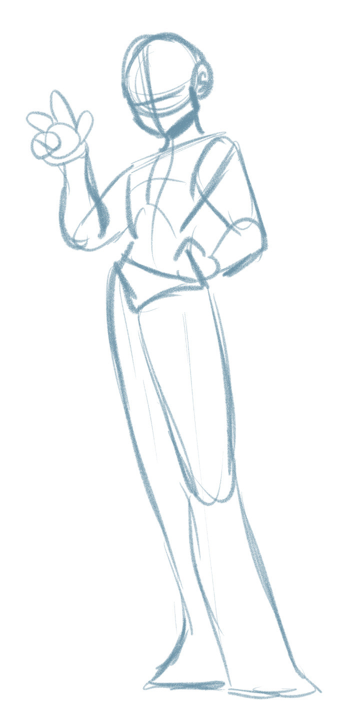
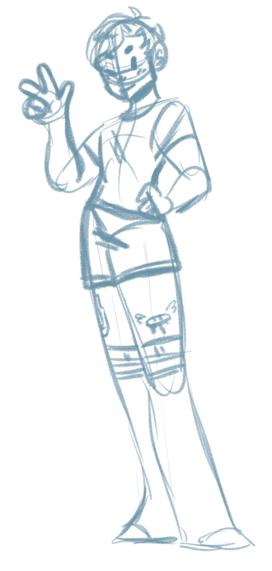
After torso I throw on the limbs. Usually i sketch out where the ribcage is too if I'm putting detail on the chest. Then I throw on details like the face and clothes
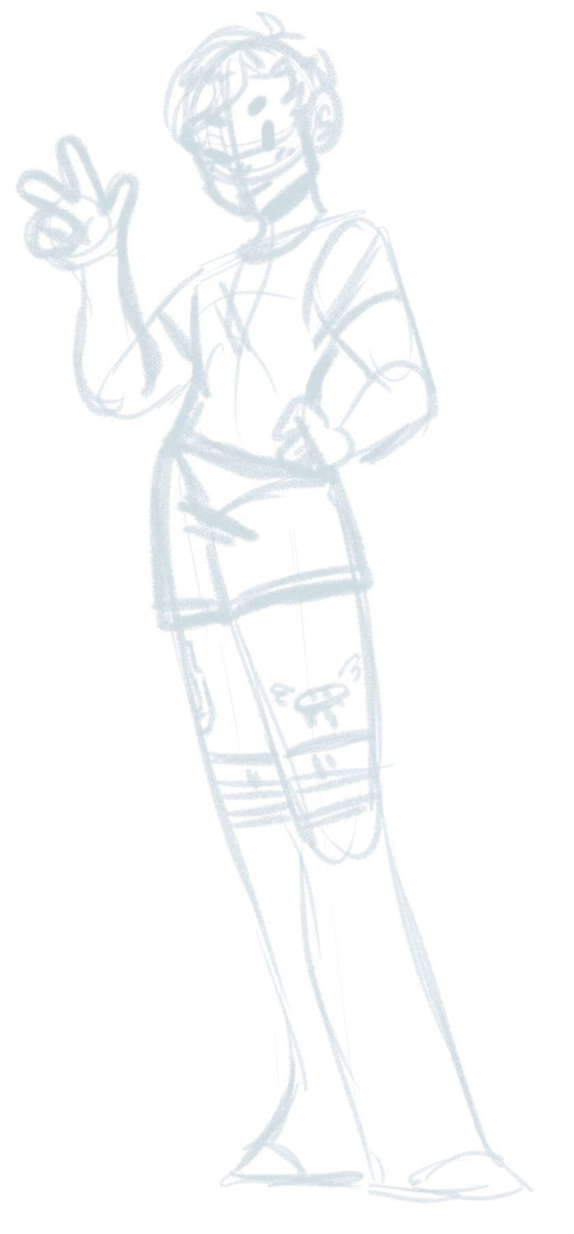
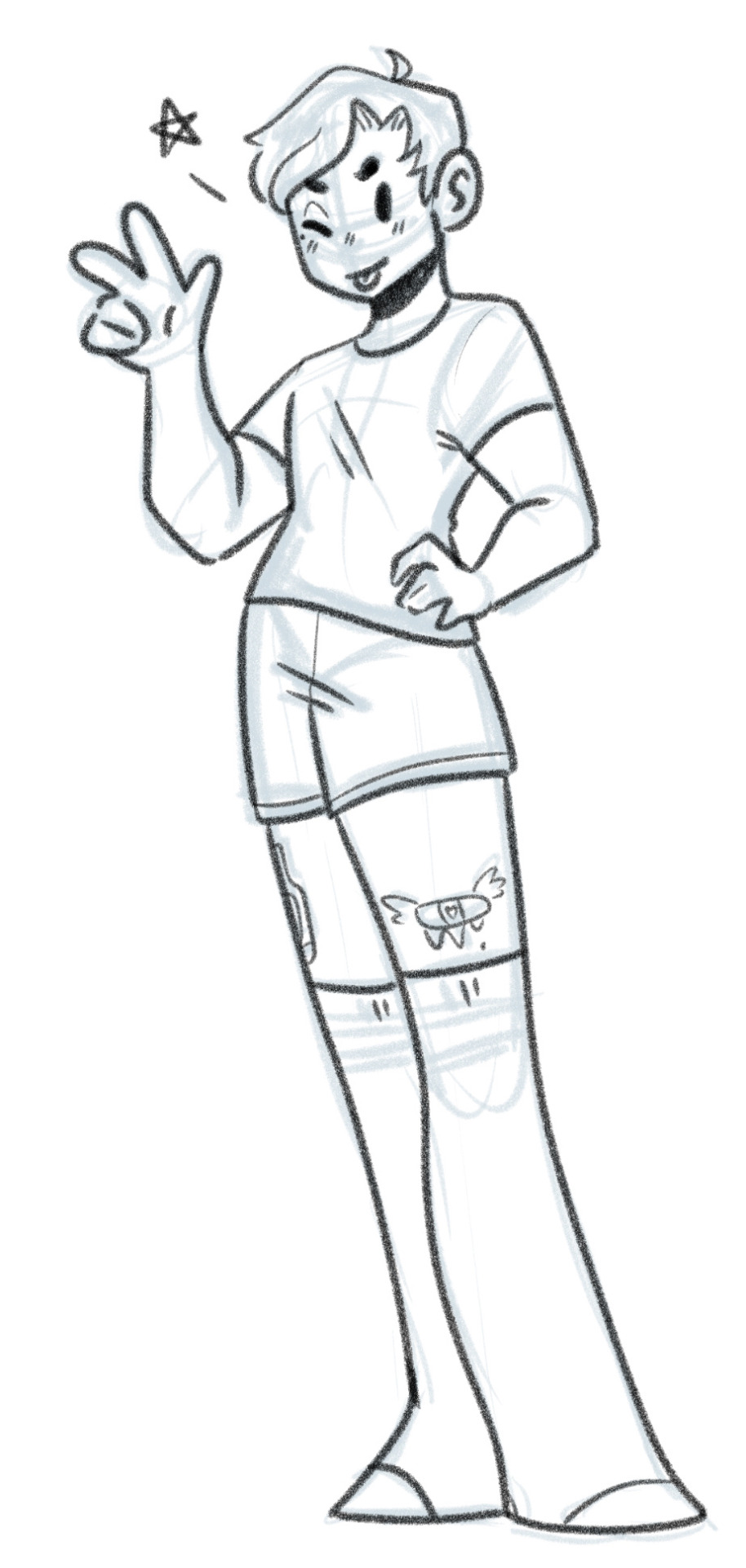
I'll then put down the transparency of the sketch layer and on a new layer throw on the line art. brush size 30, and 100% stabilisation. I have just realised the hands are two different sizes. this happens often because of how quick i try throw together things like this.
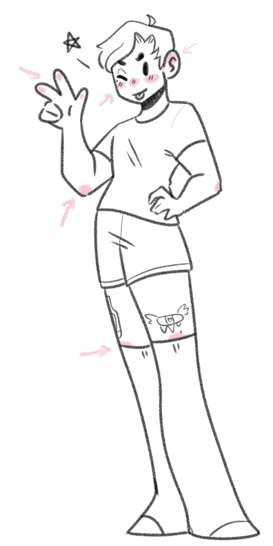
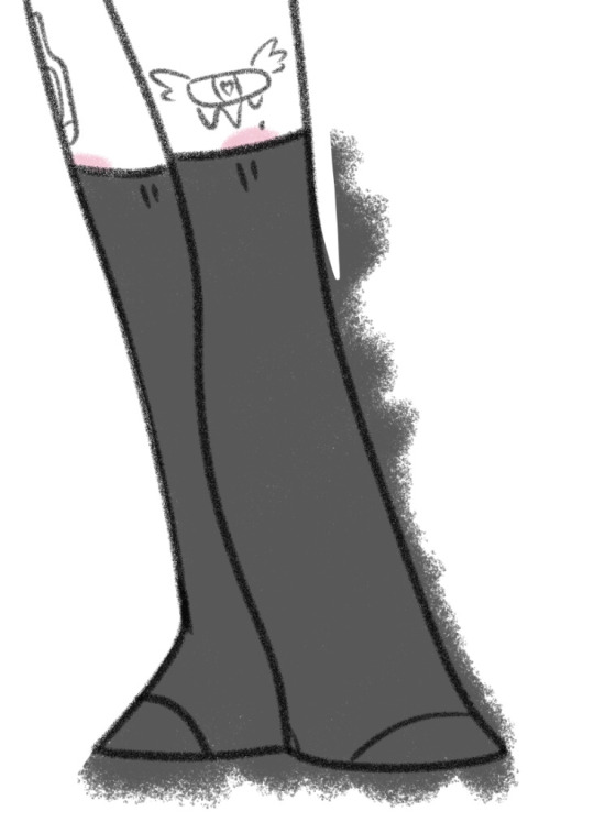
As for colouring, blushies go here, and usually i over colour with a large brush and erase around it. For bigger pieces I do a thicker line around the outside of the figure, select the space around it, invert selection, grow selection by 10px, fill in with white, and then use a clipping mask or transparency lock, then you don't have to erase around it. I stick to as few colours as possible and i rarely colour skin unless the character has dark skin cus if I don't it looks strange i've found lol. I use pastels as well, like if i'm colouring in black I colour it grey instead.
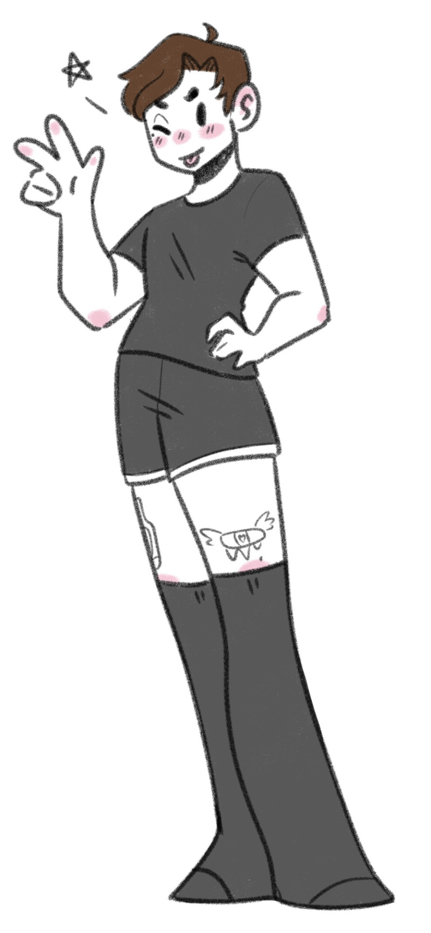
AND WE'RE DONE!
Drawings for this blog depending on complexity usually take me anywhere from 20mins to an hour. I'm not fussed about perfection cus I just wanna get them done to answer or doodle my thoughts. Since I started this blog I've gotten way quicker at drawing just cus i was drawing so much when I first started, I was able to adapt the style. I used to do it with like longer faces but somehow it evolved into something more chibi like. I also went through a massive style overhaul when I first started I used to draw something very detailed that took me multiple days, but now I have the simpler style I adapted from doing this which is faster. as you see from my commissions I still have the detailed style, a simple style, and the chibi style which is what I use for the blog.
TLDR; 1 sketch layer, use loose, quick lines. Don't stay stuck on details and perfection, the more you draw the more shortcuts you'll find.
idk if this was necessary brief but there ya go!
18 notes
·
View notes
Note
Hi. Hope you’re well. I am also autistic and have been wanting to get into writing properly for a while. The problem is, none of my ideas feel like my own. Of course, they are, but they feel like elements of other people’s stories mushed together into a combination unique to me. Even the way I write and try to write don’t seem like me. It’s like my masking has bled through into my writing and ideas so I don’t know what my true creativity or writing style is. A lot of writing advice is about writing true to yourself and what excites you, even if it’s weird. But I’m really struggling to do that. Is there any advice you could give?
I think there's too much pressure on newly-starting creatives to Be Unique. Most things have been done before, because that's the nature of storytelling. It's why myths and folklore from across the globe share common motifs (or narrative "threads") – humans will extrapolate the same sorts of patterns from their surroundings and put them into stories. What makes each story unique is the person telling it.
The first stuff you write will be just for yourself (generally speaking), so it's important to get comfortable with not always being pleased with what you create. In this case, that might mean recognising that your story isn't uniquely yours, and trying to make peace with that. The important thing is that you wrote it! You created a piece of art with words from inside your head and put them into a tangible form! Be proud of yourself for that; it means you're improving as a writer.
The second most prominent piece of advice I can give is this: a story isn't a fixed point. By which I mean, a story goes through enough drafts, revisions and edits that it takes on a different shape entirely from what it began as. The first version of a story might seem like something made from other people's ideas, and that's perfectly fine. That first version is purely for you to build on and learn from. As you work on it, you'll read/listen to/watch different stories, and those will also have an influence, and then you'll keep working on your story and eventually realise it's become something else entirely.
As the writers, we're aware and hyper-critical of our writing in ways that readers aren't. Whereas we know everything that influenced our writing styles and ideas, readers only get glimpses of this. Generally speaking, these glimpses create a favourable impression on the reader. If your thing is similar to another author's thing, and they liked that other author's thing, then they'll probably like your thing too!
When it comes to finding a style or voice, remember: your writing style probably won't sound like you at first. I know that masking and mimicry can go hand-in-hand, and I remember how for a long time that made me feel really hyper-aware of other authors' influence on my style. But then I realised: this isn't an experience unique to masking. Most writers start out by mimicking others – it's how we learn! Just like a story isn't a fixed point, neither is your writing style. Finding a personal style takes time and experience, and it's something that will constantly evolve. You've just got to Write Things, and Write Lots of Things, and then look back at your old writing to realise how your style has matured.
Best of luck on your writing journey! (*^▽^*)
76 notes
·
View notes
Text
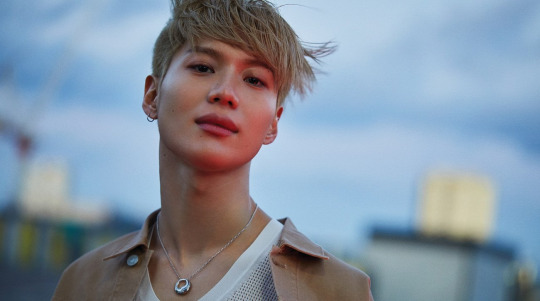
(interview) vogue korea april issue 2020 - perfect taemin
1. superm was another chance for taemin’s ever-evolving performance to be showcased. i thought a lot about how to create synergy with these exceptional performers. to put it simply, i wanted us to come off as energetic. but these days i’ve had a change of heart. our identity is definitely important. rather than just working hard, for superm to show off their colours well we need to show our personalities; we should be seen as one team. to be able to formulate a solid and clear colour is our homework. that’s why it’s regrettable. we couldn’t come up with a novel choreography to carry our new identity. we tried a lot in the practice room. superm seems to have found its musical identity but hasn’t gotten a hold of its performance character yet. the stages are too vague. 2. now that you are finally promoting with your best friend kai in one group, you two must’ve shared your concerns. since this friend is someone who has a lot of passion and ambition, he talks about various things. for instance, this style is pretty good, this choreography is quite trendy. thanks to him i’ve learned a lot. he is also very knowledgeable about the latest ‘hottest’ genres. we talk about these things often and even watch videos together. kai gives off ‘popular’ vibes. compared to him, my interests are quite unusual. nowadays kai is interested in music while i am into science. 3. is it science fiction? these days we’ve been watching videos on the theory of relativity and quantum mechanics together. 4. what aspect of it interested you? originally i was very curious, after seeing a recommended video on youtube i learned about quantum mechanics for the first time. i couldn’t understand the explanation, even those who were explaining it said it was a difficult concept. that was very fascinating to me. kind of like magic. 5. are you reading books on the subject too? the subjects of the books i read are different (laughs). there’s a book that was published long ago called ‘regarding the pain of others.’ it is a pessimistic book that gathers contradictory opinions of people for instance ‘people find joy in the pain of others, it is instinctual.’ as a celebrity, there are times when you are criticized but there are also times when you receive comfort from people. rather than blaming others, while reading this book, i began to think ‘people are like that, at most i shouldn’t behave like them.’ my interests are all over the place. 6. what makes you and kai click? we converse well. our opinions almost never clash and we respect each other. moreover, we fully understand our own roles in superm. 7. what position do you hold in superm? since i can’t ask if it’s the main dancer. in pictures and interviews, i’m the center. baekhyun hyung is the leader (laughs). 8. when the conversation wasn’t flowing well during the talkshow interview, i saw you neatly concluding it. that does happen. nct and wayv are still in the learning phase. that’s why i first listen to all of their thoughts during interviews then flesh it out with details later. 9. compared to when you set out abroad as shinee then promoting overseas as superm now, the status of k-pop has changed. looking at how superm was able to start off with an arena tour in the us and europe made me feel that k-pop is a ‘hot’ topic. in the past, we’d use venues of this scale for smtown concerts. even if you promote mainly in asia, seeing the audience section will make you realise the perception of k-pop has changed. 10. though k-pop’s scope has expanded and diversified, its definition has become simple. what are your concerns? my first concern is language. after i was able to communicate via language during my japanese activities, there were so many advantages. though each country overseas has its own language, i felt that i needed to learn english first. there are many international fans who want to experience the chemistry between our members, they’d feel much closer to us if we communicated using (a common) language. k-pop isn’t one dimensional. it’s not only about the music, there is music video, style, etc. included. people would make dance covers in the past, now they even emulate the styling. all of this is korean pop culture. 11. superm were on the ellen degeneres show and jimmy kimmel live. before we went on the ellen show we really rehearsed the interview a lot. america’s atmosphere is different so you receive questions that are never asked in korea. they don’t disclose the questions in advance either. we were also worried because the emcee could ad-lib. we came up with the most probable questions and practiced, we also received lessons from american comedians. compared to that, we went on jimmy kimmel live without any prep. 12. what went according to plan and what didn’t? the questions were not as intense as expected, ellen was well aware about k-pop culture so it went smoothly. 13. is there a dance genre you’re into these days? contemporary, lyrical hiphop, in the future as superm i think i’ll be able to show more, not the kind of dancing that you do after learning a given choreography but the kind that is full of emotions. it’s about giving meaning to your gestures. it isn’t out yet but my concert vcr features lyrical hiphop. in it i think i’m dancing alone with a giant full moon as my backdrop but get confused when there are two of us, either it’s another person or a shadow. a choreographer with a body type similar to mine had to dress in all black to come across as my shadow. i wore an oriental outfit with smokey makeup. 14. how do you usually come up with your ideas? i get inspired by the choreographers and creative directors. i imagine it as we converse then the idea develops. 15. was there a time you were inspired by fashion? of course. art begins with the five senses. what you see with your eyes, the things you can feel, clothes, food, perfume, music that you listen to are all sources of inspiration. i create private accounts to follow fashion brands. 16. having debuted at the age of 16, you are still young but your work experience has been long. i was in certain situations because of this. it doesn’t happen as often now but even in my early 20s, i completely belonged to the senior category at broadcasting stations. they are my juniors but many of them are also hyungs, i’m their senior but i’m also the youngest. now there are even staff members who are younger than me. they’re too formal with me (laughs). 17. are there juniors that ask you for advice or help? the superm members! especially ten, he is very curious. when we come out of a company meeting, he’ll get surprised and say “wow, hyung everything you said was right.” i even hear things like ‘veteran’ and ‘seer.’ apparently my predictions come true. but i try not to advise them as much. taking the initiative to say something feels overwhelming. 18. born in 1993 between millennials and gen z, do you share any characteristics with those in your age bracket? we’ve picked out a few of their traits. the first one is ‘they don’t eat fast food.’ me too! i took care of my health well ever since i started out with shinee. i was brainwashed from home to avoid foods that harmed the body. not even ramyeon, snacks were also banned. and just like that in my 20s i started carrying out the regime on my own. it’s become a habit to look after my health ever since i moved out. i always eat things that are good for my body, if the hyungs are taking vitamins, i’d ask for one too. 19. i suddenly recall a variety show where you were the only one who skipped the sauce and ate the meat on its own! one should not eat irritable foods. my mother’s words. 20. how about ‘they watch videos on youtube rather than tv. even the ads don’t particularly bother them.’ that’s right. i watch youtube more often than tv, while watching the ads i'd even marvel at their production quality. i’ve signed up for the premium package now so i don’t see the ads anymore. 21. ‘marrying or wanting to buy their own house.’ i currently live alone and i have no interest in decking out my house. at first, i didn’t think like that but a month later my interest dissipated. i’m lazy. it’s not like my house is for others to see, i’m fine with the incomplete feeling for now. 22. and finally ‘they avoid investing in financial companies.’ i don’t do that. my parents manage that, if there’s a good tip i’ll just let them know. 23. hiphop musicians tend to express their success through music. as an idol musician how have you been using the wealth you accumulated all these years? i invest in food instead of saving up (laughs). honestly, i don’t spend much. i don’t have anything i want. though i do spend on others a lot. 24. what kind of household did you grow up in? what gifts did you inherit from your family as a musician? i inherited my body type. all of my cousins have model-like physiques, they’re taller and slimmer than me. my mother sings well. my father plays instruments as a hobby. oh, and my paternal aunt used to be a ballerina. so perhaps i inherited such genes? 25. you’ve been doing the same thing for more than 10 years. what is the purpose behind creating music and showcasing it? in the past, i would think i should do well, i need to be number one, these days i’ve become ambitious for other aspects. i take pride in the fact that my work supplies others with positive energy. i feel a sense of accomplishment when fans like my music, i want to make them as happy as i am. everyone’s profession is different but i hope this synergy gained from mutual dependence leaves a good impression. 26. are you still composing songs? i used to but now i only participate in lyric writing. it differs with each song, at times the lyrics are emotional or talk about abstract love. it seems like my next solo album will include a song i wrote the lyrics to. sometimes songs composed by overseas composers might prove too difficult for the general public to understand. so i participate a lot in the arrangement or mixing phase. i point out the parts that should be added to the composition and those that are unneeded. teacher lee soo man does give advice but it often feels like i do the producing of my own solo album. 27. taemin’s originality is the clearest when he promotes as a solo artist. which song has best represented your identity? i worked hard on all of them but there was a turning point. at first there was ‘danger’ then ‘press your number’ was a conceptual performance, the transition to ‘move’ turned out well. i wanted to break out from the typical choreography routine and create my own identity, the resulting performances were ‘move’ and ‘want.’ my next solo album is again different. i’ve been making a lot of changes these days. 28. you seem to have high standards when it comes to composing music. was there ever an occasion where you absolutely refused to compromise and gave others a hard time? everyone is used to it (laughs). it’s something i learned from the head manager hyung who’s been with me since debut. the belief that ‘there is nothing that can’t be done. there is no such thing as impossible.’ another team manager hyung would tell me ‘you remind me of our head’ (laughs). honestly, the staff around me work beyond their given roles and with affection. normally work timings are from 9 to 7, they stay back till 10-11 pm for me. they don’t hold it against me, and when things do well, they too feel a sense of fulfillment together with me. 29. the new unreleased song must be quite different from the original then. there are already 12 versions of the song. when i thought we were somewhat done, we recently started arranging it again (laughs). 30. you hold your body to specific standards for the best performance outcome. i don’t ‘bulk up.’ previously, i used to work out when i ate a lot but my body would feel weighed down, it wasn’t what i wanted. if i gain a lot of muscles or become thick, it hampers my dancing form. that’s why i don’t put on weight. i train my stamina and strength and avoid bulking up my shoulders and arms. 31. by the way, do you do neck exercises as well? i was touched looking at your long neck in the vogue photoshoot. i had been noticing this too, now i know the reason! i think it’s because i dance. a lot of resistance goes into the neck when you dance. our head is the heaviest and it’s the neck that supports it. it goes away when i rest for a few days. we’re shooting amidst the superm tour maybe that’s why it looks thicker now. 32. an editor who has been watching you closely for a long time said that you’ve become extroverted. could it be that experience and relationships have made you comfortable and secure? i’ve lowered my guard. i couldn’t reveal my current self to others before. as a child i used to be so introverted that i’d hide behind my mother when strangers would get into the elevator. i changed with time. 33. is your ever-present smile a product of your personality or just business decorum? i’m always smiling. i even laugh at things other people don’t find funny (laughs). 34. shinee members are currently serving in the army. when they’re on break what kind of advice or nagging do they subject you to? i wish they would do that. we have a group chat on kakaotalk and i always revive it by asking “what’s up” “happy new year.” but as soon as the conversation picks up they only talk about the army. when i inform them about an issue at the company they say “really?” then it’s military talk again. when i feel left out and tell them to stop, they reply with “you’ll understand when you get here.” 35. in your career as a musician, when do you feel the best? when it’s time to reveal all that i’ve been preparing for so long! it feels different from finishing it. the first stage after debuting, shinee’s first concert, performing at tokyo dome, receiving the award... these are the moments that come to mind. 36. watching taemin grow for the past decade has been a huge source of strength. what are your dreams now? there are many. first of all, once shinee comes back again, i want the entire group to give off a feeling of revival. usually after getting discharged, it’s hard to keep up with the next generation, i want to avoid that. i’ve imagined it all when the shinee members return. second, i want to perform a lot on various stages as a solo artist. superm topped the billboard 200 album chart, it’d be nice to enter the top 10 on the hot 100 digital chart as well. 37. you are really talented at setting goals. i’ve gotten greedier. it’s just not for myself but i want to do it for the fans and members, even the staff. they become my driving force. i really am lucky. everybody works hard but i even get the recognition for it. come to think of it, i was given many opportunities and i worked hard to make the most of them, i’m really happy my efforts paid off in the end. i’m surrounded by good people. shinee, superm, many people fill in the gaps for me that i can’t solve on my own. 38. superm’s concert title is ‘we are the future.’ when you hear the word ‘future’ what are you reminded of? first, it’s h.o.t. (laughs). future-oriented things come to mind like artificial intelligence, drones, 3d hologram concerts. then again, in the future, though people might be able to watch concerts through holograms, i think humans will not give up on the tasks they themselves can do. my work will still be the same in the future. 39. the reason you don’t write anything on instagram. i don’t have anything to say yet (laughs). i don’t know if i should make my instagram cool or approachable. when fretting between writing a caption or using an emoticon, i just end up leaving it blank. actually i signed up after my manager hyung suggested that instagram would be good. so i’ve made one but i still don’t know what to upload. i get teased by the people around me for putting up selfies. i even took lots of pictures especially for instagram but... 40. did you not post the pictures? the point of instagram is real-time communication. is that so! i didn’t know (laughs).
translated by romanceboys — take out with full credit (source)
580 notes
·
View notes
Text
Post 1: CV & Online Portfolio
The first thing I did after been given this course module was deeply considered what future career I possibly wanted to get into after I finish university for I could use this module to build my client connections and/or my portfolio around this future career and help myself for when I finish university. Thinking hard and looking into the different career paths illustration could take me and remembering past university modules. I realised how much I really enjoyed book illustrating so I looked into that career path, looking online at existing book illustrators such as Dan Santat, and discovered that becoming a children’s illustrator appealed the most to me since I feel like my art style and passions work best for children media. So, going forward into this client studies module, I had the idea of a children’s illustrator in mind.
After talking to the work placement partner Laura, I realised I would need to do some preparations before applying to placements, such as creating a new CV and online portfolio. I have had a CV before but it was very basic and designed more for retail jobs, not illustration work, so I looked on Behance and Guru for existing examples to get some ideas on how to create an illustrator CV.

I discovered I gravitated towards the more graphic CV’s with illustrations instead of photographs, I liked how more unique and personal they felt and how they showed off their art styles and brand. With this in mind, I started to consider what my style and brand was, looking at my artwork I could see a running theme of bright colours, simple lineless art and a child-like charm which suited the children’s illustrator career path I had in mind thankfully; so, I decided to design towards this mindset.
I was unsure how to start but decided that the information was the most important since that is the purpose of the CV so I started to add that onto the page. I quickly realised that this was my first opportunity to make it more personal, so I when onto Calligraphr, downloaded the template and digitally designed my own font using my handwriting. This was fun and was a great skill to learn for the future especially if I want to do children’s book in the future since I won’t have to worry about the copyright of the font and can make it personal and stylised to fit alongside the illustrations.

After putting all the information I wanted to include such as my previous work experience, what software I use and some brief information about myself I realised there wasn’t as much room as I wanted for illustrations. I discovered that layout is not my strongest skill, I couldn’t work out how to layout the text with enough space for illustrations while not making the text hard to read, I tried to use the CV examples I found but I didn’t want to straight-up replicate them since I want my CV to represent my style and stay true to my strengths and weaknesses. I manage to somewhat fix this by cutting down some of the information and just briefly mentioning stuff by name and date only but there still wasn’t much room left. So, I prioritied the illustration I knew I wanted to include, an illustration of myself that show off my art style and the logos of the software I use, after doing this the CV still looked a little plain but I wasn’t sure what other illustrations I could do, so I thought maybe showing off another aspect of my style which was my use of bright colours so getting the colour I like the most that work best together I colour the text in my name and added spots of colour around the text to help separate it and make it more visually interesting; it also helps add to the child-like style I am trying to convey.
Looking back, I think after my experience during this client studies module and having gained more practice with text layout from personal projects, I think I would be able to improve this slightly; change the spots to more solid shapes to frame the text and add more illustrations such as a props/objects like pencils and maybe fun characters that would show off my character design skills. However, I do think this CV does best represent the style I wanted to present and helped me figure out a colour scheme I could use as an artist brand, it gave me more practice with text layout and taught me a new skill (creating a font) that will benefit me greatly in the future. I am also able to use the illustration of myself in the future to represent/market myself and I am happy enough with the final product to send this to future work placements and clients.
Next preparation I needed to do was create an online portfolio before I had just used my Instagram but it never allowed me easily show all my illustrations related to past projects, so using Wix I created an online portfolio in the same style (font & colour scheme) and my CV. I created the main page that shows an illustration from each of my projects, original work and fanart with a title when hovered over it which will lead you to another page when clicked.
Link to my online portfolio: https://chloeillustrations.wixsite.com/myportfolio

The other page show all the original illustrations and a brief description of the project. I also included an about me page, using the same illustration of myself from my CV and wrote a more detailed bio about myself to give new viewers and clients a better idea of how I am as an artist and person. I kept my portfolio simple and easy to see and navigate for all ages and to keep to my child-like brand. However, I may update it in the future to make the main page a bit more visually interesting and easier to see what each project is without the need to hover over the images but for now, the website works for what I need for this module. I may also fix the placement of the images since some on some of the pages, the images are too large, making it feel cluttered and could detract people away due to how much scrolling is needed to see my illustrations.

Overall, this taught me a lot, I hadn’t created a portfolio like this before so it was fun to experiment with website layout which slightly improved my basic layout skills, made me look into my past projects and see how much my style has evolved and made me consider who I am as a person and an artist as I wrote the bio; the bio will be helpful in the future when I may need to describe myself again in the future. Creating both the CV and the online portfolio helped me design a style from my brand as an artist and was a nice welcome back to the university course and this client studies module, warming me up for what is to come. Next, it was time to look into work placements now that most of my preparation was finished.
1 note
·
View note
Note
Hi can I request a matchup?? I’m a 5’0 bi girl (preference for girls but guys are also cool!) i have short, dark hair and big brown eyes, and I never leave the house without trying to dress fashionably. I’m super bubbly and social, sometimes reckless and wild, I’m intellectually smart but a huge dumbass, and can’t help myself from smiling. I’m also depressed and hella self conscious so that’s fun! I like art, writing poetry and short stories, and theatre. Thank you so much!
Hi this took forever I am SO sorry. My ass Do be depressed and slow, and my brain said ‘haha writer juices EMPTY. WHORE’ so this definitely had me stumped
#1 is...Neijre!
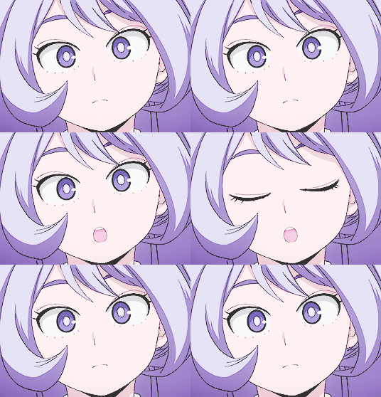
Now I’m probably gonna key in on the reckless and wild part here
Because y’all met at a party probably!!
Now we all know that Neijre is popular.
Blunt but popular.
So one day y’all are at someone’s ‘my parent’s aren’t home and I’m pretty sure that if I replace the vodka with water they won’t notice’ party.
It’s going great!!
People are wasted and Lady Gaga is blasting and the friend you came with ran off with a Ketsubutsu student
You’re kind of tipsy
Tipsy enough that you don’t have the cognition to think through decisions
So you’re standing next to this blue-haired cutie who you’re pretty sure you’ve seen before
When someone bursts through the front door, screaming bloody murder about the police
Naturally, they have everyone’s attention when an officer that definitely already called the paddy wagon
So someone from the upstairs balcony hollers ‘scatter!!’ and you grab the hand of the first person you saw
Which was the blue-haired girl!
And she seems surprised but she runs with it (literally)!!
You two go upstairs, almost cornered, before hopping out a window
You two are falling when she uses her quirk and helps your landing
And then y’all make tracks for the fence line.
By the time you two have ditched the house, it’s almost midnight
And you guys are wandering around town
The blue-haired girl’s heels are hanging off of one hand
And the silence is filled with babbling between the two
A gas station is the decided pit stop before you two part ways
And you walk in to get some waters
As you two sit on the curb, watching idiot light cigarettes and try to peel out of the station, she glances over
There’s something magnetic about you
And she can’t quite pin what
But you’re always smiling
And it’s the opposite of getting on her nerves
She wants to see it again and again
She’s staring at her drink, thinking, before you present her with a handful of chicory flowers
She realises that you must have picked them from the side of the road
She’s bright red because, with all of her social expertise, she doesn’t even know your name.
She doesn’t know if you’re into girls, if you’re trying to ask her out, if you’re just being nice…
She takes them, and before y’all know it, you’re both leaning in
And as she takes the flowers from your hands, you two kiss
Someone mumbles from one of the pumps that it’s just turned midnight
Out of nowhere
Your phone goes off
And that’s when you jump out of the kiss, and your face falls into a mix of shame, fear, and sheepishness.
‘Sorry,’ you murmur. ‘This is my friend, she was at the party. I probably have to go. Are you going to be alright?’
Neijre can only mutely nod, still awestruck
You begin to walk away, your friend audibly hollering at you from the other end of the line about bail
You look back every couple steps or so to make sure that Neijre is okay before you turn and walk out of sight
And this begins something for Neijre that makes her hold her hands in her cheeks with a bright red blush
The problem rises the next morning though
When she wakes up in her bed with a headache, she realises that she has no literal idea who you were
So when she goes to class (because real thugs party on weekdays) she’s hugging the chicory flowers to herself
She tells her story to Mirio
Who tells it to Midoriya
Who tells it to Ochako
Who tells it to Aoyama
Who tells it to-yeah, you get the idea
So by lunch, the entire school is talking about Neijre’s Cinderella story, and about her kiss at midnight
And what do you know?
You hear it in your friend group from 1-D that Neijre got into a cop chase with a dashing stranger who she made out with on a bridge before being cruelly dumped
And you’re just like ‘?????’ before asking where to find Neijre.
They answer but don’t put two and two together that maybe you were the dashing stranger
So later that day you go to the road to pick more chicories and add some speedwells in there, before going to hunt down Neijre.
You’re standing at the entrance of school the next morning
And it’s FAR too early for this
But that’s what love does
But anyway
You’re standing there
With the flowers in hand
And you stand there
And stand some more
And you’re standing there for two hours
And you’re contemplating just bailing and finding her another time
When you hear the loudest gasp
You look up
And she’s standing there, hands covering her mouth and her eyes wide
‘N-No way! It’s you!!’
She looks positively elated, and before you can do anything more
She leaps forward and kisses you smack on the lips
Sure people are staring
But she just covers you in kisses, grinning giddily the entire time.
She seriously had doubted that you would appear, ever again
And that midnight would seem like a summer dream
Mirio would have to usher Tamaki with him inside because of how long it takes for you two to part
It becomes the Cinderella story of U.A.
#2 is...Tooru!
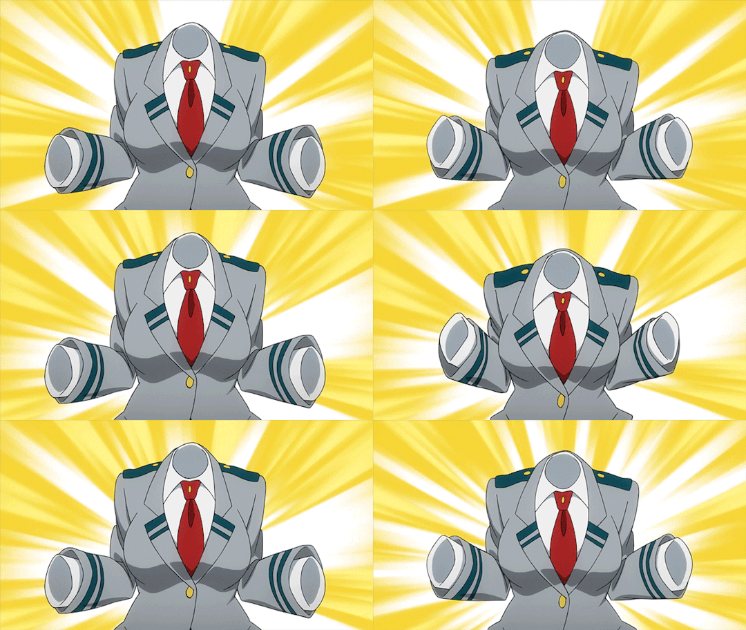
Listen
This may be sad/punny
But you make her feel seen
You always make her feel involved
She understands that because of her quirk there is a bit of an obstacle in trying to involve her
So whenever you look over and ask her opinion
She feels really giddy!!
It makes her blush, and for once, she feels grateful for the invisibility; you can’t see her light up like a Christmas tree.
She daydreams about you a lot, and to be honest, it’s always really domestic.
Yes, she may be a cuddle bug, but she wants to go grocery shopping with you and complain about how expensive milk has become
And sometimes her daydreams will evolve into actual scenarios, including arguments.
Every time it shifts, she gets kinda spooked and semi-avoids you for about an hour afterwards
The first time you guys really interacted was at the Sports Festival, during the race
She was lagging a little bit behind because her quirk doesn’t really help
So at one point, she gets tripped up (she has her uniform on, remember!)
And she’s pretty sure that he knee is scraped
But then this sweet little lady stops and notices Tooru holding her knee for a second.
Tooru’s confused when the young woman looks around, before placing a hand over the wound.
Tooru’s about to freak out before realising that the wound is gone, but instead, it’s on your knee now
You give her a thumbs up and carry on, limping a bit now
She can her Present Mic talking about it loudly, but she’s too busy getting back up and running to pay attention
She makes it into the top ten (if I remember right) so after you congratulate her!
With a high five!!
She’s really giggly throughout the entire encounter and tries to subtly ask if you’re single
Note that subtly is not really subtle
So you have an invisible cutie coming for your kneecaps!!
To kiss them better!!
After you two begin to chat more
And she invites you to a lot of the extra 1-A outings!
All the girls are super supportive of it and do their best to make some sort of shoujo situation out of it.
If it rains then conveniently Tooru left her umbrella at the dorms!! Oh no!!
Oh? Ochako has an extra that’s big enough to cover the entire class?
Well then!! You and Tooru have to share
(bakugou also forgot his umbrella, but as much as he complained to everyone else, he didn’t say a word to you and Tooru)
The boys (like Bakugou) are a bit less wing-man-y, but they certainly are rooting for you!
If Tooru wants to know your favourite colour, then chances are, Midoriya’s got it in his brain somewhere.
If she needs help cooking your favourite meal, then Bakugou will bitch and whine while making sure she measures flour properly.
And if she’s going on her first date? You bet your ass that Aoyama will be there, styling her.
So when they see you two kiss for the first time (Tooru wore lipstick to make it easier to aim) everyone went ballistic.
‘Fucking finally!’
‘Go Tooru-chan!!’
‘Congrats, kero.’
#3 is...Todoroki!
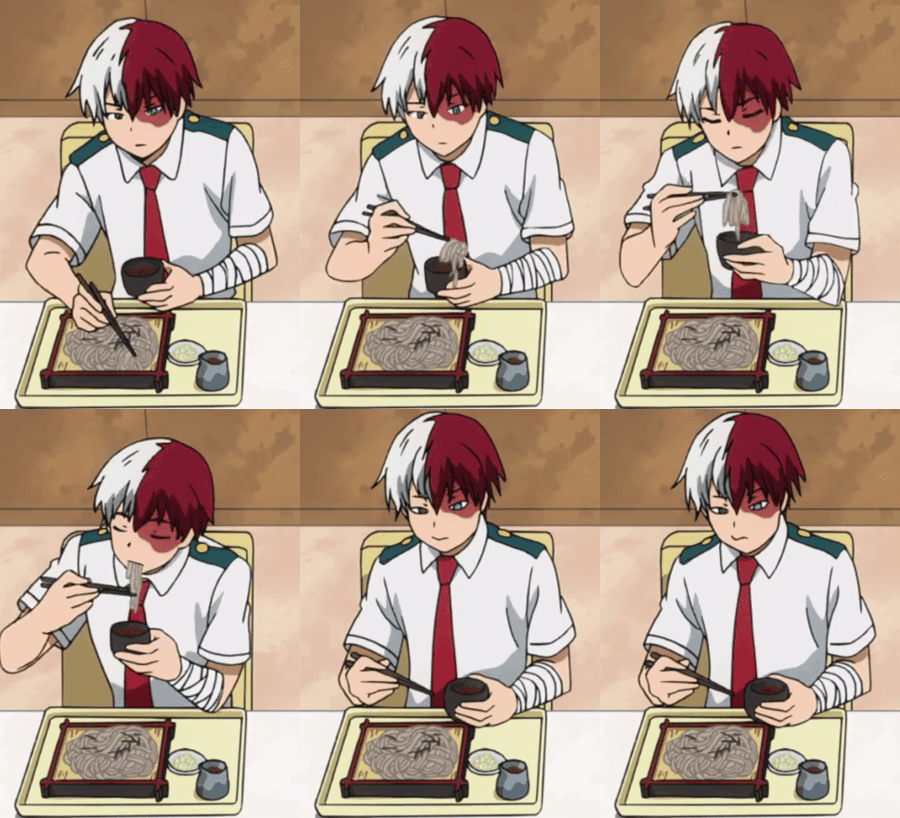
j
Jealous boy
He wants to be popular
He noticed you after the sports festival (of course)
And sees that you’re a little social butterfly.
He wants what you have
You have all these people that flock to you for friendships, and you’re always smiling and goofing off
And yet you have fantastic grades
So with a determined huff, he decides
He’s gonna ask you to coach him in being a young socialite.
So when he approaches you he feels really daunted
You’ve got this crowd of people around you (in his eyes)
And he thinks that you wouldn’t even notice him, probably
However he forgets
He is a half white half red angsty bastard who everyone saw and instantly parted like the red sea for
So all you guys see is him glaring down at you
And you’re like ‘😰 whoop guess this is where i die”
Someone’s asking if they can be in your will when Todoroki starts talking
‘You’re loud. And friendly.’
Everyone’s expecting him to blast you to the moon for being loud
When he goes into a ninety-degree bow
‘Please teach me, sensei.’
Everyone’s like the pic i sent you of Bibble
It’s just AWESTRUCK
And you’re like ‘ohh, you don’t wanna kill me? Dope!’
And that’s where his lessons begin
You start off with telling him that his resting face made him look either constipated or pissed
So he starts working on making sure that people know he has no ill intent
And slowly but surely
People approach him with invitations to parties for he himself to go to, not as a Todoroki, but as Shoto
And he’s absolutely ecstatic
He thanks you endlessly
But naturally this leads to something or the other for him
Because you gave him the chance he needed to be a teenager, for once
And gradually he realises
That’s he’s gotten a crush on you
Now
He’s a bit afraid, because he’s not had any good role models in terms of love
And baby boy doesn’t want to lose your friendship and trust if it doesn’t turn out
He does get jealous
But doesn’t say anything
He just stares
And at one point, after a cute Support student tried panning over their number, you notice todoroki staring at the ground, looking angry
You go up to him
‘Hey, are you okay? You look kinda upset.’
His head snaps up and he’s blinking down at you
And he just feels really conflicted
Because he assumed that it would be better if you just remained as friends for right now
And that the best route would be just to keep you in his heart
But when you look at him like that, he snaps
‘May i talk to you in private?’
‘Sure. Is everything alright?’ You’ve got a nervous smile on your face as he drags you outside
And once out there he just spills his heart out
‘I understand that you and I are friends, and you are one of my closest friends. However, I’ve found myself feeling...different around you. I want to hug you, and ward off anyone that tries talking to you with romantic interest. When I first met you, I was jealous that you were so popular and kind, and that everyone loved you for who you were. But as you showed me more and more about how to be normal, I started getting jealous of everyone else, that they could be-’
And he goes on this speil and the entire time he is this 🤏 close to crying
And he starts talking about his mother and how he’s scared he’s gonna end up the same way if he dates you
You don’t want to cut him off
But he’s going on and on and on pouring out his emotions
So when he takes a second to catch his breath, you pop in
‘I’m glad you’re talking to me, but I like you too. Hopefully, you’ll stop stressing a bit.’
And todoroki short circuits.
He takes a second
Blinks
And then blinks again
Before smothering you in a hug as he lets a tear or two fall onto your shoulder
And you two stand there for definitely longer than you should’ve
Present Mic actually comes looking for you two because classes started again
And from behind Todoroki’s back, you give Present Mic a thumbs up before gesturing to your other hand rubbing his back and then his gently crying
Present Mic gives a big ol grin before turning a corner, waiting for you two to be done
(you’re lucky it was present mic, or else you two would’ve been physically ripped apart)
@deer-skull2319
7 notes
·
View notes
Text
Jérémie Fischer & Jean-Baptiste Labrune
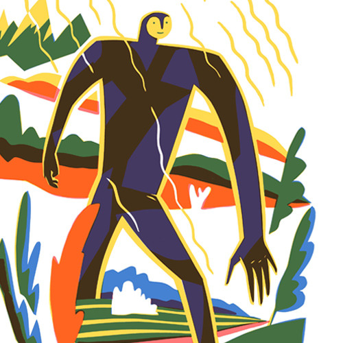
In this post, Jérémie and Jean-Baptiste talk about the creation of the excellent ‘Les contes de petit duc’ (Little Duke’s Tales), their latest book together with French publisher Éditions Magnani.
Visit Jérémie Fischer’s website Visit Jean-Baptiste Labrune’s website
Jérémie: ‘Les contes de petit duc’ (Little Duke’s Tales) is the third book that Jean-Baptiste Labrune and I have published together with Éditions Magnani, after ‘L’éléphouris’ (The Elemouse) in 2012 and ‘Le veilleur de nuit’ (The Night Watchman) in 2014.
It’s an illustrated book like ‘The Night Watchman’ (similar formats and both about 200 pages). But this time, the book is structured around four origin stories and a prologue and epilogue. ‘The Night Watchman’, you might know, has 7 chapters: 6 nights and 1 morning of a single week.
JB, what made you want to use a fairy-tale structure for this new book? What is your relationship with tales (this is a narrative form you used in your first book,‘The Elemouse’)?
Jean-Baptiste: It’s hard for me to say exactly how the structure of a long-form piece of writing takes shape. I go by trial and error, blindly, no plan. Then a narrative appears, I work with it, I think it’s done. Then I come back to it, and it’s all wrong. I carry on, for better or worse and a new structure emerges, sharper, subtler. The coming and going between writing and structuring can happen five, six times. Maybe more. It’s as if the text already exists, but it needs to be drawn out of me, bit by bit, little by little.
Regarding Little Duke, I remember having written some tales in 2011 – or more like poems in a very neat Baroque style. The ancestor of Little Duke featured in these. He didn’t have a name (not that name, anyhow), it was a kind of monster with three pairs of eyes rolling all over the place, who lived in a very scary forest. Then the character of an old wanderer (who became Chèms, the other main character in ‘Little Duke’s Tales’) quickly took form. I gradually realised that what interested me wasn’t the fantasy or the lexical complexity (I was entering a phase where, after ‘The Night Watchman’, I was looking to refine my language and aim more for concision), but these two characters and their relationship.
So I set to work on the two accomplices. I worked out what they had in common, what they didn’t, the images and themes associated with them. That’s how Chèms and Little Duke got their own names. Their traits were honed to become complementary to one another. I wanted a lively style, punchy, with something prophetic to it. So I dived into sacred texts, those of Miguel Angel Asturias, Khalil Gibran’s poetry, Serge Pey... and I wrote ‘Little Duke’s Tales’. The framework was in place: Little Duke would have to tell stories to Chèms.
The idea for origin stories set in quickly. In fact, I seem to have written the first story more or less straight after the prologue. I returned to a long-term reading obsession of mine (already explored in ‘The Elemouse’): Egyptian, Greek and Scandinavian mythologies, which I’ve loved since I was little, and then the authors I read later: Cyrano de Bergerac, Swift, Kipling, Tolkien and Michaux. The origin story gives a very simple temporal narrative structure (one time, one day, since this day). From there, one has total freedom; geography, characters, images, languages, everything can be re-imagined. At the same time, the rigid time frame of the origin story also allows for a social or cultural critique. It’s about requestioning the world as we know it, just seeing it as a simple contingency.
Next, with the tales, it’s possible to work on them serially, like in ‘One Thousand and One Nights’. I had my narrative, so it would be enough to make a coherent collection (or so I thought), to just put the stories one after the other. But very quickly, I found myself with so many tales – long endless lists of “why?” – and it wasn’t going anywhere. The world I had built was faint, blurry, tired. Little Duke and Chèms were buried under an abundance of stories; they weren’t characters any more, just a slightly useless narrative trick.
So I decided to settle on four stories, which are based around light and darkness, waking and sleeping, the passage of time. At the same time I established how the relationship between Little Duke and Chèms would evolve as their dialogue continued. The structure was in place. I wrote the second tale. And then the third and the fourth, and finally the epilogue. After that, it needed adjusting, editing, tightening up. Then I had to think about the text with images: remove repetition, adapt the ellipsis ... There Jérémie’s work became essential, but that’s another story!
Jérémie: I went through many successive stages with illustrating the stories. Starting with trying out many different possible relationships between image and text, I wanted, at first, to work with a written manuscript and few images. In 2013, we had published our first story ‘Why is night black?’ in the first issue of a magazine called Pan, which JB and I looked after and which was edited by Julien Magnani. That was the early stages of the book, with a few ink images to go with the text.
But I wasn’t satisfied. I found the result too sensible; the text and images spoke to each other, but everything stayed in its place. Some years passed; I let the project mature in a drawer, taking it out regularly to work on breaking down the text and the book as a whole.
In 2017, something clicked. I was especially interested in Czech illustrators like Josef Čapek, Květa Pacovská and more recently Jiří Šalamoun. Also Kurt Schwitter’s two books, ‘Fairy Tales of Paris’ and ‘The Scarecrow’ (Die Scheuche Märchen), published in 1924 and 1925 respectively. I was fascinated by the freedom of colour and composition used in these different books – like how Čapek used typography as illustration on many of the book covers he produced.
At the same time, Jean-Baptiste had just written a funny little story, ‘Bululú’, very like Schwitters’ stories. I immediately got hold of it and it was published as a special edition with Pan in 2017 – a small 16-page format, 180 copies printed. From a graphic point of view, ‘Bululú’ is the prelude to ‘Little Duke’s Tales’. You see here the choice to use typography as illustration, to play with it on each page in a new way.
One year later, in July 2018, ‘Little Duke’s Tales’ was finished.
I chose the same printing technique for this book as with ‘The Night Watchman’. That is working with colours separately whilst drawing on carbon copies and using inactinic paper, constructing the image with successive sheets. We used 4 spot colours for the whole of the book.
Illustrations © Jérémie Fischer. Post translated by Gengo and edited by dPICTUS.
Buy this picturebook
Les contes de petit duc / Little Duke’s Tales
Jean-Baptiste Labrune & Jérémie Fischer
Éditions Magnani, France, 2018
Chèms sees and hears everything. He is a wise man. But Chèms starts to wonder about the reality of his wisdom. One night, Chèms meets an owl called Little Duke, who claims to know the answers to all questions.
Chèms asks Little Duke the questions he’d always pondered: Why is the night black? Why does the moon shine? Why do we dream? Why do we age? Little Duke answers Chèms’ questions in the form of tales, beginning with the tale of the giant Aketopiou, to tell the origins of the day and the night...
5 notes
·
View notes
Text
Archer Dougherty: Experiment to Eliminate Fear of Failure
Archer Dougherty strongly disbelieves in nurturing a “signature style,” instead of encouraging artists to constantly experiment with thought, concept, visual language and so on. Mostly self-taught while social media was still in its infancy, she dove into an exploratory approach to develop her skill and vision through a mixture of learning from failures and little successes. Not trying ensures one is not a failure but neither a success, she realised.
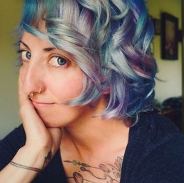
For over ten years, Archer Dougherty specialised in design and 2D work, drawing being her favourite mode. Though she studied sculpting and print-making at her local state university, Archer trained herself technically in contemporary art through emerging social media. She loves football, hiking, Shiba Inus and dreams of having a farm populated with mini animals.
ORDER A CUSTOM ILLUSTRATION
Q. What got you started as an artist and what path did you take thereon to grow and evolve at your craft?
Archer Dougherty: It may sounds cliché but I’ve drawn it ever since I can remember. I always gravitated toward art, so my career was simply a natural outgrowth of that relationship. I tried to pursue a formal art education but couldn’t afford to go to a proper brick-and-mortar art school and the internet wasn’t much of a thing in the late ’90s. So, I attended my local state university and studied sculpting and printmaking there but was discouraged from focusing on anything narrative.
After academia, the internet was gaining traction and the backlash in my mental space resulting from an education that didn’t ignite any real passion launched my true artistic training. Books, an infant YouTube, Facebook, and an even newer Instagram put me in touch with contemporary art which was being done in the ‘now’ and seemed important. I began my technical training through these channels and have been flying along this learning curve ever since.
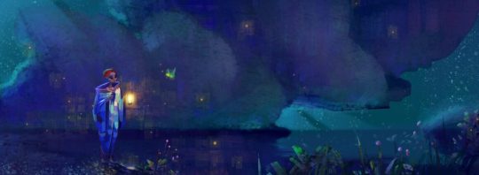
Q. What would you say is your signature style in your works and what is your process to achieve it?
Archer Dougherty: I don’t relate to the phrase “signature style.” I think it is used way too often to catalogue for branding purposes, which has a use in the larger market, but it should not be a “goal” in itself for any artist in terms of the artistic process. When younger students are bombarded with art through social media, as they are now, and see profile after profile showcasing a very polished and specific personal visual language, they grow walls around their thinking, making them single-mindedly pursue the idea of a “signature style.”
It inhibits growth and takes up way too much mental space in anyone’s head, especially for those starting. I believe in pursuing ideas and experiments, technical and conceptual stepping stones and failures, and that your language will mature as you make mistakes and learn what appeals to you both spiritually and intellectually and what does not.
Simply copying or attempting to imitate a style to follow someone’s career arc will end up making you feel like you have to wear a suit that no longer fits, though it’s what everyone has come to expect. The way my art looks and feels has come through years of absolute and abysmal failures at every technique and visual language imaginable while also recognising those small successes which add up to a rich and fulfilling personal output.
It is a massive additive compilation of preferences in art history, literature, movies, comics and illustration. These preferences are arrived at simply by trying new things all the time. A lot of artists are afraid of failure but they don’t realize that failure isn’t even a thing until you try. If you don’t constantly try, you won’t be a failure but neither a success. You won’t be anything at all.
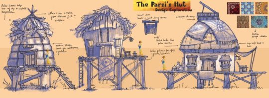
Q. What subjects, mediums and tools do you most like to work with?
Archer Dougherty: I sort of work with everything. My current technical preferences are oil on board, traditional, Procreate and the iPad digital. I prefer environment design and experimenting with colour psychology on my iPad. When I paint in oils, I prefer symbolist portraiture.
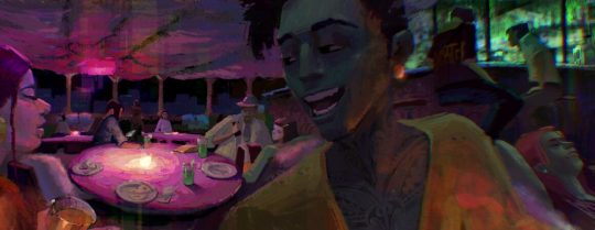
Q. What do you suggest artists and clients both should keep in mind to work together efficiently?
Archer: Communication and transparency. Understanding the other party’s priorities is essential so that both can understand each other’s point of view and reach a solid mid-point.
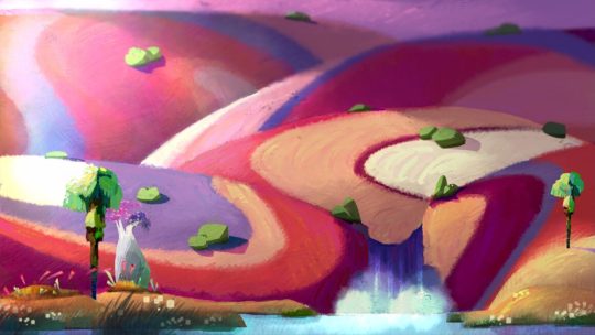
Q. How do you achieve a sense of 2D realism, symmetry and depth across your works?
Archer Dougherty: I’ve put myself through a decade of learning to ingrain the fundamentals of things such as an approach to realism, value structure, anatomy, light, form, mass, composition, colour, etc. I use those learnings to create from my mind when I want to. Actual symmetry is utilised in a lot of art, native art and, I suppose, one could say a great composition utilises a form of visceral symmetry.
If you don’t constantly try, you won’t be a failure but neither a success. You won’t be anything at all
Q. What kind of projects are you currently working on and what kind are you looking to work on in the future?
Archer Dougherty: My projects vary greatly, depending on my mood. When I die, I will have so many unfinished works that my family won’t be able to sell any of them. In terms of future projects, I have many animated shorts and self-published printmaking collections mulling around in my head. Narrative painting projects and the likes, too. Pinpointing one and beginning is ninety percent of the work.
Q. Could you please highlight some of your most notable works and why you find them noteworthy?
Archer: I have a singular notable work that no one has seen. In my opinion, it is the culmination of years of introspection, practicing self-awareness and reflection, learning largely academic techniques and then learning to be alright with abandoning them when it suited the work. It is the result of self-discipline and self-abandonment and a study of the essence.
It is the one piece in which I can say I was fully immersed, mind and body, from beginning to end and it is mine in its entirety, called “Metempsychosis: The Transmigration of Souls”, an ink, oil, shellac and wax medium on seven panels across seven feet. I’ll get it framed one of these days.
Q. What has been your greatest insights as an artist, with time?
Archer Dougherty:
1. Discovery – that I didn’t have to look or feel or make art like anyone else to make great art was possibly this discovery.
2. Cross-discipline learning is the greatest asset you can have to make richer and fuller art throughout your life. Study the sciences, literature, poetry, humanities, etc.
3. My penchant for the “big questions” allowed me to pursue my visual language on a level that both challenged and fulfilled me. I used the thoughts surrounding these questions to ask more questions rather than be plagued by a lack of answers.
4. Art is the reflection of a thing, not the thing itself.
Q. Who has been your favourite clients to work with and why?
Archer Dougherty: Modern Eden Gallery in San Francisco remains one of my top favourites. They are generous, truly care about their artists’ wellbeing and prioritise good relationships. They are good people. Dave and Brett from Laetro have quickly made the top of the list, as well, through their generosity, vision, intelligence, and communal priorities.
I also loved working with Magnetic Dreams Animation Studio – the same adjectives tend to apply to the people who make my top clients list. I feel that communication, a mutually beneficial relationship, and empathy are important in any client relationship.
0 notes
Photo
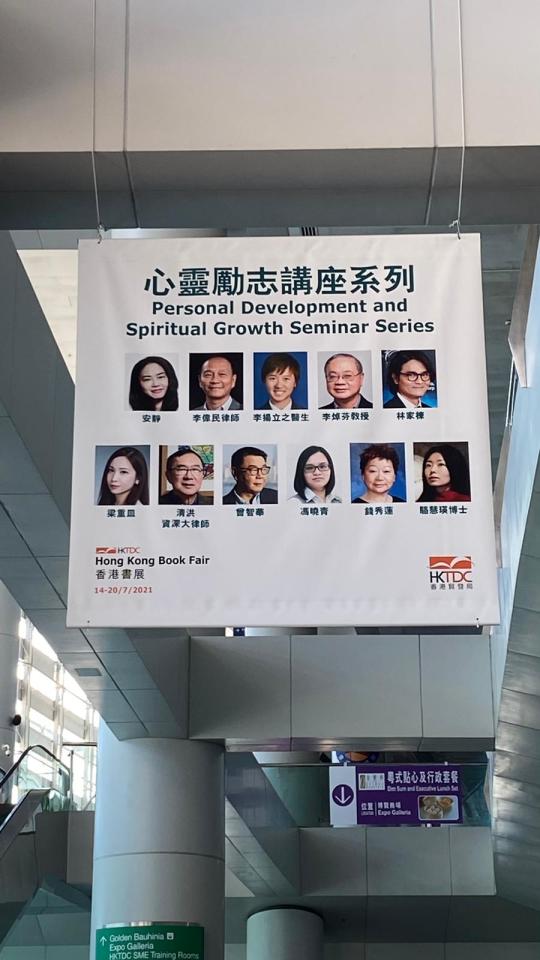
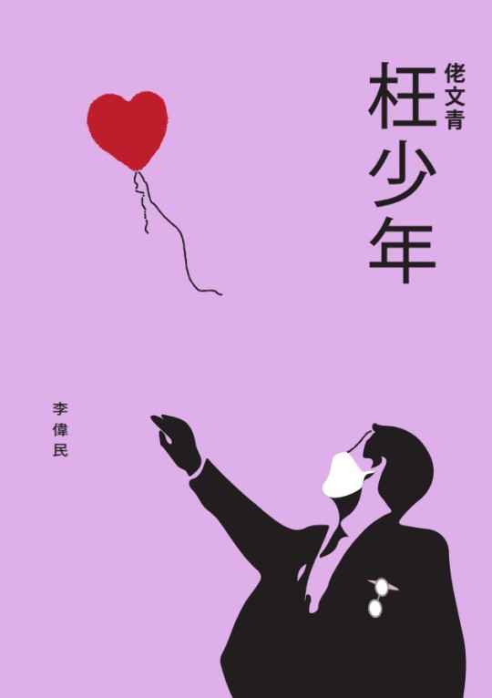
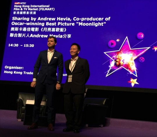
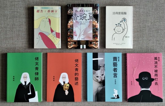
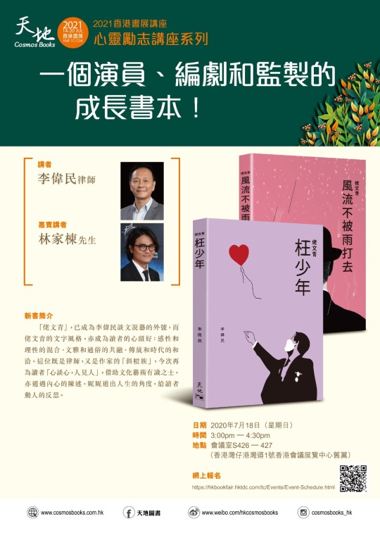
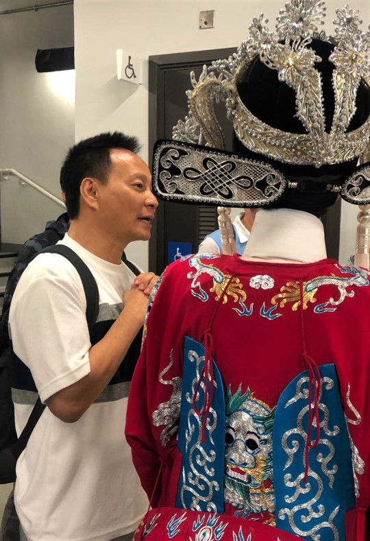
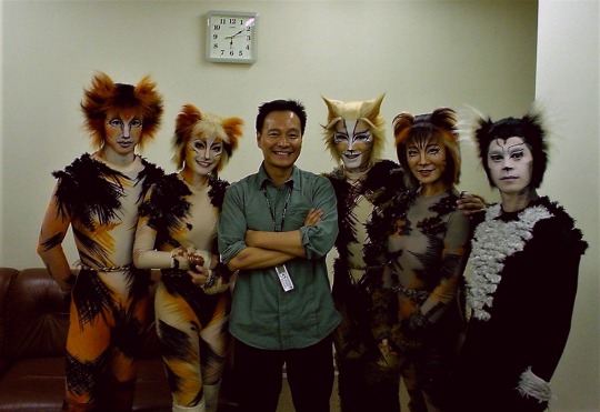
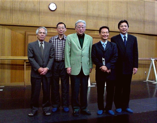
“The Artistic Lawyer or the Lawyerlike Artist?”
(acknowledgement: Interview of Hong Kong Lawyer, publication of The Law Society of Hong Kong, with Maurice Lee) (by Sonali Khemka)
There is a widely accepted theory that people are either left-brained or right-brained, meaning that one side of their brain is dominant. If you are mostly analytical and methodical in your thinking, you are said to be left-brained. If you tend to be more creative or artistic, you are thought to be right-brained. In Maurice Lee’s case however, the equal dominance of both sides has shaped him into the person he is today – a lawyer with the soul of an artist.
Writing Right
Lee enjoyed writing from as early as his teenage years, when he would take part in and win several writing competitions in high school. Encouraged by these victories, he applied for an after-school-scriptwriting class organised by Hong Kong TVB in 1978 – a class that only had twenty spots and over 3,000 applicants. At the age of seventeen and still in high school, Lee managed to bag a place as the youngest member of the class. “The classes were intense. They were held five times a week in the evenings and for three hours each,” he recalls. His immense enjoyment of the activity and aptitude for it led him to not only complete the course but also work part-time as a scriptwriter for TVB for few years after graduating from high school. At the time, his heart was set on becoming a professional scriptwriter or director.
However, the left side of his brain nudged at this point and Lee was tempted to pursue a university degree and career that was more academically sound and commercially viable. “My family told me that if you are in the creative field in the early 80s, you will face a very rocky path with many ups and downs. But if you are a lawyer, you have a safe landing,” he shares. After an internal battle between the left and right side of his brain, Lee eventually accepted his place in The University of Hong Kong’s School of Law. Not keen on giving up on his creative side, he continued working as a part-time scriptwriter for TVB throughout his four years in law school, focusing primarily on hour-long dramas and eventually switching to comedy. “I was good at writing dramas, but the producer told me I was not emotionally mature for the material in the drama shows,” he recalls amusingly. “I wasn’t at the appropriate age to write about passionate love affairs and dramatic struggles, so I switched to comedy,” he adds.
Lee’s creative career has taken different shapes and forms – a result of his willingness to not over plan and make the most of any worthy opportunity. In the mid-1980s, he wrote as a columnist for local newspapers, contributing 500-word prose pieces in Chinese on various topics and in the 1990s, Lee even garnered a fair amount of fame as a program host for a talk show for Commercial Radio Hong Kong. Around the same time, he was invited to write fiction literature by Cosmos Books and channeled his very own John Grisham by opting to write legal fictions. His present creative career, which commenced around six years ago, stems from an invitation from two online news platforms – HK01 and Orange News – to write critiques on different forms of art and culture, varying from movies and plays to visual arts and cultural trends. He supplements this with his own Facebook page, named “HKArtMan” where he shares his views on the same in a personal capacity. In addition, Lee also takes on the role of performance organiser when time permits and has previously organised a play and a concert – something he believes Hong Kong is in more need of.
Hong Kong’s Art Scene
Lee believes that prior to the 2000s, the city’s art and cultural scene was plagued by apathy and was a severely overlooked area. In the 2000s, Lee feels the situation has improved but not enough. “There is more curiosity and awareness, but people do not do enough to support the development of art and culture. There is too much financial reliance on the government only,” he shares. “Hong Kong is in a serious need for rebranding,” he adds. “We are currently just a financial center – like Zurich or Luxembourg and relying too much on old industries like logistics and trading,” he explains. Lee envisions a Hong Kong that is on par with global cultural and financial hubs like London or New York City and believes moving towards intangible assets or intangible intellectual property such as the arts is crucial. “We need commercial energy to be put into the art and cultural circles and more money from private companies and investors. That way more people will feel encouraged to pursue artistic careers because they can earn a decent income, which will in turn drive Hong Kong’s art and cultural scene,” he shares. His ultimate dream is what he calls an “Art Economy for Hong Kong,” an environment whereby art becomes more than just a leisurely activity and can be pursued as a commercially viable career.
In order to help realise his vision for a more art-savvy Hong Kong, he plans on putting together a concert and a musical for export to the Greater Bay Area (GBA) next year. “If they are staged only in Hong Kong, there can be less than five shows. However, if I export them to eleven cities in the GBA region, I can stage sixty shows – it makes more sense as an economically sustainable activity,” he explains. Lee believes exporting Hong Kong’s artistic talent is key, if financial prosperity in the arts and cultures is to be achieved. He recalls Hong Kong’s former status as “Hollywood of the East”, a time when films made in the city were enjoyed fervently beyond the borders. Similarly, he is hopeful that other forms of home-made art will also someday be appreciated in different markets.
Critically Creative
For Lee himself, he is content with how his career and personality have shaped out to be. “People tell me as a lawyer I talk like an artist, and as an artist I talk like a lawyer,” he shares. “As a lawyer, I am more sentimental, humanitarian and expressive and as an artist, I always have a mental framework. Artists can be quite unorganised. I am very organised. I put bits and pieces under different headings and am good at fulfilling long-term artistic projects because as a lawyer you are always handling long term cases. You have to be systematic and strategic,” he explains.
Lee encourages lawyers to pursue a creative side too, albeit on a personal level – something he believes would only make them more professionally sought-after. “People think lawyers are checklist animals, I think they are more than that. There is a lot of creativeness and criticality involved in being a lawyer when we handle a case and we should keep those sides alive,” he shares. “There are two minds in demand nowadays – the creative mind and the critical mind. No matter what profession you are in, you should have both,” he adds. He is aware that evolving from executors who merely follow instructions to critical thinkers who ask questions and initiate change can cause adverse reactions – “People find this type of person to be very maa faan (annoying/troublesome), they know too much and ask too much,” he shares with a grin. “But it is important to stand out, both minds will help each other,” he adds.
As a consumer or spectator, his favourite types or forms of art include ballet, paintings by American artist Edward Hopper and the diminishing art of Cantonese opera. “I admire ballet because it is so physically challenging and difficult. I like paintings by Edward Hopper because they make me feel sad – his pieces are very poignant. And I treasure Cantonese opera because it is sadly disappearing. They use old Shakespearean style Chinese dialect which might someday vanish completely,” he explains.
Having enjoyed a rewarding career so far, with ups and downs, with legal wins and creative commendations in abundance, Lee has a particular memory that still lingers vividly. “Fifteen years ago, I was the Vice-Chairman of the Hong Kong Arts Development Council. At that time, the famous movie director Johnnie To and I organised the first outdoor media art exhibition outside the Hong Kong Cultural Centre in Tsim Sha Tsui. The idea was to do some artistic projections on the external wall of the cultural centre and these projections were shut off by 11:00pm. I was at the exhibition till closing on the first day when a young boy came up to me, shortly past 11:00pm. He was 14-15 years old and he begged me to allow him into the exhibition area. He said his family is poor and he works at McDonalds at night. He lives in Tai Po and has come all the way to Tsim Sha Tsui to view the exhibition because he was so interested in what it might be like,” Lee recalls. Moved by the young boy’s passion and determination, he allowed him in as an exception. Till this date, Lee wonders what became of that young boy and whether he ended up pursuing something artistic. “I was so touched and amazed and I wonder how many boys and girls or men and women in Hong Kong have that kind of passion for something non-commercial, something artistic and spiritual,” he muses. If it fortunately turns out to be that the boy is one of our readers, Lee would be delighted to hear from you.
The Law Society of Hong Kong Journal
MLee
中文版 Chinese Version:
https://www.patreon.com/posts/wo-de-2021nian-53673006?utm_medium=clipboard_copy&utm_source=copy_to_clipboard&utm_campaign=postshare
"Youth Dance" Acknowledgement - 中國有嘻哈 official https://youtu.be/PNlC__GiqaY
Movie: “Time” Trailer Acknowledgement-安樂影片 Edko Films Ltd https://youtu.be/g0TT_mwq-DI
Interview of Petrina Fung and Patrick Tse Acknowledgement – ATV 亞視數碼媒體 https://youtu.be/BJnMtmaLzwQ
0 notes
Text
THE GOD’S LEGIONS
What you are about to read does not have the blessings of God. He has made it clear that I am on my own on this one. So be it. He thinks I am crossing the line.
This time, I want to be the judge of it. Not him.
April 3, 2015.
I am standing with my wife in a large playground. There are a thousand others. The Good Friday’s service is in session. Veneration will soon follow. Hymns are being sung. Wife is mouthing the lyrics. I just stand solemn. By birth – she is an ardent Catholic, and I am a liberal Hindu.
The tempo picks up in the air. So many people at once. All dressed up. Prim and proper.
The weather is wealthy. Perfect for the open-air setting. My arms are ambushed by a dense army of goosebumps.
There is promise in the atmosphere.
Veneration commences.
In the distant background, as we are entranced in the gospels, I hear the maghrib (after sunset prayer) from a mosque that is five commercial buildings shy from the playground we are in.
Few notice. Rest ignore.
I wonder – it is just one day, can’t the Muslims leave it alone today! Dedicate the day to Christ?
The breeze romances the trees.
In a couple of seconds, from the far end of the street, bells from a Murugan temple start composing their rhythmic charm. It is Panguni Uthiram. A day on which Sri Deivanai married Lord Murugan.
Man, this is not cool.
I apologise to Jesus on behalf of the mosque and the temple.
He sacrifices his life for the people, and he can’t get a moment to himself?
Is the mosque doing this on purpose? There is no way for them to not have known that today is Good Friday.
What about the temple? Why are they playing foul?
I shut up and listen. It starts to grow on me. The collaboration. Hymns here. Allah-ho Akbarthere. Murgunakku Haro Hara in that corner.
–
The first thing I do is hate the mosque and the temple. If you ask me, Jesus deserves the full day to himself.
I see this kid running away from his mother’s lap. He stumbles on a chair and falls on his face. His mother runs to his rescue. The kid is not crying. The mother pats his knees and wipes his face. His mother tells him that he is okay. The kid acknowledges. He is not a fussy kid.
That is all the kid needed. He needed to be told that he is okay.
I think that is what they are doing. The mosque and the temple. Telling Jesus that they are with him. An act of compassion. Standing by him. Holding his hands.
I can only think of two options.
1) Neither the mosque nor the temple has any regard for its brother from another mother, despite sharing the same confederacy.
2) They feel for Jesus. That is their way of showing. Besides, how else will they? These guys are socially awkward and they never show up in person anyway. They might as well use their proprietary branch offices to send a message to the man who was crossed today 1,980+ years ago.
By all means, I will go with the second option. Sounds legitimate. Appropriate. Too candid to plead coincidence.
–
Don’t you see that?
They are all one. How do you know that all three of them are not playing scrabble high over our heads right now? I am sure if you look up you won’t see them. Invisibility is their speciality.
None of them hate each other. They are all celebrities in their own leagues. Think about it. If any one God was greater than the other, do you think he would allow the other newer or older God/s to evolve/survive? To be birthed in the first place? The way I see it, everything is God. Everything under the Sun is born and dead out of its own situation and discretion. It is not right to meddle with this sacred order.
Despite their prophecy being solid, how come the Jews denied the claims of Jesus? How come who they refused to accept went to on change the face of the calendar for mankind? If Jesus is the ultimate son of God, how was prophet Mohammed allowed to jump into the picture?
Religion is purely an art form. Each with its own structure, style, subject, and configuration. Each religion comes with its own painting. All subject to interpretation. Every picture is engineered with a special stroke, colour, depth, ambience, motive, and imagination.
Regardless of their origin, form, or appeal, they share one common attribution. The quality of being unique.
Art is to be cherished. It is not to be fought for, kill for, or be killed for.
–
“I love to eat ISIS. They are full of protein. They are my favourite meal morning, afternoon, and night.” – Leishmaniasis
They say that there are 100,000 ISIS people. Now, I don’t know if I should be sad or happy. I think I am happy. But again, I can’t tell for sure. That’s a lot of people.
I mean, I can never understand what in the world gives you guys this burning desire to wear your G.I.Joe-gone-rogue halloween costumes and threaten people toward the blunt decoction of your religious rigidity.
Anybody surrenders to a gun, man. You give me a gun. I will make you pee. It is not the question of who holds the trigger. The concern is what the trigger is going for. When it is for your uptight state of affairs, I feel that I should strangle your balls. Eyes, I mean. You don’t need them, since you don’t see the world you ought to be seeing it like.
–
All the people, who are not captured by you and videotaped by your ‘Jihadi John’ make fun of you. I am sure you know that. They call you heartless. No wonder it doesn’t get to you. I even made a joke about you guys once.
Q. You know why ISIS takes heads? A. Because they don’t have one.
Some kids pick up your flag on the streets and what do they become? The Boko Haram. Brilliant.
There are several other insurgency groups. But I am going to pick on you guys, since you guys seem to have excellent PR, world over. Even Kim Kardashian is your twitter follower. Rad.
Listen, all I have to tell you is this. The ISIS, The Boko Haram, The Hindus who led the burn attacks on churches in Delhi, The infants of the future crusades . . . why the hell can’t we all be together? Come on, come shake my hand. I am a good guy. Come to my house, eat my mother’s avakai pongal. You will sell all your guns to me for free after eating it. I could come to your place (so long as you don’t kill me or put anything in my bum or mouth) and let me eat your fatteh. Let’s exchange cultures. Let’s exchange goodwill. Let’s give each other life. We have facebook. We could be on each others’ lists? You can even subscribe to my blog (request you to not hack it though). I write about some interesting things. I have a feeling that you will like some of them.
–
Word is that the USA is killing you guys using a sophisticated biological weapon, since you guys stirred a shitstorm in a pisscup. It might even be my own conspiracy. I even have vague theories to believe that you are the CIA’s bastard children. The Snows sent to guard the wall.
In the end all that matters is what you decide to do and do. If they or someone else asks you to eat shit, don’t.
If anyone out there is still waiting for the “real” son of God, well, you will only be spared the moon to dance with. It is just you and me now. Let’s be good to each other. Our natural time will come anyway. Until then, if you are still interested in fighting something, take care of that mortality of yours. But so long as we are alive, can we forget about your religion, my religion, and their religion? Pray in your will. On your bill. Don’t pry on another’s. Don’t tab another for your shit.
Gods don’t kill each other, man. That is why we have so many. We have billions of Gods. You are a God to me. So am I to this cause.
We upgrade weapons. Technology. Lifestyle. Why not our realisation?
The oldest and the foremost religion in the world is evolution. The rest is a combustion of mankind’s masturbation.
Let’s evolve for good. Let’s dissolve for the better. Let’s revolve around each other for the best.
How about that for a change?
Photo by Lucas Pezeta
0 notes
Photo


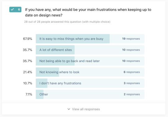

My Survey Lines are Now Closed and the Results are in!!
To start with below are my key stats for the survey:

I was a little disappointed with there being 47 visits and only 28 people filled in my survey. I do feel like I got a good amount fo responses that I can use for my research.
The results are now in...
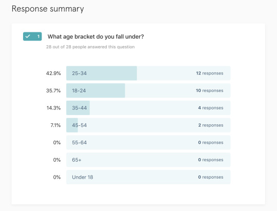
Question 1 - What age bracket do you fall under?
I was thinking my target audience would just be designers. Which as we know come in all different ages. I assumed I would probably split them into students and then working designers. My results where pretty ranged and fell under my expectations.
There was:
35.7% for 18-24
42.9% for 25-34
14.3% for 35-44
7.1% for 45-54
This fall under my brackets as I assume the audience above 25+ are working designers but now reflecting on this that could have been a question I asked in my survey instead of just assuming.
Question 2 - What tools do you currently use when doing design research?
I listed out a few options of research/inspiration tools that I use myself and had found when doing competitor research.
This list was:
Dribbble
Behance
Design Inspiration
Usepanda
Muzli
Awwwards
Out of these, I was expecting Dribbble to be the most used.
The three top results where:
75% Dribbble with 21 responses
60.7% Behance with 17 responses
25% Awwwards with 7 responses.
A few people have other as an option and suggested something that myself feel silly for not putting down as an option which was BOOKS!! I am thinking now maybe having a section in my web application with books for designers.
Question 3 - If you have any, what would be your main frustrations when doing research?
For this question peoples, biggest frustration was “Having too many tabs open and losing websites”. The other highest result was “Trying to stay organised”. These are answers that I assumed people would answer with but it is what people wrote in the other section that was interesting.
Responses from the other section:
Having a no-show for a user interview
Finding examples that meet my use case
Most available design inspiration is superficial, showing one element or one page of an entire project. This doesn't allow for a deeper UX understanding of how these elements fit together and create a cohesive user experience.
The last point was interesting as I can understand this sometimes with the likes of Dribblbe and Pinterest you don’t see the design thinking behind the design. This is something I could help with my app I think and something I can do more research into. Definitely has given me food for thought.
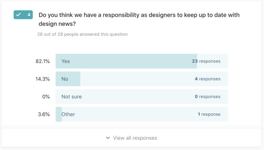
Question 4 - Do you think we have a responsibility as designers to keep up to date with design news?
I think from a biased perspective this was my biggest question. 82.1% people said “Yes” with 23 responses out of 28. I think this shows that it is important we keep up to date with design news which I knew from the start.
There was one comment I got in the other section that I found interesting it was:
“Design trends don't always = good design. Keeping up with news such as new tools, new techniques, new lines of thinking can be very beneficial however also overwhelming.”
I do agree with the first statement for example when I did my research into light and dark theme which you can see in a previous post. I read that dark theme now is trendy and a lot of people are using it because it is trendy and thats not right as we should be using it based on our user's environment. I also think that design trends help us evolve and grow as designers. This statement has made me think of this from two points of views which is helpful.
Question 5 - What tools/sites do you use to read up on design news?
The three highest results in this question where:
82.1% Medium with 23 responses
25% Designer News with 7 responses
17.9% The Designest with 5 responses
I was expecting Medium to be the highest result. I am starting to realise that the best information is in the other sections of my survey. There is some really interesting suggestions for this question.
They are:
4 people said twitter
UX Collective
UX Collective and Sidebar newsletters
Panda
Designtaxi
A custom feed of various blogs and sites
I have never heard of DesignTaxi so that will be something I can do competitor research into. I also have never used twitter for design news so that is something I can look into for my project and also myself.
Question 6 - If you have any, what would be your main frustrations when keeping up to date on design news?
The three highest frustrations where:
67.9% It is easy to miss things when you are busy with 19 responses
35.7% A lot of different sites with 10 responses
35.7% Not being able to go back and read later with 10 responses
These are interesting as a feature of being able to save back and reading later was something I was thinking about so it is helpful to see this is something designers have frustrations with.
Question 7 - Can you suggest anything that would improve your experience when doing research for a project?
This question was an open question.
Some of the useful suggestion where:
One central platform for everything design research related
Quickly finding examples that suit my use case
Documenting ideas, sources, analysis, images as you go.
Finding resources with more detailed case studies e.g. how a company designed ftux from start to finish, how that evolved over time or as new features/products were introduced. Things that worked and didn’t work and why.
Access to previous research archives from other designers
Getting snippets of information so if I don't have time to read the entire article I can get the highlights. Also if I can get all the sites, inspirations in one location will be super helpful.
Better categorization / easier browsing (i.e., not just search). Something visual skin to Pinterest?
A more diverse range of sources
A place to store and collect inspiration/articles/notes/thoughts easily using an accessible and simple method. Possibly a Chrome plug-in (see Pinterest's plug-in - however, it is all visual, it doesn't really allow for the collection of articles, quotes, concepts etc)
trending/top rated articles appear at the top
For me, the most important thing is the understanding of colour trends, trend styles and several other trends.
Category specification and thematic distribution of art online
A place where I can keep all my bookmarked sites that help with research and design in a visual way. possibly a website that reposted hot topics from other sites into their own so you would only have to go to one place (sorta like how you can have a fb news feed embedded into sites)
There is a lot here that I find useful and will go through each one individually and do research and see if I can think of any features for my application that will help or anything I could use to make my application experience better.
Question 8 - Can you also suggest anything that would improve your experience when keeping up to date on design?
This question was also an open question.
Some of the useful comments where:
One central platform for anything design related
A resource curated by the design community would be nice but it would have to be supported by the whole community and design leaders.
Take notes on ideas, takeaways so that you can refer to them later!
More blog posts or article that show how long it takes to read so that you might be less likely to bookmark to read later (which is what I do a lot)
Having a single source of truth, there are so many views and opinions it's sometimes hard to know what best practice is actually best. Maybe some way to centralise this info and maybe vote among designers
reminders to see latest design inspirations which will be like a min or 2 ...so basically quick view but also relevant to me
Better, curated content. Like design journalism by good writers, rather than just link posting
Time :D
Subscribe to sites like Medium so they are in your inbox
Keeping Information Overload low
A streamlined edited view that wades through all the ideas, "pretty" visuals and egos to show the best work happening in design/UX right now.
quickly get updates, I don't have all-day
Know how much exactly you need time for specific design so you can easily manage multiple projects
Better bookmarking/saving system
A single platform dedicated to such updates.
One platform with multiple feeds
A website that had a list of high rated design articles, other sites, news etc
As you can see there is a good amount of feedback here that I will need to sort through and do research into and figure things out with it. One of the answers was “Time” if only I could give people more time!
Question 8 - What do you think of an app just for designers to help with research and design news?
I then summed up my survey with my idea and if people would find it useful.
I got 23 responses out of 28 saying that they thought it was a great idea this is really encouraging. I hope I am going on the right track with all my research and from this survey I feel like I am.
I was able to generate a report with Typeform so that you can view my results here: https://evagarcia643343.typeform.com/report/xVxzyg/vYfzRJ6MGIL1dcU6
0 notes
Text
25 Years of Warcraft and 15 Years of WoW: An IGN Retrospective
When I think of the games and franchises that define Blizzard Entertainment as a development studio, the name that stands tallest amongst a formidable line-up of giants is Warcraft - Blizzard’s high-fantasy universe full of memorable characters and moments, epic battles, and lore that spans thousands of years.
In many ways the story of Warcraft is also the story of Blizzard, and the evolution of the accessible, fun, and cinematic approach it brings to many of its creations. It’s a story that takes us from a small studio looking to create something new and original to a larger and more experienced team delving into a broader online world. In the 25 years since Warcraft first hit retail shelves as a new strategy game, and in the 15 years since World of Warcraft created a community of millions, this franchise has evolved and grown, as has its popularity.
To celebrate the anniversary of Warcraft, the games and its history, I sat down with several key Blizzard devs to discuss Warcraft's journey.
Warcraft: Orcs & Humans (1994)
“I was actually at 3DO at the time, a company I helped found, and I had gone to Electronics Boutique to look at some new games that I could play,” John Hight, Executive Producer on World of Warcraft recalls. “And I see this game called Warcraft: Orcs & Humans. I picked it up and was completely enthralled, I played through the campaign and tried to convince anybody that would listen to me to go out and buy it. Partly so we could play together. It caused me to shift my career direction. After 3DO I went to work for Westwood Studios where eventually I worked on Command & Conquer: Red Alert 2. Warcraft was my first introduction to real-time strategy, and I loved it.”
By 1994 Blizzard Entertainment had already developed a few titles: licensed products like The Death and Return of Superman for the 16-bit Super Nintendo in addition to original efforts like The Lost Vikings. Under the guise of Silicon & Synapse, the studio was made up of a small team of passionate developers that, when not working on a project, could be found discussing what games they were playing at length.
The Lost Vikings, a strategy platformer of sorts where players were put in charge of a colourful group of Nordic warriors who had to work together to reach a goal, began as a riff on the popular hit Lemmings. Warcraft, which would go on to define almost a decade of real-time strategy excellence for Blizzard, began in a similarly unexpected way.
[caption id="attachment_2276499" align="aligncenter" width="1280"] Lost and clearly loving it.[/caption]
“At the time it wasn't actually going to be Warcraft: Orcs & Humans the strategy game,” Technical Director at Blizzard Bob Fitch tells me. “We were playing games like Monkey Island, and point-and-clicks were really fun, so the next thing was going to be a graphic adventure game.” And that adventure game was set to star the Lost Vikings.
As a Blizzard veteran, Bob has been working on the underlying tech that has driven many of the company’s most iconic releases for decades. This flirtation with the graphic adventure genre wouldn’t last though, thanks mostly to the release of Westwood Studios’ Dune II – a game that many cite as the original real-time strategy or RTS game. Slowly but surely the team became fixated on this new way to experience interactive strategy, so the decision was made to rework the engine and to create something in this space.
“We were thinking that the obvious answer was to take the Vikings, shrink them down to be really small, and then have the player direct them where they wanted them to go," Bob recalls, noting that the initial tests were simple scenarios that were very different to the puzzles found in The Lost Vikings. Looking to Dune II, the addition of opponents, the ability to attack, and PvP entered the picture. But when it came down to creating abilities or different types of Vikings, the team hit a wall.
“We realised that just telling our Vikings where to go and attack wasn't as much fun as playing Dune II,” Bob continues, confirming that coming up with Viking powers was a struggle. “The next thing you know, artists were drawing pictures of orcs and goblins and elves and saying that if we weren’t coming up with interesting ideas for what Vikings could do, this might be the answer.”[poilib element="quoteBox" parameters="excerpt=%22D%26D%20and%20Tolkien%20were%20all%20very%20traditional%20medieval-styled%20characters%20and%20places.%20We%20pushed%20our%20fantasy%20world%20into%20the%20realm%20of%20superhero%20comics%2C%20blockbuster%20movies%2C%20and%20heavy%20metal%20music.%22%20-%20Samwise%20Didier"]
“We all grew up playing Dungeons & Dragons, and reading Tolkien, so we all knew what an elf looked like, or what a paladin was,” Senior Art Director for Blizzard Entertainment, Samwise Didier, recalls. “Artistically, we really wanted to make our creations stand out. D&D and Tolkien were all very traditional medieval-styled characters and places. We pushed our fantasy world into the realm of superhero comics, blockbuster movies, and heavy metal music. Everything we created was ramped up. Anything ‘Level 1’ needed to look like it was ‘Level 5’. We didn’t go to ‘11’, we went to ‘111’!”
It was a defining moment for the studio. Although it had already created an original property with The Lost Vikings, the Warcraft universe would soon become something much more. Once the decision was made to tackle fantasy elements the project quickly evolved, with new mechanics and features added over time. Even the chess-like nature of the RTS genre would take literal form. “We had actual chess pieces, that was the black pieces and the white pieces,” Bob explains. “It was the Orcs & Humans. On one side you got the footman, on the other side you had the grunts, and they were kind of equal, and each side had its pieces in a particular slot.”
[widget path="global/article/imagegallery" parameters="albumSlug=warcraft-orcs-humans-screenshots&captions=true"]
Warcraft: Orcs & Humans released in 1994 to both critical and commercial success. Warcraft II: Tides of Darkness followed shortly after in 1995 and saw the series, franchise, and real-time strategy really deliver on its potential.
Warcraft II: Tides of Darkness (1995)
“I was working on MechWarrior 2 at Activision and a colleague started playing Warcraft II,” Tim Morten, former Production Director on StarCraft II recalls. “I looked over his shoulder and it seemed like fun. There was a feature back then where with one disc you could have your friends play multiplayer with you. So, I got to join him in a multiplayer match and he immediately marched into my base and built towers. Of course, at this point I'm figuring out the tech tree. I hadn’t played an RTS so I had no idea how to counter that strategy and he couldn't stop laughing at how my base was getting taken apart by these towers. That was my inspiration to learn how to get better at playing RTS games.”
“I think in a lot of ways we didn't really feel like we were finished,” Bob Fitch tells me. The still relatively small team at Blizzard was ready to keep going the moment development wrapped on the original Warcraft. “We were finished in that it was the game we had set out to make, but there were things that got cut. Things like Naval battles. That and we just wanted to keep working on it. We had learned a lot about how to make an RTS, how they play, how to balance them, how to make artificial intelligence for them – and we knew we could do an even better job the second time around.”[poilib element="quoteBox" parameters="excerpt=%22We%20had%20learned%20a%20lot%20about%20how%20to%20make%20an%20RTS%2C%20how%20they%20play%2C%20how%20to%20balance%20them%2C%20how%20to%20make%20artificial%20intelligence%20for%20them%20%E2%80%93%20and%20we%20knew%20we%20could%20do%20an%20even%20better%20job%20the%20second%20time%20around.%E2%80%9D%20-%20Bob%20Fitch"]
“Orcs & Humans was our first step into Azeroth,” Samwise adds. “And we basically just stuck to orcs and humans, with a little flavour added through water elementals and demons. With Warcraft II, we added elves and dwarves, as well as trolls, ogres and dragons. We were building our fantasy world with the standard tropes but were making our own versions of them – the Blizzard versions that we all know and love.”
“We realised that it would be more interesting if the sides were more diverse,” Bob continues. “And so, you can see that in Warcraft II, which had so much more variety in the way that each side played and what all the units were. And that evolution was then reflected in StarCraft where there's three unique races.”
[widget path="global/article/imagegallery" parameters="albumSlug=warcraft-ii-tides-of-darkness-screenshots&captions=true"]
In creating Warcraft II, the team at Blizzard also worked to evolve the tools that it had, with the goal being to create something so powerful that players would have the option to create anything they wanted. In Orcs & Humans, many of the maps and campaign missions were laid out using text files. This evolved into a proper editor for the completion of Warcraft II and later, its expansion, The Dark Portal.
“The campaigns went through evolutions where originally they were simplistic,” Bob explains. “Over time they grew to have more story and sub-quests, as we got better. And then that segues into another evolution, which was the editor. We began building the editors to have more and more functionality until our goal with Warcraft II and eventually StarCraft II was to create engines and editors so powerful that end users could create whatever they wanted.”
Jumping forward to the release of Warcraft III: Reign of Chaos in 2004, this goal was met when user-created versions of genres we now know of as Tower Defence and MOBAs began to appear for the first time – all within the Warcraft universe. For the team at Blizzard it was a gradual evolution of the tools it had been honing internally finally making their way out into the world. And in a way getting to see the end results felt like mission complete.
In expanding the scope of Warcraft II, however, the characters and lore of the universe began to form alongside the art and strategy gameplay. Compelling characters began to emerge, and events took on more cinematic qualities. This storytelling would eventually take the series and franchise in new and exciting directions.
[caption id="attachment_2276501" align="aligncenter" width="1920"] Warcraft II saw the series really finding its feet.[/caption]
Warcraft III: Reign of Chaos (2003)
“When I started at Blizzard, it was 1996,” Chris Sigaty, former Executive Producer and Senior Vice President at Blizzard recalls. “I was in college at USC at the time, and I knew a friend who knew somebody at Blizzard, and they invited me to come in and help test Warcraft II: Beyond the Dark Portal. I absolutely loved Tides of Darkness and strategy gaming. And immediately there was this feeling of having found my people. I was a total Dungeons & Dragons nerd, science fiction and fantasy reader growing up and I never imagined there was a career in it. But once I arrived, I knew this was exactly what I wanted to do.”
Before Blizzard would return to Warcraft though there was - as the team lovingly puts it – many distractions along the way. From the dark action-RPG Diablo series to the science fiction space opera StarCraft. The latter took the RTS genre to its strategic limit by introducing three varied, asymmetrical, and involved races that engaged in grand battles involving large armies. It was StarCraft’s popularity and success in this space, bolstered by the earliest examples of competitive esports, that would inform the development of Warcraft III. That and the renewed focus on character and story.
“Warcraft III was where everything came together,” Samwise tells me. “The story, art, movies, hell - even the art in the manual, really pushed our game to 111. We came up with the franchise’s biggest characters in Warcraft III: Jaina, Illidan, Thrall and Arthas, and dozens more. Almost every character in World of Warcraft was based and modelled after something we created in Warcraft III and when World of Warcraft came out, it only got better.”
[poilib element="quoteBox" parameters="excerpt=%22We%20came%20up%20with%20the%20franchise%E2%80%99s%20biggest%20characters%20in%20Warcraft%20III%3A%20Jaina%2C%20Illidan%2C%20Thrall%20and%20Arthas%2C%20and%20dozens%20more.%22%20-%20Samwise%20Didier"]
“It was originally a hero-controlled game,” Chris says, talking about the earliest moments developing Warcraft III. “You could only control your hero, and the units you had around it were selected only if you had vision of them. It was a very different game. It wasn't working out, but it gave this differentiator for Warcraft III that we wanted, which was something that played very differently than the units-swarming you got from StarCraft. Hero-centric, level up, have items, consume them, go into different buildings and then focus on a few smaller armies. We called it RPS (Role Playing Strategy).”
This new direction saw an explosion of lore and gameplay come together, from the introduction of 16 or so playable races, to the simplification of base building to incorporate more story and role-playing character progression. Warcraft III would ultimately see this vision move back towards more traditional RTS mechanics, with the playable races cut down to eight and then four, but its focus on hero abilities and a central character remained.
“It was a complete revamp at that point,” Chris confirms. “We basically went back to the drawing board, but the element of having this hero character was something the team was very fond of. That hero-centric play felt like the big innovation for us.”
“We were still working on StarCraft at that time,” Rob McNaughton, Lead Artist on StarCraft II recalls. “We really sat down and thought about how we are going to evolve the RTS. We wanted to take it to the next level. First, we made the decision to go with 3D graphics, which meant that Warcraft III became one of our most technically challenging games to make during those years. But we also quickly realised that it was going to be more than just a continuation of the RTSs we’ve made. With the heroes and levelling, the game could become more accessible to a lot more people. So, from our point of view internally, the Warcraft franchise went a little softer where StarCraft went hard esports.”
“By Warcraft III, we added dozens more races and places to Azeroth,” Samwise adds, “including some of our most recognisable races in the game; the night elves, tauren, and murlocs. Working with 3D models and environments at this time allowed us to really push the look of the game and add to the immersion with in-game cutscenes. All the while, our pre-rendered cinematics were improving with each game and by World of Warcraft, both gameplay art and cinematic art hit a whole new level.”
[ignvideo url="https://au.ign.com/videos/2018/11/02/warcraft-3-reforged-cinematic-trailer-blizzcon-2018"]
Warcraft 3 returns!
World of Warcraft (2004)
“I was working at BioWare in Edmonton, Alberta, Canada on a game called Jade Empire,” Kevin Martins, Lead Designer on World of Warcraft recalls. “With World of Warcraft we had heard the buzz about it. We played a demo at E3, but as we only played about 20 minutes of it, we didn't think much of the game. I’m an orc and I kill scorpions. I hope there's more to it. Oh boy, was there more to it! When it was released it quickly took over the team at BioWare, where it single-handedly delayed Jade Empire because we were all playing it. I had my troll and female mage, my first characters and they're still around to this day.”
Taken at face value, World of Warcraft presented a new direction not only for the franchise but Blizzard as a whole. But much like the origins of Warcraft, which was born from playing and loving a new type of game with the release of Dune II, World of Warcraft’s inception followed a similar trajectory.[poilib element="quoteBox" parameters="excerpt=%22When%20it%20was%20released%20it%20quickly%20took%20over%20the%20team%20at%20BioWare%2C%20where%20it%20single-handedly%20delayed%20Jade%20Empire%20because%20we%20were%20all%20playing%20it.%22%20-%20Kevin%20Martins"]
“The team was playing EverQuest and Ultima Online and loving them,” Chris recalls. “So, immediately we began asking - what if. What if we brought our slant to it? There was another game in development at the time and it was not an MMO in any way. And we didn't want to do that anymore. The big moment came when Allen Adham walked in and said, ‘I know we've been doing this thing, but we all really want to go and do this thing.’ And everybody was like, ‘Let's do it.’ And that new thing became World of Warcraft.”
Having thousands of people log into a single server, with the goal being to create a seamless world without the zone-loading seen in EverQuest, was there from the beginning. This alone proved to be a huge technical challenge and undertaking for the team. “It's hard to wrap your head around it,” Chris continues. “We started building this engine that needs to do all these things, and it was new territory. Blizzard had been through this many times where we’ll ask, ‘What do we know about that?’, and then realise we don't know anything about it.”
The sheer scope of World of Warcraft’s, well, world was larger than anything Blizzard had developed to date, and it required both new technology and a different approach to design. But it wasn’t long before the first prototype build was put together and the team could see the Warcraft universe face-to-face for the first time.
“I remember being completely impressed by seeing the world at scale,” Chris tells me. “With the Warcraft RTS games, even though they showed some size differences between units, it's not truly a scale. It does whatever it needs to do for the gameplay, so an ogre might be bigger than a footman as far as the number of pixels on the screen is concerned, but it wasn’t an accurate scale.”[poilib element="quoteBox" parameters="excerpt=%22When%20you%20look%20at%20how%20big%20that%20initial%20world%20was%20and%20how%20ambitious%20it%20was%2C%20comparing%20it%20to%20all%20the%20MMORPGs%20that%20were%20released%20before%20that%20-%20I%20don't%20think%20any%20of%20them%20came%20out%20with%20a%20world%20that%20huge.%22%20-%20John%20Hight"]
“When you see a treant in Warcraft III walking around, it's big compared to your footman,” Chris continues. “But it's not like when you walk around in World of Warcraft, look up, and see a treant. That was one of those moments where it was like holy crap that’s a treant! That's how we knew we were on the right track, because it's such an epic feeling. We knew Warcraft players were going to like this too.”
“Instead of viewing multiple characters from above, we had our first experience of looking up to see a sky and seeing just how terrifying some of our creatures and characters could be,” Samwise adds.
Although early builds would provide this new perspective, there were still many challenges facing the team. One was taking the art style seen in Warcraft III and translating that to a more traditional over the shoulder look. “Keeping the Warcraft style; we struggled with that for a while,” Samwise admits. “For some reason, with this new point of view, the art team had a tendency to go more realistic with the characters and environments. Our weapons and armour were more proportionate to normal-style weapons, and our colours were becoming dull and muted. Maybe it was the view we were working in.”
[caption id="attachment_2283094" align="aligncenter" width="1280"] Battle Chests... now that takes me back.[/caption]
“At that time, most first-person style games were trying to be more realistic,” Samwise continues. “That is definitely not want we wanted. We wanted the immersion to feel realistic, but not kill the Warcraft art style that we all loved. We needed to get that superhero vibe back. We just applied our normal philosophy for creating art and tweaked it a bit to fit this new camera view. By pushing the proportions back to normal Warcraft levels, our characters became more dynamic and more heroic. We pushed the weapons and armour to be even bigger and bulkier, and juiced up our palette to keep our colours rich and vibrant. After that, we had the feel of Warcraft back in our art.”
“The game for me and I think for a lot of players, is that the world is the star first,” John Hight says. “There's always something new and an interesting place to explore. When you look at how big that initial world was and how ambitious it was, comparing it to all the MMORPGs that were released before that - I don't think any of them came out with a world that huge. And then each expansion added to the world with interesting storytelling and characters like Jaina or Sylvanas or Thrall. Characters that we’ve followed through many different stories over the years.”
“The moment to me that really stands out came on launch night,” Kaeo Milker, Production Director on Heroes of the Storm tells me. “We do launch events and we did one for WoW at Fry's Electronics, which is this big warehouse electronics store. We'd done them before and usually a couple of hundred people show up, they're all excited and they buy the game and we sign autographs and we all celebrate together. But that night when we arrived there was a line of people wrapped around and around this huge building multiple times. And then it went out into the parking lot and around the block. There were thousands of people there and it was the first moment where we realised that this was different. It felt like the beginning of everything, beyond all of our wildest expectations.”
[ignvideo url="https://www.ign.com/videos/2018/08/09/25-changes-to-world-of-warcraft-since-it-launched-in-2004"]
A look back...
Warcraft: Legacy (2019)
It’s hard to overstate how the success of World of Warcraft not only impacted the industry but Blizzard as a studio. From a small team that created Warcraft: Orcs & Humans the studio would grow to measure in the hundreds, especially as work commenced on expansions for World of Warcraft. But behind this exponential rise in popularity and awareness, Warcraft has always remained the result of developers given the freedom to create. “We know what we like,” Bob summarises. “Sometimes that's all it really takes, knowing what you like and a commitment to do it.”
“Warcraft came from passionate players creating the games they wanted to play,” Chris Sigaty confirms. “And it turns out that the people out there playing the games are basically brethren, people that feel the same way, and there's this awesome camaraderie that comes out of that. You can feel that togetherness.”
“Friendships that people could make before ever meeting in real life, that's always been a part of what the internet is,” Kevin Martins adds. “The power of relationship building was particularly strong in World of Warcraft and it’s a legacy that resonates to this day.”[poilib element="quoteBox" parameters="excerpt=%E2%80%9CThe%20power%20of%20relationship%20building%20was%20particularly%20strong%20in%20World%20of%20Warcraft%20and%20it%E2%80%99s%20a%20legacy%20that%20resonates%20to%20this%20day.%E2%80%9D%20-%20Kevin%20Martin"]
“We love seeing people create costumes and artwork based on Warcraft,” Samwise says. “I remember explaining to the artists when they joined the team what the ‘Warcraft’ art style was. At the time, it was really different, and sometimes polarising for people. Now, everyone walks into Blizzard knowing what the style is. I have hired people as artists specifically from seeing their fan art.”
“You know, we do want World of Warcraft to live for another 15 years or 50 years or even a hundred years,” John Hight tells me. “And in order to do that, it has to remain relevant to the community out there. We're also developing for the next two, four, six, eight years. We plan many expansions ahead. What’s exciting is that people coming to work on the game or play Warcraft for the first time probably have no idea about the games that had influenced the designers of the originals.”
With the release of World of Warcraft: Classic, which recreated the launch period of the game to great success, and the upcoming release of the remastered Warcraft III: Reforged, this is a sentiment that rings especially true for Blizzard. Both projects have artists, designers, and engineers who grew up playing Warcraft – either in its original real-time strategy form or the phenomenon that is the massively-multiplayer World of Warcraft.
“When I think about how those things influenced each other, it wasn't this path that we set out on, knowing we're going to get to this place,” Chris concludes. “But World of Warcraft became the giant exclamation point for Warcraft in that it created communities of people. It broke down barriers with people simply having a great time adventuring together. That for me, I want to share that with more people, and I look forward to 25 more years where we can broaden that feeling and bring that sense of togetherness to an even larger group.”
[poilib element="accentDivider"]
Kosta Andreadis is an Australian freelancer who also wrote IGN's Diablo retrospective and StarCraft retrospective, as well as a look at the early days of Blizzard with its co-founder Allen Adham. Follow him on Twitter.
from IGN Video Games https://www.ign.com/articles/25-years-of-warcraft-and-15-years-of-world-of-warcraft-an-ign-retrospective via IFTTT from The Fax Fox https://thefaxfox.blogspot.com/2020/01/25-years-of-warcraft-and-15-years-of.html
0 notes
Text
7 More PSX RPGs That Everyone Needs To Play
Back in January, I wrote a list of the top 7 PSX RPGs that everyone should play (here). Well, the original PlayStation had such a wealth of role-playing games that we couldn’t just leave it at those first 7, now could we? I mean, the console has an ocean of RPGs to tap into!
With that in mind, I decided to revisit the topic and present to you, all of my lovely readers, 7 more great PSX RPGs that everyone should play at least once in their life!
Wild Arms
Starting off the list, we have Wild Arms. This is a tremendous J-RPG that fuses Spaghetti Western visuals and music with more traditional J-RPG game mechanics and story elements. That is, admittedly, a mix that shouldn’t work very well, but it just does! The developers did a wonderful job at combining these two seemingly unrelatable genres together into a cohesive story and excellent game.
There are a few odd design choices, like using the Mode 7 style graphical effect on the World Map, but they are all minimal and minor. As a whole, Wild Arms is a brilliant little PSX RPG that paved the way for one of the most underrated and overlooked series in PlayStation history! Oh, and it is also coming out on the PlayStation Classic as well, so now you’ll be able to play it on an HD TV without any problem!
Castlevania: Symphony Of The Night
Moving on, we have one that you’ve probably heard a huge amount of talk about, but surprisingly, a lot of people never played it. Castlevania: Symphony of the Night is widely considered one of the best Metroidvania games ever made, as well as one of the best RPGs on the original PlayStation. It is a challenging game that features incredibly entertaining gameplay, as well as a lot of exploration.
There is even a huge twist halfway through the game that will blow your mind! Not a story twist, mind you, but a gameplay twist. I won’t say any more in case you haven’t played it. But you really should, just to experience this great game yourself.
Parasite Eve
You may know that I adore experimentation in game design and development. That’s why Parasite Eve is on this list. Squaresoft managed to merge the Survival Horror and RPG genres into a wonderfully successful game. Based upon the Parasite Eve novel written by Hideaki Sena, the game features some of the most scientifically grounded body horror that I have ever seen. Hideaki Sena is actually a pharmacologist as well as a novelist and used that knowledge to create the horror in the novel.
This is transferred over to the Parasite Eve game series as well (except for the spin-off, 3rd Birthday). The characterisation in the game is phenomenal and the plot is exceedingly well executed. I really hope that this game gets brought over to Europe with the PlayStation Classic, but either way, you owe it to yourself to play this game.
Persona 2: Eternal Punishment
Now, if you’re a fan of RPGs for the PlayStation consoles, or RPGs in general, you’ll have probably heard of the Persona series. However, most people have only played Persona 3, 4 or 5. The first three games (yes, three) have been largely forgotten. Revelations: Persona, Persona 2: Innocent Sin and Persona 2: Eternal Punishment are all outstanding games, but they are massively different from the later three games released on the PS2, PS3 and PS4.
That said, Persona 2: Eternal Punishment remains my favourite in this Shin Megami Tensei spin-off series. It is mature, gory and features a very dark storyline dealing with demons, serial killers and rumour spreading. If that doesn’t sound intriguing enough, then it also has a very tactical and strategic, yet challenging battle system!
Front Mission 3
On to the first tactical RPG on this list, we have Front Mission 3; a tactical role-playing game from Squaresoft filled with realistic portrayals of war, death and violence. Oh, and it also features giant robots, just to make sure that you realise how awesome the game is. The level of customisation that Front Mission 3 gives you is absolutely crazy, meaning that you’ll probably end up completely engrossed in try to make the perfect party of characters and mecha for you.
If you are a fan of character customisation but also want a deep and rich storyline, then you really need to get your hands on Font Mission 3. You will not be disappointed!
Jade Cocoon
I’m pretty sure everyone has played a Pokemon game. However, if you’ve ever felt that they were a little too happy and child-friendly for your taste, then Jade Cocoon could be the perfect answer for you. You play as a young man trying to save his village and loved one from a truly terrible fate by capturing the monsters in the lands around you and using them to progress in the game. You can merge them, upgrade them and battle them, just like Pokemon, or any other monster-catching RPG.
However, the game is far more mature, dealing with very depressing and heartfelt themes whilst also offering a definite challenge. For anyone who enjoys monster-catching games, Jade Cacoon is an absolute must play!
Kartia: The Word of Fate
The last entry in this list goes to another tactical RPG for the PSX; Kartia: The Word of Fate. This is a largely ignored PSX RPG, but honestly, it really deserves far more attention than it got. The tactical battles are complex, need evolving strategies and will take a lot of getting used to, which can put some people off. However, if you enjoy tactical thinking and coming up against a challenge, then Kartia could be perfect for you.
There is even some replay value as you can play through the story from the viewpoint of two very different characters. This only adds to the game, as it feels like a different game depending on which character you choose.
And That’s All Folks
So those were 7 more PSX RPGs that you really need to play. Each one is a work of gaming art in its own right, offering unique takes on traditional RPG gameplay. If you enjoy the RPG genre in general, I would definitely recommend giving each of these games a try.
What PSX RPGs would you recommend? Let me know in the comments below!
from More Design Curation https://www.16bitdad.com/7-more-psx-rpgs-that-everyone-needs-to-play/?utm_source=rss&utm_medium=rss&utm_campaign=7-more-psx-rpgs-that-everyone-needs-to-play source https://smartstartblogging.tumblr.com/post/178426135965
1 note
·
View note
Photo

Evaluation FMP
Here is my fmp. My fmp evolves around shelters and filters, which I developed with a architect touch. As you can see I have created 3 moon boards to show what’s areas I will be focusing on.
First one was shelters. I explored all types of architect shelters protected anything underneath the shelter from people to houses to Animals.
I then thought to expand my knowledge by thinking of natural shelters.
Natural shelters involve things like rocks, leaves eyelids E.x.t.
I look at all these and keeper in mind for future plans of what I could creat for starter models.
I also look at African huts within nostrils structures. This is because the huts would be created out of sticks, straws ,leaves and animal skins.
I then looked at my second part of my fmp which I wanted to merge with shelters which was filters.
This involves how information/energy changer from one state to another but going trough something such as a filter.
I done this by focusing on light and how it can be changed beautiful within a sheltered design. La muralla roja Here we have my first artist that I researched.
La muralla was pick by me because of the colours she has used and because she represents my theme with a extra meaning.
She designed stairs and create a shelter on top of them which can be used as more stairs.
She also uses beautiful colours through to her work which makes it stand out. Simijan radic
This art is I researched created sheltered within deserted areas such as harsh mountain terrain or fields.
Simijsn also uses calming cookouts such as gray whit and black. They all have a calm and quiet colour to them.
Simijsn also uses a load of natural structures to help the creation of his sheltered building. He also places rocked and stones throughout his work to show a strong connect with nature. MoMA museum
Drew a couple pictures from the MoMA museum
And took some good quality pictures. Here is a artist response I created referring to La muralla.
I used paint and feltips to create this little experiment to show a connection with my artist and natural forms. The natural for that is indicated within this work is that waves of water. That is what I wanted to show a connection with.
I also uses the colours which are shown in la muralla works.Here is the New York trip.
We went New York for a week and adventures a load of museums and treats. Artist research on Frank Lloyd Wright and response on Frank and simijan. I look at Frank Lloyd Wright work to gain a load of inspiration but I only had a taster. I only like the unique style of which he surrounds he’s creations with greenery. Also frank also fits my theme of creations shelters with natural inspiration. He uses wood and warm colours through this work.
I responded with a small model with limited resources at home. I created a small shelter which I then placed out in a open filed and took pictures. I then surrounded it with greenery and rocks to show a connection with simijan. I also used the same colour scheme.
I also created a few drawings and paintings if franks work. I did a 15min drawing session with my left hand to show and explore my skills. Here I looked at probably my best artist jae hyo lee.
He specialised with wooden crafts and sculpturing.
I loved his use with wood and the uniqueness, because it still has a natural feeling towards it.
I especially loved the stone structure which has wooden rectangles elevating towards to the top of it. I took this as inspiration and was willing to experiment strongly with it. Here I took a good look at rocks and stones.
The shape of it I would love to take and develop with different textures. I was making notes of using wood, sand, leaves or anything natural to creat the shape of a rock.
But firstly I just drew simple sketches of different types of rocks that can provide shelter. Here I created a A1 sheet filed with inspiration from artist such as Jae hyo lee and natural structures such as stones.
I put this right into my 3D models and made exactly what was on my mind.
The experiment turned out beautifully and showed my skills within 3D.
I created small rock look alike structures with metal mesh, and covered one side of it with a response of Jae hyo lee. The abstract look beautiful and very unique. I then looked at my models to see if I can develop it any more. I realised I didn’t create it to my theme which was shelters. I then went on to create two more models which was clearly shown as development. I created a sheltered area for my models. Here is another experiment I created at home. I used plants within the metal mesh and made them escape out the structure to look like over growth which provided shelter. Here is my first idea of my final piece.
I started looking at mushrooms and how they fit my theme. They provide shelter also with the natural structure they provide but don’t filter any light or wind or anything. So my creation and to fit around making a way to make filtering work with the mushroom design.
I drew out the shapes of a mushroom and tried to ulterior and change the way it looks by referring to artist.
I looks within Jae hyo lees work once again to get inspiration.
I designed the stem of the mushroom to have a wooden effect to it such like how Jae hyo lee has done before.
The top part of the mushroom will look see through with a glass or plastics topping to filter light through. I also wanted to add a special material which stretches and is made out of paper to represent the design of under the dead of a mushroom. Here I have done more artist response towards Jae hyo lee.
I created a few drawing and a painting to show skills and inspiration from his work. I used straws to creat the effect that can be seen . I also used water colours to creat a beautiful and stunning design. I painted the straws black to make it stand out tremendously. Here I created another artist response towards Jae hyo lee. I was experimenting and created a small model that look beautiful and unique. I used metal mesh the created the shape and with in the middle was newspaper. Then I had a material that showed the texture of wood which I then used on top of the mental mesh with a glue gun to make a beautiful shelters effect.
I then took out the newspaper inside the structure to make space within the model.
I then was complete and wanted to see what it would look like when filtering it with light in a dark place.
It looks beautiful the light filters in a unique way where it looks like a start. The inspiration was from Jae hoe lee. FINAL PIECE I started to create my final piece step by step. First I used s metal mesh to get the shape of it. I then used that mesh and placed it on a piece of wood and drew the out line of it. The out line was quite big but I then went to cut it out. I marked where the entrance will be so I don’t get confused.
I then went to making another wooden slap the place under the first one to creat a dome effect from the bottom to the top.
The mesh I used I formed it as a shape of a rock.
I then look at jae hyo lees wooden work and saw the long rectangular wooding slabs and how they are formed.
I have previously played about with this before so it was quite easily tampered with when creating models. I used the wooden style around the sides of my sheltered creation.
I then put the pieces together to give the back shape.
I then looked back at jae hyo lees work again and saw the fact that he created windows, wooden windows that stick out of he’s circle building which i wanted to experiment with.
I then looked at a mother artist Zaha haddid and saw the materials she uses. She loved metal curved shapes so I used this on my windows for the sheltered creations.
That was done ,then I went in to adding the wooden texture to the metal mesh on the top of my fmp.
I had to cut up a load of small shapes to cover the top part of my shelter. I glue gunned the small wooden shapes on top of the metal mesh and moved on to the stairs. I added a spiral stair case the the building to allow elevation.
I then worked in the sides of my design. Jae hyo lee burned his wood to create a dark and light effect that looked special and ancient. It gives his building more texture.
I added this to the side of my wooden rectangles sticks. Burnt them and made them look unique.
I then went to finishing the base. I cut a larger 120 cm by 69 cm wooden plank to put my final piece on. I marked out the partway and added sand and stones to finish it up.
My finial piece was complete and read to be assessed and improved. I then did artist research on Zaha Hadid and Frank Gehry . These to artist are fabulous at what they do but sadly they have both passed away.
I loved the way the both gave futuristic design that have had inspiration from flowers or trees or even animals.
I drew responses and even created models to represent the art word.
0 notes
Text
Skills Audit & Action Plan (And a bit of a reflective PDP post)
Although it’s been a while since I initially worked on this part of my Survive Guide, I feel that it’s really helped shape my work as a whole, as well as my visual language and the front I put on as a professional illustrator.
Looking into my strengths, specific skills, and how they can be applied within the industry has helped me open my mind and think about where I can take my work, as well as apply these strengths to units after this exercise - I’ve become much more confident as an illustrator, and also spent more time honing the skills that I feel are primary to what I do, and rather than shaping myself into an industry, it has helped me shape an industry to me - there is a place for everybody, and as Keith Haring said, art is for everybody. I’ve now just gotta make mine really good!
In the audit, skills I highlighted were: 2D Digital
It’s pretty clear that my most primary method of working is 2D - recently, I have been adding things such as drop shadows, slight dimensions to my work however, such as here. I think that allowing my work to remain 2D keeps texture as the forefront of my visual language - I would like to explore into 3D design, however it’s quite a ‘clean’ dominated area from what I’ve seen, and I still have so much more exploring and prospering to do within 2D! 2D work is also super fitting for media and units that I’ve worked across, for instance editorial briefs, commissions for a beer bottle label, and media campaigns - things to be put onto posters, billboards, and even small animations. Abstract
Abstract is a weird one, I see my work as quite abstract in how I use texture as a shape form and a platform to add onto my illustrations and the parts around that one texture I’ve used. Looking back to second year, my What Do You See? Zine was very abstract, images and shape were intertwined, the zine was a method of enticing an audience to dissect what they saw and become engulfed in the chaos that had been laid before them. Although I feel that this was a successful piece of work and I enjoyed my methods of working, I think I’ve evolved a little more as an illustrator since, and even in the process methods of how I worked, layering, distorting allowing things to be in front of what I see as more important now; legibility, message, perspective, gesture, and shape, I’d like to say abstract work could be something I perhaps look into in the future, or if I want to create extra pieces of work, accompaniments for a client, crops of parts of texture and works could prove as nice abstract pieces. My textures set so much of a mood for me and my work that I feel that this could be, if done rightly, a strong thing to keep hold of - I guess it’s a case of whatever creativity I yield and what’s required of me in the future! Animation
Animation will aaaaaaalways be something I keep aspiring to do. It’s something I keep doing, and something that’s been included in my work each year, but I still can’t quite put my finger on it and keep it mine. Experimentation with stop motion in James’ workshop in first year really got me more confident in seeing that animation wasn’t people sat behind MacBooks on really fancy software that nobody else could do, it was more than Pixar stuff, but it was and still is, simple movements, lo-fi ways of making things happen, making them happen in a different way, and I think a method of me either enhancing my work or adding a little movement to it. Drawn frames have been something I’ve used a lot, particularly in my Illustrator/Authorstrator unit, I’ve drawn hundereds. Some have worked out lovely, and some just haven’t done it for me. Compiling an animation of a collection of ‘90s inspired MTV idents was a huge learning step for me. I learned things along the way, mastered making GIFS, became a little more familiar with frame rates, and saw the importance to detail and consistency. For me, I think the biggest thing is the context requiring the animation, media used, and simplicity. I need to stop focusing on how many frames I have and how intricate it is (although this did work for such specific movements in the Inflatable Man ident animation), but really nailing what I need to. I was recently shown a bit of work from one of the artists in the We Are Goodness agency, and it just blew my mind that a few variations of one frame can come together and be so effective. I’ve begun to become familiar with Adobe Character Animator, and I think this’ll be a great place to start looking at developing my animation skills - there’ll be less of a separation of stuff being too hand rendered and media use being limited (my Jeff Koons animation was almost solely line, and even after hours of deliberation it still didn’t mix in properly), and working with my illustrations and introducing a little movement. Architecture
Architecture is a strange one. I still struggle to see past fancy pants diagrams and blue prints, but in my work it’s something quite comfortable for me. I like illustrating things. I loved the concept of how objects evoke nostalgia and memories in my (Re)Collection unit, and having something to focus on and make it really work is something I love doing, not just in Architecture based work, but as a whole. First year saw me use a little sketch from inside the John Rylands Library in a screen print experiment, to commissioned work outside of uni of The Palace Cinema, which I actually just casually showed the owner who I work for, and she actually loved!
I’ve more and more begun to look into what actually makes up what I’m illustrating, for instance in the Palace Cinema illustration, I spent hours gathering the different colours of the bricks, to make it look bricky. I’ve begun to see that you can own something that’s real, make it your illustrative style and visual language without it having to be realistic. I spent less time on making sure every little thing was the exact same, and used the colours and shapes I’d studied within each detail to highlight them, exaggerate them, introduce daring blues into greys, and oranges into bricks, to get an end result I was pretty impressed with. I think that’s what helps make my work so striking. Not just the texture and shape, but separating myself from expectations, what it should look like, and make the item itemy.
Business
If I’m honest, I’m a bit of a kid and easily stereotype this bit. I see grey computer chairs and a murky office. BUT, applying myself into the industry, as well as other industries as an illustrator, has really helped me realise the importance of illustrating for business. If you work well and present as a confident, professional illustrator, you’ll be taken seriously. Businesses look to you as an illustrator who specialises in something that they don’t, and it’s important that you keep in mind that that’s why you’re there. If a business wants you to illustrate something, or illustrate them as a company, you need the output to gather the essence of them. Even if I got a commission for a magazine on something like wooden pegs, it’d be so important to study their importance, function, and what the client wants and needs. I think that the b biggest creative challenges I’ve faced, especially in one day briefs, have been because I’ve either not been familiar with the subject topic, or the industry itself. Recently, again, I’ve become involved within the cinema business. It’s all about illustrating things you’re not comfortable with, or haven’t illustrated before. But that adaptability, to a certain level, and making it yours, it’s what’s important. Publications and organisations such as the Financial Times, Guardian, and Business Insider/Weekly are highly successful commissions for illustrators and I’d like to aim high! Collage
I like to see past collage as something kids did in school as an ‘art’ class. It’s all about instinct, and for me, collage is my skills of bringing hand rendered things, textures, markmaking, objects, cut shapes, together with Photoshop and creating something unique and eye-catching. I like to see my illustrations as collages themselves, I’m literally adding bits and bobs together for people to stand back and go ‘Oh, yeah its a person climbing a mountain but she’s made up of all bits and bobs, that’s pretty cool that’. For something that I used to see as just photomontage and for people who’s work was solely strong as hand-rendered and perhaps just scanned in, it’s now a skill I see over a lot of the time, but definitely the roots of my visual language. Design
DESIGN IS SO IMPORTANT TO ME, I NEVER REALISED HOW MUCH I ACTUALLY FIT INTO AND ROCK THE LABEL AS DESIGNER! I think that since working on my Future Self part one, the beer project, I’ve begun making much more informed decisions about my work. Type, placement, composition have all become really important in my creative process. Design allows me to make my work apply to certain things, such as my zine being more than just a zine for uni, but a self-published piece that I can have in my store and say “I made this, it’s about beer, it’s unique, and you can buy it if you’d like” and be confident in saying that! Each illustration now has so many possibilities, and I think that design is more important than ever for me because such texture-based works need the design element there, to allow for space around them, and elements within them that push them that little further to being something that’s worthy of being professional. Design has also taken on now as being a part of my actual visual language rather than just a skill - it’s now on the drafts for my business cards, as I do see myself as a designer. I’d like to think that because of the informed decisions and time put behind my recent (Re)Collection work, the logo, the brand, authenticity, space as advertisements themselves, that my work’s been seen not only by university as design-led, but the outside world and the industry. I’ve been asked to design and illustrate actual things outside of university because of my skills and design behind my final works. Fantasy
I’ve developed past someone that saw fantasy work as pixies, fanfic illustrations and very 3D based, realistic work. I think I actually fell into the Fantasy skillset by accident! A major step in dong this was probably my Future Self part 1 work, such as the illustrative responses, Elvis Juice and IPA ’74. I I mean, a skeleton fully clad in biker gear, with a grapefruit helmet, on a bike with grapefruit wheels is cool, but it’s definitely not real. But I managed to illustrate that, and make it conceptually plausible. Channelling my responses to the tastes and experiences from the beers I was trying, the content for my unit, past what I just tasted, to what it felt like and would really work as was probably one of the first big things that allowed me to start feeling like a proper illustrator. I saw Elvis Juice as a badass, punchy, refreshing fruity number, and channelled Brewdog’s punk scheme of things as was, to create a damn cool illustration. I saw drinking the first proper IPA I’d ever had, the most hops I’d ever tasted at once, into a pool, no, a sea of beer. I added colours I’d never have thought to add to something when illustrating beer, and it really worked.
Editorial
Almost as a combination of both fantasy and design, I like to push the boundaries of what something should look like and represent, but also keep it cool and professional - not too abstract - although I take much more of an Authorstrator response, I like to keep to the brief and adapt to the client’s needs, but keep my visual language at the forefront of things. The one day brief really helped me to see this - although it was a slightly shoddier version of my better work, it still grasped the topic and article content - I enjoy the challenges of using limited colour pallettes, and although I like to make my work hyper representative of what I’m illustrating, taking the actual colours away from something and applying a new palette can really help embolden my work and add meaning and context however I may need to. I like creating work that I can see applied throughout various media in the industry. Although my Peak of Culture piece wasn’t for anything editorial as such, it was the first piece in my (Re)Collection work that really hit it as a piece that could be distributed into the media. The way that I’d really worked with the perspective of the climber’s legs, to allow her to stand out, and make sure that you could see she was climbing and almost leaping - the true lengths she was going to - was something important for me - it was as if I’d adapted this frame of mind where I can see that I may have a limited size of image, or audience - either familiar with my style or not - to get as much as I need to out there, in the best way that I can. I like making my work accompaniable, and strive to see the final outcome as something I could see out there as a professional piece.
Merchandise
Merchandise isn’t something I have too much experience with, as I’ve made t-shirts as a secondary product to my What Do You See? Zine, but it was very rookie and basic. The t-shirts had linocut designs of mini illustrations featured in my zine, and although they were somewhat aesthetically okay, there’s something more I need to keep doing. I enjoyed getting appropriate photos to fit the feel and crowd of my t-shirts, and putting them online - I’ve also learned the importance of social media as an illustrator, as well as self-promotion. Plus, my visual language has evolved from there. Being more confident now, I’d love to be able to adapt some of the ‘90s work I’ve used in my (Re)Collection work onto t-shirts and even tea towels - ‘90s fashion is such a comeback right now and it could really nicely adapt. Perhaps screen printing work and illustrations, definitely text, would prove quite nice as some merchandise. My own merchandise is also important, as it’s a source of money. Aside from commissions, getting my own work out there as something saleable is important - I’ve got prints and my zine of past works up there in my store, but there’s so much more I could do. Merchandise in terms of commissions for others is something I really really aspire to become involved in - campaigns such as Everpress are really good ways of me kickstarting this and getting my work, on t-shirts and merchandise, out there into the industry - it has a very tight knit creative crowd, and there could be fashion designers and brand owners amongst them. Aiming high, I aspire to create merchandise for brands such as Vans, to even smaller brands - merchandise for bands, posters, t-shirts has always been something I've liked to do - it’s applying! I’ve currently been experimenting with screen print at home using DIY stencils, mixing colours and applying ink in ways that create texture - this has proven successful, and with some tweaking could be something I could further with and really grasp onto for my last unit. Narrative
I very naturally and comfortably allow my work to take on a narrative approach, as my visual language can be very high-energy, and telling of the subject. If an object or character requires movement, I’ve adapted the surroundings or features using shape, space or form to be able to enhance the movement. Pieces such as the Saxo or Dancer from my (Re)Collection work, required a lot of time into skewing, perspective, and strength in colour to be able to get their angle, energy, and capturing their possible movement. I think that narrative is something I improve on with each brief (hopefully!), adapting to the needs of what's asked of me, and how my work can meet that. Social Issues
Social issues are something I’m very aware of, and as many people know, voiced around. Because of this, I do take time to explore any issues I cover, and although most of the time I do tend to choose briefs that don’t cover social issues, when I’ve had works that include concepts of it, or decisions that require a moral or social input, I’ve always been happy to add to it and take the time to think it through. I think the most prominent socially aware piece I’ve made is one of the double page spreads for my What Do You See? Zine. I’d collaborated with photography student Ellie Andrews to swap works covering sexuality and identity, and mixed with her work as well as my own illustrations, it became a successful piece, I think covering it as it should be. Freely. There was nudity, masturbation, and topics that required equal exposure. Gender fluidity, the male and female body, and it would have proved quite difficult if I hadn’t considered why I was covering this, and how. I ensured every subject was covered, and that things weren’t too vulgar or in your face, but things such as the female nipple, and male anatomy were clear for all to see. These are such things that currently are being more accepted in society, but art is a great platform to be able to get this out as well as laying out facts.
Generic Skills
The generic skills I selected as my strongest, rating at 4 and 5, were:
-Coherent visual language
- Reading and understanding a brief
- Using visual research
- Recording your process
- Making corrections to your work
- Working in a given format
- Scanning artwork
- Preparing artwork digitally
- Sending hi-res artwork
- Sending a professional email
- Verbal and written communication
- Working to a deadline
- Working under pressure
- Working independently
- Working in a team
- Adapting to change
- Establishing client needs I feel that I work really well on all of these, my visual language is something that’s come together really neatly over time and something that will continue to develop thanks to these exercises, my briefs, and feedback, as well as the creative process itself. I’m used to recording my processes, however things like working to my sketchbook need to be looked at nicely as well as stuff on here - I need a good balance as sometimes I forget how important my sketches etc are. So much of my work is prepared digitally, and preparing for things such as the One Week Exhibition at Kosmonaut at the start of the year really helped me to get a hang of hi-res, the right format of colour, and sending things over to be printed. Emailing practitioners to get feedback is something I’ve worked really well on, as I managed to hear back from some great people! I’m hoping to do the same again when asking for Portfolio Reviews. Specialist Skills
Specialist skills concerning the parts of the industry I aspire to go into include creating a range of works which link, and marketing myself - I think I’ve managed to do this well throughout - the previous units, both the Future Self part 1 and (Re)Collection had really helped me to get out there and pull my work together as one combined, consistent piece. I was lucky enough to get a commission out of my work in Future Self part 1, as a small brewery in Ambleside that I’d visited saw my work on Twitter, illustrative responses to beers similar to theirs and beers they were interested in, and asked me to create a bottle label for them! Putting myself out there as an illustrator as if I were being commissioned by the people I’m interested in is very cheeky but also very effective. Obviously I wasn’t commissioned by MTV for the (Re)Collection unit (I wish), but by allowing my work to look as though I had been professionally commissioned actually made myself look really professional and stepped me up out there a little bit. Because I’d put my work into mockups and adapted it that it were possible that I could have been commissioned, it really did attain a lot of comments and likes, a lot of people paid attention and I actually felt really confident. Emma Reynolds’ talks about being a professional out there also restored a lot of confidence - you don’t and you won’t hear back from a lot of people when asking for work or putting yourself forwards as an illustrator - particularly concerning things like editorial work - you have to put the work in as an illustrator and contact the right people - and if you don’t hear back, you don’t hear back. There are so many opportunities out there, that you just keep going and something will find you. Looking at the directories for agencies and editorial contacts was also a real confidence booster - I’m sure I’ll be terrified when I get to it, but it’s so nice to see that there’s people I can actually get in touch with in terms of getting my work out there! Aaah! The ability to visualise clearly was also something I rated myself quite well for, as I enjoy the creative process of brainstorming potential ideas, writing about them, what works and what doesn’t, and along with research and drafts, selecting the best ideas to represent not only my abilities and visual language, but the brief itself. Finally, one of the skills includes working to a tight deadline - I’ve really worked hard to get what I needed to done as well as I can, and as best as I can this year particularly - and after all of the grouchiness, tiredness and stress, it really pays off and I take a lot of pride in it. This is something I keep aspiring to do, as the final unit coming up is being cut a little short as I’m away for the actual deadline (!) so I’ll have to keep cracking on and ensure I can get everything handed in a little earlier and to the best that I can. Action Plan
1) I need to learn more from professionals on how to deal with clients and financially work, such as sending invoices, how much to charge people, and taxes.
Professional practice talks with Emma Reynolds and Jo have really really helped me to be able to see how you work as a professional in terms of dealing with clients and finance - I’ve looked at what powers I’d have as a professional in terms of not being paid, and how to go about any difficulties with a client. I’ve also learned the hard way in terms of being paid on time - it’s best to ensure you have the money in case you don’t get paid on time! Looking at day rates for new graduates and what kind of work costs what is definitely something worth talking to illustrators about - it’s normally the same generally, and people are normally happy to share it with you. This may be something I may ask my contacts when getting some Portfolio Reviews, as this is pretty important to know and learn about before I graduate. Talking is good!
2) Get myself braver and used to the commission process - the best ways to create rapport and how to approach the market myself.
Creating rapport is something that still scares me now, but I’ve started noticing people and illustrators alike in the creative industry are actually really nice, and like-minded - sending messages to thank them for following me, commenting on work that’s really nice, and general appreciation is so important. 3) Market myself - find people who are interested, followers etc.
It’s important that I continue to get myself out there, as this isn’t something that just happens. Especially with the importance of social media, although people use it so much, clients don’t just flock to you. It’s important that I ensure I keep my portfolio up to date, available online for people to see my best work, keep my website looking clean, and always have business cards to hand - you could meet someone that could be a potential client anywhere! Looking into the people who illustrators and those out in the industry are interested in, in contact with, and look up to is always a good way for me to not only open my eyes, but keep up to date with happenings in the industry, as well as trends, and good things to know. 4) Filter thoughts/ideas into the best that I can
This is a work in progress for me, and as a creative, I think it always will be. You can’t get better at something by not doing it. I’m going to keep filtering my ideas to the best that I can, and if I have the time to in a brief or a commission, sit back and think about if and how I could do something better, not only visually but as a professional. This proved really important in my work creating the logo for the (Re)Collection campaign, where authenticity was key. I actually had to look and find out what font the Guardian used, and when finding out how expensive it was, had to use the help of other creatives out there in the same position to be able to create a worthy piece! 5) Become more sophisticated with my craft, how I work, techniques, and myself.
God, I don’t leave myself much rest do I? This is so vital. The art world changes, and after learning through university how much illustration has actually merged into different disciplines, it’s more important than ever that my work is sophisticated, out there, and as professional as I can get it. Looking at my work and how I create it constantly will be something I need to get into the habit of doing, as it’s the only way I’m going to improve it! Looking back at my book cover from last year, to my most recent work, is quite scary - something I thought was the best I could be at the time compared to now, is so different!
0 notes
Text
Blog task 6
The first photographer who has influenced my own photography would be Lucy Shires. Lucy shoots many different types of photography, one of which is texture photography. Within her texture photography, Lucy focuses on cracking and peeling textures such as paint and wood/bark and also rusty surfaces. I did a couple of different shoots that were influenced by her style of work, managing to shoot lots of peeling paint and rusty objects and even the cracked bark as I found her images intriguing to look at as the 3D element of the paint coming off the walls and so on was interesting to me. Many of her images have high contrast such as the wood on the log cabin or the image of the pavement with puddles on, so in one of my outcomes I edited a series of images on photoshop and gave them all high contrast, which made them look eerie, mysterious and dark. I then moved them around and chose a sequence to put them in, block mounted them and put them in my chosen sequence onto the wall. I was really happy with how this block mounted sequence turned out as the images all fit nicely together and were similar to some of Lucy Shires images.

Her images of peeling paint inspired me to do shoots and create more outcomes based on her work and that specific subject area. I created some acetone prints onto fabric and also some T-shirt prints that were all inspired by her. The T-shirt prints turned out much better than the acetone prints as they were fully opaque and bold whereas the acetone prints were quite faint, although this gave the acetone prints a retro look to them which I thought worked nicely and looked effective. I also created my own spin on acetone prints and made even more prints onto fabric with nail varnish that didn’t have any acetone in as an alternative. This made the colours bleed more onto the fabric and create new patterns within the textures of the photos. These prints turned out a lot brighter and more colourful than the acetone prints. Many of images within Lucy’s photography have a small depth of field, which I find creates a great composition within an image, especially texture photography as it creates a subtle manipulation without completely changing or hiding the whole texture. I have taken many photos with a small depth of field as Lucy inspired me to do so. Her image of a rusty drain is similar to my photo of a rusty drain and also my image of a rusty old barbecue as the effect of the small depth of field creates the same effect and they have the same tones within them. Through looking through Lucy’s work and finding out more about her and her photography, I have realised that simple photos are sometimes the more effective ones. She loves to restrain the composition of an image and capturing how a location is without distorting the narrative through the viewers subjective lens born out of context and history. She really likes to dig deep into the history of the locations she shoots in, especially as she uncovers the forgotten lives of the people who lived in the abandoned places that she visits and takes photos of. All of my shoots inspired by her work turned out successful as I gained some great images from them with really nice composition that weren’t too busy as she avoids that at all costs. She has really helped me develop my texture photography as I had never tried photographing this subject area before this project but by practicing her techniques such as using a small depth of field, it really helped me create images that are a lot nicer for viewers to look at.
Aaron Siskind is another influential photographer to my work and inspires me to go further with my photography as he went through a lot in his photography career. He was one of the first photographers to combine what was known as “straight” photography, which means recording the world as the lens “ sees” it, with abstraction. The abstract look in texture photography was easy to recreate as images in texture photography usually focus on only a small segment of the whole object, meaning most of the time no one can really tell what the original object was, so it adds that element of mystery to an image which I really enjoy. He was gifted a camera as a honeymoon present after his wedding and although music and poetry were his first loves, he became very interested in photography.
Firstly, he was into documentary photography but then it evolved into more abstract photos. Images that are abstract make them so much more intriguing for viewers to look at as they will be questioning what the object was, making the work interactive with others and helps the audience to fully engage in the work. Texture can be an important part of abstract photography. This is because the depth of field will be small as you use mainly macro photography and you restrain the composition which is what I did in the images I took that were inspired by Aaron Siskind, so texture within the image gives the photo that added element that will give the image more depth even when it’s only on a small scale. For example, I took images of peeling paint and cracked walls that were inspired by him and of course, edited all my images into black and white to fit in with his style and theme of work. The peeling paint gave a 3D effect, helping the image to not look flat with its restricted composition. The cracks in the walls also gave the photos depth and add extra tones within the image, as sections will be darker/lighter than others as they are edited to be black and white only. Using a small depth of field also gave the blurry effect and gave the images the abstract vibe as the texture merged and faded out creating that mysterious vibe abstract photography has. With the images I took that were inspired by him, I created a 7 image, block mount sequence on the wall. All my images chosen for the outcome were urban apart from one, so I placed the odd one in the middle of the sequence surrounded by the urban images. Aaron Siskind inspired me to experiment with more urban photography and even thought there was one odd image in my sequence, I found it gave the outcome a twist to make the work more my own but was still relevant to my topic area and Aaron’s work. I played with the grey scale of the images chosen for my outcome, making the tones darker/lighter on certain images and manipulating them to my desired final image. Aaron travelled a lot taking different styles of photography, so I took my camera and explored different locations in which I was going to do shoots inspired by him. I chose specific aspects of the outside world to photograph, mainly going down alleys to get the decaying and abandoned kind of vibe on my images just like Aaron’s. His image of the poster on the wall where you can only make out a few letters as the paper has peeled off reminds me of my images if the back alleys where there’s peeling paint and cracked walls, which gives my images the same feel and emotions as Aaron’s images create in his viewers.
Another photographer that has had an impact on my work is John Estwards. There wasn’t much information about him coming from himself as I couldn’t find a website that was solely information about him, but I found a few magazine articles on how he created his imagery which I found really interesting. He displays a unique style of analogue photography by using multiple exposure techniques and more to alter the surface of the film on a Polaroid camera. This technique allows him to dive into his imagination and create illusory effects. He would often draw surreal or macabre scenarios that he then translated into his photography: dressing up in masks and place himself in odd settings. One day while doing a self-portrait he accidentally double exposed the film. When he figured out the technique of double exposing Polaroid film, it opened up a whole world of possibilities for him and took his photography to another level.
“When I was 17 I went on a trip to the coast of British Columbia and was very inspired to take surreal photos in the beautiful natural landscapes, and I made some of my best early work. When I got back to my extremely mundane urban hometown of Windsor, Ontario, I felt incredibly stifled artistically after being able to work in such a beautiful environment. My city offered me almost no gratifying natural environments, and I had to turn inward. I started making sets in my room and using digital projection to create my own alternate reality for my photos to exist in. Combining the beautiful quality of the Spectra film with double exposure, as well as the art I would create for shoots and lighting techniques, I developed a process that I’ve been using for many years. I used to shoot Polaroid every day in high school and it helped me develop my style so much.” He definitely played a vital part in my project, especially when it came to my physical outcomes. Firstly, I’ll talk about the colours in his images. Every image holds a variation of vibrant colours and often the images have high contrast to tone down the colours slightly. I really love his use of ranges of colours.
This led me to experiment with the lighting of my images, by playing with coloured torches that gave the same effect created within his images and helped me develop my photography by trying out different techniques to manipulate the images in person rather than digitally or on photoshop. The technique used in his imagery creates an overlay effect of 2 images. One of the images would be something of reality that you would see in everyday life, the next would be something surreal and hazy, which creates an image as if the viewer is in a dream like state. I love the contrast between those two variants and this would create many opposing emotions within the viewer. His images really inspired me to create many different outcomes to do with layering images, as that’s what his images showed. The fact his images were taken on a Polaroid made them look as if they had been projected, so I chose to do an outcome with an OHP projector where I layered my acetate images onto the OHP, adding nature on top and laying coloured sheets over to change the original colours. This gave my images a similar effect to John’s but I put my own twist on it, making it my individual work. I also printed on acetate and made a window mount for my images, this meant I could layer up images and stick different variations onto the back of it, seeing which combination looked best. I then hung these onto a light box and photographed them, the light from underneath the images left that overexposed feel to the images just like John Estwards again.
0 notes
Text
Reflective Text
Over the course of the semester we experimented with a number of drawing machines, visual aids and processes that have heightened our awareness of the relationship between humans and machines. Specifically, we have explored how these relationships are evolving with emerging technologies, and shaping how we design. We have explored how our own design practice is affected by making an outcome with a ‘machine’ of our own invention.
We experienced a series of lectures on various design practitioners and design styles and also undertook various group projects. Our ‘solo’ projects were inspired by this accumulation of knowledge, research and skill and we carried these out over a series of steps, prototyping and developing our own mark making systems.
The lectures gave us important insight into what ‘came before us’ and helped us to situate our work in context. This idea of situating ourselves/our work in regards to what has already been done by others was really interesting. Rather than designing ‘in a vacuum’ we acknowledged - this is what has been done, this is how this person did this, and this is what we are doing.
All of the lectures and the group projects allowed us to practice this idea of building on what has come before us. For example we in small groups created our own ‘Rube Goldberg Machines” and then merged the groups together into one big chain reaction. Throughout the semester I personally struggled with the idea of a ‘machine’ (any autonomous or semi-autonomous system that assists humans). Our mish-mash of objects and nicknacks was a ‘machine’ and I struggled to comprehend this. I am so used to thinking of things like cranes and printers as machines, so it felt foreign to call something we pieced together with random things a ‘machine’. That being said, I got a lot of enjoyment from this activity and particularly enjoyed the performative aspect of this, and seeing our machine work all together.
Our process changed again and again as we experimented with the wide array of materials. The part that I found most interesting was the contrast between the impact made by different elements. Some parts of the sequence would be carried by a tiny marble rolling along quietly, and some would be a massive crash of a mousetrap or chain. The elements were unpredictable, we had to test them so many times. It took multiple tries to get the sequence to flow all the way through.
I liked starting our sequence with the ‘human’ element of the chair being sat on. Kind of makes me think of the butterfly effect, and also the effect that we as humans have on our environment and how small things we do can impact non human aspects of life. These were the small things that eventually helped me to come to terms with the idea of the final assignment. We weren’t just looking at machines we were looking at how they are integrated into our lives.
To further this experience and add to our knowledge and research, we did some work shops around drawing machines. The sense of uncontrollability I had been feeling with this new way of thinking and designing remained with the experimentation we did with drawing robots due to the ‘messy’ nature of this work. However I really enjoyed this session. Vinny and I created ‘Dotty’ using a paper cup and some metal wire. This small machine moved around powered by the small battery motor. We experimented altering the pens, weight, balance, leveling, batteries, path, obstacles, obstructions. The dotty circles that resulted are what gave our little guy his name - “Dotty”. The movement of the machine (at this stage) gave it a ‘personality’ and thereby gave it a name, which in turn gave it a human element. It was interesting to realise that we had an emotional connection with this machine because we made it, and because it took on a little life of its own when we set it free to roam around and draw.
A benefit of the lectures was getting exposed to the work of a multitude of artists, this was a great launchpad into our own research and encouraged me to investigate artists with spinning, pouring and dripping elements. I looked at Damien Hirsts’ spin paintings. He throws the paint onto a spinning canvas. The erratic way the paint falls and spreads out in his works kind of takes the control out of the artists hands in some way. Theres not really a guarantee on how its going to look in the end. You can control the colour and speed, but the rest depends on physics. Linda Benglis was one of the people that stood out to me in the lectures for her work pouring paints because of the free nature of her works.
Some insights from my research were creations in which gravity contributes as well as the contrast between the idea of control, rigidity and structure vs freedom and mess. I documented these explorations on my tumblr and found it weird but cool when classmates mentioned images they had seen on my tumblr. I guess thats part of the reason the tumblr is valuable, that we were able to get an idea of what others were learning and in turn learn from that too. I made a conscious decision to comment on other classmates posts, and even reposted a couple in the spirit of open communication and collaboration.
We had an incursion by Karen ann Donnachie, who taught us the basics of Processing, the open-source coding platform for artists and designers. She demonstrated how to create a number of typographic animations.
Andy posed the question “Could this become another tool for you to explore human-machine relationships within your project, or your design practice in general?”
I had been lacking direction with my project and feeling a bit lost, so I took this on board and really thought about how I could explore processing. I liked the human/machine interaction of the coding Karen showed us, as each input would create a reaction which still needed to be ‘unlocked’ by an human. For example how we put into the computer certain coding (machine) - which we could also customize (be that the shape, size, colour) and then clicked, moved the mouse around (human) to determine the outcome.
To further explore the human-machine relationship I thought I could try and do portraits of people or things, using processing - with either an actual description of the person or a poem relating to them, or written by them. The portrait would be made up of their ‘story’ or them in words. Furthering the human-machine relationship.
This could be a really interesting thing to explore independently. However I did not pursue this path in the course.
I was intending to use a record player to do some trials of some kind of spin art but in the mean time, I explored my back shed and discovered an old fan. This sparked my attention and having undertaken the course so far I had a renewed perspective and didn’t (as i would have previously) immediately discount this as useful or usable. I took the fan out, and preceded to take it apart, lay it down and got to work. By taking of the wire face of the fan, and unscrewing the safety cap I was able to remove the blades.
By securing various canvases to the fan blades I had a means to then attach the canvases to the fan with the fan blades and rotate them this way. An important element here was balance. Having the canvas centered and properly secured ensured that the canvas would spin properly. I found that if it was unbalanced the fan would make weird noises as if it was not functioning properly- clicking. In one of my initial trials with firstly just spinning a blank canvas, it flew off as i hadn’t secured it tight enough. From then on I taped the canvases extensively and also worked up the speed settings slowly to test that it could take it. I used weights to hold the head of the fan in place as it is not designed to work horizontally. The ‘neck’ of the fan was fairly flimsy in this horizontal position and also quite light, so the force of the fan would unbalance it. The weights improved this dramatically. This prototype was the beginning for me feeling passionate and actually driven. I felt like it had all sort of clicked and I was getting the idea of the whole thing. I think I needed to go through all the lectures and workshops, AND the confusion/doubt to get to this point. My brain was constantly questioning things, and it finally had a direction.
Once the machine was a working prototype I began to test it with the substances. I began by placing the paint on the canvas before commencing the spinning. The spinning motion of the machine caused the substance to spin out over the canvas due to the speed and rotation of the fan.
The outcome can be varied however depending on where the paint is placed by the human. This had similarities to the work of Abraham de la Torre. In the outcome there appeared to be a source point then the pint splayed out from it. I wanted to take away more control from the outcome and then tried pouring the paint as the canvas span, so rather than having a source point, or applying the paint directly like Brian John I then tried pouring the paint as the canvas was spinning. I was really excited by these outcomes and it really gained momentum as I got futher and further along.
I started attempting to use the spinning method to do a hat and tshirt. Kind of overdid these ones to be honest. Too much ink kind of ruined them. The shape of the hat didnt work well in creating a visually appealing pattern with this method of applying ink. With the shirt the ink also spread because of the material and didn’t retain much contrast. However by taping off the edges of the shirt around the canvas it created this crisp border around the ink markings that works really well think.
There was not much balance or good use of space in the hat trial and I think thats what came down to it being a failure. In this case mess was not more. The spinning with these attempts did little in the way of spreading the substance, unlike in the canvas trials as it is absorbed quickly onto the surface. With the paint on canvas, the spinning motion draws the paint out impacting the shapes and space. The designs were determined by where i held the ink bottle above the spinning surface and how much pressure I applied on the bottle. I don’t think this is a favorable result. I preferred the spinning to have a greater impact on the result and to create interesting outcomes. However, as I had found momentum at this stage, this only kind of spurred me on. I knew now what didn’t work and what did, and it gave me goals.
I refined my skills, and undertook the creation of my final works. I looked over the previous work and developments, both canvas and clothing and analyzed what was good, wasn’t so good and why. I was pleased with my final result and felt like as an edition they worked really well together. I really developed my design thinking and challenged myself by persevering with the notion of human - machine design interaction.
1 note
·
View note