Don't wanna be here? Send us removal request.
Photo

Evaluation FMP
Here is my fmp. My fmp evolves around shelters and filters, which I developed with a architect touch. As you can see I have created 3 moon boards to show what’s areas I will be focusing on.
First one was shelters. I explored all types of architect shelters protected anything underneath the shelter from people to houses to Animals.
I then thought to expand my knowledge by thinking of natural shelters.
Natural shelters involve things like rocks, leaves eyelids E.x.t.
I look at all these and keeper in mind for future plans of what I could creat for starter models.
I also look at African huts within nostrils structures. This is because the huts would be created out of sticks, straws ,leaves and animal skins.
I then looked at my second part of my fmp which I wanted to merge with shelters which was filters.
This involves how information/energy changer from one state to another but going trough something such as a filter.
I done this by focusing on light and how it can be changed beautiful within a sheltered design. La muralla roja Here we have my first artist that I researched.
La muralla was pick by me because of the colours she has used and because she represents my theme with a extra meaning.
She designed stairs and create a shelter on top of them which can be used as more stairs.
She also uses beautiful colours through to her work which makes it stand out. Simijan radic
This art is I researched created sheltered within deserted areas such as harsh mountain terrain or fields.
Simijsn also uses calming cookouts such as gray whit and black. They all have a calm and quiet colour to them.
Simijsn also uses a load of natural structures to help the creation of his sheltered building. He also places rocked and stones throughout his work to show a strong connect with nature. MoMA museum
Drew a couple pictures from the MoMA museum
And took some good quality pictures. Here is a artist response I created referring to La muralla.
I used paint and feltips to create this little experiment to show a connection with my artist and natural forms. The natural for that is indicated within this work is that waves of water. That is what I wanted to show a connection with.
I also uses the colours which are shown in la muralla works.Here is the New York trip.
We went New York for a week and adventures a load of museums and treats. Artist research on Frank Lloyd Wright and response on Frank and simijan. I look at Frank Lloyd Wright work to gain a load of inspiration but I only had a taster. I only like the unique style of which he surrounds he’s creations with greenery. Also frank also fits my theme of creations shelters with natural inspiration. He uses wood and warm colours through this work.
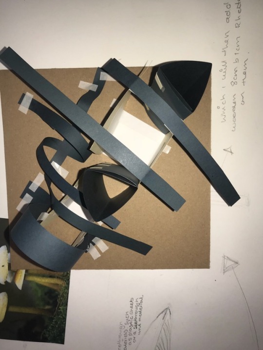
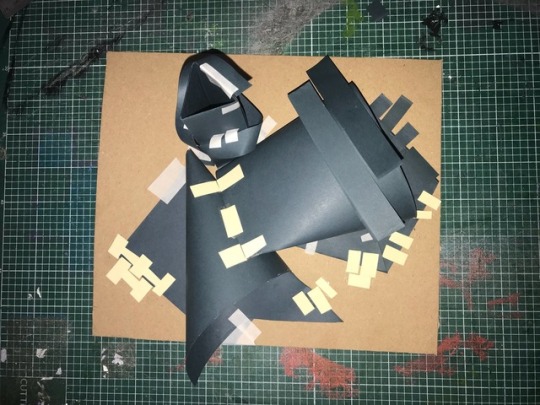
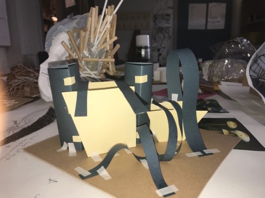
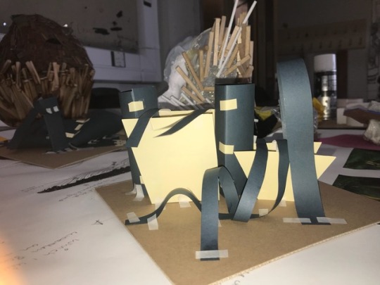
I responded with a small model with limited resources at home. I created a small shelter which I then placed out in a open filed and took pictures. I then surrounded it with greenery and rocks to show a connection with simijan. I also used the same colour scheme.
I also created a few drawings and paintings if franks work. I did a 15min drawing session with my left hand to show and explore my skills. Here I looked at probably my best artist jae hyo lee.
He specialised with wooden crafts and sculpturing.
I loved his use with wood and the uniqueness, because it still has a natural feeling towards it.
I especially loved the stone structure which has wooden rectangles elevating towards to the top of it. I took this as inspiration and was willing to experiment strongly with it. Here I took a good look at rocks and stones.
The shape of it I would love to take and develop with different textures. I was making notes of using wood, sand, leaves or anything natural to creat the shape of a rock.
But firstly I just drew simple sketches of different types of rocks that can provide shelter. Here I created a A1 sheet filed with inspiration from artist such as Jae hyo lee and natural structures such as stones.
I put this right into my 3D models and made exactly what was on my mind.
The experiment turned out beautifully and showed my skills within 3D.
I created small rock look alike structures with metal mesh, and covered one side of it with a response of Jae hyo lee. The abstract look beautiful and very unique. I then looked at my models to see if I can develop it any more. I realised I didn’t create it to my theme which was shelters. I then went on to create two more models which was clearly shown as development. I created a sheltered area for my models. Here is another experiment I created at home. I used plants within the metal mesh and made them escape out the structure to look like over growth which provided shelter. Here is my first idea of my final piece.
I started looking at mushrooms and how they fit my theme. They provide shelter also with the natural structure they provide but don’t filter any light or wind or anything. So my creation and to fit around making a way to make filtering work with the mushroom design.
I drew out the shapes of a mushroom and tried to ulterior and change the way it looks by referring to artist.
I looks within Jae hyo lees work once again to get inspiration.
I designed the stem of the mushroom to have a wooden effect to it such like how Jae hyo lee has done before.
The top part of the mushroom will look see through with a glass or plastics topping to filter light through. I also wanted to add a special material which stretches and is made out of paper to represent the design of under the dead of a mushroom. Here I have done more artist response towards Jae hyo lee.
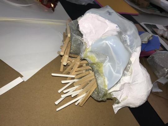
I created a few drawing and a painting to show skills and inspiration from his work. I used straws to creat the effect that can be seen . I also used water colours to creat a beautiful and stunning design. I painted the straws black to make it stand out tremendously. Here I created another artist response towards Jae hyo lee. I was experimenting and created a small model that look beautiful and unique. I used metal mesh the created the shape and with in the middle was newspaper. Then I had a material that showed the texture of wood which I then used on top of the mental mesh with a glue gun to make a beautiful shelters effect.
I then took out the newspaper inside the structure to make space within the model.
I then was complete and wanted to see what it would look like when filtering it with light in a dark place.
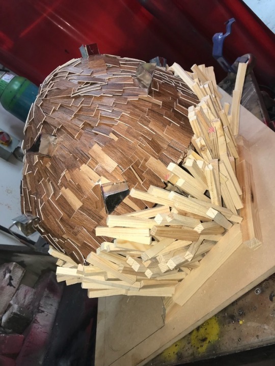
It looks beautiful the light filters in a unique way where it looks like a start. The inspiration was from Jae hoe lee. FINAL PIECE I started to create my final piece step by step. First I used s metal mesh to get the shape of it. I then used that mesh and placed it on a piece of wood and drew the out line of it. The out line was quite big but I then went to cut it out. I marked where the entrance will be so I don’t get confused.
I then went to making another wooden slap the place under the first one to creat a dome effect from the bottom to the top.
The mesh I used I formed it as a shape of a rock.
I then look at jae hyo lees wooden work and saw the long rectangular wooding slabs and how they are formed.
I have previously played about with this before so it was quite easily tampered with when creating models. I used the wooden style around the sides of my sheltered creation.
I then put the pieces together to give the back shape.
I then looked back at jae hyo lees work again and saw the fact that he created windows, wooden windows that stick out of he’s circle building which i wanted to experiment with.
I then looked at a mother artist Zaha haddid and saw the materials she uses. She loved metal curved shapes so I used this on my windows for the sheltered creations.
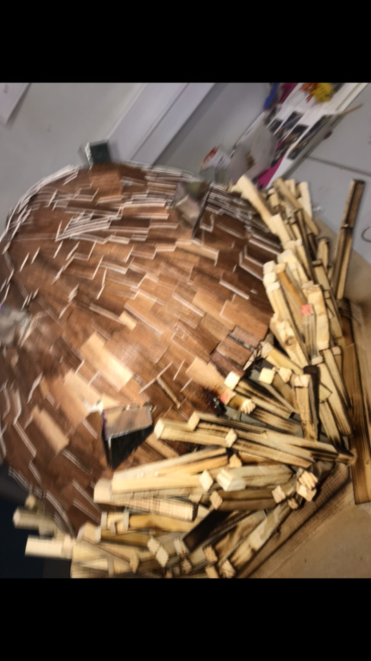
That was done ,then I went in to adding the wooden texture to the metal mesh on the top of my fmp.
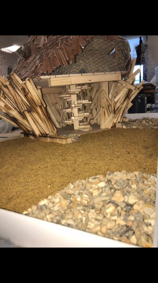
I had to cut up a load of small shapes to cover the top part of my shelter. I glue gunned the small wooden shapes on top of the metal mesh and moved on to the stairs. I added a spiral stair case the the building to allow elevation.
I then worked in the sides of my design. Jae hyo lee burned his wood to create a dark and light effect that looked special and ancient. It gives his building more texture.
I added this to the side of my wooden rectangles sticks. Burnt them and made them look unique.
I then went to finishing the base. I cut a larger 120 cm by 69 cm wooden plank to put my final piece on. I marked out the partway and added sand and stones to finish it up.
My finial piece was complete and read to be assessed and improved. I then did artist research on Zaha Hadid and Frank Gehry . These to artist are fabulous at what they do but sadly they have both passed away.
I loved the way the both gave futuristic design that have had inspiration from flowers or trees or even animals.
I drew responses and even created models to represent the art word.
0 notes
Photo
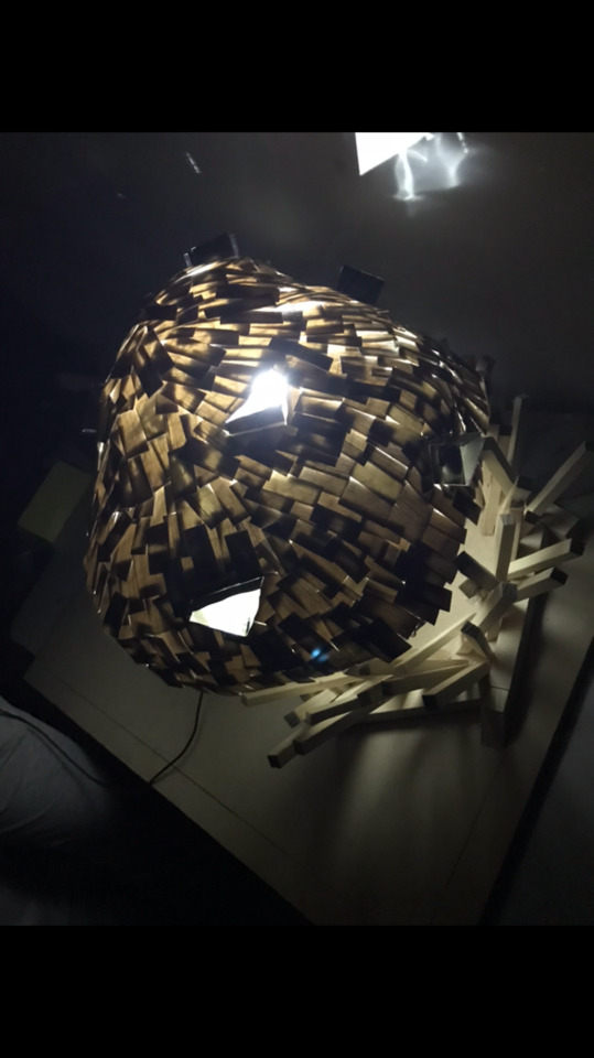

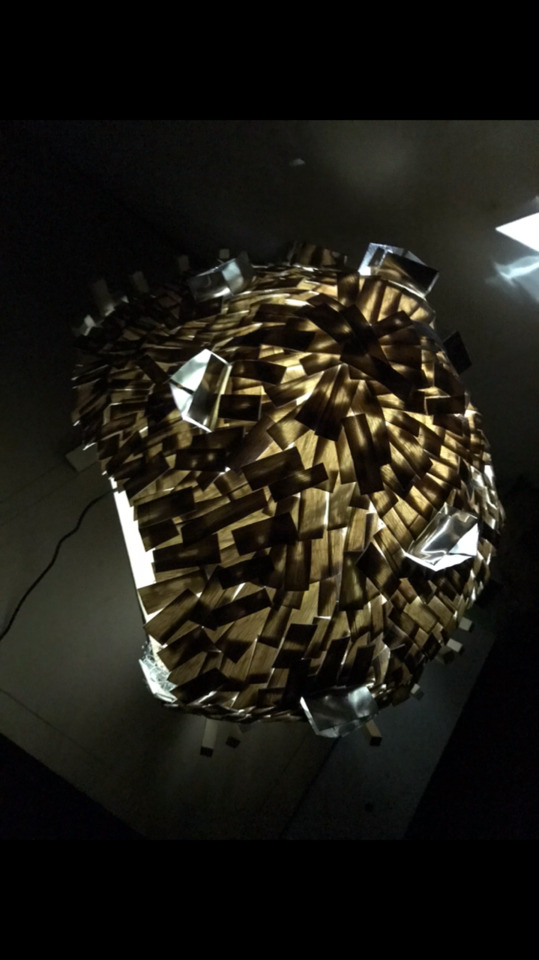
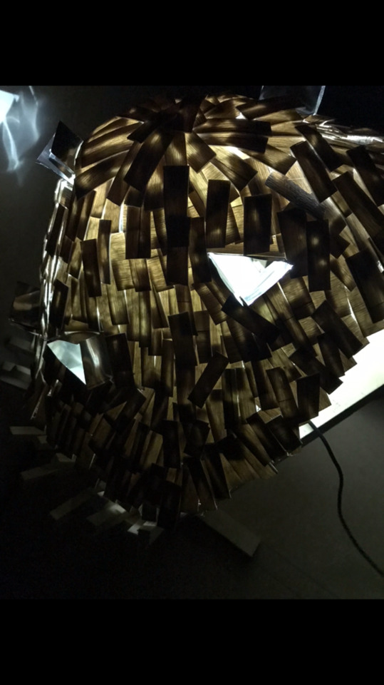
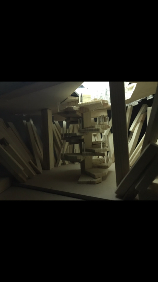

Here is my final piece when it’s in the dark and emitting light. It shows a good representation of filtering light.
0 notes
Photo
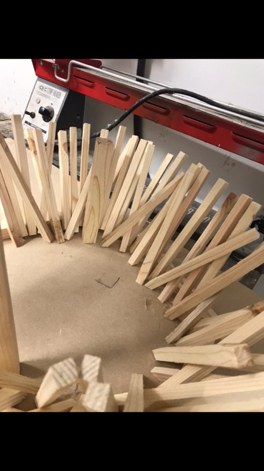

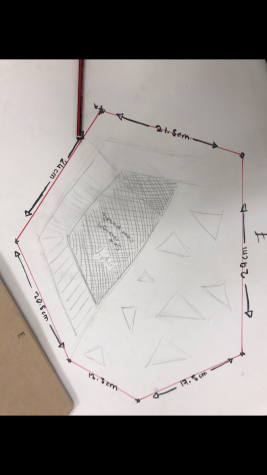
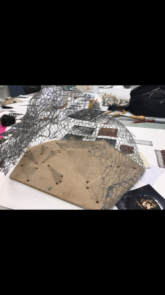


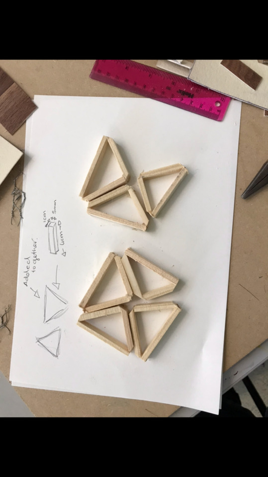
Htheses are the steps that I used shown within pictures to show what I have done.
0 notes
Photo
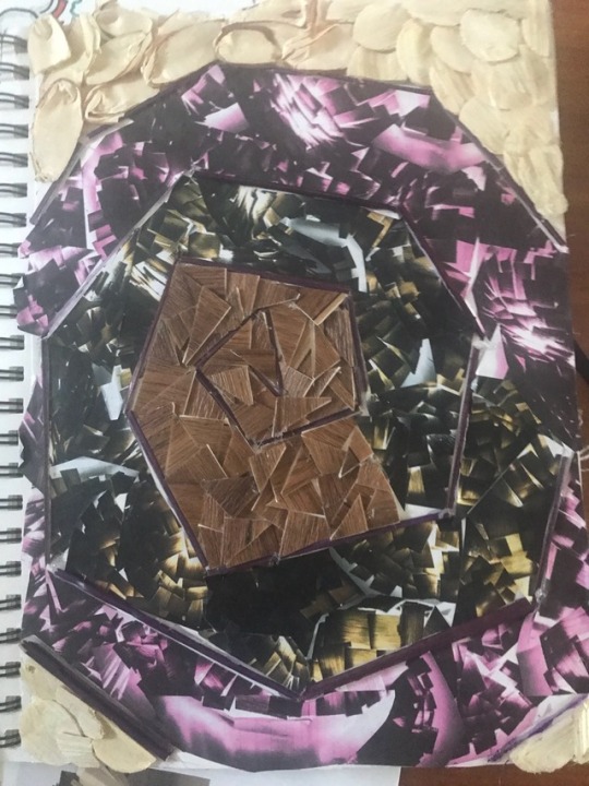
Here I created a little experiment with picture and materials I used from my final piece.
0 notes
Photo
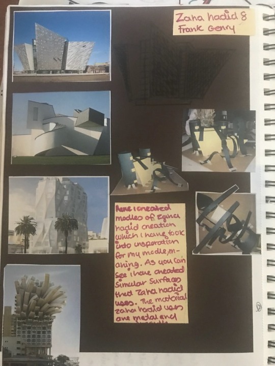
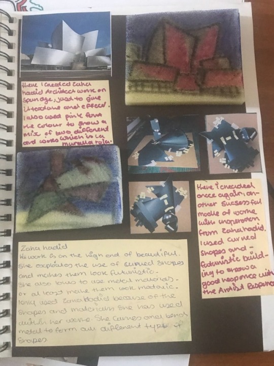


Here I did artist research on Zaha Hadid and Frank Gehry . These to artist are fabulous at what they do but sadly they have both passed away. I loved the way the both gave futuristic design that have had inspiration from flowers or trees or even animals. I drew responses and even created models to represent the art word.
0 notes
Photo


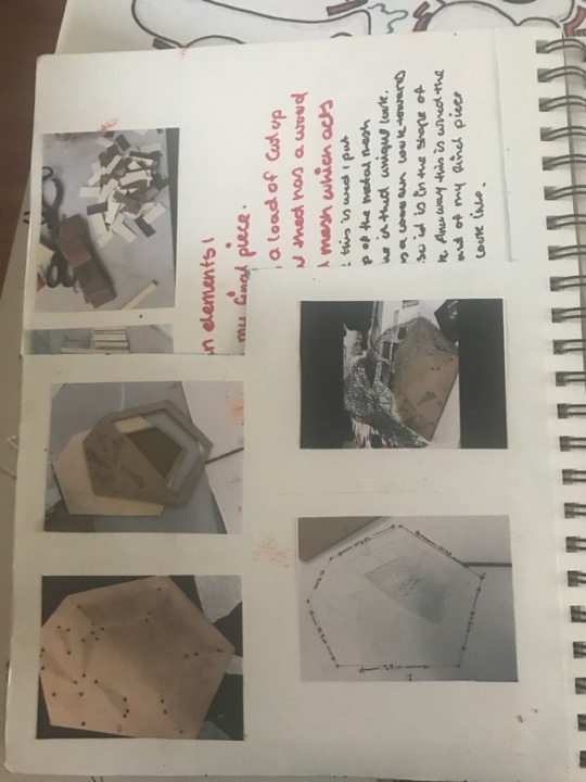

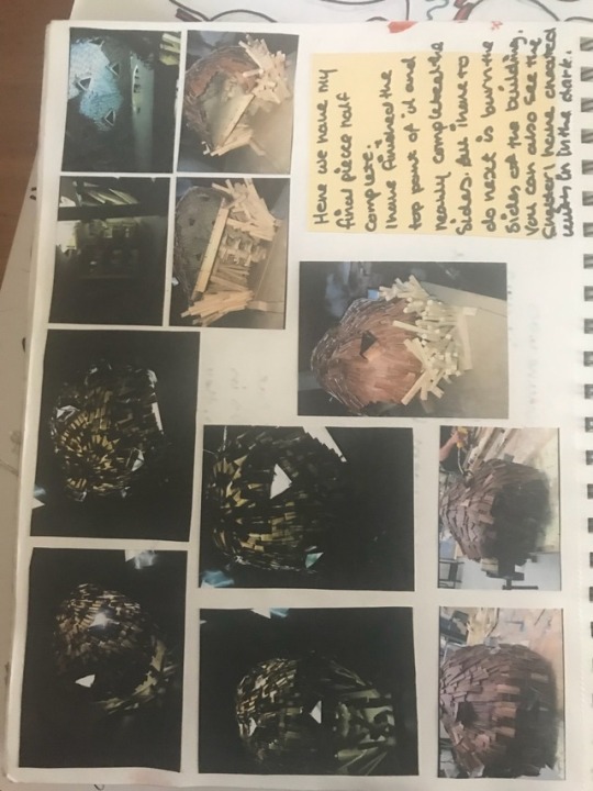
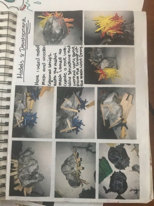
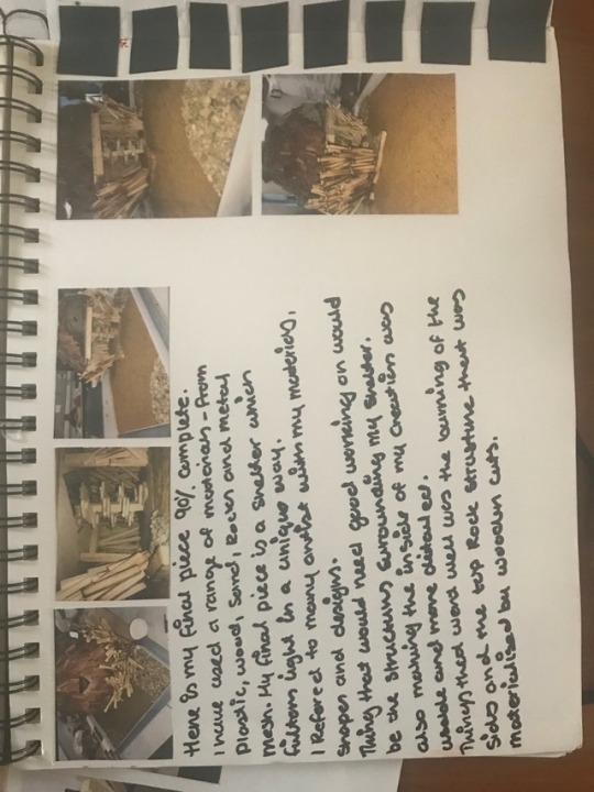

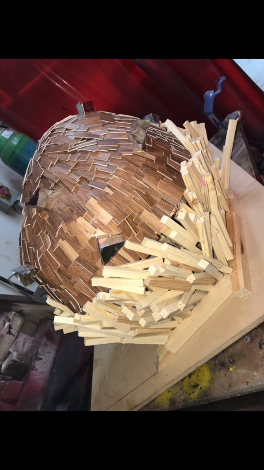
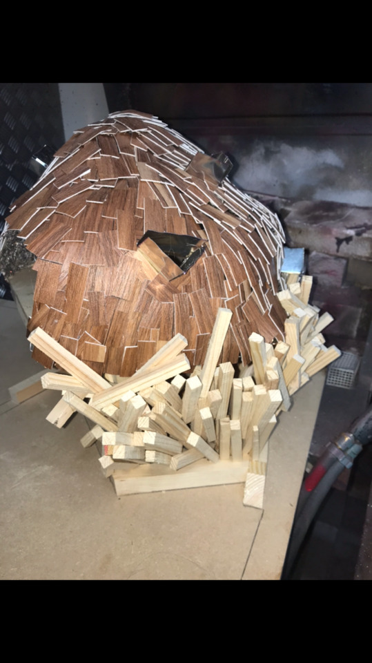
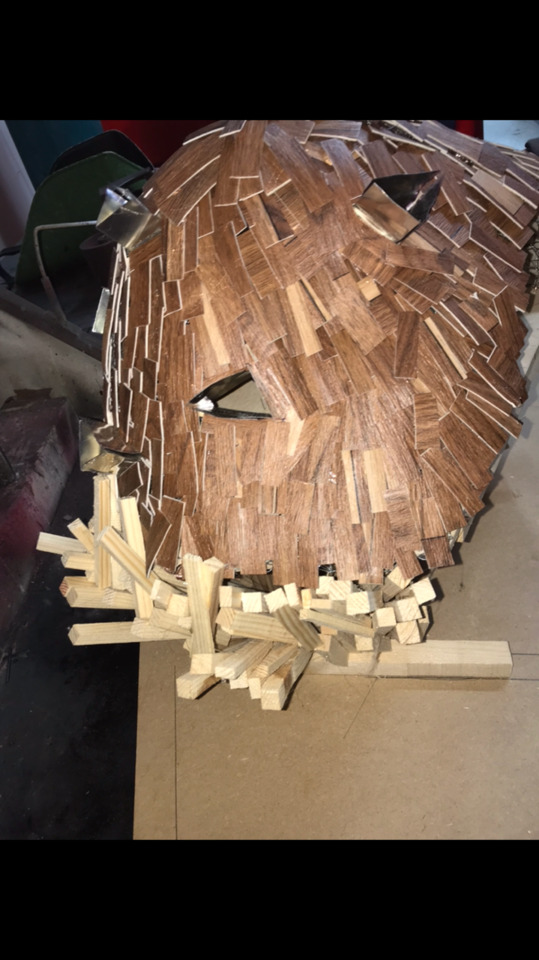
Here is where I started to create my final piece step by step. First I used s metal mesh to get the shape of it. I then used that mesh and placed it on a piece of wood and drew the out line of it. The out line was quite big but I then went to cut it out. I marked where the entrance will be so I don’t get confused. I then went to making another wooden slap the place under the first one to creat a dome effect from the bottom to the top. The mesh I used I formed it as a shape of a rock. I then look at jae hyo lees wooden work and saw the long rectangular wooding slabs and how they are formed. I have previously played about with this before so it was quite easily tampered with when creating models. I used the wooden style around the sides of my sheltered creation. I then put the pieces together to give the back shape. I then looked back at jae hyo lees work again and saw the fact that he created windows, wooden windows that stick out of he’s circle building which i wanted to experiment with. I then looked at a mother artist Zaha haddid and saw the materials she uses. She loved metal curved shapes so I used this on my windows for the sheltered creations. That was done ,then I went in to adding the wooden texture to the metal mesh on the top of my fmp. I had to cut up a load of small shapes to cover the top part of my shelter. I glue gunned the small wooden shapes on top of the metal mesh and moved on to the stairs. I added a spiral stair case the the building to allow elevation. I then worked in the sides of my design. Jae hyo lee burned his wood to create a dark and light effect that looked special and ancient. It gives his building more texture. I added this to the side of my wooden rectangles sticks. Burnt them and made them look unique. I then went to finishing the base. I cut a larger 120 cm by 69 cm wooden plank to put my final piece on. I marked out the partway and added sand and stones to finish it up. My finial piece was complete and read to be assessed and improved.
0 notes
Photo
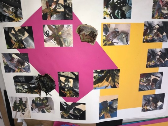
Sheets created from models that took pictures from at home. Inspiration from artist like jae hyo lee, simijan and la muralla.
0 notes
Photo

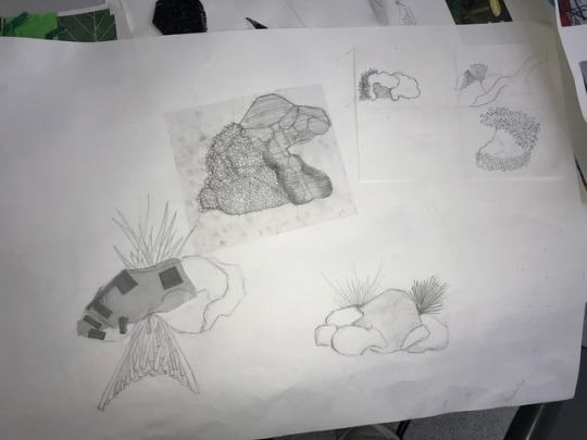
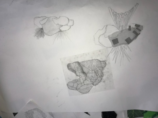
Here are some A1 that I created to show inspiration and development from my models.
0 notes
Photo
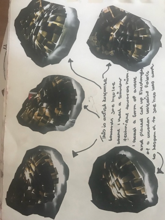


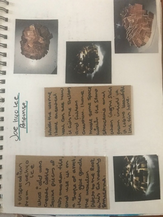
Here I created another artist response towards Jae hyo lee. I was experimenting and created a small model that look beautiful and unique. I used metal mesh the created the shape and within the middle was newspaper. Then I had a material that showed the texture of wood which I then used on top of the mental mesh with a glue gun to make a beautiful shelters effect. I then took out the newspaper inside the structure to make space within the model. I complete and wanted to see what it would look like when filtering it with light in a dark place. It looks beautiful the light filters in a unique way where it looks like a start. The inspiration was from Jae hoe lee.
0 notes
Photo

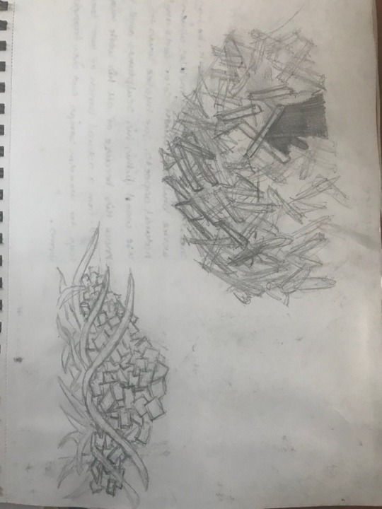
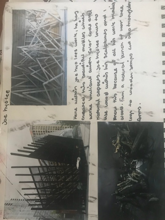

Here I have done more artist response towards Jae hyo lee. I created a few drawing and a painting to show skills and inspiration from his work. I used straws to create the effect that can be seen. I also used water colours to create a beautiful and stunning design. I painted the straws black to make it stand out tremendously.
0 notes
Photo

Here I created a sheet with the idea of my mushroom design.
0 notes
Photo

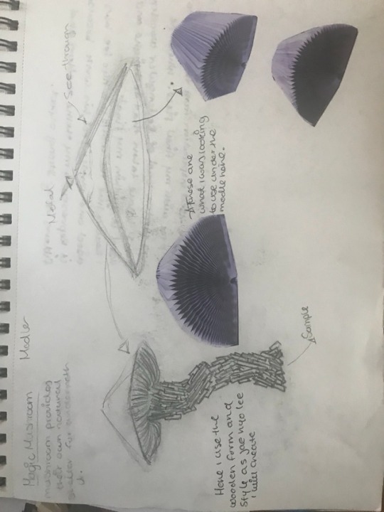
Here is my first idea of my FMP. I started looking at mushrooms and how they fit my theme. They provide shelter also with the natural structure they provide filtering any light, wind or anything. So my problem solving was to make everything fit around filtering the mushroom design correctly. I drew out the shapes of a mushroom and tried to ulterior and change the way it looks by referring to artist. I looks within Jae hyo lees work once again to get inspiration. I designed the stem of the mushroom to have a wooden effect towards it, such like how Jae hyo lee has done before. The top part of the mushroom will look see through with glass or plastics topping to filter light through. I also wanted to add a special material which stretches, made out of paper to represent the design of under the head of a mushroom.
0 notes


