#pre-made psd
Explore tagged Tumblr posts
Text
♡ COMMISSION◝ by clicking here or the source link below you’ll be able to purchase #360 pre-made (clipped, sharpened, but not colored) psd gifs of alisha boe in the buccaneers [s01]. all of the psd gifs were made by me from scratch, so please do not redistribute or claim them as your own. please reblog post if you found these useful.
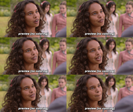
(!) pre-made psd gifs means clipped, sharpened, but not colored gifs only in .psd format which you can buy as zip-files and which you can edit in PS by yourself.
you can save psd gifs to your computer and use them for your replies, sidebars, reactions, bios, etc. on any rp platform.
you can edit the psds, e.g. for crackships and gif icons.
you can post gifs made from my psds as gif packs.
you can use these psds for commissions, but: (!) your gif pack has to be public. (!) you have to let the person paying you know that your gifs are pre-made (not made by you from scratch).
#alisha boe#alisha boe gif pack#alisha boe gif hunt#alisha boe gifs#pre-made gifs#pre-made psd#pre-made psd gifs#gif hunt commissions#gif pack commissions#rp commissions#gif commissions#psd#gif psd#my psd#help#premade gifs#premade psd#premade psd gifs#rph#rpc#♡
19 notes
·
View notes
Text


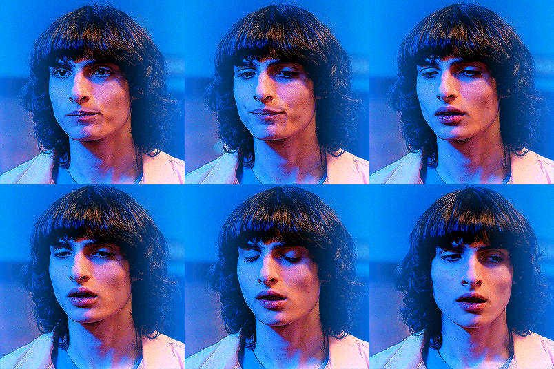
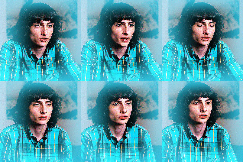


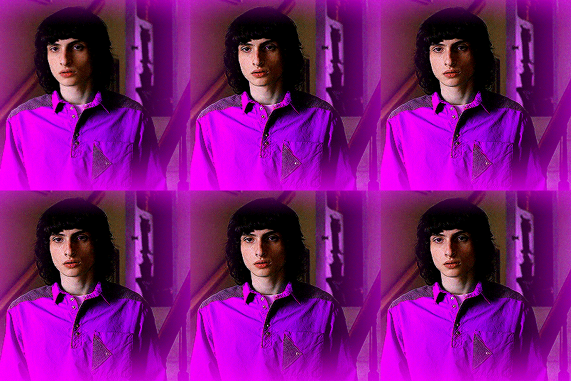
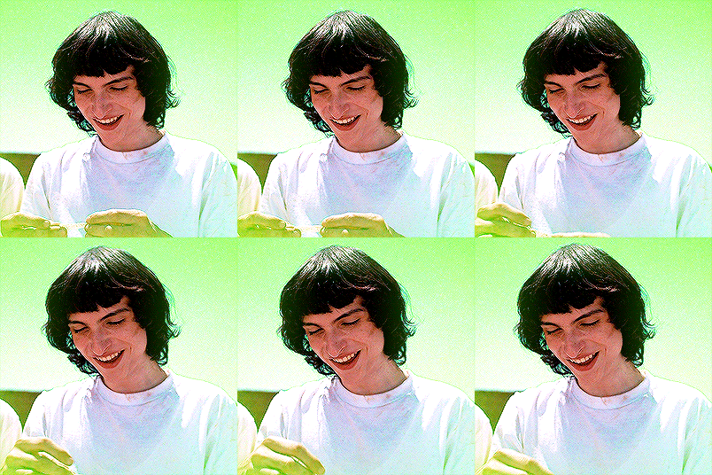
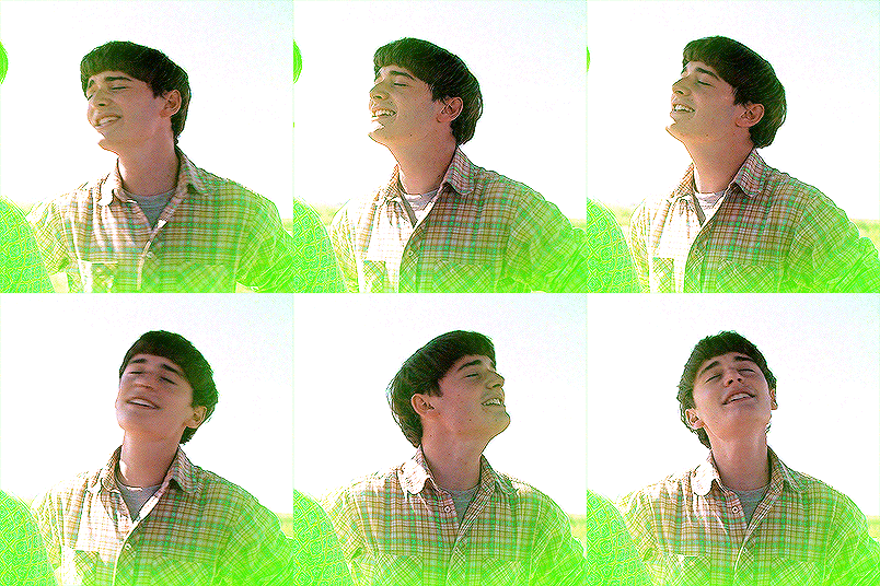
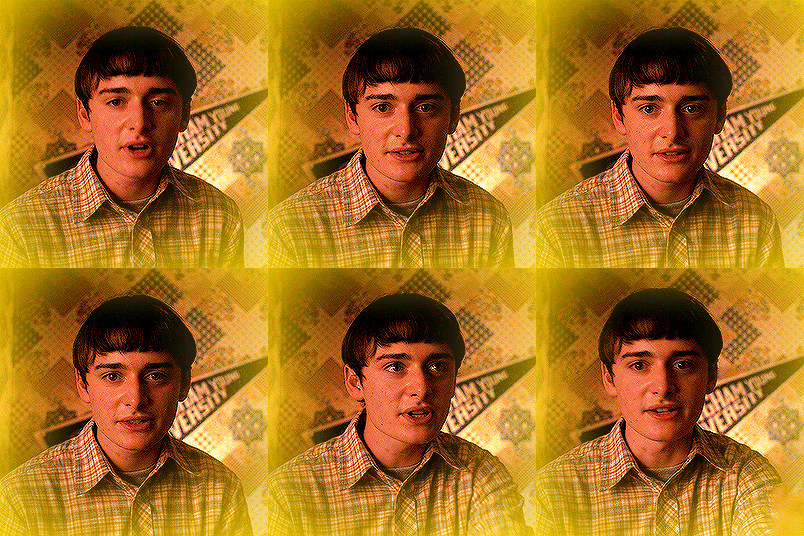

are "friends" electric?
byler week 2023 | day vi: pre-volume 2 vibes
#byler#bylerweek2023#Day 6 Pre-Vol 2#byler edit#byler gifs#clapping myself because i made a psd that works just fine in like every scene.#episode 7 no byler so yeah#no but like noah's wig in ep.6 is so weird i can't#creative process: um so as pre volume 2 vibes i wanted to put the byler scenes i liked the most in each vol. 1 episode#of course i avoided to gif scenes i already gif'd thousand of times (cough - cool cool intimate moment- cough)#or car scene in the desert#and i also wanted to make it really bright and vibrant and yeah#no like it wasn't intended to be a rainbow gifset - even tho it pretty much is#but you know guys i had to go along with it#mine:gif#mine
401 notes
·
View notes
Text
i'm so new to giffing that when i started this esther yu mega gif pack (i plan on giffing her in all 35 episodes of a drama) i was using a gif psd made by someone else, but now that i'm comfortable doing basic colorings on gifs i feel weird because now i have like 400+ gifs with a psd and want to do the rest with my own coloring. but at the same time i want them all to look cohesive. i'm giving myself a headache.
#hi cherry !#to be deleted !#i mean i'm only four episodes into the show#but still !!!#to clarify there is nothing wrong with the gifs i used the pre-made psd on#its lovely
5 notes
·
View notes
Text
one day im gonna get over my anxiety and post my pre distortion michael art and its gonna be all over for u guys
#thats all i draw is pre distoriton michael i have drawn mikey D maybe like 5 times at most#meanwhile i have maybe 40 psd files of pre distortion michael in a folder and a 3d model i made from scratch#when i say he is my comfort character.... it is like on another level#the 3d model IS rigged and textured btw#tma#michael shelley
17 notes
·
View notes
Note
hello hannah! i loved your olivia's gifset in the good mother! i make gif packs and i'm finding hard to make gifs of olivia because of the colouring. may i ask if you can share the psd you used? i would credit you. but it's okay if you don't want to share! just want to say this :) have a good day!
hi, i'm so glad you liked the gifset :) i actually color all of my gifs from scratch, otherwise I would absolutely share the psd with you. is there a particular gif you'd like the psd for?
1 note
·
View note
Text
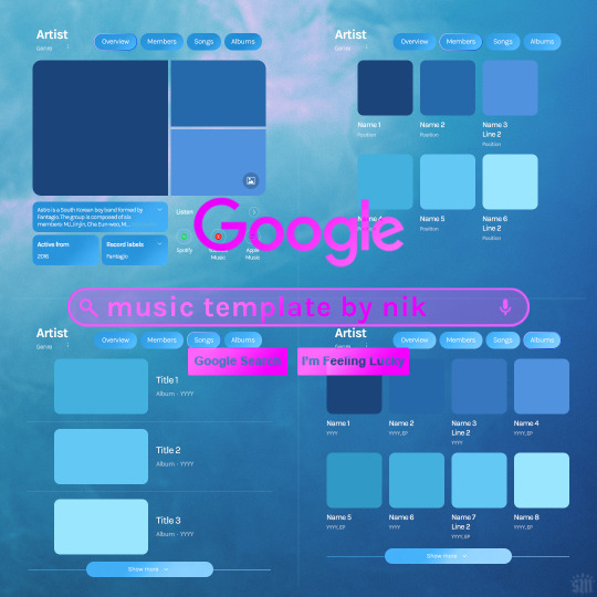
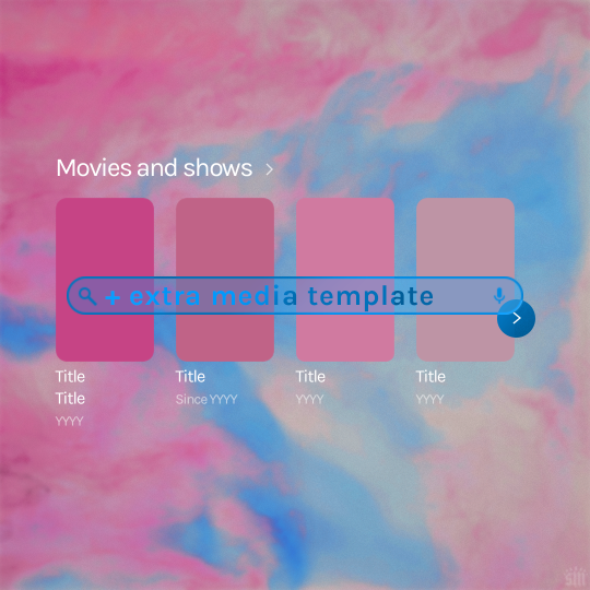
Hi! I've had these templates sitting with me for a while and never got around to uploading them lol. Here are Google templates for musical artists, a newer style originally seen in this set. Plus, an extra template that goes with my previous layouts, showcasing media titles (seen in this set). As always, my templates are free — all I ask is that you give me proper credit in your caption if you use my template or take inspo from my design. Enjoy! :)
Get the NEW Google templates free via ko-fi: MUSIC TEMPLATE | MEDIA TEMPLATE (Donations appreciated but not required <3) Includes PSD/PSB templates with pre-made layer masks, shapes, and tips for the following designs: – Overview – Members – Songs – Albums – Movies and shows (.psb)
Additional resources: – My original animated Google search overlay tutorial & template – Extended Google template (image search results, biography, related searches, animated "no search results") – Karla Google Font (this is the only font used) – Backgrounds via Unsplash: [Blue] [Pink]
#gif tutorial#completeresources#usershreyu#useryoshi#userzaynab#usersalty#alielook#tuserabbie#useraish#userabs#mialook#resource*#gfx*#google*
290 notes
·
View notes
Text
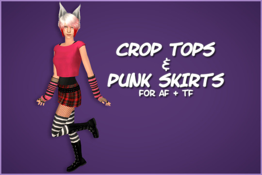

HAPPY BIRTHIVERSARY part 2 - Crop Tops & Punk Skirts
FUN FACT: The Sims 2 (2004) was released 3 days before the date upon which I was released from my mother's womb, therefore making me younger than The Sims 2 by 3 days as of September 14th 2024, but objectively older by 6 years as of September 17th 2024. As of this post, it is now my birthday. I can feel the hands of time slowly pulling me into the earth. Let's celebrate!
Today's Very Special Birthiversary post includes a set of stylish, vaguely Scene-inspired clothes for ladies: 24 recolors of the Urban Primitive skirt, separated from the Maxis outfit by Skell, and 5 Goth themed patterned recolors and 5 bright solid recolors of the 4t2 Bow Crop Top by MDPthatsme, with black tank top undershirts attached using textures by DeeDee. The clothes are for AF and TF, with Standalone and Repositoried options for TF, and they come with all morphs.
All meshes are included and special characters that would make the game load slower (specifically hyphens) have been removed from the filenames. Since the skirt is from the ever popular Maxis Match Repository Project, you probably have the mesh for the skirt lying around in your Downloads somewhere, so make sure you don't have duplicates.
For the skirts, there are two versions with tights - one of which is a mashup of fishnets by Io (colored red and black) and the Maxis black and white stockings, and the other is the Maxis shorts+fishnets texture because I liked it - and one version with bare legs, which can be used with @themeasureofasim's stockings accessory boxes. (actually only a handful work, see under the cut)
The crop tops and the skirts are 'meant' to be paired together but, being separates, you can mix and match with any other top or bottom you want.
CROP TOPS SWATCH | PUNK SKIRTS SWATCH
See under the cut for more (not very important) information.
DOWNLOAD (sfs)
Mesh credits: @mdpthatsme, Yuichen, @deedee-sims, Skell Texture and alpha credits: DeeDee, Ghanima Atreides, Creesims, Io, and Maxis Pattern credits: andrea_lauren, nerd-and-vine, ophelia_payne (@ Spoonflower), Blue Moth Fabrics, and VictoriaBat.
I have done my best to credit everyone who's resources I used. If I have misattributed or missed anybody, or if I have broken a rule in someone's TOU somewhere, please let me know.
Secondly, this is my first time 'retexturing' clothing instead of just recoloring it, as well as the first time I've done anything clothes-related in a very long time, so please be gentle to me with your criticisms and let me know if anything needs fixing <3
I wanted to recreate this outfit using only textures, because I know nothing about meshing and Milkshape scares me. As you can probably tell, I got a little carried away from the original goal.
I mashed a bunch of patterns, textures, and colors together on top of the crop top and skirt in an effort to learn 'advanced' recoloring of clothes in GIMP, as the most I've ever done before was just recoloring using pre-made PSDs. it was a bit of a disorganized disaster and there was quite a bit of blood, sweat, and tears. But the end results look... mostly nice, I think.
The arm warmers and fishnet gloves shown in the preview are a pair of accessories created by katsurinssims that I used to try to 'complete' the look, and are not included in this download.
Edit: im very sorry, I only tested a handful of the accessory stockings on the bare legs skirts, because I was very tired and there are A Lot of them, and assumed they would all work. But after a bit more testing, some of them have small gaps or poke through the boots, and the ones that are supposed to go over the crotch area end up looking like over the knee socks. Other than that, most of the knee high socks and tights work, but only on AF. I don't consider this a huge problem though, because a good amount of the tights work and the ones with gaps are barely noticeable.
There's a shoe swap that makes all of the boxes work with these skirts and I'll make another versIon of them with that mesh later.
#ts2#the sims 2#ts2cc#s2cc#sims 2 cc#sims 2 download#sims 2#happybirthiversary2024#the sims 2 anniversary#ssd cc#dl clothes#dl afclothes#dl tfclothes#i worked so fucking hard on this you don't even know
164 notes
·
View notes
Text

genderchaos - a gender system for genders connected to [x] & chaos, being (a/an) [x] & chaos, [x] chaos, etc.
this is intended purely as a gender systems & has no ties with any pre-existing genderchaos terms. symbol from photopea. psd file here.
made by us. suggested by @flykites. tagging @radiomogai & @dimensen.
21 notes
·
View notes
Text
ARTIST OF THE WEEK (GIFMAKER EDITION)
This week's artist is our very own, favourite gifmaker Ida @bizarrelittlemew who I'm sure everyone follows and knows. S2 and even pre s2 would have been such a different story without Ida's amazing and speedy gifs, and they agreed to answer a few questions for me:
All the programs you use to make gifs (including screengrabbers etc)
I use DaVinci Resolve to cut the clips I want to gif and Photoshop 2024 for everything else. occasionally I use Adobe After Effects for rotoscoping (cutting moving objects from videos, like I've used here and here.
One adjustment/PSD that you couldn't live without (you can only pick one!)
making me choose just one is cruel 😤 but I guess it will have to be the Levels adjustment layer. it does so much heavy lifting for me and can do both light/contrast and color adjustments, I could probably do full coloring only using Levels ❤️
Favourite gif you've made or scene/episode to gif
ough this is difficult. I think S1E7 might be the episode I've giffed the most (and one of my favorite episodes in general), so it'll have to be that - especially the scene in the clearing after the treasure map burns, with Stede's little pout and Ed's heart eyes
One thing that always makes you curse the gods while making gifs (that one adjustment that takes too long, dark scenes, etc etc?)
since "the color grading of ofmd s2" seems too general, I will say the constant balancing of toning down the yellow while still keeping Stede's hair sufficiently golden 😔 it turns dull so easily
One tip for people who are just starting to learn giffing
my general tip is to start with well-lit outdoor scenes to get the basics down before moving to darker scenes. and, for the love of god, do NOT start your giffing journey with the indoor scenes in ofmd S2E4. listen to me. LISTEN. look me in the eyes. Do Not start with that. I have no idea what happened to the color grading of that episode but hooo boy it is SO red/yellow. and dark. and sometimes it's just out of focus. it can be a fun challenge when you've got a little more experience but do not be tempted by Stede's earnest gazes and Ed's cute huffy faces to make your first gifs from those scenes. actually, my advice is to start with season 1, there are lots of vibrant colors to have fun with and even the dark scenes are decent to work with!
Why OFMD
if I try putting it into words I will combust
37 notes
·
View notes
Text

🎨✨ Commissions Are Now Open! ✨🎨
I'm officially open for commissions! Whether you're looking for custom RP icons, profile picture edits, or promotional designs, I’ve got you covered. Here’s what I’m offering:
🌟 What You Can Commission:
RP Icon Packs
Custom Profile Picture Edits
Promos and more!
Check out my Ko-fi to commission me or donate if you'd like to support my work in other ways: Link here
📜 Read My Terms:
Before placing a commission, please review my terms of service here: Link here
💾 Standalone PSDs Available:
Not ready for a custom commission? You can still grab some of my pre-made PSDs for your projects over on Payhip: Link here
💖 Support in Any Form Means the World to Me!
Even if you can’t commission right now, reblogs, donations, or spreading the word is a huge help. Thank you so much for your support!
📩 If you have any questions, feel free to send me a DM or ask.
9 notes
·
View notes
Note
Hi. Do you mind sharing the psd you used for your for Wednesday psychics gifset? It's so beautiful and I'd really appreciate it but if you don't share psds, that's ok and sorry for bothering :) /post/747314355490652160/graphicgifset-tag-meme-favourite-type-of
Hello, dear! I don't usually use pre-made psds and prefer to colour each gifset as I'm making them. However, whenever I am doing something bigger and involves blending, effects, etc, I make sure to save my progress. And you're right on time with this question, because I was just about to delete what I saved on that particular gifset. But here it is:

(DOWNLOAD THE PSD HERE.)
I hope this helps. If you ever use it to make a gifset, please let me know, I would love to see it 🖤
#chaoticresources#dailypsd#dailyresources#allresources#completeresources#my resources#my psds#anonymous#messages
48 notes
·
View notes
Text
♡ COMMISSION◝ by clicking here or the source link below you’ll be able to purchase #473 pre-made (clipped, sharpened, but not colored) psd gifs of dominique devenport in sisi [s03] // part two. all of the psd gifs were made by me from scratch, so please do not redistribute or claim them as your own. please reblog post if you found these useful.

(!) pre-made psd gifs means clipped, sharpened, but not colored gifs only in .psd format which you can buy as zip-files and which you can edit in PS by yourself.
you can save psd gifs to your computer and use them for your replies, sidebars, reactions, bios, etc. on any rp platform.
you can edit the psds, e.g. for crackships and gif icons.
you can post gifs made from my psds as gif packs.
you can use these psds for commissions, but: (!) your gif pack has to be public. (!) you have to let the person paying you know that your gifs are pre-made (not made by you from scratch).
#dominique devenport gif hunt#dominique devenport gif pack#dominique devenport#dominique devenport gifs#pre-made gifs#pre-made psd#pre-made psd gifs#gif hunt commissions#gif pack commissions#rp commissions#gif commissions#psd#gif psd#my psd#help#premade gifs#premade psd#premade psd gifs#rph#rpc#♡
17 notes
·
View notes
Text


tags masterlist 🎼*•°✩


note: at the moment, the links to the tags may not work. my apologies!
MY POSTS ♫
luci’s asks ��� - asks i have been sent and answered ! luci’s backgrounds ♡ - backgrounds, either tiles or full ones ! luci’s dividers ♡ - dividers i have either made or edited ! luci’s graphics ♡ - graphics i’ve made ! luci’s inspo ♡ - rentry / sntry pages i’ve made ! luci’s layouts ♡ - layouts for any site i’ve made ! luci’s pngs ♡ - usually png dumps ! from other sites luci’s renders ♡ - renders i’ve posted, usually by myself ! more will be added as i create more posts d(·∀·*)♪゚˙•˚˙•

MY REBLOGS ♫
luci reblogs backgrounds ♡ - backgrounds (ex. rentry outer container bgs) luci reblogs blinkies ♡ - blinkies (those seizure-inducing button looking things) luci reblogs borders ♡ - usually container borders luci reblogs buttons ♡ - can either be those imvu buttons or webpage buttons in general luci reblogs dividers ♡ - whenever someone includes F2U (i think) dividers in their posts luci reblogs fonts ♡ - usually font lists luci reblogs frames ♡ - anything you can put an image behind and it will show in the image luci reblogs gifs ♡ - basically pngs if it was gifs, sometimes backgrounds/overlays too luci reblogs graphics ♡ - graphics, mainly for rentries luci reblogs inspo ♡ - full rentry pages, does not include templates luci reblogs layouts ♡ - layouts for any site luci reblogs masks ♡ - any image you can clip another image onto and it’ll look decent luci reblogs overlays ♡ - usually texture images, sometimes pngs too luci reblogs pixels ♡ - anything i think could be used as a pixel, usually pre-resized but sometimes needs some resizing luci reblogs pngs ♡ - basically renders but more focused on objects luci reblogs promo ♡ - spreading promotions for other blogs, support them ! luci reblogs psds ♡ - colorings specifically for photoshop / photopea luci reblogs random ♡ - anything that isn’t a resource (usually art or positivity luci reblogs renders ♡ - pngs but usually based on characters luci reblogs stamps ♡ - similar to postcard stamps, can be used as buttons luci reblogs symbols ♡ - actually good symbol packs (similar to emojicombos.com) luci reblogs templates ♡ - can be status/bio text layouts, OR rentry templates luci reblogs tutorials ♡ - spilling those secrets of rentry editors
more will be added as i reblog more posts d(·∀·*)♪゚˙•˚˙


19 notes
·
View notes
Text


Airi Momoi Sanrio Graphic
f2u + credit
psd link here : 🐇
likes and reblogs appreciated
Day 6 of Kio/s 1.5k event — Edit a character with light / pastel colors or Edit a character with dark / monochromatic colors


aaaaaa whenn i saw the prompt i immediately thought of the Airi Momoi saniro card, especially with all its pastel colours and so thats what I edited for this day. Also shockengly i actually made a new colouring for this day and didnt use my pre-existing pink colouring cause i wanted this to be LIGHT


#rentry#rentry inspo#rentry resources#rentry graphics#kats new shot ♥︎#kat’s post it’s ♥︎#pjsk#project sekai#airi#airi momoi#pjsk airi#mmj#mmj airi#sanrio#my melody
30 notes
·
View notes
Text
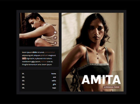
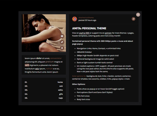
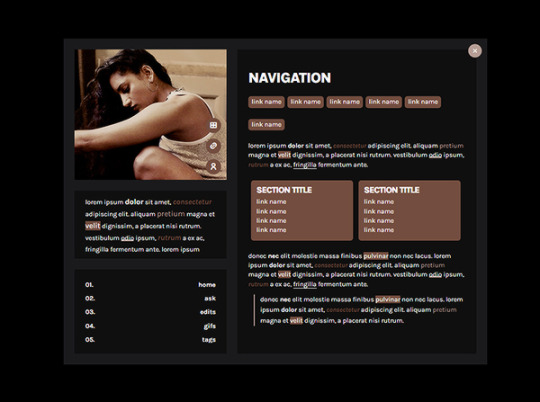
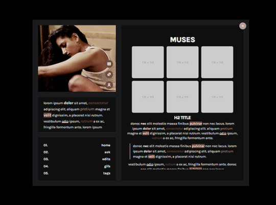
AMITA: PERSONAL THEME BY ETHEREAL THEMES
View on payhip ($5.50), check out the preview or support me on patreon for more themes + pages, header templates, coloring psds and more every month!
🎊🎆🎉 COUNTDOWN TO NEW YEAR: Get this theme + many more as we countdown to the new year over on my Patreon! 🎊🎆🎉
Personal Theme
Navigation Links: Home, Contact, +6 additional links
Dark or light custom tumblr tools control
Un-nested captions + NPF support
Color options for: background, text, links + border, content, container, container shadow, two accents, sidebar, links, popup styles + more
Sidebar:
280x240 Image + popup links (and posts if enabled)
Scrolling Description
Navigation Links
Other Options:
Posts show as popup or on hover (on/off toggle option)
Font options (Serif and Sans-Serif Styles)
Title font sizes
Body font sizes
Post Spacing (space between posts)
Black or white light box options
Dark or light custom tumblr tools control
Popups:
Navigation/Tags - Two styles, single links and link groups that include a section title*
Muses - Image icons with hover character names, unlimited amount + sizes up to you to fit your post size*
*All styles included (blockquote, pre, lists, etc) to create unique pages
Do edit any feature to make it your own.
Don’t use as base code, remove credit or claim as your own.
Everything you see can be edited including colors, texts and much more. This theme was made with personal (and muse / rp) blogs in mind.
Basic - Advanced HTML to edit depending on what you’re editing. There are settings in the default editor, but being an personal theme you will need to add details such as the navigation and muse popup info, etc. Please reblog or like if using. And let me know if you come across any issues.
#personal theme#codingcabin#dearindies#personal#rpt#rp#themes#all#contained theme#muse#amita#personal*#premium theme#ethemes#all*#contained*#popups*
49 notes
·
View notes
Text

INTRO
Step right up and let me show you the secrets of the game.
I'm Kakavasha, your guide to the thrills and excitement of the casino world.
But tonight, it's not just about the cards or the chips; it's about making sure you have a winning experience in every way.
Ready to let me deal you in?
REQUEST GUIDELINES
Each request will contain six transparent and upscaled PNGs. [Max of eight, if you'd prefer less; just include so in your request.]
In order to request, you need to provide any of the minimum; link to video [and frames if you have a preference], a character and their media/source, or pre-gathered screenshots you'd like edited.
I will work with almost any [within reason] media; I have no blacklist; but if i deem something unsuitable or inappropriate; you will be alerted privately (unless you ask anonymously, then I will answer your ask publicly,) and I will not be completing the job.
CREDIT REQUIREMENTS
When using my content in edits, or other media, please tag me, so that my content can reach and be utilized by more people.
You need to credit me when using my renders. This is how we reach more people you can use my assets.
My content is available with credit, however if you'd like to partner up, feel free to ask about it! [Per example, an editing blog would like to collaborate in order to complete a larger editing project and/or request.
MISC
I don't mind spam reblogs or random promos.
It is completely okay to use my ask box for questions or casual conversation.
If you find yourself too timid to use you account and utilize the anonymous option, i understand that you cannot post imagery in asks. Please just describe what you are looking for textually and we will work together.
Do be patient with me, as this is my first time running a blog of any kind like this. However you are more than welcome to leave constructive criticism, but be honest. If you believe there is an aspect of my work that I should focus on improving, I'd love to hear about it. A simple ask would be fine,
If you see an issue with my work, as if there is a discrepancy within an image, you are more than welcome to point it out in an ask. I can always edit the image and the post to update it with a better version of the image.
The credit for the PSD in my banner, icon, and dividers belong rightfully to pinkmiku on Tumblr.
Gifs in my profile were made by my beloved @boothyll
The "number of cards" in my blog description is the number of requests in my inbox!
Each request can take anywhere between 1 hour and 4 hours to complete. Patience is appreciated, as I work full time, often over 40 hours a week.
I'm actually okay with people mentioning that they'd like me to rush their request, especially if they need the asset to complete a project of their own, but be humble. I'm serious.
INBOX
Fu Xuan Renders
Topaz + Guinifen Renders
Lingyang Renders
Ruan Mei Renders
Sparkle Renders

11 notes
·
View notes