#plus a bunch of overlays
Explore tagged Tumblr posts
Text
tubi is better than netflix bc you can watch gerard way perform with duran duran in hd
4 notes
·
View notes
Text
think when im back home im gonna set up my own standard hair color textures so i can just make hairs without worrying about that too much. not gonna work for every single hair idea im sure but having my own system in place should make it easier when i start getting in the weeds
#plus theres a couple colors id like to add to the palette#like a proper purple#and a 2nd green#at the very least.#but i also wanna make an ombre/roots/split color system#that ideally would be compatible with other ones (or at least the racoonium overlays which i use in my game)#so that the colors/texture match up properly for my base colors but also so you dont NEED other cc to do those things#but i know its annoying as fuck to download a bunch of overlays for EVERY hair so i dont wanna do that i wanna just get a standard system#from the start.#but ideally once i have a whole base texture set up ill just be able to get up and go#like i hate doing that part lmao#simoleon#note to self: add a highlights/streaks overlay too#to easily add grey hairs to any hair color#or green strands. or pink or brown.#i would primarily use it for greys i can say that much lol
8 notes
·
View notes
Text
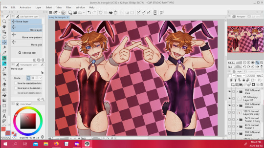
i kinda hate this conceptually but like... technically i'm really happy with the colours and stuff orz
#i just sorta started going on a sketch i wasn't done refining so like...#theres a dozen things i'd change if i actually planned anything about this#i don't even know if it works as a two character piece i just sorta added delusion chi/de as i went#i wish i'd posed them differently it's really bothering me... i got distracted because i was having fun with the colouring#why'd i space them so far apart (╬▔皿▔)╯#i don't wanna scrap it since i really do love how the shading on the bunnysuit came out#but... i'll be honest the layers are a fucking mess.#if i go in and change a bunch of stuff i will be fighting for my fucking life in there#plus... it's like 98% done i might fiddle with the levels and overlays a little more but it's... postable#might just separate them into two vertical pieces instead of this horizontal one and call it a day#this is hardly going to be the last time i ever draw either of them in a bunnysuit so i'll just do better next time#might delete this tomorrow i always feel really embarrassed posting wips my process is a MESS#snow blogging#wip
1 note
·
View note
Text
Astro observations
Sister signs are the funniest to look at sometimes, because much like sisters there will be the similarites. For instance, Leo and Aquarius are both cocky asf but you know what the difference is between them? Idk if it's just the leos I've met or what but they will say they don't care what others think of them and yet when you say something about them all of the sudden they in their feelings. I can say this as a leo rising too cause bitch, no puedo mentir....if you talk about my looks I might feel some kind of way lowkey. Mostly because it is one of those things that I take seriously about myself so it feels really odd when someone who (in my opinon) doesn't look as good as me and disses me on the way I look...I'm going to be acting (with a lack of better words) like a bitch. I think this is why I get along with libra placements so well because I swear if a libra calls you ugly, you know they can say that shit with no worry of pushback. Like have you see libra placements...motherfuckers rule Venus for a reason (taurus are also pretty but it is definitely different if you know what I mean, I jsut wanted to point that out since Taurus also rule Venus and I didn't want any confusion). Moving on what I wanted to point out is that Aquarius (at least from the ones I've met) honestly don't seem to care. Like I think depending on the placements of the person it could change some stuff up but overall most Aquarius I have met in certain things say they don't care and they won't. Like if you say shit about something they don't care about...they simply won't really react as opposed to thier sister sign leos (fire signs can't help it, it is me I am the fire sign).
Literally Leos it's okay to care about shit...like own up to it. It's better than contradicting yourself. And yes ranting a whole bunch about something does count as caring about it. I'm sorry to break the news to you (i know breaking news people care about things). I do wanna repeat that this is based off my own personal experience as a leo rising with my sun in aries (17 degree) and my venus in the fifth degree (if you don't know those are leo degrees), so I am calling myself out a bit when I wrote this.
Moving on, I might write more about the sister signs in another post
Is it just me or are a lot of Pisces suns I've met happen to be left handed? Like I assume being left handed and a Pisces is one of the biggest coincidences I have experienced in my life. It's even funnier cause I remember meeting a person who was ambidextrous and they had a Gemini sun, libra moon, and a Pisces mars. I asked them if they were left handed and just had to learn how to write with their right hand (apparently left handed is connected to Satan or something like that) , but actually they just decided to write with their left hand as well because it felt more balanced to them. I find it funny because of the whole thing of doubles in these three signs. Gemini= Twins, Libra= Scales, and Pisces = two fish.
Alright final thing, mercury in the fifth house in synastry is definitely a moment to experience. It is one of my favorite house overlays in synastry from usually being one of the most fun conversations I have had with someone with this overlay. Generally speaking air house overlays with mercury is great but something about the fifth house really goes for me. I want to assume it's because my fifth house is in sag and I already have a ninth house stellium natally plus a sag mars. Plus my Aries mercury is helpful in this as well but ehh.
Anyways I would love to hear you guy's thoughts, or even any suggestions on what I should talk about next.
#astrology#astro#astrology observations#astro observations#astro posts#sagittarius#synastry#leo#aries#natal chart#astro notes
135 notes
·
View notes
Text
small revamp update
there is now officially a "confirmation" page that will display on your first time opening the new site which lets you use the saturation slider in advance, before you even see anything, and set your content warnings in advance as well. it will only display once until you click the final continue option, but the settings you set on this page will be able to be changed later. the content warning switches also have little dialogs that explain the main things covered underneath the categories. however, on the main site you will still be able to check the trigger masterlist to see what certain things might be filtered under in each volume (plus the comment section which allows custom questions for specific content)
in addition, this page is not as eye-straining as the main site theme with an overlay to make it easier for you to select your saturation level before you see a bunch of bright colors.
58 notes
·
View notes
Text


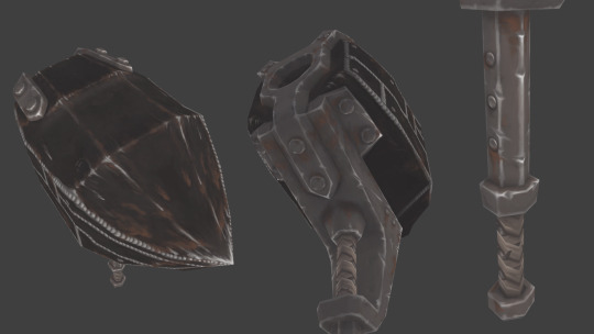

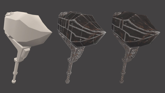
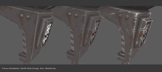

Monday Update!
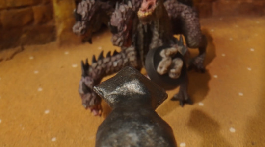
My Monster Hunter Iron Hammer project is finally, finally done!
In all its low-poly, hand-painted drab-background glory! I am actually pretty happy with this. I would've liked this done a long time ago, and even this post to be out like a week ago, but the results are pretty solid.
I learned a lot about texturing details, the scale they should be that's readable from a far (I'm looking at you guild crest) and their distribution and density around the prop itself. Also had a moment where some other stuff regarding just illustration in general clicked that caused me to redo a bunch of detaling on this - but this came out better for it. This looked pretty solid near the end, but my decision to do a final, extra bit of metal shine, plus a bit of color overlay and shading really brought it home.
Against my better judgement I'm going to do another one - the Giant Jawblade - but the lesson this time will be speed.
#Monster Hunter#My Art#3D#3D Art#monhan#props#3D prop#hand painted#lowpoly#IT DONE#I was always gonna do another one or two of these#it actually did turn out pretty good#and that presentation isn't half bad either!#deciding how scratched up the tip of the hammer was gonna be took a long time#and a lot of trial and error#because in-game the Iron Hammer tip is like spotless?#and since I wanted mine beat up I added a bit#adding a lot just did not look good#either way#THIS ONES FOR ALL MY FELLOW HAMMER MAINS OUT THERE!#also not a WIP post!
103 notes
·
View notes
Note
Hey there! Do u have any recs for skin details (or tattoos or facepaint or whatever u prefer to use) for creating a worn out, sickly sort of look? I have some eye bags cc but it doesn't make much of a difference. I hope this makes sense. Thanks a bunch!
Oh, I have a ton of skin details for that!
@sammi-xox's Cheek Overlays
@snoopy487's Face Shade
@gerbitshi's Aging Details Overlay
@nesurii's Face Definition Overlay
@faaeish's Structure & Decades
@tamo-sim's Basic Eyebags
@kismet-sims's Eyebags Plus
@pralinesims's Eyebags N08 & N10
@early-grape's Vampy Eyebags
@cerberus-cc's Frankie Set
@octetsica's Dead Vibez Dark Shadow Tattoo
@imadako's Tattoo Face Color
That should be a decent mix of face structure/eyebags/shadow/color to get you started.
72 notes
·
View notes
Text
A very lovely anon asked for some of my favourite accessory creators, and i really enjoy doing this top cc lists, so here we go!
tbh i don't use that many accessories, but the ones I do use, I really love!
@tamo-sim

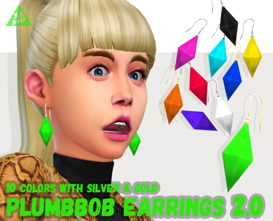


okay i'm pretty sure most people know of tamo's amazing cc, but i use their stuff ALL THE TIME so it was essential for me to mention them! Their glasses are some of THE most essential cc items in my game, and I adore all of the swatches and the fact that they're available for multiple ages! As well as their awesome glasses, they also have some great jewellery and other cas items to check out, too!
@liliili-sims4


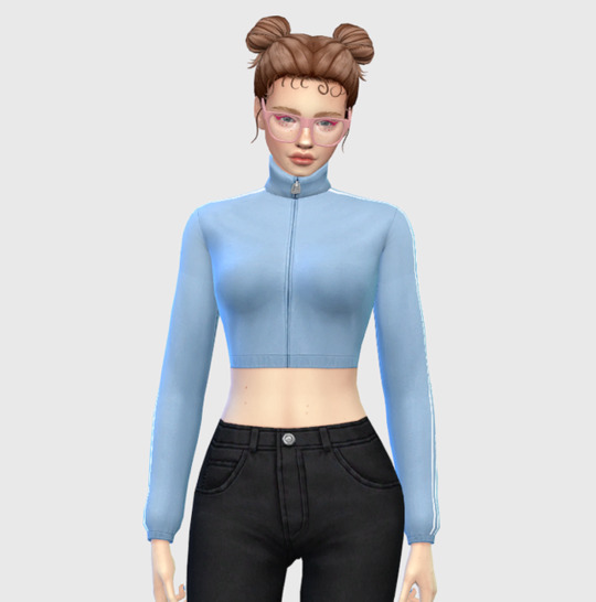
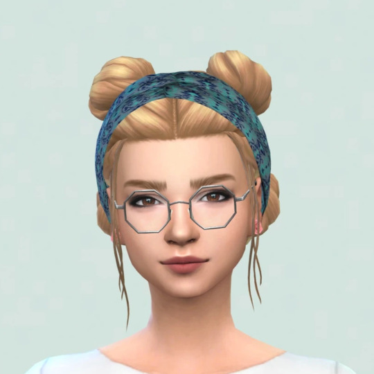
so in general, liliili has some really neat CC - i really love a lot of their clothing items, there's so many fun swatches! But their accessories are really awesome - especially hats! I love giving sims hats but it can be a struggle sometimes to find ones, but liliili has some really cool ones! Plus, a load of great glasses, and their set of accessory tops are SO cool - multiple types of shirts, including collared shirts and zipped up tracksuit ones (pictured above), all with a load of great and versatile swatches!
@tukete
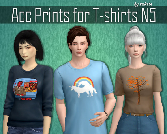
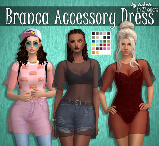


alright i love quirky earrings (more of those after!!), and tukete has some super cool ones! i LOVE the vampire fang ones, and the pumpkins! Their horn rim glasses edit (pictured above) is another MUST HAVE for me, because i LOVE those glasses but always wanted more swatches and non-sunglasses versions! AND! shirt graphic overlays!!! being able to turn any plain top into one with a bunch of fun graphics is SO brilliant, and really helps capture a sims' personality more.
@squasha
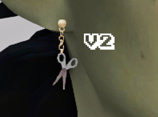
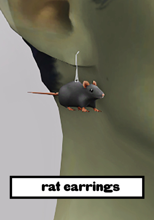


i mentioned quirky earrings, right? because squasha's cc is a GOLD MINE of incredible earrings - they do other awesome CC, too, but the earrings are of course my most beloved. sometimes your sims just need little rat earrings, okay? I'm not sure if they're still active on tumblr or not, but you can find their downloads here!
@kissyck
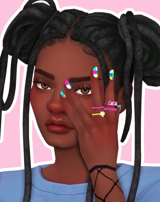

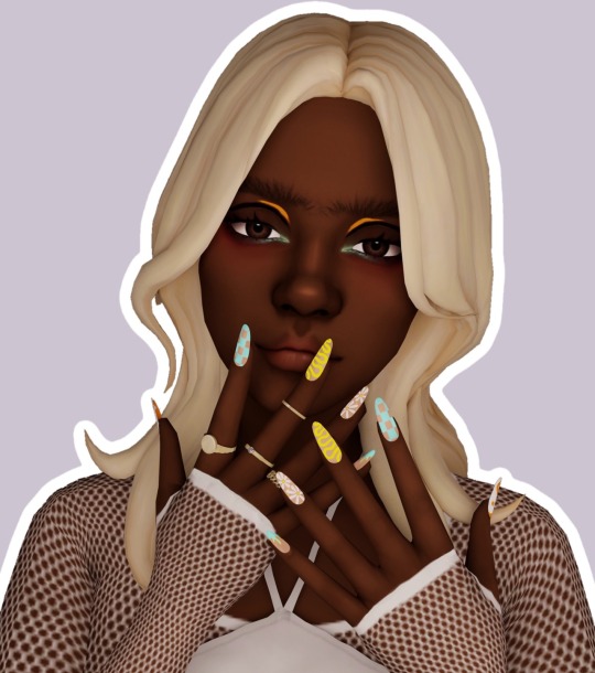

aaaaaaaand rounding this post off with my FAVOURITE nail cc! i hope that we all know by now that i LOVE lots of colour and patterns, and kissyck's nails? PERFECTION!!!!!! SO many options - not just in terms of the swatches (which are AMAZING, BY THE WAY) but nail shape/length, too! honestly, these are another 'must haves' in my CC folder, and my game would be seriously lacking without them.
I hope this helps! Like I said, I don't use all that much accessory CC, but you could never tear me away from the ones I do use, because they're brilliant and add a lot of joy to my sims and my game!
And thank you so much for your kind words? Honestly, it really made my day! I hope you have a wonderful day, lovely anon!
96 notes
·
View notes
Text
FHJY trailer frame-by-frame
because i love these freaks. ok lets get into it (this is gonna be long)

love the dome this season !! the backgrounds are beautiful. the steps up in production across FH is amazing
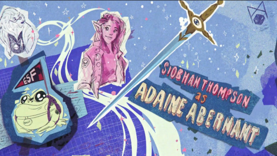
ADAINE !! JAWBONE !! BOGGY !! i think her splash art is my have from the six. i have no clue what ESF stands for so anyone lmk
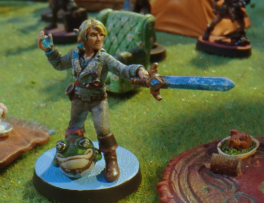
her mini is also i think my favorite, the pins on her leather jacket really sell it. minus points for boggy's HUMAN ARMS though, theres a clearer shot later on
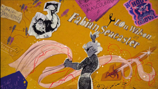
fabian time ! love the blanket. bill seacaster art as well ! god hes terrifying. the doodles on the owlbear stickers are cute too
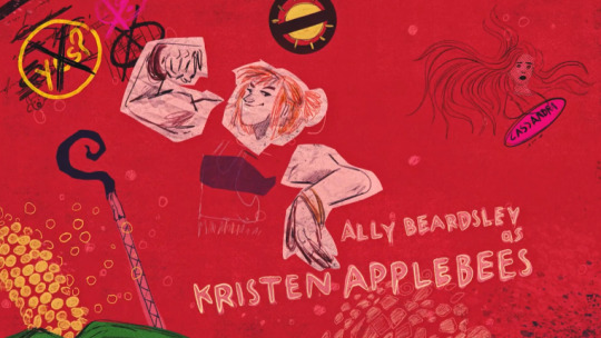
apples bee ! plus some art of cassandra. kristen is in her strong arc, which the world is all the better for. i think its also important to remember that from the start of the series kristen has always had a higher strength score than fabian (ignoring her 4 dex)
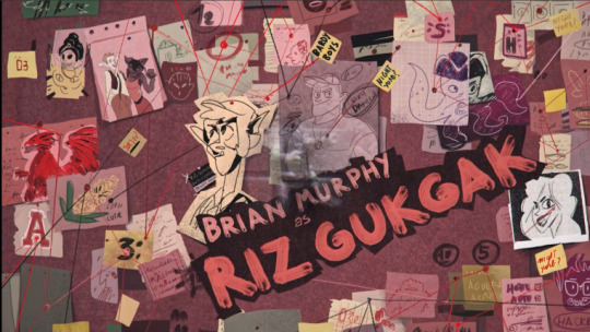
ignore the phantom riz mini, the trailer hardly stayed on his intro art for long. which is a shame cause LOOK AT IT !! the kalina picture, fuckin baron, the corn cuties, so much night yorb, bizz in the corner, captain whitclaw, coach daybreak - the man riz shot through the head in cold blood, the bardy boys !! its perfect.

fig !! sad theres no ayda art in here but theres gotta be in the series. "-and a wizards paramore, YES its part of my identity, thank you" iconic. glad her mini has a custom bass. also gilear <3<3
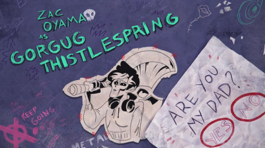
gorgug my boy. with his giant fuckoff axe. so happy his mini is including his artificer level, PLUS that probably means he takes another level in it, and unlocks infusions >:)

this two headed dragon guy. red dragon can always mean some Kalvaxis callback, but we never know. i DO know that there's a statblock for two headed dragons in Monster Manual Expanded III, so maybe brennan uses that ? or just gives a regular dragon two breath weapons. we will see

this was one of the clearest frames i could get for this art, but what we can see is still cool. love kristen in her kill bill jumpsuit. as an aside im still a riz-has-a-tail believer
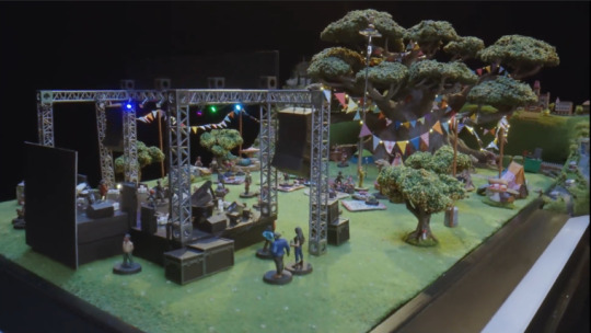
now THIS is a battlemap. im like 99% sure that that's the Thistlespring Tree in the background, and the Sig Figs are having some kind of concert here. HOWEVER, if we zoom in, it doesn't look like any of their minis are on the stage. intrigue.

the internet mall ! or something. i have no idea who the minis could be, BUT the IDK-wearing purple one in the middle could be some Guardian of Faith representing cassandra. also adaine and boggy have matching berets in the wide shot

this set i think is a gladiatorial arena of some kind? because we see a bunch of monstrosities and aberrations with this in the background later. also the big gates and monster-keeping pens are a clue.
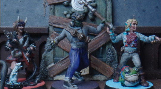
BOGGY ARMS. BOGGY ARMS. adaine is covered in blood. but fig looks to have some kind of ghost opossum familiar. BUT, my friend pointed out that it could be edgar, zayn's ghost rat ! so maybe we have him return for an episode. this house looks spooky enough. maybe mordred manor gets infested by demons or something

otyugh spotted !! my favorite monster of all time
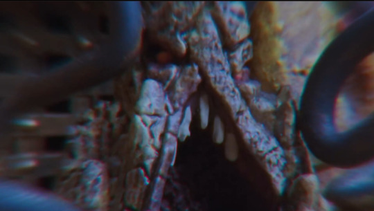
this roper-looking thing. it overlays when brennan says "an eldritch beast that threatens all of the denizens of this world," so im really thinking there's gonna be an overarching Aberration theme in these combats

also this guy. i have no clue what he is honestly. the rectangle in the background could maybe be a mirror or painting, so this might take place in the mordred manor-looking set from before
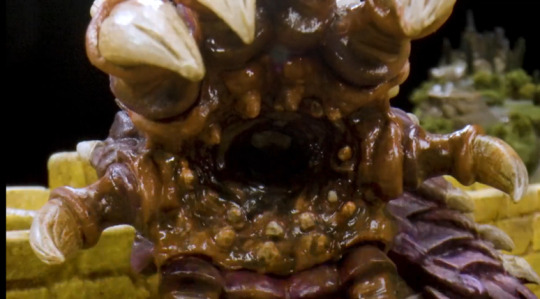
purple worm, in the gladiator arena !

some sort of ghost ship? doubtful that its bill seacaster's ship again, and the mist could mean the ethereal plane
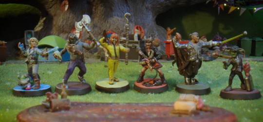
the bad kids !! just noticing that fabian's eye patch is either missing or on the wrong side
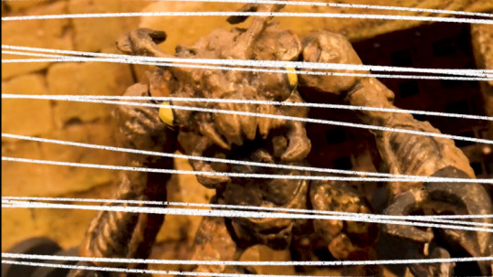
im pretty sure this is an umber hulk, also in the gladiator set
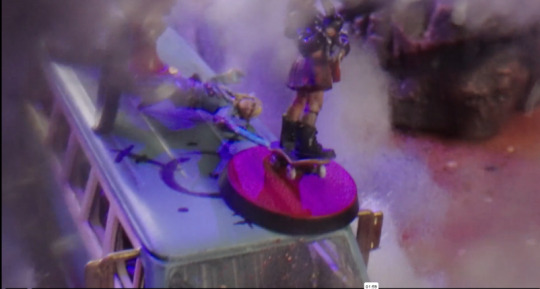
skateboard fig mini. also, this could be the hang van (?) but it also could be too long and be some kind of ghost limo. idk
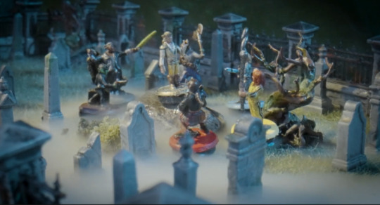
graveyard ! maybe they team up with zayn here

a blue dragon, which makes me think the red dragon from earlier isnt kalvaxis related and is just a dragon
more POV arrow shots, but this one's going into a fucking hydra. which looks like it grows three heads instead of two ? if that's what the attachment on the right side means.

this could be the red wastes ? back on the kalvaxis theory.
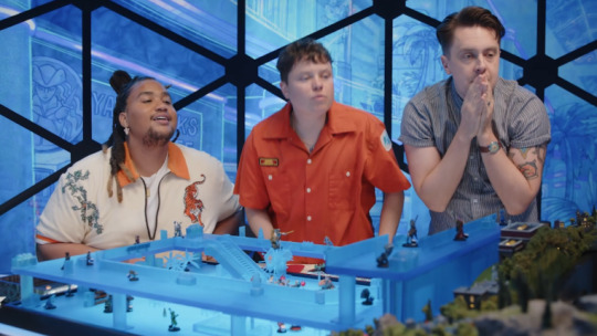
a wider shot of the internet mall. note the "YARRRRbucks" behind lou
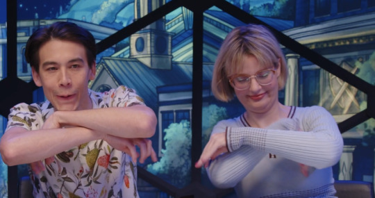
THE RETURN OF THE CRAB KING !!
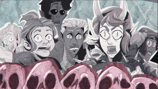
aaaand the final art frame !! fig finally gets her license (or not)
all in all 10/10 frothing at the mouth till jan 10
49 notes
·
View notes
Text
Sims 3 - Gameplay enhancing mods: CAS, Build/Buy, World, Objects + Chores & Services.
A category-based mod post. Mods and links previously featured in our Masterlist. All credits to their rightful owners.
Categories include: CAS, BB mode, (Edit) World, game objects related mods, along with chore fixes and new services.
CAS:
Truely Unique Sims
o violet on Tumblr - Pure CAS lighting mod
The Sims 3 [cas background, cas lighting mod, & cas organizers] | Patreon
CAS Sim Bin Genetics as Presets
CAS Lighting Edit
ColorLash: Eyelashes Match Eyebrow Color + Mascara
XCAS core mod: more tattoo locations, edit naked outfit, slider hack, body hair, more
Build/Buy:
One More Slot Please! (with vertical shifting)
[TS3] Catalog Search Mod | Patreon
Add Any Lot Size
No More Free Roofs by Gurra (simlogical.com)
TS3 HD Textures Series - Terrain Pack [UPDATE: Fixed road tiling]
Builder Stuff
Reworked & Improved EA Lights
Lazy Duchess — [TS3] Auto Lights Overhaul (tumblr.com)
More Light Coming Through Windows
Microwave Slots
Railings on Spiral Staircases!
Stuff on the Back of the Toilet
More 1-tile Dressers!
Decorate 6 Base Game Dressers - with more slots
"Stuff on the Fridge" Mod
What's On Your Stereo?
Showbiz, Profession & Other Trophies for Displays & Pedestals
Floor Plants Placeable On Slots [BG & SEAS]
More Slots for EA Furniture - End Tables, Coffee Tables, Windows, Bookshelves & More
Midnight Hollow Toys and All Teddies on Surfaces
Horse Trophies for Display Cases
Shelves + Extras Shift & Hide With Walls Down
So Many Shiftables! And a little more.
Shiftable Curtains
'Cortinas Festivas!' and 'Traditional Curtains' Blind Fix UPDATED!
Shiftable Televisions
Shiftable Skill and Partnership Certificates
Shiftable drafting table sketches
Fountain and Hot Tub Fixes by sydserious (simlogical.com)
Base Game Half Walls FIXED!!!!
Dangerous Stoves Mod - More Fire!
Objects:
Collection Icons and Files
Functional Washboard - Sims 4 Conversion
Harvestable Tree Default Replacement
More Harvestables
Buyable Mermadic Kelp
Same Energy Gain For Every Bed
Super Hampers -- Automatic Laundry Pick Up (Plus Bigger Hampers) by Nona Mena (simlogical.com)
Spring Harvest And CookBook
Harvestable Flowers
Better Hoverboards
Canning Station Overhaul
The Transmogrifier (aka Object Script Changer)
New and Improved 9/11/21] Functioning Well - and Off-Grid Plumbing!
No Crappy Bunk Beds!
Default Umbrellas & Parasols
Default Taxis
Digital Photo Frame Overlay Replacement
Unlocked Permanent Tents for Residential and Community Lots
Wildflower Sell Price Nerf
Buyable Beach Towels (with custom script)
Vending Machine Tweaks
Salvaged Junkyard Objects Made Usable
Make those elevators go faster! Or slower...
Toilet Tweaks
Fairy House motive tuning: Bladder and Hygiene
Buyable Culinary Career Rewards: MinusOne Kelvin Fridge by Nona Mena (simlogical.com)
[WA] Buyable Permanent Sultan's Tabernacle (Scripted object) by Nona Mena (simlogical.com)
[SEAS] Gift Pile Tweaks by Nona Mena (simlogical.com)
[SEAS] Buyable Bunch o' Gifts (Gift Pile) by Nona Mena (simlogical.com)
Motorcycle Parking Spaces
World:
Reduce/Remove Lag caused by Houseboats
SetHour Cheat
Lot Population Mod
TS3 Apartment mod - Updated for patch 1.55 - 1.63/1.67
nraas - Apartment Mod
Invisible Sim Fixer Mod by Consort (simlogical.com)
RPG Manager - Edit your Bin sims, towns and Active household!
NPCRomance
Space Rock Spawner Edit
Lunar Lakes missing EP rabbit holes by Darkitow (simlogical.com)
Auto-place official festival lots in later Store worlds
AMB Community Lots Auto Placement Fix + Add Other Lots (Compatible with Patch 1.63-1.67)
Chores + Services:
Gardener Service 2
Housekeeper Service - v1.2
Housecleaning For All Sims
Dirty Laundry Mod (Update 8/8/23) - Maid & Butler Tweaks
Butler & Maid will Feed Pets & Clean All Pets.
DouglasVeiga's Dancer Service
35 notes
·
View notes
Note
what brushes did u use to paint ur most recent post theyre so nice looking!!
THAN K U THANK YOU!
i grabbed a bunch of these procreate brushes from brush packs online, so if you want me to send them over don't be shy!! i'll gladly share :)

these are the ones i used for this piece.

the first "LB Nib Wet 1" was used for all stages of sketching plus the attempted lineart. The default Round Brush was used to lay down initial values once i had filled in the flats.
The LP Flat Knife was used similarly to the round brush, but also for blending. Not much thought went into that LOL soz
Edge Control was used for fabrics! It's a flat finish on one side and a soft edge on the other, so it came in handy for shading the clothes and soft material.
The Chinese text brush (not sure where I got it) was used for the very faint overlay gradient. It's not very noticeable under the texture I slapped over the finished thing, which does all the heavy lifting in my opinion.


(with and without texture)
Then a little Gritty Tone here and there from a brush drive I downloaded ages ago. It's rlly good!!
Here's the texture I used, just switch it over to Overlay and mess with the opacity (or don't! You do you!)

Thank u again!
19 notes
·
View notes
Text
So for reference in crossover lantern and pumpkin vs after-story lantern and pumpkin.
They're sort of duality still very much stays. But it's a different kind of safe. In after story. Lantern has to be defensive because Blue Moon literally can't see or fight back. Meanwhile. At home there's literally nothing to do. Because not only is it boring. But nothing happens. The old Tsams dimension literally has everything figured out. No one is fighting with anyone. There is no overlaying threat. And they don't dimensional hop and get in trouble. So pumpkin literally has nothing to worry about but cuddling with his dad and having fun. Lantern is the only one who knows of dangers outside.
But in the crossover continuity. Well. There's a bunch of dimensional hopping. There's a bunch of still present threats. Sure. A bunch of them are really easy to handle because they have a thousand siblings. But there's essentially a probable threat every single day. Plus people. Lots and lots and lots of people.
Lantern is still relatively the same. They have to be outgoing to ask questions. They have to be defensive because dimensional hopping just occurs that. They don't have to be so defensive though for Blue Moon. Blue Moon can do that by themselves. They're just more so the prodding person who gets to explain who Blue Moon is and help Blue Moon realize if there is danger.
Pumpkin though has changed. Sure he's still the most outgoing. But he has a lot more exposure to the dangers of the world. There's dangerous people. There's powerful people. His father goes teleporting around quite a bit. He's kind of gotten a bit more of a lanterns defensive personality. Except the kicker is. That introductory outgoingness is gone. He's still super outgoing when he's comfortable. But Pumpkin has never been initially outgoing with introduction conversations.
I probably failed to note this because he's just this puppy guy. But he will always wait for either his father or his brother to say okay. Usually it's a very simple "Oh it's okay" for after story pumpkin and he's ready to go boogie. But in crossover. Well he wants confirmation from both his brother and father. It's not the simple "It's okay". He needs to know that the person is safe. That father says they are safe. And that lantern predicts they are safe.
It's a different sort of pumpkin. One that while about as safe as his active story predecessor. Has a lot more exposure to what danger could be. And so crossover pumpkin is a bit more cautious, and a crossover lantern is a bit less.
5 notes
·
View notes
Text
Upgrade Your Steam Deck Experience with SteamOS 3.6.19

SteamOS 3.6.19 release with big update for Steam Deck support in a variety of areas, even games. Thanks to the Valve team and all the players who shared their feedback. Available for all owners via Steam. Good news, fellow Steam Deck users. SteamOS 3.6.19 has released with a whole range of updates, tweaks, and fixes to make our Deck experience even better. Let’s dive into what’s new, and I’ll keep it simple and to the point.
System Updates
First off, SteamOS 3.6.19 now runs on an updated Arch Linux base with the Linux kernel bumped up to version 6.5. What does that mean for us? It translates to better hardware compatibility, smoother performance, improved security, and a more stable system overall. If you’ve had any issues with random crashes or slow updates, those should be less of a problem now. Speaking of SteamOS 3.6.19 updates, they’ve made future OS updates quicker, which is always a win. Also, there are fixes for certain microSD cards, especially some SanDisk ones that were being misread by the Deck. Plus, session restarts should be faster, especially if your system glitches from GPU errors. If you’ve run into issues with long play sessions causing crashes (like the annoying ‘page allocation failure’). That’s has a patch too. And for those unlucky few who had corrupted Steam installations, recovery should now be smoother.
Wi-Fi and Connectivity Fixes
Steam Deck also fixed several Wi-Fi issues. You should have fewer connection problems, especially if you’re using WPA3 security or Wi-Fi 7 access points. Plus, Valve’s handheld should handle cursor alignment and performance overlay glitches more effectively. Which is also a nice touch.
SteamOS 3.6.19 Display and Performance
For anyone using the OLED model, display issues like weird refresh rates, gray lines during boot, or random screen blacks should be gone. There’s also better color balance and gamma uniformity, meaning the display should look crisper and less “greenish” in low brightness settings. VRR (Variable Refresh Rate) issues with external displays have also have a fix now. Due to make gaming on bigger screens a better experience.
Bluetooth and Controllers
Big win for Bluetooth users—there’s improved pairing for Apple AirPods, and new support for HFP and BAP Bluetooth profiles. They’ve made sure only certain Bluetooth devices (like controllers) wake up the system. So your Deck won’t suddenly power on when you don’t want it to. Some controller bugs have been fixed in SteamOS 3.6.19 too. Check out the gear that now has support through each link, so you can get exactly what you need. Especially for the DualShock 4 and DualSense controllers. Also, Steam Deck now officially supports the ASUS ROG Ally extra keys, Raikiri Pro controller, and Machenike G5 Pro controller, which is great for those who use these peripherals.
Desktop Mode and Docking
If you’re a fan of Desktop Mode, there are a few KDE Plasma updates (now at 5.27.10). SteamOS 3.6.19 also offers a bunch of fixes to ensure smoother switching between Desktop Mode and gaming. External display issues (like blank screens or crashes) should be fixed now too. For those using the Docking Station, there are new HDMI CEC features, meaning you can control things like waking up the TV or switching inputs with your Deck, which is pretty neat.
Battery Life and Power
Steam Deck LCD users will notice up to a 10% battery life improvement under light load situations, which is always welcome. There’s also better power management with fixes for things like random power LED blinking.
SteamOS 3.6.19 Game Fixes and More
A bunch of game-specific fixes are also apart of the changes. Titles like BlazBlue Centralfiction, Warriors All-Stars, ELDEN RING, and Disgaea 5 Complete should all run smoother without those annoying display glitches or crashes. Even game recording should work better with fixes for colors and capture issues.
Final Thoughts
Overall, this is full of useful upgrades, from better Bluetooth and controller support. Also, smoother display handling and more reliable updates. So, if you’ve been running into any of these issues. SteamOS 3.6.19 should make your Valve handheld that much better to play games. Time to get gaming and enjoy these fresh fixes. Available for all owners via Steam.
2 notes
·
View notes
Text
took a bit but that one post that i said "ten notes and i share my funy godgame cards" got the required notes. ideally i'd be reblogging said post and adding this under it but the boopometer is doing strange things to my dashboard right now.
To preserve everyone's dashboards because cards is big: READMORE! This dish contains a lot of spicy rambles of autistic machismo!
To get it all out of the way: none of these cards will enter the steam workshop. They're just funny cards for get togethers with the pals.
you will also find that i am super inconsistent with wordings and also forget important clarifications. but! that just makes the cards more fun. or less fun. it depends on how often the readers of the cards bicker, which in my case is never often. (i've only played with 2 friends thus far, but I have faith even still.)
i also cannot explain the mechanics of godgame. because.... there's a lot of mechanics. ...I mean, I can, but it's a lot of effort, especially when I don't physically have the board in front of me.
anyways here's our first card... one of my lobcorp OCs in fact!
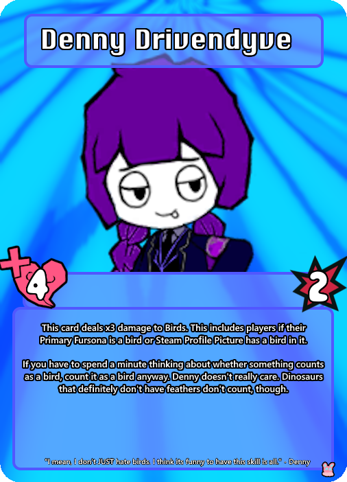
Denny.... she's one of the originals. She's not as funky as everyone else so she doesnt see much sun nowadays but! I can count on her to be easy to make a card for at least. As the blurb says, she's not ALL hating birds. She, like, has a boyfriend. It's just very funny to play it up for the bit. (She also is easy to rile up.)
Side Note Number One... I have formats and shit. However I dont know and dont want to learn how to work photoshop. so it's all a bunch of pngs that i layer on top of one another individually rather than some sort of photoshop type thing.

this is about what it looks like. dont worry about what "overlay jewel office" means. i am not at liberty to explain jewel office because i didnt create it; i just invent the cards...
OK, card number 2!

sootpy. i drew Soot (another lobcorp OC) as peepy once. i was looking in my doodles folder for an image of another guy ive got in here and i found him. I fudged this card up in about 10 seconds not counting time spend actually putting the card together.
Actual Soot might function entirely differently from sootpy. i dont think the peanut part is capable of functioning.
Okie, next caaaaard...!

Memory Maggot! memory maggot's from my original universe type thing i call elsewhere; hence the unique background. It's a champion card, but since i'm biased and like making card backgrounds, cards from elsewhere get their own backgrounds.
originally this card had different (albeit not by much) art, but then I made my silly memory maggot pixel art and liked it better. memory maggot's a lot more than just memories, but i thought that idea for a card would be funny. and speaking of elsewhere champions...
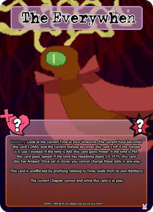
this is the Everywhen. he also lives in elsewhere. i designed him, but at the same time i don't hold full custody over him so to speak. he's goofy levels of busted, yes, but I think Champions are allowed to be just a little bit like that. For fun.
I don't only make cards of my own OCs, though!
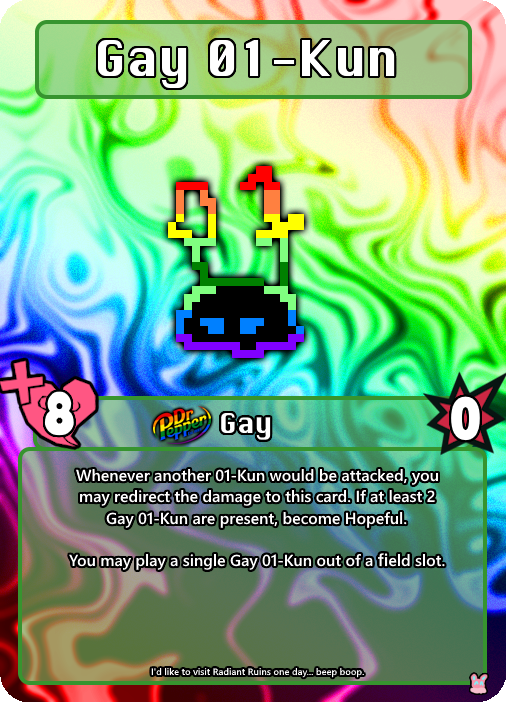
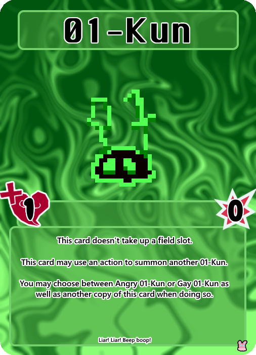

Example: these are the 01-kun, they're from yume 2kki. They don't actually have any of these abilities ingame, but I think I'm allowed to fudge things up a little bit when it comes to these sorts of things. Plus... it makes for a funny archetype.
Yes. The status icon for gay is dr pepper gay icon. I made that myself, actually. In the past I made a whole bunch of just. Dr pepper pride logos for some reason when I made drinking the stuff by the gallon my whole personality... I still have them, and I figured "why let them go to waste?"
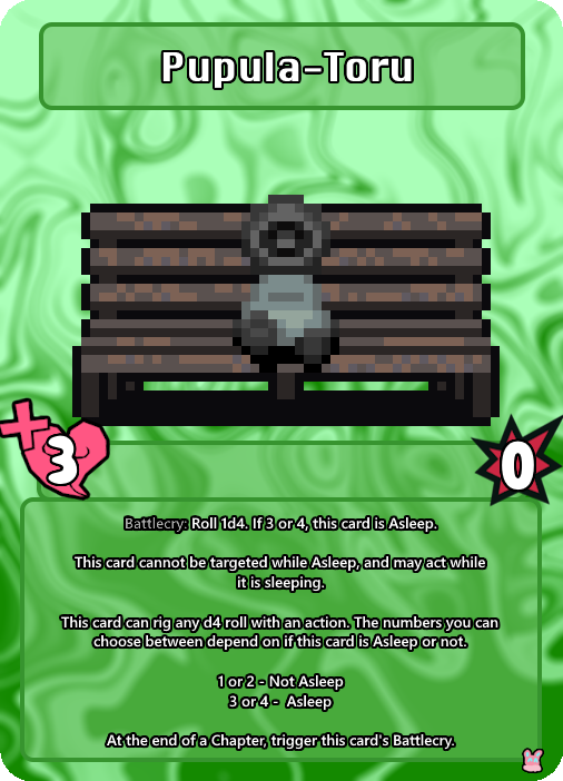
This is Pupula-toru, also from Yume 2kki. This one actually has some basis in how the little guy appears ingame. Even if it is a little complicated for a basic card...
See, in yume 2kki, there's this thing called Variable 44. One of the easiest ways to check the status of this variable is to visit Pupula-Toru, as they're not too far in the dreamworlds. They'll be in one of 4 different poses depending on the variable, and two of them are asleep. Variable 44 is what changes other different forms of per-dream RNG, so knowing it is pretty useful for looking for certain things. Therefore, checking on Pupula-toru has a slight rng-manipulation association in my head, hence how it works.
...Well, errors are popping up when I try to post more images, so now I think I'll just make a reblog chain, or more posts and I'll add them to this one later. There's way more cards I wanna show off..........
#all the stuff in the chain will ALSO be readmore'd if i go that route.#so now its time... for Kira's God Game Moments.
5 notes
·
View notes
Note
hi what sims mods are you using for the plus size characters bc??? Holy shit she's so pretty
I am using so many mods tbh it's hard to pinpoint; Bea alone has at least 80 on her, but for plus size chars, DEFINITELY get body slider mods that let you push parameters more (there's a bunch on thesimsresources)
There's also a bunch of very good plus size skin overlays on there, too!
48 notes
·
View notes
Note
question. what do u use to animate . ?.!.?:.?
I used procreate, capcut, and prequel!
Procreate has an animation feature ( it’s not great but it works for me ) and so use that to make my gifs
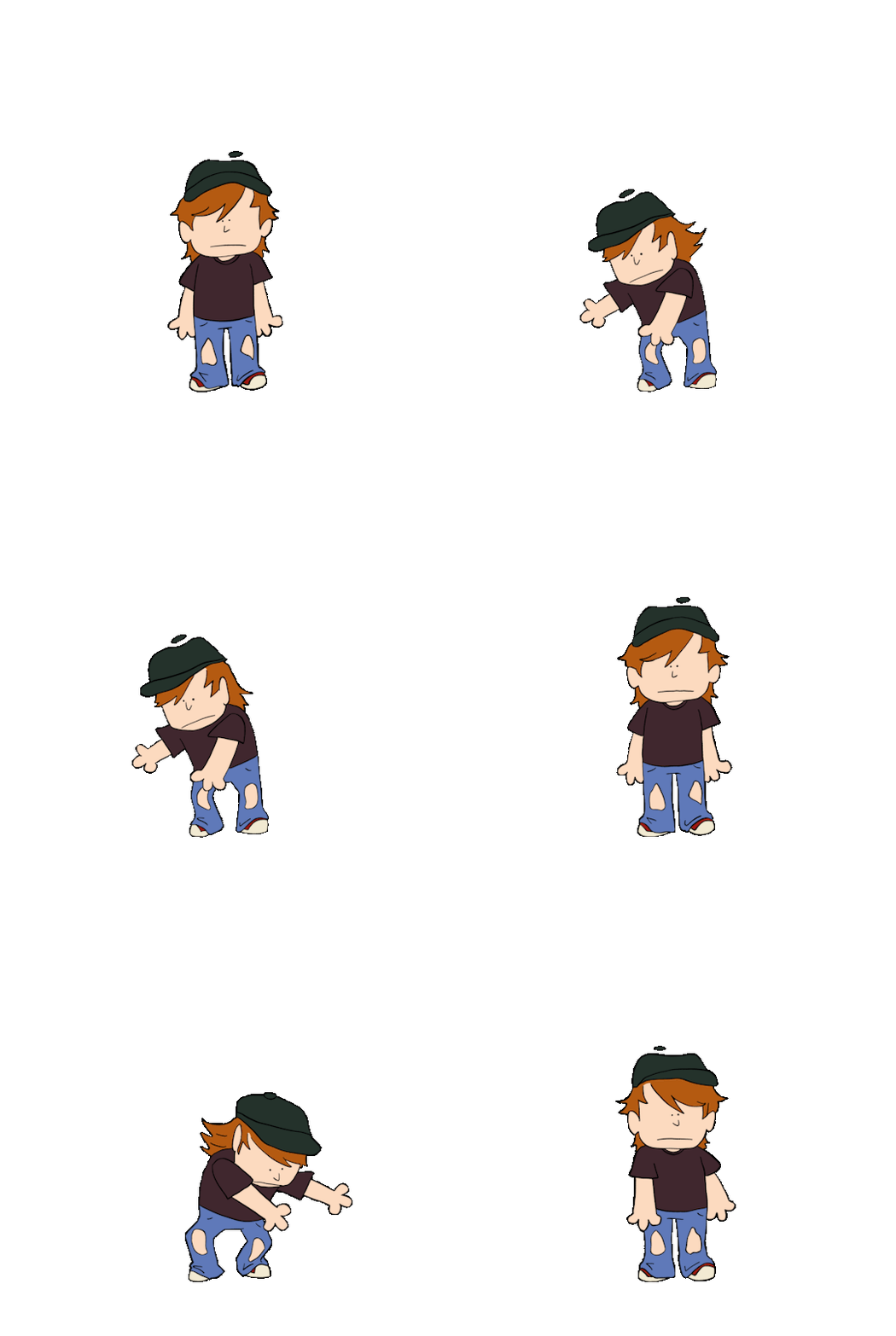
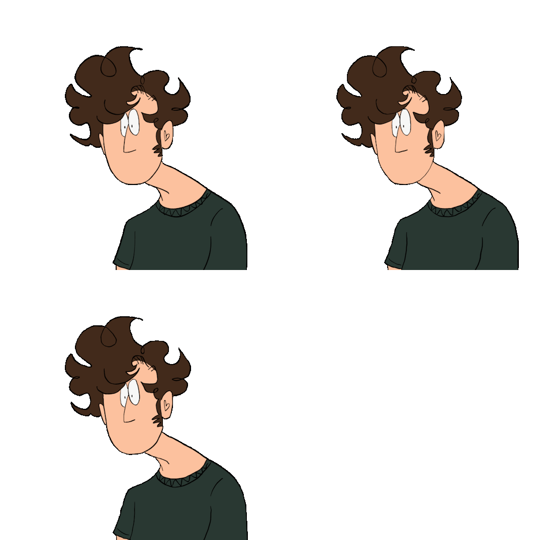
I export them with transparent backgrounds. I then draw the backgrounds
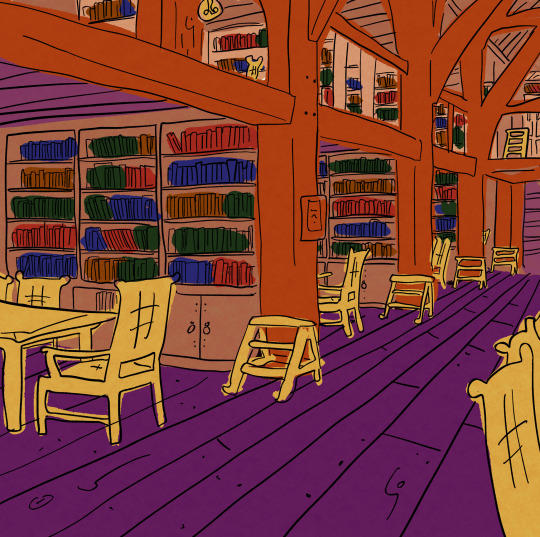
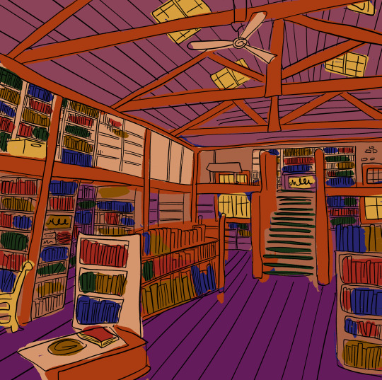
( second one is pretty blank in the middle cus joes head covers it plus I was tired and over it)
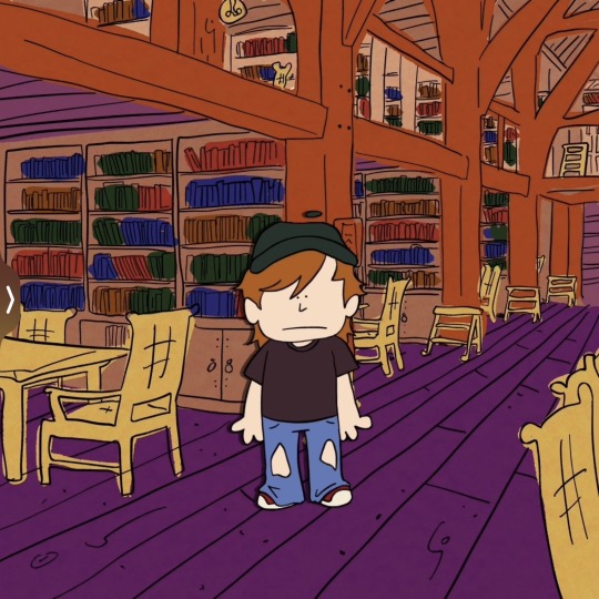
I then put the backgrounds into capcut and add the transparent gifs as an overlay. I also duplicate that layer, use the filters to make it black, shift it a little and change the transparency to add the illusion of a shadow from the “ cel “
I export and put them into a new capcut file. I drew a bunch of mouths and overlayed them on top to do the lip syncing. Export finished video.
Obv you could keep it like that but I like my stuff to look older so I then use the app prequel ( also I only use the free filters cus I’m cheap )


Here we have plain, first round, and second/last round of filters.
First round is to make it look older and like it’s traditional cel animation. I like to use the effect “ lomography “ bcus of the blur. I then use the filter “ brownie “ cus it kinda dulls everything. And then in adjustments I make the exposure stronger, contrast less, highlights down like all the way, a little bit of fade, grain, and dust ( plus others you gotta fiddle every time )
Second round is to make it look like your watching it through your old tv/was ripped from an old vhs tape. I like to use the effect “ vhs “ and then in adjustments fiddle around again, I like to use temperature adjustment to make it cool toned cus I feel like that gives it more of an 80-2000s look.
#no one asked for that much detail#but whatever I’m procrastinating#how to make your art look older was something I struggled with for a while#and figured I shouldn’t gatekeep#art tutorial#retro art filters effects#my art#art#80s art effect
36 notes
·
View notes