#plus I'm really in love with this colouring style
Explore tagged Tumblr posts
Text


Forget about the tortoise. They just teased us with Big Dragon S2 and... where is that random child coming from??
#big dragon#big dragon the series#jane watches stuff#mosbank#not the biggest fan of adding a child to the mix but that's just me being uninterested in (fictional) children lmao#i'm sure i'll love it#plus we haven't really seen this trope play out in thai bl yet#that being said#the mv was so beautifully shot and colour-graded#i'm not surprised mi directed it again#i really really hope he gets to direct season 2 as well#i love his style so much
48 notes
·
View notes
Text
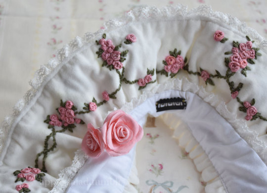
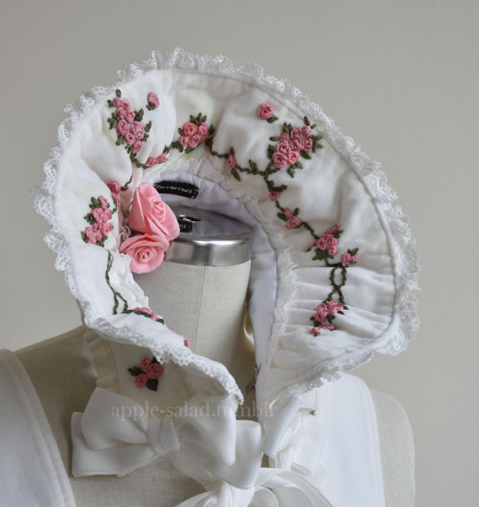
Rose Ribbon Embroidery "Mini" Projects (for BABY NYFW) Part 2: Embroidered Bonnet
I decided semi-last minute to attend BABY's fashion show at NYFW!
BABY had mentioned in their NYFW brand description that their newest collection would be a return to their origins, as well as presenting archival items.
You have to dress to impress for NYFW, right? So of course, I had to pull out all the stops and wear my Rose Ribbon Embroidery.
Also at the last minute, I decided to make a few extra complementing items...
A matching RRE kumya JSK, and a bonnet.
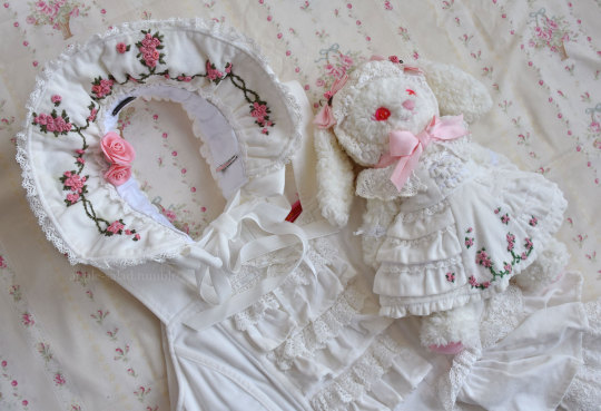
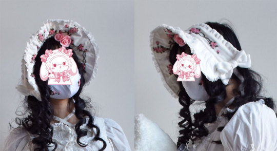
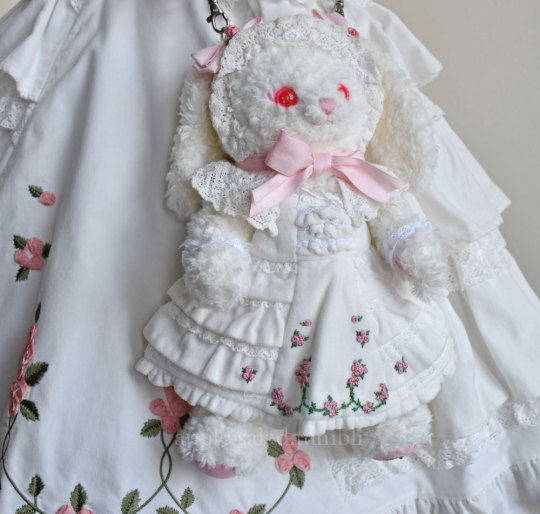
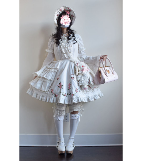
What follows is more of a sew-along/journal rather than a tutorial or guide, mainly for my own memory's sake. But if you enjoy looking at my process (sometimes sloppy), I'm happy!
Also feel free to take a look at the more romantic process video I edited.
Part 1: Kumya JSK
Part 2: Bonnet (you are here)
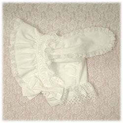
This post will be my process pictures and notes for the bonnet, as well as a matching mask as a bonus.
I don't believe BABY released matching headwear for Rose Ribbon Embroidery, although I've seen an unknown velveteen headbow with rose lace sold with RRE before.
BABY usually coords RRE with the bunny ear bonnet since Ichigo wears it this way in Kamikaze Girls.
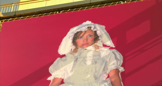
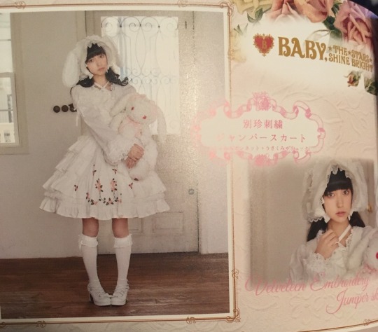
I do own this because I wanted to wear an Ichigo-like outfit at some point, but for this occasion I decided to do something different and make a "matching" embroidered bonnet.
I originally wanted to make a hard bonnet with a very defined brim that could show off the embroidery clearly as I don't really like soft bonnets, but when looking at existing BABY bonnets as a reference, it doesn't look like hard bonnets were a thing back in 2004 (and as it is, BABY rarely releases hard bonnets). So to keep with the oldschool theme, the bonnet is a soft one, although I later make some decisions to make it slightly more structured.
The next decision to make was full bonnet vs half bonnet. The bunny ear bonnet is a full bonnet and I think this is technically more "period accurate", but I am not a fan of how they look like a weird hood from the back so I opted for half (plus, that makes construction and patterning easier for me).
I still used my own bunny ear bonnet as a reference for approximate brim dimensions!
The kumya JSK was a little easier to carelessly sketch out and embroider since I was copying 1:1 from an existing design, but I felt I needed to do at least a bit more careful planning for the embroidery on this. I'm quite bad at creating embroidery designs from scratch, but with the mental image of the rose clusters and swags of vine, as well as referencing the embroidery from the film, I came up with this:
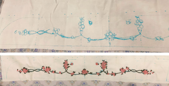
I wanted to emulate the embroidery style of the Momoko's (well, in reality likely the embroidery designer Onoe Megumi--unclear if she did the actual embroidery, but it's likely) embroidery, which I figured wouldn't be too difficult if I was also embroidering by hand.
For material, I am using the same velveteen I used for kumya's JSK. Not my first choice and I actually purchased some thicker looking 100% cotton velvet that I thought would be more similar to the original JSK material, but was worried it wouldn't arrive in time and wanted this project out of the way in case things went wrong/took longer than I expected (it did arrive about a week before the event, but it was totally wrong IRL so I'm glad I just went with this acceptable option). I also bought some more torchon lace, so I used that and another lace from my stash.
The colours of the embroidery in the film also seem to be quite different than BABY's dress. I'm not sure if the pink of the roses has faded over the years, but it has a slight salmon tone whereas the film's roses seem to be more of a pale cool/neutral pink (hard to tell with the yellow tint of the entire film) with some variegation. I love the colour scheme of the film's embroidery, but to keep things coordinated I try to opt for the same colours as the actual dress I have.
I only have white silk ribbon in the width I wanted, so I opted to attempt to dye it to match. Previously I have used alcohol markers to colour the embroidery afterwards, but I find the colour hard to control and it tends to bleed into the fabric. I've also tried colouring the ribbon with the marker before embroidering, but without heat setting the colour transfers onto the fabric as well (and it seems like trying to do so with the amount of ribbon I need would be a waste of ink).
I don't have a lot of experience with it, but since the ribbon is silk, acid dyeing seemed like the way to go.
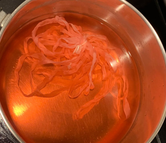
Very interesting photo of ribbon in pot (the pink ribbon gets eaten up by pinwheel roses much faster than I expected so this is the second batch I had to dye--not ideal as they are definitely slightly different in colour but it's not too noticeable). In total, I think I had to dye 3 batches of ribbon and 4 for the pink ribbon as I just barely ran out near the end, and they are all slightly different colours. Thankfully the undertone is the same so it's difficult to tell unless you are really comparing up close.
I thought I would take this opportunity to use the "peach" acid dye that I bought years ago for another project, but this ended up being a mistake as the colour was totally off (maybe the red dye was too expired). I ended up using my regular fiber reactive procion dyes (with heat/acid), because I have many more colours I could mix together, and that was much better. I really should have done this from the start as I wasted perfectly good silk ribbon by making it too dark/off for my purposes (I ended up overdyeing it in pink so it's a usable colour now, but not for this project).
The silk seems to take on dye extremely fast--even just heating up the dyebath will colour it. In some cases I removed the ribbon before adding any acid at all because I felt the ribbon was already getting too dark.
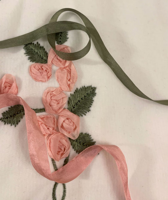
I managed to get a fairly usable mossy green colour for the leaves and vines, however the pink still ended up being a little off/dark compared to whatever BABY used. It's not too bad here as one strand of ribbon, but when many layers are on top of each other in a rose it seems pretty dark. While not ideal, I think it's still okay, especially considering the embroidery colours used in kumya's JSK match nothing else (many pinks will be going on in this coord).
After dyeing and drying, the ribbon is super wrinkled so I ironed it and wound it on some spare card so it's ready to use.
And now I can start the arduous process of embroidery.
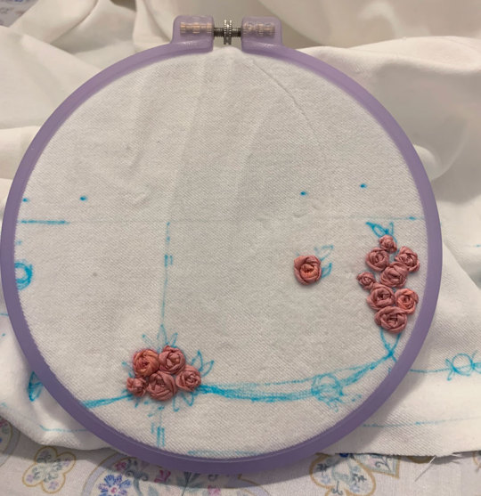
Like before, I mainly use a combination of ordinary ribbon stitches, pinwheel roses, and french knot roses. However, this time I try harder to duplicate, or at least evoke the appearance of the embroidery of the film.
It's interesting how plain and somewhat boring the roses look on their own, especially with this monotone colouring. The varied colours of the film's embroidered roses are lovely, but I decided against it here because the BABY dress has monotone ribbon roses.
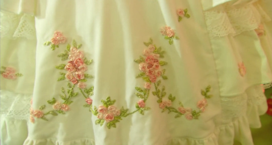
The roses definitely seem to just be pinwheel style which is very easy and doable, however I am a bit more confused about the leaves. They look like a number of straight stitches in various lengths and directions that fill in a leaf-like shape. I have no idea if this technique has a name and if there is a proper method for it, because I am a silly beginner who is very uneducated in embroidery.
Anyway I do my best and hopefully I got close enough. Ribbon embroidery is really all about the texture, which is really lovely to look at. Except I have trouble looking at my own work for too long because I start nitpicking all the mistakes I made...
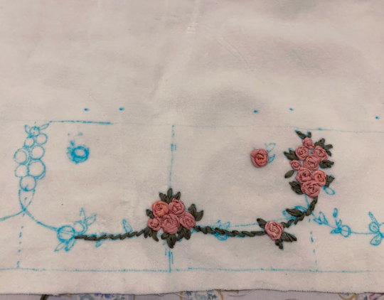
Adding the green and leaves really helps the embroidery come to life.
I took even fewer pictures of the embroidery process than kumya's JSK this time because it's not that interesting. I was definitely getting sick of doing the same pinwheel over and over...
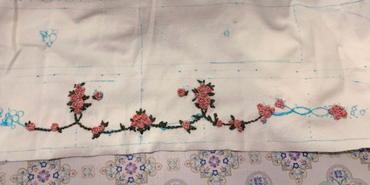
I stupidly decided that aside from embroidering the front of the brim, I also wanted a little bit of embroidery on the back of the brim for interest, as well as on the side.
The designs I drafted out for these two pieces is much simpler, but still, more work....
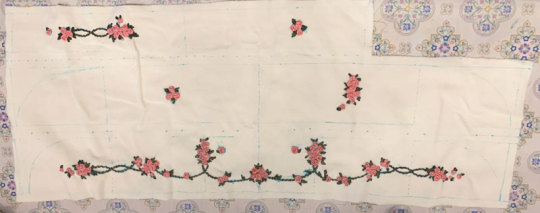
Almost ready for construction! Hopefully a lot faster with the handwork out of the way.
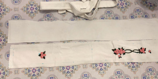
I iron on some interfacing onto the back brim panel and the bonnet band for slight extra stiffness.
The bottom part of the brim is plain cotton sateen because I was worried that the part that touches the head would get dirtier more quickly it if was velveteen.
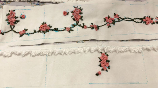
I wanted some lace gathered around the brim and an extra velveteen ruffle on the back of the band, so I prepare that now. The lace is gathered with a single gathering thread and sewn down before sandwiching between the two brim panels.
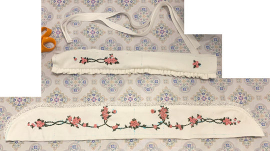
Brim sewn and topstitched (and band is ready for attachment).
The upper flowers ended up a little closer to the top of the band then I intended, but I think it's okay.
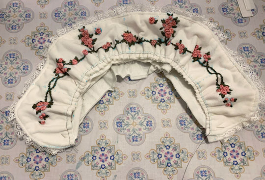
Gathering brim and attaching it to band. Because the velvet fabric is so thick, the usual "sew one line of stitching with a wide stitch length" not only made the fabric incredibly difficult to gather, but the thin polyester thread also continually broke when trying to do so. Therefore, I opted for an alternative method I think I'd remember seeing in my sewing machine manual of all things--a zigzag carefully stitched over a central gathering thread. This worked much better, although I probably should have used a thicker/extra strong thread as the central gathering thread because it did break the second time I had to gather the brim due to a mistake.
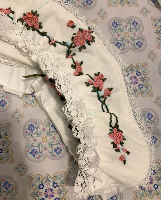
I also add a bit of lace to the inside of the brim. I think this adds some luxury and frilliness between the head and the bonnet's brim, so I wanted to add a small width. I probably could have used even more of the lace's width since it turned out very subtle when worn. But I still think it adds a small amount of interest to the innermost part of the brim and was worth adding.
Unfortunately here after sewing on both brim parts I realize that I gathered both using an incorrectly marked centre line, so I had to rip it out and do it again ;_;
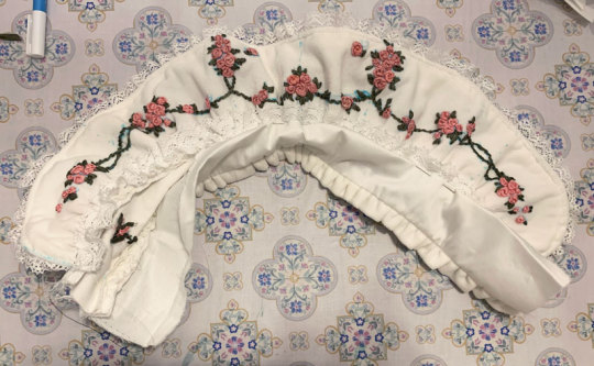
Next, I can carefully align and pin the bottom of the brim to the bonnet and sew it down. I tack this down by hand because I'm not skilled/accurate enough with a sewing machine to topstitch both sides nicely at once (look closely, and my messy stitching is quite visible...)

I also fold in the raw edges and finish the sides of the brim by hand, leaving some openings for ribbon ties.
At this point I spray almost the whole bonnet with water to disperse and fade my markings. Unfortunately, some of the earlier batches of ribbon that I dyed (Can you tell the variance in the 3 dye batches I needed to do?) were probably not washed well after dying and seem to have bled into the fabric from the water...but hopefully it's not too noticeable.
Next I topstitched all around the brim and attached the ribbon ties.
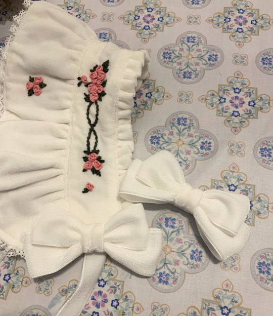
I bought some double sided velvet ribbon in my last minute supplies shipment and made some bows from it. I think the material is a little thick and petersham would have worked alright as well, but the consistent velvet material feels more luxurious, doesn't it? I also think as an added benefit (?) the ribbon being plush and double sided made the bows more puffy looking.
I add some clips to the sides and a toupee clip to the top for security. I opted for a toupee clips because I think it's really the way to go if you don't want the head item to move at all, no matter how thin or slippery your hair.
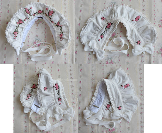
Finished.
Bonus 1: rose accent pin
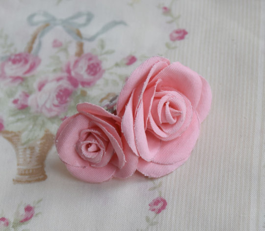
I was in a bit of a rush at this point as it was near the end of the week coming up to the show, so I didn't take any photos of the process here but the technique and templates I used were identical to my handmade faux rose rosettes I made for UM (and the bonus corsages). I have a post with all the details of this sitting in my drafts that I will post eventually, and I will update this post when that happens.
The brooch was just meant to add a bit of 3D faux flower accent to the bonnet, bringing in the rose motif even more. Partially inspired by the faux flowers BABY adds to their bonnets sometimes, like on Milk Tea Doll.
The fabric was "custom dyed" with the same fiber reactive dye I used for the silk. The fabric was further starched, cut out by hand, and shaped with flower iron tools before gluing together.
Bonus 2: matching embroidered mask
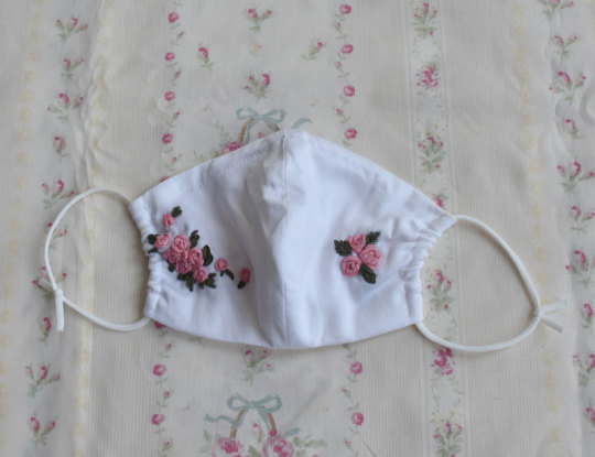
I wasn't sure about whether or not I wanted to wear a matching mask, but decided to do so for situations when I would want my face at least half-covered in public. I didn't really expect to be visible in fashion show pictures as someone in the back, but just in case. (I think this decision was worth it, although my makeup transferred all over the thing and in most pictures my face was even more unflattering. eh well)
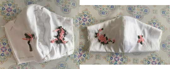
I forgot to take a lot of pictures of my process for this, but it's very uninteresting and not dissimilar from every other mask sewalong from 2020. I draft out a design similar to the bonnet motifs on both of my mask panels (cotton sateen), and embroider.
I should have embroidered closer to the centre of the mask because when worn the embroidery is not very visible/covered by my hair at the sides. What can I do since the panels were already cut though...oh well!
The lining material is some Japanese CLEANSE Ex fabric I had bought previously to make masks during the pandemic. It's supposed to be antibacterial and antiviral, as well as washable, but I have no idea how well supported those claims are.
Sew together normally on both upper and lower sides, turn inside out, add a channel for nose wire and side channels for elastic.
I also have some mask elastic on hand so I use that.
And the finished outfit again with all my items~
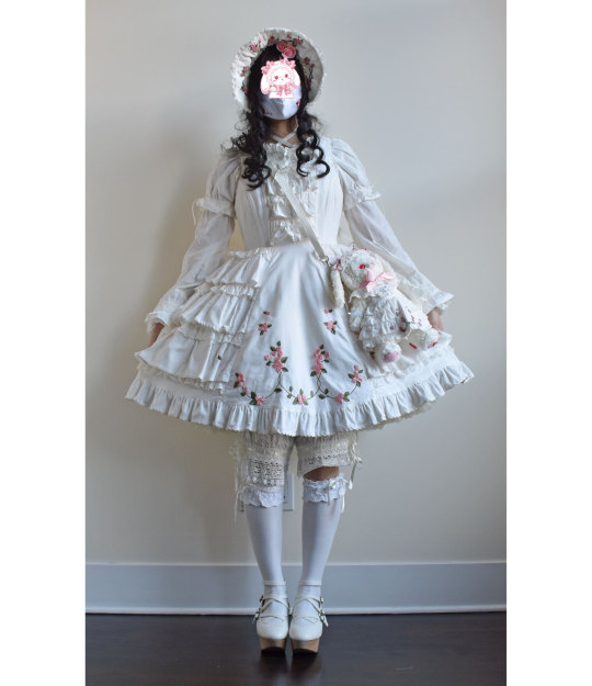
Thank you for reading! If you ever feel inspired to take up a similar project, such as the kumya JSK, I'd love to see it!
226 notes
·
View notes
Note
I loved your Ramadan works with the JJK characters. It's so nice to see another muslimah who writes for JJK :)). I am not sure if you are still actively posting, but would you consider writing a piece with the cast's reaction to the hijab and abaya? JazakAllah!

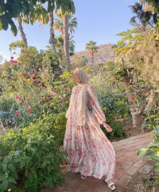
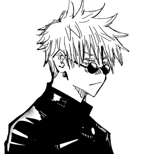


jjk characters with a muslim/hijabi reader [gojo edition]
gojo x reader [platonic or romantic it's open to interpretation]
w/c: 955 words
a/n: i got so carried away writing gojo's i realised if i added more characters, it'd be an incredibly long post. so i took them out and i'm gonna post them over the next couple weeks <33 so far i have megumi, nanami, itadori and nobara lmk if you want anymore characters :)) also guys pls feel free to send requests/suggestions :))
also anon you're the sweetest person every thank you so so much you've single handedly given me motivation to keep writing and ive got more works coming out. i hope you're having an amazing day inshaAllah bestie 💗

Gojo definitely thinks you’re doing a cosplay of some sort. It’s not uncommon in certain parts of Tokyo, so it’s safe to assume so most of the time. Even he’s been mistaken for Kakashi cosplays a lot of the time, with his black get-up and blindfold.
But then he sees you wearing different colour hijabs and abayas, and sometimes even a cute lil jilbabs and it confuses him. Suddenly, the thought occurs to him that maybe you’re not in a 24/7 cosplay, like him, and actually just dress covered head to toe.
As soon as he reaches that epiphany you best believe he pesters you and badgers you for answers. “y/n are you cold? is that why you’re always dressed like that?”
At first, you think it’s funny to give him nonsensical answers because he keeps saying stupid things, but you realise he's being deadly serious. plus, he gets increasingly bothersome, so you eventually get annoyed from all his questioning and just tell him about how you’re a Muslim and observe hijab.
He actually takes it quite seriously and apologises for lowkey making fun of your shitty cosplay in his head. He’s ignorant, not prejudiced, so he defo takes it back and, for once, takes accountability and apologises for his actions. He’s personally not a believer, but he respects it.
Once, you complained about how expensive abayas were becoming and how you just wished someone would just buy you a whole wardrobe of them to all the students, and he happened to overhear.
Literally days later he’s at your door with multiple bags full of abayas and hijabs and all sorts of modest clothing. You’re completely shick shack shook and don’t know what to say. You defo cry and try to hide it with your headscarf.
He barges into your room (after making sure you’re fully covered, he's learnt from that mistake) and spends the next 5 or so hours showcasing each item and telling you where in the world he got it from, the materials and everything.
He has really good taste in colours and styles and knows what would look good on you. You’re literally set for life. Absolutely refuses to let you pay him back. Every single time you mention money, he shuts you down and changes the topic entirely.
In summer he’s shocked you look relatively calm and okay. He’s literally boiling his bum off with a tank top (I’m laughing at imagining Gojo in a white tank top like an immigrant dad lmaoo) and you’re looking as fresh as daisies with everything covered. He asks how you're not melting and you’re waffling to him about airflow and how it’s actually quite breezy, and you’re not wearing anything underneath, so it’s fine, and he stops breathing and short circuits.
He looks at you with his eyes wide, and his sun reddened face goes a shade darker. "You’re not wearing anything underneath?" He takes it the completely wrong way, and you realise what it sounds like, and you’re both a bumbling mess.
It's the first time anyone’s ever seen Gojo that flustered.
Also some quickfire headcanons:
He genuinely thought you slept and showered with your hijab on, so he burst into your room one day and you screamed and he immediately warped somewhere else when he saw you wearing pyjamas (he didn’t see anything above your clothed knees, he panicked and left so quickly plus he was scared to look).
Gets you cute little clips to put on your hijab. He thinks they’re pretty.
Is absolutely devasted you can’t have mochi and some other desserts because they have pork gelatine in them and he always tries to find vegan alternatives.
Purposefully steps on your abaya/dress when it's flowing and he's behind you to annoy you.
Has extra pins pinned onto his uniform for you just in case you need them.
This is a secret he’ll take to his grave, but he actually tried to make you one of his favourite desserts you couldn’t eat (he threatened the bakery for the recipe), but it went so disastrously wrong he gave up and didnt want to face the embarrassment.
I’m talking melted plastic in the oven, small kitchen fire, eyebrows singed, and potential carbon monoxide poisoning bad.
You wore this specific shade of light blue once with a cream khimar, and for some reason, he was absolutely obsessed with that outfit. It wasn't until Nobara pointed out that your outfit matched Gojo's colour scheme did he finally realise why <33
The abaya sizing really confused him and he was so baffled as to what the numbers meant. Wdym size 52 what does that even measure 😭😭
He was faffing about for 2 hours before he realised he could've just googled it, and he felt absolutely stupid about it.
Whenever he sees a bit of your hair accidentally peeking out he covers his eyes and screams at you to "cover yourself woman goddammit". He's so dramatic honestly.
Thinks it’s hilarious seeing you run in your abaya. He thinks its the funniest thing in the world.
Once (he's lying defo more than once) he was zoned out while watching you and his heart started beating faster when he realised how beautiful you are with your long dress blowing in the breeze and your hijab lightly fluttering. You looked ethereal. He didn't know what to think, and he pushed his feelings back down. Deep deep down.
He doesn't need unnecessary feelings complicating things, but for some reason, his heart still yearns for you.
He also makes terrorist jokes about you to you. I will not explain that one, but he 100% does.

© ffsg0jo 2024 — do not plagiarise, repost, modify, or translate any of my work in any way, shape, or form; i will piss in your cereal if you do. all work belongs to me and me only.
#🌻.sunspell#🌻.nonny<33#jjk x reader#jjk#jujutsu kaisen#jujutsu gojo#gojo satoru#jjk satoru#satoru gojo#gojo x reader#satoru x reader#gojo satoru x reader#satoru gojo x reader#jujutsu kaisen x reader#jujutsu gojo satoru#jjk gojo satoru#jjk satoru gojo#muslim reader#gojo x muslim reader
170 notes
·
View notes
Note
Hi! i’m going around asking different clangens for different clangen reccs bc I’ve been interested in reading more! Do you have any reccs?
Oh I DO !!!
A lot of the blogs I follow feature heavily stylised characters and colorful pages, wich I love. For some of them I'm not even quite caught-up but I just love seing their art coming across my dash because I love making my tumblr feed an inspiring place (don't we all) Also, I'm fairly new to the Clangen side of the WC community tbh, so some blogs featured here might be already pretty well known in the community.. But who doesn't love a nice shoutout <3 🥰 For some of these blogs I don't know wich pronouns their user might want to be used, so I'll refer to them as they/them.
☁️ First off, the blog that litteraly inspired me to start my own : https://www.tumblr.com/vaporclan @vaporclan // I just LOVE their character designs and expressions. plus the intrigue is REALLY GOOD. They also have a side-blog wich is very promising : 🐅 https://www.tumblr.com/tigeroftheskies
💧 Second one that I came across : https://www.tumblr.com/moons-of-dewclan @moons-of-dewclan // BEAUTIFUL artstyle. The composition of each page is gorgeous and the ambiance is always on point. Can't wait to read more about their traumatized cats.
🪴 @gray-thistleclan // I realize from the amount of notes that their art is already pretty well received in the community, but I LOVE the character designs featured on this blog, plus the intrigue is really unique and fairly new in the WC community (depending on if you were here when we all thought Bramblestar was gonna get rabies lol) But yeah, gorgeous art with very intense moments of drama!! Can't wait to read more!!!
🪩 splinterclan.tumblr.com @splinterclan // Artstyle is *chef kiss*, immaculate, very modern, I love the way they portray their character interactions it's always very believable.
🍄 https://www.tumblr.com/sporeclan @sporeclan // First of all how great is this Clan name --- Second, I found this blog throught the official Clangen blog, and fell in love with the way the artist composes her pages, it's beautifully done. Her colour palettes are also very pretty, and tho I'm not perfectly caught up with the intrigue I admit that I followed her when I saw the family tree she composed for her allegiances. Very efficient, beautiful, and the expressions are very cute.
🪷 @lotusclans-luck // This blog is kinda on hold right now but their artstyle is just a joy to watch, very delicious, I would eat it for breakfast everyday. Very 2D animation style, I can't wait to see more of their art in the future if they update it !
🐌 @snailstep-and-her-clan // The story here is really interesting, I love the main character, Snailstep, and her developement. Also, the character designs (I feel like I'm saying it about every blog ahahah) and colour palettes of this blog are so cute, unique, and original. I love when artists have fun with their palettes,, ugh...
🌿 @juniper-clan // This artist has been posting about his clan for almost a year now, and I LOVE how it evolved. It's very refined, the setting is unique and their characters have a beautiful depth that's a joy to explore. I can't wait to read more about Heronstar, she might be one of the characters I like the most out of all these blog listed. (With Snailstep)
🔊 loudclan-clangen.tumblr.com @loudclan-clangen // Very unique and interesting artstyle, designs are handeled with a lot of care and efficiency, you just can feel that the artist knows her characters on the tip of their fingers. Alos, character interactions / jokes are GOLD omg the writting is so good. I wanna be able to write such good dialogue that naturally (but the neurodivergence is holding me BACK fljgdjgs).
𓀒 fallenclan.tumblr.com @fallenclan // The story is immaculate and I can't wait to read more even tho there's so much lore that I know I won't be able to keep up entirely 🥹 But the artstyle is very efficient here as well and the character designs are very memorable. Once again, character interactions are on point and very natural, it's a pleasure for the eyes.
🦋 @the-blight-of-mothclan // Who doesn't love a good lineless artstyle ?! It's so pretty, and the soft colour palettes pleases my eyes a lot. Beautiful backgrounds also ! It must take so much time to paint those, couldn't be me 😭
And finally :
🎍 @black-buttercup-clangen // HUGE inspiration when it comes to palettes. I don't know how they manage to make their art so textured with such effective and "simple" (NOT derogatory, quite the opposite) details. The artstyle is SO effective and the colour palettes are just beautiful. Go check them all out they all deserve support and love <3 I hope I helped you discover some gem that you will like :D 🤌🏼 🎨 Also, for more discoveries, you should DEFINITELY check out @officialclangen - They often reblog some very interesting and cool blogs, that's how I came across a lot of these.
85 notes
·
View notes
Note
helloooo!! I absolutely adore your works puts me to sleep with a great bag ass smile on my face! Can you please write about the moon boys where the reader is a complete bimbo/ fashion fanatic showing off her newly bought clothes and accessories to them
I hope this is okay! I'm not so good with bimbo reader, so this is a lot more like reader that likes fashion. <3


Moon Boys x gn!Reader • Rating: 18+ pals Masterlist• ao3• want to be tagged? | request info • buy me a coffee? • ask-travaganza masterlist •
Warnings: Fluff, silliness, a little mention of masturbating in (semi)public, not beta read, please let me know if I have missed a warning!
Word Count: 712

Steven Grant
Is super interested in your love of fashion because you are interested in it. Literally loves to listen to you talk about it for hours and will not get bored. Asks lots of questions and gets so happy when you excitedly tell him the answers.
Loves going shopping with you, will give you his honest opinion on everything, even if he disagrees. “That’s awful love.” “I like it.” “Well then get it, of course, it’ll look beautiful on you, but it is hideous.” Pulls faces to make you laugh. The only thing he’ll really grumble about is if you wear clothing that feels bad (sensory wise) for him, but he’ll do it in a jokey way.
“You know where this would look better, love?” “On your bedroom floor?” “No, in the bin.”
Is happy for you to suggest some clothing choices for him, but he won’t change his style/comfort, he’s very content to be himself. However, he does adore it when you buy him clothing because you always make sure it’s something he would like and it makes his heart so full that you put in so much time and consideration for him. (When he expresses this and you tell him, ‘duh, of course, I love you silly!’ you are getting 1000 kisses. No other option.)
Really likes it when you try on sexy outfits in changing rooms and send him photos. (This has led to him asking you to touch yourself and send him a video while you do it.)
Marc Spector
Gets a little nervous sometimes if he comes with you shopping in person, this depends on if the shop is very busy/the lights are really bright and overwhelming. It’s difficult to let when he gets overstimulated, because Marc masks a lot and has done so for a very long time. Plus, even if you’ve told him you want him to tell you, he doesn’t want to ruin your fun.
Also likes it when you buy him clothes, always washes them before he wears them and usually asks you to wear them/lay on them before he puts them on so that they smell like you.
Don’t tell you if he hates something, tries to be so polite, but you can tell because he does a little ‘oh’ face with raised eyebrows before he gets his expression back under control.
Surprisingly, really loves bright colours. Doesn’t tend to wear them much himself, but is always drawn to them. Really loves whatever personal style you have (bright or dark colours, he doesn’t care, you look amazing no matter what.) and will try really hard to point things out/show you what he thinks you’ll like/fits with your vibe.
Really likes watching shows about fashion with you, gets very invested in The Great British Sewing Bee.
Jake Lockley
Has so much fun going clothes shopping (in person or online) with you and having a massive try on montage. Literally flings the curtains open so dramatically. Will try on anything for the thrill of it.
Quite often you both have a silly day where you try to dress as each other, this has led to some very realistic interpretations and some utterly chaotic ones.
If he’s annoyed with you he will find the most eye watering outfit in the universe and wear it, saying ‘It’s the height of fashion’.
His favourite t-shirt to sleep in is one with grammatically incorrect spanish on it that he found in a charity shop and thought it was hilarious. You cannot get him to part with it for love or money, even though it is falling apart and he has fixed it many times. (You don’t actually want him to get rid of it, but it’s become a fun little teasing game both of you play with each other.)
I’ve said many times that I headcanon Jake as a knitter, (because he is (joking)), I think he would happily knit with you/teach you if you wanted/didn’t know how to. He’ll also happily make you lots of clothes and accessories as gifts. However, it took him a long, long time to ever make and give you a jumper because of the knitter's curse and he just got so paranoid about it.

Thank you for reading!
@pleasurebuttonwrites @raven-rk @campingwiththecharmings @alexxavicry @whatthefishh
@romanarose @strangerhands @saturn-rings-writes ho
@steven-grants-world @eyelessfaces @angel-of-the-moons @minigirl87 @lunar-ghoulie
@silvernight-m @autismsupermusicalassassin @reallyrallyauthor @basicalyrandom
@alwaysmicado @mangoslushcrush @marc-spectorr @spxctorsslxt @novarosewood
@pygmi-cygni @hammerhead96 @emma23 @sub-aro @killerdollz
@maplemind @mwltwo @loonymagizoologist @dameronshandholder @queerly-anxious
@homuraak3mi @swiftiegirliepop @oscarssimp @milkypompon @eternallyvenus
@lounilu @avengersinitiative2012 @pigeonmama @marcsb1tch
@iolaussharpe-24 @chaithetics @DowBaStan @faretheeoscar@lonelyisamyw-0love
@queerponc @twwcs @Spnwhore2430 @ominoose @ierofrnkk
@have-you-seen-my-sanity @to-be-a-sunshine @blushingrn @missdictatorme @musicalnacho
@soft-girl-musings @hammerhead96 @emma23 @sub-aro @killerdollz
@mwltwo @loonymagizoologist @dameronshandholder @queerly-anxious
@homuraak3mi @swiftiegirliepop @oscarssimp @milkypompon @eternallyvenus
@mandytrekkie @novarosewood @pygmi-cygni @purple-amaranthe @amasdaydream
@i-have-all-these-freakin-uwus @casa-boiardi @bookoffracturedescapes @pigeonmama
@theratscorner @krakenkitty @sergeant102105 @weekendgothgirl
@klillah @howellatme @mystic-writings @f0url3af @brunlocc @buckyssugarchick
@mari-thesimp
If you'd like to be taken off the tag list please let me know here
#marc spector#moon knight#moon knight mcu#marc spector x reader#x reader#marc spector x you#x you#marc spector x gender neutral reader#x gender neutral reader#marc spector x gn!reader#x gn!reader#my writing#fanfic#oscar isaac#oscar isaac characters#steven grant#steven grant x reader#steven grant x you#steven grant x gender neutral reader#steven grant x gn!reader#jake lockley#jake lockley x reader#jake lockley x you#jake lockley x gender neutral reader#jake lockley x gn!reader
52 notes
·
View notes
Text
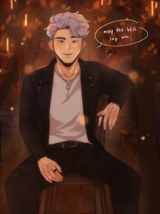
redraw of this piece!! i mentioned in that post that i would redraw it at some point and ig that time is now! (i meant to post this before id2 came out but i got really busy so y'know lol better late than never)
i like to think i've improved! still can't draw chairs though haha
side by side comparison under the cut + rambly artist commentary(?):
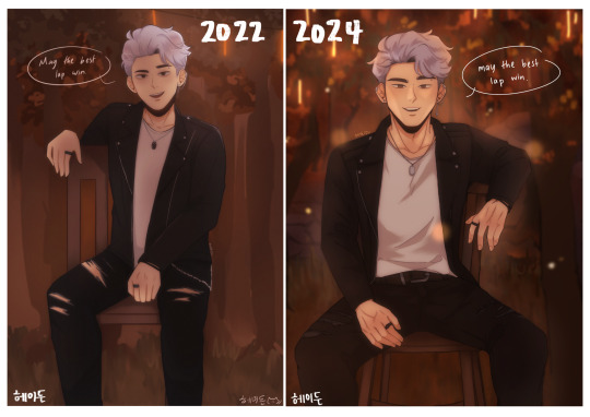
i still have a long way to go in learning proper anatomy but i think the new pose looks a lot more natural and comfortable! also ~sexier~ perhaps
i tried to make the bg look closer to the actual cg they used in the book, i am arguably better at doing backgrounds now i think! i used to not put a lot of thought into it and just blocked out random shapes and called it a day (okay, i still do that now lol but i put more care into it now !! i try to make the shapes a bit more distinct and actually plan and sketch it out rather than draw some blobs and hope for the best ldkfkhsl). also more colour range(?) to give it a bit more depth!!)
i'd also like to add that i think i'm also better at figuring out compositions now, idk how it is for y'all but when i look at the original my eyes can't help but just fall to the centre, bc there's no focal point(?) or anything that's visually interesting for the eyes to land on. plus with the way it's structured, my eyes just naturally fall to center (+ bottom half bc the skin showing through the rips are bright in contrast to the black) >_> in contrast, in the redraw your eyes are automatically drawn to the face bc it's arguably the most interesting thing on the canvas and thus acts as the visual anchor of sorts (plus there is enough contrast with the background to make cas stand out instead of blend in)
even though i cringe looking at the og i can't help but to also feel endeared bc this was one of the first immortal desires fanart i ever did and also one the first of my posts to do really well! i never expected to get that much attention since i was only posting casually but it really warmed my heart reading all the lovely comments and motivated to draw more :D
it's also really fun seeing how much my art style and techniques have evolved! i don't think i use any of the same brushes i used to use for my old pieces anymore now haha. i also watched the timelapse for the old one and am honestly kind of in awe at how my different my drawing process used to be!!
i still have a lot to learn (esp in terms of anatomy, lighting, shading etc.) but i'm happy with where i am rn! the great thing about being a hobbyist is that there isn't really any pressure for me to improve quickly so i can just take my time haha (except maybe from imposter syndrome but that's neither here nor there)
i think i could've drawn his face and expression a bit better but i think this is a satisfying enough redraw for now!
btw, these are just my thoughts! i am not an art student so the things i said might not be technically correct but this is how i make sense of things in my brain
#once again i didn't draw gabe and jade but i did that on purpose this time lol#love them but cas is the focus of this piece so i want him to shine!!#fun fact i was at my late grandma's place when i drew the original; and she had these big ass dining chairs right#i took photos of me sitting on one of those chairs for reference so the chair in the og drawing ended up being big too lmao#anw i haven't read book 2 yet so no spoilers pls !!!!!#i will read it tonight#i bought the 24hr vip pack just for this lol#playchoices#choices id#choices immortal desires#immortal desires#choices fanart#fanart#cas harlow#my art#hydn.jpg#forgive me if this is extra rambly it's midnight and the adhd is adhding
125 notes
·
View notes
Text

I've seen Elyse Taylor around tumblr before—I think she might even be a Victoria's Secret model? Perhaps those panties are Victoria's Secret? Honestly I have no idea, but they're the reason I'm posting her, definitely. Because she looks SO good in those panties, and they're not completely my style tbh, but she made me love them, so that's all on her. Personally, I'm not much of a fan of such high-waisted panties (both on other girls or for myself). I love a belly, and a lower cut just emphasizes that more. As far as wearing them goes, I just don't like things so high up. I find it super uncomfortable. Also, that bow is ridiculous, but somehow it works? The colour and the lace are perfection. And the top she's wearing is amazing and really compliments the panties. Plus, she's beautiful. Kinda obvious, but thought I'd mention it in case you thought this was 100% about the panties. It's not. Today's girlcrushart guardian is Elyse Taylor.
76 notes
·
View notes
Text

Right! Off we go off we go! Andreana and Kako. Yeah I'm still torn on this. I just think the original doppel worked really well and this one just... ruined it..? I don't think they needed to change the doppel aspects and in doing so it made it look worse. The dual blades looks too busy and kinda dumb and why is her hand up there?? I get she's reckless so she might have cut it off but still... I'm unsure about the legs either. Her whole body is a mishmash of colours and her legs are suddenly all one colour? Dunno... I'd give her a bigger book skirt, highlight the bookmarks more (yes I know the legs are probably bookmarks but moreso as a skirt) and probably give her legs more like her arms.

Oh dear Maura... why did they choose the curtain one..? Maura and Nanaka. It's... it's boring, anyone with eyes can see it's boring. I just feel like the witch takes away from everything interesting about the original. My favourite part is how dark Nanaka's inclusion is and of course, that's absent here. And even the upside down curtain was at least a little interesting but now it's just curtains hanging the regular ol' way. I feel like this witch would be way way better animated instead of just sitting there curtain-ly. They should've chosen someone else with a better doppel...

Meiyui and Delanna. Now I know why she's in a crib, she's just straight up babyish and sleep themed. I think she's fine, nothing special. The crib is fun and creepy. I kinda wish the mouths were more creepy but I guess that's just her style :T

Heidesommer and Konomi... ehhhhh this is super boring... the doppel is more fun... witch is just a mound, it looks like a pile of junk. I don't have much to say about it... doppel is better
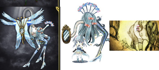
Cendrillon and Rena. Now. I think the full witch is beautiful. The colours are so pretty, the faces are horrifying and the bird detailing is lovely. But... is it the doppel..? N-Not for me... Like, I just feel the bird theming comes out of NOWHERE. Her theme is Cinderella, where did this come from?! (actually do birds peck out the eyes of the ugly stepsisters or something in the original? Maybe, that would be a bit better) And the three legs don't do it for me. I felt the one leg to highlight the missing glass slipper works well. And the hair pieces being on the side of her body doesn't sit right with me. Neither does the tail(?) piece, looks stuck on like they were like 'oh, fuck, we forgot the fan part!' BUT. It is a beautiful witch. Do I see this doppel coming from it if it was the other way around? No Also here I included Cendrillon's brief anime appearance and it lines up pretty well! I think in the anime one the body looks more lumpy, the beak isn't as big and its missing the wings.

Zola and Kaede. Meh, disappointed. Why is she less detailed than the doppel??? But I suppose we already kinda saw what she was gonna look like anyway, I should have prepared myself... From the anime, my favourite part was her body and it just feels kinda hard to see here, like, show me those RIBS! I wanna see them! And those big ol' arms! But they're so hidden by the background and her body mehh. Plus I think the face of the doppel is weird and creepy and that's just not there in the final... Also don't like how the horns(?) just completely differ from the doppels style. They kinda look like veins but I dunno if I like them.

Also special guest... my own full witch interpretation from (i think) last years witchtober. I prefer mine thank youuu. But if I redid the witch I'd give her the doppel face, I believe I was basing mine off the anime image at the time

Let's finish on a good one! Momoko and Elfriede! Another that's super pretty, I have few complaints. The head is horrifying and I love it and the dress is still super pretty. Only gripe is I prefer the black lace to the gold gems. My biggest gripe is the fat, bloated hand at the bottom. Why..? What was wrong with the doppel's ones? I think such a slim and elegant needed something better than a hand that looks like a balloon dog. If the fingers were longer I think it would have worked better. And the floating fingies look a little dumb but thats minor
#madoka magica#puella magi madoka magica#pmmm#witch#madoka magica witch#doppel#magia record#magia record spoilers#zola#elfriede#cendrillon#heidesommer#delanna#andreana#maura
94 notes
·
View notes
Text
VIOLET, LET ME IN ON YOUR SECRETS
Ok, hear me out, is it just me or does Buddy's outfits look mighty stealable?
JK. I ALREADY KNOW IT'S NOT JUST ME BECAUSE IT CAN'T.
Like, I mean, I love Chase's outfits and Bronze is getting better at creating outfits for Deacon (ahem, not hard after you put a man in a cat onesie without ANYTHING underneath).
But, Chase's and Deacon's outfits aren't really my style (although Chase's give me gender envy). In plus, the colours are ones I don't like as much.
BUDDY'S ON THE OTHER HAND.
Purple and black? Goth? BOOB WINDOWS? I NEED THEM.
I used to be emo, like the whole, "I'm weird and random, nobody understands me. I have demons," kinda emo, ik ik, cringe (I can say that bc it's myself we're talking about here) and my favourite color combination was purple and black.

Ahem, exhibit A. Quickly drawn and colored by yours truly. He has horns, it's just covered by the hair... and yes those are cat ears.
ANYWAY, SO OBVIOUSLY WHEN BRO SHOWED UP LIKE THIS.

AS A DEMON. NONETHELESS.
*cough cough* AGH! *cough cough* Punko, you've killed me...
I have the urge to start using purple and black more again (although that has never gone away). Also, to become a goth and wear eyeliner.
This man makes me so confused because, as a trans guy, I go, "I wanna be him," but as a gay, I go, "I wanna be with him."
Like, you can't be this attractive, man. Save some for the rest of us.
#funny#gender envy#stealy stealy#hehe#buddy cinderella boy#cinderella boy#cinderella boy webtoon#fashion#goth#why cant i be a pretty boy#with cool looking outfits#gay#transmasc#ftm#trans#jealous
25 notes
·
View notes
Text
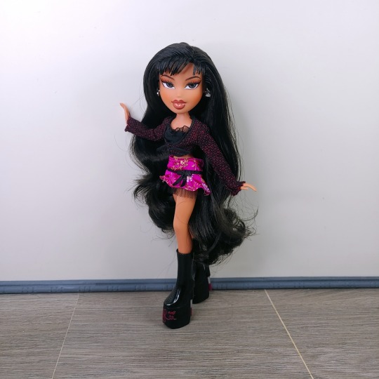
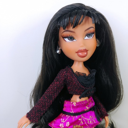
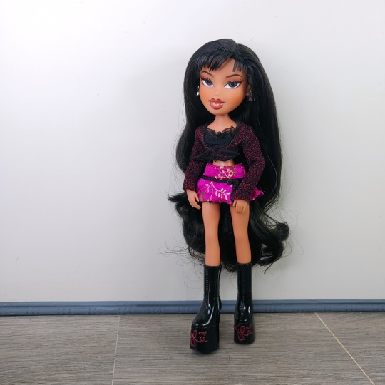
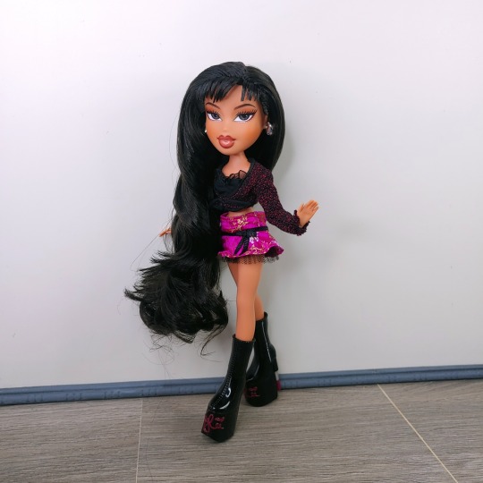
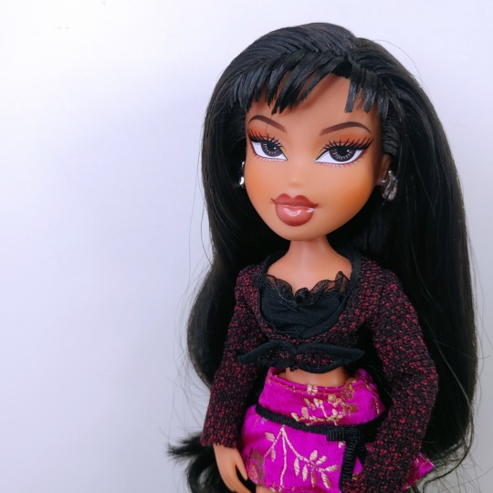
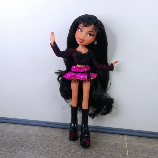
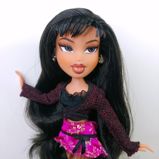
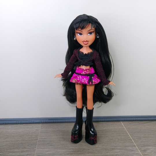
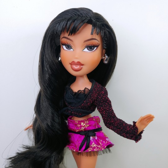
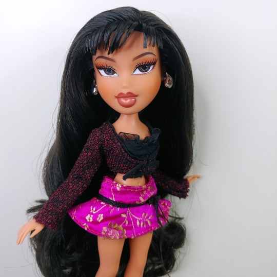
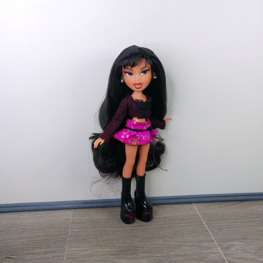
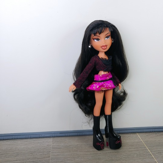
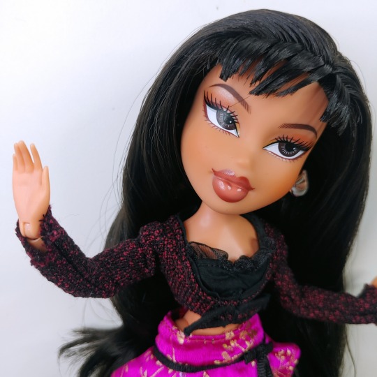
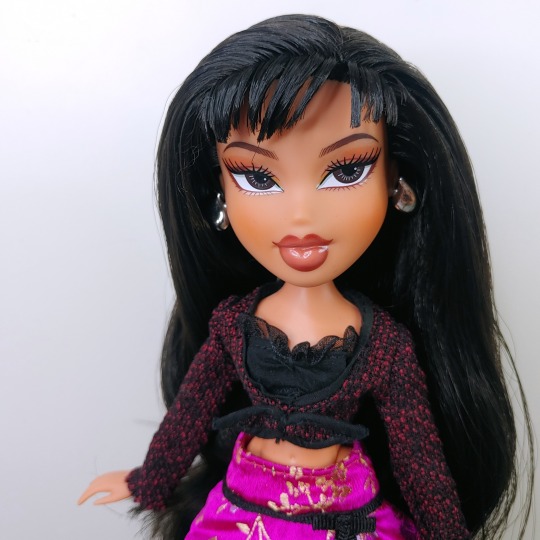
To be honest, I'm not a major Bratz collector or a Kylie Jenner fan, but I was struck by how pretty the face was since it was significantly more delicate and different looking to regular play line dolls. Turns out @lwrepaints was actually the face designer, which explains a lot about the delicate line work and character filled expression. I always loved their line work and how their style has this painterly quality to it, plus their work has that dreamy watercolour manga style that is so unique to their faces. And of course I think it's amazing that a collector is able to go mainstream like this so I've been wanting to add this doll to my collection. The distribution is kind of wild in the UK but I managed to find a nude doll of her for sale and I'm really impressed seeing this face in person. It's interesting to see the hand painted style work of Lolliword's be translated to a factory printed product, something that is often at odds with the style. The use of metallics really helps add more depth to something that is often flat and mechanical, and delicate but deliberate line work is something i feel is missing from modern production faces so this really feels like a breath of fresh air. But I think the use of colour, line work and design really shines in this face and even if I'm not a Kylie Jenner fan, I think the doll is incredibly pretty and I'm so happy a fellow collector was able to work in an official capacity like this!
47 notes
·
View notes
Note
Any thoughts on the new "Spooky" NC styles compared to the old nostalgic versions? I really like some of the new ones like the Gelert and Xweetok.

I will say off the bat that I'm not opposed at all to redrawing old colours to be more interesting; a lot of the ancient early 2000s art was literally just "the default pose with modifications". Take the original Halloween Aisha, for example; not only is the shading and overall art pretty poor, but it's also just sitting there generically smiling.

However, I will say that there's some weird classifications going on with these guys; to start, "spooky" is a pretty terrible adjective that describes absolutely nothing. It's also a bad choice because it has to be swapped out for each color (the redone Ghost styles are "eerie", for example). I've heard the term "dynamic" tossed around, which I think would've been a much better name choice that could've been universally applied to any colour.
Also confusing is that they classify any new styles for pets that were made post-conversion as "spooky", but when they made new styles for Grey pets they classified them as "nostalgic". I guess they were just going off of the poses, but still, it gets complicated fast.
And finally, I kind of wish they had released both nostalgic and spooky styles for some pets, because it feels like some of the old art changed drastically in ways that go far beyond just posing. I don't mind a few details being tweaked here and there, but some of feels like a drastic change to the pet's whole personality. For example:


Gelert: Entire personality changed (went from being more stoic and shifty to being cunty and more "bleh"). Tail has an extra segment. Hairstyle is completely different with no receding hairline. Detail around the clasp lost. Way more fluffy. Teeth and nails sharper. Cape lost the bat wing design.
Ixi: Entire face changed (eyes too big and too far up on the head, plus the eye shape is wrong), horns facing backwards instead of inwards, ear shaped changed, face and body more fluffy.
There's not inherently an answer to which design is better (I personally don't like the Gelert while Anon does, for example), but having more styles would satisfy both parties. Hopefully they'll add more in the future.
Favorite Styles:
(Good news: There were so many good ones I had trouble narrowing it down. Honorable mentions that were cut for space include the Xweetok and the Lutari.)


Poogle: The pose is not only really fitting for the pet, but it adds a ton of personality (compared to the original, which was just generically angry). A few subtle changes were made to the design, like the muzzle being light blue and the teeth being way bigger, but they're minor changes that shouldn't upset any fans of the original. The changes also feel very "pre-conversion" esq; like, you could've told me the spooky style was the pre-conversion art and I would've believed you.


Bori: Not necessarily the most exciting style, but I like this one a lot. The change to the crouching pose looks a lot more natural and invokes the Bori's more quadrupedal look pre-customization. The shading is spot-on for old Neopets' art, and I love how the design makes some subtle changes to the design that, like the Poogle, are minimal and shouldn't bother fans of the original—these include a longer, narrower skull and a different expression, more defined claws, less uniform back plates, and a less uniform tail shape.


Grarrl: Definitely my all-time fav from the Spooky styles. I just talked about this one for my Grarrl review so I won't repeat myself here, but the pose is more dynamic without being too over-the-top, the design reverts back several unnecessary changes that occurred during customization (the clasp was randomly made blue, for example), and the overall art quality is really solid, and there's not many changes outside of the addition of little claws. My only nitpick is that the eye shadow should've been bigger, but that's it.


Koi: Just the fact that it's actually holding the pitchfork is a major improvement, but I also really like the pose; it has a great flow to it and shows off the design well. Subtle touches like the transparent fins are really nice, and the design is really accurate to the original art save for a bigger pitchfork.
Least Favorite Style:


Kougra: Out of all the styles, I think this one is probably the one that's objectively different but in a way that's just kind of worse all around compared to the original. List of changes:
Pupil shape changed.
Eye color changed.
Ear shape changed.
Wings and ears drastically smaller than on the original.
Wing shaped changed at bottom.
And even if you don't care about any of that, the lineart's too thick, the shading doesn't have a clear light source and has too many layers, and the anatomy is really messed up. I like the idea of the pose in theory, but the execution is lacking. Plus, while the original pose wasn't that exiting, it did give off a nice stoic vibe, so it wasn't like it was overly "default-ish" in the first place.
21 notes
·
View notes
Text
Omori Manga Thoughts cause it was uhhh
OK so like. The thing is I only got into the omori fandom in February of this year so take my opinion with a grain of salt.
1. I'm mostly a fan of the art style-- a lot of people said that Sunny always seems to have a panicked expression so it's hard to read into him, plus the characters look a lot younger than they're supposed to (Which I find odd). But other than that, I think it does a really good job representing the scarier parts with very abstract drawings of Mari/Something. They coloured it well and thank god did Kel's skintone right. There is one particular panel that I especially love:

So much detail and it captures the feeling of seeing faraway for the first time really well ^^
Some nitpicky positive thoughts:
Sunny could have looked more distinct from Omori because the only difference I see are their outfits. Maybe make Sunny's features softer and have less contrasting values so we can see an immediate difference.
I like how they did everyone's eyes-- Sunny/Omori's are just dull and black, and everyone else with dark eyes are shown to have a light in them. (Just a nice detail i appreciated)
I like how Omori is clearly less expressive compared to sunny, but I think Sunny could have benefitted from having more emotions than surprised/blushing.
2. The pacing was weird. like really fucking weird. The basic structure of the game Omori is: Omori is in whitespace -> Omori plus the gang (Hero, Aubrey and Kel) meet up with Basil and Mari in headspace -> everyone minus Mari goes to Basil's house and learn all the combat stuff along the way -> after fixing the photo album it suddenly shifts to basil in a panicked state before glitching you back into white space again. The moment when basil shifts the mood from calm to terrifying is REALLY important.


It forces the new tone on you very suddenly and also sets up a lot of mystery surrounding Mari when Basil can't finish what he was going to say about her. By now we know that something is very wrong and it has to do with Mari, but we don't know what.
The manga is kind of all over the place the whole time. First we see the christmas scene when Sunny gets his violin. But then Mari does her whole nightmare thing and we know somethings up from the first few pages. Next we wake up at night as Sunny in the real world... yet it shows the little "THREE DAYS LEFT" as well? At this point I was super confused because basically the entire nighttime sequence is shown through a sort of montage with Sunny's mom's voice message in the background before transitioning into the day when Kel first knocks on the door. A cool thing they did was parallel Kel's knocking with the creepy knocking we get from Mari Something. HOWEVER for reasons unknown they just completely cut out the fight against something on the stairs??

Something I was really excited about was seeing how they would integrate the combat into the manga. And they do it later with the Aubrey fight (more on that later), but not now? So now I'm wondering if they'll include Sunny's three fears that he has to overcome.

So next we find our boy (KEL!!!!!) and he is asking Sunny if he wants to come to Hobbies. I did find the dialogue here pretty awkward as Kel bounced back and forth in demeanor, but that's to be expected since Sunny isn't talking. (And I appreciate how he shows some kind of reaction to seeing one of his best friends after 4 years lol)

I mean compared to this when he just jumps straight into his hobbez idea without much reaction to actually seeing Sunny lol.
The most notable thing after this is the Aubrey confrontation with Basil and the other hooligans. I DONT KNOW WHY but they chose to not show the hooligans in that scene!! The hooligans are aubrey's little gang/posse who she hangs around with all the time and the people we always see when she's bullying Basil.


It's very important to note that Basil is talking to KIM here. He starts the conversation begging for her to tell Aubrey to give the photo album back. Aubrey is actively ignoring his attempts to get it back, with basil claiming "She won't listen to me."

In the manga she appears out of seemingly no where and proceeds to beat Basil directly with her bat. Prior to this we get no setup or explanation as to why Aubrey's attacking him or what the situation is. WORST OF ALL, It's only Aubrey alone attacking him and NOT her gang of the Hooligans. The hooligans are important in showing us just how isolated and ostracized from society Basil really is after Aubrey began bullying him. He literally has a whole gang of kids who call him a creep and attack him regularly. Here it seems like Aubrey is insane and is just beating him selfless for kicks. (not that I'm justifying Aubrey's behavior in the game, but the lack of context makes this situation even worse.)
I think It's also important to bring up how they switched around the order of events because in this situation, it's not working. We're supposed to first be introduced to younger Aubrey and Basil in headspace-- their younger counterparts. Aubrey is strong-willed and excitable and Basil is calm and kind. And most importantly-- they're VERY GOOD FRIENDS. So seeing Aubrey revealed to have been bullying him these past 4 years shocks the player and makes them understand how much things have really changed. Doing it the other way around will automatically villainize DW Aubrey since we already know what goes on in real life.
And then something interesting happens-- Sunny blacks out during the fight and returns to Headspace. This is SUPER weird as we've only ever seen Sunny go into headspace while sleeping, because it's an escape mechanism he uses to avoid The Truth. Does this mean he isn't aware he goes into headspace unwillingly sometimes? And what does this mean for the continuation of the real world story? Are we going to go through the entire Space Boy quest just to get back to that scene?
Anyway, I'm interested to see how they take it from here. Maybe they'll do a continuous switchover to the real world where they jump between it more frequently. But I question what that would mean for the timeline because the events of headspace happen in between the three days while Sunny is sleeping-- so he can't be in two places at the same time. Maybe they'll write more and more random ways for Sunny to black out to do this?? They defiantly are trying to take a step back from following the game exactly. I can't say I don't like it because I don't know how it'll turn out, so I'm excited for chapter 2!
#omori#omori manga#omori analysis#omori sunny#omori basil#omori fanart#omori game#omori aubrey#omori kel#omocat#omori mari#omori omori
26 notes
·
View notes
Note
I have a couple of things
One, I love your art style! It's so cute and scrunkly, I hold it in my hands gently,,, /pos
Two, if this is okay to ask, what is your opinion on gokumota? They're my favorite ship, so I'm curious about what you think about it! :o

I THINK THEY ARE LOVELY.... himbo 4 himbo fr....
they are both scientists that are often perceived as dumb by their classmates... methinks they would bond over talking about bugs and space respectively...
from what little I remember from Kaito's free time events I remember the stories he told were a bit off the walls but I think Gonta would love listening to them,,,! Maybe use them as an inspiration too!! -and in turn Kaito listens to Gonta's rambles about becoming a gentleman and encouraging him,, Kaito is like Gonta's hype man in a way...
also when I think they'd do a lot of stargazing and whatever together,, especially cause in-game Gonta tends to point out the stars a lot,, like,,, Kaito tells him about all the constellations and shows them to him,, and the next time they go outside at night together Gonta tries to look for them!!!
plus... Purple and Green... best colour combo of all time.
my brain is flip flopping between viewing them as besties or romantically involved [probably the aromantic in me kicking in] but either way I think they are wonderful...
gives me the same feelings as Cats & Piranhas [Ryoma & Himiko friendship] cause they're both similar [Gonta and Kaito being optimistic scientists who are viewed as idiots sometimes,, and Ryoma and Himiko being both tiny and had important people leave their lives,,, and they probably have undiagnosed depression...] but not really having much significant interactions... sobs...
I have not thought about this ship [or even their friendship] before but looking more into it,,, its actually so cute and silly,, you have opened my eyes,,
144 notes
·
View notes
Text
Day 161: Finally announcing the winners of the DTIYS competition! Sorry it took so long to get around to lads TwT
I’m amazed at how many entries i got, and they were all wonderful! If you check out the #daily teki dtiys tag you can check em all out for yourself ^^!
It was really hard to pick between the top 5, (so much so that I changed having a top 3 for a top 5) so without further ado:
Coming in at 5th place, we’ve got @frenchgremlim1808 !!
I rlly love the bright colours and shading, plus your style is always absolutely iconic.
4th place goes to @nina-the-ninth !
The shading and more realistic style is spellbinding, and it’s composed rlly well- it was super tough choosing between 4th and 3rd place. This was 100% the reason I ended up deciding to do a top 5 rather than a top 3- I absolutely couldn’t leave it out
In 3rd place we have @bagofjax !!
The lighting and the textured hand drawn calligraphy contrasted to the bright pixel colours of the game sprites really got to me, and then seeing the strings of numbers making up the background absolutely pushed it over the line into the top 3 for me.
An incredibly close second place goes to @goldyluna !
I am such a sucker for the flow and styling of that hair- she looks like she could be right at home on a figurine shelf. I love the unique chains around her neck seeing as she doesn’t say a word ingame, and I love that you added more chains as well. I also love your font with the calligraphy, the spiky fringe, and even the spotted pattern in the background looking like someone’s watching. Overall I think it’s my favourite drawing of teki herself, and both second and first place are on a skill level I’d love to someday achieve.
And in 1st place is @averagecatdoodlesenjoyer !
The chromatic aberration adds extra depth, and I love the addition of the chains in the background. I flipped so many times between first and second place because they’ve both got so much going for them in so many different aspects. The lighting and composition is what ultimately won me over, and the slight change in pose really works too. It’s truly beautiful, it even looks like she’s under a stage light with the poses falling down like pieces of paper or giant confetti. And so it certainly gets the confetti from me.
I loved absolutely everyone’s entries for this, and a huge thank you to everyone who participated! I’ll have to think of something to give to all the winners seeing as just a thank you and a pat on the back seems a little cheap for everyone’s hard work on these.
#daily teki#daily teki dtiys#your turn to die#yttd#teki yttd#teki tsutone#yttd memory dance girl#yttd art#yttd fanart#memory dance girl#dtiys#dtiys challenge
28 notes
·
View notes
Note
I'm in the fluffiest mood lately, so how about a no stakes sickfic. Movie night and the trip (Matt, Sel/Zaya) are home and decide to put on something like spiderverse or smth else, point being, either Isaiah or Matt gets super motion sick from it
Something fluffy it is. Thank you for the ask, Soup!!💙
Cinema sickness
The middle position was the best.
Matthew didn't notice when exactly they started to fight for it like that, but it was increasingly a place one of them got as special treat.
Like of course, when Isaiah was having his not so heart episodes that Seline still didn't know the cause of or when he was emotional. Then it wad Seline herself with a fever. She also usurped the spot most openly when she was well.
Matthew was a little too embarrassed to be that forward. Not when he was feeling fine.
They bought a camera projector they have been saving for a few months. Seline dreamed about the home cinema early on and Isaiah was such a movie buff, it was only to be expected.
Matthew found the cinema experience tiresome because of all the people, so their own private living room cinema because of the projector? Sounded fun. Though the cinema made for good people training.
"You guys didn't watch the second Spiderverse movie yet, right?" Seline said, taking control of the chromcast with her phone to put it on.
"I didn't see the first one either," Matthew grumbled as she climbed up between him and Isaiah who was scrolling through IMDb. He had a thing for ratings, while Seline loved comments and spoilers.
Matthew considered himself the only sane and commonly invested movie person. He liked to get surprised.
"The animation is out of this world. The first movie got an Oscar for it too, but they went overboard and beyond with the second. Each universe has a different animation style! It's the perfect movie for a cinema." Seline waved her phone in front of Matthew enthusiastically.
"Isn't animation for children?"
Isaiah and Seline both gave him scandalised looks. "In what hole did you live until now for such an outdated opinion?" Isaiah asked teasingly.
Matthew rolled his eyes. Didn't look like he would have a say today.
"I don't think you need the first one to understand," Seline said thoughtfully as she put the movie on. "They explain it pretty well, plus I can always explain things to you if you need it."
"You are still more of a fan of the first one, aren't you?" Isaiah said, bumping against her. They were sitting shoulder to shoulder, all three of them.
"I think the character development is simply better there? Also the relationships. The focus on bad mentor and a confused kid and different father figures...this one goes more into the romance storyline-"
"The focus just shifts from him to her's all-"
Matthew shook his head. "Alright, quit it. I want to see for myself."
The movie looked like a very expensive video game. The animation really was something else. Matthew understood quickly they would not be able to film stuff like this for real.
So many colours and so much quick movement. Their living room wall was basically flickering, going from one side of the colour spectrum to the next at rapid speed that had his head spinning.
How could there be so much happening on the screen? It was downright impossible to catch it all.
His eyes felt tired from it. It was all so fast and coupled with the music it was downright aggressive.
Matthew didn't notice when, but the left side of his head felt like someone held it in a vice grip. The more he watched and tried to make sense of what was happening, the more his left temple pounded in unison with his heart.
He found himself shaking his head to clear his vision, rubbing at the side of his face. He even tried closing one eye and then the other. But the images just kept coming and there was some kind of dramatic scene with spidermen all over the screen and damn, his head really hurt.
Seline was leaning her head against Isaiah's shoulder, her legs stretched out and touching them both. Her lap seemed very inviting.
Matt leaned to the side experimentally. He wanted to go slow and see how that would be taken, but the possibility of getting some cover from the screen was getting more irresistible by the second.
He slumped down into Seline's lap, twisting so his face was against her stomach. The lights were all over the living room, reaching even to the windows and the kitchen. No hiding from them.
Matthew closed his eyes, face buried in Seline's belly. He secured her from squirming with his arm over her torso, stretched out all the way to Isaiah's tight. If the other wolf wanted to protest or made any move of displeasure, Matt would quickly notice from that position.
His head hurt. Why just the left side of his face? It was tingling.
Everything was moving too much. The dizzying spinning sensation didn't quite go away, although he had his eyes squeezed shut and wasn't looking.
Not to mention he was starting to feel vaguely queasy, his dinner sloshing in his stomach angrily.
"Mattie, you aren't watching," Seline admonished softly. Her hand went into his hair though, petting it softly. He melted under her touch, grateful for a pleasant feeling to focus on.
Suddenly there was the incredible sound of the movie stopping.
"Matt? You tired?" Isaiah asked, shifting somewhere behind his head.
"Mhhhhhhhhmmmm." Was he that obvious? Suspicious? He wanted to stay huddled there in the softness, thanks.
Isaiah's hand landed on his arm. The older wolf reserved his touches for when Matthew felt sick. But they were so physically close these days, because of Seline of course, no other reason, Matthew kind of craved it, even when he didn't need it.
Or maybe it would count now. But he didn't want to ruin the celebratory mood by being a baby. It was a stupid children's movie, for God's sake.
"We can just call it a night, I think. Continuation tomorrow," Isaiah suggested, ever the peace keeper trying to accommodate everyone.
It sounded nice to not continue the movie in any case. But going to bed created a new set of problems.
Matthew would have to move.
Seline wiggled under his head. "You are heavy," she said playfully. She seemed more open to the gesture than Matthew expected. For no reason at all.
Matthew hummed non-committalally not sure how to explain or escape his predicament without losing his dinner. His stomach was churning angrily and his head was still pounding, sound or not.
Isaiah chucked. "You can sleep here for all I care, but at least let the lady get her PJs."
Matthew huffed at that, but opening his mouth wasn't a good idea. A little burp escaped, muffled against Seline's ribcage.
Seline's fingers in his hair stilled. "Mattie? You feeling alright?"
Did she notice that he got burpy when he was about to spew? He could just be full. Damn it all, the risks of living with people so closely.
Another burp, this time a little louder and wetter. Matthew pressed his face closer into Seline's shirt. It smelled of rain and ozone and grapefruit.
He felt both of their gazes on him without looking. They were probably mouthing something to each other at this point. He could picture it vividly.
The pain in his left temple spiked and he moaned quietly.
Seline's cold hand cupped his nape, stroking his neck up to his cheek where she could reach.
"...If I move, I'll hurl," he admitted finally, figuring he should inform her of the danger she was currently in.
The sigh came from Isaiah though, as the raven haired man moved gently away from the sofa into the direction of the kitchen.
"What's wrong? Is your belly upset?"
Jesus, that sounded childish when she said it like that. Not to mention that weird new Mattie nickname.
"Headhurtss," he manged to get through his gritted teeth, still entirely muffled against her stomach. It was quiet, churning only gently, like a purring cat.
"Has it been hurting for long?" She sounded amazingly calm considering he was lying across her lap. "You seemed fine to me," she said with puzzlement. He could imagine the way her forehead creased, a little wrinkle between her eyebrows as she thought back about the evening.
He opened his mouth the respond, but another burp rushed out instead. Pocket of air against her stomach. Saliva was flooding his mouth.
Matthew loosed his hold on her reluctantly, turning so he would be lying on her knees. He covered his eyes with his hands. "Ow."
Seline placed her hands on both sides of his face. "Where?" Her voice was impossibly soft.
He pushed her cool hand - how was it so cool? - against the left side of his forehead.
He felt more than saw two of her fingertips on his temple, making tiny circular movements against it. She bowled over him, her lips hovering over his ear. "How is this? Should I stop?"
"No, that's nice," he said, relaxing a little. The gentle pressure felt good against the pain, though his stomach was still roiling.
Isaiah came back then, the sofa dipping under his weight as he knelt on Matthew's other side. "I got a bowl if you need it."
"Not the nice popcorn bowl, come on," Seline complained, lifting her head.
"It's big and deep," Isaiah protested, sounding amused.
Matthew groaned at the banter. The headache was giving away a bit at the message, but the nausea rose steadily no matter what he did. He felt air in his throat and spit flooding his mouth. He didn't want to move away from Seline's fingers or the attention, but his stomach cramped angrily then.
It had him shooting up into general direction of up. Except he felt dizzy right away, swaying and moaning.
Isaiah grabbed his shoulder to steady him.
Matthew held his eyes shut against the spinning of the room, trusting him to have the bowl at the right place, cause he couldn't aim. His head exploded on his left side with the sensation and puke rocketed into his mouth.
He was right to trust him. The vomit made a splashing sound against the bowl without him even looking, Isaiah holding it under hid chin.
Seline's hands came to cup his forehead from behind. "You are okay, you are okay. Just get it up."
Matthew gave in to his body completely then, a little more voluntarily at the support. His senses were all over the place. He couldn't tell which was was up and down and his left side of the face as pounding and burning from warmth.
More waves of vomit came, easier to bring up now that he wasn't fighting it. When he thought he would catch a break, a loud burp brought in one more splash and then two more. His back arched, only Isaiah's hold on his shoulder keeping him upright. The sofa was moving like a water bed.
When he was finished, he spat the rest of the foul taste and slumped blindly back into Seline's lap. He wanted her nice scent and her cool hands and the little message against his temple that had a drilling machine against it.
"Better now?" she asked, her hands on his face just like he wanted, stroking his cheek and forehead.
"Mhhhhhhhhhmmmm." There was a relief from the nausea, but he was still afraid to open his eyes.
He could vaguely sense Isaiah's movements as he got rid of the bowl, returned to position it next to Matthew. Then circled around, fitting himself into the opening between Matthew's side and the sofa.
Matthew wasn't sure when vomiting because a group activity, or if he shouldn't apologise or feel embarrassed for making a fool of himself.
He sighed contendly as Seline went back to massaging his temple. Isaiah was rubbing his arm gently, as if to remind him he was there.
And who was Matthew to refuse the middle spot?
46 notes
·
View notes
Text
ART DUMP³

BUDLEY EXOTIC ESCAPADEEE!! I LOVE HIMM!! He's doing the zesty hand pose because he's zesty as fuck!! Also, I decided to stick to the actual style of the show, so I drew his jawline and hat as it is in the original design as opposed to how I would normally draw them.

MONTEZ!!! Not much to say about this one tbh, except that I still HATE drawing faces!!

ZEMMA!!! Definitely not one of my strongest pieces when it comes to the anatomy, but I still kinda love it. Plus, I got to experiment with Emma's hair and casual clothing. Also I just love how I switched Emma's scrunchie for Zee's hair tie and vice versa.


Here's Juliaaa!! This is probably the only drawing where I didn't hate drawing the backgrounds. Also this is my first time drawing Julia, and I gave her some earrings. Not much to say tbh.

MORE ZEE!!!! This drawing was originally just going to be a sketch for a friend of mine, but I eventually decided to turn it into a drawing and I'm very happy with it. And I know the heart hands aren't exactly "heart-shaped", but I tried my best.

Oooh, yikes... this drawing... I don't think it's necessarily horrible but I don't think it's great either. Drawing MK was a fucking nightmare, I did not have fun with this one. Originally I didn't want to draw the backgrounds but instead copy and paste the bg from the og show, but it looked horrible. I'm not sure if I'll draw her again...

ZEE AS A HOCKEY BRO!!! Aside from some small issues I have with it, I really liked how this one turned out!!! Now normally before I draw them digitally, I make a sketch first and trace over it on my drawing tablet. That wasn't the case with the raccoon logo, I designed it right out of my ass and I just love how it looks. I tried to make the jersey look baggy and I hope it translated well. Also the colours I used were from a bitmoji.

And here's Brad... Oh... I don't think this drawing is b(r)ad but... I just don't like the face. Also I really do not know if the anatomy is good with the neck connecting to the head. That's something that always confuses me, but I think I'm improving with my arm/hand anatomy, I think?


And finally, my YouTooz designs. As of now, I've only drawn 7 characters, Wayne, Raj, Zee (With Olivia von trashpanda), Millie, Ripper, Emma, and Caleb (With 2 additional variants of Ripper & Millie). I won't go over my descriptions for each of them, but I really do want to continue with these, it's been a long time. Maybe Bowie or MK are next? Those two seem like they'd be hard to make, so I'd rather finish them now than later.
That's a lot of tags, uh... hasta luego!!
#budley exotic escapade#bud exotic escapade#exotic escapade bud#exotic escapade budley#budley ee#bud ee#ee budley#ee bud#montez exotic escapade#exotic escapade montez#montez ee#ee montez#zee total drama#zee total drama island#total drama zee#total drama island zee#zee td#zee tdi#tdi zee#td zee#emma total drama#emma total drama island#total drama emma#total drama island emma#tdi emma#td emma#emma tdi#emma td#julia total drama#julia total drama island
14 notes
·
View notes