#plasterers plasterer interior decoration
Explore tagged Tumblr posts
Text
House Beautiful Weekend Homes, 1990
#vintage#vintage interior#1990s#90s#interior design#home decor#pantry#kitchen#timber#yellow ware#stoneware#pottery#flowers#dog#portrait#plaster#cottage#country#style#home#architecture
1K notes
·
View notes
Text
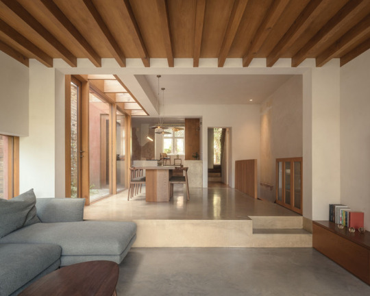
Putney Riverside House, London - VATRAA
#VATRAA#architecture#design#building#modern architecture#interiors#minimal#house#concrete#house design#modern#minimalist#concrete house#extension#home extension#exterior#pink#terracotta#earthy#elegant#microcement#plaster#london#british architecture#living room#kitchen#beautiful homes#interior decor inspo#garden#design blog
150 notes
·
View notes
Text
A nice eat in nook
#breakfast nook#wall nook#seating#wood dining table#eat in kitchen#dine in#table for two#orange#brown#april#spring#toya's tales#style#toyastales#toyas tales#home decor#interior design#interesting#interiors#home improvement#home decorating#home design#home & lifestyle#mosiac#tile floor#terracotta#plaster
80 notes
·
View notes
Text
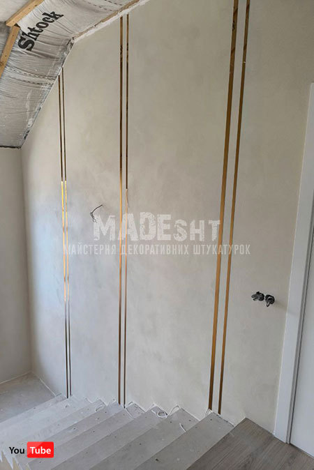
Marmorino in Polvere Concrete Colorificio Veneziano, гладка фактура в один шар
Професійне нанесення декоративних штукатурок Майстерня декоративних штукатурок MADEsht
#Майстерня декоративних штукатурок MADEsht#decorative plaster#interiors#decor#декоративна штукатурка#marmorino#професійне нанесення декоративних штукатурок#Marmorino#Colorificio Veneziano
2 notes
·
View notes
Video
youtube
Interior Veneer Plaster patch over sheetrock
1 note
·
View note
Text
Before you start decorating, we highly recommend plastering the walls and ceiling for a professional and luxurious finish.
0 notes
Photo
Charlotte Traditional Dining Room Example of a large classic medium tone wood floor great room design with orange walls and no fireplace
0 notes
Text
Wordpress também uma ótima plataforma para colocar os seus projetos. O gesseiro silvio posta os seus conteúdos do site principal também nessa plataforma. Os conteúdos do site principal onde é postado sobre serviços realizados no rio de janeiro, central do rj, nilopolis, mesquita, belford roxo e etc.
0 notes
Text
All prep done for plastering the bathroom 🚽!
Cannae wait to see this finished 🥰🥰
#interior decorating#auction#rennovation#hardwork#house#home design#labouring#renovation#bedroom#remodelling#plastering
0 notes
Text
Call us-0420697243
Office Cleaning in Yarralumla
A clean and organized office space is essential for productivity, employee morale, and making a positive impression on clients and visitors. If you're seeking reliable and efficient office cleaning services in Yarralumla, look no further. Our team of dedicated professionals is here to ensure your workplace is pristine,allowing you to focus on your core business activities. Let's explore the benefits of professional office cleaning and how it can transform your work environment.
Maintaining a clean and hygienic workspace is crucial for the well-being of your employees and the overall health of your business. Our office cleaning services adhere to the highest standards of cleanliness, utilizing industry-approved techniques and eco-friendly cleaning products. We pay special attention to high-touch areas,such as doorknobs, light switches, and shared surfaces, to eliminate germs and reduce the spread of illnesses. With our meticulous approach to cleaning, you can create a healthy environment that fosters productivity and reduces sick days.
Your office is a reflection of your business's professionalism and attention to detail. A spotless and well-maintained workplace leaves a lasting impression on clients,partners, and potential customers who visit your premises. Our team understands the importance of presenting a clean and inviting atmosphere. We meticulously clean and polish all areas, including reception areas, conference rooms, restrooms, and common spaces, ensuring a pristine environment that showcases your commitment to excellence.
#Interior and exterior painting in canberra#Painting and decorating in Amaroo#House painting in canberra#Residential painting in Ainslie#Commercial painting in Franklin#Plastering and painting in Palmerston#Appliance installation in Kingston#Gyprock installation in Campbell#Staining and varnishing in Harrison#Floor painting in Gunghalin#Upholstery stain removal in canberra#Wall renovations in Franklin Gunghalin#Professional cleaners in Palmerston#Plasterboard work in Braddon#Office cleaning in Yarralumla
0 notes
Text
The drawing room at Womersley Hall in South Yorkshire has a fine plaster ceiling and fireplace, probably the work of the eighteenth-century architect James Paine. The fireplace opening is faced in Delft tiles and features classical mouldings, columns, and medallions.
The Fireplace, 1994
#vintage#vintage interior#1990s#90s#interior design#home decor#Womersley Hall#South Yorkshire#England#drawing room#plaster#fireplace#James Paine#architect#Delft#tiles#moulding#painting#classical#English#style
539 notes
·
View notes
Text
This is the third part of the Estate Set. This time, it's a mix of items. You will get items for the garden, and I finished a few objects for the interior, too.
You will get:
Garden Furniture, including an armchair, loveseat, lounger and a parasol
Wrought Iron Gate and Fence
Hydrangea Bush and Potted Hydrangea
Cone-shaped Topiary and Potted Version
Different Hedge Pieces
Potted Citrus Tree
Timber Panelling
Plaster Walls with Trim
Adam Style Wall with Decals for extra Decoration
Curtains for all three Wall Heights
Several people have contacted me because the wallpapers haven't been showing correctly in their games since the DirectX 11 update. This update is in beta; I think the mistake might be on the EA's end, and I believe this will be fixed once DirectX 11 is appropriately released. If you are playing on DirectX 11, there is a fix. You can Download the latest version of Sims4Studio and run a Batchfix. Go to Content Management -> Batch Fixes -> Misc -> Update images for DX11. That should do the job and fix your wallpapers.
This is the final Part of the Estate Set for now. I enjoyed working on this subject and will likely continue this Set in the Future. Don't worry if you liked this content. I shall stay in the same world for the coming months, but it will be Cottagy instead of estate. I enjoyed making the Plants and Vines in the Estate Set, and I think a Cottage Garden would be an excellent continuation from there :)
This Set is on Early Access and will be available for everyone in November :) And you will find it here
Thanks again for your support and lovely comments; I appreciate them!
Lots of Love,
Felix xxx
1K notes
·
View notes
Text
“Hearts for a sweetheart.”
Summary: Bumping into a sweet chocolatier evolves into something even sweeter (Timothée Chalamet!Willy Wonka x fem!reader)
Word count: 1.9K
Warnings: Kissing, swearing (once I think).
-
-
Walking along the street, I’m interrupted by a sea of cheers as a man in an elaborate get-up passes around chocolates and sweets with a strong smile. As he walks through the crowd, people push forward, reaching for the chocolates forcing me forward, almost causing me to fall to the ground.
After nearly tripping over from the force of the crowd, I feel a hand on my shoulder and turn to look at the person, steadying myself.
“Are you alright, miss?” The extravagant man asks.
Looking over him I can’t help but smile a little at his top hat and jacket, finding it endearing combined with his gentle nature.
“I’m okay.” I say as he helps me stabilise myself.
“Would you like a chocolate?” He asks with a new kind of smile, a toothy grin as he extends his arm, a tray of chocolates decorating the plate.
“Thank you but I can’t afford your fancy chocolates.” I deny, looking down a little ashamed as the crowds of people still surround us although they’ve quietened down a bit now.
“They’re free. No price for you, or anyone.” He pauses after saying ‘you’, seemingly forgetting the rest of his sentence.
“Really?” He nods and I reach to take one gently. “Thank you, mister…” I pause, not knowing his name.
“Mr Wonka, chocolatier.” He grins as he tips his hat towards me with a smile.
“Thank you Mr Wonka, the chocolatier.” I smile before seeing him disappear back into the crowds.
I only see him a couple more times as he looks back at me with a smile plastered on his face, his top hat sticking out above the crowds making me chuckle before putting the small chocolate into my mouth, resting it delicately on my tongue.
Closing my mouth, I start to chew the chocolate, truly surprised by the delicious treat. It’s like nothing I’ve ever tasted before. I try to savour it but it’s gone too soon, making me wish it would last forever.
Mr Wonka, a name I would not soon forget, in fact I couldn’t stop thinking about the man: his chocolates, his fashion and most of all his endearing, sweet nature. Walking through the streets, making my way home I ponder whether I would see him again or how. He must have a shop or a stall or something similar, maybe with the other chocolate stores? It doesn’t seem like he’d fit in with those pretentious sellers who seem to have no love for the art of food, let alone chocolate.
After a couple of weeks I had saved up some coins, not enough to get me more than one chocolate I doubt, but it'd be worth it both for the delicious chocolate and to see him again. With my coins in my pocket, I wander through the town centre, keeping my eyes out for the chocolatier but I don’t spot him.
Making it to the palace of chocolate stores I begin to feel the cold nipping at my skin, regretting not bringing my jacket. I walk through the doors, feeling very fancy as I do so, looking at the patterned floors and incredible glass dome roof.
Feeling a slight shiver I hurry along, looking to the stores and suddenly seeing a new store: Wonka. Upon seeing the name I make my way towards the store, taking in the beautiful design and calligraphy.
Walking in I’m instantly taken aback by the extraordinary interior, colourful candy delights disguised as nature causing me to gasp. Frozen, I stand in the door probably looking quite shocked as after a few seconds I feel a tap on my shoulder causing me to turn around, eyes going a little wide at the slight shock.
“Hello miss.” I turn around to see Mr Wonka smiling. “I wasn’t sure if I was going to see you again.”
“You remember me?” I ask, tilting my head slightly confused.
“Of course I do, I only regret that I didn’t ask your name last time we met.”
“(y/n), Mr Wonka.”
“Ah, call me Willy, last names are too formal for me.” He chuckles and I nod before looking around.
“Your store is incredible.” I say, looking around awe-struck.
“Why thank you, would you like a tour?”
“You’ve probably got more important things to do…” I say quietly with a soft smile.
“Nonsense! What could be more important than showing a woman as lovely as yourself around?” He asks with a charming smile. “Now, what kind of chocolate do you like?”
I think about it for a second, realising how long it’s been since I’ve had chocolate, excluding the last time I bumped into Willy. “The normal kind of chocolate?” I say, unsure.
“Normal kind?” He raises an eyebrow playfully. “Milk chocolate?” I nod.
“I think so, the chocolate you gave me last time was delicious, the best I’ve ever tasted.” I smile.
“Thank you, that means more than you realise.” He says softly, a tone of sincerity. “I’ll make you something special.” He grins. “Do you want to look around for a minute? I won’t keep you waiting too long.” He smiles, I nod before he seems to disappear before I even realise.
I walk towards the river watching as the boat goes round and round, the mechanisms seem incredible. Crouching down by the river I reach for a flower, inspecting the treat before taking a tentative bite from the petal. I let out a sigh, the treat tasting even better than I thought it would. Standing back up I take the flower with me, nibbling on the petals as I walk around the store, in awe at all the beautiful decorations.
A few seconds later, Willy pops up from out of nowhere, startling me slightly but with a small box in his hand.
“I didn’t mean to startle you.” He offers a small smile. He removes the lid from the box revealing a set of three chocolate hearts with delicate piping on top.
“Wow, these are beautiful.” I say, staring at the artwork.
“Hearts for a sweetheart,” He grins, flustering me a little.
“Thank you… How much do these cost?” I ask, trying not to be awkward but failing.
“Nothing, well except that I get to see your reaction, I think you’ll like them. I based them off of the chocolate you had a couple of weeks ago but made them better.”
“Are you sure? I have some coins.” I reach into my pocket, pulling out some coins but fumbling them leading multiple to fall to the ground. “Shit, sorry…” I say quietly before crouching down and reaching for the coins.
Willy does the same helping me pick up the coins as his hand accidentally brushes against mine. We both look up at each other before I look away embarrassed. He holds my hand, turning it over and placing the coins in my hand before folding my hand, covering the coins. He brings my hand up to his face, pressing his lips against my wrist with a small smile.
“Thank you…”
“Don’t worry about it.” He says as we both stand up again, I slide my coins back into my pocket.
He offers me the box and I take one of the three heart chocolates and place it in my mouth.
“Oh my god, you’re a genius.” I sigh, enjoying the chocolate. “These are incredible.”
“Thank you.” He grins, a proud expression on his face. “Would you like anything else? A buttercup? Cotton candy cloud? Cherries? Gummy bears?” He shoots off options one after the other at a quick speed.
“What would you recommend?” I ask, tentatively.
“Please follow me.” He smiles, leading me around the store to a patch of flowers. Crouching down, he plucks a few flowers, matching them by colour and tying them to make a chocolate bouquet before passing it to me.
“It’s beautiful.” I smile. He pulls out one more flower and tucks it behind my ear.
“Don’t worry, that’s a real flower.” He reassures me with a soft smile.
“Thank you.” I say softly.
“They’re chocolate, one’s white, dark and the other milk so you can work out what you like.” He says gently arranging the flowers. “Then you can come back and I can make you some more.” He chuckles. “The more information you can give me, the better the chocolate will taste!”
“Thank you, Willy, but I should get going now, I didn’t realise it had gotten so dark…” I say quietly as I look outside.
“Time flies when you’re having fun.” He shrugs as we walk towards the door and I start to feel the cold breeze against my skin. “Are you cold?” He asks, tilting his head slightly.
“A little, I should’ve brought my jacket.” I dismiss with a small smile. “I’ll see you around, Willy.” I say, stepping out of the door and walking away.
About a second later, I hear him speak again. “(y/n) wait!” He says and I turn around as he walks towards me, pulling off his long magenta jacket and sliding over my shoulder.
“Now you’ll get cold.” I chuckle, pulling the coat around me a little tighter.
“I’m okay, I was getting a bit warm anyway.” He smiles before looking behind me into the night. “Can I walk you home?” He asks, sweetly.
“You want to walk me home? I don’t live very close to your store…”
“Even more reason for me to walk with you.”
“Okay, if you’d like to, I won't stop you.” I smile brightly as he walks next to me.
“You know, you look really beautiful when you smile.” He says which only makes me smile more.
“Stop.” I chuckle.
“But it’s true.” He smiles. “You’re truly the most beautiful woman I have ever laid eyes on.” He says in a gentle but more serious tone.
“Thank you.” I whisper looking up to him before resting my head on his shoulder as we walk. “You’re really an incredible guy.”
“Ah, I just make chocolate.” He chuckles.
“Really good chocolate.” I smile. “And you make it look really pretty and your shop is incredible. I’ll have to come by more often.”
“I’d like that.” He pauses “May I hold your hand?” He asks gently after a short pause and I reach my hand out to his
Once we reach my home, I turn around to face him.
“This is me.” I smile. “I’m sorry you had to walk so far.”
“It was worth it.” He brings my hand to his face, pressing his lips against my hand again.
“Here, let me get your coat.” I say, beginning to slide the coat off of my shoulders but he stops me.
“Keep it, it gives you a reason to come back and see me again.” He says with a small smirk.
“Sneaky, very sneaky.” I chuckle, letting the jacket rest on my shoulders. “Get home safe.” I smile, as he begins to walk away.
It takes me a few seconds to fight my thoughts off before I call for him.
“Willy?” He turns around to face me, standing about eight steps away.
I walk quickly towards him, pressing my lips against his briefly before pulling away. “I’ll see you in a few days.” I whisper with a soft smile.
“You’re not gonna see me for a few days after pulling that stunt?” He asks with a playful expression causing me to chuckle and nod. “Well, I look forward to seeing you again.” He smiles brightly.
“I won’t keep you waiting too long.” I smile before going inside my house, shutting the door after he walks out of sight. I let out a breath as I have to fight a smile, excited to see the chocolatier again.
-
AN: I love this movie with my whole heart!
Hope you enjoyed reading!
#timothée chalamet!willy wonka x reader#wonka 2023#wonka#wonka movie#willy wonka#willy wonka x reader#willy wonka x y/n#willy wonka x yn#willy wonka x you#wonka x reader#wonka x you#wonka x y/n#wonka x yn#fanfiction#fanfic#wonka fanfiction#wonka fanfic#charlie and the chocolate factory#fluff#timothée chalamet!willy wonka x fem!reader#willy wonka fanfiction#willy wonka fanfic#timothée chalamet
2K notes
·
View notes
Text
Білий мармур з прожилками з венеціанської штукатурки
Професійне нанесення венеціанської штукатурки у Києві
Майстерня декоративних штукатурок MADEsht
#interiors#decor#decorative plaster#майстерня декоративних штукатурок madesht#декор#venetian plaster#професійне нанесення декоративних штукатурок#декоративна штукатурка
0 notes
Text
Fantasy Guide to Interiors
As a followup to the very popular post on architecture, I decided to add onto it by exploring the interior of each movement and the different design techniques and tastes of each era. This post at be helpful for historical fiction, fantasy or just a long read when you're bored.
Interior Design Terms
Reeding and fluting: Fluting is a technique that consists a continuous pattern of concave grooves in a flat surface across a surface. Reeding is it's opposite.
Embossing: stamping, carving or moulding a symbol to make it stand out on a surface.
Paneling: Panels of carved wood or fabric a fixed to a wall in a continuous pattern.
Gilding: the use of gold to highlight features.
Glazed Tile: Ceramic or porcelain tiles coated with liquid coloured glass or enamel.
Column: A column is a pillar of stone or wood built to support a ceiling. We will see more of columns later on.
Bay Window: The Bay Window is a window projecting outward from a building.
Frescos: A design element of painting images upon wet plaster.
Mosaic: Mosaics are a design element that involves using pieces of coloured glass and fitted them together upon the floor or wall to form images.
Mouldings: ornate strips of carved wood along the top of a wall.
Wainscoting: paneling along the lower portion of a wall.
Chinoiserie: A European take on East Asian art. Usually seen in wallpaper.
Clerestory: A series of eye-level windows.
Sconces: A light fixture supported on a wall.
Niche: A sunken area within a wall.
Monochromatic: Focusing on a single colour within a scheme.
Ceiling rose: A moulding fashioned on the ceiling in the shape of a rose usually supporting a light fixture.
Baluster: the vertical bars of a railing.
Façade: front portion of a building
Lintel: Top of a door or window.
Portico: a covered structure over a door supported by columns
Eaves: the part of the roof overhanging from the building
Skirting: border around lower length of a wall
Ancient Greece
Houses were made of either sun-dried clay bricks or stone which were painted when they dried. Ground floors were decorated with coloured stones and tiles called Mosaics. Upper level floors were made from wood. Homes were furnished with tapestries and furniture, and in grand homes statues and grand altars would be found. Furniture was very skillfully crafted in Ancient Greece, much attention was paid to the carving and decoration of such things. Of course, Ancient Greece is ancient so I won't be going through all the movements but I will talk a little about columns.
Doric: Doric is the oldest of the orders and some argue it is the simplest. The columns of this style are set close together, without bases and carved with concave curves called flutes. The capitals (the top of the column) are plain often built with a curve at the base called an echinus and are topped by a square at the apex called an abacus. The entablature is marked by frieze of vertical channels/triglyphs. In between the channels would be detail of carved marble. The Parthenon in Athens is your best example of Doric architecture.
Ionic: The Ionic style was used for smaller buildings and the interiors. The columns had twin volutes, scroll-like designs on its capital. Between these scrolls, there was a carved curve known as an egg and in this style the entablature is much narrower and the frieze is thick with carvings. The example of Ionic Architecture is the Temple to Athena Nike at the Athens Acropolis.
Corinthian: The Corinthian style has some similarities with the Ionic order, the bases, entablature and columns almost the same but the capital is more ornate its base, column, and entablature, but its capital is far more ornate, commonly carved with depictions of acanthus leaves. The style was more slender than the others on this list, used less for bearing weight but more for decoration. Corinthian style can be found along the top levels of the Colosseum in Rome.
Tuscan: The Tuscan order shares much with the Doric order, but the columns are un-fluted and smooth. The entablature is far simpler, formed without triglyphs or guttae. The columns are capped with round capitals.
Composite: This style is mixed. It features the volutes of the Ionic order and the capitals of the Corinthian order. The volutes are larger in these columns and often more ornate. The column's capital is rather plain. for the capital, with no consistent differences to that above or below the capital.
Ancient Rome
Rome is well known for its outward architectural styles. However the Romans did know how to add that rizz to the interior. Ceilings were either vaulted or made from exploded beams that could be painted. The Romans were big into design. Moasics were a common interior sight, the use of little pieces of coloured glass or stone to create a larger image. Frescoes were used to add colour to the home, depicting mythical figures and beasts and also different textures such as stonework or brick. The Romans loved their furniture. Dining tables were low and the Romans ate on couches. Weaving was a popular pastime so there would be tapestries and wall hangings in the house. Rich households could even afford to import fine rugs from across the Empire. Glass was also a feature in Roman interior but windows were usually not paned as large panes were hard to make. Doors were usually treated with panels that were carved or in lain with bronze.
Ancient Egypt
Egypt was one of the first great civilisations, known for its immense and grand structures. Wealthy Egyptians had grand homes. The walls were painted or plastered usually with bright colours and hues. The Egyptians are cool because they mapped out their buildings in such a way to adhere to astrological movements meaning on special days if the calendar the temple or monuments were in the right place always. The columns of Egyptian where thicker, more bulbous and often had capitals shaped like bundles of papyrus reeds. Woven mats and tapestries were popular decor. Motifs from the river such as palms, papyrus and reeds were popular symbols used.
Ancient Africa
African Architecture is a very mixed bag and more structurally different and impressive than Hollywood would have you believe. Far beyond the common depictions of primitive buildings, the African nations were among the giants of their time in architecture, no style quite the same as the last but just as breathtaking.
Rwandan Architecture: The Rwandans commonly built of hardened clay with thatched roofs of dried grass or reeds. Mats of woven reeds carpeted the floors of royal abodes. These residences folded about a large public area known as a karubanda and were often so large that they became almost like a maze, connecting different chambers/huts of all kinds of uses be they residential or for other purposes.
Ashanti Architecture: The Ashanti style can be found in present day Ghana. The style incorporates walls of plaster formed of mud and designed with bright paint and buildings with a courtyard at the heart, not unlike another examples on this post. The Ashanti also formed their buildings of the favourite method of wattle and daub.
Nubian Architecture: Nubia, in modern day Ethiopia, was home to the Nubians who were one of the world's most impressive architects at the beginning of the architecture world and probably would be more talked about if it weren't for the Egyptians building monuments only up the road. The Nubians were famous for building the speos, tall tower-like spires carved of stone. The Nubians used a variety of materials and skills to build, for example wattle and daub and mudbrick. The Kingdom of Kush, the people who took over the Nubian Empire was a fan of Egyptian works even if they didn't like them very much. The Kushites began building pyramid-like structures such at the sight of Gebel Barkal
Japanese Interiors
Japenese interior design rests upon 7 principles. Kanso (簡素)- Simplicity, Fukinsei (不均整)- Asymmetry, Shizen (自然)- Natural, Shibumi (渋味) – Simple beauty, Yugen (幽玄)- subtle grace, Datsuzoku (脱俗) – freedom from habitual behaviour, Seijaku (静寂)- tranquillity.
Common features of Japanese Interior Design:
Shoji walls: these are the screens you think of when you think of the traditional Japanese homes. They are made of wooden frames, rice paper and used to partition
Tatami: Tatami mats are used within Japanese households to blanket the floors. They were made of rice straw and rush straw, laid down to cushion the floor.
Genkan: The Genkan was a sunken space between the front door and the rest of the house. This area is meant to separate the home from the outside and is where shoes are discarded before entering.
Japanese furniture: often lowest, close to the ground. These include tables and chairs but often tanked are replaced by zabuton, large cushions. Furniture is usually carved of wood in a minimalist design.
Nature: As both the Shinto and Buddhist beliefs are great influences upon architecture, there is a strong presence of nature with the architecture. Wood is used for this reason and natural light is prevalent with in the home. The orientation is meant to reflect the best view of the world.
Islamic World Interior
The Islamic world has one of the most beautiful and impressive interior design styles across the world. Colour and detail are absolute staples in the movement. Windows are usually not paned with glass but covered in ornate lattices known as jali. The jali give ventilation, light and privacy to the home. Islamic Interiors are ornate and colourful, using coloured ceramic tiles. The upper parts of walls and ceilings are usually flat decorated with arabesques (foliate ornamentation), while the lower wall areas were usually tiled. Features such as honeycombed ceilings, horseshoe arches, stalactite-fringed arches and stalactite vaults (Muqarnas) are prevalent among many famous Islamic buildings such as the Alhambra and the Blue Mosque.
Byzantine (330/395–1453 A. D)
The Byzantine Empire or Eastern Roman Empire was where eat met west, leading to a melting pot of different interior designs based on early Christian styles and Persian influences. Mosaics are probably what you think of when you think of the Byzantine Empire. Ivory was also a popular feature in the Interiors, with carved ivory or the use of it in inlay. The use of gold as a decorative feature usually by way of repoussé (decorating metals by hammering in the design from the backside of the metal). Fabrics from Persia, heavily embroidered and intricately woven along with silks from afar a field as China, would also be used to upholster furniture or be used as wall hangings. The Byzantines favoured natural light, usually from the use of copolas.
Indian Interiors
India is of course, the font of all intricate designs. India's history is sectioned into many eras but we will focus on a few to give you an idea of prevalent techniques and tastes.
The Gupta Empire (320 – 650 CE): The Gupta era was a time of stone carving. As impressive as the outside of these buildings are, the Interiors are just as amazing. Gupta era buildings featured many details such as ogee (circular or horseshoe arch), gavaksha/chandrashala (the motif centred these arches), ashlar masonry (built of squared stone blocks) with ceilings of plain, flat slabs of stone.
Delhi Sultanate (1206–1526): Another period of beautifully carved stone. The Delhi sultanate had influence from the Islamic world, with heavy uses of mosaics, brackets, intricate mouldings, columns and and hypostyle halls.
Mughal Empire (1526–1857): Stonework was also important on the Mughal Empire. Intricately carved stonework was seen in the pillars, low relief panels depicting nature images and jalis (marble screens). Stonework was also decorated in a stye known as pietra dura/parchin kari with inscriptions and geometric designs using colored stones to create images. Tilework was also popular during this period. Moasic tiles were cut and fitted together to create larger patters while cuerda seca tiles were coloured tiles outlined with black.
Chinese Interiors
Common features of Chinese Interiors
Use of Colours: Colour in Chinese Interior is usually vibrant and bold. Red and Black are are traditional colours, meant to bring luck, happiness, power, knowledge and stability to the household.
Latticework: Lattices are a staple in Chinese interiors most often seen on shutters, screens, doors of cabinets snf even traditional beds.
Lacquer: Multiple coats of lacquer are applied to furniture or cabinets (now walls) and then carved. The skill is called Diaoqi (雕漆).
Decorative Screens: Screens are used to partition off part of a room. They are usually of carved wood, pained with very intricate murals.
Shrines: Spaces were reserved on the home to honour ancestors, usually consisting of an altar where offerings could be made.
Of course, Chinese Interiors are not all the same through the different eras. While some details and techniques were interchangeable through different dynasties, usually a dynasty had a notable style or deviation. These aren't all the dynasties of course but a few interesting examples.
Song Dynasty (960–1279): The Song Dynasty is known for its stonework. Sculpture was an important part of Song Dynasty interior. It was in this period than brick and stone work became the most used material. The Song Dynasty was also known for its very intricate attention to detail, paintings, and used tiles.
Ming Dynasty(1368–1644): Ceilings were adorned with cloisons usually featuring yellow reed work. The floors would be of flagstones usually of deep tones, mostly black. The Ming Dynasty favoured richly coloured silk hangings, tapestries and furnishings. Furniture was usually carved of darker woods, arrayed in a certain way to bring peace to the dwelling.
Han Dynasty (206 BC-220 AD): Interior walls were plastered and painted to show important figures and scenes. Lacquer, though it was discovered earlier, came into greater prominence with better skill in this era.
Tang Dynasty (618–907) : The colour palette is restrained, reserved. But the Tang dynasty is not without it's beauty. Earthenware reached it's peak in this era, many homes would display fine examples as well. The Tang dynasty is famous for its upturned eaves, the ceilings supported by timber columns mounted with metal or stone bases. Glazed tiles were popular in this era, either a fixed to the roof or decorating a screen wall.
Romanesque (6th -11th century/12th)
Romanesque Architecture is a span between the end of Roman Empire to the Gothic style. Taking inspiration from the Roman and Byzantine Empires, the Romanesque period incorporates many of the styles. The most common details are carved floral and foliage symbols with the stonework of the Romanesque buildings. Cable mouldings or twisted rope-like carvings would have framed doorways. As per the name, Romansque Interiors relied heavily on its love and admiration for Rome. The Romanesque style uses geometric shapes as statements using curves, circles snf arches. The colours would be clean and warm, focusing on minimal ornamentation.
Gothic Architecture (12th Century - 16th Century)
The Gothic style is what you think of when you think of old European cathedrals and probably one of the beautiful of the styles on this list and one of most recognisable. The Gothic style is a dramatic, opposing sight and one of the easiest to describe. Decoration in this era became more ornate, stonework began to sport carving and modelling in a way it did not before. The ceilings moved away from barreled vaults to quadripartite and sexpartite vaulting. Columns slimmed as other supportive structures were invented. Intricate stained glass windows began their popularity here. In Gothic structures, everything is very symmetrical and even.
Mediaeval (500 AD to 1500)
Interiors of mediaeval homes are not quite as drab as Hollywood likes to make out. Building materials may be hidden by plaster in rich homes, sometimes even painted. Floors were either dirt strewn with rushes or flagstones in larger homes. Stonework was popular, especially around fireplaces. Grand homes would be decorated with intricate woodwork, carved heraldic beasts and wall hangings of fine fabrics.
Renaissance (late 1300s-1600s)
The Renaissance was a period of great artistry and splendor. The revival of old styles injected symmetry and colour into the homes. Frescoes were back. Painted mouldings adorned the ceilings and walls. Furniture became more ornate, fixed with luxurious upholstery and fine carvings. Caryatids (pillars in the shape of women), grotesques, Roman and Greek images were used to spruce up the place. Floors began to become more intricate, with coloured stone and marble. Modelled stucco, sgraffiti arabesques (made by cutting lines through a layer of plaster or stucco to reveal an underlayer), and fine wall painting were used in brilliant combinations in the early part of the 16th century.
Tudor Interior (1485-1603)
The Tudor period is a starkly unique style within England and very recognisable. Windows were fixed with lattice work, usually casement. Stained glass was also in in this period, usually depicting figures and heraldic beasts. Rooms would be panelled with wood or plastered. Walls would be adorned with tapestries or embroidered hangings. Windows and furniture would be furnished with fine fabrics such as brocade. Floors would typically be of wood, sometimes strewn with rush matting mixed with fresh herbs and flowers to freshen the room.
Baroque (1600 to 1750)
The Baroque period was a time for splendor and for splashing the cash. The interior of a baroque room was usually intricate, usually of a light palette, featuring a very high ceiling heavy with detail. Furniture would choke the room, ornately carved and stitched with very high quality fabrics. The rooms would be full of art not limited to just paintings but also sculptures of marble or bronze, large intricate mirrors, moldings along the walls which may be heavily gilded, chandeliers and detailed paneling.
Victorian (1837-1901)
We think of the interiors of Victorian homes as dowdy and dark but that isn't true. The Victorians favoured tapestries, intricate rugs, decorated wallpaper, exquisitely furniture, and surprisingly, bright colour. Dyes were more widely available to people of all stations and the Victorians did not want for colour. Patterns and details were usually nature inspired, usually floral or vines. Walls could also be painted to mimic a building material such as wood or marble and most likely painted in rich tones. The Victorians were suckers for furniture, preferring them grandly carved with fine fabric usually embroidered or buttoned. And they did not believe in minimalism. If you could fit another piece of furniture in a room, it was going in there. Floors were almost eclusively wood laid with the previously mentioned rugs. But the Victorians did enjoy tiled floors but restricted them to entrances. The Victorians were quite in touch with their green thumbs so expect a lot of flowers and greenery inside. with various elaborately decorated patterned rugs. And remember, the Victorians loved to display as much wealth as they could. Every shelf, cabinet, case and ledge would be chocked full of ornaments and antiques.
Edwardian/The Gilded Age/Belle Epoque (1880s-1914)
This period (I've lumped them together for simplicity) began to move away from the deep tones and ornate patterns of the Victorian period. Colour became more neutral. Nature still had a place in design. Stained glass began to become popular, especially on lampshades and light fixtures. Embossing started to gain popularity and tile work began to expand from the entrance halls to other parts of the house. Furniture began to move away from dark wood, some families favouring breathable woods like wicker. The rooms would be less cluttered.
Art Deco (1920s-1930s)
The 1920s was a time of buzz and change. Gone were the refined tastes of the pre-war era and now the wow factor was in. Walls were smoother, buildings were sharper and more jagged, doorways and windows were decorated with reeding and fluting. Pastels were in, as was the heavy use of black and white, along with gold. Mirrors and glass were in, injecting light into rooms. Gold, silver, steel and chrome were used in furnishings and decor. Geometric shapes were a favourite design choice. Again, high quality and bold fabrics were used such as animal skins or colourful velvet. It was all a rejection of the Art Noveau movement, away from nature focusing on the man made.
Modernism (1930 - 1965)
Modernism came after the Art Deco movement. Fuss and feathers were out the door and now, practicality was in. Materials used are shown as they are, wood is not painted, metal is not coated. Bright colours were acceptable but neutral palettes were favoured. Interiors were open and favoured large windows. Furniture was practical, for use rather than the ornamentation, featuring plain details of any and geometric shapes. Away from Art Deco, everything is straight, linear and streamlined.
#This took forever#I'm very tired#But enjoy#I covered as much as I could find#Fantasy Guide to interiors#interior design#Architecture#writings#writing resources#Writing reference#Writing advice#Writer's research#writing research#Writer's rescources#Writing help#Mediaeval#Renaissance#Chinese Interiors#Japanese Interiors#Indian interiors#writing#writeblr#writing reference#writing advice#writer#spilled words#writers
3K notes
·
View notes
Text
10 Unheard Cornice Design Ideas To Uplift The Look Of Your Home
#cornices#interiordesign#design#plaster#interior#homedecor#decor#details#moulding#plasterwork#ceiling#exterior#architecture#coving#frames#oracdecor#livingroom#home#panelling#wallart#architecturephotography#gypsum#mouldings#columns#corbels#plasterdecoration#oracaroundtheworld#celing#restaurant#cornicemoulding
0 notes