#pixel 7 case
Explore tagged Tumblr posts
Visit Tumblr Blog
Explore Tumblr blogs with no restrictions, modern design and the best experience.
Last Seen Tumblr Blogs


Fun Fact
Tumblr has a 66 index score for customer satisfaction in the US.
Text
#cell phone case#crochet#custom phone case#galaxy s22 case#hand made#iphone#iphone 15 case#iphone case#phone case#pixel 7 case#pouch#samsung#unique gift#cellphone covers#cellphone case#unique#unique embroidery#unique decor
0 notes
Text
Why 7-11 doesn’t go on leave with Graves to hang out with Adler- @pampanope
#shadow company#call of duty#pixel (cod oc)#shadow 7 11 (cod oc)#keys (cod oc)#case black ops#felix neumann#phillip graves#russell adler#cod black ops 6#someone help 7-11#he might not last staying with them
71 notes
·
View notes
Text


Dying is hard :(
Alt version with (non graphic) blood bc I couldn’t help myself undercut


#THIS IS HOW I COPE#i have never churned out a piece of art so fast#he misses his best friend :(#nd suas there also bc i love her#alien stage sua#alien stage ivan#alien stage till#alst#alst sua#alst Ivan#alst till#my art#artists on tumblr#ivantill#???#i mean nothing explicitly ivantill is happening here but sure#poor sua third wheeling#I simplified Ivan’s outfit BC HOW IS IT SO INTRICATE BUT SO BORING FROM THE BACK#alien stage#alien stage spoilers#just in case#alien stage round 7#FUCK I FORGOT SUAS EYESHINE IN PIC 2#GODDAMNIT#if u look closely there is one pixel of red in tills eye ;)#this art was completed in one sitting
101 notes
·
View notes
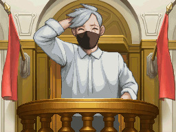
Text

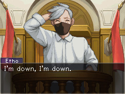
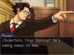
...i tried my best 😂😂🙈🙈
additional thing for @shepscapades hc character design week 2 prompt, quotes from first 10 minutes of the etho vs b-team trial, some pixel patches are from phoenix wright and ema skye + pixel patterns from apollo justice and lotta hart (what this means is a mystery to everyone but it makes sense to me "xD)
im really proud of the beef one btw

without text bubble
#if you ever mention pixels to me i will stare at you with incinerating look#this was... so much work and so many squeezes of my eyes xD#i apologize for this but also the version of me whos one year younger is happy rn so whatever!#theyre on prosecution side of the courtroom so i had to flip one background for pause#tbh i had absolutely no idea what kind of lawyers they were before rewatching that two days ago#... pause transitioned during it good for him#but i guess it doesnt really matter in the end and so i rest my case#i go mimir now... this took *looks at file time* 11:54 time so its almost 12 hours#o_O uagh!!! it was 7 yesterday! time flies#shepshermitdesign23#vintagebeef#ethoslab#pauseunpause#team canada#artstump
974 notes
·
View notes
Text
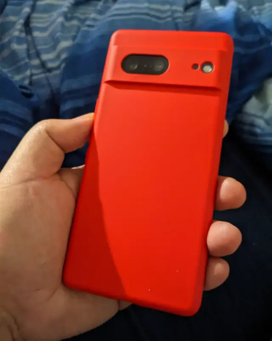
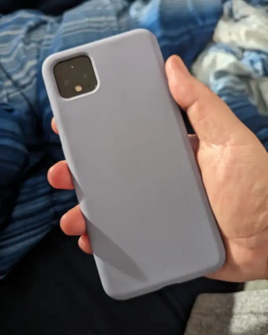
New cases for Pixel 7 & Pixel 4XL
1 note
·
View note
Link
Google Pixel 7 Pro Cases
Google Pixel 7 Pro Cases – You’ll want to shield this gorgeous phone from life’s minor accidents. Check out our selection of the most delicate Google Pixel 7 Pro cases if you’re interested in card cases, minimalist transparent cases, or something a little more colourful. There are already several significant cases available for Google’s newest flagship. Your upcoming issue is listed here.
5 Best Google Pixel 7 Pro Cases
1. Mous Limitless 5.0 Case
Your Pixel 7 Pro is shielded from drops, scrapes, and bumps with AiroShock technology, and a soft microfiber lining prevents scratches. A high-protective bump surrounds the camera for increased protection, while ridged edges increase grip. Various fashionable backplates are available, including walnut (our favourite), aramid fibre, black leather, and silver pearl.
2. Poetic Revolution Series Case
You should give the Poetic Revolution Series Case much consideration if you are worried about breaking your phone. This one is one of the best cases for protecting your Pixel 7 Pro from drops and scratches. This case has a raised bumper frame to protect your phone’s exposed edges and an integrated screen protector from deterring dings and fractures.
3. Bellroy Leather Case For Pixel 7 Pro
Bellroy, the original Made for Google case partner, constantly provides us with what Pixel owners are looking for. The six colour variations of this “environmentally-certified” leather-wrapped hard case captivate the mind and heart while skilfully adhering to the sculpted sides of the Pixel 7 Pro.
4. Pela Case
Although flax might not seem soft, this is one of the best-feeling Pixel 7 Pro cases by a considerable margin. And who right now doesn’t want a little extra fun? There are many possibilities in simple colours, but cases with engravings and patterns, like this Seashell Disco, let you add a little additional excitement.
5. Evunnbc Slim
I appreciate covers like the Evunnbc that hide as much of the Pixel 7 Pro’s frame and camera bar as possible, as they may be downright distracting due to how wonderfully glossy, they are. It will not only cover any scratches your 7 Pro may acquire, but you won’t have to be concerned about dazzling loved ones or ruining pictures due to that bar’s ridiculous light reflection.
6. Otter box Defender
You can’t go wrong with the Defender Series from Otterbox because they are known for their protective cases. This case is the one to get if you enjoy extreme sports or the great outdoors because it is made to withstand significant wear and tear. This case’s PC shell and synthetic rubber slipcover offer rugged, layered protection, and it is made to withstand four times as many drops as the military standard. Raised borders add security around the camera and screen, and port covers block away dust and debris.
7. Spigen Slim
The sleek card slot on the back of this thin case, which can carry up to two cards, doesn’t add any extra bulk to your phone. Dual-layer protection is provided by a polycarbonate shell and a shock-absorbing TPU interior, and air cushion technology shields your phone from all sides. This case is available in the traditional colours of black or rose gold, but a word of caution: wireless charging is not supported.
8. UAG Scout Series
Since the Pixel 4, Urban Armor Gear has been a little sparing with colour options, but this year it offers us options besides black. The forest green here complements all three frame colours for the Pixel 7 Pro beautifully, even though calling it Olive Drab doesn’t do it any credit.
0 notes
Text
In Defense of Curly (Again)

This post is not about absolving Curly of his “sins” or anything, Curly is not an innocent angel that has done no wrong, no, he is morally grey as they come. But I will not stand for slander on my wife NO MORE. Curly is not as guilty as you would think, but neither is he Innocent. Anya is so much more than a victim, Curly is so much more than a bystander, and Jimmy is so much more than a rapist, they are multifaceted characters in a very multidimensional game. They’re all characters that have been individually crafted to tell a story, and everyone is avoiding that by reducing them to a singular note of events rather than their entire personality and even going as far to twist their dialogue and character to fit their own bias, ignoring whats actual factual and canon for the sake of projection.
So with that out of the way, let us begin.
────────────────────────────────────────────
A sense of timeline for better understanding.
Curly's Psych Eval (and by extension, Jimmys) was 7 Days before the crash. Curly does not know Anya is pregnant here.
The birthday Party is 6 Days before the crash. Curly doesn't know here either.
The Dead Pixel scene is 2 Days before the Crash. Curly doesn't know here either.
Anya stealing the gun is 1 Day Before the Crash. Curly Finds out Anya is pregnant here and that Jimmy is responsible. Anya tells Jimmy about the pregnancy and tells Curly about it. 0 Days before the crash (The Same Day)
────��───────────────────────────────────────
Pony Express’ Abuse
As for the first subject, I want to make it very clear about Pony Express’ Failure to comply and have any standard safety measures (most noticeably in the lack of locks) and the fact that they very often penalize their employees by taking from their pay and that they’re extremely lazy and known to cut corners for everything. The poster in-game tells us a lot about this if not backed up directly by the dialogue.

"Proper preparation prevents accidents, it is your responsibility to keep yourself and the crew safe. Medical expenses will be docked from person credits."

"Punctual delivery is our pride and promise- No matter where you are! Late deliveries will be docked from personal credits."

"Teamwork is the soul of success! When you have completed your tasks, always check on other tasks! HR complaints about poor team synergy may result in collective punishment"

"Sleep is the best rest after a long day of work, earn that rest! Don't overdo it or fall behind! Do not indulge in over 5 hours of forest, including leisure time. Sleeping over the allowed budget will result in disciplinary actions."
Neither Curly nor Jimmy are getting anything close to the required amount of rest for such a demanding job, with only 5 hours compared to the IRL guidelines for pilots to get an average of 10 hours of rest between shifts with 8 hours of sleep, it's also implied by Anya and Curly's own dialogue that he struggles to sleep. Which all together implies that they're both working 19-hour shifts every day. Every. Single. Day.
We see them both on shift at the same time multiple times during the game and Curly is the only one with clearance to make certain extremely important navigation decisions (like turning off the autopilot) and we can easily come to the conclusion that they are both extremely overworked, Curly Especially.


We can easily see that Pony Express are not shy to punish their employees and even goes as far as to routinely engage in collective punishment, and this is shown to be the drive behind a lot of Curly's decisions in particular, especially with how he reassures Anya that her stealing the gun case will not go on the performance log and reducing the chances of her being punished at all and to probably put the pressure onto himself in case Pony Express does find out. Given her precarious financial situation, she literally cannot afford to have her pay docked and Curly knows this.
Pony Express is known for its laziness, negligence and its ability to cut corners, they are also seen to not trust its employees by making everything have to go through him from axe usage to making a cake. To not supplying enough medical equipment, a fifth cryogenic pod to account for Daisuke or even to account for him at all. Curly himself even commented on how he should have made a bigger “stink” about the situation of Daisuke being thrown on the Tulpar last minute, which implies that he did raise this as an issue and a safety risk and was ignored.

I'm not going to take this as seriously but it is worth mentioning regardless because it is just absolutely Kafkaesque levels of absurd, They actively make it borderline impossible to report anything, so even if Curly or Anya were able to get ahold of Pony Express to send in a report, they never could due to the requirements and the prerequisites. It also implies that if you apply for a job there but refuse the medical evaluation, they can fine you despite the fact that you don't even actually work there yet.
Another classic example of Marx's theory is of the alienation in capitalism, wherein workers are estranged and separated from the products of their own labour. The crew had absolutely no idea what they were delivering, and judging by how much was put in place, they were never supposed to.

Marx's theory, the implementation of automation would negatively impact workers by depriving them of job opportunities that could have been filled by humans. This is strongly suggested to be the primary reason for the downfall of Pony Express and why the crew was fired.

────────────────────────────────────────────
Anya’s Assault
Anya being assaulted is never outright said, with an intentional layer of vagueness layered over the top with how she talks about it and how she mentions it to Curly. The words “Assault” “Rape” or even “Attacked” are not mentioned at any point, we only learn this through visual imagery and subtext of Anya mentioning the lack of locks on the doors, how unsafe she feels around Jimmy, and she would rather him not have the gun at all—fawning at his every response in a panic of upsetting him or escalating the situation. The words are never explicitly said as many other victims can sympathise with, saying the words out loud can be very difficult sometimes, and Anya’s vagueness was intentional on the happenchance that Curly did take Jimmy’s side. She was trying to put distance between herself and that possibility by being as cautious and as vague as she could, in hopes that Curly would pick up on the signs himself and come to that conclusion himself instead of Anya babying him and dumbing down the situation.
This is a believable reaction, especially when your abuser has any kind of power over you or other people, and he isn’t the only one either. Curly has just as much power, if not significantly more over her, which adds more to the fear of even mentioning such a thing, as mentioned earlier in my section of Pony Express' Abuse towards them, the possibility of being penalized with her– and everyone else –pay being docked because she made a simple complaint, was a very real threat, and even more dangerous after finding out about the whole crew being laid off. Jimmy tears her down every chance he gets, makes her feel little and even compares her to Polle in his hallucinations. And Anya knows that he and Curly have a very lengthy history, so her caution and anxiety about even mentioning the incident, let alone saying the word “rape” is borderline impossible for her. It’s a manifestation, it’s a verbal acceptance and confession that it’s even happened. Something she has been trying to avoid coming to terms with.
And when she does eventually tell Swansea what happened, as much as you want to think she told him- she most likely told him to not do anything, to try and keep the peace for as long as possible.
Again, her vagueness is not her fault, nor is it her responsibility. It was Jimmy’s responsibility to not abuse and rape her.
It’s also very present that Jimmy is verbally abusive to her, putting her down at every opportunity by ignoring her very talented medical skills by saying Pony Express only hired her to cut corners in an attempt to reduce costs because she failed Medical School and that she’s not a “real nurse” because of that, and how he constantly questions her skills despite keeping Curly alive for such a long time in such a state.

After being insulted by him multiple times, she fawns to get him to actually do something beneficial because she knows he responds well to praise, and he complies, all while still insulting and belittling her for being "weak" and "sentimental"


────────────────────────────────────────────
The Dead Pixel In The Room
Going to immediately preface this with a very big obvious “Curly did not know Anya was raped” warning sign to hopefully weed out the weak that don’t want to actually read this. You can leave now if you’d like, no hard feelings. This scene is supposed to be your first clue as a player, as well as Curly's. It's intentional to be like that, it makes the most sense chronologically as well because up until that point, we don't even know.
Okay, we can start now. First, off the bat, I want to talk about that dead pixel scene. And how both Anya and Curly have their own individual meanings behind It, and how both play into each character’s relationship with Jimmy. With Anya’s being a constant reminder of Jimmy’s presence, how it affected her and how it’ll always be there no matter what. And Curly’s is something that he knows exists, but cannot see for himself, because he’s too busy looking at the bigger picture. Even if he knows it's fake, even if he knows it’s an illusion.


He doesn’t doubt her here either, and even though he admits he cannot see it. He believes that it's there, despite this, and that it doesn’t ruin the image. Choosing to see the good, the beauty, of the bigger picture. The Dead pixel scene isn’t just about Anya, it’s about the both of them. And you’re probably asking how Curly hasn’t gotten the point Anya is trying to make, and thats again because she’s being intentionally vague here, and her comment about the lack of locks ties up pretty well with the previous two conversations she’s had with Curly directly. Complaining about Jimmy being weird during the psych evaluation and then her pithy comment about Pony Express’ cutting back expenses on their food and the comment she makes about the code scanner during the birthday party.

All of her previous conversations with Curly have been about their work or something going on in the ship or even with Pony Express directly. So it’s not unusual for her comment about the lack of locks on the sleeping quarters, it’s not random, it’s pretty on theme with the direction of how their conversations go, Curly wouldn’t pick up on that alone because it’s not a strange thing to say.
It's also very much shown that Anya trusts Curly, trusts him enough to not only confide in him first about the pregnancy but also allow herself to be open and friendly with him, even going as far as to try and get him to open up to her during his psych evaluation. She is also hiding behind his seat when she steals the gun. She feels the safest when she is with the real captain and how uncomfortable she is listening to Jimmy's orders to strip Curly of that title.


Every single time that Curly and Anya speak directly, he is always reassuring her, attempting to calm her down and her safety is the first thing he's concerned about when he finds out she's taken the gun.


And once she mentions the pregnancy, his priorities flip, again to her safety, reassuring her that she won't get punished for this. Once again telling her that everything is going to work out, that WE will fix this, WE WILL figure this out TOGETHER. He and Anya.

A key important word here is "what would you have done"
Would. Not, what will you do, no she's asking in past tense. The assault has already happened, she is reassuring herself here before telling him about the pregnancy that he is on her side, that he believes her and that her trust in him isn't misplaced.
And when he does find out she's pregnant, he still doesn't know exactly how. And it's important because it reflects back onto how Curly does ultimately behave when he does approach Jimmy. He doesn't know he's confronting a rapist, and his dialogue here proves that he does just think it was ultimately her choice, her decision. And the most painful part Is the very blatant unwanted pregnancy, not anything else.

Anya is still being intentionally vague here as well, as mentioned earlier. Curly did not actually know that Anya was raped, as the only thing that's mentioned is the pregnancy and that Jimmy is involved. Which is absolutely something to be worried about, regardless of how it happened, because they're on a ship. In the middle of Space.
Someone who knew would not react like that. Curly never once doubts Anya's words or her truth. And after Anya tells Culy about how she told Jimmy about her pregnancy, Curly says that she should have waited for him because he wanted to be there just in case.
Curly even does it literally. The most important part that everybody overlooks is how determined he is to get to the cockpit as the ship is crashing. He knows it's crashing but all he can do is try, he could have run away, but he didn't.
Curly took responsibility multiple different times which is easily overlooked because so much happens in such a short time span that people literally think he had months between knowing about Anya being raped and then the crash when it was barely a day. Just like how people easily overlook the dead pixel scene and how it also represents something to Curly as well, and just like how people overlook Anya's "I told you so"
Curly's kind, forgiving and trusting nature is not inherently bad. It was how it was used against him in an extremely difficult situation, which is exactly what Abusers do time and time again. He failed Anya in such a delicate way and in such a difficult situation, but it's something to understand that Pony Express failed her first, failed her in all the most important ways by even allowing a situation like this to happen. It was Jimmy's responsibility to not be a rapist, but it was Pony Express's fault for even enabling that in the first place.
────────────────────────────────────────────
Curly's Trauma
A very common thing that people tend to overlook, and this is either because they subconsciously forget that men can be victims of abuse, or simply because they don’t care enough to consider Curly to be one– his relationship with Jimmy and what we can glean from is very abusive, emotionally and verbally and then soon later on physically. Curly is just as much a victim of Jimmy's mistreatment and abuse as Anya is, in their own unique and parallel ways, they both had everything taken from them. We can tell in Jimmy’s behaviour and the way he intentionally isolates Curly in the Birthday scene and the Psychological evaluation in the cockpit, Jimmy takes Curly’s weakness and anxieties and twists them around to isolate him from receiving any help or support from others.
Curly’s biggest weakness is his forgiving nature. We all talk about how Anya is a victim of Jimmy, and she absolutely is, but so is Curly. His first immediate response Jimmy's reaction to Anya announcing her pregnancy is met with immense fear and anxiety with the added soundtrack of what could be equivalent to the sound of Curly's heart racing. He freezes, he fawns, he panics.
Curly's good-natured heart, being lax, trusting and a constant mediator isn't inherently a problem. It was the circumstances that turned that so volatile. If Jimmy wasn't who he was and so readily abusive then Curly's character would not be that detrimental, and his actions would not have such a catastrophic impact. And everyone immediately boiling down those harmless traits and villainising them does much more harm than good, especially since the character they should be targeting is Jimmy, not Curly.
He is beyond terrified, and when he does finally get to Jimmy, he immediately fawns and freezes. He makes absolutely no mention of Anya or anyone else because all that mattered in that panicked situation was easing Jimmy down and resolving the situation. There was truly, absolutely nothing that Curly could have done that wouldn't have resulted in either direct consequences or collective punishment. All of Curly's thoughts, behaviour and actions were as carefully thought out as he possibly could in the short 24 hours or so that he was made aware of Anya's pregnancy and Jimmy's involvement.

He is trying to eliminate all potential problems in the situation so Curly can take the full front of Jimmy's rage. This again furthers the point of exactly why Curly wouldn't recognise the signs of Anya being abused as well because this is all so normal for him. He’s terrified of Jimmy, and an abuser's main tactic is to make sure that their victims never feel confident to speak up against them, or to ever seek out help from others. It’s why he never rushes to defend himself, he just lets Jimmy do and say all of these horrible things.
And Jimmy immediately stabs back putting him down. Twisting the blame and putting it into Curly. Like he somehow was a part of it all and that it was his fault.

Curly was and has been a victim of Jimmy's abuse for a very long time on an emotional and mental aspect that clouded his judgements and perceptions in the scenario which devolved into physical and medical abuse very quickly once Jimmy got his chance. And it is also true that Curly had a responsibility to protect Anya as a crew mate and Captain that he failed due to bias towards his abusers, and his kind and forgiving nature of simply wanting to see the good in Jimmy, which is also another aspect of what victims believe. Curly enables Jimmy's behaviour towards himself and even goes as far to completely blame himself for everything that happened in How Fish Is Made.


A lot of victims tend to surround themselves with excuses of why they’re abused, that it’s somehow their fault and that he’s done something awful to deserve it, that this a normal thing that happens, that Jimmy has his reasons to be like this and it isn’t his fault. People argue that Curly should have done more and that he "failed" in any regard is putting a huge expectation onto a victim like him of someone like Jimmy's relentless abuse and how it takes such an impactful toll on someone like Curly. Everyone who plays or watches the game looks over the very easy and subtle warning signs of this abuse and is too busy claiming Curly to be the antagonist here and holding him responsible instead of Jimmy.
────────────────────────────────────────────
Conclusion + Other Comments
Curly is not perfect, but he is not as guilty as everyone wants him to be. If you go into mouthwashing anticipating Curly as a cruel, selfish monster, of course, you're going to interpret him that way and twist everything he ever does or says to fit your narrative although he very obviously isn't that way at all and get upset when someone tells you you're wrong. You need to remember that he had a whole crew to think of, Curly is not judgement, nor is he the executioner. His hands were absolutely tied and for one reason only: Because Pony Express does, did, and will not care. Pony Express has it explicitly like this so you cannot do anything. So people like Jimmy who manipulate the vulnerable can prey upon his co-workers and get away with it.
The situation on the Tulpar is not as straightforward as people would like, I understand it's extremely cathartic to think of a situation where Jimmy gets what he deserves but it isn't realistic, and thats what this game is trying to say. Abusive corporations, exhausting capitalism, this environment breeds Abusers like Jimmy and victims like Anya and Curly. There was nothing that could be done. Pony Express is what doomed them all, they're the catalyst.
At some point, you have to understand and accept the fact that certain scenarios are simply just cathartic fantasies that simply couldn't have happened. They were all doomed, right from the start. It wasn't just Jimmy's actions (Although they significantly influenced the outcome), and it sure as hell wasn't Curly's inaction. It was Pony Express. I think something that a lot of people get mixed up in their interpretations of Curly is that he's not us, and we're not supposed to be him. Constantly projecting your own fears and experiences onto him to sway your interpretation of his words takes away from the already written-in-stone character he is. You saying "He didn't mean it" when talking about Curly saying he cares about Anya is not only incorrect, but it's YOUR projection onto a character that is already extremely upfront and honest about his intentions and kind personality. He is not malicious, evil, cruel, selfish or misogynistic, so saying that because you interpreted his words to be half-truths or him lying through his teeth to Anya and that his kindness is fake is literally obstructing his character.
Everyone wants them both to be perfect examples of victims and refuses to understand or even believe Curly's situation. Curly DID fail Anya but not for the reason everyone thinks he did.
They're both victims to the same man, they both believe in the best of people (although to their own detriment in a way) they want to find peace, and fulfilment in their career and life. They're so alike in such delicate and intimate ways, that trying to constantly paint Curly as this great, horrible oppressor over her does way more harm than good.
Curly's character is painfully obvious, very very upfront and honest. He is kind, constantly weighed down by guilt and anxiety about his future and career and is being abused by his so-called friend and the company he's working himself to death for that he absolutely hates that just discarded him like he was nothing. Like a lame horse.
Thank you so much to the Mouthwashing Mania Discord server for helping me with this thread! Specifically Mogs for their amazing analysis on Capitalism which can be found here!
Thank you for reaching the end of the thread, please don't be scared to share your thoughts in the tags or in my inbox, I'd love to hear them! good job! (っ˘з(˘⌣˘ ) ♡


#mouthwashing#mouthwashing anya#mouthwashing jimmy#curly mouthwashing#mouthwashing curly#anya mouthwashing#daisuke mouthwashing#mouthwashing analysis#jimmy mouthwashing#analysis#long thread#long post
293 notes
·
View notes
Text
aftercare with abby <3
summary: abby taking care of reader after an eventful evening together.
warnings: mentions of sex, descriptions of nudity. no outbreak/modern!au. short n sweet fluff <33
a/n: my first abby work ahhh. i love my big sexy gf!! pic cred: hyujies on pinterest
don’t stop talking about palestine
tlou2 is based on the israeli occupation of palestine. don’t not purchase tlou-related products. i don’t mind making silly little fics abt silly little pixels but if ur interacting with my posts, know that i am in full support of palestine and palestinians
✧
7:48pm.
abby glanced at the clock on her bedside table, reading the time quickly before turning her focus back to you. the setting sun painted the room in a beautiful orange hue, illuminating every corner. though the sunlight never looked more gorgeous than when it landed on you.
you were laid on your stomach, hands placed under your cheek as deep breaths escaped parted lips. and while the comforter was stretched over your hips, the skin of your back glowed, and abby swore she saw a sparkle dancing across your body. perhaps it was the sweat from the evening’s previous endeavors, or her eyes playing tricks on her, but then again her eyes always saw stars when it came to you.
you were absolutely ruined.
by the time she got done with you, your legs hardly had the energy to carry you to the bathroom. in fact the blonde had to do so herself.
“tired you out, huh pretty girl?” she’d tease, making you blush and bury your face in her neck as she carried you bridal style over the threshold and into the bathroom.
she carefully took a damp wash cloth to clean your inner thighs. “open up for me, baby.” the entire time you’re sleepily mumbling sweet nothings in her ear with a cheek on her shoulder.
“i love you so much abigail,” you’d whisper. to which she’d always reply, “i love you more.” no matter how much you tried to fight her on the subject, it was but a losing battle.
after getting cleaned up, you both had fallen asleep in each other’s arms, the soft beating of your girlfriend’s heart lulling you to sleep.
that was hours ago.
abby had woken up before you, rubbing her eyes and checking the time, seeing you both had been asleep for nearly two hours. usually, she’d wait for you to wake up so you’d decide together on what to eat. though, it was getting late, and most restaurants would be closing within the hour.
she could softly shake you awake or go grab something quick for the two of you, but if she’s learned anything in the past two years, it’s to never interrupt your beauty rest and don’t leave you alone while you’re asleep.
the taller girl ponders momentarily, though the growl of her stomach is what pushes her to climb out of bed, careful not to wake you.
she throws on a comfortable outfit, walking out the closet to give your forehead a quick kiss.
once she’s got to her car she sends a quick text in case you were to wake when she’s gone.
to my love: hey baby, just stepped out to grab dinner. be back soon ❤️
✧
#naomis-daydreams#abby anderson imagine#abby anderson tlou2#abby anderson tlou#tlou2 abby#tlou abby#abby anderson x reader#abby anderson smut#abby anderson x fem reader#abby anderson fluff#abby anderson#abby the last of us
972 notes
·
View notes
Text

Thy Graphics
A graphics card for the Cactus directly patterned after the OSI-440, with a few modernizations and optimizations.

I've replaced the eight 2102 SRAM chips with a pair of 2114s. I've also swapped the 2513 character generator ROM with a 2816 EEPROM which gives me not only lower case letters, but pseudo-graphical characters not unlike PETSCII. I've re-implemented the address select logic using modern parts (thank you 74688), and swapped the open-collector NAND gate based video/sync combiner circuit with one I copied from a PET video combiner circuit using 4066 analog switches. I didn't like how vague the delay taps were described, so I added in some jumpers to let the user pick their delay timing.


And hooo boy this had some motherfucking BUGS in it.
Vertical sync polarity was backwards.
Video pixel data was inverted too.
In fact, so were the DIP switches for the address select.
I also got half of the 74123 resistor/capacitor inputs backwards due to not paying attention to the idiosyncrasies of the symbols in my old version of KiCAD.
Oh, and the character ROM I stole from my OSI-540B replica has inverted bit order, so the characters looked backwards.
Every single problem I had was due to something being backwards.

Nothing a little debugging can't fix. Took about 7 hours of tired stumbling with help from friends in the retrotech crew to figure out all the little faults and work around them, but in the end...

It works! It fucking works! The Cactus has video! I made a fucking video card from scratch! I didn't use any dedicated video chipsets or FPGAs or microcontrollers or CRTCs or any of that shit. I didn't make VGA, I made composite video.

All 24x24 usable characters on screen in monochrome goodness from this tiny little PCB. Now onto the Rev B design!
282 notes
·
View notes
Text
[Simmerianne93]Xmas_poses_19

----------
Hello everyone, how are you today?
How did you spend your Christmas? (those who celebrate it) Mine was really good. How are your days these last days of the year? Will you celebrate shooshoobeee with your pixels?
Here I bring a little package for your sims to celebrate too.
I was a little hesitant to bring this package for you, because I know Miss Melissa, better known as TheSerenadeOfShadows, has brought a similar package recently (if you haven't seen it, check it out here because the poses are amazing)... but I wanted to do these poses since last year that I couldn't do them, especially the first pose of the pack... I really, really wanted to do them so I said, well, the more the best, right???
So here are 4 more celebration poses for a group of sims to celebrate shooshoobee.
I'm excited because I love how they turned out and because they also go really well with the pack I published two years ago "Xmas_08" (Find it here), so go download them now too if you want to have a big party with your sims haha... and if you end up using the pack these last days of the year, don't forget to tag me... I know I'm late... in fact I was going to publish this pack two days ago... but hey, it's never too late... isn't it?? hahaha that's what i say to myself e.e
And... in case I can't publish the last pack I want to publish this year.... HAPPY NEW YEAR!!!!
Enjoy!!!
----------
What is on it?
4 Groupal poses (for 6, 7 and 8 adult sims)
--- What do you need?
Andrew poses player.
Teleport any sim by Scumbumbo or Mccc by deaderpool.
champagne glass acc by beverlyallitsims
"The hipster hugger" sofa from Basegame (pose #1)
———
Instructions in the original post.
——
TOU
Do not claim my creations as your own.
Do not re-upload or modify my creations.
Do not make money of my creations.
Do not include my creations in Mods folders to download.
Please follow my Term Of Use.
——
Download it now here — [FREE FOR EVERYONE]
——————
If you want to support me: Patreon | Ko-fi
All my poses overview: Pinterest | Wix | Tumblr
More in-game preview pics of all my poses: Instagram
My socials: Twitter | BlueSky | Instagram | Tumblr
Lives and videos: Youtube
——————
I really hope you like them and I will say in advance: Thank you so much for using them.
@ts4-poses
--
#poses#simmerianne93#ts4#sims4poses#thesims4#posesforsims#sims4#thesims#ts4poses#creator content#giftsposes#giftposes#publicposes#publicdownload#public#download#freeposes#freedownload#freecontent#free#groupalposes#celebrationposes#newyearposes#xmas#xmasposes#xmas2024#accessoryposes#accposes
122 notes
·
View notes
Text
#cell phone case#crochet#custom phone case#galaxy s22 case#hand made#iphone#iphone 15 case#iphone case#phone case#pixel 7 case#pouch#samsung#unique gift#christian quotes#christian blog#christian living#christian faith#christianity#hoodies gifts#unique#unique embroidery#unique beauty#unique decor
0 notes
Text
how i make color palettes of my ocs before i pick one, an art tutorial?
hello, whenever i made a new design for myself i found a way to make lots of color palettes and pick one! i see this method more in paintings and rendering but not much on character designs? here are some examples i used that on.
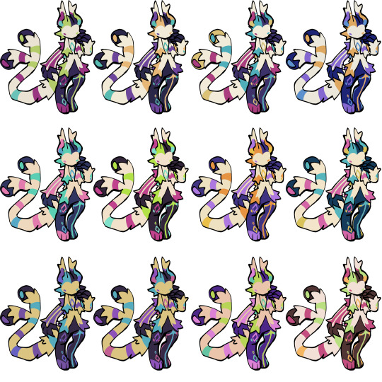
it helps me so much when i feel experimental with colors. here are what you need
a wip character design. sketchy or pixel art works better since the colors can have some anti aliasing issues
a program with gradient maps. i'm using clip studio paint but ik photoshop also has it. like i said this is used more on photos or paintings
and here's what you do!
draw your character. i'm making a new fursona for myself but anything should work.
2. decide on their markings/color placement in grayscale. i recommend doing grayscale so you can easily see the values. split your grays into however colors you want. i like doing 5-6 the most. i reccomend duplicating the color layer if you wanna try multiple palettes.
3. this part is program dependent but in csp's case go to edit > tonal correction > gradient map.
4. i made a few default 5 color gradient maps but if don't use gradients like me i reccomend making the graph like this so they become solid color. split the map into however many colors you used. i'll add a color to the red-orange one bc my character has 6 grays.
5. replace the colors by clicking below specified color. it all depends on your creativity and what you want. experiment til you like it.
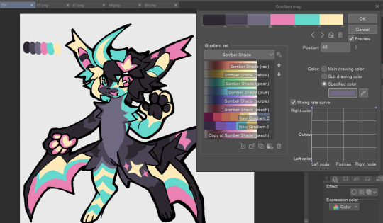
6. fuck around, try stuff, put them together to see if you like any of em. i made 9 to see if i can focus on one of them and i actually ended up loving the bottom right. it really makes them shiny
7. (optional) if you like a palette you can further and play with colors while keeping the palette. you can use color balance (in the same menu as gradient map in csp) or layers to mess around, have fun!
also a color tip because people seem to compliment that a lot in my art: digital art has millions of colors! don't be afraid of using wacky tones unless you're going pantone. if you want to get something physical i recommend being open to alternative colors as they tend to be more limited. i know whoever is doing it will try their best to keep the colors close.
color theory is something i don't...care much about mostly because this is something i'm doing for fun. i'll consider it in professional work.
#artists on tumblr#digital art#ika's showtime#ikarnival#art tutorial#art tips#drawing tips#art resources#clip studio paint
407 notes
·
View notes
Text
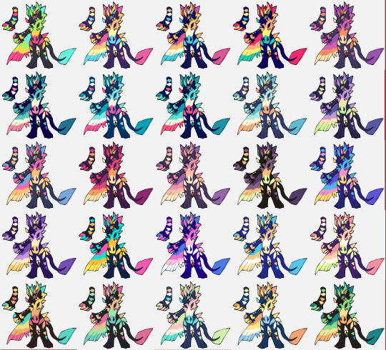
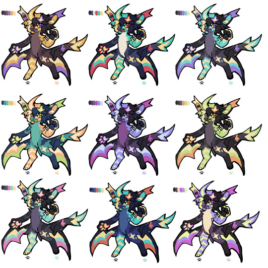
Okay so technically I got this ask over on @only-horse-polls but it feels like it belongs here more.

Step 1. Draw your creature. I'm old school so we're doing this in flat white, no transparent or layering.


Step 2. Put down the 2 primary colors that you're gonna fade between. Make sure to get all those tiny pixels.

Step 3. Note the two colors' RGB values. When you know the RGB of both colors, note how big the difference in values is.

Step 4.1. Now if you don't feel like taking out each transition color one at a time, you can open whatever art program of your choice be it SAI, photoshop, mediabang, all you need is the gradient tool.
We're gonna use 14 transition colors so we're making a 16 by 16 canvas. If you want more or less transition colors size your canvas accordingly.
Select the gradient tool, apply your two base colors, and make a gradient. Make sure the two utmost colors are your base colors. Now you can simply copy and paste that gradient into paint.

Step 4.2. If you want to only work in paint or can't be bothered opening a new program you first have to figure out how much your RGB values are gonna have to change with each transition color. Do this by dividing your value difference by however many transition colors you want. In our case, it's 100, 87, and 80 divided by 14.
100/14 = 7.1 (round to closest, 7)
87/14 = 6.2 (round to closest, 6)
80/14 = 5.7 (round to closest, 6)
These are the numbers we're gonna add or retract, depending on which base color we start at.
If you land on #.4 or #.5 or #,6 I'd recommend altering between rounding up and down for every color.
For example; you have 8.4, round to 8 for the first transition color and 9 on the second, then 8 on the third, and so on.

Step 5. Section out where the transition is going to be using other colors and assign each section color to a transition color.

Step 6. Select your section color in your first color slot (you can do this by pressing 'I' to get your color selector and then left-clicking the color you want to select), and your corresponding transition color in your secondary color slot (can be done by right-clicking with your eyedrop/color selector).
Then press 'E' to select the eraser, make it a decent size, and then right-click and drag it over the transition areas!

Step 7. Continue until you've covered all section colors with your transition colors, after that you can add whatever else you want to your creature and you're done!

85 notes
·
View notes
Text
As a stationery and fountain pen affictionada...
This. Still. Makes. Me. Laugh.

Let me explain why:
Look at how Tim is holding the pen. Stylistic choice or not, that grip means he's putting pressure on the pen. That he's heavy handing his writing.
Now look at the pen. That's a fountain pen. Fountain pens work through combined capillary and gravity action that makes the ink flow down to the nib naturally when the pen is in writing position and in contact with a writing surface; which is, depending on the model, between 45° and 60° angle in the vast majority of the cases.
Most fountain pens aren't made to sustain heavy hand writers. In fact, a great number of them is used to correct the grip, angle, muscle memory and heaviness of a person's handwriting style, since the simple act of touching the nib on paper easily makes the ink come out.
Now, look at Damian's implied facial expression and body language. Yes, we can all shrug it's just his rivalry with Tim that makes him react like that, it's a perfectly reasonable way to explain it all. However, for a fountain pen affictionado, for someone who loves fine writing instruments, that right there is a sentence of death.
Damian isn't just seeing Tim use his pen. He's seeing Tim, a person who couldn't care less for the writing tools he's using, obliterate the tines by placing way too much force on them. He's horrified of his favorite writing instrument being damaged by Tim's disregard with it, which is the most common reaction ever when any fountain pen lover sees their favorite pen being held and used by another person without their authorization.
Damian isn't overreacting at all.
The fountain pen community can confirm it.
[EDIT]
I know it's no ones concern, but as a lover of fountain pens, I kind of had to give a huge zoom-in in a version of this that isn't as pixelated and... guys, I think I know which fountain pen is this!
I may be wrong, but I think that's a Lamy Safari Black Charcoal model!
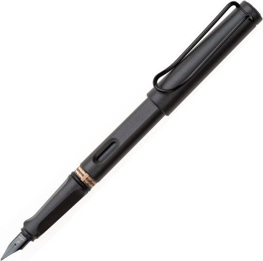
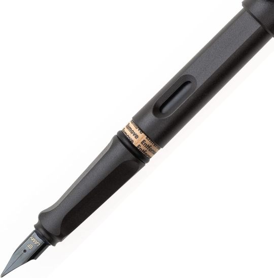
In the comic we can't see the window or the triangular grip very well (I can kind of see a shadow of the triangular shape, but I'm not calling it without being certain) and it looks a bit chonkier, but look at that cap! That minimalist cap with the sturdy yet simple, black clip and small gap on the top of the cap! That's a cap for a Lamy Safari model if I ever saw one!
Yes, maybe it can be some other fancier and more expensive brand, most Lamy's I've seen are between 30-60USD with special collections being a little closer to the 80USD mark on really expensive shops online, but let me make an argument for it.
A Lamy Safari fountain is considered a popular workhorse among affictionados and artists alike. Not only it's reliable, with a simple yet stylish body and construct that serves to pretty much every occasion, its construct is simple in terms of maintainance and handling. Want to go travel on a plane? No problem, take the cartridges with you! Prefer bottle ink? Not a problem at all, here's the converter for all your bottled ink needs! Oh, the standard medium nib isn't to your liking? Let's find one that you enjoy, there's European extra fine (0.38) to broad, stub, italic and even for writing musical score! Still not enough? Hey, there are many manufacturers that make their own customized nibs for a fair price, maybe give them a try? And the best part? The nibs aren't so expensive that you're breaking the bank with them, so if you break one you can get another with relative ease.
This sweet pen is a monster at work 24/7. No wonder it's a popular model among beginners and long term users and lover of fountain pens. They're just that good.
423 notes
·
View notes
Text

an HSL color graph (S = 1.00) rendered with 16 colors in computercraft (361x101 characters)
all images in this post in their original state (pre-tumblr upload) are available here
elaboration on exactly what this is (+ how it is, why it is) below the cut:
first and foremost, this is a regular HSL color graph at S(aturation) = 1.00 (or 100%):

computercraft has the same basic color palette as minecraft dyes; it has only 16. it lets you control the text and text background colors per character, and it has a stripes character that takes up ~33.33% of the total area of each character unit (it's a monospace font). this enables a sort of pseudo-256-color palette:

with some math, you can compare the similarity of the RGB of any HSL value with the average RGB of each character unit and match it to the nearest, which can then be used to render an HSL graph. i had to slowly composite several screenshots of the program (craftos-pc) to get this whole thing captured in one image.
here's a close-up, in case tumblr or your viewport displays the original image too small to discern:

and yes, if you're curious, i did crunch down the image in an editor to see what it would look like if each 6x9 pixel character were just a single pixel:

overall, i spent about 7 hours on this, and i'm really honestly not quite sure why. welp! time to see how i might be able to improve this.
#this was hell but also so worth it#katherine txt 8008#katherine's art tag 8008#art#colors#programming
45 notes
·
View notes
Text
Tutorial: Converting all types of CAS CC to work with color sliders (+ how to disable it)
This enables CAS CC to work with Color Sliders for Hair, Clothes, & Accessories by thepancake1 and @mizoreyukii.
Since S4 Studio only let's you batch convert hairs and update makeup for compatibility, I present to you: TS4AlphaConverter_2_2_0_0 by CmarNYC.

Keep in mind that enabling CAS CC for color sliders will increase the file sizes of your .package files!
Sliders will also always affect all the texture, i.e. you can't exclude accessories like buttons or zippers, so some textures might not work well.
Also check out this tutorial: Fixing slider compatible CAS CC with broken textures

💜 Requirements:
Color Slider mod
TS4AlphaConverter_2_2_0_0
CAS CC you want to enable
Featured CC by @trillyke @daylifesims @jius-sims @magic-bot
💜How to enable CC for color sliders
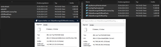
1. Download the required program, mod and CC you want. This is my outfit before sliders:

2. Open up Alpha Converter
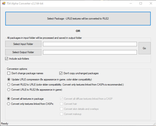
3. For enabling sliders, you can only use the folder option and not single files: Select your input folder which contains the .packages you want to enable. Then select your output folder where you want to save the new files. "Include subfolders" is handy if your CC goes into more folders inside your input folder. It will reproduce the same file structure.
4. I would recommend enabling "Don't change package names" so you can just replace your input files directly, otherwise it adds "_Fixed" at the end of the filename. I will also leave "Don't copy unchanged packages" checked.
5. Next we will select "Convert RLE2 to LRLE" to enable color sliders. I will explain the others later. It then enables "Convert only textures linked from CASPs" which is good, e.g. it will only target actual CAS CC textures then and no Build & Buy for example. Leave "Convert all diffuse textures linked from CASP" checked if you want to convert all types of CAS CC.
6. These are my finished settings:
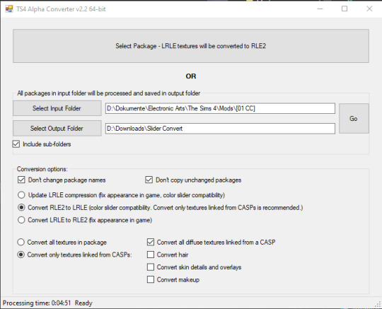
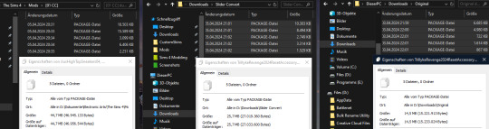
7. Press "Go". It will then take a while depending on file amount and swatches, as it will have to go through textures one by one.
8. Check your finished files. The file size should be bigger, in this case it went up by 30 MB for only 5 files.
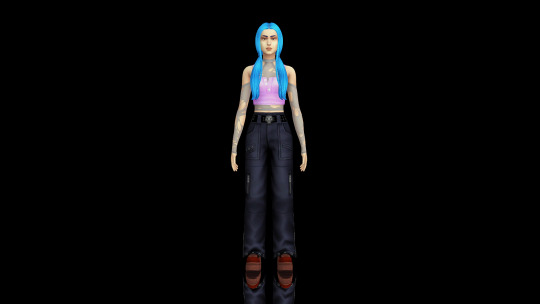
This is how the outfit looks after applying sliders to all pieces:
💜 How to disable CAS CC for color sliders
This time select "Convert LRLE to RLE2". You can leave "Convert only textures linked from CASPs".

2. Press "Go" and let it do it's thing.
3. As you can see, the file size went down again (middle), but it is not the same size as from the original file (right).
You will no longer be able to use sliders on the CAS CC piece, except transparency, which always works.
💜 Fixing slider compatible CAS CC with broken textures
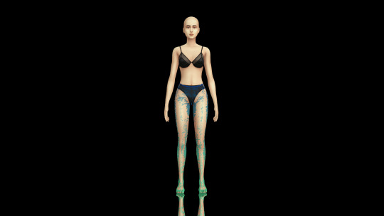
If some of your CAS CC displays huge areas of missing, pixelated textures there is an issue with compression.
I don't know how and why this happens, but check out * this tutorial * on how to fix it.
@thefoxburyinstitute @maxismatchccworld @emilyccfinds @sssvitlanz
#ts4 tutorial#ts4 resources#tutorial#Sims 4 tutorial#s4 guide#ts4 guide#Sims 4 studio#Sims 4 cas#ts4 cas#color slider#cmarnyc#thepancake1#mizoreyukii#yorututorials
86 notes
·
View notes