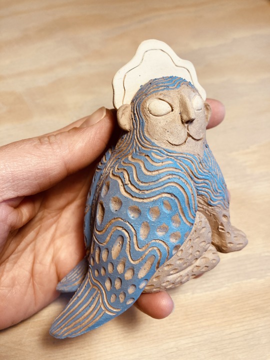
#pigments vs dyes
Text
Light-fast? My pigment is a fugitive and ran away with the sun!
Okay, okay, you're about to be subjected to one of my favourite topics, so if you have no interest in traditional art and why some stuff fades away (quite literally) then move along.
But if you're like me, and you want to know more about pigments vs dyes and why your pink thing has over time become a white thing, keep reading…
So, my interest, aka my dive into the rabbit hole that is lightfastness, started way back when I made a friend a bright pink thing (cheap student grade acrylic paint on canvas board) , they hung it up in their window, and it slowly turned into a white thing.
Gasp! Shock! Horror!
No really, I was slightly traumatized, simply because I was about to start selling my artwork and if it was going to fade away in the space of a year odd, then I was going to have a big problem. I mean, you can't sell art and then tell people they must keep it in a dark place and only observe it under moonlight. Well okay you probably could if you marketed it right, but I'm terrible at marketing and the idea of someone coming back to complain about the art disappearing gives me anxiety.
So I went on a hunt to find out WHY.
So let's talk about pigments vs dyes and what fugitive pigments are, and why artist grade is so much more expensive than student grade.
What's the difference between pigments and dyes?
Think of paint made from pigments as a suspension, finely ground up particles are suspended in a medium, much like mixing sand into water. If you let a sandy water mix sit for long enough the sand particles will sink to the bottom and separate from the water. Pigment based paint sits on the surface of your canvas or paper (yep even watercolours, the paper gets wet, but when it dries the pigments are sitting on the surface, they haven't sunk in and bonded with the paper). Pigment based paint is more inclined to be opaque.
Paint made from dyes are a solution, very very finely ground particles are dissolved into a medium and change their chemical makeup, you can let them sit as long as you like and they won't separate. Dyes sink into the surface of the paper or canvas. Dyes are naturally transparent. Dyes are used for fabric precisely because they sink into the surface and bond with it.
So, those fugitive pigments huh?
I'll start with the kicker, dyes, by their very nature, are fugitive.
Let me explain that a bit more - dyes are a solution, they have chemically bonded with the medium and because of this chemical change they are much more vulnerable to UV light, to the point they can completely disappear. Alcohol markers are a prime example of this. This is also why clothing fades over time.
Any fluorescent colour is fugitive. Don't ask me why, they just are.
So what about pigments?
Well, if you mix them with oil, pretty much all the pigments will manage to stick around, oil creates a protective coating that shields the pigments from UV light.
Not so with other mediums though, so some pigments will fade over time. As paint companies have become aware of this, they have tried to find alternative pigments that are light-fast and you will find a light-fast rating on good brands of paint.
The white factor.
White tends to be opaque and is very light-fast, it's usually PW6 pigment for titanium white and PW5 for zinc white, which is also known as the mixing white and is supposedly less opaque - personally I can't tell the difference.
So, white, all good, gonna use white which is light-fast and this tube of red which is also listed as light-fast and make pink, no worries right?
Wrong.
Mixing white into other pigments can make them less light-fast.
Why???? I hear you scream.
It's to do with (someone correct me if I'm wrong but this is my understanding) the fact white reflects light, so as soon as you mix another pigment into white, not only is the concentration of the pigment reduced, it's also at the mercy of all that extra light. Some pigments are naturally very light-fast anyway and being mixed with white won't be much of an issue.
Avoiding the known fugitive pigments is a good start to ensuring your artwork is going to stick around for the long haul, of course painting in oils is more of a guarantee but not everyone can be bothered with the mess.
So, artist grade vs student grade?
In general artist grade paint will have a light-fast rating, list the pigments used AND most importantly they will contain much more pigment and better quality pigments than cheaper paints. More pigment means stronger more vibrant colours, you need less paint to cover a surface, there are no fillers like chalk to make the paint opaque and the quality of the pigments is higher. Basically when you buy artist grade paint you are paying for the pigments used, you're more likely to find single pigment paints and the pigments are more likely to be light-fast.
Of course oil paint can pretty much ignore this, buy whatever works for you, it's not going to matter much.
What about student grade?
Well, student grade from a reputable brand may still give you a list of pigments and a light-fast rating, you can feel pretty assured that the paint will perform as required, but the pigments will be cheaper and less concentrated. If, like me, you have found yourself utterly annoyed you can't get a vibrant enough look from your student grade paint no matter how much you apply, then this is why, it simply doesn't have the same amount of pigment as the artist grade in the same brand does. While the artist grade is more expensive, my personal findings with watercolours are that I use much less of it because it is more pigmented, so it works out more cost effective in the long run.
Student grade will often substitute an original pigment for a 'hue', like 'cadmium red hue' which is a replication of the colour and doesn't actually contain the cadmium red pigment. So you get a lower cost pigment in a lesser concentration.
Student grade paint generally won't be as concerned with using light-fast pigments, so you're more likely to find less permanent pigments and also pigment mixtures rather than pure single pigment paints.
What's the difference between single pigment and mixed pigment?
Glad you asked.
It's the mud factor, we've all mixed paints together and come out with a sludgy grey muddy colour right? Mixed pigment paints when they contain multiple pigments are more likely to give you dull muddy colour when you mix them with other paints, simply because mixing complimentary colours together will give you a neutral grey. (Stares hatefully at reeves watercolours, my first experience with mud production and chalkiness)
Single pigment paints are easier to mix vibrant colours with.
What about student grade, or ungraded paint from non recognized brands?
Well, generally they make up their own names for the colours, they give you no pigment or light-fast rating (though many claim to be light-fast, they show no actual ratings and can't be trusted) and they can often contain dyes as well as fugitive pigments, because they are cheaper to use. They will contain a lot of fillers and less pigments, and can be harder and more frustrating to use. It's not always the case of course, but in general you get what you pay for.
Finally, designer mediums vs art mediums.
Or - was never intended to last vs meant to be hung on a wall.
Some currently popular and commonly used mediums were never intended for preservation. They were created for design, be it architecture, fashion design, magazine illustrations or other things that were made to be photographed and then reproduced in print.
Prime examples of this are alcohol markers and gouache. They were never ever intended to be light-fast, they were made for quick execution and reproduction, the original was often just thrown out.
Gouache, because it dries fast and is matte makes it perfect for both quick turnaround illustrations and reproduction. The matte surface makes photography easy without any worries about reflected light messing up the image. It was used extensively in the magazine and printed periodical industry.
Alcohol markers were more aimed at the design industry.
Gouache, by it's very design tends to still be very inclined to use fugitive pigments, Windsor & Newton do have some with high light-fast ratings, but you have to read the labels carefully and if you use the paint as a wash it's still going to say goodbye faster than it should (it's the white factor again, this time it's the white of the paper).
Alcohol markers, as I've said before, are dye based, and are highly fugitive. (Do I get mad when people sell original art done in alcohol markers, yeah, a little bit, I feel bad for the person buying it who presumably wants to put it on the wall and it IS going to fade away. I don't see anything wrong with selling the artwork, markers have their own charm and the effects are quite unique, but you should at least warn people that it's fugitive)
Most calligraphy inks designed to go inside pens are dye based and will fade. (Gel writing pens too, even in closed books that will fade drastically, ask me how I know!)
(Pigment based ones tend to clog so are reserved for dip pens and brushes, and are usually mixed with shellac to make them waterproof. )
Don't be put off using these mediums, they are great fun to play around with, just be aware that they are not designed to be exposed to light for long periods of time are best for reproduction as prints.
Can you enhance the lightfastness of a painting?
Yep, put it behind glass (perspex is even better?). I think it's possible to find UV resistant varnish too, but don't quote me on that, I haven't seen any myself. I don't think this is a reliable method for dye based art though sadly, while watercolours behind glass will last longer, some dyes can fade away even without light on them (see the gel pen experience)
Can you do your own lightfastness test on your mediums?
Sure can, as long as you have a control swatches kept in a dark place, you can put swatches in direct sunlight and compare them to the ones you kept in the dark to see how much they have faded and how long it took. Some will show no signs of fade even after a year of direct sunlight, some might disappear completely, it will depend on the pigments.
So there you have it, the lowdown on the difference between pigments and dyes, why your medium of choice makes a difference to how long your artwork will last and what makes artist grade what it is.
#art talk#traditional art#art materials#lightfastness#pigments vs dyes#cross posted on cohost and pillowfort
7 notes
·
View notes
Link
Pigments and dyes are used to add colour and texture to different polymer clays. These are available in a wide variety. Both colourants are majorly used in textiles, cosmetics, plastics, and the painting industry. These are used to make products more attractive.
0 notes
Text
Part 1 : HAIR DEBATE.
I noticed a debate about Arthur being dark blonde or light brown. I would say both.

As seen in this photo, Arthur has some darkish brown and light brown to burnt blonde looking color to it.

Same with his hair. And before you argue that I'm using mods in these that change his hair I'm not, I only have an online content unlocker and I do not have a rampage trainer so mods that mess with his hair are very unlikely.

Also, the darkest color Arthur's hair can be ingame is dark brown, which is due to darker lighting. But my proof is inaccurate at best as photobleaching is a thing. And if you don't know what it is the photochemical alteration of a dye or a fluorophore molecule such that it is permanently unable to fluoresce. Or fading for short.
PART 2: EYES
I saw a debate on Reddit. Yes, Reddit. But it was about Arthur's eye color, I always thought it was blue until I checked this, now the thing about blue-eyed people is that their eye color can appear different per se. I can prove this I am blue-eyed. For example, my eye color looks purple sometimes, some dude said it was rainbow once kinda weird. But it can also look green at times just like Arthur's in this photo.

But this is caused by the light brown pigment of whatever the fuck interacting with the blue light in your eyes or whatever. Which causes it to look green or speckled. Also, I have proven before that Arthur has blueish-greenish eyes. Yes, that's real.
PART 3 : ARTHUR MORGAN vs. ELLIE.
no debate about Arthur solos. has around 6'0, 180lbs but if you want me to go deep into this. According to a video I have found and some other evidence Arthur's quickdraw is around .23-.27 seconds and the blink of an eye is .25 seconds, so before Ellie could get close she'd already be shot. Anyone who says otherwise might just be a dumbass.
PART 4 : Ending some bickering between John and Arthur fans.
It is persistently debated about who is the better gunslinger between Arthur and John, or fighter in general. It's not a fair comparison, it's like comparing apples to oranges, both have their specialties, and both have their advantages over the other. In terms of gameplay, they are indistinguishable. But in terms of lore, most will say that Arthur would win in a brawl and John would win in a regular duel. There isn't much debate about whether or not Arthur would win in a brawl, most would agree on this, though the second one is a bit more controversial. But it is reasonable to suggest that in John's prime and after all of his experience and training with Landon, that he would be a quicker draw. But the comparison still isn't fair nonetheless. Arthur isn't a gunslinger, though he may be extremely quick, he prioritizes accuracy over speed, and that is his specialty. Arthur is a sniper, he is a rifleman, he would pick off enemies from an extreme distance and John would clear them out with extreme speed. Arthur is better in terms of accuracy, but yes, John would likely win in a duel. But so what? Duels aren't all that common and it likely wouldn't be the circumstance in which they would fight. However, if it came down to it and they were both in a battle close to mid-range with guns, John would still likely win because even if Arthur can hit a vital headshot with great accuracy, John can still hit his shots almost as well, and do so quicker. This is assuming that they are both in their prime, of course, because if we are referencing Arthur while he has TB or while John is still an oaf and doesn't have the same versatility with guns then it wouldn't really be fair. Additionally, most John fans will mention that John had a better arsenal, but what relevance does that have? Did he find a time portal in 1911 and teleport back in time to 1899 just to shoot Arthur or something? If they were to fight, it would be in the same period, so arsenal doesn't matter.
PART 5 : Naming my son. ( made my Vern's brother Mike. )
Hey, I'm Michael, and I also manage the RDR2 FANCLUB Blog. I had a debate with my wife the other day about whether we should name our child Arthur ( comical I know. ) or Iroy both are good but I need your opinions. also, @arthursdoll you're a pretty good friend of my brother so I'll let you decide :)
PART 6 : John Marston who?
rip van winkle.
PART 7 : Ending another stupid Reddit thing.
" When do you think Dutch went sour. "

Dutch wasn't necessarily always a good figure in the game, he didn't really start out as one and this is speaking from someone who's played it 16+ times. Oh and by the way if you couldn't tell Vernidia isn't explaining this one. But you have to take something into account so let us start with the.
Death of Davey Callander. The death of Davey surely played an impact on the choices that Dutch throughout the story. So did the death of Jenny I suppose, both weren't really introduced.
Chapter 2. Chapter 2 played a big part in the game, it was one of the LARGEST chapters. And if you watch the hidden dialogues in chapters 2 and 3 between Dutch and Lenny and Hosea and Lenny, it looks to me like they were grooming him to become Dutch’s next “consigliere”.
Trolley incident, and ETC. The trolley incident happens during the trolley mission where Dutch hits his head, an injury possibly played a part during this, I don't quite know. But there is an obvious change in Dutch after he hits his head during that mission.
FORGOT SOMETHING. Arthur mentions in Chapter 1 Colter that he never saw a side of Dutch that he's seen before, this is when he killed that girl on the ferry job in Blackwater.
The Bank heist went wrong. The bank heist surely played a huge part in the game it contained the death of Hosea and Lenny. And after these deaths you can see a sure change in Chapter 5.
My conclusion is he went “Sour” during the ferry heist but didn't quite reveal his true colors until Chapter 4-5.
PART 8: When Dutch shot at John in rdr1 did he mean to kill him?
Yeah probably.
Made by Vernidia, Mike, and Scooter
41 notes
·
View notes
Note
Dunno if anyone's asked this yet but how do you transfer / create patterns for your embroidery pieces? :O
Has not been asked yet! :>
I prefer to print my design onto paper and then trace over it with Pilot Frixion products onto a piece of water-soluble stabilizer. Pilot Frixion products are pens and markers that disappear when heat is applied. My preferred stabilizer is Pellon 541. I buy it by the bolt because it is a tried and true favorite of mine and I know how to get the most out of it.
Tracing by hand is another step vs using products that allow you to print a water soluble design but Pilot Frixion pens don't stain my preferred fabrics I work on. And I can just use a glue stick on the Pellon 541 (which I cut into the shape I need) so that it sticks to the fabric without shifting, so I can use less for each piece. I keep many colors of the Frixion fineliners on hand so that when I transfer embroidery I plan out then, not later, where I want each color to go, and have a guide to follow when I'm in the weeds stitching. This is a choice I make for my workflow, not something that I see commonly done. If I don't do this, I'll forget how I intended to do some sections.
Pilot does not endorse crafters using the Frixion products this way since they're not tested or rated for that use, btw - they are normal pens and markers meant for paper. Very experienced high art crafters also do not endorse Frixion products because of the very valid reality that the PH could degrade fabric over time, or the marks can reappear if exposed to cold. I do not especially care about making heirlooms for people that are intended to last decades - my projects get a LOT of hard use and wear. The embroidery process will not be what causes the fibers to wear out on my clothes or accessories.
I have used the stick-on printable washable stabilizers. I used it on the dragon vest I made, and I regret it deeply. It turns out that some printer inks do NOT wash out when the piece is rinsed and the dyes/pigments settle on the fabric and just stain the everloving fuck out of your fabric. I had to use every ounce of my laundry knowledge from years of working with fibers to save my vest, so I had color catchers on hand and had to immediately run to buy two liters of vodka for soaking instead of risking it drying overnight.
I still have my printable interfacing sheets and I'll probably see if friend-printers have ink that works better than mine did, which is in the fine print of the product, that it might stain and to test it. Or I can just use them up as tracing papers without printing. It feels like a waste to do that without trying other printers since it's so expensive for a pack of sheets and I am currently unemployed. I'll do whatever suits my needs on a project by project basis with it.
Anyway. Don't be me with using new methods of transfers on the big important projects. Test your new transfer method with your fabric in an inconspicuous spot. Honestly, test older transfer methods with any fabric if it is a gift or something Special and Important. I almost destroyed 130 hours of work and I am experienced enough that I had the skill to just barely salvage my hard work.
#embroidery help#chatter#i did the boop piece so fast because I did draw directly on the fabric btw. it meant i didnt have to wash the piece and wait for it to dry#thats my secret to how i did that one so quickly~!
40 notes
·
View notes
Text
Did the ancient Celts really paint themselves blue?
Part 1: Brittonic Body Paint


Clockwise from top left: participants in the Picts Vs Romans 5k, a 16th c. painting of painted and tattooed ancient Britons, Boudica: Queen of War (2023), Brave (2012).
The idea that the ancient and medieval Insular Celts painted themselves blue or tattooed themselves with woad is common in modern culture. But where did this idea come from, and is there any evidence for it? In this post, I will examine the evidence for the use of body paint among the ancient peoples of the British Isles, including both written sources and archaeology.
For this post, I am looking at sources pertaining to any ethnic group that lived in the British Isles from the late Iron Age through the early Roman Era. (Later Roman and Medieval sources will be discussed in part 2.) The relevant text sources for Brittonic body paint date from approximately 50 BCE to 100 CE. I am including all British Isles cultures, because a) determining exactly which Insular culture various writers mean by terms like ‘Briton’ is sometimes impossible and b) I don’t want to risk excluding any relevant evidence.
Written Sources:
The earliest source for our notion of blue Celts is Julius Cesar's Gallic War book 5, written circa 50 BCE. In it he says, "Omnes vero se Britanni vitro inficiunt, quod caeruleum efficit colorem, atque hoc horridiores sunt in pugna aspectu," which translates as something like, "All the Britons stain themselves with woad, which produces a bluish colouring, and makes their appearance in battle more terrible" (translation from MacQuarrie 1997). Hollywood sometimes interprets this passage as meaning that the Celts used war paint, but Cesar says that all Britons colored themselves, not just the warriors. The blue coloring just had the effect (on the Romans at least) of making the Briton warriors look scary. The verb inficiunt (infinitive inficio) is sometimes translated as 'paint', but it actually means dye or stain. The Latin verb for paint is pingo (MacQuarrie 1997).
The interpretation of vitro as woad is supported by Vitruvius' statements in De Architectura (7.14.2) that vitrum is called isatis by the Greeks and can be used as a substitute for indigo. Isatis is the Greek word for woad; this is where we get its modern scientific name Isatis tinctoria. Woad and indigo both contain the same blue dye pigment, hence woad can be used as a substitute for indigo (Carr 2005, Hoecherl 2016). The word vitro can also mean 'glass' in Latin, but as staining yourself with glass doesn't make much sense, it's more commonly interpreted here as woad (Carr 2005, Hoecherl 2016, MacQuarrie 1997). I will revisit this interpretation during my discussion of the archaeological evidence.
Almost a century later in De situ orbis, Pomponius Mela says that the Britons "whether for beauty or for some other reason — they have their bodies dyed blue," (translation by Frank E. Romer) using virtually identical language to Cesar, "vitro corpora infecti" (Lib. III Cap. VI p. 63). Pomponius Mela may have copied his information from Cesar (Hoecherl 2016).
Then in 79 CE, Pliny the Elder writes in Natural History book 22 ch 2, "There is a plant in Gaul, similar to the plantago in appearance, and known there by the name of "glastum:" with it both matrons and girls among the people of Britain are in the habit of staining the body all over, when taking part in the performance of certain sacred rites; rivalling hereby the swarthy hue of the Æthiopians, they go in a state of nature." In spite of the fact that glastum means woad in the Gaulish and Celtic languages, Pliny seems to think glastum is not woad. In Natural History book 20 ch 25, he describes different plant which is almost certainly woad, a “wild lettuce” called "isatis" which is "used by dyers of wool." (Woad is a well-known source of fabric dye (Speranza et al 2020)).
Of course, "rivaling the swarthy hue of the Æthiopians" doesn't necessarily mean blue. Pliny seems to think Ethiopians literally have coal-black skin (Latin ater). Additionally, Pliny is taking about a ritual done by women, where Cesar was talking about a practice done by everyone. Are they talking about 2 different cultural practices, or is one of them reporting misinformation? Or are both wrong? Unfortunately, there is no way to know.
The Roman poets Ovid, Propertius, and Marcus Valerius Martialis all make references to blue-colored Britons (Carr 2005), but these are literary allusions, not ethnographic reports. As such, they don't really provide additional evidence that the Britons were actually dyeing or painting themselves blue (Hoecherl 2016). These poetic references merely demonstrate that the Romans believed that the Britons were.
In the sources that come after Pliny the Elder, starting in the 3rd century, there is a shift in the terms used. Instead of inficio which means to dye or stain (Hoecherl 2016), probably a temporary application of color to the surface of the skin, later sources use words like cicatrices (scars) and stigma/stigmata (brand, scar, or tattoo) (Hoecherl 2016, MacQuarrie 1997, Carr 2005) which suggest a permanent placement of pigment under the skin, i.e. a tattoo. This evidence for tattooing will be discussed in a second post.
Discussion:
Although the Romans clearly believed that the Britons were coloring themselves with blue pigment, that doesn't necessarily mean that Julius Cesar, Pomponius Mela, or Pliny the Elder are reliable sources.
In the sentence before he claims that all Britons color themselves blue, Julius Cesar says that most inland Britons "do not sow corn [aka grain], but live on milk and flesh and clothe themselves in skins." (translation from MacQuarrie 1997). This is demonstrably false. Grains like wheat and barley and storage pits for grain have been found at multiple late Iron Age sites in inland Britain (van der Veen and Jones 2006, Lightfood and Stevens 2012, Lodwick et al 2021). This false characterization of Insular Celts as uncivilized savages would continue to show up more than a millennium later in English descriptions of the Irish.
Pomponius Mela, in addition to believing in blue-dyed Britons, also believed that there was an island off the coast of Scythia inhabited by a race called the Panotii "who for clothing have big ears broad enough to go around their whole body (they are otherwise naked)" (Chorographia Bk II 3.56 translation from Romer 1998). Pliny the Elder also believed in Panotii.

15th-century depiction of a Panotii from the Nuremberg Chronicle. Was Celtic body paint as real as these guys?
The Roman historians Tacitus and Cassius Dio make no mention of body paint in their coverage of Iron Age British history (Hoecherl 2016). Their silence on the subject suggests that, in spite of Cesar's claim that all Britons colored themselves blue, the custom of body staining or painting was not actually widespread.
Considering all of these issues, is any of this information trustworthy? Based on my experience studying 16th c. Irish dress, even bigoted sources based on second-hand information often have a grain of truth somewhere in them. Unfortunately, exactly which bit is true is hard to identify without other sources of evidence, and this far in the past we don't have much.
Archaeological Evidence:
There are no known artistic depictions of face paint or body art from Great Britain during this time period. There are some Iron Age continental European coins that show what may be face painting or tattoos, but no such images have been found on British coins (Carr 2005, Hoecherl 2016).
In order for the Britons to have dyed themselves blue, they needed to have had blue pigment. Woad is not native to Great Britain (Speranza et al 2020), but Woad seeds have been found in a pit at the late Iron Age site of Dragonby in England, so the Britons had access to woad as a potential pigment source in Julius Cesar's time (Van der Veen et al 1993). Egyptian blue is another possible source of blue pigment. A bead made of Egyptian blue was found at a late Bronze Age site in Runnymede, England. Pieces of Egyptian blue could have been powdered to produce a pigment for body paint. (Hoecherl 2016). Egyptian blue was also used by the Romans to make blue-colored glass (Fleming 1999). Perhaps this is what Cesar meant by 'vitro'.


Potential sources of blue: Isatis tinctoria (woad) leaves and a lump of Egyptian blue from New Kingdom Egypt
Modern experiments have found that reasonably effective body paint can be made by mixing indigo powder either with water, forming a runny paint which dries on the skin, or with beef drippings, forming a grease paint which needs soap to be removed (Carr 2005, reenactor description). The second recipe is very similar to one used by modern east African argo-pastoralists which consists of ground red ocher mixed with cow fat (unpublished interview*).
Finding blue pigment on the skin of a bog body might confirm Julius Cesar's claim, but unfortunately, the results here are far from conclusive. To my knowledge, Lindow II is the only British bog body that has been tested for indigotin, the dye pigment in woad and indigo. No indigotin was found (Taylor 1986).
The late Iron Age-early Roman era bog bodies Lindown II and Lindown III show some evidence of mineral-based body paint (Joy 2009, Giles 2020). Both of them have elevated levels of calcium, aluminum, silicon, iron, and copper in their skin. Lindow III also has elevated levels of titanium. The calcium levels may simply be the result the of the bog leeching calcium from their bones. Some researchers have suggested that the other elements may be from mineral-based paints applied to the skin. The aluminum and silicon may be from clay minerals. The iron and titanium could be from red ocher. The copper could be from malachite, azurite, or Egyptian blue (CuCaSiO4), pigments that would give a green or blue color (Pyatt et al 1995, Pyatt et al 1991). These elements may have other sources however, and are not present in large enough amounts to provide definitive proof of body paint (Cowell and Craddock 1995, Giles 2020). Testing done on the early Roman Era (80-220 CE) Worsley Man has found no evidence of mineral-based paint (Giles 2020).
One final type of artifact that provides some support for Julius Cesar's claim is a group of small cosmetic grinders from late Iron Age-Roman Era Britain. These mortar and pestle sets are found almost exclusively in Great Britain and are of a style which appears to be an indigenous British development. They are distinctly different from the stone palettes used by the Romans for grinding cosmetics which suggests that these British grinders were used for a different purpose than making Roman-style makeup (Carr 2005). Archaeologist Gillian Carr has suggested that these British grinders might have been used by the Britons for grinding, mixing, and applying a woad-based body paint (Carr 2005).


Left and center: Cosmetic grinder set from Kent. Right: Cosmetic mortar from Staffordshire. images from Portable Antiquities Scheme under CC attribution license
The mortars have a variety of styles of decoration, but the pestles (top left and top center) typically feature a pointed end which could be used for applying paint to the skin (Carr 2005). The grinders are quite small, (most are less than 11 cm (4.5 in) long), making them better suited to preparing paint for drawing small designs rather than for dyeing large areas of skin (Carr 2005, Hoecherl 2016).
Conclusions:
Admittedly, this post is a bit off-topic, since the Irish are not mentioned, but dress history is also about what people did not wear. Hollywood has a tendency to overgeneralize and expropriate, so I want to be clear: There is no known evidence that the ancient Irish used body paint.
So, who did? For the reasons I have already discussed, I don't consider any of the Roman writers particularly trustworthy, but I think the following conclusions are plausible:
A least a few people in Great Britain dyed/stained or painted their bodies between circa 50 BCE and perhaps 100 CE, after which mentions of it end. Written sources from c. 200 CE on talk about tattoos rather than painting or staining. The custom of body dyeing/painting may have started as something practiced by everyone and later changed to something practiced by just women.
None of the writers mention any designs being painted, but Julius Cesar's description could encompass designs or solid area of color. Pliny, on the other hand, states that women were coloring their entire bodies a solid color. The dye was probably blue, although Pliny implies it was black. (I know of no plants in northern Europe that resemble plantago and produce a black dye. I think Pliny was reporting misinformation.)
Archaeological evidence and experimental recreations support the possibility that woad was the source of the pigment, but they cannot confirm it. Data from bog bodies indicate that a mineral pigment like azurite or Egyptian blue is more likely, but these samples are too small to be conclusive.
The small cosmetic grinders are suitable for making designs which might match Cesar and Mela's descriptions, but not Pliny's description of all-over body dyeing.
*Interview with a Daasanach woman I participated in while doing field school in Kenya in 2015.
Leave me a tip?
Bibliography:
Carr, Gillian. (2005). Woad, Tattooing and Identity in Later Iron Age and Early Roman Britain. Oxford Journal of Archaeology 24(3), 273–292. https://doi.org/10.1111/j.1468-0092.2005.00236.x
Cowell, M., and Craddock, P. (1995). Addendum: Copper in the Skin of Lindow Man. In R. C. Turner and R. G. Scaife (eds) Bog Bodies: New Discoveries and New Perspectives (p. 74-75). British Museum Press.
Fleming, S. J. (1999). Roman Glass; reflections on cultural change. University of Pennsylvania Museum of Archaeology and Anthropology, Philadelphia. https://www.google.com/books/edition/Roman_Glass/ONUFZfcEkBgC?hl=en&gbpv=0
Giles, Melanie. (2020). Bog Bodies Face to face with the past. Manchester University Press, Manchester. https://library.oapen.org/viewer/web/viewer.html?file=/bitstream/handle/20.500.12657/46717/9781526150196_fullhl.pdf?sequence=1&isAllowed=y
Hoecherl, M. (2016). Controlling Colours: Function and Meaning of Colour in the British Iron Age. Archaeopress Publishing LTD, Oxford. https://www.google.com/books/edition/Controlling_Colours/WRteEAAAQBAJ?hl=en&gbpv=0
Joy, J. (2009). Lindow Man. British Museum Press, London. https://archive.org/details/lindowman0000joyj/mode/2up
Lightfoot, E., and Stevens, R. E. (2012). Stable Isotope Investigations of Charred Barley (Hordeum vulgare) and Wheat (Triticum spelta) Grains from Danebury Hillfort: Implications for Palaeodietary Reconstructions. Journal of Archaeological Science, 39(3), 656–662. doi:10.1016/j.jas.2011.10.026
Lodwick, L., Campbell, G., Crosby, V., Müldner, G. (2021). Isotopic Evidence for Changes in Cereal Production Strategies in Iron Age and Roman Britain. Environmental Archaeology, 26(1), 13-28. https://doi.org/10.1080/14614103.2020.1718852
MacQuarrie, Charles. (1997). Insular Celtic tattooing: History, myth and metaphor. Etudes Celtiques, 33, 159-189. https://doi.org/10.3406/ecelt.1997.2117
Pomponius Mela. (1998). De situ orbis libri III (F. Romer, Trans.). University of Michigan Press. (Original work published ca. 43 CE) https://topostext.org/work/145
Pyatt, F.B., Beaumont, E.H., Buckland, P.C., Lacy, D., Magilton, J.R., and Storey, D.M. (1995). Mobilization of Elements from the Bog Bodies Lindow II and III and Some Observations on Body Painting. In R. C. Turner and R. G. Scaife (eds) Bog Bodies: New Discoveries and New Perspectives (p. 62-73). British Museum Press.
Pyatt, F.B., Beaumont, E.H., Lacy, D., Magilton, J.R., and Buckland, P.C. (1991) Non isatis sed vitrum or, the colour of Lindow Man. Oxford Journal of Archaeology, 10(1), 61–73. https://www.researchgate.net/publication/227808912_Non_Isatis_sed_Vitrum_or_the_colour_of_Lindow_Man
Speranza, J., Miceli, N., Taviano, M.F., Ragusa, S., Kwiecień, I., Szopa, A., Ekiert, H. (2020). Isatis Tinctoria L. (Woad): A Review of Its Botany, Ethnobotanical Uses, Phytochemistry, Biological Activities, and Biotechnical Studies. Plants, 9(3): 298. https://doi.org/10.3390/plants9030298
Taylor, G. W. (1986). Tests for Dyes. In I. Stead, J. B. Bourke and D. Brothwell (eds) Lindow Man: the Body in the Bog (p. 41). British Museum Publications Ltd.
Van der Veen, M., and Jones, G. (2006). A Re-analysis of Agricultural Production and Consumption: Implications for Understanding the British Iron Age. Vegetation History and Archaeobotany, 15 (3), 217–228. doi:10.1007/s00334-006-0040-3 https://www.researchgate.net/publication/27247136
Van der Veen, M., Hall, A., and May, J. (1993). Woad and the Britons painted blue. Oxford Journal of Archaeology, 12(3), 367-371. https://www.researchgate.net/publication/249394983
#cw anti-black racism#romano-british#period typical bigotry#iron age#bog bodies#no photographs of bog bodies though#roman era#ancient celts#celtic#woad#insular celts#anecdotes and observations#body paint#brittonic#archaeology
31 notes
·
View notes
Note
Hey hi hello!
I’m a big fan of your work, I bought a small raven witch from you, which I love and cherish, and I was wondering if I could ask you what kind of tools you’re using for your sgraffito?
I’m getting back into ceramics myself, and I just got a little jackalope cup back from the kiln, where I tried to sgraffito détails in my slip, but the cobalt was meltier than I anticipated and it covered most of them. I think I need to work on my application, but also that a thicker line might help, and I was wondering what you were using?
You can check my stuffs at @unnamedartist-portfolio if you want, and if you have any advice, I would be so honored to hear them!
Hope you have a fantastic day! :)
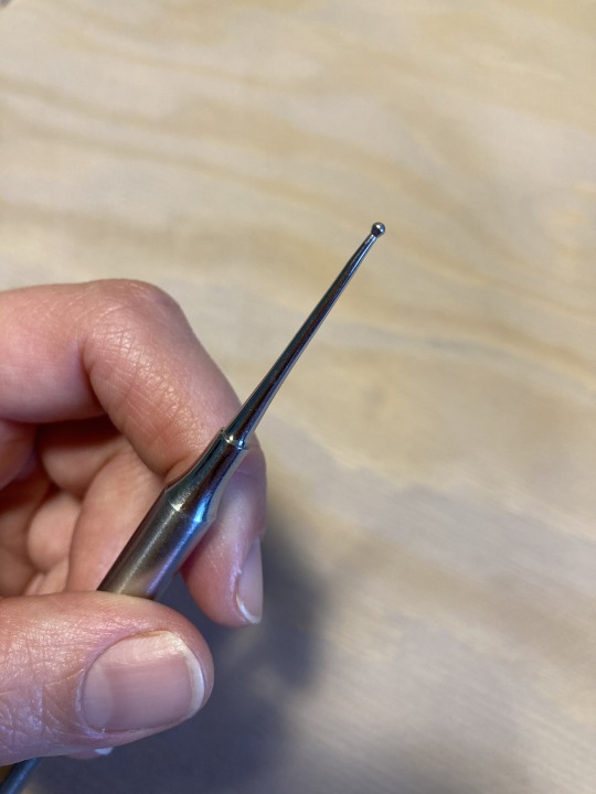
Hello @iam-adreamwalker! My apologies for taking 500yrs to reply to this - I've only just now found the time to take some better photos of my sgraffito gear.
These are basically all of my sgraffito tools, but you definitely don't need this many (I just have a pottery-tool-buying PROBLEM). My core tools are the ones to the left - the two pointy sticks & the two carve-y guys. Both of the wire loop tools are by Kemper, and I'm not 100% sure the brands of the sticks. The colourful set is from Xiem and is nice if you're doing a ton of sgraffito work, because it offers so many options for carving! I especially like the round-loop tools for carving feathers.
Here are some close-ups of my main tool gang:
I especially like the darker-brown stick tool because its point is slightly rounded, making it easier to scrape the slip off the surface of the clay vs. just making a deeper line that won't be as dramatic (more on technique later!).
Speaking of rounded-tip tools, I just realized I forgot my other favourite, a core tool that could replace the lighter-wood pointy stick in my Most Important Sgraffito Tools ranking - the ball-ended, double-sided stylus! This thing is a tiny powerhouse and, like the more rounded point on the dark-wood stick, it gently draws the slip off the clay rather than gouging:
Next up, slip! I'm not sure what you were using as your colour layer, because you mentioned that it ran/moved on the surface of the clay, which my stained slip doesn't do. Did you mix glaze into the slip? Or were you working with a powered pigment?
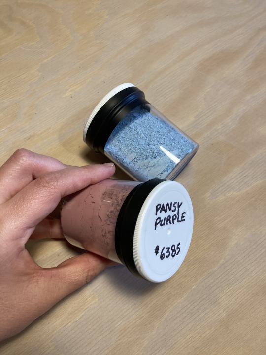
When I'm making coloured slip, I use a powdered pigment called Mason Stain, which can be used to dye slip, clay, and clear glaze bases (eg. to make translucent celadon glazes). I use a couple different brands, but it's all called Mason Stain.
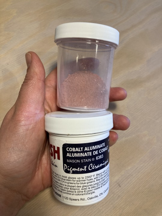
If you're a sensible person you can find proper recipes for mixing the slip and the stain, but I honestly go by how it looks - I add it to the slip a few spoonfuls at a time, mix, and see how pigmented the slip looks. If you want to really make sure the pigment is well-mixed you can get a stick blender from a thrift store or attach a mixing head onto an electric drill (something I'd like to upgrade to as the stick blender is SUPER messy & hard to clean out), but I mostly just mix it really well with a stir stick.
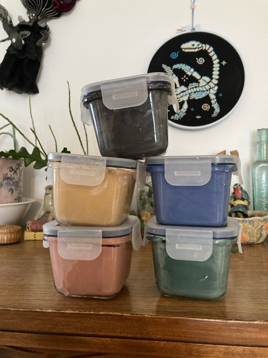
Once it's mixed, I keep my slips in these little self-sealing glass containers from IKEA, which stop it from drying out too fast (I tried keeping slip in regular jars & it turned into a rock...you definitely need a container with a rubber seal on it!). You'll still need to add water here & there, but it can sit for weeks without too much concern.
My slip is a little thick & gloopy, so I usually brush two layers of slip onto the leather-hard sculpture, letting each dry before I put on the next coat, and I let it dry until it's no longer at all tacky before I start carving (otherwise things WILL smudge and it WILL be terribly messy.
Finally, technique! I did take a look at your blog & the sgraffito project you mentioned & one thing I noticed was that your scratch marks were very deep and didn't reveal much clay under the scratched-away slip. This is an easy thing to have happen, especially if your slip/clay/both are still too wet or you're putting too much pressure on the carving tool.
My best tips for remedying this are:
Make sure the slip isn't at all tacky to the touch & that the clay underneath is leather hard.
Go very gently at first! It doesn't take much to scratch the slip away and you can always come back and take away more slip/make your carving area deeper if you want to, but you can't put the clay back!
Use the carving tools at an angle to the clay (somewhere around 45º ish, this is not a hard science), not perpendicular to it - this will stop you from stabbing straight down instead of scraping. If you've ever done linocut prints, think of the angle you hold the linocut tool at - sgraffito is generally a pulling-towards motion vs. a pushing away one for lino, but the angle is important either way!
Having even just a small variety of tools (eg. my core 4-5 as shown above) will also help, as you'll have options for line-weight/how much slip a tool takes off.
Phew! I sort of got carried away there, but I hope this was helpful?? If you have any more questions (or if anyone else does), please don't hesitate to ask! I'm still planning on making a proper sgraffito tutorial/series of tutorials, but need to find the time for all the filming/editing that requires.
114 notes
·
View notes
Note
(from arisenreborn) Arisen #1, Arisen & Pawn #16, World & Story #4
Hi hi thank you for the asks! :3 Ask game here
Arisen 1. Whether they remember or not, where are they from?
Carwyn was a Pawn summoned in Gransys! But the place he calls home now as a human is Harve Village in Vermund.
Arisen & Pawn 16. What is the “silliest” order VS what is the “worst” order your Arisen has given your Pawn? (These things potentially don’t have to be separate.)
The silliest was Carwyn begging Seresa to stop throwing explosive barrels in his direction. Seresa has too much fun to obey that though.
(Copy-pasting this from something else so it might be a bit messy lol) The worst, in the sense that it genuinely compromised the two's relationship at least for some time comes from Carwyn being so secretive. He'd experienced Dragonsplague/being a Corrupted Pawn on BBI, and thought it was best not to reveal that to Seresa. She began to press and argue at some point with why Carwyn's so secretive and miserable about everything, because first and foremost she's here to help him get through whatever hurdles come their way; can't do that unless he opens up. Carwyn being the emotionally immature dick that he is gave a hurtful "order" to drop the topic, before immediately regretting it. Cue a good couple of days of the two ending up looking like this:

World & Story 4. Whether they’d still be together or separate - What kind of life would they be living if they were not Arisen and Pawn, but NPCs?
Carwyn would be a woodworker as usual, but he'd be too depressed to do anything outside of the mandatory routine. He'd have no incentive to socialise, or treat himself. The entire time, he'd think his life and will is chained to the one his Arisen bestowed unto him. The Dragon's Dogma was supposed to be his test to prove otherwise, and Seresa would've been the one to help him out of that mindset and have him care about something.
Seresa if she was a regular Beastren would be assisting the Pawn near the Bakbattahl Riftstone in collecting pigments to create dyes. She wouldn't be the one actually fighting monsters to collect the pigments, but she'd process and gather them!
I don't think they'd ever have a chance of meeting each other naturally. If they did, the only way I can see it is Seresa travelling to Harve Village for some pigments, maybe from Asp Saurians, but she'd probably be advised against going there because of the racist village chief. If she did go anyway, she might look around for souvenirs. The wooden carvings of rabbits might catch her eye.
10 notes
·
View notes
Text
Different Voices, Different Lives (Orin/Constance vs. Ebenezer/Constance)

Fun parallels between Orin and Eb.

“Constance, finish your drink,” Orin said. “You’ll need it for what I plan to do to you later.”
“Are you done with your drink, love?” Ebenezer asked. “Here, I’ll take your glass. No, no, don’t get up.”
“That dress? Blue looks horrid on you; you should know that. Change into green, or red. Now.”
“Darling, you look stunning. Gods, I’ve never seen you in blue before! You look lovely. Nobody will be able to keep their eyes off you. I should know.”
“Constance, that man across the ballroom is a top lender. I need to get on his good side. Here, tug your dress down a bit … not that far down, you whore. There, perfect! Now, go make yourself useful.”
“You look uncomfortable. … Oh, you recognize that man across the ballroom? He’s a lender, isn’t he? … I see. Shall we go somewhere else, away from him? Let us. I know a secluded balcony with a beautiful view.”
“Is your hair naturally red? Really? Good. It should be easy to dye, then. Virgin hair takes pigment much better than anything that’s been dyed before. I’m thinking brunette or blonde. You can choose.”
“Red hair and blue eyes … such a beautiful combination. Very befitting of a beautiful woman with an even more beautiful heart.”
“Constance, I over drafted our account this month. Don’t ask why, just balance this for me. Fix it. If I hear one word of complaint, then I’ll … well, use your imagination.”
“Connie, my darling, you’ve been working so hard lately. Your accounts are in stunning shape. Would you … be interested in us taking a day off? Perhaps we could take a holiday together? … You’d like that? Ah, wonderful!”
“You know, some women wake up before their husbands in an effort to make themselves look presentable. You don’t even want to try?”
“Waking up next to you … it’s such a beautiful blessing. There is no sight more radiant than your sleeping face. Every morning, I’m reminded that I’m the luckiest man alive.”
“Constance, dance with me.”
“May I have this dance, dearest?”
@quill-pen more reasons to hate Orin.
33 notes
·
View notes
Note
please tell me about the pigments i would love nothing more than to hear you talk about that one shade of red you like and the process it took too recreate it
... oh, op. you have no idea what you've unleashed.
alright. here we go.
OKAY SO THE RED PIGMENT. pr206. my beloved. my dearest friend. it was an absolute bastard to find because there are so many of these. however many you think there are, there are MORE, and that's only if you don't count the many many scenarios where colors are known to be multi-pigment mixes, usually varying in tone/shade/intensity depending on the brand and manufacturing style. some colors are more consistent than others, but there are situations where a color can be named the same and contain the same pigments and STILL look wildly different depending on the ratio, binder, and paper you use. and that's not accounting for the way the pigment is processed. some pigments (like pv19 for example) can come in so many shades it's frankly kind of ridiculous.
anyway, my quest begins when i am, admittedly, in an edgier phase. i want a blood red, but not specifically because of that—no, i want it because it is THE IDEAL COLOR (to me) for a perfect, warm, slightly muted but still intense shade to add to a muted autumn watercolor palette. and... if you look at my whole theme, you probably know how much i love warm colors. i want to paint mushrooms. i want to dim down some of the brighter greens to make them autumnal. i want the perfect red to put as an undertone.
the search starts in earnest.
the immediate issue is this: reds (and purples and pinks) have horrifically bad lightfastness. not all of them, mind, but many are NOTORIOUS for fading under uv light, which means they will also fade if exposed to sunlight even in passing should it happen often enough. and—in especially bad cases where they're essentially working with dye and not pigment—they can even fade inside your notebook. inside of a drawer.
so not only are we working with an unfortunate pigment base (i'm simplifying here, there's way more nuance to this but shh) but we are working with one that skews heavily toward floral pinks or oranges. the red i'm searching for is warm, but not orange. dries dark but not brown. is transparent, not opaque. that last part is agonizing, because i also desperately do not want a color that will fade on me or generally destabilize, and most of the stable dark red pigments are EARTH pigments like red ochre (pr101) or the like. which, while fascinating because of their historical usage in things like pottery and even cave paintings that last to the modern day, are VERY OPAQUE. this is an issue with my preferred style of watercolor painting specifically, because opaque pigments tend to lift easier off the page and limit layering.
the search continues. pigment after pigment breaks my heart for one reason or another, drying too close to the cooler purpleish-red tint of wine at best. i think i find it in perylene maroon, but the drying shift (the difference between how a color looks wet vs after it dries on the paper) is so extreme that it loses the luminosity AND it's more opaque than most. i languish.
for a while my search turns to creation. i try and mix as many of my single pigment colors as i can into something that vaguely resembles what i'm looking for—so i take quinacridones and mix them with napthols, with nickel azos, with dashes of ultramarines and burnt sienna. everything turns out either just a bit too opaque, just a bit too muddy (that happens with multi-pigment mixtures, and is why so many people swear by single pigment colors. it's personal preference, really, great art can be made either way.)
still, nothing works. failure haunts me. i sit before a pile of used up watercolor paper that is literally covered edge to edge in nothing but similar red squares with various gradients and blooms as evidence of when i tried and failed to convince myself my efforts were close enough. i admit defeat.
in the meantime i shift my focus. i try and appreciate different color palettes and profiles, experimenting with things like fully transparent palettes (personal favroite) to fully opaque ones that function more like gouache. but despite finding appreciation for it, i still think about the damn red that i could never recreate. it kills me.
and then one day, a youtube video. a pigment is being discontinued, and the watercolor community is distressed. this happens a lot, because pigments are actually not always popular because of artists—sometimes beloved colors are put out of production because larger markets like car companies no longer find them popular enough to invest in. this time, the casualty is pr206, aka brown madder, aka quinacridone burnt scarlet.
let me tell you a little about quinacridones. they are genuinely remarkable colors. they have their own cult followings because of how bright and abnormally stable they are under uv light. they're transparent. they're luminous. they come in mostly shades of red and pink and purple, though there are a couple oranges and yellows in there. (there are no quinacridone blues, as far as i'm aware, but the phthalo blues have that category covered.) they also rewet beautifully, so you can put them on your palette and let them dry and not worry about it turning into a useless little rock of color that you can't get any pigment from anymore.
quinacridone magenta (pr122) is probably the most popular of these, the most often used besides maybe quinacridone violet (pv19). a few years prior we suffered the loss of quinacridone gold (po49) and since then people have been On Alert when it comes to losing these colors. i am one of them, because i never got the chance to even see po49 in person, and now the tubes are so stupid expensive that even the student grade versions go for Ridiculously High Prices on ebay, and the professional brands are being hoarded like (ironically) gold by anyone lucky enough to have a tube left over.
but back to our main character. not me, the pigment. pr206. i have legitimately never heard of this one, which to be fair is probably because i try to limit the random colors i fixate on since the hobby can easily get VERY expensive if you aren't careful. but it's a quinacridone, and that catches my eye.
i open the video.
now, i'm sure any artist out there will be familiar with the fact that screens don't display color consistently. it depends on your device, but most can agree that something that looks cooler on one may be warmer on the other, it's just what happens. but i see this color being swatched, and my brain implodes.
it's almost a perfect match.
it could work. it could. years of thinking that same thought have left me bereft and mistrustful of this specific quest marker, but the thought refuses to leave me. probably because the 'discontinued' label flashes like a neon sign.
i resist for about six months, and then i cave. at this point i have genuinely been trying and failing to find this color for upwards of five years. i am desperate, and the color might not be available anymore soon anyway, and apparently i am weak to sales pitches. (note: the color IS now unavailable in some brands, but others bought a decent supply and should have it available for at least a little while, alongside po48 which is quinacridone burnt orange, a favorite of mine and probably one of the only oranges i use regularly. both are discontinued officially, but they'll still be on sale till those supplies run dry.)
the color arrives. i grab my favorite brush. i pull out my stash of paper that i save for special occasions.
it's almost perfect.
i mix it with quinacridone burnt orange.
the result is, i swear, a perfect match for what i have been searching for.
it's warm. it dries dark but not dark enough to look brown. it keeps its luminosity (thank you quinacridones). it's fully transparent (thank you quinacridones). i genuinely feel the urge to weep, but i don't because i am clinging at last to the dredges of my sanity and also salt makes watercolor pigments behave differently and i will not risk this glorious moment. finally, after all these years, bill cipher has a gun i found the goddamn COLOR.
i mix it with warm yellows and with my favorite blues. with the pinks, just to laugh. life is beautiful and i am painting its sunsets, and i do not care if they look ridiculously messy. i have won.
the moral of the story is to never give up. or maybe it's to remember you never actually know everything about even the fields you love the most, because this color totally blindsided me despite being much more common than i expected. or maybe it's that i seriously needed to chill out for a while.
but yes. that is the tale of one (1) of the colors that has taken up residence in my soul. i hope you don't regret asking now lmao.
#ney's art tips (art questions)#ney's chatter (ask answers)#so also i said that a good alternative to pr206 is pr175#but i'm actually not totally sure about that because i've never tried it myself#watercolor is an expensive hobby and that's part of why i swapped to digital orz#BUT! from comparisons i've seen they are at least similar enough to scratch the itch#ironically i think i still USE po48 more than i do pr206#but that one is also In Discontinued Limbo where you can buy it but supply is indeterminately limited lmao#still a gorgeous color though.#... wow. this was incredibly niche and probably barely coherent i am so sorry LMAO#but thank you for indulging my color madness. it was the only hobby i had for *ages*.#long post#very very long post#good god is this my longest text post? aside from maybe a hive story?
20 notes
·
View notes
Text
Are they related? Food vs Food
How often do you look at foods in the grocery store, back and forth between two items thinking 'This looks exactly the same. Are they exactly the same? How are they not the same?" and no, I'm not talking about the processed repackaged foods and you're looking at 40 different kinds of tomato sauce. I'm talking about the produce lane.
Sure in some cases it's obvious they're not EXACTLY the same. But they must be related. Right? Well, sometimes they are, some times they're not, and some of these may surprise you. I know they surprised me!
Cucumber Vs Zucchini

I think anyone looking at these two would assume they're related. They're both long with dark green skin and light green flesh. When eaten raw and unseasoned, they also have a similar taste. However, these are two completely different foods.
The zucchini is a type of gourd, being more closely related to a Pumpkin. The cucumber is a Melon and is more closely related to the Watermelon. ....alright fine, technically gourds are a type of melon, still making them related; but my point remains! Try eating a cucumber with some sweetener like sugar or honey and it'll taste like watermelon. Won't work with zucchini.
Both cucumbers and zucchini are related to Fidelity, Chastity and general sex and Lust magic. But cucumbers are also associated with youth, beauty, glamor, stress relief, and rejuvenation. There was an old superstition that cucumbers had to be planted by young men in order for the crop to be successful.
Parsley Vs Cilantro
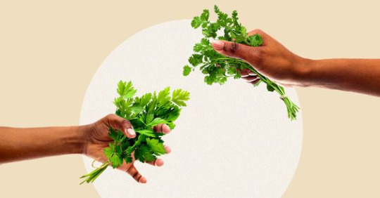
At a glance, these two herbs can easily be mistaken for the same thing. But once eaten, the difference is very clear. Cilantro (Also called Coriander) has a strong, lemon pepper taste; while Parsley is mainly an aromatic with a Lighter earthy taste.
People who love Cilantro might be perplexed by the hate it gets. Sure it's a strong taste but it's not overpowering. Well it turns out Cilantro is related to Fennel. Which is also related to licorice. It turns out, if your DNA is set up one way, these foods taste great. But if your DNA is set up another way, these foods taste TERRIBLE. My partner describes Cilantro as tasting like soap. So we stick with Parsley.
Superstitious farmers used to refuse growing parsley. See, parsley only grows back every other year. So, because of how long it takes to grow, it was believed parsley had to travel to hell and back 7 to 9 times. This was to try and convince the devil to give it permission to grow. And if the devil did not give the parsley permission to grow, the people who planted it would die. Was dubbed The Devil's Oatmeal.
Cilantro is a great protection herb. Protect the home, protect the garden, protect your health, protect your secrets. Parsley is also good for protection, but also has more general uses. Cleansing, Attract love and prosperity, Wisdom, commune with spirits; parsley has a long history in Rome of using to honor the dead and wear to enhance thinking power.
Ginger Vs Turmeric

Both roots, often eaten together as a seasoning. They look very similar; they must be related. Well, you'd be right! They are both part of the Zingiberaceae family. Both have strong anti inflammatory properties and have been used in natural remedies.
They still have very different tastes, however. Ginger will have a fresh, somewhat spicy taste. Turmeric is a bit heavier and earthier. Turmeric is also recognizable for it's bright yellow orange pigment. It's known to stain and dye.
Because they are roots, both Ginger and Turmeric have good Grounding properties. They are also both good for healing, cleansing, purification, prosperity and protection. But then we start to split off. Ginger is great for raising one's personal power, success, new experiences, passion, and general energy. Turmeric is better for communication, family relations, courage, confidence, beauty, memory, and honesty.
Peach vs Nectarine

So what's the deal with these two? They look a lot a like. They smell a lot a like. They taste a lot a like. Are they the same fruit? Well no. But also yes. It's kind of interesting.
A peach is just a fuzzy nectarine. Their genetic composition is structured in a way they they are identical except for one difference that occurred naturally, stopping the fuzz from growing on peaches. Giving us nectarines. They are exactly the same in every other way. Which is hilarious because I remember growing up, I hated nectarines but loved peaches. I think the peaches were just grown local so they tasted better.
I want to be clear, this genetic deviation is a naturally occurring mutation. It was not a result of science or GMOs or any kind of known human interference.
Peaches are a very spiritual fruit. They are linked to wisdom, happiness, harmony, longevity, love and protection. Nectarines....would probably be an acceptable substitute.
#food and folklore#food magic#food correspondence#similar foods#food folklore#food history#food facts#magic#kitchen witch#kitchen witchcraft#witch#novemeber#folktale#folklore#klickwitch#peach#parsley#cilantro#ginger#turmeric#cucumber#zucchini#nectarines
18 notes
·
View notes
Text
Stuck Between a Hippy and an Industrialist
People really need to stop getting their hands on little tidbits of information and then treating them like they're religion. I mean, no big news there, but it bears repeating.
Your hobby - whatever it is - is not the be all and end all of environmental glory, unless your hobby is actually directly connected to environmental improvement. Say, for instance, your hobby is reintroducing lost farming methods that increase the amount of workable land in an area. Then you can puff out your chest a bit about sustainability and such.
Fiber craft, though? Painting? Unless you're limiting yourself to...what, a dozen pigments?....forget it.
And yet - and yet! - people get all high and mighty about using natural pigments instead of synthetic ones. Then the people who have figured out that "natural pigments"* aren't always safe for people or the environment and may, in fact, be more damaging than their synthetic counterparts get all high and mighty back.
(* they also always say "natural pigments" as if the fact they aren't 100% safe and environmentally friendly means they aren't actually natural? Or something? Seriously, why are you guys making that a quote?)
This gets so utterly ridiculous that I have a book on making natural paints that makes a huge, screaming, more-hippy-Earth-hugger-than-thou deal about the horrible, awful, no good, very bad environmental impact of producing titanium and zinc oxide for white and then goes on to tell you in the 'what natural pigment to use' section that if you want white you should use...
...you guessed it - titanium or zinc oxide.
These people also point out that Scheele's Green and Paris Green were made from arsenic. And yet they still act like anyone who would even consider using synthetic paint is an anti-environment nut job who's going to ruin their health!
Seriously, to anyone with two brain cells it's obvious that natural doesn't automatically mean safe, but when it comes to natural vs. synthetic, a lot of people just...don't seem to have two brain cells. Or they don't use them both.
But the reverse is also true? Acid dyes and synthetic dyes can be highly toxic to people and the environment, so refusing to use natural dyes because they aren't 100% safe and "omg this has copper/iron in it, how do we get rid of the dye bath afterward?" is just as ridiculous as insisting that people use only natural dyes for everything ever! Especially since in most cases the safest way to get rid of the dye bath is to exhaust it! Just keep dying things until there's no more colour and bam! Problem solved! You can now safely dispose of the waste water! Or, you know, contact your state department or similar government agency and ask them! They will tell you!
Synthetic green dye is much safer than any of the old arsenic pigmentation. Alum and cream of tartar are used in food preparation and can combine with things like onion skins to produce absolutely lovely colours. Most of my knitting these days goes to a charity that provides under privileged kids with warm clothes in the winter. Due to the prevalence of wool allergies, we have to use synthetic yarn, which means if I'm dyeing yarn for that I have to use synthetic dye because natural dye and acid dye won't work with them. If I'm trying to figure out something to do with my roses other than go "how pretty! I should take pictures when I get the tim...oops. Too late" then I mordant my yarn in alum and call it a day!
There are no completely awesome answers here, unless you seriously want to restrict yourself to the dye stuffs that can be eaten, and preferably protein - wool and silk - yarn because it generally just needs an alum mordant. But then you get into the construction of your yarn/cloth/macrame cord/what have you and you get a whole 'nother ball of ouch!
At the end of the day, we all just need to do our best. If you do your best and I do my best and my neighbors do their best and your neighbors do their best, even though we won't all be doing the same thing, hopefully we'll all balance each other out a bit. Either way, my making one batch of copper penny dye, which I fully plan on exhaust dyeing, is not going to destroy the planet, any more than my RIT Dyemore experiments, 'k thanks.
#hidden notifications#crafting#natural vs synthetic#no easy solutions here#no easy solutions exist#everything has it's pros and cons#take your high horse out and shoot it
3 notes
·
View notes
Text
Permanent Vs Semi Permanent Vs Demi Permanent Vs Non Permnent Hair Color
In the world of colors where a variety of hair dyes are available, choosing the right type of color is the key to achieving your desired looks. From long-lasting transformation with permanent hair colors, or subtle change of color with demi-permanent, just want to experiment with colors with semi-permanent and temporary hair color, each type of hair color has its own consideration. Today, we’ll discuss the distinction between them and help you choose the right type of color which suitable for your unique style and preference.

Types Of Hair Color
These classifications are determined by the lasting power of applied color, chemical composition, and the size of the color pigment in the product.
Temporary hair color
Semi-permanent Hair Color
Demi-permanent Hair Color
Permanent Hair Color
Read the full blog here
4 notes
·
View notes
Text
more cat world stuff about the genetic system and how much about the sparklecat characters are natural vs. artifical
despite there being lots of new "unnatural" colors they still follow the laws of cat genetics. there are new genes etc added but they still have some semblance of thought behind it. an example of an addition is a green pigment artificially introduced called chloromelanin alongside the natural eumelanin (black/brown) and phaeomelanin (red). similar to the caramelization modifier, there is a magenta and indigo modifier that create different effects depending on the base coat of the cat. there's more but these are some examples. so to an extent the sparklecats are like that naturally. other stuff such as true rainbow fur is not genetically possible but dyeing parts your fur different flashy colors is very common, like dyeing your hair among humans but even more so. it isnt that common to dye your entire coat due to the time it takes, difficult upkeep, and high cost but certainly not unheard of especially among the rich and celebrities. cats also will get designs, shapes, markings etc dyed onto their fur just like the way humans get tattoos.
same goes for nonfeline traits. some smaller traits were successfully able to be spliced into the cat gene pool, such as horns/antlers, fins, particularly long claws or teeth etc. cats will also wear accessories too that may resemble nonfeline traits, and dressing this way is pretty common. or example, micha the main character wears a sweater with artificial wings. while there are cats that have feathers in place of fur due to gene splicing with birds, wings were not able to be created with the technology available at the moment since it would basically be adding an entirely new set of limbs; which is much more drastic and difficult thing to achieve. that's not to say that it isn't being studied and hasn't been tried by cat scientists...
eventually ill draw up a whole guide to the genetic system lol. there's also a lot of existing cat breeds; some may resemble the current day look, others not as much; as well as many new ones created since.
2 notes
·
View notes
Text

Periodic Table Championship:
Round 2, Day 4, Boron vs. Iodine
The fifth match of day 4 of round 2 has element 5, boron, facing off against element 53, iodine. Last round, boron beat nihonium with 92.1% of the vote, while iodine had a slightly less decisive match, beating europium with 80.6% of the votes. A reminder of our challengers:
Boron is a hard, brittle, metalloid element with multiple allotropic forms. Pure boron does not occur naturally and the element is difficult to prepare, making scientific study difficult. It is primarily used for the production of glass and ceramics, but it is also used in steels, as a dopant in semiconductors, and magnets, among other applications. Its name comes from the mineral borax, from which it was isolated.
Iodine is a non-metallic solid member of the halogen group that crystalizes in the orthorhombic crystal system at room temperature. It is known for its low melting and boiling points, becoming a liquid at 114°C (237 °F) and a gas at 184 °C (363 °F). Iodine is also well known as an essential mineral nutrient, but also has uses in numerous other applications, including catalysts, propulsion, pigments and dyes, and spectroscopy. Its name comes from the Ancient Greek word for violet.
6 notes
·
View notes
Text
Mastering Hair Tinting: A Comprehensive Guide
You’ve probably seen those stunning hair hues like cherry blossom pink, rich chocolate brown, and chic ash blonde lighting up your Instagram feed. These aren’t just typical hair dyes—they’re “hair tints”! Take inspiration from the fabulous Ruby Rose, our iconic Aussie model who rocks these gorgeous tints, enhancing her unique style.
Ready to add a pop of colour to your look? This blog is for you! Dive into the world of hair tints and discover the perfect shade to match your personality. Plus, we’ve got essential tips for choosing the right hair tint for you.

Understanding Hair Tinting vs. Hair Dye
First, let’s clarify the difference between hair tints and hair dye. Hair dye offers a more permanent change, while hair tints are semi-permanent. Hair tinting involves applying colour to the outer part of your hair strands, adding a layer of pigment to your existing colour.
Whether you want a subtle tint to enhance your current shade or bold, vibrant hues to turn heads, hair tinting lets you experiment with colour without committing to a permanent change.
Choosing the Right Hair Tint Colours & Styles
Hair tinting is all the rage in Australia, and the variety of shades available will leave you spoiled for choice. Before picking a hue, consider factors like your skin tone, eye colour, and hairstyle. Opt for colours that complement your features to enhance your overall appearance. Consult expert hair colourists to guide you.
In Perth, our seasoned hair colourists at Chilli Couture are colours your go-to for stunning Australian hair tints. With years of experience and a passion for helping you look and feel your best, they’ll help you achieve the perfect tint.
Types of Hair Tints
Explore various placement methods to create a unique style. Here are the types of hair tints available:
Semi-Permanent Hair Colour: Lasts several weeks and gradually fades. Perfect for trying a new shade without long-term commitment.
Temporary Hair Dye: Ideal for short-term changes, washing out after a few shampoos. Great for special occasions or brief style experiments.
Natural Tint Hair Colour: Enhances your existing colour with a touch of richness and vibrancy, without drastic changes.
Maintaining Your Tinted Hair
Hair tints require proper maintenance to last. Here are some tips to prolong your hair tint:
Use Colour-Protecting Products: Shampoos and conditioners designed for colour-treated hair help maintain vibrancy.
Limit Washes: Washing your hair less frequently extends the life of your tint.
Protect from Sun and Chlorine: UV rays and chlorine can fade colour. Wear hats and use leave-in treatments with UV protection when outdoors or swimming.
Get Regular Trims: Prevent split ends and maintain hair health with regular trims.
Hair tinting is a fantastic way to experiment with your look and showcase your personality. From semi-permanent to temporary options, the possibilities are endless. Follow best practices, seek professional advice, and care for your tinted hair to enjoy vibrant, beautiful locks that turn heads.
So, what are you waiting for? Book an appointment with Chilli Couture today, a high-quality, eco-friendly hair salon in Perth, Australia, and unleash a new dimension of beauty and confidence with rocking hair tints!
---------------------------------------------------------------------
Also Read:
1. What are the hottest hair color trends for brunettes right now?
2. How to Choose the Right Curly Haircut for Your Face Shape?
3. What are some healthy scalp tips that can promote strong and glossy hair?
4. What are the Effective Treatments and Solutions for Common Hair Problems?
5. How can one master the art of blow-drying like celebrities?
Contact:
• Address: - 3/117 Brisbane Street, Perth Western Australia 6000
• Phone No.: - +61452445545
• Location: - https://goo.gl/maps/t4QDUDHjgvn1Q7qx6
• Website: - https://www.chillicouture.com.au/
#organic hair salon#best hair salon perth#organic hair salon perth#chilli couture#natural hair color
0 notes
Text
What Makes Natural Pigments Better?
What Are Natural Pigments?
Natural pigments are colorants derived from plants, minerals, and some animals. Unlike synthetic pigments, they are sourced from nature and have been used for centuries in various applications, including cosmetics.
History of Natural Pigments in Cosmetics
The use of natural pigments dates back to ancient civilizations. Egyptians, for example, used henna and ochre for makeup and body art. Over the centuries, the use of natural pigments evolved, but the core principle of using earth-derived colors remained.
Benefits of Using Natural Pigments
Natural pigments offer several advantages, including being non-toxic, eco-friendly, and often gentler on the skin. They provide a safer alternative to synthetic dyes, which can sometimes cause irritation and other adverse reactions.
Types of Natural Pigments
Plant-Based Pigments
Plant-based pigments are derived from various parts of plants, including leaves, flowers, fruits, and roots. Common examples include beetroot, turmeric, and spirulina.
Mineral-Based Pigments
These pigments are sourced from naturally occurring minerals. Examples include iron oxides, mica, and titanium dioxide. They are known for their stability and safety.
Animal-Based Pigments
Some natural pigments are derived from animals, such as carmine, which is extracted from cochineal insects. These pigments are less common due to ethical and sustainability concerns.
Synthetic vs. Natural Pigments
While synthetic pigments are often cheaper and more stable, they can contain harmful chemicals. Natural pigments, on the other hand, offer a safer and more sustainable alternative, though they may come at a higher cost.

Benefits of Natural Pigments
Environmental Benefits
Natural pigments are biodegradable and have a lower environmental impact compared to synthetic dyes. Their production typically involves fewer harmful chemicals and less pollution.
Health Benefits
Natural pigments are generally non-toxic and hypoallergenic, making them suitable for sensitive skin. They reduce the risk of adverse reactions compared to synthetic alternatives.
Sustainability and Ethical Considerations
Sustainable sourcing and ethical production practices are key advantages of natural pigments. Many are sourced through fair-trade agreements, ensuring that local communities benefit.
Applications of Natural Pigments in Cosmetics
Skincare Products
Natural pigments are used in various skincare products, including creams, lotions, and sunscreens, to provide color and additional benefits like antioxidant properties.
Makeup Products
Makeup products like lipsticks, eyeshadows, and blushes often use natural pigments for their vibrant colors and skin-friendly properties.
Hair Care Products
Natural pigments like henna and indigo are popular for coloring hair, providing a natural and chemical-free alternative to synthetic dyes.
Nail Care Products
Nail polishes and treatments can also benefit from natural pigments, offering a safer option for those looking to avoid harsh chemicals.
Sourcing and Production of Natural Pigments
Sustainable Sourcing Practices
Sustainable practices ensure that natural pigments are sourced responsibly, minimizing environmental impact and supporting local economies.
Extraction Methods
Extraction methods vary depending on the pigment source. For example, plant pigments may be extracted using solvents, while mineral pigments are typically mined.
Quality Control and Standards
Quality control is crucial to ensure the purity and safety of natural pigments. Standards and certifications help maintain consistency and trust.

Popular Natural Pigments
Annatto (Bixa orellana)
Annatto is a bright orange-red pigment derived from the seeds of the achiote tree, used in cosmetics for its vibrant color and natural origin.
Henna (Lawsonia inermis)
Henna is a well-known natural pigment used for hair coloring and temporary tattoos. It provides a reddish-brown hue and is derived from the leaves of the henna plant.
Beetroot (Beta vulgaris)
Beetroot provides a deep red pigment that is used in various cosmetic products for its rich color and antioxidant properties.
Turmeric (Curcuma longa)
Turmeric offers a bright yellow pigment known for its anti-inflammatory and antioxidant benefits, making it a popular choice in skincare.
Spirulina (Arthrospira platensis)
Spirulina is a blue-green algae that provides a vibrant green pigment, rich in nutrients and antioxidants.
Charcoal (Activated Charcoal)
Activated charcoal is used for its deep black pigment and detoxifying properties, commonly found in masks and cleansers.
Safety and Regulations
Safety of Natural Pigments in Cosmetics
Natural pigments are generally safe for cosmetic use, but it's important to ensure they are properly tested and certified.
Regulatory Standards
Regulatory bodies like the FDA and the EU have standards in place to ensure the safety and quality of natural pigments used in cosmetics.
Testing and Certification
Testing for purity, stability, and safety is essential. Certifications help verify that products meet stringent quality standards.
DIY Natural Pigments
How to Make Natural Pigments at Home
Creating natural pigments at home can be a fun and rewarding process. Common ingredients include fruits, vegetables, and spices.
DIY Recipes for Natural Cosmetics
Recipes for homemade cosmetics can include lip balms, face masks, and blushes using natural pigments.
Tips and Precautions for Using Homemade Pigments
Ensure ingredients are fresh and properly stored. Test products on a small skin area to avoid allergic reactions.
Comparative Analysis
Natural Pigments vs. Synthetic Pigments
A detailed comparison of natural and synthetic pigments, highlighting their differences in terms of safety, environmental impact, and performance.
Cost Comparison
Natural pigments can be more expensive due to sustainable sourcing and production methods. However, the benefits often justify the cost.
Performance and Longevity in Cosmetics
While synthetic pigments may offer longer-lasting color, natural pigments provide a safer and more environmentally friendly alternative.
Case Studies and Success Stories
Brands Successfully Using Natural Pigments
Highlighting brands that have successfully integrated natural pigments into their products, such as Burt's Bees and RMS Beauty.
Consumer Testimonials and Reviews
Positive feedback from consumers who prefer natural pigments for their safety and efficacy.
Market Trends and Consumer Preferences
An analysis of current market trends showing a growing preference for natural and eco-friendly cosmetic products.
Challenges and Considerations
Stability and Shelf Life of Natural Pigments
Natural pigments may have a shorter shelf life compared to synthetic ones, requiring careful formulation and storage.
Color Consistency and Variability
Achieving consistent color can be challenging with natural pigments due to variations in raw materials.
Potential Allergens and Sensitivities
Some natural pigments may cause allergic reactions in sensitive individuals. It's important to test products and provide clear ingredient information.
Future of Natural Pigments in Cosmetics
Innovations and Research in Natural Pigments
Ongoing research and innovation are expanding the possibilities for natural pigments in cosmetics, leading to new sources and improved formulations.
Emerging Natural Pigment Sources
New sources of natural pigments are being discovered, offering a wider range of colors and benefits.
Predictions for Market Growth
The demand for natural pigments is expected to grow as consumers become more conscious of their health and environmental impact.
Conclusion
Natural pigments offer a multitude of benefits for both consumers and the environment. As the cosmetic industry continues to evolve, the preference for natural, safe, and sustainable ingredients is likely to grow. By understanding the various types, benefits, and applications of natural pigments, consumers can make informed choices that align with their values and needs.
1 note
·
View note
Last Seen Blogs

dancingtothesurfacenoise
Ben New

pinstripesandplaid
A Day In The Life

cyril-erica-blog
Incognito Assemblage

blurrysbrain
blurry ✩

daneshgahonline-blog
Untitled