#photoshop tutorials for beginners
Explore tagged Tumblr posts
Visit Tumblr Blog
Explore Tumblr blogs with no restrictions, modern design and the best experience.
Last Seen Tumblr Blogs


Fun Fact
28.6 is the average number of monthly visits per US mobile user.
Text
guys photoshop has an oil paint brush, all of my classes might actually be of use now 😭😭
#Skye learns photoshop in 2024#I’m so stupid these brushes have been here all along#seriously tho if anyone has any beginner photoshop tutorials pls lmk 🙏🏼🙏🏼
5 notes
·
View notes
Photo

New to photoshop . Made this- (u/Electrical_Battle319)
#Berserk#fan art#anime fanart#Photoshop#Digital Art#Fan Art#Art#Graphic Design#Creative#Illustration#Digital Painting#Beginner Art#Photoshop Tutorial
0 notes
Note
I'm in love with your gifs 😩🩷🩷🩷
omg thank youuuuu! i've been trying some new tips and tutorials lately and it's been a really fun learning experience I'm glad you like them!
#the courtney love ones have been getting a lot of notes lately so if this is abt them double thank you!#I also got a good copy of man on the moon so more courtney gifs are imminent!#some of these tutorials are so advanced though i'm like in awe of the photoshop skill#i'm such a beginner compared to the absolute sorcery some people are doing on here but it's become one of my fav hobbies :3
1 note
·
View note
Text

10 Easy Photoshop Tips for Beginners to Edit Like an Expert
Adobe Photoshop is one of the most powerful tools available for digital artists, photographers, and designers. But when you open it for the first time, it can be overwhelming. With so many tools, panels, and features, where should a beginner even begin? Fortunately, you don’t need to know everything at once. By mastering just a few core techniques, you can significantly improve your editing skills and grow more comfortable using the software. In this post, we’ll share 10 easy Photoshop tips that will help beginners get started the right way.
1. Learn to Work with Layers
Layers are the foundation of Photoshop. Every image you edit should involve layers so that you can work on different elements independently. This means you can apply changes, add effects, or move objects without affecting the rest of the design. For instance, you can keep the background on one layer and a subject on another, making it easier to isolate and edit either element. Always name your layers for clarity and group related layers together. Mastering layers early will give you much more control over your edits.
2. Use Adjustment Layers Instead of Direct Edits
One of the best habits to adopt as a beginner is non-destructive editing. Instead of applying changes directly to the image, use adjustment layers for things like brightness, contrast, hue/saturation, or levels. Adjustment layers sit on top of your image, and you can modify or delete them at any time without harming the original image. It’s a safer and more flexible way to experiment with edits.
3. Improve Your Composition with the Crop Tool
Cropping isn’t just about cutting out parts of an image, it’s also a powerful composition tool. Using the crop tool, you can reframe your image to draw more attention to the subject, remove unnecessary space, or follow visual rules like the Rule of Thirds. The crop tool helps create balance and improves the overall visual impact of your photo.
4. Get Comfortable with Keyboard Shortcuts
Photoshop has hundreds of tools and functions, and constantly clicking through menus can slow you down. Learning keyboard shortcuts can dramatically improve your speed and efficiency. For example, ‘Ctrl+Z’ undoes your last action, ‘Ctrl+T’ enables free transform, and pressing ‘B’ selects the brush tool. Even learning just a few shortcuts will save time and make your workflow smoother.
5. Use the Clone Stamp Tool for Precise Retouching
The Clone Stamp Tool is incredibly useful for duplicating or removing parts of an image. It allows you to sample one area of an image and paint that sample over another area. This is especially handy for removing blemishes, dust, or objects from photos. The key is to sample from a nearby, similar area for the most natural results.
6. Play Around with Blending Modes
Blending modes let you change how layers interact with each other, and they can add depth, texture, or drama to your work. Try setting a text layer to "Overlay" or a duplicate image layer to "Multiply" to see how the result changes. Blending modes are creative tools that give your images a unique touch.
7. Heal with the Healing Brush Tool
While the Clone Stamp Tool copies pixels exactly, the Healing Brush Tool blends them more naturally with the surrounding area. It’s a fantastic tool for touching up skin, removing small objects, or fixing minor imperfections without obvious signs of editing. It blends tone and texture for seamless results.
8. Save Your Work Regularly
Photoshop is powerful, but it’s also memory-intensive, which means it can occasionally crash. To avoid losing progress, save your work regularly by pressing ‘Ctrl+S’ (or ‘Cmd+S’ on Mac). You can also use "Save As" to create multiple versions of your project as it evolves.
9. Customize Your Workspace to Fit Your Needs
Photoshop allows you to customize your layout, so you can create a workspace that suits your editing style. You can rearrange panels, open specific tools, and even save your custom workspace for future sessions. Having a familiar layout improves comfort and efficiency, especially as you begin using Photoshop more often.
10. Always Use Non-Destructive Editing Methods
Finally, one of the most important tips is to avoid editing your original image directly. Always duplicate your layers or use layer masks when making changes. This non-destructive method keeps your original content safe and allows you to make adjustments at any point in the process without starting over.
Conclusion
Photoshop is a deep and powerful program, but you don’t need to master everything at once. By focusing on these 10 beginner-friendly tips, you can start creating better edits and gain confidence with the tools Photoshop offers. Keep practicing, be patient with yourself, and don’t be afraid to experiment, that’s how real progress begins.
#Photoshop tips#Photoshop for beginners#Easy Photoshop tutorials#Photoshop editing tips#Beginner Photoshop guide
0 notes
Text
⭐ So you want to learn pixel art? ⭐
🔹 Part 1 of ??? - The Basics!
Edit: Now available in Google Doc format if you don't have a Tumblr account 🥰
Hello, my name is Tofu and I'm a professional pixel artist. I have been supporting myself with freelance pixel art since 2020, when I was let go from my job during the pandemic.


My progress, from 2017 to 2024. IMO the only thing that really matters is time and effort, not some kind of natural talent for art.
This guide will not be comprehensive, as nobody should be expected to read allat. Instead I will lean heavily on my own experience, and share what worked for me, so take everything with a grain of salt. This is a guide, not a tutorial. Cheers!
🔹 Do I need money?
NO!!! Pixel art is one of the most accessible mediums out there.
I still use a mouse because I prefer it to a tablet! You won't be at any disadvantage here if you can't afford the best hardware or software.
Because our canvases are typically very small, you don't need a good PC to run a good brush engine or anything like that.
✨Did you know? One of the most skilled and beloved pixel artists uses MS PAINT! Wow!!
🔹 What software should I use?
Here are some of the most popular programs I see my friends and peers using. Stars show how much I recommend the software for beginners! ⭐
💰 Paid options:
⭐⭐⭐ Aseprite (for PC) - $19.99
This is what I and many other pixel artists use. You may find when applying to jobs that they require some knowledge of Aseprite. Since it has become so popular, companies like that you can swap raw files between artists.
Aseprite is amazingly customizable, with custom skins, scripts and extensions on Itch.io, both free and paid.
If you have ever used any art software before, it has most of the same features and should feel fairly familiar to use. It features a robust animation suite and a tilemap feature, which have saved me thousands of hours of labour in my work. The software is also being updated all the time, and the developers listen to the users. I really recommend Aseprite!
⭐ Photoshop (for PC) - Monthly $$
A decent option for those who already are used to the PS interface. Requires some setup to get it ready for pixel-perfect art, but there are plenty of tutorials for doing so.
Animation is also much more tedious on PS which you may want to consider before investing time!
⭐⭐ ProMotion NG (for PC) - $19.00
An advanced and powerful software which has many features Aseprite does not, including Colour Cycling and animated tiles.
⭐⭐⭐ Pixquare (for iOS) - $7.99 - $19.99 (30% off with code 'tofu'!!)
Probably the best app available for iPad users, in active development, with new features added all the time.

Look! My buddy Jon recommends it highly, and uses it often.
One cool thing about Pixquare is that it takes Aseprite raw files! Many of my friends use it to work on the same project, both in their office and on the go.
⭐ Procreate (for iOS) - $12.99
If you have access to Procreate already, it's a decent option to get used to doing pixel art. It does however require some setup. Artist Pixebo is famously using Procreate, and they have tutorials of their own if you want to learn.
⭐⭐ ReSprite iOS and Android. (free trial, but:) $19.99 premium or $$ monthly
ReSprite is VERY similar in terms of UI to Aseprite, so I can recommend it. They just launched their Android release!
🆓 Free options:
⭐⭐⭐ Libresprite (for PC)
Libresprite is an alternative to Aseprite. It is very, very similar, to the point where documentation for Aseprite will be helpful to Libresprite users.
⭐⭐ Pixilart (for PC and mobile)
A free in-browser app, and also a mobile app! It is tied to the website Pixilart, where artists upload and share their work. A good option for those also looking to get involved in a community.
⭐⭐ Dotpict (for mobile)
Dotpict is similar to Pixilart, with a mobile app tied to a website, but it's a Japanese service. Did you know that in Japanese, pixel art is called 'Dot Art'? Dotpict can be a great way to connect with a different community of pixel artists! They also have prompts and challenges often.
🔹 So I got my software, now what?
◽Nice! Now it's time for the basics of pixel art.
❗ WAIT ❗ Before this section, I want to add a little disclaimer. All of these rules/guidelines can be broken at will, and some 'no-nos' can look amazing when done intentionally.
The pixel-art fundamentals can be exceedingly helpful to new artists, who may feel lost or overwhelmed by choice. But if you feel they restrict you too harshly, don't force yourself! At the end of the day it's your art, and you shouldn't try to contort yourself into what people think a pixel artist 'should be'. What matters is your own artistic expression. 💕👍
◽Phew! With that out of the way...
🔸"The Rules"
There are few hard 'rules' of pixel art, mostly about scaling and exporting. Some of these things will frequently trip up newbies if they aren't aware, and are easy to overlook.
🔹Scaling method
There are a couple ways of scaling your art. The default in most art programs, and the entire internet, is Bi-linear scaling, which usually works out fine for most purposes. But as pixel artists, we need a different method.


Both are scaled up x10. See the difference?
On the left is scaled using Bilinear, and on the right is using Nearest-Neighbor. We love seeing those pixels stay crisp and clean, so we use nearest-neighbor.
(Most pixel-art programs have nearest-neighbor enabled by default! So this may not apply to you, but it's important to know.)
🔹Mixels
Mixels are when there are different (mixed) pixel sizes in the same image.

Here I have scaled up my art- the left is 200%, and the right is 150%. Yuck!
As we can see, the "pixel" sizes end up different. We generally try to scale our work by multiples of 100 - 200%, 300% etc. rather than 150%. At larger scales however, the minute differences in pixel sizes are hardly noticeable!
Mixels are also sometimes seen when an artist scales up their work, then continues drawing on it with a 1 pixel brush.

Many would say that this is not great looking! This type of pixels can be indicative of a beginner artist. But there are plenty of creative pixel artists out there who mixels intentionally, making something modern and cool.
🔹Saving Your Files
We usually save our still images as .PNGs as they don’t create any JPEG artifacts or loss of quality. It's a little hard to see here, but there are some artifacts, and it looks a little blurry. It also makes the art very hard to work with if we are importing a JPEG.

For animations .GIF is good, but be careful of the 256 colour limit. Try to avoid using too many blending mode layers or gradients when working with animations. If you aren’t careful, your animation could flash afterwards, as the .GIF tries to reduce colours wherever it can. It doesn’t look great!

Here's an old piece from 2021 where I experienced .GIF lossiness, because I used gradients and transparency, resulting in way too many colours.
🔹Pixel Art Fundamentals - Techniques and Jargon
❗❗Confused about Jaggies? Anti-Aliasing? Banding? Dithering? THIS THREAD is for you❗❗ << it's a link, click it!!
As far as I'm concerned, this is THE tutorial of all time for understanding pixel art. These are techniques created and named by the community of people who actually put the list together, some of the best pixel artists alive currently. Please read it!!
🔸How To Learn
Okay, so you have your software, and you're all ready to start. But maybe you need some more guidance? Try these tutorials and resources! It can be helpful to work along with a tutorial until you build your confidence up.
⭐⭐ Pixel Logic (A Digital Book) - $10 A very comprehensive visual guide book by a very skilled and established artist in the industry. I own a copy myself.
⭐⭐⭐ StudioMiniBoss - free A collection of visual tutorials, by the artist that worked on Celeste! When starting out, if I got stuck, I would go and scour his tutorials and see how he did it.
⭐ Lospec Tutorials - free A very large collection of various tutorials from all over the internet. There is a lot to sift through here if you have the time.
⭐⭐⭐ Cyangmou's Tutorials - free (tipping optional) Cyangmou is one of the most respected and accomplished modern pixel artists, and he has amassed a HUGE collection of free and incredibly well-educated visual tutorials. He also hosts an educational stream every week on Twitch called 'pixelart for beginners'.
⭐⭐⭐ Youtube Tutorials - free There are hundreds, if not thousands of tutorials on YouTube, but it can be tricky to find the good ones. My personal recommendations are MortMort, Brandon, and AdamCYounis- these guys really know what they're talking about!
🔸 How to choose a canvas size
When looking at pixel art turorials, we may see people suggest things like 16x16, 32x32 and 64x64. These are standard sizes for pixel art games with tiles. However, if you're just making a drawing, you don't necessarily need to use a standard canvas size like that.
What I like to think about when choosing a canvas size for my illustrations is 'what features do I think it is important to represent?' And make my canvas as small as possible, while still leaving room for my most important elements.
Imagine I have characters in a scene like this:
I made my canvas as small as possible (232 x 314), but just big enough to represent the features and have them be recognizable (it's Good Omens fanart 😤)!! If I had made it any bigger, I would be working on it for ever, due to how much more foliage I would have to render.
If you want to do an illustration and you're not sure, just start at somewhere around 100x100 - 200x200 and go from there.
It's perfectly okay to crop your canvas, or scale it up, or crunch your art down at any point if you think you need a different size. I do it all the time! It only takes a bit of cleanup to get you back to where you were.
🔸Where To Post
Outside of just regular socials, Twitter, Tumblr, Deviantart, Instagram etc, there are a few places that lean more towards pixel art that you might not have heard of.
⭐ Lospec Lospec is a low-res focused art website. Some pieces get given a 'monthly masterpiece' award. Not incredibly active, but I believe there are more features being added often.
⭐⭐ Pixilart Pixilart is a very popular pixel art community, with an app tied to it. The community tends to lean on the young side, so this is a low-pressure place to post with an relaxed vibe.
⭐⭐ Pixeljoint Pixeljoint is one of the big, old-school pixel art websites. You can only upload your art unscaled (1x) because there is a built-in zoom viewer. It has a bit of a reputation for being elitist (back in the 00s it was), but in my experience it's not like that any more. This is a fine place for a pixel artist to post if they are really interested in learning, and the history. The Hall of Fame has some of the most famous / impressive pixel art pieces that paved the way for the work we are doing today.
⭐⭐⭐ Cafe Dot Cafe Dot is my art server so I'm a little biased here. 🍵 It was created during the recent social media turbulence. We wanted a place to post art with no algorithms, and no NFT or AI chuds. We have a heavy no-self-promotion rule, and are more interested in community than skill or exclusivity. The other thing is that we have some kind of verification system- you must apply to be a Creator before you can post in the Art feed, or use voice. This helps combat the people who just want to self-promo and dip, or cause trouble, as well as weed out AI/NFT people. Until then, you are still welcome to post in any of the threads or channels. There is a lot to do in Cafe Dot. I host events weekly, so check the threads!
⭐⭐/r/pixelart The pixel art subreddit is pretty active! I've also heard some of my friends found work through posting here, so it's worth a try if you're looking. However, it is still Reddit- so if you're sensitive to rude people, or criticism you didn't ask for, you may want to avoid this one. Lol
🔸 Where To Find Work
You need money? I got you! As someone who mostly gets scouted on social media, I can share a few tips with you:
Put your email / portfolio in your bio Recruiters don't have all that much time to find artists, make it as easy as possible for someone to find your important information!
Clean up your profile If your profile feed is all full of memes, most people will just tab out rather than sift through. Doesn't apply as much to Tumblr if you have an art tag people can look at.
Post regularly, and repost Activity beats everything in the social media game. It's like rolling the dice, and the more you post the more chances you have. You have to have no shame, it's all business baby
Outside of just posting regularly and hoping people reach out to you, it can be hard to know where to look. Here are a few places you can sign up to and post around on.
/r/INAT INAT (I Need A Team) is a subreddit for finding a team to work with. You can post your portfolio here, or browse for people who need artists.
/r/GameDevClassifieds Same as above, but specifically for game-related projects.
Remote Game Jobs / Work With Indies Like Indeed but for game jobs. Browse them often, or get email notifications.
VGen VGen is a website specifically for commissions. You need a code from another verified artist before you can upgrade your account and sell, so ask around on social media or ask your friends. Once your account is upgraded, you can make a 'menu' of services people can purchase, and they send you an offer which you are able to accept, decline, or counter.
The evil websites of doom: Fiverr and Upwork I don't recommend them!! They take a big cut of your profit, and the sites are teeming with NFT and AI people hoping to make a quick buck. The site is also extremely oversaturated and competitive, resulting in a race to the bottom (the cheapest, the fastest, doing the most for the least). Imagine the kind of clients who go to these websites, looking for the cheapest option. But if you're really desperate...
🔸 Community
I do really recommend getting involved in a community. Finding like-minded friends can help you stay motivated to keep drawing. One day, those friends you met when you were just starting out may become your peers in the industry. Making friends is a game changer!
Discord servers Nowadays, the forums of old are mostly abandoned, and people split off into many different servers. Cafe Dot, Pixel Art Discord (PAD), and if you can stomach scrolling past all the AI slop, you can browse Discord servers here.
Twitch Streams Twitch has kind of a bad reputation for being home to some of the more edgy gamers online, but the pixel art community is extremely welcoming and inclusive. Some of the people I met on Twitch are my friends to this day, and we've even worked together on different projects! Browse pixel art streams here, or follow some I recommend: NickWoz, JDZombi, CupOhJoe, GrayLure, LumpyTouch, FrankiePixelShow, MortMort, Sodor, NateyCakes, NyuraKim, ShinySeabass, I could go on for ever really... There are a lot of good eggs on Pixel Art Twitch.
🔸 Other Helpful Websites
Palettes Lospec has a huge collection of user-made palettes, for any artist who has trouble choosing their colours, or just wants to try something fun. Rejected Palettes is full of palettes that didn't quite make it onto Lospec, ran by people who believe there are no bad colours.
The Spriters Resource TSR is an incredible website where users can upload spritesheets and tilesets from games. You can browse for your favourite childhood game, and see how they made it! This website has helped me so much in understanding how game assets come together in a scene.
VGMaps Similar to the above, except there are entire maps laid out how they would be played. This is incredible if you have to do level design, or for mocking up a scene for fun.
Game UI Database Not pixel-art specific, but UI is a very challenging part of graphics, so this site can be a game-changer for finding good references!
Retronator A digital newspaper for pixel-art lovers! New game releases, tutorials, and artworks!
Itch.io A website where people can upload, games, assets, tools... An amazing hub for game devs and game fans alike. A few of my favourite tools: Tiled, PICO-8, Pixel Composer, Juice FX, Magic Pencil for Aseprite
🔸 The End?
This is just part 1 for now, so please drop me a follow to see any more guides I release in the future. I plan on doing some writeups on how I choose colours, how to practise, and more!
I'm not an expert by any means, but everything I did to get to where I am is outlined in this guide. Pixel art is my passion, my job and my hobby! I want pixel art to be recognized everywhere as an art-form, a medium of its own outside of game-art or computer graphics!

This guide took me a long time, and took a lot of research and experience. Consider following me or supporting me if you are feeling generous.
And good luck to all the fledgling pixel artists, I hope you'll continue and have fun. I hope my guide helped you, and don't hesitate to send me an ask if you have any questions! 💕
My other tutorials (so far): How to draw Simple Grass for a game Hue Shifting
28K notes
·
View notes
Text
Scope Computers
🌟 Unlock the world of technology with Scope Computers! 💻 Ready to boost your computer skills? From beginner basics to advanced coding and design, our YouTube channel is packed with easy-to-follow tutorials and expert tips! 🚀
Whether you want to master Excel, learn web development, or dive into graphic design, Scope Computers has everything you need to succeed. 🖥️
Subscribe, hit the bell, and start your learning journey today! 🔔 Join our growing community and discover how fun and easy tech can be! 🌍✨
#scope computers#digitallearning#learn to code#tech journey#youtube learning#tech tutorials#coding for beginners#computerskills#coding community#photoshop
0 notes
Text
youtube
#digital painting#art process#speed painting#painting tutorial#digital art process#painting techniques#how to paint#digital illustration#time-lapse painting#concept art#digital art tips#procreate tutorial#photoshop painting#art workflow#painting demonstration#creative process#character design#landscape painting#fantasy art#beginner digital painting#art progress#step-by-step painting#painting speedrun#painting breakdown#color techniques#art timelapse#digital sketching#drawing and painting#painting tips#art inspiration
0 notes
Text
Advanced Photoshop Techniques: Elevate Your Design Skills
Introduction
Once you've mastered the basics of Photoshop, diving into advanced techniques can significantly enhance your creative projects and workflow. These advanced skills will allow you to push the boundaries of your creativity, creating professional-grade designs that stand out. In this guide, we'll explore a variety of advanced Photoshop techniques to help you elevate your work.
1. Mastering Layer Styles and Blending Modes
Understanding and utilizing advanced layer styles and blending modes can create stunning effects and bring your designs to the next level. Layer styles like Bevel & Emboss, Drop Shadow, and Gradient Overlay can add depth and dimension to your designs. Experiment with blending modes such as Multiply, Screen, Overlay, and Soft Light to blend layers creatively and achieve unique visual effects.
2. Advanced Masking Techniques
Mastering advanced masking techniques allows for precise control over image adjustments and compositions. Using layer masks, you can seamlessly blend multiple images or selectively apply adjustments to specific areas. Refine Edge and Select and Mask tools help create intricate selections for complex subjects like hair or transparent objects, ensuring smooth and realistic composites.
3. Non-Destructive Editing with Smart Objects
Smart Objects offer a powerful way to apply transformations and filters non-destructively, preserving the quality of your original images. Convert layers to Smart Objects before resizing, warping, or applying filters. This way, you can make changes without degrading the image quality, and you can always revert to the original state if needed.
4. Creative Use of Filters and Effects
Applying creative filters and effects can transform your images and add unique artistic touches. Use the Liquify filter for surreal distortions, the Oil Paint filter for a painterly look, or the Tilt-Shift filter for miniaturization effects. Combine multiple filters and effects to develop your own signature style, and use the Filter Gallery to preview combinations.
5. Advanced Retouching and Healing Techniques
Advanced retouching and healing techniques can help you achieve professional-quality results in portrait and product photography. The Healing Brush and Clone Stamp tools are excellent for removing blemishes, imperfections, and unwanted elements. Frequency Separation is a technique that separates texture and color, allowing for precise and natural-looking skin retouching.
6. Using Actions and Scripts to Automate Workflow
Automating repetitive tasks with actions and scripts can streamline your workflow and save valuable time. Photoshop Actions record a sequence of steps that you can apply to multiple images with a single click. Scripts, written in JavaScript, offer even more advanced automation possibilities, such as batch processing and complex adjustments.
7. Creating Complex Selections with Channels
Channels provide a powerful method for creating complex selections, especially when dealing with intricate details like hair or fur. By isolating the color information in different channels, you can create precise masks. Use the Alpha channel to store and refine selections, combining them with layer masks for detailed compositing work.
8. Advanced Typography and Text Effects
Elevate your text designs with advanced typography techniques and text effects that stand out. Use Layer Styles to add shadows, glows, and textures to your text. Explore the capabilities of the 3D Text tool to create dynamic and realistic text effects. Combine text with clipping masks and layer blending modes for creative and impactful typography.
9. 3D Effects and Compositing
Explore the world of 3D in Photoshop to create immersive effects and complex composites. Use the 3D workspace to build, texture, and light 3D objects. Integrate 3D elements with 2D images to create realistic scenes. Experiment with depth maps, extrusions, and 3D layers to add an extra dimension to your designs.
10. Leveraging the Power of Camera Raw
The Camera Raw filter offers advanced tools for photo editing, providing greater control over exposure, color, and detail. Use Camera Raw to make global adjustments, such as correcting white balance, enhancing contrast, and sharpening details. The local adjustment tools, like Graduated Filter and Adjustment Brush, allow for precise, targeted edits to specific areas of your image.
Conclusion
By incorporating these advanced Photoshop techniques into your skill set, you can push the boundaries of your creativity and produce professional-grade designs. Mastering layer styles, blending modes, and advanced masking techniques will refine your compositing skills, while non-destructive editing and automation will streamline your workflow. Embrace the power of Photoshop's advanced features, and watch your design capabilities soar.
#photoshop#onlineducation#hrishionlinebuddhi#onlinelearing#career#course#graphic design#Photoshop#graphic design tutorials#Photoshop tutorials#learn graphic design online#best graphic design software#free Photoshop course#graphic design courses#advanced Photoshop techniques#graphic design certification online#Photoshop for beginners#graphic design inspiration#Photoshop tips and tricks#online graphic design degree#how to use Photoshop#graphic design portfolio examples#free graphic design resources#graphic design trends 2024#Photoshop editing techniques#graphic design jobs
0 notes
Text
Photo Manipulation
#photo manipulation#photo manipulation photoshop#photo manipulation tutorial#photoshop manipulation#photo manipulation in photoshop#photo manipulation photoshop tutorial#photoshop manipulation tutorial#photo editing#photo manipulation speed art#cinematic photo manipulation#photo manipulation tips#photo manipulation course#photo manipulation mistakes#beginner photo manipulation#text manipulation#photoshop photo manipulation#photo manipulation tutorials#ahshanhabib
0 notes
Text
Website : https://www.academyofartmichaelschutte.com/
Address : Qualicum Beach, Vancouver Island, British Columbia, Canada
Michael Schutte is a concept artist and teacher from Amsterdam, The Netherlands. He founded The Academy of Music and Art in Qualicum Beach, Vancouver Island, where he imparts knowledge in art and music. With decades of experience in the entertainment industry, Michael has assisted thousands of students on their artistic journey. He is also a producer for Shaw Television, presenting the Art and History Show "Painting the Island with Michael Schutte". Michael offers digital courses designed to address the needs and challenges faced by his students, ensuring the content is accessible to both beginners and advanced learners.
Facebook : https://www.facebook.com/p/Academy-of-Art-Michael-Schutte-100086094936534/
Keywords: online art courses online animation classes best online art courses digital art online courses digital painting techniques online digital art courses academy of art online tuition best art courses online 2d animation classes online art and design courses online liberal arts online courses 3d animation classes online digital art workshop adobe online photoshop tutorials best online photoshop tutorials online photoshop tutorials for beginners photoshop online tutorials for beginners 3d art courses online academy of art online courses art appreciation course online art business courses online art design courses online best online art courses for beginners best online concept art courses creative art courses online game art course online anime art classes online anime drawing classes online best animation classes online computer animation classes online digital animation classes online disney animation classes online online animation classes for beginners online animation classes for teens learn digital painting online advanced digital painting techniques digital art painting techniques digital painting lighting techniques digital painting techniques photoshop photoshop elements online tutorials cartoon animation courses online online animation classes for high school students online animation classes for kids 3d techniques with digital painting digital painting coloring techniques digital painting tools & techniques for beginners adobe photoshop 7 online tutorial adobe photoshop cc online tutorial adobe photoshop cs5 online tutorial adobe photoshop cs6 online tutorial best online tutorials for photoshop digital arts online photoshop tutorials easy online photoshop tutorials learn photoshop online video tutorials online mac computer tutorials for photoshop online photography class photoshop tutorial deal online photoshop 7.0 tutorials online photoshop basic tutorials online photoshop beginning step by step tutorials online photoshop cs3 tutorials for beginners online photoshop effects tutorials online photoshop tutorials video photoshop editor online tutorial photoshop effects online tutorials photoshop elements 14 online tutorials photoshop makeup tutorial online design fantasy landscape online animating cartoon characters in maya online courses animation foundations: drawing cartoon characters online courses cartoon animation course online cartoon animation online course good online courses for 2d cartoon animation good online courses for cartoon animation modules of online art gallery animal photography classes online learning digital painting online courses digital art workshop for children digital art workshop online online digital art workshops personal digital art workshops
#online art courses#online animation classes#best online art courses#digital art online courses#digital painting techniques#online digital art courses#academy of art online tuition#best art courses online#2d animation classes online#art and design courses online#liberal arts online courses#3d animation classes online#digital art workshop#adobe online photoshop tutorials#best online photoshop tutorials#online photoshop tutorials for beginners#photoshop online tutorials for beginners#3d art courses online#academy of art online courses#art appreciation course online#art business courses online#art design courses online
1 note
·
View note
Video
youtube
Techniques Help You Grow Like a Pro
0 notes
Text

As a thank you for so many new followers, here's a brand new edition of my editing resources masterposts ✨ (you can find the previous editions here). Make sure you like or reblog the posts below if they’re from other blogs to support their creators! A friendly reminder that some of these are free for personal use only, so be sure to read the information attached to each resource to verify how they can be used.
Textures & Things:
Collage Kits from @cruellesummer that I find myself using basically every single day
Taylor Swift Wax Seals from @breakbleheavens that I also use literally every day
Rookie Magazine Collage Kits (1, 2, 3, 4, 5, 6, 7, 8, 9, 10)
Scribble Textures & Cross-Outs (1, 2, 3)
GIF Overlays (1, 2, 3)
Film Grain & Noise Textures (1, 2, 3)
Paper Textures (1, 2, 3, 4, 5, 6, 7, 8)
PNG Overlays (Paper, Flowers, Clouds, Stickers, Lips, Vintage Paper, Misc. Symbols)
Halftone, Scan Line, & VHS Noise Textures (1, 2, 3, 4)
VHS Tape Textures by @cellphonehippie
Misc. Texture Packs (1, 2, 3, 4, 5, 6, 7, 8)
Photoshop Effects (Halftone Text Effect, Chrome Effect, Glitch Effect, Ink Edge Effect, Photo Morph Effect)
Fonts:
Badass Fonts (free fonts designed by womxn 🤍)
Open Foundry Fonts
Free Faces
Uncut Free Typefaces
Some Google Fonts I Like: Instrument Serif, DM Sans, EB Garamond, Forum, Pirata One, Imbue, Amarante
Some Adobe Fonts I Like: New Spirit, Ambroise, Filmotype Yukon, Typeka, Big Caslon CC (TTPD Font!)
Some Pangram Pangram Fonts I Like: Editorial Old, Neue World Collection, Eiko, PP Playground
Fonts In The Wild (font-finding resource)
Tutorials & Resources:
Comprehensive Rotoscoping Tutorial (Photoshop + After Effects, great for beginners!) by @antoniosvivaldi
Rotoscoping & Masking Tutorial (After Effects) by @usergif
Texture Tutorial for GIFs by @antoniosvivaldi
Color Control PSD by @evansyhelp (to enhance, isolate, or lighten specific colors)
Cardigan Music Video PSD by @felicitysmoak
Picspam Tutorial by @kvtnisseverdeen
Moving GIF Overlay Tutorial by @rhaenyratargaryns
GIF Overlay Tutorial (+ downloadable overlays!) by @idsb
Icon & Header Tutorial by @breakbleheavens
GIF Blending Tutorial by @jakeperalta
Split GIF Tutorial by @mithrandirl
Guide to Coloring Yellow-Tinted Shots by @ajusnice
Slow Motion After Effects Tutorial (useful for GIFs!)
Gradient Map Tutorial by me!
Misc:
How to Make Your Own Textures by @sweettasteofbitter
How to Report Tumblr Reposts of Your Work by @fatenumberfor
Tips for Accessible Typography
930 notes
·
View notes
Text

i told my friend i would find him some beginner’s giffing tutorials, but all the one’s i could find were either years out of date, used a method that made me go “huh”, or incorporated ready-made actions. all perfectly fine, but if i’m sending someone a tutorial i’d rather it be one for a method i understand enough to help with.
so, here is a beginner’s guide to giffing, as told by cleo, a neurotic, detailed, and organization happy individual. there will be many pictures.
this tutorial will strictly cover the gif making portion of the process, from getting your screencaps to importing in photoshop, resizing/cropping, and sharpening. i was going to briefly go over colouring, but tumblr only allows 30 images and i ran out of space, so i'll have to do a separate colouring tutorial (which also means i can go into more detail, yay).
downloading the videos, whether direct downloads or t*rrents, is also another tutorial. but make sure you’re using at least 1080p, and the bigger the file the better. a single episode of a ~45 minute show should ideally be 2gb at minimum. a full length movie should ideally be at least 5gb. imo 2160p/4k files are not really necessary; the quality increase is negligible, and it takes a lot longer to screencap them. if you do use 2160p/4k files, try and make sure it is not HDR, as those videos are often washed out and require a different screencapping program to fix.
Programs
I am using a cracked version photoshop 2022, but whichever version you use should be pretty much the same
Actions. not a program but a function inside photoshop, where you essentially record a series of steps, and then you can simple play that action when needed and those steps will repeat, which saves considerable time when giffing. I will note which parts of the tutorial are best saved as actions, and explain how to create actions at the end.
For screencapping i use kmplayer it’s free and very simple to use
not at all a necessary program, but i use freecommander instead of the regular windows file explorer as i find the dual panels very helpful when moving the frames around
Screencapping
there are many programs you can use to get the screencaps from a video, a lot are basically the same, some are better suited for particular video file types. kmplayer is a very simple program to use, but afaik the capture function only works on mkv. files (the only other file type i’ve tried is mp4, which plays but does not capture)
once you open your video file in kmplayer, we’re going to open the advanced capture window, found under capture→advanced capture, or alt+v
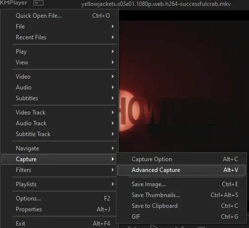
the window should look like this
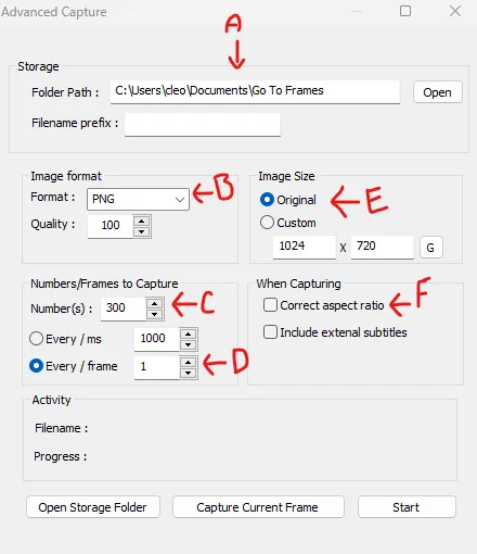
A-this is where all your screencaps will save to. i recommend making a specific folder for all your screencaps
B-make sure this is set to png for best quality
C-this is the number of screencaps you want to take, guesstimate how many you will need, keeping in mind that most videos are approx. 25 frames per second, and you should always cap a bit more than you think just in case
D-make sure “every/frame” is selected and set to 1
E-make sure “original” is selected, resizing will be done in photoshop
F-make sure “correct aspect ratio” is unselected
go to the part of the video you want to gif, and pause it just slightly before that part starts, then select ‘start’. the screencaps will start to save to the file, no need to play the video, and will automatically stop once it has capped the number of frames you have chosen
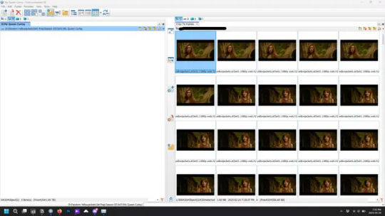
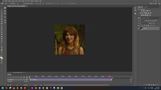
and here is how they look inside freecommander. i have already made a folder for this gifset, which is on the left. now you’re going to make a folder for each individual gif. i’ve decided this one will have four gifs, so create four folders (i just label them gif 01, gif 02, etc) and then move the frames for each gif into their respective folder
while you can always delete frames once the gif is made if it’s too big, i prefer to make sure i have the correct number of frames before i start. the gif limit on tumblr is 10mb, so it’s good to look at the scene/shots you’re giffing and decide approx. what dimensions your gif will be. full size gifs have a width of 540px and your choice of height. if you go for a square gif (540x540) you can usually fit 40-50 frames. if you’re planning for a smaller height (such as 540x400) you can usually fit more around 50-60 frames.
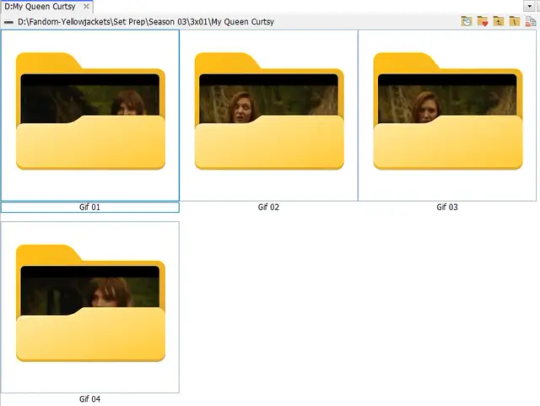
and here are the caps inside the folders. another reason i like freecommander is it’s ability to “multi-rename” files. the default file explorer can do so as well, but you have to do each folder individually and you can’t customize the new names as much. either way, i prefer to rename the files to each gif just to scratch my organization itch.
Introduction to Photoshop
NOTE: i have changed many of my keyboard shortcuts in photoshop to ones i prefer, so any you see listed in the menus of these screenshots are likely not the original shortcuts. you can see and change them yourself under edit→keyboard shortcuts

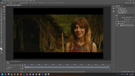
quick run-down of the photoshop interface. i have adjusted placement of some things from the default so this isn’t exactly how your photoshop will look when you open it, but everything is labelled, either on top or by hovering over the element. once you’re more familiar and have your process down i would recommend adjusting the workspace to suit your process.
A-your main tools and colour selector. almost all the tools have either several tools in one, or have alternate options which can be accessed by right-clicking the tool. you can also hover over each tool to get a pop-up with a quick explanation of the tool
B-additional “windows” such as history, properties, actions etc. can be opened from the window menu at the top and moved around with click-and-drag. history and properties should already be there by default, but probably on the right hand side instead. each window opens and closes with a click
C-the timeline window where the gif is made. the white square is a single frame of a gif, and on the row below is the play controls. this will not be there by default and will need to be opened from the window menu
D-adjustment layers for colouring
E-layers box. this is where the screencaps will show, along with adjustment layers, text layers, etc.
Opening Screencaps in Photoshop
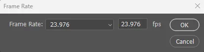
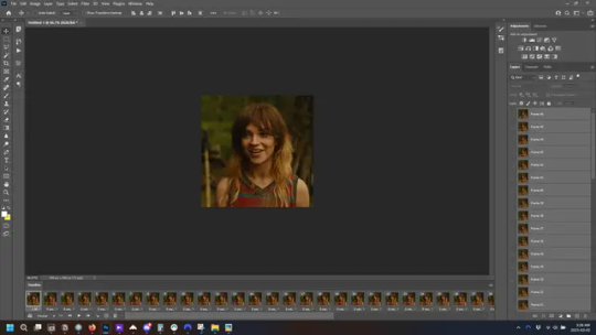
go to file → open navigate to the folder for your first gif, select the first screencap, and check the image sequencing, and click open

a window will open labelled frame rate. set it to 23.976 and select ok
the screencaps will open in the timeline view, seen as the blue panel line at the bottom, and the screencaps are combined into video layer in the layer panel on the right.
Creating Frames
technically, you could go right into your cropping/resizing and sharpening from here, however if you do that directly then you have to keep the screencaps in the folders you have, otherwise if you save and re-open the gif it won’t move.
this next part should be made into an action.
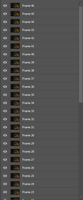
at the top right of the timeline window, click four vertical lines to open the menu and select convert frames → flatten frames into clips. depending on how long the gif is, this can take a minute.
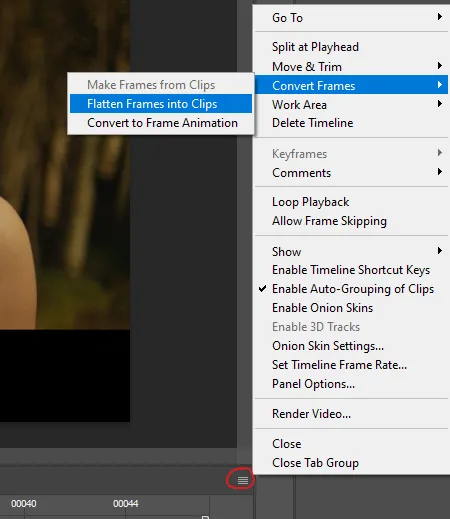
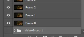
the layers panel should now look like this, each frame of the gif is now its own layer.
the very bottom layer will be the video group. this can be deleted as we’ve made the frames from it
in same timeline menu as before, right under “flatten frames into clips”, select “convert to frame animation” and the screen should now look like this. this will be the end of this action.
Cropping and Resizing
with widescreen footage, sometimes it’s just shorter than 1080p, but most of the time it will have the black bars on the top and bottom, and frustratingly, they’re not always the same size. it’s good to save the most common sizes as actions.
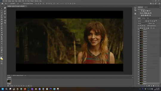
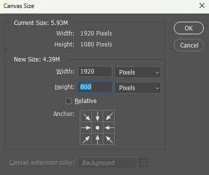
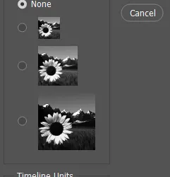
to find the size of the actual screen you turn on the rulers under view→rulers and check the height. then open your canvas size dialogue box under image→canvas size and change the height, making sure pixels are selected in the dropdown. yellowjackets is what i call “xtra wide” which is 800px. “normal” widescreen is 960px.
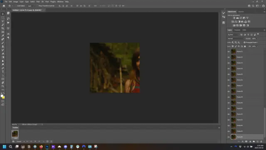
next we’re going to resize the caps. i also make actions for this, one for each potential gif size. open the image size dialogue box under image→image size and change the height of the image to your desired height plus 4 pixels. these extra pixels are to prevent a line at the top and/or bottom of your completed gif. now re-open the canvas size box, change the width to 540px, and the height to the desired, removing those 4 extra pixels. i have set this one to 540x540. this is where you would end the resizing action.
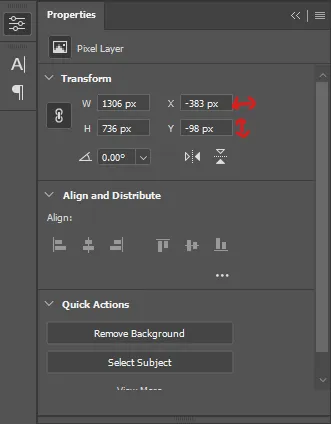
and as you can see she is off-screen. select the top layer, hold down shift and select the bottom layer to select them all, and with the move tool (the very top one) activated, click and drag to move it left to right as needed to centre the figure/s. as you move it a box will appear telling you how far you are moving it in any direction. make sure you are only moving it left or right, not up or down. to be certain of that, open the properties tab.
the y axis is your up/down, x is left/right. for this gif the y needs to stay at -98. you can also manually change the x axis number instead of dragging the image. also helpful for making sure multiple gifs of the same shot are all positioned the same.
the layer are currently ordered with the 1st at the top and the last at the bottom. with all layers still selected, go to layers→arrange→reverse. the last layer will be on top now. if there is movement in your gif, check if you need to alter the position again to make sure the movement properly centred. but once you are satisfied with the position, the layers should be in “reverse” position, of last layer on top. this is to ensure that the gif plays forwards.
Converting Gif
this should also be made into an action, going through sharpening process
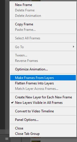
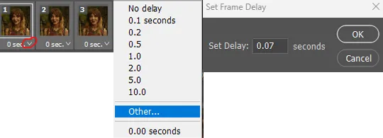
in the timeline menu, select “make frames from layers”
the frames are now populated in animation window. in timeline, click select all frames. go to any of the frames on the bottom and click the little arrow beneath it, select other, and enter 0.07 seconds. this is not a necessary step, as we will have to adjust the frame rate at the end, most likely to 0.05, but if we don’t change the frame rate here, then when we play the gif while working on it to check how it looks, it will play very fast.
in the same menu at the right of the timeline box, select “convert to video timeline”
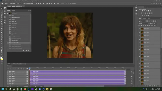
then, making sure all layers in the panel on the right are selected, go to filter→convert for smart filters. this turns all the layers into a single smart object.
but if you look where i’ve circled, it says the gif is 99 frames long*, when in fact there are only 47. if you are making regular “scene” gifs, basic colouring and maybe a caption, this is fine and does not need to be fixed, it will play at the same speed. if you want to change it to display (approx.**) the correct number of frames, go to the timeline menu on the right, select “set timeline frame rate” and change it from 30 to 15
*if it does not list a frame number by 4 digits but instead says 5f, 10f, 15f, etc. go to the timeline menu on the right, select panel options, and change timeline units to “frame number”
**the reason why this is only approximate is because the actual frame rate is not a a whole number, so when changing the frame rate it isn’t a 1:1, and 47 frames becomes 50 frames. the extra frames are removed at the very end, but if you are not doing any edits that require working frame by frame, there’s no need to change the frame rate here at all
Sharpening
this is, as it sounds, making the gif look sharper. to start go to filter→sharpen→smart sharpen and this window opens. play around with the dials to see what each ones does. the below settings are good for most high quality footage.
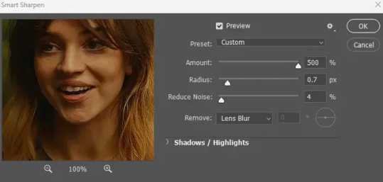
Amount-basically, how sharp do you want it
Radius-hard to explain, but this essentially sets how deep the lines of the sharpness are
Reduce Noise-smooths the pixels
once you click okay your single layer should look like this.
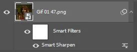
you’re going to then right click the layer and select duplicate layer. with the top layer selected, go to filters→blur→gaussian blur and set the radius to 1.0 pixels.
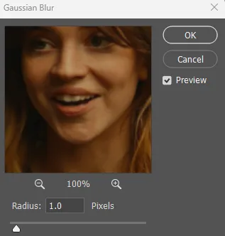
then change the opacity of the top layer to 10%. this is to essentially soften the sharpening a bit, as if it’s too sharp it can make the colouring wonky. this opacity level can also be changed depending on need.
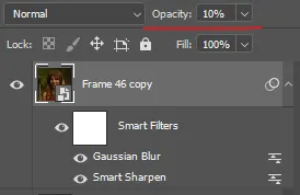
finally, select both layers, right click, and click “group from layers”. your gif is now fully made and sharpened.
Colouring
yeah. ran out of image space. but this is where you would do your colouring and add a caption or any other text.
Converting & Exporting
when all your colouring is done, you’re ready to start saving your gif. you can do it directly from your current file, but that means essentially losing your colouring, as all those layers will be merged together. i am someone who likes to save my psd’s (photoshop files), at least until i’ve posted the gifs, in case i need to fix something in the colouring. if you’d like to keep yours as well, open the history tab and select the first icon at the bottom “create new document from current state”. this will open a copy of the file in a new tab. save the original file and you can close it, continuing all work on the copy file.

select your all your layers, convert them into a smart object from filter->convert for smart filters, then follow the same steps from Creating Frames above. once you're back in frame animation, select Create Frames From Layers, and once again set the frame animation speed.
most people set the speed to 0.05. i personally set it to 0.05 or 0.06 depending on the length of the gif. check how it looks at 0.05, if it seems too fast, try 0.06.
now to save. go to file->export->save for web (legacy). the number is the lower left corner is your gif size, it needs to be under 10mb or else you'll have to delete some frames.

the right panel is your save options. the preset dropdown has some built-in settings, but you won't use them because (at least on my version) the presets only go up to 128 colours, instead of the full 256. the 3 i've highlighted in green are the only one's you'll adjust as needed. the settings below i use for i'd say 90% of my gifs. i'll sometimes change the adaptive dropdown to one of the other options, ocaissionaly the diffusion, and rarely the no transparency dither, but play around with them and see how they change the look of the gif.

when you're satisfied with the look of your gif, click save at the bottom right of the window.
voilà! you now have a gif.
Actions
this is your actions panel. the triangle on the left side is the button to open it. remember, if it's not already there, go to windows->actions to open it.
the buttons on the bottom, left to right, are stop recording, record action, play action, new folder, new action, and delete.

as you can see, i have different folders for my resizing, sharpening, captions, saving, and my 1 step (temporary) actions. to run an action is very simple; click the action, and click play.
to create an action, click the new action button, a box will pop up, give the action a name, and click record. the record button at the bottom of the action window will turn red. now perform all the steps you want it to record, and click stop recording. keep in mind it will record every single thing you do, including in other open files, so if the action you plan to record will have a lot of steps, it might help to write them down first.
to modify an action, select the step in the action above where you'd like the new step to be, hit record, perform the step, stop recording. select the step you'd like to delete, and click the delete button.
steps within the actions can be clicked and dragged, both within that action and moved to other actions. actions can also be moved between folders.
282 notes
·
View notes
Text
youtube
NEW VIDEO TUTORIAL 🩷
After almost two years it's time for a new and improved version of my "How to make CAS CC" video. This time I will explain how to create a frankenmesh out of a jumpsuit and a dress for adult Sims! It's VERY beginner friendly so if you weren't successful yet with starting to make CC, maybe this one will give you the help you need!
All the topics I cover in this video below the cut:
00:00 Intro
01:00 Software
01:36 Downloading & Installing Sims 4 Studio
01:56 Downloading & Installing Blender 4.2
02:10 Downloading & Installing GIMP
02:20 Introducing Sims 4 Studio
03:03 S4S | Gathering assets to work with
04:09 S4S | Textures
05:12 Project Folder
05:34 S4S | Gathering assets to work with
07:10 Introducing Blender
10:17 Blender | Edit mode (Select, Delete, Wireframe)
12:38 Blender | Append second mesh (Proportional Editing, UV overlapping)
18:23 Blender | Join two meshes (Material, Merge)
20:03 Blender | Cleaning up the mesh (UV editing, Merge, Rip)
22:14 Blender | Cut number
22:43 GIMP | Making a texture (Select, Delete, Healing, Smudge)
24:52 Photoshop | Making a texture (but make it easy)
25:15 GIMP & Blender | Preview of the texture
25:43 GIMP | Making color swatches (Layers, Lighting, Fill tool)
28:33 S4S | Introducing the CAS area
29:15 S4S | Creating a package file
30:25 S4S | Importing all our assets
31:17 GIMP | Creating a shadow texture
32:24 S4S | The specular map
32:39 GIMP & Browser | Creating a normal map
35:58 S4S | Vertices & Polygons, LODs
37:02 Blender | Creating LODs
38:20 S4S | Categories (Tags, Allow for random, Gender restrictions)
39:36 S4S | Tuning tab (not covered)
39:47 Sims 4 | Results & Outro
435 notes
·
View notes
Text
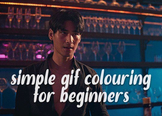
✨ Simple Gif Colouring for Beginners ✨
I wrote up my basic gif colouring process for a friend recently, but a couple of people here mentioned they'd also find it helpful! so, as requested, this is a beginner-friendly walkthrough of the way I colour my gifs :) it's aimed at brand new gif makers with no prior experience with photoshop or photo editing.
when I first started gif making I found colouring and photoshop in general suuuper daunting, so I've tried to simplify everything here as much as possible. hopefully this will be relatively easy to follow and not too intimidating!
a couple of things to begin with:
I'm only talking about colouring here - this is not a full gif making tutorial. I've linked to some of my favourites of those here!
I personally like to make bright, 'clean' looking gifs with vibrant but natural colours, so that is the style of colouring this tutorial is geared towards. most of gif colouring is subjective and about personal taste - the only thing that I'd say is possible to get wrong is skin tones, which I talk about a lot in this guide.
as I mostly gif Thai dramas, most of the advice is geared towards colouring for East Asian/South East Asian skin tones - but the techniques should be fairly universally applicable (and here are some tutorials that talk about gif colouring for other skin tones).
I'm not an expert! I'm not claiming this is the best or the only way to colour gifs - it's just how I do it.
this post is very image-heavy. if the images aren't loading (or the gifs are running slowly or cutting/looping weirdly), then try viewing the post in its own tab (rather than on the your dash or someone's blog) and refreshing the page.
okay, full walkthrough beneath the cut!
contents:
1. intro a. natural gif colouring goals b. very very basic colour theory 2. super simple colouring (the essentials) a. curves b. selective colour (and skin tone correction) c. hue/saturation d. saving and reusing colouring e. another simple colouring example 3. other adjustment layers a. brightness/contrast b. levels c. vibrance d. colour balance e. channel mixer 4. troubleshooting a. curves b. saturation 5. fin!
1. intro
the colouring part of gif making can be super overwhelming, especially if (like me when I first started!) you're completely new to photoshop and/or have no experience with colour theory or photo/video editing.
if you're opening photoshop and making gifs for the first time, I highly recommend getting used to making a few basic, uncoloured gifs to begin with. just to practice, rather than post anywhere (though you can always come back and colour them later if you want) - but it'll make the rest of the process much easier if you're already beginning to get used to working in timeline mode of photoshop. give yourself a bit of time to practice and get a feel for things like how many frames you tend to like in a gif, where you like to crop them for the best loop, what kind of aspect ratio you like etc* - so that you're not trying to navigate all of that for the first time on top of everything else!
* frames: for me between 60-90 frames is ideal, but 40-120 frames is the absolute min-max I'd personally use in a normal gifset loops: for the smoothest loops, try to avoid cutting someone off mid-movement or mid-word if possible. aspect ratio: for full-size (540px) gifs, I tend to go for either 8:5 (slightly 'skinnier' gifs), 7:5, or 5:4 (particularly big, thick gifs lmao)
✨ natural gif colouring goals
part of what can be so daunting about starting gif making is not knowing where to start or what you want to achieve. this is definitely something that gets easier with practice - the more gifs you make, the more you'll get a feel for what kind of look you like and the more instinctively you'll know how to get there. it also helps to see if any gif makers you like have made "before and after colouring" posts - these can help with getting a sense of the kinds of changes made through gif colouring. here's one I made!
in general, I like to make my gifs bright and 'clean' looking, with vibrant but natural colours. these are the things I'm usually hoping to achieve with colouring:
brighten dark scenes
remove muddy, yellowish lighting or filters
saturate colours
correct any skin lightening filters or overexposure
make lighting and colours as consistent as possible between gifs within a single gifset, especially gifsets featuring gifs from multiple scenes/episodes/videos
this guide is focusing on natural colouring, but of course there are many cool ways to make stylised/unnaturally coloured gifs. imo you'll need to master these basics first, but if you want to learn how to do things like change the background colour of gifs or use gradients or other cool effects, then @usergif's resource directory has loads of super helpful tutorials!
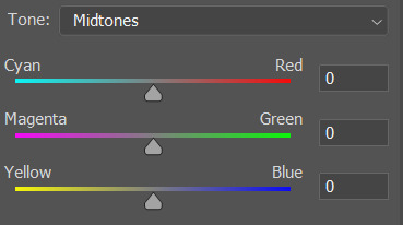
✨ very very basic colour theory
[disclaimer! I don't know shit about fuck. I do not study light or art. this is just an explanation that makes sense to me exclusively for the purposes of gif making.]
the primary colours for light/digital screens are red, blue, and green. having all three colours in equal measures neutralises them (represented by the white section in the middle of the diagram).
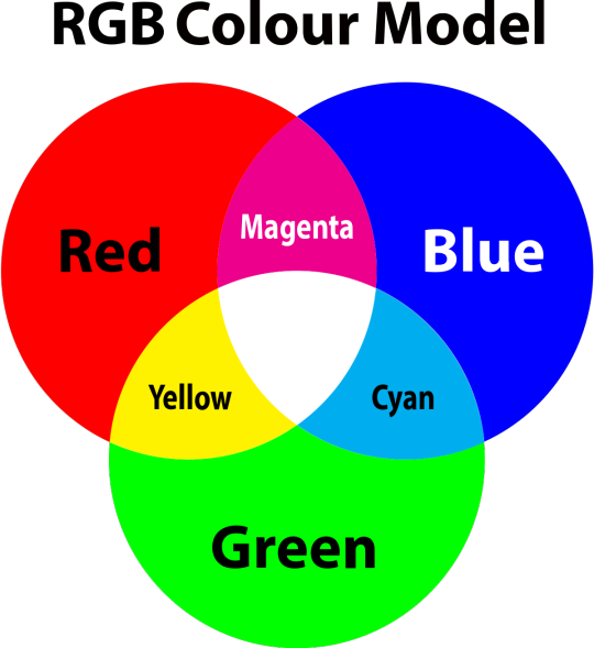
so to neutralise a colour within a gif, you need to add more of the colour(s) that are lacking.
in practice this usually means: the scene you want to gif is very yellow! yellow is made of red and green light, so to neutralise it you need to add more blue into your gif.
it can also mean the reverse: if you desaturate the yellow tones in a gif, it will look much more blue.
looking at the colour balance sliders on photoshop can make it easier to visualise:
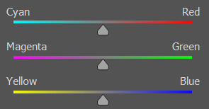
so making a gif more red also means making it less cyan.
removing green from a gif means adding magenta.
taking yellow out of a gif will make it more blue.
tl;dr:
neutralise yellows by adding blue (and vice versa)
neutralise reds by adding cyan (and vice versa)
neutralise green by adding magenta (and vice versa)
2. super simple colouring (the essentials)
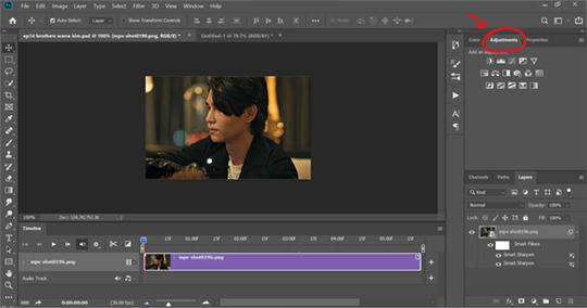
starting with a nice sharpened gif in photoshop in timeline mode. (these are the sharpening settings I use!)
some scenes are much harder to colour than others - it helps to start out practising with scenes that are bright/well-lit and that don't have harsh unnaturally coloured lights/filters on. scenes with a lot of brown/orange also tend to be harder.
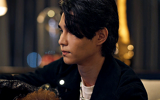
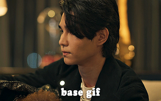
I usually save a base copy of my gif before I start colouring just in case I end up hating it, or find out later that it doesn't quite fit right into a set and need to redo it etc.
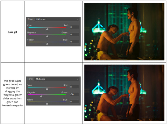
so here is my base gif!

it's an okay gif, but it has a bit of a yellow tint to it that I want to reduce.
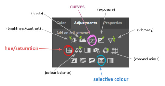
colouring is easiest to do in adjustment layers, which can be found under layer -> new adjustment layer - or for me they are here:
there are lots of different types of adjustment layers that do lots of different things - but for me the absolute essentials for colouring are curves, selective colour, and hue/saturation.
I also use brightness/contrast, levels, exposure, vibrance, colour balance, and channel mixer sometimes, depending on the gif - but I use curves, selective colour, and hue/saturation on every single gif.
✨ curves layer
the first thing I always do is a curves layer. when you first open one it will look like this:
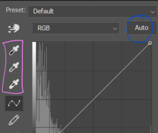
first I usually click the ‘auto’ button, just to see what happens. sometimes it makes a big difference (it usually brightens the gif a lot) - but on this gif it didn’t do much.
if it had made the gif look nicer then I would have kept it and added a second curves layer on top to do the rest of these steps.
the next step is selecting the white and black points with the little eyedropper tools.
the bottom eyedropper lets you pick a white point for the gif. click somewhere super light on the gif to see what happens - for this gif, I clicked on the lampshade on the left. if it looks weird, I just undo it and try somewhere else - it usually takes a few goes to find something that looks good.
here's what that did to the gif:

then I pick the top eyedropper and use it to pick a black point by clicking somewhere really dark, again playing around until I find a black point that looks good.
here's what the gif looks like after picking the white and black points:

this can take some experimenting, but you can make super easy drastic changes to your gif just with this. in this case, the curves layer took out a lot of that yellowy tint.
and this is what the curves graph looks like now:
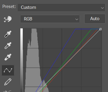
you can click and drag those lines to make further changes if you want - I usually leave them alone though. the colours of the lines indicate which colours have been changed in the gif - for example, you can see from that steep blue line on the graph that blue has been added to neutralise those yellows.
next I usually do another curves layer and just press the ‘auto’ button again to see what happens. usually it brightens the gif a bit more, which I like.
‼️if nothing is working: usually with a bit of fucking about a curves layer works well - but sometimes you can’t find a good white and black point anywhere, and instead your gif turns wacky colours and nothing looks good. this happens more often with very heavily colour tinted scenes :( the troubleshooting section at the end goes over some options, including starting with a levels layer instead.
✨ selective colour (and skin tone correction)
skin tones are made up of a mixture of yellow and red.
removing yellow (or adding blue or red) to a gif will make the skin-tones too red - and removing red (or adding cyan or yellow) to a gif will make the skin-tones too yellow.
adding blue to this gif with the curves layer took out the yellowy tint, which I wanted - but it also took the yellows out of Kim's skin tone, which I don’t want. so I need to put yellow back into the skin tones specifically - without putting it back into the rest of the gif.
selective colour layers let you select an individual colour and adjust the levels of other colours within that colour. you can change how yellow the green shades are, or how much cyan is in the blues, for example.
I need to add yellow back into the red tones to correct the skin tones on this gif. this is the case for most gifs in my experience - the vast majority of the time, unless a scene is very heavily tinted in another colour, a curves layer will add blue/remove yellow.
in the 'colors' dropdown, select the 'reds' section and drag the 'yellow' slider higher - this will add more yellow into just the red shades within the gif.

the amount of yellow you need to add back into the reds depends on how much yellow was taken out of the gif initially - I just play around with the slider until it looks right. if you're not sure, it helps to have some neutrally-coloured (not white-washed!) reference photos of the people in your gif to compare to.
here's the result. Kim's skin is a lot less pink toned and much more natural looking:
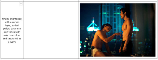
✨ hue/saturation
this adjustment layer lets you adjust the hue and saturation of the gif as a whole, and also of each colour individually.
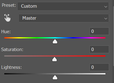
I don't use the hue or lightness sliders unless I'm trying to do something more complicated with the colouring.
clicking the dropdown menu that says 'master' lets you edit the saturation of each colour individually. this is useful if your gif is still super tinted in one colour.
I thought the yellows on this gif were still slightly too bright, so I switched to the yellow channel and desaturated them slightly. (remember if you do this then you need to go back to selective colour and add more yellow into the red skin tones to balance out the desaturation!)
then I increased the 'master' saturation of all the colours to +5:
I usually find the right amount of saturation is somewhere between +5 and +12, but it depends on the gif.
‼️if the gif feels undersaturated, but the saturation slider isn't helping/is making the colours worse, try a vibrance layer instead.
done!
✨ saving and reusing colouring
you can copy and paste adjustment layers between gifs to make your colouring even across each of your gifs for one scene - so if you're making a set of multiple gifs of the same scene, or you think you might want to gif the same scene again in the future, you can save it as a psd so you can reuse the colouring again later.
each gif's colouring will then still need tweaking - different cameras/angles/shots of the same scene can still start out with slightly different colouring.
I recommend uploading the gifs as a draft post on tumblr so you can see what they all look like next to each other and catch any inconsistencies.
✨ another one! (speedrun!)
HI KEN!
the white point for the curves layer was in the window behind them.
the curves layer removes the muddy yellow tint, but again it makes their skin tones (especially Ken's) very red toned, which is adjusted by the selective colour layer.
3. other adjustment layers
imo many many gifs can be coloured really nicely with just those three adjustment layers, but some need different adjustments.
✨ brightness/contrast
pretty self explanatory!
I personally usually avoid using the 'brightness' slider because I rarely like the effect - I only tend to use the 'contrast' one.
the 'auto' button is sometimes useful though, especially if you’re struggling with the curves layer.
✨ levels

levels alters the white and black points of the gif, like curves - but unlike curves it doesn't also alter other colours.
use the sliders beneath the graph to alter how dark/light the gif is. you can slide the black slider further to the right to make the blacks darker, and the white slider to the left to make the whites lighter.
levels is a good place to start if your curves layer isn't working.
(I'm going to hit the image limit for this post lol so here are some screenshots of a table I made to demonstrate this rather than actual gifs. sorry!)
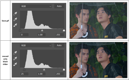

on both sides, I dragged the sliders up to where the big jumps are on the graph - this is usually a good place to start!
✨ vibrance
vibrance... makes the colours more vibrant. it's more subtle than saturation.
it's really helpful for gifs that feel grey. sometimes adjusting saturation just makes the greys kind of weirdly tinted, but a vibrance layer can fix that.
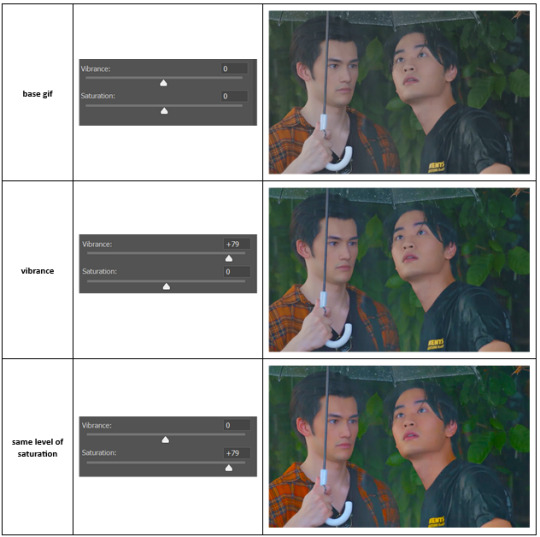
vibrance is much more subtle!
✨ colour balance
colour balance affects the overall balance of colours within a gif.
it's good for scenes with heavy tints.
I tend to stick to the 'midtones' dropdown, but you can also alter the colour balance within the shadows and highlights if you want.

✨ channel mixer
I avoided channel mixer for such a long time because it scared me. but it's great for scenes that are very heavily tinted in one colour.
basically, it works with the levels of red, green, and blue within a gif. you select an output colour and then play around with the levels of the colour you selected within each other colour.
kind of the reverse of selective colour?
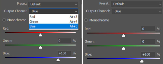
so in the 'blue' channel, the levels of blue are at 100%, and the levels of red and green are at 0% - but you can impact how much blue is in the reds and greens and blues.
this tutorial explains it well - but imo the best way to get to grips with channel mixer is just to play around with it a bit (sorry)
(when I made this guide for my friend, I also made a slightly more complicated gif colouring walk-through that included using channel mixer. there isn't space to include it within this post, but if anyone is interested I could always upload it as an 'intermediate' gif colouring tutorial - lmk!)
4. troubleshooting
‼️curves
usually with a bit of fucking about a curves layer works well - but sometimes you can’t find a good white and black point anywhere, and instead your gif turns wacky colours and nothing looks good. this happens more often with very heavily colour tinted scenes :(
for example, with this base gif:
using many of the brightest points as a white point turn it wacky colours, like this:

yikes :(
some options for these cases:
try brightening the gif first with the 'auto' button on the curves layer or with a levels layer. having a brighter gif to start with can give you better options for picking a white point.
try finding an alternate, whiter/brighter white point. look for places the light reflects - on this gif, using the light on Porsche's cheekbone works well as the white point. it also helps to find places that would be white if the scene wasn't tinted - the lightest part of a white shirt is often a good place to start, for example.
skip the curves layer, and instead use a levels layer to alter your white/black points, and colour balance or channel mixer to balance the colours.
‼️over/undersaturation
if your gif (especially the skintones) is looking a little washed out or lifeless, it might be undersaturated. boost that saturation - or if that's not working, try a vibrance layer.
oversaturation is often easiest to spot in the mouths and ears of any people in a gif. if the mouths are looking unnaturally, vibrantly red, then you've gone too far with the saturation.
5. fin!
and done! I hope this was coherent helpful to somebody.
if there's anything that I've missed or that doesn't make sense pls feel free to shoot me an ask or a message and I'll do my best to help! I've also collated a bunch of additional reading/resources below.
happy gifmaking 🥰
✨ some links!
photoshop basics by @selenapastel
gifmaking for beginners by @hayaosmiyazaki
gifmaking guide for beginners by @saw-x
dreamy's gif tutorial by @scoupsy-remade (includes instructions on how to blur out burned-on subtitles or annoying video graphics)
beginner's guide to channel mixer by @aubrey-plaza
how to fix orange-washed characters by aubrey-plaza
colour correcting and fixing dark scenes by @kylos
does resampling matter? by usergif
how to put multiple gifs on one canvas by @fictionalheroine
watermarking using actions by @wonwooridul
resource directory by @usergif
#i got a couple of asks about this so i figured i'd type it up as a post#it's been sitting in my drafts for a while now though i'm so sorry omg.#i had to replace my laptop and it took me a while to get round to downloading photoshop on the new one#but i hope this is helpful!!#gif making#tutorial#photoshop tutorial#colouring tutorial#coloring tutorial#gif colouring#gif coloring#photoshop resources#gif tutorial#gif resources#userbunn#uservik#darcey.txt#darcey.gif#usergif
908 notes
·
View notes
Note
Ozz! I'm trying to get into drawing, but I'm absolutely horrid at it and have no idea where to begin. Do you have any tips for beginners? Also, what program do you use? I've heard Krita is good, have you heard of it?
Also, also, remember to hydrate properly and get a good amount of sleep and do lots of self-care! <33 we love you and your content; you make the world a brighter place ^^
~ 🐇
If you want to start from the very bottom, there's a website where the first lesson is drawing a line, quite literally. It builds your confidence with basic shapes, then moves on to more complex topics like textures, shapes in space, construction of real life objects and so on.
I've had it in my bookmarks for...gosh, years now. I should definitely pick it up again, haha.
I also follow Alphonso Dunn on YouTube, he has hundreds of art tutorials and exercises.
As for software, I briefly used Krita years ago and it was nice! It had a very easy interface and the brushes worked well if you wanted to reproduce traditional art. The only reason I didn't stick to it was because I already had PaintTool SAI and Photoshop at the time. When I got my first graphic tablet, I started with Paint.NET, though it was very simplistic.
The general consensus online seems to be Krita for painting or MediBang if you're into drawing anime. In terms of paid software, I think Clip Studio Paint is very popular and has a lot of resources, from brushes to 3D models. Photoshop is classic, but it can be overwhelming if you're new to digital art.
I personally use Procreate because it came with my iPad and it has a very simple menu. Some professional illustrators say it lacks the advanced options you'd find in other programs, and I do agree it may not be enough if you want to go beyond merely drawing. To add text and make small edits, I'll put the doodle through Photoshop, for example.
Free software: Krita, MediBang, Gimp, KRESKA.art (no installation required)
Paid software: PaintTool SAI, Adobe Photoshop, Procreate, Clip Studio Paint
If anyone has more suggestions or tips, feel free to drop them in the comments!
88 notes
·
View notes