#photopshop
Explore tagged Tumblr posts
Text
Graph&co'
Les créateurs photosensibles comme moi, est-ce que vous avez noté une tendance à créer des choses un peu "trop" sombres et à devoir souvent corriger votre taf pour apporter un contraste un peu plus "lumineux" (tout en gardant votre vibe sombre hein, on s'entend)
Je demande parce que j'ai le problème et j'ai, de mon côté, mis un moment à réaliser que mon taf était parfois plus "opaque" que ce que je pensais, étant donné que mes mirettes sont susceptibles.
Et que bosser sur du design clair, c'est un cal-vaire.
7 notes
·
View notes
Text
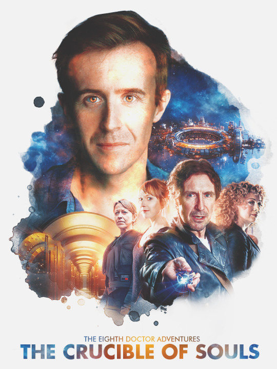
At the end of a stressful week, some fanart to unwind! One of my fave DC stories!! The Nine is just everything!
#doctor who#liv chenka#helen sinclair#river song#eighth doctor#big finish#nicola walker#hattie morahan#alex kingston#paul mcgann#doom coalition#fanart#doctor who fanart#photopshop#the nine
48 notes
·
View notes
Text
We are a creative graphic design studio where art meets innovation.
We create unique and inspiring design solutions, transforming ideas into visual masterpieces.
Trust us with your vision, and we will turn it into art that speaks for itself.

2 notes
·
View notes
Text
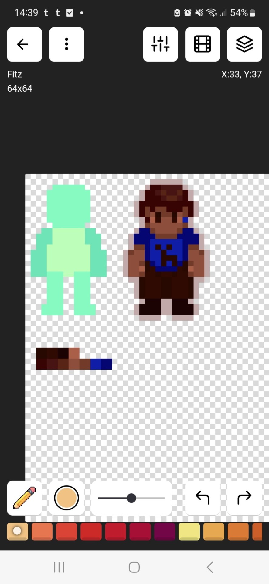
Told my irl friend that I want to do a "game" based on my favorite book so now I have more reason to get to it. Check out my little fitz
8 notes
·
View notes
Text
Sizzling Stede 🔥
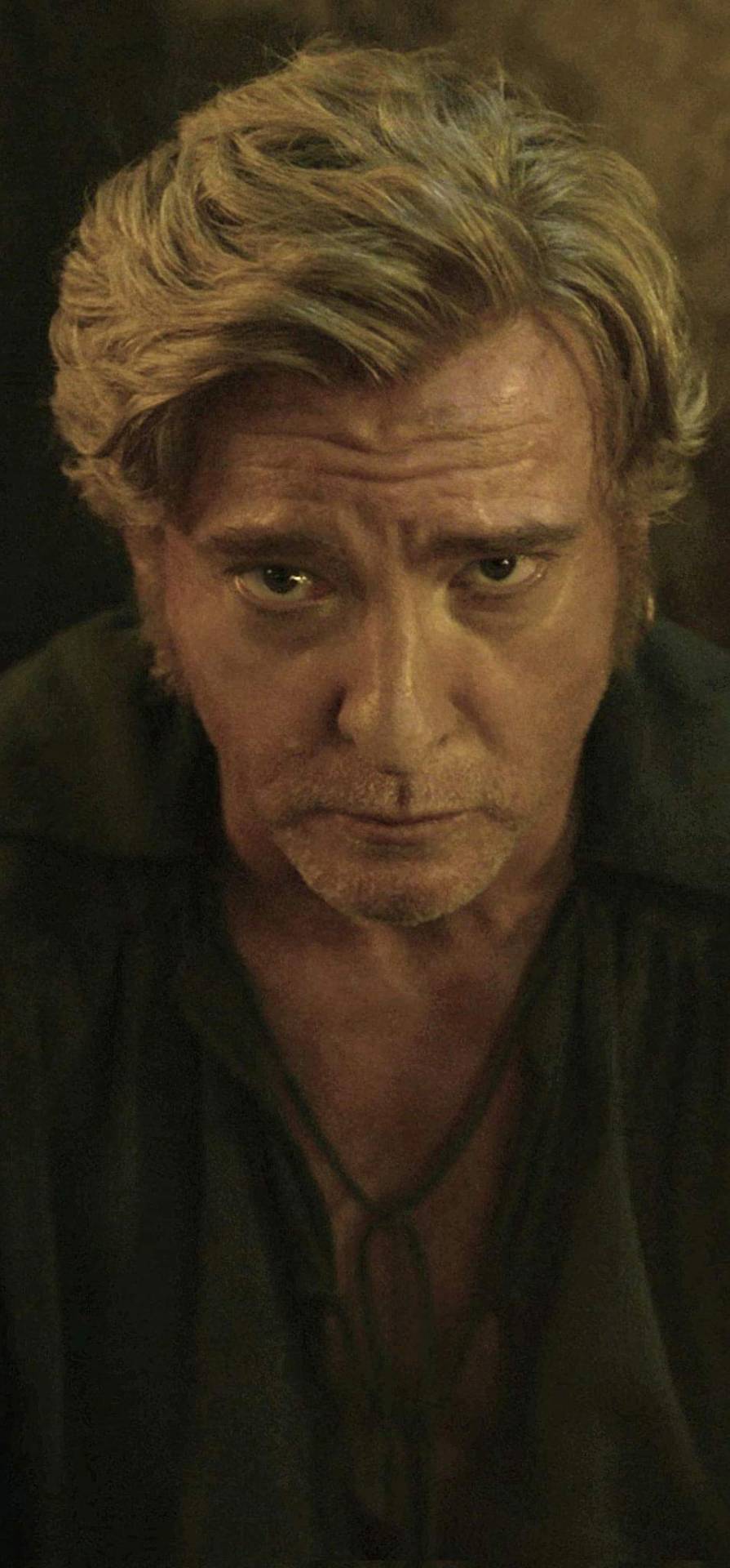
Thanks to Heather Bayliss on the Rhys Darby Fan Page (on Facebook), I came across this shot of Rhys and saved it. Now, I took on the mission to share it with my fellow Stede/Rhys girlies (gn), and if by any chance you came across this shot already, then sorry - not sorry for being this late in the game and for reposting. 😘 😘
Enjoy! ❤
(p.s. I have been staring at this image for a couple of hours and still haven't recovered. It should be the dictionary definition of "criminally hot". 🔥🔥)
UPDATE: Thanks again to Heather @fuzzylogic-27 for bringing to my attention that the above image has had the eyes photopshopped to look forward (by which source, unfortunately it escapes us) from the original 'Horsey Leg' scene. Still, it does not detract from Stede/Rhys in all his attractive glory. 😍
@mxmollusca @bizarrelittlemew @sherlockig
#rhys darby#ofmd#our flag means death#ofmd s2 spoilers#stede bonnet#rhys darby: official tumblr sexyman™#totally normal for rhys darby tumblr association#darling honey light of my life#rhysdarby
333 notes
·
View notes
Text
My first edit on photopshop with help of youtube tutorial. Should i post? Nervous pfft first edit is going lestappen lmaooo
13 notes
·
View notes
Text

Couldn't figure out photopshop so I drew my OC expressing that emotion (doing much better currently)
0 notes
Note
badly photopshopped image of his fucked up face while wearing a propeller beanie
Hi, I’m out of the office right now and can’t reply.
0 notes
Photo
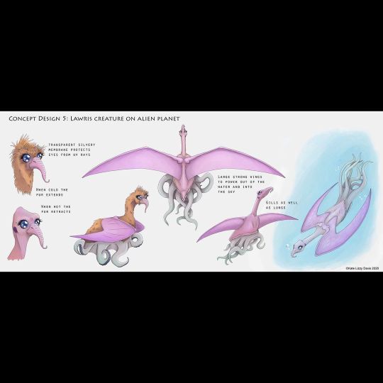
This is 5/5 Concept Designs I made as part of my Final Major Project. It was part of a story/ study of an amethyst encrusted levitating island on a not so distant planet. For more about the world and all important island, be sure to visit my website. Link can be found by going to the LinkTree in my bio. #alienplanet #concept #conceptart #conceptdesign #art #myart #ukartist #artistoffacebook #scifiart #aliendesign #aliens #alienart #artist #digitalart #digitalillustration #procreate #procreateillustration #photopshop #photoshopillustration #annotation https://www.instagram.com/p/COTH1XhLGUR/?igshid=nc73ikd830ox
#alienplanet#concept#conceptart#conceptdesign#art#myart#ukartist#artistoffacebook#scifiart#aliendesign#aliens#alienart#artist#digitalart#digitalillustration#procreate#procreateillustration#photopshop#photoshopillustration#annotation
4 notes
·
View notes
Photo
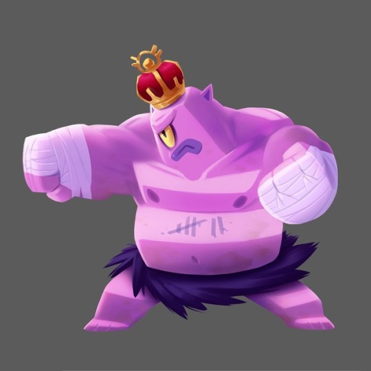
🥊KO King🥊 . . . #conceptart #characterdesign #gamedev #drawing #photopshop #clipstudiopaint #pink #boxing #king #ogre #crown https://www.instagram.com/p/BrWteYBFegd/?utm_source=ig_tumblr_share&igshid=1flhq18f0zrlm
20 notes
·
View notes
Photo


Seasons
#pixel art#trees#my art#photopshop#game art#seasons#nature#environment study#design#spring#summer#autumn#winter#artists on tumblr
5 notes
·
View notes
Note
Great tutorial, thank you for sharing your knowledge!
hi!! can I ask how do you take and edit your dollhouse screenshots? they look absolutely gorg x
Hey hey! Apologies for the late response. I suppose this question prompts a mini-tutorial!
Software I use:
Greenshot to take screenshots
Adobe Photoshop CC (latest version) to edit images
Note: this tutorial requires basic knowledge of the standard Adobe Photoshop tools. I will however provide links to Adobe help pages throughout this tutorial.
1. Take a screenshot
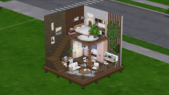
First things first: take a screenshot of a build you'd like to edit. I use Greenshot instead of in-game screenshot capture because I use ReShade to adjust the exposure levels.
I try to mimic the isometric projection when I take the screenshots.
This is the original screenshot:
2. Create a new Adobe Photoshop file
Create a new file in Adobe Photoshop. Don't forget to save the file as .psd so that you can save your progress. For this tutorial, my preset settings are as follows:
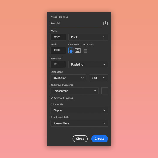
3. Add the screenshot as a Smart Object layer
Drag & drop the screenshot into the file you created. This adds the screenshot as a Smart Object layer. This means that you can apply different adjustments to the layer with the ability to reverse any changes.
Resize the layer according to your preference.
4. Remove the background
I use gradient or solid backgrounds in my build edits. This means that I need to isolate the build from its original background. To do that, I use the Polygonal Lasso tool. The edges of the build in my screenshot are mostly straight, so this tool is sufficient.
Once the selection is complete, press the "Select and Mask..." button which should be visible in the top toolbar.
In this workspace, you can play around with selection settings to refine the edges. In my case, I don't need to do a lot of adjustments (I only increased the "Contrast" property).
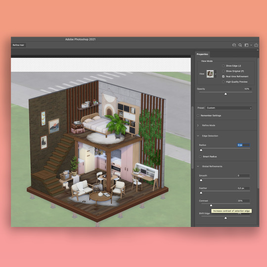
In the same Properties toolbar, under "Output Settings", select "Layer Mask" as the Output To option. Press "Ok" to exit the Select and Mask workspace.
5. Ta-daa!
The background is now not visible. In the "Layers" tab, you can see that your screenshot layer now has a mask applied to it. It's always better to "cut out" parts of images using masks - this way you can re-adjust visible parts of the image and reverse any previous actions.

6. Create a new background
Now for the fun part - creating a new background for your edit. You can do it via the top toolbar by selecting Layer -> New Fill Layer -> Solid Color or Gradient. For this tutorial, I selected "Gradient" and picked some lovely pink shades.
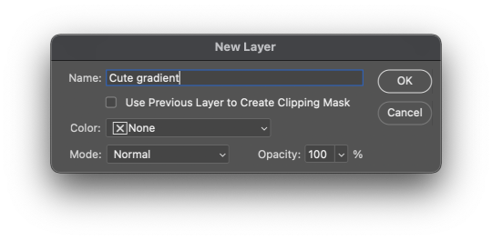
7. Adjust brightness, contrast, etc.
Finally, I add some layer adjustments to the screenshot layer. I typically adjust brightness/contrast, color balance and saturation settings.
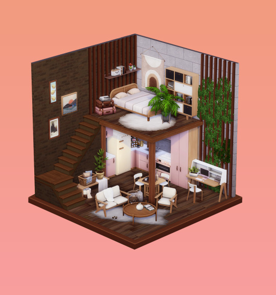
And that's it?? Hope this was useful!
A couple of notes:
Make sure that the in-game lighting matches the overall vibe you're going for with your edit. I found that harsh sunlight doesn't work too well as some areas of the light-colored objects become overexposed. I like to take my screenshots in cloudy weather conditions :)
I don't use any camera mods.
416 notes
·
View notes
Photo
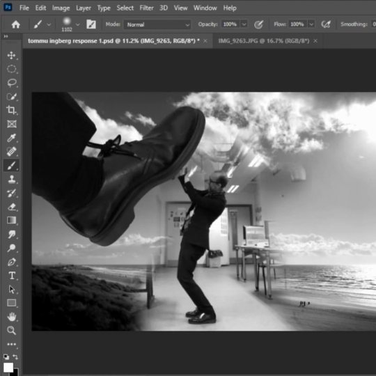
Watch how to make a Surreal Landscape, inspired by the artwork of Tommy Ingberg. Learn how to use multiple layers to build up the image, including how to add layer masks to blend them together. Learn how to make adjustments to the levels and how to turn images black and white. Enjoy making your own Surreal Images. #photopshop #madewithphotoshop #surrealism #photoshoptutorials https://www.instagram.com/p/CaVIkeUMWFq/?utm_medium=tumblr
0 notes
Photo
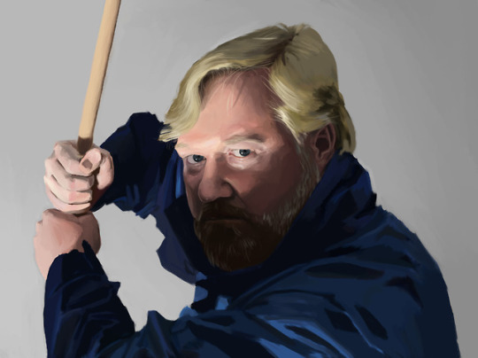
Self portrait painted in Photoshop for Draw 250 class at Savannah College of Art and Design.
2 notes
·
View notes
Text

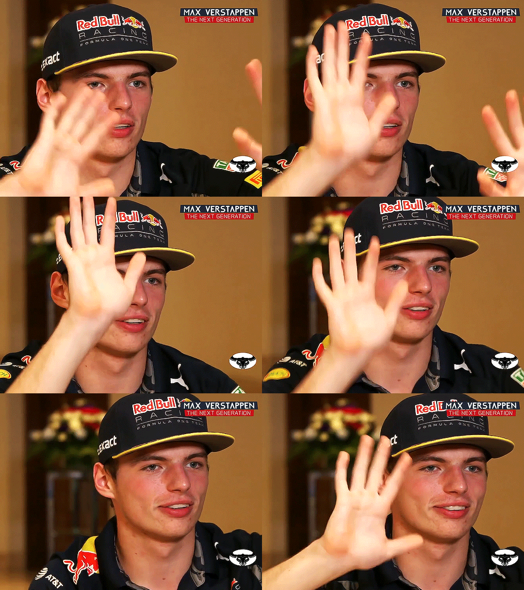
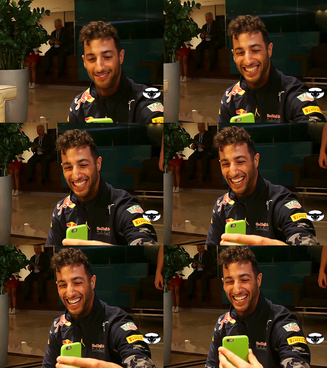
2016 post-season Daniel interrupting Max's interview
#maxiel#daniel ricciardo#max verstappen#f1#abu dhabi gp 2016#*#**#a baby 🥲#daniel watching so adoringly I want to cry#youtube please stop shoving random maxiel content i've never seen in my face at this insane hour what am I supposed to do not gif it?#i have a job i have rent to pay i cannot be on photopshop trying to make max verstappen's eyes bluer at 1am on a workday#that being said this lil moment makes me so so happy 🥲#what they had it doesn't happen very often it's actually hard to come by. they know that. right?
532 notes
·
View notes
Photo
Guess what, you guys ...
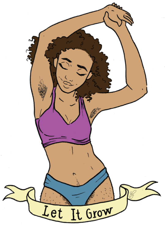
It’s been a long time coming, and I’m terribly sorry for the absence. As I go on this journey to finish my senior year in Illustration, I had to talk to myself. I said, “Self... You are about to graduate, and you want to move on California. Now, unless you want to live in a two-story refrigerator box, your wi-fi being from Starbucks, and bathing in the community pool, you need to get it together. People aren’t going to pop out of nowhere and randomly buy your art if you don’t make yourself known.” And for the LONGEST TIME, I believed (and still kinda believe) that my art isn’t good enough. But I thank God for the people that have supported me through my journey, and now that I took a step back, I can see what they are talking about. I even kicked myself in the ass and made a website. My art is worthy. I should indeed continue to let it grow. So now, I present you with my sticker:
Let it Grow
3x5 in sticker
ink, digitally colored in Photoshop.
DO NOT REPOST WITHOUT PERMISSION
#my art#let it grow#cosmopaulatan#my artwork#art blog#sticker#ink#photopshop#body appreciation#hair appreciation#body hair don't care#body hair#body hair appreciation#women of color#woc#no shave no shame#no shave november#even thought it's march but whatever#digital art#sticker for sale#reblog#tumblr artists#black artists#female artists#black female artist#black female artists#black artist#female artist
11 notes
·
View notes