#part 1 of 3 that i have already screencapped
Explore tagged Tumblr posts
Text
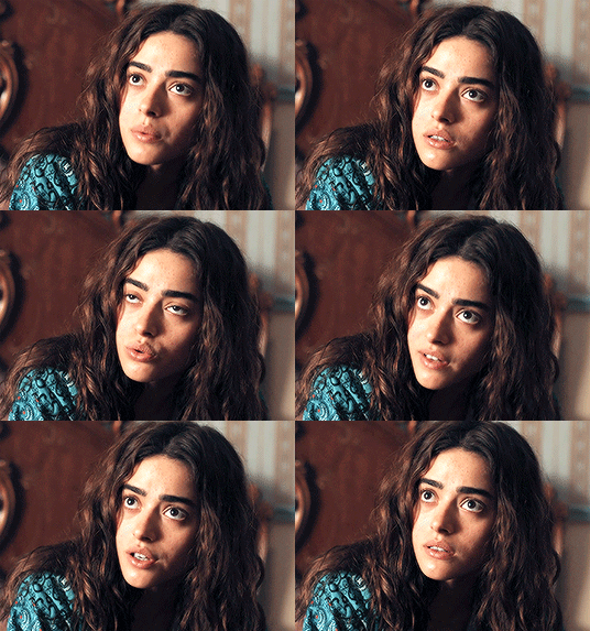
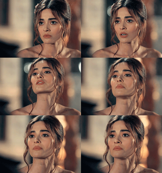
* SIMAY BARLAS IN AZIZ ( part 2/3 )
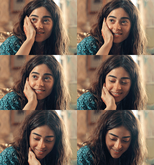
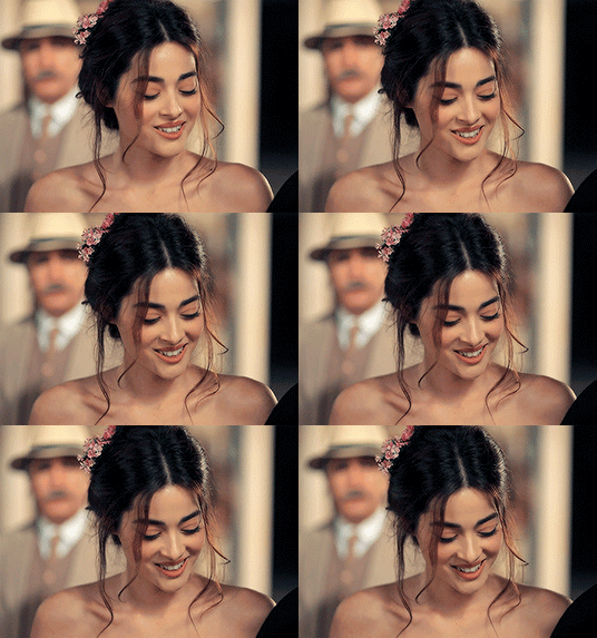
PAID CONTENT ! — by clicking on the source link you will find a page with 150 gifs ( 268 x 191 ), all made from scratch by yours truly, of simay barlas , a turkish actress, in the show aziz. do not claim as your own, or add to free gif hunts. you can edit them for your own use, as long as you credit me somewhere ♥ have fun!
#gif pack#periodfcnetwork#simay barlas gif pack#simay barlas gif hunt#period fc#fcxdirectory#turkish fc#simay barlas#gifpackshq#supportcontentcreators#part 1 of 3 that i have already screencapped#might do more if people like it
124 notes
·
View notes
Text
When the interviewer asked when we should expect s5 to be coming out, that’s when Shawn mentioned that a little bit of an answer to that might be out there soon.
He actually mentions that this answer could be out by the time the video for this interview comes out, and since this interview was filmed mid-May and it’s now mid-June, I’m assuming we could be getting something soon or within the next couple months, potentially about a release date aka possibly a small teaser with 2025 stamped at the end…
#byler#stranger things#st5 predictions#idk I’m just praying for a vague quick 15 second teaser with 2025 at the end#idc if it’s late 2025 which is most likely#and so they’re just pulling this out of there ass to put something out there#but they have decent amount of footage already they should be able to pull from#even if that’s not what they want to do rn#they could release something vague that doesn’t even involve actors being in it and just maybe a build up of s5 vibes with 2025 at the end#I do feel like it has to be release date related even if it’s small af tho#bc we’ve gotten bts nonstop so just a mere screencap of s5 won’t be enough#it’s also worth considering that they might release s5 in very far away volumes like they did with cobra kai#not saying I want that but it’s possible#that could mean an earlier release date for those first episodes#i don’t think late 2024 is possibly honestly#but I know Maya mentioned in an interview they were like 1/3 of the way through filming s5#and this was about a month ago#so it’s possible a split could result in a serious waiting period between seasons#idk if Netflix is even willing to do that for st though#but I’m not ruling it out!#especially in the finale or even the second to last end up being longer l#we could be looking at a series finale on its own potentially taking up that vol 3 spot#but i still think late 2025 is likely for the ending regardless of how much earlier the initial part could come#also thinking about how they prefer to release the show during the season the show is set#if they can do that I feel like they will
97 notes
·
View notes
Text
Agatha All Along deep dive: episode 9 part 2
(Wandavision entries: [1][2][3])
(AAA entries: ep1 [1][2][3][4] ep2 [1][2][3][4] ep3 [1][2][3] ep4 [1][2][3][4][5][6][7][+1] ep5 [1][2][3][4][5] ep6 [1][2][3] ep7 [1][2][3][4][5][6] ep8 [1][2][3][4][5][6][7][8][9] ep9 [1][2][3][4][5][6])
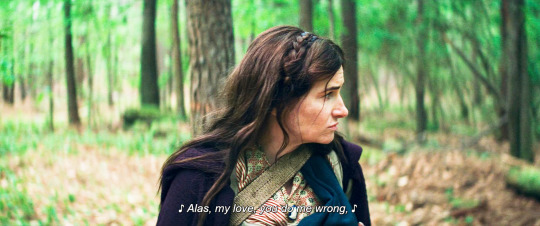
I'm glad nicky came up with a cool new tune because according to period movies and shows greensleeves is the only song anyone ever knew
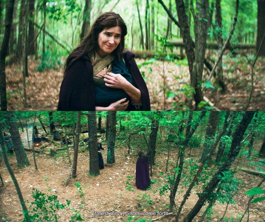
look at that meek little smile, ughhhh. nicky is like two days old and this asshole has already figured out he's the perfect prop for her murder sprees. and these poor women are calling her sister and are willing to help too.
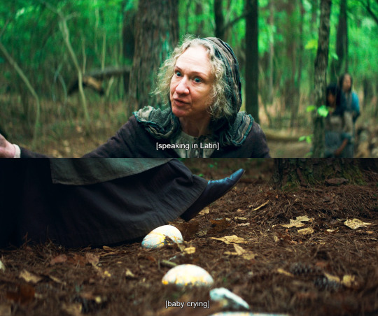
the spell is te accipimus in circulum, we accept you in the circle, and yes that makes me cry a little. we accept you in our community. and the spell is yellow air magic, which sounds like the most empathic kind if Lilia is any indication.
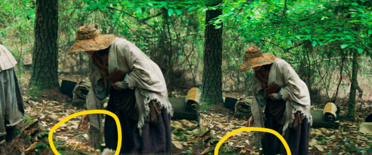
that's interesting, you can't really tell that well from screencaps but go rewatch the scene, this witch is making mushrooms grow with yellow magic instead of green?? is it just a spell (she is holding a book) or have I been getting it all wrong and color has nothing to do with the type of magic one has?
or maybe??? the color depends on the coven you're in?? the salemites all had blue magic for example. and now that I think about it the stone circle is a protection spell but it's not red/orange.
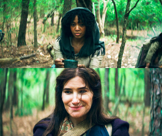
the meaning of this scene is so glaring dear lord. agatha was never going to give these women a chance to prove that yes, there are people out there who could love and help and accept her. she has shut herself up to that possibility a long time ago.
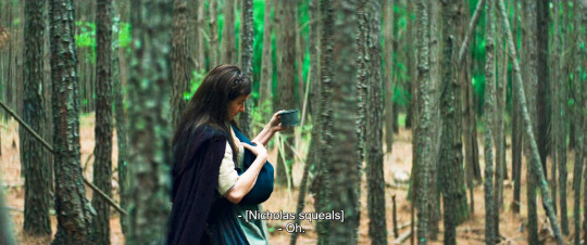
and she stole the soup too. awful.
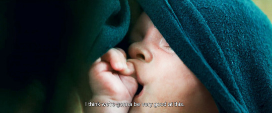
I've seen all the different theories about nicky needing to feed on witches too, or nicky needing soul sacrifices to survive because he's the son of death etc. we don't have enough evidence to prove anything yet, but personally I headcanon nicky as a totally normal kid, that makes this story even more tragic.
and aww that baby suckling on the little pudgy fist
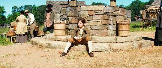
nicky doesn't look that happy about what he's been asked to do, does he?
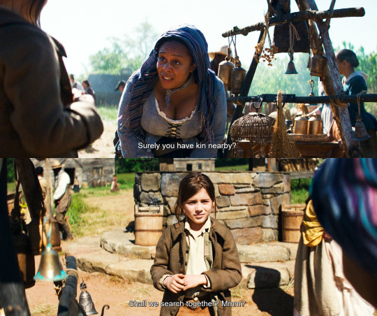
we establish that nicky was sickly (maybe he was born with some internal defect that rio temporarily patched up?) we also see him steal the bell agatha will use for her Road scam in the future.
and we meet yet another witch being kind and wanting to help.
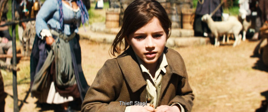
agatha: I love this six year old so much I'm gonna make him accessory to murder
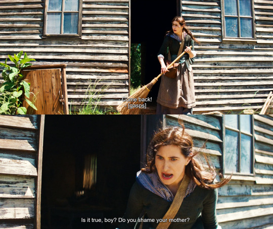
dO yOU ShaME YouR MOtHER
and the big fake gasp too. as usual this bitch has conned a whole community
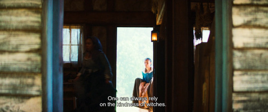
like, she's convinced herself that other witches are bad and are after her WHILE relying on witches's good hearts to con and kill them. what sort of mental gymnastics???
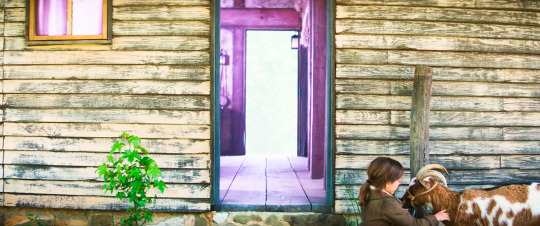
color goes from yellow to purple. nicky waits outside while his mom commits murder, it's not a good look on agatha. completely fucked up, actually.
(I'm terrified that the goat will end up being an agent of mephisto or something idiotic like that, lemme tell you. I hope they're just keeping it for milk and company.)
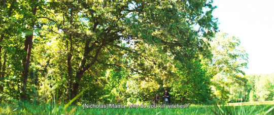
and here's the million dollar question. nicky has seen his mom kill literally since he was born, and now he's old enough to start realizing what that means.
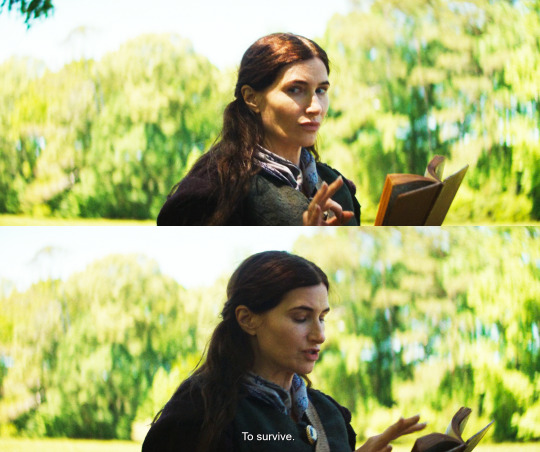
oooh I know that look, that's agatha when she's put on the spot. she avoids his gaze, she can't be sincere with him.
and of course she's teaching herself spells from a book. nerrrrrrd
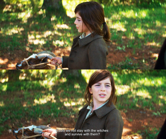
nicky, bless his soul, appears to give it a good thought and then offers a practical suggestion. I guess he wouldn't mind to have a roof on his head and some friends too.
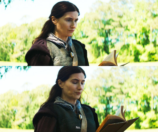
GREAT acting from kathryn here. the quick OH SHIT face followed by the super final NO, with her jaw so rigid. in typical agatha fashion, when she's upset she becomes avoidant.
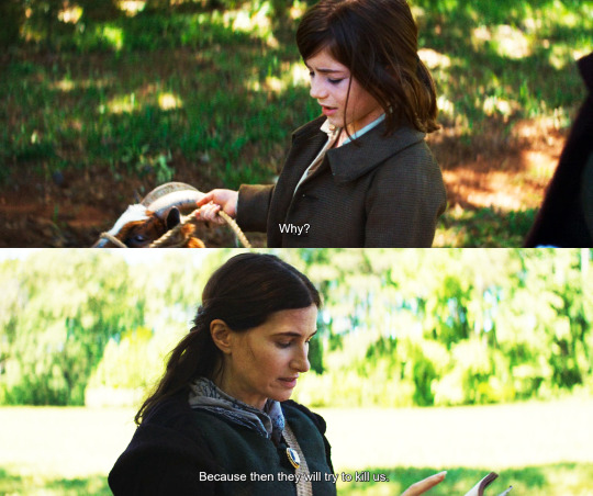
this is evanora's legacy. despite agatha's immense love for nicky, she is passing all that pain down and inflicting it on him.
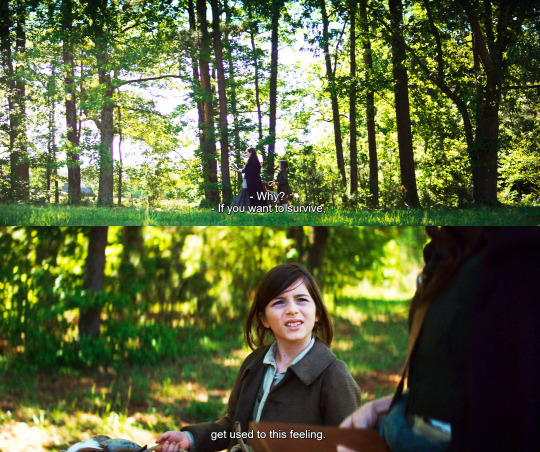
remember when she called billy a survivor? this is the greatest asset in her opinion, the one she wants to teach her son. the truth is, she is angry at witches because she is scared of them, she's scared of being targeted again. but look at that kid's dark circles, I can't believe she's making him sleep in the woods, sick as he is!
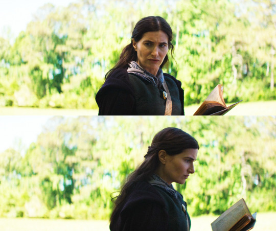
really really fantastic subtlety. agatha wants to sound wise and strong, but she looks scared, uncertain, guilty.
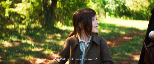
see how nicky looks at agatha while he sings? he's checking to see if she's noticing, because his mom likes music and likes his voice. he's afraid he has upset her and wants to make her smile. he tried to reason with her, and now he tries to soothe her. this is what happens when you have an immature parent, a child will want to help, they will try to fix things. they'll end up parenting their parent, and it should always be the other way round.
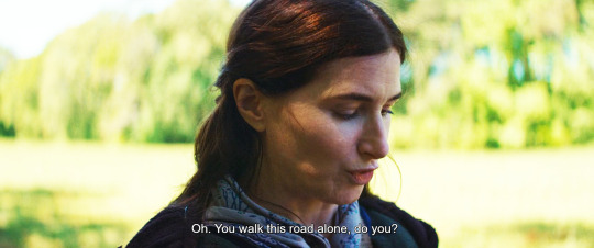
agatha takes the bait. she's relieved that the conversation has moved to a safer subject. but oh, this script is so good. this is a mostly innocent, mostly sweet remark, but with a possessive undertone. don't forget that you are mine, she says.
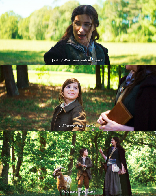
and still, the love is real. even in a fucked up situation like this, these moment of happiness are precious and genuine and will linger on. look at how adoringly nicky looks at his mom, she's literally the sun and center of his small world, and that's how agatha likes it: she created nicky because she needed someone who could be hers without any baggage or consequences. but it turns out that raising a child is not a cheat code for love, it's one of the most difficult, most significant and impactful decisions a human can make.
go to episode 9 part 3
155 notes
·
View notes
Text

Hi! I got asked if I have an icon tutorial so I thought I'd do my best to go through my (probably way too long) process :) I'm going to show how I made that icon up there 👆
When I first started making icons I used this great tutorial by @/strwrs and then slowly added my own preferences to make this chaotic process 💕
First for getting screencaps of things i normally just google "[name of show/movie] screencaps" but one of the ones I use a lot is this site.
1. Open the pic in photoshop and crop it
Here's the full image:

Here's where I'm cropping it:

I like to make the size of my icons 250x250 but it can be more of a preference thing, a lot of people use 200x200 or I've seen 100x100 too.
I also like to crop a little above the image sometimes to give more space above the head
2. Removing the background
Removing the background is way easier on animation than on real people sometimes so I can show 2 examples even though I do it the same way...
First I go to select > select and mask:

Then I use the quick selection tool to select as much of the head as i can and the brush tool to remove/re-add parts that got missed so it should look like this:


(is the quick selection tool great? not all the time but when it works well it's great 🤡)
For something like this where her hair has a lot of texture in it and it's difficult to get a good outline, I'll zoom in really far and use the brush tool to get as many of the big pieces as I can so it looks a little more natural when the background color is added

Sometimes there can be a white/black line around the icon that got missed from erasing the background and you can use the brush tool to erase that as well.
3. resizing and sharpening
Now everything should look like this:

I'm going to go to the right where my layers are at and create a new group by clicking on the folder at the bottom
Then I drag the layer mask up to link it to the group instead of just the image and drag the image into the folder:

Next I like to sharpen before I resize the image so I open the group and highlight the image layer and then go filter > convert for smart filters and then for sharpening: filter > sharpen > smart sharpen with these settings:

Now with the image layer still highlighted i go to image > image size and set it to 250x250

4. the fun part ✨
Now we can add the background color and everything else ✌️
I have a lot of previous templates saved to save me time so what I normally do is open a psd template I have then highlight the group layer i just made then right click > duplicate group and have the destination be the psd and then I can just change the colors of gradients i've already made (For this tutorial though I'll show you how I make the gradients/paint layers)
For coloring this is pretty much what my process usually looks like (im probably going way overboard with it but oh well lol) it really depends on the pic being used, some don't need to be colored as much.
I have found that over brightening/upping the vibrance isn't necessarily a bad thing sometimes (not all the time though) because of how small the icons are it kind of helps the image stand out more when they're used but it's up to you!
(I also put all the adjustment layers into one group because it gets a little chaotic if I don't)

Next we're going to make a gradient ✨ first i go to the adjustment fill button (?) and pick gradient

Then I just pick one of the generic photoshop options that kind of has the look I want ( it doesn't matter too much since it will be edited so it can be any color)

Now to change the color of the gradient click on the color part in the gradient section and you'll see this

I deleted the bottom middle square because I didn't want it, but to change the colors double click on the bottom left or right squares and a color wheel will pop up.
When I pick the lighter color i normally just go up to a lighter section above the darker color
This is the change i made, you can move the middle diamond slider to have the darker or lighter color be more prominent

Next is playing with the angle/scale until it's how you want it, these are what mine ended up being

I also normally adjust the angle so that the lightest part of the gradient is in the top corner where the light source is coming from in the icon pic to make it look more natural
Next I add a solid color layer over the coloring layers with a color that's similar to the background gradient color im using and switch to the brush tool with black paint and with the layer mask selected on the solid color layer paint over everything i don't want colored with black
Then I do a second solid color layer set to a lightish brown, normally on just the hair, to add a bit more contrast

then i set the color fill layer that matches the background to either overlay, soft light, or color (depending on which one looks best for the image) and adjust the opacity/fill to where I want it.
I always set the brown layer to soft light with the opacity at around 80%
And NOW just when you think I might be done...I'm not...because I have to make this process as long as possible ��
Now I do another color fill layer but this time over the entire image group layer. I normally make the color a slightly lighter color than the darkest part of the background color, set it to soft light, lower the opacity/fill to about 50% or lower, (depending on how much it changes the pic) and then right click > create clipping mask so it only effects the image and not the background
This kind of just tints the image a little with the color to bring it together a little more

Now the icon looks like this:

You can add more fun stuff like doodles/background textures i've used these and these but there's a lot of resource blogs like @/completeresources and @/allresources that have long lists of different textures
If i wanted to add a texture though i would put it over the gradient layer and set it to overlay or soft light


And to add a doodle you just put it at the very top of everything and resize it/turn it using the move tool :)


Then you're done! you can go file > export > quick export as png and thats it 👏
Hopefully this makes sense! I've uploaded the template i made in the tutorial here if that's easier to follow but feel free to ask if you have any questions!
#icon tutorial#dailyresources#completeresources#icons#tutorial#tutorial*#photoshop tutorial#usertana#userzo#tusertha#ps*
78 notes
·
View notes
Text
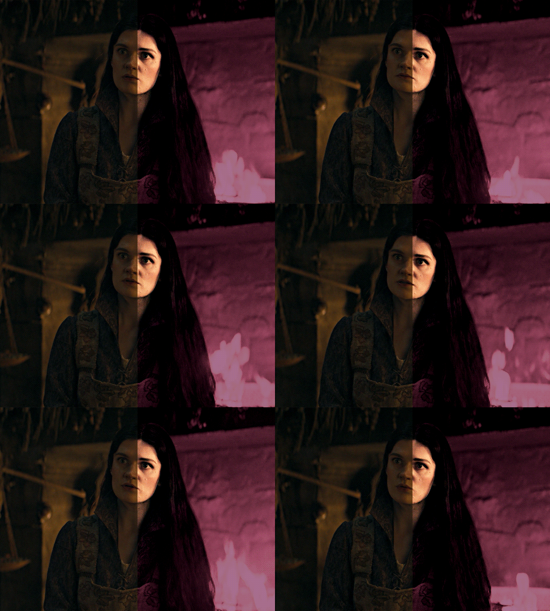
i was asked by @matthew-macfadyens for a colouring tutorial, so here we go ! i've been making gifs for almost 4 years now and finally feel comfortable and confident in my skills to make a full tutorial on my colouring process. there are so many different ways people colour gifs, and there's no wrong way, this is just how i do it ! i learned to gif by reading so many tutorials and picking and choosing what works for me, so hopefully this can help someone out !
if this tutorial helps you, please considering supporting me ! buy me coffee ♡

TUTORIAL UNDER THE CUT
what you'll need: - photoshop ( i use ps cc 2023 & frame timeline ) - basic ps knowledge ( how to make gifs, how to sharpen gifs, general understanding of adjustment layers, layer masks and blending modes ) - a whole lot of patience
helpful resources:
the beginner's guide to channel mixer by @aubrey-plaza
giffing 101 by @cillianmurphy
gif making for beginners by @hayaosmiyazaki
colouring yellow-tinted shots by @ajusnice
becca's mega colouring tutorial by @nataliescatorccio
@usergif

PART ONE: BASE COLOURING
- step 1: curves - step 2: exposure - step 3: colour balance - step 4: selective colour - step 5: levels - step 6: brightness / contrast - step 7: gradient map
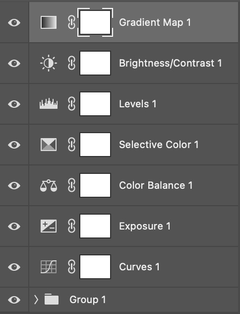
okay so, before we get started, this tutorial is for colouring only. at this point, i've already gotten my screencaps, imported them into photoshop, made the actual gif & sharpened the gif. the above image includes what my typical adjustment layer stack looks like !
STEP ONE: CURVES
a lot of people do the majority of their heavy lifting in curves...i'm not one of those people. i've never gotten the hang of curves and haven't been able to fully taken advantage of everything it can offer. i use curves to mainly brighten up my gif and to start my process.
i use the "auto" button in the curves function - this automatically corrects the curves for your gif ( mainly the brightness / contrast )
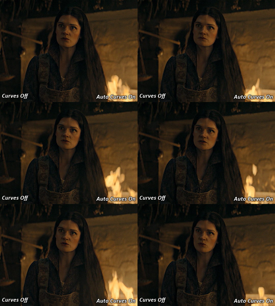
you can see that the auto curves has brightened up the gif and evened out the brightness/contrast. i just find this gives a better starting point for the colouring process.
STEP TWO: EXPOSURE
this step is for, you guessed it, brightening the gif more and evening out the contrast and blacks. i don't have any real rules for doing this, the amount i highten the exposure and contrast is different based on the scene and the show, however, i tend to stay around +1 on both exposure and gamma correction.
exposure effects the brightness of the gif and gamma correction effects the blacks and contrast. this step also effects the saturation of the gif, so it's important not to go too crazy. i often end up coming back to this step every now and again to adjust and fiddle with it.
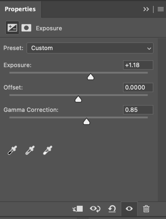
for this gif, i put the exposure at +1.18 and the gamma correction at 0.85
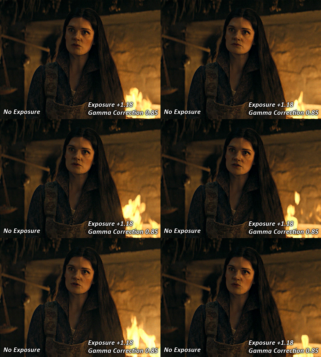
you can see this step serves to add some more brightness and contrast - it also adds some more saturation, that we don't always want, but don't worry, that's what the next steps are for !
STEP THREE: COLOUR BALANCE
i use this step to do a lot of my heavy lifting - i'm a whore for colour balance. this serves to even out the colours and help neutralize the colours for an easier canvas. it's important to understand the basics of colour theory for this, i recommend checking out the channel mixer tutorial i listed above, because a lot of those steps applies to colour balance.
essentially, there's three separate profiles to edit on - highlights, midtones and shadows. in each profile, you have 3 colour sliders. the top one is your cyan to red, middle is magenta to green, and bottom is yellow to blue. the colouring of the scene will decide where to move your sliders.
for example: if your original scene has a cyan tint to it, you'll want to pull your slider to the right, towards the red to help neutralize the cyan. if your scene has a green tint, you'll want to pull it left towards the magenta. as you move the sliders, you'll notice that sometimes it brings out other colours you don't necessarily need, you can adjust the other sliders to help neutralize further.
i always do my main correction in the midtones profile.
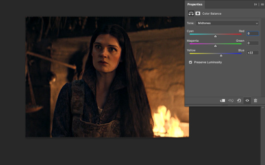
since this scene has a heavy yellow tint, my first step was to adjust the bottom slider. i pulled the slider to the right towards blue at +22. you can see this helped get rid of a lot of the yellow, but adding in the blue warmed up the reds and made it more saturated.
to help with this, i pulled the top slider left towards cyan to help neutralize that red.

i pulled the top slider to -28 and you can see this cut out that heavy saturation and redness. it's looking a lot better, but now it's a little too green for my liking. this is where that middle slider comes in!
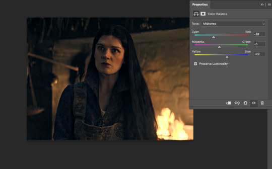
i pulled the middle slider to -6 towards the magenta to help counteract the green that came in. ( i ended up going back in and adjusting the bottom slider to +10 instead, as it was a little to blue )
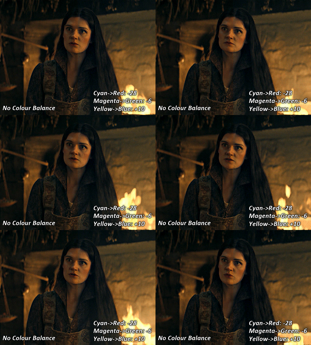
you can see this step really did the heavy lifting, helping to neutralize the canvas so that it's easier to work with...but it's not quite perfect yet!
STEP FOUR: SELECTIVE COLOUR
a lot of the same principles around colour theory apply to selective colour! this is where i go to adjust the colours according to what my colour palette is. for this gif, the overall colour is going to be purple, so i'll adjust the individual colours with that in mind.
i only ever adjust my red, yellow, white and black profiles! sometimes i'll do the other colours, but that's only for tweaking the final colour. i normally don't touch them at all.
ps: you'll notice i prefer a cooler toned gif, and almost always go for a more magenta looking red/yellow.
i always start with my yellows:

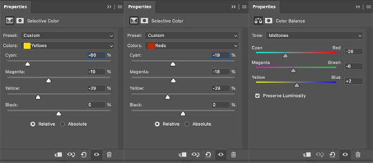
in the yellow profile, i pull my cyan towards the left to -38 (this helps eliminate the green in the yellows) and my yellow slider to the left to -27 (this cools down the yellows. i top it off by adjusting my magenta slider to -10, to help lower the saturation of the yellows.
you'll notice this step got rid of most of the green undertones - that's because the green was nested inside the yellows, so by taking out a lot of the cyan and yellow, you're left with a warmer yellow as opposed to a cooler yellow.

next i go on to my reds. this step will mainly effect the alys's skin tone, but i'm going to do pretty much the same as above but with much less dramatic of a change. lowering your colours in your red profile too much can lead to a very saturated gif, which is not what i'm going for.
i pulled my cyan slider to -19, magenta to -9 and yellow to -15. you can see this helped add some more cooler tones to the reds.
the next profiles are your white and black profiles. i use white to brighten the lightest parts of the gif. no rhyme or reason here, i just pull the black slider towards the left...usually around -25. for the black profile, i always move the black slider towards the right. anywhere from +3 to +8, depending on the gif. for this gif, i did +8. this darkens the blacks and, in my opinion, helps the gif pop!
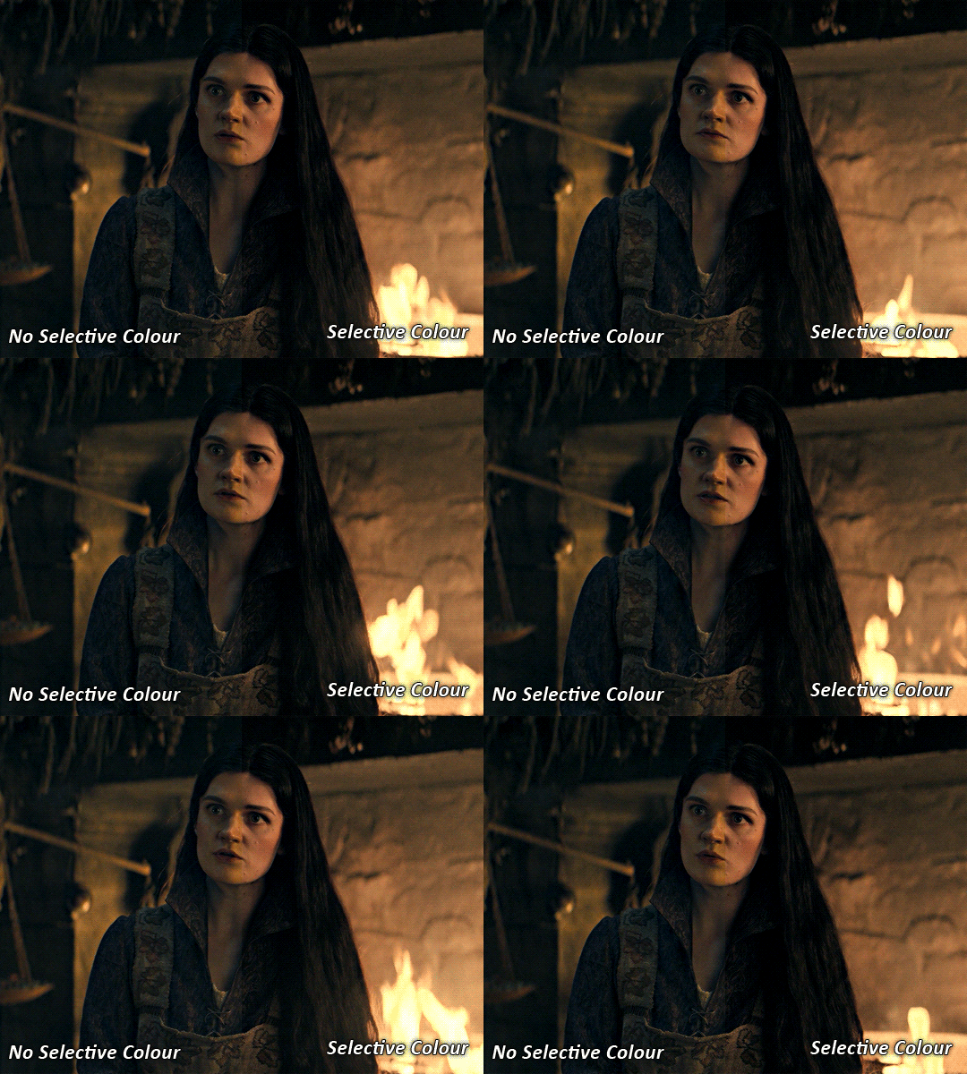
you can see this step got rid of the yellow tint, gave the gif a more neutral look and adjusted the reds to better compliment a purple colour scheme !
STEP FIVE: LEVELS
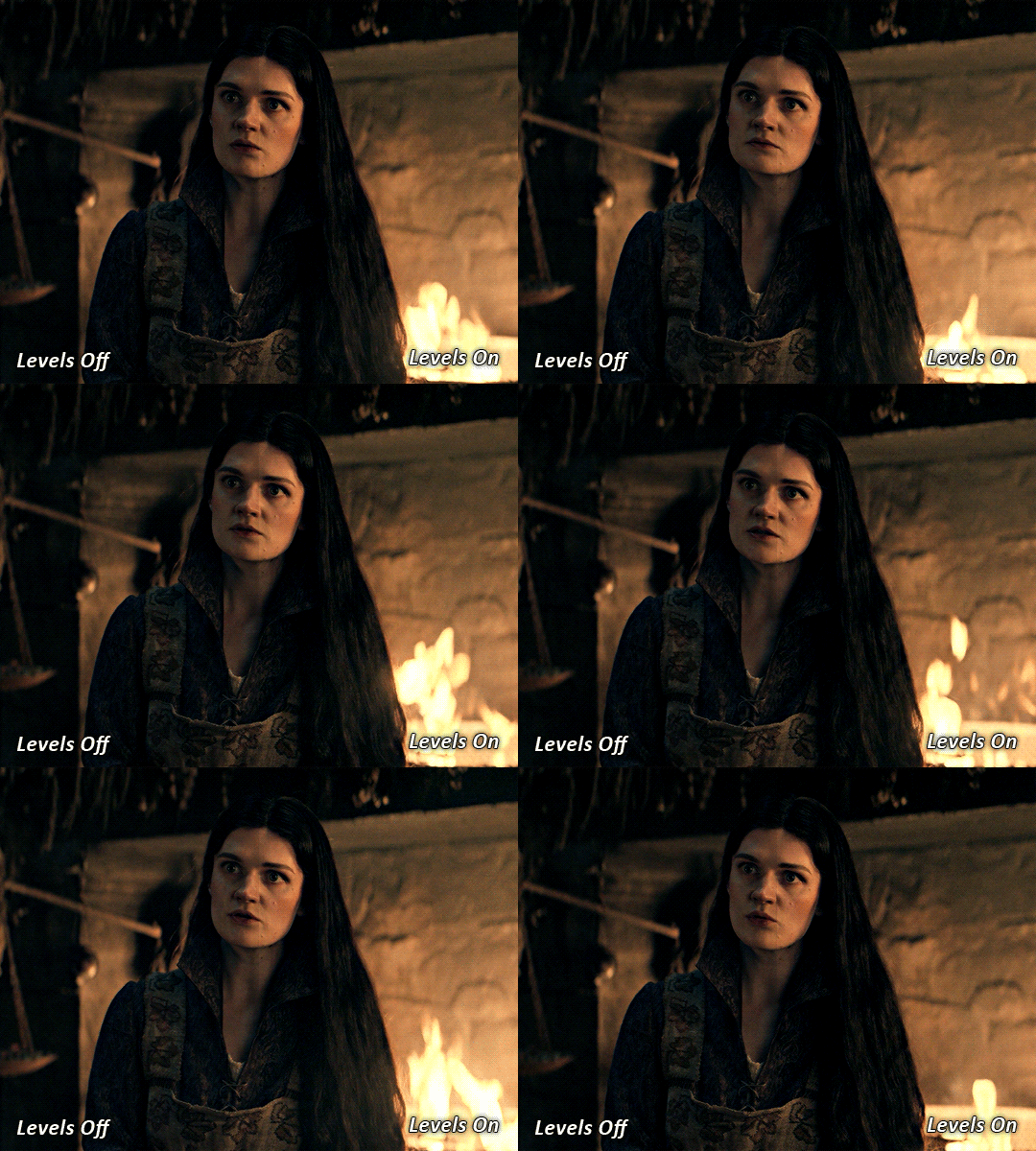
this adjustment has three toggles - i'm not 100% sure what each toggle really does, i just know that by pulling the leftmost toggle to the right, it darkens your gif, and pulling the rightmost toggle to the left brightens your gif.

this step is so hard to explain, but really i just pull the toggles around until it looks good...sorry !
STEP SIX: BRIGHTNESS / CONTRAST
this step is exactly what it says on the tin...it brightens your gif. this step is based on your scene and personal preference, there's no real guide to it.
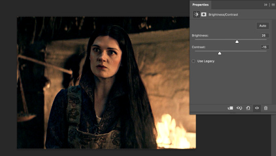
i always pull my brightness slider to the right ( brighter ) and my contrast slider to the left ( less contrast ).
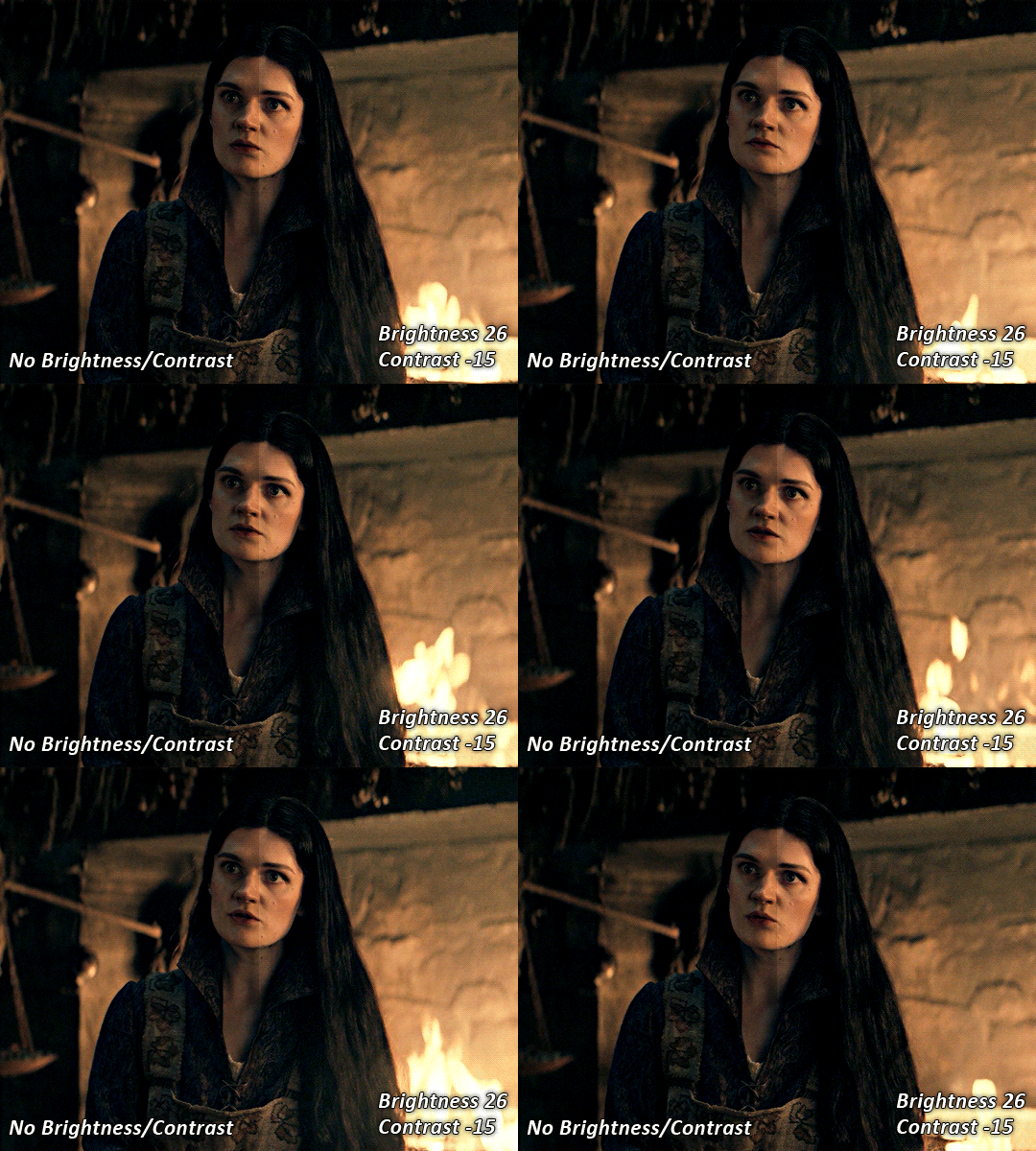
STEP SEVEN: GRADIENT MAP
this last step is something i learned from @nataliescatorccio ! i add a gradient map to the top of my stack, and choose a lighter colour of what i want my overall gif to be. in this case, i used a very light purple!
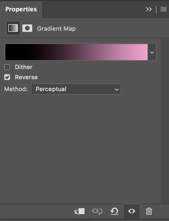
i then set the blending mode to "soft light" and lower the opacity to anywhere from 20-30%. for this gif, i did 30%
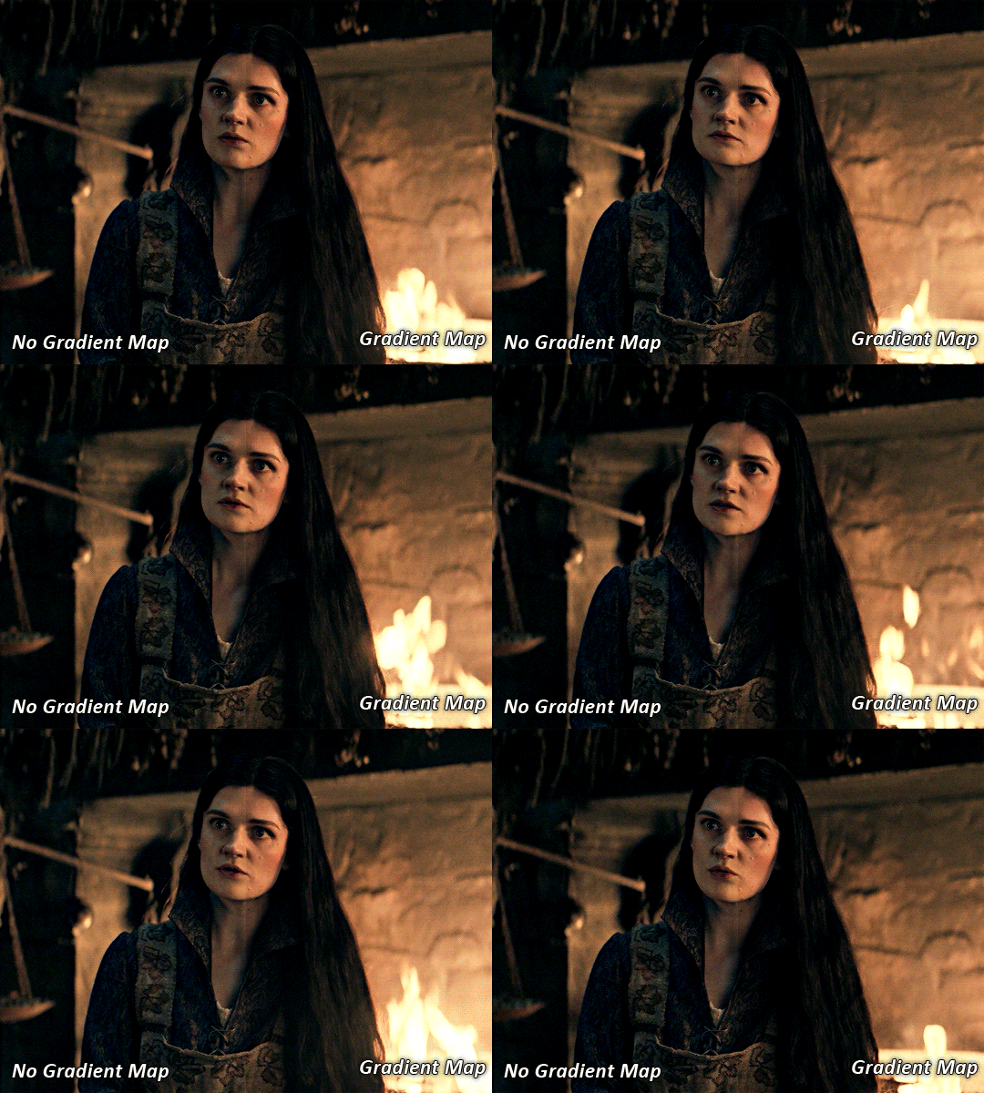
this step will help make your colour pop once you do your main colouring!

PART TWO: PAINTING & COLOURING
- step 1: layer 1 - step 2: layer 2 - step 3: layer 3 - step 4: final touches
okay, so my actual colouring process is based in 3 layers. for this gif, i'm using a deep purple/mauve colour !
STEP ONE: LAYER ONE
between your brightness/contrast and gradient map layers, add another blank layer. change the blending mode of this layer to "colour" and set the opacity to 40%.
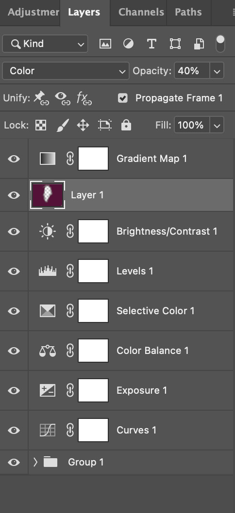
then, using a soft round brush with an opacity of 100% ( size of the brush is your preference, i typically use around 108 ), colour the parts of the gif you want coloured !

you can see this helps us get the canvas to a more uniform purple colour!
STEP TWO: LAYER TWO
for layer two we're going to do the exact same thing. add a layer above your previous, set to "colour" at 40%. we're going to go over the same areas!
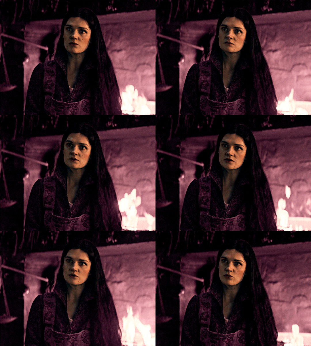
you can see this helped get the purple so much more vibrant and closer to what our final colour is going to be!
STEP THREE: LAYER THREE
for our final layer, add another layer above the previous 2, set your blending mode to "multiply" and your opacity to anything from 60%-100%. for this gif, i did 60% !
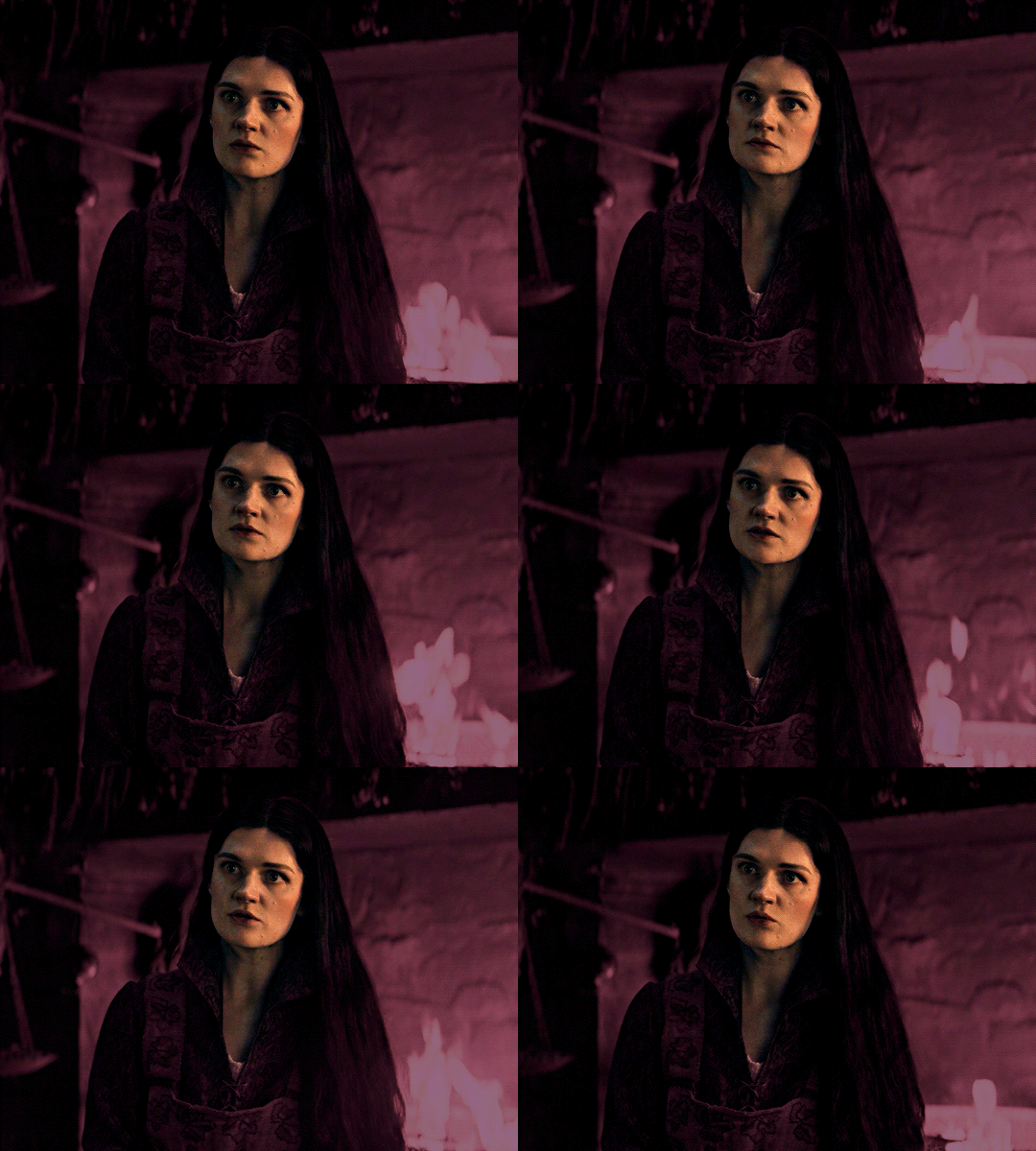
now, our colouring is pretty much done but you can see that, now that our colour is down, alys's face is still a little too blue/green/yellow for the background purple. the next step, we're going to adjust and add final touches!
STEP FOUR: FINAL TOUCHES
at this point, i went back into my selective colour layer and adjusted my yellows & reds and went back into my colour balance layer to adjust everything overall.

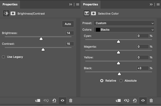
at this point, i'm going to go in and add some adjustments layers above everything - i usually add some brightness/contrast, and a selective colour layer to darken the blacks.
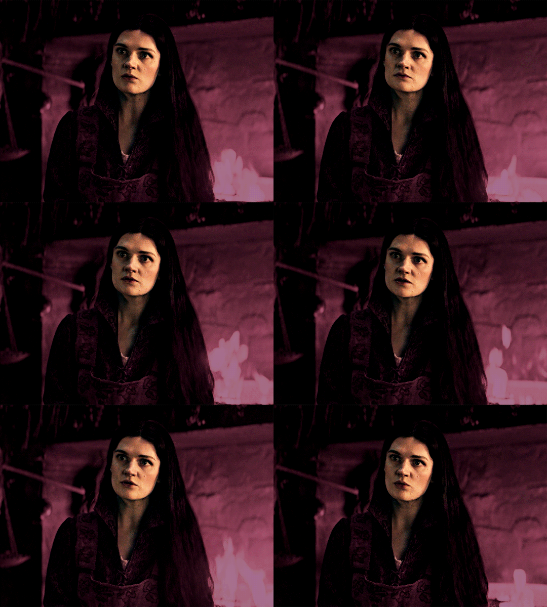
which brings us to our final result:
#usergif#dailyresources#pscentral#ps tutorial#tutorial#coloring tutorial#allresources#userbecca#tusermich#userjoelle#ughmerlin#mialook#*tutorial#**
237 notes
·
View notes
Text
rilla of ingleside book club, chapter two

okay I'm already kind of over screencapping the text except for the chapter titles lmao. moving on!
"Her hair was ripely, ruddily brown"
Honestly funny that I'm not sure any of the popular editions of this book have managed to get this right. Rilla's a much brighter redhead on the Bantam cover, and even the unabridged, researched and lovingly restored Viking Press version looks like this:

I have...no real opinions about Miss Oliver; I think her ~visions~ tend to be a little too dramatic (especially once she starts predicting the outcome of the war with them, like come on), although the way she teases Susan and the Blythes is occasionally funny. I'd rather her role be replaced with an actual peer of Rilla's (lots of girls are mentioned as Rilla's friends in passing, but we don't see an actual friendship between them!), but I don't feel that strongly about it. (Actually, having read the rest of the chapter, I had the sobering realization that Miss Oliver is probably the character I'm most like, in that I am pessimistic over things going too well and a little superstitious and also Of An Age and unmarried. Welp. This has been an educational read.)
“Why couldn’t they have called her by her first name, Bertha, which was beautiful and dignified, instead of that silly “Rilla”? ”
This is so funny to me because I don't think there's a single girl in the 21st century who would rather be called "Bertha" than "Rilla." rilla/carl agenda time: you ever think about how they both go by shortened versions of their middle names and nobody ever uses their first names?
I do wish we got a little more of Marilla (Cuthbert) besides Rilla just casually mentioning that she died and Rilla hated her name :(
I def. remember thinking Rilla and Walter's relationship was eye-rollingly saccharine as a kid -- as the elder of two siblings I was like, "Start bullying her or get out of the older sibling club Walter", but thinking about it more -- while my brother and I fought constantly as kids, by the time I was Walter's age and my brother was Rilla's, we actually did get along really well! So, yeah, baby freyafrida was wrong there, lol -- I actually really love Walter as a big brother, reading this now. He's clearly so sweet and patient with Rilla's need for attention from her older siblings ❤️ (Also, while I have never shown my diary to anyone, I do wince in sympathy with Rilla showing hers to Walter, because I def. had that urge as a teenager -- the idea that showing someone you like/admire all your secrets will make them understand the Real You and open up in turn.)
The dynamic between Rilla and the rest of her siblings also intrigues me -- she seems...apart from them, in a way, almost like Shirley? I mean, part of it is probably that there are just no scenes of her spending time with them, and that she was too young to be part of their shenanigans in Rainbow Valley, but it does lend some...legitimacy, I guess, to her being upset that they're all hanging out without her -- while it's understandable that Jem is too old to really want to hang with her, the gap between her and Nan/Di isn't much bigger than the gap between them and Jem iirc. (Just speculating, but I imagine it'd be hard to be the only other sister to a pair of twins.) (That said, every pair of siblings I knew who were only 1-3 years apart in age got along swimmingly -- I really envied them when I didn't get along with my brother -- so Rilla and Shirley should've been besties!!)
Speaking of, love the mention that Shirley teases Rilla by calling her "Spider" 🥹 He's so nonexistent that it's easy to speculate he's not close with his family, so I love that he does have a teasing relationship with her.
“Wordsworth never wrote anything like Walter’s poems—nor Tennyson, either.” “I wouldn’t say just that. Both of them wrote a great deal of trash,” said Miss Oliver dryly.”
LMAOOO. I will say I did not particularly enjoy any of the poems attributed to Walter in The Blythes Are Quoted, apart from "The Aftermath" -- maybe it's a personal taste thing, although I do think part of it is that they're very much in LMM's voice, so they come off weirdly twee if you're trying to imagine that a college-age dude wrote them.

Ah, and of course there's Walter writing poems to Faith. Now, the way I jumped when I saw in Readying Rilla that the draft originally explicitly said Walter was in love with Faith! From what's actually published, you could read him writing sonnets to her as a poetic or aesthetic interest (although I do think he had a legit crush on her, see below), so it's v. interesting to see that the original intent was that he was into her, romantically. Also interesting suggestion that it might've caused conflict with Jem and Walter, although of course it didn't -- mentioned before, but it's funny that this whole Jem/Faith/Walter situation gets set up in Rainbow Valley and mentioned at the start of Rilla, and then it goes absolutely nowhere. There's never any drama between Jem or Walter because of it and it never comes up again.
Speaking of...is it too early for Walter Sexuality Discourse? LOL. Tbh I don't have much to say there; my boring Both Sides take is that I see the vision in reading Walter as gay and I don't think it's a reach -- on the other hand, I also think there's evidence that his thing with Una is meant to be a doomed romance where Walter was capable of reciprocating, and I roll with that reading because I love Una too much to think that Walter wouldn't love her back. Anyway, I bring it up because I do read Walter as being legitimately attracted to and interested in Faith. There's not much of it in Rilla, but in RV I do think he has a clear crush on her. ("Walter did not want to ride a pig through Glen St. Mary, but whatever Faith Meredith dared him to do must be done.") It jives a lot with his worship of beauty for beauty's sake and his Anne-like tendency to get swept away by ideals and surface-level perceptions (e.g. fearing the pain of getting his tooth pulled in RV even though having the chronic toothache is worse).
(Once again an interesting choice -- Faith briefly thinks Jem is handsome at the start of RV, and they get a brief scene together at the end of that book, then are nearly engaged in Rilla. And yet, much of RV is actually devoted to Faith and Walter's friendship -- although I think it's kinda obvious straight off that they wouldn't work as a couple, see Faith telling Walter to just suck it up re: his toothache and get it pulled. She'd get sick of his poetry and dramatics so fast, lmao.)
“I don’t half like that,” said Miss Oliver, with a sigh. “It’s ominous—somehow. A perfect thing is a gift of the gods—a sort of compensation for what is coming afterwards. I’ve seen that so often that I don’t care to hear people say they’ve had a perfect time. June has been delightful, though.” “Don’t wish it. Dramatic things always have a bitterness for some one. What a nice summer all you gay creatures will have! And me moping at Lowbridge!”
Miss Oliver, you don't have to respond to everything Rilla says with how moody and emo you are, lmao.
“I heard some one say once that the years from fifteen to nineteen are the best years in a girl’s life.”
I love how weirdly specific that is to encompass the years of the coming war. Like, haha, get it??
“Father says I toil not neither do I spin.”
This is interestingly exactly what Phil Gordon says about herself in Anne of the Island!
“And then,” continued Anne, “there will be a good deal of work to be done. Stella’s aunt can’t do it all. We all expect to have our chores to do. Now, you—” “Toil not, neither do I spin,” finished Philippa.
Although I have to wonder...if Rilla's not doing chores and not studying, what exactly is she planning to do every day for the next four years? Genuinely I'm not super up on what she would've been able to fill her days with (social calls all the time?), I'd be interested in any insight there.
Anyway, this is basically another chapter that sets up the idyll of Ingleside life before war invades it, this time setting Rilla's character up for us. I always liked Rilla -- she was a fave upon first read and I still like her now! Idk, I've always liked silly, frivolous female characters -- I think it's because growing up, I felt like such characters in children's/YA books were often portrayed disproportionately negatively -- I never felt like their behavior was offensive enough to warrant them having to be humbled, you know? (don't ask for examples because I can't think of any off the top of my head lmao, I'm just recalling Vibes from when I was young that shaped my opinion in this direction!) I think the fact that the narration has a sense of humor about her ("...sighed Rilla, a little importantly”) also makes her frivolity more palatable and even relatable -- who doesn't love a good self-important sigh every now and again, you know?
Readying Rilla stuff:
Rilla originally just refers to Walter having "the flu" (or, well "the fl", LMM apparently cut that idea off before it even finished lmao) instead of typhoid; interesting to think if he was meant to have nearly died from the flu, or if his illness was initially much less serious!
Walter is initially referred to as being 19 instead of twenty. Not sure if he was intentionally aged up or this is another example of "Shirley is eighteen for two years"-esque math.
Dog Monday's name was originally some variation of "Jink/Jack/Jacks" and then Rags.
37 notes
·
View notes
Text
以沫 - Yi Mo (shared breath)
youtube
相濡以沫 lit. to moisten each other with spittle This was derived from Chapter 6 of Zhuangzi, The Grand Master, 'When the spring dried up, the fish found themselves dwelling on land together. They wetted each other with their breath, and moistened each other with their spit. It had been better times when they were unfamiliar strangers in the rivers and lakes.' This idiom has come to metaphorically describe people who help each other with whatever little they have while in difficult circumstances themselves. Legend: Fei Du, Luo Wenzhou, Both (yellow in the video)
In my heart, there is a thicket of flowers growing outstretched toward the blazing sun, more fragrant than all the finest wines. Their searing fragrance once flooded the chest of a man made of straw; and from then on, that straw man’s conviction would endure beyond time.
----------------------------------------------------------------
The turning days of yesteryear still vivid: In your eyes, the moth is aflame. [1] Why do you choose silence? [2] Many years have passed… who is that now softly reading? Life and death, love and hate - divided. [3]
The gates of hell are wide open; my sight blurs more and more. [4] Reciting memorized names from the list of devils, that’s me, barely breathing. Vanishing suddenly, the shooting star is a flash across the sky filled with reluctance; [5] with the cigarette snuffed out, your silhouette is outlined by the darkness.
I am adrift alone, the molten lava’s searing flow rising past my chest; the fragrant blossoms in my heart reach toward the blazing sun. [6a] You go to that faraway place where there is no sunrise, no first light… [7] but likewise - no regrets; you walk into the abyss, and I with you. [8]
A single song plays on loop; in me, the past is deeply branded. Time is being squandered, discerning good from evil, where they begin and end. [9] These twinkling lights of a million homes… are they worth mooring for? Lost within the fog, that brilliance quietly fades. [10]
I am adrift alone, the molten lava’s searing flow rising past my chest; the fragrant blossoms in my heart reach toward the blazing sun. You go to that faraway place where there is no sunrise, no first light… but likewise - no regrets; you walk into the abyss, and I with you.
The ship docks in the harbor, a ray of light shining through the window. I am by your side; my heart and my hurts healed. The waves shatter and rise again—cyclical, they bear witness to the past, and with time, become boundless and everlasting. [6b]
Ten thousand years later, you and I, we’ve transformed into two clouds of foam. [11] Reunited, two gasping fish upon the rocks each spitting foam on the other, [12] refusing to part.
A moment of your tenderness, and the vast indifferent sea of Others shattered, [13] the chronic affliction self-healed, the crimson blood dimmed. ‘Without your permission’ I’ve left the sand dunes and the wastelands far behind, all for that one instant of starlight. [14]
A lone boat sails the misty waves - to save me. [15]
NOTES
My goodness. It’s been quite a while since my last song closely linked with a novel. This one has all the distinct vibes of a fansong xD I don’t know if it was because it’s written for audiodrama or if it was already an existing one before this, but either way I have missed this flavour of song! It was such a nostalgic experience to listen to it on a loop and play around with guessing references, even if this isn’t my fandom.
As usual, I have not (fully) read the novel it was based on, and as such this is a semi context-free take. Y’all really have @decrescendo to thank for this, because the translation is brought to you by yj’s last braincell that grabbed on to -

- and REFUSED to let go.
BTW, that’s a screencap of her (previously) work in progress fanvid for Justice in the Dark, the 默读 drama adaptation that finally after sooooooooo much difficulty and fridging, finally got broadcast. And she finished it too - COME WATCH IT HERE!
Are any of them worth anchoring for? And then the answer was SO GOOD. If you’re a Mo Du or JITD fan, I’ll leave you to experience the full song in my post and then see what A did in her fanvid.
Anyway, full disclosure: I’ve read about ⅕ of the priest’s 默读 on jjwxc (plus all the Fei Du major injury scenes *cough*) and about nine or ten episodes of Justice in the Dark - still need to get back to it someday - and have osmosed the barest gist of the story. It may have been enough to make fairly educated guesses at what some parts of the song were about. BUT!!!! For a context based translation, Chaikat has a very in-depth writeup here. Also check it out in general because this is a SINGABLE version in English (omg). I’ve tried it. It works!!!! So many kudos for this labour of love.
Onwards to annotations for the song!
[1] 朝夕如昨 你眼中飞蛾扑火 The turning days of yesteryear still vivid: In your eyes, the moth is aflame.
What this reads like to me is, ‘In all the times we spent together that are playing back in my mind now, it’s clear you were going to do something not recommended by EHS - it was written in your eyes.’
The first four words are literally [dawn and dusk] [like yesterday]. The common usages of 朝夕are things like indicating the passage of time, a cycle of day and night i.e. short period of time, or doing something/something happening day and night and so on. It threw me for a loop for a while because I hadn’t made the latter connection xD And then separately, like its english counterpart, ‘like moth to a flame’, in 飞蛾扑火 there is a layer of inevitability and self destructiveness inherent in that image. Also it’s so dramatic that my brain automatically provides an image of the moth already burning up in the fire it threw itself on.
[2] 为何选择 沉默 Why do you choose silence?
This was a delightfully ambiguous line because there is no subject in the sentence. Is this a question for Fei Du - why didn’t you say anything about your past and your plans? Or is this a question for himself, Luo Wenzhou - you observed all the signs and said nothing about them!
I like that a lot. It’s nice to chew on!
[3] 生死 同爱恨 分隔 Life and death, love and hate - divided.
The literal translation of this is, ‘life and death have been separated from love and hate’. My context-free understanding of this is that it’s natural for life, death, love and hate to be intertwined, and so for there to be a separation, something unnatural must have happened. Of course, the line could be a neutral statement about how feelings for a person exist no matter their state of being. However, from the preceding line 多年又过 是谁轻声诵读着 | Many years have passed… who is that now softly reading? it already sounds very tied to plot shenanigans unbeknownst to me.
In song context, I would guess that the character’s will to live, fear of death and human emotions have become, hmmm… not so accessible. And that has something to do with the person reading the literary work (classic literature) aloud. 诵读 is doing that - usually specifically with a literary work - with emotions, bringing it to life.
(Also I couldn’t figure out if 诵读 is a closed book i.e. reciting or an open book exercise, so if someone knows please enlighten me! It was interesting to read this detailed description of schooling requirements for reading aloud from The Education University of Hong Kong LOL)
[4] 地狱之门大开着 眼前愈发浑浊 The gates of hell are wide open; my sight blurs more and more.
Both figurative statements I think. In song context (influenced by my vague impression of novel context) the crimes keep happening and mastermind (?) behind them has muddied the waters. The moth flying toward the flames in the song (Fei Du) is also not sharing everything he knows. And so for the other character (Luo Wenzhou) from whom things are hidden, it’s increasingly hard to see the truth as plot things go on.
[5] 猝然消逝的流星 一闪划过 / 明明不舍 Vanishing suddenly, the shooting star is a flash across the sky filled with reluctance;
I think this is just imagery representation for vanishingly small moments of joy? But also to set the path for the lights and stars that come later. The parts about the shooting star were sung by Fei Du, but the ‘obviously reluctant’ line was by Fei Du and Luo Wenzhou together. They timed it so well that it is a full sentence.
Song logic: Something wondrous that makes you feel fortunate to see it flashes by, and you feel reluctance to see it go. I gave the emotions to the shooting star because it was more Romantic, but you know they were felt by the observer(s) too. A pause to live in the moment. But then it's time to do something hard in the shadows.
[6a] 我一人漂浪 岩浆滚烫漫过胸膛 心底的芬芳 向烈日生长 / [6b] …同时光 万寿 无疆 I am adrift alone, the molten lava’s searing flow rising past my chest; the fragrant blossoms in my heart reach toward the blazing sun. / …and with time, become boundless and everlasting.
Preserving an alternate version of 6a here: I am adrift alone, the searing molten lava overflowing from my chest.
These are references to the ‘reflection letter’ Fei Du wrote, that though disguised as a prank to irk Luo Wenzhou with its mushiness, was actually a confession. I don't know at what point this was written canonically, but with the way Fei Du was coughing, I'd guess it's after something not great for general health and safety (likely that final thingy where he did the thing xD I have only vague memories of it).
In my heart, there is a thicket of flowers growing outstretched toward the blazing sun, more fragrant than all the finest wines. Their searing fragrance once flooded the chest of a man made of straw; and from then on, that straw man’s conviction would endure beyond time.
The story of this song only feels complete with this piece, which is why I wanted to keep them together xD
[7] 没有黎明不见曙光 You go to that faraway place where there is no sunrise, no first light…
黎明 is a [time] i.e. dawn, when the sky is about to turn light or has just started to turn light. 曙光 is that light itself. But also refers to the light of hope for a bright future.
[8] 也无悔 深渊 同往 but likewise - no regrets; you walk into the abyss, and I with you.
I just wanted to yell about @decrescendo’s *YEETING* here: ‘No regrets, then - the abyss can have me too’. THAT WAS SO GOOD. I love it. It’s so creative and gets the vibe perfectly while being economical with wordcount xD
[9] 光阴在无度挥霍 分清善恶始末 Time is being squandered, discerning good from evil, where they begin and end.
I absolutely imagined this as a :/ and Luo Wenzhou figuratively tapping his disapproving fingers on Fei Du’s previous sentence.
[10] 这人间万家灯火 值不值得 靠岸停泊 迷雾中湮没 光影 悄悄褪色 These twinkling lights of a million homes… are they worth mooring for? Lost within the fog, that brilliance quietly fades.
Literally what the text says here xD but I just want to sigh at the meandering journey he took to find a worthwhile *home* out of the ‘abyss’ in song logic.
[11] 两朵泡沫 two clouds of foam
朵 is literally the collective noun for cloud in Chinese xD I couldn't help it :P
[12] …礁石上相濡以沫... …two gasping fish upon the rocks spitting foam on each other…
Yup it’s that idiom! I moved the translation originally here right to the start xD There was also the full TL of a passage from Zhuangzi xD but it was pretty depressing and unrelated, and so was taken out. Maybe it can be its own thing sometime when I get around to reading the full text xD.
[13] 你温柔那刻 茫茫人海化作粉末... A moment of your tenderness, the vast indifferent sea of Others shattered…
From A hahahahh

YES
I also really like callback to the earlier 万家灯火 | twinkling lights of a million homes with 茫茫人海 | the crowd of people like a sea. That feeling of alienation (wanting and not having a light left on for you to come home to, being alone in the clamor of a crowd) can be crushingly lonely. And the moment of tenderness that shatters that and heals your pain!!! Just as worldview shaking as the blossoming flowers that flood the chest of the straw man :)
[14] 我未经允诺 告别沙丘远离荒漠 只为那 一瞬 星火 ‘Without your permission’ I’ve left the sand dunes and the wastelands far behind, all for that one instant of starlight.
Making ‘without your permission’ a quote was a liberty I took after listening to this song on loop for a ridiculous number of times. The exceedingly formal 我未经允诺 - casually ‘without your permission’ but it’s actually on a more formal register than that, and I just don’t know how to render it lol - just really stood out as there was nothing about a promise to inform Luo Wenzhou or anything of the sort throughout the song. Fei Du has also never given any indication he was aware of anyone else in this duet until that verse that they sung together (because of surviving the yeet into the abyss with Luo Wenzhou?).
[15] 孤舟随烟波 渡我 A lone boat sails the misty waves - to save me.
And this is the basis for their names isn’t it? The boat and the person to be delivered from suffering.
31 notes
·
View notes
Text
Holy shit. TIMEBOMB FANS STRAP IN FOR THIS.
(lots of you have probably already seen this video before, but here’s a quick reminder)
First let’s start with the pinned comment that breaks down time stamps in the video:
Introduction (Ekko did not just have a SLIGHT crush on Jinx lol) : [0:00]
RIOT geniously hiding stuff about Timebomb till the reveal : [1:32]
The timelapse (lots of uncorrect lines in the audio cause we didn't know they met at that time, so it was just me theorizing, but I guess I wasn't wrong now lol) : [2.35]
Ekko-Jinx background, Timelapse + what we know from LORE, and how RIOT been playing with our sanity : [3:20]
✨ WALL ANALYSIS [starting with the easiest ones to see, most interesting parts are near the end]
Intro : Ekko's Wall painted in a RORSCHACH Art style [patchwork graffiti] - being full of Powder & Jinx, Ekko being in love representations, and references to Arcane : [7:28]
Jinx's heroe number and Ekko having her X and her signature all over him : [10:09]
(!) Please see the threads in description to see it all pointed out (!) The video didn't really say it right but these pictures and explanations will definitely make you see what I mean, and also, what I mean about the hair-clip and the Firelight symbol might be theory but I have explained in my thread all the things I discovered that make me thing the Firelight symbol, seeing how it changed, might have a link with Jinx in the first place when it was invented by Ekko.
RIOT playing with us and hiding the fact Jinx was on the wall : [12:14]
This is NOT hypothesis : [12:58]
The developers pointing out the forms we need to see with the thunder hextech energy : [14:54]
Yes, Ekko was in love, and he represented himself 6 times looking at her with bewildered eyes, heart in his eyes, blushing or spying on her during their teenage days : [15:18]
✨ SUMMARY FOR THE THE PAINTINGS --------
NOTE : sometimes you will see the paintings I’m pointing out even better in the next paintings I will point out. By exemple, the Firebomb and the Ekko blushing drawing described in N°2, are clearer and more easy to see in the screencaps pointing out painting N°3! Just try sticking till the end of the video to see them all! ;)
First observations & How I started my Analyze : [16:11]
N°1 - Arcane Jinx main painting on the left - representing Ekko’s Hope to get her back : [16:41]
N°2 - Powder main painting on the right (double faced Powder-Jinx + Ekko blushing + Jinx Chumper bomb) : [17:44]
N°3 & N°4 (I apologize for the lame quality of this one but it was quite hard to make it stand out!) - Screaming/crying Powder, teenage Powder-Jinx drawn K/DA style boxing + teenage Ekko with his Firelight jacket standing on the other side : 5 scenes painted in one and moving along with the seconds! (SIDE NOTE : the cube design on the painting represents the Arcade place in which Jinx boxes the machine, I forgot to mention it in the video!) : [19:19]
N°5 - Vi abandoning Powder - exact Arcane scene : [21:28]
N°6 - Get Jinxed scene from Arcane and Ekko spying on her : [22:14]
N°6, 7 & 8 - Ekko representations watching with bewildered eyes, blushing, with his Firelight mask AND A HEART around the 2 middle Powder & Jinx paintings : [25:20]
Back on N°7, beautiful painting of teenage-adult Jinx with shimmer eyes on top of the wall : [26:26]
N°9 - Little Powder from Arcane & Ekko blushing next to it : [27:47]
N°10 - Doll Jinx with Arcane's clothes : [28:28]
N°11 - Black & white picture of the same screaming/crying Powder represented on painting N°3 : [28:50]
N°12 (that you can see more clearly later in the screencaps of N°27!!) - Ekko in GILDED skin & Jinx with untie long hair drawn in negative mode : [29:04] (!) in the video I said Firelight jacket but now that I discovered all the Ekko-Jinx matching stuff in the Gilded universe (and them hiding in the crowd side-by-side on the Caitlyn’s Gilded artwork lol), I realized it looked like Gilded Ekko in that painting!
N°13 - Young Ekko with unknown person on his side but seeing how the rest of the wall is Jinx, it is probably Powder : [29:19]
N°14 - Young Powder & Ekko talking, probably the talk they had after Powder was taking in by Silco, seeing how Ekko is represented like a skeleton (dying inside) : [29:37]
N°15 - Jinx blue smoke/cloud tattoos representation (!) this cloud I'm pointing out is actually part of the ''cracking the hextech scene'' I've discovered later on, and is located on her shoulder! I will show the painting of that scene later in the video don't worry ! ;) [30:25]
N°16 - Symbols next to the Get Jinxed painting, that have different meanings in the next scenes I will show when the wall will be upside down (singing, crying + hextech symbols) : [30:32]
N°17 - THREE PAINTINGS IN ONE : Powder's red eye when she looks at Silco at the end of Act 3 + Jinx's face/mouth when she looks at Ekko before she made her bomb explode : [30:45]
N°18 - Representation of baby Powder's trauma on the bridge : [31:54]
N°19 - Lighting the flare scene drawn negative mode again, being represented in every way/side you turn the wall : [32:12]
N°20 - Random elements, like Ekko's young blushing face, giving the shape of a heart when you turn them upside-down : [32:29]
N°21 - Young Powder with Arcane's clothes, but looking more fierce as the Powder we know. Perhaps one Powder from Ekko's memory, or the Powder from the Timelapse : [32:40] (!) You can see this painting more clearly in the screencaps of N°27 (!)
N°22 - Jinx drawning/reborn scene with Silco : [32:56]
N°23 - (sorry I have deleted this one since I couldn't point it out in the video, but here's what it was : the black canvas on each side of the scene, also have Jinx & Powder's representations on them, but you'll have to zoom in and improve lighting + the quality yourself to see them cause it can't be shown in a video ToT/)
N°24 - Powder’s leather bag + teenage Ekko staring + blue & pink hand palm : [33:17]
N°25 - Big Jinx monkey-bomb from Arcane, near the other paintings of that exact same scene : [33:37]
N°26 - Drawn negative mode : ''Devil'' Jinx from the bridge scene : [34:08]
N°27 - Two paintings in 1 - Teenage or adult Ekko & Jinx + Ekko’s Gilded skin again ? : [34:31]
N°28 - Jinx ''cracking the Hextech'' scene : [34:57]
N°29 - Firelights representations, same as the ones Jinx drew in her Diary : [35:40]
N°30 - end [36:05]
MORE INTERPRETATIONS & BETTER QUALITY OF SOME PAINTINGS :
N°12 - Ekko & Jinx with untie long hair drawn in negative mode but also, if you look at it at [34:55], you'll see it way more clearly AND also see that it gives Jinx lighting up the flare scene with Ekko on his overboard flying around her.
N°27 - at [34:37] you'll see the young Powder from N°21 way more clearly!
The Jinx Monckey-bomb. At [30:58] ; [31:55] and [34:13] you might see the Jinx Monckey-bomb more clearly as the pictures are in better quality or more focused on this area !
N°22 [32:06] : I forgot to mention it in the video but in that drawing-reborn scene with Silco, you can actually see fingers/a hand (drawn by the Jinx mouth from N°28) pushing on Jinx’s skull/in her hair which seems to be pulling her under water.
More stuff about the Get Jinxed painting and the Devil Jinx one : on top of the Get Jinxed painting, there is a scary white mask/face that I believe to be representing Silco. When you turn the picture upside down, and try not focusing on that mask, it then gives off the Devil Jinx I showed earlier.
Also, the big yellow/bewildered eye in the middle of Jinx chest in the Get Jinxed painting could be representing the Eye of Zaun, as this a tech-nerd Jinx being represented here, and as Ekko is represented staring/spying on her, it could imply that Ekko has recognized Powder in her in that moment, the Zaunite child with whom he grew up with and whom he loved.
End note : I forgot to mention it in the video but there are also 2–3 Vi representations on the Jinx paintings, one from the scene where she left her on the street and went to calm herself away from her, and another with her head and shoulders down, on the main Jinx painting on the left, that looks like the Vi introducing scene from Episode 4 in the prison.
OKAY INSANE. Next I’m gonna give you some screenshots I took so y’all can get some visuals to the stuff you just read. Also, WATCH THE VIDEO!!! The creator does a lot better at exposing than I do—never mind the fact that this is literally their findings! (I didn’t find any of these, just watched the video and now spreading it to tumblr). I have absolutely no recollection of which N• photo these images belong to so you’ll have to play connect the dots lmao
A lot of the images also already have text on the screen explaining, I’m just gonna paraphrase what the voice in the video (not the text) is saying.


These two photos are telling us how Ekko’s down bad ass based the entire firefly logo off of Jinx and her logo… and for the context in the first image about the emboldened Z, here it is:

PRACTICALLY IDENTICAL.

This is the video creator explaining their level 1 billion brain power on thinking outside the box and how the idea of the painting was to go back to an Ekko origin short that came out YEARS before Arcane did. They’ve been planning this entire time, and when the description pasted far above talking about the different photos it was talking about the images painted on a wall in an Ekko origin (will show screenshots next)

The creator of the yt video found almost FORTY Jinx paintings and references to Arcane (which hadn’t been anywhere near its release date when the origin came out.


These ones on the large wood slab are CRAZY. The artists and develops had loads of fun because in the last photo you can see jinx screaming/crying if you focus on all the colours in the photo.
However, the YouTuber blurred Jinx’s face to hell you focus on the blues and pinks where the developers/artists made kind of like a moving mini scene that moved while the video itself moved. To my understanding you can see Jinx boxing and at some point Ekko shows up, too.
(I’ll repost this so I can add more images 👍)
#✮ reef talks#arcane#timebomb#theories#league of legend#Ekko#jinx#crush#before you started talking to the gun#league of legends#lol
72 notes
·
View notes
Note
Hi! I don't know if you already have a tutorial but would you mind sharing your gif making process? Thank you!
hiiii anon!
thank you for sending this in :) it's my first time getting a tutorial request hehe i tried to explain each step i do as best as i can.
i'll put the gif making process and tutorial under the cut bc it's image + text heavy
before starting, i'd just like to share what i use in creating gifs:
i'm on mac (i used to do them on windows... the ps steps are the same if you're using one)
i'm currently using photoshop 2022
i use 9xbuddy or video downloadhelper extension on firefox mainly for downloading videos
best quality to download for hq gifs is ideally 1080p and above. (although you can get away with 720p for smaller gif sizes)
i use mplayer-osx extended to get the screencaps/frames for my gifs (if i'm not doing the import option in photoshop)
for this tutorial, i'm using the latam highlights video from louis' ig reels to make today's gif. on to the tutorial / process!
please click the screenshots i've included below and zoom in on the texts on them to see them clearly (apologies for the quality!)
IMPORT YOUR FRAMES. once you've downloaded your video, open photoshop and click FILE > IMPORT > VIDEO FRAMES TO LAYERS
SELECT THE PART YOU WANT TO GIF. the shorter, the better because you want to keep it crisp and keep the file under 10mb when you save it after all the layers. here are the settings i use:

toggle the smaller arrows under the bar to select the parts you want to gif. once you have your frames loaded, it should show you a timeline table at the bottom and their corresponding layers on the right side. (if you can't see the timeline, go to WINDOW > click TIMELINE)
3. DELETE EXTRA LAYERS, CROP PARTS YOU WANT TO FOCUS ON, AND RESIZE.

after cropping the parts of the gifs, resize them according to the tumblr sizing to prevent your gifs from looking blurry once you upload them. you can use this size guide for your reference :) the gif's height can be any size as far as i know. go to IMAGE > IMAGE SIZE > INPUT THE SIZE. for this gif, we'll do 540 x 540
4. CHANGE GIF SPEED and CONVERT TO SMART OBJECT

once you've selected all frames
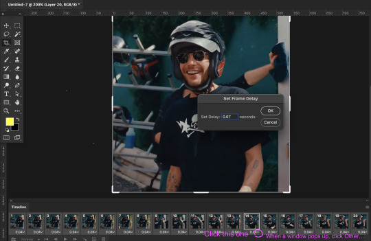
set the delay to 0.07. this is usually the natural, normal speed for gifs on here. it depends on the number of frames you have but i usually do .07 or .05 (sometimes .08 haha)
with all your timeline frames still selected, then select all the layers on the right side. go to SELECT > ALL LAYERS
then convert them to smart object so we can edit all the layers all at once. go to LAYER > SMART OBJECTS > CONVERT TO SMART OBJECT
5. SHARPEN (one of my fave parts!)
this is the basic one that most users use:
STEP 1: go to FILTER > SHARPEN > SMART SHARPEN

radius usually goes from 0.3-0.4
STEP 2: Repeat STEP 1, but this time change the settings to:

you can stop here but i like my gifs crispier and to have more texture! i use the sharpening settings from this tutorial or these sharpening action packs from user brainwasheds. i highly recommend these! i mix and match the settings when i'm not happy with how they look on my gifs. but for this gif we'll use the sharpening settings from this tutorial.
in addition to the settings from that tutorial, i also added FILTER > OTHER > HIGH PASS at 3.4 radius, then set the opacity to 60-80
then lastly add FILTER > ADD NOISE > NOISE at gaussian setting with 1.5 amount, then set opacity to 20-30
6. BRIGHTENING, COLORING, BALANCING, ADDING TEXTURE
now for the fun part!
STEP 1: BRIGHTEN UP THE GIF this is my go-to way to increase the brightness. go to LAYER > NEW ADJUSTMENT LAYER > BRIGHTNESS / CONTRAST then change its blending mode from NORMAL to SCREEN
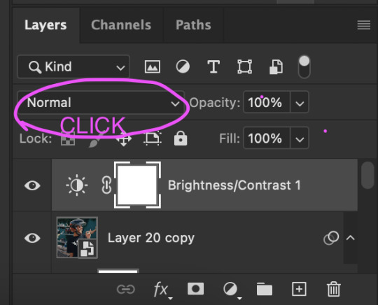
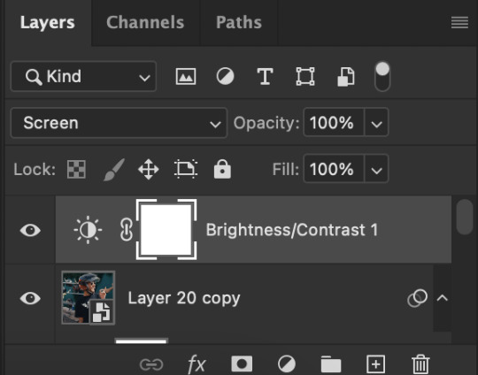

you now have a very bright, highly saturated gif but we'll fix that lol
STEP 2: ADD CONTRAST BY FIXING THE BLACKS AND WHITES add a new adjustment layer > LEVELS

i usually play around with these. middle and black arrows add shadows and contrast while the white arrows add highlights/brightness to the gifs.

these are my settings! these are not definite bc it varies depending on what you're working on, so adjust them accordingly. next, add another adjustment layer > CURVES

i usually zoom in to locate the darkest / black area using the black dropper. then once that's done, do the same and locate the brightest/white area. this adds further contrast to your gif that wasn't done in the previous step.
STEP 3: COLORING (my fave part!!!) add a new adjustment layer > SELECTIVE COLOR this is the part where i like to neutralize the skin color when it gets too yellow or red, make the colors pop, and sometimes change them too. louis' skin was looking too red heavy, so i wanted to reduce that! i start with balancing out the skin color with REDS & YELLOWS.
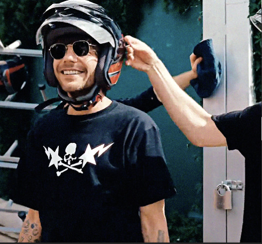
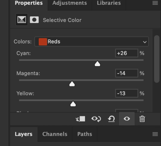

these are my settings for this gif! adjust them and observe the changes it makes on the person's skin. if you know color theory, it's helpful to see how it affects the colors on your gifs. putting the arrows more on the left side, adds more 'cool' tones, whilst putting the arrows to the right side, adds more 'warm' tones.
i like to deepen the blacks on my gifs further so, go to selective color's BLACKS and on the black scale, add more to the right! for this one, i added +10
add a new SELECTIVE COLOR adjustment layer. for this one, we'll make the surrounding colors pop more!

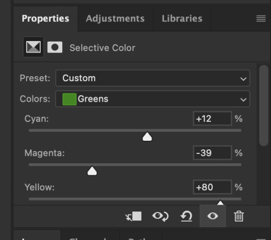
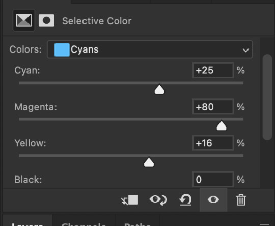

for these settings, i made the leaves more vivid while the teal(?) wall, i adjusted them made it more blue.
next, add a new adjustment layer > COLOR BALANCE this is where you can make further adjustments on the overall colors of your gif. you can also change the color tone of your gifs here if you want to make it more 'cool' tone or 'warm' tone looking.


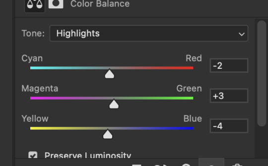
earlier's color theory applies here as well!
6.5. OPTIONAL STEP: ADD TEXTURE/OVERLAYS after the last step, you can save your gif as is but again, i like adding textures to my gifs so we'll add one. i use the textures/overlays that i got from here :)
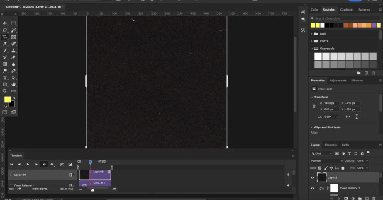
i like to use film, grainy textures! add the texture you want on top of all the layers.

then change the blending mode to LIGHTEN or SCREEN. adjust the opacity to 20-40%. for this gif i used screen with 40%.
7. EXPORT AND SAVE YOUR GIF time to save your gif! click FILE > EXPORT > SAVE FOR WEB

this is my default setting for my gifs. i also tick the interlaced option sometimes.
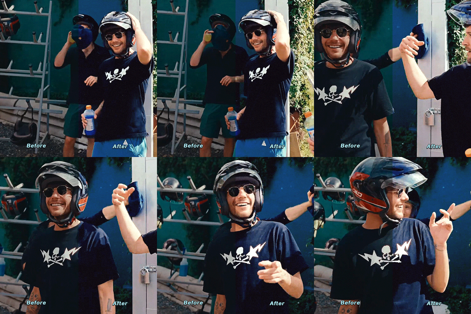
here's the finished gif:
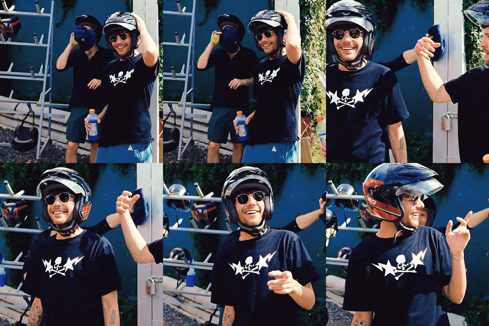
there you go anon! :) if you have any more questions, just lmk or you can directly dm me off-anon if you want.
i also get inspo, guides, and other tutorials over at @usergif
94 notes
·
View notes
Text
jitd jp broadcast notes eps 1-2
i had a friend who was livestreaming the eps for me bless her but otherwise...
ww is 100% region locked, you can't even bypass the geo restriction even with a vpn because ww knows you're on vpn, they will tell you that sir/ma'am you cannot access with a vpn on :D
technically the process is (1) sign up for an account (2) pay for the monthly subscription which is about 20 bucks a month (3) make sure your laptop timezone matches the japan timezone (4) be in japan > the last part is the difficulty and most of us can't bypass or cheat the system so it's a moot point - i did pay for everything up incl the subscription till the region part ;-; i knew it was going to be probably impossible, but i tried it anyway
EDIT: just saw someone say that it doesn't work on the website but it works on the wowow app on phone with the VPN so i shall try that next week since i already have a subscription
the timings of both the old ep. 1 and current ep. 1 are actually almost the same despite the seeming number differences; within the allotted time period like 15 min is dedicated at the end of the ep to a long round of advertisements - first ads to pop up after ep 1 was shl and cql lol
the only major differences are: (1) ending and opening sequences have new content; priest was credited up front in the opening sequence rather than not mentioned at all as with the youku version and they changed the art piece to the last supper in one of the art graphics (2) they lengthened some scenes by some milliseconds, very negligible (3) colour grading and filtering - the colouring is much better on the ww version and users did mention that they can actually see what's happening in the dark corners of some scenes finally as it was q dark previously
it is 100% hard-subbed; subbing and other teams/accounts on weibo are working real hard to erase the hard subs and provide chinese subs etc. - can't share which accounts or direct links lol but if you search you'll be able to find resources - the jp subs are really huge af like if it's two lines that's half the width of the frame gone (ok i exaggerate but it's at least 1/3 nonetheless)
yes fans will come down hard on you if you so much as share a pixelated screencap for example, as is the usual case (even with other bl shows) because ww apparently will come down hard on you too and their older notice says that illegally uploading will lead to cancellation of the show (as is the usual case with other several jp broadcast platforms), so don't even think about sharing a visual on twitter/x - but just that side of things i think.
there's no stopping cn fans on weibo or intl fans anywhere else they usually get content from, if they can get it, no idea honestly, it's really the community delivering for the community and it's tough work > not endorsing, but i uds it's a resource for many ppl - in any case can still try to get the subscription on ww
some fans say that it’ll eventually be available internationally :/ no idea, it could mean maybe they’ll work with another platform? but if it’s just ww alone I haven’t seen any evidence that ww will provide for intl fans so fingers crossed there's a plan
technically also if they do dvd for jitd that's great too, but still also quite challenging to get and also comes like months later
idk if that means we can actually still post from the old youku footage eps 1-8 though LOL
34 notes
·
View notes
Text
* SIMAY BARLAS IN AZIZ ( part 1/3 )
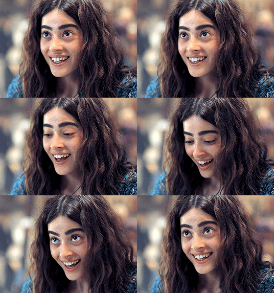
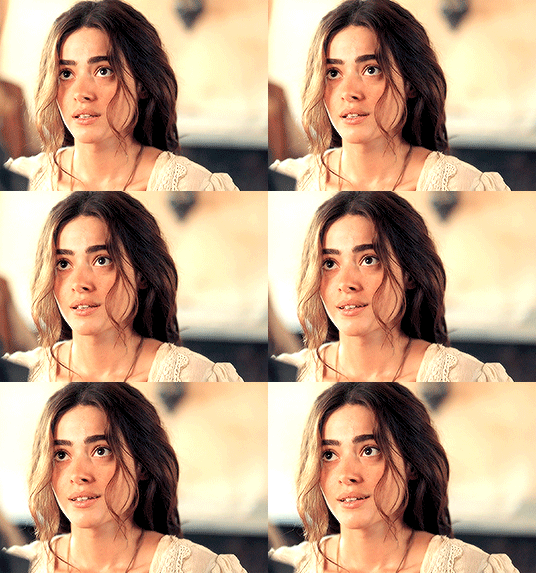
PAID CONTENT ! — by clicking on the source link you will find a page with 150 gifs ( 268 x 191 ), all made from scratch by yours truly, of simay barlas , a turkish actress, in the show aziz. do not claim as your own, or add to free gif hunts. you can edit them for your own use, as long as you credit me somewhere ♥ have fun!
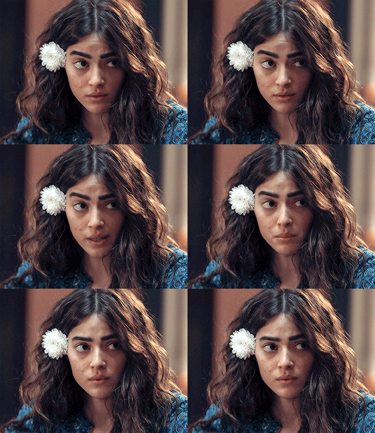
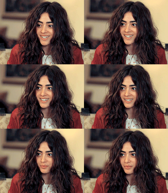
#gif pack#periodfcnetwork#simay barlas gif pack#simay barlas gif hunt#period fc#fcxdirectory#turkish fc#simay barlas#gifpackshq#supportcontentcreators#part 1 of 3 that i have already screencapped#might do more if people like it
52 notes
·
View notes
Text
an overview of the Théâtre des Vampires coven according to show canon (to the best of my knowledge)
section 1: the core acting company
apologies for shitty screenshots i made this on the fly and i could not be fucked to get high quality screencaps
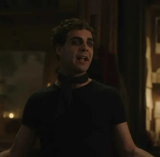
Gustave - Currently part of the core acting company, he was a member of the coven since at least before Lestat's arrival, he's in those early scenes.
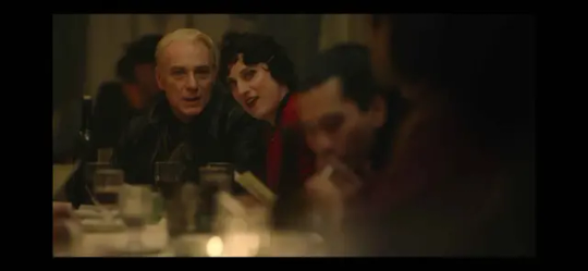
Celeste (pictured here with Santiago) - Currently part of the core acting company, was also a member of the coven in those early scenes. She and Gustave were seen together having most of the lines in those scenes representing the grub coven.

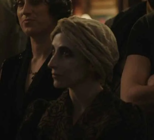
Estelle - here seen in both recognizable outfits for her. Currently part of the core acting company, her maker is Celeste.
I'm unclear on when Estelle was turned. I'm... pretty sure she's not in the scenes with the grub vampires, but it's possible that this is her handing out flyers for the first edition of the Theatre des Vampires... what do you think? Same lady? 👇
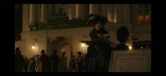
If that's her, then that might imply that Celeste turned her at some point between the dissolution of the grub coven and the reestablishment of the Theater coven, which would make sense in my opinion since I can't picture Armand actually approving for Celeste to turn someone
The final member of the core acting company is Santiago, but I'm skipping him because he's a main character so you already know him.
section 2: the orchestra
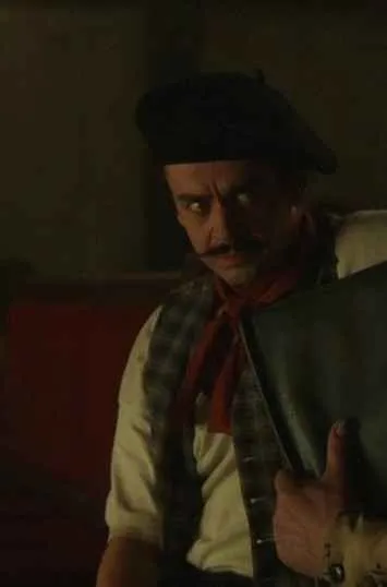
Basilic - part of the orchestra, Basilic was also a member of the grub coven.
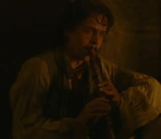
He's seen in that flashback ☝ playing an instrument which @bloodripelives identified as potentially a chalumeau. (i spent 3 months calling this guy merde'em by mistake, fuck me)
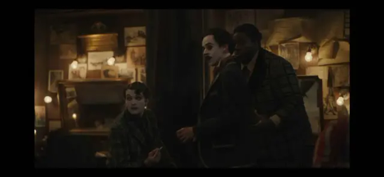
Here's the rest of the orchestra. From left to right: Merde'em, Basilic, Planche.
Don't ask me what instruments they play, I didn't try that hard but I'm sure you could check if you watched the B-roll hard enough.
Merde'em and Planche were both turned by Basilic at some point - presumably Basilic could have gotten approval from Armand to turn people because they needed an orchestra. I feel like that would be a sufficient reason for Armand to consent, especially if Lestat was co-leading the coven at the time. Also Nicky was probably around but I'm ignoring him because he's dead by now so you don't have to try to spot him in the 1940s coven scenes.
Don't ask me why Merde'em is literally named "shittem," your guess is as good as mine.
Planche has a good relationship with Eglee - we see him squeezing her shoulder to comfort her during the dinner scene at the restaurant. Speaking of, let's talk about her and everyone else.
section 3: everyone else
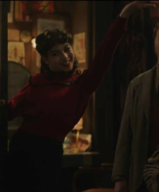
Eglee - Front of house. Because we see humans handling the ticket counter when Louis and Claudia arrive, that means that Eglee must be the manager of all the ticket counter staff and ushers.
actually on second thought i think the guy who louis and claudia see at the ticket counter with the fake fangs might actually have been Sam? idk, worth a look. Either way, front of house is Eglee's purview.
We see her sexually ride Santiago's motorcycle as well as suck him off in the lair.
During the 2x04 "Lulu Dress" confrontation between Armand and Claudia, Santiago jumps to Claudia's defense and criticizes Armand. At this point in time, Celeste throws her support behind Santiago and also verbally criticizes Armand, which Santiago appreciates.
Seeing Celeste unexpectedly throw her support behind Santiago (and knowing that Celeste and Santiago have had an on-again-off-again thing for years), Eglee gets jealous and shouts "put your tits back in your bloomers, slut!" before attacking Celeste onstage, to Estelle's delighted shock.
then Eglee is later jealous and morose at the restaurant scene
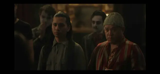
Tuan (left, father) and Quang (right, son).
Tuan does the projections and works alone in the projection booth all show.
Quang is a swing actor, so he's sometimes on stage and presumably serves as an understudy for most of the male roles.
Because Quang "refused the dark gift until he was old enough to be on stage", we know that presumably Armand allowed Tuan and Quang to join the coven while Quang was still mortal. Which is fucking wild, but I won't be getting into that with more depth here.
Also, Tuan and Quang Pham are from Vietnam, which was called "French Indochina" at the time because colonization. We don't know when specifically they were invited into the coven, but that can give you a rough lower bound on the years. here's a map of the french conquest of vietnam by years, from the french indochina wikipedia page.
the upper bound would probably be the 1900s? because they would have to have been brought into the coven 1. before santiago, and 2. long enough before santiago that Quang had time to grow up and be turned before Santiago was turned.
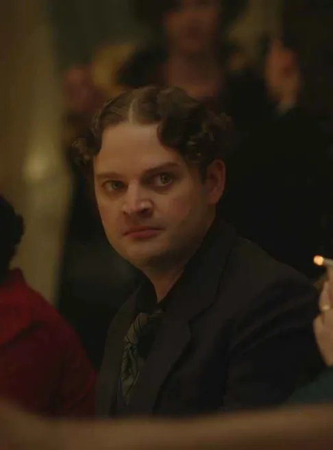
Romaine - stage manager. No idea when he was turned or brought in. From his behavior in the scene with the restaurant, we can see that he's tasked with giving Armand updates and reports about what's going on with the coven. He's a snitch.
He's also the one who interrupts Armand during the gallery scene, after he finished telling Louis about Amadeo. Romaine phones in on the vamp wifi and tells Armand that Claudia is at Madeleine's atelier. (Or possibly Romaine just tells him "there's a body rotting on the green room floor" and Armand tracks down Claudia himself). Either way: Romaine's a snitch.
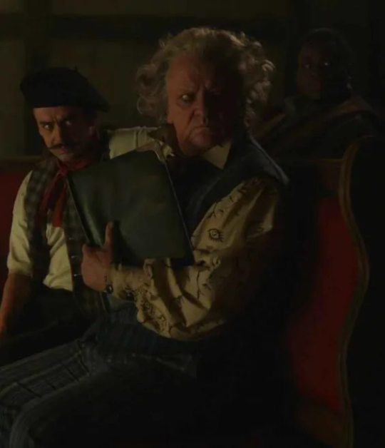
Samuel "Sam" Barclay - a nod to real life playwright Samuel Beckett. Armand refers to him as the "playwright in residence" so personally i want to headcanon that he's not actually a part of the coven, though I have no evidence to support that.
He's basically a main character so I'm not gonna talk about him much more here, but like. I'm interested to see what they do with him. We don't know when he was turned, we don't know who turned him, we don't know how old he is. We do know that he got away from Louis' rampage and became a friend of the Talamasca. We also do know that he's a DJ in 2022 and wears a helmet when he performs.
Center, here, is Hans Luchenbaum, the costume designer. We don't really know much more about him, except that he's most often referred to as Luchenbaum, and he sounds a little more german than french? idk.
That's all folks! <3 hope that was helpful. if i got anything wrong, which i probably did, go ahead and tell me please. also go read my fics. eventually i'll post the fucking coven fic on there.
48 notes
·
View notes
Text
Agatha All Along deep dive: episode 8 part 5
(Wandavision entries: [1][2][3])
(AAA entries: ep1 [1][2][3][4] ep2 [1][2][3][4] ep3 [1][2][3] ep4 [1][2][3][4][5][6][7][+1] ep5 [1][2][3][4][5] ep6 [1][2][3] ep7 [1][2][3][4][5][6] ep8 [1][2][3][4][5][6][7][8][9] ep9 [1][2][3][4][5][6])
We're on to the new moon phase and Green Witch trial. On a side note, I finally found out why the order of the trials didn't make sense to me! Or rather, I found a reddit post explaining it because I'm not that smart on my own: the moon phases form a pentagram! How cool is that?
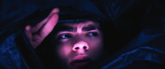
billy has learned that their green witch is none other than Death, so they wake up in a morgue. like alice said, the Road isn't subtle.
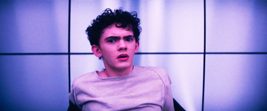
this trial is not for rio though - she was never part of the Road. there's nothing green here, the light is blue and pink and purple, like billy, jen and agatha. and how apt for billy to wake up in a body bag, considering he's a reanimated corpse.
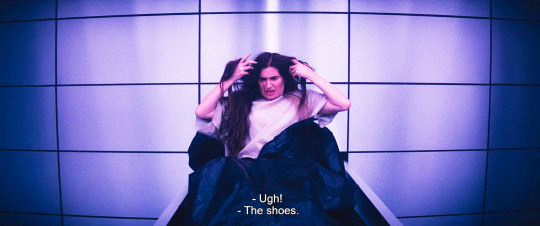
agatha of course complains about what she's wearing
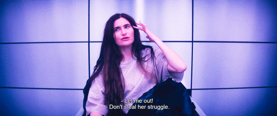
whenever agatha finds herself in a dicey situation she has to crack jokes and posture and look uncaring. billy and jen can express their genuine fear, agatha will swallow it down and beat it back with a stick and choke on it rather than showing an inch of vulnerability
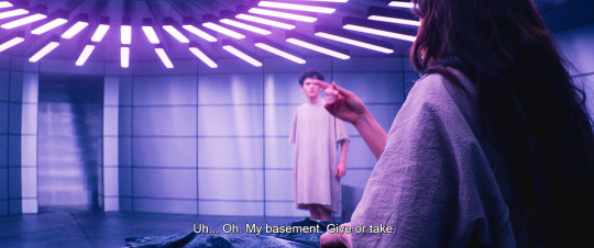
technically they've been under her basement this whole time
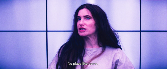
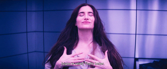
I hope someone has compiled a list of all the Wizard of Oz quotes in this show, seriously there's so many
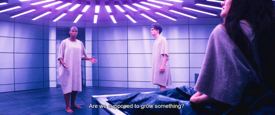
yes you are! this show keeps being so clever. out of death, life.
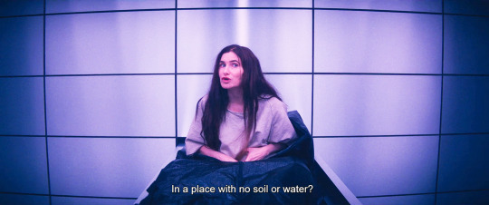
agatha you made a whole baby from scratch with rio, keep up! if you were any good at metaphors this trial would have been over already
the brooch is always her priority. I find it so interesting that it belonged to her mother too, it symbolizes both evanora and nicky, it's a generational (literally maiden mother crone) curse that she tried and failed to break and reclaim
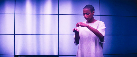
jen checking if she has any healing water left. she doesn't, it would have been too easy.
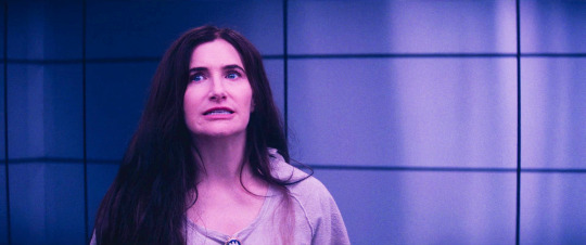
this clown is so scared fr
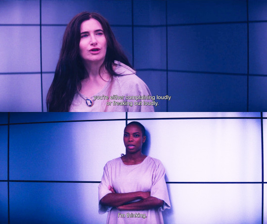
aaand of course she starts tormenting people around her. her behavioral patterns are so predictable once you start noticing
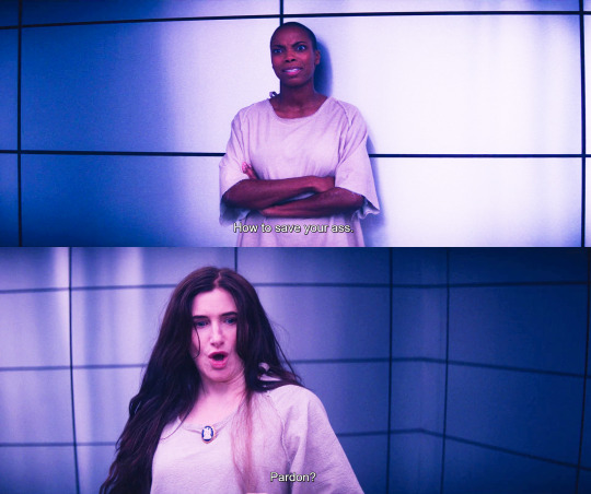
you don't know how many times I facepalm watching and screencapping this show. all thanks to the stuff agatha says or does.
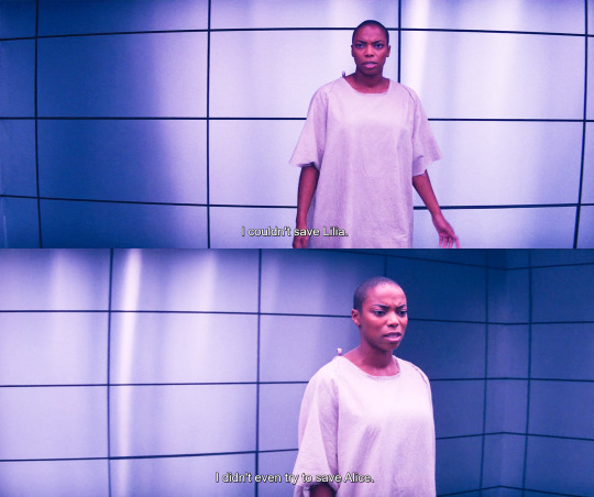
I didn't even try to save alice really gets me. she didn't. she stood by and watched as agatha killed her. she was too engulfed in her own self-preservation and her hatred.
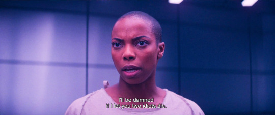
alice's and lilia's examples have made an enormous difference.
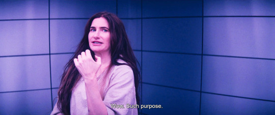
agatha has never met a genuine honest emotion without wanting to bury it with sarcasm
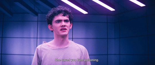
they are all so fed up with her!
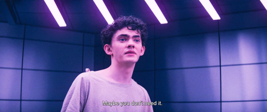
this is billy doing exactly what he's been doing in every trial: oversimplifying complex issues. alice needs to sing a song to solve her mommy issues! lilia can wear silly costumes and learn to accept her identity! agatha can just chat with nicky via ouija board, that'll solve that whole can of worms! and jen can totally get over the horrible abuse she's been trough if she believes in herself hard enough. the real magic was in you all along, jennifer!
billy's heart is absolutely in the right place, but he's been playing with people feelings and he has a lot to learn still.
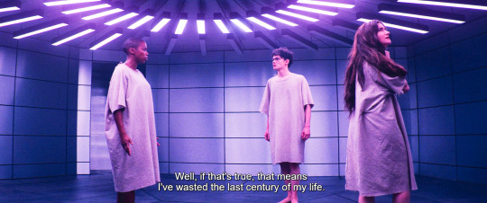
jen very rightly points out that that would mean she wasted the last century. it's a matter of nuance, you know? billy still thinks of trauma as something that you can snap out of if you're strong enough, trivializing the actual time and willpower and work and pain it takes. jen did not waste a century, jen needed a century to come to terms with what happened. healing takes time and it's not straightforward. sometimes it's simply impossible.
and also, the implication that jen should just snap out of it and find her own strength completely erases what agatha and the doctor did to her, it places responsibility only on her shoulders. jen is a VICTIM. jen was violated. I'm glad the show negates billy's input and has jen confronting agatha head on.
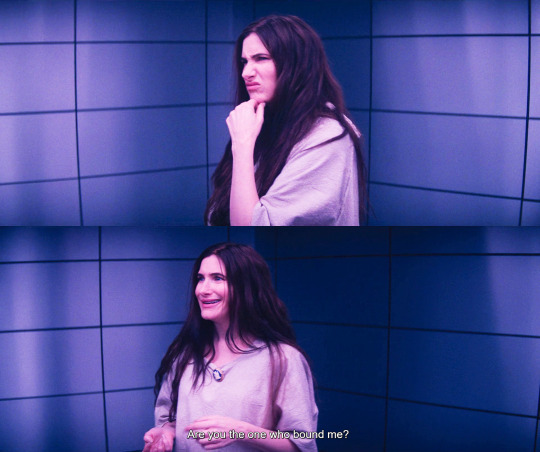
why DOES agatha admit her guilt now? because she does it on purpose, mark my words, agatha has always ulterior motives. look how dramatic she's being about it! she's been pacing this place like a lion in a cage, trying to find a way out. like I said, she is predictable, she is doing exactly what she just did with billy on the Road: she throws a bomb and hope it'll get them unstuck.
and also, idk if agatha already knew she was the one who bound jen or if she just found out this moment, but I'll tell you what: she feels FUCKING GUILTY. we've been shown time and time again that agatha feels guilt for all the fucked up shit she did. as agnes she was genuinely distraught about wanda's death. hell, she doesn't want to face nicky because she can't justify what she did to him and to his memory.
agatha respects the shit out of jen, even if she'd swallow her tongue before admitting it. you know that guilt is eating her alive.
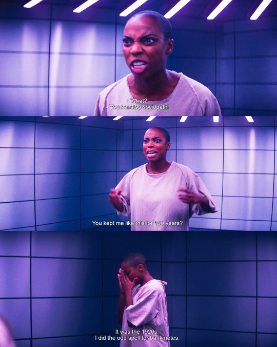
incredible work from sasheer here. it's rage, it's exasperation, it's disbelief, it's one hundred years of pain.
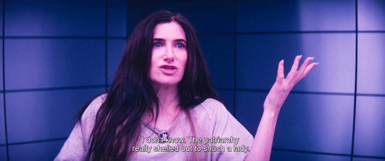
btw I'm still working on my essay about agatha and internalized misogyny. yes, it has turned into a full blown essay by now. I'm probably going to call it Agatha and the Patriarchy or something of the sort, because, like, look at this shit.
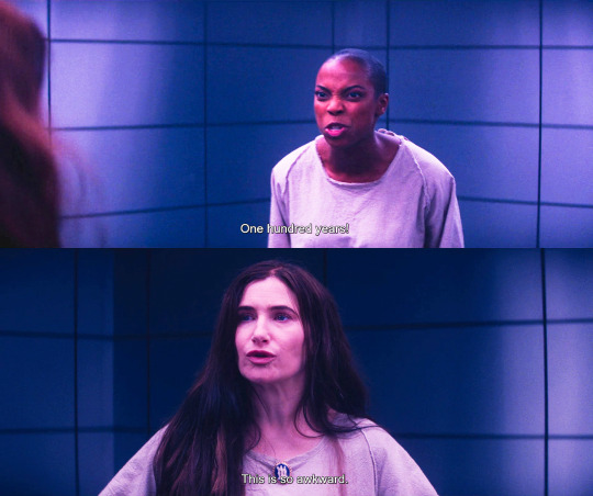
jen is wearing her heart on her sleeve right now, she's vomiting all of her emotions. agatha is deflecting and deflecting and deflecting. this is where we start, this unbalance between them. look at how the scene evolves.
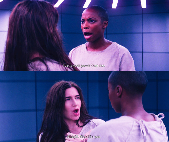
jen initiates the unbinding ritual, and she knows it by heart. how many times has she pictured doing this to the person who bound her?
agatha tries to make it sexual, and look, let's not mince words. I keep saying violation, but there's a clear metaphor for rape here. that agatha would go there is nothing short of despicable.
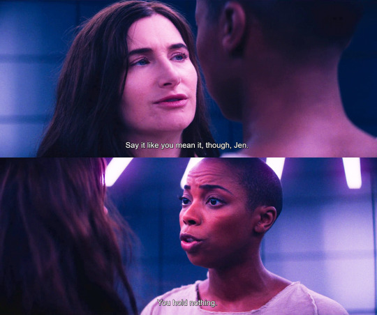
agatha tries to look away. jen grabs her and makes her look.
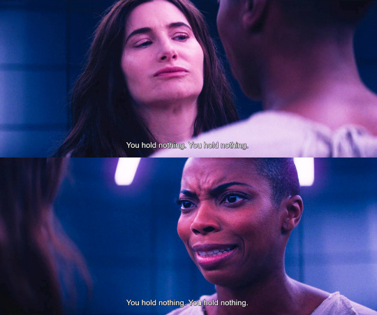
agatha squirms. jen grows more and more emotional.
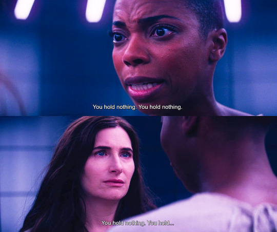
as jen goes through the ritual, agatha grows somber. she cannot escape anywhere, she cannot joke or deflect, jen has literally tied her up and forced her to look her in the eyes, witness her tragedy, face what she did.
on her tarot card agatha holds up her hands, like she's begging - for power, knowledge, love, forgiveness. she's always begging, always searching, always hungry. but everything she tries to hold she crushes. she holds nothing.
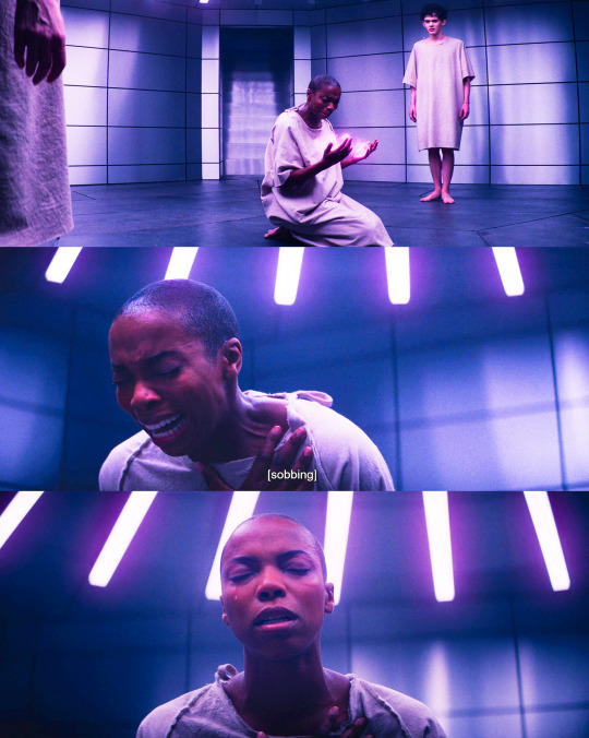
sasheer.
this is not jen finding magic inside herself, this is very clearly, very deliberately jen wrestling back her agency from agatha. you hold nothing, you are a pathetic, wretched little woman and I won't allow you to hold power over me any longer, you don't deserve it, you're not worth to take any more space in my existence.
and I love that she just leaves. she never comes back to bail agatha out of the trial, she's not asked to be the bigger person or to forgive and forget. alice forgave agatha, lilia did. jen doesn't, and she has every right not to.
I'm not going to attempt a discourse about race here, I'm white and I don't have the background, language or authority for it. I can only ask you to listen to what black women have to say and read articles and books on the subject (i recommend White Feminism by Koa Becks.) (also, do add to this conversation!) i'm just gonna say that if I could change one thing about the finale or the show in general, I'd give more breath and weight to jen's story - the way things were shaped, jen's trial was only minimally about her, and her big moment in the finale, while undoubtedly nice, is still too little too late compared to what alice and lilia had. at least she's still alive, so I guess there's still hope that the stars will align and we'll get some more consistent and fulfilling writing for her in the future.
I know this is first and foremost a show about agatha and, like the old tumblr wisdom says, if you try to tackle too many issues you'll just turn into glee. Still, jen's story deserved to be handled more carefully.
go to episode 8 part 6
#agatha all along#agatha deep dive#jennifer kale#sasheer zamata#agatha harkness#billy maximoff#character analysis
122 notes
·
View notes
Note
Hiii your icons are so pretty, would you have a tutorial on them or tips on how to do it?
hello lovely and thank you so much!! i have been making icons for a long time, but have also just started with this style of icon, so i don't know how much of a help i can be but i'll try my best! i make all my icons in photoshop, but when i first started i used gimp, it works similar and i'd recommend it if you dont want to commit to ps just yet. this ended up getting kinda long because i went step by step on how i make my icons like the ones from this post, with a bunch of tips and tutorials linked, so i put it under a read more. i specifically go deeper into how to change the colours of his hoodie depending on your background/preferences. i hope i could help even a little bit!

1. the base
one of the first steps is deciding what you want the base to look like. you can do just a solid colour, gradients, patterns, etc. you can use the solid colours and gradients that are already a feature in photoshop, but there are also a lot of amazing resources and bases by other talented people either on here or on deviantart. just look up icon textures on deviantart, you'll be able to find a bunch of textures and pre-set gradients you can use as your base. this is a really great pack you can find on deviantart that offers a bunch of bases. if you'd like to make gradients yourself, here's a really good tutorial! i am not really an expert on explaining how to use textures because i've only really just started with headers.
2. the picture/png
onto the star of the show - the person you want to have in your icon. i usually get those from screencaps from whatever show/movie i am making icons of. you can get screencaps of most shows and movies from screencaped.net. i then isolate the person i want to be in my icon so that the background is removed and transparent. you can do that yourself, here is a very good tutorial on how to do that in photoshop, or you can use other platforms like canva or adobe express, that have features to remove the background for you. you usually cannot adjust those, so if they dont cut out things the correct way you have to adjust in photoshop afterwards. when chosing a screencap you should make sure that the person and silhupette are clear and delinated from the background, without any obstruction in the foreground, so that you can cut out the entire figure easily without parts of their body missing. i usually also look for screencaps where the head and the sites aren't cut off, so that i can freely adjust the sizing and move the figure around. i also try my best to get a scene where the lighting is alright so that i don't have to fight for my life colouring it, but sometimes it can't be helped.
this is one of the screencaps i used for my recent eddie icons and it's a good example: his upper body is clearly seperated from the background, nothing is cut off, etc.
this screenshot is an example that i personally wouldnt use because there is a jug in the foreground in front of eddie that would be in the icon as well.
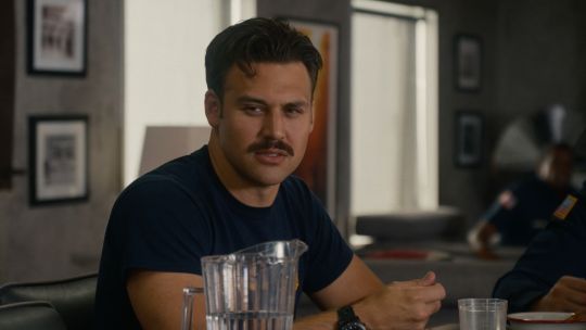
buck looks very cute in his lil hat but the shot is cut off on the right and on top, so i didn't end up using it either. you just kinda go through the screencaps you have (or take your own) and figure out which frames fit for the type of icon you'd like to make.
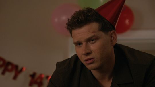
if you'd like to make screencaps yourself, here is an easy tutorial to follow!
3. basic colouring
when i make icons like these, i usually dont go too crazy with the editing, i mostly just adjust the lighting and colouring the create a well-lit base. here you can see the unedited png (first picture) and then once ive used a basic colouring (second picture).
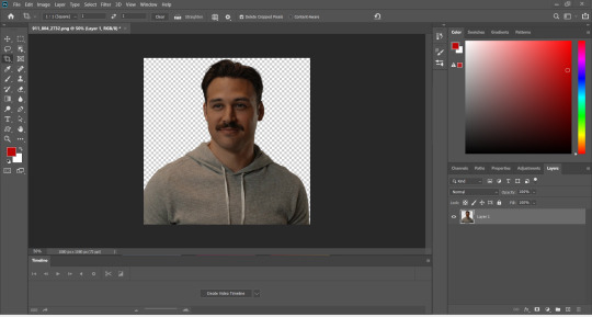


this is a very good tutorial on basic colouring using curves, hues, etc, as i've done as well. it is for gif-making but those same editing steps can be applied to still pictures as well.
4. colour isolation
the icons i am currently making are in a style that you can see a lot around tumblr - where parts of the person in the icon, usually their clothes and other accessories, are edited to be a certain colour that matches the background, and that colour can be changed to match different bases. you can see that the hoodie eddie is wearing has a different colour to match the different colours of the background.

i desperately tried to find the tutorial that i used to learn how to do this but i can't, so i'll try my best to explain it myself (brace yourself). i have seen people do this by drawing onto the png, but i use a different method. for this you'll need to have some basic knowledge on layer masks.
we're gonna start with our png image that already has the colouring applied to it (1).

now, click on the layer and add a solid color layer (2). you do that by clicking the symbol i've marked on the bottom and then selecting "solid color...".
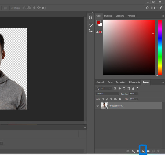
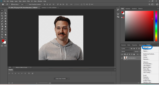
in the screen that pops up now you can select the colour you would like the accents to have (3). choose the colour you want and then click "OK".

your entire image should be in the colour you chose. now right-click on the solid colour layer in the layers panel on the right and select "create clipping mask" (4). this will apply the solid colour layer only to the cut out of your lil guy. it should looks like this now (5).


now we're going to adjust the blend mode. right now it should be set to "normal" (6). click onto the drop down arrow and select the blend mode "colour"(7).
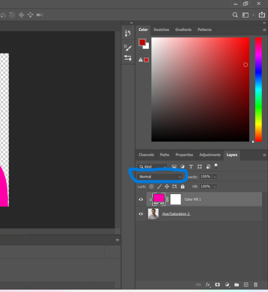

now we can see eddies features again! now we want to edit it so that the pink is only on the parts that we want to be colourful. for this left-click on the white box in your solid color layer (8) so that it's selected. after that select the brush tool (9) and make sure it's set to black. we use black to take colour away and white to add colour back in.
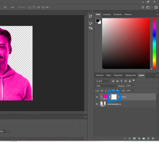
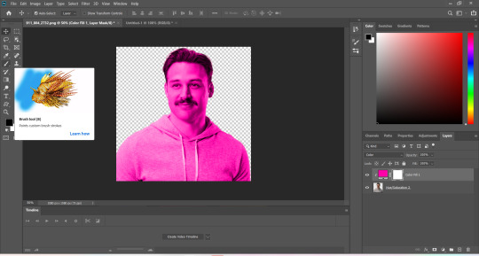
now go over all the parts that you don't want to be colourful. if you accidently take too much away don't worry, just switch the brush colour to white and go over what you want to add in again. it looks like this (10) for me afterwards.
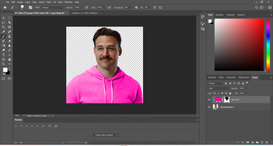
you can change your colour if you double click on the little pink box of your colour layer and adjust it however you want.
5. adjustments
after i've done everything listed above i usually group the two layers (your cutout and the solid colour layer) together so i can move them as one (11). after that i pull the group over onto my base and adjust it so that fits properly (12).

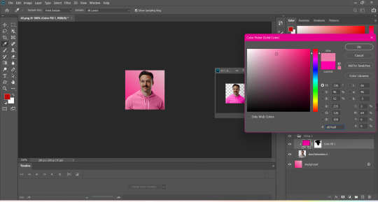
now that the cutout is on the base layer i usually go in to properly adjust the colours and make sure the colours on the cutout match well with the background. you can do that by changing the colour manually or using the eyedropper tool. and voilá! i know it sounds like a lot right now reading this, but once you've gotten the hang of it, it really isnt that hard.
i hope this was at least somewhat understandable and that i could help a bit! there are a ton of amazing tutorials out there for all parts of editing and photoshop in general that go deep into details in case there is a specific part you want to learn more about. for now i hope this gives you at least a small overview.
38 notes
·
View notes
Text
The Third Blade: Hinalung - Handheld Speartip
Five days left to go before the launch of the Gubat Banwa Kickstarter campaign! Gubat Banwa is a TTRPG that allows you to play as warrior Kadungganan in the Sword Isles, a fantasy setting as colorful and intricate as the Southeast Asian cultures from which it draws inspiration.
I've been posting the weapons I've been drawing for the game as kind of a countdown, leading up to the launch on October 10. I was planning to do this for Swordtember, but sometimes you gotta shift the goalpost a little bit. 3/7 blades down, behold the HINALUNG
This multi-purpose blade comes in a few different shapes and sizes, but in general they are symmetrical and double-edged. They don't get much longer than one's forearm, and more often than not have handles wrapped in rattan lashings.
(Blades by Tatang HImanggo and one of his students- a certain Arnold; As shared by Biboy's Sharp Edges) If I'm not mistaken, the term "hinalung" is Ifugao- referring to a certain group of indigenous peoples in the Philippine Cordilleras- though the usage of the blade itself was widespread across the mountains of north Luzon. Nowadays, it isn't just Ifugao smiths making them, and a number of contemporary smiths from across the region seem to lay claim to the blade. In any case, the blade is of the Cordilleras, unconquered by Spain.
(Blades by Ifugao Traditional Blades) One more thing of note is the open scabbard, which seems to be common among blades in that region- not just the hinalung. Some of them boast enough space for more than one blade to be sheathed, and are often sold as novelties. The first example below has a large hinalung in the middle, joined by a pair of pinahig. It can very quickly get out of hand. These X-in-1 sets are usually sold as novelties.

(Blades by Orinn Mongalini/Panday Anitu Mumbaki)

(Photo from Orinn Mongalini)
(Photo from Ifugao Artistic Blade)
Now for the fun part! You may be wondering why the handle is shaped the way it is, with that triangular opening near the base of the blade? Or perhaps you read the title of this post and you already know where this is going?

They double as spearheads! The handle itself is steel folded in to create a hollow socket, allowing the hinalung to be mounted on a wooden shaft, turning it into a spear. Supposedly, this spear-form was used for hunting. You can see the hollow socket more clearly here:
(Blade by HanYan Blades)
(Screencap from a video by AJ Blade Reviews testing the blade as a spear; Blade by Lakay Paul Dulnuan Sr.) As mentioned previously, the Philippine Cordilleras were never conquered by Spain, and as such were able to carry their traditions with a little more ease into the present day. It is very much apparent in the blade culture. Present-day smiths in the Cordilleras still forge hinalung, some of them stating they do it in the traditional way, others admitting to hewing to more modern methods.
(Antique from the Peabody Museum of Archaeology and Ethnology)
(Modern build by Lakay Pabian, photo by Ramon Bathan) Like I said before: Blade culture is alive and still developing. One of the Five Major Mahamandalas of Gubat Banwa pays homage to and gleans inspiration from living cultures like those I mentioned here. If you want to know what the first half of that sentence means, check out the game and its Kickstarter!
The Gubat Banwa Kickstarter launches in 5 days! Check it out here:
I've watched this game be started, written, and developed by like- one guy, who just managed to drum up enough interest and meet enough people willing to help shape the dream, and make it what it is today. It could not have gotten this far without all of them. Still, it remains a very small team of creators from the global south, with very limited resources. We would dearly appreciate any and all help in getting the word out about the game!
#gubat banwa#gamedev#ttrpg#ttrpgs#indie ttrpg#indie ttrpgs#tabletop rpgs#rpgs#rpg#southeast asia#southeastasia#dnd#kickstarter#swords#philippine blade#weapon design#dagger#philippine history#philippine culture#filipino artists#artists on tumblr#kathang langit#help us get the word out!#fantasy#fantasy worldbuilding#swordtember#bolo#itak#hinalung#igorot
98 notes
·
View notes
Text
A random assortment of Geoff Castellucci pictures - Part 3
Y'all seemed to enjoy part 1 and part 2, so here, have a part 3! Featuring pics of Geoff from videos where I haven't already saved any screencaps from (not counting Voiceplay Visuals posts), but where he still looks really good anyway. And so because this one involves me going back and rewatching certain videos for the purpose of screenshot grabs (always nice to have another excuse! <3), these pictures are going chronologically by video, oldest to newest, rather than alphabetical by title. And again, featuring little bits of thoughts/commentary from yours truly. This one ended up being longer than part 2 as well, so enjoy!
(Everything below the cut as like the previous posts!)
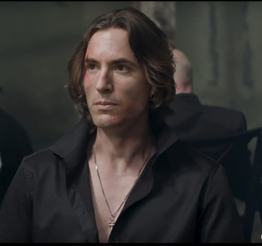
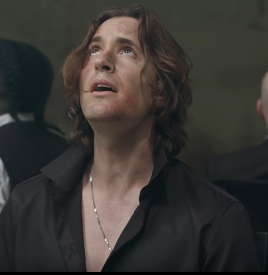
Starting off strong my fam!!
I said as much in my VoicePlay Visuals post I think but this is honestly one of Geoff's best "shorter (or at least shorter-ish) hair" looks imo. Like look at those waves and curls! To! Die! For!
Also the open shirt with the popped collar is such a look and I kinda wanna see Geoff with a popped collar more often tbh
Also on the Panic Medlry Part 2 video someone commented "Is it just me or is Geoff extra hot in these last two vids". VoicePlay replied with "It's not just you. There was no air conditioning. ;)" XD
I forgot how hard it is to get decent pics of Geoff from this video, rip. I couldn't not include anything from it though! I mean come on!
Sir excuse me who gave you the right (and can they give you the right more often please)
I don't even know what it is in particular about this look that's so good but dear god everything just works and like, y'know, as I very frequently say: He's! So! Pretty!!!
Actually I do know one key component: his smile!!! <3
Well hello there good sir! 👀
Yet another video where Geoff smiles a lot and it's so lovely and nice but goddang is it hard to get a clear pic of him!
Yes a good portion of these pics is honestly just me showing some of my favourite Geoff smiles from different videos, and I apologise for nothing <3
Look, I love Geoff as a Disney villain, of course I do, he slays it absolutely every single time, but goddamn, I would love for more Disney Prince Geoff, in vibes/aesthetic if not any actual Disney song.
Also shoutout to one bit during Eli's When I'm Older section, where Geoff is looking off to the side and smiling <3 (smiling at Kathy? Maybe?)
(Oh and actually, between Sh-Boom and this video, I'm realising I kinda sorta wanna make a picture collection post for Layne as well - he does have some good looks sometimes! Nothing Else Matters, Hellfire, Warriors, y'know?)
Jumping ahead 1.5 years now!
Butter is such a fun video - everyone looked like they had such a great time!
If I Were A Rich Man/Girl MY ABSOLUTE BELOVED
The fluff in the hair, the visible bit of white/grey, the shirt, the smile!!! This video has me so weak y'all <3
Honestly Geoff looks phenomenal in almost every single medley video in particular and I love it (almost every medley - Greatest Showman Medley isn't in this photoset for the same reason that Kidnap The Sandy Claws and Hide And Seek aren't, lol)
(Also appreciation for the long-sleeve shirt behind rolled up to the elbows 👀)
Geoff from like 2022 onwards was "I'm going to find a hundred different black outfits to wear in videos and I'm going to look good every time" /j
Couldn't help but include a pic from We Don't Talk About Bruno in this - he's so silly (affectionate) <3
Not including any pics of Disney Princess Geoff(tm) only because it makes me laugh too much XD (seriously even as soon as Ashley starts singing Isabela's part I already start giggling, and it does in fact get me every time, but you can find a couple of pics of it in my VoicePlay Visuals post for this video HERE
I haven't rewatched this video in a while, so I wasn't exactly sure what kinda quality of screencaps I was gonna be able to grab from it, but well... it delivered!!!
I said this in a comment on the video as well but whoever had the idea to have that little bit of breeze/wind blowing Geoff's (and Adriana's) hair back, you're a genius and I love you
Also DJ_410 has occasionally referred to Geoff having "puppy dog eyes" or something along those lines, and man, he ain't wrong!
Someone said in the comments of this video that "Geoff is slowly turning into a silver fox" and honestly so true bestie <3 (ages! like! fine! wine!)
Also love how you can see the full necklace in this one (fun fact: Geoff's wearing a white singlet underneath, but he actually deliberately ripped it open a little bit at the neckline, which is how we end up with this 👀)
Plus this is the closest we've come to Geoff wearing a upturned/popped collar since the Panic Medley!
I Love Drunken Sailor A Normal Amount
Okay so obviously I already had one image from this video already saved to my folder - my profile pic - but nothing otherwise, and man is this video a goldmine. The arms! The hair! The eyeliner!!!
We really were absolutely spoiled when it came to Sleeveless Geoff in 2023 quite honestly
And what better way to end this post than with the god-tier all around stunningness that is Geoff in Hellfire?
I mean come on he literally looks like a goddamn painting!
So that's all for now! I might at some point do a part 4 or something dedicated to Minis and/or Shorts, but I do have a couple of other post ideas in mind for later down the line, so we shall see!
12 notes
·
View notes