#owl drawing tutorial
Explore tagged Tumblr posts
Text

I did this Witchy Owl as a drawing tutorial on my youtube channel. These drawing tutorials are hard as hell to make. Even at the basic level im currently making them. But i figure that they'll get easier. Ill get better. And the videos will end up being kind of cool.
youtube
#art#drawing#sketch#how to draw#how to draw owl#draw an owl#owl drawing#owl drawing tutorial#how to draw an owl#owl#witchy owl#witchy#Halloween owl#halloween#Youtube
5 notes
·
View notes
Text
DRAWING BACKGROUNDS: TIPS AND TRICKS
So many people are afraid of drawing backgrounds and I think it's a shame, so here's some tips and tricks, because I'm not perfect at it myself but I think the hardest part is really just knowing where to start.
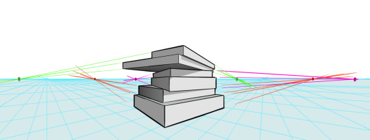
First off: Perspective
Yeah, yeah, that's the scary word. But I promise you, once you're familiar with the basics, backgrounds are a LOT less intimidating. Don't get discouraged if WHEN you have trouble with it. Even professional artists struggle with it. I promise you, screwing it up is good and normal. That's how you learn after all!
Now I'm not going to go into detail on how to do it here, because honestly there are a thousand and one free resources online and in libraries that can explain it far better than I ever could in a singular broad-strokes tumblr post. But I AM at least telling you you should familiarize yourself with these basics:
Important Terms: Horizon Line: A horizontal line across your canvas, showing your viewer's eye level and providing a location for most of your vanishing points. Vanishing Point: Integral to drawing in perspective. The sides of a 3D object get smaller as they become farther away from the viewer in space. This point is where the parallel lines of a side eventually meet.
The Basic Types of Perspective: One Point Perspective: Good for drawing things that you're looking at straight on. Two Point Perspective: Good for drawing things at an angle. Three Point Perspective: Good for drawing things the viewer is looking up or down at, especially at an extreme angle.
[Click images for ALT descriptions]
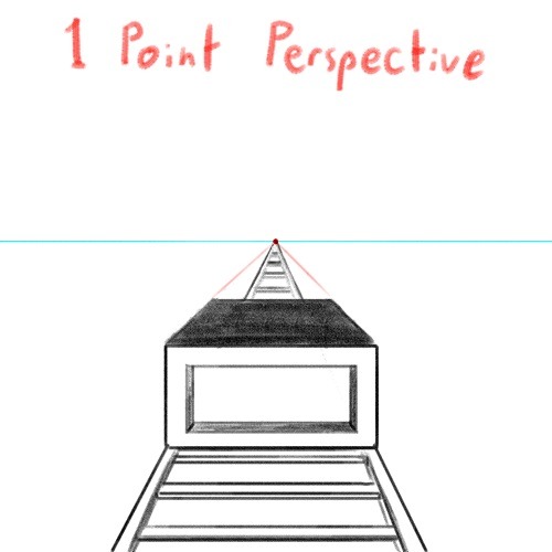
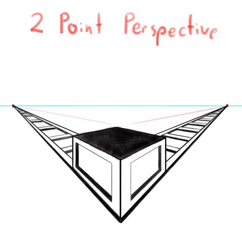
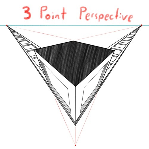
And if you're comfortable with these and serious about improving your skills for use in storytelling, I also might suggest looking up:
4 Point Perspective: Great for extra wide or tall shots and for camera tilts if you're doing an animation or animatic. I think some other names for this in animation include "banana pan" and "warp pan."
5 Point Perspective: Fish-eye lens. Good for all your angsty anime boy slipping into madness needs!
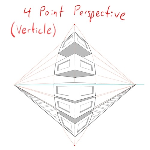
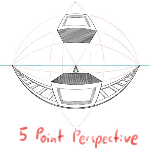
Some perspective tips I wish someone had told me earlier:
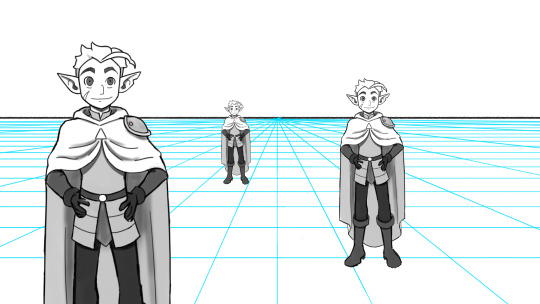
Objects' relation to the horizon line is constant. A super helpful tip to remember when placing a character or object in space is that they will always (assuming they aren't changing in size or moving up or down) have the same relation to the horizon line no matter how far or close they are. If your horizon line is at shoulder height for your focus character in the foreground, any character of the same height in the background will still line up with the horizon line at the shoulders.
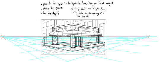
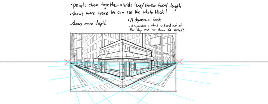
How to pick the distance between your vanishing points: 2 pt perspective uses 2 vanishing points, 3 pt uses 3, etc, etc, but how close should they be? Well, first of all, for anything that isn't one point perspective, one or more points will usually be off the canvas. Super annoying, I know, but the closer your vanishing points are, the more warped your drawing will become. Second, a helpful thing to know is that choosing the distance between your points is basically the illustration equivalent of picking your camera lens! Photography buffs will know that wider (shorter focal length) lenses show more space and make the distance between foreground and background more dramatic, while longer focal length/telephoto lenses are flatter, and more focused and intimate. The same is true of vanishing points that are closer (shorter focal length) or farther apart (longer focal length).
2 point/3 point/etc doesn't actually mean you're limited to that many points total on your page. this one confused me a lot when I was getting started, lol. A lot of examples will show you drawings of nice, neat cities or something, in which all the buildings are facing the same way in order to demonstrate perspective drawing. But in real life, buildings don't all face the same direction. They're at all sorts of different angles. So how do I do that??? Answer: Just because you're drawing in 2 point perspective or whatever doesn't mean you... have to actually keep your 2 points in the same spot. You can move them around, just keep them the same distance apart, so you're not screwing up your camera lens.
Other Tips:
Use reference! The instant you try to draw a house, you're going to forget every house you've ever seen. That's just how it goes. Buildings are complicated. Do yourself a favor and collect a few reference images first, buddy!
Consider details (like architectural style, amenities, and materials) Your building will look more like a building when you keep in mind that buildings have gutters and door knobs and light switches and paneling and stuff, and aren't just boxes with roofs on them. Again: reference! You will forget electrical sockets and baseboards exist immediately. Art brains are dumb.
Use details and texture to fill in negative space Giant stretches of blank space tend to be boring and distracting. Put a few suggestions of wood grain or something on that wall back there, bud, just don't overdo it.
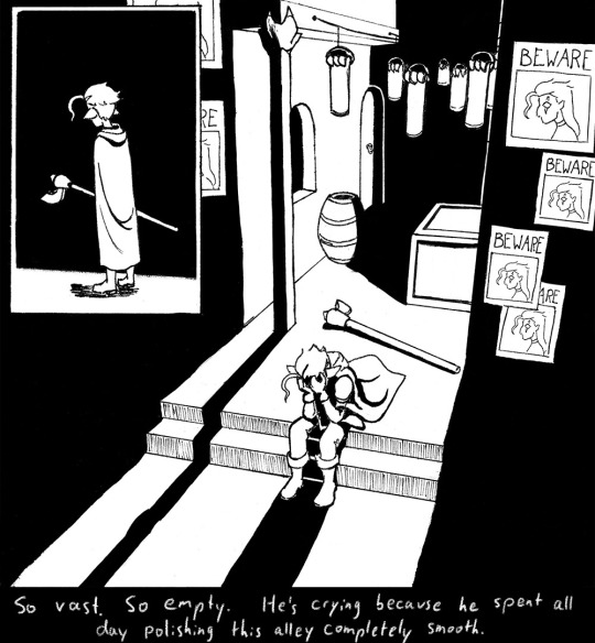

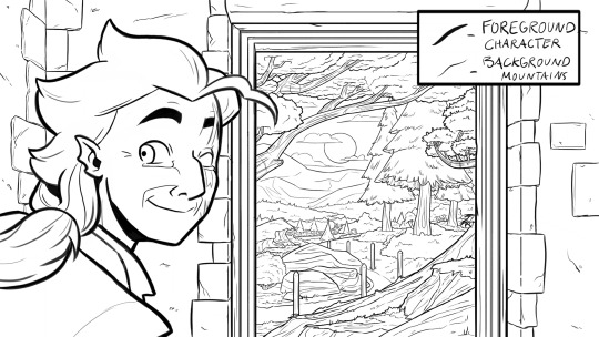
Line weight Darker, thicker lines draw more attention, look heavier, and look closer to the viewer than lighter, thinner lines do. Take advantage of this to draw the viewer's attention to your focal points, de-emphasize less important details, and imply depth. It's up to you to decide how you want to use this and what your style is, especially once you start getting into combining or replacing it with shading, values, and color, but a helpful rule of thumb is to try reserving your thickest lines for focal foreground characters and use thinner lines on backgrounds, especially details in the far distance.
Perspective guides If you're drawing digitally, take full advantage of any perspective tools you have access to! A lot of art programs lately have begun adding perspective guide features that let you set up vanishing points and then literally guide your hand as you draw so you stay in perspective. Some of these include Procreate, Clip Studio Paint, and Adobe Fresco. (still sadly none in Photoshop as far as I'm aware, what the heck, Adobe!). Check through the settings of yours to see if it gives you any perspective guides or other similarly useful tools. They're 100% worth it! And for god's sake, if you've got any skew or perspective warp tools, draw your complicated shapes flat and then warp them instead of spending an hour on it! Don't make my mistakes!
#backgrounds#art tips#tutorial#art reference#drawing tips#perspective drawing#the owl house#hunter toh#doodle art#doodletext#rambling topic#yes i'm using my blorbo to demonstrate art tips what about it#this took longer than i meant it to lol. i got really into the examples#thank you for your patience guys#this turned out to be a GREAT exercise for me as an artist too actually. Trying to explain things is rlly good practice#I didn't even get into values and such. I can only ramble so much I'm afraid
1K notes
·
View notes
Text

world’s worst polycule and their son rekrap
(i’ve literally been working on this on and off for prolly close to a year and i FINALLY finished it)
random notes
skip and sand are a species that usually look like what they do in this drawing, but they have human forms too
jay’s accent colors (hair, sweatshirt, and sleeves) can change color. i usually associate him with purple tbh but the purple/black combo felt too close to branzy’s colors
rek is missing something but i cant put my finger on it. his design feels incomplete so I’ll probably keep cooking that up
15 notes
·
View notes
Text
youtube
#youtube#msunamusednerd#billie bust up barnaby#billie bust up#barnaby the owl#billie bust up fanart#barnaby fanart#barnaby the ghost owl#billie bust up barnaby fanart#Digital art#drawing tutorial#how to draw#how to draw barnaby
44 notes
·
View notes
Note
ur art is amazing !! how do u render / paint :0 it reminds me of those renaissance sketches and paintings
thank you! I don't quite have a rendering process I can explain easily but I start with an airbrushed general shading for each area of colour, and then I put them all on the same layer to shade more properly using a soft brush -- not quite a method to it expect whatever works better to my eye haha
#anonymous#[.asks]#I should post more process videos maybe those work as a better explanation#i tried to make a tutorial but it looked very 'and then draw the rest of the owl'#maybe someday ill make a more proper one
11 notes
·
View notes
Text
I find this drawing app I kind of use on my phone really funny because it offers a time-lapse thing but it’s very patchy so I’ll go from having just a circle head to a fully finished sketch in a single frame
5 notes
·
View notes
Text
FINALLY learned how cat claws work
#Owl Hoots#From a drawing tutorial#I’ve admittedly never looked it up#but I’ve wondered how they retract#NOW I KNOW
6 notes
·
View notes
Text
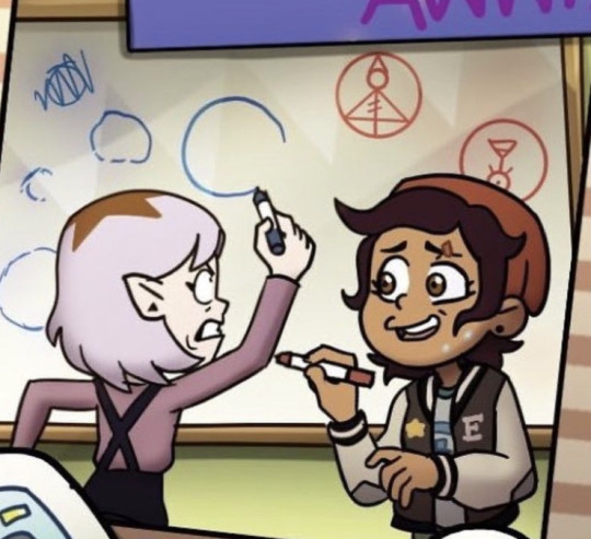
amity stressing out over drawing a perfect circle would be such a fun scenario
also HOW IS LUZ SO GOOD this was my main concern if i ever went to the boiling isles, circles defy me
#toh amity#toh finale#should show her the spongebob tutorial for how to draw a perfect cirlce#toh watching and dreaming#owl house#toh luz
7 notes
·
View notes
Text

#80s#90s#art tutorial#scholastic book fair#how to draw ghosts vampires and haunted houses#the rest of the fucking owl
2 notes
·
View notes
Text
*This is a work of Satire, brought on by my dislike for certain types of art tutorials on a certain social media that rhymes with Sinner Cam. I do not genuinely believe any of this. Heck I don't even do or use some of the stuff in these lists.*
According to the Art Tutorial part of the internet, there are only:
Three artstyles:
Realism (the only valid one)
Anime (the cringe one, like what are you, 12? Weeb)
Child (which is only acceptable for people between the ages of 2 and 9)
Two drawing apps:
Clip Studio Paint
Procreate
(Free apps? What are those? We only accept paid apps that may or may not be exclusive to certain operating systems here)
Two subjects:
People (the only acceptable option in all forms)
Landscapes (preferably with at least one person in them so that you know it's drawn by someone Normal! Because nobody draws JUST a landscape, that would mean you hate people! Ha! Right! Get out of here, freak!)
Two types of artists:
Good
Bad (If you draw anything other than Perfect Realism you are automatically Bad. All artists must draw Realism. It is the only art form that will Get You Somewhere, after all. You can't get money, the only acceptable goal for an artist, by drawing cartoons or weird humanoid animals, after all. Those are only for degenerates.)
#owlkalinity#satire#art tutorial talk#genuinely though draw art how you want#don't let others dictate what does or does not count as 'good' art#and there's always room for growth!#just a few glimpes into the brain of your favourite author owl#owlkalinity's art escapades
3 notes
·
View notes
Text
@darkespeon11
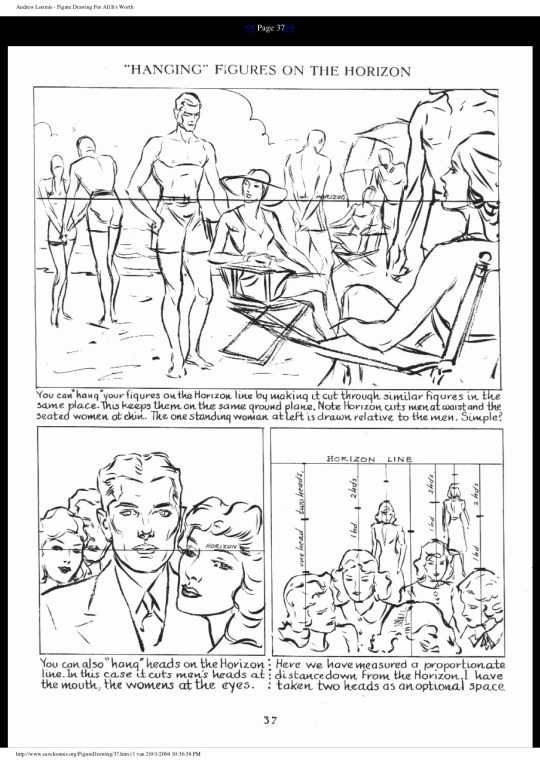
I was talking shop with an artist in the studio today and I shared this page from Andrew Loomis, which might be the single most valuable page I've ever encountered in a how-to-draw book. I can't BEGIN to say how many hours this "hanging figures on the horizon" technique has saved me.
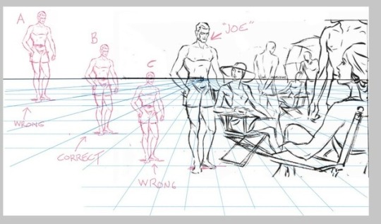
(EDIT: Over on another site, someone said they didn’t understand how to read this pic, so maybe adding a second pic and some explanation will help?)
Let’s say I want to draw “Joe” standing further back. I need to know where to place him so he looks like he's the same height, even though he's further away. If I get it wrong, he’ll look giant or tiny.
I can do that by making sure that the horizon cuts thru Joe AT THE SAME HEIGHT, no matter how close or far away he is. In the original picture, it cuts thru the original Joe at the waist.
So let’s look at three different Joes.
A: Wrong. Horizon goes thru his knees. In this context, he’s a giant.
B: Correct. Horizon goes thru his waist, just like the original Joe!
C: Wrong. Horizon goes thru his head. In this context, he’s tiny.
7K notes
·
View notes
Text

owl from a tutorial by Mark Kistler
0 notes
Text
youtube
Hiya! Thought we'd share this cute little project on how to make an owl in Illustrator. You'll learn how to the pathfinder panel and how some of the drawing modes work.
Difficulty: Beginner
1 note
·
View note
Text
How to draw an Owl by ddrawanart on @DeviantArt
#tutorial#owl tutorial#drawing tutorial#owl#owl drawing#artists on tumblr#hobby artist#hobby art#my hobby#hobbies#drawing#i love owls
1 note
·
View note
Text
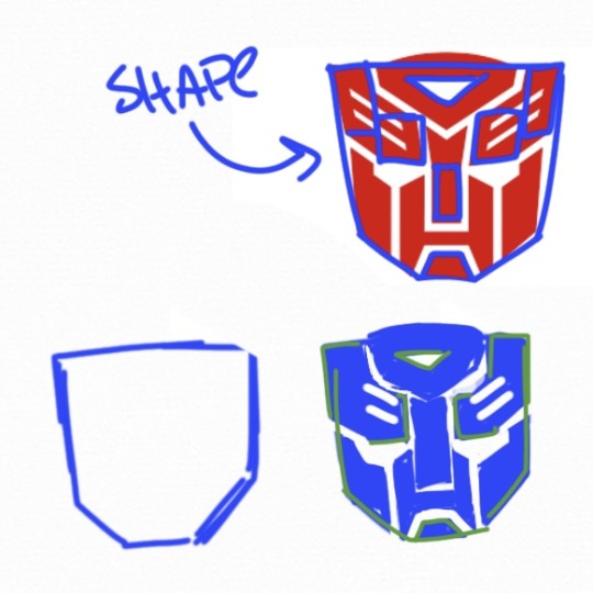
I’ve been so excited to talk about this you don’t even wanna know: the easiest imo is def the autobot insignia. One of the things that’s helped me the most in drawing Transformers is Transformers animated, the distinct shapes of every character taught me how to simplify things
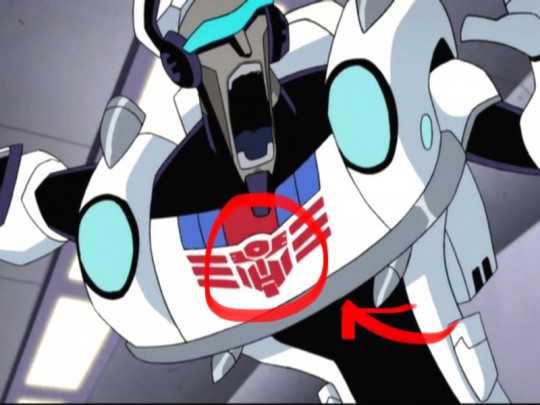
a lot of times when I’m too lazy to draw the insignia I’ll fill it in with a square/upside down house shape, only time I do hearts is if it’s a style choice lol
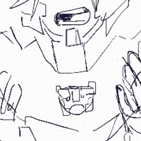
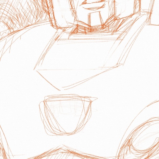
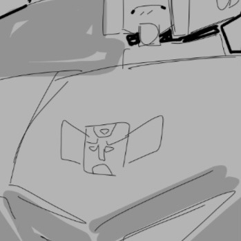
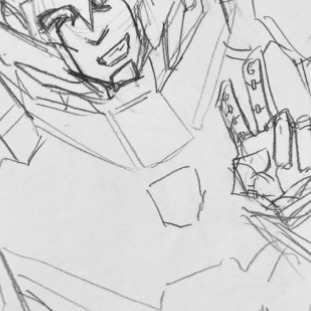
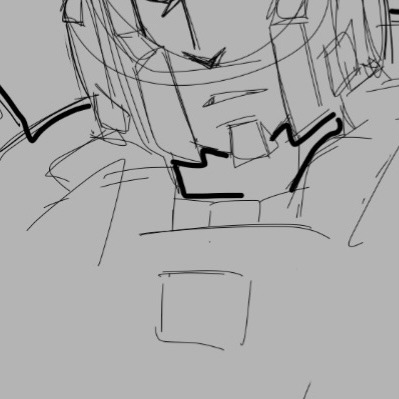
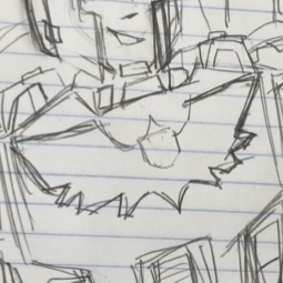
I started drawing insignia pieces one by one but it was really tedious so I started to look at the shapes that went into things, the process for me is pretty much: “draw the rest of the fucking owl”
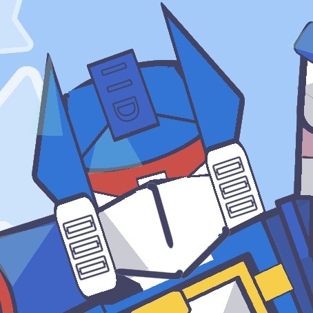
Hardest insignia for me is gotta be decepticons tho. I see a lot of similarities between the insignia and soundwave for some reason, but I just can’t handles the sharp points. It’s why I work mostly with squares

That’s that, I haven’t drawn enough of any of the other insignias beside like the wreckers and rescue bot but those are both kinda variations on the autobot symbol.
(CALLING ALL TRANSFORMERS ARTISTS)
Drawing Transformer Insignia troubles!!
Listen, We all know drawing Transformer insignias is not fun.. but I want to start a discussion on this because I think this is a fun topic!! Which insignia is easiest or hardest for you to draw? Which one do you know by heart? Which one do you dread drawing? Literally tell me anything, whether you draw the hearts in place of the Insignia or you just draw low quality versions of them.. I just want to know because it's a common struggle between us Transformer artists, In my opinion the Decepticon insignia is easiest for me because I've seen it over and over to the point where I know it by heart. But if I'm feeling really lazy I just do the hearts in place of the insignia lmao..
#transformers#maccadam#fanart#art#artists on tumblr#Reblogs#insignias#art tutorial but it’s just draw the rest of the fucking owl
100 notes
·
View notes
Note
Would you ever consider doing a tutorial on how you paint skin and hair? I adore your style!!
I'll try to give some sort of an answer NOW if I can muster up some thoughts, it's just difficult how to advice anyone else, since a lot of my tactics lean on a lot of background knowledge about light, color, form etc. ...It easily becomes the how to draw a horse/owl meme.. But I'll try giving some tips.
Since I'm guessing the Skuld spurred this question on, I'll use her as an example on how I approached her, but in reality my approach varies per piece.

Skin.. oh boy this might be a bit of a how to draw a horse...
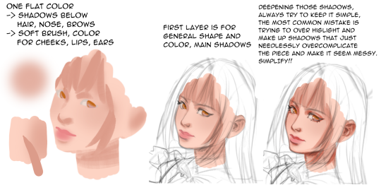
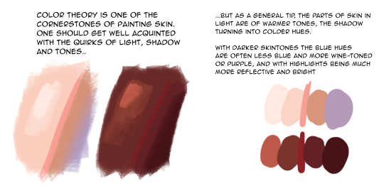
..that's all I have time for, off to walk my dog, hope this gave some insight!
255 notes
·
View notes