#originally designed for and used in machine translation
Explore tagged Tumblr posts
Text
this is because people take a look at tech and project their feelings into the tech itself rather than how forces in society encourage use of the tech, therefore expecting the tech to be neatly separated into "the good AI" vs "the wretched generative AI" or similar.
also see "enshittification" and how people came to think it's what companies do to ruin your free online services for funsies, rather than an inevitability of a for-profit company running a free-to-use non-profitable service, that costs money merely by existing.
i think people realized that "AI" has been applied far too generously and came to mean any kind of machine learning ever, creating mass hysteria and confusion. The clearer replacement, I've noticed, is "generative AI" and I'm just gonna say, no, try again, that's also already a widely used term for art with randomizing/procedural elements. i recently got an angry comment on my "1 hour of generative breakcore" video from someone who thought it was machine learning.
#ai discourse#your problem with ai is capitalism#object detection in an image can be used for cancer detection and also as face recognition by a surveillance state#dynamite was used as a tool for mining and also as a weapon#nuclear energy has been used for atomic bombs and also for nuclear power plants#the 'T' in 'ChatGPT' stands for 'transformer' which is a machine learning architecture#originally designed for and used in machine translation
598 notes
·
View notes
Text

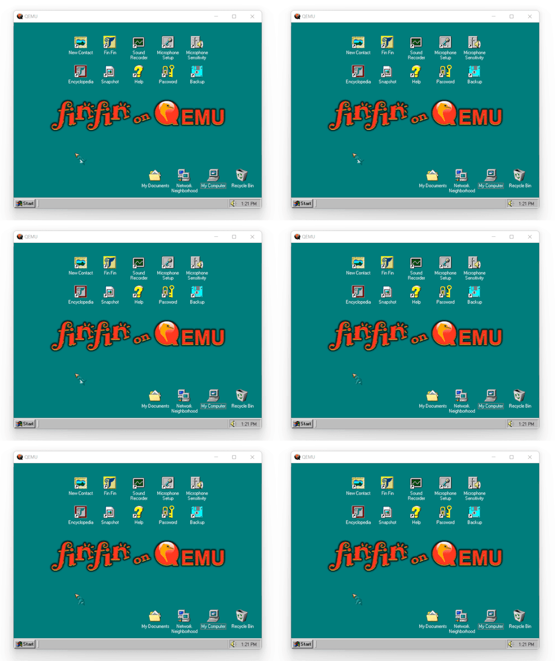
Fin Fin on QEMU (Current Version - v2.2)

Fin Fin on QEMU is a project designed to create an easy to use way for anyone to play Fin Fin without the need for any complicated setup on modern operating systems. It is fully compatible with Windows 10 and 11, but will also work on any version after XP.
The version of the game used is a custom made translation that includes all 6 worlds in English. It has working microphone input, sound recording, and all associated features such as screenshots and the encyclopedia work as well.
Rather than using virtualization, this works through emulating an entire Windows 98 machine. To play it there's no need to install any hypervisors or set up a virtual machine, as everything is already set up, and ready to go.
The download link can be found here! (Hosted on MEGA)

Installation
The whole thing is portable, meaning nothing is actually "installed" and all the data is wherever you place the folder. This also means that if moved to another PC, all user data will still be present.
To run, all you need to do is extract the folder in the .zip to a location of your choosing, and then run one of the launchers.

Included are two launcher versions for the different QEMU display options, one that uses GTK and one that uses SDL. The only difference between the .bat script and the .exe versions is that a command window will be shown when using the .bat script.
Both have pros and cons, so I've included both to let the user decide which one they want to use.
SDL has broken window scaling and no mouse integration, but has a correctly stretched fullscreen. GTK has a stretched fullscreen mode, but has working mouse integration and window scaling. Basically if you want the game in fullscreen use SDL, otherwise use GTK. For a bit more info about these, checkout the 'Files' section under the 'Keep Reading'

Important Info
Before launching the main game, be sure to create a profile using 'New Contact', as the game will not run until doing so. When exiting the game use the shutdown option in Windows 98. Exiting through closing the window forcefully can possibly cause data loss/corruption. When using SDL, mouse and keyboard input will be captured. To release this, press 'Ctrl + Alt + G'. When using GTK, the menubar can be hidden or shown by pressing 'Ctrl + Alt + M'. To make the window fullscreen, press 'Ctrl + Alt + F'.

Sounds
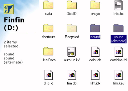
Included are two "sound effect packs" for the in game sounds that play based on the number keys from 1-5.
By default, the game will use the sound effects from the 5 Worlds version, but you can swap out to the 6 worlds one by renaming the "sound (alternate)" folder in the D: drive to just "sound", and renaming the original sound folder to something else.

I hope you all have fun with your new best friend Fin Fin!

Fin Fin is a wonderful little enigma from the past, and my attempt to make it easily accessible even in the present is something I hope you will all enjoy.
If you encounter any issues in Fin Fin on QEMU, please contact me about it.
To view the changelog, credits, and some more info about this project check below the 'Keep reading'.

Changelog
Some information is cut for brevity, the full version can be found inside of Fin Fin on QEMU and the MEGA folder.
v2.2
Added several new Fin Fin screensavers the user may choose from Updated method for calculating Transfer folder size Updated emulated machine to use 128mb of RAM and a Pentium Updated main teoboot.exe executable to fix several issues Updated shortcuts
v2.1
Removed WHPX launching options Removed FinFinWHPX.bat and FinFinWHPX.exe Removed startup crash fix as it was only needed for WHPX Modified folder settings in Windows 98 to open folders in the same window Rearranged Fin Fin on QEMU folder layout for cleaner appearance Added 'OK' button back to Microphone Setup that was mistakenly removed Updated shortcuts for Microphone Setup and Sound Recorder Fixed problem with 'Encyclopedia' launching script that caused screenshots to not show up in the photobook Added 'Transfer' Folder which allows for transferring files between the host and emulated machine Added options for launching with either GTK or SDL display Altered updater to improve ease of use and used NirCmd to improve process as a whole (Updater.bat & updater.iso)
v2.0 (Major Update - 6 Worlds Edition)
Modified original Taiwanese 6 Worlds version to add English Translation Added 'Microphone Sensitivity' shortcut to the desktop and start menu Added in 5 Worlds version Encyclopedia (finfinEncyc.exe & encyc30.GIZ) Added sound effects from 5 Worlds version (D:\sound) Added Mouse Integration Added Nircmd to replace launch batch scripts (C:\WINDOWS\nircmd.exe) Added Windowed Mode shortcut to start menu Altered launching scripts (FinFin.bat, FinFin.exe, FinFinWHPX.bat, FinFinWHPX.exe, FinFin Update.bat) Removed large amount of unecessary setup files from finfin.qcw Removed 'Task Scheduler' from taskbar Added Credits and Changelog shortcut to start menu Added dll to fix issue with running on Windows 7
v1.3
Added animated Fin Fin cursor
v1.2
Added guided updater (FinFin Update.bat & updater.IMA) Adjusted wallpaper Renamed startup shortcut ("_setup.bat" to "Crash Fix" at C:\WINDOWS\Start Menu\Programs\Startup) Adjusted Volume Control Settings
v1.1
Added new wallpaper (C:\background.jpg) Added new startup sound (C:\boot.wav)
v1.0 (First Public Release)
Changed from qemu-3dfx to base Removed unnecessary files in Windows Added missing shortcuts on Desktop
v0.5 (Playtester version)
Moved all Fin Fin data to finfin.qcw Created batch scripts for Disc.id Added shortcuts to launch programs Removed unnecessary programs from Windows Removed unnecessary files in Windows

Credits
Resources
The finfin Homepage (finfin.de) - By EMGE The finfin Archive (finfin-archiv.de) - By Xvemon, Nadine S., and EMGE Fin Fin 6 Worlds "Beta" (finfin-archive.de) - By Harald G.
Playtesters
mchi22 that-one-scratch-on-your-arm
Software
QEMU 7.1.0. (qemu.org) - By QEMU team: Peter Maydell, et al. NirCmd (nirsoft.net) - By Nir Sofer Resource Hacker (angusj.com) - By Angus Johnson

Updating Versions
Included is a guided updater that will help you transfer your save, screenshots, and sound recordings to the latest version.
Place the new version in a temporary location without replacing the original. Then, just run "Updater.bat" and follow the instructions.


System Time
Time in the emulated machine is synced to the host PC.
If you would like to time travel in Fin Fin, you can change the time in the emulated PC but it will go back to normal after a restart. Note that if you do this you will not be able to go back to the original time, you can only go forwards using this method If you would like to permanently change the time, you can use the built in date-changer present in the 'New Contact' program, but this will cause the loss of the current profile.

QEMU
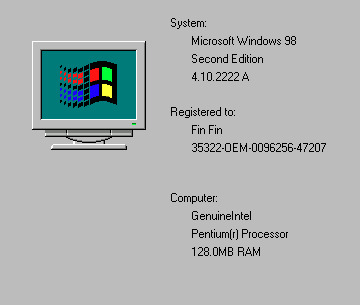
Though it should be quite obvious by now, this project works through the use of QEMU, an open source emulator. Specifically, its emulating a full Windows 98 SE machine, and then the game is run on that.
The emulated machine has 128mb of RAM, an AC97 Soundcard, and a Pentium CPU.

Files
The only files this project really has aside from QEMU are FinFin GTK.bat/.exe and FinFin SDL.bat/.exe
The reason I list the .exe and .bat files together is that they do exactly the same thing. The executables aren't really 'true executables', but are instead just batch scripts that have been converted into .exe files. When they run, they essentially create a temporary batch script that deletes itself. The only real benefit of this is that its a bit more straightforward for launching and creating shortcuts, and that there is no distracting command window while playing.
Within the 'Data' folder is where the bulk of the project is. Inside are two virtual hard drives, w98.qcw being the main Windows 98 drive, and finfin.qcw being where all the Fin Fin game data is.
3K notes
·
View notes
Text

This took way too fucking long- Everyone, gaze upon the Megatron/Galvatron height chart I made. If someone could get me a cold drink, I would love one, I have been working on this for the better part of a month. 26 separate designs, for one character, across 40 years of history. And I had to exclude a couple, the grand total is like 30 different ones. I left those four out because they were just pallet swaps of a design I already had; It felt redundant to include them.
This guy just can not decide if he's named Megatron or Galvatron sometimes, he just switches between the two names at random. I think in Unicron Trilogy, he switches to Galvatron multiple times, and yes, he does switch back to Megatron before every one.
My brain is kinda broken after finishing this. I worked on this one and the Optimus one at the same time (the optimus one is so much bigger holy shit-) and I've lost the ability to feel pain at this point.
Quick Disclaimer, if any of the images look weird, it's because I had to stitch a few separate images together to create a full body shot of the character.
Links to my Bumblebee Chart and my Optimus Chart. !!NEW!! -> Shockwave & Soundwave. For future reference, all these charts will be filed under my "Transformers Height Charts" tag and my "aka the adventures of a..." tag. Hopefully, my bumblebee post is acting up and idk if the same issue will happen here.
Explanations below the cut, I have to justify myself for a few of these.
G1 Beast Wars V1 - ~9 Feet (PMeg. TFWiki, he's so small. Dinosaur Man is so small)
G1 Beast Wars V2 - ~10 Feet (PMeg. TFWiki, This fucker has roller blades. I'm not fucking with you, they gave the T-Rex Roller Blades and he uses them)
G1 Beast Machines V1 - ~12 Feet (PMEG. The Wiki doesn't have any numbers for Beast machines, sadly, but I found an old forum post comparing the heights to the Beast Wars designs, so I win)
G1 Beast Wars V3/Machines V2 - ~13 Feet (PMEG. The TFWiki says this bitch is like 11.5 meters tall, but no, I've done the math, he is not. If he was, Rattrap, a character who is consistently stated to be 1.8 meters tall across multiple sources in multiple languages is actually not that tall. So no, he's about 2 and a bit Rattraps tall, and that translates to about 13 feet. And I'm pretty sure he reverts into this at some point in Beast machines, though correct me if I'm wrong)
G1 Beast Machines V3 - ~16 Feet (PMeg. This design is identical to the Optimal Optimus design so I'm gonna be lazy and use that number. Not like I have many other options.)
Beast Wars 2 - ~16 Feet (Galv. Idk, the wiki had the number and his name is Galvatron, was I supposed to ignore this? Never gonna watch it, but here it is)
Earth Spark - ~16 Feet 2 Inches (Mega. There are no actual numbers for Earth Spark (yet), but I was able to find Bumblebee's height, which I then compared to Optimus's height, and now I can compare Optimus and Megatron.

Yay!- he's so short it's so fucking funny tiny short man universe)
One V1 - ~17 Feet (Mega. I am aware, of the supposed "Canon Heights" listed on the wiki. 32.462 feet, allegedly. But, have you considered A: These numbers are sourced from the Walmart Promotional AR Experience that came out before the movie. B: There are three decimal points, and that number does not convert into a whole number in meters (which is originally what I thought was weird about it). C: The director has said that this movie is both canon to the LA movies and its own separate canon. AND ALSO Meg is taller than Optimus the entire movie but his height is listed as shorter than him on the wiki. They are the same height by the end of the movie, I call BULLSHIT Walmart; these are not actual numbers I will ignore them POST HASTE! Sadly, Megatron has yet to appear in the KCV live-action movies as I make this, but we know Meg and OP are the same height by the end of TFOne, so knock a couple of feet off this one, and we get pre-cog height)
Netflix Cybertron Trilogy - ~18 Feet (PMeg. Slightly confusing, but there are two Megatrons in this universe, but they are two completely separate characters. This is Predacon Megatron, design-wise identical to his V1 Beast Wars counterpart, but he is much taller in this universe. So I did some admittedly deranged comparisons to other characters and I got this height. It's a similar ratio to Prime & Primal's height difference so I'm running with it)
Gen 1 V2 - ~ 18 Feet 6 inches (Galv. So the Wiki failed me on this one, but- and maybe this is backwards thinking, the WFCT Galvatron is this height, at least comparing him to WFCT Megatron, who I've decided is the same height as Gen 1 Megatron, who we actually have a number for- I am aware it's convoluted but it's all I got)
Netflix Cybertron Trilogy - ~18 Feet 6 inches (Galv. Okay so, Galvatron and Megatron are entirely separate beings in this universe, which is a large departure from Gen 1 where they're effectively the same guy, which means I could compare their heights, and this is about the height Galvatron is. And I have decided that the WFCT Megatron is the same height as Gen 1 Megatron because they're nearly identical otherwise, making the assumption that the Galvatrons are the same easy. The amount of hoops I have to jump through sometimes...)
Gen 1 V1 - ~19 Feet (Mega. TFWiki. Hey look, it's the guy that's the foundation of like 5 other character's calculations)
Prime Wars - ~19 Feet (Mega. As I've said before, I have decided that this design is the same height as the Gen 1 design, because they're identical, yes one is 2d, and the other is 3d but I don't care)
Netflix Cybertron Trilogy - ~19 Feet (Mega. You already know what I'm going to say; it's identical to Gen 1. Just try and stop me)
Unicron Trilogy V2&3/ENG&CYB - ~19 Feet (Mega/Galv. He flip-flops so much in this universe, I think Megatron becomes Galvatron 3 separate times. For the uneducated, the Unicron Trilogy has given each of its 3 seasons separate names and 3 separate art styles. These are the designs used in Energon (S2) and Cybertron (S3). The Wiki had Cybertron's numbers but not Energon's, so for my own sanity, I decided the two were the same height. I could have done something in between Cybertron's and Armada's (S1) numbers, but there was a lot of float between the two)
One V2 - 19 Feet 10 Inches (Mega. As I have stated in the previous One entry: I don't trust Walmart, Meg and OP are the same height by the end of the movie, and the KCV LA and One are kinda one universe. Optimus is this height by the end of the movie, therefore so is Megatron. How many times do I have to explain this)
Cyberverse - 21 Feet (Oh sweet, sweet "I don't have to justify or explain my numbers, I have a source". This comes from a screen-shot of this video which has the Cyberverse height chart everyone uses, though the quality of the screen shot is iffy. If anyone has a better one, I would love to see it)
RID 2001 - ~22 Feet (Mega/Galv. TFWiki. Why are there so many Megatrons who become Galvtron at random and look functionally identical to each other why does this keep happening. Also this guy transforms into a hand)
Unicron Trilogy V1 - ~23 Feet (Mega/Galv. TFWiki. I am very tired, we have another functionally identical Megatron Galvatron conversion and I am in pain)
Bayverse V2 - 30 Feet (Mega/Galv. TFWiki, Movies 4 & 5. This time, they're actually identical, and Mr. Bay has once again blessed me with numbers from all of his movies)
Aligned Cont. WF/FOC - ~30 Feet (Mega. TFWiki. Look man, I don't know how he grows nearly five feet between the games and the shows, it's just what the video game info screen said)
Animated - ~31 Feet (Mega. Animated has no actual numbers, but the lovely @phoenix-inanis has provided a frankly astounding resource with their own calculations for the heights of all the TFA characters. Go look at it, it's wonderful -> https://phoenix-inanis.notion.site/TFA-Height-Chart-f6ad2960ca8c4c5b859ee4958723aaa4?pvs=4)
Aligned Cont. TFP V1 - 34 Feet 5 Inches (Mega. Yes, this is from Fandom. But, and I will continue to say this until my lungs give out, this entire universe is just fucking enormous. Look, I believe Bayverse is the most consistent tf universe when it comes to the transformers' models and designs, and if we do some comparisons between characters with similar listed heights (I did it at the end of this post), it's way too close for me not to believe it)
Bayverse V1 - 35 Feet (Mega. TFWiki, Movies 1-3. Look at this bitch, getting his secrets exposed by Mr. Bay. Look at him, he's going to shrink down in the forth movie, gonna get dumped down to 6th place on the podium. Get Shrunk, Idiot)
Aligned Cont. TFP PR V2 - 42 Feet 7 Inches (Mega. Look at this enormous bitch, look at the freak standing there, fuckin enormous n' shit. Wack ass Unicron- Did you know that this is probably the TALLEST base form transformer ever? Excluding any super modes or upgrades or a transforming Cybertronian Base/Spaceship, just default general body size, I'm pretty sure this Megatron is the tallest Regular transformer ever)
Not Pictured: RID 2001 Galvatron Pallet - ~22 Feet (the only thing that was different between the two designs was the colours, if felt redundant to include it), Unicron Trilogy Galvatron Pallet(s) - Armada: ~23 Feet, Energon/Cybertron: ~19 Feet (Again, just the colours changed, otherwise everything else was the same)
I have done it. I have conquered my Everest. I have finished the big two charts. If anyone has any suggestions for which transformer I should aggressively analyze next please tell me I don't know which ones to do next
Here are the different layers separated out into their own pictures, I know it's kinda hard to tell everyone apart when they're all on top of each other.


#Transformers Height Charts#personal stuff#aka the adventures of a mother fucker with the power point program#transformers#macaddam#macadam#Megatron#Galvatron#tf megatron#tf galvatron#g1 megatron#g1 galvatron#beast wars megatron#beast machines megatron#beast wars galvatron#tf one megatron#tf one d 16#wfc trilogy megatron#wfc trilogy galvatron#pw trilogy megatron#unicron trilogy megatron#unicron trilogy galvatron#cyberverse megatron#rid 2001 megatron#rid 2001 galvatron#bayverse megatron#bayverse galvatron#wfc megatron#tfa megatron#tfp megatron
84 notes
·
View notes
Text
(Potentially) new information from the Spy x Family exhibit book!
Okay, I’ve done some digging around and not gonna lie, some information in there has me excited. I can’t read Japanese so I took photos and put them through translate, so it’s not the most accurate, and please take this post with a grain of salt. Here we go!
Translations are more than welcome! Feel free to use these photos and feel free to DM me for clearer photos. I would also love to know what this all means haha. Japanese “raw” text is taken from Google translate and may be inaccurate to what is actually shown in the photos.
✩ The SxF world apparently has no Christmas!
I’ve heard claims of it, and here’s a picture I took.
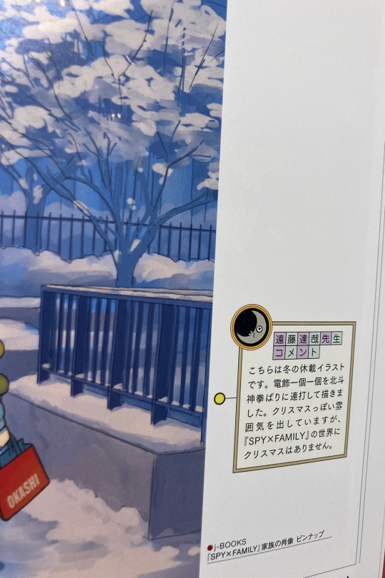
“遠藤達哉先生 コメント
こちらは冬の休載イラスト です。 電飾一個一個を北斗 神拳ばりに連打して描きま した。 クリスマスっぽい雰 囲気を出していますが、 『SPY×FAMILY』の世界に クリスマスはありません。”
Google translate tells me that there’s no Christmas in the SxF world but he tried to create a Christmas-like atmosphere? Not sure but it would align with other people’s claims.
✩ Yuri apparently had a girlfriend in a rough draft!
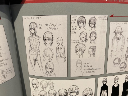
This is Endo’s handwriting so the machine can’t recognise the words easily, but I think the woman in the bottom of Yuri’s sheet is his “girlfriend”? And Google translate tells me she’s Yuri’s “weakness” and Twilight might use her against Yuri / take advantage of the girlfriend? This is a very interesting idea that didn’t get used in canon (yet?). I think in canon, Yuri is popular but he’s too devoted to his sister. A new significant other of a prominent character would shake things up. Especially when it comes to Yuri, a member of the SSS.
By the way, Yuri’s potential designs are kind of cool. I like the ponytail.
✩ Apparently “Oscar” was one of Twilight’s potential names! + Early Twilight designs
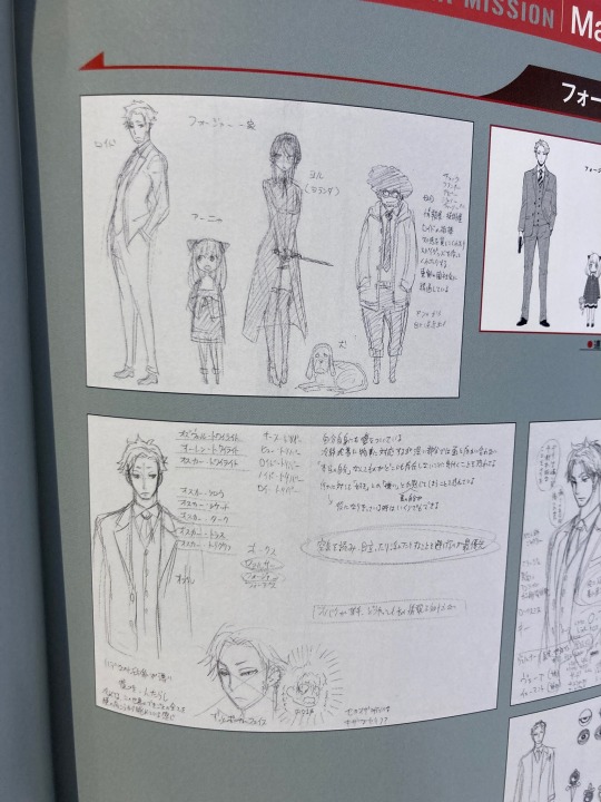
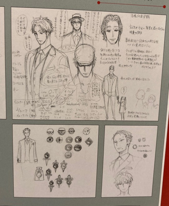
I think we know Yor was originally short for Yorlanda (this is in the upper sheet). There’s a whole list of names beside Twilight and the name Oscar オスカー appeared frequently. There are also more names that I can’t decipher.
✩ Designs of some potential WISE agents! (And early Fiona)
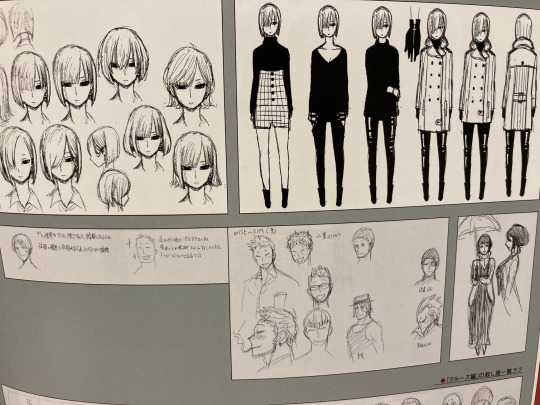
Fiona’s sheet (next to Yuri’s) was titled “WISE spy (female)” and now we have a sheet titled “WISE spy (male)”. Was Fiona a placeholder spy that made it to the main cast? Or will this “male spy” end up having significance too? The two smaller heads at the left are apparently Twilight’s associates. Also, a Melinda sketch. Not gonna lie, the male spy feels kinda cute. Hope he’s not completely scrapped.
✩ Endo’s interview!
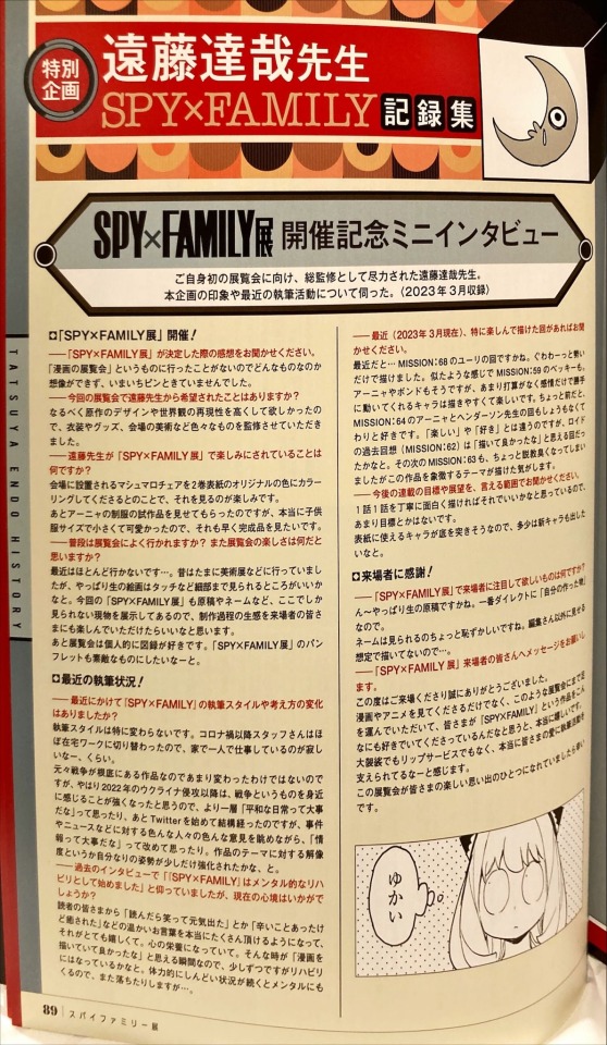
I feel like I should put this earlier but I was distracted with the Christmas / Yuri’s potential girlfriend thing. This is at the very end of the book. Apparently Endo was influenced by the invasion of Ukraine in 2022. This interview was apparently taken in March 2023. I think it’s fairly important so I’ll wait for a proper translation before saying anything else.
✩ Comments on Donovan, Melinda, Redacted, and Sylvia!
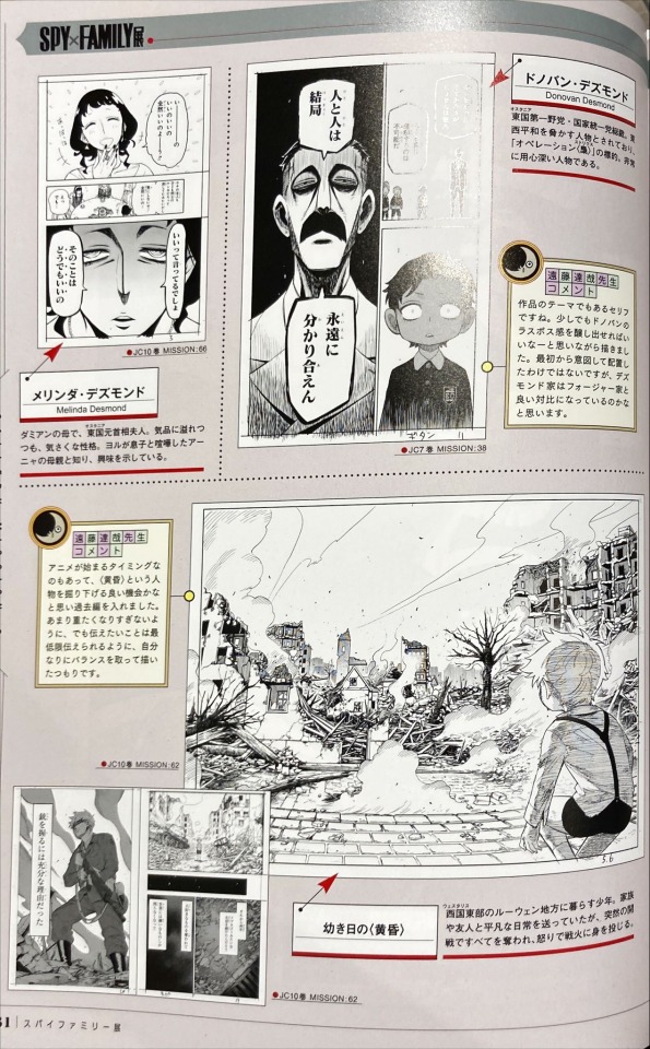
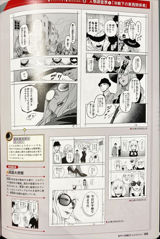
These two pages are together and I found it significant because Endo discusses the SxF themes. (My notes are not direct translations.) Apparently:
Sylvia’s scene in Mission 20 is Endo’s favourite scene, and he was looking at materials related to war for a long time and wondered if he could make use of it. [JP below]
とてもお気に入りのシーンです。 「SPY×FAMILY」の連載とは関係無し 昔から戦争に関する資料は色々見て いたので、多少はこの作品にも活かせ ているのかなーと。
Donovan’s statement of “in the end, people will never understand each other” (rough paraphrase) is the theme of the work. And Endo wanted to create a feeling of Donovan being the final boss. He didn’t plan on arranging it from the beginning, but he thinks the Desmonds are a good contrast to the Forgers. (Does this mean the Forgers think people will understand each other?) [JP below]
作品のテーマでもあるセリフ ですね。 少しでもドノバンの ラスボス感を醸し出せればい いなーと思いながら描きまし た。最初から意図して配置し たわけではないですが、デス モンド家はフォージャーと 良い対比になっているのかな と思います
The chapters on Twilight’s past coincided with the anime so Endo thought it was a good idea to explore Twilight’s past. [JP below]
アニメが始まるタイミングな のもあって、黄昏〉という人 物を掘り下げる良い機会かな と思い過去編を入れました。 あまり重たくなりすぎないよ うに、でも伝えたいことは最低限伝えられるように、自分 なりにバランスを取って描い たつもりです。
Melinda is described as “friendly” (?) even though she is dignified. A positive description of Melinda… interesting. What’s also interesting is that after she learns that Yor is the mother of the child who got into a fight with Damian, she “shows interest”. Melinda, what do you want with Anya? [JP below]
ダミアンの母で、東国元首相夫人。気品に溢れつ つも、気さくな性格。 ヨルが息子と喧嘩したアー ニャの母親と知り、興味を示している。
I personally think these two pages contain hints about the mystery of the featured characters and would love to know what it means :D
✩ Early Yor and Bond!
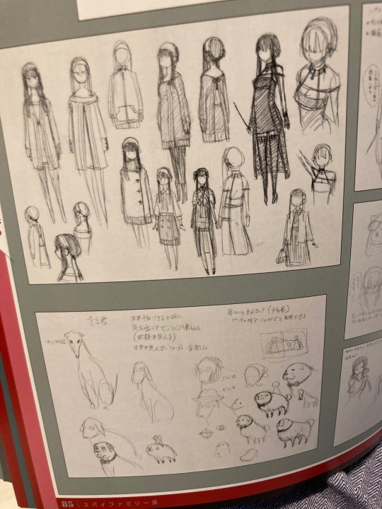
There’s a lot more Yor but again the image limit is constricting me. I really like the Bond designs, they’re funny and he’s just a chonky little boi :)
✩ Comments on the panel of Twilight’s head in Yor’s lap!
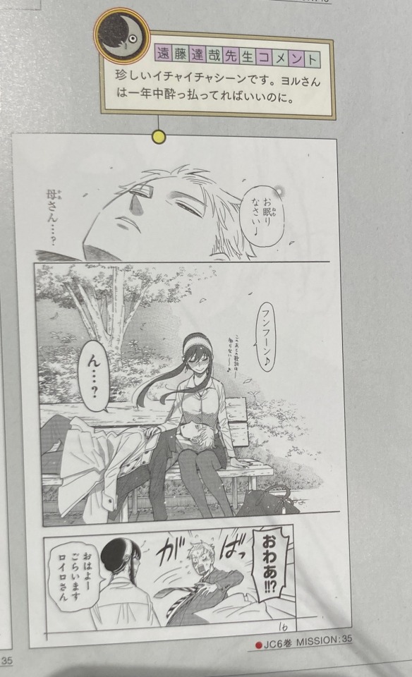
“珍しいイチャイチャシーンです。 ヨルさん は一年中酔っ払ってればいいのに”
Which apparently means: “a rare flirting (?) scene, I wish Yor was drunk all year long”
?!??! Twiyor?!! Hello!! I cannot resist mentioning this one, this is one of my favourite Twiyor / SxF scenes. Are we gonna get more drunk Yor? More Twiyor? More flirting? I’m excited now.
I’ve reached the image limit, so here’s all for this post for now! Translations are totally welcome and again I would love to know what this all means. I’m sorry if I accidentally said misleading information, so please tell me so I can correct it. Once again, don’t take my words as complete fact. The Yuri girlfriend thing is really surprising to me haha.
#spy x family#spy x family exhibition#yor forger#loid forger#yuri briar#fiona frost#bond forger#donovan desmond#sylvia sherwood#melinda desmond#twiyor#i guess. that comment seems shippy to me#long post
793 notes
·
View notes
Text
when robots got muscles
You can blame @centrally-unplanned for this post. She(?) wrote...
The ‘chrome’ designs pioneered by illustrators like Hajime Sorayama (Sexy Robot from 1984, for example) tended to be more in vogue at this time (or just…a hot girl, who is apparently a robot, trust me bro), you don’t see designs like this too commonly until later (ask resident robo-fetishist/animator expert @canmom for details on that timeline).
After a challenge like that how can I refuse? Although the question is ‘when did robots get muscles’, this turned into something of a historical survey of robot designs from the 80s on with a throughline of biomimesis.
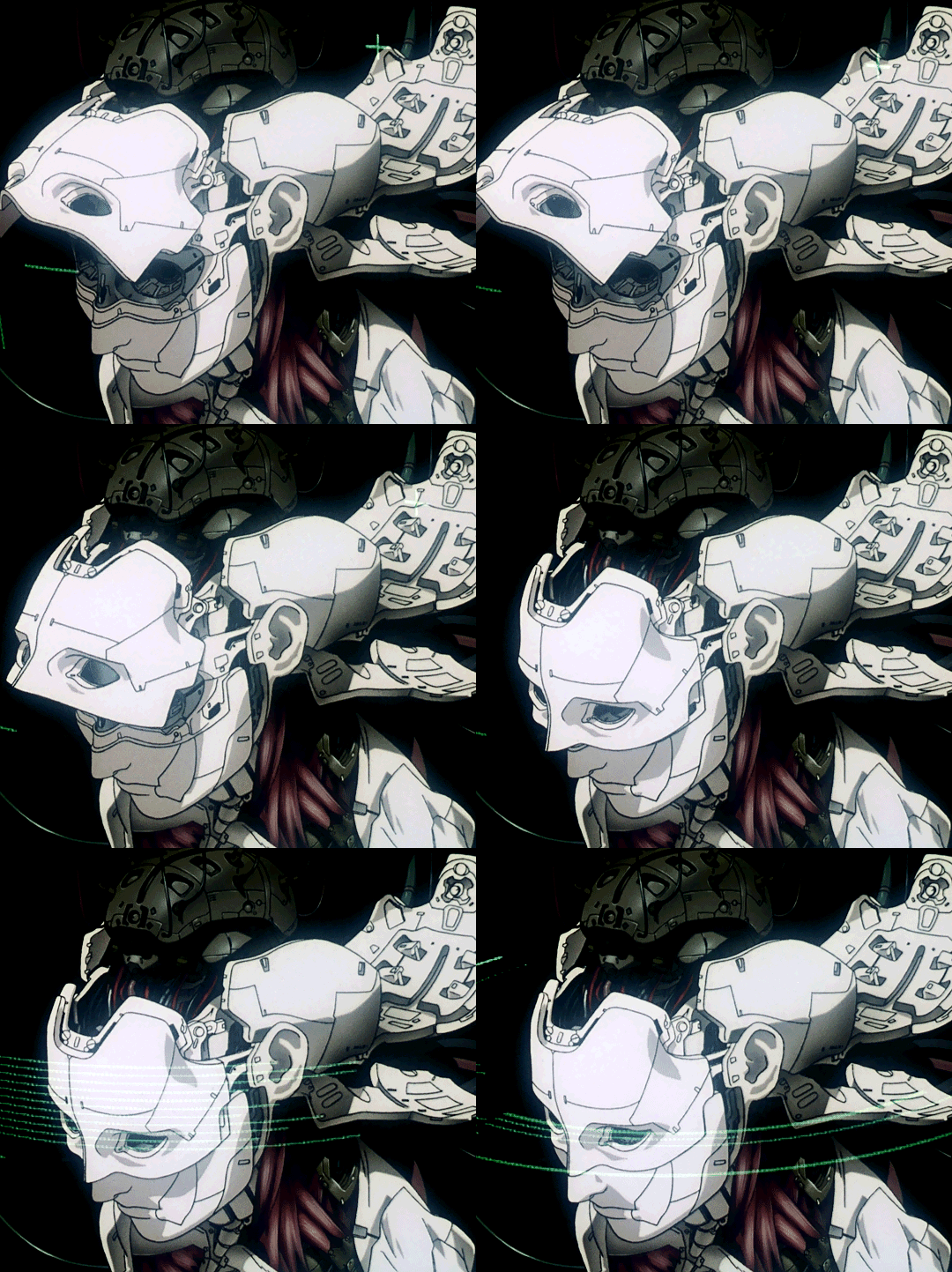
(Originally this was just going to be an excuse to talk about Ghost in the Shell... but I gotta be thorough.)
This was all brought on from this picture from a 1989 fanart magazine...
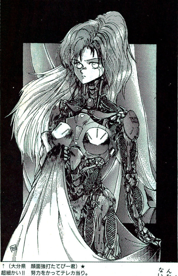
by an artist going by ‘Facepunch Tatebi-kun’ (顔面強打たてびー君, Ganmenkyouda Tatebii-kun). I remarked that it was interesting to see these kinds of ‘robot muscles’ in a picture from 1989, since I thought that kind of design became popular in the 2000s.
On some reflection, I think I gotta revise that opinion! I think ‘robot muscles’ became a thing around the mid 90s in anime; in the West I think it took a bit longer. But you can also see precursors already before that.
So. One thing artists are super into is biomimetic robots. That is, robots whose form (and perhaps function) is similar to animals, especially humans. The word ‘android’ referring to a human-like automaton dates all the way back to the late 19th century, but the modern ‘android, robot, cyborg’ taxonomy apparently became established around the 40s.
There’s two types of humanoid robot that get a lot of play, especially in anime. One is the convincingly humanlike cyborg, which is the same size and shape as a normal human; the other is a what we call in English a ‘mech’, i.e. a big robot you can sit inside.
Of course, if your androids just act like humans all the time, then there’s not much point having them be robots. To really create the frisson of contrast between human and mechanical forms you have to show the mechanism somehow. This could be because the machine isn’t perfectly human-like, and has visibly mechanical joints - take a look at the works of @sukabu89 for very inventive depiction of this theme - or, the android could be damaged or undergo maintenance.
When you attempt to translate biological forms into a more mechanical design language, the traditional way has been to use hard, rigid shapes, since these make the contrast especially clear. In more recent designs, particularly as we started to see real robots with ‘artificial muscles’ such as the ones created by Boston Dynamics, we get another sort of design language to express ‘mechanical parts’, and robots start having more biological forms with exposed plasticy muscles.
So let’s tell the story. We begin at the end of the 70s.
the dawn of mechaguro
For an early example of ‘mechaguro’ (a term I’m applying very anachronistically!), when a robot gets smashed up, we have Alien (1979). This film did a ridiculous amount to define sci-fi design language, and of course the alien itself blends mechanical and biological forms, with its glossy black surface allowing it to seem to melt into the exposed pipes of the spaceship. But let’s focus on the character Ash, a secret android who is broken apart in the second half of the film.
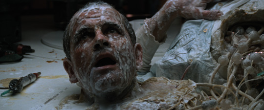
When Ash is torn apart by the alien, his insides consist of weird white plastic beads and a milky fluid that seems analogous to blood. It’s not clear what the function of any of this tech is - it’s intended to be vague and mysterious. The outside is biomimetic but the inside is anything but. He has a kind of artificial skin which resembles a latex mask.
The Terminator films are another major touchpoint for 80s science fiction. Late in the film, Arnie starts taking damage which reveals the Terminator skeleton underneath his fake skin.
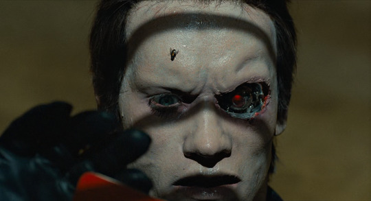
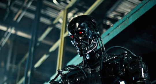
The stop-motion Terminator model is basically designed according to the principle of ‘replace human bones and muscles with hard metal bits’. So you have a metal skull, metal clavicles (which are pistons for some reason), metal shoulder blades, hydraulic pistons generally in the places where muscles are. e.g. in the above picture you can see pistons that stand in place of the sternocleidomastoid muscle, and in this picture...
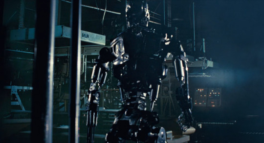
...you can see metal scapulae and piston biceps and triceps and a piston. The shoulder joint by contrast built in a very non-human-like way. Also there’s random tubes everywhere lol.
That’s generally how androids are portrayed in the 80s. The ‘droids’ in Star Wars are similar; C-3PO is an arrangement of metal plates with gaps suggestive of underlying mechanical details and rudimentary joints and pistons.
In Blade Runner, we have the Replicants, humanoid robots - but by the premise of the film, they are essentially indistinguishable from humans. So when the Replicants die, we never really get to see their robo-innards.
and now, anime
OK, that’s the big four Western 80s sci-fi movie series; what of anime? Of course, androids in anime go all the way back to Astro Boy. But most of these early designs don’t really focus on mechanical details all that much. Super robot designs are more like tokusatsu suits than anything. There were certainly instances of impressive mechanical animation in the 70s, with early experts including Kazuhide Tomonaga on Space Battleship Yamato. Then there’s Hayao Miyazaki’s episodes of Lupin III Part 2 which featured proto-Nausicaa flying a prototype of the robots from Castle in the Sky. It would be some years before anyone could come close to matching these!
The original Gundam in ‘79 famously started the ‘real robot’ movement [Animation Night, so let’s take a brief look at how a Gundam fits together.
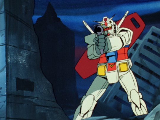
Generally speaking, the way Gundams are drawn in Gundam ‘79 is kind of rough. The methods to animate these rigid mechanical systems in super accurate perspective were just not yet established at the end of the 70s, certainly not on a TV budget. The actual joints on the Gundam are left very vague, but it broadly speaking seems to move like a human in armour.
But the OVA boom was about to begin, and while it would be a while before we saw the heights of Headgear/Production I.G./Gainax, things were going to change a lot. Mechanical design and animation was about to get much more sophisticated very very quickly.
In 1982, we have Super Dimension Fortress Macross, with robots that transformed into fighter jets. Its robots are designed by Kazutaka Miyatake, who cut his teeth doing mechanical design for Space Battleship Yamato and Daicon. The Macross TV series introduced the world to the animation of Ichirō ‘Missile Circus’ Itano. [AN64] A plane with legs... honestly looks kind of goofy, but Itano’s ambition to have a highly mobile 3D camera that could move in ways that would simply be impossible in live action marked a huge step up in how robots are animated. And this would get refined even further in the film Do You Remember Love.
In terms of design, we’re really moving our inspiration from ‘tokusatsu suit’ to ‘military hardware’ here. A Macross suit has to look like something that could transform into a plane, so its silly little arms and legs have to look kind of plane-like. In any case, we are definitely still in a world of hard and rigid robotics.
Dallos (1983-4) dir. Mamoru Oshii is known as the first OVA, if not the first successful OVA [AN115]. It features a variety of mining robots on the surface of the Moon, which are generally less humanoid, taking their design cues from JCBs...

...as well as humanoid robots with fairly clear joint patterns...

...and more humanoid robots too.
The eponymous Dallos, however, is a huge humanoid robot that looks like this...
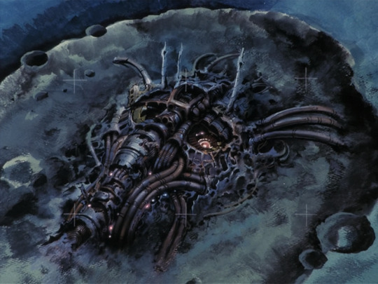
Here we have a pile of mechanical shapes that vaguely calls to mind a human face. It’s suggestive of motifs we’d see later in works like Akira.
A year later in 1985, Megazone 23 really kicks off the OVA boom in earnest [AN 103]. It also has a robot, in the form of a transforming bike that can become a humanoid piloted mech...
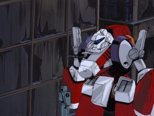
You can see mechanical designs and shading have become considerably more detailed; its motion is a lot more complex as well with a ton of indulgent background animation shots. The actual details of the bike -> robot transformation are rather brushed over. But to sort of sum up the design language: we have organic but hard-edged shapes contrasted by inorganic but round shapes. (These terms ‘organic’ and ‘inorganic’ refer mostly to symmetry and a sense of ‘flow’ in the shape.) There are few right angles as such, but a lot of broadly boxy topology. The shapes are broken up by elaborate specular highlights in complex shapes, a motif of the later Kanada school.
OK, but that’s all variants on ‘rigid robot’ so far - what about the androids? What about the more directly biological designs?
Following the enormous success of Megazone 23 Part I, Toshiki Hirano got the chance to adapt his favourite lesbian cosmic horror hentai manga Fight! Iczer One into a rather more tame OVA which released from 1985-87. In terms of mechanical design, this starts to do some interesting moves towards blending biological and mechanical forms...
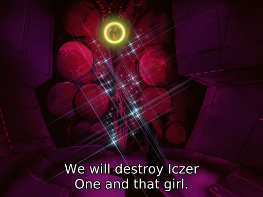
Of course it has a robot in addition to the requisite bishōjo and lightsabers. In contrast to the boxy shapes we’ve seen so far, the robots in Iczer-One have a much more curvy organic sort of design language. Still, there is not a lot of emphasis on the precise details of mechanical articulation outside of select shots. (It is however notable for the first ever Obari punch!)
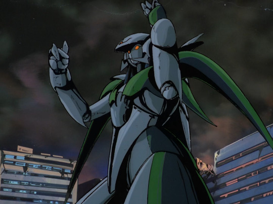
Despite the change in shape language, these are still very clearly animated as metal plates and not yet muscles.
In 1984 we have a very important film (for this narrative, and in general), Nausicaa of the Valley of the Wind, the film that created Studio Ghibli. Here we have the ‘God Warriors’, giant humanoid weapons with the ability to shoot a massive laser out of their mouth. Rather than robots, these are very much biological in nature, having to be grown in a kind of cocoon. In the film version of Nausicaa, an incomplete God Warrior is released, leading to an iconic scene animated by Hideaki Anno in which the God Warrior attempts to blow up the oncoming wave of Ohmu.

The God Warrior’s melting flesh is gorgeously animated, bubbling and sloughing off in great big lumps as the skeleton pokes out from underneath. Throughout, Nausicaa is full of beautiful and impressive animation of both machines (mainly planes) and biological (the giant insects), but the God Warriors, as human-made lifeforms, bring the two together. However, this strand wouldn’t be especially followed up on for a long long time.
Right, but what about Bubblebum Crisis (1987-91)? That is, after all, the iconic 80s robot girl OVA. It’s inspired heavily by Western robot-related films like Terminator and Blade Runner; here we have ‘Boomers’ (never stops being funny) as androids that can appear convincingly human. Like the Terminator, the underlying metal parts can burst out. Here we have a metal frame designed to resemble muscles, and also metal tentacles.
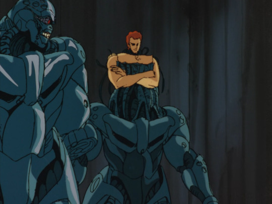
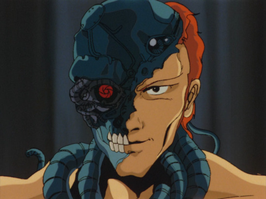
The shapes of these robots are a lot more organic. The robot neck has tubes that sort of resemble the neck muscles, metal plates that resemble pectorals and abs and deltoids and biceps and so on. You’ve even got a direct riff on the Terminator ‘fleshy face falling away to reveal metal skull with glowing red eye’! Under the plates there are clusters of tubes which also heavily resemble muscles. Also you’ve got the classic ‘three small circles’ motif there.
Contrasted against them are the Knight Sabers, who aren’t cyborgs as such but fight in powered exoskeletons which fit the design motifs of robot girls.
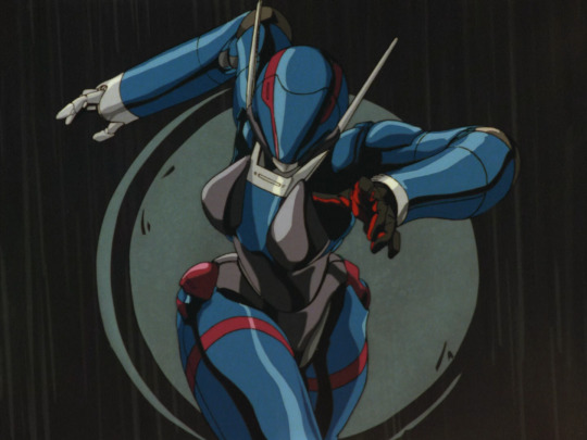
These suits are quite form-fitting, with a rubber under-layer and metal shells on top. There is definitely some attention paid to how they’ll articulate around the joints. One very recognisable 80s motif is the sort of extending spike thingies you can see on her hat there; there’s also the jets that extend out behind the suit. And, you have that multi-layer shiny highlighting of course!
Still, the way the characters move in Bubblegum Crisis is still very squarely Kanada School poses; big movements, lots of held poses accentuated by flashing and line boil, not a lot of concern for conservation of momentum or anything like that.
For a contrasting strand we can look at the rise of the ‘Otomo school’ (if you will) of realism. Around the end of the 80s, a pool of talented animators were gathering around Katsuhiro Otomo. Their most famous work is Akira, but I’m actually going to begin with Robot Carnival (1987), a wonderful anthology of short films from 1987. This features a huge variety of interpretations of the concept of robots.
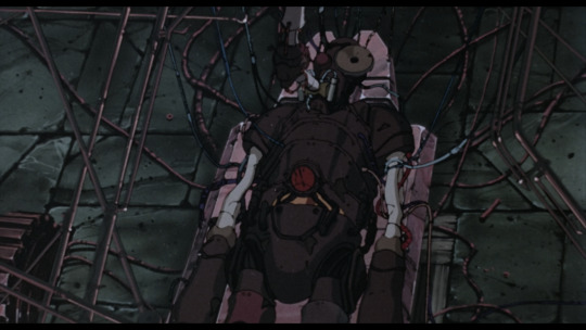
For example, for Kōji Morimoto, later co-founder of Studio 4°C, the robot is a kind of cobbled-together steampunk Frankenstein’s monster. It’s a very cool design with all sorts of asymmetries and exposed parts suggesting its cobbled-together nature. And although all the robot does in this short is stand up and then fall over, a great deal of attention is paid to the little details of its articulation and its movement through space.
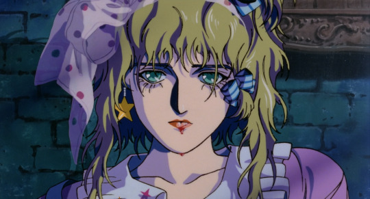
Presence, directed by Yasuomi Umetsu, is notable for its steps in the direction of realism - Umetsu’s characters are hyperdetailed and in some ways over-drawn. The opening shots establish this is a world where lifelike androids are common, when an android gets his head kicked off and stolen by children. Here the robot-as-doll metaphor comes in, something that will be increasingly central in the next decade. The robot girl is essentially a human-sized doll in a room full of other toys. Her creator smashes her to pieces with a wrench; later her ghost visits him as an old man. We see the girl attached to a bunch of wires, but she bleeds like a human.
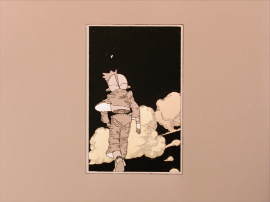
Cloud by Manabu Ōhashi features another humanoid robot, an Astro Boy-like child recognisable as a robot based on his segmented torso and legs and robotic ear... cones. Here the robot is a standin for human emotions, the boy’s struggles projected onto the constantly changing sky as he walks against the wind.
Strange Tales of Meiji Machine Culture: Westerner’s Invasion by Hiroyuki Kitakubo (later to direct Golden Boy, Roujin Z and Blood: The Last Vampire) is a sendup of mecha shows in which two very goofy looking steampunk robots operated respectively by Japanese and Western crews duke it out, laying waste to the city around them. The Japanese robot is basically a big wooden samurai...
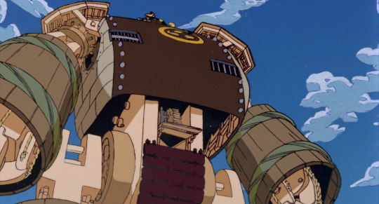
and the Western (more specifically American) robot is, uh
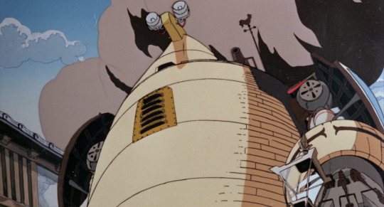
sorta big barrel with little eyes on top? I’m not entirely sure what the deal is with this design!
That’s really not relevant to our story tbh I just think it’s a neat short.
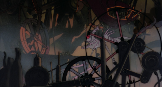
Chicken Man and Red Neck, by Takashi Nakamura, features especially distinctive robot designs. The film is kind of a dream sequence in which a terrified drunk man witnesses the revels of the machines of Tokyo, transformed into robots; the robots are extremely shaped, moving through a world that is pretty much just pistons...
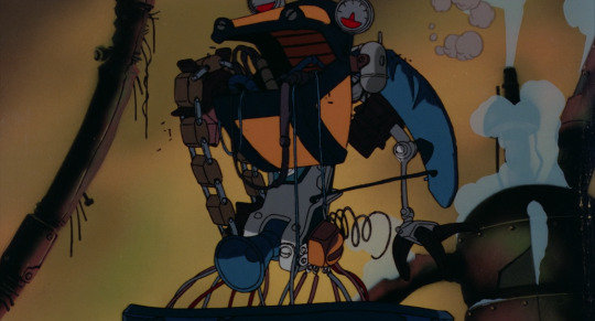
These robots call to mind the dancing demons in Fantasia’s Night On Bald Mountain sequence, or even Bosch.
Otomo’s own segments feature the Robot Carnival itself, a vast mechanical structure built as... well some kind of entertaining spectacle, but which now drives around the post-apocalyptic wasteland dropping robots which explode as bombs. It’s cute.
OK, to wrap up the 80s, we gotta cover Akira (1988) [AN34]! Akira has plenty of impressive mechanical animation of helicopters, hovercraft thingies, satellite lasers and of course the famous bike, but it doesn’t really feature robots as such - but what it does have is a blending of mechanical and biological forms in its climactic sequence where Tetsuo’s psychic powers go out of control. First, wires start to spread like the roots of a plant from his robot arm - less an actual machine and more something he assembled with his psychic powers...
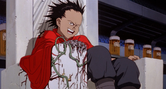
He takes a bullet, and the mechanical wires and muscles start to blend together and spread out like a slime mold...
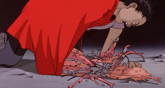
...which he can extend as essentially a giant tentacle.
When his powers fully go off the rails, he bulges out into big blobs of flesh which have both veins and wires running over them. These burst out of the metallic parts as well.
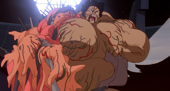
He turns into essentially a giant biomechanical baby.
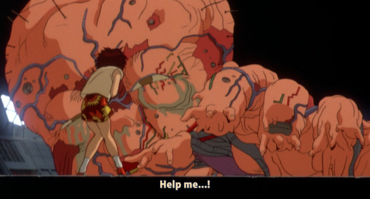
Did Akira invent these images of blending biology and machinery? Probably not, but I’m not really familiar enough with manga of the time to say. What can at least be said is that Otomo’s absurdly meticulous style could really sell it. Otomo was truly a god of perspective and detail; Akira the film was an enormous, prestigious production that threw ludicrous effort and resources towards realising his vision (which doesn’t mean it paid its inbetweeners much more...). A lot of the animators who worked on Akira would go on to be prominent in...
the 1990s
So, the 1990s. If the 80s was dominated by the later Kanada School, the new movement of the 90s, at least as far as film animation goes, was ‘realism’.
But before we get onto that, let’s take a brief look at Gunnm (1990). Known as Battle Angel Alita in the West, this manga by Yukito Kishiro depicts a world in which most people are cyborgs; it was adapted to an OVA by Madhouse in 1993 and became wildly popular overseas. Its protagonist Gally, aka Alita, starts out the story as a wrecked cyborg body like this...
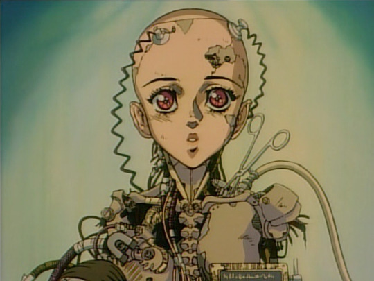
Looking at this design, you can see similar patterns as we have so far. We have metal clavicles, metal sternocleidomastoid muscle, metal pectorals, metal spine. There aren’t robot muscles, per se, but there’s a lot of attention to detail on mimicking biological shapes.
Before long she is rebuilt (twice in the manga, once in the anime). Her new body is like this...
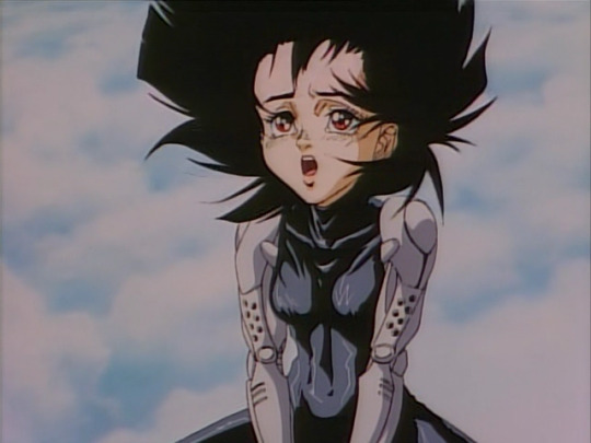
...which is to say a skintight bodysuit in the middle, and metal arms. These arms, although designed in a way that indicates hard surface and with a hinge joint at the elbow, are designed in a way that mimics the flow of muscles in a human arm. By contrast, her sorta-love interest Yugo has a body like this:
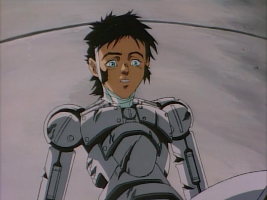
which gets mashed to pieces in the finale of the OVA. There’s a striking mechaguro scene in which Gally catches Yugo, but leaves him hanging by a fraying arm, which snaps, leaving him to fall to his death. Compared to later iterations of the ‘robot arm torn apart’ device, this one’s relatively light on detail...
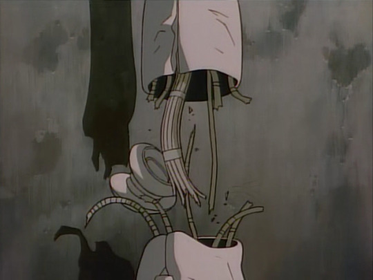
Cyborg bodies in Gunnm are used as a visual indication of character type. Gally has curves but also sleek robo muscles: she’s a Beautiful Fighting Girl, sweet but also extremely powerful. A huge ‘muscular’ cyborg with wide shoulders is likely to be a brute. Yugo here has much more plain, simple shapes with visible bolts, not precision pieces like Gally.
I don’t know how much of this originates with Gunnm. I’m sure the idea of cyborg girls was in the air long before, but this became an influential example on the tail end of the time of the 80s bishōjo. One device that is notable here is the idea of a ‘full body cyborg’, which is only human down to the brain (or perhaps not even that). Body swapping is a major theme in Gunnm, something that would be expanded on before long...
And if that was going out, what was coming in? Let’s look at Patlabor, which traces the evolution of the Headgear artistic collective and IG Tatsunoko into Production I.G.. This is about as down to earth as giant robot stories can get, with robots as just everyday machines used for work and by the cops. But where things really go nuts in animation terms is the opening to Patlabor 2 (1993).
youtube
Here you can see some of the most impressive sequences of mechanical animation ever drawn. We see pilot Noa testing out the robot, and especially notable are the scenes of the hand flexing and of walking. Enormous attention is paid to the articulation of joints. The robot’s hand can swivel 360 degrees, unlike a human; however, like a human, the articulation of the fingers seems to be controlled by hydraulics in the forearm (whereas in humans, the muscles and tendons in the forearm control our fingers). When the robot’s foot steps, it flexes like a real human foot, with believable joints, and a sensible arrangement of pistons to absorb force.
It’s not imitating a human’s muscles, but the attention to the details of the robot’s mechanical design serves precisely to draw our attention to the ways it’s like/unlike a human - the robot’s hand impossible motion immediately contrasted with its pilot shot from the same angle. And the perspective drawing is absolutely impeccable. The robot is made of purely rigid structures, and the way rigid structures articulate is not at all how a human’s joints articulate.
The sequence above was animated by Atsushi Takeuchi. But across the board, the bar was getting pushed for mechanical animation. For example, observe this cut from Mobile Suit Gundam: The 08th MS Team (1996-1999), in which the robot tears off its own arm and beats up another robot. The precision of the way the joints are animated and the way the robots move in space is just completely on another level compared to what Gundam had been doing a couple of decades prior.
Anyway, we’re here to talk about robot muscles, and we’re just a few years out from that now!
The year that robots got muscles, at least as far as anime is concerned, is 1995.
You can probably guess the next part. In 1995, we get Eva and GitS. Let’s start with GitS, to continue the Production I.G./Mamoru Oshii thread. The opening sequence of GitS, animated by - who else could it be? - Hiroyuki Okiura - has to be one of the most iconic segments of video ever drawn. Here’s a merely 720p youtube upload but go and find the place you have GitS stored on your hard drive and watch it in proper quality eh.
youtube
OK, yes, a lot of it is a naked lady floating around, sue me or whatever. But the sense of form. We see early on an appearance of ‘robot muscles’, here closely resembling real muscles...
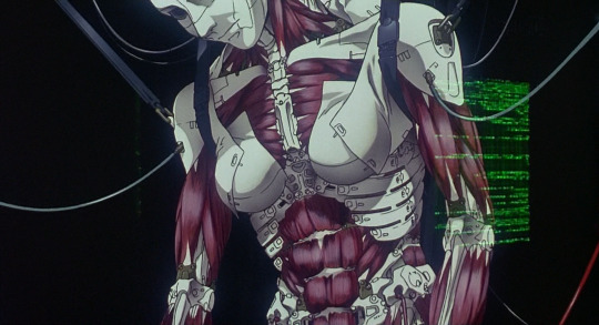
We can see from the way this is drawn that it’s made of a combination of artificial muscles, solid segments, and flexible, fabric-like panels. One of my favourite shots at the beginning shows the solid segments of the skull clicking into place. Here we have a very clear contrast between the angular, hard edges of the mechanical pieces against the organic forms of a human body.
Elsewhere in the film, we see various incredibly cool bits of ‘wouldn’t be fucked up if a body did this‘, like the fingers...
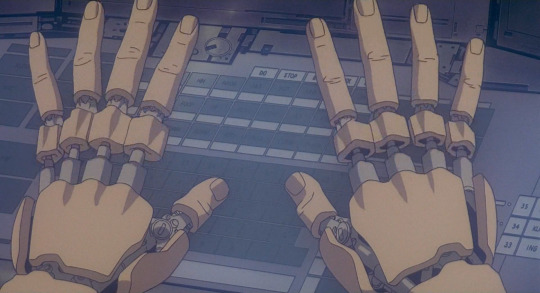
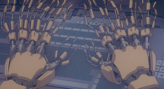
Here, what we expect to be soft biological fingers is contrasted with unexpected rigidity, mechanical joints under a shell.
Also in this scene we encounter a robot body that has been stripped of her arms, legs and hips but is nevertheless still alive...
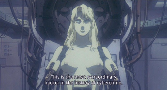

most extraordinary hacker in the history of cybercrime and you have your titties out and yet you still can’t get them to stop misgendering you, smh
For the Terminator, having its body smashed up and continuing to walk was a demonstration of its strength. Here, as would become perhaps an increasing motif, having a robot body is a source of vulnerability: people can do things to you that would kill an ordinary human but you keep going through it. Not surprisingly, ‘robot body maintenance’ is a recurring porn device. (One that GitS deploys in SAC s2).
But of course this all builds up to the all time classics of mechaguro scene at the ending where the Major attempts to tear off the hatch of a spider tank. Muscles ripple individually under the surface of her skin, her arms bulge in exaggerated contraction, and then her arms fully tear apart under the force.
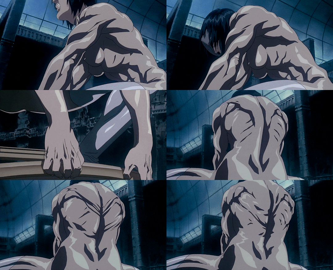
Here, we’re showing her as mechanical not by contrasting rigid forms with biological ones, but by exaggerating the biological ones to the point of doing something extremely unnatural. Human muscles do not generally flex in such an individual way, nor are they strong enough to tear the arm apart, but robot muscles? Yeah, they could do that. This sets up the next scene where the Major lies unnaturally still, but can still exert control through hacking through her union with the Puppet Master.
Robots holding onto something so hard their arms explode has become... if not a recurring image, then at least one that was called back decades later in Violet Evergarden.
The final scene of GitS brings back the image of robot-as-doll, with the Major’s consciousness now uploaded into a black-market robot body that resembles a child in a dress.
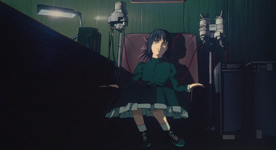
This is further expounded on in Oshii’s second GitS movie Innocence (2004), with its Ballade of the Puppets in the soundtrack as Batou and Togusa (and eventually, the Major) are attacked by essentially an army of ball-jointed doll gynoids. The puppets’ movements are extremely unnatural and erratic acrobatics, constantly flipping all over the place; when hit by bullets, panels pop open to reveal the underlying brass skeleton. It’s a very cool image. (The thing that lets the sequence down is the extremely dated CGI and aggressive digital compositing.)
It also has Donna Harraway as a literal cyborg!
Now, the GitS movies didn’t drop fully formed out of nowhere, but draw on the work of Masamune Shirow. The manga has a somewhat different design sensibility than the movie, distinctive and shiny as all Shirow’s art. It is more rounded and organic, less cold.
So, the basic design of a cyberbody originates with Shirow. You can see it on this page (unfortunately from a flipped version, translation Dark Horse):
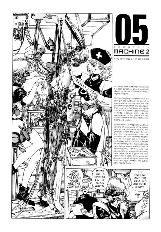
You might be able to determine from how the nurses are dressed that, yeah, the GitS manga is in significant part fetish porn. But really nerdy fetish porn, which is the best kind. This chapter is almost entirely dedicated to explaining how cyborg bodies are constructed in great detail, from the ‘sensory film’ (that’s what’s being applied in the opening to the 1995 film) to the hair implantation.
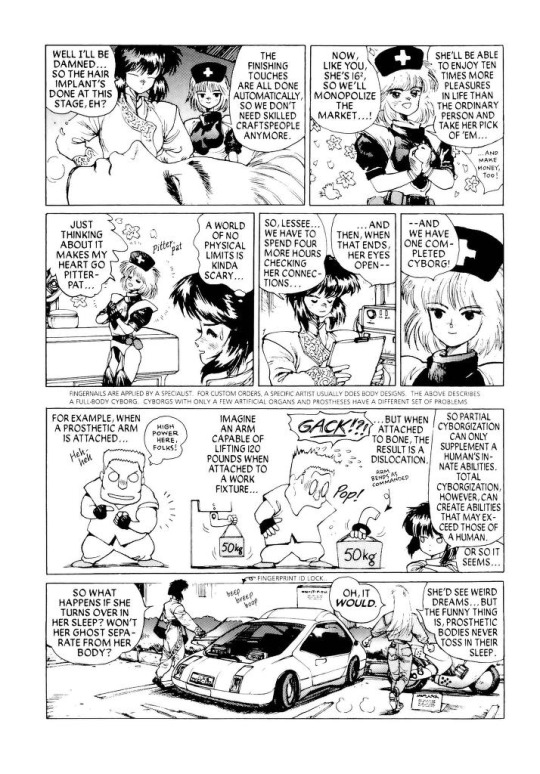
It’s interesting seeing how some of the more out-there designs of the manga, like Chief Aramaki, are transformed into the realist style of Hiroyuki Okiura. It’s Okiura, so it works great of course.
I don’t know if there are manga examples of such detail about cyborg bodies that predate Shirow.
Anyway, that’s just one of the two punches dropped in 1995. The other is Neon Genesis Evangelion. To the pedants: sure, the Evas are not actually robots, but they’re giant cyborgs that play the role of ‘robot’ in the story and they look like robots so I’m counting them.
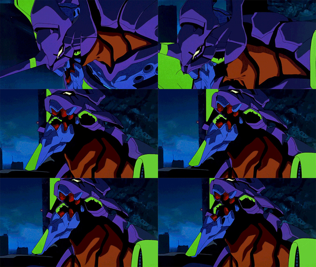
Anyway, the thing about the Evas is they are incredibly lithe. They run, rip and tear and swing heavy objects around in a way that’s both weighty and distinctly biological. Their bodies are extremely flexible compared to prior mechs (look at how much the spines bend in that Iso cut from EoE!), but not without hard, rigid components such as the shoulder towers. Their jaws are bestial but feature mechanical-like components like interlocking hexagonal teeth and jet-like vents. They are in short a fantastic design that blends biological and mechanical features.
The impact of Eva on just about everything can’t be overstated, but as far as robot design, well. There certainly were works that leaned on the precedent set by Eva, as for example RahXephon, which also treats robots as something spiritual, prone to popping into a blob of weird little bubbles just like in Eva.
There’s a great deal missing from this account. I am very focused on anime because I’ve watched a lot more anime than I’ve read manga or played games from this period. So I’m sure there’s major foundational works I’m missing here!
the 2000s
When did the West start to catch up? eh that’s subjective - David Cronenberg was way ahead of the game! - but specifically in the sense of robots with mechanical muscles, I think the major points in the timeline go a bit like this.
In 1999, there’s the Matrix, which leans heavily on anime. This features a similar ‘robot takeover’ premise to Terminator, but here it’s biomimetic robots modelled after squids, with clouds of constantly moving tentacles that sweep behind them. After making a cool half a billion dollars, the Wachowskis decided to pay all their favourite anime directors to make short films. I’m not going to comment on every part of the Animatrix, since most of it isn’t really relevant, but I will point to this horrifying cut by Takeshi Honda in The Second Renaissance in which a robot woman has her clothes torn and then skin bashed off by a mob. The framing, motion, her expression of abject terror, and the ‘reveal’ of her ‘true’ nature, all viscerally call to mind a trans bashing.
On the manga side, a big one to mention is Gantz, a gory nihilistic seinen manga which ran from 2000-2013. The characters in Gantz fight in special latex-like suits which take on the appearance of muscles while engaging superstrength, but can also sustain damage that causes them to drip fluids from ports located at the neck and become fatal to their wearer. Gantz was adapted to anime by Ichirō Itano in 2004, but I haven’t seen it so I can’t comment on any notable animation.
Cyborgs are a favourite subject of games, but in the 2000s, games are really pushing art direction and biopunk stuff is in. Half Life 2 (2004) has its spider-crab like Striders and dropships and so on. Oddworld: Abe’s Oddysee (1997) bases its whole concept around the sheer variety of weird creatures that would inhabit its dystopian factory. And I gotta give a shoutout to Septerra Core (1999) - in case one other person has played that lmao
At some point after 2005, Boston Dynamics became a viral sensation thanks to their robot BigDog. BigDog is just welded steel and hydraulics, but its lifelike hopping movement style definitely brought to mind the idea that the future of robots is going to be in biomimesis.
So, 2007, here comes Crysis to melt your PC! This is an FPS with the not-uncommon premise of being a supersoldier fighting (country America hates) and also aliens, but its gimmick was that you have a special exosuit that wraps around your body with artificial muscles, making you much stronger and manlier or whatever.
youtube
This is indicated by a visualisation that could be right out of a toothpaste ad, where tiny little balls drop into the character’s pores and somehow go straight into the bloodstream which is of course a void full of flying red blood cells. And so on. It sold the game, though! The ad there focuses almost entirely on the suit and not the character wearing it, who is basically an irrelevant soldier man. What it entailed in gameplay terms is that you have a mode switcher so you can have strength or armour or invisibility or whatever. But it’s cool military superscience, you see!
Anyway. Not like my preferred flavour of cyborg is any less stupid I guess x3
In the same year, Bayformers started. These films’ robots are honestly just visual noise, there’s so many moving metal shards going every which way that it’s next to impossible to discern any sort of underlying mechanical principle. A similar ‘overwhelming business’ visual effect would be applied the next year in Iron Man, kicking off the MCU. So mechanical muscles definitely weren’t the only expression of ‘hyper-advanced robot’ in Western visual media in the late 2000s.
I’m going to end my story with two more games: Horizon Zero Dawn and NieR Automata.
Horizon features a world inhabited by a large variety of robot animals, using the peak of AAA rendering techniques. The robots are designed to be biomimetic after both modern animals and prehistoric ones, and feature a combination of hard surfaces and softer biological muscles. For example, a robot horse:
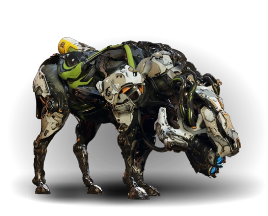
The discipline of making designs like these now has a name: it’s called ‘hard surface modelling’ and it involves boolean operations and bevels and other techniques designed to create a balance of hard edges on a surface against the smoother parts. The design language of Horizon says that the hard plates are white, the soft parts are very dark and may be patterned like a cloth texture, and there can be small colour accents here and there.
I think you can definitely see the influence of Boston Dynamics’s robots (and recent military tech in general) in these designs, iterated on through a decade and a half of increasingly intra-referential concept art. They are visually very busy designs, but there are a couple of recognisable features that draw attention by being inorganic, such as the cylindrical fuel tank at the back. Vitally, the silhouette is very readable.
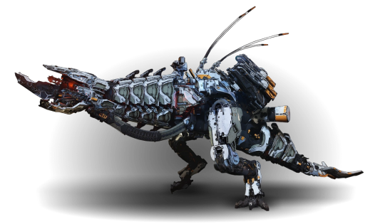
This robot T. rex for comparison serves as a world boss monster, and you can see it’s got a bunch of military looking attachments that look like radars and missile launchers and so on. As real tech evolved, so too did our idea of what a scary robot ought to look like.
So, that’s where this kind of design pattern has gone in mainstream games.
Now to finish, a brief comment on NieR Automata. Its designs draw hard on those of Ghost in the Shell. Visually it draws a strong contrast between the Machine Lifeforms, who have inorganic shapes (spheres and cylinders) and very visible and plausible mechanical joints, and the doll-like androids, who might as well be human (although A2 provides some contrast in an android who is damaged enough for the underlying materials to show through). The mechanical nature of the androids is communicated by the acrobatic way they move and the interface elements, and dead androids you find in the field - and later when they start losing arms and stuff, it’s a whole thing. But just like humans in Yoko Taro Games, they’re capable of dying in a puddle of blood.
(I guess if you take one thing from this post it’s that if you’re a robot, don’t expect to keep your arms.)
Robot muscles gives you a chance to give both the ‘anatomy porn’ of drawing something very precisely right, with the added bonus of giving you a reason to draw the muscles écorché, and the chance to make it weird and defamiliarised by splitting it with mechanical elements. In short... they look cool!
In this whole post I’ve basically not touched at all on illustration. I can point to a variety of illustrations of robot girls, but in terms of periodising them, I just don’t think I know enough. Though it’s safe to say that cyborg bodies in various states of construction or disrepair are now a mainstream of concept art - and that Ghost in the Shell is usually cited as an influence. I don’t know if robot muscles ever truly became the mainstream way to depict a robot, but it does feel like they’re increasingly common.
One artist I will briefly mention (besides sukabu), mostly bc I think they’re neat, is Haruyo Megurimu, who draws these very intricate designs of ‘necrotech’ which is sort of very biological robots extending out of human bodies - limbs extended on long spindly insectoid strands, jaws splitting open, that kinda thing. Can’t say who influenced them or anything but it’s a compelling extension of the idea into a particular corner of aesthetic space.
And that’s all I’ve got I think. There’s definitely big gaps like. More recent sci-movies. Western comics. Nevertheless, that’s an arc.
If you’ve read this far: thank you for indulging my autism.
800 notes
·
View notes
Text
Lessons in Japanese Game Design #3
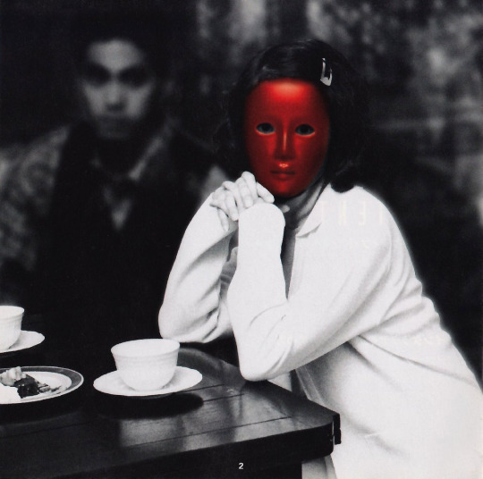
From Killer7 to Deadly Premonition, Japanese game creators have intrepidly explored the theme of mental illness in a variety of genres, often in highly stylized form. The title I wish to approach today is a lesser known reference that approached this subject matter with unusual tact and clarity - a memory, if you will, which the collective conscious has long repressed.
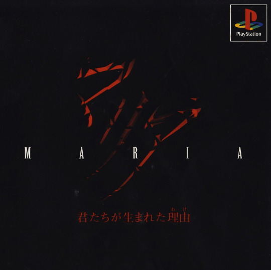
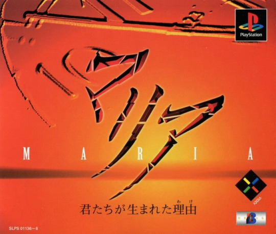
Maria Kimi Tachi Ga Umareta Wake (The Reason You Were Born) is a late 1997 adventure game firmly rooted in the visual novel template that earned Chunsoft great repute. It was Break studio's debut, produced over a year and half for both the PlayStation and Saturn systems. It was published by Axela, a company born out of the internal management conflicts and accumulated debt at ASCII, leading to some of its executives teaming up in 1996 to establish a new project centred around software and magazine publishing. The story of this company's origins, alone, would merit a separate post.
Foreseeably, its release was followed by moderate controversy, such that worked mostly in its favour. One of the most polemical moments is found in the introduction scene, with its tasteful yet unvarnished depiction of Maria's suicide attempt, followed by her hospital admission. The imagery and that which it depicts remains as painful to watch today as it did decades ago.
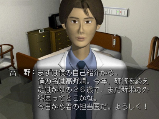
While Maria is the central character, her tragedy and arc merge with that of the actual protagonist, Jun Takano, a fledgeling surgeon who, in the quality of certified psychiatrist, is assigned to provide therapy to the French-Japanese patient the morning after her admittance.
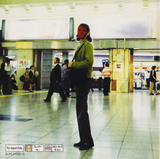
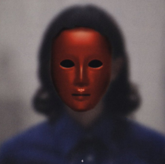
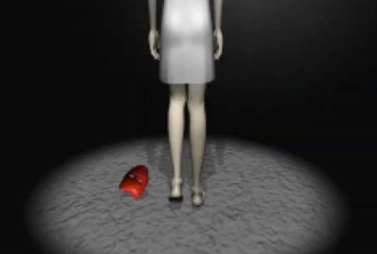
Maria's mental illness component comes to light as the story and therapy sessions progress. The key art consists of photos of women using coloured masks to visually represent the dimensions of her multiple personality disorder.
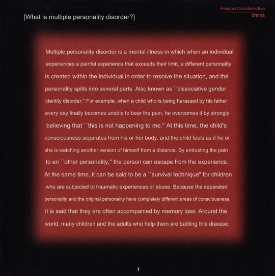
(Note: the text above is machine translated from the original Japanese game manual.)
Break was denounced for its bid to integrate so serious a derangement as a theme in a juvenile entertainment piece. Their reaction was to highlight the research done to ensure a careful treatment of the subject and sensitization of players via a bespoke message in the manual. In retrospect, the relative popularity of this game at the time was greatly owned to this fleeting controversy, and is believed to have been a crucial factor in the obtention of budget for Maria's far less spirited sequel.
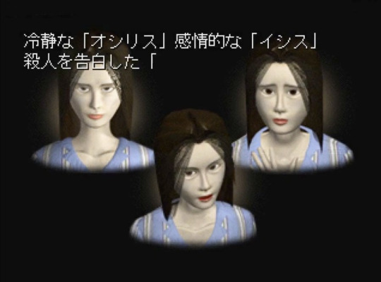
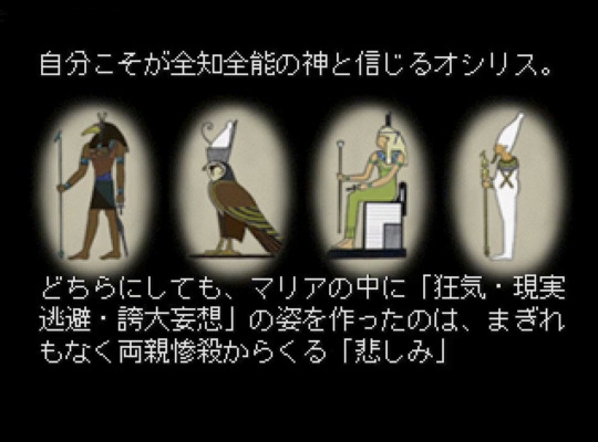
As a work of pure fiction, scenario writer Kirie Fukuda was at liberty to carry the already divisive premise into even more exotic territory by establishing a mysterious yet playful correspondence between Maria's distinct personas and Egyptian deities.
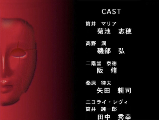
The game's structure is modelled after hirudorama, a Japanese word interchangeably used to describe daytime TV fiction or soap operas; each of its nine chapters lasting nearly thirty minutes, equipped with a plot twist, cliff-hanger ending, and followed by rolling credits.
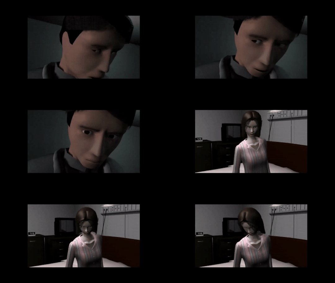
Perhaps the single most outstanding aspect about this production results from a tireless effort to surpass the standard of authenticity in what pertains facial expressions; particularly those of the multifaceted Maria, often with stilted yet all the more fascinating results.
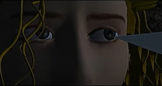
In this and other regards, the influence of D no Shokutaku and its character, Laura, is clear and unmistakable. Maria's director and studio head at Break, Akira Okada, was an ex-Warp employee who worked as sales director precisely at the time when Eno's game was being developed.
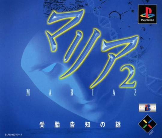

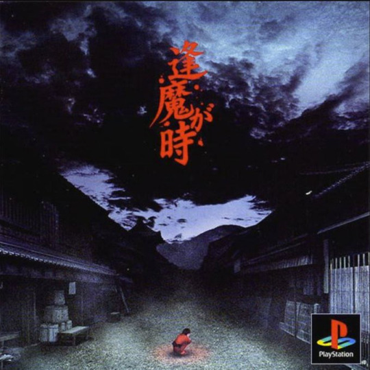
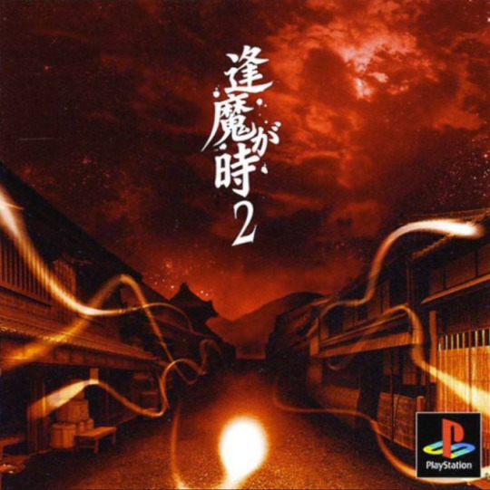
Following a modest success, Break released Maria 2: Jutaikokuchi no Nazo in 99, a not-so-direct sequel which did not command the same attention as the original. The studio created other noteworthy visual novels: Ouma ga Toki and its sequel, as well as the most unusual Saishuu Densha, a paranormal-themed romantic story involving two strangers who meet in a train.
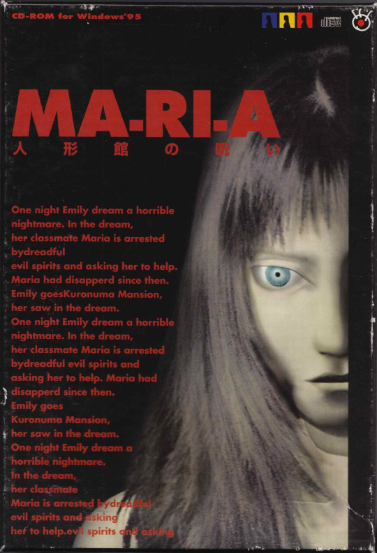
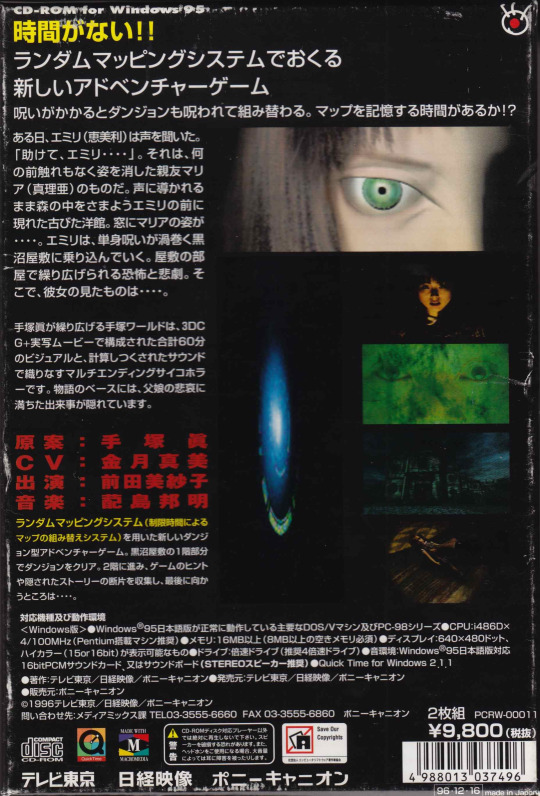
Before closing, it would pay to emphasize that this is an entirely different adventure game from the similarly forgotten MA-RI-A Ningōkan no Noroi, a 1996 3D CG horror adventure designed by Osamu Tezuka's son, Makoto; and scored by Kuniaki Haishima, of Kowloon's Gate and Siren 2 fame.
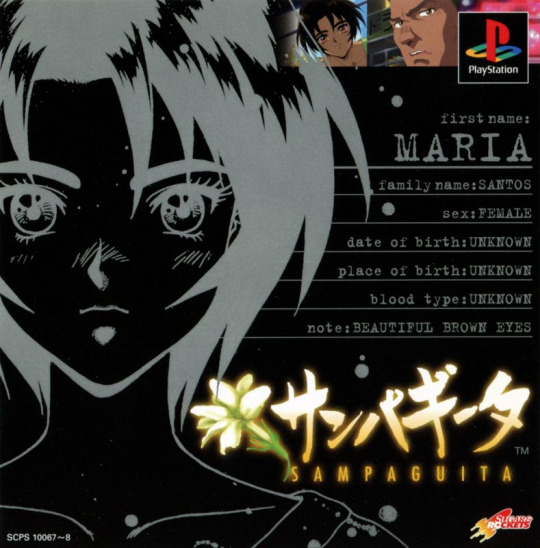
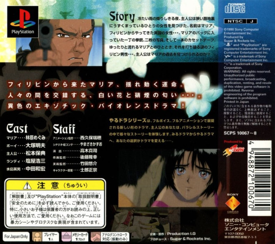
Nor is it related in any way with the so-called "Maria" episode from the Yarudora visual novel game series, Sampaguita, released in 1997 for the PlayStation by Sugar & Rockets and Production I.G.
#Maria Kimi Tachi Ga Umareta Wake#obscure japanese games#japanese game design#mental illness#suicide#axela#break#playstation#saturn
70 notes
·
View notes
Text
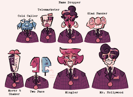
sellbot cog redesigns!!!! :D thought process + extra design deets under the cut! (waning: its very long LOL)

cold caller: loosely based off of their tto trading card! rotary phone because uhhh. duh they call people, big pointy nose resembles icicle, elongated eyes / eye scopes? idk lol resemble allan. the shape of the receiver is supposed to resemble earmuffs almost? + little teefies
telemarketer: this is probably the most. vague design LOL but they're an auto-dialing machine! specifically based off of the one from the simpsons coz it.. felt fitting idk. i definitely took some liberties but they have a speaker mouth, an indicator bulb for a nose, and the cassette portion is their eye ^_^
name dropper: this was one of the harder names to translate into a design since it doesnt have any ties to any physical items / ideas? so i ended up just building upon their base design. the glasses and bun give them an uptight secretary vibe + gave them more droopy features such as a longer nose and hoop earrings to replace the old ones
glad hander: not much to say about this one. HAND!!!!! my original redesign for this had their eyes on their palm while the fingers sat on top but. idk. it felt more fitting for their hand to be in a fist while the eyes were on the fingers. it makes their middle finger look like a nose
mover & shaker: shaker -> salt & pepper shakers. ez pz. the lids look like little hats too
two face: this was a little tricky coz i like the double face look they originally had. but double talker already has that model and i think it fits them much more than it does two face. i cycled through a few different ideas but eventually ended up with this, inspired by the mayor from the nightmare before christmas & the way his head operates :P
mingler: nothing changed. literally perfect. mingler is peak cog design. just tweaked their colors and gave them a stronger head + hair shape that stands out against the others
mr. hollywood: same with name dropper & mingler, they have a vague name thats hard to interpret BUT the og design was already so good there wasn't much to change Anyways. i was subconsciously inspired by Something while designing them but i dont know what, i guess 50s celebrities? also inspired by ernesto de la cruz from coco!
as a general rule of thumb: i stuck to the same color palette for all of these designs (except for the blue in cold caller & two face. obviously) in order to communicate the fact that they're from the same department. for the more human cogs i tried to separate different parts of the head using color & lines (forehead, cheekbones, chin, nose, etc) in order to give them a subtle robotic look but you can't really see it lol... i tried to keep their GENERAL head shapes but some of them wandered a little far
+ i actually made palettes for all of the cog departments to work on if i ever want to make more redesigns! i'll stick them here since they're on topic

#toontown#toontown cold caller#toontown telemarketer#toontown name dropper#toontown glad hander#toontown mover & shaker#toontown two face#toontown mingler#toontown mr hollywood#art#artings#ttcc#toontown corporate clash#<- not specific to ttcc but they're based on the design conventions of ttcc so#the sellbot department is my fav ever <3#its always been my fav. even when i was still playing ttr#so this was very fun for me i love these fellas
83 notes
·
View notes
Text
Han Yoojin's Black Choker
This post isn't going to be everything, but it's going to hopefully be easier to find/navigate than the handful of posts I'm seeing floating around and that I've responded to: a summary of official art with Han Yoojin wearing the black choker in S-Classes that I Raised, its maybe appearances in the text of the novel, and its maybe relationship with fanart. For the short answer, yes it appears in multiple pieces of official novel art, and maybe at least once in the novel text. But it might also be a fan design that's sort of accepted as official at least in some cases? Explanation beneath the read more.
Yoojin's black choker is most likely Grace, the protection item Myeongwoo made from Shalos. Other folks have said it's the translation item he gets from Yoohyun, and I disagree, but I'll get to that.
The novel covers and text


Yoojin is not wearing a choker on either novel cover. The first cover, on the left, has a black line for his collar, not a necklace or choker. It appears often in the manhwa. The black collar is gone in onlyraii's cover on the right (even though onlyraii had drawn Yoojin with the collar in fanart years prior to this, detailed later). The first cover seems to be from when the novel started publishing, and the second cover came out in April 2022. More on the second cover later.
The ebook release also got a cover, but it doesn't have Yoojin on it.

Text-wise the "choker" is possibly from novel chapter 109, where Grace turns into a sparkling choker at one point (which Yoojin notes is more over the top than a bracelet during his struggle to get her to turn into something less ostentatious). Some folks looked at different text in the novel here for how it and particularly Grace look, but just as a warning, there is no official English translation for the novel outside what we get in the manhwa, which is somewhat modified because it's a manhwa adaptation. There are fan translations for parts of the novel, but a lot of folks use machine translation, which can be very dubious.
In other places in the novel she's just described as turning into a necklace, not specifically a choker, though in novel chapter 176, it's described as sitting close around Yoojin's neck (which sounds like a choker). Whatever jewelry she turns into is specifically described as having a blue/silver jewel from which her bird form emerges (as she has in novel chapter 156, which is the chapter one fanwiki lists it appearing in, and in which she is described as turning into a necklace, not specifically a choker). So there's very little textual support for him to be wearing a choker, though he does at least on occasion wear necklaces.
Revised ebook novel volumes
SCTIR the novel was (and still is) originally released chapter by chapter on Naver, Munpia, and Ridibooks (currently Side Story is only available on Naver, but the chapters of the main story are on all three). The main story was eventually collected into 35 volumes and partially revised or at least given additional scenes in places. Each volume contained at least two pieces of art. For volumes 1-14 this was seemingly a character portrait with their bio (e.g., age, height, likes, dislikes), and 1 piece of interior art, with the latter at least being by 비완 (the manhwa artist). Volumes 15+ switched up interior artists, for a total of I think at least 3-4 artists, and those volumes had at least 2 pieces of interior art, with volume 35 having 4. The individual chapters didn't have this, it was added for the ebook release.
The volumes themselves are available on Ridibooks and Naver (they might be somewhere on Munpia but I couldn't find them).
The first volume of the ebook released in May 2020 (the Ridibooks release lists an earlier date for some reason than the one on Naver, which is November 2020). By this point, fans had already been drawing Yoojin wearing a black choker with a gem (usually blue or silver) on it since at least 2019: 1, 2, 3, 4, 5, 6. <This fanart is by onlyraii, the artist who went on to make the new cover for the novel published in April 2022. So at least some of the official artists were involved in the community and knew of popular fan designs (though notably, Yoojin is not wearing the choker on onlyraii's official book cover).
Just want to emphasize: there's a difference between an author drawing/commissioning art and ensuring that it complies with their specifications in the text/their vision and their publisher commissioning art that might not even get approval/comment from the author. I don't know how much geunseo had a say in any of the art for the novel. If there's some interview or something somewhere where they state clearly how many/which pieces of art they approve and the level of control they have over what the art looks like, I haven't seen it. It's not unusual for third party artists to have more freedom to do stuff and draw fan designs/things that aren't accurate in "official" art and for it to get approved (e.g., some of the interior art for the official English translation of "Mo Dao Zu Shi", which actually goes directly against what's on the page; it's kind of unclear how much control MXTX had over this stuff, and heavily implied she had little to none; it's possible that's the same case with geunseo). So whether or not you view this stuff as official is up to you. But it is in the official ebooks, though designs are not really consistent, which implies there was a lack of strong direction in what artists were/weren't allowed to do.
비완 potentially drew Yoojin wearing the choker in volume 13, for the Chuseok art (September 2020, I'm going by the Ridibooks release dates). It's very hard to tell whether that's his shirt collar or a choker. But judging by the color of what's beneath it before robe starts and the skin above the choker, it looks like it's again the collar of a white t-shirt, not a choker.
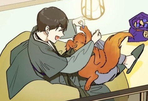
The next time it was potentially drawn was by a different artist in volume 18 (July 2021). It's hard to tell because he's holding a bouquet that mostly covers his neck, but on the right side of his neck seems to be part of a black choker.
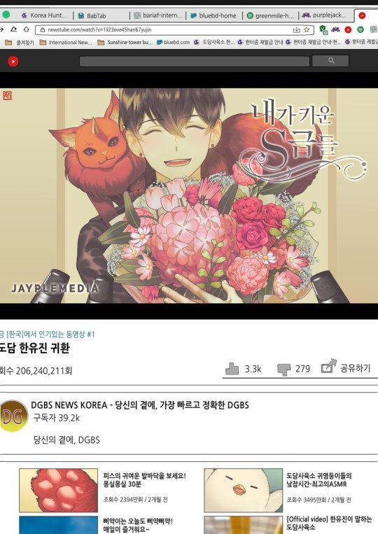
You can kind of see something that looks like a black choker near Peace's front left paw.
The clearest earliest example of him wearing it in official art is in volume 19 (April 2022), where he's clearly visible wearing a black choker with a blue gem on it. I don't see it mentioned as something he's wearing in the text of that chapter, at least from a brief browse.
He's also definitely wearing it in two pieces (one each) of art for volumes 20-21 (April 2022). Here's the one from volume 21:
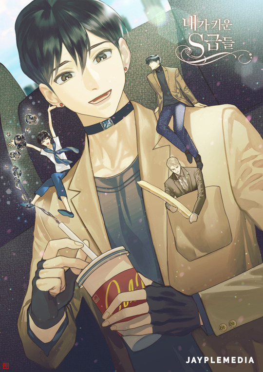
In volumes 22 (April 2022) and 25 (August 2022), Yoojin seems to be wearing a cat collar with a similar design in two other pieces of art (one each volume). Not exactly a choker, but he's at least wearing something on his neck. Here's the one from volume 22:
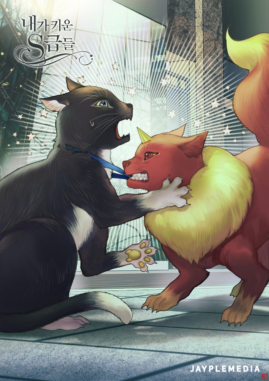
The other art of him with the cat collar in volume 25 is a lot more similar to the other interior art choker designs, with a black ribbon or whatever it is and a blue gem in the center, rather than a blue ribbon.
After that, they switch artists at least once if not twice and none of them drew Yoojin with the choker - or any necklace at all - that I can see. He didn't lose Grace for good in the novel, though he doesn't wear her all the time, but no other artist for the interiors drew him wearing the choker for the last 10 volumes of the revised ebook novel release, if not the last 14. Whether that's a narrative choice or the inclusion of the choker at all is random/whatever the current artist wants/what was geunseo/the publisher's mood, who knows?
The manhwa adaptation
This is how manhwa episode 103 depicts Yoojin trying to get Grace to turn into something wearable after first receiving her (art by 비완), when the alleged "choker" description appears in the novel text:
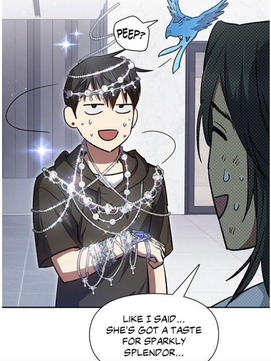
I'm not seeing a black choker anywhere. The black line near his neck is the collar of his shirt.
As of posting on June 21st, 2024, at least on the free to read Webtoons page and Tappytoon English chapters of the manhwa, there is no art of Yoojin wearing the choker, either as Grace or the translation item he got from Yoohyun. The manhwa depicts the translation item differently, and Grace has only appeared as fancy necklaces or a bracelet. If 비완 drew the choker on Yoojin in the Chuseok ebook novel art for 2020, although the manhwa hasn't gotten there yet, they have drawn him wearing the choker before in official artwork, and yet have not drawn him wearing it since in the manhwa, for whatever reason. We'll have to see how the scene is drawn when the manhwa gets to Chuseok.
In the manhwa, Grace is shown turning into a simple bracelet after negotiation in episode 103:
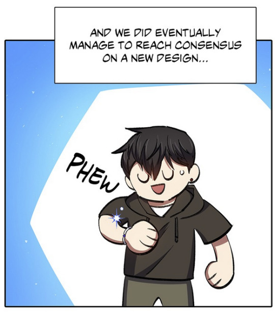
You'll note he often wears shirts with black collars on them.
This is the translation item that Yoohyun gives Yoojin as it appears in manhwa episode 55:
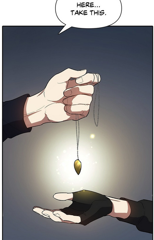
Which is roughly how it's described in novel chapter 68, absent any specific color description for the metal ornament. Someone else said this is actually what people are drawing when they draw the choker because the design is vague enough to match a choker, which is strange to me, because from what I recall of the novel, Yoojin has this in his pocket/inventory most of the time. He's not wearing it constantly (he also already had it when he got Grace). It's kind of implied if not stated he doesn't like wearing it much and only puts it on out of necessity and takes it off at the first opportunity. He does, however, typically wear Grace (though he does, for various reasons, take her off a decent amount).
The April Fool's 2022 art by ? and the 2022 official novel cover by onlyraii
Someone else pointed out the "sketch" for the official novel art by onlyraii (final art below):
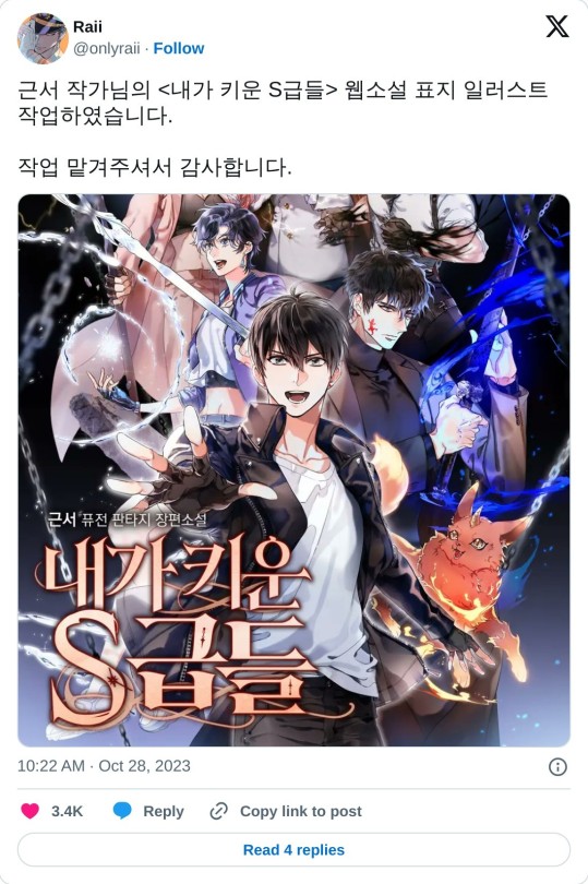
And here it is when it was released seemingly originally on 31 March 2022/1 April 2022 (KST).
In the other post I'm seeing about the "sketch" for this, the unfinished "sketch" listed was actually the April Fool's Day joke for 2022 that seems to parody onlyraii's cover, but with all the guys being bald:
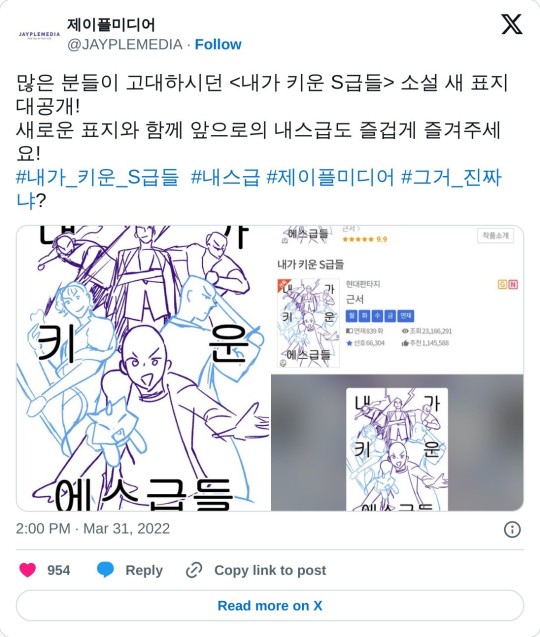
(A lot of manhwa and I think Korean webnovels do April Fool's Day joke posts with fake "new" art done by official artists; 2022's SCTIR manhwa April's Fool's Day joke was magical girl themed, and this was 2024's, which had most of the cast become dinosaurs).
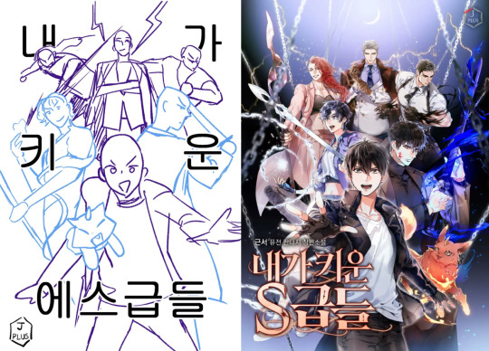
You can also see that while there are similarities, this is very much not what they ended up with, and again, it's dubious this was an actual sketch for the cover: it's not on onlyraii's twitter, though that doesn't mean it wasn't posted elsewhere, and seems more in the style of 비완's art, so it's likely this is the manhwa team doing a jokey post (the manhwa started in November 2021, and 비완 was still doing art for the novel ebook revision at least around 2020, so they'd have been around, and serikachan, the lead storyboard artist, does post about recent novel chapters on twitter, so at least some of them pay attention to the novel). I think it's intentional that all the men are bald as well, to note it's a joke; a lot of the Korean commenters are commenting on their baldness.
A core issue is the similarity and that they were released 11 hours apart (the gag went up around 11 hours before the official cover was released; onlyraii commented on their work for the cover around 40 minutes after the official cover was released). The "sketch" seems to show maybe a planned choker, but if it was an actual sketch in whole or part, it was clearly nixed for the final design. Who made that decision is anyone's guess.
"Sketch" or not, again, onlyraii has drawn Yoojin with a choker many times in their fanart dating back to 2019: 1, 2, 3, 4, 5, 6. Before the 2022 piece. If onlyraii and/or 비완 wanted to incorporate a fan design into the official art in some way, again, they wouldn't be the first fanartist/community member to do so on official artwork.
In conclusion:
At this point I don't fully know if the design/his regularly wearing a choker comes from the novel or fanon that was later incorporated by fans into canon when they worked on the official art, or if geunseo suggested it or at least okay'd its inclusion on official art, but these things at least are true:
Grace is apparently mentioned as being a choker at least once in the novel text, but it's described as being rather fancy
the fan design/idea of the black choker with a small gem in the middle predates at least the official release of the ebook art with him wearing a choker (if they were released earlier than that on an artist social media post or portfolio or publisher post somewhere, in some form, encouraging fans to use it in fanart prior to the book releases, I have no idea), so at least the stuff pre-2020 was not inspired by the ebook interior art, and potentially nothing before 2022 was inspired by interior art because the clearest art with him wearing it wasn't out until then; it was likely inspired by the potential single/two times Grace is described as a choker in the text, or just generally popular fanon about him wearing a choker (wouldn't be surprising, there's a lot of emphasis on Hyunje grabbing Yoojin's neck all the time and how Yoojin's neck feels when he's not grabbing it)
Yoojin wears a black choker/collar with a gem in the middle of it in at least 3 if not 6 pieces of official ebook interior art, and a blue ribbon collar in at least one piece of official ebook art
after the choker/collar shows up on those 3-7 pieces of interior art, it stopped appearing at all (his neck is visibly bare of any necklace of any kind in multiple art pieces), and he doesn't wear anything on his neck in the artwork for at least 10 volumes; furthermore, despite the manhwa artist potentially drawing him wearing the choker in one of those pieces, they have not drawn him wearing it in the manhwa in the years since that ebook art was released, even after he had both Grace and the translation necklace item, both of which have been suggestions for what the choker is
So does he wear a choker? In the novel text and novel art, maybe, at least sometimes, but not currently in the manhwa. Does it look like it does in fanart? Maybe: it's not really described in the text and the few novel art pieces we have don't quite match each other. The publisher and/or possibly geunseo okay'd at least some official art with it on (though I don't know how much control geunseo has in that decision, and the author of the original work okaying art is different than the publisher okaying art, particularly depending on what degree of control geunseo had over any changes/what could be drawn, or if they were just allowed to say yes or no and that's it).
I'll try to keep this updated if new information/art comes out, so if you're seeing this as a reblog, check the source post to see if there's an update.
#han yoojin#sctir#my s class hunters#s classes that i raised#han yoojin's choker#han yoojin choker#내가 키운 s급들#this is probably annoying to people but I was curious too and wanted to know if it was official#it's a long novel it's easy to forget details#it's not a criticism I just like having information clear#also I feel bad responding with all this to all those posts#sorry the opening is text heavy I tried to go semi chronologically#and while a past version of this started with the manhwa I felt it made more sense to start with the novel#fallfthoughts#now with more official art cause the publisher shared at least some of it on twitter
64 notes
·
View notes
Text
The Great Crusade Café | Concept Design
You can just watch the video which has a detailed description as well as the tour. I used Chinese dubbing with English subtitles, so make sure you have the subtitles turned on while watching.
CAFÉ FOR ASTARTES! | Fan Idle Game: The Great Crusade Café Concept Design
youtube
The Great Crusade Café
Productivity Tool& Idle Game Fanart Project (Concept Design Only)
Concept design: Gameplay
[Intro & Setting]
When a user first opens the web page, the name The Great Crusade Café will appear. After clicking, you can start by naming the café owner, which is the role you will play.
Then, as the owner, you will be asked to choose the tasks you want to undertake in reality for today. The default name here is John.
The purpose of this web page is to provide users with a leisurely and comfortable café white noise. It allows you to enjoy such an atmosphere whether you are reading or translating WH novels. Additionally, café-themed white noise has been proven by studies to increase efficiency for people. Therefore, you can also use it while working or painting miniature models.
After setting a task, you can officially enter the management of the café within the game. Don't worry, you can change the current task being undertaken at any time, just below the time displayed in the top right corner. And if you feel that the display of time might make you anxious, you can also turn it off in the settings.
[Coffee System]

After today's business starts, you can choose to make a cup of coffee for yourself first. By clicking on the coffee cup under the coffee machine, you can make a cup of your favorite drink for yourself.

Recaff is precisely the coffee beverage commonly found in the "Siege of Terra" series of novels. And various other drinks also have their unique origins.
After deciding which type of coffee to make, we can choose options like the milk to use based on our personal preference.

This will result in a steaming hot cup of coffee.

After each cup of coffee is made, hovering the mouse over the coffee cup icon will start a 2-hour timer. However, after one hour, the steam on the coffee cup will disappear. And when the timer finally reaches zero, you will know that two hours have passed. Setting a 2-hour timer aligns with the time unit of the Pomodoro Technique. If you want to use the web page as an efficiency tool, you can make good use of this feature.
[Character Visiting]
After making a cup of coffee for yourself, naturally, various characters will be attracted to the café and its aroma. They usually greet you directly and place their orders. But sometimes, you will need to guess their preferences based on the characters' personalities. If you have read many related novels, you will have a unique advantage in this aspect.
For example, people from Caliban would drink black tea. Commanders stationed on Terra, on the other hand, prefer bitter coffee, among other things. Additionally, some special drink recipes need to be purchased or unlocked through gifts from characters.


After fulfilling the characters' needs, their Trust will increase.
Subsequently, they often spend some time in the café, and during this period, you can engage in conversation with them. As the Trust increases, the topics they bring up will also vary.
For instance, Loken might talk to you about Mr. Sindermann's lectures, while Argel Tal could bring up his friend Khârn. Ahriman might mention that the café was recommended to him by his human friend Gaumon.
This often unlocks more characters. After all, the café's reputation is always spread by word of mouth among friends.
And some rarer characters, I mean, like a Primarch, might require the trust of everyone in the legion.

After increasing trust levels, besides more conversations and characters, there will also be an important matter.

Once trust levels reach their peak, characters will give you a variety of gifts, including decorative items. For example, members of the Thousand Sons always like to give you various books, regardless of whether you can understand them or not.
But you can use some of them as decorations inside the café.
This can sometimes be key to unlocking rare characters. Of course, you can also purchase various decorations and drink recipes at any time from the itinerant merchant in the upper left corner of the screen.
And if you complete the current task setting and change the task, most of the characters present will express encouragement and approval towards you.
[Bulletin Board & Character Book]
Each character stays for a different amount of time. Many of them are very busy with numerous affairs. However, you can find clues of their visits on the bulletin board.
Almost every customer who has visited the café leaves something behind on this bulletin board. For example, stickers, messages, or even advertisements.
Hovering the mouse over specific items will display detailed explanations and descriptions.
You can also find information about the visitors in the customer notes, where all guest information is recorded.
However, characters that have not yet been unlocked will be displayed as "unsigned".
[Weather System]
Additionally, some sufficiently important characters, if they are very satisfied with your café, they will grant you access rights.
This privilege allows you to open cafés in different areas, such as on battleships, Terra, the Hive cities, and various other places.


As time passes, the ambient light in the café will also change.

This also means that some special characters will only be unlocked at specific times. If you go from noon to night, you can see the nighttime view of the Hive city outside the window. As time progresses from afternoon to night, you can see the nighttime view of the Hive city from the window. And when midnight arrives, the starry sea above the deck will leave you in awe. In the central area of Terra, mornings always face the unchanging snowy mountains.
[Vinyl Records Player]
While running the café, you can always spin your vinyl records. This allows you to change the background music and even import your own favorite tracks. If you don't like the ambient chatter or the sounds of the coffee machine and cups, you can also turn them off here.

The above is a brief instruction for using "The Great Crusade Café".
The project is a purely conceptual design. As Games Workshop does not allow fanart creators to engage in programming or development. It is currently only presented in this form to everyone. It's worth mentioning that this design was inspired by a series of excellent projects, including VA-11 Hall-A, Coffee Talk, I Miss My Cafe, and Neko Atsume, etc. That's also why I chose to use a pixel art style in the project.
At the same time, I'd like to thank the pixel art artists who collaborated with me. Without you, this demo video wouldn't have been possible.
Finally, thank you for watching. If you enjoy research and artistic creations related to the Warhammer theme, feel free to follow my Youtube channel and X.
May your day always start with a great cup of coffee : )
#warhammer 30k#horus heresy#warhammer#warhammer 40k#warhammer art#game design#idle games#30k#pixel art#fan game#warhammer community#Youtube
75 notes
·
View notes
Text
Sad she only got one album out before everything went to shit, but what's a girl to do?
This is a fake album cover for my dnd character, Helvia, and her fake band THREAT DISPLAY!!! Context for this piece and Helvia as a whole under the cut because once I start I can't stop talking about her <3
SO the campaign hasn't started yet, but Helvia is my character for a science fiction campaign. She's robot!!! Well I guess that's obvious now. BUT the basic gist: Helvia was manufactured as an industry-controlled and maintained electronic "punk" singer. When the project ended up making no money, everything related to it (including her), was abandoned. Three years later, she wakes up out of stasis with no clue what happened, an insane debt, and a failing memory. You will look at her !! Her full name is Helvia Cardinalis. This is just a genus of mantis it doesn't have any special meaning I just like bugs <3
-she has generated "background" memories of an entire life, but there's no telling which of those are real. I don't actually know which of them are real. My dm does!!! We'll be finding out together!!
-sometimes she uh. Doesn't know basic information. Whenever something she should reasonably know gets brought up I get to roll a flat d20 to do a "memory check", the checks getting harder the older the memory is. When she fails, she gets to lie or change the topic etc because she would rather DIE than admit anything is wrong with her.
-the album cover is kind of an intentionally really poor introduction of her character. She's more silly than anything? The entire project was meticulously micromanaged by the company that made her. The "novelty" and aesthetic of having a construct as their lead took forefront in its advertisement. There were two other members of THREAT DISPLAY!!! But she has no memory of them because they were considered comparatively SO unimportant to advertising and to her that they have gone... forgotten.
-Helvia herself is. A real character alright!!! Based entirely in what a corporation thinks a "cool alternative girl" is, she's impulsive, selfish, and just. So fucking stupid. She's firmly a "might makes right" type of person who was designed to appear counterculture but still ultimately serve and be fine with the status quo as long as it benefits her. She's going to do anything that grants her immediate satisfaction, and is obsessed with maintaining her image as "cool and above it all", even as her body is actively breaking down. She easily falls for flattery.
Notes about the piece: yeah I downloaded and used splatoon fonts for the nonsense text. I think I typed gay sex like twice I'll be real none of it translates to relevant information. I think there's something in there about how I hope it came across as an adequate parody of machine girl album covers (my main inspiration). The composition of the piece itself is meant to feel kind of skeevy and exploitative because well. It is!! It's drawing the fine line between 'wow this is so cool and counterculture of us wow!!!' and fetishistic? Etc etc missing the chestpiece as an analog for putting a woman topless on the cover. There's actually a separate sketch I did as a canonical "mock up" for the design that originally included the other members, treating them like props because they're so unimportant, before they were scrapped from the final design because they were That Unimportant.
Notes on Helvia's design: I pulled from a few sources for this!! Notably I looked at so many pictures of that band Tramp Stamps. Remember Tramp Stamps? I don't. They're like the direct analog I think to her. I also pulled from vocaloid designs!! Impractical, cool, kind of "anime" feel. This comes across most in her hair I think which is just so beautifully impractical. The yellow gloves are so stupid important to me actually they're kind of ugly but it's the only way her name ended up being important: helvia cardinalis (mantis) is Bright Yellow and raises its 'arms' in its threat display, which I wanted to pull from for potential posing of her!! So. Bright stupid yellow gloves <3 they're an easy way to tell her character apart too & mean I don't have to worry about drawing all the nonsense on her arms. The translucent skirt also comes from the mantis, sort of pulled from its wings!! Original concepts for her included synthetic skin rotting away but her design was already more complicated than I normally go for and we ultimately ended up realizing her being openly and visibly a construct was important for her image in her music career so it worked out well! She is at least missing an eyeball :] doesn't affect vision since the mechanics are still in place but I guess she just gets that fun sans glow socket <3 her outfit is meant to look simultaneously cool, vaguely expensive, but also super super cheap?? Overall I'm happy with the fact that she looks both cool and really stupidly impractical in that classic 2000s deviantart oc way <3 it's important to me! Ultimately:
#Palart#robot character#robot art#robot oc#my art#character art#art#dnd character#dnd art#dnd oc#oc: helvia#cw suggestive#? pretty. idk I've stared at this too long to know anymore#described by me#synth.solo#I think I've talked about her before a little bit but <3 she's just all the tropes I like jammed into one character I refuse to apologize#accidentally started the draft on this blog instead of my art blog so oops guess it's here now!!
72 notes
·
View notes
Text
What do we know about Joris le Sans-Pouvoir (Joris the Powerless)?
Aka, addressing the "cancelled Nintendo DS game"-shaped elephant in the room.

While this blog has gone deep into the show and character dissections, I think it would be remiss to proceed without addressing the elephant in the room — the game, the myth, the legend, the 2007-2009ish cancelled game Joris le Sans-Pouvoir.
There isn't a lot that is known about it, and all the data in this post comes from two developers.
The only videos of it we have available are uhhh......,

...Please say "Thanks Ronik!" for this video in particular.
I spent hours trying to convert these two SWF animation video files, — which demonstrate how the game was supposed to look, — to something actually viewable. There were many issues, with at least seven different programs.
I suffered for crepinjurgenology studies, but I did it.
Instead of recounting the story in my own words and omitting anything on accident, I will simply present to you, what the portfolios of two different developers say (these two pages are the source of all the images, gifs, and gameplay):
Joris Le sans-Pouvoir is the main character from a feature film Ankama due in 2013. It’s a new character IP situated in the DOFUS universe. I had the chance to work on a platform game prototype that was all about delving into of the character’s backstory. We wrote a lot of background and had a lot of fun designing and developping a cute and quirky platformer with a hint of metroidvania elements and a dash of Grow gameplay elements in-between levels. It also was a great opportunity to work with Jono Takeshi-san of Radiata Stories fame who worked with me on the art direction. (SOURCE)
Joris was the first Nintendo DS project developed at Ankama (in partnership with Magic Pockets). I began working on the project as narrative game designer, then took on the role of Lead Designer and Project Manager. Game design on this project involved boss fight, level design, minigame design, UI… I also designed an original collecting system where collectible items were used in a minigame inspired by the “Grow” series. The developpement has been put on hold to match the release of the animated movie with the same character (scheduled in 2013). (SOURCE)
Neither the movie nor the game, survived their development, due to circumstances. (shorthand for: I have no idea what happened, man. Maybe one day I'll write a post about the history of the movie, and truly open that can of worms, but god, not right now. I don't want to spend more time on this.)
Eventually, The Wakfu film turned into three OVAs instead, and the Dofus film changed its plot a bunch of times, and became Livre 1 : Julith.
...For some reason, in some version of it, Joris had a tail. Yeah, I don't know what that's about either. Cool clothes, though!
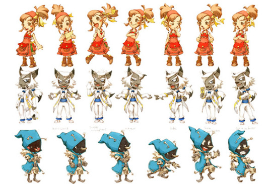
We don't know anything about its plot, and unlike cancelled projects Dofus Donjons and Welsh et Shedar (which was cancelled for years, until its recent resurrection), the lore of this game carries no relevancy in modern canon.
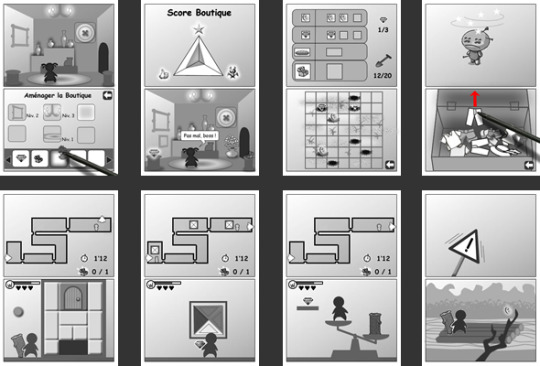
The name, Joris the Powerless, as well as the log-centric gameplay, both seem to reference the early concept that Joris had log-based powers, — and that without his "magic wand," he couldn't do much.
(Joris and his weird fucking "magic wand" were, in turn, borne out of the idea of a warrior who had a woman's voice. Which makes me chuckle.)
(The following quotes are machine-translated and may contain errors)

(SOURCE)
This is, by the way, the reason why I personally headcanon Joris to be really bad at huppermagic. So bad that he dropped out of the Huppermage Academy, and almost never uses magic in combat. It's a homage to his original idea.
(Yes, there is an actual reason why I headcanon Joris to be godawful at magic, besides just projecting my neurodivergencies onto him.)
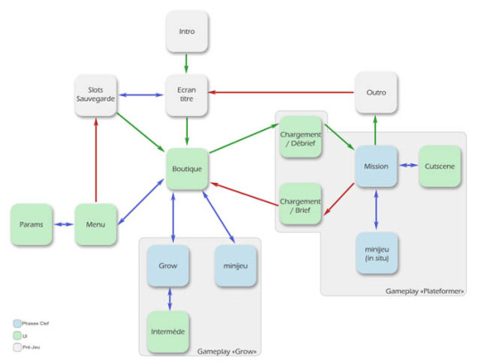

I suppose that, even at this time, Joris was meant to be a store owner:
The gameplay loop involves going from boutique, to missions, and so on, while those two pieces of concept art involve the said boutique section, and show a female character saying «Pas mal, boss !».

In my opinion, it might be this character. Proto-Simone, perhaps?
Since the store seems to be the centerpiece, and the Grow-style minigames involved collectibles, I would assume that the plot involved Joris going around and finding artifacts for the store. That would also explain the concept art gifs of him adventuring.
(Though, the adventuring would probably just be the inciting incident/a vehicle for plot development. Nintendo DS games loved using the jobs characters did for that purpose.)
This is the extent of what I can surmise about the plot.
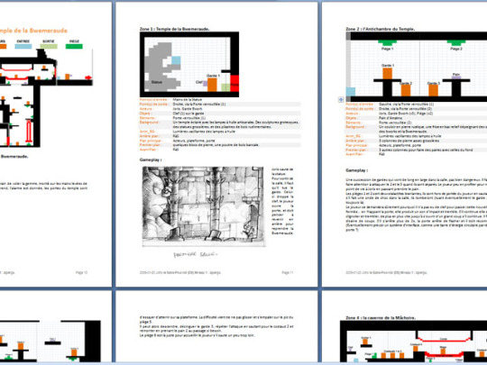
The developer portfolios also included these example documents, but the image quality is too bad for me to make sense of or upscale. I am including them here solely for some French people who are very good at reading blurry text. (If you learn anything, let me know, okay?)
Overall, my verdict is that this game's cancellation was both a blessing (Joris without Kerubim and Atcham is like tea without water and a cup. How am I meant to drink leaves? Are you stupid? Why are you giving me leaves with nothing?) and a curse (THEY CANCELLED A GAME ABOUT MY BLUE-COLORED YOINKY SPLOINKY (who has a THIN, GRABBABLE WAIST)????? FUCK!)
Hope this was a fun read!

#ro liveblogs dofus#joris jurgen#wakfu#dofus#dsgame#<this one is for my pinned organization post's sake#anyway this post has fucked me. and my wife. and i don't even have a wife. my spine hurts my eyes hurt my hands hurt.#i want to do unspeakable things to that blue little man for what he put me through during the writing of this post.#please dont ask me to write about the other nintendo ds games ankama cancelled. they don't have joris so i don't care
56 notes
·
View notes
Text
On Writing Characters That Don't Or Can't Speak English
This such a fun dynamic, honestly and more fantasy and sci-fi should implement it. You don’t even have to design a fantasy language, although writing that character’s un-written dialogue constantly as narration might get old.
I haven’t done this with any real-world languages or cultures but a tiny advisory: Take care in how you describe the cadence, tonality, and gesticulations of characters meant to represent real world cultures speaking in their languages. You can get unintentionally discriminatory very quickly, so do your research and hire sensitivity readers.
With that said!
There’s a few points I want to cover here.
1. How your characters communicate without dialogue
This also concerns characters that cannot learn the dominant language, whether they’re a fantasy character that just can’t make those sounds, or they’re deaf or mute or have another disability that makes verbal communication difficult.
You have so many options and you can have so much fun with it. You can make your own version of a sign language or a code language that only your core characters or a group they belong to can communicate in. Create your own pidgin or medium of communication, like a soundboard of different tonalities or a thought-to-speech translator like a Speak n’ Spell, or an Etch A Sketch, or have a magic hologram subtitle display before them. Or like the Q*Bert dialogue bubbles in Wreck it Wralph where the translation is never given, only the detailed response so you can fill in the blanks.
One of my favorite cartoons is Transformers Prime. It’s based off the character designs from the Bay live action movies, not the original cartoons, so the machines they transform into are modern and updated and there’s a few references to the Bay movies’ lore sprinkled about, but not a required watch for appreciating the show.
In it, Bumblebee carries over his inability to speak due to a damaged voice box. I imagine he now communicates in a series of beeps and bleeps because the cartoon didn’t want to pay the licensing fees for Movie Bee’s jukebox dialogue, but it works way better here. Why? Because, I think, and I do not suffer from any speech impediments, that it better conveys the struggles of a disability.
Bee never speaks and his dialogue is never subtitled. The audience is only clued into what he’s saying when other characters respond to him in an unambiguous way so, like Q*Bert, you can fill in the blanks. He isn’t universally understood, either, only one human and the other transformers can understand him, so when he’s with other humans in a dangerous situation, their inability to bridge the language gap becomes a very real problem (that no one ever blames Bee for).
Also, Bee is never once insulted, belittled, demeaned, or mocked for his speech impediment and he’s a badass character in his own right. He’s not “the robot with the speech impediment” he’s “the badass sportscar scout with a heart of gold, and who also has a speech impediment”. The only time it’s talked about negatively is by the main villain, who’s trying to be an asshole about it, but even then, Megatron never thinks Bee is less capable for it, he just thinks everyone is lesser than himself across the board (Megatron is also responsible for his disability ‘cause Bee was captured and his interrogation went poorly, if you needed another exhibit of the Big M’s sadism).
Bee’s damaged voice box is almost never central to his arc, either. He gets one two-parter where he loses his ability to transform and takes it super hard, since he’s already damaged and sees himself as less useful than the rest of the team without this critical ability.
Again, I don’t have this disability so I can’t comment on how respectful it actually is to those who do, but from an outsider’s perspective, I think Bee is a fantastic example of empowering disabled characters and giving them substance beyond their disability—cannot comment on how they ended his arc and resolved the impediment, or that it was resolved at all.
2. How you describe those unwritten words
Doubling down here: Do your research so you aren’t stereotypical and insensitive, please.
Still going off the assumption that you aren’t just writing this dialogue in the other language for now, like a character who only speaks in Spanish and you have the dialogue there in Spanish that I may have to translate separately, like in Spiderverse, or the Gaelic in Outlander, neither of which were subtitled for non-native speakers.
Since you don’t have the dialogue there, you are relying entirely on tone of voice, gesture, volume, and facial expressions, so dial your descriptions of those up to eleven—especially if this is a character who over-gesticulates to better get their point across.
You can also have the characters they’re closest to pick up on a few of their common or significant phrases to convey the connection and friendship they share.
In Outlander, at least the first season when they’re actually in Scotland (easily the best season), there’s entire scenes in Gaelic and all you have as an audience member is their tone of voice and gesticulations, and sometimes you just have to presume the gist of the scene because an English speaker isn’t present and they only give the gist a few scenes later. One in particular comes at the end of the season after an extremely traumatic event that happened to Character A, arguing over why he wants to end his life to Character B. One would think that this gut wrenching dialogue would be critical to understanding the scene but the two actors go above and beyond conveying the critical emotions behind what they’re saying, so the words don’t even matter. If you were deaf, you’d understand the scene as effectively as someone who doesn’t speak Gaelic.
Can’t confirm but I think they did this very much on purpose because Gaelic isn’t getting any more commonly spoken and you’re meant to feel a little alienated by it and only those who know Gaelic can get the full scene, like it's just for them. Can’t confirm the accuracy of the dictation or translation of the language, either, but the ‘alienating’ effect always leaves me utterly fascinated by the language. You cannot ignore the Gaelic to just drone through the subtitles, you have to pay attention.
3. How that character bumbles through the dominant language
This one is for non-disabled bi or multilingual characters or those who could learn the dominant language but haven’t had the time or opportunity. Depending on the character’s skill with the language, they can Spanglish their way through with awkward parsing still using their native languages grammar rules.
I can’t speak to this, I only know very clunky Spanish. I can say my efforts to speak in Spanish are always done in excitement as I get the chance to practice this language, and then the pressure to translate on the spot has me forgetting words I definitely know how. I get by, even if my conjugations are botched, and me, looking as I do, definitely catch people off guard when I respond to them in Spanish, generally followed by smiles at my attempts.
Just recently I had to perform tech support for a family in my apartment complex. They needed to print a thing and the printer wasn’t connecting. We gestured and pointed our way through getting their files onto my USB drive and plugging that direct into the printer, and doing one copy at a time, it was a whole thing with me bumbling through printer tech support in basic Spanish because they didn’t know a single word of English. But by god, we did it.
4. The conflicts that arise from mismatched dialogue
On a more big picture level, miscommunication through to a mistranslation can range from comedic to critically life-threatening, and it can be a recurring hurdle for the character or team to consider and plan for.
Comedy wise, mistranslations can be hilarious. Characters blanking on the word they need and being entertainingly frustrated, or taking a roundabout way to get to the word they need by piecing it together. Characters who don’t get a joke that only native speakers would know, or translating a joke in their language that isn’t as funny in another language without the other parlance.
Or just two characters who have to cooperate to survive and who don't have a common language to make that cooperation easier. I *love* gratuitously violent action movies and just the action genre in general, even if the story is cheesy or dumb. One of those movies is Alien vs Predator. In it, eventually, Protagonist 'enemy of my enemy's her way into an alliance with one of the Predators, against the much larger Xenomorph threat.
He doesn't speak anything other than growls and she only speaks English and though the movie overexplains many things (probably because the producers didn't trust the audience like the writers did), they have several moments together where he has to give her critical survival information, like "I have a failsafe bomb with a very short delay we need to run right now" and "Use this meat shield to protect yourself against their acid blood" and "You're an honorary Predator warrior now I must do this ritual for you" and can only mime his way through it, and through the power of gesture and charades, they make it work.
Drama wise, I live for big problems coming unexpectedly from small, human mistakes. One translation error can snowball into some horrible consequences.
—
Big picture, though, you do your fantasy or sci-fi world a disservice by not considering multiple languages, even if you don’t write them, or multilingual characters and the problems and world biases that arise from these different groups. Dead languages, rare languages, languages associated with the villain group or minorities. Languages that only one character is fighting to keep alive, or a language that, when spoken, comes with some sinister side effects (like Parseltongue or the Black Speech, the language of Mordor).
It really adds to the immersion when you have an expansive story that doesn’t just assume English/Common is the law of the land, or that all your fantasy/alien species can or want to speak it.
#writing advice#writing a book#writing resources#writing tips#writing tools#writing#writeblr#fantasy#scifi#fantasy language#worldbuilding#outlander#transformers prime#bumblebee#alien vs predator
47 notes
·
View notes
Text
One last little run of classic games consoles? These are all 80s and early 90s machines, so we're coming into the era of things I was actually playing with first time round.


The Sega Master System of 1986, the western version of the Sega Mark III, and below, the somewhat cheaper 1990 Master System II. In my day, you were either a Sega or Nintendo household. We were resolutely Nintendo, but we played the Master System II at our neighbour's (that was permitted by the terms of rivalry).

The 1987 European model Atari 7800. Never used the Atari, they were waning by the time I was playing, but I love the design. They had backwards compatibility, which it took forever for the others to catch onto.

The Casio P1000. Short-lived, Japan only, but God, isn't it gorgeous? From 1983. I feel like you could climb inside and live TRON.

The Action Max by WoW from 1987. Beautiful looking bit of kit, but it played games on VHS tapes! You had to plug the Action Max into a VCR and the VCR into the TV. Some games were based on movies which must have led to some error purchases.

The Amstrad GX-4000, a British console released in 1990. Cheap but with great graphics, but the games were crap so it flopped.

VTech Socrates from 1988. Known in European markets as translations of Professor Know-It-All. This was an educational system with limited games but it's a lovely design.

The Systema TV Boy Mk. II (1992 I think). I had one of these, it was terrible. It had over 100 games programmed in, but they were shoddily ported knock-offs of Atari games.

The Sega Mega Drive, or the Genesis if you're American. The original version came out in Japan in 1988, we got it in 1990. I played a lot on these at friends' places after they upgraded from the Master System, until we got:

The Super Nintendo Entertainment System, 1992 UK edition. Abbreviated lots of ways, we always called it the SNES. In Japan it was the Super Famicom, released 1990. The Mega Drive might have looked cooler, but the SNES had the very best games - OK, half of them were the same, but Sega didn't have Mario or Donkey Kong.
#classic games#video games#computer games#gaming#nintendo#super nintendo#super nes#snes#sega#sega master system#sega mega drive#tv boy#super tv boy#vtech socrates#amstrad#action max#casio p1000#games consoles
16 notes
·
View notes
Note
I am in love with the wha cross guild designs. Can you say something more about them? Like the thought process behind them and stuff.
sure! What I focused on first is how Mihawk, Buggy, and Crocodile's motives and personality would translate into the WHA world (I need a loose story first to be motivated before delving into the design!)
tbh I think with one piece's characters so focused on freedom and living without constraint, all pirate characters would technically be brimhats LOL (and Coco's arc of realizing the flaws of the current insitution is quite similar to Koby and the marines).
Devil fruit powers are easy to translate into seals tattooed on the skin (hence wha!Buggy's seal on his chest letting him split his body and wha!Crocodile's on his hand giving him sand manipulation). Mihawk is more interesting since he doesn't have a devil fruit, so naturally wha!Mihawk also doesn't have tattooed seals. Another way for a witch to become a brimhat is dabbling in forbidden seals, so wha!Mihawk has cursed seals on Yoru instead (which makes him a brimhat without modifying his body)
As for cornerstone character traits in the original: Mihawk is the greatest swordsman, Buggy is… just vibing LMFAO, and Crocodile is ambitous/power hungry/looking to rule his own kingdom. Obviously the greatest swordsman title means nothing in WHA, so wha!Mihawk instead is a great artificer, with Yoru being the strongest magic imbued weapon in existence. I'd like to think Yoru's seals were initially within guidelines, but Mihawk felt those rules were suffocating Yoru's potential, which is when he started using cursed and forbidden seals instead, all for the sake of Yoru becoming stronger.
Buggy I'd imagine is kind of like how Iguin is introduced in Coco's past- as a solo traveling witch mingling amongst common folk rather than being in a community of fellow witches. I think he'd be addicted to that feeling of superiority he'd get from being a revered witch in the eyes of the common people, so he's probably the head of a traveling circus troupe (where he's the only witch) touring the countryside (keeping a relatively low profile in the realm of witches, never staying in one place too long so the Knights Moralis don't go after him). Buggy's definitely not as altruistic or eager to help those in need as witches are supposed to be in WHA society, but of course he'd put on a good show to entertain the masses.
Eolio mentioned something interesting in chpt 53 ("We can be as in the tales of yore. King and witch, side by side"). There might've been more references to this concept of a monarch/person in power with a witch as their advisor (I just can't find it at the moment a;sldkfs) but I'd imagine that's what Crocodile would be doing. Like Buggy, I think he also gets a sense of superiority by being alongside commonfolk (vs Mihawk who's goal is to genuinely just make the strongest weapon possible and not interested in mingling with others). But instead of Buggy's route of mingling with commoners, Crocodile would definitely go the more sinister route- find some easily manipulated king or high lord and get into his good graces, eventually becoming the witch operating in the shadows and whispering machinations in his liege's ears. We don't know much about the pennisula yet and how far the witches' institution reaches so I don't know the exact position of power Crocodile feels safe aiming for without the Knights Moralis coming for his ass (a ruler might be too obvious lol but then again Crocodile tried to take over Alabasta right underneath the World Government's noses so who knows).
As for the designs themselves: Mihawk's fluffy plume being reminiscient of a brushbug is what started this entire idea for me, so I knew I had to add that in somehow. For each character I picked an overarching motif/theme I wanted in the character design, as well as adding in WHA design elements. WHA characters all tend to have large cloaks to cover their body while writing seals, and even though Cross Guild is all brimhats, nobody starts out as a brimhat so I'd imagine a large cloak or something top heavy would still be familiar to them even if they don't care about covering seals anymore.
For Mihawk I leaned a bit more into the vampire theme than his usual (cloak silhouette is bat like, plus the additional crosses everwhere. His sleeves aren't exactly attached to his jacket (like OPLA) and I also added that detail in the pants haha. I think Yoru is the real star here with all the seals on it, the two big ones are actually modified seals from the Ars Goetia (since they're supposed to be cursed after all); the top one is Glasya-Labolas (manslaughter and bloodshed) and the bottom one is Ronove (taker of old souls). The flower pattern on his sleeves is also not as paisley looking since it doesn't fit with the WHA artstyle, but there's so much hatching that at the end of the day I don't think it mattered lol. His cloak is the least cloak like since he needs to be able to swing that sword HAHA also he's not interacting with normal humans much anyways, usually he only interacts with witches that try to challenge him. Personally I think wha!Mihawk is quite bad at drawing seals on the fly- his specialty is being able to carve complex ones on metal perfectly so they'd be suitable in a fight later.
Buggy I went full medieval jester mode (I always tend to lean toward that aesthetic for Buggy rather than Joker Batman anyways haha). A couple of star motifs here and there, as well as slashed sleeves to reinforce the slicing and dicing of his body. Overall there's just a lot of vertical and horizontal lines on his body for that purpose. I really wanted to let Buggy's beautiful hair down since WHA's style is lovely with that kind of flowing hair. Oh all three of them are also wearing slyph shoes!
Crocodile's coat is directly inspired from Iguin's (esp for that scale motif); overall I wanted to incorporate flowy ornaments for him since I'd be drawing a lot of flowing sand; hence all the tassels on his cloak and sleeves. Cutouts are there for him to use sand manipulation more effectively. I know in canon both for him and Buggy the clothes also are affected by devil fruit powers but I don't think that would be the case here- Buggy's clothes also probably have seals in them and no one would be able to see if he's on stage but I think for Crocodile, since he'd be working with normal humans more he does have to be more cautious about things (hence why he also has a more traditional cloak compared to the others). Sand hat for coolness also for convenience bc he can just dissipate the sand if he's trying to disguise himself (like how Ininia's ribbons can appear normal instead of brim shaped). I also gave him a smoking pipe instead of a cigar because the pipe can be used as a red herring of sorts- to outsiders it might appear the pipe being the source of power (like for Mihawk's sword) but Crocodile's sand manipulation ability has the same scope as canon.
ANYWAYS that's probably a way more detailed response than you expected but hopefully that was interesting to read my thought process behind things! even though i captioned it Cross Guild I guess it ended up being more East Blue/Alabasta saga personalities than actual post Wano Cross Guild dynamics haha
#cross guild#one piece#witch hat atelier#erio stuff#for those confused go check my previous wha cross guild crossover art#I honestly did not expect that my thought process would be this lengthy#I guess this is what those 5 paragraph essays next to museum paintings are LMFAOOOO#maybe I should read them more closely next time I go to a museum
64 notes
·
View notes
Text
A few days ago I responded to an ask, explaining that Korean K-pop stans overall are the more intense version of whatever you see on the international side, and that one way k-fans perceive international fans is that international k-pop stans are easier to manipulate and rile up.
For anyone who is aware of the subway scare and the supposed link to ARMY and BTS, pay very close attention to what’s happening right now as a case study demonstrating what I wrote, happening in real time.
As a quick overview:
1 - This happened about an hour before Yoongi’s live where he showed his tattoo

*
2 - About an hour after this happened, an ARMY coming back from Yoongi’s concert, watching his livestream on their way home, reacts to his tattoo by screaming while in the subway. They record themselves and post the video on Twitter. The tweet itself is deleted now so I can’t link it, but I’ll link the OG video in point 5.
*
3 - After that ARMY posted their reaction to Yoongi’s tattoo, this Korean k-pop stan claims a fan screamed next to them on the train and caused panic and a stampede. This account’s most recent activity is from 2022, but the first thing they tweet in 2023 is that an ARMY caused a stampede because of Yoongi. Okay.
*
4 - One of the followers of that account then retweets that account to post an edited version of the ARMY reaction video, blurring out the reaction on the train, and further linking the two events (1) an ARMY screaming about Yoongi, (2) a resulting stampede that needed police intervention. This video is then used as the basis for user posts and articles written on k-blogs which then get translated as user posts on Allkpop and Pannchoa.
*
5 - For reference, this is the OG video from that ARMY showing what actually happened on the train. Note how there’s no panic in the train.
***
Basically, two events separated by about an hour are conflated on purpose by linked anonymous accounts on the Korean side, quickly translated into English and spread on the international side through k-pop gossip blogs like Allkpop, which Korean soft media (blogs etc) then picks up and takes as further credit to the underlying claims, though those claims are false.
And voila, a scandal is born.
Now, this isn’t to say BTS, ARMY, and people affiliated with them never do anything wrong and can never have a legit scandal. For example, I think anybody screaming for no good reason in a packed subway train is an idiot and should face some kind of consequence if harm is caused. But that’s not what happened here. What that ARMY did was stupid but harm wasn’t caused and Korean antis instead used it as an opportunity to link BTS with an incident that happened an hour earlier.
Occasionally, some of you might’ve seen me write about ‘manufactured controversy’ before, usually in passing when discussing something else. I remember I’ve mentioned it a few times such as during Jimin’s missed insurance payments scandal, during Jungkook’s Itaewon scandal, and also Min Heejin re: NewJeans (after just 5 minutes of looking at the original claims in Korean. The only thing holding the majority of the claims against MHJ together is sheer willpower and vibes atp). Someone has also asked me about hate ‘slave rooms’ before (context was Twice attacked by slave room hate) and I responded that hate in Korea towards people in the k-pop industry, is incredibly organized and insidious. And the bigger the target, the bigger the fall and the bigger the payout.
Please keep that in mind when you read shit online. Keep your eyes open and your wits about you. Become more media literate and learn how to think for yourself. Seriously. Because in this machine called k-pop, nearly everything about it is designed to suck you in till you have no idea which way is up. Pay attention, please.
2026 is still a long way off and we’ll have many incidents like this before then.
Good luck everyone.
94 notes
·
View notes
Text

Official images of the Marl Kingdom 25th Anniversary Collection have been posted! Below are the descriptions of the bonus features (machine translated):
★ What's included
· Game software
Contains three titles: "Puppet Princess of Marl Kingdom," "Little Princess: Puppet Princess of Marl Kingdom 2," and "Angel's Present: Marl Kingdom Story."
・3-disc original soundtrack
This 3-disc set of original soundtracks from "Puppet Princess of Marl Kingdom", "Little Princess: Puppet Princess of Marl Kingdom 2", and "Angel's Present: Marl Kingdom Story" includes the background music that enlivens the world of the gentle and warm "Puppet Princess of Marl Kingdom" series, created by Tenpei Sato. It also includes vocal songs that play during musical scenes.
・Visual art book (A4 size)
A 100-page A4-sized illustration collection including cover, featuring art from the "Puppet Princess of Marl Kingdom" series.
Contains over 150 illustrations, including character designs, package illustrations, backgrounds, and rare illustrations drawn specifically for various bonus features.
A book where you can enjoy the illustrations in large size, down to the finest detail.
・Set of 5 original reproductions (A4 size)
Five carefully selected illustrations from the "Puppet Princess of Marl Kingdom" series are included as A4-sized reproductions of the original artwork.
These reproductions bring out the charm of analog originals to the fullest, with delicate touches and color shading reproduced using a high-definition printer.
・Special Box (A4 size)
A special box with a luxurious design commemorating the 25th anniversary, which can store the above bonuses and the game software.
Additionally, pre-order bonuses from each official retailer have been penciled in on the official website:


22 notes
·
View notes