#or the redesign of the art style etc
Explore tagged Tumblr posts
Text
is this a safe space
#petra.txt#hades 2 spoilers#the sequel is a downgrade in every way and yeah yah it's early access but i'm talking abt core gameplay#i don't like the weapons and the boons and i don't like the amount of new doors#or the redesign of the art style etc#soRRY#might just play the first one again idk#i hate the way the third biome is set up with the walking to the different thing so idk idk#i think the new characters are boring af and so is melinoe sorry
2 notes
·
View notes
Text
So, as you may have noticed, I have been working on a lot of redesigns for the au right now. Because the old ones were not relevant this year, my art style has improved.
There are three redesigns for the pre-horror trio of administrators. (One of them will be hidden for some reason, it's not time for that person to appear in the story.)

As you can see, only two have changed a lot. However, in my opinion, they look much better.
The main reason why I changed them was that I was not very happy with how they looked. Basically, I felt a bit weird when I looked at them and just said "I don't know... Feels a bit unfinished." As you may notice, a lot of changes are happening to Abel. He has a more human look and is closer to his horror appearance. Unfortunately, even the third person has undergone many changes. Basically, the body. Most of the work was done to make it look more human and non-human.

I also changed the poses and angles of their poses slightly. Just to feel less uncomfortable about them in my head.
On old ones, you can see color disbalance, weird design decisions, and many other things compared to new ones. Simply, I was not happy with Mushy's idea of Abel fitting into this AU. There is not much to say here, just my own destructive thoughts that I might copy designs and ideas. Now, a bit about Caine. His palette was reworked and simple outfit designs were created, trying to balance all the colors so that they didn't feel unbalanced. I also added special items for them so that they could move around locations much faster than regular players.
And oh well, dear God, there's a lot of text. I never have written so much. Ahaha, sorry about that. I guess it's just my thoughts on these design things and etc.
#ark talk#ark draw#ark's huge text post#the past of dhl#the amazing digital circus#tadc au#tadc#digital horror land au#the amazing digital land#caine#abel#[data not found]#character design
178 notes
·
View notes
Text
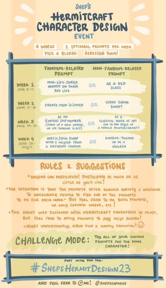
Super, super excited to announce this character design challenge event!! I’ve been wanting to do something like this for ages that’s kinda spread out to give people time to draw without too much rush or pressure, so this is my perfect excuse to get back into drawing and posting here while inviting people to join me while I have some downtime between semesters :]
I’ll be posting here at the start of each week with an elaboration of that week’s prompts, offering ideas, suggestions, and other stuff like that!
As the flyer suggests, anyone can participate, and feel free to @ me and use the tag #ShepsHermitDesign23 if you post! :D
I’m hoping a lot of people will feel inspired to join in and have fun with this, so please reblog to spread the word! I’ll be reblogging this a bunch throughout the week leading up to Monday the 5th, the start of Week 1 :]
If anyone has any questions, feel free to shoot me an ask!
Since everything is hand-written, I typed up a transcript of the announcement below:
SHEP’S HERMITCRAFT CHARACTER DESIGN EVENT
[4 weeks] – [2 Optional Prompts Per Week] – [Pick a Blorbo] – [Redesign Them!]
[The table in the green box is organized into 4 Weeks and the two prompts for each—The first, a “Fandom-Related Prompt”, and the second, a “Non-Fandom-Related Prompt”]
Week 1 (June 5-11) – A Non-Life-Series Hermit on their Red Life [OR] As a D&D Class
Week 2 (June 12-18) – Create-Mod-ificated [OR] Video Game Swap!
Week 3 (June 19-25) – As an Empires SMP Member (make up a new empire, or use someone else’s) [OR] As a classical work of art (or in the style of a famous painter/artist)
Week 4 (June 26 - July 2) – Outfit / Skin Swap with a MCYTer from a different fandom [OR] Horror-themed or as a Villain!
RULES & SUGGESTIONS
Anyone can participate! Participate as much or as little as you’d like!
The intention is that the prompts offer enough variety and intrigue to encourage people to pick one of the prompts to do for each week – But feel free to do both prompts, or only certain weeks, etc.!
The event was designed with Hermitcraft characters in mind, but feel free to apply prompts to any MCYT Blorbo!
Most importantly, have fun & Happy Drawing! :)
CHALLENGE MODE: Try all of your chosen prompts for the same character!
Post with the tag: #ShepsHermitDesign23
And feel free to @me if you post your designs/drawings! (@Shepscapades)
#hermitcraft#life series#hermitcraft fanart#empires smp#trafficsmp#character design#drawing challenge#how do i tag this awyawrghg#mcyt#art event#art challenge#ShepsHermitDesign23#shepshermitdesign23 faq
2K notes
·
View notes
Text
NEOVEMBER IS HERE
A fanmade* artistic challenge in celebration of Neopets!

This was made for a [Neopets OC server] I run in collaboration with some of the other members but I was told people on Tumblr might enjoy this too! *Not associated with Neopets or TNT. This is unofficial stuff.
For Neovember, enjoy 30 prompts to inspire you to draw something Neopets related daily through the month of November.
There's a mix of prompts and adjectives to choose from to balance options for people who like more or less guidance for challenges like this. You can choose to do one, do both, do neither, or combine 'em. Engage with this art challenge on your own terms and at your own pace. These prompts are intentionally open ended.
See the Read More for all the prompts! Happy Neopetting!
NEOVEMBER PROMPTS
⭐ Week 1
Day 1
Prompt: Your favorite Neopet species and color Adjective: Sleeping
Day 2
Prompt: Redesign your least favorite Neopet species Adjective: Omelette
Day 3
Prompt: Your favorite Petpet or Petpetpet Adjective: Awakening
Day 4
Prompt: Your Neopet as their Petpet or Petpetpet equivalent Adjective: Carnival
Day 5
Prompt: Design a new cursed Chia color Adjective: Wheel
Day 6
Prompt: Design a Paintbrush idea that you would love for TNT to implement Adjective: Running
Day 7
Prompt: An underrated pet color Adjective: Hunting
⭐⭐ Week 2
Day 8
Prompt: Your favorite site or gallery collection item(s) Adjective: Plushie
Day 9
Prompt: An item you wish was wearable Adjective: Fashion
Day 10
Prompt: Your favorite game trophy Adjective: Castle
Day 11
Prompt: Highlight a favorite Customization wearable Adjective: Relaxing
Day 12
Prompt: Your pet's favorite food and drink items or those chosen as monthly freebies Adjective: Eating
Day 13
Prompt: Fashion Fever: What outfit would your pet choose from this Flash game? Adjective: Woods
Day 14
Prompt: Your OC as a shopkeeper. What do they sell? Adjective: Jelly
⭐⭐⭐ Week 3
Day 15
Prompt: Your favorite site NPC Adjective: 8-Bit
Day 16
Prompt: Your favorite Altador Cup team (or player) OR Draw a site NPC you have a rivalry with Adjective: Swimming
Day 17
Prompt: A character from any plot (Ex: Tale of Woe, The Void Within, Faerie's Ruin etc.) Adjective: Faerie
Day 18
Prompt: A character from any site event (Ex: Charity Corner, Festival of Neggs, Daily Dare, etc.) Adjective: Mutant
Day 19
Prompt: Your favorite Faerie Adjective: Hiding
Day 20
Prompt: Your favorite site villain Adjective: Gross
Day 21
Prompt: Your favorite Cheat! player or a character from any Flash game Adjective: Gathering
⭐⭐ Week 4⭐⭐
Day 22
Prompt: Your average experience in the Battledome Adjective: Fuzzle
Day 23
Prompt: Your pet's average stay in the Neolodge Adjective: Stamp
Day 24
Prompt: Your favorite Flash Game Adjective: Space
Day 25
Prompt: Your pet's means of celebrating their (or your) favorite site holiday or event (Ex: Advent Calendar, Charity Corner, Festival of Neggs, etc.) Adjective: Collecting
Day 26
Prompt: Your favorite Neopets Land Adjective: Potion
Day 27
Prompt: Your last random event Adjective: Storing
Day 28
Prompt: SCRUNT. NOW!!!!!!!!!!!!!! Adjective: Battle
⭐⭐ Home Stretch ⭐⭐⭐
Day 29
Prompt: Use a style or medium you don't usually attempt Adjective: Pirate
Day 30
Prompt: Your pet or OC in the Neopets Style Adjective: Celebrating
96 notes
·
View notes
Text
DIALTOWN FANDOM: how interested would the people be in a storyboarded MAP (multi-animator project) of the evil roger route to Redesign Your Logo by Lemon Demon, hypothetically hosted by yours truly
NOTE:
would probably not have set character designs (participants can use their own) but there WILL be certain fixed design elements and an art direction
would not require full frame-by-frame animation, people can do pmv style or go ham and fully animate
potentially fully storyboarded in advance or at least scripted
dont hold me to this im bad at committing to stuff but i think this idea could be quite cool
62 notes
·
View notes
Text
This design is. A lot. But that’s kind of the intent so,, SOH Mikau redesign!! Uhhh I will be designing the rest of the Indigogos too, but yk. I tried to make him look like a scene kid, and I think I kind of succeeded, but he looks more like if Harry Styles had a fursona who then had a jojo siwa era. Also designing him allowed me to come up with some more stuff for the zoras!! Yippee!!

There are three aristocratic zora families, which I don’t have names for yet, so I’ll call them the royals, the blues, and the reds. Design-wise, the royals are deep-sea creatures, and the reds and blues are…. Well. Red and blue. Politic-wise, the blues are steeped in Zora tradition (matriarchs, holidays, art, etc), the reds are more progressive (shift in political systems, acceptance, athletics), and the royals are devoted to getting the Hylians away from the Domain (quality of life, feeding the hungry, recovering lost soldiers). Since the disappearance of the last zora queen (who was a royal) the domain has been divided in three, debating over who should take the unoccupied throne. The blues want Princess Ruto to rule, the Royals want to focus on finding and recovering the previous queen, and the reds want Prince Sidon.
Mikau, the Sage of Water, distanced himself from the world of the blues because he wanted to pursue music with his childhood friends instead. He’s haughty and arrogant but well loved by a lot of the domain. A lot of Zora elders don’t like him because he’s. Emo. He’s got kind of a Jacob V Edward thing with Sidon tho; a lot of people in the domain like to debate on who’s hotter bc 👍 I think it’s FUNNY

#SOH redesign#mikau#oot redesign#Zora redesign#zelda zora#tloz zora#loz zora#Mikau zora#soh Mikau#soh zora#zora#character design#my art
95 notes
·
View notes
Text
Creature Design: where to begin?
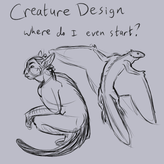
(image description: drawing with the title "creature design: where do I even start?" over two messy sketches of an elf with a monkey tail and a flying lizard with pterosaur wings. end description)
So you want to make cool fantasy creatures or people but you haven't the first clue where to start! I may not be the best at explaining this process because I just sort of come up with an idea and start drawing, my process is very quick and heavily influenced by the fact that I've been drawing since I was a small child and building my fantasy world and stories since I was like twelve. So for me, a lot of this is really intuitive and I don't know how to fully describe each step.
The honest truth people may not want to hear is that you'll get better at figuring out your designs if you just spend a lot of time doing art studies of real things and a lot of time making messy messy sketches from your own mind. take a pile of paper and a cheap pencil and fill those pages with scribbles that vaguely resemble creatures and people. don't worry about making things look nice. you've got to be comfortable with mess.
and I do mean it about the studying. Whether you're going for a cartoon style or a realistic one, it's hard to create new creature designs if you're not familiar with the shape and movement of real animals. trace studies are fine! nothing wrong with it. I do it all the time. gather some photos and trace out the loose shapes as well as the important details, then draw it again without tracing. rinse and repeat. this is how you get better at drawing with variety instead of getting yourself stuck on a handful of things you're confident with.
basic art practices are essential if you want to create unique designs.
but with that little caveat out of the way, let's talk about the creature design process!
step one: well if you want to design anything, you need to start with an idea!
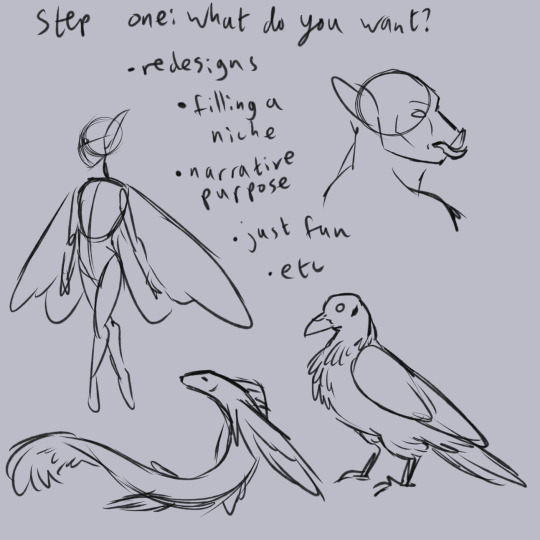
(image description: several messy simple sketches of different fantasy designs. there is a dainty fairy, an orc with a pig snout, a bird with a bald head, and a long skinny flying fish creature. the image is also titled "step one: what do you want?" with a list of ideas below that says "redesigns. filling a niche. narrative purpose. just fun. etc." end description)
in other words, what are you hoping to accomplish by making a design? is it part of a larger project or just a little one-off idea? do you want to make your own version of a common fantasy creature, or do you want to make something totally new? You don't need to answer every detail right away, but you have to come up with a starting point. For this post, I'm creating a unicorn design. The world I've built has a lot of fantasy people and their cultures are pretty well fleshed out. But I really haven't done much to add unique fantasy animals to the setting! Certainly not any that can actually use magic. and my very first baby ideas about fantasy were so very deeply focused on unicorns, I owe it to my childhood self to have some unicorns in this world.
it's a long post, so the rest is under a cut. Next step is gather references and start doodling.
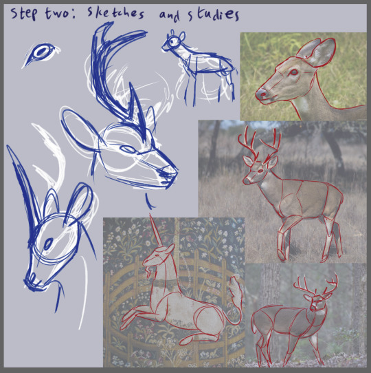
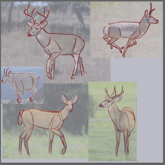
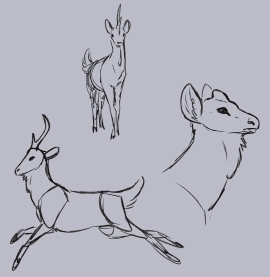
(image description: three collections of sketches. the first image bears the title "step two: sketches and studies." below the title is a compilation of white tailed deer photos with lowered opacity and red sketch lines traced over them to mark the forms of their body parts. next to this are a few white and blue sketches of deer-like unicorns, with a focus on their head shape and how their singular antler is positioned. the second image is another photo compilation with traced sketches over top, this time of several even toed ungulates. there are a few deer, a mountain goat, and a pronghorn gazelle. the final image shows a few sketches of a deer-like unicorn in different positions, with a close up on one unicorn's head with the antler only being a lump under the skin. these unicorns have long legs and very narrow faces with a singular forked antler on their foreheads. they also have a fluffy dewlap under their lower jaw. end description.)
I decided to go with a deer unicorn because I've already established that my main setting has elk! I did explore the idea of going in the direction of mountain goats or some form of other antelope or gazelle, with a focus only on things native to the americas, but ultimately I went with the deer. However, I don't want these unicorns to just look exactly like any real deer species but with one antler instead of two. I want them to look like their own unique species of deer. By doing study sketches of multiple deer species as well as other animals in the same general category, I get a better sense of the common body and head shapes, how the limbs move, and what I can change to create a unicorn that looks like a deer while still being its own new thing.
step three is to just flesh out the details! ask some questions about your creature. how do they fit in your setting? how do they interact with other living things? what are some details that make them look unique?
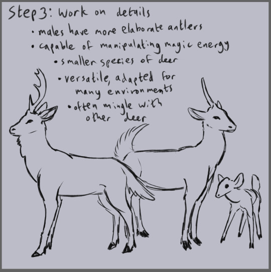
(image description: sketches of three deer-like unicorns. a male with a more elaborate forked antler and fuzzy dewlap, a female with an extra fluffy tail and a smaller antler that has no forks, and a baby with no antler at all. above the sketches is the title "step 3: work on details." and below this is a list of traits: "males have more elaborate antlers. capable of manipulating magic energy. smaller species of deer. versatile, adapted for many environments. often mingle with other deer." end description.)
Like the unicorns of many real life myths, I've decided these ones use their heightened intelligence and ability to manipulate magic as a way to guard the environment they live in. They're not sapient beings, but those who study magic in the world I've written are very interested in studying how unicorns use magic. Does magic ability grant sapience? or is magic ability gained as a side effect of becoming sapient? it's an important and fascinating question.
Unicorns tend to travel in very small groups and hide among herds of larger deer, using their magic abilities to sense danger and warn the herd of predators. they cannot perform all the effects of people magic, only using their natural behaviors to cause small effects. But their abilities are still quite impressive and tell a lot about the development of magical skills. Their abilities seem to confirm that spoken magic is the most primal form of magic, as they have a complex set of vocalizations that accompany their use of magic.
The effects they can cause seem to include a ripple effect in the air, akin to the heat waves that cause illusions, and a quick flash effect from their antlers, not unlike the glow created by runes. This flash effect is very fast and not terribly bright, but it's enough to startle other animals and hunters who don't expect it. this is perhaps the most intriguing of their abilities, as no people group has figured out how to replicate it. there may be other magical effects and abilities in the uicorn's arsenal, but it's difficult to document or understand them all, especially if some of those effects are more internal and not easily noticed from an outside perspective.
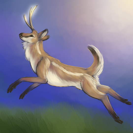
(image description: painting of a deer-like unicorn leaping through a grassy field. its long fluffy tail is curled up in warning and its forked antler is emitting a light. the unicorn's fur is a pale golden red with dark brown tips on the tail, ears, feet, and nose, as well as a dark stripe between the eye and nose. the lower part of its face, neck, belly, tail, and the inside of its ears are all white, along with a white stripe from its neck to its flank. end description.)
I hope you enjoyed this little design journey! I really did sit down and do the unicorn design today, and I came up with most of the worldbuilding details for it as I was writing this post! I can do this very quickly because I've been doing it for years, so don't be discouraged thinking you're bad at it if it takes you longer. I also could spend a lot more time working on the details and especially figuring out that antler shape and the coloration of its fur, because I am not fully committed to them yet! this is like a first draft.
you might go through several designs for something before you nail down a version that satisfies your goals! you might also get really far in the process and start to hate it and decide to start over. these are normal obstacles! wrestling with your ideas is rough, but it can also lead to more ideas! and the next thing you know, you've got an entire world of complex characters and fictional cultures and you're not really sure how you got there, but by golly are you going to run with it.
have fun!
52 notes
·
View notes
Text

Finally finished artwork gift for my friend @jayjay667! It took a bit too long, because of my lazy ass and other stuff happening in life. But it was satisfying to draw our humanized Herculeses regardless. And her design and style are great, although I'm not the best at trying to capturing them. I doubt that I will post art regularly, although I never did regularly post anything tbh. But I'm thinking of improving my art skills, artstyle etc. and practice for a while (I'm not sure if I'll want to do anything else, like translation of episodes). And I'm still thinking of human designs for TUGS characters, if not redesigns (I tried to draw my Hercules with outfit inspired by us navy winter uniform, and give vitiligo which is invisible here now oof-) Also I decided to add watermark for changed nickname, cause why not?
And here's black and white version, like the photo!

#this is tugs#bigg city port#tugs fanart#fanart#digital art#digital fanart#digital drawing#fanartwork#digital illustration#artwork#digital artwork#tugs hercules#hercules#drawing#tugs human au#human au#humanized#gijinka#humanization#humanizations#gift art#1920s#1920s fashion#tugboat#star tugs#star fleet
36 notes
·
View notes
Text
FFSU’s Fan Fashion Week!


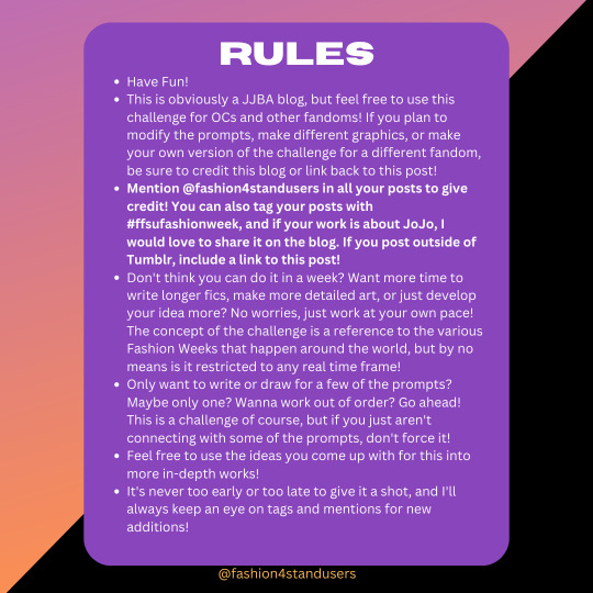
*ETA: Works posted to AO3 can be tagged as "FFSU Fashion Week"!*
I’ve had the concept for this in my head for AGES but never got around to posting it. I originally planned to run it as an event during a certain time period, but I found that making it an event intimidated me out of actually making the idea happen. I just think that I’m a lot more confident in my ideas when I don’t overthink it! Therefore, instead of running an event, I’m just putting this challenge out into the atmosphere for people to take it and run with it.
REBLOGS GREATLY APPRECIATED!
Everything you need to know is in the graphics, and here’s a plain text version as well:
Fashion For Stand Users’ Fan Fashion Week Challenge: a 7-day art and/or fic-writing challenge!
Art Prompts:
- Day 1: Runway
Draw your chosen character(s) in an outfit from a designer runway! Check the blog archive or Vogue Runway for references and modify the look however you want.
-Day 2: Subculture
Draw your chosen character(s) in the fashion of a certain subculture: goth, raver, scene kid, etc.
-Day 3: Style Swap
Draw two or more characters swapping their canon outfits, or simply wearing outfits more suited for the other person's vibe and aesthetic.
-Day 4: Historical
Draw your chosen character(s) in the fashion of another era.
-Day 5: Redesign
Redesign, reinvent, or modify the canon outfit(s) of your chosen character(s).
-Day 6: Formal
Draw your chosen character(s) in gowns, tuxedos, and other fancy clothes.
-Day 7: Free Space
Draw any kind of outfit(s) you'd like for your chosen character(s)!
Writing Prompts:
- Day 1: Character Study
Write about why a character dresses or looks the way they do. Why do they like the clothes they wear? Do they wear something with personal significance? How do they want the world to see them?
-Day 2: Makeover
Write about a character getting a makeover from another. Are they getting new clothes, a new hairstyle, new makeup? Is it just for fun or a sign of a bigger change?
-Day 3: AU
Write about an alternate universe where the characters are models, fashion designers, hairstylists, makeup artists, etc.
-Day 4: Disaster
Write about something going horribly, horribly wrong: wardrobe malfunctions, makeup mishaps, over/underdressing, etc.
-Day 5: Shopping Trip
Write about characters going shopping together and all the shenanigans that ensue.
-Day 6: The Event
Write about a character getting ready for or attending an upscale event. Who are they going with? What are they wearing? How are they feeling?
-Day 7: Free Space
Write about any scenario you'd like, as long as it's about clothing or fashion!
Rules:
Have Fun!
This is obviously a JJBA blog, but feel free to use this challenge for OCs and other fandoms! If you plan to modify the prompts, make different graphics, or make your own version of the challenge for a different fandom, be sure to credit this blog or link back to this post!
Mention @fashion4standusers in all your posts to give credit! You can also tag your posts with #ffsufashionweek, and if your work is about JoJo, I would love to share it on the blog. If you post outside of Tumblr, include a link to this post!
Don't think you can do it in a week? Want more time to write longer fics, make more detailed art, or just develop your idea more? No worries, just work at your own pace! The concept of the challenge is a reference to the various Fashion Weeks that happen around the world, but by no means is it restricted to any real time frame!
Only want to write or draw for a few of the prompts? Maybe only one? Wanna work out of order? Go ahead! This is a challenge of course, but if you just aren't connecting with some of the prompts, don't force it!
Feel free to use the ideas you come up with for this into more in-depth works!
It's never too early or too late to give it a shot, and I'll always keep an eye on tags and mentions for new additions!
291 notes
·
View notes
Text


This is just for practice, study and fun! I hate this arrogant, immature and disrespectful mentality of "i fixed it" "mine is better" etc and i don't want to be associated with them.
Calamity trio re-imagined! (edit video link) notes in read more
- I made the colors more saturated to match my art style
- Designs inspired by Valeriana's phrase: "Think of your memories of Amphibia, of how much this world means to you. This will allow the stones to resonate with your hearts... once again!"
Anne

- Lotus hair and frog eyes as in the concept art
- Lotus flower headband
- Heart-shaped gems as the blue gemstone represents heart
- Shoulder pad inspired by the Plantar's house and the blue mushrooms that are very distinctive in this region
- I made the boots more similar to the dragonfly costume's boots
- Vines on gloves and boots as they are a natural and common element in the region where Anne lived
- The boot leaf is the same as Leif's, the first Plantar
Sasha

- As Sasha herself said, "I am not that person anymore!", so I was heavily inspired by the new Sasha's outfit from the third season
- But I still decided to leave some elements of the official design on the arm, inspired by the design of the battle of the bands and her design of the second season, as they were important moments for her
- Now the heron circlet is bigger and has a scar on their eye, matching Sasha and Grime
- A cool eye patch with the eye symbol
- Toad eye!
Marcy

- Changes the hue to another shade of green
- I gave the same hairstyle as the battle of the bands outfit and kept the green barrette
- Newt eyes!
- Now the tiara has the shape of corals and a gem like the brain-like mushrooms (from the first temple) in the middle, as the green gemstone represents wit
- All armor is inspired from General Yunan and King Andrias' armor
- Shells throughout the design as they are very distinctive in this region
- Her skirt is a mix of my redesign with the design of the band battle outfit, and with the wave print like Lady Olivia's dress
#my edit#amphibia#anne boonchuy#sasha waybright#marcy wu#calamity trio#re-imagined#character redesign#character design
39 notes
·
View notes
Text
✨Commission info✨
I'm ready, I'm rested, I'm refreshed! And I'm completely charged to take care of your new ideas and characters!! Especially for this, I'm trying to expand the ways to bring your characters to life so that you can see them and be convinsed that they exist! I truly believe that every character is awesome and original and deserves to be shown with their own story! And I'll try to help you with this in a way that is more convenient for you! You just pick one below ;)
✨ PRICES:
- SEMI-REALISTIC STYLE (for the cases, when you want it looks more real without much stylizing)

- USUAL STYLE (for the cases, when you don’t mind it looks more stylized and a lil sketchy)

- STORYBOARD (for the cases, when you want to tell a story and don't mind to do this in very sketchy stile)

(this is a new way to tell your story in several frames. It'll look like still frames from a video, where you can show the dynamics of the scene and insert replicas in the form of subtitles. The form and type of storyboards can be redesigned. Keep in mind that frames will look very sketchy and with visible inaccuracy! DM me for more details ;))
Aaand...
👀COMING SOON!!!👀 - 3D MODEL OF YOUR CHARACTER

* you can find more examples on my page by commission tag and more examples of storyboards by rita diaz tag ** a helpful post describing a right order for your refs
✨ DEADLINES: After you DM me with a brief description of your idea, I’ll tell you the approximate date when I’ll be able to proceed with your commission !!!!Always warn me in advance if I need to draw art by a certain deadline!!!
✨ PAYMENT: What: USD or RUB When: full pre-payment (when you sent me the email and we approved the art idea) Where: Boosty (russian platform, supports payment via PayPal)
✨ THE PROCESS: You write to me in private messages on Tumblr, briefly tell me your idea of our future art, what style and what slot you want (full body / half body / bust). Then I give you my email address and you send me an email (with your Tumblr name as the topic please) with all necessary references (your character's face claim, their pose, clothes, background etc.). You describe the idea of the art in details, where it takes place, and other things that I need to know so that I can base the sketch on all that info, because after you approve the sketch, I don’t change art much in the further stages of the work, just some details. I send you the payment link on my Boosty page. Send you the sketch. After you confirm that you like the sketch, I finish the work and send it on your email😊
✨ OTHER: - I don’t correct the art after you approved the finished version. - I don’t copy other artist’s work or poses from their work. - I publish every commission on my social media, if you don’t want it to be published, just let me know. - If you’re not sure about art idea, I can suggest you 4 sketches with different poses/concepts/angles for extra $20 and you pick the one you like the most. - For significant corrections or a lot of small ones at any stage of work, an additional fee may be charged (this doesn’t apply to some small adjustments or details witch I missed). There are 3 free changes at the each stages of the work (sketch, finished version), further - $2-$5.
___________________________________
And of course I can't skip to say a huge thank you to those who commissioned and continue commissioning art from me! It means a lot! For real! This is not only material support, but also moral one, saying that I’m not wasting my time and energy in vain, that I’m moving in the right direction, that people like what I do! I can't tell how inspiring it is!! 300 commissions! I’ve never imagined that one day I would draw so many art for others! Just.. wow!! Thank you again so much for trusting me bringing to life your ideas! I truly appreciate it!😌
____________________________________
I think this is it, right? If you have any questions, feel free to DM me ;)
I’ll be VERY grateful for your reblogs!! ❤❤❤❤❤❤ (and thank you very much for this in advance, it helps me A LOOOOOOOOOT, I see each and every one of them! You’re the best!!!) Thanks for your attention! Have a good day =)
108 notes
·
View notes
Note
What are the factors of you not liking big-headed designs and why? (as shown in Heliolisk, Fennekin, Froakie, etc)
I actually do like them! It's just while redesigning them, I didn't feel like the overly-large cartoony heads fit my art style. I would also say my art style is pretty cartoony, but I tend to exaggerate different features to different extents. I don't dislike the original designs at all.
Hopefully that makes sense. c:
20 notes
·
View notes
Text

this year actually ended up being the 60th anniversary of the first book in the Pencil and Screwbolt series aND this piece was born to sort of honour that bc i'm a hopeless nerd < 3
honestly i don't think the references in this piece are... especially easy to pick on (and i mean that in the worst way possible, not that they're too elaborate/refined for "anyone" to pick up at all lmao akhsjhs) but it's just something that i largely drew for my own little fulfillment so its symbolism is wholly from my perspective!! I find it fascinating how certain characters tend to long outlive and transcend the media they originally come from (like, nowadays people don't issue magazines as often as before, which is where these two stem from), as well as migrate to other media and manage to still uphold some level of recognition and popularity? I mean without the book (though it's not their first depiction individually, it's their first novellization and a shared depiction) I myself wouldn't have been introduced to these characters in the first place and they still mean so much to me even to this day! neat!! And to think they have been through 20-something books, highly various redesigns done by numerous official illustrators and artists, several animated shorts, other merch over the years?? n e a t e r
so here are some of their more well-known depictions done by veteran artists such as Semenov, Eliseev, etc who have illustrated the P&S books over the years! done in my lackluster style akjhkjhj. And of course my own version is the centerpiece < 3
also depicted throughout the art are the most important people who have brought Pen and Bolt to life - Ivan Semenov (Pencil's creator), Nina Benashvili (Screwbolt's creator), Yuri Druzhkov and his son Valentin Postnikov (the novelizers and popularizers of P&S books).
so yeah in short....... im lomve them your honour
#k-art#pencil#screwbolt#pencil and screwbolt#the adventures of pencil and screwbolt#soviet animation#children's books#ivan semenov#yuri druzhkov#valentin postnikov#nina benashvili#fanart#artists on tumblr#artist on tumblr#digital art
8 notes
·
View notes
Text

same with the other two, sorry for bad quality im lazy etc etc
ivan redesign, requested by my brother and because i HATE drawing his canon design too
okay so show ivan is really hard fro me to draw bc my art style is really cutesy and also he looks like. and old man, and i actually like his design i think? i mean i dont think its bad its jsut hard to fit on my style, besides hes an incel which, those arent reallt the vibes that his design gives me
so first, i changed his face shape so he looks younger + more simple, i made his jacket a simpe hoodie, i gave him actual shoes instead of whatever he was wearing, i wanted his clothes to be simple, i literally looked up incel and i saw the same simple clothes so yeah. i gave him a beanie bc it fits as a reference to his clone father big hat, and i gave him two pins (my brothers idea) to complement that ugly ass vibe he has. i tried to give him a yellow color pallete as a reference to his clone father most famous portrait, but i didnt like how it turned out so i kept the green
his personality is the same, unlike the others i dont really have much to change about him personality wise or to expand, hes the same dumb asshole
but thats his whole deal yk so hes perfect staying the same
#clone high#clone high au#clone high: re do#clone high season 3#clone high season two#clone high ivan the terrible
18 notes
·
View notes
Text
Commissions are open!!
Hi! I'm Cat, and I'm opening commissions to help my family who is currently struggling through a bankruptcy. These are my prices! (USD only please!)
My Kofi link: https://ko-fi.com/spacecatz
INFORMATION BELOW THE CUT
BASIC SKETCH
- bust: 5 dollars
- fullbody: 10 dollars
LINEART
-bust: 15 dollars
-fullbody: 20 dollars
FULL COLOR
-bust: 25 dollars
-fullbody: 30 dollars
SIMPLE SHADING
(Without color)
-bust: 16 dollars
-fullbody: 19 dollars
(With color)
-bust: 26 dollars
-fullbody: 31 dollars
COMPLEX SHADING + LIGHTING
(without color)
-bust: 17 dollars
-fullbody: 18 dollars
(with color)
-bust: 27 dollars
-fullbody: 32 dollars
ADDITIONAL CHARACTERS¹
sketch: +1 dollar
Lineart: +2 dollars
Full color: +3 dollars
Simple shading (no color): +2 dollars
Simple shading (color): +3 dollars
Complex shading/lighting(no color): +3 dollars
Complex shading/lighting(color): +4 dollars
BACKGROUNDS
Simple²: +2 dollars
Complex³ (This will take MUCH longer!): +6 dollars
COMICS
(Will contact for composition of panels)
Sketch: +1 dollar every panel
Lineart: +1 dollar every panel
Full color: +2 dollars every panel
Simple shading (no color): +3 dollars every panel
Simple shading (color): +4 dollars every panel
Complex shading/lighting (no color): +5 dollars every panel
Complex shading/lighting (color): +6 dollars every panel
Simple² backgrounds: +2 dollars every panel
Complex³ backgrounds: + 3 dollars every panel
¹: this includes more than one of the character in a space, for example on a reference sheet.
²: "Simple" refers to places that are easier or simplistic to draw- ground + wall, in a doorway with the room behind the subject blocked, sitting on a surface, etc. It will automatically line up with what you have chosen for the subject (sketch, lineart, shading, etc).
³: "Complex" refers to places that are harder to draw or more detailed in nature- entire rooms, detailed forest backgrounds, places with several background items like stores or bookcases, etc. It will automatically line up with what you have chosen for the subject (sketch, lineart, shading, etc). Since I am not usually a background artist, this particualr option will take a bit longer to complete and is therefore more expensive.
WILL DO:
Fanart of media
Ships
Ocs
Anthropomorphic characters
Animals
Character redesigns
Complex clothing styles (as long as there is a reference provided!)
Reference sheets with color swatches and information
Action poses (may require Reference and adjusting to liking)
WONT DO:
Incestuous or pedophilic relationships
NSFW/kink art (as of [post date]. Anatomy is hard)
PLEASE DO NOT REPOST, FEED MY ART INTO AN AI, OR RESELL MY ART. Use for profile pictures, backgrounds, etc is permitted with credit. Reblogs are permitted and encouraged!
(For those travelling from other sites to this one: repost refers to posting the image by itself and/or claiming it is yours. Reblogging refers to sharing the original post on your blog by hitting the 🔄 button!)
Here are some examples of my art!

[Full color fullbody, no shading- 30 dollars]

[Full color bust with complex lighting/shading- $27]

[Full color "bust" with complex lighting/shading- $27]

[Full color no shading "bust"- $25]
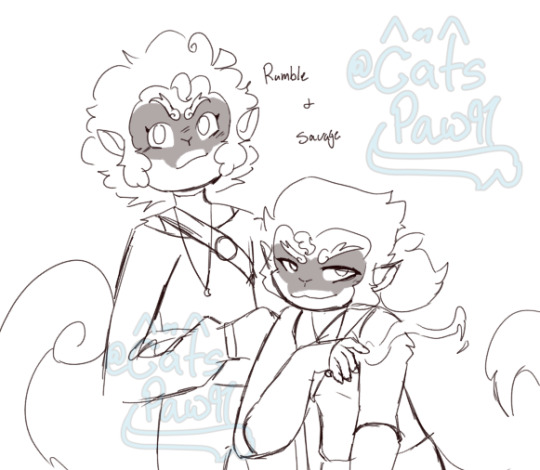
[Sketch bust + additional character- $6]
Thank you for reading through! If you enjoy my art, please consider commissioning me! You can contact me through dms here, OR on discord, if you are more comfortable that way! I will provide my discord in DMs.
(Credit to characters- Sun Wukong, Redson, Rumble, and Savage are all LEGO Monkie Kid characters. Kelvin and Solara, however, in the second and third image, are my own ocs!)
#yes i do more than lmk but ive been obsessed w it lately lol#lego monkie kid#lmk oc#lmk redson#lmk rumble#lmk savage#rumble and savage#mentally ill artist#artist#my art#fanfic art#<- the second art piece which i plan to post alone later#a garden across our collarbone#commission#commision art#cheap commissions#unless you plan on making it fancy bc max can be 72 dollars but basic stuff is usually around 26#lmk sun wukong
11 notes
·
View notes
Note
I just wanna say that I love all your character redesigns, they're all very beautiful! I also wanna ask if you have any recommendations of sites or books for researching historical fashion.
Thank you so much! I’ve had a lot of fun over the years <3
Historical fashion is a very big amorphous topic so take all of my recommendations with their usual grain of salt and keep in mind that the most important of things are primary sources and authorial context. For example: the portrait of a Queen is generally going to be the beautified propaganda version of the day, but still a primary-ish source of her fashion. Channel your inner historian and examine your sources critically. Who recorded this history? Why?
Photographs are stellar. While there were “photoshop” tricks those usually don’t change the clothing. Extant garments? Bog bodies? Gold mines. So never be afraid to dig into clothing that has been preserved or displayed.
I guess what I’m trying to say is that what kind of fashion and when it happened is going to set the parameters for the majority of your research. It’s too big a topic to have an easy answer, tragic I know. However there are communities upon communities online that specialize in certain historical moments, countries, styles, art, etc, etc, etc.
If you want a really great general overview by decade of Western/European fashion I recommend the website Fashion History Timeline. They don’t have a lot in their Medieval or ancient sections but 14th century to 21st century is a LOT of ground to cover while still being an easy to navigate website.
If you want even more Renaissance to vintage clothing research to the point where you could make or purchase those items yourself there is American Duchess.
And finally, honestly, someone has probably made a YouTube video about it. Double check their research and sources but if you want a plain speech audible research paper with visual aides… it’s kind of the place to be. University lecturers have slide videos up about fashion, the historical “cosplayers” do a ton of research and trial and error construction, history buffs will tell you all about it. There are so many talented people out there, from ‘Not Your Momma’s History’, ‘Off the Great Wall’, ‘Mochi Hanfu’, ‘Dandy Wellington’, ‘Bernadette Banner’, ‘Priorattire’, ‘Pinsent Tailoring’, Mina Le and so so so many more!
And I think that’s everything for now? Let me know if you have more questions
#answered#references people references#reference images#do lots of research#historical fashion#good luck!#have fun!#ellenart#people ask me things#isn’t that wild
41 notes
·
View notes