#ok not really tutorial but yknow
Explore tagged Tumblr posts
Note
How do you draw eyes? they look so good and very expressive.
that's really nice of you tysm ^-^ i dont really know how to explain my processes so i made a crude little overview of how i generally go about drawing eyes, from shape, angles, lines and color to giving it expression and exaggeration

this is what works for ME personally in MY own style, so feel free to incorporate (or not) this however you see fit into yours. Remember that references and practice are your friends forever and ever, but i hope this can be of help!
#asking#art tutorial#tutorial#ok not really tutorial but yknow#IF ANYTHING ISNT LEGIBLE OR YOURE CONFUSED PLEAAAASE DONT BE AFRAID TO ASK A MILLION TIMES OVER#WHAT A SENTENCE SAYS. I PROMISE I WONT GET MAD AT ALL I JUST HAVE SHIT HAND WRITING#so yeah! this is how i go about it... really like polygons#gives the shape more of a.. push? more lively you could say#also eyebrows. god eyebrows were SUCH a game changer when i started adding them to my drawings omg
314 notes
·
View notes
Text
i finished 7th dragon a lil while ago n some of the worldbuilding is so funny i cant stop thinking abt it. why is the lost city of atlantis populated by catgirls
#they made it so the women are all catgirls and the men are all more elven which is. something?????#story is kinda wild n not the Most interesting considering all the games ive played w time travel being a main focus#but its ok. enough to get thru it without issue after u get past the tutorial#the characters are also in the same boat where theyre alright but ive seen too many that did each characters job better#i DO rly like the custom character designs n stuff tho. might make ocs out of some of em that i grew fond of#i also appreciate that its a game set in the future that actually has ceased homophobia entirely AND openly. not enough of those i think#also idk if the balancing for the character jobs is perfect (bc one of em is just completely busted) but the dynamics u can create are fun#i always kept each team the same so i didnt play around w that part much but pairing physical-based jobs w each other#and magic-based jobs w each other seems really good#u can even base a team around most of ur characters dying for ridiculous damage output. rly funny idea that i might try one day#my favorite unit is the silly lil catgirl i had w the busted job. she wasnt on my main team so i discovered just how good it was p late#also u can date quite literally everyone. which has both good and bad perks as u can imagine#kind of a. persona type deal. yknow.#on the bright side there was a tragic clone character 👍 they did him so dirty tho there was so much more they couldve done w him#also theres an alien that looks like a stuffed rabbit and uses he/him that also turns into a girl. peak gender tbh#if anything the queer rep in this game kinda rules#not even sure if its on purpose or not. but it rules
1 note
·
View note
Text
mutt's guide to using dsr on ts4, with pictures!!!
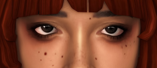
ok so, dsr is a thing available for nvidia gpus that allows you to take veeery high resolution screenshots of games without much trouble, like this
it's an alternative to srwe, as it plays nicer with a lot of reshade shaders and is just, generally more nice to use! let me teach you how to use it - full tutorial with pictures for every step under the cut (im sorry its too long without the cut)
step 1: right click your desktop and open the nvidia control panel
step 2: go here (adjust desktop size and position)
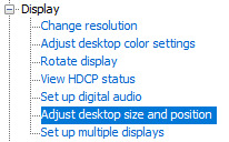
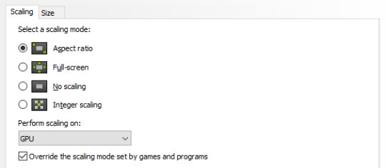
step 3: make sure your settings are set as follows! this is important
step 4: now, go here (change resolution)

step 5: under change resolution, click on this button (highlighted with a red square)
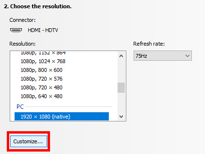
step 6: in the windows that appears, make sure that "enable resolutions not exposed by display" is ticked! this is very important! (again, highlighted in red - it should look like this)
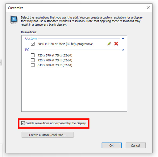
step 7: now, click on "create custom resolution"
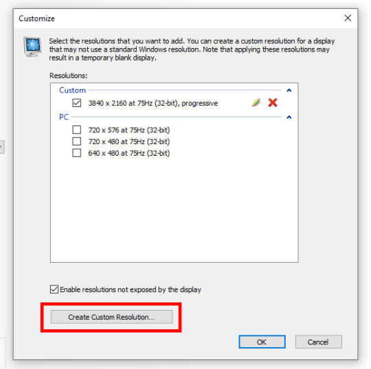
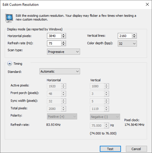
step 8: this is where you set your desired resolution, and where i get a bit rambly; so, in my opinion, there is ZERO reason to go above normal 4K for TS4, as it's generally not a really high-poly game and it has rather simple graphics. you can fuck around a lot here, but if you don't feel like it, here are my settings - this will give you 4K screenshots. NOTE: THE REFRESH RATE DOESN'T NEED TO BE 75! SET IT TO WHATEVER THE REFRESH RATE OF YOUR MONITOR IS!
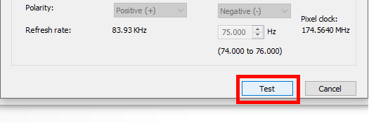
step 9: now, click on test
step 10: let the thing load, and after it's done, a window like this should pop up.. but yknow, in your language. click on "yes" (or accept or ok!! idk mine's in russian; basically, the button highlighted here!)
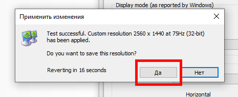
step 11: click "ok" in the window that pops up! like this! afterwards, close the nvidia panel

step 12: open the sims 4 and go into game options, then into graphics
step 13: set your "display type" as "fullscreen", like this

step 14: under "resolution", select whatever resolution you setup earlier; in my case it's 4K, so if you used the same resolution, your settings should look like this

step 15: click on apply changes!
AND UR DONEE!! WAHOOIEE!! now, take your screenshot using reshade, and then go back into sims settings and set it back to what you usually play at, then apply changes!
every time you need to take an HD screenshot, simply open game settings and use your custom resolution! that's it, have fun :3
#sims 4 tutorial#ts4 tutorial#sims 4 screenshots#ts4 screenshots#sims 4 screenshot tutorial#ts4 screenshot tutorial#sims 4 hotsampling#ts4 hotsampling#srwe#nvidia#dsr#tutorials
727 notes
·
View notes
Note
OK ok... weird suggestion but... what if Zayne likes the thought of PDA, but doesn't show it/do it because once he has his hands on you, he'll either, A.) Get really nervous in public and doesn't want to mess it up for you & himself and as a result of that have ppl judge him, or because of B.) Because he'll take it too far...? 👀
Like I think a lot about that line in Business Trip where after he meets MC at the train station and he's just looking at her, yknow, ogling her, eyeing her up & down, and MC is just like ?!?!?! Why isn't he doing anything?!?!?! But then when he gets home with MC, we all know he's like super touchy n shit and says that line, "What would you have liked me to do in front of all of those people, hmm?"
Like to me, that says he knows he would've LOVED to kiss MC or something, but if he did he probably would've lost control bent her over on the train platform LMAO
Like I know he loves his privacy with MC so he can do anything with her without the eyes of the public judging them, but like after that Tutorial card... it has me thinking he wouldn't mind taking her in public if he could... 👀 hehe
I cannot remember who it was that suggested this (maybe @wolfofcelestia ???) that narrative-wise we're slowly seeing Zayne get more and more comfortable (aka braver) with PDA as his relationship with mc goes on. Because if you compare the brief physical contact in Nostalgic Sweetness when she grabs his chin (and he gets all huffy and flustered with her and grabs her hand away) vs the Tutorial where he's literally scooping her into his arms for a full on make out only to have her push him back down and then he's like "Ah naw you dont" and pulls an Uno Reverse on her and slides between her legs and pins her to the table (where people could walk in)?!?!
Like I genuinely think this is character growth and it looks soooo good on our man. We gotta remember that she is his first relationship EVER so I think a lot of it is what you said with him just not really knowing. Yeah he's private and reserved but also he doesn't know what he's comfortable with because he hasn't experienced it yet. So it stands to reason some of that will change as his experiences do as well. Zayne has some pretty incredible levels of self-control when he chooses to use them (which he can be very bad about), so your idea could also play into it a bit as well. The longer he's with mc the more we see him slipping in terms of letting his guard down. He's becoming softer, more playful, rising to her bait on purpose. He's wilfully engaging in her childish antics far more often now and it's freaking adorable and opening him up to a lot more of these kinds of moments.
But that's just my 1 am opinions 😅
#lnds#love and deepspace#lads#l&ds#zayne#love & deepspace#zayne love and deepspace#love and deepspace zayne#kay's thoughts#kay's answers#lnds meta
96 notes
·
View notes
Text
i say stuff about rh characters part 2two
becuase. teehee
the fir1st one, the t3hird one
rhds tiem!!!!!!!!!!!!!!!!!!!!!!!readmore jumpscare
yuka: wair i already d
that frog doll from the tutorial: I give!
note: the jumperrrr
widget: oh its you. yknow your older brother /gn akai mono likes to piss people off sometimes /silly
conductor: jj rpcker questions why you dont move and im glad i can answer her with "he does in megamix"
chorus kids: hi elleon the screaming screamers. theyre ltierally so sikly. but Watch Out
robots (fillbots): the snall one reminds me of coxmo. yall know cozmo? the lil guy and he had cubs that he plays with. and you cn like. and he. cost 200 dolar. the snall rovoNow i feel nostalgic
pop singer (erina): shhehehjdubdmyedrjguexrguderjugdexkvguuggxrwguvvjgkzhdvjgwxd
monkey (fan club): boy stop staring at me your judgemental ass lyour fuckin We're the best fanclSHUT yo stupid ass up fuckin banana lookin headasss i suppose you should jump off a cli
paddler: scare the shit out of me /half sily
blastronaut and shoot-'em-up radio lady: uhhhhhhhhhhhhhhhhhhhhhhh
inturders: l + ratio + get blasted
captain blue bird: when i heard this lil shit go "STRETCH OUT YOUR NECK" the firsttime i was like WA IT THAT REMINDS ME OF SOMETHIGNG,,, WHHWHAHAYTFAFYA
the blue birds: ok actually. the enitre minigame takes me all the way back to the we are number one rh remix imm so df. s SADDACGFHEVVHG /POS
moai kids: doo-womp womp
moai bird: wait i though you were called seagullx
love lizards: Wonderful cnaracters, HHHHHHORIBBLE minigame. that is all. unles you uh. i mean. listen. leans c,oser to you. what if you flicked for each shake.
stomp farI HHEHDHHHHHJBJFXHEHBSDXJHB. GRABS HIM SHAKES HIM SHAKES HIM SHAKES HIM SHAKES HIM SHAKES HIM IT WAS OOONNNEEE MOOOOOOLLLEEEEEEEE OOOOONENEEEEEE MOOOOOLLLLLEEEEEEE
oh god the vegetables again: ok!
moles: pats your head. i know. hes very mean to you guys. i mean. like. i misse dlike One of oyu and stomp farmer gave me A GOD FORSAKEN ok. i know its not his fault its the games. judgement system. but the way he
tj snapper: me and the bad bitch i pulled by being autistic
tj snapper's girlfriend: me and the goofy guy i pulled by being autistic
the dazzles: stop staring at me im trting my best,,
munchy monk: i call him munchy in my head. he smiles SOOO WIDE in the battle of the bands audience hes so goofy i lov
dj yellow: SCRATCHO
dj blue: i. the lips. the lips. what have the done to you. its gonna be okay. i sure as hell am not drawing you with those big ass lips. hily s
taiko rally squad: DON DOKODOKODON DOKODOKODON kinda unfair how in the try again and ok screens this guy Loses. but in the superb screen BOTH SIDES WIN. PARTICIPATION TROPHY-ASS SHIT
research scientists of love lab: bi4bi. and if youre willing, bi4bi4bi.
the three synchrettes: alley-oop!
dolphins: oh cool dolphins :)
ecto: omg hiiiii helloo litle guyyy i wuv youuu ^_^ kises your snall tiny forehead
booboo: FUCK you FUCK you FUCK you FU
spooky: honestly? i fw him
dog ninja: i wanna cook soup wjf youbyoure soawesome and cool and i lpve you hii doggyyy hi dogy. dohyynkkgunnbuyrctib
mister eagle: thanks for telling me to cut the fruits. i was gonna do that anyway but like. shoutout to you man. props
the frogettes: jj rocker really likes you huh. cant get enough young love rock and roll even
space kicker: hi radar AAGHHHH THE SPACE!!! KI IEKR AAHH ITS HIM INAHIUIBSSYSBIYFIBYDS /VPOS
stepswitcher: love these thangs. i have several of my own thangs. the one i (mc) adore most is the purple thang. his name is mo
JJ ROCLEKEKRKMJ &*;*;&;&$-$×<;^<^<^$ UBGDEBGSCXUGBUSDXGBBHG my eif ei lvoe her so so sp sososososoos muuch foreverrr aheehee giggle. kicks my feet twirls my hair. i think i hauve covid
STUDENT ROKCKONOUCRFUIBCFEJHBGCERBGUSXD MY CHILD HE HAS EVERY DISEASE
airboarder: yeeeeaaaaaAAAAAAAHHHHHHH LETS GO
seals: wait. whatd you do with the dolphins. where are they. say somethign . Where are thr DOLPH
smiling coin: do i know you
thr cnaract3rs from tunnel the endless game: ehhhhhhhhhhhhhhhhhhh. i gues. but like. do you really ned a cowbell to keep driving? i mean. just record yourself playing a cowbell and like play it on the radio. just do that. why am i holding a cowbell anc playing the cowbel for YOU. do it yourselfIs she even listening to. m
glass tappers: ths Glass Tappers J SWEWR EVERY TIME I READ THR WORD "TAPPERS"
the thing from rhythmove dungeon: youre. okay. i guess. i only played your endless game once. uh it 's fine. i mean.
clodhopper pickens: youre so full of glee,, id be happy too if my business card made music,,
slot monster: tjen scdrunkly. scdunkyl. scrunkly. sc
octo-pop: WAHAHHA THE. MSUIC SO FAST
beat machine: i barely messed around with this one. it's fine . wish the crowd wasnt so judgemental thogu
beatbag I dont know this one
kappa dj: ive seen you on davidmismol thumbnails and thats basically it lel
okaye wow owwowow owowowo WOWWOWWOW
13 notes
·
View notes
Note
I wanna make a fantroll whos a ceruleanblood clerk/office worker/very boring FBI agent how does one go about this shit
Oooooo ok!!!! I can show you how I make my fantroll usually.
Now normally I’ll make a design and then assign the personality after but there’s a way I do it when I have the character down first.
Now while you can EASILY go to the extended zodiac and take the quiz to make a sign I usually worry about that at the end.

Now we’re doing this on the phone because when you get the doodles out for a design on mobile you care WAYYYY less.

Now I’ll fill it up with a bunch of placeholder things. For like examples sake let’s say I’m also making a cerulean. But I’ll give him a different job for the sake of this like tutorial. So this is a cerulean, but I’m gonna say like he’s a taxi driver who likes taking peoples wallets.
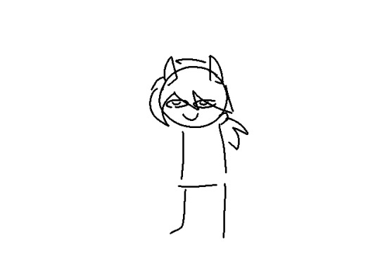
Now doing the HAIR first is usually really helpful. Helps you get shapes out for the character that will mostly define them.
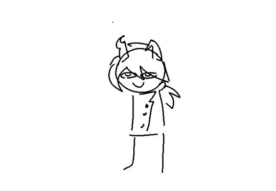
Honestly Uhh.. erm… then you just. Add clothes. Usually I’d make up a really stupid name for them too. Like yknow what this is bakset drivur (backseat driver)
Im probably not the best source for making fantrolls tbh a lot of mine have really dumb names and stupid designs so there’s not much I can offer. But uh. Hope this helped (
9 notes
·
View notes
Text
Listen to me listen the most important thing about art is to be yourself
But also
1. You can become good with any tool. Expensive tools are not necessary but they might help if you're a beginner. It's easier for more experienced artists to get more use out of cheap tools. However the ever famous Pencil and Pen will never let you down
2. Observe and experiment. See something you like in other peoples art or the way light bounces off something? Try it. Doesn't hurt to try because uh
3. Practice is everything. As in the answer to "how did you learn to draw" or "how do you improve at art" is practice. I've been drawing for over 10 years. I'm sorry its messed up but true that practice really is the only way to improve and it's going to take a very long time and you probably won't even notice the improvement until you look back and go wow I'm improving! A lot of improvement in my experience just sort of happens. Things will just suddenly click.
4. Be nice. Be nice to your art and to other peoples if you can ok. If you associate art with negativity right out the gate it'll only hinder you. I'm not saying being nice about your art will automatically make it easy or anything but insulting your art definitely will automatically make it harder. And insulting other peoples art especially those who don't deserve it will probably make you less likely to branch out with your art and try other methods and learn and grow. Also makes you a prick soooo....
5. Sometimes you have to draw wrong to draw right. This is why I don't really make tutorials on how to draw things because half the video would be "don't do what I'm doing right now the way I do it is wrong" basically if you focus super hard on what's wrong and right you won't find what works for you. It's good to learn commonly accepted right things but yknow to each their own and do what feels best to you. But also expect to be pushed out of your comfort zone too. I dunno! Have fun!
6 notes
·
View notes
Text
this post is a fair size already so idk who all will see this, but as a neocities enjoyer and useless-degree-haver who specialized in and has worked in web design— i wanna add some things!
Tips for HTML/CSS and Making Your Site Accessible:
1. validate your HTML and CSS!!!
basically it’s for making sure your stuff works properly! you can search “html validator” or “css validator” to find the appropriate sites, where you can upload your work to be checked!
validator at w3 dot org
2. you can write code in any basic text document. but if you’re new to html and css..
try a free program to help you out, it’s like having the code equivalent of a spell checker. can also help organize and keep your code simple and clean! :>
hell even if you’re not new, it can be nice to help speed up the process and avoid mistakes, so why not.
iirc VSCode is the microsoft visual studio adjacent one for this and is pretty good!
“brackets” is also a big one, because it’s owned by adobe (..and so eats up all the features and innovations of the competing programs they subsume, cough cough).
you can find more alternatives pretty easily with a quick search if you don’t like either of those!!
3. use alt text!!
use alt text on all your images!! this is not only good for accessibility purposes, but also improves the searchability of your site!
if you’re interested in more in terms of searchability, if for example you want to make something like a portfolio site, read up on SEO!
4. make your site readable and accessible— for example, with smart use of color contrast!
while you may be more inclined to use more “aesthetic” color schemes, you really should be checking your color contrast! you should always do your best to make sure everyone can use your site! luckily, there are plenty of sites online just for that.
webaim color contrast checker
link to read more important information on making your site an accessible, disability-friendly space!
w3 dot org quick hand reference to the web content accessibility guidelines
4.5. while there are some fun tempting toys to add to your site (and relive those earlier web days), keep in mind that some of those things died for accessibility reasons! i won’t be able to make an explicit “do/do not” list on every single possible thing. but basically: use your head, be considerate, and check out the web content accessibility guidelines to understand some things to consider!
5. use big enough font sizing!
ok, this kind of also falls under 4?
for your body text, you really don’t wanna go below like 16px— that’s default browser font size! there’s other measurements you can specify that do also scale (like ems) if you wanna look into what they are and how to use them!
contrasting by good use of headers is incredibly helpful, as well!
5.5. font choice in itself can also contribute to accessibility and readability!
things like contrasting a sans-serif header font with a serif body font, for example.
you can see more about specifying fonts in the css tutorial resources like w3schools. you will want to keep an eye out for bits about setting backup/default fonts (for when the viewer can’t see or load your font for some reason— you can, for example, import fonts via google fonts url).
really it’s a simple thing to add, but you can see the listing there about what fonts are like.. “default” browser fonts that pretty much every visitor will be guaranteed to see on their end!
6. by default, most stuff is gonna be responsive (resizing to fit different browser or window or device sizes).
hmm if you’re having issues with text and image and layout responsiveness, you could try adding something like bootstrap framework.
it’s pretty helpful for short handing some things, and helping you get a good layout across any device. particularly if you are totally new to html and css and want some organizational help yknow?
basically it’s just some commonly used files you add to your site and then don’t touch lol. like prebuilt css classes to apply to your divs and style certain things. it’s like having a grid to put your stuff into! it is still used a lot ime, but thanks to browser responsiveness improvements across the board, it isn’t quite as relevant/necessary as it used to be (some of my other points about font and image responsiveness can somewhat fall into this, as well, but i like to be extra safe and feel like it’s good to understand the concept).
7. and always remember, for the love of fucking god compress your images.
uhh i’m sure there’s so much more i could say. ig also if you use contact forms, be careful about how you put them together/be safe. but yeah, w3schools is a great starting point and reference for getting started! they have lots of live examples you can edit and copy/paste if you need help figuring out how to make something new.
but i hope this is helpful (and hopefully readable? i did not sleep last night and am solely running on coffee lol).
have fun stay silly etc etc :>

neocities guide - why you should build your own html website
do you miss the charm of the 90s/00s web where sites had actual personality instead of the same minimalistic theme? are you feeling drained by social media and the constant corporate monopoly of your data and time? do you want to be excited about the internet again? try neocities!!
what is neocities?
neocities is a free hosting website that lets you build your own html website from scratch, with total creative control. in their own words: "we are tired of living in an online world where people are isolated from each other on boring, generic social networks that don't let us truly express ourselves. it's time we took back our personalities from these sterilized, lifeless, monetized, data mined, monitored addiction machines and let our creativity flourish again."
why should I make my own website?
web3 has been overtaken by capitalism & conformity. websites that once were meant to be fun online social spaces now exist solely to steal your data and sell you things. it sucks!! building a personal site is a great way to express yourself and take control of your online experience.
what would I even put on a website?
the best part about making your own site is that you can do literally whatever the hell you want! focus on a specific subject or make it a wild collection of all your interests. share your art! make a shrine for one of your interests! post a picture of every bird you see when you step outside! make a collection of your favorite blinkies! the world is your oyster !! here are some cool example sites to inspire you: recently updated neocities sites | it can be fun to just look through these and browse people's content! space bar | local interstellar dive bar creature feature | halloween & monsters big gulp supreme peanutbuttaz | personal site dragodiluna linwood | personal site patho grove | personal site
getting started: neocities/html guide
sound interesting? here are some guides to help you get started, especially if you aren't familiar with html/css sadgrl.online webmastery | a fantastic resource for getting started with html & web revival. also has a layout builder that you can use to start with in case starting from scratch is too intimidating web design in 4 minutes | good for learning coding basics w3schools | html tutorials templaterr | demo & html for basic web elements eggramen test pages | css page templates to get started with sadgrl background tiles | bg tiles rivendell background tiles | more free bg tiles
fun stuff to add to your site
want your site to be cool? here's some fun stuff that i've found blinkies-cafe | fantastic blinkie maker! (run by @transbro & @graphics-cafe) gificities | internet archive of 90s/00s web gifs internet bumper stickers | web bumper stickers momg | gif gallery 99 gif shop | 3d gifs 123 guestbook | add a guestbook for people to leave messages cbox | add a live chat box moon phases | track the phases of the moon gifypet | a little clickable page pet adopt a shroom | mushroom page pet tamaNOTchi | virtual pet crossword puzzle | daily crossword imood | track your mood neko | cute cat that chases your mouse pollcode | custom poll maker website hit counter | track how many visitors you have
web revival manifestos & communities
also, there's actually a pretty cool community of people out there who want to bring joy back to the web! melonland project | web project/community celebrating individual & joyful online experiences. Also has an online forum melonland intro to web revival | what is web revival? melonking manifesto | status cafe | share your current status nightfall city | online community onio.cafe | leave a message and enjoy the ambiance sadgrl internet manifesto | yesterweb internet manifesto | sadly defunct, still a great resource reclaiming online social spaces | great manifesto on cultivating your online experience
in conclusion
i want everyone to make a neocities site because it's fun af and i love seeing everyone's weird personal sites that they made outside of the control of capitalism :) say hi to me on neocities

86K notes
·
View notes
Text
yknow i never exactly. liveblogged it when i played cassette beasts for the first time these past two or so months i should go into detail bc i don't think. the one screenshot of 900+ something fused material upon unlocking the noticeboard was enough to stress just How i decided to play this game bc i don't think a simple screenshot can get that across (and also bc lowkey i think this may give context for how i'm gonna write stuff with my cassette beasts oc asphodel in the future bc like. that is semi based on this playthrough and the reason she's Like That is partially bc of that fact .)
be warned this is very long and goes into detail about the whole game so also spoilers ofc
ok so when i first started my save file it was actually pretty late when i started and i got through like. the tutorial stuff and then went to sleep. but like i went through that relatively normally which is surprising even for me bc i need everyone to know that like. i'm the kind of person who grinds to like level 10 and up in the tutorial section for fun if the game lets me. if u know pokemon mystery dungeon explorers of darkness/time/sky. i literally grind to level 30+ each time right before i hit waterfall cave. there is no reason for this other than i just want to. for no reason. for those who don't know this dungeon is like a level 15 dungeon at Most and is a relatively early section in the game. this is very important to know bc i have a Habit of playing games like this even when i'm not given absolute freedom to do fuckall. and to clarify i mostly played the game in harder level scaling though i Did put it on easy if i was struggling enough with a fight but i generally went on harder difficulty once i got comfortable enough with the gameplay like around 5-10 hours in
the moment i picked up the game again i immediately decided to turn on the level scaling to max and did not stop destroying the local wildlife population until i hit like. level ~40-50 i wanna say? i also wanna stress that this was when i was supposed to head to the ranger outpost. i knew it was something marked as part of main quest and immediately decided to ignore it on purpose. i did also explore more and then managed to get all the way to thirstaton lake and then went back. i would regularly go back and forth for grinding by foot until i got too injured and fast travelled back.
now see another fun thing about this all was that i had no clue where to fight other archangels that weren't involved in any partner quests. bc i hadn't thought of the others that were just There at all with no partner quest involved. so i didn't even unlock any of the stations i could've until after i completed everyone else's quests. the only ones that i found were by complete accident until i realised like 50+ hours into the game. so i did not have fast travel to so many of the areas in this game for the longest time and honestly idk if that made the whole grinding situation better or worse
speaking of the partner quests. i had most of them except barkley's started Enough that they were marked on the quest log but didn't really do them yet for . whatever reason ???? honest to god i still don't know why. but anyways would you believe me if i said the first partner quest i actually did and finished was viola's. and that it resulted in robin goodfellow being the second archangel i fought. because it was and honestly thank god for level scaling except also not bc i briefly disabled it to check and see my level for that area and was surprised when it was still close to mine and i didn't think . to maybe do something else first instead for. whatever reason. but anyways yeah that was my second archangel fight and i struggled if only bc i was still figuring out strategy in this game and therefore while viola's signature tape was fully remastered by the time i fought robin goodfellow the moves were a little. a little ass. that is to say i just brute forced the entire fight all the same and did not bother with preparing for the angelic attack or. bringing cures. i still don't know how i pulled this off because this was the fight i was the least "overlevelled" for bc i was pretty close in level even without level scaling and this did not help me to remember walls are a valuable move to have in archangel fights
then i actually decided to do everyone else's quests, which i went through relatively alright with ?? it took me a bit. longer with each one if only bc i wanted to remaster everyone's tapes first (barring kayleigh's bc i'd already remastered hers before swapping her out for viola). i think this was when i did actually look on the wiki for specific things like the elemental altars and then like the landkeeper offices in the mire sea and autumn hill (the moment i got the personal quest for kayleigh i avoided autumn hill if Only bc my allergy to actually doing story in a normal way so i had no clue about the right side of the map ngl). but that i actually did without scary grinding for the most part except i think i did reach level ~70 ish around this point? and also i was losing my mind bc i accidentally knocked out the averevoir in barkley's quest and didn't record it nor get the ability. this becomes relevant to a whole mission i went on in an upcoming bit
okay so before i did the last partner quest i had left (kayleigh's to be specific), i was still. peeved about that damn bird. and looked into where i could potentially record it later. and then i learned of the fusion radar and that's where i went into the full grind on the ranger stuff. because until then i thiiink i went into the outpost but that was it?? and didn't do anything else but the moment i learned of the fusion radar i Needed it so. i immediately went on the hunt for all the ranger captains and i need to stress for the most part i think i brute forced everything except like. judas and clee-o's fights bc judas fight did actually teach me the value of actually using cures in battle (i forgot i could go back to dr pensby and. buy more) but clee-o's trashed me so bad i actually ran my own stuff with roll again with my southpaw and Then i won after stalling and hoping to god roll again would kick in for me. but i eventually did it and barely managed to win against ianthe and wilma first try?? idk. to be clear i was using eugene w robindam as my main partner for the most part during this and after getting my ass kicked i started experimenting with passive moves more so. that could also have influenced it
but anyways after that the moment i got my fusion radar you can bet your ass i went and nabbed myself that averevoir once it showed up on the map.
THEN after doing. a decent amount of grinding fusions ngl i eventually decided to do kayleigh's quest and fix up decibelle's moves bc reminder i hadn't had kayleigh as my partner in so long closer to when i started the game at that point. then i actually progressed the plot bc after that immediately the whole aleph banishing you to the dead world intermission happened and it was funny for me in the aftermath bc i was like. ok where the hell am i supposed to find other archangels now if i've done all the partner quests (did it know) (it did not know). i did figure it out after a while but tbh i got more preoccupied with grinding rogue fusions at this point and also i Did want to max out my relationship levels with eugene at least since i was already on 3-4 hearts before the intermission and i wanted to finish another partner's relationship levels since i already maxed out barkely's by this point so. give or take it took me a while. then i actually did all of the archangels except i think i did like cherry meadow's station like the dungeon earlier on but didn't come back for several in-game hours until i remembered. but either way i did all of them EXCEPT waterloop station and icelington station bc 1. those damn puzzles. and 2. idk why i didn't do icelington station sooner tbh there was no real reason bc it's one of the earlier stations i had unlocked
and also i will say before i did all of the archangels that i was probably supposed to fight sooner i Did do the dlc. this is important to mention only bc scarleteeth my beloved carrying me through so many of those archangel fights w carnivore and bite but also bc i think This is when i started thinking more heavily about asphodel backstory bc the implications with human experimentation made me think (the current backstory for it isn't the exact same as the original concept just similar in specific themes now but yknow). but i say this last part bc i think this is what helped me toy with making asphodel an archangel of sorts bc i mentioned it Once in the tags of an art post but yeah this is where that lore got stemmed from or at least gave it a gentle nudge in that direction. also i wanna say that i think gwen was the first time since clee-o that kicked my ass so bad where i got my ass beat and then won the second time after fixing my team a little bit. topsy turvy i hate you i hate you (i say like i even bothered with walls during archangel fights instead of brute forcing everything to begin with. no this didn't make me use walls in these fights after this)
but anyways bc i figured 'oh shit i'm close to completing morgante's song now i'm closer to end-game than i thought' i felt it would be a good time to stop before doing waterloop and icelington stations and max out everyone else's relationship levels bc like. by this point i had already maxed out barkley and eugene's so i figured i might as well, and also bc i wanted to fix up their signature tapes' moves more bc it'd been a while (note that i always keep their signature tapes on them. i had been making sure so much after i accidentally had eugene take my wyrmaw tape after switching partners. i was very distraught over my wyrmaw tape). and also just to 5 star those tapes too ngl bc i 5 starred some of them but not all and it felt wrong to have not done that by that point. i wanna say i managed to get everyone to around level ~100-115 by this point? and also a lot of the grinding to catch up in levels was done against rogue fusions i was accumulating a decent amount of it every so often
after that i switched back to eugene as my partner mostly bc I Like Him but also bc i had the most thought out moveset on his signature tape bc i'd used him the most thus far and it was easiest to grind rogue/swarm fusions with echolocation + pre-emptive strike and then toy hammer for the rest of the fight (this was before i made it worse with rarer stickers and sticker fusion). so i decided to grind rogue fusions again BUT i also wanted to complete as much of the bestiary as i could so that also happened too (i didn't decide on 5 starring everything until in postgame. which i have done by now). i got just about everything outside of anthema for obvious reasons i think? i mean khepri was. annoying. but i persisted
then i eventually got to doing icelington station first bc. the wretched puzzles that haunt me. and it was relatively alright so i eventually did waterloop and i need u to know i just looked up the puzzle solution immediately for the turning statues. i lose it every time i see those types of puzzles dragon quest 7 left me a bitter creature when i had to solve one of those puzzles without any way to look up and answer bc i was in a car (road trip) and no wifi and i struggled for hours. i did not forget nor forgive. but either way i did both archangels and if you're thinking i did the rest of the main story after this. you're wrong i went bootleg hunting for almost 50 in-game hours instead
bc you see i wanted more coverage for certain things so i decided to replace my southpaw for a plant bootleg one with a similar ish build to the old one? just with stuff like leech and poison pollen in addition to the roll again bc i liked the speed on it and i happened to like plant bootleg puppercut enough after burning my first ritual candle bc it was the first one i encountered so. yea
the others though. oh my god let me tell you scarleteeth and apocrowlypse were a pain in the ass . to be fair i did their first stage forms littlered and nevermort just bc i didn't wanna do all of that and also it looked easier to tell those fusions apart than with their remastered forms. but it was still painful. i was looking for ground littlered and fire nevermort specifically right. and while now i do think ground isn't really as good as other types please note that i had no other lightning coverage than robindam and it isn't always a guarantee i'm using eugene or just having him use it bc of type interactions. and also fire bc it was annoying me but ramtasm had it mostly covered so i cared less. i was very desperate. fire nevermort was bc i got so sick of the khepri tape breaking after one or two melee hits it immediately got benched after i grew annoyed enough ❤️ also bc i wanted more speed and a taunt user bc "having taunt would be useful" i thought, 80+ hours into the game. i mean now khepri finally got released from the timeout corner and is now used for random starter + headshot spam for rogue fusions bc funny but Never Again if i'm not doing that
but anyways littlered bootleg hunting was. painful. i found. everything but ground for a solid day. i found 4 separate glass bootlegs. 4 separate beast bootlegs. 3 plant. 2 poison. 2 metal. and then one of literally every other type until i found ground. i think i lost my mind during this but not enough to never do it again bc after this i did the fire nevermort hunt except that was less painful. this i actually liveblogged most of it on discord to my friends i was so distraught i even have pictured images of it all (...don't mind the nickname)


so after That whole battle i decided the only way to move forwards was obviously to go hunting for an astral bootleg traffikrab (this was less painful than the littlered saga but was more stressful in that i was trying to do this before i went to work and idk if i'd feel awake enough for video games afterwards since i had a 6-11 pm shift. i did somehow succeed though so yay?)
but anyways after this all i ended up fighting more rogue fusions mostly just to max out my rewind and respool upgrades, but also to get as many upgrades as i could to make my life a little easier (after doing many of the major story fights already). but eventually i think i got high enough level to the point where i was like 'fuck it i'll just go to level 200 then' and it was mostly just against rogue fusions? i mean i did captain rematches during this point too but it was mostly rogue fusions bc i had done most of the captain rematches before the whole bootleg hunting happened. but then i reached that and decided. why not do that with the rest of the partners. and oh my god going from level 200 partner to level 150 ish on the impenetrable grind fighting level 200 fusions is. something. if you're wondering why i didn't use olive ups it's bc i wanted the exp gained to get to the benched partners and i doubted using an olive up did that so i instead went the hard way with it. but in the end i don't even think i used the olive ups later not even with barkley who was giving me the most trouble leveling up ngl so i just had. 33 olive ups sitting there. i have at least 40 now
during all of this i was given like too much time to think while doing all of the grinding bc i think This is when i started thinking about asphodel backstory in full depth bc i had gotten vague spoilers about certain things but not enough where it was explicitly said (but like enough that i had an idea on stuff that would happen w the finale and also the mordread stuff bc i thought about it a lot i really did. though it was the stuff i was most spoiled on but not by too much). and was like. 'ok i wanna finish the main story first just bc i wanna get the information firsthand but the moment i do i'm hitting asphodel with the archangel beam bc like. idk i think it fits with specific aspects of her character and background.' and also bc i was relistening to kirby and the forgotten land ost entirely too much during that so it was bound to happen to asphodel at some point sorry girl. two planets approach the roche limit assignment be upon you
but after all of that. i did in fact beat the game and did the final stuff. like i didn't actually procrastinate it even after unlocking night's bridge station which is shocking for me. but the funniest thing to me is that i did not utilize fusion until it was forced upon me during the scripted part of the aleph null fight bc like. i need you to know even with having the levels close to mine it was like a one sided battle. fighting aleph was funny bc i don't even. think his angelic attack did that much to me or it didn't matter bc custom starter + sticky spray + two critical AP (one shared with allies) mothmanic with robindam that hits like a truck with ranged attack just. utterly demolished that guy. literally the same shit happened with aleph null except everyone else was there that i had. also maxed out and everything. i'm pretty sure if the fight wasn't scripted that would've been the end of it aleph is just a sore loser and cheated. i got through the scripted segment, i went through the credits and i decided to listen to into the light splatoon 2 after it and it made me feel. Emotions. did not help that this game reminds me the most of a pokemon mystery dungeon game out of all of the pokemon games i've played if anything
postgame has been mostly me grinding and i have not touched the gauntlet yet just bc there's other stuff i wanted to do first (such as completing here comes the sun and also eventually the morgante rematch...which i still haven't done yet. rn it's bc i'm procrastinating but before it was bc it forces me to actually use walls in archangel fights >:(). but i Will get around to it in between that and other things i need to work on
i think i said it before but i'll say it again: i had fun with this game and still am having fun! i played it on switch for the first time bc honest to god if i had gotten it on steam it would've taken me. months to get to and lowkey i would've been enraged if i had started playing it on my old laptop right before it broke bc i Did think about buying it on steam first i really did. i Do wanna play it again on steam at some point mostly to stream it to my friends on discord so i can spread my illness /hj but yeah it was definitely a fun experience to play a different monster collector genre game that wasn't pokemon or dragon quest monsters (i only add the latter bc i grew up w it specifically the joker series. more people should try that one too), the experience felt more unique to those and it was really fun actually going into the game absolutely blind to anything about it. i plan to eventually try out more monster collector games when i have the gaming energy to do so, though honestly a lot of the time it's gonna be on switch first bc i don't. trust my laptops to function properly for longer than a year any more despite me maintaining them well. i do plan to keep playing cassette beasts in the meanwhile, i had fun with it and honestly having a thing to hyperfixate on after the whole latter half of october and november as a whole went down. probably helped me not lose my mind as much lol
on a different front. i Will blame this game for causing me to introject like 3 different guys relating to it bc wtf man /lh (<- see: system. i know damn well that i was likely to introject at least one character from this game i just didn't think it'd fuckgin be. three guys at once)
but yeah thank you for reading this far if you did bc this is . very long i enjoyed explaining the way i played this game very much i hope this gives context on that one screenshot of the 900+ fused material collected
#ghost whispers#cassette beasts#my awesome rambling that i'm sharing bc i think the way i played this game is funny#i wanna ramble more about asphodel lore specifically but lowkey i kind of wanna wait to do that until i post more writing with her#but also that will take me forever. but also the satisfaction of revealing it like that could be so good . i'm conflicted#but anyways yeah :3 i'd share images of my team at the time but i did not take any and i've been sitting on this draft for days now </3#and said team has changed slightly and also gotten different movesets since then bc i'm experimenting with sticker fusion#(<- me when the passive sticker merchant gave way air resistance w compatibility with any tape and phase shift w one extra slot)#reminder to myself to share this post w my friends who are playing/plan on playing the game when they finish it bc. funny
0 notes
Text
SSP1.... sorry.
SEE I TOLD YOU ID BE BACK W THIS..... IM SO SORRY....
ok well it turns out I forget stuff way too easily um. so I actually made a mind map of stuff to work on from the last game from project 04 in ESP and yeah. no wonder i got the research done so fast it was so detailed asw and I FORGOT ABOUT ITTTT ok here it is fgjdhkd
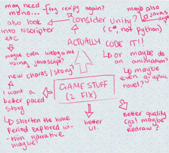
mind map. literal lifesaver. that i FORGOT ABOUT.
ok anwyay so I honestly had soooo much stuff to work on, like firstly I had to figure out if I even wanted to do a game now because of how insanely painful it was last time.... but ofc as you can so clearly tell, I LOVE to torture myself. so. yknow. that didn't last long, though I did do some really stupid sketches of comics (I will post these later I very stupidly forgot my sketchbook at home. erm. yeah. anyway.
the next thing I kinda looked into was the story. "kinda" I wrote up 4 different storylines. actually those will get a post of their own each bevause I consider myself a genius lowkey for the things I do with evil/toxic/tragic lesbians in my brain (God I love my OCs)
then I went on to actually look into the technical aspects of how I was going to make the game now. Honestly, I'd basically given up all hope on ren'py, so I actually decided I wanted to use unity and make my own setup for the vn on there. I found a really good set of tutorials on youtube, I'll make a playlist of those and link them in a seperate post too!
Along with this, I began to look into how I would elevate the artwork of my game- at this point I was still in the old style, using the old sprites and visuals, so I wanted to see if I could perhaps rig the character models on live2d! I actually spent quite a while learning how to rig 2d images on there, but then opted not to go down that path because I genuinely just wouldn't have time for that. That being said, it did help me a lot when I did end up changing the artstyle of the game to simplify my character designs, as that was something I had to get used to when drawing to rig.
This was hoenstly such a great starting point for me because I ended up doing SO much research and it rly helped my game blossom!!!
1 note
·
View note
Text
SPLATOON 3 DIRECT my thoughts n stuff :]
ok so obviously spoilers kjdfhgkjd i have Many Thoughts so i am gonna put everything under a readmore!
i am so eXCITED to walk around splatsvilllee!!!!!!!!! it's so much bigger n feels more Lived In!!!
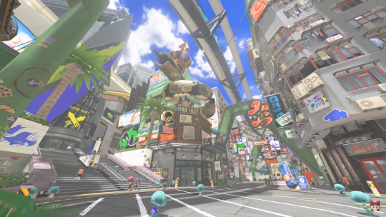
n i'm guessing the music playing in the first part of the video is what's gonna play in thee tutorial? w how the music builds up and everythingg and it's of the main songg n stuuff just like how it is in the first two games!
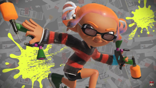
i Need this emote
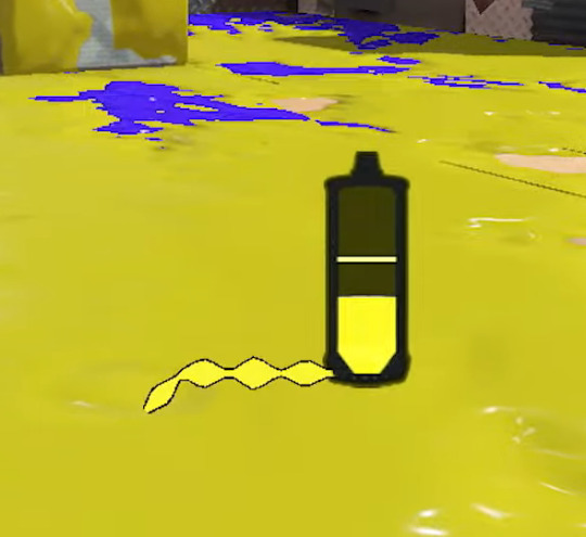
the new ink refill sprite thingy is super neat!!! a lil on the fence abt how it loooks but! i like that it shows that u get ink faster when swimming in ink!!
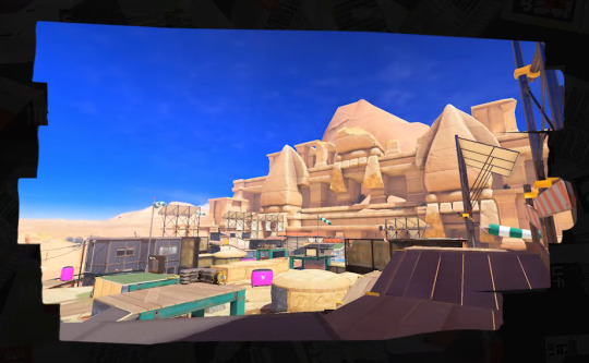
tHE STAGESSSS ARE SO COOOOOOLL i especially lOVE that including hammerhead bridge gives us an explanation as to hOW exactly we're transported to and from splat1 and splat2 stages -w- also it's so cool to see it finished!!! i haven't played splat1 nearly as much as splat2 but i'm happy that that stage is coming back -w- aND FLOUDER HEIGHTS IN THE UPDATE TOO also i lOVE the detail of the NILS statue being in the bg but u can't see it in the eng ver of the direct bc of the name covering it but u can see it in the japanese direct dhkdjfgs

mahi-mahi is nice too!!!!! i really liked that stage in splat1 :D and it looks so much better skjhdfgd and i am also wondering abt tHIS badboy history museum lookin stage in the updates >:3c
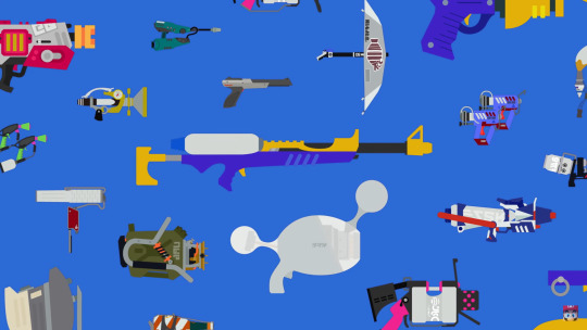
hello i Love the new flat clipart look of the weapons in the ui???? shown a lot better heree, i really hope that they make weapon wallpapers in splatnet 3 >:] it would also be nice if they added other ways to get wallpapers other than lifetime inkage :c
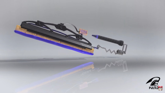
honestly idk how i feel abt the splatanas but i'm happy for the more melee leaning players out there -w-
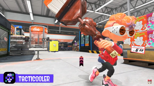
the tacticooler is so cool ;;; i love the lil jingle it plays when you deploy it n when you take a cann ;; also the bit showing it off has some new voice clips for the players!!! which is super cute -w-
i lOVE the design of the wave breaker ;; it's that lil ball string cheap toy thing i think, plus i think the concept is super cool tooo!!! very fun special -w-
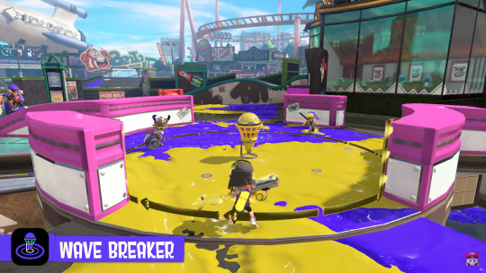
the reef slider looks cool!! not my kind of special thoughh, it's like a cross between a baller and a curling bomb hskjdfg

I AM SO HAPPY THEY'RE BRINGING THE TENTA MISSILES BACKKK AHHAHHAHAHHAA!!!!!!!!!!!!

i actually really love the new weapon currency?? it's super clever n i love that you can get weapons early!! dualie squelchers my beloved skjhdfgd n by how the freshness stars look and work i don't think that the freshness goes down when you lose a bunch now like how they did in splat 2! :0 which is really nice -w- when checking the splat website for extra details it looks like there are different kinds of liscences too! :0 bc having splatoon 2 save data grants you 3 gold sheldon liscences so that should meann that the ones on the screen rn are silverr? maybe tin n then there's bronze n silver? idk???
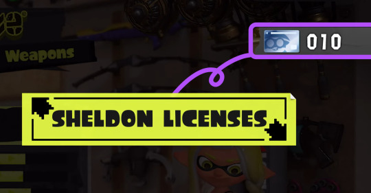
the music that plays in sheldon's shop is really nice ;-;
the new shopkeepers are pretty neat too -w- i don't have very many thoughts abt them :c except for mr coco he sounds so silly i love him dskjhdfg
also mURCH????????????????????????????????????????????????

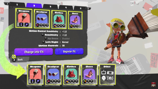
and you can change the primary ability now!!!!!!!!!!!!!!!!!!!!!!! which is pretty neat! i was wondering why the splatnet3 shop offered exclusive clothing now kjshdd i also really like that they did that! gives players a lil more incentive to use the app but still not make it essential to the game n stuff yknow -w-

the new freshest fits thing is really nice!! esp for people without amiibos dskjhdfg i'm glad they added that -w-
tHE NEW LOBBY UI IS SO COOL BUt also has me wondering a lil w how similar it looks to the oe ui. that coulped w the sea cucumber phones makes me hOPE that we get to see deep sea citizens around! or at least iso padre n cq maybe 🥺
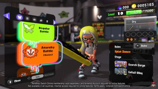
they show which team is in the lead!!!!!!! i fucking love that ty it takes less brainpower now <33

and rainmaker has checkpoints now!!! which is super nice so now the rainmaker doesn't always spawn back in the middle and you don't have to do that jump off the map to bring it back thing anymore bc the checkpoints are closer to your base now so yEAH that's super nice!!!

it looks like the merged all the ranks together again :0
I'M SO HAPPY YOU CAN PRACTICE N DO STUFF OTHER THAN MIX MUSIC WHILE WAITING FOR BATTLES TO START

all the lobby updates are so nice and there's so much content i want to kiss nintendo on the mouth
it's really nice that they moved the new snack bar! now i don't have to leave lobbies n walk all the way back when my ticket runs out dkjfghs

i want to know what tHIS DOES ..collectibles? 🥺
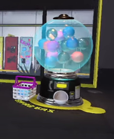
tHEY'RE THE APARTMENTS THAT WE'VE ALL BEEN WANTING!!!!!!!!! THANK YOU NINTENDOOOO also the splatoon equivalent of furbys n long furbys kdjfhgkdj

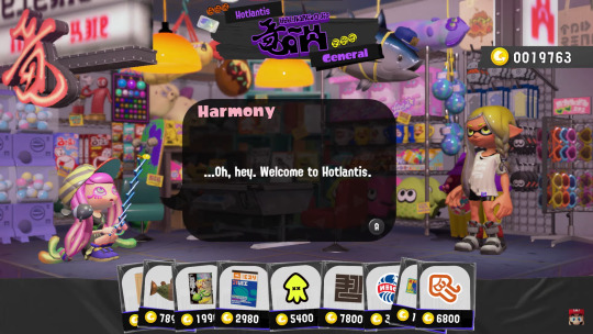
eeEEEE PARUKOO!!!!!!!!!!! the shop music here is so cozyyyy ;;;;;; also oh my gOD i'm so happy that there's more shit to spend our coiNS ONNN AAUHGUGHUGAA n seeing that there are gatcha machines in this shop too maybe the lil gacha thingy in the lobby gives you other stuff to put in you locker too? maybe some tickets n stuff thrown in the mix?
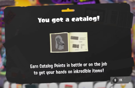
i love the splashtags and the emotes so mUCh ough i love how much customization we're gettinnggGG even in grizzco!! u can change your uniform which i think i super awesome! (that wasn't shown in the direct but rather it was said in the splat website linked earlier skjhdfg) and it's great that they're adding another way to get tickets oughh
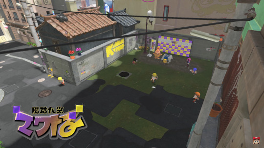
idk abt y'all but i LOVE the table turf battle!!! it's a lil cheesy but it's nice that there's this local thing to do in splatsville!! i kinda want a deck irl skdjfhgd and being able to play against locals!! it makes everyone feel so much more! alive!! and not just npcs glued to their store!!! also the card art is sO CUTE IDC IF Y'ALL THINK IT'S OFF BRAND OR WHATEVER I AM PLAYIGN THAT GAME AS SOON AS I GET THE DEMO (if u can even play it dskjhdg)

also hello i lOVE this lil alley there the card stuff is held
onto salmon run!! i lOVE the new boss salmonids! it's really nice how they kinda help players practice n learn abt ranked modes n specials!! this is true for the original boss salmonids too! the fry stick for tower controlll n the dolphin for splatzoness, the bigshot for the new wave breaker special and! idk abt the slammin lid but that name is super clever hdfkjghd i love the new music!!! :D

also you can use the big shot's thingy to shoot golden eggs???? i love you??

tHIS XTRA WAVE THING SCARED ME SO BAD ;;;;;;;;;;;; but also that's so cool?? i wonder what happens when you get to defeat it >:3c

ok i reached the image limit lemme make a new post
28 notes
·
View notes
Text
O wow I'm glad this actually reached some people :D
I'm gonna be tacking my reactions and thoughts to new stuff on this post so I've got a timeline of sorts. So if you want, you can stick around for my likely desent into madness lol. (only slightly worried that statement might be true at some point)
Spoiler warning for below.
So remember when I tagged this original post with the game being great at putting you in Sifs head?
Yeah I didn't hesitate for a damn second when given the option to stab that tutorial sadness. I had zero thought for how sudden and violent of an action that was. That scene absolutely haunts me.
I had just helped out my entire party, and really got to know them better. Only to immediately terrify them.
(I absolutely adored the helping out sequences, couldn't stop smiling (Mirabelle and Odlie were so relatable, and Bonnie's and Isabeaus made me grin so wide, I've been saying how badly Sif needs a hug this whole time)
(But all that made the whiplash even worse lol)
I mean I wanted something like Memory of Sadnesses to make navigation easier. But man. It's a memory only I have (?) that alters their behavior so severely. It's got me. Concerned, about the nature of the time loop.
Couple more thoughts rq. This post is more theory and paranoia flavored than the last lol.
The king is probably from that island that fell off the face of the planet, it could be the thing he wants to say before dissapearing, but physically can't cause yknow. Well ok I have no idea why exactly the island and everything associated with it dissapeared (maybe that's why he took such an issue with him dissapearing hm), but it's an established fact so I'll draw things from it. I really want to read that damn unreadable language that likely from there. That damn book wedged in the wall has been bugging me since loop 1.
Hey speaking of Loop yknow what else haunts me. The very starting cutscene when Sif eats that star...Why? Did they break the loop and choose to go back? Cause Sif never mentions it (the dream? Vision?) after they wake up.
Idk what Loops deal is. I mean thanks? Glad I have someone to speak to at all about any of this. What's with the meta game knowledge and looking at profiles? Almost feels like the player personified, just trying to help their favorite lil guy. Actually wait yeah. Typing that out I notice that makes a lot of sense with the "choosing to be here" lines. Hm.
Anyways see you on the flipside. Still in act 3, btw. Beat the king for the second time and, sadly not very insightful. Devastatingly hollow victory with the Head Housemaiden repeating the exact same thing (maybe cause it's the only thing Sif has ever heard her say? Hm)
I wonder why Sif is always hungry....
Ok I'll actually see you on the other side
You guys are never gonna believe the game I picked up on groundhog day.
It's the time loop game. In Stars and Time that is. I heard it was good and wanted to give it a try, didn't realize how funny it was that I picked it up on what's basically Time Loop Day.
(More rambling below)
I really really like it so far! Act 3 is breaking my heart bro, poor Sifirrin. I'm hoping I can figure out an escape. And I'm hoping this narrative isn't doomed, I'm going it 94% blind so I have no idea. So, wish me luck, I also hope this game doesn't break me in half but at this rate who knows :>
#isat#in stars and time#part 2#?#ig its a pt 2#cause im liveblogging my thoughts lol#idk i thought itd be neat to record my thoughts in the moment#instead of trying to remember what i thought was going on later on#current goals#find out what a damn secret ingredient is#read that unreadable language & open that one door#find time craft stuff#speaking of#...wth is rotting?#........is it me?
21 notes
·
View notes
Note
Hi this is my first time requesting a matchup, I hope I'm not too late.
So I'm 21 years old, capricorn, latina and INTJ on the MyersBriggs test. My friends call me "nats" as in my username but my name is Natalia. My pronouns are she/her and I'm straight.
I have tan skin, brown eyes, brown hair just above my shoulders and I'm 5"3. I'm also a bit chubby specially on the thigh and hip area and have a small chest. I HOPE I'm not making this too akward with this descriptions lmao.
I speak 3 languages: spanish (native), english and french. I'm currently studying computer science at univeristy and love everything in regards to technology in general, I think that it can be incredibly helpful in the right hands but also very dangerous if it falls on the wrong ones. My hobbies are watching anime, movies, playing videogames and playing the electric guitar :) I love to dance specially genres like salsa or merengue but I'm always up for it regardless of the type of music. I consider myself to be reserved so it takes a while for me to become friends with someone and by myself around them. I'm also quite introverted if it wasn't obvious by now haha. I adore coffee with my soul and my favorite date is going to a coffee shop and just talk about everything and anything while drinking a capuccino or an iced latte. I really like the horror genre in media, psychological and gore stuff. I'm also a fan of conspiracy theories, or anything that involves analysis and deducing events and hints much like Sherlock Holmes or murder mysteries.
I'm a very loyal person and I always try my best to be there for the people I care about no matter what. I have a very methodical mind but a sensible heart so they're always clashing in stressful situations. I have lots of anxiety but somehow if it's a "professional" setting I can pull it off, in any other casual situation I just can't handle it.
I'm just fine with seeing my significant other from time to time, we don't have to be together all the time to care for each other. I think this is relevant? My love languages are words of affirmation and quality time. I'm not big on material gifts, although I do appreciate them that's not enough to "win me over" yknow.
Idk I hope this isn't too much, I tried to be concise and not ramble as much. I love your writing and congrats on your blog's success you totally deserve it !! :)))
Don’t worry you’re not being awkward!! Describing oneself is always hard 💀 the like one time I submitted for someone else’s follower match up event I struggled HARD so no worries, I’ve been there hahaha. I’m so glad you like my writing, thanks for the sweet words ❤️
Another one I didn’t think I’d pair anyone with but I pair you with Izuku Midoriya!
He is so down bad when you talk about your major. He could listen to you talk about technology all day and will absolutely take notes so he can ask you about it later. Makes a note every time he sees something interesting and tech related pop up either at work or on the news so he can get your opinion on it. He’s probably hopeless at dancing when you first meet him, but you can bet he’s gonna be watching YouTube tutorials and asking Mina for help until he can at least hold his own so he can take you out dancing. He will go so far down the rabbit hole with you on conspiracy theories or anything requiring analysis and deduction. He’ll start mumbling away, tryna play 5D chess to figure shit out. Even if it’s a conspiracy theory he doesn’t believe in, if you’re into it then you can bet he’s diving into any and every aspect of it so the two of you can discuss.
I think Midoriya’s love languages would also be quality time and words of affirmation. Being one of the best pro heroes in the country and All Might’s successor is time consuming, so he appreciates that you’re ok with not being able to spend every minute together. When the two of you are together he makes it count and that’s what’s really important.
As you approach the doors for your favorite coffee shop, you fire off a quick text to your boyfriend.
Just arrived, see you soon x
No sooner than you’ve hit send do you look up to see the man in question giving you a sheepish grin with two cups already in hand. You chuckle to yourself, making your way over to Izuku who’s already got a blush high on his cheeks.
“Patrol finished sooner than expected so I came here a little early,” he admits.
“How early?” you question.
“Uhhh, don’t worry about it. Here! Your usual cappuccino!” he answers, the blush on his cheeks intensifying slightly as he presses one of the cups into your hand.
You chuckle but thank him, pressing a kiss to his cheek as you settle into the seat across from him.
“So tell me about your day?” he asks genuinely, leaning forward onto the table to give you his full attention as you answer him.
The two of you stay there for hours. People wander in and out, employees clock out and in again, your drinks are drained and shortly afterwards replaced, until the sky turns from blue to red and orange and the last shift starts to clean up.
Midoriya trails off mid sentence, the hearts practically visible in his eyes as he traces over the features of your face.
“What is it?” you ask, fondness bringing a chuckle to your lips.
“Nothing it’s just, uh, you look really stunning in this light,” he admits, eyes sliding to the side as he scratches the back of his neck sheepishly.
Something warm grows in your chest and your expression goes soft. You reach one of your hands forward to grasp his, fingers tangling together as you squeeze gently to show your appreciation.
“Let’s get out of here, looks like they’re closing up,” he points out.
You nod, both of you rising and throwing your trash away. As you both walk out and into the cool autumn air outside, he wraps an arm around you and pulls you in tight. The door closes behind you with a quiet click, followed shortly afterwards by the sound of the lock turning as the last employee shuts everything down for the day. They watch you leave with a fond smile on their face, knowing they’ll see you both doing the exact same thing this time next week.
4 notes
·
View notes
Text
x4 me to die - let’s watch the twewy anime
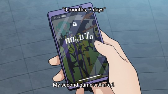
oh yeah wow the sub timing’s really bad lol. good thing im a fast reader! (and i also have ears)
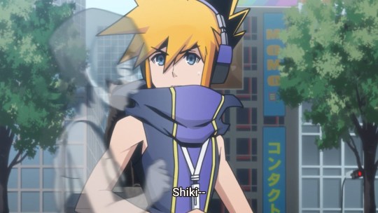
oh nooooo he mistakes someone else for shiki ;;; theyre really cranking up the pain of some of these scenes to 11
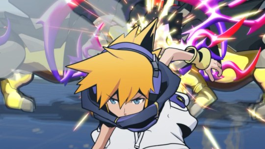
ok so ive been slowly trying to get through final remix, which is easier said than done because im old now and the controls do a number on my wrist. anyway i had to fight one of those rhino things and totally forgot you have to aim at its ass. but it turns toward you whenever you hit it anyway? goddamn fucking rhinos
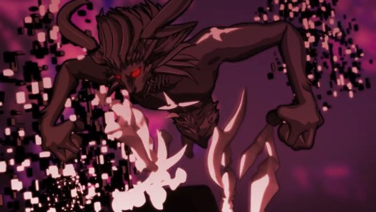
alright, fun story, i didnt play twewy right when it came out because i was a baby who needed my mom and dad to buy games for me. but my VERY FIRST memory of it is wondering why the fuck this person i followed (uhh “watched”?) on deviantart kept saying “zetta slow xDDD” what does that mean, what’s slow, more like zetta annoying as shit
my opinion has not changed.
and now i have money to spend on games and mountains of sho beanbags
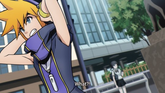
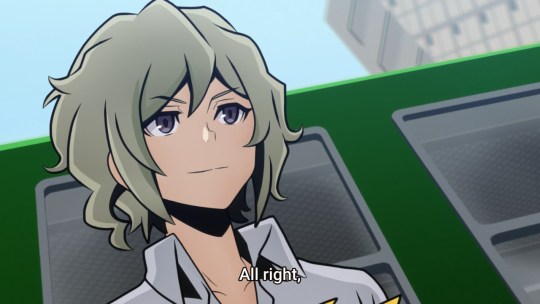
iiyo
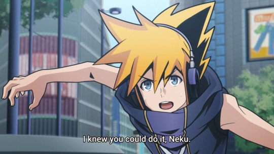
so they had josh call him “neku” twice before asking his name in the DS NA version, edited that out of the switch NA version, but now it’s back here
our normal friend josh! also he slow claps lmao
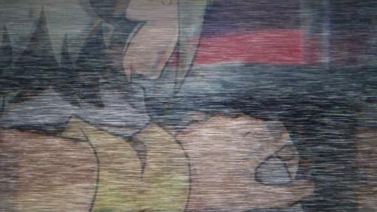
alright, i was wondering how they were gonna do this--actually imo the first scan happening by accident like this makes more sense to me than the game’s “just scan me if you dont trust me” “i know that won’t work (does it anyway)”
.......but now i wanna know how the other josh scans will work out? in the game he could do it, like, secretly from afar, but is he gonna be like “hey bro dont mind me just gonna platonically touch your shoulder and stare into space for a bit, as bros do”
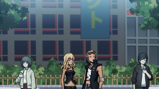
more foreshadowing! ok well it’s more like straight up “these two are players now” but yeah
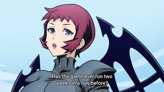
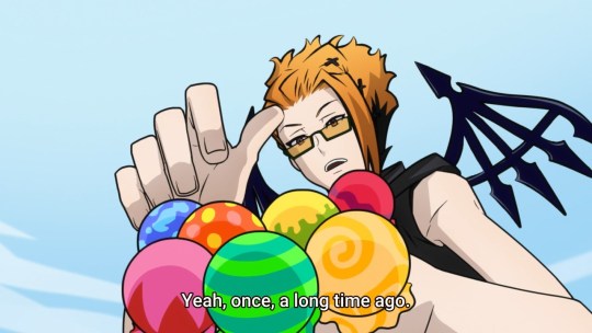
there it is, the line that sparked years of twewy conspiracy theories
(...from me. are they gonna elaborate on this in neo?? I HAVE TO KNOW)
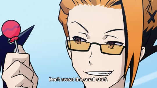
bro we all know youre like 40
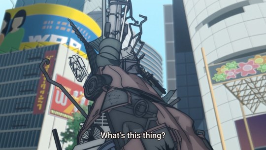
one time i trespassed visited a junkyard with my dog and she kept jumping into all the junked cars because she wanted to go for a ride. it was adorable.
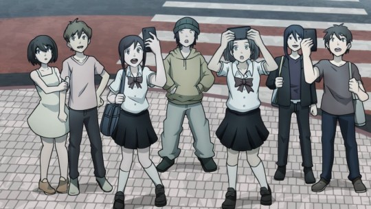
OH NO! OH GOD! ALL THIS TIME I THOUGHT THESE THINGS WERE JUST IN THE UG BUT EVERYONE CAN SEE THEM??? #CRINGE #CRINGE #CRINGE
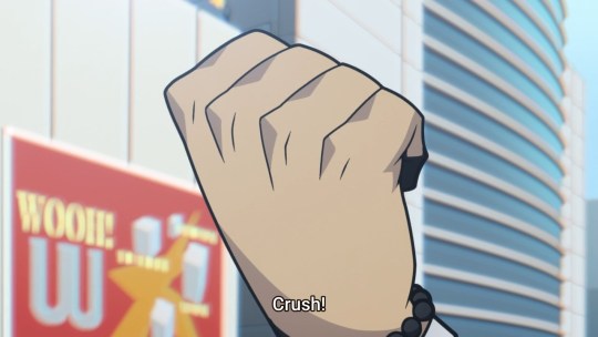
it’s too much. my rage has dissipated into solemn acceptance. all i can think of to say is “ouch” and “this is really sad”
(and “wooh! w”)
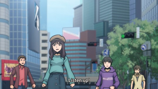
these guys are cringing too
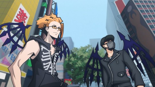
OH RIGHT I ALMOST FORGOT, i didnt mention it before but the reaper grunts’ designs have changed, and someone pointed out that the red ones’ is really similar to neku’s new design in neo
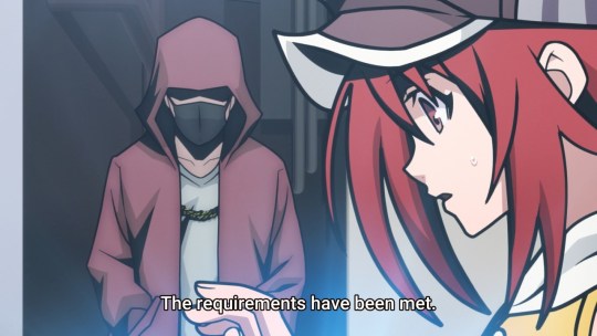
chain necklace, mask, v-neck, hoodie
this has some unfortunate implications!!! (i mean assuming it IS neku, which we dont actually really know yet)
anyway
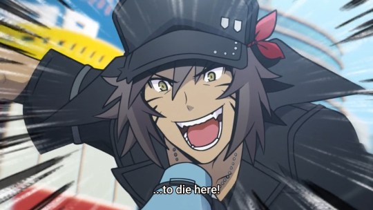
koko de 4ne
(the subs dont even try to translate the goroawase... a blessing or a curse? u decide)
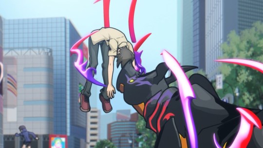
[insert really gory sfx here]
but no blood? that’s weird. do players not have blood?? or maybe someone stepped on a burger or something. anyway this guy’s hella dead
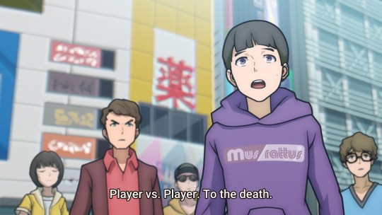
then sho tries to make everyone kill each other???????? but neku’s like “dont listen to that asshole” and theyre like “ok”
...yo that’s totally the mus rattus shopkeeper on the bottom left there

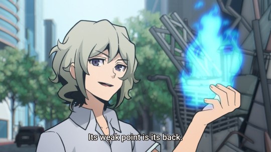
gee thanks for the gamefaqs josh wouldve been useful a few days ago
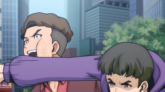
oh nvm there’s violence anyway. “what no, purple hoodie guy, purple hoodie guy no”
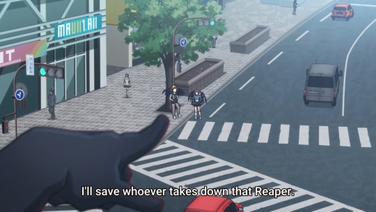
BRO????
okay well now kariya and uzuki are summoning rhinos too. rhinos all over the goddamn place. goodbye, yumi sheena
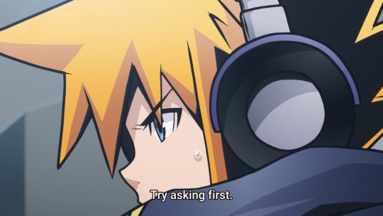
subs leave out number puns: thank you
subs translate “follow my lead” “screw that” differently: noooo whyyyy i hate funimation :’( :’( :’(
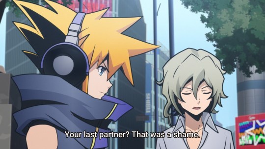
in the game neku tells josh what happened to shiki and he’s like “happens all the time who cares lol”
here, josh already knows makes a lucky guess. because it happens all the time.
normal friend josh!
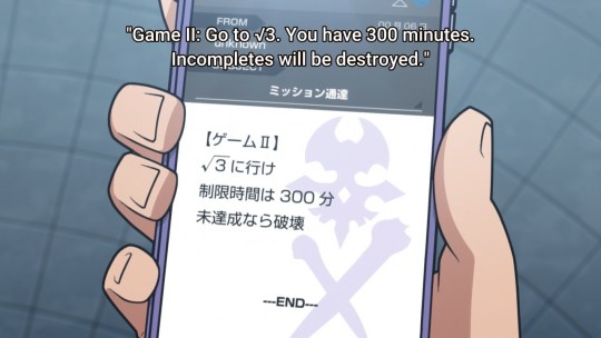
five hours
yknow what, yeah, considering sho’s characterization here, he probably did want them to just murder the winner for the gold pin
--oh wait no this isnt the gold pin mission. but still
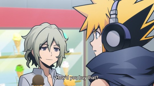
“i stole it :)”
shopping tutorial’s moved way ahead to here. clearly this is foreshadowing josh’s princess umbrella, which will prove invaluable in the final battle
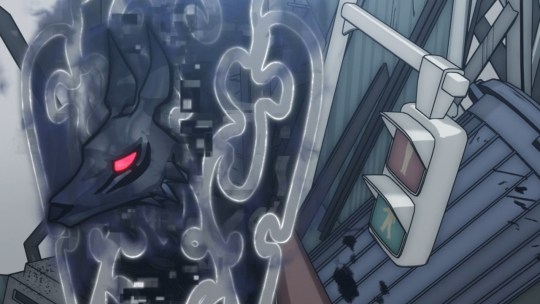
man i wonder who’s responsible for making all that taboo noise? it’s a mystery
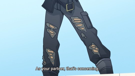
ugh, anime is full of male gaze :///
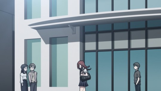
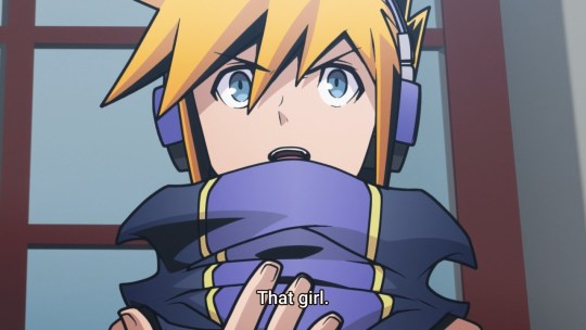
OH OKAY THIS IS DIFFERENT
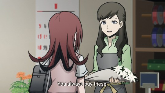
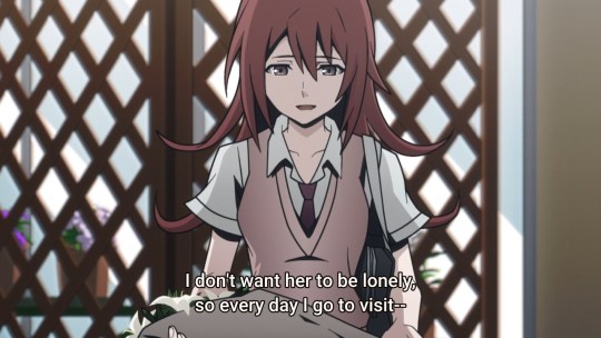
zowee
yooree
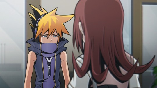
:(
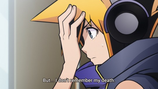
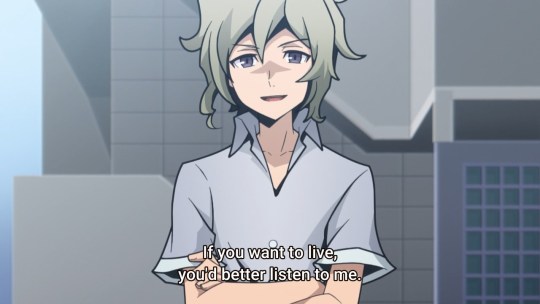
♫ there’s our friend, our normal friend, there’s our normal pal josh ♫
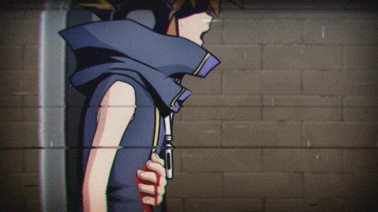
♫ he’s a normal guy, with red glowing eyes, he likes to think about how neku dies ♫
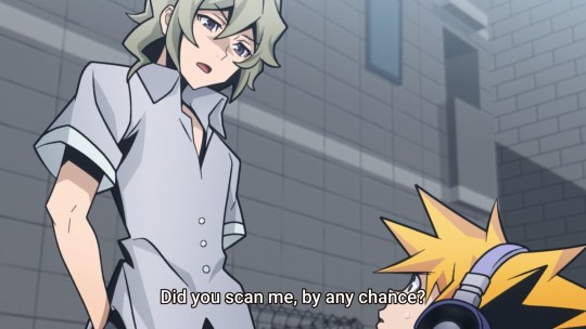
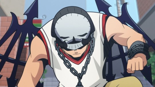
what an awkward situation! luckily beat is here to punch neku in the face to break the ice, as well as neku’s jaw
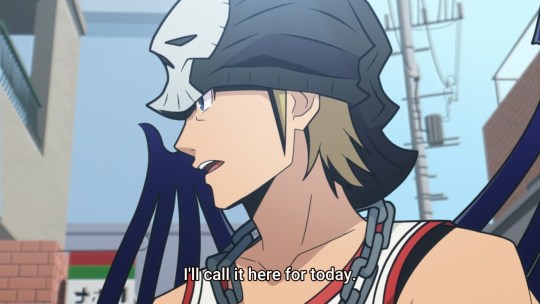
and... uh... then he leaves. the end
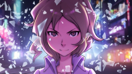
♫ normal guy, breaks glass with his mind ♫
bonus:

#i hate you... but i love you... but i hate you...#twewy spoilers/#this took way too long because tumblr fuckery sry
23 notes
·
View notes
Note
what are some of mod dave's aus
uhh ok this is a fucking plethora
SO I HAVE!!
HUMANSTUCK - i just imagine this one by default,,, uhh john was definitely born in athens greece. terezis been chinese / korean this whole time idk what youre talking abou-,t-
DEMIGODSTUCK - i Know i have gone into detail about on this blog before. my favorite concepts from this one are greyro ace vitiligo aphrodite son karkat who doesnt feel like he fits in with his cabin cause they make fun of him for being “ugly” and “loveless” and then he comes around and completes a quest and becomes head counselor, and uhhh hephaestus dirk who has pyrokinesis and also loses an arm so now hes got a metal one he built himself
DONT LOOK DOWN - my greyromantic human-collegestuck 18kword banekat fic im writing which ive Also mentioned on this blog before
DEAD KIDS - this is based off a katie alender book called “the dead girls of hysteria hall” please read that book its fucking phenomenal dave is the one who inherited the asylum and all the homestuck girls are the ghosts trapped inside its made my friends cry before when i made them read it hal almost busted out his witch charm and warded me away cause of dead kids
DONT STARVE - where everyone lives in the 1920s and they get sucked into tim burton minecraft island hell and they all gotta survive there (handmaid is definitely charlie. it fucks aradia up cause she Knows. think like winona. she gets one free night without being consumed by the darkness itself cause Family Reasons)
MINECRAFT - this one is where a lot of people are like sentient humanoid half-creatures like sollux is half creeper half human and dont. uh. dont get him mad. also drowned eridan and feferi but theyre not dead or brainless they just be lookin like that. its cool !! you know !!!
MEDIEVALSTUCK - terezi is an oracle of the church except not anymore shes blasphemous and gets exiled and its her and a bunch of friends who are all like “wow the kingdom thought i was weird too lets all have an adventure together”!! examples: dave cant be a knight cause his eyes are red and that means hes the devil. sollux is a mage who specializes in death-related magic so obviously he brought upon this plague. rose is a lesbian thats not allowed also shes a WITCH. kanayas a vampire. shes just a vampire. she proposes to rose with a sword
EARTH INVASION - this is a no-sburb au where the alternian empire came and took over earth as a colony, also all the trolls exist at the same time as the revolution so like the whole vantas family gets to help out, and the humans are taken as like property cause theyre Technically Lowbloods but theyre Not having it so they all escape and join the rebellion and take down the GOVERNMENT
TROLLSTUCK - daves a mutantblood (same idea where all troll generations exist at the same time) and he finds the vantas rebellion and JADE is a LIMEBLOOD and she is NOT having a good time but shshhs shh its ok shes an olive its FINE
BLOOD / KIDSWAP - kanaya is the vantas and she thinks shes so clever cause shes posing as a bronzeblood. there IS sburb in this one. also dave egbert and john harley. love those boys. jade lalonde is a terrifying concept if she ever goes grimdark run away immediately
OPPOSITESTUCK - jade is the main character and she just wants everyone to shut the fuck up. this is also a sburb au and she hates her land its Too Loud. uhh rose is a being of chaos and exists in the void outside of spacetime itself. and john is a little bastard. tavros is now The Antichad. which is a valid ancestor name actually-
CYBERSTUCK - this one is really really specific, uhh its a post-apocalyptic dystopian cyberpunk futuristic humanstuck where the city everyone lives in once flourished with the help of several versions of androids, but as they advanced they needed more and more power which became fucking nuclear and there was a fallout. so now everythings radioactive, everyones scrounging to survive, androids from “the underground” (the main core of where most of specifically the power droids were kept) are SUPER fucking valuable cause theyre able to give you power, and the radioactivity mutated a lot of people so instead of zombies there are just mutants. and roxy is one of them but theyre still sentient so they look like fucking HEINOUSTUCK roxy but theyre still like. vibing
MAFIASTUCK - where everyone does Illegal Things but mostly not like morally illegal things. just like. yknow daves a thief and. sollux is the most wanted anonymous hacker in texas,, uh. dirk commits arson sometimes,. vriska is vriska,.. jane is in on some high key white collar crimes in the crockercorp company,, and poor john is just this normal idiot surrounded by all of this at college and hes like “god. i hate you all. please be normal”
MIRACULOUS LADYBUG - uhh john has a miraculous and its firefly themed and thats his name !! “firefly”!!! his Big Power is like “typhoon” or some shit he can make a big storm Go and serenity the firefly is his little fuckin uhhh Friend. the Miraculous Animal i forgot what it was called
YOUTUBERSTUCK - this ones based off unus annus p much where like theyre all youtubers and thats how they all met like john and dahnte (banes oc, ive also talked about dahnte) are unus annus and dave and sollux are like. good mythical morning and roxy is an asmr channel and kanaya is a makeup tutorial channel and jade has a vlog with her dog and its called doggy vloggies and eridan does all these science experiments and jane has a baking channel and nepeta ,, she just like. does, what she does and people like her. she doesnt have a genre. shes just nepeta on youtube. and shes a fucking hit. also dirk and jake make music
then like i obviously have concept aus that are pretty much just designs, like gemstuck where theyre all . ,, steven universe gems, and then rwbystuck where theyre all at beacon academy and have their own semblances, and a one piece au where theyre all pirates and some of them ate the Big Shit Fruits, and my own flavor of demonstuck cause who doesnt have a demonstuck, and stardew valley stuck (which i call starstuck valley) where a couple of them are farmers on their own respective farms and they all come together amidst the idiot villagers and go “hey did that wizard make you drink that leaf juice soup too or like is that just me”, and a survivalstuck where the whole premise is like. “the forest” kinda game. oh shit your plane went down and youre stranded in the woods. find your friends and survive. maybe dont get near those eight-armed women with no heads. thats a good idea
long story short i have. uh. a plethora
77 notes
·
View notes
Photo
mobile header tutorial
hello! I’m here to share how to create a header similar to these that i’ve done in the past. here are the tools i’m using:
photoshop cc 2018 (from @birdysources)
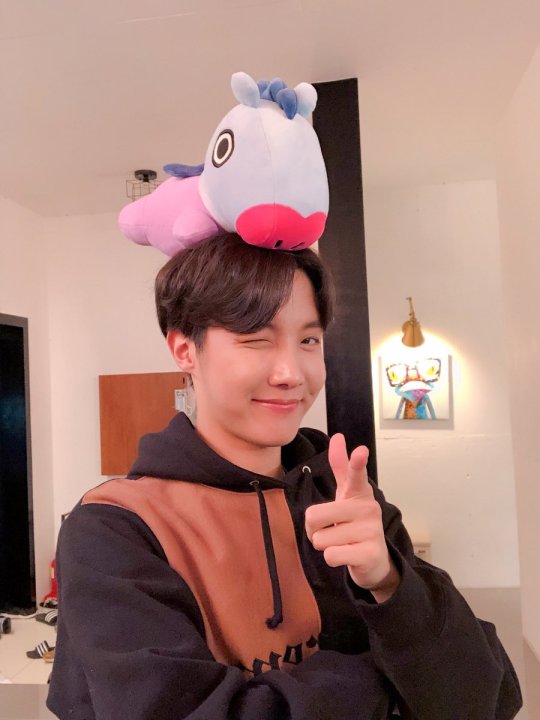
some picture of hoseok probably from either twitter or weverse i don’t remember lol
i included pictures and tried to make it VERY beginner friendly, but please, send me an ask or dm if i’m unclear at any point. it’s 2:38 am as i’m making this tutorial and i just downed my cold brew so i’m sorry if it’s messy
1: open your picture in photoshop (here’s the picture of hobi if u wanna follow along)
2: find the quick selection tool
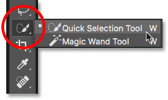
you’ll find it in the left sidebar, fourth from the top. i’ll often use this and the tool above it (polygonal lasso tool) depending on the photo. the quick selection tool is faster but more tedious, in my opinion, but hoseok was easy enough to cut out just using the quick select. use both! whatever u are comfortable with.
here are my settings for the tool:
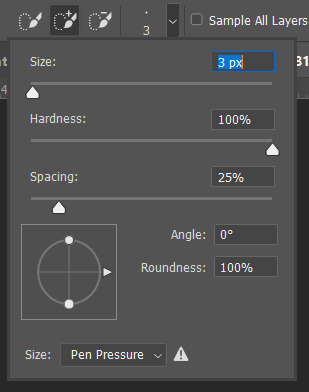
i almost always keep it at 3px. unless the image is huge, then i’ll go up to 5px, but never really above that.
3: trace over your subject(s) (aka hobi) by dragging the tool along the edges, until you’re happy with the accuracy:
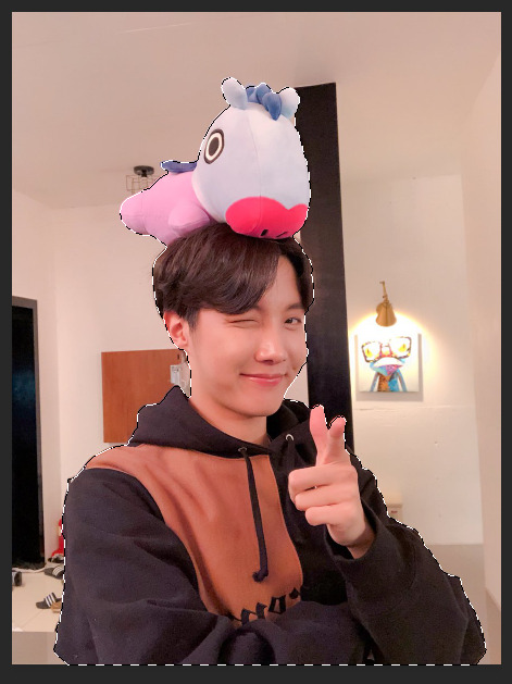
4: find Select and Mask (directly above the image):

and here are the settings i’m using:
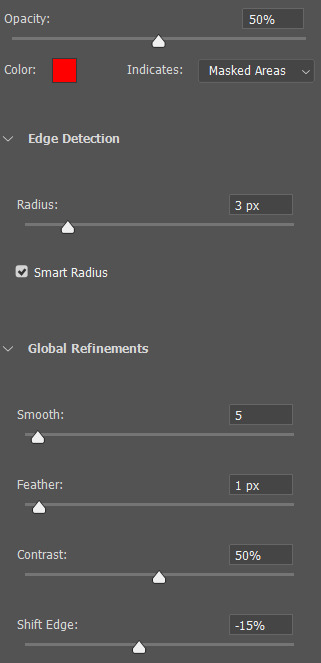
then press ‘Ok’ !
5: Select Inverse (right click inside subject)
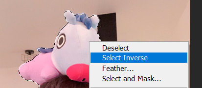
now we’re going to press ‘backspace’ on your keyboard, and the background will be gone~
make sure your file isn’t locked! it should be labeled ‘Layer 0′ and not ‘Background’ (if it’s locked, just double click it and press ‘Ok’ on the window that pops up)
after pressing backspace to delete the background, it should look like this:

then deselect it all. now is the time to look closer at your newly made render and see if there’s any cleaning up to do. i’m good to go, so i’m gonna continue on with making my header.
tip: drag the subject (hobi) with the move tool (very top tool on your left sidebar) to the center so he’s in the very middle. it should click to the center (you’ll see the pink line)

it’s not necessary for the tutorial but if you plan on saving this render as a .png and dispersing the renders you make-- it’s just cleaner looking to have them centered!
6: File > New

i always use 800 x 430 for mobile headers. for gifs, i size it down to 650 x 349.
7: resize and drag hobi into the new canvas (Image > Image Resize)

for single subjects like this i usually resize them to ~300 to ~400. whatever you think looks best tbh
now drag the file from its place up top:
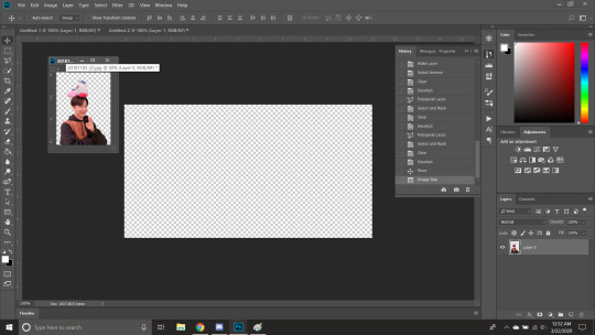
then the file from where it’s labeled ‘Layer 0′

8: now hobi is inside the canvas where the actual header is going to be made~ you can get rid of the render, or save it as a .png, whatever u plan on doing w it
i’m gonna center my hobi for the header i plan on making! from this point it’s just gonna be coloring, sharpening, etc. if you’re interested in using any textures like flowers or bring in other renders of objects, DeviantArt is a great place to search for texture packs. @beapanda on DeviantArt makes beautiful resources (kpop and non kpop related) be sure to credit them or whoever u save ur textures from!
for this header i’m not going to be using any outside resources, i just want my hobi to be the focus~
for the background, i’m gonna use a gradient from this site (this pack is 200 images. phew)
i’m using no. 200 from that pack.
9: optional- i’m gonna make some extra layers and start coloring hobi using clipping masks.
make a new layer > right click the new layer and find ‘create clippink mask’ > set the layer to either color, overlay, or multiply (whatever you think looks best and does what u are trying to achieve)
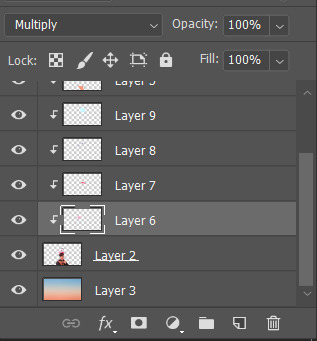
here i’ve just make layers to color things like his hair, his hoodie, and baby mang
here’s with vs without:
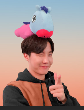
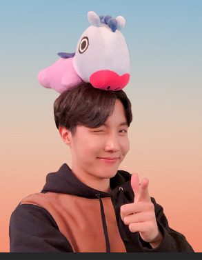
and when you’re done, go ahead and right click your primary layer (subject layer) and click ‘merge clipping mask’.
10: coloring~
find a psd you like or being to color the header yourself. for this header i’m gonna be using a homemade psd. i’m not gonna go into detail bc there are sooo many places to find psds on tumblr and deviantart. just like you brought hobi into the header canvas, drag your psd there, and that’s how u apply a psd.
when u are happy with the coloring, right click the bottom layer and flatten the image.
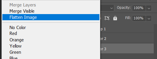
11: topaz clean + unmask sharpen
topaz clean is an addition u have to manually add to your photoshop program. u can google how to do it, but if anyone’s struggling i can show u how i did if i remember (but i’m pretty sure i do)
topaz settings:
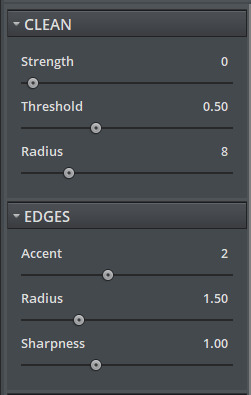
unsharp mask settings (go to filter > sharpen > unsharp mask):
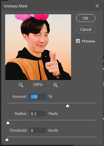
honestly, topaz is completely unnecessary, but i like the way it looks so i’m gonna go with it anyway. sharpening the header alone will still give you a great outcome
12: final step, header border time~
over on my film/tv blog @gusdapperton i’ve made a header template pack (click here if u just wanna use my premade borders) but for this tutorial i’m gonna show u how i actually made those (minus the cloud one, i was just fucking around lol) (it’s so simple)
>>> if u DO just save one of the borders i made in that pack, resize it so the width is at 800 and drag it to your header canvas. set the layer to ‘screen’ and bang there u go!
BUT with that method u can’t change the color from white. so if u want a border with any other color, keep following the tutorial >>>
go to view > rulers and select that to show the rulers (duh)
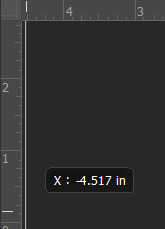
click from inside the ruler (light grey) and drag out your guides. here are where i’m placing mine:
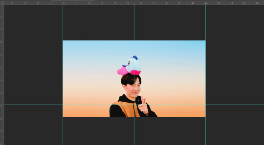
they should ‘snap’ right into place, but if they don’t, make sure u go to view > snap and that’ll fix it. u will know what i mean once u try it lol
select the curvature pen tool (right click the pen tool to show more tool options):
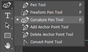
and begin to place your dots. thanks to the guides, these dots will also snap into place
here are mine:

(i eyeballed the two in the middle, it doesn’t need to look perfect tbh)
this next step is sorta stupid but i haven’t found a better way to do it yet lol
to close the shape just make sure to closely follow the direction of the dot you last placed, then go around to make your way back to the first... it looks silly but like this:

just play around with the shape and the tool... u will get the hang of it lol
now look up ^ and press Selection

then ‘Ok’ in the next window. then boom~ there’s your selection for the border we’re about to make.
make a new layer then select the rectangular marquee tool (second from the top on the left sidebar) and either drag with your mouse or use the arrow keys to move the selection we just made. here is where i’m placing mine:
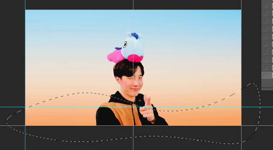
then select your paint bucket tool (if you can’t find it, right click the gradient tool and it’ll be one of the sub tools, like i showed u with the pen tool)
make a new layer, then fill it in (i’m using white)
you can stop there, but to make that line like i did in my border template pack, press the down arrow on your keyboard and go down 5-10 pixels, press backspace, go down the same amount of pixels, and re-fill that area.

now unselect. there’s the border~
now go to view > clear guides to get rid of those. u don’t need em anymore :) i’m also going to move the border we’ve just made down to the bottom of the canvas since we don’t need that big gap there.
>>> tip, don’t fill in the white directly on the layer if you wanna change the color. create a new layer on top of the border layer, right click > create clipping mask > fill the layer with the color u want for the background. example:

it saves the integrity of the shape. if you color fill right over the white, look closely and you’ll see it looks sort of pixelated and not as clean or smooth. it’s subtle but noticeable enough to me where it bothers me.
since this color i chose is kinda vibrant and clashes, i’m gonna help it out some. go back to the quick select tool and select everything inside your border layer. make a new layer, fill the layer with black (any color will do, it doesn’t matter) and set the fill to 0%. double click that new layer, and a new screen will pop up. go to drop shadow, find the settings you like, and boom. here’s what i did and what it’ll look like:
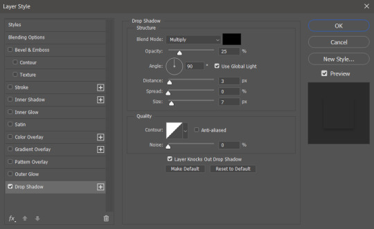
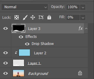
now u are finished~ i didn’t do this but u can skip sharpening the header earlier in the tutorial and reflatten the image again to sharpen it at this point instead but, yknow, i didn’t do that lol
here’s the final product (save by going to file > export > save for web)
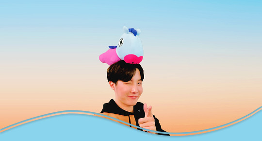
preview of how it looks on mobile:
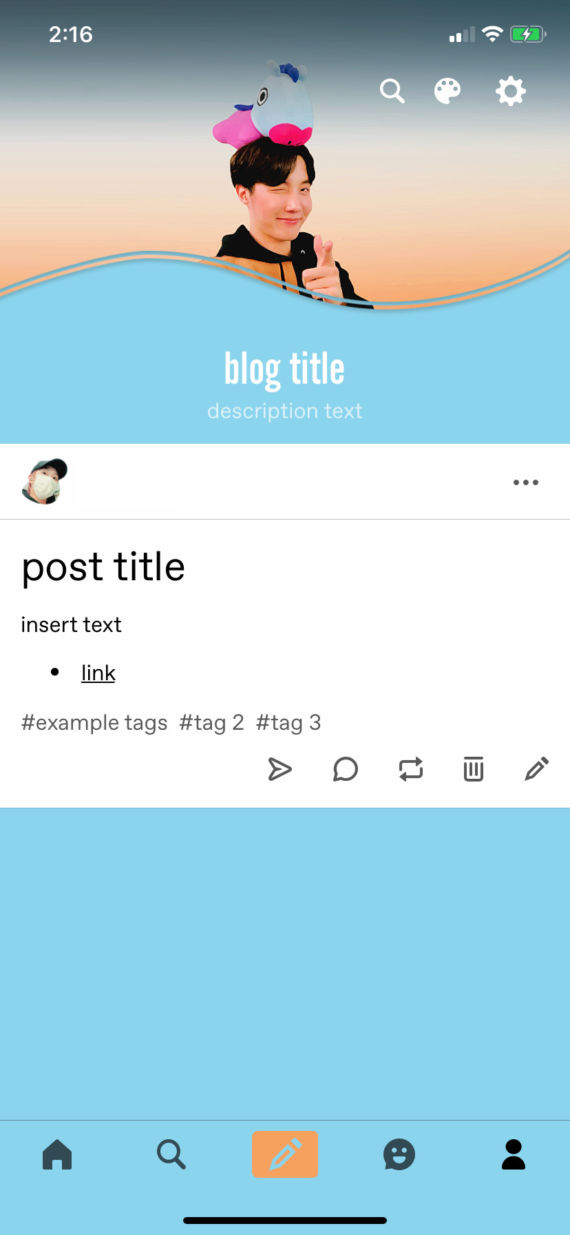
background: 8bd4ed
the end~ please send me an ask or dm if you haven any further questions, i will try my hardest to help <3
#photoshop tutorial#header tutorial#allresources#completeresources#mine:tutorial#i probably fucked up somewhere but it's bed time so i will find out in the morning hehe
149 notes
·
View notes