#oh YEET
Text
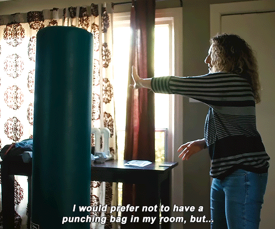
I am simultaneously deliriously in love with the ending of Loki season 2 and absolutely loathe it
On one hand…Shakespearean tragedy at its finest, essentially circling back to Loki’s original Thor 2011 character arc by reversing it, and Loki has literally ascended to godhood. In the end, Loki’s ultimate selfless sacrifice was to sit upon the highest throne in the multiverse, and that to me is tragically ironically beautiful
On the other hand…Loki being alone makes me want to burn Marvel studios to the ground and do other unspeakable things
Best and worst ending of all time f u Eric Martin
#loki#loki spoilers#WHAT DID IT COST? EVERYTHING#NO ONE WON#sylki#Lokius#oh i love it and i hate it at the same time#*screams*#*yeets myself out the window*#loki series spoilers#loki season 2 spoilers#hey guys I would appreciate that you not tag this as just Lokius or Sylki cause this post is not ship specific#sylkius if you must#people finding out I ship romantic Sylki and queer platonic Lokius are gonna be surprised
14K notes
·
View notes
Text
dnp are so much worse than we could ever be. they bully us for being like omg they touched and then sit there screaming and giggling and kicking their feet because omg dan helped phil sort his fringe out in 2015 that’s soooo sweet!1!!1!!!!! 😭😭😭 omg did you see how they communicated without words?? 😱 they are so in tune with each other they have such a powerful connection 🥹🥰😆 so cute how dan was looking out for phil soulmate shit fr 🥺 let’s watch it again 😝😍🤣😵🤭🫨 like shut the fuck up?? fucking phannies?? you’re so embarrassing??
#it’s already annoying enough that we know they see two of anything and go ‘omg that’s us’#and that they send each other posts like ‘this was made for us 🥹’ and sit around going ‘oh my god that is SO us 🥺’ ‘i know! 🥺’ like go away#THEY HAVE A FRAMED PICTURE OF THEIR FINAL FANTASY CHARACTERS FFS WE CANT BEAT THAT#they are the biggest phannies there’s no competition#knowing that helps me sleep at night#i’m like ok being a phannie humiliating and shameful but it could be worse i could be dnp#/j#self love is good i guess#hi sanj if you see this im sorry for neglecting you i haven’t not been on twt#dnp#dan and phil#phan#dip and pip#d&p#dapg#danandphilgames#dick and penis#yeet my deet#dan howell#daniel howell#amazingphil#phil lester#danisnotonfire#yeet my deenp#tatinof#dnptit#pp42??#bog#tmogar
2K notes
·
View notes
Text

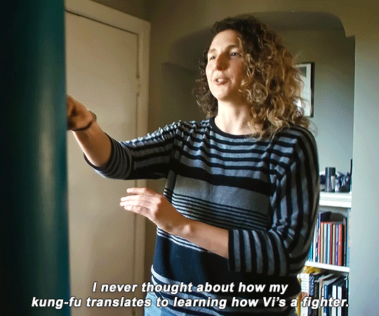


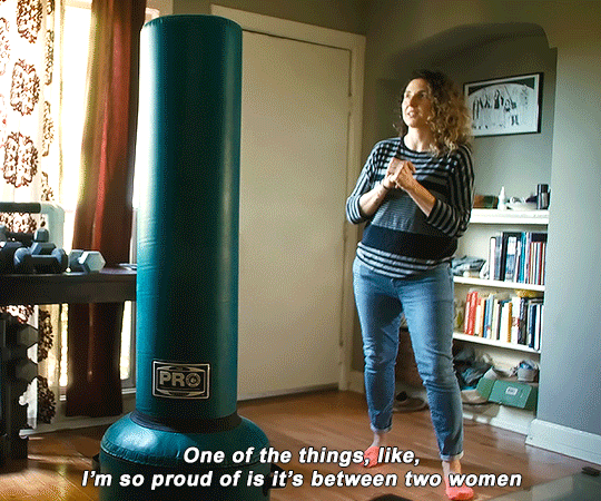

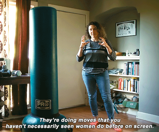

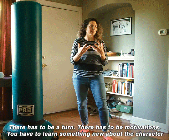
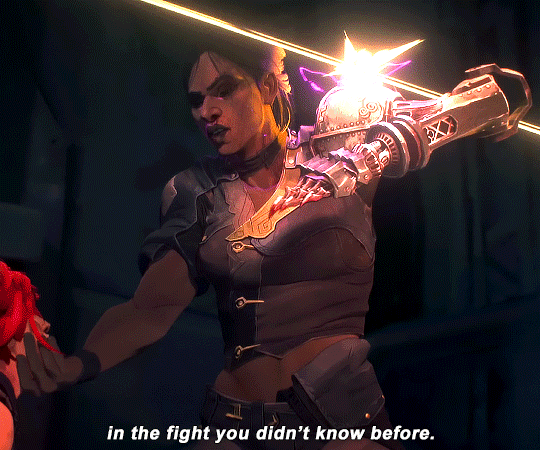
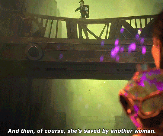
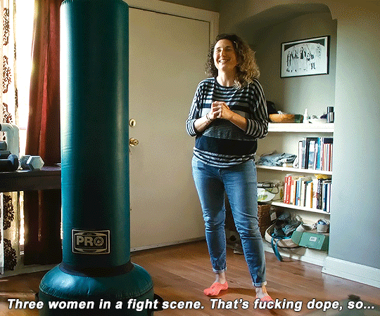
ARCANE: BRIDGING THE RIFT Part 2 - "Persistence (Or When Your Best Still Sucks)"
↳ "You're, like, always trying to get into the heads of the characters in any way you can. "
#arcane#arcaneedit#arcane league of legends#league of legends arcane#arcane bridging the rift#bridging the rift#vi#sevika#amanda overton#caitlyn#caitlyn kiramman#vi arcane#arcane vi#sevika arcane#arcane sevika#media: bridging the rift#also i made a typo but god i already deleted the psd file dammit………. oh well lol#2 gifs in a day?? yeah but watch me yeet outta again since holidays are over lol
2K notes
·
View notes
Text
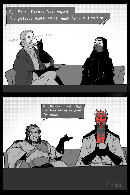
Continuing this fix-it AU where Commander Fox springboards off the deep end into a full-on rebellion, featuring unlikely allies belatedly finding out they are allies far too late to stop being allies but then again it’s never too late not to throw a terrifyingly destructive fit about it (Maul)
Close-up’s under the cut


#fan art#artists on tumblr#star wars fanart#star wars: the clone wars#fix it au#commander fox#obi wan kenobi#padme naberrie#darth maul#Fox - this NEW ally I found is amazing he too hates the Chancellor and he’s giving me guns to use which is my favorite thing#Obi-Wan - Oh perfect I can’t wait to meet this mysterious ally#Maul - Bet#rebel!fox#Maul/the ever present urge to yeet into the void when you realize you’ve been helping your second most hated sworn enemy#feat. Padme slowly but surely losing her will to keep the pinky extended#My sole goal was to come up with context so I could draw that Maul face and it got out of hand#Repurposing GAR Armor AU
1K notes
·
View notes
Text
ngl there's something incredibly funny about how shen yuan transmigrates into an entirely different guy and his narration immediately starts calling himself by that guy's name. meanwhile the actual original article gets relegated to being called "shen jiu."
imagine you die, someone jacks your body, and then everyone starts calling the bodyjacker by your name and you by your fucking deadname.
#svsss#shen qingqiu#shen jiu#yanyan speaks#god there's probably actual meta written about how quickly sqq seems to shed his old identity#like we don't really see him angsting about permanently losing contact with all his loved ones#or getting yeeted into an entirely different universe#it's just “oh no im gonna get murdered :(” and then “bingheeeeeee”
628 notes
·
View notes
Text

I posted 48,147 times in 2022
That's 16,094 more posts than 2021!
79 posts created (0%)
48,068 posts reblogged (100%)
Blogs I reblogged the most:
@maximum-ride
@gundham-tanaka-did-nothing-wrong
@joey-wheeler-official
@optimisticgalaxynightmare
@bubblesthemonsterartist
I tagged 13,897 of my posts in 2022
#bloodborne - 1,801 posts
#elden ring - 1,651 posts
#dark souls - 843 posts
#genshin impact - 646 posts
#dark souls 3 - 449 posts
#dark souls 2 - 357 posts
#persona 5 - 330 posts
#fave - 316 posts
#tma - 294 posts
#chainsaw man - 274 posts
Longest Tag: 139 characters
#tumblr memes come and go like waves hitting the shore and there i am sitting sinking further into the sand and getting splashed in the face
My Top Posts in 2022:
#5


See the full post
12 notes - Posted August 22, 2022
#4

22 notes - Posted October 29, 2022
#3

249 notes - Posted October 4, 2022
#2

297 notes - Posted February 24, 2022
My #1 post of 2022

505 notes - Posted May 2, 2022
Get your Tumblr 2022 Year in Review →
0 notes
Text

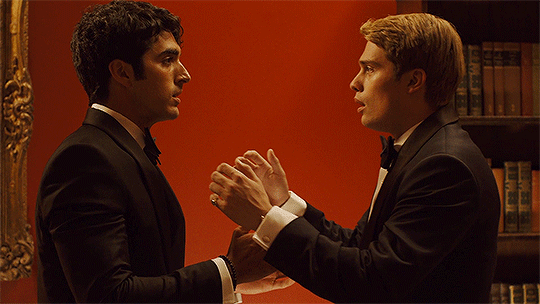
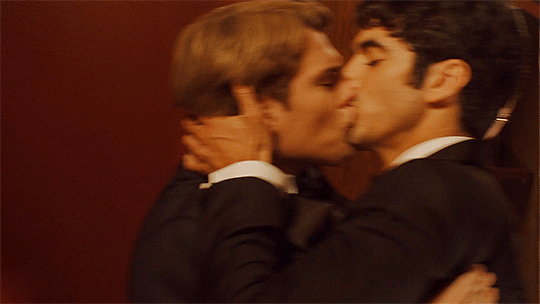
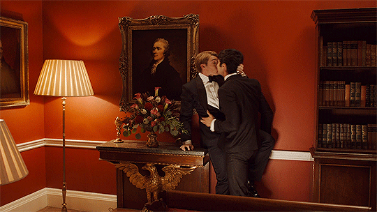

Look, I know I owe you an explanation. My behaviour was appalling-
#red white and royal blue#firstprince#red room#rwrb#rwrbedit#rwarbedit#firstprinceedit#mine#oh my god the way henry yeeted into that bookcase will#never#not#be#the funniest thing in all of existence
1K notes
·
View notes
Text
why Aurora's art is genius
It's break for me, and I've been meaning to sit down and read the Aurora webcomic (https://comicaurora.com/, @comicaurora on Tumblr) for quite a bit. So I did that over the last few days.
And… y'know. I can't actually say "I should've read this earlier," because otherwise I would've been up at 2:30-3am when I had responsibilities in the morning and I couldn't have properly enjoyed it, but. Holy shit guys THIS COMIC.
I intended to just do a generalized "hello this is all the things I love about this story," and I wrote a paragraph or two about art style. …and then another. And another. And I realized I needed to actually reference things so I would stop being too vague. I was reading the comic on my tablet or phone, because I wanted to stay curled up in my chair, but I type at a big monitor and so I saw more details… aaaaaand it turned into its own giant-ass post.
SO. Enjoy a few thousand words of me nerding out about this insanely cool art style and how fucking gorgeous this comic is? (There are screenshots, I promise it isn't just a wall of text.) In my defense, I just spent two semesters in graphic design classes focusing on the Adobe Suite, so… I get to be a nerd about pretty things…???
All positive feedback btw! No downers here. <3
---
I cannot emphasize enough how much I love the beautiful, simple stylistic method of drawing characters and figures. It is absolutely stunning and effortless and utterly graceful—it is so hard to capture the sheer beauty and fluidity of the human form in such a fashion. Even a simple outline of a character feels dynamic! It's gorgeous!
Though I do have a love-hate relationship with this, because my artistic side looks at that lovely simplicity, goes "I CAN DO THAT!" and then I sit down and go to the paper and realize that no, in fact, I cannot do that yet, because that simplicity is born of a hell of a lot of practice and understanding of bodies and actually is really hard to do. It's a very developed style that only looks simple because the artist knows what they're doing. The human body is hard to pull off, and this comic does so beautifully and makes it look effortless.
Also: line weight line weight line weight. It's especially important in simplified shapes and figures like this, and hoo boy is it used excellently. It's especially apparent the newer the pages get—I love watching that improvement over time—but with simpler figures and lines, you get nice light lines to emphasize both smaller details, like in the draping of clothing and the curls of hair—which, hello, yes—and thicker lines to emphasize bigger and more important details and silhouettes. It's the sort of thing that's essential to most illustrations, but I wanted to make a note of it because it's so vital to this art style.
THE USE OF LAYER BLENDING MODES OH MY GODS. (...uhhh, apologies to the people who don't know what that means, it's a digital art program thing? This article explains it for beginners.)
Bear with me, I just finished my second Photoshop course, I spent months and months working on projects with this shit so I see the genius use of Screen and/or its siblings (of which there are many—if I say "Screen" here, assume I mean the entire umbrella of Screen blending modes and possibly Overlay) and go nuts, but seriously it's so clever and also fucking gorgeous:
Firstly: the use of screened-on sound effect words over an action? A "CRACK" written over a branch and then put on Screen in glowy green so that it's subtle enough that it doesn't disrupt the visual flow, but still sticks out enough to make itself heard? Little "scritches" that are transparent where they're laid on without outlines to emphasize the sound without disrupting the underlying image? FUCK YES. I haven't seen this done literally anywhere else—granted, I haven't read a massive amount of comics, but I've read enough—and it is so clever and I adore it. Examples:


Secondly: The beautiful lighting effects. The curling leaves, all the magic, the various glowing eyes, the fog, the way it's all so vividly colored but doesn't burn your eyeballs out—a balance that's way harder to achieve than you'd think—and the soft glows around them, eeeee it's so pretty so pretty SO PRETTY. Not sure if some of these are Outer/Inner Glow/Shadow layer effects or if it's entirely hand-drawn, but major kudos either way; I can see the beautiful use of blending modes and I SALUTE YOUR GENIUS.
I keep looking at some of this stuff and go "is that a layer effect or is it done by hand?" Because you can make some similar things with the Satin layer effect in Photoshop (I don't know if other programs have this? I'm gonna have to find out since I won't have access to PS for much longer ;-;) that resembles some of the swirly inner bits on some of the lit effects, but I'm not sure if it is that or not. Or you could mask over textures? There's... many ways to do it.
If done by hand: oh my gods the patience, how. If done with layer effects: really clever work that knows how to stop said effects from looking wonky, because ugh those things get temperamental. If done with a layer of texture that's been masked over: very, very good masking work. No matter the method, pretty shimmers and swirly bits inside the bigger pretty swirls!
Next: The way color contrast is used! I will never be over the glowy green-on-black Primordial Life vibes when Alinua gets dropped into that… unconscious space?? with Life, for example, and the sharp contrast of vines and crack and branches and leaves against pitch black is just visually stunning. The way the roots sink into the ground and the three-dimensional sensation of it is particularly badass here:

Friggin. How does this imply depth like that. HOW. IT'S SO FREAKING COOL.
A huge point here is also color language and use! Everybody has their own particular shade, generally matching their eyes, magic, and personality, and I adore how this is used to make it clear who's talking or who's doing an action. That was especially apparent to me with Dainix and Falst in the caves—their colors are both fairly warm, but quite distinct, and I love how this clarifies who's doing what in panels with a lot of action from both of them. There is a particular bit that stuck out to me, so I dug up the panels (see this page and the following one https://comicaurora.com/aurora/1-20-30/):

(Gods it looks even prettier now that I put it against a plain background. Also, appreciation to Falst for managing a bridal-carry midair, damn.)
The way that their colors MERGE here! And the immense attention to detail in doing so—Dainix is higher up than Falst is in the first panel, so Dainix's orange fades into Falst's orange at the base. The next panel has gold up top and orange on bottom; we can't really tell in that panel where each of them are, but that's carried over to the next panel—

—where we now see that Falst's position is raised above Dainix's due to the way he's carrying him. (Points for continuity!) And, of course, we see the little "huffs" flowing from orange to yellow over their heads (where Dainix's head is higher than Falst's) to merge the sound of their breathing, which is absurdly clever because it emphasizes to the viewer how we hear two sets of huffing overlaying each other, not one. Absolutely brilliant.
(A few other notes of appreciation to that panel: beautiful glows around them, the sparks, the jagged silhouette of the spider legs, the lovely colors that have no right to make the area around a spider corpse that pretty, the excellent texturing on the cave walls plus perspective, the way Falst's movements imply Dainix's hefty weight, the natural posing of the characters, their on-point expressions that convey exactly how fuckin terrifying everything is right now, the slight glows to their eyes, and also they're just handsome boys <3)
Next up: Rain!!!! So well done! It's subtle enough that it never ever disrupts the impact of the focal point, but evident enough you can tell! And more importantly: THE MIST OFF THE CHARACTERS. Rain does this irl, it has that little vapor that comes off you and makes that little misty effect that plays with lighting, it's so cool-looking and here it's used to such pretty effect!
One of the panel captions says something about it blurring out all the injuries on the characters but like THAT AIN'T TOO BIG OF A PROBLEM when it gets across the environmental vibes, and also that'd be how it would look in real life too so like… outside viewer's angle is the same as the characters', mostly? my point is: that's the environment!!! that's the vibes, that's the feel! It gets it across and it does so in the most pretty way possible!
And another thing re: rain, the use of it to establish perspective, particularly in panels like this—

—where we can tell we're looking down at Tynan due to the perspective on the rain and where it's pointing. Excellent. (Also, kudos for looking down and emphasizing how Tynan's losing his advantage—lovely use of visual storytelling.)
Additionally, the misting here:

We see it most heavily in the leftmost panel, where it's quite foggy as you would expect in a rainstorm, especially in an environment with a lot of heat, but it's also lightly powdered on in the following two panels and tends to follow light sources, which makes complete sense given how light bounces off particles in the air.
A major point of strength in these too is a thorough understanding of lighting, like rim lighting, the various hues and shades, and an intricate understanding of how light bounces off surfaces even when they're in shadow (we'll see a faint glow in spots where characters are half in shadow, but that's how it would work in real life, because of how light bounces around).
Bringing some of these points together: the fluidity of the lines in magic, and the way simple glowing lines are used to emphasize motion and the magic itself, is deeply clever. I'm basically pulling at random from panels and there's definitely even better examples, but here's one (see this page https://comicaurora.com/aurora/1-16-33/):

First panel, listed in numbers because these build on each other:
The tension of the lines in Tess's magic here. This works on a couple levels: first, the way she's holding her fists, as if she's pulling a rope taut.
The way there's one primary line, emphasizing the rope feeling, accompanied by smaller ones.
The additional lines starbursting around her hands, to indicate the energy crackling in her hands and how she's doing a good bit more than just holding it. (That combined with the fists suggests some tension to the magic, too.) Also the variations in brightness, a feature you'll find in actual lightning. :D Additional kudos for how the lightning sparks and breaks off the metal of the sword.
A handful of miscellaneous notes on the second panel:
The reflection of the flames in Erin's typically dark blue eyes (which bears a remarkable resemblance to Dainix, incidentally—almost a thematic sort of parallel given Erin's using the same magic Dainix specializes in?)
The flowing of fabric in the wind and associated variation in the lineart
The way Erin's tattoos interact with the fire he's pulling to his hand
The way the rain overlays some of the fainter areas of fire (attention! to! detail! hell yeah!)
I could go on. I won't because this is a lot of writing already.
Third panel gets paragraphs, not bullets:
Erin's giant-ass "FWOOM" of fire there, and the way the outline of the word is puffy-edged and gradated to feel almost three-dimensional, plus once again using Screen or a variation on it so that the stars show up in the background. All this against that stunning plume of fire, which ripples and sparks so gorgeously, and the ending "om" of the onomatopoeia is emphasized incredibly brightly against that, adding to the punch of it and making the plume feel even brighter.
Also, once again, rain helping establish perspective, especially in how it's very angular in the left side of the panel and then slowly becomes more like a point to the right to indicate it's falling directly down on the viewer. Add in the bright, beautiful glow effects, fainter but no less important black lines beneath them to emphasize the sky and smoke and the like, and the stunningly beautiful lighting and gradated glows surrounding Erin plus the lightning jagging up at him from below, and you get one hell of an impactful panel right there. (And there is definitely more in there I could break down, this is just a lot already.)
And in general: The colors in this? Incredible. The blues and purples and oranges and golds compliment so well, and it's all so rich.
Like, seriously, just throughout the whole comic, the use of gradients, blending modes, color balance and hues, all the things, all the things, it makes for the most beautiful effects and glows and such a rich environment. There's a very distinct style to this comic in its simplified backgrounds (which I recognize are done partly because it's way easier and also backgrounds are so time-consuming dear gods but lemme say this) and vivid, smoothly drawn characters; the simplicity lets them come to the front and gives room for those beautiful, richly saturated focal points, letting the stylized designs of the magic and characters shine. The use of distinct silhouettes is insanely good. Honestly, complex backgrounds might run the risk of making everything too visually busy in this case. It's just, augh, so GORGEOUS.
Another bit, take a look at this page (https://comicaurora.com/aurora/1-15-28/):

It's not quite as evident here as it is in the next page, but this one does some other fun things so I'm grabbing it. Points:
Once again, using different colors to represent different character actions. The "WHAM" of Kendal hitting the ground is caused by Dainix's force, so it's orange (and kudos for doubling the word over to add a shake effect). But we see blue layered underneath, which could be an environmental choice, but might also be because it's Kendal, whose color is blue.
And speaking off, take a look at the right-most panel on top, where Kendal grabs the spear: his motion is, again, illustrated in bright blue, versus the atmospheric screened-on orange lines that point toward him around the whole panel (I'm sure these have a name, I think they might be more of a manga thing though and the only experience I have in manga is reading a bit of Fullmetal Alchemist). Those lines emphasize the weight of the spear being shoved at him, and their color tells us Dainix is responsible for it.
One of my all-time favorite effects in this comic is the way cracks manifest across Dainix's body to represent when he starts to lose control; it is utterly gorgeous and wonderfully thematic. These are more evident in the page before and after this one, but you get a decent idea here. I love the way they glow softly, the way the fire juuuust flickers through at the start and then becomes more evident over time, and the cracks feel so realistic, like his skin is made of pottery. Additional points for how fire begins to creep into his hair.
A small detail that's generally consistent across the comic, but which I want to make note of here because you can see it pretty well: Kendal's eyes glow about the same as the jewel in his sword, mirroring his connection to said sword and calling back to how the jewel became Vash's eye temporarily and thus was once Kendal's eye. You can always see this connection (though there might be some spots where this also changes in a symbolic manner; I went through it quickly on the first time around, so I'll pay more attention when I inevitably reread this), where Kendal's always got that little shine of blue in his eyes the same as the jewel. It's a beautiful visual parallel that encourages the reader to subconsciously link them together, especially since the lines used to illustrate character movements typically mirror their eye color. It's an extension of Kendal.
Did I mention how ABSOLUTELY BEAUTIFUL the colors in this are?
Also, the mythological/legend-type scenes are illustrated in familiar style often used for that type of story, a simple and heavily symbolic two-dimensional cave-painting-like look. They are absolutely beautiful on many levels, employing simple, lovely gradients, slightly rougher and thicker lineart that is nonetheless smoothly beautiful, and working with clear silhouettes (a major strength of this art style, but also a strength in the comic overall). But in particular, I wanted to call attention to a particular thing (see this page https://comicaurora.com/aurora/1-12-4/):

The flowing symbolic lineart surrounding each character. This is actually quite consistent across characters—see also Life's typical lines and how they curl:

What's particularly interesting here is how these symbols are often similar, but not the same. Vash's lines are always smooth, clean curls, often playing off each other and echoing one another like ripples in a pond. You'd think they'd look too similar to Life's—but they don't. Life's curl like vines, and they remain connected; where one curve might echo another but exist entirely detached from each other in Vash's, Life's lines still remain wound together, because vines are continuous and don't float around. :P
Tahraim's are less continuous, often breaking up with significantly smaller bits and pieces floating around like—of course—sparks, and come to sharper points. These are also constants: we see the vines repeated over and over in Alinua's dreams of Life, and the echoing ripples of Vash are consistent wherever we encounter him. Kendal's dream of the ghost citizens of the city of Vash in the last few chapters is filled with these rippling, echoing patterns, to beautiful effect (https://comicaurora.com/aurora/1-20-14/):

They ripple and spiral, often in long, sinuous curves, with smooth elegance. It reminds me a great deal of images of space and sine waves and the like. This establishes a definite feel to these different characters and their magic. And the thing is, that's not something that had to be done—the colors are good at emphasizing who's who. But it was done, and it adds a whole other dimension to the story. Whenever you're in a deity's domain, you know whose it is no matter the color.
Regarding that shape language, I wanted to make another note, too—Vash is sometimes described as chaotic and doing what he likes, which is interesting to me, because smooth, elegant curves and the color blue aren't generally associated with chaos. So while Vash might behave like that on the surface, I'm guessing he's got a lot more going on underneath; he's probably much more intentional in his actions than you'd think at a glance, and he is certainly quite caring with his city. The other thing is that this suits Kendal perfectly. He's a paragon character; he is kind, virtuous, and self-sacrificing, and often we see him aiming to calm others and keep them safe. Blue is such a good color for him. There is… probably more to this, but I'm not deep enough in yet to say.
And here's the thing: I'm only scratching the surface. There is so much more here I'm not covering (color palettes! outfits! character design! environment! the deities! so much more!) and a lot more I can't cover, because I don't have the experience; this is me as a hobbyist artist who happened to take a couple design classes because I wanted to. The art style to this comic is so clever and creative and beautiful, though, I just had to go off about it. <3
...brownie points for getting all the way down here? Have a cookie.
#aurora comic#aurora webcomic#comicaurora#art analysis#...I hope those are the right tags???#new fandom new tagging practices to learn ig#much thanks for something to read while I try to rest my wrists. carpal tunnel BAD. (ignore that I wrote this I've got braces ok it's fine)#anyway! I HAVE. MANY MORE THOUGHTS. ON THE STORY ITSELF. THIS LOVELY STORY#also a collection of reactions to a chunk of the comic before I hit the point where I was too busy reading to write anything down#idk how to format those tho#...yeet them into one post...???#eh I usually don't go off this much these days but this seems like a smaller tight-knit fandom so... might as well help build it?#and I have a little more time thanks to break so#oh yes also shoutout to my insanely awesome professor for teaching me all the technical stuff from this he is LOVELY#made an incredibly complex program into something comprehensible <3#synapse talks
761 notes
·
View notes
Text

Redrew a frame from Avengers Assemble as MCU Stevetony because it was driving me absolutely INSANE
reference:

#IM BACK DRAWING THEM BABEYYY LETS GOOOOOOO#ignore the fact i didnt put in the effort to draw the adaptoid much less mcu-ify him#magic beams instead. yeet#stevetony#stony#superhusbands#mcu stevetony#aa stevetony#avengers assemble#mcu#ironshield#THEMMMMM#theyre my number 1 for ever#OH ALMOST FORGOT#airlocks art
171 notes
·
View notes
Text

hhappy pocky day 11/11!! here's some self-indulgence ft oreo man///
#mblue art#self insert#cross!sans#forgive the cursing but oh my god im so fucking gay for cross what is this doki doki bullshit (it is 3am)#'just a quick doodle' i said; hrs earlier#'hey lets try to color it more actually' - 'oh no its cute'#anyway bless references 🙏 glad they exist#also unFAIR a pocky game AND a kabedon??? WOW this is what i get for giving him 2 boxes of choco and cookies and cream pocky??? smfh#its like he cranked up his rizz meter and went all in#ok im shutting up before the brain filter yeets outta my head#guys forgive my 3am sleep deprived brain it's running on simp fuel istg#@ that friend who encouraged me to draw the idea you know who u are (index pointing emoji)#pocky#CM
467 notes
·
View notes
Text
I am of the opinion that if Cale were to ever realize how much his kids think of him as their parent, he would absolutely speedrun therapy and you cannot change my mind
#cale henituse#lout of the count’s family#lotcf#trash of the counts family#totcf#my communication issues are actually causing these children harm???#YEET#deruth and violan would ask him if he wants to introduce them to the high society scene#and if they say yes they will be decked in gold turtles#if not then oh well#organizer: how grand do you want this debutante ball?#cale: yes#theyre his kids they deserve the best#tcf#lcf#tcf cale#lcf cale
279 notes
·
View notes
Text


dan, susan and carl are not real. they are featureless limbless cartoon balls in a video game. it’s really really okay. i promise.
#“who’s your husband. tell me.” like please calm down babygirl#“SHUT UP! EW”#he’s never beating the [insert anything here] allegations#losing the idgaf war every minute of everyday#dnp#dan and phil#and him threatening death both times#“i hope you zoom off a cliff.”#“oh no they crashed in a tragic balloon accident and they broke all of their bones.”#phan#dan howell#daniel howell#amazingphil#phil lester#yeet my deet#danisnotonfire#yeet my deenp#danandphilgames#the game of life#d&p#dapg#tmogar#bog#inaccessible#needs id
767 notes
·
View notes
Text
Prompt 186
Ghosts are dragons.
No, really, Danny swears. Sure they might sometimes take a more humanoid form to interact with the living world, but the default shape for each of them is a dragon. Or their world’s equivalent, since there’s also not just human-ghosts which wow was he giddy when he met his first alien.
But yeah, ghosts were dragons.
Which meant he was in fact a dragon. Or at least half a dragon. Which over time started having a bit of an effect on how his human form started to look too. Which he would be worried about except for the fact that everyone else in Amity was starting to look the same.
So he should probably be concerned about ecto contamination but there’s this happy rumbling in his core next to his Obsession and Hoard bonds. Honestly, what could go wrong? They’re all used to property damage thanks to wrestling getting out of hand. They can retreat to the Zone if there’s a big danger approaching the city.
And really, what wants to mess with a city full of dragons and those slowly turning into dragons huh?
…
Well he stands corrected, apparently the GIW and whoever else they’ve brought in are in fact that stupid. Alright guys, let’s try Not to squish people.
#Prompts#Ghosts are Dragons Au#dcxdp#dpxdc#GIW: There is an entire city being overtaken by creatures help#Amity Park: Oh it’s these assholes again who wants to yeet them out first#All of Amity are down for tossing out the GIW and whoever they happen to bring with them#They also just enjoy a good tussle thanks to all the ecto-contamination#Everyone who is not part of the Fraid is not welcome#Like damn if you’re coming into the city then at least don’t do it with the idiots in white who everyone hates#Everyone has their own obsessions but they can all agree that the city is their shared Area#Their houses are their Lairs where they keep their precious things like stuff for their obsessions & family
293 notes
·
View notes
Text

im just playing dress up w/ them at this point lol
#cult of the lamb#cotl#narinder#cotl narinder#cotl lamb#cult of the lamb au#cotl fanart#the lamb#the one who waits#cotl the one who waits#artists on tumblr#cotl art#artwork#lamb x narinder#the lamb cotl#okay i had this idea after going insane abt their clothes abt fisherman AU#and by vessel its the lambs fucknig BOAT#the lambs got a lot of screws loose and is very hard headed n stubborn#narinders been exiled and is a stowaway same w/ the twins lol#spotted loony lamb w/ their porcelain crown & they were the perfect victim to harbor the traitors#oh yeah lol the bishops yeeted the red crown to the sea n the whoel idea is that the lambs like “lol i liek the red crown sure”#anyways canon is fishsticks here and this AU is mostly for art LOL
224 notes
·
View notes
Text
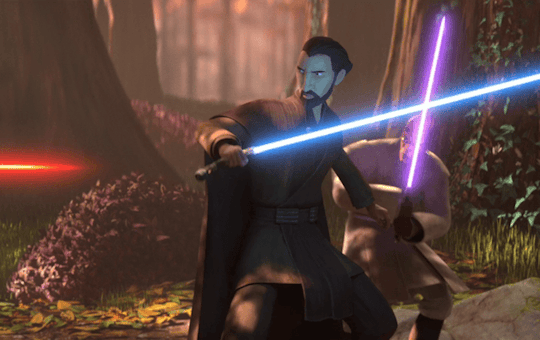
I'll probably post more detailed and coherent thoughts about my TotJ rewatch later today (now with 30% less yelling), but I have to comment on this little maneuver above.
Mace and Dooku are suddenly attacked from the rear in their confrontation with the Raxus soldiers.
Dooku: Busts out his patented behind-the-back, elegant Makashi defense move.
Mace: PARKOUR!
#i'm sorry but mace just yeeting himself out of the frame is hilarious#also great juxtaposition between the two fighting styles#more on that later#gods dooku is so classy#count dooku#mace windu#it's so funny that dooku does so few acrobatics in terms of his fighting#at least in comparison to other jedi#and yet he is so damn effective with his dance-like makashi movements#anyway#oh boi here we go again star wars....#THiS ALWAYS HAPPENS
129 notes
·
View notes
Text
Joking summary of this one bit of Foundling at the Door:
Clark: Phew, finally got Kon and Tim to go get a couple of hours of sleep down in the dorms. Man, they act like I'm going to just lose her the second they're out of the room or something!
Elle: *wakes up from her coma the second Tim & Kon walk out the door*
Elle: *makes direct eye contact with Clark*
Elle:
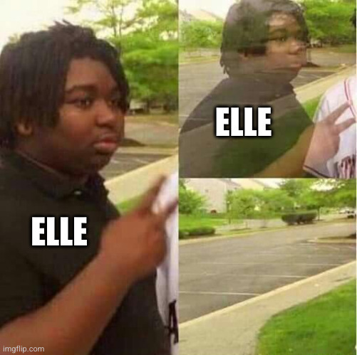
Clark: well
Clark: fuck
#dpxdc#dp x dc#dc x dp#tim drake#kon kent#kon el kent#clark kent#dani phantom#danielle phantom#elle phantom#tim & kon adopt elle#elle has been out of her coma for a second and immediately activates gremlin mode#would clark actually say fuck? probably not but it's funny to imagine#elle yeets herself out of the room and all clark can think is#oh shit tim and kon are going to *kill* me#followed immediately by#oh shit the girl!!!#and sounds the alarm
615 notes
·
View notes
Last Seen Blogs

crispydinosaurstrawberry
Untitled
crispydinosaurstrawberry
Untitled
crispydinosaurstrawberry
Untitled

elytc
Eliana_TiC

onepiecehasnopeace
A proud UA drop out