#od pink headers
Explore tagged Tumblr posts
Photo


☆ pink lyrics headers ☆ (requested)
- like/reblog if saving
- credits to @nghtviews if using x
#request#ed sheeran#one direction#header#headers#pink#light pink#pastel pink#lyrics#text#quotes#ed sheeran header#ed sheeran headers#one direction header#one direction headers#od#1d#od header#od headers#1d header#1d headers#pink header#pink headers#one direction pink headers#one direction pink header#od pink header#od pink headers#light pink headers#pastel pink headers#text headers
14 notes
·
View notes
Note
MY WIFE HAS A NEW ICON??? it's sooooo sexy omg
- 👀👜anon 💍 era
(also good LUCK on your exams!!! once again dfgjdfs) <3

#AWWWWWW THANK U 😭😭😭#ITS WHAT JIHOON DESERVEESSSSSSSSSSSSSSSSSSSSSSSSSS <3#also wanted to change my header to match it but ion think i can ever top this one KJFDJKDFKJF#also this reminds me of my layout during spider era it was also red hot pink and black JFDKDF#ANF THANK U OH MY OD IM SO AXNIOUSSSSSSSSSSSSSSS#im cheering u on as well (im assuming you're still having exams too? 👀)#👀👜 anon 💍 era#👀👜 anon#anon#y.ask
0 notes
Text
my beloved @fancykraken tagged me! 💖
1. Why did you choose your url?
so, i've technically had six urls through my tumblr history, but the most consistent and important one sits in quiet mausoleum-like reverence because i was only going to be here temporarily (lol), and didn't want to reclaim it, and didn't feel right going back to that blog. alas, here we are. (and now there's an added weight to it because we exist in a world without stephen sondheim.)
when i secretly made this blog in early 2020, i was on a Romantics kick and had borrowed "melodious" from Keats in Ode to a Nightingale (thou, light-winged Dryad of the trees/In some melodious plot/Of beechen green, and shadows numberless/Singest of summer in full-throated ease) because i wanted something music-themed, and "ghost" obviously from my constant theme of being a ghost girl who is herself a haunted house, but it never felt "right," and for some reason i didn't like the way ~melodious~ looked the longer i sat with it, so i switched it to "septembers," because almost all of my urls have begun with an -S, and because it's my birth month, and tied subtly to dean (my birthday being pilot anniversary day on the 13th, then the significance of september 18th). i am quite attached to september in general outside of that, and thus septembersghost felt very much like an accurate depiction of me.
2. Any side blogs?
not here, no, though i have a couple of urls saved despite the fact that i'd never use them.
3. How long have you been on tumblr?
off and on since 2011.
4. Do you have a queue tag?
the very boring "q," i used to always have cute personalized ones (almost all were musical theatre lyric-based) but was too lazy to do that here asdsajkfdh
5. Why did you start your blog in the first place?
i started my original blog literally because of bonnie, whomst did tag me in this post, and because so many people from LJ were migrating here (hilariously, i also started my LJ in 2004 because of bonnie...alexa, play "every breath you take." BLAME HER FOR MY INTERNET PRESENCE! 😂). this one i started in 2020 "just in case"/to lurk (interestingly, for taylor and penny dreadful and better call saul, not at all for spn), but then 15x18 happened and i had...a bit of a hard time...and realized i couldn't handle enduring the last two episodes of that alone after suffering and engaging for fifteen years. (little did i know how MUCH i wouldn't be able to handle it?) so i crept back to spend those final weeks here and never left.
6. Why did you choose your icon/pfp?
because i love her and she IS SO IMPORTANT TO ME and i wanted to mix it up a little. something yet remains.
7. Why did you choose your header?
"are there still beautiful things?" is like...the eternal beating question of my heart. seven in general, with the themes of haunting and memory and the sorrow in nostalgia and grief in love and stories being passed on even when you can't recall every moment or detail. that's my whole essence. also, pink.
8. What’s your post with the most notes?
that quote of jennifer carpenter's...you don't understand. she was talking about haunting HIM? but now she haunts ME. the intensity of the irony now considering that i posted it for my own reference, it was the very first dexter-related post i made here (i didn't even have a tag for the show! i didn't think i'd ever be able to watch that show AGAIN! i'm happy i was wrong, paul rudd look at us.gif), i thought it would be relevant to like three people so i didn't source it in the caption, and the gothic horror tumblrinas got hold of it and it took on a life of its own. i like to pretend that revival never happened and was a very poorly constructed bad dream, and i have to ignore the rest of that interview by extension, but girlie really tapped into the other side when she said that.
9. How many mutuals do you have?
i have no idea but 💛💛💛
10. How many followers do you have?
354, i was at like 395 but then the great bot clearance happened. i am teensy, but once upon a time i had over 1200 and that was a lot. seeing the number bon put on this gives me anxiety omg
11. How many people do you follow? 133
12. Have you ever made a shit post?
maybe? i'm not sure what qualifies as that.
13. How often do you use tumblr a day?
sometimes a lot, even if i'm only here for like five minutes at a time. sometimes i'm not here at all and it's just my queue running ghostily for me, it depends how i'm feeling illness-wise from day to day.
14. Did you ever have a fight/argument with another blog?
an actual fight, no. minor disagreements, yes, being falsely accused of something and having to defend myself to complete strangers, yes, and the zany hate messages which were all one-sided beef from anons who think hating on my faves is a power trip? 🥴
15. How do you feel about the ‘you need to reblog’ posts?
Hate them even if they’re something that is important and with good information. If you add that then I will not reblog them. <- this. it's an unnecessary guilt trip and distracts from whatever information or message is being given.
16. Do you like tag games?
I do! Even if I forget to complete them I still appreciate being thought of. <- this too!!! 🥺
17. Do you like ask games?
i never do them because i'm shy and anxious and also think no one will send any of them to me lol
18. Which of your mutuals do you think is tumblr famous?
i don't know if any of them are tumblr "famous"? (are any of you secretly internet celebrities and holding out on me?! 👀) but one of the nice things about tumblr is how that absolutely does not matter here. we can support each other and enjoy one another's content whether we have 12 followers or 12,000 and that's cozy. you're all stars to meeee
19. Do you have a crush on a mutual?
i do not, but i'd hold your hands and kiss your foreheads and wrap you in blankets no matter what.
20. Tags!
i am not tagging anyone because this is long and i talk too much, but please feel free to take it and tag me in it if you do so that i can see your answers! 🥰
6 notes
·
View notes
Text
What My Tumblr Means
I was tagged by @mellowyellowwitch (thank you again!!)
Header: It’s a pink-y sky to match the pink mobile theme I have going!
Icon: Lana Del Rey of course, I love meme-y icons
My content: Kind of everywhere now-a-days, but lately it’s mostly BoJack Horseman content bc of the series finale
Background Colour: Pink! Bc pink is one of my favourite colours!
Letter Colour: A dark grey to soften the theme kind of?
URL: I’m a Scorpio, and I wouldn’t necessarily say im ethereal, but I liked how it sounded
Blog title: End of the Earth, which is an ode to my favourite Marina song on LOVE + FEAR
I tag @gimmeeshelter @forever-angels @gothcarat @thesleepykoalas @tiberiusmulder
4 notes
·
View notes
Text
Final Project / Brand Style Guide
Initial Stages - Ideation Process��
For my final project, I went with Option 1 which was to create a brand guide for myself. That’s because I thought no one understands me better than me (or so I thought...)
Anyway, I concluded that I was indecisive (a boyfriend/girlfriend’s worst nightmare) which led to me thinking of combining all the elements that makes me, me into 1 logo which is how my logo was born. But first, I decided to create a little sketch to see what are the elements I could incorporate into my logo and this was what I came up with.
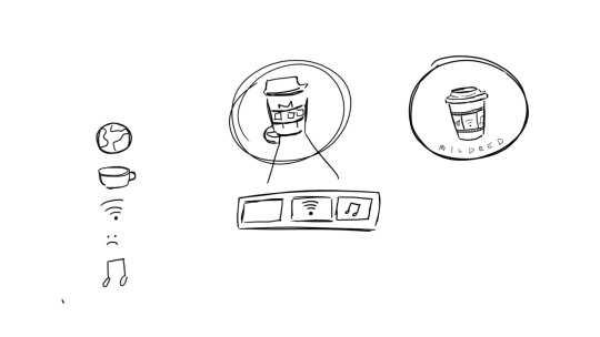
Fig.1: Logo Sketches
So to start off I was thinking about stuff that I really liked and basically media came to mind which included films, TV shows and music. Hence, I decided to incorporate these elements into my logo. Then I realised I’d require WiFi to have access to media as almost everything is online nowadays which was why the WiFi logo was in the centre of the cup. Afterwards, I was stuck as I was thinking what could best represent films and therefore, I realised my coffee cup needed a cup holder which was why the film strip came to mind and my other elements can be in the strip. The reason why I settled for a coffee cup logo was because I realised I drink copious amounts of coffee. The first cup is to be a decent human being to others, the second to have the energy to interact with people and the third is because of the mid-day slump. Hence, I decided to use the coffee cup in my personal branding as I need it to survive. Going along the lines of needing to survive, multimedia also keeps me going as I cannot imagine going a day without listening to music or watching a movie or TV show on Netflix. Therefore, these are the elements that help me survive which was how my initial logo came to be (sin colours) (Fig.2).

Fig.2: Initial Logo
For some of the logo guidelines, I had to take precaution to not accidentally resize it on Adobe Illustrator as I wanted to make sure that it looked proportionate. Hence, I learned the hard way that if I did not press command or shift on my keyboard I would get interesting variations of the logo. I also had to make sure that my branding colours were added to make my logo pop. (Fig.3)

Fig.3: Logo Guidelines
Colour Scheme
For colours, I knew black was going to be in there as it was my favourite colour. Black is also elegant and a colour that basically represents my soul as I still listen to pop punk music like an angsty teen (it’s genuinely not a phase mom). Using the colour white as the lid and the film strip was pretty much out of necessity and because it was aesthetic and it is obvious to people that it is a film strip. As coffee is usually brown, I decided to go with a brown exterior. Also it just so happens that I am an earth sign and I thought that it was very representative of me being grounded although I do like to daydream but I guess I will snap out of it when it gets too far. Lastly and probably the most essential colour was the fact that I wanted to use pink. This is because my name's Mildred so that is mild red which is pink. My friend prompted me and asked me how I came to that conclusion and to be honest, it’s probably because of the hundreds and thousands of times where I have heard my name being butchered left right and centre and one day someone called me mild red and I never saw it that way before and that’s how the colour pink came to be symbolic with my name. I guess for literal purposes it should’ve been a shade of red that’s mild but I preferred pink and it worked too. (Sorry Victoria, the pink line was named after me. I’m kidding!) Therefore, that explains the colour template that I have decided to go for (Fig.4 and 5)
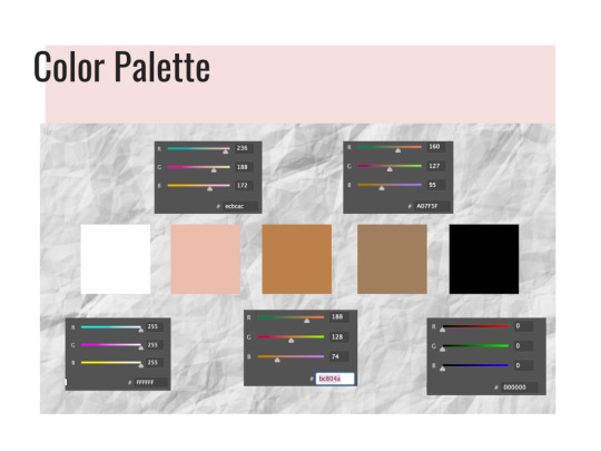
Fig.4: Colour Palette
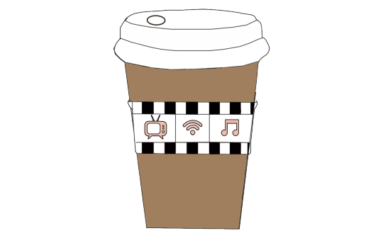
Fig.5: Initial Logo with branding colours
For my fonts, I have decided to go with Relation 2 (Serif font), Oswald and Open Sans (San-Serif fonts). This was because I wanted to go with a serif font that was cursive and still easy to read. I have been a fan of cute cursive fonts because my handwriting is as straight as a ruler and I have always been jealous of people who could write in cursive which was why when this self-branding came about, I really wanted my name to be in a serif font. It also gave me Bridgerton, Lady Whistledown vibes and I don’t know what it is but Serif fonts do make their letters look way fancier than they already are. Hence, I decided to incorporate that in and also to make it stand out from the rest of my serif-font resume. For the other san-serif fonts like Oswald and Open Sans, I decided to change it at the last minute as initially I wanted to use Avenir book.
The reason for this was because I thought Oswald was an easy font to read and when paired with Open Sans, I felt that these fonts worked well together. Oswald has been mainly applied in the headings of my resume and I have also chosen to bold and type it in caps so as to standardise everything on the application. In my namecard, Oswald is used for my name so that it stands out more against the black background and is easier to read.
For Open Sans, I decided to use it in semi-bold was because it helped stand out more against the background and it mainly functions as my body text for my resume and name card. (Fig.6)
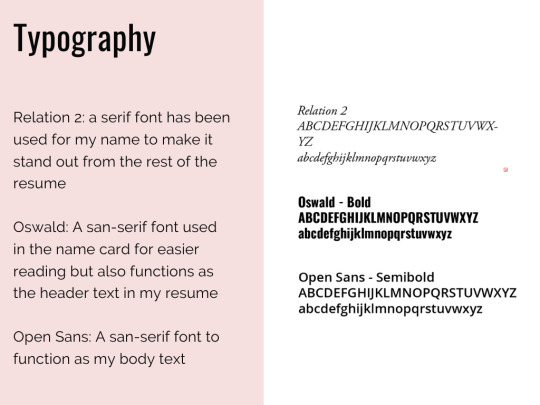
Fig.6: Typography
Critique Sessions (Week 11-13)
During the critique session on the first forum, I was given general feedback that I needed to try and fix on a design for the logo to which I was finally confident with. Also in the second forum and my Zoom critique in Week 12, I was advised by my classmates to possibly add in a signature or something on my logo to let people know that this is my coffee cup as I was lacking the personalised touch instead of just combining elements together that represented me. Simultaneously, I was also given the feedback that I needed to work on my logo guidelines which I attempted to fix and reason. Lastly, I was also advised to potentially try and incorporate my elements into my resume and find a way to standardise them and these are my final products (Fig.7, 8, 9.1 & 9.2).
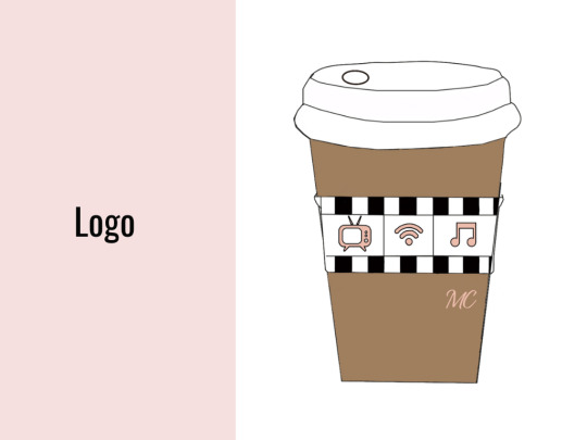
Fig.7: Final Logo
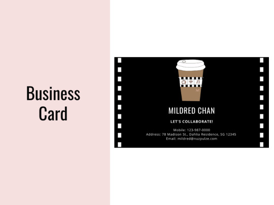
Fig.8: Final Namecard

Fig.9.1: Final Resume
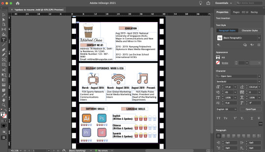
Fig.9.2: Final Resume on InDesign
Final Changes
Firstly, for my logo, I have finally added in the branding colours to give a rough gist as to how it would look like. Initially that was going to be my original logo but then I received some feedback that I should potentially try to personalise my logo so that it was more me rather than just work and CCA. I was also toying with the idea of initially putting my name or initials on the cup like how they do at Starbucks. Hence, that was the reason that I decided to finally incorporate my initials on the right side of the cup below the film strip in 30pt. As I did not want my initials to overpower my elements, I decided to keep the Relation 2 font that I was planning to use for my resume and since I loved cursive, I decided that it would work and flow well with the whole branding look. Everything else remained the same except for the fact that I just signed off on the cup. It could also be interpreted as an ode to me signing off for the semester but more of the fact that I wanted this logo to reflect a bit of me in there.
For my name card and resume, I wanted to standardise the whole look and feel of my branding which was why I incorporated the film roll / strip used as the cupholder on my logo to the borders for the 2 items.
As mentioned previously for my name card, I wanted to use the Oswald font so that my name would stand out more against the dark background. I also included some necessary information that I thought was needed in a name card like email , address and phone number so that it was easy for people to reach me to collaborate on creative projects together.
In my resume, this was the draft that I presented in the second forum (Fig.10)

Fig.10: Old resume
To briefly sum up what I did in the original one, I made this resume look like a film strip and added the required information in it. I stated my contact information, education, relevant experience, software and language skills. On the first film, my contact information was on the right hand side of the page and the education ones were on the left. The 2nd was just my relevant work and CCA experience which tied back nicely to the logos on my coffee cup as I was given advice that I should try and link my elements of the coffee cup to the resume somewhere and this was what I came up with. The third film included my software skills and language skills on the right. At 3am, I came up with the idea of using popcorn for the ratings as I realised that’s what movie theatres do when they are rating the show (i.e. rotten tomatoes). Hence, I decided to incorporate that into my resume for better cohesion and make it pretty movie-themed (Fig.11.1 and 11.2). The font I used for the headers is Oswald and the main body text is Open Sans in 16pt and 14pt respectively this is so for more efficient reading and I decided to space out the text so that it did not look so cluttered together. The pink border for the header is mainly to signal to the readers that this is a new section and that it begins here. I reused the pink from my brand guide as I figured that was a colour that would stand out amongst the black and white text. I also went ahead to make use of logos for the software skill sets to break up the monotony of words on the page. A picture speaks a 1000 words and that was what I intended to do and make it easier for visualisation.
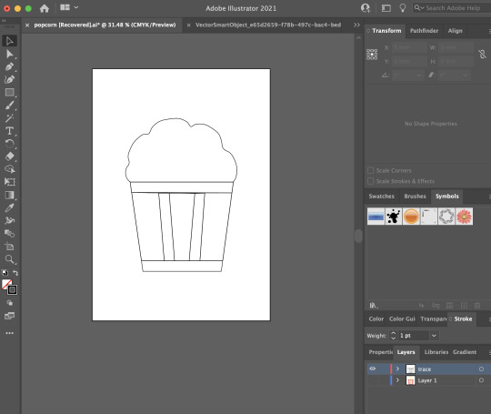
Fig.11: Popcorn hand drawn on AI
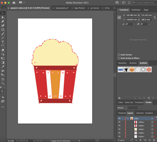
Fig.11.2: Popcorn hand drawn on AI in colour
During the critique session, I was advised to put my contact details on the left of the page instead of the right and I realised it was a relevant point as people naturally read from left to right. Hence, I quickly made the changes in my final resume. Another good feedback I received was the fact that since my logos and other icons in my resume were hand drawn on Illustrator, I could potentially draw the icons for the software skills in a similar theme so that it was more cohesive and I took that on board for the final resume (Fig.9).
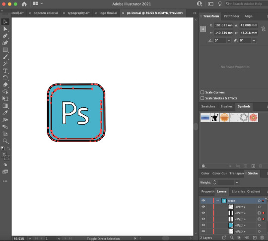
Fig.12: PS logo traced on AI

Fig.13: InDesign logo traced on AI
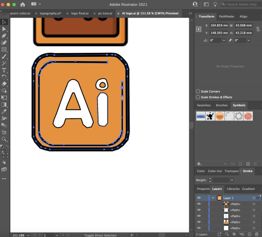
Fig.14: AI logo traced on AI
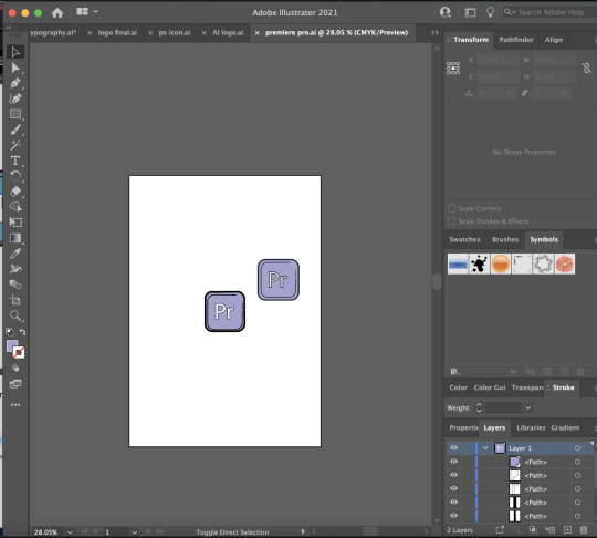
Fig.15: Premiere Pro logo traced on AI
In these logos, I simply traced them out on AI and then used the colour picker tool to select the colour so it matches. Afterwards, I thickened the stroke (5pt) on the logo outline so that it stands out more against the white background.
Overall for my brand guide (Fig.4,6,7,8 and 9.1), I was also advised to add in some headers so that the person grading would know exactly what they are referring to and not to put everything into 1 png image but instead a multi-page pdf. In the brand guide, I also added a pink border on the left and the headings are all at the side so that it was more pleasing to look at and it would draw the audiences’ eyes accordingly.
Throughout this final design assignment, I really needed to learn how to be organised and this was where layers came in to save my life. Especially because of the fact that it was hard to move things around the InDesign application so I needed to learn how to group my assets together so that it was easier for movement, rescaling and resizing. This was so that I do not end up with the white boxes / films being too widely or narrowly spaced apart.
#nm3217#finalproject#thankscurieforeverythingandforhelpingmetobelieveinmyselfbciwasinsecure#peaceoutsem2#nus
1 note
·
View note
Text
Jazzamatazz - Smiling Sixties 13

Wednesdays 2pm-4pm EST Today’s Bombshell (Bombshell Radio) Bombshell RadioJazzamatazz Double Header FRIDAYS 1pm-3pm EST 6pm-8pm BST 10am-12pm PDT bombshellradio.com Sundays 7pm-8pm EST Smiling Sixties is a collection of non-stop hits & classics from the 1960s. A blend of Rock'n'Roll,Soul,Pop,Beat,Rock & lots more groovy sounds from a great decade of music. 25 tracks that still put smiles on faces over half a century later. Lots more@ https://www.mixcloud.com/JAZZAMATAZZ/playlists/sideburn-sounds-psych-garage-rock/ #oldies #pop #rock #soul #r&b #classics #rocknroll 1 Ode To Billie Joe Bobbie Gentry 2 Strange Days The Doors 3 Flowers In The Rain The Move 4 God Only Knows The Beach Boys 5 Rag Doll The Four Seasons 6 On A Carousel The Hollies 7 Get Back The Beatles 8 Rescue Me Fontella Bass 9 Reach Out I'll Be There Four Tops 10 Galveston Glen Campbell 11 With A Little Help From My Friends The Young Idea 12 Happy Together The Turtles 13 Running Bear Johnny Preston 14 Stand by Me Ben E King 15 Beauty's Only Skin Deep Temptations 16 Move in a Little Closer Baby Harmony Grass 17 Standing On The Corner The King Brothers 18 Lily the Pink The Scaffold 19 The Lion Sleeps Tonight The Tokens 20 I Want To Love Him So Bad The Jellybeans 21 The More I See You Chris Montez 22 (I'm A) Road Runner Jr. Walker & The All Stars 23 Stay Maurice Williams 24 Island Of Dreams The Springfields 25 Boom Bang-A-Bang Lulu Read the full article
0 notes