Hi I'm Mildred, a coffee addict who shoots and get shot (occassionally).This is my blog for NM3217, so make yourself feel at home as I attempt to tell you my life's story through design
Don't wanna be here? Send us removal request.
Text
Final Project / Brand Style Guide
Initial Stages - Ideation Process
For my final project, I went with Option 1 which was to create a brand guide for myself. That’s because I thought no one understands me better than me (or so I thought...)
Anyway, I concluded that I was indecisive (a boyfriend/girlfriend’s worst nightmare) which led to me thinking of combining all the elements that makes me, me into 1 logo which is how my logo was born. But first, I decided to create a little sketch to see what are the elements I could incorporate into my logo and this was what I came up with.
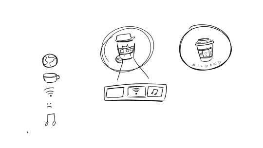
Fig.1: Logo Sketches
So to start off I was thinking about stuff that I really liked and basically media came to mind which included films, TV shows and music. Hence, I decided to incorporate these elements into my logo. Then I realised I’d require WiFi to have access to media as almost everything is online nowadays which was why the WiFi logo was in the centre of the cup. Afterwards, I was stuck as I was thinking what could best represent films and therefore, I realised my coffee cup needed a cup holder which was why the film strip came to mind and my other elements can be in the strip. The reason why I settled for a coffee cup logo was because I realised I drink copious amounts of coffee. The first cup is to be a decent human being to others, the second to have the energy to interact with people and the third is because of the mid-day slump. Hence, I decided to use the coffee cup in my personal branding as I need it to survive. Going along the lines of needing to survive, multimedia also keeps me going as I cannot imagine going a day without listening to music or watching a movie or TV show on Netflix. Therefore, these are the elements that help me survive which was how my initial logo came to be (sin colours) (Fig.2).

Fig.2: Initial Logo
For some of the logo guidelines, I had to take precaution to not accidentally resize it on Adobe Illustrator as I wanted to make sure that it looked proportionate. Hence, I learned the hard way that if I did not press command or shift on my keyboard I would get interesting variations of the logo. I also had to make sure that my branding colours were added to make my logo pop. (Fig.3)

Fig.3: Logo Guidelines
Colour Scheme
For colours, I knew black was going to be in there as it was my favourite colour. Black is also elegant and a colour that basically represents my soul as I still listen to pop punk music like an angsty teen (it’s genuinely not a phase mom). Using the colour white as the lid and the film strip was pretty much out of necessity and because it was aesthetic and it is obvious to people that it is a film strip. As coffee is usually brown, I decided to go with a brown exterior. Also it just so happens that I am an earth sign and I thought that it was very representative of me being grounded although I do like to daydream but I guess I will snap out of it when it gets too far. Lastly and probably the most essential colour was the fact that I wanted to use pink. This is because my name's Mildred so that is mild red which is pink. My friend prompted me and asked me how I came to that conclusion and to be honest, it’s probably because of the hundreds and thousands of times where I have heard my name being butchered left right and centre and one day someone called me mild red and I never saw it that way before and that’s how the colour pink came to be symbolic with my name. I guess for literal purposes it should’ve been a shade of red that’s mild but I preferred pink and it worked too. (Sorry Victoria, the pink line was named after me. I’m kidding!) Therefore, that explains the colour template that I have decided to go for (Fig.4 and 5)
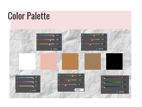
Fig.4: Colour Palette
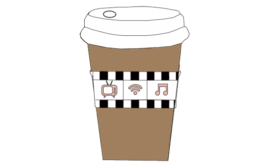
Fig.5: Initial Logo with branding colours
For my fonts, I have decided to go with Relation 2 (Serif font), Oswald and Open Sans (San-Serif fonts). This was because I wanted to go with a serif font that was cursive and still easy to read. I have been a fan of cute cursive fonts because my handwriting is as straight as a ruler and I have always been jealous of people who could write in cursive which was why when this self-branding came about, I really wanted my name to be in a serif font. It also gave me Bridgerton, Lady Whistledown vibes and I don’t know what it is but Serif fonts do make their letters look way fancier than they already are. Hence, I decided to incorporate that in and also to make it stand out from the rest of my serif-font resume. For the other san-serif fonts like Oswald and Open Sans, I decided to change it at the last minute as initially I wanted to use Avenir book.
The reason for this was because I thought Oswald was an easy font to read and when paired with Open Sans, I felt that these fonts worked well together. Oswald has been mainly applied in the headings of my resume and I have also chosen to bold and type it in caps so as to standardise everything on the application. In my namecard, Oswald is used for my name so that it stands out more against the black background and is easier to read.
For Open Sans, I decided to use it in semi-bold was because it helped stand out more against the background and it mainly functions as my body text for my resume and name card. (Fig.6)
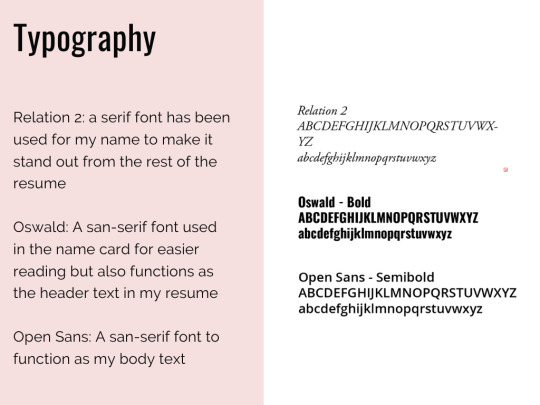
Fig.6: Typography
Critique Sessions (Week 11-13)
During the critique session on the first forum, I was given general feedback that I needed to try and fix on a design for the logo to which I was finally confident with. Also in the second forum and my Zoom critique in Week 12, I was advised by my classmates to possibly add in a signature or something on my logo to let people know that this is my coffee cup as I was lacking the personalised touch instead of just combining elements together that represented me. Simultaneously, I was also given the feedback that I needed to work on my logo guidelines which I attempted to fix and reason. Lastly, I was also advised to potentially try and incorporate my elements into my resume and find a way to standardise them and these are my final products (Fig.7, 8, 9.1 & 9.2).
Fig.7: Final Logo
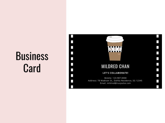
Fig.8: Final Namecard

Fig.9.1: Final Resume
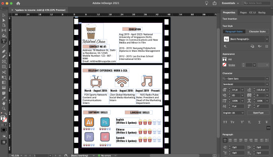
Fig.9.2: Final Resume on InDesign
Final Changes
Firstly, for my logo, I have finally added in the branding colours to give a rough gist as to how it would look like. Initially that was going to be my original logo but then I received some feedback that I should potentially try to personalise my logo so that it was more me rather than just work and CCA. I was also toying with the idea of initially putting my name or initials on the cup like how they do at Starbucks. Hence, that was the reason that I decided to finally incorporate my initials on the right side of the cup below the film strip in 30pt. As I did not want my initials to overpower my elements, I decided to keep the Relation 2 font that I was planning to use for my resume and since I loved cursive, I decided that it would work and flow well with the whole branding look. Everything else remained the same except for the fact that I just signed off on the cup. It could also be interpreted as an ode to me signing off for the semester but more of the fact that I wanted this logo to reflect a bit of me in there.
For my name card and resume, I wanted to standardise the whole look and feel of my branding which was why I incorporated the film roll / strip used as the cupholder on my logo to the borders for the 2 items.
As mentioned previously for my name card, I wanted to use the Oswald font so that my name would stand out more against the dark background. I also included some necessary information that I thought was needed in a name card like email , address and phone number so that it was easy for people to reach me to collaborate on creative projects together.
In my resume, this was the draft that I presented in the second forum (Fig.10)

Fig.10: Old resume
To briefly sum up what I did in the original one, I made this resume look like a film strip and added the required information in it. I stated my contact information, education, relevant experience, software and language skills. On the first film, my contact information was on the right hand side of the page and the education ones were on the left. The 2nd was just my relevant work and CCA experience which tied back nicely to the logos on my coffee cup as I was given advice that I should try and link my elements of the coffee cup to the resume somewhere and this was what I came up with. The third film included my software skills and language skills on the right. At 3am, I came up with the idea of using popcorn for the ratings as I realised that’s what movie theatres do when they are rating the show (i.e. rotten tomatoes). Hence, I decided to incorporate that into my resume for better cohesion and make it pretty movie-themed (Fig.11.1 and 11.2). The font I used for the headers is Oswald and the main body text is Open Sans in 16pt and 14pt respectively this is so for more efficient reading and I decided to space out the text so that it did not look so cluttered together. The pink border for the header is mainly to signal to the readers that this is a new section and that it begins here. I reused the pink from my brand guide as I figured that was a colour that would stand out amongst the black and white text. I also went ahead to make use of logos for the software skill sets to break up the monotony of words on the page. A picture speaks a 1000 words and that was what I intended to do and make it easier for visualisation.
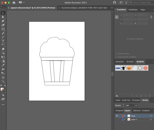
Fig.11: Popcorn hand drawn on AI
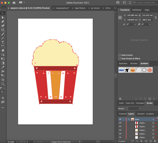
Fig.11.2: Popcorn hand drawn on AI in colour
During the critique session, I was advised to put my contact details on the left of the page instead of the right and I realised it was a relevant point as people naturally read from left to right. Hence, I quickly made the changes in my final resume. Another good feedback I received was the fact that since my logos and other icons in my resume were hand drawn on Illustrator, I could potentially draw the icons for the software skills in a similar theme so that it was more cohesive and I took that on board for the final resume (Fig.9).
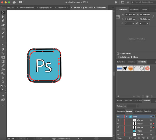
Fig.12: PS logo traced on AI

Fig.13: InDesign logo traced on AI
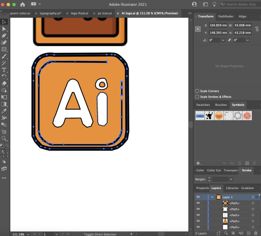
Fig.14: AI logo traced on AI
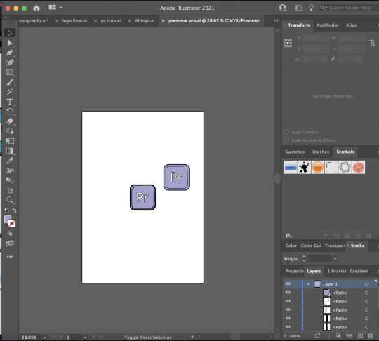
Fig.15: Premiere Pro logo traced on AI
In these logos, I simply traced them out on AI and then used the colour picker tool to select the colour so it matches. Afterwards, I thickened the stroke (5pt) on the logo outline so that it stands out more against the white background.
Overall for my brand guide (Fig.4,6,7,8 and 9.1), I was also advised to add in some headers so that the person grading would know exactly what they are referring to and not to put everything into 1 png image but instead a multi-page pdf. In the brand guide, I also added a pink border on the left and the headings are all at the side so that it was more pleasing to look at and it would draw the audiences’ eyes accordingly.
Throughout this final design assignment, I really needed to learn how to be organised and this was where layers came in to save my life. Especially because of the fact that it was hard to move things around the InDesign application so I needed to learn how to group my assets together so that it was easier for movement, rescaling and resizing. This was so that I do not end up with the white boxes / films being too widely or narrowly spaced apart.
#nm3217#finalproject#thankscurieforeverythingandforhelpingmetobelieveinmyselfbciwasinsecure#peaceoutsem2#nus
1 note
·
View note
Text
In Lecture Exercise G: Patterns

Fig.1: Basketball patterns
In this exercise we were required to create a pattern using any element of our choosing. I decided to use a basketball which I had already previously drawn for 1 of my assignments until I realised it wasn't relevant. However, when this assignment came about, I decided to not let my efforts go to waste. Moreover, I will pretend that I was watching High School Musical before this which was why I decided to use the basketball as my main element.

Fig.2: Patterns drawn on Photoshop. P.S. Ignore 2nd image on the right.
For the first few patterns (top row), I randomly arranged the basketballs in the rectangle space that I had outlined in Photoshop (Fig.2). In the last few arrangements (Bottom row), I decided to properly align them especially for the last photo where it's more structured with equal spacings for each basketball so that it creates a vertically and horizontally placed pattern or row. This is so that it looks neater and more visually pleasing to the eye than the other method that I had tried using previously which was to arrange the basketballs in a diagonal manner as it wasn't properly placed and it ended up looking very messy as the basketballs (elements) had no space to breathe. Hence, in the last photo (most bottom right), had structure and looks more like a pattern.
0 notes
Text
In-Lecture Exercise F
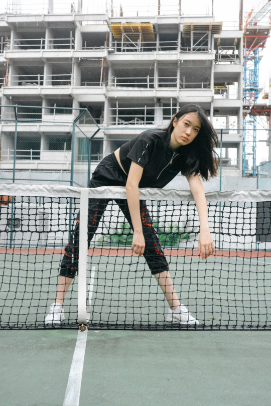
Fig.1: Photoshoot I did with my friend over Winter Break

Fig.2: Color Palette

Fig.3: PS Colour Swatches.
The five hues that I have chosen to extract from this shot are dark green, beige, reddish beige (closer to red), white and black. I firstly picked out the colours using the eye dropper tool on Photoshop and drew squares so that I could compile them as seen in Figure 2. The colours are generally are very muted and pastel-like (low chroma where the strength of the colour is weak) considering this hard court needs a paint job as it’s been years. As the colours are not as bright, they give a very warm feeling and gives it a calming effect to look at.
As green is normally associated with mother nature and earthy tones, it also brings with a feeling of peace in some sense and being in touch with our surroundings. The green is also tinted which makes it lighter and therefore, leaning more towards the pastel side of the colour spectrum.
The tinted red compliments the green hard court flooring and also enhances the earthy themes that are being portrayed in this picture. Red is also commonly found in sports industries which would also tie in with the picture as this is being shot at a tennis court and the colour resembles something like the Roland Garros red clay court except that it’s more muted.
Moreover, the white of the tennis court aids in neutralising the colours going on in the background and when paired together with the subject leaning over it creates a strong contrast between the 2 elements allowing for the drawing of more attention to the centre of the photo. As the white is not as bright (shaded) in the background where there is construction work, it blends a bit more into the background and allows for the subject to stand out.
Furthermore, the beige colour which is the subject’s skin tone also acts a neutral contrast to the harsh black and white and red and green.
Lastly, the model is donned in an all black outfit which conveys authority which is very true of this picture as she is the main focus of the picture despite all the other elements going on in the background. This also invokes a sense of power and this colour stands out from the muted earthy tones.
In sum, these colours give the photo dimension as a contrasting colour like black and white against red, green and beige commands the audience to focus on the subject as she is the main focus of it. The background colours also compliments each other giving the photo a harmonious look overall.
0 notes
Text
Assignment 3: Information Design
In this last assignment, I was tasked with creating an infographic based on a certain set of data. If I am being honest, I chose to do an infographic on Netflix because it was a mature company and because I was watching Stranger Things prior to this assignment which really gave me the inspiration. Conceptualisation
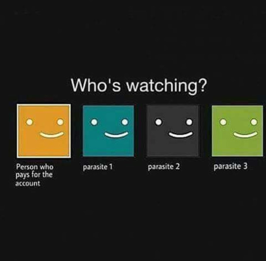
Before planning out what I wanted to include in my infographic, I went to Pinterest to do some quick searches for design inspiration and what I could potentially include in this infographic. Something that caught my eye was this infographic that I found had a mixture of words and pictures with Netflix’s signature colour, emblem and stats which gave me things to work with and potentially expand on that (Fig.1):

Fig.1: Netflix old stats: http://www.tommiemedia.com/diversions/netflix-by-the-numbers/
As the stats were a little outdated, I decided to make something similar and update it with the current stats.
Sketch
After getting the rough information down, I made a quick sketch on what I wanted to include in the infographic as shown below (Fig.2)

Fig.2: Sketch of Netflix Infographic
Firstly, I knew that I wanted to arrange my infographic in a top down, left to right manner which is why I had the big label of Netflix heading the infographic to give audiences an idea of what they’re looking at.
Next, I knew that I wanted to incorporate the Netflix logo and give some background information on the company. To show this list, I mainly did it in a diagram form so it is easier to absorb. To the right of it, I wanted to present the stats of the number of people (in millions) who are making use of the service in the different regions. To best represent this information, I decided to do it in a bar chart form.
Finally, from the 2/3 of the page down, I wanted to include some statistics on Netflix’s revenue, most streamed acquired series, most viewed original film, Popular Netflix Original series Viewership, most viewed Netflix movies in the US in 2020 and it’s competitors. These stats as a whole aim to tell the readers how well the company is doing financially, how they are doing against their competitors and what kind of content do people want to watch as well as how much they are averaging for the most popular original content that they have put out. This is so as to continue knowing their audiences and making content for them to enjoy which ultimately results in revenue for the company as well. Inspiration and Tracing
In my infographic, I was initially thinking about what I can use to symbolise the different aspects that I wanted and therefore, I decided to use a dollar sign for revenue, clapperboards for films, TV sets for television shows and for the competitors I decided to use versus (V/S) in the same colour as Netflix’s branding colours. After having the rough idea of what I wanted to portray in my infographic, I decided to use the trusty search engine google to look for images that I could trace and edit. Below are some of the inspiration pictures and samples that I have from google (Fig.3).

Fig.3: Images from Google
After acquiring these images, I traced them out on Adobe Illustrator and these are some of the drawings that I obtained (Fig.4).

Fig.4: Final traced images exported in PNG from AI
From Tracing to Colouring
After getting the drawings out, I wanted to colour them in to make it look more realistic and stand out from the background.

Fig.5: TV in AI
After tracing the TV using the pen and curvature tools, I selected the layer I wanted to colour in by tampering around with the fill and stroke icons. Afterwards I just repeated that for all the different layers and before I knew it, I had a TV straight out WandaVision in the first 2 episodes (Disney did it better though but I’m pretty content with the fact that I could actually draw). This similar process was repeated for all the visual elements that I had (Fig.6,7,8 and 9).

Fig.6: Dollar sign to symbolise revenue on AI.
For this sign, the original image was in greyscale and as I wanted my image to represent wealth. Hence, I went with the colour green as it is universally associated with money and coupled with the dollar sign, it instantly signals to the viewers that I will be dealing with numbers in the section below as well.

Fig.7 Clapperboard on AI
For this clapperboard, I purposely chose to leave the space there blank as I knew I was going to be dealing with 2 movie titles, The Secret Life of Pets and Extraction and therefore, I wanted to keep the space there so I can use typography (for the movie titles) to fill in the blanks. This was the same for the TV graphic that I had drawn as I was going to fill it in with the popular TV shows when I have laid it all out in the graphic.
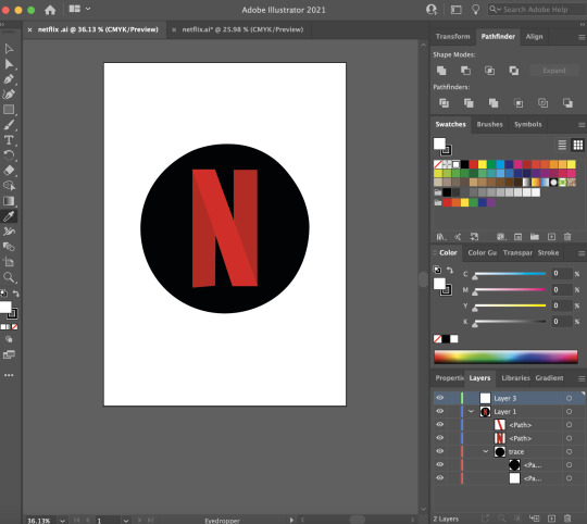
Fig.8: Netflix logo on AI

Fig.9: Netflix full logo on AI
In the colouring for the Netflix logos, I decided to use the eyedropper tool to select the shade of red on the original Netflix logo as shown in Fig.3 and that was the colour I used to fill in the letters to complete the drawing.
From AI to InDesign
After getting all the visual elements that I needed for the infographic, I decided to open up InDesign to lay them out better for me to see and this was the final product that I came up with (Fig.10)
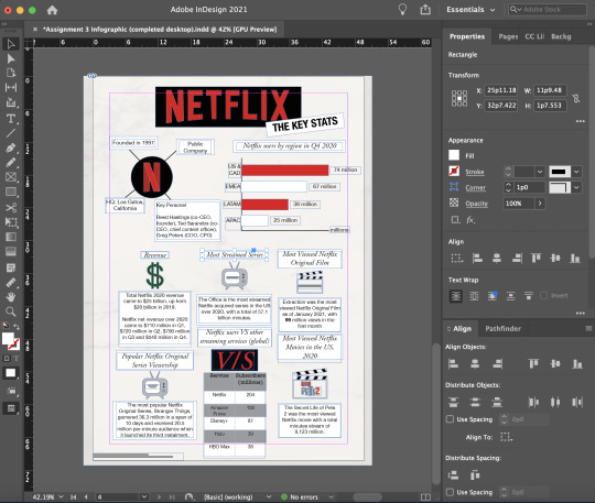
Fig.10: Infographic layout on InDesign
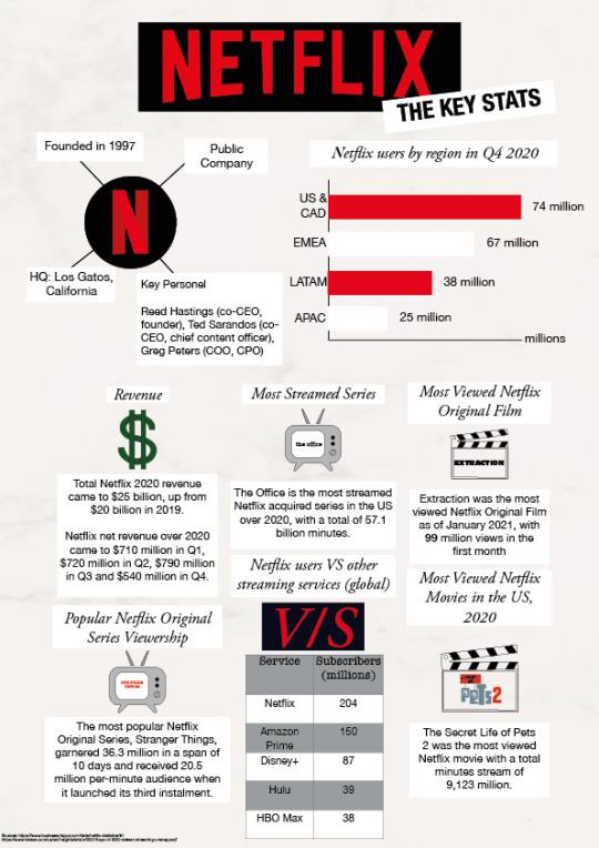
Fig.11: Infographic in PNG form.
In this layout, I have used a white background but adjusted the shade I have made some changes to the placement of the graphics (i.e. Competitors and Popular Netflix Original Series Viewership) and text as I lacked space if I stuck to my original plan and I felt that this layout worked the best. I kept the header the same and added a white rectangle with black text titled the Key Stats at the side and angled it up. The purpose for doing that was to allow the readers to know what they can expect from the infographic. I used a san-serif font (Helvetica Neue) and (condensed) bolded the letters in 24pt. This was to allow the readers to easily read the header and move on as I don’t want them to dwell too long on it. On the top left, I made use of the Netflix logo that I traced previously and added a white background and using the same san-serif font (Helvetica Neue) in 12pt so that I have more space at the bottom in the later sections. On the top right, I created a bar chart using the lines and shapes function on InDesign and purposefully chose the colour red and white to show a clearer distinction between the graphics. As red is the main colour of the Netflix logo and a colour that demands for attention, I decided to incorporate it into the graph so that viewers would give it equal attention like they do for the traced Netflix logo.
In the bottom 2/3 of the graphic, a 16pt serif (Garamond) font was used for the headers and for the other information (body text), I kept the san-serif Helvetica Neue text in 11pt. This is mainly because I wanted the body text to be easily read and it has thicker strokes which is easier on the eyes. The second reason was so as to save space as I had a lot of information to try to fit in as well as wanting to give the text more “breathing space”. I chose to use a white (#FFFFF) rectangle border around my texts so that they would stand out from the shaded white background. I kept the text in black because I thought it was elegant and classy as well as overall easy to read. Even though centre-aligned, as taught in the lecture, was a weak way to get readers to read the text, I still went ahead to centralise my header texts in the boxes as well as the columns of content in the centre using the align tool in InDesign as the left-aligned text made it look aesthetically unpleasing. When I had a solo text in the last line, I was also careful to not leave it hanging at the bottom as it was not supposed to be orphaned according to a rule in design.
Moreover, I also made the careful decision to put the icons in the middle of the texts (i.e. header, icon, description) so as to break them up so it didn’t look too chunky so that it was easier for the reader to absorb. For the V/S icon, I did it a little differently compared to the rest of the icons as the rest were traced on AI but this was solely using the Garamond font in Semibold Italic at 57pt. Initially the kerning looked a little too close to one another and a little uneven. Hence, I made the decision to give the V and S more breathing space by going to the VA settings on the right and adjusted that to 50.
Furthermore, to represent the part on Netflix users VS other streaming services (global), I decided to represent that in a table form as it was easier to understand and people could instantly see the figures which is the important part of that section.
Lastly, in the bottom left part of the infographic, I included the link to my sources in San Serif Helvetica Neue 4pt as it was not as much of importance but it was more for the reason that I did not want to be thrown out for plagiarism.
Challenges
Throughout this entire infographic process from conceptualisation to design to the final product, I realised my biggest mistake was not organising my layers as I was dealign with so many especially when it came to text because everything will go out of alignment if I accidentally selected something else by mistake which I will take on board with me for my future design assignment.
Apart from that, I also realised that the part addressing the key people in the company actually needed a lot of space which might have played in to the factor where I had limited space for the bottom 2/3 of the infographic and it may not be as neatly aligned. Therefore, I had to go through several adjustments and scaling options by expanding the width of the white text box and make the text fit before finally settling on the best option.
Critique
During the critique session, I received really helpful feedback such as:
Bolding the stats (i.e. 74 million) so that it stands out more from the background because these are important figures.
Improving on my visual hierarchy as the white background that helps the text stand out was pretty unevenly drawn. (alignment issue)
By putting all my texts in white boxes, it gives all the information that I have provided similar intensity and symbolises the fact that they have similar importance.
Post-Critique
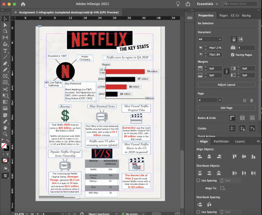
Fig.12: Updated Infographic in InDesign

Fig.13: Infographic in PNG format.
To rectify the issues that were being brought up during the critique, I decided to bold the numbers at the side of my graph so that it stands out as I wanted to highlight the important statistics.
With regards to the alignment issues, I have tried to align or draw my white text box so that they will be the same width. This also includes the table as I have attempted to do the same by scaling it up so that it aligns with the width of the white text box. Afterwards, I centre-aligned it again so that it flows better.
Moreover, to address the critique on my information having a similar intensity, I decided to go ahead and play around with the colour by changing it to the Netflix red, E3051A. I have also increased the font size to 13pt and bolded the stats. Hence, all these elements work together to aid the important statistic stand out in the body text.
Other amendments
I realised that for the bar chart I was missing an axis titled region so I decided to add that in and shifted the graph down. At the same time, I decided to change the rectangle graph color from white to black as white was already used a header background option and i didn’t want to confuse the audience even more which was why I made the switch.
5 notes
·
View notes
Text
Assignment 2: Storytime!
A Remote Stand-Off
Starting the assignment
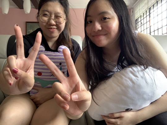
In this assignment, we were tasked to create a storyboard. Firstly, it started conceptualising the simple narrative that I wanted to tell using the 3 act structure (Setup, Confrontation and Resolution). Afterwards, I went ahead to sketch these stories out to make sure that they represented the vision that I had and then took the photos to bring it to life. Hence, the gist of the story that I was trying to tell was about 2 friends who were bored in quarantine and just turned on the TV and having a debate about what to watch on Disney+. Heavily inspired by some of the conventions and cinematography of the Spaghetti Westerns i.e. the duel scene and the ECU shots of the eyes etc, I decided to have these 2 girls (my friend and I) fight over the remote to see who gets to decide the show they will be watching: High School Musical or Lemonade Mouth. If you’re wondering if this was inspired by a true story, it was but don’t worry we were still friends after this as you can guess from the selfie we took midway because we decided to give ourselves a 5 minute break in between shooting scenes.
Storyboarding

Fig.1: Storyboard Part 1 (Drawing)

Fig.2: Storyboard Part 2 (Drawing)
The storyboard first starts off with a wide shot (WS) or establishing shot (ES) of Disney+ being featured on a TV screen. The scene then cuts to 2 girls, Layla and Isabella, on the couch looking bored and figuring out what’s good to watch. This is the set-up of the scene which leads onto the rising action when both of them spy the remote on the table and reach forward to grab it. These 2 scenes are being shot in close up (CU) and mid-shots (MS) respectively. That’s when both girls grab onto the remote at the same time (shot in CU) which leads to the stakes getting a little tense as it cuts back and forth to an extreme close up of Layla’s eyes first and then Isabella’s, both of them refusing to let go of the remote. This action results in the biggest crisis or confrontation, the duel for the remote and its shot in a MS. In this scene, it is also when the girls started screaming High School Musical and Lemonade Mouth respectively. This then brings us to to the resolution and last shot of the storyboard which is Isabella managing to triumph over Layla and manages to get ahold of the remote as Layla rolls her eyes in defeat. This is shot in an MS so that you can see Isabella raising her hand with the remote in it so she can pick the movie.
Below is the storyboard but in picture form.

Fig.3: Storyboard Part 1 using pictures

Fig.4: Storyboard Part 2 using pictures
Pre-Critique
To further prepare for the assignment, I attempted to make my narrative foolproof and cutting out the unnecessary scenes I may not have needed. I also went a step further to try and edit some pictures using Photoshop by playing around with the settings that it had to offer. For the first picture, I decided to make the TV stand out a bit more from the background and to do that, I went ahead and selected a new curve layer and using the brush tool, I masked it with another layer where I inverted the masks and modified the layer again. This effect overall did help as the TV is now slightly brighter than the rest of the objects in the background (Fig.5). For the rest of the shots, I mainly played with brightness/contrast to get achieve the desired effect that i wanted as the light source was to my right in the picture (as you can see from the windows), I wanted to make sure everything was brought up to ensure the white balance is there. I also cropped some images like Shot 7 as I wanted to bring out the ECU and the MS shot as I felt it was better in that size than a WS. Moreover in Shots 6 and 7 (Fig.6 and 7), I also played around with the spot healing brush tool to get rid of the pimples that plagued our faces which we were not excited for the world to see although we are still coming into adulthood. After all these pictures have been edited, I layered them all out on InDesign (Fig.12) and used a western background to further bring out the mood of what I was trying to go for which was a story inspired by Spaghetti Western conventions.

Fig.5: PS work area for Shot 1.

Fig.6: PS work area for Shot 6

Fig.7: PS work area for Shot 7

Fig.8: PS work area for Shot 3

Fig.9: PS work area for Shot 5

Fig.10: PS work area for Shot 8

Fig.11: PS work area for Shot 9

Fig.12: InDesign workspace for storyboards (drawn or photos)
I left shots 2 and 4 unedited as I thought they perfectly captured the essence of the story I am trying to portray on their own.
To sum up the shots in the assignment:
Shot 1: WS of the television featuring Disney+
Shot 2: MS of 2 girls staring at the TV pondering what to watch
Shot 3: CU of the TV remote
Shot 4: MS of 2 girls reaching for the remote at the same time
Shot 5: CU of the 2 girls grabbing the remote at the same time and refusing to let go
Shot 6: ECU of Girl 1 (Layla) staring at Girl 2 (Isabella) intensely
Shot 7: ECU of Girl 2 (Isabella) staring at Girl 1 (Layla) intensely
Shot 8: MS of fight for the remote
Shot 9: MS of Girl 1 smirking happily as she emerged triumphant while Girl 2 is rolling her eyes
Pre-Curation
Before achieving the images that I needed to place in my storyboard, I did have some shots that I was not as satisfied with such as these 4 examples below.
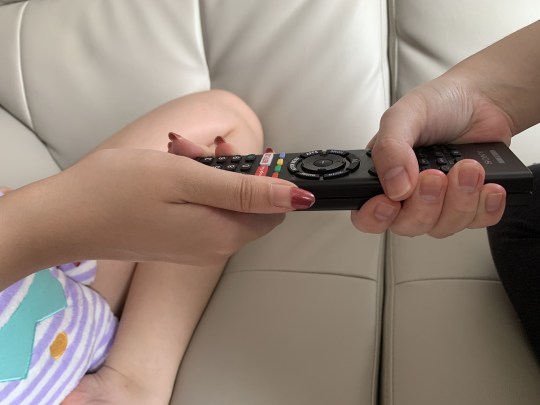
Fig.13: Shot 5 of the remote that did not make the cut
In Fig.13, this was meant to be for the 5th shot and I personally thought was not suitable. This is because according to the rule of thirds the remote is off centre and towards the centre right of the photo which is very uneasy on the eyes and puts the remote not as the focus of the photo as in the left third, Layla’s leg is showing which brings in a lot of elements and the viewer would not be sure as to what to focus on if this image was presented instead of the final one that’s being shown.
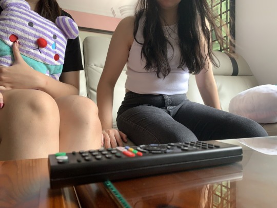
Fig.14: Attempted CU of the remote
For this shot, I wanted it to be used for the 3rd photo where the remote is in focus which was why I attempted to try for a CU shot. Even though the remote is placed in the foreground of the photo, it is not as sharp as the people in the background. As our eyes are naturally more drawn to the object that stands out, the remote in the foreground which is not in focus would lead audiences to think that the focus is the person in the background when that is not the case. Hence, this shot was a complete fail and did not make the storyboard for its shot size and depth of field.
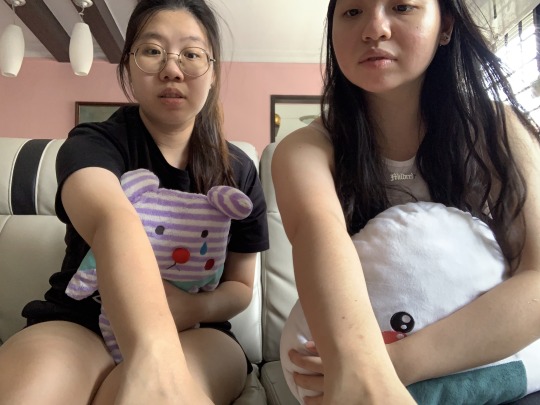
Fig.15: Attempted Shot 4 (reaching for the remote scene)
This shot though emphasising the point that I was trying to make about the 2 girls going for the remote at the exact same time is very uncomfortable to look at as there is no headroom for the girls and even cuts out some of the features of the girl on the right. Therefore, this does not make for a good scene as there is no room for your subject to breathe (cropped head) and the framing is just very awkward and aesthetically unpleasant.
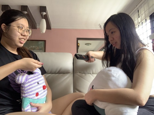
Fig.16: Attempted Shot 8 (duelling for the remote)
This shot was one of the many outtakes that did not make the cut as it was very obvious that Isabella has already gotten hold of the remote. Hence, this was a fail on the misc-en-scene and character behaviour where Shot 8 was meant to be the 2 girls struggling for the remote. A challenge while shooting this shot was actually getting the timing right as we needed to time it perfectly so that it showed the struggle of the 2 girls grappling to see who gets hold of the remote. Therefore, to overcome this obstacle, I decided to film us doing the action instead and then revisiting a few frames to get the shot that I needed so that it was timed perfectly which is being shown in the final submission.
Critiques and Edits
During the critique session earlier, I breathed a sigh of relief when I found out I did not have to reshoot any of the scenes and that my narrative was easy to comprehend (thank you film school for making me a film school brat) i.e. Shot 1 of the TV was good at establishing the setting and the rest of the events to follow. However, I do realise that I could have experimented with the angles a little more if I did have a tripod but I made do at my friend’s apartment.
Hence the main feedback I got was to work on the formatting of the storyboard. For example, I should not include the captions that I had previously as this is meant to be a photographic storytelling not a storyboard that I was used to in film classes and to also put the shots that I had into 1 page so that it was easier to see the flow.
Final Versions
After listening to the critiques, I made the adjustments accordingly so that my photos and sketches in my InDesign layout (refer to Page 3-5) are put in the 3,3,3 format. I have also removed the text from the bottom and decided to feature it in the blogpost instead. I have also added in the pre-curated images that did not make the final cut.

Fig.17: InDesign layout
Overall, this assignment really tested my creativity and allowed me to incorporate some of the film conventions I already know and put it into modern day context. This was a fun assignment that I got to do with friends as I felt that it made the story more realistic and it is a first world problem that we face today as well.
1 note
·
View note
Text
In Lecture Exercise E

1. What seems to be off about this particular typographic representation?
This typeface right off the bat is centre aligned which learned is the weakest form of aligning a text making it super hard to read as you are unsure where the words start and end.
As much as the text tries to distinguish its title from it’s body text, it was so hard to read as it was only the font size that changed but not the serif typeface. Even though there were attempts to bold the title, it was still very difficult to tell them apart as from afar it looks like a mass of text and nothing stood out. Hence, this creates a separation or a disparity instead of a unison where readers may interpret the body of the text so much so like a very long sub-header.
The text is also using all caps which makes it worse as to me this came off almost like a picture instead of a mass of text I am supposed to be reading. The words “tempor” and “nunc” are merely separated by a full stop and it took me a while to realise that it was a different sentence altogether. Another thing is the blocky, outlined text with white spaces in between the outline of the text doesn’t help the words stand out in anyway shape or form and as it is in the body of the text it was not suited for reading which makes some readers not want to finish reading the message.
2. How would you improve this typographic representation
To start off, I think I would first apply some grids in the InDesign panel so that I can figure out where my text is going to go or what is its purpose for. This is also to give it some stability and structure because if i can’t structure my life, something has to be. To further expand on this point, I would also attempt to align the title and body text to the left so that readers will be able to tell where the text starts and ends or have a fixed reading point so as to be able to start their sentences.
I think instead of using serif fonts for both the title and the body text I would incorporate sans-serif text so that it compliments the current text or image better. Additionally, I would also attempt to choose a simple sans-serif typeface, i.e. Avenir, that is more legible and easier to read.
Instead of having black outlines and awkward white spaces in between the texts, i would make them solid black text and fill them in so that it stands out from the white background that’s already making it very illegible.
Lastly, I would attempt to make the reduce the font size of the typeface so that it is a smaller size as compared to the title so that it looks more like a body text instead of a sub-header.
Therefore, all these elements combined would have made the text easier and more efficient to read.
0 notes
Photo
Assignment 1: Stripping Down!
The Process
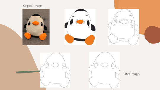
In this first major assignment, we had to take a photo of something around us and present the process of abstraction by stripping it down (no Liam Payne pun intended) to its base structure or construction. The photo I took was of my soft toy penguin, Pengy. I named him when I was a teen. (Yes I know, how original.) The rationale behind choosing this photo and object was initially because I assumed the shapes of the characters were distinct and I wanted to construct the image using these simple shapes i.e. circles etc.

Fig.1: Original Pengy photo
In the initial stages of my process of abstraction, I thought I could get away with simple shapes but then I realised that was not possible as Pengy was pretty unique-shaped. Hence, for the first abstraction, I decided to try and trace out Pengy’s original shape using the pen tool on illustrator (Fig.1)
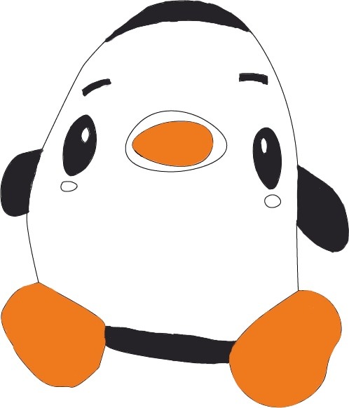
Fig.2: Drawing of Pengy but coloured in with the 1 extra colour, Orange, besides Black and White.

Fig.3: Using the Fill tool and Paintbrush tool to colour Pengy in.
During the first stage of the abstraction process, I went with tracing the full image of Pengy and attempting to turn him from a 3D to 2D form. I also figured out to get smoother curves I could make use of the curvature tool which was how I attempted to get better curves and it made it easier when it came to the feet portion. On top of that, I was allowed 1 other colour of choice so I decided to go with the orange shade, #EF7A1D, as it was the colour I got from the colour dropper tool for his feet and beak. Hence, after tracing Pengy out and colouring him in that was how I obtained the first drawing of Pengy (Fig.2). To fill in the colours, I made use of the fill tool for the nose and for the rest of the elements that the fill tool didn’t work, I made use of the Paintbrush tool to colour it in (Fig.3).
In the second process of abstraction, I decided to remove the colours on Pengy so that it ended up as Pengy’s full figure without him being coloured in. From the audience’s POV, they could still make out that it was Pengy and he was my soft toy and it was simply the outline of him.
In the third picture, I decided to strip back the image even more and remove some of Pengy’s features like his hands, legs and cheeks which leaves the outline of him and his eyes and beak which is very unrecognisable by then.
In the last photo, I took out even more details in the eyes which left the bare skeleton of the image to which I got comments from my friends saying that he looks like the Mr Bean icon. That was when I realised I might have abstracted Pengy a little too much and it was almost pushing it.
Challenges
One of the main challenges that I had and came to realise after abstracting Pengy was that since Pengy is already white and black, it was hard to practise the abstraction process even further because of the lack of room that I was allowed to play with colours. This could probably also contribute to why I initially only had four (4) stages of abstraction compared to (5).
Critique and Edits
During the critique session, I received helpful feedback from my tutor and peers. Although my process of abstraction was headed in the right direction (I promise I’m not here to make one direction puns but I guess this is where we’re going with it), there were still issues that I needed to work on.
Some of the key points that were highlighted to me in this critique were:
To firstly define the characteristics of the penguin and see what is the best way I can go about abstracting it to keep its essence.
To include one more stage in the abstraction process anywhere that I deem fit.
To label the stages of abstraction.
Pengy looked too simplified to know what animal it was when it came to the final stage of abstraction.
Revised Edition
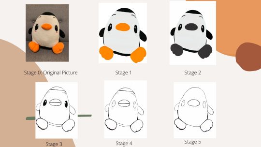
Fig.4: Pengy Final Abstraction for Submission
After getting the comments back, I decided to discard the previous draft and instead of Adobe Illustrator (AI), I tried using Photoshop (PS) to experiment with layers better and this was the final result (Fig.4). I have also included the labels for the different stages of abstraction to make it clearer and included in 1 more stage in between the original Stage 1 and 3 of my previous work and switched out or discarded some images for Stage 4 and 5 which I will explain further in the post.

Fig.5: Using paintbrush tool in PS.
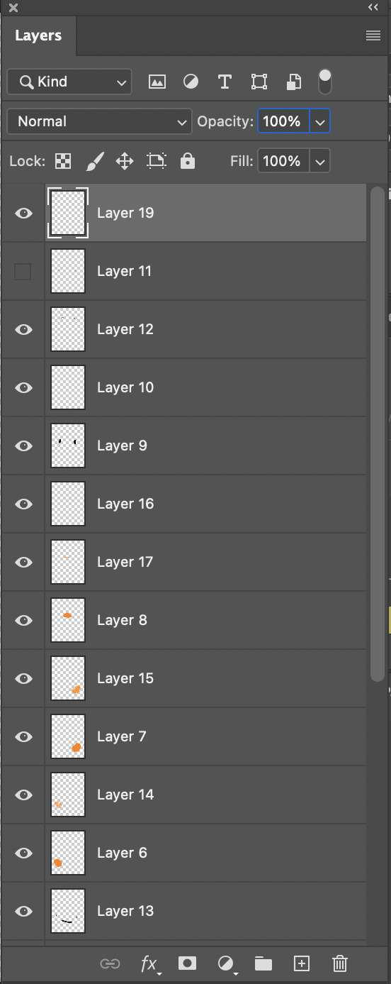
Fig.6: The layers I used in Photoshop (PS) for the coloured photo.
Throughout the process of abstraction, I pretty much kept the same line of thought. In Stage 1, I made use of the pencil tool to trace the outline of Pengy before adding the different layers and elements (which I will attach with my final photo submission on LumiNUS) to get the final outline of Pengy. After drawing the full outline of Pengy, I then selected the Paintbrush tool to fill the colours in to make it more lifelike (Fig.5). I also added extra layers of the different shades of the colour so that the feet would be able to stand out more from the image. This is very different from my first draft as well as this time I decided to make use of layers to help make my drawing stand out a bit more.
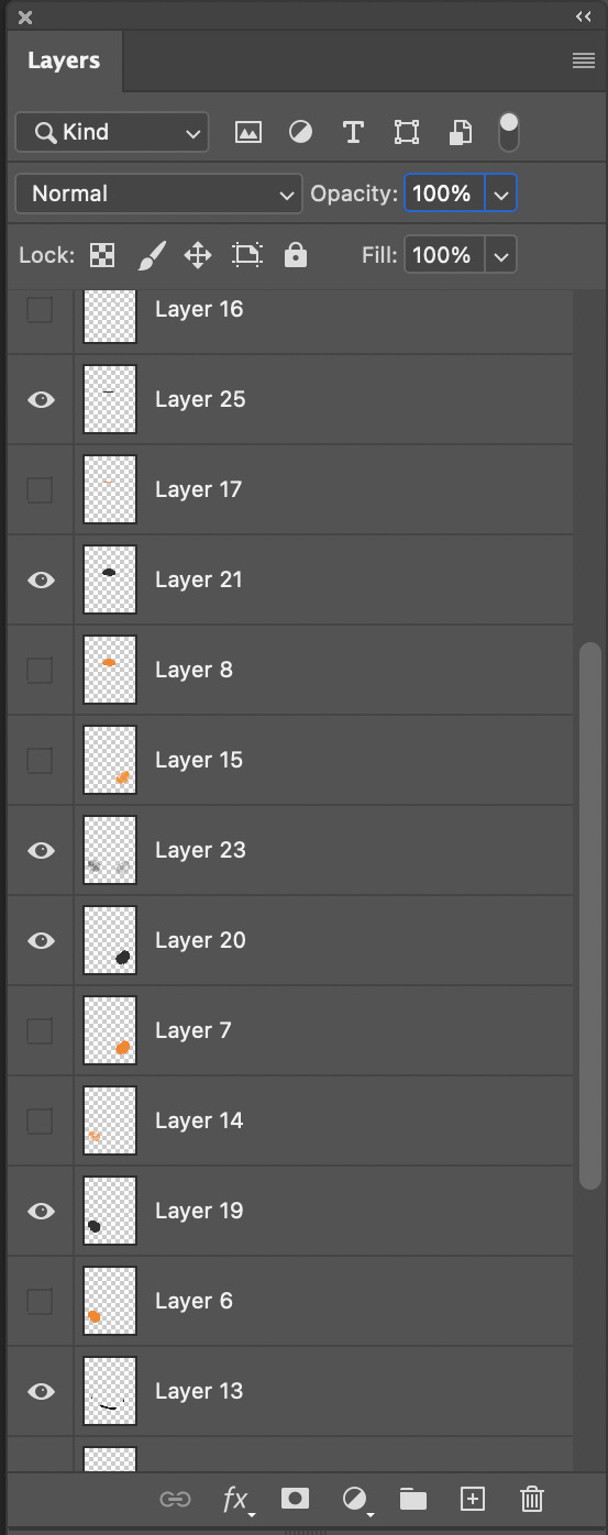
Fig.7: Layers for the B&W image of Pengy
Fig.8: An example of the different shades of white in a PS layer to give Pengy’s belly a more textured look, #E9E7E6
In the second stage of abstraction, I decided to make use of Pengy’s natural colours (black and white) to represent it better which is shown in the workspace above (Fig.7). As a penguin is naturally black and white, I had to get creative in terms of making it more lifelike by playing around with the different shades of white (Fig.8). Hence, as I already had the outline of Pengy traced out, I then used the Paintbrush tool again to colour in the black and white. As noticed, the orange colour is now gone and replaced with the black colour on its beak and feet. Everything else remained the same and this was mainly to capture Pengy in black and white and bring out its natural colours.
In Stage 3, it is the full outline of Pengy with its eyes coloured in. The reason why this is is that I went back to the drawing board to figure out what was the best way to capture the essence of Pengy without removing too many details till the point where he would become unrecognisable which is also in response to feedback that I got. Afterwards, I realised it was the colouring of the eyes which brought it to life and made it look more realistic. I also realised that it’s the different layers such as the fur which makes it look more like a soft toy. Therefore, to achieve that effect on Photoshop and making the lines a little thicker, I used the hotkeys such as command F so that the outline of Pengy will stand out. In this abstraction, I also removed the colour from the beak and feet but left the outlines of the Pengy there.
In Stage 4, although I mentioned that it is the colouring of the eyes which is one of the ways that keeps Pengy from looking as close to the original image as possible, I decided to remove them in this stage. This is to solely focus on the outline of Pengy without the usage of any colours from the paintbrush tool function. Hence, the outline of Pengy remained with all the additional details like the eyebrows, head, feet, cheeks, and flippers/hands were still recognisable as well as made obvious.
In the last stage of abstraction, I decided to get rid of the extra features of Pengy such as its head, eyebrows, cheeks and remove the line from the beak. In this photo, no colour was used as well.
After reviewing this image, it was when I realised I might have needed to stop before going further. If I removed the hands and feet, Pengy would have ended up being in a weird blob which makes him very unrecognisable just like in the last stage of my critique. Hence, I decided to stop my abstraction process here as I felt that this was the simplest form where Pengy could be represented properly without deviating too far from the original 3D or 2D image.
0 notes
Text
In Lecture Exercise D - Composing Compositions


In this series of photos that I would like to title: “I got told to go exercise and I reluctantly stood on the treadmill”, features my friend who was nice enough to let me use her as the subject.
The first picture is one of a Long Shot (LS), the second is a safe attempt at the Bird’s Eye View shot (as the table was very unstable but we do it for the blog), the third is a Mid Close Up (MCU) and the last is a Medium Long Shot (MLS).
In the LS, it is usually used as an establishing shot to give viewers the bigger picture and to set the context as well as the setting of the scene. This is the portion where the subject can be seen but it’s the location which would be more in focus and the subject is being acquired in that space which is her living room. Here, the audience can tell that there’s a girl in her living room on her phone.
The second shot is framed from the Bird’s Eye View which is meant to be framed at a high angle. I stood on a table and placed my subject at the middle to lower third of the frame so I could get more headroom for the shot. Usually this shot is used when intimidating a subject as it makes them look small as the audience towers over them, stripping them of whatever power they thought they had. In this case, this picture could be interpreted as someone towering over her and telling her to go exercise.
The third shot is an MCU where the subject is looking displeased and now I have chosen to place her at eye level so that we’re on the same level as her and we can see how she’s feeling which is probably something resembling annoyance. Therefore, the purpose of the shot is to basically focus more on the subject and her emotions rather than the background and with heavy emphasis on the subject’s features, we can roughly tell how she’s feeling.
Lastly, I used a MLS of my subject on the treadmill. This shot covers about 3/4 of her legs up to her face. Hence, this gives enough information to the viewers that she has moved from her original spot on the chair and to another area in her house where the treadmill’s located. Therefore, this could be interpreted by the audience that she’s finally on the machine but whether or not she chooses to actually exercise is up to her but she’s already there.
0 notes
Photo
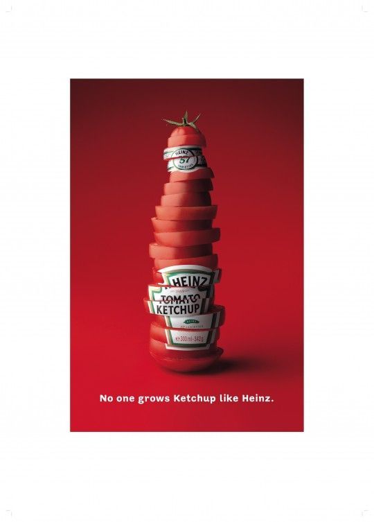
In Lecture Exercise C: The Sign - Signifier and Signified
After looking at the photo that I needed to analyze, I went “It had to be Heinz.” Jokes aside, on the surface, the poster depicts Heinz’s tomato ketchup as written on the stacks of tomato that is shaped like a bottle.
To analyse the poster, we need to first define the signifier and the signified. According to the French linguist, Ferdinand Saussure defined the signifier as the form and the signified as the idea or concept (Hall, 2013).
Hence, in this poster, we can identify the signifier as the raw slices of tomatoes being stacked up to form the ketchup sauce bottle that Heinz would usually package their tomato sauce in. Coupled with the text that goes “No one Grows Ketchup like Heinz” (signifier), the signified that can be implied here is that their ketchup is the freshest. The word “grow” in the text (signifier) can also lead to the implication that Heinz grows their tomatoes and makes their ketchup from scratch which would also explain the green steam at the top representing the bottle cap.
In the aspect of colour, they have chosen to go with red which is the colour of ketchup. Besides that, the colour red (signifier) can also be seen as eye-catching but also, in this case, dominating as it reinforces their slogan, “No one Grows Ketchup like Heinz” (signified) which shows how they are still trying to prove themselves as the freshest brand of Ketchup there is. The colour green is also used as the stem or the bottle cap of the ketchup bottle (signifier) and green can help emphasize the freshness of the ketchup even further as green is a colour which is usually associated with nature i.e., trees, shrubs, bushes etc.
Therefore, this poster, which is straightforward yet creative, was a good marketing strategy on Heinz’s part. This is because they have managed to convey the message of the Ketchup well and this affects how people view their products which would encourage the desirability of the product and ultimately lead to the purchasing of the product by the customer.
Bibliography
Hall, S. (2013). THE WORK OF REPRESENTATION. Retrieved 6 February 2021, from https://www.semanticscholar.org/paper/THE-WORK-OF-REPRESENTATION-Hall/c82a842e89a041f4dfa3e70380280e3576290450
Heinz. No one Grows Ketchup Like Heinz [Image]. Retrieved from https://i.pinimg.com/564x/c4/6e/6d/c46e6de182f8274bdac8d5491eb1dff7.jpg
0 notes
Photo
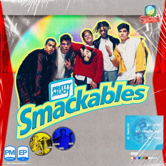
Fig.1: PRETTYMUCH’s new EP cover (PRETTYMUCH, 2021)
PRETTYMUCH, a band started by Mr. Simon Cowell, was recently signed to Sire records under Warner Music. Their new single, Stars, premiered last Friday and on the same day, they released the artwork for their new EP, featuring three (3) brand new tracks that their fans aka ‘BEANZ’ are eagerly anticipating.
From the artwork it is obvious that PRETTYMUCH has always been a band that pays tribute to the iconic era of boybands in the 90s like NSYNC and Backstreet Boys who sing and dance. Therefore, their new EP “Smackables”, has never been more on brand for them. Resembling a famous nostalgic American snack, Lunchables, it is no wonder the EP art is so synonymous with their image of reviving the love for boy bands whilst putting their own modern-day spin on the term. Especially with the usage of the CD, it is very clear what inspires them and their sound/style of music.
This deliciously packaged EP features the band members of PRETTYMUCH on the front cover outlined in a light pastel yellow. The colors used are mainly a sky-blue color and darker blue edges at the end of the letter. By doing so, the blue contrasted with the yellow helps the text stand out and makes it draws the attention of someone who’s looking at the image for the first time. Their album name “Smackables” spans across the top half of the lower third of the album art in a san-serif font called “Neue Frutiger” (Fig.2).

Fig2. Font for PM album
As previously established that it is similar to that of the Lunchables packing, “Smackables”, can be interpreted as their new EP having really good songs that they are confident enough to put out and after hearing the songs, dare I say, it smacks, especially “Parking Spot”. This is further reinforced by the plastic-type wrapping that is constant throughout the EP art. This can be interpreted as the EP being brand new and freshly sealed for the viewer’s enjoyment when they slowly begin to discover the art that they have put, and it can also indicate how their tunes are always fresh.
Their band name is positioned directly above the letters ‘A’ and ‘C’ in “Smackables”, where the letter H, became the line that surrounds their band name, separating it from the album title. It is also in the same shade of color as their EP name which brands them as a band, and it lets viewers know that this EP belong to PRETTYMUCH.
On the bottom right, their track list is being released in white san-serif fonts. Behind the track list is a logo created that has the words PM, PRETTYMUCH worldwide and est. Los Angeles in dark blue. These words are in a circle and almost resemble the shape of a seal that can be interpreted as them making their mark on the world but also not forgetting where they belong. This is complemented by the bottom left-hand side where they again state the words “PM EP” and an infinity sign which resembles the Lunchables’ nutritional information indicators on the packaging. This can be an indication from the fan’s point-of-view that they are here to stay, and they are going to constantly keep making music for the world to hear. Next to the letters there are photos of them in yellow and blue stating their names where the first letter of their names spells the word BEANZ, which is also the name of their fandom. The top right-hand corner does the same where a globe is depicted in neon type colors and there is a ticket on the bottom stating the year their EP is dropping which is 2021.
The graphics and elements of the photo have been arranged in a hierarchy whereby it draws your attention to the respective portions that the band wants you to see which would first be the title of the EP, their faces and the bottom right which features their track list if you pay close attention. The EP has done very well when it incorporates the usage of bright colours which allows the band members to stand out from the background. This is because the CD behind them reflects a lot of light which might be very distracting to the viewers when looking at it visually and takes away the focus from the members. Fortunately, the designer has managed to see that and put a bright yellow outline around the member’s very vintage-looking image so that the band does not blend in with the background. However, I think if it were me, I would try a white border around the members instead, so it makes them stand out a bit more instead of the yellow. This is because when I looked at it at first glance, it was a bit jarring and the stroke was a little thick. I do understand that it is probably because of the color scheme that they designers are decided to go with yellow in the end.
Moreover, all these elements being put together can be an indication that PRETTYMUCH as a band are here to stay and they’re constantly making music as if they never left. This is a very successful part of their artwork as the message is very clear to the viewers that the band is first and foremost releasing a new EP titled “Smackables” and their songs are going to be heard around the world. The infinity sign could also be an indication of how their songs will be so iconic that they will be remembered forever and that’s what the band is aiming to achieve with their new music.
In conclusion, this EP design has been an overall success as it conveys what they wanted to to their fans. It also showcases a new era for PRETTYMUCH as they continue doing what they do best which is producing music for everyone, mainly their fans, to enjoy and relate to.
Bibliography
PRETTYMUCH. (2021). Smackables EP Artwork. Retrieved 29 January 2021, from https://www.instagram.com/p/CKVdvKWMY6J/?utm_source=ig_web_copy_link
4 notes
·
View notes
Photo
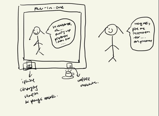
Presenting the All-In-One or Alli for short.
This creative machine functions like a full-length mirror that you can hang anywhere in your house that you deem fit. Think a mirror like something out of “Snow White” but instead of it being used for evil gains, it will be used for good to push my creativity forward. A bonus, an AI robot will be living inside it and it is ready to respond like a normal human. With the voice command from the user, “hey alli”, the AI robot will listen and give you inspiration for anything you need help thinking about or whatever you just asked for as shown in the example above. After being inspired and coming up with the bright idea, I will then pitch my idea to Alli to see what she thinks. As someone who still struggles to streamline her thoughts, this AI will function like a human to discuss it with you and give you opinions on what they think about your idea.
Extra features also include a coffee machine in built onto the full length mirror to give me the caffeine boost so that I will be more alert and ready to tackle my daily challenges head on. Whenever I feel like I am in a creative slump, the mirror also has an iPhone charging station and speaker that plays my carefully curated Spotify playlists to help me get out of that funk.
In my opinion, I think I am a very simple person who prefers to purchase products with more than 1 functionality. This is so as to save space and cost on getting other items. With this creative machine up and running, I feel more confident to conquer the world one creative problem at a time.
1 note
·
View note