#not posting but holy crap. holy crap. holy crap. HOLY CRAP
Explore tagged Tumblr posts
Text
Today on: Holy crap that's 100% a scam.
Boy howdy did I find another gold mine of scams/scam bots in the "hiring" search. This is the funniest example:

My thoughts:
Struggling with your classes? Can't pass the test? Hire totally real (no fake) and totally smart (no dumb) people by giving us your real name, credit card, and login information, and we'll do your work FOR you! No guarantee you'll pass, but hey, you paid us anyway!
Disclaimer: This is obviously a joke I'm making here, do not go to these websites and do not actually pay for something like this. Also please don't use ChatGPT for your class work in school and college...

My thoughts: HMMMM yes let's book a totally real plane off of tumblr dot com! What could go wrong?! :D

My thoughts: I would not trust that thing near my house... at all.

My thoughts: Wanna get robbed or kidnapped?
This is how you get robbed or kidnapped.
----------
Will probably make some of these posts in the future, just thought people would get a chuckle out of them.
Again, obvious disclaimer: Do not click on these links.
No matter how good of an offer it is, it's likely a scam.
Always make sure to report these posts too if you see them.
#scam#scams#scam awareness#scam alert#online scams#scam warning#scammer#scammers#please don't fall for this kind of thing....
49 notes
·
View notes
Text
*wakes up*
*checks Tumblr*
*sees that they actually went through with it and sent me fanart*
A-ah-
..........
.......HHhhhhhhhaaaahhhhh!?!?!?!? O////////O Sh-she- she's- nnnnnnnn........nnnnnn......!! htdjhtedjrythgryshty!?!?
#not posting but holy crap. holy crap. holy crap. HOLY CRAP#some of these are- wow i am not straight#shes just....so gorgeous humanized aaaaaaa she was already really pretty in game too and aaaaaaa#(ive actually seen two of these before but the others? hhhnnnnnn....)#(shes humanized in my fic btw everyone is)#lauri talks to herself
3 notes
·
View notes
Text
We've gathered here today in celebration of men with pretty brown eyes
#Holys crap they're soeb beautibfuol omg#gay#mlm#mlm sfw#gay yearning#mlm thoughts#mlm yearning#boy appreciation post#0///0
18K notes
·
View notes
Text


the witcher + text posts:
radskier edition (part 1)
#the witcher#thewitcheredit#jaskieredit#jaskier#radskier#witcheredit#radovid#my edit#2k#holy crap!!!#jaskierxradovid#text post meme#the witcher spoilers#witchertextposts#thewitchersdaily#thewitcherdaily#userbecca#witchersdaily#ughmerlin#useravia#arthurpendragonns#chewieblog#(hope it's ok to tag!)#welcome to another series mainly i will enjoy asdfghdsjs
3K notes
·
View notes
Text
Fem!Wrightworth doodles
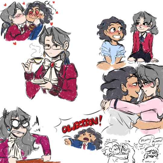
#narumitsu#ace attorney#wrightworth#miles edgeworth#phoenix wright#holy crap i did not expect that much notes on my last post-#thank you :''333#fem!wrightworth
835 notes
·
View notes
Text
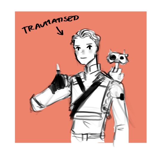
hands you all this cal to announce i’ve FINALLY finished fallen order (by which i mean i finally picked it up again after those couple hours i played a few months ago and then finished the whole game in 2 days lol)
#cal kestis#bd 1#jedi fallen order#jfo#star wars#my doods#anyway HOLY CRAP YOU MEAN STAR WARS WAS ALLOWED TO BE GOOD BEFORE ANDOR (2022-)??????????????? AND I DIDNT KNOW??#i love cal i loved the story i love how cinematic and amazing it looked good lord#i don't think i've ever played a game which gets such an amazing sense of scale across#like all the great temples or fallen starships were just Wow#like bracca ALONE gobsmacked me. seeing all these things i grew up watching in tcw as wreckage was like Ough Wow and THEY FELT SO HUGE#im just. wow!!#and THAT FINAL MISSION HUH. MOST FEAR INSPIRING VIDEOGAME ENCOUNTER EVER#my only criticisms are the awkward navigation/ level design in some areas and maybe the ending felt a bit lackluster somehow#i say somehow bc i dont get how lol#the reason im making this post past midnight is bc i got off work at 10pm and then immediately had to finish it LOL#anyway big heart emojis im very happy i sat down and actually played it finally#i want jedi survivor now LOL unfortunately it costs money and i have a rule i never buy games in release year lol#tbh i never rlly buy games til they're £20 or less
2K notes
·
View notes
Text

help, my boyfriend took the most speak now coded photo in existence 😭
#just started going through the photos and holy crap.#my post#the eras tour#the eras tour sydney#sydney night 3#speak now
482 notes
·
View notes
Text

THEYRE INSANE FOR THIS WHAT THE FUCK MAX
#f1#formula 1#mclaren#lando norris#max fewtrell#pietra pilao#holy crap#CANT BELIEVE MAX POSTED THIS#og mando
290 notes
·
View notes
Text


king candy posting again, my hand slipped.
(sir, you need to get out of my head. sir. sir, please. I'm begging you-)
#my favorite senior citizen#hard to keep this guy consistent hahahha ....#wreck it ralph#king candy#wir king candy#wir turbo#turbotastic#fanart#doodle#coralscribs#holy crap posting two days in a row?? wooooow#wir sour bill#i think its fair that sour bill should join a union#wir
200 notes
·
View notes
Text
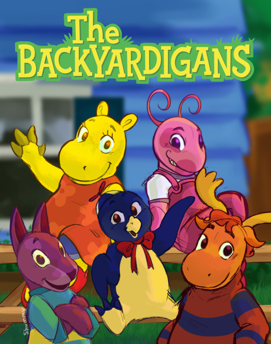
WE OUTSIDE
dedication under the cut:
i originally started this just a few days before janice burgess passed away. if you have been following me for a while, you'd know that the backyardigans is still one of my all time favorite shows to this day: a major brainworm ive had since i was first popped out the womb.
she had such a huge hand in me and my siblings childhoods outside of backyardigans, as well, and i cant understate how much it means to me to see a black woman have such a major role in various popular animated franchises.
RIP to one of my greatest animation inspos, ESPECIALLY when it comes to children's entertainment. the fact that mrs. burgess passed on the day before my birthday hurts especially, so i dedicate this drawing to her! i would not be who i am w/o these goobers, so thank you
#RIP Janice Burgess#the backyardigans#backyardigans#uniqua#pablo backyardigans#austin backyardigans#tasha backyardigans#tyrone backyardigans#this and akira's passing leading up to my bday really hurt my soul#literally one of the post impactful series in my life.#it literally help lay the foundation for little old preschool me + its fun as hell to revisit#shumm's art#medibang paint pro#medibang#digital art#artists on tumblr#nick jr#noggin#2000s nostalgia#and this show turns 20 in august??? holy crap.#now i HAVE to make a video#backyardigans redesign#? i suppose#i didnt want to change too much but you can tell the designs were simplified specifically because its early 2000s cgi#screenshot redraw
226 notes
·
View notes
Text
play dentist
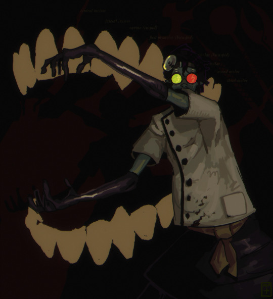
#caligosto loboto#dr loboto#but specifically wayyy younger#psychonauts#trainofthought#things that will make sense to me specifically and also close friends. i thinj#kind of rough but i dont care#umm 911? my dentist is being Really Fucking Weird 🫣🫣🫣🫣#skirt because it said so. i happened. i was there. i was the dentist#holy crap i forgot the nose bridhe. of the glssses. oh fudge.. ummm… 2 late 😇#i was looking up refference images. Why are they just. selling dental equipment on amazon..???#like. for personal use.#Thats…. Not Okay…. I think.#praying that i got everything labeled right#blood tw#<-kind of..?? its more implied if anything#every day my vintage effects get more and more aggressive#soon you will barely be able to see my artwork it will just be noise /j#the hardest part about posting art is convincing myself to post it…#whavery… the internet has to deal with my sillyness and i will simply not care
905 notes
·
View notes
Text
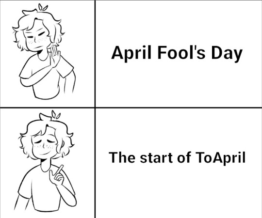
ToApril back! 804 dead, 77 injured
#pjo#toa#rrverse#trials of apollo#trials of apollo memes#apollogists#pjo apollo#lester papadopoulos#toa fandom#holy crap 2 posts within 5 months of each other!
262 notes
·
View notes
Text
The thing I love about the ending of mha is not only that there's no conclusive "canon ship", but the way he ended it as sort of a new beginning, so anything could start to happen.
And specifically for bkdk, it's not canon but he gave us AN INCREDIBLE AMOUNT TO WORK WITH.
Katsuki leading the project to get Izuku a support suit so he could be a working hero again. Katsuki putting out a hand for izuku to take.
The forgone conclusion that Izuku and Katsuki will now be competing again as they ALWAYS WANTED. Their future could have them jockeying for rankings for the rest of their lives, constantly one upping each other, AND/OR they could become partners, or open their own agency!
The implication that Katsuki wanted a future WITH IZUKU so badly that he contributed a large chunk of his own money and resources to making it happen. That he MOST LIKELY was where they got a lot of the info on how the Quirks worked and how Izuku utilized them. Sure they have battle footage, but katsuki had intimate knowledge as Izukus closest person and sparring partner.
The fact that A PROPOSAL, A RING, AND A WEDDING WOULD HAVE BEEN CHEAPER.
Like there are so many little ideas buzzing around my head and it's not fair that I don't even have enough time to sit down with them for post epilogue fics 😅
And I want to know more about that suit. I hope they animate it more in the anime when the time comes bc I do want a little super suit fanservice.
#bakudeku#bnha spoilers#bkdk#post epilogue bkdk#like horikoshi gave us a HUGE BLANK CHECK#for us to draw our own conclusions#and the katsuki funding the suit thing alone is just SO RICH#the SUBTEXT HERE#holy crap#idk if a canon ending for them would have been this rewarding#i love this partnof the ending fr#no one won but i feel like we won???#stay winning#izuku as a sensei is great#but now with this twist of getting to be a pro hero again#like it opens a lot of interesting doors#particularly with like teamups#ranking#and then whatever the hell he has with kacchan#also we can make up for ourselves if they live with each other or move in together#the possibilities are endless
127 notes
·
View notes
Text
ITS JUST ME MYSELF AND I
97 notes
·
View notes
Text
Seducing Your Partner In The Kitchen: The Right Way and The Wrong Way
The right way…
Ruby: Heeeeeyyyy, Weiss~! 😘
Weiss: Ruby, what are you doing? I thought you said you were baking cookies?
Ruby: *undoes her apron to reveal a chocolate chip-patterned bra* How about THESE cookies, sugar? 😏
Weiss: 😳
Weiss: 🥵
…and the wrong way.
Nora: *naked on the counter* Reeeeennn…! I thought we were going to have seeeeex…! 😭
Ren: *stirring* If I don’t stir constantly the roux will burn and ruin the flavor of the entire dish!
The right way…
Yang: *leaning backwards on countertop* Oh, my~! How clumsy of me! I accidentally spilled icing all over my tits and abs…! If only someone could help me…clean it off…? 😘
Blake: *tying on a bee-patterned bib* 😍🐝🤤
…and the wrong way.
*bacon sizzling* 🥓🥓
*loud pop*
Jaune: AAAAHHH!!! MY NIPPLES!!! 😫
Pyrrha: *frantically applying ice to burns* 😰
Jaune: AAAAHHH!!! MY NIPPLES AGAIN!!! 🥶
#rwby#Ruby rose#Weiss Schnee#Blake belladonna#Yang Xiao king#jaune arc#pyrrha nikos#lie Ren#Nora Valkyrie#Whiterose#bumbleby#arkos#Renora#Ruby X Weiss#ruby rose x weiss schnee#blake x yang#Blake belladonna X Yang xiao king#jaune x pyrrha#jaune arc x pyrrha nikos#ren x nora#lie ren x nora valkyrie#holy crap I need to put fewer ships in a single post this is a lot of tags
184 notes
·
View notes
Text
Sure you may be able-bodied, but is your body ABLE to shut up when disabled people talk about our experiences?
#ableds gonna able#read the notes of someone else's post and holy crap ableds have OPINIONS on what we personally experience#'I'm not disabled and have never experienced this so have you ever thought about that you're making all of this up?'#ableism
160 notes
·
View notes