#not a drawing tutorial just my personal experiences
Explore tagged Tumblr posts
Visit Tumblr Blog
Explore Tumblr blogs with no restrictions, modern design and the best experience.
Last Seen Tumblr Blogs


Fun Fact
25% of US internet users with an annual income of $80-100K use Tumblr.
Note
can i ask advice ;; drawing wise ? how did you start to anatomy but also w stylization? did you bruteforce by studying every bone muscle etc in art school?
hmm...
First, you must distinguish between two completely different concepts: gesture and anatomy. The stylization and dynamic you often see me doing with my dancing practice is "Gesture". This is an excellent tutorial by Proko about gestures. I practiced gestures very soon when I started drawing, simply because I wanted to draw dynamically, lucky for me it was the right thing to do. This was the main reason why I'm so fast at sketching.

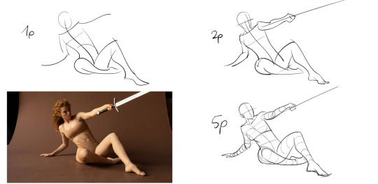
This is my gesture practice, 1 min, 2 min, and 5 min sketch. It's about the flow of the body and which direction each part is going, use "sharp and coherent lines". I practice until it becomes a "natural reflex", a habit when I look at people's interactions.
This below is something I drew 3 years ago (my anatomy was not good sorry), notice how I use many many coherent lines? At the thigh, shin, arm stretching,... all the bigger areas? That's the remaining of gestures.

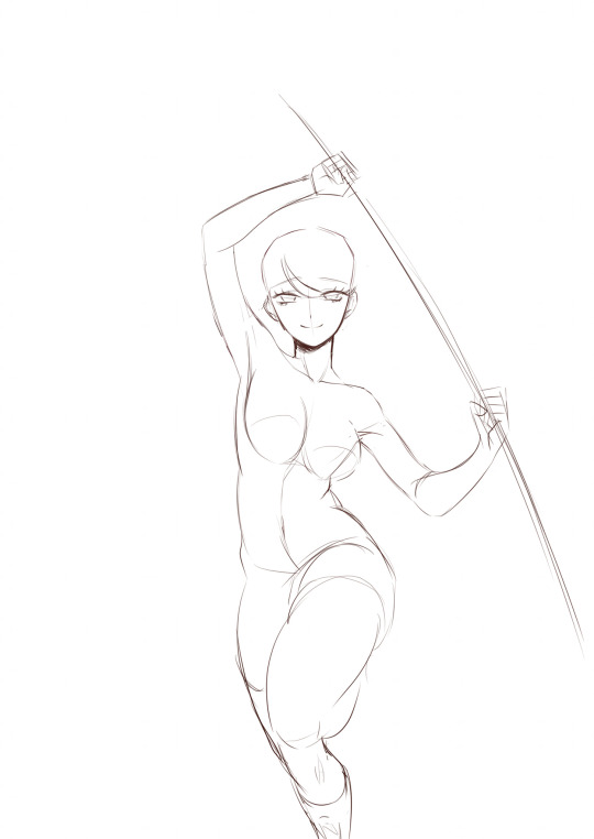
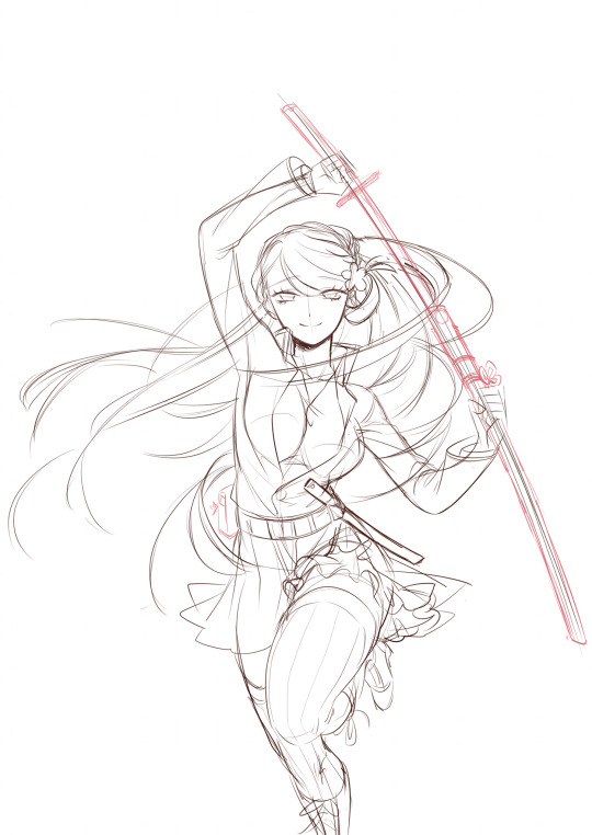
It goes without saying. Try to find the flow of gestures, even for the hair or clothes. Heh, I drew this 4 years ago, how nostalgic.

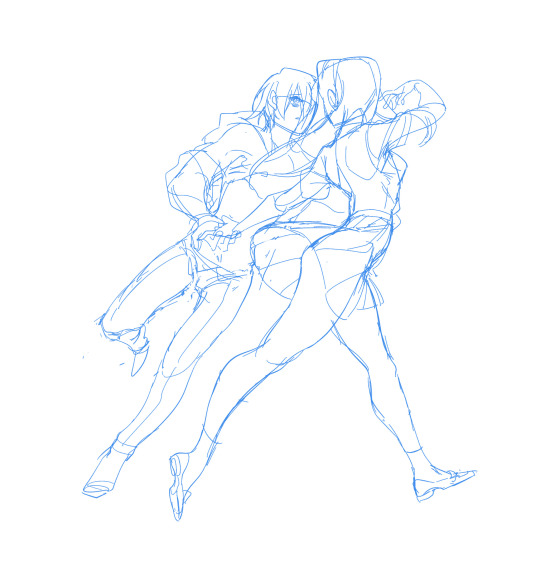
You can see how I just create the flow with Lya's hair and body movement in the dancing pics too. Like with Kylar's pic her body is straight up one quite hard mass from head to toe. You know she's leaning forward, seemingly wanting to abandon Kylar with a "pathetic loser like you? With me?" attitude (ouchie sorry Kylar nation). While in Sydney's pic she seems much more relaxed and enjoys how her body parts seem to loosen and more in sync with Sydney's movements. Her hip and legs sway more, and her hair also sways back at Sydney's body, hinting that her moves are relatively close to his body. I don't think I have enough vocabulary to describe, gestures are always just "feelings" to me. If people see what I want to show, that's the success for me.

I know many self-learners started by finding random tutorials that have muscle breakdown or box-like proportions to try and mimic. Mimic is good, drawing is mimicking and remembering what you saw, but without good gesture practice, many people tend to make anatomy very stiff.
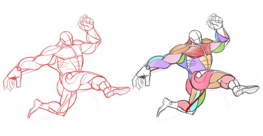
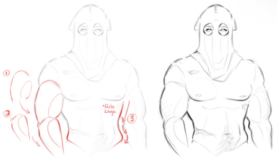
Then, you start to apply anatomy to the gestures you've practiced. One way to do it is by learning about muscle position first, and then trying to apply it to a figure, or a model. This is my homework and it's HORRIBLY WRONG IN MANY WAYS. My teacher fixed it for me but I don't have the after with me right now, so take this as an example of how to do the apply thing, DO NOT USE IT AS MUSCLE REF it's very wrong.
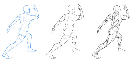
In my opinion bone structure is not strictly needed like muscles. Bones are for muscles to hang onto. You only need to remember some important "landmarks" like the collarbone, elbow joint, anterior pelvis, knee, and ankle,… to hang the important muscles to it. After you're familiar with muscles and gestures, you can start to stylize. Applying your knowledge to animated characters with cartoonish design is one great way. THESE HOMEWORKS OF MINE ARE STILL WRONG but ye hope you get the idea. I'm still struggling with anatomy.

One of my all-time fav are AFK ARENA artists and what they do for the game. Aki as the main artist, Kuri Huang, and another artist I suddenly forgor the name as home screen illust. I recommend researching their works if you want a direction on how to stylize your character with great dynamic gestures and shapes.
And
As much as I hate to say this, I was particularly considered a failure, a stone-head, who couldn't be changed for the better when I was still in art school - uni. My chosen major was digital graphic design, not specified in drawing but in designing, that's one thing I regret. I traded 5 years of my youth for doing the things I don't want to do. That's why the moment I graduated, I immediately went and signed up for an advanced art class specified in drawing. I'd be lying if I said the uni didn't teach me anything about drawing. They did, but almost everything I learned during 5 years of uni was self-learning from outer sources. I encourage self-learning the most when I talk with younger artists. Proko is a very trusted source to learn from, go to their YouTube channel, and you might figure out something too.
251 notes
·
View notes
Text
okay but where the fuck does one even begin to learn how to draw i-
#i mean#i have an itty bitty amount of experience because of what i had to do for architecture#but that was like.... buildings.#how tf do you even begin to draw a person#HOW.#my brain is self destructing#do i need to start hoarding youtube tutorials or something????? help#im trying to get more into it cause i think it'll be another good outlet for me but. uhhhhhh#so far ive just been using references to just kinda practice basics but. is that correct#idk man i'm trying#₊˚⊹⋆˚☂︎ bunny babbles ₊˚⊹⋆˚
8 notes
·
View notes
Note
How did you learn to draw fat bodies but still keep it cartoony? I love how you draw different types of bodies and make them all seem normal instead of certain body types sticking out like a sore thumb next to others. I struggle to draw fat bodies without it looking weird with the rest of my art. Do you have a specific tutorial you followed or something?
This is a really good question! I'm glad you like my depictions of different body types, i worked really hard to get better at that so im happy folks enjoy em!! I didn't actually learn from a book or tutorial, it was mostly looking at fat bodies IRL and learning to incorporate those features onto what I already drew. As it turns out, we're all human, so if you understand the anatomy enough to draw a skinny person, you have the tools to understand the anatomy of a fat person.
So, like, here, this is my sketch of someone with a very average build. If I were to draw a fat body, I would still use all the basic principles I use here. One mistake I think folks run into is "isolating" parts, which can lead to things like this
which isn't necessarily bad, but if its not what you're going for, the issue is pretty apparent. Weight affects ALL of the body, not just the stomach or the face or the limbs. If you think about how that weight affects everything in tandem then you can start drawing fat bodies that work more in your style.

for this, this is the same quick sketch using the same pose and principles as the first one. but! I allowed the weight to be distributed across the body. Notice how the legs, belly, arms, etc all got thicker? The key to drawing fat bodies and making them look like they fit is allowing that weight to affect everything. without it, it just looks like you're adding on features to someone rather than considering everything at once.
my other tip is: don't be scared! things like fat arms or chins or bellies or stretch lines are not something that's bad to depict. if you want to draw fat bodies, you gotta not be scared to draw things the way they are. someone having a fat body is not bad, and you drawing that fat body is not bad either. Experiment! To me, art is about representing ideas, and the only way to get better is to experiment with how you represent those ideas. I'm by no means an expert, and I think you can also get a ton done by looking for resources aside from me, but I hope this helps, and have fun!!
5K notes
·
View notes
Text
Art Videos I've Learned From
Here's some art videos that i greatly learned from. i dont work well with things presented in a specific rigid fashion my brain just doesnt respond to it well so here's some that helped me.
Teaching Myself to Draw for 30 days by Leap Tries It
Even more so than the pewdiepie video this video was what made me feel like i could do it myself, he shows like every step of the way both mistakes and victories, its nice.
Pursuing Art at 30 (as a beginner) by Taylor Losch
This one resonated with me because I'm also 30 and while I did draw things as a younger person I gave it up around the time I turned 18 because my mindset was still that if im not instantly good at something i cry. Its a nice video and outlines his pursuit.
What to study to improve your art by bluebiscuits
lays out the fundamentals in an easy to digest manner. what i appreciate is that she lays it out without assumptions of you going for a realistic style which i feel too many art tutorials fall into on youtube
Draw boxes (correctly) to improve your art by pikat
Lays out how drawing boxes helps you be able to draw in perspective and build up your character to make them look less flat. Ive still yet to learn this but ive been doing exercises of drawing boxes so im sure its just a matter of drawing more and more boxes.
Can a beginner ACTUALLY learn how to draw in 30 days? by pikat
she goes over the pewdiepie video and does an experiment with her partner who doesnt really draw and is a math and spreadsheet nerd and idk i thought it was just fun and cute at times. It does also show some pitfalls.
Theres more but I think these are a good place to start, at least they were for me. Your experience may differ, people learn differently but hopefully this will help some
544 notes
·
View notes
Note
Hello! I’ve been reading WLB from some time now, and I am still absolutely loving this comic every time.(on my 4th reread lol) WLB has inspired me greatly along with WC content and (also great!)creations by other creators to the point that I am almost about to script my own comic, with a few scenes that WLB had a huge influence on. Though, I can’t help but be a little overwhelmed when I actually think of creating one, mostly because of the fact I lack the skills to draw comics. Believe me, I am shit at panelling lol. But also l‘m a bit scared because even if I actually end up making my own series it absolutely could end up flopping and that would probably make me lose enthusiasm. I don’t necessarily want to make money out of my comics but rather show others my stories and characters that I love, but I have a history of making and posting oc art just for nobody to watch and kinda giving up.(even though I’m aware of the fact that this happens to practically everyone all the time, it still hurts) The (real)question is if there is some advice you can give to beginner/wanna-be comic artists, and how did you feel when you first posted The Recruit if that’s your first comic. I’m sorry if this sounds like a vent, and feel free to pass this if you want-just know you’re a great inspiration for many people. Stay safe, remember that YOUR well being is number one, and Love from Korea♥♥
Hello! I'm very glad you've enjoyed WLB!
A webcomic can for sure be a daunting and overwhelming thing. Most artists are a one man show, and knowing how to do Every Aspect Perfectly is an impossible task. I think it's important to remember everyone starts somewhere, and it is hard to get better unless you Start.
I mean, the first comic pages I drew digitally looked like this.


The comic lasted 6 pages before I got tired of it, and then I started The Recruit.
(which was over 430 pages long and started and had quite a style/writing change throughout the 7 years I worked on it)


You learn so much by just doing. There are a lot of helpful free resources online now a days to make the learning faster! There are tutorials on how to panel! And I think just reading comics in general is a great source of learning. Pay attention to the things you like (paneling, simplification process, color palettes ) and implement them in your work!
I think it's really important to figure out the level of detail you want the comic to be. I don't think it's wise or sustainable to put 100% effort into every aspect of it. It will burn you out. It's good to consider what level of shading (if any) you'll be willing to do for hundreds of panels, what level of background detail, how many colors the characters should have, and figure out what your focus is.
I've met a lot of comic artists over the years, EVERYONE has a different method or different focus. Creating is not a universal experience!
As for having your work be seen, it is honestly a lot of luck. Back in the day for TR I would just submit to all of the deviantart warrior cat groups and people would find it that way. deviantart groups are pretty dead now so I am unsure if that is any good now.
I personally really think ComicFury is a wonderful place for new artists. It's default page always shows the latest comic, so everyone always has an equal chance to be seen. You can be on the front page every 12 hours (i think, it might be 24..) and with a striking icon and consistent posting, you WILL find people.
It's not the largest site, but it is my favorite for comics.
I do not like the mindset of a comic "flopping." I think it takes time to build an audience. It is very unlikely for people to find your comic overnight, it will very likely take at least a few months of consistent posting to find a few engaged readers. I know it sucks to feel like no one is seeing your work, but it's just something that takes time.
Cat comics do tend to find readers faster though, so if that is your goal, I do hope you find success!
You could also post your updates in comic/art related places, like discords or post panels on bluesky or instagram. really any site or app that posts an image.
I also think consistent uploading is a strong key to building an audience. And to do this, it really helps to have a backlog. Meaning you draw like the first 10-20 pages of you comic (or however many) and upload one or two pages a week. The more your comic is seen popping up on their feed, the more likely people will be to finally click it. I usually do not click on comics I see once or twice, it usually takes a few weeks of me seeing it pop up before i decide to check it out. (talking about on Comicfury to be clear)
Once you've established you are dedicated to your comic, people do not mind if you take breaks. (and if they do, fuck em)
Also, having a community of friends or creators is a huge motivator. Show your work to friends! Share in a community of comic creators! Some things my friends have said to me about my comics has lifted my creative spirit more than anything.
This is turning into some 3am ramblings but to summarize my points:
•Find a style that will work for you to sustain a comic. (do not make 100% effort art pieces)
•Upload on comicfury (great comic site, equal opportunity for new comics) (I would also cross post to other platforms and link back to CF as a primary comic site)
•Work on some pages in private, so you can upload consistently once you begin your comic! (I would update daily for maybe a week and then switch to weekly pages, just to get the best chance of being seen + consistent posting. so that would be good to have at least 10 pages of backlogs. 7 for the first week, plus 3 weeks of backlog at that rate)
and the point most dear to my heart;
•Don't be scared of change.
I know a lot of folk wait and wait to make their comic until they are perfect artists or writers, but like, you'll never make anything if you wait for that. Change is so natural and normal in webcomics, in all art really. I think if you shade for 10 pages and decide you hate it, it's okay to change how you shade or drop it entirely. Change your art style. Change how you panel pages. Change how you do backgrounds. Change anything and everything you want. Enjoy the process and tell the story you want to tell.
Best of luck on your comicing journey, I hope you really enjoy it.
#answers#comic advice#im not the advice king and I can only say what I know#if you have any other specific question feel free to ask!#this is pretty rambly. im sorry.
164 notes
·
View notes
Note
I mess around with a lot of random art supplies. I have zero training other than, like, primary school and some random one off classes or short series of classes. I follow a lot of different creators in different mediums on social media. I have never been taught to draw or paint or anything and so I don't really know how I'm supposed to learn. And so a lot of what I do is watch someone do something and then play around with it on my own, or decide I want to draw something and trace it or find a basic "how to draw [x]" and I guess my question is, am I violating some sort of "learn to [art skill]" etiquette or is this a reasonable, if somewhat scattershot, way to approach making stuff?
I guess I worry that, idk, someone is going to feel like I stole their thing? I don't sell anything, and I post from one account (not on Tumblr) just because I like to keep a record of experimenting.
If you're not selling replica work in competition with an original creator, then no, no problems with doing this.
It's funny because I was just talking to a studiomate about this--SO much of learning art is repetition and replication. We stand on the shoulders of the great masters who came before us--from cave paintings to cathedrals, artists have been looking to and imitating the work of other artists. So do tutorials, and trace, and try to copy, and do whatever interests you. Yes, it's possible that some random individual may take offense, but frankly that is never not a possibility, and in the grand continuum of artists, what you're doing is a long and storied tradition of learning. If you go looking, you will find centuries of artists copying and mimicking other artists to learn and develop their skills. And if you're not trying to become a really particular kind of professional artist, then there's really no right or wrong way to teach yourself art, so long as you're having fun.
For a good chunk of the "copy" stage of learning art, you're just not going to have the technique to be a viable competitor to most of the artists you're probably copying from, and by the time you do have the technique to really mimic talented artists, you're probably going to have your own ideas you're more interested in making anyway.
As a personal policy, if I feel I'm coming too close to someone else's original idea, I just don't sell that work. I may keep it or gift it, but I don't try to make any kind of profit off someone else's idea, even if it was my work. If you're posting and want to feel like you're giving credit where it's due; go ahead and post reference links for whatever you're working off. It's not required but it's nice to show respect to the work in that way, if you're able to.
#if some artist specifically doesnt want their work referenced then yknow respect that as a not-unreasonable request#but this shit is how people LEARN#also developing an individual artstyle is overhyped#itll just happen on its own without you trying to do it or! it won't! and you'll be a generalist!
286 notes
·
View notes
Note
Hey, I've been having trouble drawing arms lately, but I really like the way you draw them, do u have any pre ink sketch's that i can see so i can get a understanding of how u draw the shoulders connected to the arm? Please and thank you.
SUREEE¡¡¡ sorry if it took me a while to do this tutorial. Kinda surprised you ask me from all people hahahah I'm not an expert but I'll give you some tips <3


DISCLAIMER
This is based on my personal learning experience. This could help you improve your drawing skills, or it may not be for you since I don't know your art level. This is my first tutorial, and English is not even my first language
HOWEVER
I made this just for you <3 I hope it helps
120 notes
·
View notes
Text
♡ Poplar - Valentine's One-Shot ♡
Written by @/duskyskye
•••••••••••••••••••••••••••••••••••••••••••••••••••••••••
“Splendid, absolutely splendid!”
Poplar gazed at your latest piece, raising it above his head. You’d tried your best to work with the tiny watercolor canvas and brushes he had available for you, but you really thought you could have done better with this one. Especially compared to Poplar’s prowess.
“I don’t know,” you thought aloud, “I don’t think it’s really all that.”
“Nonsense! The way you rendered this flower is lovely! I love the shading you did on the petals.”
“Poplar…you and I both know I was just following a tutorial. I couldn’t do that without help.” Your tone was light as you spoke, though the creeping feeling of inadequacy was still present. Of course, Poplar wasn’t taking that from you.
“Hmm…what I know for certain is that you shouldn’t be nearly this hard on yourself. Everyone begins somewhere, after all! I think you’re off to a lovely start. Now, may I?” Poplar stood, gesturing to the wall. You gave him a shrug and a nod, trying to keep the smile on your face. Without another word, he positioned your piece just above his desk mirror.
“Well, I think that makes for a lovely centerpiece. Done by an even more lovely person.” Poplar smiled, looking at the wall.
You followed his gaze. Yep. That was your piece, alright. Next to the other paintings that he had hanging. They seemed to dwarf yours in quality, the brushwork and delicate detail reflecting Poplar’s talent in his craft. You shuddered a little bit.
Poplar seemed to pick up on your discomfort, his smile faltering as he sat back down next to you.
“Does it really bother you that much? Your painting?”
You gave him a small nod. He sighed, looking downcast for a brief moment before his sockets widened, his smile quickly returning as he turned to you.
“I don’t think I’ve ever shown you my old paintings, now, have I? Oh dear, what a shame. Though surely if you’re so bothered by someone’s early works, you’d have no interest…” Poplar made a point of acting hurt, leaning dramatically against his desk. You giggled at the theatrics. Maybe you were a bit on the theatrical side yourself with how downtrodden you were being.
“Are you acting like that because you think they’re any worse than mine?”
“Darling, I KNOW they are.” Poplar gave you a quick grin before taking his cane and walking to his dresser. With a flourish, he pulled out a well-loved folder from the top drawer.
“I suppose I should clarify before I open this, but I am showing this to you with the express purpose of helping you understand that everyone struggles when beginning in a new medium. I fully expect you to laugh, to judge, and so on. All I ask is that when you reach the life drawing section, you refrain from visibly cringing too hard.” Poplar slid back into the seat beside you, placing the file on the tabletop where you had been working.
“What’s that supposed to mean, anyway?”
“You’ll find out in just a moment.”
You opened the file, which contained a relatively thick bunch of papers. The top started with a few color studies. Each labelled with various brush styles, paint colors, and blending methods. Wet on wet, wet on dry, flat wash, gradients, glazing… all things you had a vague understanding of, but more than you think you would have the patience to complete. You could tell that the strokes and coloring were not nearly as neat as the works that were displayed above your head.
Pages turned from dedicated exercises to a few applications. Circles in various colors were shaded using the previous techniques. He was experimenting with the various colors available to him. You could tell that he had also been following guides with a few of these as he got the hang of the technique. It all seemed fairly rudimentary, but you could tell that he had put a lot of effort in.
At this point it appeared he was branching out his sketching skills as well. Leaves and flowers were a common subject, it seemed. It was at that point that he broke the silence.
“Ash was beginning to garden at around the point I started to commit to bettering myself in the visual arts. It’s interesting, trying to capture the detail in such tiny little things. Though I think you can see that the subtlety is easy to lose.” He finished with a laugh.
Sure enough, the linework was notably shaky. The symmetry he had tried to go for had been lost. The lines clearly lacked confidence, and the veins of the leaves looked more like fur than anything else, somehow. Not that you could do much better if you were going for absolute realism.
“I think you still did a good job.” You said, gesturing to a couple illustrations. “This leaf looks really nice!”
“I’m well aware that they’re wonky, darling. They were my first attempts.” Poplar offered you a smile. “You don’t need to struggle to come up with compliments.”
“No, no, I genuinely think they’re good! Especially for first attempts.”
“Then I suggest you continue onwards. Though while you do, would you mind if I make a sketch of my own while you continue to peruse?”
“Go for it.”
Poplar nodded, pulling his sketchbook and a pencil into his hand. You flipped to the next page.
Poplar had shifted from leaves and flowers to objects that you recognized from around his room. A porcelain plate with floral decoration that he displayed on the other side of the room. A plush that he had carefully mounted on top of his shelves. What you assumed was either an older bed of his, or one of his cousin’s, as it wasn’t the one you were next to currently. Each had what looked like at least an hour of work poured into them. Even if they weren’t the best sketches, you could see he was gaining a better eye for detail as he worked at it.
Then you flipped to the next piece.
You could only ASSUME that what you were looking at was his first attempt at drawing chicken.
You looked back at Chicken, who had been fast asleep on their pillow for the majority of their visit. You turned in your seat, looking between the sketch and the real thing.
“Ah. You found it.” Poplar broke into a fit of giggles. “It’s absolutely awful, isn’t it? It’s alright to laugh.”
Well, it was…certainly an attempt. Poplar had gone VERY heavy on the wrinkles. One eye was notably misshapen compared to the other, and the muzzle was disproportionately long for a cat. The end product was what you could tell was Chicken from the approximation of feline traits and almost nothing else.
“I don’t know, I think you did ok.”
“No, I absolutely crashed and burned. There are only two reasons that that sketch isn’t in the bin. The first is that when I’m struggling with a piece, it reminds me that I could do so much worse. The second is that when I’m feeling overconfident, it humbles me.”
Hearing him talk…yeah, you knew what you sounded like now.
“Should I continue going through this, or do you think that your point came across just fine?” You asked him, a slight hint of comedy in your tone. The stack that you had left to sort through wasn’t thick.
“Oh, by all means, continue. I’m still working on what I’m doing over here. Though if you’re curious about any of the other pieces within, you only need to ask.” Poplar looked up at you from his paper, gesturing to you to continue.
So, you did.
While none of the pieces invoked the same level of shock in you that Chicken’s portrait did, you could see the purpose of these sketches was very much to learn the ropes of anatomy and shape. It wasn’t like you had much room to speak, of course. It was more of a comparison to his current work than anything else. You could see things improving as you thumbed through each sheet of canvas, each work growing more refined as you went on. By the end, you could see a couple of full pieces that started to look very nice.
“So?” Poplar eagerly piped up as he saw you close the folder. “What are your thoughts? Do be honest about it.”
“It’s your beginner’s folder. I think you showed a lot of promise even back then, even if your pieces weren’t always the best work.” You stated bluntly. Poplar smiled at your tiptoeing.
“Now, tell me: how many folders in do you think I am now?”
“…I have no clue.”
“Fifteen. All as big as this one. Plus at least three sketchbooks. It’s a hobby, but I’m quite dedicated.”
Your eyes widened. Wow, no wonder there was such a jump in quality between then and now.
“No kidding you’re, ‘dedicated.’ I can see that all that work paid off.”
“I’d like to think so. Of course, everyone has areas in which they can improve with their artwork. I’ve just been working hard enough and for long enough that things come to me more naturally than they once did. For instance:”
Poplar thumbed through the sketchbook he was holding to an earlier page. On it was a similar picture of Chicken, this time with more precise proportions. A marked improvement from what you had seen before.
“I see. You did an amazing job on that.” You reached out, gently touching the paper.
“I’m glad you think so! Though I find I’m still not the best at rendering skin folds. They look more like the folding you’d find on clothing than the kind you’d find on skin. It doesn’t help that I can’t use myself as reference, what with the bones and all.”
Poplar closed the sketchbook, looking you directly in the eye.
“I never want you to feel bad at where you’re at in your art journey, my love. We all have to start somewhere, and personally, I think yours is much better than mine. What matters is that you’re trying, because if you keep doing that, then you’ll get to where you want to be eventually.”
You looked back at the piece he’d hung up on the wall. Sure, it was more of an attempt than anything, but maybe it wasn’t so bad. You chuckled.
“Yeah, I got you. I appreciate the reassurance, Poplar.”
“Any time, my love. Now, are you curious as to what I was working on while you were distracted with my crimes against art?”
You giggled at his joke.
“Of course.”
Poplar opened the sketchbook back up, turning to a point about midway through.
What greeted you on the page was your reflection, not fully rendered due to the lack of time, but still clearly you, nonetheless. Your hair was perfectly textured, your eyes stood out brightly with a small amount of rendering, and your skin looked as light as the paper it was drawn on.
“Poplar…I’m flattered.”
“Well, you know, I think it has room for improvement. Time to shade and color, for instance. There’s SO much to improve on. After all, it’s hard to compare a pencil sketch to the TRUE work of art that it’s based on…”
“Yeah, yeah!” You shoved him, both of you laughing. “Seriously though, this is gorgeous. Thank you for this.”
“Of course, my love.” Poplar leaned in, planting a gentle kiss on your cheek. “You know that if you ever feel as though you’re lacking confidence, I’m happy to give you any encouragement you need. Even if it means showing you my first attempts at drawing my cat.”
You smiled, not doubting his words for even a second.
“Thank you, Poplar… and you know what?” You pulled a new canvas from the paper stack Poplar had supplied you and confidently took a pencil in your hand. “I’m ready to start on my next piece.”
Poplar’s sockets sparkled; his grin widened from cheek to cheek.
“I’m excited to see what you create, darling.”
157 notes
·
View notes
Note
You should totally do like a how to draw Konig tutorial for one of ur daily sketches
Chibi or not
But u should totally do it
I neeeeeeeeed ur process
-🦥
notes below the cut - additional notes can be found in this post where I give art tips from my experience
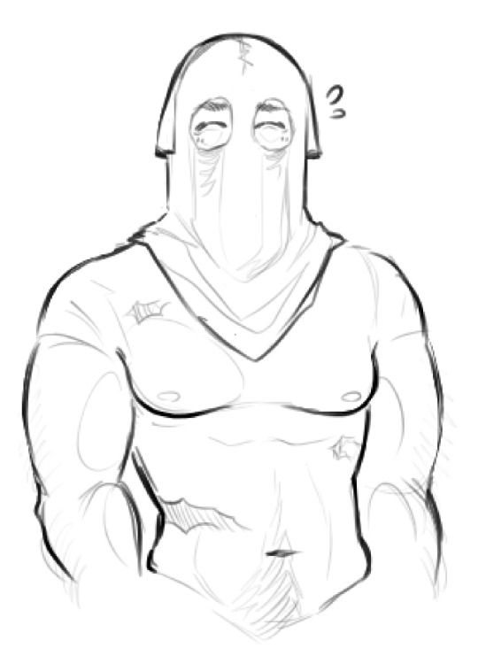
daily König sketch with bonus content♥️‼️post is a little late but it’s due to the info dump below haha, anyways, he’s a little nervous

hi!! thanks for requesting a little “my process” thing - super happy to do one<3
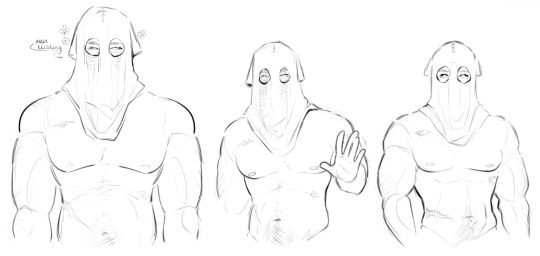
I’ll be using these pieces of him that I’ve done to go over my notes - this is just how I go about drawing him. I’d definitely recommend also going through this post linked above too for additional info because a lot of it carries over!
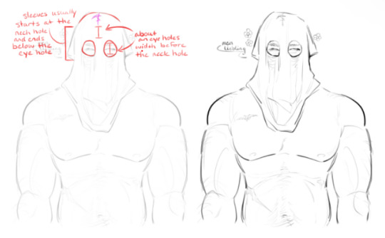
I think the most important thing for me when drawing König is spacing out his hood ratios. I always start out by just drawing where his eyes and eyebrows are, then I draw the cut-outs around them. after that, I start the stitched neckline - that’s usually an eye hole’s width above his actual eyes, it gives a good allusion to where his forehead would be
they aren’t hard and fast rules I follow, more like a silent guideline that can be meddled with depending on the drawing. I usually follow them because, to me, it looks the best with how I draw him. it’s flexible - same with the sleeves, sometimes they end below his eye cut-outs, sometimes I cut them short and they’re higher
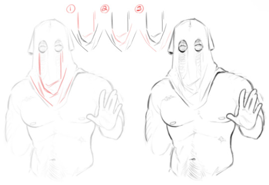
I thought I’d do a step-by-step for the hood folds because just info dumping all at once sounded confusing in my head
I start by just drawing lines down from the corners of his eye cut-outs, then I loosely draw a slanted line to show some bunching of the fabric. the slanted line is usually around where his collarbone would be
best way I can describe figure 2 is drawing folds in a ‘U’ shape. the fabric is falling from his head and ‘pooling’. the ‘U’ shape adds a little depth
miscellaneous little folds around the hem. they follow the way his hood rests, slanting downwards towards the center
if anything, just study how fabric falls and bunches up! a lot of drawing is looking at reference material to figure the ‘why’s and ‘what’s - “why do the folds bunch in certain areas?”, “why is fabric gathering in that area”, “what’s causing the fabric to move like that”, etc
lastly is his body, and as we know, I’m allergic to drawing clothing (read “lazy”). I actually really recommend looking at the post I linked above for this because, in the last figure, I show the Pinterest reference of the man who inspired my König’s body shape (and went into depth on using references)
for arms, in figure 1 and 2, you’ll see me draw an oval inside the bicep and forearm - those are just to add the allusion to muscle mass. if I don’t draw those ovals, to me, it looks a little flat. in figure 3 I go over his waistline because of course I do
I always account for a prominent rib cage line because I personally like drawing a more pronounced rib cage in general. after the ribcage, there’s a slight indent at the waist before it flares back out - that ‘flare out’ is the line for the Adonis belt. again, just personal preference, but I enjoy making the curves a little dramatic so they’re more pronounced and visually appealing to me

I don’t know how helpful that was but I hope I got some information across - uuh, even though I don’t draw his tactical gear and uniform that often the advice I can give is to just look at his model haha. the only gear that gives me a headache is his helmet, but even then I just bs my way through it
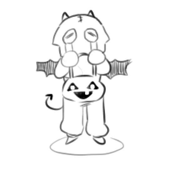
for chibi König I just shrink all his proportions and draw a stupid little t-shirt for his head<3 he doesn’t need to think, he’s just a cute little fella. I draw chibi König the way I would draw a puppy, make him look cute without a thought behind those eyes
for additional reference material here’s the link for my Pinterest - I have an absurd amount of reference material for you to browse through
hopefully this was slightly helpful?? I don’t know, as long as you get something out of this I’m happy
229 notes
·
View notes
Note
Heyo! Do you have any tips for making comics? :)
I've been meaning to get back into the swing of it, but concentrating on such a commitment that takes so much time is tough sometimes haha.
How do you make it work? Are there things you avoid/make easier for yourself just to make the process more fun and do-able?
First of all, I’m very happy for you! I think it’s very exciting whenever we return to a craft we were once passionate about. I wish you the best of luck!
This is a big question and I don’t think there’s really one simple answer since all artists are different and have their own strengths and weaknesses.
One of the biggest issues I face is that I have a million ideas but I simply don’t have the time to do them all. I want to share all these ideas but if I gave each and every idea the same amount of attention and detail, I’d hardly get anything done. So here are some things I've learned through my own comic-making experience, but keep in mind it may not be what you're looking for. Also remember this is NOT career advice. I make comics for fun, not for a living. If you’re looking for professional advice I would suggest looking elsewhere 👍
1 - A comic doesn't have to be fully rendered to be entertaining. Although I love to draw and line and color my work, it’s not always necessary. If I feel a punchline is strong enough to stand on its own, I’ll just make it into a doodle comic. In fact, I’ve found that some of my doodle comics perform better than the fully rendered ones! The doodle comics are still very fun for me to draw and they also serve as gestural drawing practice, so in the end it doesn’t feel like I'm making a sacrifice. I'm still getting my ideas out there and I'm still drawing, I'm just prioritizing what gets more attention so I can better manage my time.
2 - Not every panel needs an illustrated background. You definitely need to show backgrounds for establishing shots and when characters are interacting with the scene. But sometimes the focus needs to be entirely on the character and/or what they’re saying. You can choose to have a solid color background and maybe add a few textures to keep it visually interesting. You're still putting in the effort to make your art pop, but you aren’t losing a ton of time by drawing dozens of backgrounds. Color is also a good way to convey mood. I do that a lot in my comics, like this bit from “My Gal”:

^ I was trying to show a progression in excitement here, so having the colors change from cool to warm does a better job portraying that than if I just had a standard, scenic forest background for all the panels.
3 - Use resources: That's what they're there for! Because I make all these comics by myself, I have had to find resources to help me get through some of the steps faster so I can focus more on the story writing and the artwork. For example, to help me save time on lettering, I use the Onomatopedia font and the Manero Panels, SFX and Bubbles brush set for Procreate. I’m still selecting the sound effects and choosing the appropriate bubbles and tails to suit the mood and scale of the text, but this has saved me a ton of time because I’m not drawing each individual element by hand over and over again. Personally, I purchased these resources but I'm sure there are plenty of free tools out there that you can use.
As far as making it more fun... Honestly, I just love comics as an art form so much that learning about all the 'rules' and techniques and 'SOP's behind comics makes it more fun for me to make them. I recommend checking out tutorials and tips (even if you think you already know it all) and you might be surprised at how much it might ignite more of your comic-making passion. For example, I've spent hours on Blambot's "How-To" page and on ComicDevices.com just to try and soak up as much as I can. They're full of fascinating reads that make me want to try out different things!
I hope this helps! Good luck with your comics!
102 notes
·
View notes
Text
NAKED GRANDMA
Now that I have your attention, just wanted to put out a few things. This does not apply to anyone in particular, but set as a reminder to everyone, though I will be directing some of these to people who warranted it. This applies to both here on tumblr and on my twitter page.
At the end of the day, Raven is MY original character.
about the top/bottom thing
I get a lot of asks pushing the idea that Raven must be dominant or topping Price because she's a badass which let me be clear, Raven is a switch. Sometimes she tops, most time she doesn't. If I've already talked or drawn things where she's explicitly bottoming or just being submissive, you who comes in and push her to topping instead in an already established dynamic and context is kind of a dick move to me. Listen, just because a character is strong and competent doesn't mean she is also dependent in the bedroom, that they are only valid if they're dominant at all time. Get that misogyny bs out of here.
about requests and rude comments
If you're sending ask telling me to draw a mlm art with Price, going as far as telling me that Price is gay why do you have to do what every tiktokers/artist and ship him with a skinny copy and paste girl- Get out. This is my blog and you're coming here to frame her presence and existence as somehow inferior just because "it's better" then please fuck off. Take your sexisms and poorly disguised fetish FAR AWAY FROM ME. I won't entertain these asks and simply won't care. This is my main OC with stories and lores I care about. You want mlm? then find it elsewhere, there are places out there with this sort of content. Also, just fucking block me if you hate my OC stuff so much. Block the tags block my blog everything, if you need a tutorial here's one. I promise I don't give a flying fuck of your feelings.
Also, another subset of asks who's somehow disappointed about the fact with Raven marrying and having a family with Price (which mind you, the kids exist in a different timeline and not the canon one even), as though settling down with someone you love is????wrong???bad????? You people gotta be coming from the most narrow-minded or cesspool of tiktok/twitter to think settling down is downplaying her character. Again, this must be fucking linked back to the idea that "strong woman" must remain cold, isolated, work all the time to be valid. Don't bring your "oh she could've earned her Master degree and that high paying job at New York but noooo she settled with a boy without frontal lobe development who still stays at his mom's basement without a paying job instead :(((" and "just as worse as early Disney Princesses story" into MY NARRATIVE. Raven and Price are both approaching 40, coming from high demand and stress work who WANTS to settle down and build something NICE and domestic together. It's healing and they deserve it. Don't go around projecting your dislike for marriage and kids onto my, or ANYONE'S characters and dynamics (again, it's my OC??? like???? kindly fuck off once more??????)
Raven should and must do this or that
No, Raven should rest. Tone is important, if at any point it sounded like a pressure than a chill hey an idea :D then out the door you go as well.
Final note
I'm not trying to deter anyone from sending ask about Raven, you're welcome to make your HC and interpretations about Raven because well it's the internet and part of the fandom experience. I do enjoy and love answering ask about them! On the occasions I don't engage or respond to them, it's not personal alright? I just don't agree with or vibe with the take, I'm very specific with Raven specifically because she's the closest OC I've got here. But please please don't keep pushing your view onto mine, especially when I've already established my take on her.
I am sharing my OC with you, because I love her, I love her story and everything I've done to build her, and to share some of those moments both sad and joy with you because it's fun. I'm not here to warp her by popular demands or to change what she does just because you're whining about it.
Thank you for reading this far, and thank you everyone who has been kind and respectful. Here's to more OC shenanigans.
#psa#i really dont like making posts like this but it's gotten to the point where I have to#gummmyspeaks#my oc#[oc]Raven#do you even know that I take out any character tags out of my OC posts because people are that bothered about it?#like im taking out jp from PriceRaven doodles because people who are scrolling the jp tags are yelling at me to stop plugging the timeline+#with “forced” oc stuff#incredibly insane asks#I don't think ive gotten really bad ones but you'd be surprised#friends gotten them and holy shit yall really need some help or just are not suited to join Tumblr#the sexism shit also happen to people who does “mlm” OCs btw. people are getting too comfortable and priviledge to find the audacity#like saying Character is not gay why do you make em gay asks#utterly mindboggling please stay the fuck away from me#rant
61 notes
·
View notes
Note
The way you color is absolutely phenomenal! Looking at your latest Naruto piece I’m just absolutely astonished by how the colors all work together. If you could give any recommendations for tutorials for a fellow artist I’d so appreciate it!
Keep up the amazing work 💕
~pudding 🍮
Wow, thank you so much!!! That’s so kind! I’m very happy you like it! To be entirely honest I’m still learning how to colour—a lot of what my process is right now for colouring is just… vibes. I play around with it until my brain is like ‘I like this’, and I haven’t really watched many tutorials for colouring (I should…) so my best point of reference is to see how an artist you likes does colour and experiment on your own canvas to see how they achieve that. Studying and experimenting is a huge part of the learning process, and finding what works for you specifically.
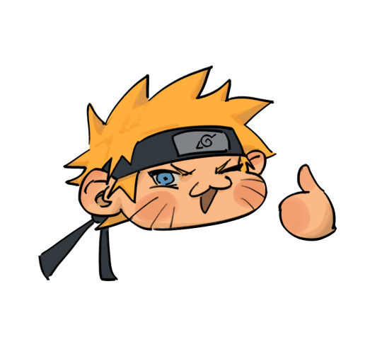
The simplified version of my process is that I paint with colours that act as the general idea of what the base colours are, and then play with curves to lower contrast + darken. I did a very quick example of what that looks like with this Naruto chibi:

This is what curve setting I use on procreate (it’ll look a little different when I do it on clip studio or photoshop, but the points remain the same. First dot is brought down a little, second dot is brought down a little, lol):
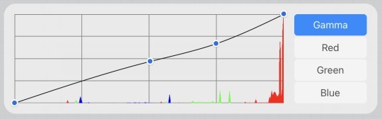
(usually I play around with curve settings a lot depending on the piece, but again the variation is based purely on what itches my brain. I just try to maintain that the curves, for me, lower contrast and darken the colours.)
For shading I will often desaturate+darken the flat colour, but I 1000% go in with a more saturated tone in between the shading and the flat colour, and over the course of painting and colour picking, it just ends up being this amalgamation of colours that work together since they are MOSTLY within an analogous range. Does that make sense?! I’m a terrible teacher, LOL!
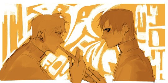
If you’re interested in slightly more details of my process, I will say that when I do have a background, that colour is usually the first thing I put down onto my canvas. I will fill in the lineart with a darker version of that colour and then start getting a basic idea of shading down before doing any colouring and rendering just to see how the general composition will feel. With the narugaa piece you mentioned, it looked like this (ignore all the white around them, this was going to be more type-heavy before I realised I hate doing text LOL):
It’s not quite just shading, but the goal is to find the values that I would be happy with seeing throughout the piece and on this hue+value of background. Also, at this point, I’m drawing with the assumption that if I were to do this completely monochromatic, the values would look like this, ya know. And then afterwards, like I depicted in the simplified version way above, I lay down flat colours. In this case, my colours were laid down on a layer that was on the “hard light” blend mode, but I think you should just do whatever blend mode gives you the colours you like best. From here, if you combine layers so that it’s a normal layer, then just playing with the curves should get you the effect that I usually work with, but this is what those base colours looked like in my case:
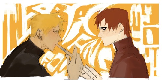
You can skip this part if you feel you’re good enough at colour picking, but it helped me personally with laying down colours. I did curve adjustments + new blend mode (pin light) so that I could play with complimentary colours in a way that would add some “flavour” to the drawing later. In this case it was this greenish+reddish colour for Gaara and yellowish+purple/bluish colour for Naruto (I know his skin looks more pink/red than anything but it’s significantly more cool toned, which is what I was considering for colour harmony/relationship):
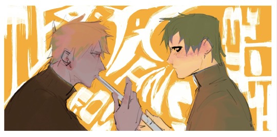
I did most of the painting over these colours before using a lasso tool to pick out specific areas and change the curves to be the Actual colours of the characters, but you can mostly tell what sort of colours I maintained from the previous version vs which ones I changed. I really do think this made for more interesting visuals, but I also think it’s sort of a convoluted process that you can just do from the get go if you have a better grasp of colour theory than I do. Unfortunately I’m not knowledgeable enough about colour to get colour harmony just by picking out the colour from a wheel. This is why I love curves so much!!! Anyway, this is what it came out to:
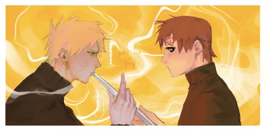
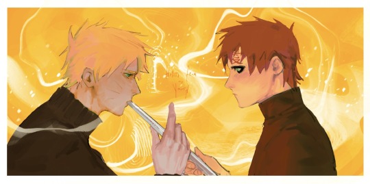
And then I duplicate the canvas so I can merge all the layers into a single one, and then do the final curve adjustment to make everything feel cohesive. I mostly used the curve adjustments that I showed in the very beginning of this post, but because so many of the colours in this piece felt analogous, I actually valued slightly more contrast in this piece than I would want for most other pieces. Posting the final piece here for convenience:
And that’s it!!! I’m super mega sorry for how long and convoluted this probably is LOL but this is my process……. I’m certain other artists have better tutorials and I will always recommend Sinix Design on YouTube for ANY art tutorial that you might need, but if I’m being entirely honest, anything I know of colour is entirely just me consuming a lot of art over the years and going ‘oh, I like that’ or ‘oh, this is a pattern between these two artists, so it must be right’ or ‘oh, this random artist posted a tutorial and it looked good, let me glance at this and hope it somehow subconsciously sticks’ LOL. There are definitely fundamental rules that would help to know (shadows will usually be less saturated, deciding between high key vs low key composition as far as your value scale goes, what sort of emotion each colour combination/scheme evokes, the power of tints and shades) but a simple google search on basic colour theory will already explain most of this to you. Passively implementing these practices into your drawings, in my experience, helps make a lot of these rules second nature when you’re drawing. Above all though I think you should just do whatever itches your brain LOL. I have a huge reference library that I often refer to—I recommend any artist to do the same :3
#nc111 tutorials and studies#thanks again for the kind words#to be complimented on my colouring… I am floating in heaven
49 notes
·
View notes
Note
May I ask for some tips on designing characters? Yours are so cool!! ✨️✨️✨️
AA thank you so much! I’m not a professional really, but as a hobbyist.. I could give you some advices that have worked well for me \o/
Tip 1: Don't be afraid to experiment and try something new! Use and mix the most chaotic colors, combine the uncombinable, and just have fun
(this is my normal process of creating designs tbh.. I just don’t think about it a lot and draw everything the way I feel xD)
Tip 2: If you’ll be practicing making designs all the time, eventually you'll start to feel and understand which colors work well together and which don't. There are also some win-win color combos that always look good - for example, plain black/white with golden parts, or tropical colors (blue & orange & yellow & red & green), or brown palettes with rainbow shades, or black & white & grey & red, etc. I personally found my comfort in rainbow accents, gradients and vibrant colors 💛
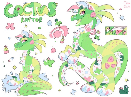
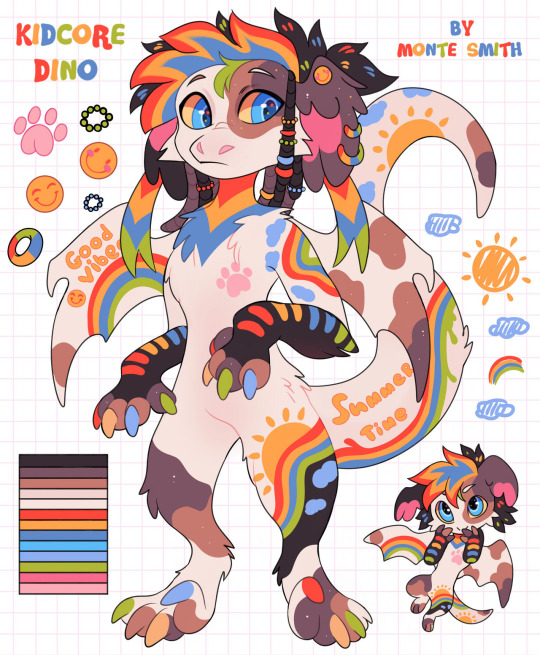
Tip 3: Mix different themes! I really enjoy designing reptilian characters and mix them with absolutely any themes I could find :D For example:
plush & cactus & raptor
dinosaur & kidcore aesthetic
peacock & dragon & snake & constellations

raptor & bat & cow and… wooden raptor?😳
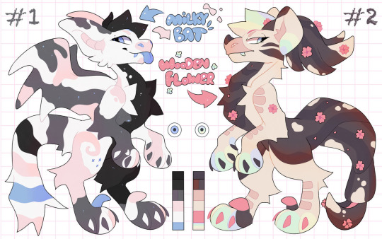
…and so on!
Find your own comfort species & themes and mix them with everything you want ^^
Tip 4: If you got no ideas yet, but still wanna design something, I highly recommend using Pinterest for inspiration! It contains a lot of great images/photos which can bring you tons of ideas (not only for characters designs, by the way). I also use it for clothes tutorials, poses references, and lightning/shading guides sometimes!
Tip 5: To improve your visual library, look at others’ characters and adoptables. Analyze what exactly you like about these designs - it can be some special color palette or other unusual choices. This will not only give you an understanding of which palettes and design elements go well together, but also allow you to discover your own favorite elements/details you can use in your own work!
That’s it! There's probably something else I forgot to say, but for now.. that's all my sleepy brain could remember at the moment <D
80 notes
·
View notes
Text
Massive comic bookbinding progress post.
Making a massive bookbinding post with my progress and what resources and steps I use. I do not claim to be an expert and recommend if you want to get into bookbinding yourself you look into any linked tutorials (or find some yourself), because they are made by people with much more experience.
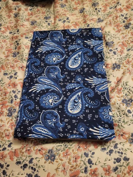
So. When I just got into bookbinding, I was following an instructables tutorial for (link) most of the book. the sewing part, I was following this (link) tutorial. The cover tutorial (instructables) wasn't great for what I currently do, and I changed a lot looking back on it, but it had the bonus of suggesting cheap materials (Cardboard for covers, elmer's glue for spine, any spare fabric for bookcloth) that helped lower the barrier to entry and let me decide if I wanted to buy nicer stuff.
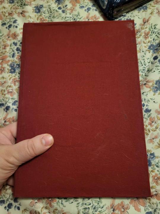
This is the first book I ever bound, using the instructables tutorial.
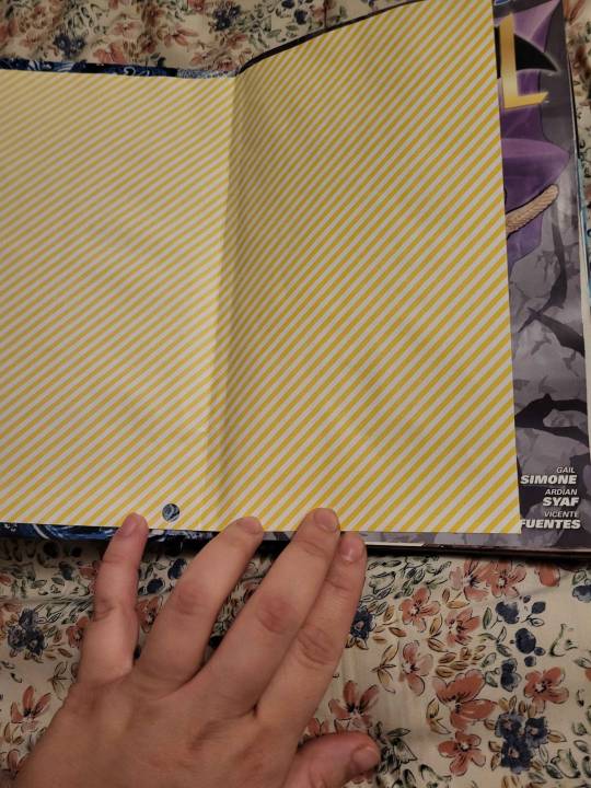
It's not the prettiest construction wise, but I can still hold it and read it which is at least successful for a first book (tho I did test on comics I didn't care as much about, in case I messed up).
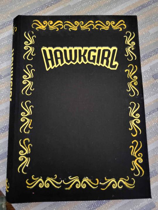
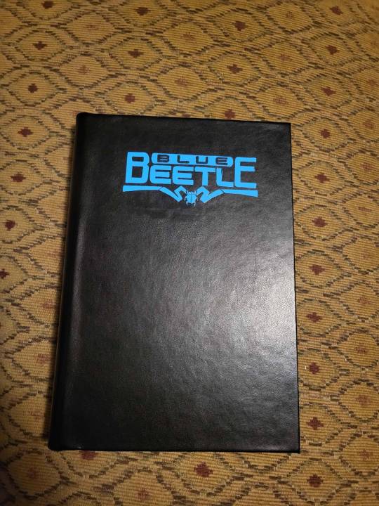
I did a couple more books like this, one being Blue Beetle: Graduation Day (in Spanish) and the other being Artemis: Requiem, and another being Knight Terrors.
Artemis Requiem I think was the last
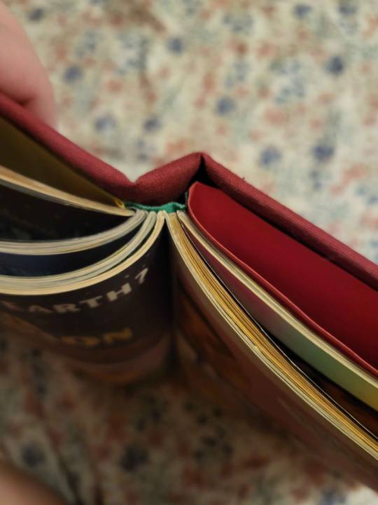
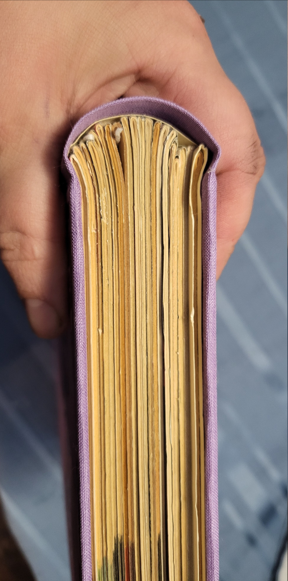
Next, I found and started using Dave the Designer's tutorial (link) and also got some materials actually targeted at bookbinding. I got bookbinding needles and thread (much thicker and stronger, it's easier to pull the threat through and it feels stronger) and davey board -- though since then I have tried chipboard which is muuuuuuuuuuuuch cheaper and works just as well unless you have a giant comic. Sometimes you have to lay weights on chipboard after gluing it to make sure it doesn't bend though, it likes bending when it is wet a lot.
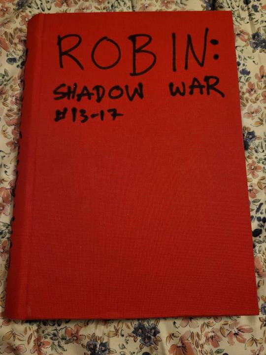
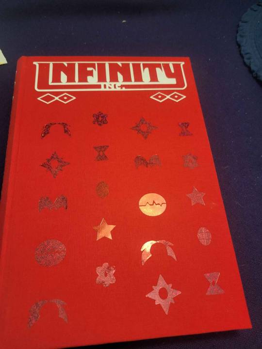
I did a ton of books in this period. I was mostly interested in making books that had good construction and were good for protecting the comics I sewed together and felt structurally sound. I did not care at all about what the covers looked like, and just wrote titles on them with sharpie. I used mostly linen cloth, buckram cloth, or occasionally spent money on book cloth
After this, my friend linked me this (link) youtube tutorial. It does not get into sewing, because the goal of that person's tutorial is not how to sew but how to rebind paperbacks as hardbacks with fancy covers. The main focus for what I watched is on covers. They use a cricut, I got the cheapest I could find (Joy xtra, not maker or any of the big kinds). It still is expensive (like 150 dollars), and in the linked playlist the youtuber includes how you can decorate without a cricut, though that does leave less freedom for what you can choose... UNLESS you are an artist already!
Shortly before I got the cricut, I did Eric Luke's WW Run
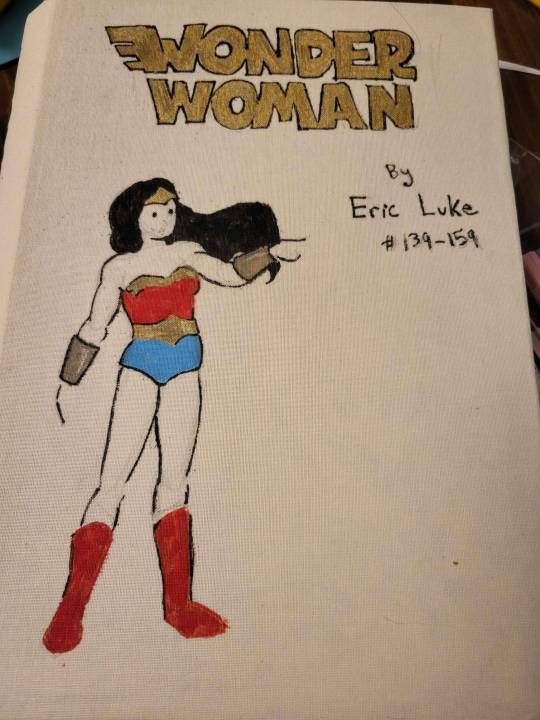
This was when I was getting frustrated I couldn't make the books look pretty on the outside, so I drew a sketch in pencil and colored in with paint pens i had bought for action figure modding (tho im sure any type of sharpies would work).
Anyway, after that I started using the Cricuts for covers. This is the first one:
i messed up on the heat transfer vinyl stuff, so I had to repaint some parts with yellow paint. I haven't had these issues since I started using the bookcloth materials recommended by the cricut youtuber I linked earlier, which are also generally cheaper per unit than where I was getting bookcloth earlier (but shipping is expensive)
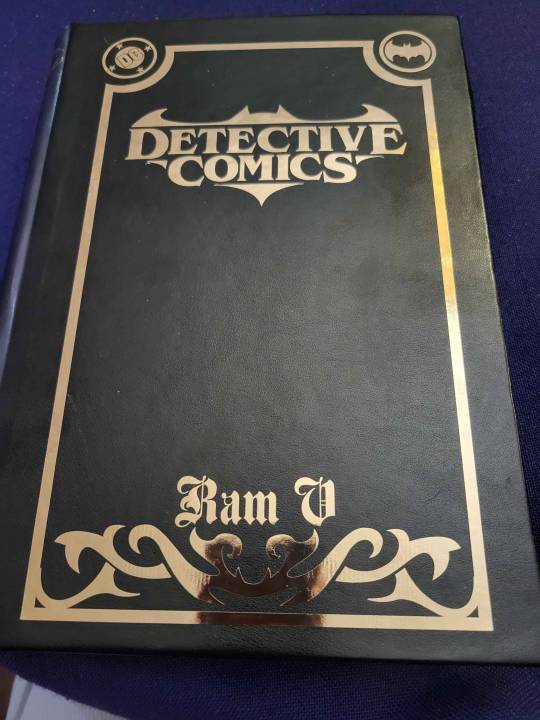
Now I do almost all my bookcovers with cricut because once you have the machine it's reasonably priced, the vinyl is pretty cheap, and it's easier on my spoons than hand drawing everything and lets you customize a lot
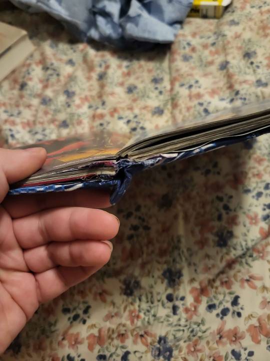
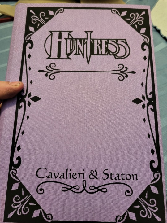
Lately, I've been trying to make my sewing/construction technique better, and I've been watching videos from DAS bookbinding (link). I tried to do my most recent Huntress comic with the rounded + backed spine with shoulders, not sure that I succeeded, but that's definitely on me because in the tutorial where he explains how to do it without the official material he's like "You should try this with proper equipment first, this is just for binders who took a course and could do the shouldering in a bookbinding course and want to try it on their own without having to buy the proper equipment" and. I have never done a real bookbinding course or used the proper equipment.
Hope this was informative/fun if you made it through!
68 notes
·
View notes
Note
would it be possible to have a tutorial on how u draw Fyodors hair?. I really struggle w it and im starting to tweak
I'll try my best 🫡

Your first step is to start shaving fyodor bald but also, draw the face first. At least the eyes, because they will serve as a guideline for the hair
Step 2: put an X on where the root of the hair will be, then start drawing the fork bangs from there

Step 3: it looks crazy but it's pretty simple. I personally like to make an indent where the hair's root is, so then I slide down to make the back of the hair. I go back up and do the other side.
You'll notice there's that little outie (idk what to call it) that I like to add during the third step, and I'm used to drawing it directly but you may make the rounded shape first then add that later on. The rest of the hair pieces are just softly rounded spikes.
Step four: final touches. For me it's adding the colored back pieces afterwards, but you can totally draw those in the same color as his hair lol. I sometimes like adding stray hairs too in this step so feel free to do that.
Note: don't hesitate to erase and edit the hair. I dont always get it on the first try and draw multiple strokes before settling on something I like. It takes time, practice and a lot of love to start getting the hang of it.
Also; please experiment! This style suited me more than others, and it could suit you as well, just as it may not. Always play around with style until you find what you like
53 notes
·
View notes
Note
Hii- I...☝️🥹 um, I don't actually quite know what to say to my idol. But believe me when I say I am absolutely besotted by your art 🫶💐
I actually got introduced to your page via your COD Valentine's Day cards, and have been stalking your account consuming your art like a hungry fella since then.
Did you know: You actually inspired me and my IRL friends to do art? :3 If you don't mind, any tips for self-learning beginners? 📝
And, sorry if this is a whole lot to read—just wanted to let you know that you are such a great artist! And I hope you know that. Great is an understatement, though 🙂↕️
omg??? thank you so much qwq it seriously means a lot to me!! <3
a small heads up, i'm not a pro or an art teacher, so these tips are just based on my own experience as a self-taught artist:
just draw. sounds simple, but practice really does make perfect. i always struggle with motivation at the beginning of a drawing, but trust me, the flow state kicks in once you get started
references are your best friend! omg, they make such a difference, especially for bigger pieces or anything you're unsure about
learn from other artists, but don’t just copy. figure out how they do things and put your own spin on it. for me, studying comic artists helped a lot with simplifying anatomy in a way that makes sense (im still learning though xD)
don’t overwhelm yourself! focus on one thing at a time. if you’re doing a composition study, don’t get too caught up in tiny details or textures—focus on the big picture first
listen to your body and mental health. take breaks, stretch, and don’t be afraid to step away for a bit. sometimes a quick walk can clear your mind and recharge you
dont compare yourself to anyone but your past self and if you post stuff/have art blog - dont pay that much attention to likes/reblogs n etc, they dont define you or your art
more under the cut!
i also recommend to check out these: again, dont overwhelm yourself with new information, this section is more of an archive/compilation of where you can find some different stuff
YT channels
Sinix Design - I LOVE HIS TUTORIALS SO MUCH.
Ethan Becker - art tips and critisism
Adam Duff LUCIDPIXUL - honestly i dont really know how to describe his content. it feels like an art podcats but more..personal? just check his channel out and you'll see it for yourself
moderndayjames - more animation based but still a lot of helpful tutorials
Dan Beardshaw - found him through anatomy tutorials but he has A LOT MORE than just them, please check him out!!
Videos
this specific video helped me understand that light is not that complicated
in this video, the author shares how they learned art, and i think they nailed the 4th tip perfectly
another lighting video
part 1 of a "how to splash art" series which goes over almost everything you need to know. this series more of a guide cause you still need to go into a depth for each topic but i just have to share it anyways, other parts can be found in the description
Books / Libraries (google drive links)
anatomy for sculptors - helps a lot with anatomy simplification and understanding
a big library with art books and other resources
another library with some books
MORPHO BOOKS!!!
Constructive anatomy by George B.Bradgman
lmk if something doesnt work or you have something else to add!! :]

32 notes
·
View notes