#nonrepresentational art
Explore tagged Tumblr posts
Visit Tumblr Blog
Explore Tumblr blogs with no restrictions, modern design and the best experience.
Last Seen Tumblr Blogs


Fun Fact
1,644 Tumblr posts in 1 second.
Text

“UnNamed Piece” (2023)
Sharpie, Micron, Poster Board
#art#my art#artists on tumblr#small artist#traditional art#illustration#drawing#abstract#abstract art#abstract aesthetic#college#art college#art student#pen art#sharpie#sharpie art#nonrepresentational art#nonreprisentational#nonbinary artist#queer artist
3 notes
·
View notes
Text


Playing with non-representational mixed media.
0 notes
Text

Wolf Head Bites Reality // 2025
#photography#art#abstract#glitchcore#glitch art#glitch aesthetic#nonrepresentational#oil painting#mixed media
41 notes
·
View notes
Text
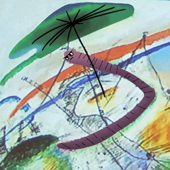

#wassily kandinsky#molepawprods#art#doodle#artists on tumblr#kandinsky#worm#wormblr#nonrepresentation art?#no#worm representational art#tumblr just crashed my shit while writing this#thats how u know its good lmfao
3 notes
·
View notes
Text
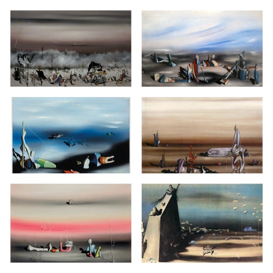
My Top 5 Painters 2/5 - Yves Tanguy
Tanguy's paintings have a unique, immediately recognizable style of nonrepresentational surrealism. They show vast, abstract landscapes, mostly in a tightly limited palette of colors, only occasionally showing flashes of contrasting color accents. Typically, these alien landscapes are populated with various abstract shapes, sometimes angular and sharp as shards of glass, sometimes with an intriguingly organic look to them, like giant amoebae suddenly turned to stone
#yves tanguy#dark academia#light academia#art academia#surrealism#nonrepresentational surrealism#surrealist art#art#artwork#art movement
7 notes
·
View notes
Text

16 x 20, acrylic on canvas
#abstract#abstraction#contemporary art#contemporary#nonrepresentational#nonrepresentationalart#colorful#rainbow#multicolor#acrylic#acrylic paint
4 notes
·
View notes
Text

Probably gonna call it done here.

woooo my eyes are killing me but I enjoy how this turned out. thinking about posting printable and transparent versions of the file for coloring, would folks want that?
19 notes
·
View notes
Text
something something about tumblrs relationship to art that really troubled me a lot in my own development. it’s obviously the fandom and characters website but the incredible pinpoint focus on drawing people, drawing digitally, not knowing how to do backgrounds, making eyes of matching size, “same face syndrome”—all that stuff that i’m sure everyone else has seen ad nauseum as well—is honestly so reductionist. i remember being a teen and thinking my friends art would “never make it” because it was abstract and geometric. obviously in hindsight that’s so stupid, but that was what being online for so long had distorted me into believing. i mean im not saying drawing characters (original or fanart) is bad! im not saying drawing digitally is bad! im just saying that people of course engage more with art on here that they already have some kind of connection to. “wow you drew my favorite character!” etc. so of course that’s the kind of art you’re going to see more of online.
i feel like the only art advice posts i’ve seen circulate also are ones focused on this character-based art focus. things like: how to draw noses, you need to learn how to draw diverse people (true, but like. not if you never draw people. or do nonrepresentational/abstract art), how to do simple backgrounds. even the entire constant discussion of “1. sketch 2. lineart 3. color” i think probably reduces people’s thinking of their own art. idk. it’s not the biggest issue in the world by a long shot. i just wish young artists could hear that the only advice they really need is “make art.” make whatever you are drawn to. never try to compromise something for social media engagement. please
106 notes
·
View notes
Text
i've seen some "modern art" (not sure what the actual term here is, the highly abstract nonrepresentational stuff) that was deeply impressive to me. i saw delaunay's rhythm no. 1 in person and it was astounding. i've also seen some stuff that didn't move me at all, like cy twombly's work; i just couldn't get anything out of it. this is centrism, i think
17 notes
·
View notes
Text
New art exhibit where we fill the hall with nonrepresentational art. When people view it and inevitably say "I could do that" we put a bag over their heads and whisk them into a beginning art class. You can make art, and you will
22 notes
·
View notes
Text

More vent art about the couple that was unable to love me because of the complications associated with my brain injury.
#journal#personal#pic#vent#vent art#art#my art#artwork#artists of tumblr#abstract#nonrepresentational art#autism awareness#autism#autistic artist#disabled artist#trans artist#transgender art#doodle#brain injury awareness#self love#inner child work#inner light#don't give up#have hope
2 notes
·
View notes
Text
People know nonrepresentational visual art precedes the 20th century Western art world right. And that finding a particularly analogous ‘musical’ equivalent like Cage or anything atonal is particularly kind of silly (as you know before Schoenberg and Cage all music was representational, directly…every just listened to tone poems all the time)
13 notes
·
View notes
Text

ABOUT ME
Hi, my name is Adina! I am an aspiring artist who has been curiously and creatively exploring mixed media for the past few years. Although I have had a passion for art since a young age, my artistic journey truly began when I attempted nonrepresentation art in 2020. Since then, I have continued to explore my artistic nature in various ways that were originally foreign to me.
Staying curious and dedicated has led me to discovering that art is a positive outlet which allows me to release and express my emotions in a representative manner. I now have a desire to share how art can positively impact one's mental health and society by continuously learning about myself, others, and this respective field. My hope for Azul's Arts is that you can help me achieve just that.
2 notes
·
View notes
Text
Exhibition Catalogue: Reflecting Upon Nude Veritas
Masterlist
BUY ME A COFFEE
Work written for University Assignment based on Catalogue Essays/Writings. Examples: A Painting - Manet's The Railway - A Painting - Mantegna's Adoration of the Magi - A Drawing - Hepworth Fenstration of the Ear - A Manuscript - The Chronicles of England
Painted during the end of the 19th century, by Viennese painter Gustav Klimt (1862-1918), the oil painting, Nude Veritas (Fig.1), comes from the era of the Vienna Secession, an art period closely related to Art Nouveau, roughly between the years of 1890-1914. Through mixed media this movement focused on combining the natural world with the man-made, using the fine arts, sculpture, and architecture for decorative motifs. Nude Veritas was created far before either world war and the artist died before the WWII.
Nude Veritas clearly has art nouveau links, with the displayed female nude, gold leaf decorative frame that’s bold and striking, and text that’s reminiscent of posters from the era. Drawing more on Art Nouveau, the painting is hung like a portrait, with a nonrepresentational background, presenting an idealised female nude. The body is flanked by decorative patterns of gold leaf and flowers which was another common motif of Art Nouveau.
While this work draws heavily on Art Nouveau, it lacks the finish that is most associated with the movement, like clean and bold contour lines, flat colours, and exaggerated curving patterns, which do feature in this work but only as a background decoration. Nude Veritas also features a “fuzzy” textural quality, thanks to Klimt’s use of oil on canvas achieving brushed out and light paint, allowing him to create this finish which draws on the Impressionist movement and contains traces of early Expressionism. Impressionism, approximately 1860 onwards, draws on saturated naturalistic colour to exaggerate emotion, with visible brushwork and painterly qualities. Paintings like these emphasised accurate depictions of light to form atmosphere, focusing on ordinary subject matter. Expressionism used distorted imagery of naturalistic scenes for a radically greater emotional effect, and to evoke moods and ideas. Whilst Nude Veritas conforms to some aspects of this movement, it largely draws on Art Nouveau and Impressionism.
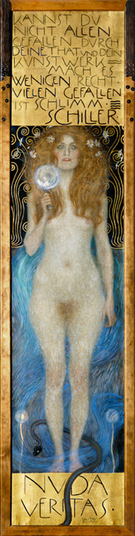
Fig 1. Gustav Klimt, Nude Veritas, 1899, Oil on canvas painting, 240 x 64.5 cm, Austrian Theatre Museum, Vienna, Austria
The text featured on this oil painting reads as follows: “KANNST DU NICHT ALLEN GEFALLEN DUCH DEINE THAT UND DEIN KUNSTWERK – MACH ES WENIGEN RECHT: VIELEN GEFALLEN IST SCHLIMM” (“if you cannot please everyone with your actions and your artwork – please only a few: to please many is bad”). “NUDE VERITAS” (“nude truth”)
Holding what appears to be a mirror or looking glass, the subject faces the viewer, challenging them head on, despite a blank and indecipherable stare. With full frontal nudity, and addition of pubic hair, the form becomes less idealised and far more confrontational. As our eyes travel lower, following her body down, we find a snake tangled at her ankles. Once again being confronted by “Nude Truth”, we find the snake obscuring the words possibly representative of an obstruction of truth. Perhaps the woman is the embodiment of truth, her nakedness linked to the word “nude” before truth and being on display for all to see. Or perhaps she is telling us to see a naked truth, once more linked to her bareness on display.
With this in mind, we must understand Klimt’s work and background to understand how this piece is recontextualised in WWII by the Nazis. There is a forgotten history here, as Nude Veritas and many others feature in an exhibit held by the Third Reich Party in 1943. Klimt’s work predominantly features women, due to the nature of the movements he was a part of. “Whenever he was free to choose his sitter, Klimt preferred the dark-haired, Mediterranean type of woman to the blonde, Nordic type so pre- dominant in the German lands.”[1]
Although The Kiss is highly regarded and known today, his other work falls into relative obscurity. Around the time Nude Veritas (1899) was finished, Klimt was commissioned to paint ceilings (1900). Philosophy, one of these paintings “was attacked as "painted lunacy," "pathological," and "immoral."”[2] While this highlights that his work was ridiculed during his life and was seen as controversial, it raises interesting questions about what the Viennese public of the 1940’s thought, under Hitler’s rule, as this work and many others of Klimt’s were displayed. However, his works were not in a degrading exhibition that the Nazis had been known to make, where they displayed artworks to humiliate and condemn certain artists and styles.
“The majority came only to jeer, but a counter-protest was staged by a small minority.”[3] These provocative pieces Klimt painted emphasize a set of conservative sensibilities, yet “writing of the Klimt era, the German Meier- Graefe said: "Woman influenced all this art, good and bad alike […] the worship of women is an integral part of the national culture."[4] How can Klimt works be considered part of a sexual revolution when the Nazi party advocated for a specific archetype of woman. The hypocrisy of the Nazis is laid bare by this contradiction, reinforced by Nude Veritas herself, inviting us to see a naked truth.
It has been well documented that “close to 16,000 works [that were] deemed degenerate were sold, burned, or ridiculed in exhibits set up precisely for that purpose.”[5] The amount of art destroyed under the Nazis, as well as the art that was condemned as degenerate, in some respects overshadows the work they did endorsed. Furthermore, there’s an estimated “100,000 artworks stolen by the Nazis [that] have still not been located”.[6] It is perhaps this we should be focusing our attention on as well, in addition to trying to understand what they were endorsing, and what they wanted the public to take away from their encounters with endorsed works, like Nude Veritas.
It's safe to say that there were a lot of factors against Nude Veritas and Klimt in general, for his work to be endorsed by the Third Reich. Just by looking at Klimt’s work, it’s clear that he does not paint archetypal Aryan women, in fact he seems to avoid them. Moreover, he had a well-documented history of Jewish patronage in Fritz Waerndorfer and his wife Lili. So, despite Klimt being dead by the time his painting was hung on display in the exhibit in 1943, it’s impossible to erase the history he left behind, and the documentation of his life. Yet despite these reasons and the fact that “Adolf Hitler had a tight grasp on the art that was promoted by the Third Reich Party, not one to delegate the task.”[7] it’s a surprise to see Klimt, an artist who succeeded in Vienna where Hitler had failed, being so readily endorsed.
It is precisely all these reasons that make Klimt’s work so interesting to observe from the lens of the Third Reich and their propaganda. Nude Veritas becomes such an intriguing piece to witness as she demands a reflection of the truth, and a self-reflection from the viewer.
Nude Veritas stand upright (240 x 64.5 cm), at just over two and half meters tall; the painting is incredibly large and imposing with a presence demanding to be looked at. This demand for attention is reinforced by Klimt’s use of goldleaf all around the frame, which exudes luxury and material wealth, something the Nazis were fond of: “The U.S. government has estimated that German forces and other Nazi agents before and during World War II seized or coerced the sale of approximately one-fifth of all Western art then in existence.”[8]
While most nudes of women are painted with sensuality highlighting a show of vulnerability, and for the pleasure of the viewer, this painting she stands tall and domineers, despite being a woman in the nude, the space she is presented in and the canvas she is painted on. Her nudity can be read as a primal exposure. This motif of primality is strengthened by her wild unkempt hair, as it bunches all around her head in a voluminous mass, intertwined with what appears to be wild daisies, giving her an untamed appearance. This nudity becomes a far more provocative work because of the fierce undertones it presents for a woman at the time. Moreover, this wildness she carries in her physical appearance, linked with the possible interpretation that she is a physical representation of truth, she reflects the true nature of a human, or women, which is unexpected for contemporary viewers.
Her mirror or looking glass only serves to reinforce the narrative of truth. The favoured interpretation is that of the looking glass, perhaps she is implying we inspect what we are shown, or told as truth, more closely and with greater scrutiny. That there is more than meets the eye, to study and dissect the painting and to carry that scrutiny and translate it into the world around us. Although her face is indecipherable, her eyes look glassy and distant, perhaps blind to truth, but desperate to see it and seek it out as she clutches her looking glass close and almost protectively.
More on the snake, toward the bottom of the painting; snakes are seen representative of duplicity and cunningness. A sign of danger and deception even from a Christian perspective with the garden of Eden, the woman here could possibly be interpreted as Eve. The snake literally is covering the truth up, it also travels towards and around the woman, encircling her legs. Possibly to physically stop her from seeing the truth or deciphering it, and potentially restraining her.
While it is hard to gauge what a contemporary audience would have taken away from this piece, as a modern audience we have a retrospective of the work. We know historically that the Nazis hid concentration camps from the wider world, and destroyed a great many more prized artworks, books, manuscripts etc. Nude Veritas gains another layer of meaning to us, if we were to place ourselves in the contemporary context, the hidden truth of the Nazis, relating their presence to the snake deceiving truth, and a physical showing of wealth and material power by possessing this, and other artworks.
Bibliography:
Morowitz, Laura, 'Heil the Hero Klimt!': Nazi Aesthetics in Vienna and the 1943 Gustav Klimt Retrospective, (Oxford Art Journal, Vol. 39, No. 1, 2016) pp. 107-129 [accessed 12 February 2024]
Kaye, M. Lawrence, Avoidance and Resolution of Cultural Heritage Disputes: Recovery of Art Looted During the Holocaust, (Willamette Journal of International Law and Dispute Resolution, Vol.14, No. 2, 2006) pp. 243-268 [accessed 9 February 2024]
Werner, Alfred, Two Austrian Expressionists, (The Kenyon Review, Vol. 26, No. 4, 1964) pp. 599-616 [accessed 10 February 2024]
#art#art gallery#artwork#writing#art tag#essay#paintings#art exhibition#art show#painting#drawings#drawing#in this essay i will#essay writing#personal essay#short essay#my essays#mini essay#art history#artists#writers#history#writeblr#writers and poets#writers on tumblr#creative writing#historical#lecture#academic writing#dark academia
2 notes
·
View notes
Text
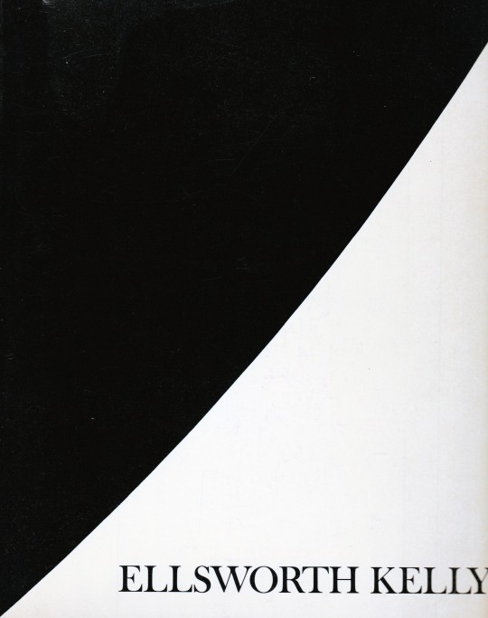


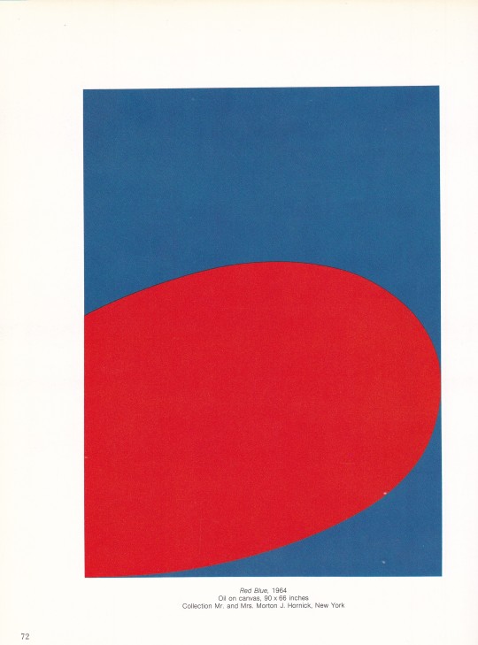


Ellsworth Kelly
E.C.Goossen
The Museum of Modern Art, New York 1973 , 128 pages,84 illustrations (18 in color), 51 reference illustrations, ISBN 9780870704130
euro 90,00
email if you want to buy [email protected]
Issued in conjunction with the exhibition at The Museum of Modern Art, New York, September - November 1973; notable for the appendix ("Kelly and Camouflage")
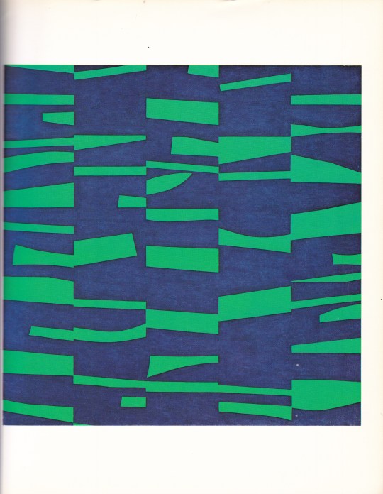
Considered a pioneer of hard-edge painting, Ellsworth Kelly is best known for his crisp nonrepresentational works, intensely colored and radically simplified. His early training in the applied art program at Pratt Institute, Brooklyn, was interrupted by his induction into the army in 1943. Art Historian E. C. Goossen has speculated that Kelly's assignment to a camouflage battalion provided him with invaluable lessons about the interaction of form and shadow in space, which were applied later in his collages, paintings, and sculpture.
After studying for two years at the School of the Museum of Fine Arts in Boston, Kelly went to Paris in 1948 to attend the École des Beaux-Arts until 1950. In France he encountered the works of Pablo Picasso, Henri Matisse, Jean Arp, and Piet Mondrian. His figurative work subsequently gave way to increasingly abstract paintings in which curvilinear and rectilinear forms suggest fragments of visual phenomena such as architectural elements and shadows.
In 1950 he began to explore the random selection of color and form by using collages, composed of torn details of his drawings, as the basis for his paintings. While in France Kelly also produced grid paintings built on modular and serial systems. By 1952 these concerns were expressed in large multipanel paintings in which each panel was a module of color. Kelly's concern with color as form was thus established.
After returning to the United States in 1954, Kelly worked with large single biomorphic shapes in black and white. Primary colors reappeared in his paintings after 1957, either in double or triple variations or singly in contrast with white, as in Blue on White
24/12/23
#Ellsworth Kelly#art exhibition catalogue#Museum Modern Art New York 1973#art books#fashionbooksmilano
4 notes
·
View notes
Note
Thoughts on Guy Davenport?
A great essayist, the generalist to rebuke all specialists, whose dizzying associations gradually overlap and braid together until all of humane culture appears as a unity. He was almost the last of that type, after his friend Kenner, or, in a more strictly academic vein, the likes of Frye and Auerbach. But Kenner, Frye, Auerbach—or even Bloom, Steiner, Sontag—all feel much heavier, more armored and therefore crushing in their erudition, while Davenport had the lightest touch. He was a true belletrist, an amateur in the etymological sense, who seemed to be doing it for fun.
I'll give just one example, from the title essay in the soon-to-be reissued collection, The Geography of the Imagination. I quoted part of it here before almost a decade ago, so I assume it's been forgotten by now: a literally extravagant ("from Latin extra- ‘outside' + vagari 'wander'") exegesis of Poe, who stands revealed, by the time Davenport is finished, neither as a panting pulp scribbler nor a dipsomaniacal poète maudit but as an encyclopedist of Joycean proportions, except in miniature:
Poe titled the collection of his stories published that year Tales of the Grotesque and Arabesque. These two adjectives have given critics trouble for years. Grotesque, as Poe found it in the writings of Sir Walter Scott, means something close to Gothic, an adjective designating the Goths and their architecture, and what the neoclassical eighteenth century thought of mediaeval art in general, that it was ugly but grand. It was the fanciful decoration by the Italians of grottoes, or caves, with shells, and statues of ogres and giants from the realm of legend, that gave the word grotesque its meaning of freakish, monstrous, misshapen. Arabesque clearly means the intricate, nonrepresentational, infinitely graceful decorative style of Islam, best known to us through their carpets, the geometric tile-work of their mosques, and their calligraphy. Had Poe wanted to designate the components of his imagination more accurately, his title would have been Tales of the Grotesque, Arabesque, and Classical. For Poe in all his writing divided all his imagery up into these three distinct species. Look back at the pictures on the wall in his ideal room [in the essay “The Philosophy of Furniture”]. In one we have grottoes and a view of the Dismal Swamp: this is the grotesque mode. Then female heads in the manner of Sully: this is the classical mode. The wallpaper against which they hang is Arabesque. In the other room we had a scene of Oriental luxury: the arabesque, a carnival piece beyond compare (Poe means masked and costumed people, at Mardi Gras, as in “The Cask of the Amontillado” and “The Masque of the Red Death.”): the grotesque, and a Greek female head: the classical. A thorough inspection of Poe’s work will disclose that he performs variations and mutations of these three vocabularies of imagery. We can readily recognize those works in which a particular idiom is dominant. The great octosyllabic sonnet “To Helen,” for instance, is classical, “The Fall of the House of Usher” is grotesque, and “Israfel” is arabesque.”
But no work is restricted to one mode; the other two are there also. We all know the beautiful "To Helen," written when he was still a boy:
Helen, thy beauty is to me Like those Nicaean barks of yore, That gently, o'er a perfumed sea, The weary, way-worn wanderer bore To his own native shore.
On desperate seas long wont to roam, Thy hyacinth hair, thy classic face, Thy Naiad airs have brought me home To the glory that was Greece And the grandeur that was Rome.
Lo! in yon brilliant window niche How statue-like I see thee stand, The agate lamp within thy hand! Ah, Psyche, from the regions which Are Holy Land!
The words are as magic as Keats, but what is the sense? Sappho, whom Poe is imitating, had compared a woman's beauty to a fleet of ships. Byron had previously written lines that Poe outbyrons Byron with, in "the glory that was Greece / And the grandeur that was Rome." But how is Helen also Psyche; who is the wanderer coming home? Scholars are not sure. In fact, the poem is not easy to defend against the strictures of critics. We can point out that Nicaean is not, as has been charged, a pretty bit of gibberish, but the adjective for the city of Nice, where a major shipworks was: Marc Antony's fleet was built there. We can defend perfumed sea, which has been called silly, by noting that classical ships never left sight of land, and could smell orchards on shore, that perfumed oil was an extensive industry in classical times and that ships laden with it would smell better than your shipload of sheep. Poe is normally far more exact than he is given credit for.
That window-niche, however, slipped in from Northern Europe; it is Gothic, a slight tone of the grotto in this almost wholly classical poem. And the closing words, "Holy Land," belong to the Levant, to the arabesque.
Now I haven't read Davenport's fiction yet. Word on the street is that the best of it is a pederastic fantasia on themes from Fourier, but I could be wrong.
4 notes
·
View notes