#no templates are mine! disclaimer
Explore tagged Tumblr posts
Text
I made the memes again!!! 😲😲 with almost all ocs this time! 💫💫
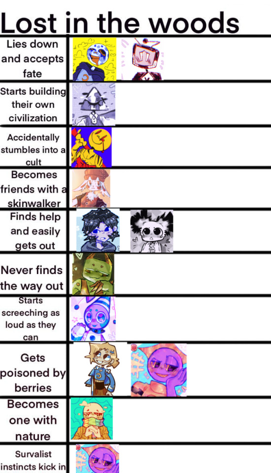
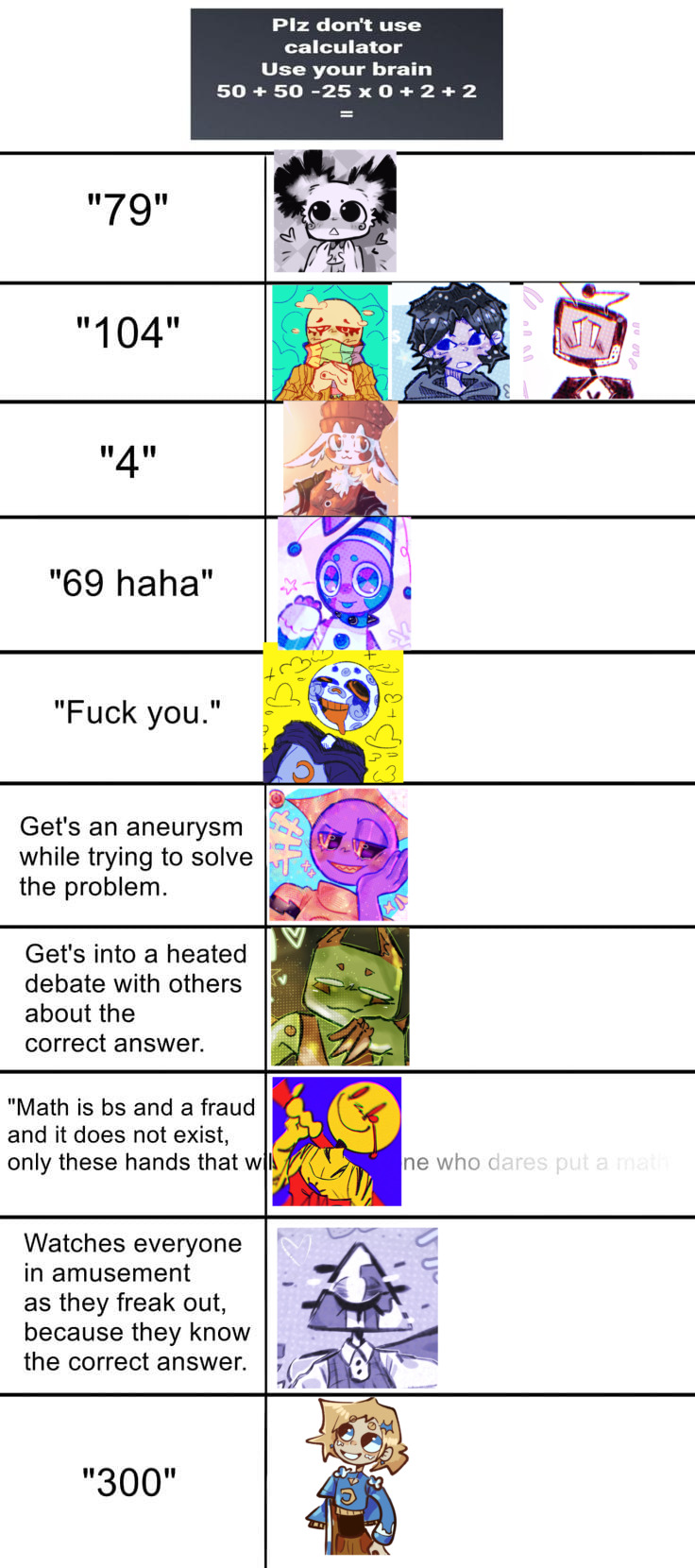
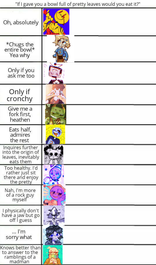
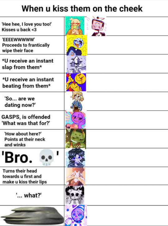
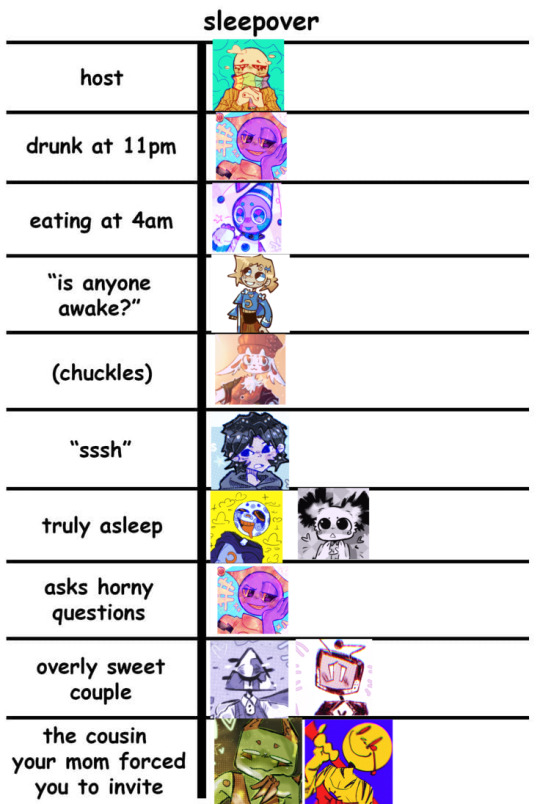
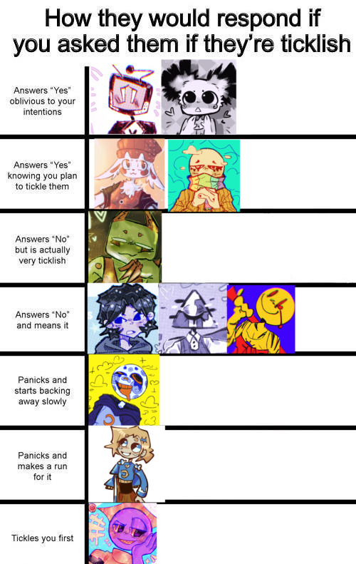
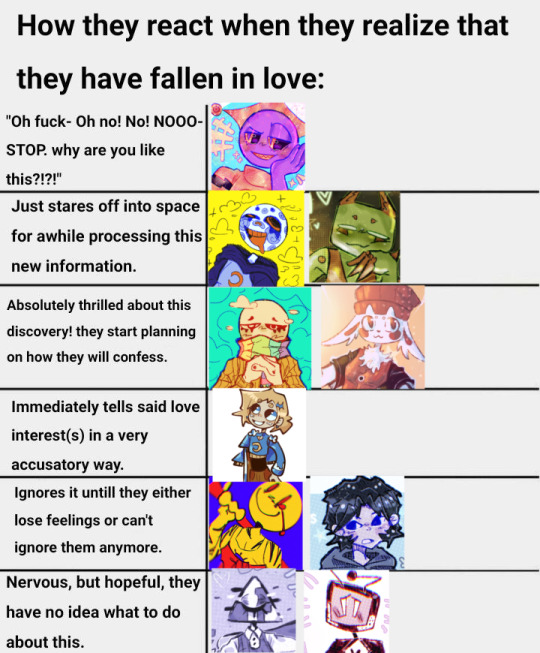
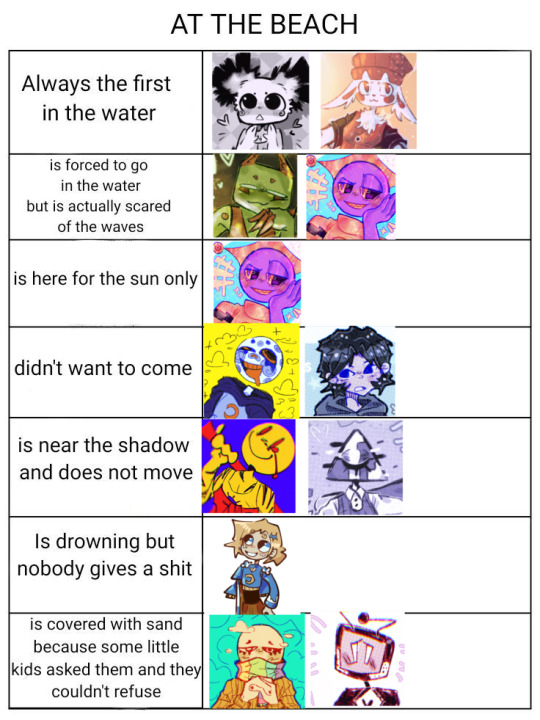
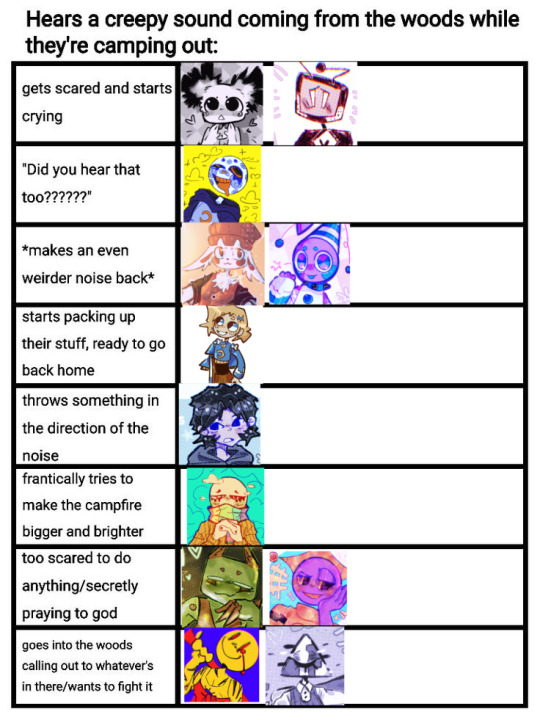
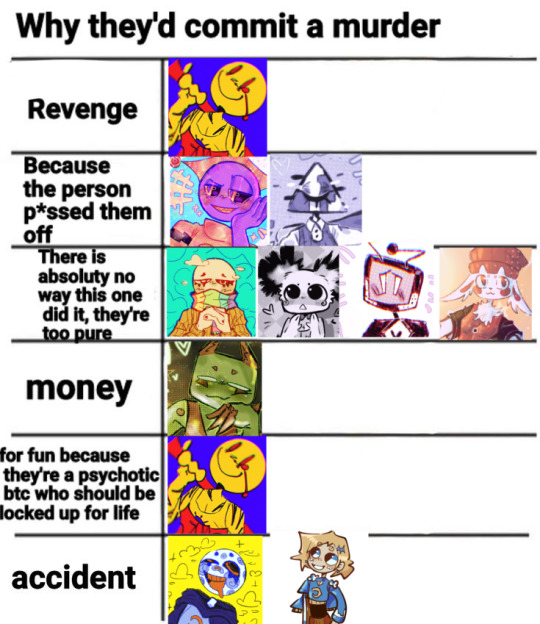
#at this point im just making fun of Libris#these are so fun to make!!! fr#pls send me more templates to fill#dm me if you want the blank templates💞#no templates are mine! disclaimer#feel free to get inspired 🫶#oc#my ocs#funny meme#funny stuff#funny#oc artist#artist#small artist#sillyposting#ocs#oc stuff#original character#oc meme#original characters#funny memes#meme#my oc character#my oc stuff#my ocs <3#artists on tumblr#my oc
291 notes
·
View notes
Text


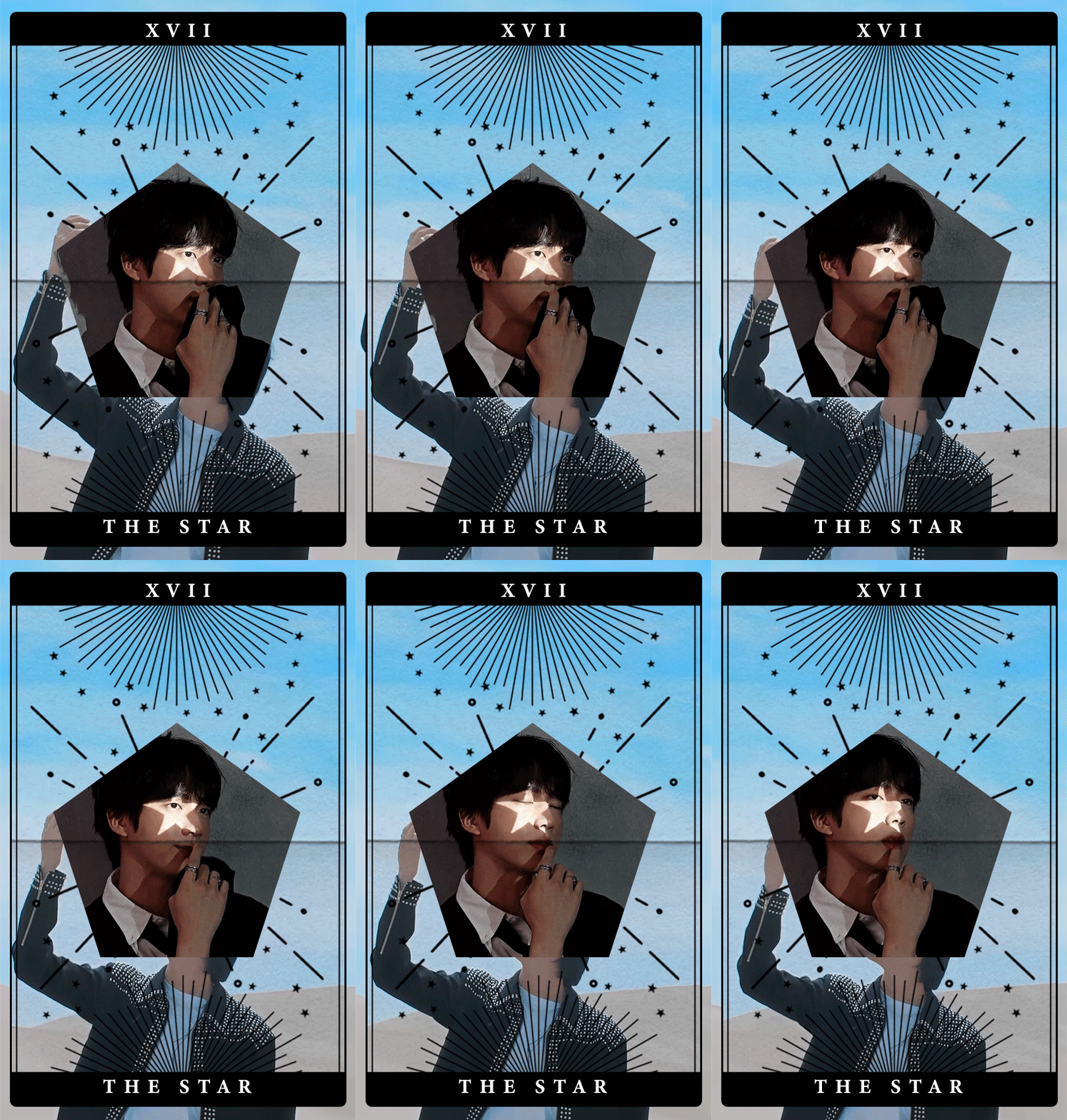
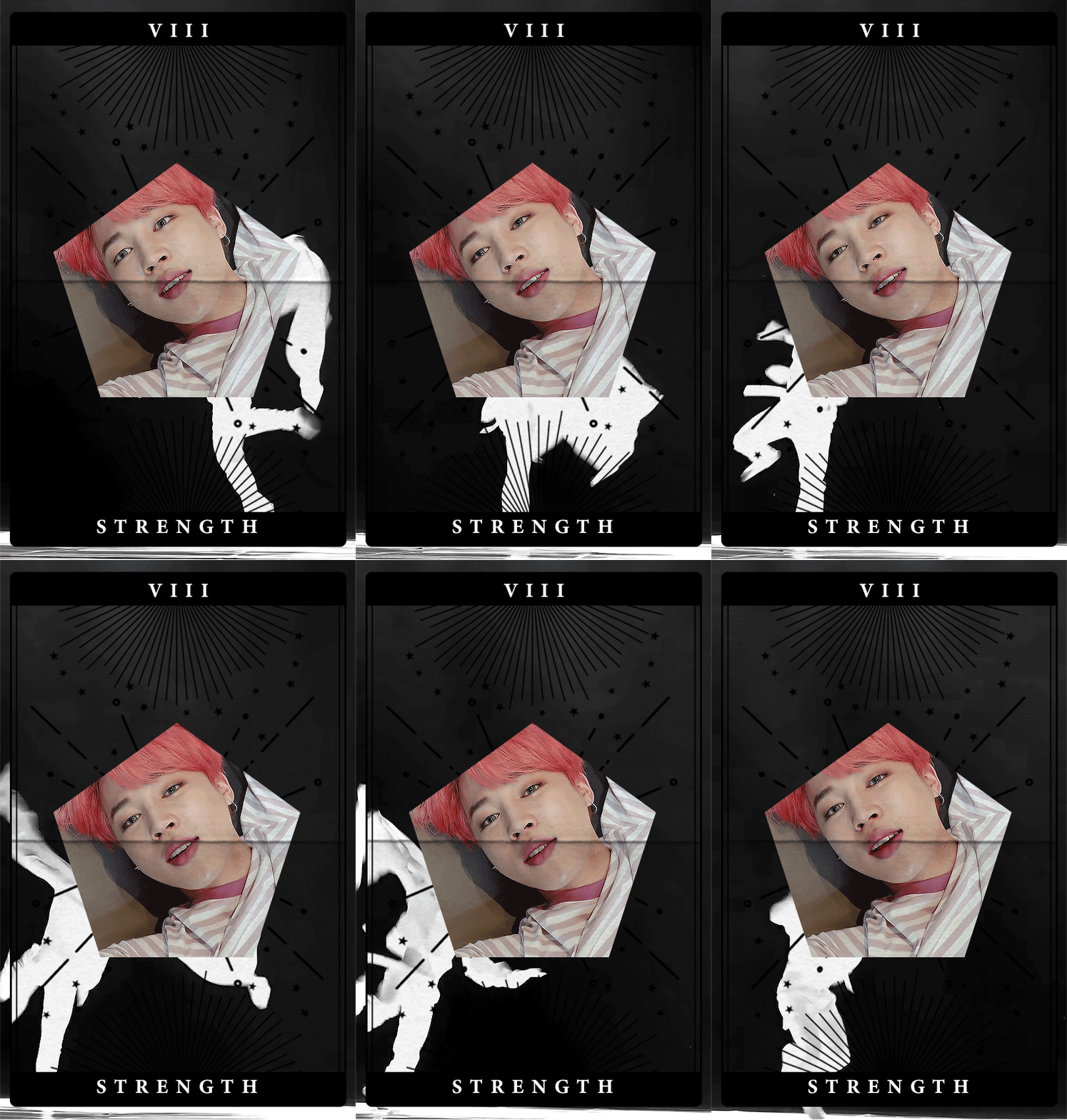
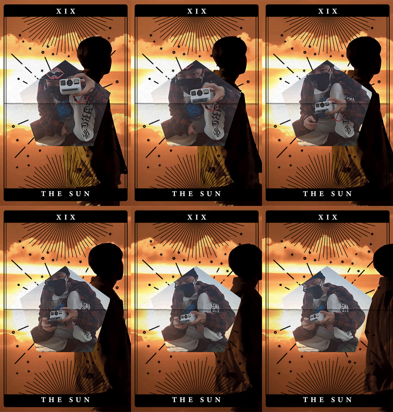

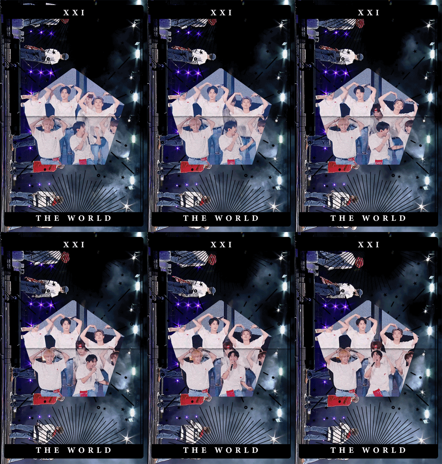
BTS x Major Arcana
for @dearedwardteach 🖤 {cr. namuspromised / psd / cards}
#HAPPY BIRTHDAY TO THE BEST PERSON ON THIS ENTIRE SITE <3#i'm late and i'm so so sorry#i had entirely different thing planned but it was awful and then i found this template and it made me think of you immediately!#i hope you like it#bts#btsgif#dailybts#dailybangtan#userbangtan#btsedit#*mine#ot7#sabri i have no words to describe how lucky i am to get to know you#you wished on my birthday to go to concert together and now look at us! we have two booked!#i cannot wait march to see you <3#i hope you will have great year full of happiness and kind people and so much love!#ily fr <3#disclaimer: i know nothing about tarot cards or anything like that#i went with general descriptions#so please let me know what you think about my choices! it's actually very interesting!#if there are any typos or anything please don't tell me or i'll cry
362 notes
·
View notes
Text
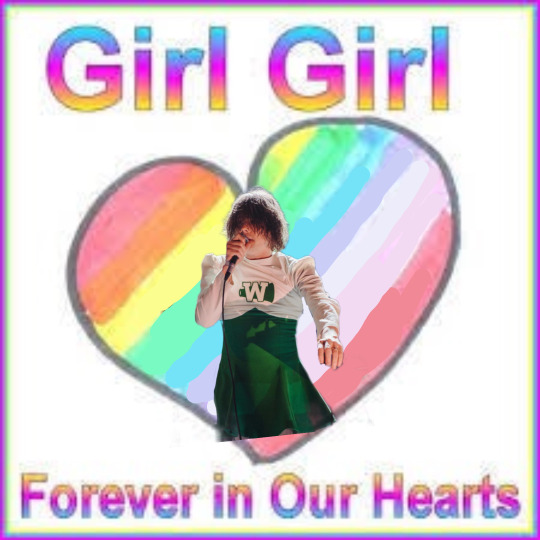
#this was actually way harder to make than it looks 😭#so please rb it i spent a long time drawing over an old web picture of a mouse#(no pressure)#kittyposting#mine#my chem#gee your hair smells terrific#gerard way#cheerleader gerard#cheer skirt gerard#my chemical romance#mcr#my chemical gerard#disclaimer im not one of those weird people on twitter who thinks#gerard is actually secretly a girl and is super invasive abt it#its just a sillay original image#if anyone wants teh template i made just ask#edit#edits
69 notes
·
View notes
Text

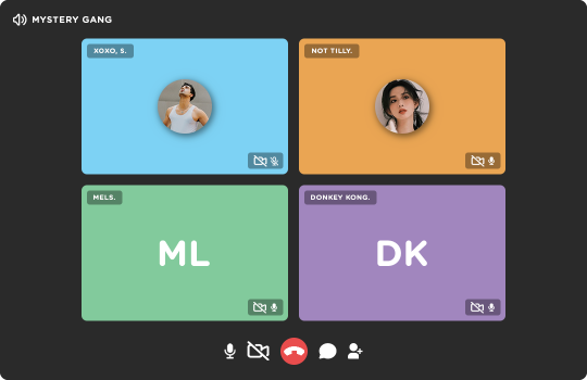
◦˚~ GROUP CALL NOW!! template by enchanthings ~˚◦
Info:
Full image size: 1080x700 px
Fonts used: Gotham Rounded
Elements are separated, grouped, and labeled accordingly.
Option for initials or profile picture included for all.
On/Off icons for camera & mic are also included.
Use clipping mask for easier fit of the images.
Credits: dedicated to the mystery gang, who lent me their muses for the preview!!
Terms of Use:
Disclaimer (!) placeholder images are not mine.
Follow my rules if using.
Do not claim or repost as your own.
Reblog or like if download.
My ask box is open if you have any questions! If you're able and willing, please also consider supporting me with a coffee!
◦˚~ [ download access through source link] ~˚◦
#templates#rp resources#template psd#psd template#graphic template#social media template#rph#rpc#dailyresources#supportcontentcreators#ps template#template#.m
666 notes
·
View notes
Text
LEAK FOR REGRETEVATOR X MIKU COLLAB?!! @yeuc-c you have some explaining to do..

DISCLAIMER: you know it's not real but i would LOVE for it to happen
featuring a special guest, @z13lovebot's HC ver of Pest!! i absolutely ADORE him.
below me is also a really awzum Regretevator relationship chart. the original person who made this template probably got their acc deleted.. idk just didn't show up in the search bar ig...
she's on good terms with some ppl since yanno.. she's hatsune miku alr!!
PS. @yeuc-c, send Pest all of Miku's (and mine) happy birthday wishes.. & a bonus sack of 100 coins Miku withdrew from her bank account.


and finally, here's an award-winning lazy-ass birthday card to send my humble wishes.

yes there's my Roblox acc, i don't accept friend reqs from ppl idk either, only follows
#oc art#artists on tumblr#art#digital art#digital drawing#idk what else to tag here lol#funkycrabturtle#my art#regretevator#oc x canon#HAPPY BIRTHDAY PEST OUR AWESOME BEETLE GUY 🎉 🎉🎂🎁#pest regretevator#regretevator pest#roblox oc#roblox fanart#roblox art#roblox#roblox avatar#should I label it as a crackship in the future or smthn??#vocalbeetle#⇠ my new favourite crackship.. idk#regretevator miku
30 notes
·
View notes
Text
so erm..
when I wasn’t able to post, I got bored and jus randomly used a few templates on CapCut jus for the giggles and so forth, SO some of the future posts after this will involve that stuff, jus bc I wanted to :]
DISCLAIMER:
SOME OF THEM SHOW AN OC OF MINE(VINCE) (which I post of) SO JUS EXPECT IT (also I do have some revolving around the oc x canon folly and so forth so ye)
I DID NOT MAKE ANY OF THESE EDITS MYSELF AND ONLY USED THEM AS A TEMPLATE, SO ALL CREDITS TO THE MAKERS.
First of these would be these little sillies :]
#regretevator#roblox regretevator#bive#regretevator bive#bive regretevator#bive x split#split x bive#split#regretevator split#split regretevator#spive#capcut#video edit
17 notes
·
View notes
Text
I had a message the other day asking (among other things) what kind of tools and equipment I use in making books, and as it's something I like to go into detail on, I realized I couldn't fit everything I had to say in a message so it's getting its own post. With photos!
Disclaimer that I'm not a professional bookbinder, I'm entirely self-taught and probably have habits and practices that would drive a pro nuts. I'm no authority, but these are the things that have worked for me, and maybe you can adapt them to work for you too.
This post will not cover: storage options, materials like board and glue, or equipment specific to one narrower aspect of the hobby like embossing or gilding. It is also not a tutorial on how to make a book, though I am covering things in more-or-less the order I use them in during the book-making process.
This post will cover: What I've found useful, what I've regretted buying, and some things you can co-opt from other, more common hobbies. A lot of it you may already have in your house. Some of it is for beginners, some is nicer equipment you might want as you get further into making books. They are not separated, it's just a list and some description.
Keep reading below the cut; this is gonna be a very long one and there are a lot of photos of everything.
If you want to make books you will need access to a printer. I'm not going to go into detail on this part and I didn't take a photo of my HP (not the best brand, but that's a long discussion in and of itself). Once you've got your pages printed and it's time to fold it into signatures, it helps to have a folding tool like these:
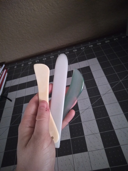
Folding tools can be anything as long as they're smooth and flat. The one on the left here is an actual bone folder from an art supply shop, but the center one is a plastic leatherworking tool that I got at Hobby Lobby, and the one on the right is an agate burnisher that I got from Amazon. None of these cost more than $10, and you can also use the edge of a pen (as long as it has no rubber grip or cap/clip) or the back of a spoon. Or your fingers, but the tools make it faster and the folds are more precise. I once worked a job where I had to fold maps, and all my coworkers were wondering how I did them so much faster and why mine were flatter than everyone else's, and it was because I'd grabbed a sharpie and started using the back end like a bone folder.
Once it's folded, you'll need to poke holes for sewing. I use one of these:
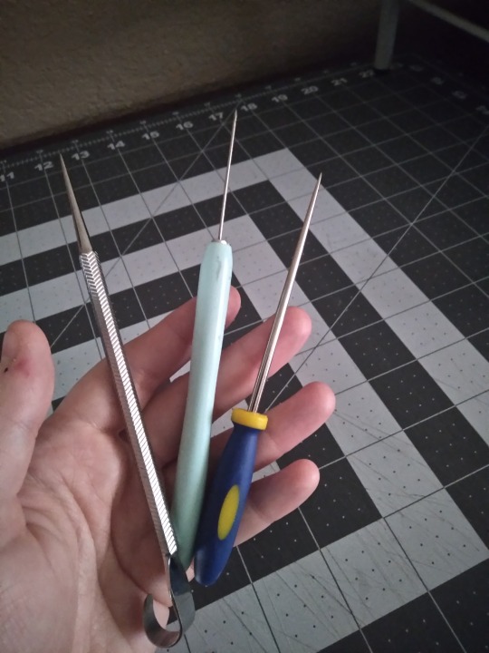
Left is, again, an actual bookbinding awl from an art supply store, while the center one is a paper quilling tool and the right one is a beadwork awl, both of which came from a big chain craft store. The bead one is my favorite; it's a good size and very stable. The quilling thing has too long and thin of a blade and it's wobbly, and I don't like the tapering on the bookbinding awl. It tends to make the holes in the middle page too big, and the outer ones too small. Again, these were cheap, about $10 each, but you can also use a sewing needle stuck in a cork, or a thumbtack or pushpin. If it's pointy and rigid, it'll work.

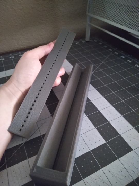
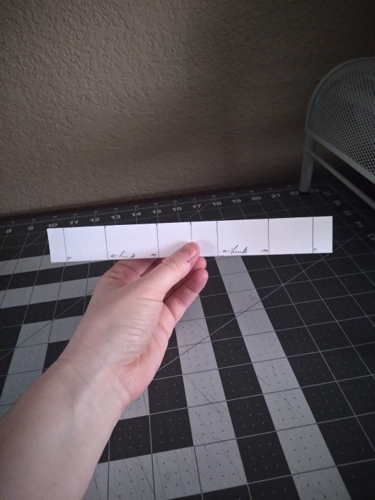
This isn't a requirement by any means, but I've found I like having a punching cradle for the hole-poking step. I got this 3d printed one from a fellow bookbinder, who was designing their own and made this one as a prototype. There are a lot of tutorials on how to make a punching cradle, or you can buy them online from several different vendors. They don's all look like this, and you can make them from wood or cardboard (though those don't usually have guide holes). If you're just starting out or this doesn't appeal, you can just use a paper template like the one on the far right. The cradle helps get the holes lined up and evenly spaced, and I've never liked this step so anything that makes it faster and less fussy is a win. If you use this kind, check that your hole-poking tool fits in the guide holes--the binding awl pictured above doesn't, but the other two do.
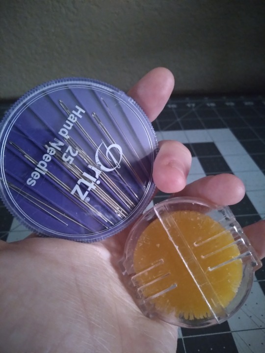
We've made holes, so let's stitch them up. These are just regular sewing needles and beeswax, to make your thread less prone to tangling. You can get both of them in any store that has a sewing department. There are dedicated bookbinding needles, like curved needles, and some binders like them, but I've never gotten the hang of the curved ones and they aren't necessary, especially when you're just starting out. If it fits through the holes you made, it will work.
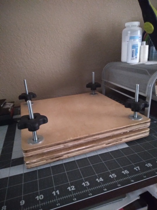
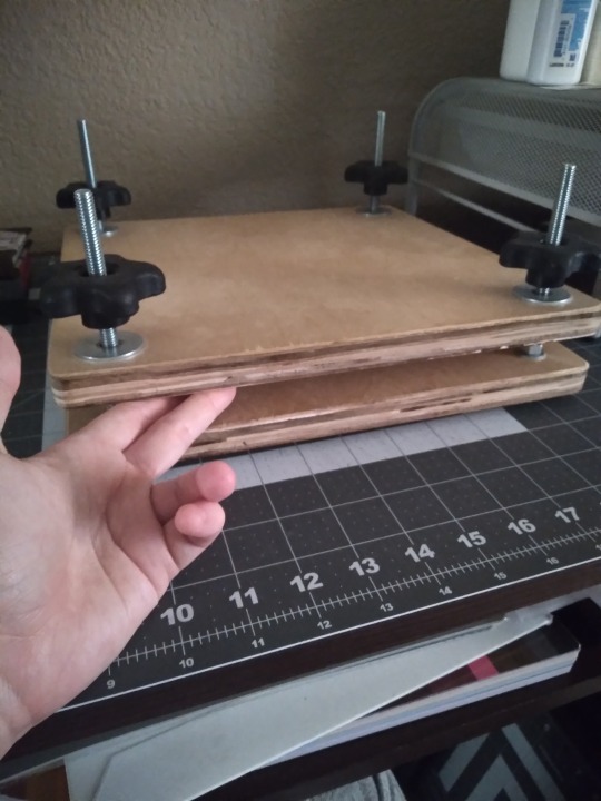
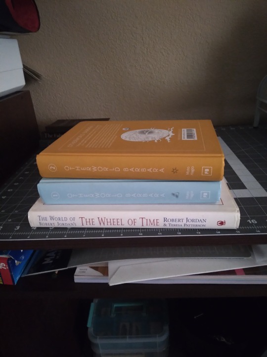
Once it's sewn, you probably want to squish your new text block so it's flat. I've got a laying press that I bought a couple of years ago when I was first getting started. It was marketed as a book and flower press, and it's honestly not the best. I would probably not have bought it if I had known that it wasn't essential to the process, and I mainly use it now when I'm squishing a text block and still want to use my work space, because once it's tight I can move it somewhere else. You can really use almost anything for squishing as long as it's heavy and flat and rigid on one side, like the stack of books in the right-hand photo. Textbooks, encyclopedias, art and photo books, and comic book omnibuses are all great. I've seen people use all kinds of things, like paper-wrapped bricks and doorstops, and there are tutorials out there to make your own press out of cutting boards if you do want one.
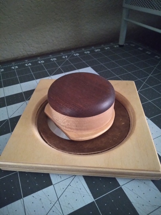
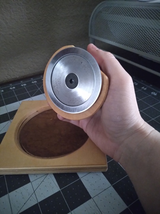
If you like your books to have smooth, flat page edges you're going to have to trim them. This is a book plow from Affordable Binding Equipment, and it was the first piece of actual expensive equipment that I bought. Not all plows look like this; I think the design is unique to ABE, but I've never used the traditional kind. In the interest of full disclosure, you can also trim edges with a sharpened chisel, which is much cheaper and can be bought at any hardware store, and some binders love this method. I do not love this method and have had zero regrets about caving and getting the plow. Very easy to use but does require some grip strength. Not pictured: the setup for sharpening the blade, which isn't hard but requires a bit of space and a small sheet of plate glass that you have to source yourself. Even with that, I still prefer it to the chisel. That said, this is not an essential step and you can leave your books with a "sawtooth" or deckled edge. Most of my early books have them, and some people just like them better than the flat ones and never learn to trim them. As another side note, some tutorials will say that you can trim your edges flat with a knife. You can't. Maybe on a pamphlet you can, but if it's more than 10 or 20 pages you just can't. It will look terrible.
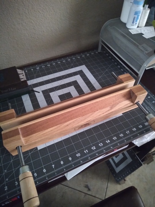
If you're going to use a plow, you've got to have the right kind of press. The one I talked about further up the thread is the wrong kind (full disclosure: I did use it with that press turned on its side, before I bought this one. But it's harder, more time-consuming, less comfortable, and less safe. Don't be like me). So here's a photo of my finishing press (also from Affordable Binding Equipment). I bought it so I could make backed books, but I use it for trimming too. The top part here has a narrow tapered section for backing, but if you flip it over it's totally flat, which is what you need for trimming. Not pictured: the stand that it came with for backing, or the c-clamps that I use to attach it to the desk for trimming. Again, though--this isn't a requirement for bookbinding. This is a later stage that's entirely optional. On the subject of backing, though:
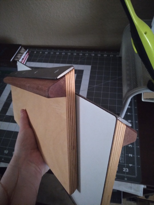
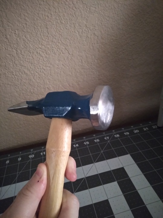
You don't need special equipment to round the spines of your books, but you do for backing. Left image is the set of backing boards I got from, once again, Affordable Binding Equipment, and on the right is a backing hammer from Hollander's. Neither of these are essential. Even if you get the boards (which have to be used in a press with a tapered edge, like the one directly above) you can actually use a regular hammer as long as the front part has no scratches or gouges. This one is a backing hammer, the primary difference being that it has a wider, convex head than a regular household hammer, to make the kind of glancing blows needed for backing a little easier. Honestly, I'm still learning how to use these and I'm not very good with them yet. Comes of being self-taught, probably. I don't think youtube is the best vehicle for learning this part, but it's what I have and I'm making do. Not every book is going to benefit from backing, either; it's primarily for helping mitigate spine swell.
Okay, time for my favorite repurposed equipment hack.
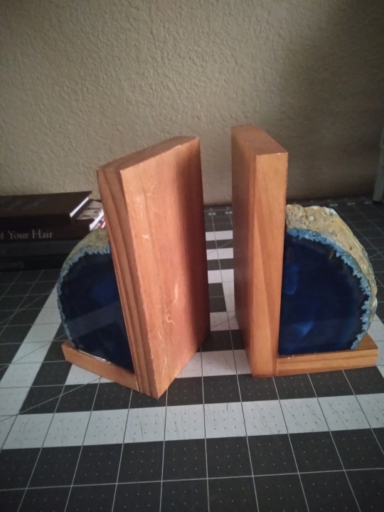
It's bookends. Regular bookends that I've had for ages and that probably came from Ross or some other place that doesn't even sell craft supplies.
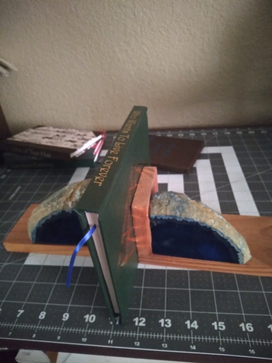
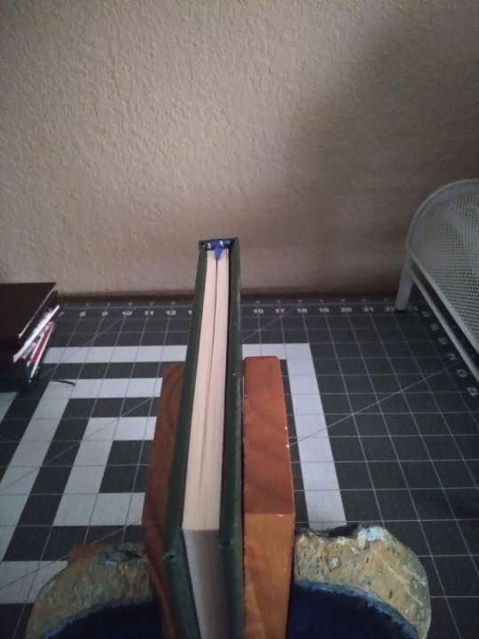
Want to keep the text block upright while you glue it? Bookends. Want to sew some custom end bands but your text block keeps falling over? Bookends. They won't provide pressure for squishing, but if you just need to hold something upright while you work on it, bookends are the answer. They hold up books, it's right there in the name. Having said that, you want some with a little weight to them, like these agate slices, so they won't slide around. And you want something with a smooth finished edge like these, so they won't scratch up your text block or leave dents. I have other sets but these are the only ones I use for this purpose, and they're better for it than anything else I've got.
Moving on from making the text block, let's look at what I use to make covers.
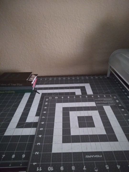
It's appeared in the background of most of the other photos, but here's a photo of just the desk surface covered in cutting mats. I really recommend a mat to protect the surface of your furniture and keep your knives from going immediately dull. I've got a big one that covers almost the full surface, and a small one for when I want to be more mobile. I started with just the small one and it was good until I started working with larger sheets of paper. The big one was bought largely for convenience but I have no regrets about it. They're self-healing, non-slip, and you can get them in the sewing section of any big craft store.
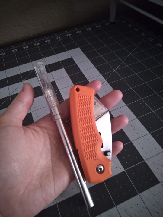
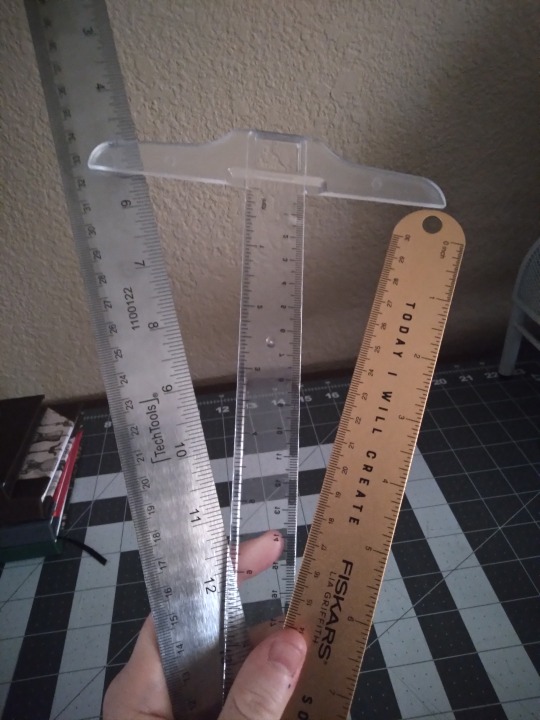
I'll be honest, I am not big on knives. I've got a regular box cutter for trimming board, and a razor knife for paper and cloth, and that's it. There are a lot of kinds and really all you need is one sharp blade for board. Paper and cloth can be cut with scissors if you want, though I find I get more consistently straight lines with the knives. Also pictured: Metal rulers and a T-square. You want a metal ruler for this. Plastic will flex and wood won't lay flat. Ideally you want one without a cork backing (my 18" one has this problem) and with the tick marks etched in rather than printed (my 12" one has this problem). For larger sheets of paper and cloth, the 18" one is great, but you can get by with the smaller one. The T-square is for making right angles; mine is plastic and only 12", and I really wish I had a longer one that was metal. These are drafting tools and you'll find them in the section of the craft store that has easels and sketch pads and they're usually pretty cheap.
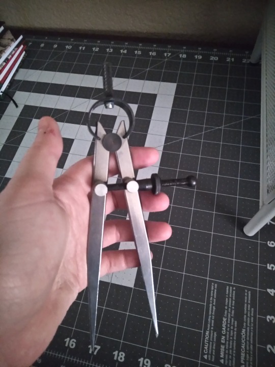
This is an adjustable compass. You can probably get these at craft stores but I got mine on Amazon. It's for measuring hinge gaps and the width of spines, both essential for making sure your cover fits your text block and your hinges open the way they should. Both of those are incredibly frustrating situations, and this thing makes it so much easier to avoid them.
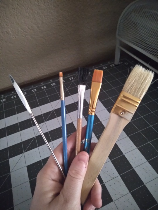
Things to spread glue with! Any old paintbrush will do, though I like to have a few different sizes and textures on hand to choose from. I like the big one for cover boards and casing in, the mid-size ones for doing turn-ins, and the little fellow for details and touch-ups. I don't care for foam brushes because I find them hard to clean when glue is involved, but if you like you can use those. The metal thing on the left is a micro-spatula, and I did have to special order it from an art supply place but it was cheap and it's very helpful to have on hand for when the brushes are too thick, for doing turn-ins on rounded spines, and for separating pages if you decide to learn edge foiling. Not essential, but recommended.
One thing I neglected to take a photo of is my crepe eraser. Despite the best intentions, no matter how careful you are, you will at some point get glue where you don't want it, where it will be visible on the finished book. This is where the crepe eraser comes in; you can use it to remove dried glue from cloth or (to a lesser extent) paper. Very annoyingly, none of the craft or art supply places I went to had even heard of these and I had to get mine from Amazon. It was cheap (under $10) and I strongly recommend getting one.
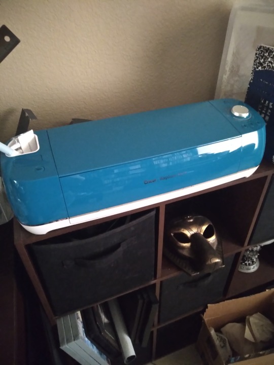
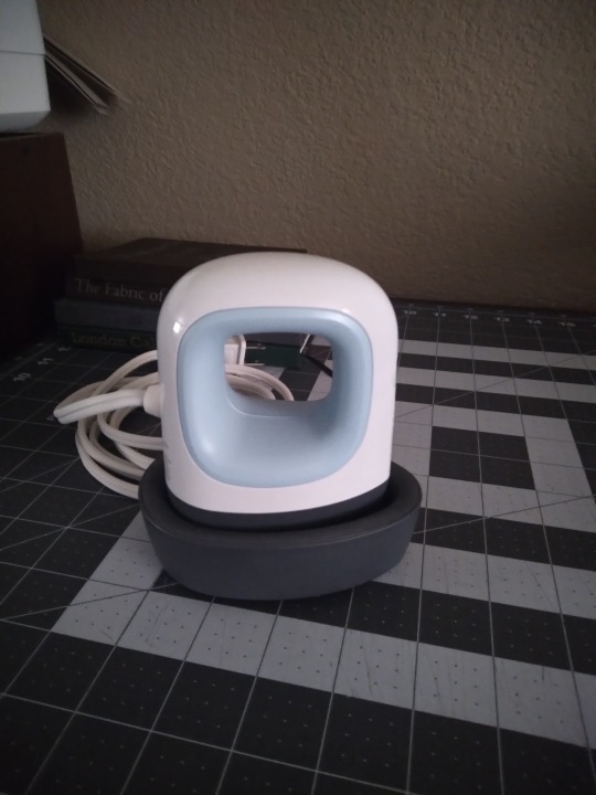
Once your cover is made, you have some options. You can leave it blank, hand-letter or draw an image, stamp it with ink or embossing powder, use a stencil, or do what I usually do these days and make a cover graphic from HTV. I've got a cricut for this (though they're not the only kind of cutting machine; it pays to research other brands) and a mini heat press (I want a bigger one, but I got this one cheap because the box is messed up). A lot of libraries have cricuts you can use, and you can use a regular iron to apply the HTV. Getting it to stick is a bit tricky, but that's true no matter which tools you use. Not pictured: a cutting mat, different than the kind shown above, necessary with most materials you can cut (mine came with one, they're about $20 at most craft stores, and they're lightly sticky to keep your materials in place while it's being cut). I don't know if other brands require them, but cricut does unless you're using their Smart Materials (I have never used these). If your library has a cutting machine, they will also have the appropriate cutting mats. Also not pictured: weeding tools. Weeding is when you remove the bits of HTV that you don't want in the final image, usually the spaces between letters and such. The negative space, if you want to get artsy. The special tools cricut sells aren't necessary, you can use an awl or needle and the dull edge of your knife blade, but I have a set of theirs and I like mine.
I didn't take a photo of it, but sometimes I use embossing inks and powder to make cover designs and text. You only need a heat gun for embossing powder, it takes up way less space than the cricut does, and it's cheaper. I got mine free from a family member so I don't know what it cost initially, but cutting machines are a really big expense; the cricut is my third most expensive piece of equipment, after the finishing press and the plow.
Good god I think that's everything. It sounds intimidating, I know. And it sounds like it takes up tons of space in your home, and to be honest it can, but it doesn't have to. The first dozen or so books I made, I made completely to my satisfaction with tools and materials that fit in one 12x16" moving box. If you love the hobby and can make the space, the bulkier items might be worth it down the line, but especially when you're first getting started it's smart to keep things low-cost and compact. Most of the basics are simple and your fellow bookbinders are delighted to share their shortcuts and substitutions if you ask.
The end! I hope it was helpful, @cardassianexpats! I did warn you it would be wordy, lol.
#bookbinding#fanbinding#long post#like ridiculously long post omg#my own verbosity will be my downfall#if anything is unclear please tell me#i can't always tell when i'm over-explaining#or when i think i've given enough info but my audience thinks i haven't#snek makes books#but sometimes she just talks about them
24 notes
·
View notes
Text
♡ ♡ ♡

last updated: 10th of december, 2024
━ ✦ ☆⋆。𖦹°‧★🪻⋆.ೃ࿔*:・ ✦ ━
✦ -ˋˏ hi, i'm aya! ˎˊ- ✦
freight trains stampeding through my backyard - it'll run across the plains, like they do in the new buffalo replaced
✦ this blog is about: yandere themes, horror, thriller, gaming, cinema, literature, | honkai star rail, genshin impact, jujutsu kaisen, hunter x hunter, twisted | wonderland, jojo's bizarre adventure, my hero academia, love and deepspace | history, psychology, poetry, durarara, dc/marvel, cottagecore, cooking, baking ╰ ➤ birthday: 13/11/05
and i know no one will save me, i just need someone to kiss
✦ identity: | pronouns: she/her/hers | orientation: greyromantic asexual | gender: cisgender woman :) ╰ ➤ MBTI: INFJ, 2w1, 296, choleric-phlegmatic
toss your dirty shoes in my washing machine heart - baby, bang it up inside
✦ works in progress: | yan sunday miniseries (part one) (80% done) | love letters (yan (college au) chrollo) (non-con) (trick or treat event) | ╰ ➤ "know thyself? if i knew myself, i’d run away." - johann wolfgang von goethe
i need something bigger than the sky; hold it in my arms and know it’s mine.
✦ important things to know before requesting!! | requests: closed | events - none at the moment! | ( rules/disclaimer ) ( ao3 ) ( faq ) ( ko-fi ) ( commissions ) | ( blog recommendations ) ( longer works/series ) ( common tags ) | ( fic recommendations ) ╰ ➤ please follow my rules and just be a kind person. always.
━ ✦ mitski fan <333 ✦ ━━━━━━━━━
// template by Kabukiiimono#3090 on emojicombos! //
last song played: ma meilleure ennemie by stromae (feat. pomme)
last show watched: chainsaw man
last movie watched: alien
last game played: the kid at the back
last book read: dracula by bram stoker
honkai star rail uid: 614590580 tears of themis uid: 202826715 honkai impact 3rd uid: 108530249 zenless zone zero uid: 1001020875 genshin impact uid: 626595699
honkai star rail mains: kafka, aventurine, clara, blade, dr. ratio, hanya, natasha, qingque, trailblazer (harmony), asta
tears of themis favorite: mc- i mean artem...
honkai impact 3rd mains: elysia - miss pink elf, elysia - herrscher of human: ego, griseo - starry impression, pardofelis - reverist calico, sirin - miracle magical girl, coralie - valkyrie blastmetal, kiana - herrscher of the void, "lantern" - lone destruction: shadowchaser, senadina - deepspace anchor: first light, helia - valkyrie boltstorm
zenless zone zero mains: rina, corin, anby, lucy, piper, jane doe, soukaku, seth, billy
genshin impact mains: kaeya, xiao, qiqi, eula, yae miko, raiden shogun, diluc, childe, wanderer, kazuha
( list of fundraisers i donate to )
( complete favorite characters catalogue )
( on repeat playlist / other ) ( favorite songs at the moment )
( book recommendations)
65 notes
·
View notes
Text

Alternative title: how to use SVGs as paths in GIMP ▬ by Joy from @creativexspirit
Though I recently created a template for text messages, I didn't like how versatile it wasn't so, here's a little tutorial on how to create your own text messages for Gimp. This tutorial is meant to explore the Path tool a little.
This tutorial is made with Gimp 2.10.38. It uses a SVG I created just for that tutorial: [LINK]
Like or reblog if you download. Please don’t request as your own, respect my work. Don’t hesitate to tag me if you follow the tutorial! I would love to see your edits. If you have any question, my askbox is open.
Quick disclaimer: the following images are for a French Gimp version.
STEP 01.
Create or open the XCF project you want the text message in. You will now import the SVG as a path.
If you don't already, have the path window open. You can find it in Windows > Dockable Dialogs > Paths. On my Gimp, as I am in single-window mode, the Paths dialog window is automatically docked to the Layers-Undo dock as a tab.

On the Paths dialog tab, open the Paths menu and import the SVG by selection "Import a path".


If you've done everything correctly, you should see a new path named "Text Message" in your Paths tab!

STEP 02.
Now, you can modify the path with different tools according to your needs: transform, scale, rotate, flip... Just make sure you always choose the Path to be transformed!
You can select whether to transform a layer, a selection or a path on the tool options.


STEP 03.
After transform, it's now time to actually have a text message. You'll start by creating a new layer that will have the background color on it. I called mine "Text Message BG".

You will now go back to the Paths tab and create a selection from the path, by selecting the Text Message path and then choose in the Path options "Path to Selection". There is also a shortcut button at the bottom of the Paths tab.


Now, you will see the selection is only a border. You will need to add the inside rectangle to the selection.
You can do so by selecting the Rectangle option and putting it in "Add to Selection" mode. (You can also be in "Add to Selection" mode by pressing Shift while doing the rectangle.)


Now, you can fill your selection with a color! (Don't forget to change your foreground color with the one you want to fill prior to doing the fill!)

You know have a background for your text message!
STEP 04.
We will now add text. You might be wondering why in this SVG file there is an inner rectangle. It is actually meant to serve as a guide for your textbox and still have some padding.
To use the inner rectangle of the path as a guide, you have to toggle Paths as a guide. To do so, check the box in Display > Align on active path.

Now you can select the Text tool and create your textbox while following the inner rectangle. You should be able to feel that the textbox will naturally clip to the edges of the path.

Now customize your text as you want and you're finished!
11 notes
·
View notes
Text
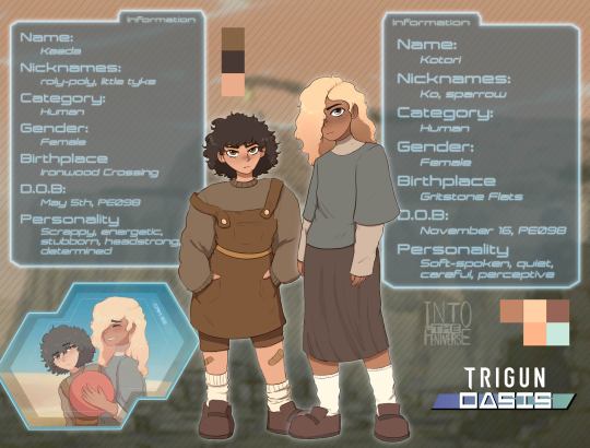
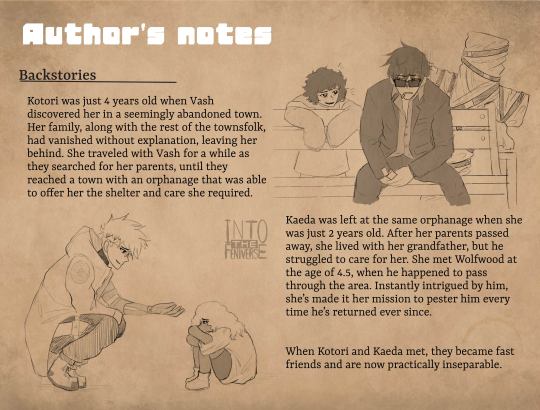
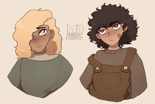
Trigun OC's || 🐤 Kotori & Kaeda 🐞
(I'm assigning Vash & Wolfwood some kids)
Additional Info (& doodles) under the cut!
Templates: bit.ly/trigunresources
Disclaimer: backgrounds aren’t mine, photos came from pexels or the show
About Kotori:
Name meaning: "little bird"
Nicknames: Ko, sparrow, songbird
She's a very shy and timid thing, very quiet, softspoken stays out of trouble. She struggles to make friends and prefers to sit by herself in a corner and read. But once she warms up to you she is the sweetest kid
Vash found her one day while he was traveling through the desert. She was all by herself in an abandoned town, with no clue where she was or where she should be. The only things she seemed to know was her name and age (4 at the time). He took her to the nearest town, but nobody seemed to know who or where she was from, or really wanted anything to do with her. So she traveled for a bit with him until they found a town with a reputable orphanage. Vash felt a little bad about leaving her there, especially after everything they had been through together, but it was for the best. Thankfully, she's a very forgiving and understanding kid, and while she was a little sad she didn't put up much of a fuss. Vash tries to visit whenever he can though.
Her favorite color is lilac and she likes storms
She loves helping in the kitchen, especially when it involves baking!
She can sing, and fairly well at that, but not in front of other people
She enjoys reading fairytales the most!
About Kaeda:
Name meaning: "maple tree"/pulled from "Kaeda Valley" (but in actuality, in the creator context, extrapolated from Cicada ;P)
Nicknames: bug, roly-poly, creepy crawly, little terror/tyke, runt
She’s an energetic little ball of spite and curiosity. She' can be a bit 's rather hot-headed, extremely stubborn, and very persistent. She’s not afraid to speak her mind and and doesn’t know when to quit, which gets her into a lot of trouble with the caretakers at the orphanage.
Wolfwood thought she was amusing at first, but quickly found her to be rather annoying once he realized how absolutely relentless she could be. Unfortunately, the town is a spot he ends up passing through pretty often, and Kaeda always ends up tracking him down without fail. It's like she has a sixth sense for when he's around. (He’d never actually say this to the little brat’s face, but he does kinda enjoy spending time with her, even if she can be annoying as all hell. It’s like having a little sister of sorts.)
Despite her rather vibrant personality, she does make friends fairly easily, once other kids give a chance to get to know her better. She’s on good terms with most of the other kids at the orphanage, but butts heads with a lot of the kids in town. Once she’s decided you’re her friend though she will be fiercely loyal until the end.
Her favorite color is yellow and her favorite food is mac and cheese
She's rather small for her age, but what she lacks in size she more than makes up for in energy and spirit (She's a little spitfire)
She absolutely Hates being tickled (will bite you if you try) and would rather avoid veggies at all costs. But she loves bugs! (and is pretty skilled with a slingshot)
These doodles are old and not great, BUT we're keeping them in


#trigun#mq original characters#OC: Kotori & Kaeda#trigun OC#trigun original character#original characters#trigun stampede#au: oasis#nicholas d. wolfwood#vash the stampede#if kaeda were an animal she'd be a goat she is very much a head butter (and biter)#these two have 0 influence on the plot but I adore them#they're also good stand in kids for other AUs (i have a single dad vash/wolfwood au rotating in mind)#oc x canon#MQ's OCs
11 notes
·
View notes
Note
I just wanted to say that I'm in love (and a bit jealous haha) with your style. It's so pretty and unique! Your hoods are gorgeous and your sims even more! (may i ask you what technique do you use to make them? Pooklet's? Face templates? A lot of sliders?)
I jumped around a lot between maxis-match, semi realistic, etc. trying to find something i liked (and i still feel i didn't quite found something i like 100%) and I'm in awe of how you made something that doesn't look like ts4 nor ts2 but a so cool and pretty in between!!!
(also a disclaimer because I'm a tiny ball of anxiety: this is no shade to anyone who likes other styles, i find them pretty awesome in other people's games, they just look a bit boring on mine. The sims is about having fun and everyone deserves to play it as they like!)
Hi! Thank you for your sweet message!
(disclaimer at the beginning of the post, my keyboard is dying since half a year and i'm putting aside the moment to replace it, but after this post, I think I'm gonna make my mind soon lol. So sorry for any misspeling - you can get double nn, no n, no m, no c, double cc, no c and many other surprises - i tried to fix everything but I could miss something xd).
I've restarted my hood 5 times I think before I got it to my recent version. I'm terrified every time through most of the process, it doesn't come easily to me xD.
Also ofc, everyone can have whatever aesthetics they like - the sims is the perfect series to express that.
With my sims it really depends. I mostly make a sim that I really like and then use it as a base for other sims, but not always. Sometimes I make a sim that I think looks quite unique but it's still missing somethig when it comes to features and makeup face details. During those moments I just open up my body shop sometime later or the next day and try to tweak this sim, sometimes it's more than once. And other times I end up liking the idk 3rd attempt but i still keep going since i want to make more similair sims, and also it's tiring to start the process from the beginning every time xD.
(pics under cut)
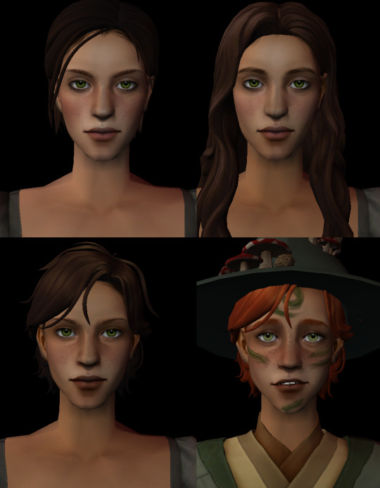
or
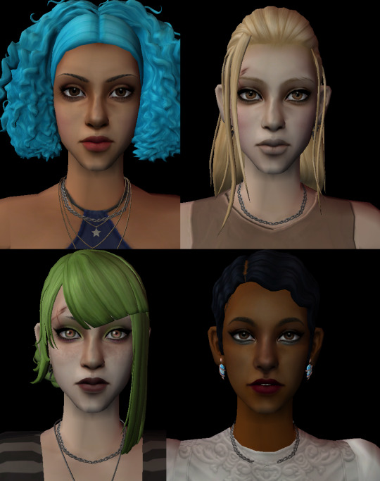
OR
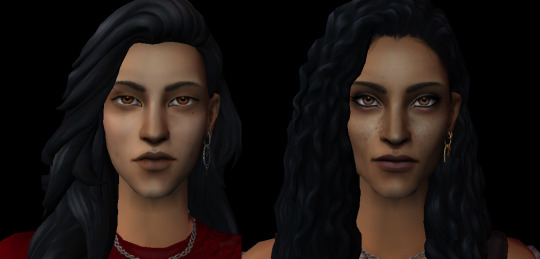
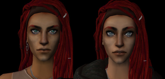
OR
sry for the baldness xD - i deleted the wip hair conversion files they had and now i can't never change their hairstyles lol, idk how i did it for those two last sims seriously.
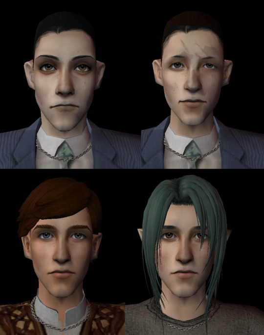
As you can see, all those sims have this maxis chain necklace, which means that I started the process using the same base sim and it just evolved into many differet results lol.
Other times I'm editing some maxis face templates to make them more my style (it's really fun!)
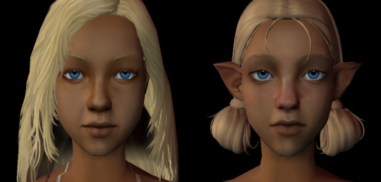
I also made one of my sims face into face template to make the rest of the family. I didn't want their faces to be - mouth: mom; eyes: dad; nose: mom - just a mix of both and adding something extra to make them a little more unique. Kinda pookleted their faces with two face templates.
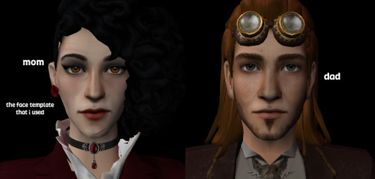
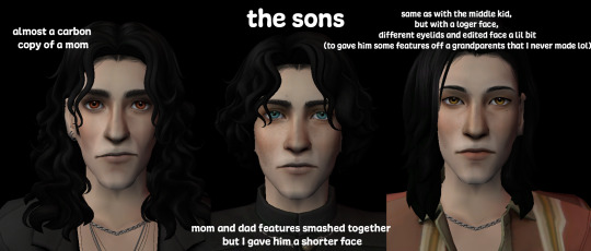
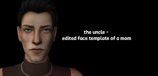
I just really like this face. It can look either goofy or good xD.
I sometimes get inspired by images of some real life ppl (models, actors). When I'm really out of ideas I'm also dowloading sims made by others and use them as a base - just tweaking their features to be my style, mostly it's about face proportions and replacing the cc they used to the one I have. There is muuuch more examples that I could give but a lot of times it's just a result of tweaking some sims a couple of times xD.
Also due to the fact that i make my sims in body shop, idk how their faces will look whit face expressions. I was always using my sims to create previews for my cc conversions so I'm also testing them that way and if something looks too off - I'm just going back to body shop to fix that.
I think I've developed my style around the clay hair conversions that I've made - I wanted the sims in my previews to go well together with clay hair. I remember that I've picked the hair first, THEN sculpted my sims faces. There just werent that many to choose from at 1st.
I don't really use face templates - I have some, but I don't use them much - i think the proportions on faces of my sims are the closest to the maxis sims 🤔. I like their sharp features so when I'm stuck with making a sim, I'm using the pooklet method with those maxis templates but only a tiiiny bit - like 10-20% and only on those parts of the faces that I want to tweak a little more. After that I'm going back to editing the face myself.
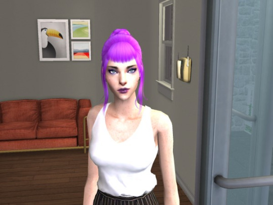
(also a lil bonus of my sim from 2017, the only older picture that i have, i found it recently by accident and i think this is the only time when it's kinda in-context to post it 🤣).
23 notes
·
View notes
Text
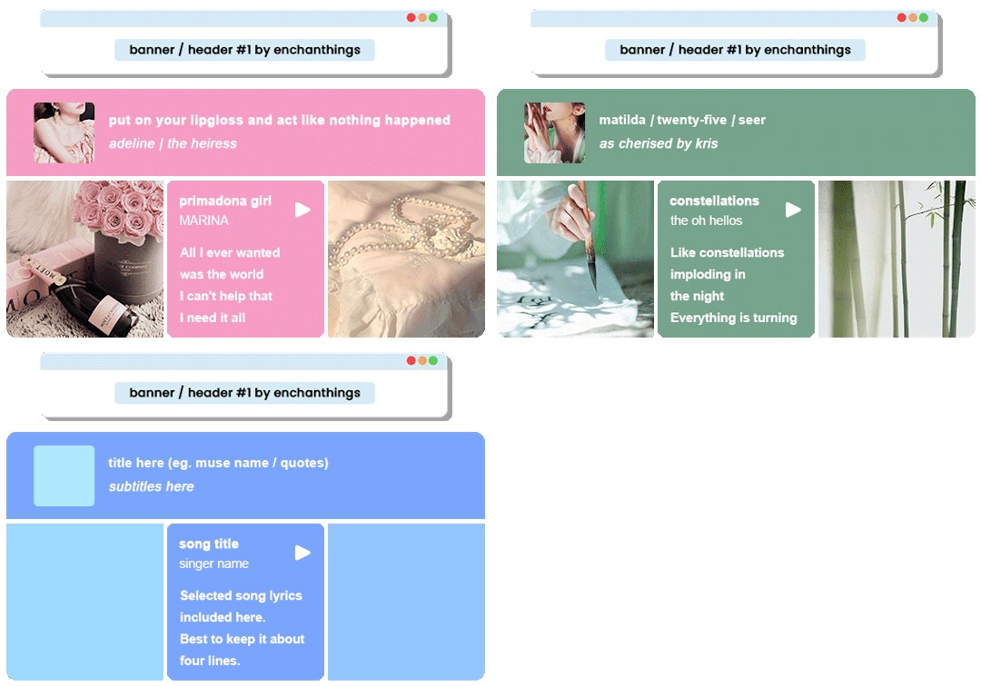
◦˚~ BANNER / HEADER TEMPLATE #1 by enchanthings ~˚◦
Info:
Imagined for banners, headers, pinned, about posts.
Full image size: 565× 300 px
Photoshop level: Beginner
Elements are separated, grouped, and labeled accordingly.
Use clipping mask for easier fit of the images.
Change the color of the header & song box by double clicking the thumbnail of the labelled.
Fonts used: Arial
Disclaimer (!) placeholder images are not mine. Follow my rules if using. Do not claim or repost as your own. Reblog or like if download. If you're able and willing, please also consider supporting me with a coffee! My ask box is open if you have any questions!
◦˚~ [ download access through ko-fi] ~˚◦
#header template#banner template#pinned template#template#templates#psd template#template psd#muse template#supportcontentcreators#allresources#rpc#rph#.m
430 notes
·
View notes
Text
⠀⠀⠀⠀⠀⠀⠀𝓙𝐎𝐒𝐄𝐄'𝐒 𝓖𝐑𝐀𝐏𝐇𝐈𝐂 𝓒𝐎𝐌𝐌𝐒
⠀⠀ ⠀ ⠀! REBLOGS ARE VERY MUCH APPRECIATED !
୨୧ ‧₊˚⠀i have been trying to find the right motivation and just overall meaning of making graphics , and while yes i do enjoy making them , i don’t like them just sitting in my camera roll to rot away. so , to start off small , i plan on selling prints i’ve made as A4 sized posters ( 8.3" x 11.7" ).
୨୧ ‧₊˚⠀also a quick disclaimer !! i will not be taking commissions until i’ve sold at least five prints from the examples i’ve provided. no , not five per example , just five in total. because , as i’ve said above , i don’t want these rotting in my phone , so of course i won’t want to make more and add to the clutter before putting the ones i’ve already made to use.
⠀
✿ 。 ׄ ׅ 𝟶𝟶 ׄ 𓈒
౨ৎ⠀◞⠀PRICES
✶⠀i’m a maximalistic designer , so it’ll be on a rare occasion that i take minimalistic comms , but bare with me as i try.
⠀⠀⠀•⠀soft ( your choice of mini or max ) — $6
⠀⠀⠀•⠀brutalism ( your choice of mini or max ) — $8
⠀⠀⠀•⠀video game ( your choice of mini or max ) — $10
✶⠀at max , im charging $10 (duh) , but tips are definitely appreciated and encouraged :3 !!
✶⠀i will also include freebies of your choose in the packaging , so when you send a comm also send your favorite idol , celebrity , or fictional character ( max up to 3 ) !!
✶⠀how i will take payments will be through zelle or cashapp ! & i will ask you to pay half of the payment before hand / when you order , and the rest of it once i’ve sent you the final draft before i go and print everything !
✶⠀sadly for right now i am only shipping within the US since that’s where i live and due to this merely being just a small side “hustle” of mine before i actually message a manufacture for my actual business.
౨ৎ⠀◞⠀EXAMPLES
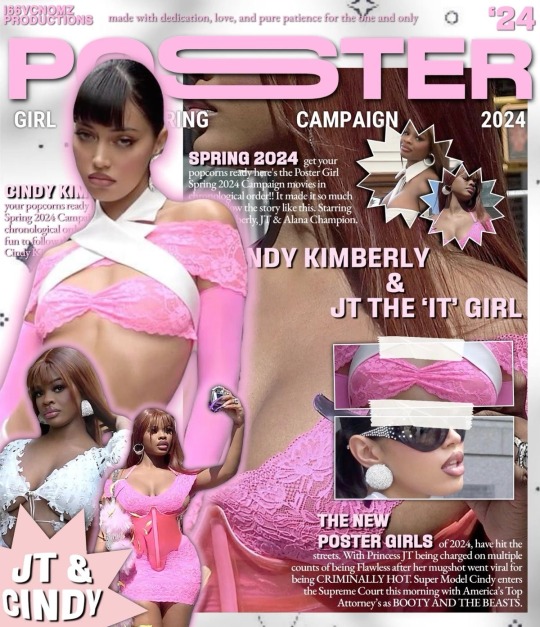
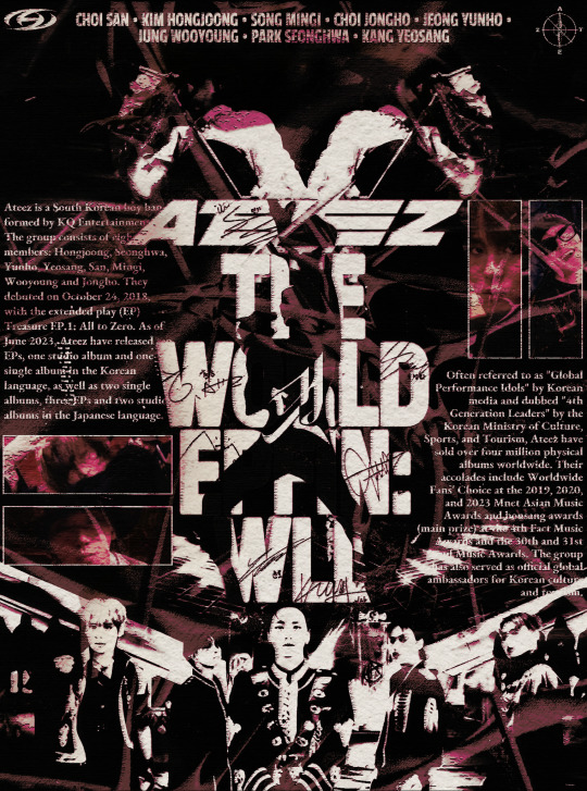
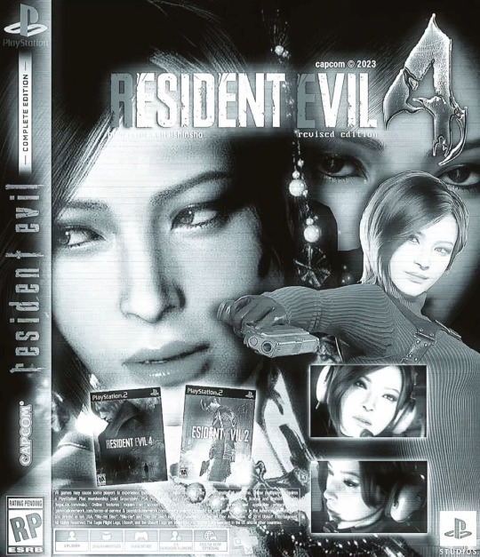
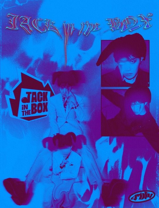
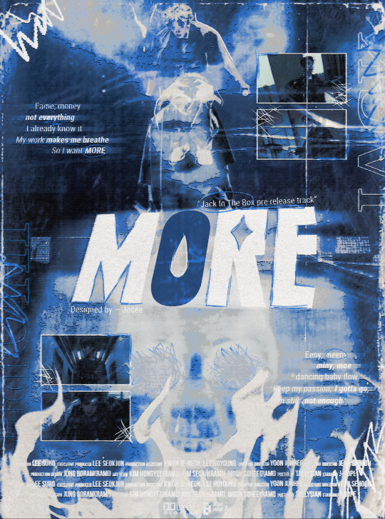
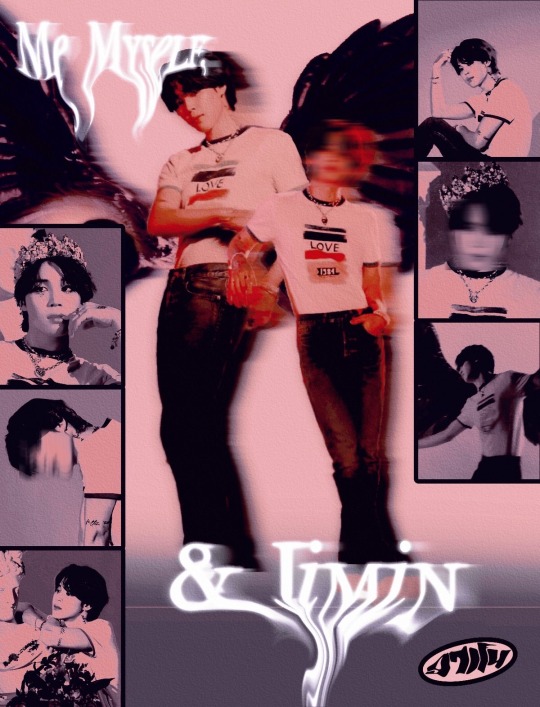
✶⠀( specifically for these three ) sizes may vary depending on the poster dimensions , but if you would like yours to be the exact 210 x 297 / 8.3" x 11.7" then just let me know , no extra charge , of course :3 !!
✶⠀if you would like me to use any of the provided examples as templates for other preferred people ( ex ; instead of JT & cindy ➞ megan thee stallion OR instead of ada wong ➞ leon kennedy ) , just let me know and i’d totally be down to do that.
౨ৎ⠀◞⠀RULES
✶⠀please refer to my etiquette page before sending a commission !! all rules , do not interacts , and byf from that list most definitely still apply to my commissions whether or not this is writing / anime related. i still have a moral code at the end of the day , money doesn’t change that.
✶⠀i will only take orders on saturday / sundays since monday - tuesday im off work , meaning i can use those 48-72 hours to properly configure your print , then ship it out. though , this may change since i’m in the midst of trying to find a new job !!
✶⠀to properly order a print , send me an inbox without anon of your favorite tv series , and i will send you a dm once i’ve received your message to further discuss your commission !!
✶⠀i will / am willing to make prints of anyone and everyone that doesn’t fit my dni criteria. ( no’s ; chris brown , jay park , lana del ray. — yes’ ; megan thee stallion , choi san , laufey )
✶⠀when you receive your order in the mail , i will kindly ask you to send photo evidence of you getting the package and for your consent so i can make a post with the photo. if not that’s also fine , don’t worry. i just want to keep track of them through here since i am selling them through my tumblr.
౨ৎ⠀◞⠀ORDERING
✶⠀once i’ve officially dmed you about your order , i will send you a sort of form to fill out for your order. which, it will include me asking you info about your order , but more importantly i would appreciate it if you sent me an aesthetics board of some sort that would visibly give me somewhat an idea of what you want your print to look like.

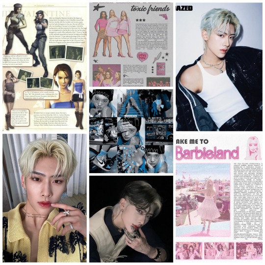

⠀⠀⠀⠀⠀⠀⠀⠀⠀⠀⠀⠀⠀⤷ like this !
✶⠀in short , it should include a few pics of references / inspo pics you’d like me to either use or incorporate ( i won’t completely plagiarize them obvi , but i will keep them in mind when editing ) , and also the face claim / person the print is about ( ex ; ricky ) , then finally if you want one include a psd that i can color drop from to use as a filter over your print.
⠀⠀⠀⠀⠀⠀⠀⠀⠀⠀⠀⠀⠀⠀⠀⠀⠀⠀⠀⠀⠀ : 𝟶𝟶 ꞌꞋ ۪ ׄ ﹏
━━━━━━━━━━━━━━━━━━━━━━
' . : ⟣ all in all , i’d truly appreciate it if you did commission me. it would mean the world , honestly. it’s been my dream to not only make prints that i know people would hang in their room, but also be able to do those cute kpop trading freebie things. it’s stupid yeah, but so damn cute ugh i love it smsm.
#© ihrtlert prodz#ihrtlert comms central#kpop#kpop moodboard#kpop icons#kpop layouts#kpop gg#kpop girls#kpop aesthetic#kpopidol#kpopedit#kpop bg#commission#art commisions#commisions open#digital commisions#taking commisions#commision info#drawing commisions#jujutsu kaisen#jjk x reader#jujutsu kaisen x reader#jjk#ateez#ateez x reader#jhope#bts jhope#bts#bts army
23 notes
·
View notes
Text
Building Dungeons that Tell Stories
One thing I've been hired to do a lot lately is to write a dungeon that's meant to fit into a larger adventure/product. For example, I wrote the Ivory Tower for Sarah Morris's The City Lost to Dream. I'm writing another one now, for [redacted], and I thought it'd be cool to talk through my process as I build the outline.
You can find a Notion template for my dungeon outline here! But this blog post will talk through it.
First, a disclaimer: This isn't the definitive way to make a dungeon! In fact, not all dungeons need to tell stories in this way. But the vast majority of mine do, because they're attached to one-shots, and I like the narrative completeness this style of dungeon creation affords. There's a narrative throughline to this kind of dungeon, where each room serves a purpose and allows the players to piece the story together. At the climax, the characters can use this information to make an informed decision about how to proceed.
This style is heavily inspired by the environmental storytelling found in games I've enjoyed like Bioshock and Pokemon. Every bit of the environment, down to the smallest aesthetic choice, links back to the main idea in some way. When you put all the pieces together, the image becomes clear.
So let's dive into it:
The Dungeon Thesis
The Dungeon Thesis is the story told by traversing the dungeon. What happened here? What will the party learn from each of these rooms? Every room in the dungeon should be a supporting argument for this thesis.
If you've read my adventure The Workshop Watches (get it here for free!), then you'll recognize the strong thesis there: S.A.M. is a sentient workshop who accidentally killed its creators. Every room inside S.A.M. supports this thesis, by providing more insight into Illumar's research and S.A.M.'s actions since its creation.
The Dungeon Background section can help you with this thesis. Who lives in this dungeon now? Why was it originally created? What conflict is created by the disparity in the answer between those two questions?
While your final draft probably won't have a section labeled "Dungeon Thesis," the entire thing should have echoes of what you put here in your outline throughout.
The Dungeon Gimmick
Not every dungeon needs a gimmick, but it is a great way to make this encounter stand out. Maybe the corridors shift, or the characters are running on a timer. Maybe your dungeon is sentient and very, very curious. When coming up with a dungeon gimmick, also consider the other overarching features of the dungeon. How are the halls lit (and who made it that way)? Are there doors? Do they lock?
When adding a gimmick to your dungeon, make sure you introduce it right away. I'll cover this more in the entryway section, but it's a good idea to establish the gimmick as soon as possible, and keep reinforcing it, so it sticks in the GM's mind (and therefore their players' minds). Here's the gimmick from The Workshop Watches:

Individual Rooms: Purpose, Challenge, and Reward
The meat of a dungeon is, of course, its rooms. I have a three-pronged approach to coming up with the rooms: purpose, challenge, and reward.
Purpose
Why is this room important to the overall dungeon? What can the characters learn from traversing this room that will lead them closer to the thesis? Does it establish the ruthlessness of the villain, betray a secret weakness of your enemy, or provide more context for what's going on here?
You don't always have to come up with the purpose first. Sometimes you look at your dungeon layout and say, "I need more combat." So build your combat encounter, and then retroactively determine why that's necessary to the story.
That's what I did for The Workshop Watches. I added the greenhouse fight because the dungeon needed more combat. I asked myself, "what kinds of rooms would exist in a wizard's laboratory?" and settled on a greenhouse full of magical plants. Later on, I came up with the temperature control mechanic, where S.A.M. would counter cold damage with fire damage and fire damage with cold damage. A burnt section of the greenhouse suggests that S.A.M. has incinerated something-or someone-before.
Challenge
What are the characters meant to do in this room? This one is the most straightforward, but writing it out can help you keep track of the balance between different types of challenges. Combat, exploration, social, trap diffusion, puzzle solving, etc.
Reward
What do the characters get for completing the challenge in this room? Sometimes the reward is just "passage to the next room." Sometimes it's as explicit as "treasure!" But think outside the box for things your players would appreciate inside a dungeon: new tools, the opportunity for a rest, more lore, a role play opportunity.
There can be multiple Purposes, Challenges, or Rewards in one room, but try not to overdo it! Conversely, you can cheat a little bit and have them overlap or omit one ("The purpose of this room is simply to be a place for the characters to rest -- a reward! The challenge is in whether they'll recognize it or not")
Examples
The template has more questions for special room types. I won't go through all of them, but I do want to share some examples from my outline for The City Lost To Dream. Here's the entryway example:

Later on, I realized that there wasn't enough in the entryway. The final draft has a statue of the tower's founder and clues to suggest you should rub the bottom of her robe, which grants you a boon on a check. A fun reward for a History challenge.
Another example, one of the Laboratory floors:

You can see there's multiple challenges here, but no concrete reward yet. In the final draft, the aboleth can help you in a later encounter, but it also grants you three "knowledge" wishes (basically, three castings of legend lore).
The Climax
The climax of the dungeon - the final confrontation. Most dungeon delving games consider some kind of confrontation to be a great cap to the adventure. Combat is especially popular here. Give your characters something to fight!
But almost as important as the fight is the choice. A question I am constantly asking myself is, "The Characters learned all that information you gave them; now what are they going to do about it?" This is a roleplaying game, after all! When the characters learn the full truth of the dungeon and uncover its thesis, it may change their minds about how to proceed. Maybe they must choose between two potential adversaries, or choose whether or not to fight, or choose whether or not to use lethal force.
And that's the outline! I hope it's helpful to folks who are interested in creating this style of dungeon. Definitely pick up a copy of The City Lost to Dream if you haven't already; it's a fun 5e adventure! And let me know what you think of this method.
71 notes
·
View notes
Text
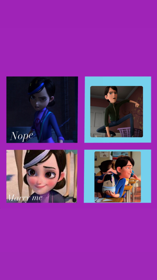
Claire is deeply in love with Jim, but can’t stand Jim. If you know what I mean.
So uhm I’m in my TOA phase again after almost two years.
Probably gonna post some fanart in the following days . Just need the time to decide the kind of fanart I want.
Disclaimer: the template is not mine , I found it on google, I only added the pics on the right for the meme ✨👀
For any particular request my Instagram is @fandoom.planet__ I would appreciate support there too 🥹
28 notes
·
View notes
Text
Disclaimer b4 this!
The just of it is THESE ARENT MINE and I only used the temp!
also the second part didn’t load for some reason so here’s the second post
the sillies tho :] (Vince(oc) n’ Bive)
I don’t think Bive would want more evil in the world nor that Buve is 45 just to say but it’s jus for the giggles :]
I had to cut it into three posts so HERE
PART 1 is this one
PART 2:
PART 3:
#regretevator#regretevator bive#regretevator oc#bive regretevator#vince regretevator#bive#roblox regretevator#capcut
4 notes
·
View notes