#no lineweight or shadows to be seen
Explore tagged Tumblr posts
Text

#hazbin hotel fanart#hazbin art#hazbin alastor#hazbin hotel#my artwork#art#fanart#lilo and stitch#this is not an art blog#its becoming an art blog#digital art#no lineweight or shadows to be seen#digital illustration#hazbin fanart#cat alastor#alastor the radio demon#radioapple#appleradio#lucifer morningstar#hazbin lucifer#lucifer magne#lucifer x alastor#alastor#illustration#I am writing this as my friends throw playdough balls at each other#nobody prepared me for college being like this
60 notes
·
View notes
Text
I got the go ahead from @jilljoycearts to do an art analysis/comparison to how she approaches the Arcana style in comparison to the game and myself! She's been a really inspiring artist to compare and contrast during my art development so it's cool to write this all down. Go follow her on her tumblr or instagram (same name.) I highly recommend her personal art, looking at her patreon, or getting a commission if possible. She drew Abosede for me once and I still look at it.
Anyway!
In comparison to the game art, I'd describe her art as the Arcana minus my art. She nails the lineweight variation that makes it so iconic and there's a detail and cleanliness in her art that I aspire to. She makes sure her lineart and colouring is neat and rendered, with a lot of lines that accent the body seen in Dana Rune's artwork especially.
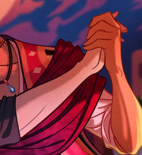
(eg. the tapering of the fingers and lines for the wrists and forearm)
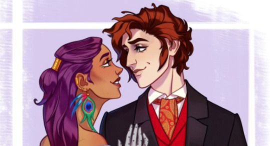
Rendering-wise, one of the most iconic things in her style is how she renders shiny materials and hair. Out of all the Arcana artists, it reminds me a lot of Veronica Liwski, but even then extra attention is put into the specific interaction of light and shadow. This extends to the rendering, where she tends towards stark lighting with dark shadows and high contrast light. There's usually three layers of lighting for added depth to the figures.
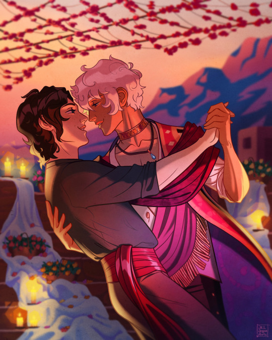
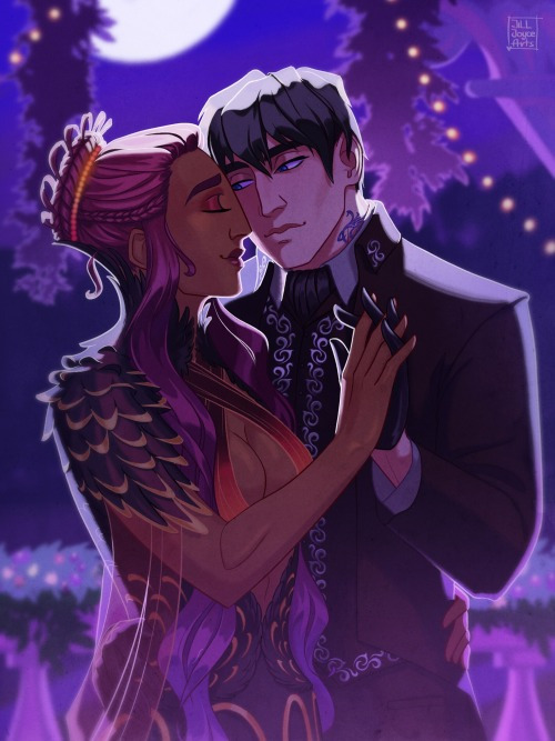
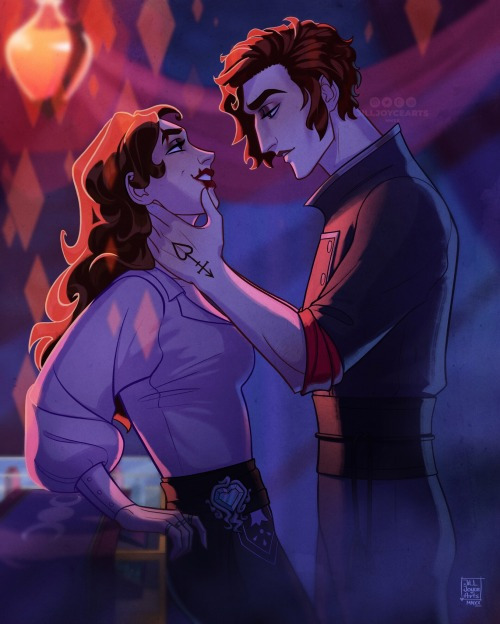

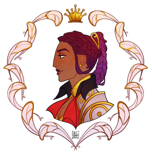
The anatomy of her style is where it differs most from the Arcana. It has less exaggerated proportions and posing; the eyes are smaller, the hair is drawn with smaller, more proportional curls/locks, and the faces aren't as sharp or long. The nose especially sticks out to me, having more of a blunt/squarish shape to how it interacts with the mouth in contrast to the drastic angles in the game.
One way I'd describe the overal compositional differences is that Joyce draws at more of a distance. The lineart is thicker and the characters are often drawn further away from the "camera" than the game (though this is in part to drawing more multi-character illustrations.) There's less texture in her art as well. I'd assume this is from the brushes she uses, but the neatness of her lineart and rendering gives it a very smooth appearance. The lineart doesn't have the same loose texture or opacity change, making it precise where the game art isn't.
My own art has less technical skill (I envy her ability to draw faces at angles) but it's looser in how I exaggerate the expressions and rough-in lighting with a low-opacity brush. It's always been a fascinating point of reference for art styles. She mostly drew Asra, Julian, and Lucio, with some Nadia, fitting her more angular art style where Muriel and Portia have some softer shapes.
#the arcana#not art#art analysis#art style#i don't know how to tag this#but thank you joyce for letting me ramble
262 notes
·
View notes
Text

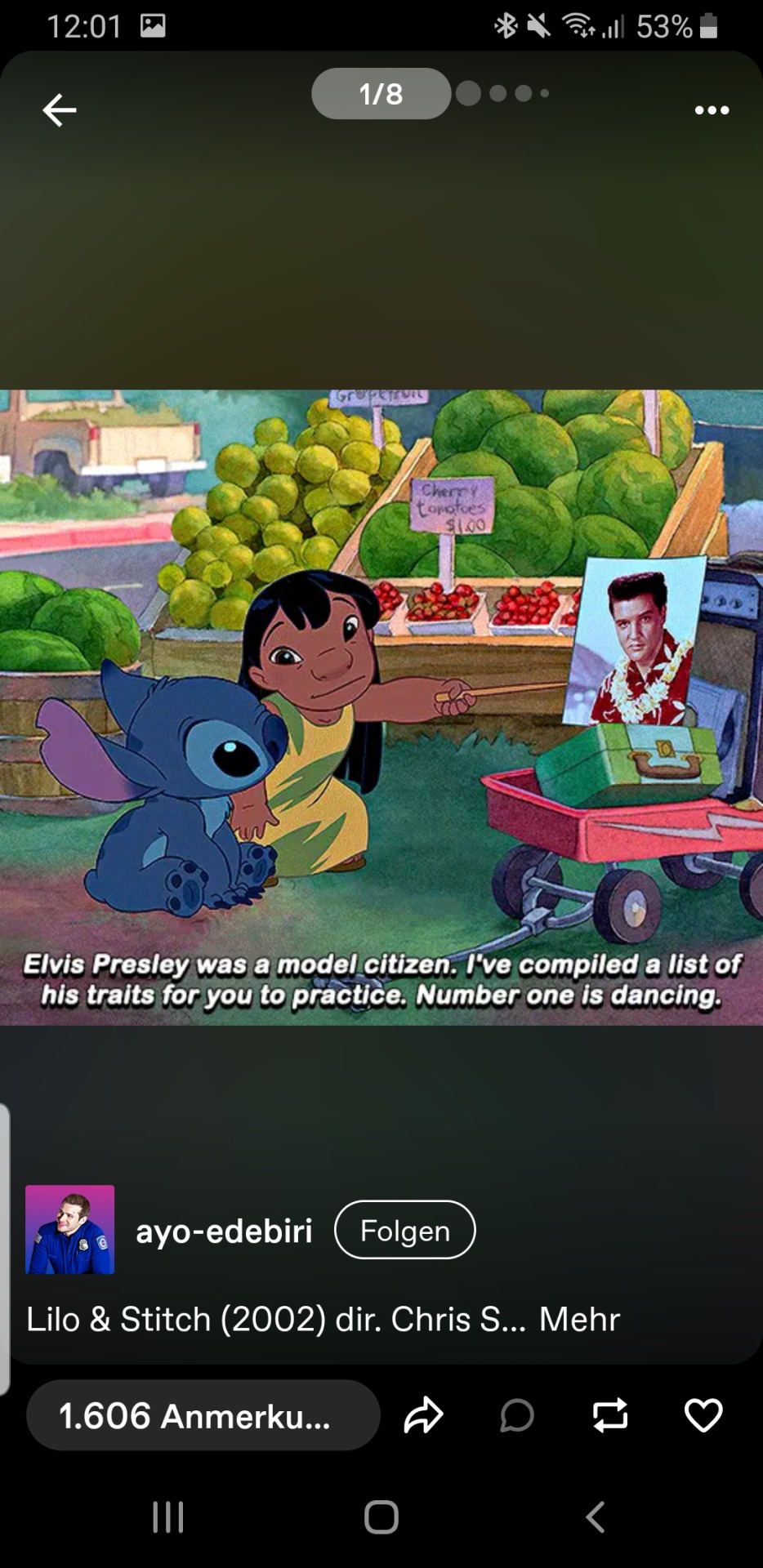
i wanted to add my 5 cents to the lilo and stitch au
inspired by @cicadaart
reference:
#i wanted to finish this in my business class on Thursday#but i got stuck with the code of my project#python is annyoing#programming survivor#hazbin hotel fanart#hazbin art#hazbin alastor#hazbin charlie#hazbin hotel#cursed cat alastor#my artwork#art#fanart#lilo and stitch au#lilo and stitch#this is not an art blog#i am just a design student who is bored#my design sketching prof would prolly kill me if he saw this#digital art#no lineweight or shadows to be seen#digital illustration#hazbin fanart#cat alastor#alastor the radio demon
30 notes
·
View notes