#new thumbnail fits means new art
Explore tagged Tumblr posts
Text


Pick your mog.
#critical role#imogen temult#bells hells#cr3#critical role fanart#laura bailey#critical role campaign 3#redraw#(kinda)#new thumbnail fits means new art
422 notes
·
View notes
Text
Scarlet Hollow UI Redesign Work In Progress
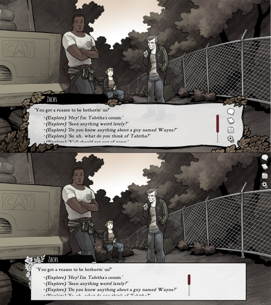
HELLO! As some of you may know we've been hard at work on a large overhaul patch for the first four episodes of Scarlet Hollow to bring the game closer to our ever-higher standards. While there are a lot of content changes and additions coming with the update, here's spoiler-free look at how the UI side of it is coming along. New UI on top, old UI on bottom. First, and most importantly is the updated textbox. We've been adding a lot of detail to small UI elements, and this is no exception — there are more leaves, and those leaves have some color in them now, which we feel makes the in-game art feel a lot richer. On the usability side, you'll notice that this new box is both taller, meaning that we can fit more options before you need to scroll, and that the scrollbar is located further to the right, meaning options can be longer before flowing onto the next line. (Again, meaning there will be less scrolling.) We've also moved the quick menu into the textbox so it no longer overlaps with any background art.
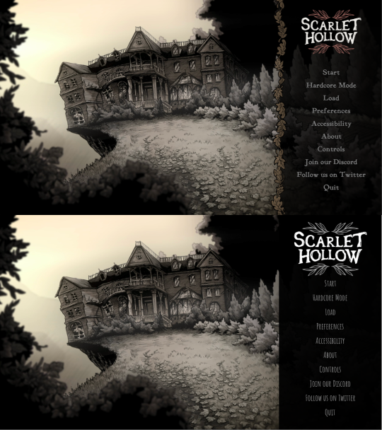
Next up, we've got the main menu. Not a ton to say here. Logo is smaller and has some color so it feels less stark. The font choice is tighter, and we added a border where the text options start to improve the feel of things. In general we're trying to make options that make the interface feel warmer, more organic, and less sterile.
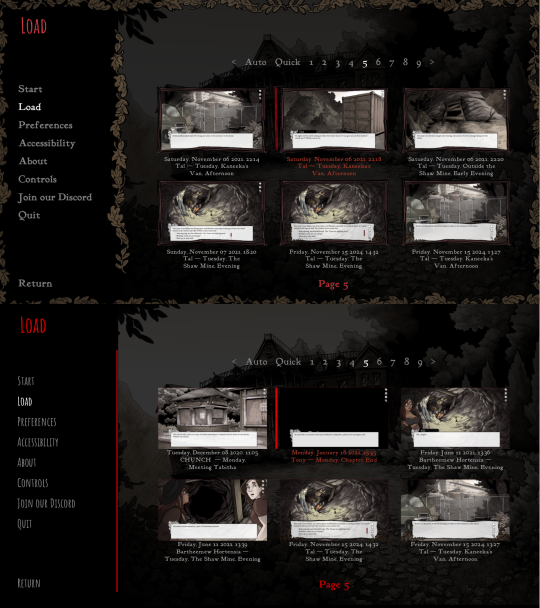
Next we've got the in-game menu. Again, framing things with organic shapes to provide better flow and separation. We've also added a wooden "frame" around each save game thumbnail give them a more natural feeling.
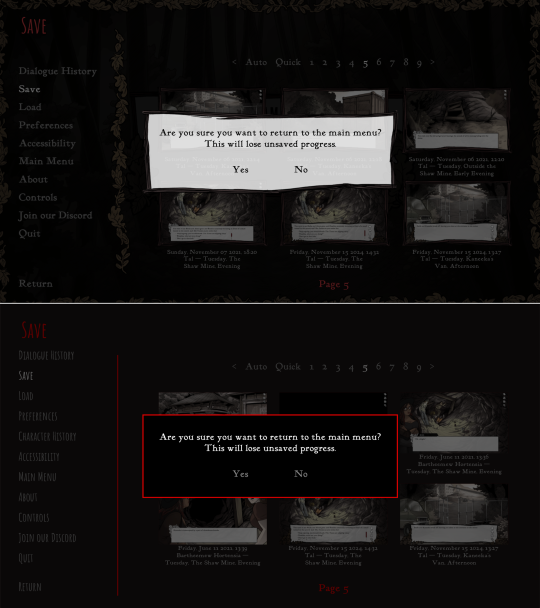
Similar notes for the new confirmation screen. We're probably going to increase the opacity a little bit. At the moment is a little too transparent.
The journal has new assets, and instead of a generic cross-hatched background, we add a semi-transparent black layer so you can still see the game world behind it.
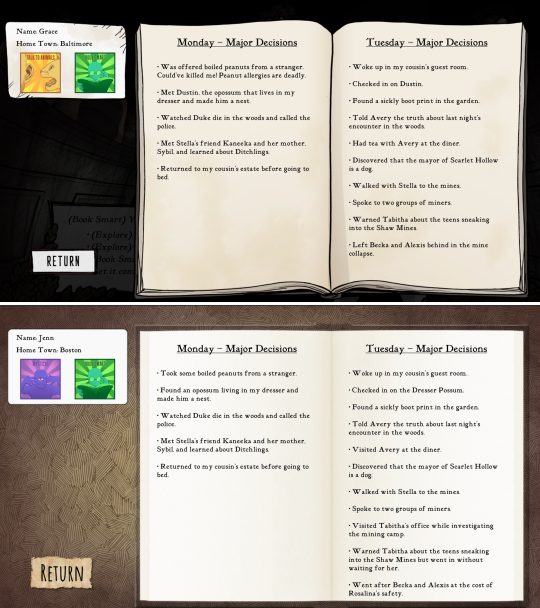
And speaking of generic cross-hatching, we've also removed it from character creation, instead replacing it with backgrounds from inside the game. Overall this should feel a lot more welcoming.
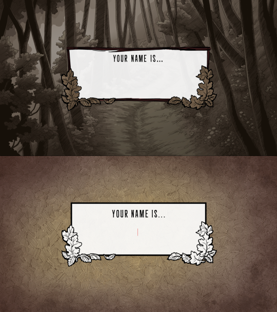
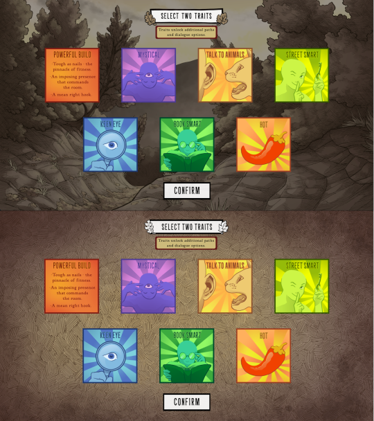
These backgrounds change with each new slide, too. Here's how trait selection works.
Anyways that's it for now! Happy new year :)
643 notes
·
View notes
Text
KYLE CROUSE: Alright, we got one last question. It’s from JediPony. [chuckles] Love that name, I don’t know why. It makes me laugh. [reading question] “How would you write an 06 adaptation in Sonic X?” Here’s the question, would you write the 06 adaptation in Sonic X the show, or Sonic X the comic?
youtube
IAN FLYNN: [laughs] KYLE: It’s very— two very different things. IAN:Very different things. I don’t know, if we’re gonna be true to the source material, then Elise doesn’t really have a role, and Chris is the one who has the Flames of Disaster sealed inside him. KYLE: [laughing] Oh no! Oh! IAN: “Chris, whatever you do, you can’t cry!” [as Chris, weepily] “But why?!” [Iblis roar] KYLE: It’s all he does! [laughs] No! IAN: Oh, man, now I’m imagining Mephiles with, like, that really bad early 2000s CG effect. All these awful filters flyin’ around. KYLE: Oh, God, no! [laughing] This would be awful. IAN: You’d have, like, the budget episodes where Soleanna and New City are just, like, these flat, grey urban textures that have like, no depth, but then you get to the final episode where they’re doing the Super fight against Solaris, and the animation bump goes through the roof, and it’s glorious. And you forgive the last 26 episodes of your life that you’ve wasted watching it so far. KYLE: Mhm. IAN: [choking the words out through high pitched, wheezing laughter] This means Chris is the one that kisses Sonic back to life! [fit of maniacal laughter] KYLE: [frantic, horrified laughter] No! No! No! No! Ian, no! Ian! No! IAN: [prolonged cackling laughter] KYLE: The worst timeline! Oh, no! IAN: Oh, and Eggman has to be as close as they can get him to photorealistic Eggman in the Sonic X style. KYLE: No! IAN: Which does not work at all! KYLE: No, no, no! No! This is not going on the thumbnail! No! IAN: [wheezing laugh] KYLE: No, do not put this on the thumbnail! [laughing] IAN: Oh, my goodness, just imagine the art errors for Silver’s head alone… KYLE: Oh… no… oh, no… at least Dan Green could still be the voice of Mephiles. IAN: Oh, yeah, that’d be fantastic. [microphone glitches] That’s the only reason to do this. KYLE: That would be— yeah. Oh… IAN: Oh, would they try to hand-animate Omega? Or would he be like, early 2000s CG? KYLE: Just crappy CG, no! IAN: That you just composite into each shot… oh, man, it’d be awful! KYLE: [pained sound not unlike he is receiving a fully conscious appendectomy] Oh! IAN: Wait! [microphone glitches again] They did the weird thing with Sonic and Shadow’s spines when they would turn their heads. What would Silver look like?! KYLE: [resigned groan] IAN: Would it just be like, one giant spine, depending on the angle? [bursts into laughter] KYLE: [groans as if he is dying] Ian… what are you doing… why are you— IAN: [microphone glitches again as if resisting] The Iblis monsters would have the terrible CG effects, too! KYLE: Why am— why am I the reasonable one!
IAN: [laughs] KYLE: Why am I the one who’s being… [gives up on finishing this sentence] IAN: Forget the comic, the comic can’t hold a candle to this idea! KYLE: Oh, no… IAN: [in awe] What a glorious trainwreck! KYLE: What’s even funnier is that your mic is trying to stop you. IAN: [cackles] KYLE: It’s not working. [laughs] So cursed! IAN: The whole thing would be so awful… KYLE: Yeah? IAN: But then there would be, like, this incredibly well-written and poignant subplot about Elise dealing with her emotional trauma, and how Soleanna as a country even works. And it’s like, maybe an episode, maybe two that really gets into it and fleshes out this world in a meaningful and robust manner. KYLE: [chuckles] Yeah. IAN: And that’s it. That’s like— that and Dan Green are the only redeeming things out of this season. KYLE: [sigh, reading chat] Ian, in the chat… IAN: Yeah. KYLE: In the Bumblekast Discord server, open it up. There’s a little piece of art there. Someone has, uh, sketched Silver. [chuckles] IAN: [seeing it, delighted, evil] Yes! KYLE: [laughing] IAN: Cursed Toucan Sam! KYLE: [cackles] Oh no! Why do you…? No! Awful! Toucan— IAN: [as Silver] “Just follow my nose, wherever it goes!” KYLE: [horrified, amused] Toucan Silver! No! [emits the world’s most drawn-out, pained cry of defeat] IAN: Psycho-beak-nesis! KYLE: [laughing] Bumblekast was a mistake! IAN: [laughs] It was, but at least we’re over with it for today. KYLE: [laughing] Oh… I guess so.[outro music fades in]
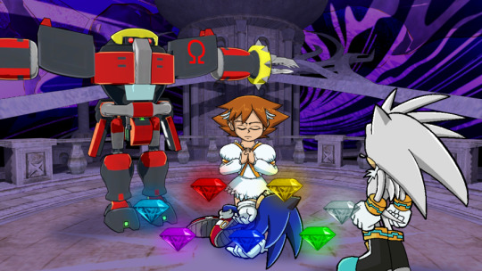
EPISODE THUMBNAIL by the incredible @nintendoni-art
—— TRANSCRIBER’S NOTE: Please remember that nothing that is said on BumbleKast is canon! It’s just some guys and their opinions occasionally spitballing ideas. If you don’t like an answer, you don’t have to take it as Word of God or anything like that. It’s all just for fun!
#bumblekast#ian flynn#kyle crouse#sonic the hedgehog#idw sonic#sonic x#sonic 06#princess elise#silver the hedgehog#soleanna#e 123 omega#eggman#writing questions#Youtube
134 notes
·
View notes
Text
You see, I’ve never actually posted here before. I only ever reblogged other people’s contact, to show my love for art and fandoms! But this… this just HAD to be put in tumblr. For anything to break my all repost blog streak, this deserves it. Every Undertale Yellow fan needs to see this absolute monstrosity. This has to be the single most unhinged thing that can ever be made forth Undertale Yellow, nothing can top this masterpiece of absurd proportions.
I was simply scrolling through my YouTube home page and found (blood and UTY spoilers ahead…)
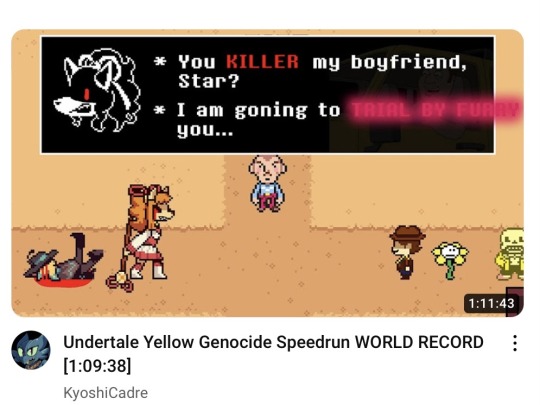
THIS!
Look at this, look at what I’m looking at! I need to know that I’m not the only one seeing this. LOOK AT IT!
We have Starlo bleeding out with his entire groin out for the world, legs defying gravity with no care for the boundaries of physics or biology! He shouldn’t even be bleeding out, monsters don’t bleed; and he was shot in the chest, not the head. What’s even funnier is the reason his legs are up like that is the sprite is suppose to be slouched against a wail, not lying down. Dude just turned him 90% and let his legs reach for the surface!
Then we have Ceroba with the classic edgy anime eyes, crying blood, with the craziest text. The grammar in her text box is insane; it’s KILLED honey, not KILLER. These two aren’t even dating, they never were in Undertale yellow, this women is RECENTLY WIDOWED FOR ASGORE’S SAKE! This fandom ships it like wildfire, and I am the one with the flamethrower, but this girl is very obviously NOT over her dead husband yet. This poor guy tried to make a pun with her genocide battle theme “trial by fury” by making it furry instead, but it doesn’t even fit in the text box! I’d normally be mad at such a massacre of my favorite girl and an amazing song, but it’s just way too funny to even think of being mad.
Shockingly Clover is mostly unchanged, just a smile added. I expected them to be covered in blood with a gun in their hand considering what’s going on in the left side of this cursed image, but no, the murders child is the most tame thing here. Meanwhile Flowey looks very concerned over a yellow sans just chilling to the side, who also looks just as concerned about all this. I can just hear the conversation between these two.
Then in the middle, for some reason, there’s just DUSTER from MOTHER 3! Why are you here, who are you, how did you get there?! I’d expect Flint or something for the cowboy vibes, but nope, just a random dude watching a furry go absolute apeshit on a child while a living Starfruit shows us a different meaning to “high noon.” And you wanna know what the kicker is, the punchline to all this, the cheery on top of this pesto bismol flavored cake is? This is a thumbnail for a speedrun.
A SPEEDRUN!
This needs to become a meme, I don’t know what or how, this is simply too over the top not to get memed to hell and back. Make sunning Starlo the new family guy death pose. I need Ceroba shouting at the top of her lungs “I AM GOING TO TRIAL BY FURRY YOU!” I need whoever this random guy from Mother Three sitting in a lawn chair with some popcorn and a soda watching this shit go down. I don’t care, this just HAS a to happen!
#cw: gore#undertale yellow#uty spoilers#uty clover#starlo uty#uty ceroba#sans undertale#staroba#I apologize perfusely#especially to the Staroba tag#i need to know this isn’t just a fever dream
82 notes
·
View notes
Note
Hii! First off i just want to I'm such a big fan of your art and animatics! Your art is just so expressive and unique its addicting to look at 💞💞
I was wondering if you could go over how your process or tutorial in making an animatic? Whenever I try to start to make one, I get jumbled up and end up ditching it lol
I'm sorry if you get this question a lot 😭
So sorry it took me so long to answer this- I was in a Busy time (diseaseridden with covid and being punched by finals) when I got the ask and wanted to answer it with some stuff Im using for my next TOH animatic!!
I'll say one thing first: I get jumbled up and ditch so many animatics. For every one animatic I release, there are three to five more I have that have NEVER seen the light of day (yet). And that's okay!! It's fun just to make them for me, and I hope it is for you too!! Animatics are scary because if you're working on it alone, it can be really hard to be your own cheerleader to keep up the mojo to keep going. So that makes it really special when there is that project that makes it to the finish line- cuz you can look at it and go "holy crap I made this. holy crap i MADE that look how SICK that is dude!! all that work and look at the turnout!!"
The following stuffh is just my personal process and is by no means representative of a professional animation pipeline, but this works for me as a Lonely Artist! It all begins with the idea - whether it's a song, or just a story you wanna tell. In the case of the one I'm gonna demo here with , I wanted to animate Hunter's first day as Del's apprentice!
The first thing I did was write a script. Not fancy or AO3-quality, but enough that I understand the pacing and the visuals of each shot. I usually just put this in a doc or put it in a script format, if I feel fancy.
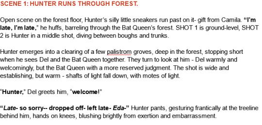
Then, I take that script and find music that I think would fit for it- and remix it (if needed) to fit the pacing/mood/etc! This is what this new animatic looked like before I began ANY artwork- this is a me thing because I'm super inspired by audio as opposed to visuals first. But you might be different- this is just how I like working personally!

Then begins the research! I find references for characters, background layouts, and create a style guide for the animatic that tells me how thick lines will be for characters, backgrounds, if there'll be tons of value or no. I make a turnaround for each character so I can refer to them because Im gonna be drawing them over and over a LOT and want to be consistent! Luckily TOH has no shortage of references, so I based my work off them.
THEN, I can begin drawing. I'm a little,,, (a lot) ADHD and may not always do this process, but if you're new to animatics or daunted by the task at hand, make beat boards of the entire project.
This is just a page of rough thumbnails that get your visual idea down - look how rough and quick these are!! I try not to spend over a minute on each beat board if I dont have to, unless it's a particularly complex shot.
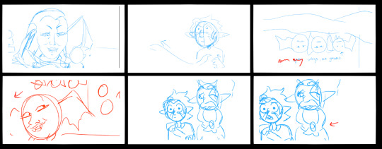
When it gets to the stage where you're ready to begin the actual scenes, I personally tend to do backgrounds first because I like to set characters into backgrounds - and for every animatic, I have the Awkward Blue Sketch Stage which is basically my beat boards timed out as an animatic.
I used Storyboard Pro for this (Toonboom, not free ): icky), but the process can be replicated across most art platforms in whichever way you feel most comfy with! This is so I can time the drawings before I devote time cleaning them up-- which can make for some Pretty Funny looking little guys but theyre important!! trust!!
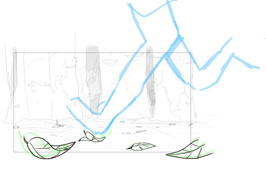
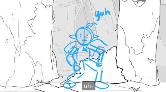
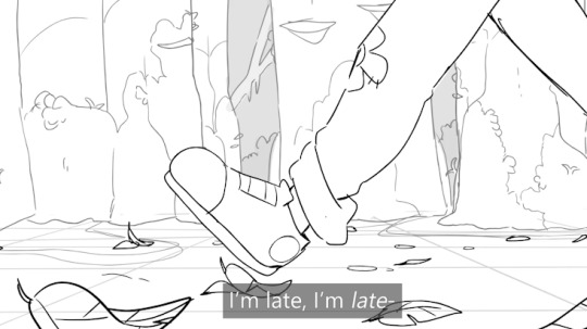
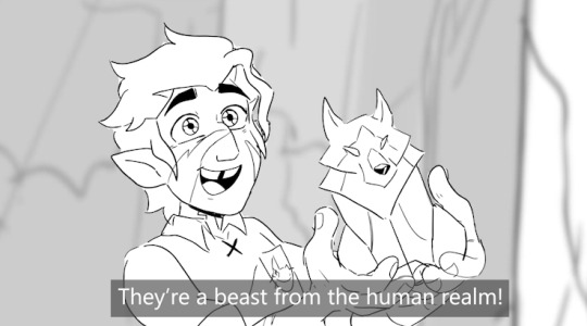
Once a big sequence of shots is cleaned up (I usually do 40-60 second chunks at a time), I export the .mov and send it to my editing program (which in this case is still Premiere Pro) - and then repeat this process again and again until.. it's done??
Here's like a TL;DR list of basically everything I said summed up:
• Make a loose script or bulletin of the idea! Do your research!
• Depending on what kind of animatic you're making, time it to music!
• Make a beat board of very loose gestures for your shots, and time them - then move on to refinement & cleanup!
• Combine all shots, refine music cues and timings, add any last needed VFX, and export!
There's no secret recipe or anything, it's just learning a pipeline that best suits you, whether it is for something professional or something you want to make for fun because you just love to make!!
#riley talks#long post#SORRY ITS LONG but i couldnt just put a bulletin list like “this is the ONLY method that works” bc thats not true!!!#everyone works diferently especially artists#and this is just my specific method of working#im very fortunate to have programs that make animatic-making a little easier#so i hope whoever wishes to make one in the future finds something that works well for them!! i have a blast making storyboards/animatics!!#text post#ask#tutorial#idk how to tag this lol
340 notes
·
View notes
Text

TLG: As You Move Forward
So I went a few months thinking about how I'd forgotten to include Makini to my past depictions of Kion's Guard as adults (1, 2), so I decided to celebrate the 4th anniversary (albeit 2 days late :p) of the Journey of Memories episode by finally showing off the adult design I have for her!
Because I'm still salty about TLG's last-minute decision in making Makini the Mjuzi of the Night Pride instead of Kiara's bestie like Season 2 hyped her up to be, I made a compromise by headcanoning that she frequently journeys back-and-forth between the Pridelands and the Tree of Life, especially when she's called over by each land for a ceremony of some kind.
Design Process:
To avoid making her look too much like a clone of her mother Fikiri, I figured that Makini would develop her dad Kitendo's features as she grew older (I think she's about 20-something in this image). It's kind of a thing for TLG to erroneously depict animals without their distinct sexual dimorphism (see: Mbuni the ostrich), but this time, I felt like embracing Makini's unusual bright colors for a female mandrill and make her look a little androgynous. I feel like it would fit her role as a Mjuzi for some reason lol
I figured the Bakora Staff she received at the Tree of Life would be her last new one as she's since learned to keep better track of it. I like to think that it symbolizes not only growth and learning, but it coming from the Tree of Life symbolizing that her true place is there.
In all that time she's owned it, being the crafty artist she is, she's put years of customization and souvenirs from her back-and-forth Pridelands/Tree of Life adventures into her decorating her staff, selecting just about every pretty flower and naturally-occurring bead she saw. I mainly sought out the idea of people bedazzling their canes for reference, she seems like the type to do that, making just about anything she owns pretty lol
Drawing Process:
ngl I got to work on this very much like that episode where Makini procrastinated on getting started on her portrait of Simba's family. I just, like... really struggled with the composition until I was hit with sudden inspiration to just go wherever my hand took me.
I grabbed a thumbnail sketch of my adult Makini design that I was the most happy with and rendered it digitally and was happy that it got me somewhere... then I ran into the background that I didn't put any thought into.
Because of the cropping and composition I already had going on with Makini's standalone model, it was very hard to come up with something she could be surrounded by, until I decided to insert some headcanons about a certain new TLG-related short Disney released. Basically: I headcanon Makini made those Circle of Life paintings that Kion shows to those younger cubs as I think the style they used in those paintings looks WAY different from Rafiki's (I mean the whole video looks different from the whole TLK art style). You can't tell me those purple pigments and cutesy flowers aren't something Makini would draw everywhere lol
Sources of Inspiration:
Sadly not pictured due to the angle and cropping is the headcanon that she paints her nails all the time, and she's always trying different color combos basically every week lol. I adopted that headcanon from iceflowerglow, who depicts Makini with painted nails in their comic "Shining Above Your Head". Other artists I drew inspiration from were Vtoony's "TLG: Kion's Guard" and tango_fizz.le's "Where'd all the time go?" when it came to designing her fully-developed mane.
72 notes
·
View notes
Text
dissecting catnaps design
i wrote this post after the trailer came out and before the release of chapter 3, so thats why the wording in this is a bit weird in some places
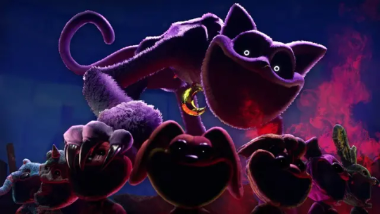

catnap is not bipedal, but quadrupedal. i figured he was after the first trailer when we saw his silhouette, but its nice to have confirmation I think the reason he is on all 4s instead of 2 legs like most experiments we've seen so far is his design. in his experiment file, found within the chapter 3 arg [and accessible via the wiki], its stated his body can contort to a third of its normal size. Catnap is huge, and it makes sense he has to crawl around on all 4s, hes likely too big to fit anywhere were he to rise up onto 2 legs. his head is level with the top of the door frame, he is massive
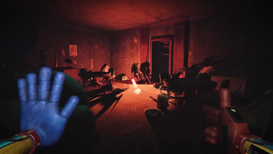

the bones in his limbs are also twisted and strange, having too many bends, almost like he has extra elbows and knees. as stated in the experiment reports about him, its probably so that he can more easily squish himself down. having those extra joints helps him be more nimble
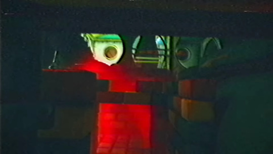
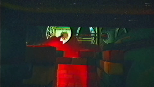
On the topic of bones, catnap is practically skeletal. In this particular frame we get to see him from the side, and you can see his spine very clearly. it also looks like he has a pretty long neck but its hard to tell because this is the only side shot we have of him.


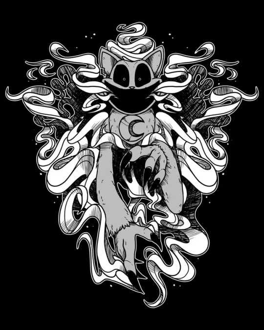

catnap also has a chip in his ear. this has been known since the plush release, where the catnap pin features a chip in his ear. Its harder to see in his actual model, but in this art of him on the official shop makes it more clear.


the models in these 2 pictures look slightly different. the one in the original trailer, apparently, lacked any fur. the lighting also makes it look more desaturated. the feet in the new one are the same as the original, hairless and almost reptilian. definitely not paws. its also said in his experiment report his claws are retractable. in the thumbnail image you can kind of see his zipper, closer to his pelvis, which means catnap has a zipper just like his toy form. he also has his extremely long tail, which has been present since his first appearance.
50 notes
·
View notes
Text
I figured I should show some quick comm/intro presentation cards, now that the bluebird app is having issues.
I meant to upload this yesterday, but for some reason Tumblr didn't let me.
Please share and reblog around as that helps me far more than just a like. If you're so kind, please recommend me to people.

Sketch style is best suited for silly doodles, quick character studies, comic pages or even character design, which I've done plenty.
This style is quick and dirty, meant to be done rather fast, loose and experimental.
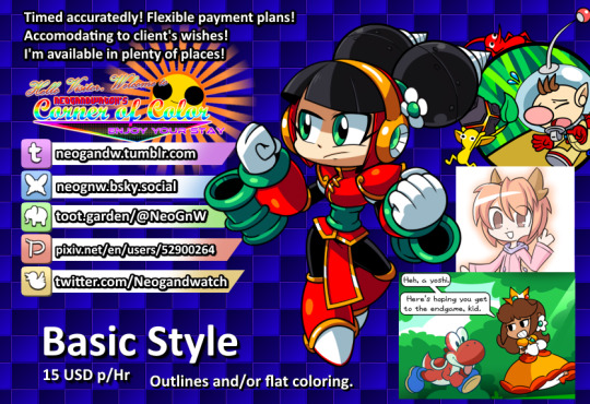
Basic style ranges from outlining to flat coloring and shading, basically a step above sketch in quality, best suited for quick renders or when you're making an asset that does at least need a bit of color.

All-Out means I do everything in my power to make the piece stand out, best suited for major graphical assets (such as stream layouts, live2D pieces, profile pictures and emoticons) or full on posters, thumbnails or character renders.
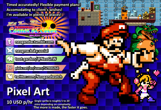
A brand new style I've been practicing a lot lately, the pixel art tier includes tilesets, single sprites, animations or even whole sprite sheets (as I've done multiple Make a Good MegaMan Level costumes, if you want a reference there).
Making a sprite sheet can be time consuming, but the more is done, the easier and faster it is to put together as it gives me chance to iterate on previous sprites to make new ones.
On the subject of time: all work is timed with software and screenshotted as evidence of work is provided, the final price is decided upon a rounding of how many hours it takes to make the piece multiplied by the tier cost.
Ex: 1 hour to make an All Out Emote, would be 20, 30 minutes would be 10, 1 hour and 30 minutes would be 25.
On the subject of flexible payments: not all of it has to be paid on a single go, if the price is too high, a payment plan can be discussed and adjusted to the needs of the client. Once its paid in full, the piece is provided, if its multiple pieces in one go, the pieces are provided as they are paid.
Other notes:
- The initial pitch sketch is not timed, its on me until the idea is decided upon, at which point the timer begins.
- Error and corrections are also not timed, I'll do the fix ups without adding to the timer.
- Evidence of work will be provided periodically.
- The usual restrictions apply: no political, overtly violent or erotic content will be drawn.
- I'm down for drawing whatever otherwise (stream assets, personal drawings, attempting specific art styles, etc.) but I reserve the right to refuse a work for whatever reason I deem fit (for instance: modifying someone else's work without permission).
- Number of characters, backgrounds or size does not affect pricing, only the time it takes to make them.
- I'll strive to be as transparent and ethical as possible with the process. So bear with me there.
#commission open#independent artist#open commissions#commissions#pixel art#sprite art#art commissions
11 notes
·
View notes
Text
Subnautica headcanon designs part 1. I might make another one with Jochi, Hollister and a couple others. I’m not entirely happy with it but I’m not getting it to look any better so might aswell post it!
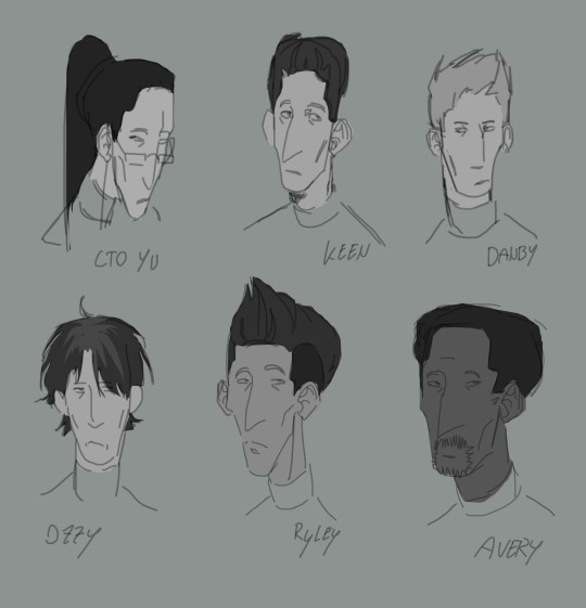
Second image was the thumbnail, as you can see, I didn’t capture a lot of likenesses and also decided to scrap doing ryley, but the shading was kinda fun so I guess there’s that. Seems like this page is going to become a dedicated subnautica brainrot page now, I think my OC stuff should stay on insta.
I’m not very happy with how the proportions turned out, I’m sorry lol. But I guess it’s some progress from the usual. I originally wanted to give danby black hair too but I realised that that’s just kinda what I default to and there are already so many characters with dark hair so I changed it to a blonde tone. I also tried to create more variety in face shapes but I’m still relatively new to that so I’m sorry if everybody looks kinda same-y or proportionally off.
Danby and Avery were done on the first day, then I drew Ozzy, then drew Yu on another day with much demotivating wich is why she kinda looks different to the others, then drew Keen and overhauled Yu again.
The artstyle was inspired by the Subnautica character concept art of Ryley!
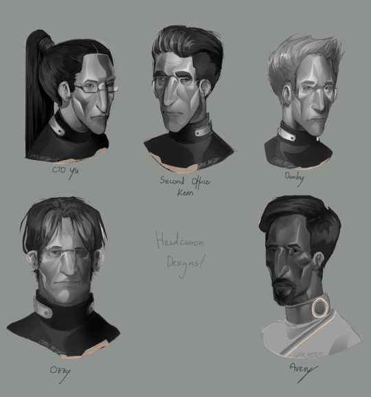
(Headcanon time)
To be honest, I’d imagine most of them know each other (except for Avery ofcourse), I’d like to believe that Danby doesn’t usually talk to people unless it’s for his job, but is still generally known and liked by the others, he finds his job boring but believes it’d be stupid to stop after studying for so many years.
I think they’d all be around 25-60 in age, with danby maybe being the youngest with about 28-31 years of age, matching with ryley who I’d imagine is around the same age.
I think Yu would be very goal oriented, but also trying to find solutions with wich everyone involved would be happy, wich mean that she’d know a bit about everyone, wich is why she feels so attached to the crew and wanted to disobey orders to try and save them after the crash.
I think Keen would really thrive in his job, similar to Yu, but be a lot more reliant on orders, somebody who likes to follow them more than to give them. He puts much trust into his captain and any other sort of authority figure above him, whilst feeling maybe a little too responsible for those under his command.
I believe Ozzy would be a very talkative person, like Yu he knows everybody a little, and everybody knows him. Except for ryley, who at this point has become kind of an outsider for just how much he tries to fit in with everyone else. Most people feel indifferent towards him.
I don’t think avery would be fond of being the captain of a ship, I don’t think he’d mind that much but I think a lot of the legal stuff he has to handle because of it would probably be really frustrating in the long run. He enjoys to talk to people though, and tries to help people in need if alterra doesn’t prevent him from doing so.
#subnautica#subnautica art#subnautica fanart#video game fanart#subnautica aurora#subnautica au#headcanon#fan design#CTO Yu#Second Officer Keen#Danby subnautica#Ozzy from the cafeteria#Avery Quinn subnautica
18 notes
·
View notes
Text

Day 28 - monster !!! i had this one all prepped 😈 and i RUSHED finishing it so i could work on that piece for the 23rd lmao so it's just gradient shaded. anyway i actually had a fantasy au of these two fuckers from a while back bc i get a feral urge when i think about mers and i was thinking about mers. and so i was like "what if i made john a mer" and then i realized. that would fix him. that would like take away most of his pain and strife. bc you can't smoke underwater. this eventually spiraled into me making him a siren and i honestly i had no other choice but to make colin a vampire do you know how many toxic love songs there are that use "vampire" as a metaphor? at least 2. and he is the vampire in both fr <3
(prompt list) RANTINGS BELOW beware of. worldbuilding lmao
originally gave john the wrong skin tone (and by that i mean blue. like his underwater skin tone is blue) 💀 so the colors of blush and eyebags and clothes might be a bit off but. oh well
anyway.

sirens are considered a subspecies of mers. i suppose. a slight genetic mutation, perhaps. also ignore the crotch part on the land form bit btw. i needed more differences LMAO i think it's mostly meant for a circumcision joke or something continuing on, it's primarily a visual allegory for autism. the feeding off of love part was mostly for john specifically though, to give him more parallels to Colin and for the relationship to be more in line with the uh "original" canon. original in quotes but ig that also fits for the actual original canon?? anyway. when touched with water, the land forms of both sirens and mers will start to change color in just that spot. hence his arm in the piece. also mers just eat fish. for simplicity.
when exiting the water, mers/sirens will typically wind up on the beach naked. so they have little lost and found shops on the shore to give them clothes and shit !! yippee. that's where john got his hoodie in this lore. btw.
some other things: this takes place in california instead of new york bc it was originally going to take place in california. not much difference, in all honesty. lot more temperate. john is a very willing food source to the point of having to get blood transfusions (the yaoi remains toxic). but at least colin feeds him back colin claims he's an elf quite frequently (his fangs aren't always out). which is a bit like saying you're old money. which he very much is NOT. he is still british though here's a doodle sheet i did while thumbnailing (most are thumbnails):

i have an unfinished rough draft of this version of the story and honestly history repeats itself bc i forgot i made the "nicknamed vamp bc he's bi" joke in it. i just thought of it a second time. oh another fun fact: vampires only need to eat like twice a month on average in this story. colin just eats him for fun most of the time. it's how he shows love <3 funnily enough i actually think their relationship is healthier in this au. they communicate like so much fucking more and john isn't AS possessive. i mean colin is actively killing him and john's letting it happen, but colin is also taking him to the hospital when he gets anemic. Even more fun fact!: colin's wearing his 60's au outfit. bc it has a poets shirt and that's more vampire than a button up. the uh chain being drawn/used correctly is just for this au though.
for an unknown reason john still uses ASL in this AU. i forgot why. but it's probably the stutter (though he didn't have one in that point of creation i don't think??? did i give him a stutter twice?? also it should've been mer sign language... bc he lived underwater. i just feel like they'd have another version due to that). he has a stutter btw have i ever said that? i decided it fairly recently. this month or any preceding month through july. uhm. here's some older art of them i might've posted here before:

#bweirdOCtober#bweirdOCtober2024#oc tober#digital art#original characters#siren#vampire#sometimes i think about adding content warnings for shit but no one would have fucking. “guy getting eaten by vampire” blocked#partially bc we're on the “guy getting eaten by vampire” site
5 notes
·
View notes
Text
Shimeji Simulation Manga Review- A Strange and Sentimental Story.
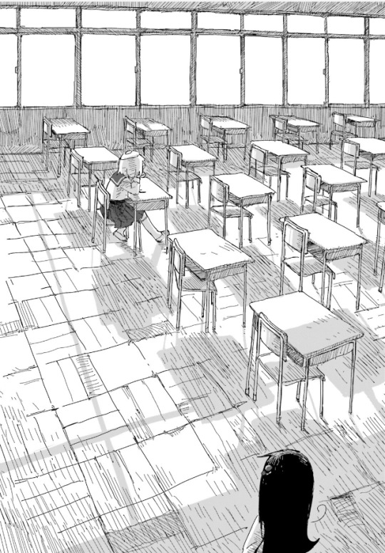
This is a hard manga to talk about. Not because it's bad or anything, in fact I think it's fantastic. It's just hard to describe what it's about and put my opinions on it into words. And I actually think this hard to describe feeling perfectly mirrors the tone and subject matter of the manga. There will be direct spoilers for the story.
I first got into Shimeji Simulation after I watched and subsequently read Girls Last Tour (GLT). I absolutely love GLT, so I had to give Tsukumizu's other work a shot. By the way, to my knowledge Tsukumizu's gender identity is not confirmed by them so I will be referring to Tsukumizu as they.
The style and overall tone/vibe of Girls Last Tour carries over into Shimeji Simulation. Both stories focus on two young girls trying to find themselves in the world.
Tsukumizu's art style has not changed since her work on Girls Last Tour. I love this style. The faces of the characters are very simplistic but super cute. There is a lot of portrayal of buildings and structures, with them being incredibly detailed. I love this contrast. There is also a great sense of scale. Characters can go from looking small to large based on how they’re drawn. The style also has the look of rougher sketches. Like you can see in the thumbnail, lines are uneven, not always fully connected, etc. Hard to explain but I really like it. I think it fits the subject matter and something about it just looks very nice.
Shimeji Simulation is a true slice of life. The main focus is the girls just living their lives, with the world they are in being a very strange one. It's got a laid back but weird atmosphere. Things can be nonsensical at times, then very normal and casual. There's a lot of philosophy and poeticism. Topics can include the meaning of life, what people mean to each other, humanity, what objects can mean. One scene I really like that touches on this tone is the scene where Shijima and Majime talk about plushies. This also serves as an example of the manga simply being very cute.
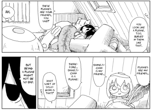
They simply talk about plushies, like why Majime likes them and what nicknames she has for them. But you get this feeling that there is something deeper you can take out of this, even if you can’t quite put your finger on it. Shimeji Simulation’s writing strongly encourages people to think more deeply about normal things. To consider the meaning of objects and concepts. Shimeji Simulation is adept at making you think about and contextualize the world around you. And this theme is expressed and reflected directly through the story.
When it comes to the story it’s also hard to describe. It starts out with Shijima exiting her closet and getting to know people and the world. Some time passes and they meet someone who's kinda like a god. Then Shijima’s scientist sister alters the fabric of reality, making it so everyone’s imaginations directly change the world. What truly makes this story special is that this is not something that is a horrible issue that the story makes clear needs to be fixed. The characters have to live with this. You see the characters adjust to the new way the world works. Some people like it and some people don’t. And the world does not immediately descend into chaos or anything like that. The people change and keep living. Even in a world where reality can change with a thought, life ends up being pretty simple. There is something so special and grounded about this. I think this story is a beautiful representation of the mundanity and simplicity that makes up much of the human experience. While also bringing up how complicated our feelings and places in the universe are.
Later on, reality basically falls apart, melding into this strange amalgamation of everyone and everything. You truly don’t really know what’s going on, as do the characters. The girls get separated, stuck in their own mindscapes. You see how their worlds are very different. But what they both want is to see each other again. They do end up finding each other. But reality does not get fixed. Their wish and what all of this meant is not clearly defined. In the end, all that really matters is that Shijima and Majime end up back together. And what you make of that and everything that led them to that point is up to you.
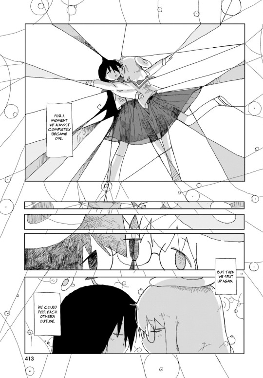
There are a lot of takeaways you can have, particularly about what life means. I think life in this story can simply refer to being with the people you love. Life can dramatically change and throw things at you that make you uncertain and afraid, but you can push through it by sticking to what is important to you. Shijima and Majime’s love for each other allowed them to find each other amidst a chaotic world and be able to find happiness. As said before. I believe the manga encourages you to reconsider how you view yourself and other people. Everyone sees things from different perspectives and has unique ideas. We see this in the reality controlled by imagination, where everyone has different living spaces, objects, even bodies. And people generally seemed happy. Shijima is able to find Majime by exploring many different places in their world that are dictated by different people. By gaining new experiences and world views, she is able to recontextualize her own. Which enables her to realize her own feelings and get in the space that Majime is in.
I feel this is one of those stories where you can really feel the author's feelings and personality in the work. And despite that, it doesn’t feel like it’s trying to convince you of any particular worldview. Rather it encourages you to look inward and come to your own conclusions. I would love to hear how any of you have taken from this story.
To conclude, I really like this manga and highly recommend it to anyone who wants a bizarre story that encourages deeper thinking while also making you smile with wholesome antics. It truly is a unique read, there is nothing else quite like it. I really hope you check it out if you haven’t. I don’t think this is a story that gets ruined by spoilers. It seems like Tsukumizu has another project in the works, so let’s look forward to that together (I hope the next one continues the trend of the previous protagonists showing up in noncritical ways. I want to see our potatoes, mushroom and egg again). Thank you for reading!
9 notes
·
View notes
Text
The Complete Guide to Selecting a YouTube Channel Name
Starting a YouTube channel is an exciting avenue, isn't it? However, before creating and uploading content, you need to make one important decision- choosing channel names for your YouTube. Your name is more than just a label; it is a vital part of your brand and can significantly impact your channel's success.
The right name will help your channel stand out, make a strong first impression, and attract your desired audience. But how do you go about choosing the perfect YouTube channel name? Let's walk through the steps to choosing channel names that are relevant to your content.
Choosing Channel Names for Your YouTube? Here's Why You Should

A well-thought-out name serves several key purposes:
Creates a First Impression: What do you think is the first thing your viewers will notice about your YouTube channel? Is it the videos, the thumbnail, or the face of the channel? It is neither of these things; it is your name, which is often the first thing viewers see when they discover your channel. A catchy and exciting name can grab their attention and make them want to click on your videos.
Helps with Branding: Brands are built on catchy names. And your name is an essential part of your brand. It reflects who you are and what your channel is about. A good name helps you create a strong, memorable identity.
Makes You Easy to Find: Your name affects how easily people can find you. A unique name or one with relevant keywords can improve your channel's visibility and ranking in search results.
Sparks Curiosity: A great name makes people curious about your content. It should hint at what your channel is about while intriguing enough to interest viewers.
Choosing Channel Names for Your YouTube- A Complete Guide
Step 1: What Is Your Niche? And Do You Know Your Audience?
The first step in choosing channel names for your YouTube is to have a clear understanding of your niche. The name should give potential viewers an idea of what your channel is about. To successfully pass this step, you must first think about the type of content you will create and who your target audience is.
Understand Your Niche: What type of content are you creating? Is it beauty, comedy, art, gaming, fitness, cooking, travel, or something else? The name should reflect the specific focus of your channel.
Know Your Target Audience: Are you making content for teens, adults, parents, professionals, or a more general audience? Your name should appeal to the group you want to reach.
Step 2: Keep It Simple So It Is Easy to Remember
Keep it simple, silly! We mean your YouTube channel. The name should be simple, easy to pronounce, and memorable. You do not want to make it too complicated or long, as it could be hard for people to remember or type in the search bar. Here are some things to keep in mind:
Short and Effective: Try to keep your name under 15 characters. Shorter names are easier to recall.
Easy to spell: Avoid using complicated words or unusual spellings that might confuse people.
Catchy: The name should stick in people's minds. A catchy name is one that people can easily remember and share with others.
Step 3: Make It Unique and Stand Out
While simplicity is important, your channel name should also be unique and help you stand out in your niche. There are millions of YouTube channels, so your name must be distinct and not easily confused with others.
Here are some ways to make your name unique:
Wordplay: Using puns, rhymes, or clever twists on common phrases can make your name more fun and memorable. For example, if you are creating a cooking channel, you might consider something like "TasteBuds" or "CookCraft."
Combine words: Try combining two relevant words to form something new. For example, "GameMaster" or "FitFusion."
Personalize it: If your content is focused on you as a creator, consider using your name or nickname. "Maya's Moments" or "Steve's Stories" can give your channel a personal touch.
Step 4: Include Relevant Keywords (If Possible)
Including keywords in your YouTube channel name can help improve its searchability. If you include words that reflect your niche or the type of content you create, people who search for that topic will be more likely to find your channel. For example:
For a fitness channel, words like "fit," "health," "workout," or "strength" could be useful.
For a travel channel, consider using words like "journey," "explorer," or "adventure."
For a beauty channel, words like "makeup," "glam," or "beauty" might work well.
Just be careful not to stuff your name with too many keywords. While including relevant terms can help, your name should still sound natural and not forced.
Step 5: Think About Long-Term Growth
When choosing your YouTube channel name, it is essential to think about where your channel might go in the future. While you might have a specific focus now, you may decide to expand or change your content down the line. Choose a name that will still work if your channel grows and evolves.
For instance, if you start a beauty channel called "LipstickLover" but later want to expand into skincare or hair care, the name might feel limiting. A more general name like "Beauty By [Your Name]" would allow you to grow without feeling restricted.
Step 6: Check the Name Availability Across Other Social Media Platforms
Once you have a few name ideas, checking whether the name is available on YouTube and other platforms is important. Consistent branding across all platforms (YouTube, Instagram, Twitter, etc.) helps strengthen your online presence and makes it easier for people to find you.
Here's how you can check availability:
Search YouTube: Type your name idea into the YouTube search bar to see if it is already in use.
Social media availability: Check Instagram, Twitter, Facebook, and other platforms to see if the name is taken.
Domain name: Planning to create a website in the future? Check for the domain name availability. A consistent name across your website and social media is ideal.
Extra Tips When You Get Started

Do not rush while choosing channel names for your YouTube.
Test the potential names with your audience, friends, family, mentor, or whoever you think can be helpful.
Ensure your YouTube channel name is positive and appropriate without any offensive or controversial names. This will help build a friendly, welcoming community.
Conclusion
Choosing channel names for your YouTube is vital to building your brand. It sets the tone for your channel, helps people find you, and makes a lasting impression.
Follow the above guide and the little tips, and let your YouTube channel wave as it stands out in a crowded platform!
0 notes
Text
Hobbies Through The Hobby.
In the modern times of the hobby there are different venues in which to share your hobby passion. I find those outlet as new hobbies in themselves.
As you can tell from reading this writing about the my hobby thoughts is one of the hobbies that spurred from collecting. I don't write much about the cards, but more about the experience I have with them.
By no means would I say I am a good writer but I like trying to gather my thoughts, quickly proofread and see how well I articulated my thoughts. If I was a better writer and faster typist, I would script my other hobby which is making videos to upload on YouTube.
This started out pretty simple, grab your phone prop up the camera and hit record and show the cards you wanted other collectors & friends to see.
Now part of the fun is the extra creativity, used to add to the videos.
For the most part all of thumbnails were create from scratch, along with logos, intro's, and outro's. In the attempt to offer the viewer a bit more substance for their time spent watching the video.
Many of the content creators are full of stories, about their fandom, card history, or player history to aid in the understanding of why they chose the card being shown. On occasion I would probably have videos like that but most of them are Guys look what I have type of videos.
But it is all in fun, which makes it a hobby in itself.
Another hobby that came via the hobby was storage building. I take a few items over the course of organizing my collection and modify them for my collection storage needs.
Once I turned a dresser into a large storage area for my cards. I make these holder that fit into the drawers with a bracket to extend the top storage shelf out and up.
So imagine a 5000 count storage box stack on top of each other and the one on top can be maneuvered to see the cards in the box underneath.
It was pretty cool until the drawers started breaking from the weight of the cards.
Hey , I said it was a hobby, I am not a pro builder.
But I continue to great different little things to store the boxes of cards in and that creativity is growing and becoming better as each new project comes to an end.
So collecting baseball cards do inspire other hobbies, many of which make craft and revise cards for the art of it.
What does your hobby inspire you to do that is another hobby? Maybe it is vice versa, maybe your hobby led you to the cards.
0 notes
Text
Game Pile: Lunark
Lunark Gushing
Watch this video on YouTube
And there’s a thumbnail after the fold, and the script outline afterwards.
Lunark is a 2023 step-platformer from Canari Studios, a Montreal-based indie game company, Wayforward games, an America-based indie game publisher, and me! Well, not me directly, but I, and two thousand eight hundred and twenty three other people all pledged some money, around $28 a head, back in 2019. It raised $81,655 on the back of a promise of a pixel-art step puzzle platformer, with rotoscoped cutscenes, and that’s exactly what I got, exactly what it is.
Well, short script, guess I can knock off early.
Lunark’s excellent. I did back it on kickstarter, entirely based on the trailer, and because it reminded me of Flashback. I loved that game, and loved all the first third of it I ever played, and the weeks of time I spent playing that part of the game.
Flashback was a great game for its time and I don’t just mean that because videogames hadn’t invented machine guns yet. It was great because the whole game fit on a 3.5 inch floppy so if you saw it at a mate’s place you could zip it up and take your own copy home and maybe photocopy some copy protection (I think) or their copy was cracked (probably). In that time, a single floppy was a great size for a game. You weren’t logging onto the internet to download new games all the time, you were having these rare meetings of going around to a friend’s house or seeing someone you didn’t often see to broaden your network of available software, and in that space, Flashback was great.
Flashback was a game that unfolded. Setting aside the core mystery you were dropped into tabula rasa, it was a game whose mechanical system felt like it was immediately available, just there under your fingertips as you played it, but which you had to learn how to coax out with the right positions, the right timing, the right combinations of buttons. Learning how to play it meant getting to know how it worked through the plot itself, which, and I know I’m not alone in this, often meant restarting the whole game to see an early cutscene again because you didn’t see what it told you to do next because you pressed a button and accidentally skipped the cutscene wholly.
Flashback was a time abyss of a game with a big beating mystery at its heart compelling you to finish it and I never did and nobody I know ever did but we all agreed that it played really well and we liked it. It was cool and it looked amazing and we definitely liked it. Do you know how it ends? Nope. Nobody did. Why’d you stop? uh, there was that bit.
You can go and play the original Flashback in a number of places, including a gog remake that… may be fine, I don’t know, and honestly don’t really care. The stylisation filter they put on it looks like my attempting to hide photoshopped-out tattoos on pictures by making the whole image’s skin texture rubbery and shiny. That’s not even touching on the 3d remake which is, uhm, well, I was told if I can’t say anything nice and the company that made it is probably out of business now anyway, since the only other game they made was Amy.
[maybe a clip from the folding ideas speedrun of amy]
The thing with going back and playing these old DOS games is that you need some heavy nostalgia to stick with them or a deep and abiding interest in getting to the end for some other reason, like a self-assigned dedication to trying to play games every week to get through a sort of ‘game pile’ as it were. Most of them work fine, but also, they’re not very good at encouraging you to play them, some of them are really repetitive, their narratives and conclusions aren’t really very interesting, the logic can be positively absurd at times, but also, very importantly, most of them have awkward interfaces. Not bad, not a huge problem, but there’s a lot of game interface language that you marinate in right now that is kind of universalised by the right things succeeding and most people adopting them.
WASD movement, which is the standard for first person shooters, was not the default in DOOM. Nor was it the default in Quake, where you were expected to toggle strafing with the alt key. Sierra, one of the companies most renowned for point-and-click games of the generation, made point and click games for less than half their life, and even then, the model people assume is standard only lasted for about five years.
When you go back to play these old DOS-era games, you were very likely to find an interface designed by someone with some very specific ideas of what was natural and intuitive and often you couldn’t customise them at all. Some designers thought the most natural way to move left and right was with the O and P keys, and jump and duck with the Q and A keys.
I bring this up to you to underscore that Lunark, as a game, owes a lot of how it looks to this particular period of rotoscoped pixel art that we mostly tie to Flashback and Prince of Persia, but what it owes about how it plays and the story it tells is not about how Flashback plays, but rather, how I remember Flashback feeling.
I mean, okay, yes, you could just simplify that into ‘Flashback but it plays really well,’ and that’s a place to start. It’s not just ‘that thing you like, in a bigger cup,’ though. I like Lunark a lot, and I like it as its own thing, which is very important. Enjoying it though, had all these moments when I thought ‘oh, is this going to be like this thing, from other games,’ and the game has an almost perfect sense for when introducing that thing would piss me off, and routes around it, or, when it would be perfect and revels in it.
You know something a lot of step platformers don’t do well? Combat and boss battles. Know what Lunark does a surprisingly good job of? Yeah! I was surprised! The step platformer tends to be a game which makes a puzzle of movement, with really deliberate and fixed-animation movement to boot and how do you treat that kind of movement in combat (you know, when there’s immediate risk of harm)? It feels weird to say this, but Lunark has a number of boss fights that feel like they cracked the puzzle without complicating the interface, and it’s just, really? Quite good?
Lunark has boss battles! And they’re interesting and good and they don’t feel like they’re repeating the same basic pattern, nor do they feel like they overstay their welcome. It’s very honest, hey, this is a boss battle and all the bits of how it works are visible, and that honestly plays into the honesty of the rest of the game. There are sure some execution problems, the game doesn’t mislead you or lie to you. Even the narrative, which is about a main character trying to solve a mystery, is mostly a mystery because people are withholding information, not because you’re somehow wrong about something important.
It’s a game that feels classical and invigorated by deeply loving its source material. Where Flashback unfolded through stages to reveal a game that was pretty good, Lunark is every bit as good, with a better interface, and an equally solid narrative told through the same mix of short cutscenes and character dialogue and play experience as Flashback did. And the story isn’t complicated, or even particularly complex. What it is, is obtuse; for the most part, the sequence of events that make up the story, and its background, all follow a reasonably coherent, sensible set of choices, but because your character doesn’t know what’s going on.
Lunark is amazing, and part of why it’s amazing is because it feels like it loves Flashback enough to know how to do Flashback better. You can make things that are like the things you love, and just add some more care, and more love, and a big monster that huggs you and an opportunity to pat some animals. That’s pretty cool.
Check it out on PRESS.exe to see it with images and links!
#GamePile #Games
1 note
·
View note
Text
Zoste Patrikia: A Middle Byzantine Propoloma Accessory for TYAEF.
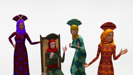
It’s a new year, and I’m back on my Byzantine nonsense as a break from the texturing long-haul of the bustle project and to give myself a quick “ooh fancy fancy” project. So have a propoloma as a Tres Reyes/Epiphany/Twelfth Night gift!
What is a Propoloma?
During the early Byzantine empire, the “propoloma” was a simple turban, as seen on the iconic mosaic of Theodora in Ravenna (1). While most depictions show it on courtiers or saints, because Byzantine art tended to focus on courtiers and saints, it is by no means improbable that a Byzantine woman with enough fabric and time on her hands could give herself a nice turban to wear. It could be worn by itself, if the fabric was nice enough, or worn under a veil.
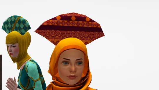
By the 10th century, it had somehow transformed into a fascinating trapezoidal/pyramidal cone, usually worn over one’s maforion, or over one’s hair, whether worn loose or styled (2). This ‘new’ propoloma was almost certainly a court headdress or upper-class headdress, if only for reasons of practicality.

The propoloma was usually white, although the zoste patrikia--the Empress’ most high-ranking lady-in-waiting--wore hers with a purple stripe, and ladies of the Imperial family wore theirs in solid purple (1). Because this is the Sims, of course, you can make yours neon pink with zebra stripes if you so desire.
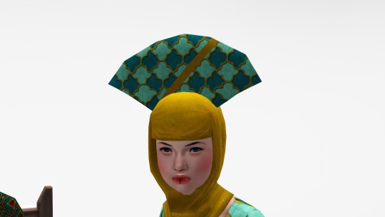
Although a propoloma of a similar shape and orientation on the head is worn in a Byzantine depiction of David’s entry into Jerusalem, as illustrated in the 1082 Vatican Psalter (3), and in the iconic Venetus A illuminated manuscript of the Illiad, circa 900-1000 (4), I would like to clarify that this is probably not the most historically accurate shape or style! Most reconstructions (e.g. Levantia and Anna’s New Rome) show the propoloma as fitted around the wearer’s head (1, 2). However, it’s extant, it’s documented, and I think it has a certain charm, so I’m sharing this with all of you.
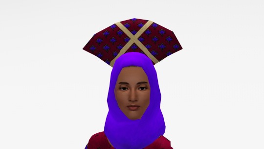
I did not create this mesh; I took it from Bipsouille’s TS2 Star Wars: The Phantom Menace hair. You can see the original here; as you can probably tell, I took off the danglies and the earmuffs, and retextured it so that the propoloma is now fabric-textured instead of hair-textured. I also removed the original overlays and created five masks; the “x” and diagonal stripe are from the eleventh century (1001-1100) and the horizontal stripes and horizontal stripes with bezants are from the twelfth century (1101-1200) (5). I am unsure if the original Star Wars headdress was inspired by Manchu liangbatou headdresses, Russian kokoshniks, or a combination of the two, as I am not familiar with all the varieties of either of those headdresses.
Download your propoloma here!
Important Information
Polycount 86 Vertices, 168 Faces.
Bone Assignment Head Dome.
Recolorable? Yes, with one, two, or three channels depending on the mask. The mesh is curved, so some patterns may not “read” successfully.
Ages and Genders Teen through Elder females. You may use NRAAS or another mod to make this available for teen through elder males!
Categories Found in “Earrings” under Everyday, Formal, Career (for courtiers, of course), Makeover, and Maternity.
Custom Thumbnail? No, sorry!
EPs Necessary Base Game Compatible.
Credits
Bipsouille, whose original mesh I’ve hacked to pieces. Merci!
@aprilrainsimblr, whose linen texture I used to retexture the propoloma.
@ninjaofthepurplethings, @ice-creamforbreakfast, @sweetdevil-sims, and @simlicious for the models used (Penny O’Hare, Margaret Crabtree-Spencer, Helen Ray, and Aurora Brunetti).
@danjaley for the poses (Medieval Story).
Mammut from the SimsZoo for the outfits (EF, TF, and AF Mittelalter).
@carversims and @procrasimnation for the veils (Carver’s Scarf Casual and one of the Aanhamdan conversions; Procrasimnation’s Sporty Hijab and LumiaLover’s Hijab).
Parsimonious for the patterns.
Recommended Downloads
My conversion of Wawa’s Byzantine crown (unisex)
My conversion of Wiccandove’s veil (female only)
Citations
(1) Syrakousina, A. D. (2015, January 16). The propoloma: A headdress of the ZOSTE patrikia and other high ranking women in the courts of Eastern Rome. Anna's New Rome. Retrieved January 2, 2023, from https://annasrome.com/2014/08/13/the-propoloma-a-headdress-of-the-zoste-patrikia-and-other-high-ranking-women-in-the-courts-of-eastern-rome/
(2) Dawson, T. (n.d.). A woman of the high aristocracy. Levantia. Retrieved January 2, 2023, from https://www.levantia.com.au/zoste.html.
(3) Meyer, M. “DID THE DAUGHTERS OF ISRAEL COME OUT DANCING AND SINGING TO MEET... DAVID ? A BIBLICAL IMAGE IN CHRISTIAN-MACEDONIAN IMPERIAL ATTIRE.” Byzantion 73, no. 2 (2003): 467–87. http://www.jstor.org/stable/44172607.
(4) Manuscript miniatures: Iliad (venetus A). (n.d.). Retrieved January 2, 2023, from https://manuscriptminiatures.com/4919/14628.
(5) “Byzantine Clothing Inspiration Page.” House Capuchin 3, September 24, 2021. https://housecapuchin.com/clothing-inspirations/byzantine-clothing-inspiration-page/.
#ts3cc#the costuming is not as accurate as i would like but i wanted this done#this has been several years in the making i think#i just like fun hats for my pixel dolls
36 notes
·
View notes
Audio
Due to the sheer length (plus wanting to preserve the format,) you can find the accompanying dialogue for this post on Google Docs.
Spamta Claus is a Deltarune AU that pulls inspiration from the infamous "Spamelle" concept, but with a fair few twists in comparison. Something goes wrong when the fountain in the library is forming in Chapter 2, causing Spamton to be forced into Noelle's body. You can read more details on the swaps + general premise over on Google Docs! The brand new Spamelle design + the art in the thumbnail were done by @bittybattybunny. She did a really great job bringing my vision for this AU's version of the character to life, and I'm incredibly happy with the final result.
Spamelle technically takes the role of Spamton. (Or does she keep it???) After something with the fountain's formation in the library goes very wrong, Spamton is forced into Noelle's body. Now Spamton is the [[BIG SHOT]] making all the [[Deal(s)]], while poor Noelle is stuck as a passenger in her own mind, watching as the world and the events there within change around her. While she's not the dominant force by any means however, Noelle's various terrified/pained thoughts *do* wind up seeping into Spamton's dialogue a fair bit, much to Spamelle's occasional chagrin.
Motifs:
Silent Night
Dialtone
Lost Girl (modified)
So ye, I've done exactly what I said I would in A Real Girl's description: there is now a second Dialtone replacement for Spamelle over on SoundCloud! This initially WOULD have been the first one, but there was no fuckin way I was gonna post a Spamta Claus track with yet ANOTHER unfitting public Spamelle design, so it was worth holding this back for the awesome thumbnail art + AU-specific Spamelle design! Someone beat me to the punch during the thumbnail's creation timeline, and I'm honestly kinda happy about that. It's low-key tiring/frustrating at times being the only one to even think of trying to fill certain musical gaps with my limited skill, whether it's UT/DR or AHIT, so I'm glad SOMEONE else had a similar thought for once! Anyhow, back on topic. I decided to take a cue from a track that already inspired me before, and base this Dialtone on a holiday carol. And considering how well the time signature lined up already, Silent Night was just an obvious perfect fit for me. On top of that tho, I also included a tiny bit of the original Dialtone melody at the very end of the piano's melody, and modified Lost Girl into the french horn part in the second half. Speaking of which, yeah! I actually decided to go for a more orchestral style in the second half (all while keeping the same phone ringing and dinky toy-like piano underpinning it all.) I figured it would help both bring a somewhat unique flair to this, as well as (hopefully) aid the intended underlying melancholy in this arrangement. All in all, p damn happy with how this turned out, and I hope you guys enjoy!
You can also listen to this track in high quality on my SoundCloud here!
#deltarune#deltarune chapter 2#deltarune noelle#noelle holiday#deltarune spamton#spamton g spamton#spamelle#deltarune au#spamelle au#spamta claus au#music#audio#Dialtone
15 notes
·
View notes