#my first lineless piece too!
Explore tagged Tumblr posts
Visit Tumblr Blog
Explore Tumblr blogs with no restrictions, modern design and the best experience.
Last Seen Tumblr Blogs


Fun Fact
Tumblr.com is the 103rd most visited website in the world.
Text

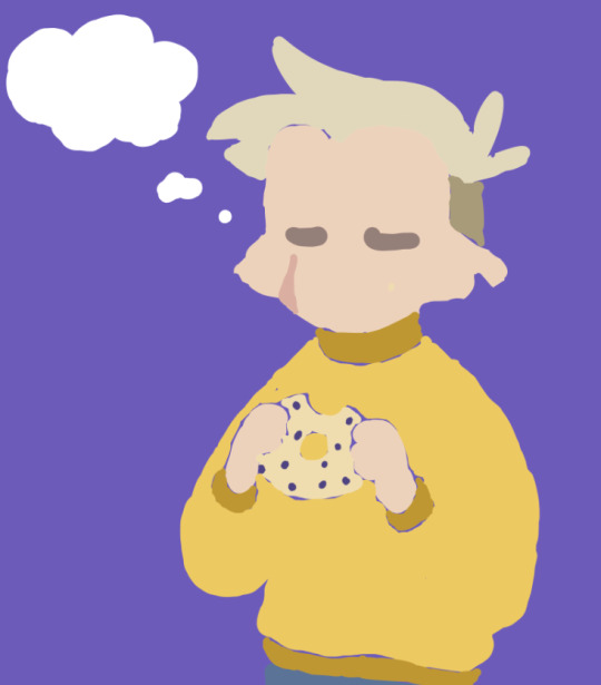
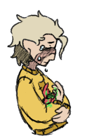
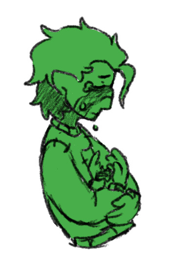
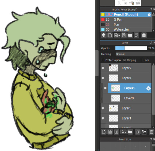
painting i did based on that really really good photo of goodtimeswithscar! is it perfect? no. I'll probably keep picking at it forever. but it's also one of the best pieces I've ever made.
#my first lineless piece too!#hermitcraft#goodtimeswithscar#uhhhhhh what else#trafficblr#i guess#sleepaways
28 notes
·
View notes
Text
i love...wanpee...........🍊🍶🧡💚
#one piece#nami#zoro#one piece live action#opla#my art#alternate caption: dum dum fruit#im so happy that more and more people are getting into op it truly is the series that keeps on giving#op is a series easily misunderstood by its art style and goofiness but at its core are themes about abuse of power. its so well written#AND IM SO HAPPY I FINALLY HAVE TIME TO DRAW FANART FOR FUN AND NOT FOR LIKE. A CON OR STH AND WORRY IF MY ART IS “SELLABLE” OR “MARKETABLE”#*checks watch* apparently i havent drawn fanart for fun since december so thats like. 9 months#i had the biggest difficulty with this drawing#i actually drew this first in a lineless style. i attempted it lineless TWICE. with 2 diff brush sets/techniques#then i lined it and i was like hmm . i dont like this its too stiff#so i tried it with a lighter hand and im like !!! it clicks#i honestly do think im pretty rusty and bc of not drawing for fun in a while i dont really know what#to do with my art style direction as of late#so i may try a bunch of different things. and i hope people enjoy em regardless!#ill try to do a screencap redraw every few days this is really fun#i also havent had time for video games in months so im also relieved ill have time for more games n game fanart hopefully
988 notes
·
View notes
Text

!!! Coming soon in @the-hermit-arcana ;3333333
#the hermit arcana#this piece had me in shambles fr. also this was my first attempt using lineless in a zine piece i think?????#had a lot of fun with it hehhehhee look out for this zine too!!!#my art
199 notes
·
View notes
Text
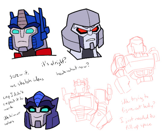
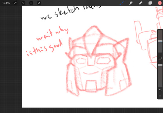
So I was attempting to practice the Cyberverse style Optimus and Megatron, though as you can see, I got a bit distracted at the bottom left, and sort of just had to put something else to fill up space
I actually started practicing yesterday at work, drawing on my cardboard sheets, so it meant I was a bit more practiced when I started here. Though annoyingly, since I elected to not go over my pencil sketches with pen, I could barely make out details in the drawings, and I could barely tell what I was doing on Megatron
It was also going to be more than just their heads, but not only was Optimus’ body taking up most of the canvas already, I wasn’t really sure how to draw it at the time. The stuff at the bottom right may have been for filling up space, but I also did need to try and at least practice their bodies
*sigh* the real struggle is making them 3D things. It’d be so much easier to figure out the shapes if I didn’t have to. But oh well, comes with the territory I suppose
But back to it, I think I did alright with the head sketches? They aren’t bad, but they feel slightly off, like I haven’t quite got them looking right
I probably need more practice, and to actually draw them full body. Also probably wouldn’t hurt to look at more Cyberverse fanart for more exposure to the style
I probably also need to start actually drawing characters more consistently, instead of drawing sketches of characters once and then never doing it again. It means I never fully get the hang of it and I keep not really making much of substance
But yeah, I feel like drawing them again at a later date, possibly even with lineless. I just don’t know what to draw them doing
But anyways, on to the bottom left
So I had finished the sketches, and my brain was like “well since we’re here, and we have helm designs right there, we could try making up fankid designs?” and eventually I gave in and decided to start sketching. I knew it’d end up on the final product anyways, but I had to give in to my impulses
Sorry, I’m sure people are sick of me bringing up this sort of stuff
Then with my first attempt, I ended up with something I actually quite liked. So I was like, might as well fully line and color
I still like the original sketch, so I’m gonna put it here, and also since I feel like the vibes are slightly different from the final
But then a problem arose after lining and going to colors. Namely that I had designed this on a whim and I had no deep thought as to what colors to use
After some tries I ended up with what you see here, but I’m not sure if I want to keep these colors. I’m not sure it fits the vibe the original sketch had
The blue middle piece I’m especially not sure on. I think it looks off, but I don’t know what to color it
Oh also, his purple isn’t exclusive to his helm, it’s his main color for the rest of his body too. At least that’s how it is in my head right now
Also as you may notice between the sketch and final, the eye shadow came later, mostly because I thought he didn’t have enough Megatron in his face. But also because of that, I hadn’t made the eyes and eyebrows with that in mind. So if I draw him again, those’ll get tweaked
I still in general don’t know if he looks enough like Megatron. I suppose I should be wondering more if he should look more like Optimus, since general shape wise he takes far more from Megs, but I’m also aware plenty of his colors stray more towards Optimus anyways
Oh yeah also, he has blue eyes here, but I really don’t know about that. I wanted to give him something other than blue or red, purple being my initial choice, but I was struggling with the colors in general and so right now he has blue. It works but I wonder if it looks too much like a fusion of their eyes
He needs more work, just like Overdrive I think. But he is here
No clue his name. I wasn’t even sure about his gender until drawing made me think “oh yeah that’s a guy”. I do have a name in my brain for a megop kid, that being Starcutter (which the two probably didn’t pick), but I don’t know if that works for him
I do think I’m going with that idea I posed yesterday (well not yesterday, but yesterday I said “what if I put it in Cyberverse?”) of him being the secret megop love child that no one but Megs knows about
I don’t know anything about him other than he’s probably on the Autobot half of Cybertron but was never really involved in the war much. To involve him in any plot, he probably comes over to Iacon after the war to try and make some name for himself
Also another idea is that he and Megatron met again during his multiverse adventures, in some universe where he was actually raised by Megatron, possibly where the Autobots and Decepticons never split because Optimus was able to properly reason with Megatron. They didn’t take him on their multiverse adventures, probably because Megatron knows he exists in his own universe and doesn’t know how to handle two versions, but also possibly because he died, I don’t know. But it was these encounters that led to Megatron attempting to search him out when he returned to his own universe. This also means Dead End and maybe Astrotrain knows about the kid’s existence, but they’re under the assumption they only exist in these wildly different universes, not their own. Which may lead to shenanigans
But yeah I haven’t solidified anything else really I don’t think. Should work on a name
And I think that’s about it for now? Yeah I should draw more Cyberverse I guess
#I don’t know what to put in the tags here#uhh#transformers#transformers cyberverse#optimus prime#megatron#my art#transformers oc#transformers sparklings#fankid#art practice
43 notes
·
View notes
Text
2023.
i hope any of you reading this will forgive the essay. i started posting to this art blog ten years ago in 2013 when i was just at the very end of high school, uploading short animations i'd made for one of my final projects, preparing myself for art school where i was gearing up to become an illustration/animation student.

i went into my art foundation course in 2014, still thinking i was going to be going into storybook illustration or with faint hopes of becoming like a concept artist for game/animation, although even then i'd started thinking about patterns...
and then in 2015 i did go into my BA, going in for that illustration with animation degree that... usually when i talk about it in real life, i say didn't really feel like the best place for me. if i think back, the best things i got out of it were two of my best friends, one of whom is now my partner. looking back on my BA era, there's some bits of sketchbook stuff...
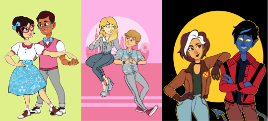
and while i was at university my main fandoms were thunderbirds are go and x-men for a bit... these are from the end of 2015 into the beginning of 2016...
then for a little while i was doing this still sort of pastel-ish lineless situation:
and i alternated between that and this thin fineliner type work (pretty sure all of the linearted pieces were done on paper and scanned, and all the lineless were graphics-tablet-only) - it was in this style that i started to offer commissions for the first time too.
and i also had fineliner-lined work in sketchbooks that i coloured with marker and posca pens, the colours of which were generally a bit more intense just based on not being able to slide the hue/saturation around on paper:
also 2016 was when i discovered the spongebob musical just after it's trial run in chicago (which ended in july of 2016) and i started making fanart at that point... which would have the biggest effect on the way i drew (and i did end up handing in a piece of spongebob musical fanart as one of my art school homeworks lmao)
from summer 2016 until early 2017 things were still quite soft and pastelly in my digital art, colour-wise:
and then suddenly everything got whacked up to 100% on saturation. also i was using the binary tool to give everything really thin pixel lineart for some reason.
then i went on vacation in summer 2017 and didn't draw for maybe a month? just short of? and when i came back i decided to change everything up again... giving characters blobbier, more ugly-cute faces with large squinting eyes and big nostrils and i was worrying a lot less about making anything look smooth, lineart-wise. i turned off the pen stabiliser in SAI and let it wiggle.
then... the spongebob musical opened on broadway in late 2017, i went to see it live in person for the first time... and my whole brain was ENTIRELY consumed by my love of it. i was putting that david zinn inspired pattern explosion into everything, even if it wasn't sbm fanart.
as we go into 2018, i started colouring my lineart. my biggest interest was still broadway musicals (with spongebob at the top of the list)
i think summer 2017 - early 2018 is probably my favourite art era, i was at my most bright and colourful and exciting... although i know in my actual real life i was struggling a lot with my home situation and i had been for some time. art was definitely my escapism back then, and i think a lot of the time i drew really bright, joyful stuff to try and inject that feeling into myself.
as for my university work, i was putting my focus into 3D paper-mache puppets:

and i was also starting to do more repeat patterns, mostly inspired by things around me. i'd learned how to make patterns actually tile and repeat in 2017, so made a few during my time at uni just to accompany some of my projects, but never as the focus of them. one of my university tutors told me that maybe i should put more focus on doing surface pattern, and maybe applying it to textiles, but i said i wasn't interested.

i graduated from my BA in the summer of 2018, and immediately began volunteering at the whitworth art gallery doing anything i could - stewarding, helping with arts and crafts, dancing with families...
in 2019 i was still very colourful... i was trying out more chunky colouring on characters skintones that i think was def inspired by tumblr artist jadenvargen:
but the blobbyness and ugly-cute style of drawing faces was gone by here, and i think... the way i drew characters probably had better *anatomy*, proportions were maybe a bit more realistic...
in 2020 i started adding the black shading to under the chins and some other places on characters' bodies because i started watching the anime my hero academia with my brother, lmao (and i was starting to pastelise colours a bit again, these are the most pastel-ish examples) my lineart has really smoothed back out too, though i never turned my pen stabiliser back on in SAI. i think my hand just adjusted. probably seems a bit insane to miss that, but i do.
by the end of 2020, the almost-year of lockdown over cobid had... made me a bit insane, i think, and i moved out of my mother's house and into a flat with a friend from university.
in 2021 i think things were much the same... i think from this point on is where things have sort of settled. i don't want to say stagnated, but i do think things have been very... like this for a while.
2022 - got the most exciting examples out...
also i was very into these little frames in 2022.
and then on to 2023! in 2022, i did begin trying to shift gears a bit -- hoping to put more energy into sewing and making products (like my tutor has suggested back in uni, even though i'd really resisted the idea.) i sold at a few in-person markets during winter of 2022, but got disheartened by the amount of money i had to sink in up front to sign up for a spot...

which has made me VERY grateful for the people who have supported me via online sales. it has really helped me stay afloat in 2023 - AND it has felt more wonderful than i can describe that there have been people interested in my work... especially when a lot of it has been my original designs, rather than the fanart that i expect a lot of people initially followed me for.
i've also... in the past 2 years... branched out a bit more when it comes to 'being an artist' - and have had the opportunity to deliver arts & crafts workshops with local refugee & asylum seeker support charity, afrocats. it's taken me to their home base in a church to hotels across the city where asylum seekers were temporarily placed while waiting on their new homes, and of course to my beloved whitworth art gallery, where we welcomed visitors from all backgrounds: from the typical white middle class visitors the gallery usually expects, to all the refugee visitors coming into the space for the first time.

and through my volunteering at the whitworth, i showed up so often they decided they might as well pay me. so i've also become a facilitator of... creative play sessions, my favourites of which have been outdoors. monthly, year-round, we have 'outdoor art club', where i get to paint with mud and make potions from leaves with kids & families - here you can see me tell you a little bit about it in this video below with 'crempog' a puppet character that makes videos about activities for kids and families around manchester (my bit starts at 01:10 although i am in the intro and thumbnail haha)
youtube
and then of course the summer 'PLAYTIME' activities we've had the past two years: scrap studio in 2022, and play market in 2023. it's the best freelance gig ever -- just to hang out and encourage families to be creative and have fun.
youtube
youtube
in working more in these new avenues... outside of being - as i've called myself for a long time - "an internet artist"... i've found myself more interested in this sort of thing. in being a "real world artist" too. in doing surface pattern design, and being a workshop facilitator, i find myself wanting to put more energy into these sorts of projects.
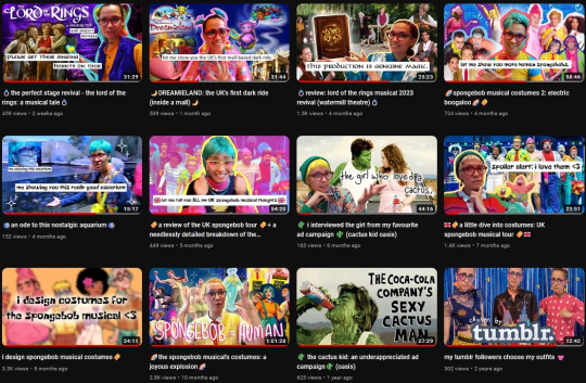
in 2023 i've also dabbled a little bit more in youtube videos! i have had a channel for a while and have made videos in previous years, but 2023 has been the year i've done the most in. admittedly most of them haven't been about my art, and more just like... random things that interest me (the spongebob musical in particular) but i've really been enjoying video editing. that's kind of an art form too, so i'm including it here!
moving forward, want to keep putting even more of my energy into other things. my shop, with a bigger range of products to offer. workshops in real life, where i can make a difference.
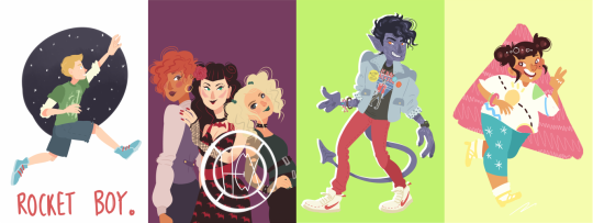
as for my art blog... i feel like i've done the least drawing in many years in 2023, and... well, things have been weird and complicated for a bit in my real life. i hope to draw for fun a bit more again very soon, and to return to doing things in more of a wild and crazy way, to be more creative and exciting with the way i draw things. still, here's some of my favourites from 2023:
thank you so much to everyone who has borne witness to my art journey this past decade!!! i hope you will stick with me, who knows, maybe for another 10 years if tumblr holds out. especially a big thank you to everyone who has ever commissioned me, or bought anything from my store, you literally keep me able to make art at all and i cannot, cannot, cannot overstate how much it means to me.
i'm moving homes soon, possibly into very cramped temporary conditions for a little while before HOPEFULLY starting my real life with my partner. if i can take one more moment to plug my work, then [here is a link to my online shop] and [here is my ko-fi page too.]
cheers, cheers, cheers!
- LOREN 🌈🍍🎉
#also: i did post. monster high and steam powered giraffe fanart on my main blog when i was in high school#in 2012/2013 it seems like i did absolutely LOADS of fanart for both of those fandoms but didn't cross-post it to my art blog#and uh. well. i'm not about to do it now hahaha#art summary
164 notes
·
View notes
Note
seeing your clowns made me go feral since my fixation is cringe and clown flavored
Who let you cook like that who let you cook AUTHHFFH UR ART IS SO COOL IM BEING DRAGGED AWAY
You’re hatching is so fucking inspiring since it’s soMETHING I try to do in my own work I LOVE UR ART
would it be fine to ask what brushes you use? I love ur values also, you’re so so good at shapes and form WAAAA I LOVE UR STUFF. I did dig up an old ask you made iirc, but I’m not sure if it’s changed
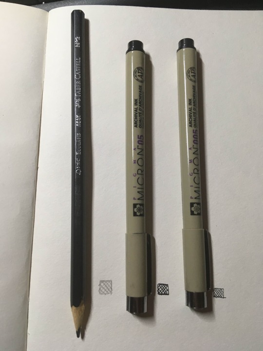
Hey! Thank you very much. I'll go through the brushes I use for each program: Drawpile
From what I understand most of these are MyPaint brushes... but I only know them as drawpile brushes because that's what I use. Main ones I've used lately is Irregular Ink and a default brush for coloring


I don't really change the size of irregular ink much and the pressure doesn't matter that much. It has high stabilization which I haven't changed, but I'm sure you could get away with lowering it. For the other brush I'm pretty sure it's a default one that I slightly tweaked (drawpile is a bit bad about communicating what brush exactly you are using to you.) I quite like it because it feels like playing with clay, makes it easy to map out the volume. I use it for those lineless pieces I do from time to time too. I change its size a lot while drawing. I've also used these two, one of the pencil brushes and a second one I stole from Jokioro that I have no idea what is called

I used the first one for the D'arce I did a while ago and the recent VTMB piece. It's great at emulating sketchy graphite pencils, I like layering it to do multi-colored hatching rendering. The second one I don't know how to use super well yet but it's probably my fourth most used as of late. It works very weirdly so if you wanna figure out how to make it work I recommend looking at how Jokioro draws. Clip Studio I bounce around a lot with all the brushes, but I use a loooot of stuff from the Frenden pack. Mainly Meeko Leako for lining and even coloring, it has a great texture to it, very fun

This has been my most used brush for years. It's great for super straight lines and produces a great difference in value between quick lines and thick lines. I haven't used it as much since I picked up drawpile more recently, but it's amazing! Other than that I use the default G-pen when I just want simple lines without much texture
It's a bit ugly at a glance but I think if you lock in it's great for super clean lines, just trying to get the point across without much noise. I also like coloring with it at times, when I'm going lineless. SAI Binary pen. Use the binary pen. It's the best brush ever made
It just feels super right to draw with it, it's so simple but it makes your lines look super slick, and it's just a binary pen. I guess they just got the behavior down perfect for it. But yeah, love this brush. IRL I've always used these archival ink pens in different sizes for basically everything I've done traditionally, and of course just a simple number 2 pencil for sketching and such. I've used a bit of charcoal recently, and been wanting to deep into darker pencils for detail, but this is still the default. I also will probably try out dip pens sometime
That's all I can think of immediately, but I always like to mess around to try and find another great brush, and you should do the same even if you end up using these a lot.
50 notes
·
View notes
Note
How do you color in your art?? I can never make mine look right, i’m still relatively new to procreate and I just wish I could instantly know how to use it because AGEGGS
I don't use Procreate and I'm not sure what you're personally having problems with, so I'll just go through my process using some of my old drawings and try to give some general advice that might help
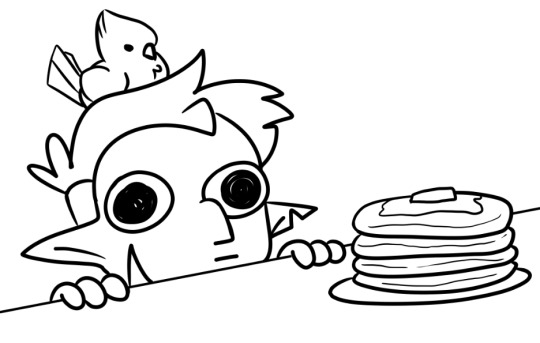
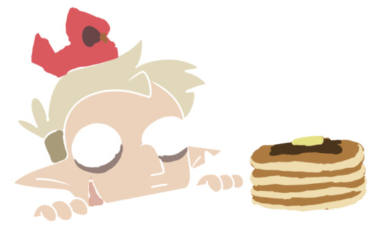
So I have the line work of "Hunter wants pancakes" here. I usually copy images from screenshots of the show and paste them onto the canvas so that I can eyedrop the colors, but I probably had it on a different canvas there.
Sometimes I'll change the colors a little bit for clothes to make them a bit brighter or less saturated (depends on what I think looks better), but really for fan art of characters that already have a color scheme, I just copy the colors.
But your line work is going to be your topmost layer the majority of the time. All the coloring stuff should be underneath the line work so that if you do color into the lines, the linework isn't impeded
I typically put all my colors on the same layer, but feel free to use layers in whatever way is more convenient for you. (When I'm doing lineless, I'll typically make a new layer for each color so that I can shade them individually later on. Idk if that's at all smart or convenient but it's just a thought)
As for the actual act of coloring, I pick a large, textureless brush. You could use whatever you want depending on what kind of look you're going for, but for my finished pieces I usually like the coloring job to look cartoonishly clean. Like you can see that the second brush changes opacity as it reaches the end of the stroke (or with lighter pressure, since I use a pen), which I don't want, since I prefer the colors to be uniform in shade and texture. So I use the first one instead. Also less texture helps keep the color in the lines from my experience.
I don't use the paint bucket tool very often because it typically won't fill in all the white space, especially when your work is more detailed (which would lead you to have to go back and go over all of the edges again with a brush anyway), so I color most everything manually now. But for "Hunter wants pancakes" I think I did use a paint bucket and then probably went back to fill in some of the gaps since there are clean white gaps where the line work would be.
That is to say you should color with your line work visible (I don't know who wouldn't but I'm trying to cover all the bases here). You made yourself a coloring page, now you get to enjoy it. Without the lines it can look pretty silly and very messy, but it doesn't really matter if it's going to be covered up by your line work anyway.
Sometimes when you're coloring with lighter shades on a light background, it's hard to tell if you're missing a spot. I like to use a really REALLY saturated color like neon green or red to see any gaps in the color. Put the layer of neon green under the color layer and it will become very obvious where you missed haha. Sometimes I'll look at the neon color for too long and will need to change it to refresh my eyes
This colored sketch isn't very clean but it shows that you can also make a clipping or masking layer (if you don't know what that is the Internet could honestly probably explain it better than I could), color over the whole thing with a different color, and lower the opacity to give it a cool-looking tint
I don't know what your specific issue was but hopefully I was able to clear at least something up for you
19 notes
·
View notes
Text
I NEED COMMISSIONS AND DONATIONS!
Hey all, need to get some more money this month for rent and loans. My next paycheck is going to come too late, so I need at least $400 to make it to next month. My commissions are open as ever, and I am still offering the 2 for 1 deal, where you can request a commission of equal or lesser value to go along with the first at no edition cost.
A brief rundown of my prices: All pieces start with a line art cost, and color , shading/effects, and lineless options are add-on costs. Head/Busts start at $20, Half Body at $40 and Full Body at $60. Backgrounds start at $20 as either their own piece or an add-on. There are multiple character options, just 2 character commission sheets are up at the moment, but I am willing to workshop a pricing scale for multiple characters in one piece if so requested.
I am also going to be opening up a commission slot for animation, just gifs at first, but I will expand that to animatics and full videos later.
I do original character/work and fanart commissions! I am currently quite fond of doing Psychonauts, Code Lyoko, Gravity Falls, FNAF, and Hollow Knight fanart, and many, many more.
If you have any requests, please commission me on my Ko-Fi. You can also message me there for questions, or DM me here. Please know though that I will only fully process commission requests once they have been made on my Ko-Fi.
Additionally, if you can't support me with a commission, please consider giving me a small donation via Ko-Fi. Donations are $3 or more. I am currently doing for the first 20 donations a $1=1min Sketch requests. How that works is if you make a donation, say $3, I will do a simple 3 minute pencil sketch of anything you request (as long as it adheres to Ko-Fi's rules). I will even record my drawing progress if you so chose! Again, this will only be for the first 20 donations I receive.
IN CONCLUSION! PLEASE COMMISSION ME OR DONATE TO ME ON KO-FI IF YOU WANT SOME RAD ART OR JUST WANT TO HELP ME LIVE!
$400 IS MY GOAL THIS MONTH! PLEASE HELP ME ACHIEVE IT!
💙💜PLEASE SUPPORT ME ON KO-FI!!!💜💙
#emergency commissions#artist help#artist support#artists on tumblr#psychonauts fanart#fanart#fnaf fanart#gravity falls fanart#five nights at freddy's fanart#hollow knight fanart#code lyoko fanart#commissions open#art commisions#commissions#ko fi support#buy me a kofi#ko fi commissions#ko fi link#ko fi#commission sheet
35 notes
·
View notes
Text
Okay, I don't know what's going on with Tumblr and everything has been absolute chaos with my life the past few months, so y'know what, screw it. I think I'm actually brave enough to share some of my art. At least it won't just be sitting on my tablet that way.
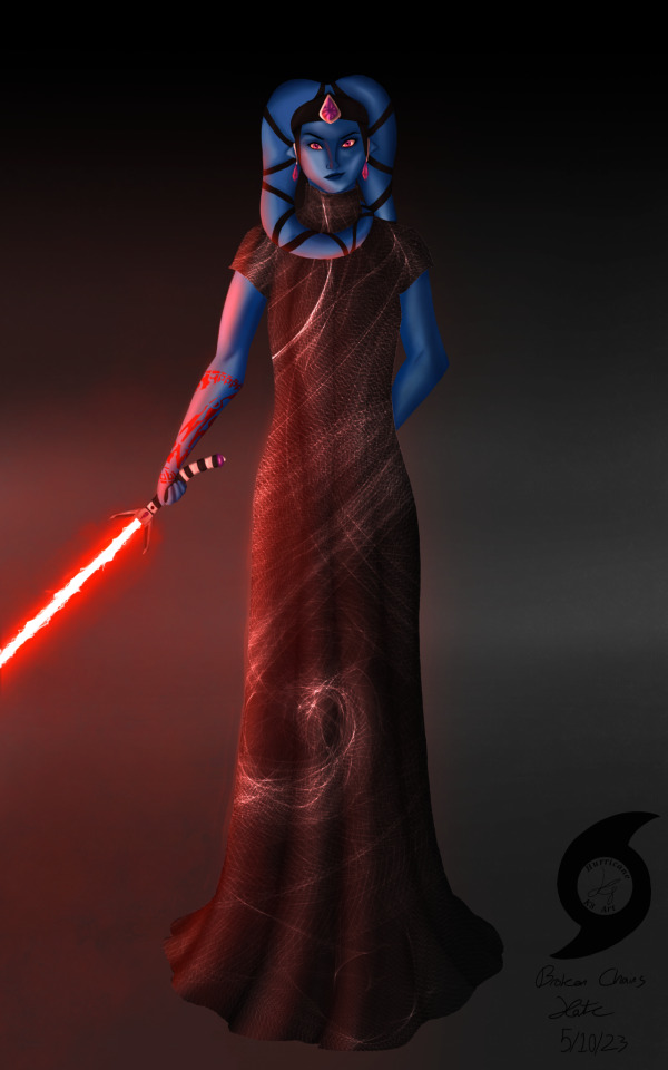
This is my Sith Inquisitor turned Force-sensitive Outcast from SWTOR, Roodaka Greatstorm-Kallig. I haven't really plotted everything out with her regarding her story, but she's not my Outlander. She leaves the Empire right after Ziost, after losing all of the family she'd used her Dark Council connections to find and save from slavery, and Lana recruits her to help Sana-Rae run the Enclave about two years before the Outlander (my Knight Aja Verdona) is rescued. She's prickly and petty and spiteful but I love her dearly. And because I've never posted art before, art process and a little bit of character lore ramble under the cut, I guess?
I usually work with lined art/sketches that are admittedly very messy, but when I did the first one back in May I was experimenting with actually rendering/painting, and I saw a fashion post thing that looked like something Roo would wear, so I was mostly just playing around, it's not a solid outfit design for her. It's janky and wonky and oh Lord please don't look closely at the anatomy or face it is not up to my usual standards, but I was so proud of myself for the lighting on this one, as well as how I managed to render the muscle. Like, the lighting! I have no idea what I'm doing but I think it looks so flipping good! And I was happy with how the crackly lightsaber blade turned out—it is supposed to be Aloysius Kallig's lightsaber, meaning it's at least over a thousand years old, right? It should be a little janky with age!
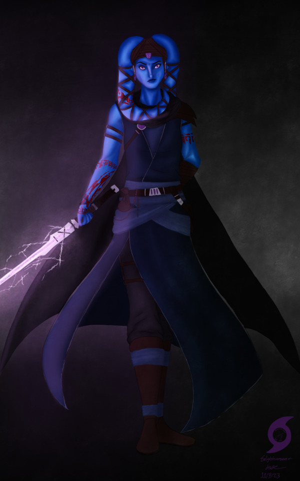
The second one is supposed to be post Fallen Empire, after she's left the Sith and become sort of a wandering Force-user—think Ahsoka as of, well... Ahsoka, but more on the side of Ventress if she'd survived TCW (don't get me started on that choice 🙄🙄🙄). I came into it knowing a little more of what I was doing, but I kinda got in over my head and gave up on the 100% lineless thing, you can definitely tell with the sword/clothes. 🥴 The second piece has been sitting unfinished in my WIP folder for months, so I just said screw it, finished up some details and called it because I am SO PROUD of her face and hands (I DREW A GOOD HAND WITHOUT LINEART WHO AM I?!?!) and how I rendered her skin, I don't want it to live in WIP purgatory forever. You can actually tell that's muscle! And a neck!
I'm proud of how her tattoos turned out, too. I played around with Cham Syndulla's tattoo pattern, turning it at different angles. It felt like a good way to root her in Twi'lek culture despite the Kallig bloodline having been separated from it for so long. She gets the first one to cover up a slave tattoo, and the rest after Ziost to further reclaim her identity and culture, leaving the Sith behind.
I have no idea how to close this post. Um... thanks for reading all this, if you have? I've never posted art before, I'm kinda terrified. 🤣🤣🤣🤣🤣
#K8's Art#(never thought i'd have the guts to make that tag!)#K8 Rambles about SWTOR#swtor#swtor sith inquisitor#swtor fanart#star wars the old republic#SWTOR OC: Roodaka Greatstorm-Kallig#i am utterly terrified of posting this but if i don't do it i dunno if i ever will#so here we go! deep breaths kate 🤣🤣🤣#edit: i'm gonna pin this at the top rather than that meet the artist because if i look at that self portrait anymore i'm gonna combust 🤣
55 notes
·
View notes
Text

ID: A lineless digital drawing of, Hollyleaf, a dark green cat with pink skin and lining and dark yellow eyes, teeth, and claws. She is reaching up at a cracked dark yellow star. She is glaring and baring her teeth and her ears are pulled back.
Hollyleaf in Bee yourself
Part of @m-chromatic’s Color Palette Challenge.
I made the background transparent because a pink background didn't look good, a yellow background wouldn't work with the yellow star, and I didn't want to redo the outlines on Hollyleaf in pink in order to have a dark green background. So it's just transparent. My first piece of art for this color palette challenge I made on Firealpaca. Too bad Tumblr murders the quality.
The song for this one is Alligator Teeth.
#warriors#warrior cats#art#my art#wc#hollyleaf#color palette#color palette challenge#digital art#warriors fanart#warrior cats fanart#wc fanart
17 notes
·
View notes
Text
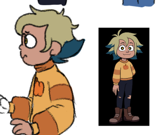
so i guess my artstyle has really evolved around necessity when it comes to lineless-ness. with the way i choose colors now, it's sort of ingrained into me that each one has to be distinct enough from each other, even when I'm doing linework and can just separate the colors using lines. i don't know if my art can really be called abstract since all of my pieces have a clear subject they are depicting, but i do know that i prefer looseness rather than realism. even when i do work with lineart i try to be pretty sparing with it, otherwise everything looks too cluttered to me. truly it is all about the shapes


first one is a sketch of a full piece ive already finished, fanart for hello world. second one is my oc nova. third one is a really hurried sketch of an objectum piece i never got around to doing
#pig originals#bonus doodles/sketches under the cut. like i really do prefer. how do you say. 'clean' sketches cause I'm just used to lineless by now
10 notes
·
View notes
Text

- Pawmi, Puzzled -
Artist's Notes
This is my third picture of Pawmi in this style. I thought that Pawmi's cheeks looked a bit like macarons. (Cute!) So that's how this picture came about. Another thing is that I intended to make the macarons yellow. (Lemon-flavored... (っ˘ڡ˘ς) yum...) but I then thought that it might be more visually interesting if they were different colors. Well, that and the yellow was too similar to the green background. I didn't feel like changing it when I realized that the macarons would blend in with it. I wonder if this idea got lost in translation with this change?
I also colored a bit differently from the last two pictures. The highlights were frustrating, which is why there are none here. I think it's because my highlights were too strong. My brother told me my first Pawmi shone like metal... (×_×)
Another thing I was trying to teach myself with these drawings was making lineless art. I'm sure you can see I gave up with this one. I just couldn't seem to make the shapes clear. My test was turning the image grayscale and trying to see if the subject was clear even without color. But I can't help but wonder if it's effective enough with how my tablet monitor is. I have tried calibrating it, but I think I might have messed it up. I don't think I'll try to fix it for a while. My temporary solution is to send it to my phone and put a filter on it if necessary.
Despite all the trial and error, I like all of Pawmi drawings very much. I hope you enjoy them too! (And maybe my thoughts on each piece too.)
xXAnnette MarieXx
12 notes
·
View notes
Text
taking a break from merch!
been feeling incredibly burnt out, so here are some thoughts on merch and events and shop stuff this year 🤔 LONGGG ass ramblings below
im going to be posting maybe like 1 or 2 merch posts daily for the next week-ish, just as a heads up!
i apologize in advance bc i feel like sometimes people just do not care about merch posts as opposed to regular ol' drawings (yes i know the psychology is that people dont like to be advertised to)... but i think the launch of my shop opening was pretty poorly timed 😬
the canada post strike (making canadians averse to purchases online, although i do not use canada post, i think a lot of people are under the assumption that most businesses use canpost) + combined with the EU product safety scare + maybe with tons of black friday competition + posting on the weekend has mixed results ..
i'm reconsidering the decision to reopen the store in dec, as i won't have any new items. additionally, this has been long overdue - i'm going to take a break from merch (besides the few events i already have coming up in dec+jan) to focus on what i really want from art. another thing that i gotta bring up is - this is the first year where i started doing more events past the summer, and well into the winter. i usually make a huge batch of new designs in late spring (for my biggest event, anime north), and a smaller batch in late summer (otakuthon). but, now i've been making new designs year round, which really is not something i'm used to, and contributed to the burnout. i've often been questioning myself, "does this need to be made?", "is this good art?" and it leads me to spiral more than necessary.
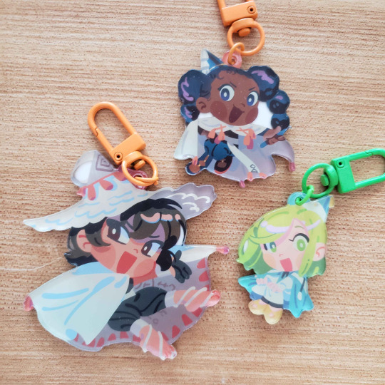
similarly, i should be working on my portfolio instead, as a lot of my portfolio works are from art school T__T i keep postponing it, i tell myself "oh just one more event, just one more event" bc i have trouble dividing my attention. how did i even do personal art + buttload of homework during animation school? HAHAHA. not to be harsh but like. what am i doing honestly 😭... i love making personal art, but i WISH i had MORE to show for my career. i want to go back into visual development. once im ready, i'll go back to drawing illustrations. in the meantime, i'll do a lot of reflection and chatting with friends, playing games, etc. getting in touch with the things i missed while i was busy crunching... --- also compiling a list of products that i have thoughts on - charms: - right off the bat, as i mentioned before, i think i've exhausted all i can from this lineless/borderless charm style! chibis for me are not artistically that interesting to draw hahaha... i don't think i'll make any more of charms in this style (unless i get a really good idea?). - i've been thinking of either stopping charms altogether, or lessening charm designs in the future. if i still... want to make charms after my break... i might opt to draw in a bust style instead. i'm really inspired by these one piece designs by my friend avenoirn..!! and these rdr wood charms by searift are so good!! but otherwise my current plan is to just focus on prints and stickers. they are infinitely easier to store too AHAHAHA.
- above: furthermore, this style does not suit all series unfortunately, examples above where i think the design is a bit weak... and i think that's where my weakness lies T__T i make things to satiate my curiosity for a short while HAHAHA but there are so many times where i'm just not proud of, or i feel indifferent, to the merch i make months down the road. - unfortunately charms are a huge seller at conventions, because of their small nature and cute quality i guess they make good gifts? i find that for me my charms didn't sell well in the past, until i switched over to this new style in 2023. i think along the way i started prioritizing charms more, and just making things that didn't work in the style like above. in reality, my heart wanted to make illustrative stuff like prints and sticker sheets, even though these products take infinitely longer to create, due to the amount of drafting and research i put into each piece. (funnily enough charms dont sell as well online + people buy stickers more) - it's getting infinitely more and more expensive to import charms from asia. first of all, shipping costs have increased, and secondly... government customs fees are truly the icing on top. it's been hard for small businesses since covid, and how heavily chinese packages have been taxed. - to be transparent, here are my suppliers: - i used vograce from 2015-2022, but over time felt that their quality declined so i stopped using them. - i use juno consistently, but also opt for kuien if i need a rush order done (~within a week, but also gotta pay premium for that rush service!!). - i have tried wooacry and can attest that their quality is good! to me it's not much different than juno's quality, besides small colour nuance and there (since wooacry's printers have the ability to print from RGB), however my designs tend to be on the simpler side.
- above, wooacry: although, it's hard to keep sizes consistent between designs (but i am a fool in this regard because i didn't check the digital mockup that precisely), so i probably won't use wooacry for huge character lineups unless i am 100% sure my charm designs are all the same size. - also geez... i didn't know people felt so hostile towards charms. (the entire disk horse on twitter if you've seen it. the original poster made a 2nd post that clarified their intent, which was, honestly?? incredibly well thought and nuanced. but the first post opened a whole can of worms, that didn't need to be that explosive from the get go, exposing myself and many other artists who make charms to other people's aggressive viewpoints). - at the same time, i understand that the scope of "anime fan merch" is very much "lowbrow art", but to act superior because one doesn't make acrylic products is a bit discouraging to say the least. i have already wanted to stop or slow down on charm designs for a long time, but this is the final blow for me. like damn. okay. ---
stickers: - importing stickers from US suppliers into canada has also similarly become more expensive with taxes TT to be transparent, i use stickerbunnies and i personally love them, however with taxes and slow response times, i cannot vouch for them all too much if you don't live in the US. however i think they would be okay if you didn't have a deadline (e.g. off peak con season) - currently i'm looking into local canadian manufacturers with affordable pricing, as well as the ability to commit to rather large orders (a few hundred)... unfortunately i'm rather picky with vinyl quality. my biggest character flaw. i used jukebox for a few designs, however they are pricey if there is no current sale. --- specialty: - also this is something ive been thinking for a while, but i'm likely going to discontinue "specialty" merch in the future..
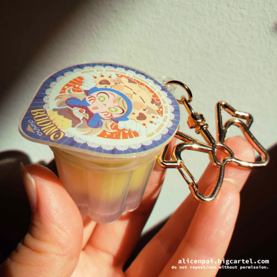
- above: anything that's not prints, stickers, regular charms... - it's ironic bc as artists grow bigger they want to branch out into new unique types of merch.. i just don't find that they sell that well for me >< i'm a bit sad at the marcille pudding, i honestly thought it would sell better. still fawkin love it though. - they cost an arm and leg to boot = higher price = harder to sell? or maybe my design sense is just bad!!!!! - the only specialty stuff i have ideas for right now are some baccano coins + poker chips... wooacry posed a potential interest for them so im. rubbing my hands greedily like a fly. -- wood: - whoa i was really negative above LMAO. one thing i DO want to try out more are layered wood pins!!
- i really enjoyed working on the wooden layton pins i have... they don't sell that well online anymore i guess bc all of my followers have seen it a million times already LMAO but they sell quite well in person!! - thankfully wood is not that pricey and i can stick to small batches for them (like 10 quantity each?) - inspiration: i LOVE these wooden dunmeshi pins seirui made. i cant wait for mine to arrive...!! also love the backing pins, they add so much character!! general - oftentimes when i make a set of products, i find that main characters sell better than supporting characters. after a while of promoting them as last chance items online + bargain bin items at cons, they just don't sell and i'm left with a ton of unwanted merch T__T what do i do with the rest of the characters that don't sell? i do have to admit i'm concerned about waste, and there are no good resources on recycling old merch. - what i did in the past was - for buttons specifically - tear them apart AHAHAHAHA. buttons are made out of metal + paper + plastic and the former two can be recycled in my area. i'm not sure if it helps but i tried to do it as per my area's recycling rules... - acrylic charms are another matter altogether. i try to gift them as much as i can... - prints are great however because i can just use them as scrap paper or recycle them if unwanted!! - i got a little carried away making merch this year. i think i'll have to go back to my old method, which was making merch in small quantities, and only sell a small number that i can confidently rely on (~10 or less).
15 notes
·
View notes
Note
Your art is very beautiful! May I ask what brushes you use? I'd love to get the same effect with my art! (Oh, and I use Clip Studio Paint! Not sure which you use, but hopefully I can still find the same or similar brushes. Lol)
thank you very much!! Yeah for sure, here's pretty much all of the main brushes I use. I also use clip studio paint!
lineart/sketch brushes:


firstly, most of my stuff uses cy's grease pencil from this pack. it's funny bc i downloaded it years ago and didnt really like it at first. but when i tried it again a couple years ago i was like wait... this is SO good. i use it for sketching and lineart (first image). there's also csp's default "flat marker" which im apparently obsessed with (second image here). it's good for shading too! lastly (third image) i'll use the stumpy pencil pack here, this one i pretty much just use for lineart but it's by far my favorite clean lineart brush. i'll be honest i had to do weird conversion to get it to work in csp and i have no idea what i did at this point BUT ! if u search up how to convert it im sure The Internet can aid you as well. i think
Coloring:


when it comes to coloring i mainly use this water color pack and then this gouache pack (which doubles as what i use for my semi-lineless painting style- the second row here). if you see any coloring that looks more painter-like and textured it's most likely me using the gouache pack. sometimes i like to do the solid/base colors with an opaque brush and then use the water color to shade bc i like the textured look :P
side note: when i shade using another layer set to multiply, i'll either use the flat marker or cy's watercolor brush (both in the entry above this one)
Additional Stuff:
both of these for certain background help
this set of overlays (not a brush, but i figured i'd add it since it definitely helps adding texture to my work)
these textures (again, not a brush. i use these so that my backgrounds arent just Blinding White- mostly for myself bc plain white is hard on my eyes lol)
-
As You Can See I'm like. constantly messing around with new brushes. I actually have well over a hundred that I've downloaded LMAO. If you ever see a piece by me and want to know what I used, please let me know!! I'm usually able to remember the brushes I used, at least some of them :P especially more recent stuff, I've been experimenting a lot with painting methods and various new brushes
7 notes
·
View notes
Text


I can finally post this, after weeks!
But yeah, this here is something I made to celebrate the 9th anniversary of Evoland 2
Some people may remember this work in progress from weeks ago, but now I can finally show the finished product. Which I finished 2 weeks ago
It’s based on the 3D picture you get when you finish the game, specially the 100% completion, and more specifically, my screenshot that I took when I first completed the game and got 100%
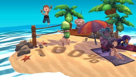
Though I should probably also note that this was the only picture I had of the beach scene until I was mostly done with the picture, so there are some inaccuracies between it and the original. Except for Reno in place of the Prophet, that was completely intentional
This game was I think the first (and will probably be the only) game I’ve ever 100% completed, and when I did it the first time, it was just because I knew that games would have extra things for those who 100% it, and I wanted to see what the game would give me. It’s the only time I was so invested in a game that I had to know what I’d get if I got everything. It’s also the only game where losing nearly 10 hours of progress due to a (maybe) glitch does not make me give up the game in frustration, but instead complete the entire thing within a single school week
I may gripe about my issues with the game, but I absolutely love it, and I have a lot of fun playing it. Well, aside from the parts I’m bad at, but that’s just because I’m bad at them. I feel like I have next to nothing to complain about from a gameplay perspective (which is in part because I don’t know how to critique gameplay, but also because I think any issues I have are my own fault), it’s just narrative stuff. And even then, I wouldn’t nitpick it so much if I wasn’t so invested in the world, story and characters
Maybe today I’ll start replaying it again, seeing how I’m pretty sure I’m free today from any schoolwork
I’m still holding on to some admittedly delusional hope that a 3rd game could release one day, even if I know it’ll almost certainly have nothing to do with this one, but even if it never does, I’ll still have this game to play over and over again, so I can accept it
I was disappointed that I missed the last two, since I first played the game in 2022, but not this year, I remembered!
Now to just talk about the art itself, the reason there’s two versions is because I originally made the background lineless, but after finishing the characters I thought it maybe clashed a bit too much, so I made a duplicate of the picture to do a lined version. But I also spent so long on the lineless version that I didn’t want to just leave it in the void, so I’m showing it too
Admittedly now I think I can say the lined version probably is the better one, but I can still show off both
I used the card colors for the characters, since all of them have cards for reference, but now I’m looking at the colors and thinking they look somewhat wrong. At least on Menos
Also as mentioned prior, I switched out the Prophet for Reno. I know I’m biased but I really think he’d fit in this picture of all the main characters far more than the Prophet, considering he’s kind of the reason the plot started, the second half happened, and he’s the main motivation for one of our party members. I mean, I see why the Prophet’s there in the original. He’s really the only other semi-important character with a 3D model, and Reno never had one, so they’d have to make an entirely new one just for this extra thing. Also it doesn’t make sense for him to have a 3D model in the first place, especially not of his Present era self. But not only is this now a drawing where I have the power to do what I want, this scene isn’t canon in the first place, so put Reno in the background there!
Overall though, I’m honestly surprised the piece turned out as good as it did. Those who follow me know that I was really struggling with drawing during the summer, more specifically drawing people and the Evoland 2 cast. But despite all that, I think the characters turned out pretty well. Certainly not the best, but better than I was expecting. And not only that, but the background turned out so much better than I thought it would, especially since I don’t usually do backgrounds. Though I suppose it does help to have a reference for all this though. But yeah, there was a reason I was so proud of how the sketch turned out, and while the final product may not have entirely been what I was hoping for after the sketch, it still turned out pretty good
As long as I can remember it next year (which I really hope I can, considering that’s the 10th anniversary), I’ll try to make something there too, hopefully with much improved drawing skills, since I’m still trying to figure all that out again still
Not sure what I’ll draw then. Maybe I could redraw the beach scene, or make an entirely new beach scene concocted by my brain. But it’s also the 10th anniversary next year, so maybe it should be something more special
Ah well, that’s next year’s problem. For now, have this to celebrate the game’s anniversary. For the minuscule amount of people who actually play this game, I guess
#I’ve slightly started to doubt if today is the actual anniversary#that’s what Google tells me the original release date was#but if I’m wrong I will never know peace#probably the incorrect phrase but I can’t figure out what it’s supposed to be otherwise#but yeah Evoland 2 anniversary#for all 5 of us who care#evoland 2#my art#anniversary art#evoland kuro#evoland fina#evoland menos#evoland velvet#evoland ceres#evoland reno
10 notes
·
View notes
Text
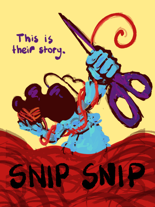
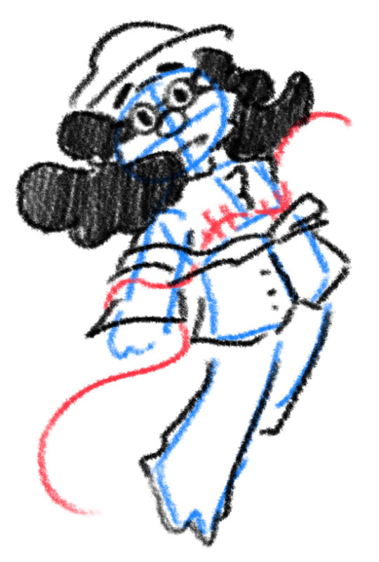
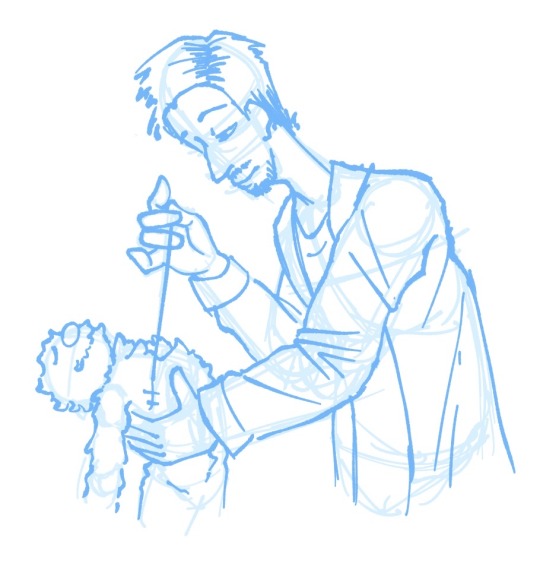
I thought I'd share the sketch of this poster/book cover as well as my initial concepts! You can click the "Read More" button for more in-depth explanations on my design process.
Thhis is all for my latest fanfiction, Snip Snip, so if you'd like to check that out, then...
Now let's crack in!
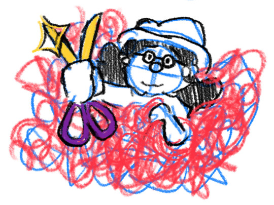
For the release of "Snip Snip", I actually had several different directions in mind! One was a comic of one of the scenes from the fanfic—specifically the one where the Professor breaks down in front of Kate and Joyce with the line "I don't like being a woman"—and the other was a series of doodles showing the Professor's transition. Unfortunately, both directions met dead ends as I couldn't find the motivation to do either. The most progress I made were these sketches.
If you're wondering, "The first one looks familiar..." that's because I reused that pose for my first promo art! It was too good of a pose. I couldn't waste it :P
But anyways, after a period of getting extremely frustrated over the lack of progress, I realized my main problem: I was biting off more than I could chew. I didn't know this at the time, but I was dealing with burnout from school assignments that made drawing more ambitious ideas like the ones I had very difficult. Hence, I had to scale it down. It made me think, "Why not do something like a movie poster or a book cover?"
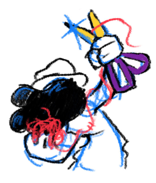
That's how the sketches at the top of the post came to be! I consulted a friend of mine over which pose to choose, and he picked the third one which I understand why so. The obscuring of the Professor's face not only made it cool, but it adds symbolism in how we don't really see his true identity—the real him—until his transition. Here's the first sketch!
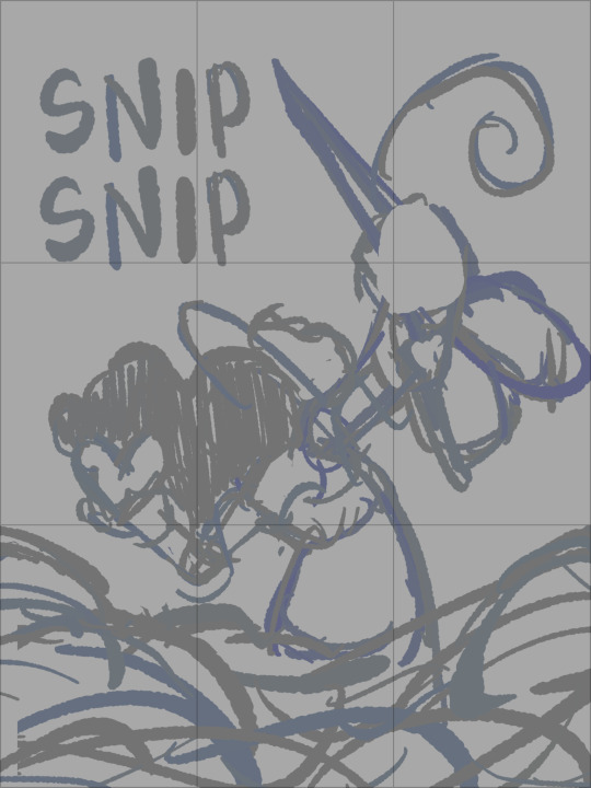
As you can see, the title is on the top left corner! However, I moved it to the bottom for two reasons
It's advice I learnt while looking up how to make movie posters since moving the title to the bottom tends to bring more focus to the illustration above.
I couldn't find a font that fits! And the idea of doing typography again (especially after the Keep Yourself Safe poster...) was really not what I signed up for.
But then it left the problem of the top corner looking empty. It was too distracting! So what did I fill it in with? The subtitle: This is their story. The composition is now more balanced, and also the subtitle tickles me.
As I said before, I looked up movie posters for this! Special thanks to the Nashville Film Institute and Muse by Clio for their articles that guided me during this poster making process. I will say though I got really sidetracked watching Filmmaker IQ's The History of the Hollywood Movie Poster 😭 It's really interesting, I'd recommend watching it!
One thing I learnt is that movie posters limit their colour palettes. Of course, this is good advice for art in general, but movie posters emphasize on its colour usage to attract the audience with their simple yet bold schemes. It is a piece of advertisement after all! Following their footsteps, I limited my colours to the primary colours (red, yellow, blue) and purple to make the scissors pop and allude to the nonbinary flag colour scheme.
And from there, it was just a matter of experimenting with rendering! I wanted a mix of pop art and storybook illustrations, so I mixed lineart with lineless, and I wanted to retain the energy of the sketch while still polishing it, so I cleaned the sketch, merged it with the colours, and painted on top of it rather than make a separate lineart layer.
Overall, I'm extremly proud of the end result! The struggle of figuring out the promo art for this fic has been tormenting me since the beginning of the year, so I'm glad to bring it to an end. Thank you for reading my ramblings! I hope you learnt something or at least had fun? Either way, have a good day!!
#this truly has been a rambles moment#i really really recommend watching that video by the way it is FASCINATING#the professor#shane madej#puppet history#poster design#art process#design process#art#artists on tumblr#sketches#concept art#chris p fried rambles#chris p fried art
14 notes
·
View notes