#my favourite colour hehe
Explore tagged Tumblr posts
Visit Tumblr Blog
Explore Tumblr blogs with no restrictions, modern design and the best experience.
Last Seen Tumblr Blogs


Fun Fact
China blocked Tumblr because of pornography and censorship problems in 2013.
Text

It is remarkably easy to buy an axe in central London, pt 2
#because I had two sketches and I had to finish both <3#even if I don't really like this one as much#art#tma#the magnus archives#jonathan sims#tma jon#jonah magnus#and his creepy ass eyes staring from that painting#tma fanart#magpod#rusty quill#shrews art#wondering who to draw next#I love drawing for tma because I can use as much green as my heart desires <3#since like the whole aesthetic of the podcast is green (at least in my heart and in fanon)#my favourite colour hehe
4K notes
·
View notes
Text

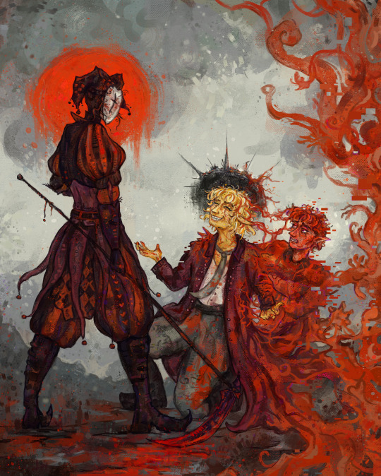
Please undo what I’ve done, Lord. I will never ask anything of you, ever again, if you just give me back the life of Gideon Nav.
—
The Descent of Gideon Nav, inspired by the statue El descendimiento by Virginio Arias ✨ Prints are available here! ✨
#the locked tomb#tlt#the locked tomb fanart#gideon nav#harrowhark nonagesimus#harrow the ninth#gideon the ninth#griddlehark#kiriona gaia#gtn#gtn fanart#htn fanart#htn#floweroflaurelin art#worked on this a little bit at a time between commission stuff :D#now that HC s10 is out though I want my ‘between comm work’ painting to be something for that hehe so i finished this wip up to make space#genuinely beige is my favourite colour scheme to work with nobody does it like her#cw blood
2K notes
·
View notes
Text
going back to my original thought when i saw the stills… TOMMY IS IN RED!!!!! not beige, not white, not grey, not black. RED.


it suits him so well.
205 notes
·
View notes
Text
set us free
#can you tell red is my favourite colour#anyway absolutely loved the spep moment#him fighting back for his body really added something to the fight#moreover something id never seen before 10/10 no notes#plus mapicc knockback sword hehe great fight all over#also my laptop may be dying but the draw cannot be stopped#honestly my screen flickering wildly throughout the whole rendering process really added something to the experience lmao#princezam#spepticle#clownpierce#lifesteal smp#lifesteal fanart#lssmp#my art#tealarts
306 notes
·
View notes
Text

pre-ascension fenglian
thanks to anon who sent fenglian hate to my main blog 😌 if it weren’t for you, i wouldn’t have thought to make this! you directly contributed to more fenglian art existing ☺️
#fenglian#tgcf#feng xin#xie lian#heaven official's blessing#my favourite doomed little teenaged romance#i bought a red coloured pencil for the blushes hehe#sketchbook#daily sketch#fanart#artsyfartsy#tian guan ci fu
111 notes
·
View notes
Text
finally remembered to update my strawpage and carrd *checks watch* 9 days after my birthday. oops
#this is your sign to check them out if you haven't already !! pretty important info in there but i know a lot of people don't look anymore#i considered giving them a full overhaul but just making these changes took ages for my indecisive ass#my favourite colour isn't purple surprisingly#i don't really know how to feel about the gifs with the colours but i wanted to use ones i've made#maybe i'll do a full change up one day#don't be afraid to send me things through strawpage too !! it's always fun hehe#chewy ramblings
2 notes
·
View notes
Text
The way I recolonized the color white
#txt#this is MY color 🗣️🗣️🗣️#it’s also my girlfriend’s favourite colour what do you know#this was actually a date outfit hehe
2 notes
·
View notes
Note
no cause the way i was wishing i had bought my juicy tracksuit in baby pink instead of navy blue for the barbie movie….
omggg anon but the navy blue is SO pretty!!!!! the only juicy item i own atm is this super cute powder blue hoodie dress c:
#i love blue it’s my favourite colour hehe c:#the navy is rly rly nice!!!!#i do want a powder pink set tho#like so so so bad#similar to the one regina’s mom has in mean girls#YOU KNOW THE ONE HEHEHE#omg anon did u see the film!? did you like it!?#i loved it so so so much#have a fab sunday bb!!#pls stay safe n drink water ok!!!#inky.bb#clari gets mail
3 notes
·
View notes
Text
The power of wearing a skirt (sans tights) for the first time since the start of winter... unparalleled
#by which I mean the power it has on my beautiful boyfriend hehe hehehe#Bloom talks#it's his second-most favourite skirt#the first most-favourite is the same model in another colour#and I cannot wear them in winter for fashion/matching reasons
1 note
·
View note
Note
11, 20, and 29 for the oc asks :> for any of your guys!
Oohh but who to pick! Who's been on my mind lately, who I haven't already talked up too much hmmm... Maybe Minki! :D

11. What was your inspiration for your OC?
Minki was the fallout of one of my Vargas AU brainstorm session actually (how??) where I was trying to come up with a pun for a potion shop owner - she came name first, then the logo of her business, then her full design! I ended up being so happy with her that I fully fleshed her out into her own character and she's taken up residence with a few other OCs that I haven't explored quite as much, but I have thought about a good clip
20. If they fight, what’s their weapon of choice?
Minki is a potions witch! She's not much for fighting herself - she makes a business of selling her potions so other people have the upper hand in their fights - but she keeps some in reserve if she needs to defend herself! A basic set of strength, stoneskin/defense buff - a fire-res in conjunction with a bottled fireball is quite effective on any hopeful intruders hehe
29. Imagine a mood board for your OC! What’s on it? (Make it if you want!)

Just a mini one this time hehe <3 She's a fairly straightforward gal!
#Woah an original post#Ask#Ask me#Minki#My art#Since it technically features lol#I keep meaning to make Minki a colour reference - it's on the pile#She's got rather strong colours in my head thankfully! Her hair is a nice gunmetal blue :D#She's got a fairly blue/purple leaning design - who me? Favourite colour? No don't be silly#Pretty sure it's been a while since I mentioned but her bracelet is actually a bunch of vial-baubles hehe#She carries ingredients with her! Easy to grab always on her person in case she's in a pinch#She's probably also into distilling now that I think of it - potion witches are really more alchemists than magicians huh#Anyhow lol#The other OC she's sometimes seen with is the drider lady! If I ever get to it there's a Whole Thing with her#I like her very much <3 She and Minki are customer-business owner style friends haha#A common patron who is polite and purchases well without haggling too far! Friendly :)#Mostly stuck to the Public Domain tag in Ecosia to gather images - I tried to use Pixabay but there's so much AIgen stuff D:#I go to Pixabay to /avoid/ AI stuff! Blegh#Hopefully that first one isn't... The other three are all photos! Or well - the singular potion might be a 3D model...? Bit hard to tell#I did some colour touch-ups on the lot :) Hopefully they're seamless >:3c#Ty for the ask! :D
1 note
·
View note
Note
:0 the new blog theme is very pretty
-🦎
ty!! <3
0 notes
Note
I like all colors actually but I like orange xD I had orange phase when i was 18, my entire room was orange and everyone hated it. No but at this point I don’t know what color I like.. I’m always changing
sjldfjksdhfdf yea i used to be the same with blue and pink!! all colours do be very pretty tho hehe no point in choosing just one 😌
#🍑 mail#yeonbins#vivi <3#i say that as i build my entire blog around one colour sdajfhlsdjfh#but also you not having any favourite colour makes it considerably more difficult for me to#make you a personalized gifset with your favourite colour 😔#i'll figure something out hehe
0 notes
Photo


The best! The very best of skeletons! (Patreon)
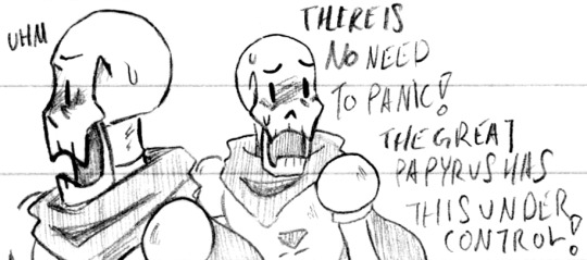
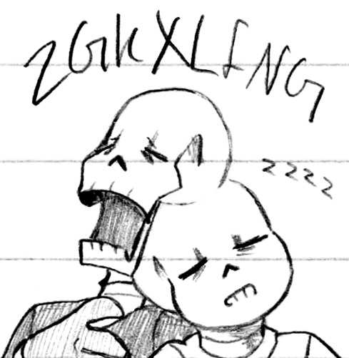
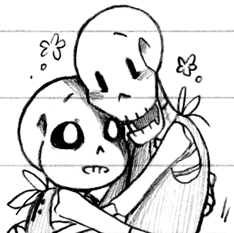
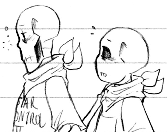
#Doodles#UT#Handplates#Papyrus#Sans#A mix of several things! Some redraws and digital reconstruction and high editing/low cleaning >:3c#This paper Actually makes that possible thank goodness#It's not the best paper but it is better in that way for sure#Quicker is all I can ask for really#Anyhow! From the top!#In looking at the old doodle with a blushy Papyrus it looks like the only thing I ''redrew'' about it was the blush itself lol#And being a bit smiley#He's very cute when he's so distracted in battle haha leave him be he's very busy!#The second one was so fun! I was very stylistic with his lower jaw in the original :D The way he looks like an interlocked puzzle piece haha#I trust him he's definitely got this handled#Colour doodles! Red and blue boys! Tall and short long and stout <3 Love 'em#My two favourite colour tools my blood pen and my blue pencil ♪ I could've gone in with my various yellows but pfsh#A nice clean two-colour is very nice :) Or in Sans' case just blue haha#I was using the same blood pen in the original too! Well the same casing anyhow the ink has since been replaced hehe#Snuggling sleeping brothers <3 Another one that was digitally reconstructed! Hopefully it's not super obvious#Even back them I was doodling them sleeping on each other haha - Handplates was an influencing factor ♪#And now into the definitely-Handplates! I love how even in sleep Papyrus snores in capital letters and Sans in lowercase hehe#It's so cute! Sans will fall asleep at the drop of a hat but Papyrus is so much more obvious with his sleep!#Maybe it's like concentrated vs. evenly spread out haha#Babies!! Love them ;; That one was originally meant to be a comic panel but I got their posing wrong lol I misremembered#But they turned out so cute! Look at them!#I especially like Sans' super-glowing eye in the shade of Papyrus <3 Sweet lads#And a couple sleepy boys to practice skeletal profiles :) Nose? Teeth? They have a subtle silhouette but there are varying shapes!#I defaulted to a more chibi look on Sans tho haha his fused jaw and big eyes just give that kind of appearance ♪
425 notes
·
View notes
Note
I just wanted to tell you that I love idwtbamg and am especially blown away by the character designs for aika and zira!!!!!! their colour palettes compliment each other really well and are soft while still having some contrast and I would love to know how you came up with the designs or if you don't feel like sharing that, your favourite parts of their designs and what you're most proud of? Good luck with the pilot, by the way!!! ^^
Aw thank you so much! Character design was initially what I wanted to do when entering the industry so I love whenever I'm able to do it~
I talk about my process for picking colors here a bit!
Design process under the cut (loooong post ahead)
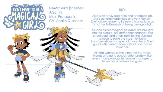
Whenever I'm designing a cast of characters I always start with the main character and build off of them. I started specifically with Aika's normal girl design. I wanted a star theme, and the star hair was the first thing I knew I needed. With her hair being the most eye catching and important part of her design, I wanted to make sure whatever else she had going on wasn't gonna distract from it too much. So I went for a more top heavy, but simple look with a big tshirt, small black pants. Aika was initially fully blonde but the stark black pants was starting to pull the eye. That gave me the idea to use the stark black in her hair (for the bottom half)! Made her hair even more eye catching and highlighted the star pigtails in a nice way.
For her magical girl design, I wanted to make it feel over the top and overwhelming to contribute visually why Aika wouldn't want to be a magical girl. Big poofy dress, ribbons poking out everywhere for a crazy silhouette and tall, tall platforms. I also wanted to give her longer hair in this form so I went with goddess locs! I was able to do an easy shorthand with it (long thick strands with lil curls at the end) I like the kinda biblically accurate angel look she has. My favorite part of this design was the ribbons in her hair that make the star pigtails look like shooting stars heehee
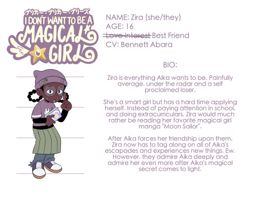
With Zira I knew I wanted her to be opposite to Aika. So sticking with the space thing, I gave her a moon motif and that was my jumping off point. With Aika having high pigtails, I decided to give Zira low pigtails and give them a vaguely crescent shape (like crescent moons get it?). Continuing with the opposites thing, I wanted to make Zira's design bottom heavy as opposed to Aika's top heavy one, and also color-wise, go on the opposite side of the color wheel from yellow for its complimentary color, purple! I didn't want Zira to feel too stylish (she's a loser after all) but also didn't wanna make her design ugly. I tried toeing the line of out of style but lowkey trendy with the grungy skirt, jeans combo. Also went with the stark black shirt under the tshirt to lean harder into the 2000s look. On top of that it helped tie her design to Aika's more (this is where I decided the stark black was gonna be an essential part of the design language of this show). My favorite part of her design for me is the mangled ends of her pants. It's a small detail but I think it says a lot about her as a character (she drags her feet, she's a little careless, kinda messy, etc.)
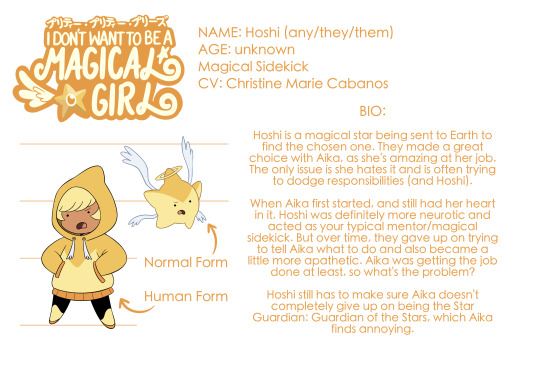
Hoshi is star. There's not much more to their design haha. I did give them wings to mirror Aika's dress ribbons. With their human design though, I just knew I wanted to make sure that they'd be able to make a star shape with their silhouette. Thus the hoodie and stubby limbs. Gave them the stark black pants (again at this point, it's part of the design language of this show). I tossed around the idea of giving them eyes that matched more with Aika and Zira, but it just didn't look like Hoshi so I stuck with the same face in their star design and I just thought that was funny hehe. My favorite part of Hoshi's design is just the overall fact that I managed to make them look like a star in their human form still haha
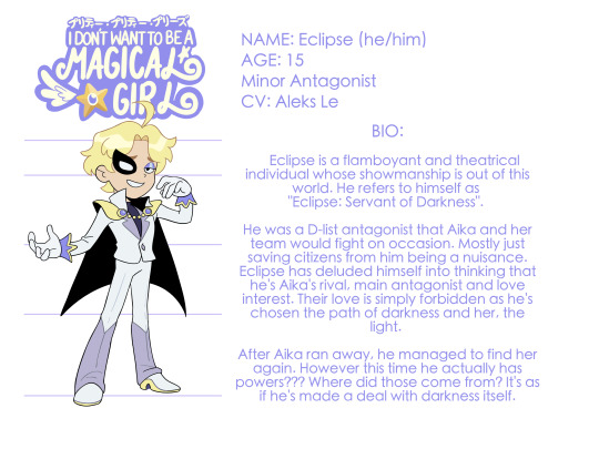
Eclipse was the hardest design for me. You would not believe how long it took me to decide whether I wanted to make him a boy or a girl. Eclipse was also gonna be named Void (and DeVoid was gonna be Eclipse) but it didn't feel quite right. I knew I wanted him to ALSO be opposite from Aika, but in a different way that Zira is. Looking at it that way helped me land on the name Eclipse because I thought it'd be fun to give both Zira and him moon motifs (as Aika's love interest and alleged love interest respectively). Similar to Zira I wanted to have purple be in his design to contrast the yellow in Aika's design. Due to his name now being Eclipse, I figured going dark with his design would make the most sense but my friend/roommie Bri @/ghostbri (who is a professional painter/color designer) suggested going pastel instead and it worked perfectly. It matched his personality and also plays on the fact that he cares more about theatrics and aesthetics than actual villainy. He completely misses the point of being the servant of darkness. He's heavily inspired by Tuxedo Mask. I wanted to make it feel like he saw a cool character once in a tv show and he decided to make it his whole persona. So he's got the suit, he's got the cape and he's got the mask. My favorite part of his design is his cape, intended to also have a crescent moon shape but then also have that stark black on the inside so his silhouette really pops against it. It's funny bc it ended up being like a reverse eclipse where the light is blocking out the dark.
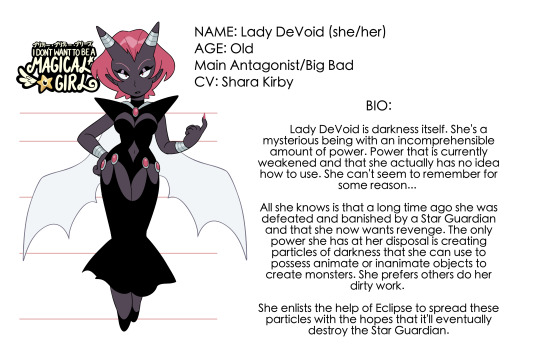
DeVoid was the easiest for me to come up with the design for LMAO. Like obviously. I wanted to make her feel slick but prickly but also slightly over the top like a lot of old school magical girl villains. I thought it'd be a difficult balance to strike but it actually wasn't too bad! I gave her a sort of form fitting cocktail dress and at this point the stark black was a must so it worked out that the "void" character would just be in that all black look. It really helped her feel slick like I wanted (also gave her the slicked back hair for this reason). To give her some edge, I gave her the giant pointy shoulder pads, giant pointy horns, pointy ears, sharp nails and bat wings! Oh also worth mentioning she's the one main cast character I didn't use Aika as a jumping off point for. I designed her to look good next to Eclipse since they'd be the ones interacting the most. I made her wings white to contrast with her black dress (opposite to how Eclipse has a black cape but then mostly white outfit). To ensure that her design wasn't too dark and that her arms would read against her body, I gave her those bright silver bracelets~ While her design was easy for me to come up with, my god figuring out what color to make her hair was killing me. Tbh I was avoiding pink/red like the plague. I didn't want her to look toooo much like Jessie Team Rocket LOL. I tried white, I tried purple, I tried a more pastel pink but none of them worked well in a lineup with the rest of the characters. Bri helped talked me through all this haha. Pink/red worked the best especially there was no pink/red in the entire lineup. The Jessie influence is still there but I feel like she looks different enough! Favorite part of her design is her big ass horns)


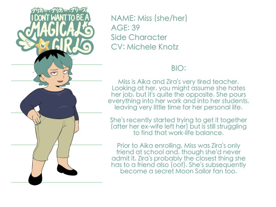
Finally Miss! Miss was an interesting case because I designed her as I was storyboarding the pilot. She was intended to be an incidental character that we'd only randomly see once in a while. She had a veeery generic teacher design in my first pass but then as I was hiring VAs I got the idea to cast Michele Knotz to play her and that was enough for my brain to start going and come up with a backstory for her and a role that could tie in with the rest of the cast in a more meaningful way. Because of this, I designed Miss to the voice I imagined Michele would use for her. She does a great groggy and tired voice so I gave her those tired eyes, she has a darker color palette, her posture's a little more sluggish, etc. Her design still felt bland in the board so I gave her a couple piercings which helped. But then! The stark black! I gave her the half dyed hair which worked phenomenally and is probably my favorite part of her design. It leans into the tired feel (too tired to dye her roots) and also was a nice way to get the black in her design without just having to give her black pants or a black shirt or something. I'd only figured out her color palette way later and after recording Michele. The VA announcement image was the first time I'd fully drawn and colored Miss. I went with green since there was no green in the lineup! Also green's my favorite color so I had to.
PHEW that's it! Hope it was an interesting read and look into my brain.
768 notes
·
View notes
Text

Morning Dawn Delight
She is such a silly and whimsical pony, fun fact this time of year is my favourite because i love seeing all the wildflowers out >u< i also really dig pastel colours that are associated with easter. Combining those two and im very happy hehe.
Also this pony's name is great love it.
#art#furry#mlp#my little pony#cute#pony#mlp g3 art#mlp g3#mlp earth pony#mlp easter#easter#mlp Morning Dawn Delight#morning dawn delight
218 notes
·
View notes
Text


usagi gestures & compositions :]
hehe honestly I rly just wanted to colour. I loved drawing the poses and the fluidity on the first pic sm and I’ve barely explored this newer colouring process of mine. I might decide to expand on some of those poses like the bottom left. Usagi (having no face) can get pretty expressive, I deffo could have gone more exaggerated which is all the more incentive to draw MORE of him!!
Iiii don’t think I ever uploaded the second page spread on here let alone that apple piece as its own thing which I might repost
I loveeee Usagi so much he is my favourite oc in the whole wide world Blue Marble, I wish I can tell more about him with yall one day ^_^
288 notes
·
View notes