#my art style is so inconsistent is so funny
Explore tagged Tumblr posts
Text

A bit of hair washing and styling won't hurt, my dear silver cowboy!
#my art style is so inconsistent is so funny#still trying to get out of art block :(#honkai star rail#hsr#hsr fanart#boothill hsr#hsr boothill#boothill#implied Argenhill#honkai sr#argenhill#art
1K notes
·
View notes
Text
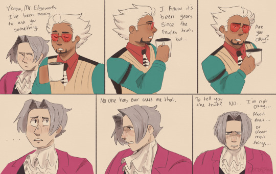
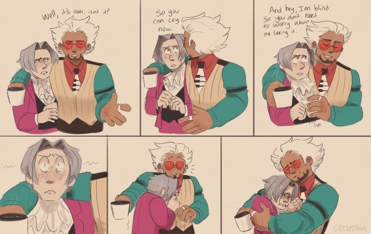
I saw an interesting post a while back that said “Capcom made us [Miles and Diego/Godot] only have like two(?) interactions because they knew we would be unstoppable with a brother dynamic” and tbh it stuck with me bc it was intriguing.
So yeah that potential brotherhood, but that Godot/Diego AU I made (that I still need a name for)
Also I bet Gregory Edgeworth would have smelled like a bit like coffee, and so Diego just reminds Miles of that comforting presence 😭 (the von Karma estate was a tea household, so he didn’t smell much coffee after DL-6 and didn’t realize how much he missed it/reminded him of his father)
#doctorsiren#ace attorney#ace attorney au#diego armando#prosecutor godot#miles edgeworth#comic#ace attorney fanart#good guy godot au#art#digital art#my art#fanart#procreate#loving the inconsistent styles for Miles in the panels HAHA#that post also made me think of an AU where after the Fawles case. miles goes to Diego asking for help because he can’t stop thinking about#what happened on the stand and he can’t go to his mentor bc he’s showing weakness and that’s not allowed#and essentially long story short. miles decided to drop prosecuting after one case and be a defense attorney and he asks Diego to protect#him from von karma and also to be his mentor#so it’s like Mia and Phoenix but it’s Diego and Miles and then after Diego gets poisoned. Mia has to mentor Miles and she’s a little#hesitant at first because of how cocky he was in that trial but she sees that he’s genuinely trying to be better#also Diego would ask miles: you’re trying to be what von Karma wants you to be…well..what do YOU want to be?#and miles would answer: I want to be my dad#JUST LIKE IN MY 1985 ANIMATIC#ANYWAYS I’M BRAINROTTING SO HARD RN EXCUSE ME LMAO#ALSO MY FRIEND SAID THAT IN THIS AU (the one in the post) DIEGO AND PHOENIX ARE ENEMIES TO BROTHERS#and that’s the best thing I’ve heard all day it’s such a funny statement AND IT’S TRUE!!!!
1K notes
·
View notes
Text
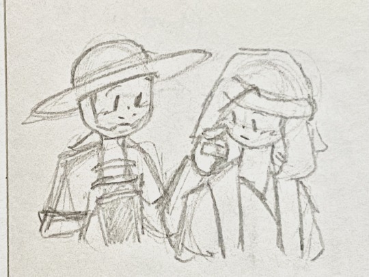
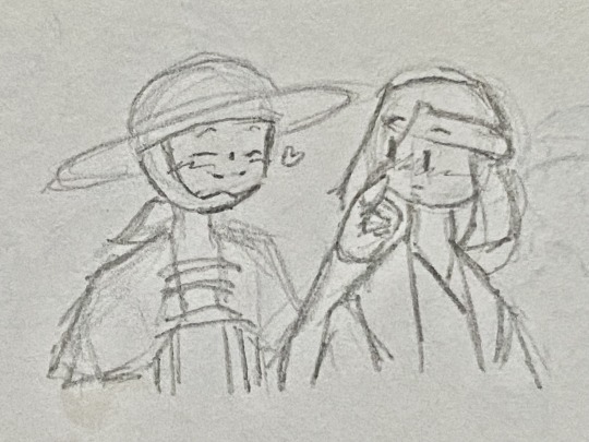


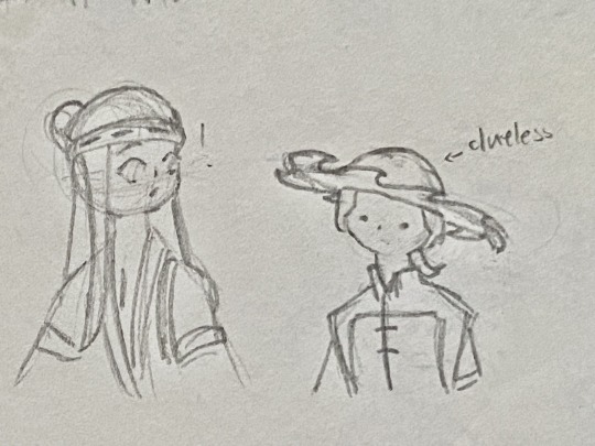

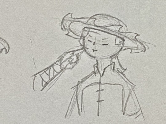
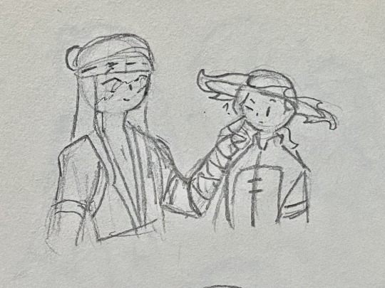
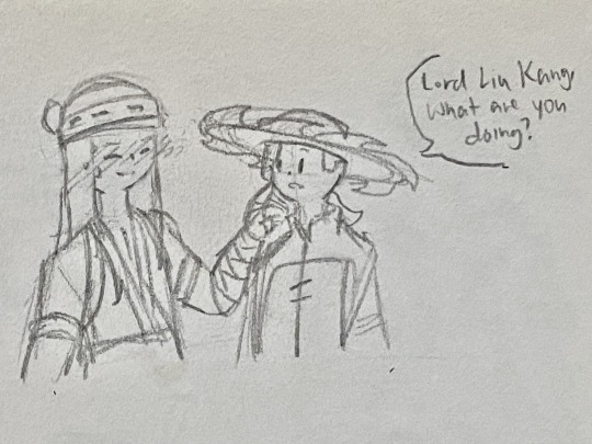
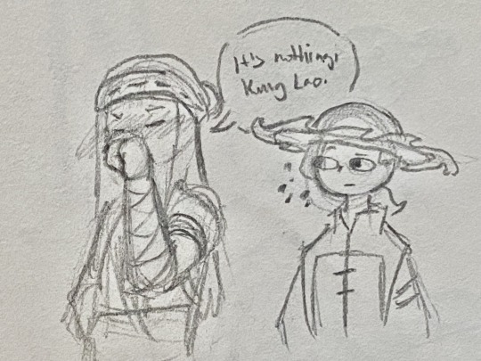
boop
#mortal kombat#mortal kombat 11#mortal kombat 1#mk1#mk11#mk1 2023#liu kang#kung lao#liulao#mk11 fanart#mk1 fanart#comic#i hate when my art style is inconsistent lmao 🫠🫠#i doubt liu kang is obviously taller in mk1 but ik he’s *slightly* taller#but it’s still funny#kung lao’s hat is so hard to draw rughhh#thinkinf about#THEM#liu kang x kung lao
226 notes
·
View notes
Text


No inktober or ectober this year cuz am very busy, so instead have some new and old art I forgot to post here
#nyk did art#art#danny phantom#dani phantom#dani fenton#krew#krewfam#krewfanart#itsfunneh#funneh#lunar3clipse#lunar3clispe#i love them#my art style be all over the place#so inconsistent it’s not even funny cry#lunar krew#Funneh krew
39 notes
·
View notes
Photo


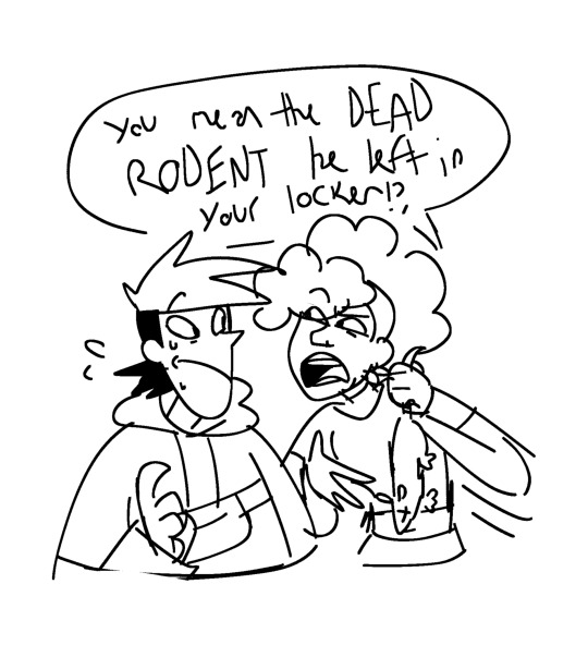

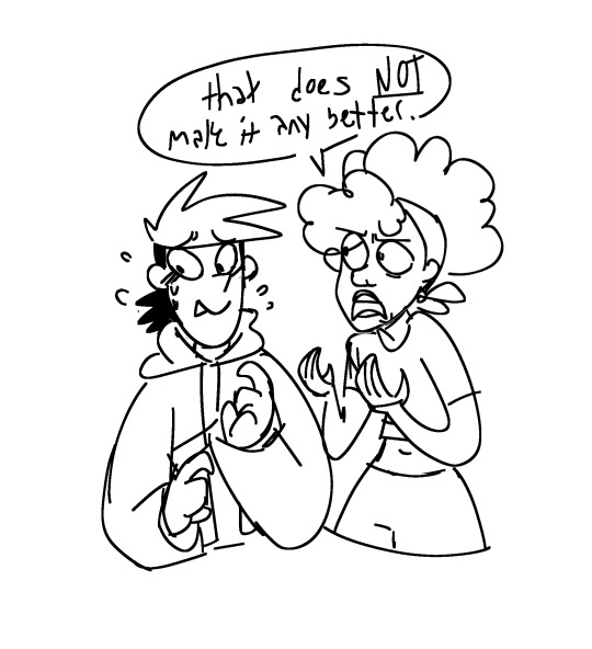

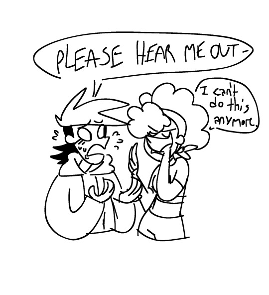
I had a vision and I needed to draw it
Harriet can only take so much,,
#art#clone high#clone high season 2#clone high confucius#clone high harriet tubman#tophucius#topher bus#he’s mentioned#THEY ARE FUNNY TO MEEEEE#dead rodents are peak love language#MY STYLE IS SO INCONSISTENT RRRRRRAAAAHHGGGGGGHHHH#They are so funny bc Harriet cares abt confucius and supports him but she also HATES topher so she questions his mental well-being sometimes
204 notes
·
View notes
Text

Mb I died again ya’ll hollow knight took over me
#rottmnt#rottmnt fanart#rottmnt donnie#unpause rottmnt#artists on tumblr#also funny thing my art likes to turn inconsistent with its style so#Also expect more stuff soon tht i’ve been doodling on teehee#my art
235 notes
·
View notes
Text


I had to get it out of my mind so obviously it has no context
#I lied there is a story here#I wondered where 'Art' came from and I said oh it must be some shit like Arthur#But then I also thought mmm that's not funny so I named it Artemis#and I thought it would be hilarious that Patrick would find out at some point in his teenage years and it would tease him lmao#God why are they so hard to draw and stylize I'm dyiiiing#That's why my style is so inconsistent here I apologize for that I'm still getting used to it#HERE COMES THE NORMAL TAGS#my style#sketch#my art sucks#challengers#art donaldson#patrick zweig#challengers movie#challengers fanart#traditional drawing
15 notes
·
View notes
Text

someone is not having a great day unfortunately :/
#ganondorf#animatic project#thralls of power#oot#wip#my art#Someone is getting his ass kicked by a ten year old!!!! oh nooooo#my style is so absolutely inconsistent it's very funny#I'm trying to power through to the ending but I get swept in the Process instead of doing ms paint doodles :/#anyway#bad day all around for mr dragmire :(
24 notes
·
View notes
Text
i'd render my art more if i enjoyed the process at all. you have no idea how many times i wanted to give up during this

#my art style is so. inconsistent it's not even funny man#i'm proud of this! i'm never gonna draw anything like it again but i'm proud of it!#detroit become human#dbh markus#my art
67 notes
·
View notes
Text
MORE SPAM IM NOT SORRY AUSGAJGSKAHS BUT I HAD A GRAND TOTAL OF 80 ATTACKS THIS YEAR SO IT TAKES MANY POSTS TO COVER ALL THAT LMAOOO (and i dont wanna make another collage like i did last year LOL)
HERES SOME GUYS WITH SILLY LIL BACKGROUNDS AND SQUIGGLES N STUFF‼️‼️‼️‼️


WOAHHHHH IMAGINE NOT HAVING A CONSISTENT ARTSTYLE COULDNT HE ME LOLOLLLLLLLLLL

#artstlye#inconsistent art style#inconsistency#my artstyle is so inconsistent its not even funny lmao#digital art#art#artfight#team seafoam
4 notes
·
View notes
Text
You ever get really upset how good one of your drawings is and then completely forget how to draw in that style again? Totally not me. Nope.
(Cries in inconsistent artist)
#art#jokes#totally fine#lol#im so funny#my art is trash#inconsistent art style#ihave4obsessions#im frustrated
0 notes
Text
the job has been going surprisingly ok! I got most of my hours for the week done in like 4 days and im kinda hoping next week i can cut that down to getting it done in like, 3 and then having 4 days off lol. but i do have a webinar thing to attend tomorrow and im dreading it dskkfhkj. i never do well at live meeting call thngies. I do ok at in person ones but for some reason web based ones wig me out x_x (its only like 45 mins and mic only so it could be worse??) auggh
#just experiencing Real Heavy anxiety abt it. like im sure itll be fine#but also its kinda objectively funny to have a training/basics and faq webinar. after ive been working here almost 2 weeks? LMAO??#a bit late for training isnt it?? 😭 ive been learning on the job...#ive made a few mistakes so far and my brain is like. the person is going to call u out on ALl of them and be mad#but. the guide literally said u have 3 months to get ur accuracy up to a certain level . so i know thats just anxiety talking#BUT STILL.#at least i recognized they were mistakes on my own and dont make them anymore?? like im still learning TwT;;#i dont actually hate the job its very chill and a diff vibe from my prev jobs and the work is kinda interesting#like its prob not what id choose to do ideally. but. not mental breakdown type terrible?#like itd never be enough to live off of and the work loads are very inconsistent but. yk. its better than nothing#and better than going back to retail hell. ill die before i go back.#im kinda just hoping theres a lot of new hires at the webinar so i can just knda sit back and chill w/out having to say much lol..pls dont#be a small group...#i also want to try and list more things on depop tomorrow or this weekend bc idk whats going on w me#but i like. hate evryhting i own suddenly ?? and want to kinda overhaul my style...#ugggh. my brain is full of bees lately#sanchoyorambles#i also wanna post some art sometime soon bc my art blog is STAGNATING but i havent had anything huge to post#im working on smthbehind the scenes but its BIG and taking TIME
1 note
·
View note
Text
sobs
#you ever cry over how pretty a man is#spookyshipping#i’m feeling things tonight sorry#i don’t post the whole day and then casually pop on here to sob on your dash over ryou. usual rainy activities#particularly gushy about how he looks right now. don’t mind meee#erm. his eyes :(#brown eyed ryou truther forever and always but i like all art of him with any eye color#i just prefer the anime giving him brown eyes because i think it goes well with his white hair <33#especially if they’re dark brown eyes…#and his eyes are literally so big sgdkdhs it’s a given because anime art style but#his eyes are so pretty… love his eyes. his blank stares or even the way he closes them when he has that soft smile#hhh… heart clutch#and his hairrrr aaaaa#his hair is so inconsistent in canon lol it goes from being at his shoulders to half way down his back#it’s kinda funny#i go crazy over it in reblogs enough times so i think it’s obvious that i love his hair too#fluffy… i think about playing with it a lot. just getting to sit and run my hands through it…#i should ask him if i can brush it one of these days…#i love his smile so much he always looks so soft whenever he does smile#and his hands… agsfjfndjfjf#like holding his left hand and just rubbing over the scar on his palm. i like tracing it and getting to help when it starts cramping up#and the scar on his upper arm and the ones on his chest… i like getting to trace those ones too#he’s so pretty i don’t think i’m ever gonna get over it#love him so much i just wanna stare at him forever and ever :((#am tired and thinking thoughts about boyfriends as always >_<#prettiest boy ever and i am over here in tears about it asgjdbd#am fine i think#delete later
0 notes
Text
sharing my opinion here about serizawas design inconsistencies over time (spoilers for mp100 ending) i feel like in each new rendition of serizawa weve seen in official art ever since the start of S3 something feels off in a different way with every new merch release
lets start here ⬇ serizawa looks like,, himself. accurate to how hes drawn since his first anime appearance


⬇⬇⬇ and then slowly,,, things start to look off. his jawline is slowly getting slimmer, his eyes look wider (same with mobs too)

AND DONT EVEN GET ME STARTED ON THESE. especially the one on the right my god. who is that


every new promo art that comes out just feels very careless. I think you could say so for all the characters (mobs giant eyes, reigens waist getting skinnier/pointier features. the PROMO art of dimple that was literally FULLY TRACED OFF OF A TEMU PIRATE HALLOWEEN COSTUME. they all look bad here)

it just feels a little depressing how little they seem to care anymore, like theyre just trying to pump out merch without bothering to use a character reference.
i notice the changes the most with serizawa. every promo art looks like theyre playing a game of telephone. each version of him is based on the last, instead of his initial design (shown below)

at the end of S2, when reigen cuts serizawas hair, he still looks like himself. they did a great job of showing "how serizawa would look underneath his moustache and big hair". In S3 it feels like they've lost that mentality completely. like he's no longer based off of his original design, but an entirely new reference of his salary man look. some comparisons between S3 vs S2 and OVA down below


I find that the line weight in S3 is much heavier and unfocused. but what bothers me most of all is that... Serizawa looks different in nearly every scene... as if they're undecided on what he should look like. the shape of his nose and jaw, his hair all change depending on the episode entirely.


The art style change for S3 was meant to be "more accurate to the manga", but I find that it had the opposite effect. especially how serizawas and ritsus eye shapes changed. ritsus large pupils and serizawas more almond shaped eyes were more reflective of their manga designs there are plenty of inconsistences in S1 and 2, but they're clearly done with purpose to reflect on ONEs art style (my beloved). I feel like the thinner lines allow more room for detail and extreme facial expressions that truly hold a candle to ONEs insane talent for capturing emotions.


these ^^^ compared to..
erm.. this.. ⬇


just felt very underwhelming... and serizawa certainly does mellow out once he starts working at S&S, but that doesn't mean that there's less opportunity for detailed expressions !!
the yokai fight scene was beautifully made i have no qualms.. but the amount of serizawa lore and dialogue in the manga that got cut from the anime just made him look like a cardboard cut out standing behind everyone. lots of funny and interesting moments cut to make room for the moefication of serizawa katsuya..
I feel like there's a lot of important moments that were cut, (reigen "i hope i can become a partner like that" arataka, serizawa "ive had a similar experience myself" katsuya )
or sad, intense scenes that were made lighthearted (the body improvement club trying to help mob, mob and ??? dialogue being cut, reigen removing his shoes in the final arc made to be meant for better grip rather than... his passively suicidal tendencies )
i think the people at bones are very talented dont get me wrong, i just felt like S3 could have been adapted better. this keeps me up at night its like 1am :) anywhosies thank you for listening to my ted talk i love you
#make everyone a little uglier again. my message#rudies ted talks#mp100#serizawa katsuya#serizawa#kameda come back for reigen ova my love
375 notes
·
View notes
Text

Edit: I MADE AN UPDATED ONE GO LOOK AT THAT ONE IT'S BETTER I CITED MY SOURCES AND SHOWED MY WORK AND EVERYTHING
Ladies and Gentlemen, Bitches and Bastards, Witches and Wizards, Mothers and Fuckers. Esteemed robot enjoyers, I present to you a semi-accurate height comparison of Bumblebee across the multiverse (as of July 2024). This really helps visualize the truly staggering differences between universes, at least height-wise. Also, three of these characters are Canonically the Same Guy; guess which ones.
I spent way too much time on the chart in the back it's not even funny. I will probably make more height charts for more TF characters and universes in the future. Don't expect it soon though, because when I make these, I am fueled by pure I-Got-Bored-At-Work-And-I-Have-Decided-To-Fool-Around-With-Robot-PNGs, and that fuel supply is inconsistent at best.
Hey Fun Fact, Did you know that Generation 1 Optimus Prime is around 19 Feet Tall? Bet some of you already knew that. I have no ulterior motives for bringing this fact up, what are you talking about.
My height explanations are below the cut, because you couldn't shut me up if you tried.
In an order:
Gen 1 - ~10 feet (the wiki says greater than 3 meters so I rounded up to the first whole number because round)
Netflix Cybertron Trilogy - ~10 feet (He looks identical to Gen 1 so... the reason his photo looks weird is because I couldn't find a good full body photo with him standing straight up facing the camera so I put two images together to make the worst looking photoshop job you have ever seen)
Earth Spark - 10 feet (There is no confirmed height yet but using a screen shot of him standing in front of a barn door I was able to make a reasonable guess.)
Animated - 12 feet (I have no genuine source for this, I think this info is just someone's guesstimate, but it seems reasonable. He's a tiny two door mini car, how big could he be)
New Live Action - 15 feet (The wiki hath declared. Also do we have a name for this universe because we need one I don't want to keep saying like 6 words to differentiate this one from bayverse)
Bayverse V1 - 16 feet (This is like the first 3 movies minimum, I don't remember when he hits his growth spurt. also wiki my love)
Cyberverse - 18 feet (I'm gonna be honest, the only info we have is from a really shitty screen shot of a magazine. SO if any one has a copy of this book from the video below, a high quality scan would be greatly appreciated and I will kiss the ground you walk upon. Yes I found the video where the screen shot comes from leave me alone)
Bayverse V2 - 18 feet (movie 4-5 I can't remember which one, I'm not re-looking this up. I fucking love the bayverse tho, this is the only universe with concrete and consistent this-character-is-this-height info)
Aligned Cont. WF/FOC - 20 feet (video game info screens you god send, kiss me sweetly)
Aligned Cont. TFP/RID15 - 21 feet (I do not know exactly where these numbers were found, but I fully fucking believe them. Just by looking at these characters on the show I can verify these numbers in my mind. They made specifically this universe to be full of freakishly tall robots for some fucking reason.)
And for any one who doesn't know, the three tallest are the same guy. Like the 20 feet tall one and the 21 feet tall ones, same guy. The ones in three wildly different art styles and designs. Let that sink in...
I fucking hate the aligned continuity why is that one my favorite.
#THIS ONE IS OLD GO LOOK AT THE BETTER ONE#All of these numbers are straight from TF Wiki or Fandom Wiki except the ones I specified came from guesses#it looks like a fucking criminal line up#please enjoy my inane rambling and obsessive knowledge consumption#Transformers#maccadams#bumblebee#tf bumblebee#tfp bumblebee#rid15 bumblebee#g1 bumblebee#earthspark bumblebee#tfa bumblebee#bumblebee 2018#bay verse bumblebee#transformers bumblebee#Transformers Height Charts#aka the adventures of a mother fucker with the power point program#personal stuff#I'm gonna die when I do the characters that show up in every universe that's going to be so many tags#opmus I love you but sweet fuck theres like 14 of you
341 notes
·
View notes
Text
.⋆。゚ Art vs Artist 2024! ⋆。゚☁︎。⋆。 ゚☾ ゚。⋆

Click for better quality!
It's my first time doing art vs artist, but I thought it'd be a nice opportunity to see how it looks! My style has been so inconsistent this year (thanks multiple style crises), but I am proud of a few pieces. Mostly. I seem to use similar techniques and colors a lot, but I guess that's the point of an art style anyway. Everything up here is cropped a bit since I don't draw at a 1:1 ratio usually. If this is your first time seeing my work, I love The Legend of Zelda and Zelink!
Thanks for another fun year of art! ^^ Some stats below:
#1 | 1,943 notes | June 18, 2024
• ▪︎ • ▪︎ • ▪︎ • ▪︎ • ▪︎ • ▪︎ • ▪︎ • ▪︎ • ▪︎ • ▪︎ • ▪︎
༺ Top 10 posts by notes!
I remember drawing this on the announcement day, within a few hours! It's my first post to surpass 1k!
My second post to surpass 1k!
#2 | 1,197 notes | June 22, 2024
#3 | 694 notes | July 27, 2024
...trends work
i need to repost this with type instead of handwriting
#4 | 572 notes | August 3, 2024
I want to redraw this one, even if it's not very canon
#5 | 546 notes | July 28, 2024
#6 | 528 notes | August 5, 2024
I will continue to change how I draw her
#7 | 456 notes | Setember 19, 2024
I tried a slightly different look here, I think it's kinda cute!
A tie!
#8 | 456 notes | June 19, 2024
Two pieces are in this post! I love Classic Zelink, so I was trying to figure out how I wanted to draw them. :) I have a lot of drawings of them to come...
#9 | 355 notes | June 9, 2024
I've really been trying to figure out how I want to do backgrounds on my doodle pages. And how to draw TP Zelda properly. Still haven't figured either out, if you're wondering.
#10 | 353 notes | May 18, 2024
. . . . . . . . . . . . . . . . . . . . . . . . . . . . . . . . . . . . . . . . . . . .
So much from EoW... I jumped on that hype so fast, it's the Zelda game I've only ever dreamed about!! ♡ Still kind of surprised nothing from Linktober is up here, though, considering it was all the better stuff. ^^" There are a few pieces I never finished this year, also... maybe 2025 will be their year!
▪︎ • ▪︎ • ▪︎ • ▪︎ • ▪︎ • ▪︎ • ▪︎ • ▪︎ • ▪︎ • ▪︎ • ▪︎ •
Small announcement - I got a private commission I'm working on at the moment, but soon they will be entirely open again! I do character art and designs if you're interested! ^^
. . . . . . . . . . . . . . . . . . . . . . . . . . . . . . . . . . . . . . . . . . . .
✦ Ko-Fi | ✧ Ao3 | ⟡ Bluesky
REBLOGGING IS ENCOURAGED, BUT DO NOT REPOST.
#art vs artist#art versus artist#art v artist#zelink#zelda fanart#tloz fanart#loz fanart#legend of zelda#the legend of zelda#loz#tloz#princess zelda#zelda#fanart#eow spoilers#echoes of wisdom spoilers#major echoes of wisdom spoilers#echoes of wisdom#artists on tumblr#tears of the kingdom#totk#my art#zelink fanart#artist wrapped#art wrapped#digital art#digital artist#ibis paint x#ibispaint#nintendo
40 notes
·
View notes