#mural 3d design
Explore tagged Tumblr posts
Text


Bella Kids Decor and Toys
A cozy haven for young minds, this collection features soft decor elements, wooden toys, neatly organized books, magical artwork, and a speaker to enhance the area, creating a harmonious setting for a child's playful yet tranquil atmosphere. Set includes Table Lamp | Desk Lamp | Wall Light | Pen Holder | Speaker | Book V1 | Books V2 | Books V3 | Toy Box | Toy Plane | Toy Boat | Elephant | Cat Pillow | Posters V1 | Posters V2 | Mural | Rug Download https://www.modcollective.gg/sims4/details/collection/620
Game-ready low poly, optimized for low-end computers. Base game compatible.
#sims#sims4#thesims4#ts4#simblr#simsfinds#sims4interiors#simsccfinds#simscommunity#custom content#ts4cc#3d design#kids#children#bedroom#decor#toys#lamp#pen#speaker#books#plane#boat#elephant#cat#pillow#art#mural#modern#contemporary
52 notes
·
View notes
Text

The right wallpaper brings beauty, soul, brightness, and style to your room. Call or message us, and we’ll take care of the rest.
📞 9899688447 🌐 www.glowviaart.com
#GlowviaArt #WallArt #HomeDecor #StylishSpaces #Wallpaper #InteriorDesign #WallpaperVsPaint #UnforgettableWalls #WallMakeover #StylishSpaces #DecorInspiration #AffordableDecor #TransformYourHome
#graphic design#painting#poster#portrait#3d printing#sketch#wall art#wallpaper#wall murals#wall painting
3 notes
·
View notes
Text
Greater Public Studio: Elevating Your Brand's Visual Identity
In today's competitive market, establishing a strong visual brand identity is crucial for businesses to stand out and make a lasting impression on their target audience. That's where Greater Public Studio, a leading visual branding company in Tampa, comes in. With their exceptional expertise and experience, they have been helping numerous businesses transform their brand's visual identity into something remarkable and memorable. So, if you're looking to enhance your brand's image and create a lasting impact, Greater Public Studio is the perfect choice for you.
Greater Public Studio: The Power of Visual Branding
What is Visual Branding?
When we think about renowned brands like Apple, Nike, or Coca-Cola, their visual identities immediately come to mind - the iconic Apple logo, the Nike swoosh, or the Coca-Cola typography. These visual elements, such as logos, colors, fonts, and imagery, together form the visual branding of a company. Visual branding is the art of using these elements strategically to create a consistent and captivating brand image that resonates with the target audience.
Experience and Expertise in Visual Branding
With years of experience under their belt, Greater Public Studio has honed their expertise in visual branding. They understand the importance of establishing a strong visual identity that aligns with your brand values and attracts your target audience. Their talented team of designers and strategists work closely with each client to create visually stunning, cohesive brand identities that leave a lasting impact.
Crafting a Unique Brand Story
One of the most crucial aspects of visual branding is storytelling. Greater Public Studio excels in crafting compelling brand stories through visuals. They dig deep into your brand's ethos, values, and goals, and weave them together in a visually captivating manner. Through their exceptional design skills, they create an authentic and meaningful brand narrative that resonates with your audience, making your brand more relatable and engaging.
Building Trust and Authority
In the business world, trust and authority are essential elements for success. Greater Public Studio understands this, which is why they focus on creating visual branding strategies that reflect trust and authority in your industry. By infusing your brand's visual assets with professionalism, credibility, and consistency, they ensure that your audience perceives your brand as a reliable and authoritative player, giving you a competitive edge in the market.
Elevate Your Brand with Greater Public Studio
Outshining the Competition
In today's crowded marketplace, standing out from the competition is crucial. Greater Public Studio uses their expertise to design a visual brand identity that sets your business apart from the rest. With their unique and innovative approach, they create designs that are eye-catching, memorable, and utterly distinct, ensuring that your brand remains imprinted in the minds of your target audience.
Transforming Ideas into Reality
Greater Public Studio understands that visual branding is not just about aesthetics; it's about telling your brand's story through visuals. They have a knack for transforming complex ideas and concepts into visually appealing designs that capture your brand essence. Whether it's designing a logo, creating a website, or developing marketing materials, they bring your vision to life, ensuring that every visual element aligns perfectly with your brand's message.
Creating Consistency Across Channels
An effective visual brand identity is consistent across all platforms and channels. Greater Public Studio ensures that your brand's visual elements are well-integrated and harmonious across various mediums, be it print or digital. By maintaining consistency, they enable your audience to easily recognize and connect with your brand, fostering trust and loyalty.
Adapting to Evolving Trends
Visual branding trends are ever-evolving, and staying updated is crucial to remain relevant. Greater Public Studio stays ahead of the curve by staying abreast of the latest design trends and industry practices. This allows them to create visually stunning and contemporary brand identities that not only capture attention but also resonate with the preferences and expectations of your target audience.
In Conclusion
Visual branding is an integral part of building a successful business. With Greater Public Studio by your side, you can elevate your brand's visual identity, create a lasting impact, and set yourself apart from the competition. Their expertise, authority, and trustworthiness in the field of visual branding make them the perfect partner for transforming your brand into something remarkable and unforgettable. So, why settle for ordinary when you can create something extraordinary? Trust Greater Public Studio to take your brand to new heights through their unparalleled visual branding services in Tampa.
#graphic design#hand painted murals agency in tampa#hand painted murals#hand painted murals in usa#hand painted murals tampa#3d printing#digital painting#visual branding services in Tampa#visual branding services
0 notes
Text

Continuing to fire on all cylinders to make this Sky 🤝Mononoke collab a reality! 🐲⚖️🌊
Process GIFs and artist commentary below the cut. ⬇️
Left: Process GIF Middle: Just the background, cos I really like how it looks! Right: Illustration without the collab logo
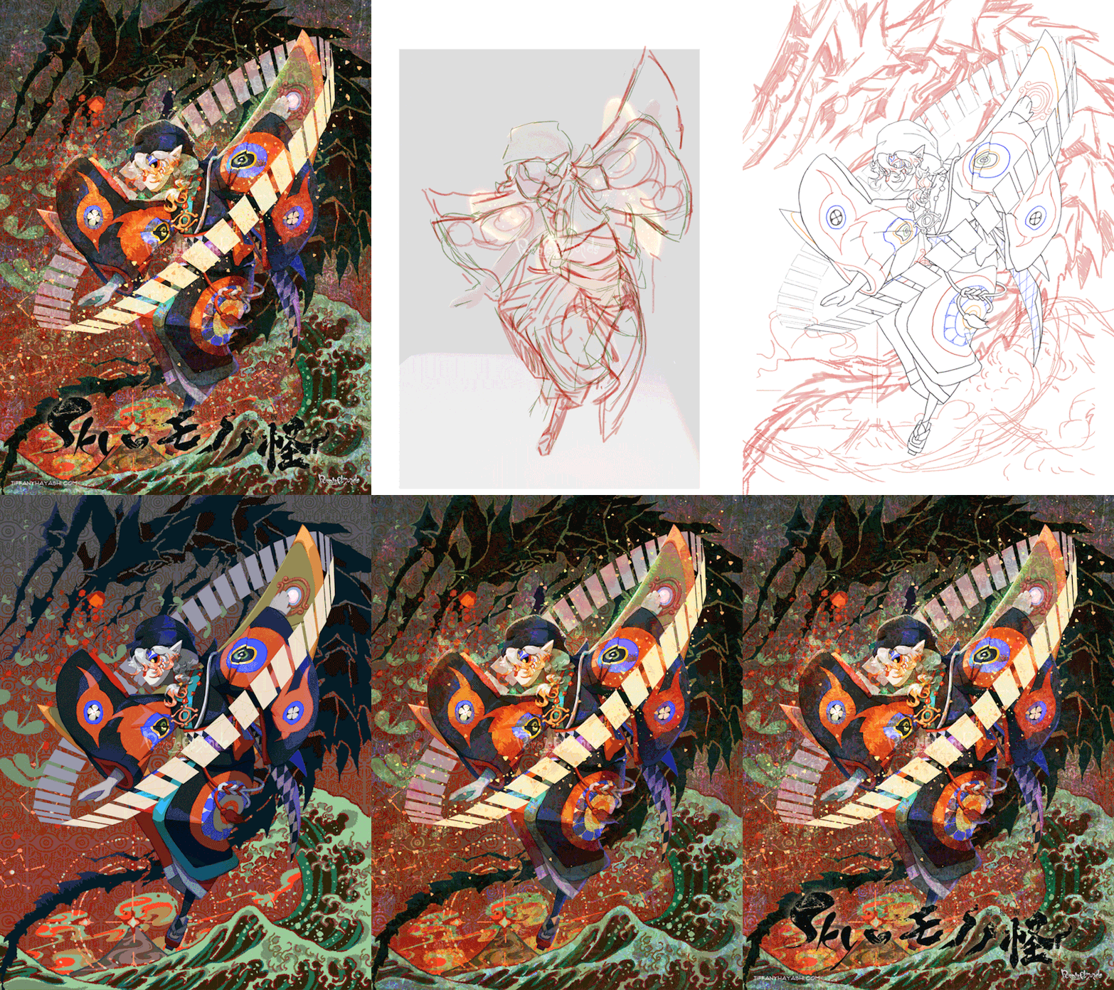
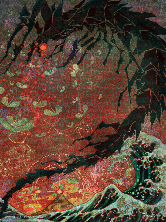
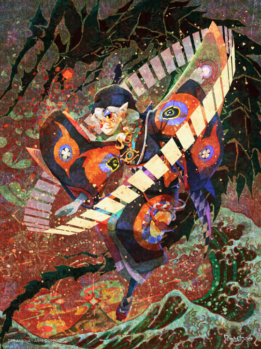
And here are my notes on my inspirations and references. There's a lot of 'em, so instead of embedding relevant images one by one I put them in a callout sheet! For accessibility, I also included transcript (with bonus ramblings) below each sheet.

Ofuda circle modeled in Google Sketchup 2017, then lightly transformed in Photoshop to flare out. I tried my best to hand-draw these, but it the results came out really clunky and stiff. I figured if Mononoke shamelessly utilizes 3D in their show, I can too!
Krill and sky kid composition roughly inspired by the Ayakashi DVD cover illustration. On the surface level, the krill's black-and-red color scheme mirrored that of the bake-neko. Not to mention, in the world of Sky, the krill would be the best fit of a mononoke-like entity. The red background is also a nod to the red skies seen during a shard eruption in Sky.
Sky kid gesture based on the Festival Spin Dancer's Tier 3 poses and the Medicine Seller's iconic pose in the Zakishiwarahi episode as inspiration. This was the idea which springboarded this illustration into existence. I wanted to do my take of the Medicine Seller's pose, but in a more dynamic manner: rotate the pose to a profile position and set the ofuda in a diagonal, flared out arrangement.
Cape inspired by tenbin design featured in the 2024 Mononoke movie. This one's an interesting one - I wanted the cape to be a stiff material that doesn't "flap" when in flight - similar to the Aurora wing capes. It ended up looking like a kite of sorts, which I'm not entirely opposed to! I haven't had the opportunity to showcase the back view of this cape design, but I envision it having some mechanical aspects to it - the "wing" which are flared out in this illustration fold in like moth wings, and a little bell is attached to the "tail" part and it jingles a little whenever the sky kid flaps!
Bandana is based on the Scaredy Cadet's hairstyle from the Season of Assembly. Mask design utilizes the 2023 Days of Style mask and the Nintendo Pack mask as bases. Pretty self-explanatory. I basically went onto the Sky wiki and found the cosmetics that most closely matched what I was looking for. Then if necessary, I went to the Office space to do photoshoots to get the appropriate camera angles for them all.
Seasonal pendant inspired by the classic Medicine Seller's necklace and the eye motif featured in the 2024 Mononoke movie. Possibly the only one-to-one homage to the classic Medicine Seller design here, but his garnet necklace was too good of a match to the seasonal pendant. A side tangent: does the new Medicine Seller possess a necklace, let alone a mirror? So far all the shots of him don't feature it. Fascinating.

Dark dragon krill anatomy references a custom figurine crafted by @/escaflowne_n07 on Twitter. Until I found this, I was honestly at a loss finding reference for this - be it on the internet or during in-game photoshoots. The lighting on the krill in-game focused on its menacing silhouette rather than its structure. And not to mention, getting a close-up shot almost always set off the dark creature's aggro. I have no idea how this guy found the references to put this model together - well done!
Mantas, elder constellations, and sun dog references murals in the Cave of Prophecy. Krill aside, the overall illustration was leaning a little too much towards Mononoke so I tried finding opportunities to insert more Sky into it. Added bonus is that now there's storytelling in the background: during a shard eruption, a giant krill rises from the frothing waves of dark water to hunt down a flock of mantas.
Clouds behind the sun dog reference the ones featuring heavily in the Umibozu episode. This illustration has a lot of ocean theming, so I figured this would be appropriate.
Rendering style of the background is lightly inspired by the 2007 Mononoke illustration. Mainly having a 2D inked style to contrast with the more polished render of the sky kid. Funnily enough, this was a tertiary inspiration, which lead to the discovery in the next point!
Dark water waves and sun dog composition heavily references Hokusai's "The Great Wave". The waves were modified to be bottle-green of the Golden Wasteland's dark waters. The sun dog is in the spot where Mt. Fuji is in the original composition. these were all hand-drawn by the way! I merely emulated the style of the source material. As a side note, I also borrowed the spotted sea spray rendering for the krill's red spotlight.
Background pattern taken from the ofuda design featured in the 2024 Mononoke movie poster. Mainly to add some gritty texture to the sky. I worked pretty hard to replicate this ofuda design as a high-res asset so I wanted to use it more!
#モノノ怪#mononoke 2024#mononoke 2007#kusuriuri#medicine seller#thatskygame#sky cotl#sky children of the light#thatgamecompany#thatskygame fanart#sky cotl fanart#crossover#purplealmonds#2023#🔕
508 notes
·
View notes
Text

Artsy modern home in Plano, TX was built in 1996 and renovated in 2005. 5bds, 5.5ba, 5,675 Sq Ft, $1.525M + $167mo. HOA.

Wow, that's a very Art Deco looking fireplace. Look at the 3D design on the wall. View of the mezzanine above.


Lots of attention to detail, from the design in the windows & the floor to the marble column.

Look at the column- it's split.

Large red & gray eat-in kitchen.

The open concept design includes the family room and kitchen in one space.

Quite a large home office fits 2 people and is enclosed by glass doors.

What an interesting sink the half bath has.

The primary bedroom features a tray ceiling, modern fireplace with a sculptural wall and storage.

The en-suite has a sunken tub with a marble surround and mural, plus a walk-in closet to the right.

View of the living/dining room from the mezzanine.

On the mezzanine they have a game area and seating.


The secondary bedroom has a standard 3pc. en-suite that was given a cool mirror and nice storage cabinet.


The other bedrooms all have the same basic 3pc. baths.

This one has a nice floor.

But, an unimpressive en-suite. The small baths are disappointing.


Covered structure for dining by the outdoor kitchen.

The lot is .35 acre.
https://www.redfin.com/TX/Plano/3516-Twin-Lakes-Way-75093/home/32233786
70 notes
·
View notes
Text
So something I realized watching a few videos and reading a few articles is that most of us aren’t angry at the idea of AI in general. Many of us are excited to learn about AI systems that can identify cancer better than doctors, for instance.
What we’re angry about is generative AI being used to destroy the jobs of artists (and I mean all creatives here), who have already been dealing with their work being devalued by modern society.
And I’m not sure how to deal with it. I do remember learning that when photography became a thing, many painters were horrified and terrified of would erase the art of painting. It didn’t obviously, and in fact photography because a whole new art form.
I grew up during the birth of digital art. I distinctly remember the phase digital art went through where many people declared it to not be “real art” and that it was “cheating” etc. I’m sure other millennial artists also remember this transition. But graphic designers pretty quickly adopted digital tools, and websites like DeviantArt popped up, and I don’t think there are too many people nowadays who would say a digital painting isn’t “art”. Still, I do imagine there is a gulf between how some people would view the “artistic merit” of a 3 ft tall oil painting hanging next to a 3 ft tall print of a digital painting, even if the subject and styles were similar. So the worries that digital art would erase physical painting was also proven false. And for the record, I think digital art is 100% art. The merit of digital art is equal to that of physical art.
On the other hand, I can’t say these changes didn’t affect older forms of art. Like, photography did affect the world of painting. I don’t have statistics, but it seems like it probably affected the world of portraiture the most. And I wonder if many of the 20th century art movements were influenced by photography. None of my art history classes touched on that and it’s kinda weird to me. There is definitely something about a Dada or cubism or surrealist painting that transcends beyond what a traditional photo of a landscape or a portrait can do. There is no location in the real world with actual melting clocks or people whose faces show multiple angles at once.
And then there was the digital photograph that changed everything again! Film has become a niche art form.
There were specific kinds of jobs lost due to the digital transition, too. I’m thinking of things like murals being replaced by printed banners, or book covers often being done in photoshop. Oh, and that’s another tool that was faced with fear: Photoshop! There was a fear it would destroy the need for professional photographers because everyone could just fix their own photos. Turns out nope, and in fact people skilled in photography and photo editing are still in demand. And of course there’s the loss of 2D animation in favor of 3D animation, the loss of practical effects for digital, etc.
And you might argue that in some of those cases people can tell corners are being cut and that they won’t stand for it, but Marvel movies still make billions of dollars so…
So I don’t know what’s going to happen with AI art. I am NOT saying “all current artists are stupid and wrong, in the future history students will laugh at how stubborn they were to resist this idea”. AI art is not comparable to photography or digital painting.
With a photograph, you still need to compose the image in the frame, you need to position yourself in the real world, you need to know your equipment, whether you’re using film or digital. You also need to know how to process that photo either in the dark room or in Photoshop. These are skills the average person does not have. You cannot tell an AI “that shot was good but can you increase the contrast?” It’ll just produce a completely new image.
I read an article about an art director who was encountering difficulties as the department tried to incorporate AI. They got back first drafts of art ideas from the people employed to work with the AI, gave critique, and the second round was just completely new images that didn’t include the suggestions… because they couldn’t. AI does not understand color theory. It does not have the ability to take critique. It can’t slightly alter the layout of a design.
And all of that applies to painting too. AI (currently) can’t do what a trained art student can do. It doesn’t know that to create a sense of atmosphere you should make distant objects bluer. It doesn’t know how to use human physiology and psychology to draw a viewer’s eyes across a large painting to reveal a story.
AI also can’t replicate INTENTION - and intentionality is a HUGE part of art. WHY an artist chose those colors, that medium, that composition, those tools, why they chose to display it a certain way, why the composition is like this instead of that - all of that adds meaning to the painting that you can’t get with AI.
(Yes, there is an absolutely valid field of art critique that evaluates a piece of art on its standalone value and the message it conveys without the context of the artist’s intent, but that should be compared to the analysis that DOES include the artist’s intent! That comparison can bring about so much understanding!)
Anyway I’m going to end this post now because it has gotten WAY too long. I focused mostly on painting and photography in this post because those are my particular fields of speciality, but this applies to ALL ART. It applies to music and writing and scripting and acting and composing music and just. Everything. All art.
I don’t think there are any forms of art AI doesn’t threaten. Now granted, AI can’t currently pick up a paint brush. It can’t use a crochet needle. It can’t hold a camera. And maybe there will be some sort of return to physical media in response to AI produced digital art. Or maybe there will be a response in digital art to stylistically distinguish it from AI in a way AI can’t reproduce. I’m not sure what will happen. Maybe some proof the image was digitally painted by a real person, somehow. Or that it’s a real photo, or a real article. I saw someone mention there may end up being labels like “100% human made” like we do for organic food lol. Maybe work in progress videos or photo metadata will become more commonplace as evidence of authenticity.
Anyway, NOW I’m ending this post. Whew.
106 notes
·
View notes
Text
Skilled Street Artist Warps Reality with Stunning 3D Illusions

Carlos Alberto GH, a talented Mexican artist from Guadalajara, brings surreal scenes to life with his mesmerizing anamorphic street art, designed to dazzle viewers when seen from the perfect angle.

From vibrant birds and reptiles seemingly leaping out of walls to whales gracefully floating above city sidewalks, Carlos’s art transforms ordinary urban spaces into mind-bending optical illusions. Before fully dedicating himself to his passion, the 31-year-old artist worked as an archaeological restorer, focusing on Mayan sites and artifacts. However, his love for anamorphic street art eventually inspired him to leave his professional career behind and pursue his artistic dreams.

Carlos discovered his love for art at a young age, spending much of his childhood drawing and painting, and even competing in art contests. It wasn’t until he encountered anamorphic street art that he truly found his calling. He was particularly drawn to this art form for its interactive nature, as it invites viewers to engage with the piece, blending reality with illusion. When viewed from the ideal perspective, his works create the sensation that the surreal elements are right before your eyes, often allowing people to pose as part of the artwork.

Despite his relatively short time in the 3D street art scene, Carlos Alberto GH has already earned international recognition, participating in prestigious street painting and mural exhibitions in countries such as the United States, Russia, and Spain. His work continues to amaze and delight audiences worldwide, seamlessly blending technical precision with imaginative storytelling.

18 notes
·
View notes
Text
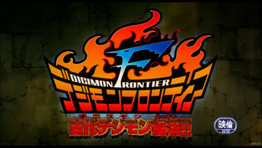
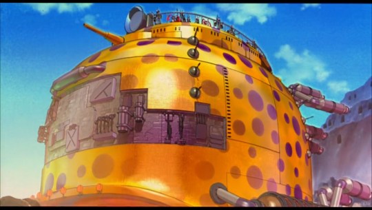
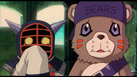
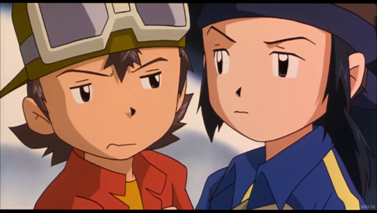
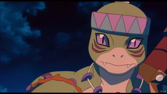
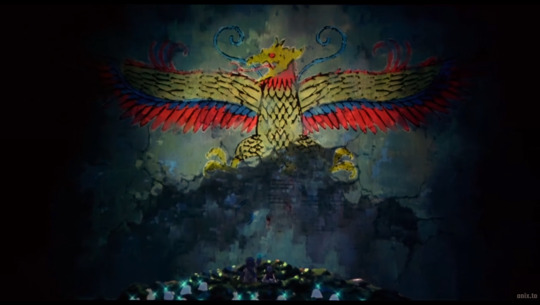
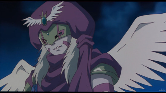
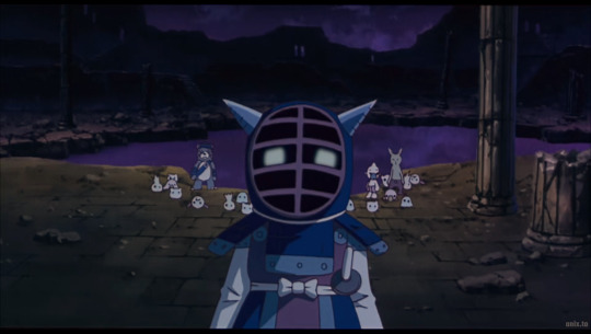
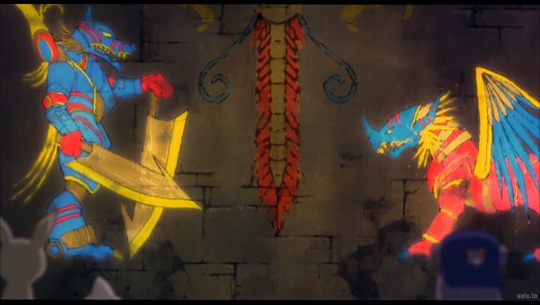
Digimon Frontier: Island of Lost Digimon
This was actually pretty fun! It wasn't the strongest Digimon movie by a long shot, but it was good as a Frontier side story. It was nice to see them revisit the whole "beast digimon vs. human digimon" conflict that they didn't do much with in the show. Also, I got to see my Digimon World 3 friends again! They were super cute.
Notes:
I enjoyed Izumi humming Funiculi Funicula in the intro to the movie. For a split second I thought it was Bolero and was about to throw hands lol.
What the HECK were they riding on in the opening? It wasn't really a Trailmon it was more like a Mike Wazowski themed rail cart. They, of course, never explained.
This movie's aesthetic was really weird. I don't know if it was necessarily higher quality animation. It kinda looked like they took the usual level of quality and put a "cinema" filter over it or something. Also some of the "shots" were weirdly cropped and almost blurry. IDK if that's just because there isn't a clean copy on the internet or if it was a stylistic choice. At least the characters are super on model, which is more than I can say for the show!
Speaking of animation quality, they were a little too obsessed with using CGI in this movie. It looked really bad and added nothing lol. Also, what was with the neon disco rave tanks? They felt extremely out of place.
Once again we get a lot of unnecessary focus on Izumi's butt...
So many new (or new-ish) background digimon! I kept being like "ooh, who's that?" I really liked the bunny-with-razors-for-ears design. It's funny how they debut new digimon in the movies and games, it almost feels like they're testing them out.
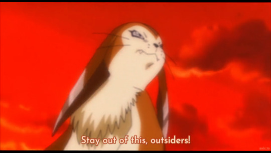
The original title is more like "The Revival of the Ancient Digimon." I can see why they would change that cuz it sort of feels like a big spoiler.
Kotemon and Bearmon were super cute. It was exciting to see their anime forms. They had really nice voices as well (in Japanese and English). Kinda wish I had watched this before DW3 instead of the other way around, whoops!
They used the exact same plot of "evil character encourages war to resurrect evil monster via the sacrifice of many" in the isekai series I'm Standing on a MIllion Lives. Makes me wonder how many fantasy series have used that. It must be a more common trope than I thought.
Why does this one digimon look like Impmon and My Melody had a baby?
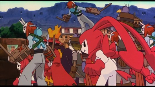
The whole "beast vs. human" thing still feels silly when half of the "human" side doesn't actually look that human. I could totally see Dinohumon be considered a "beast" in a different series. (Maybe it's a metaphor for how racism is dumb and makes no logical sense).
The visual of digieggs flying and baby digimon being all over the place due to the ongoing war was interesting. I guess they couldn't go to the Village of Beginnings because the island is blocked off from the rest of the digital world?
One CGI scene literally looked like the 3D maze screensaver from Windows 98 lol
Kinda rolled my eyes when Bokomon said that Murmukusmon (what a mouthful) could turn into any digimon. What OP power will they think of next? Also, we only saw him digivolve into two digimon, so I'm not that impressed.
That final battle was pure chaos and I had a lot of trouble following wth was going on. I didn't know why AncientGreymon/AncientGarurumon were suddenly there so I googled it. Apparently it was due to "the power of Kotemon's sacrifice and Bearmon's tears"...riiiight. Shounen movie logic.
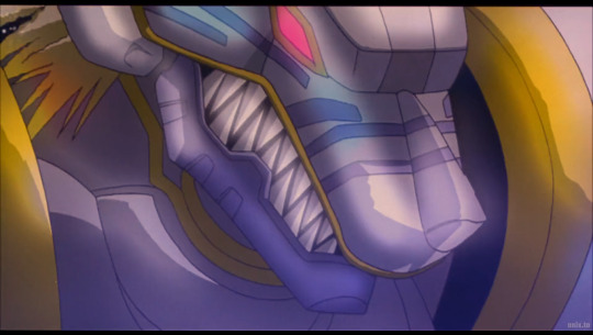
AncientGreymon looks amazing and AncientGarurumon looks..aight lol. I'm totally biased to prefer beast-like digimon
Kinda anticlimactic to have two "spirits" do the dirty work instead of our heroes, not gonna lie. Maybe if we had met AncientGreymon and AncientGarurumon before and had some level of emotional attachment to them it would have been more impactful.
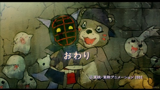
The new mural with the Frontier MCs and Bearmon/Kotemon at the end was cute
30 notes
·
View notes
Text
The Happiest, Non-Magic Boy On Earth! ❤️✨
✨ Feat. Mika Inkwell (oc) ✨
NRC’s newest student is strange boy who is deemed magicless! And yet the oddest things keep happening around him…
note: just a fun thing to properly introduce my special boy ❤️

Mika Inkwell is without a doubt, the strangest boy anyone had ever seen at Night Raven College.
The Dark Mirror dubbed him a magicless oddity from another world, during the Entrance Ceremony. Yet, not even two seconds later, he pulled a giant paint brush out of nowhere, used it to create a giant stack of soufflé pancakes, then erased it just as fast. Where did the paintbrush come from? No body knows.
Mika has a knack for pulling random objects out of nowhere. Stop signs, frying pans, lunchboxes, alarm clocks, comically large objects—literally anything.
During an argument with Sebek, he said that Mika’s goofy behavior was so disgraceful that someone should tell his mother (which he does not have, he has two fathers.) Mika proceeded to pull out an old fashioned telephone and call Sebek’s mother to complain.
“Hello, Mrs. Zigvolt? Your son is being VERY annoying!”
“What the—GIVE ME THAT—!”
Mika is quite the fashionista. Every once in a while he’ll ditch his uniform for his newest designs, from colorful dresses to flashy cardigans to strange decorated mouse ears. He’s usually seen in up to five different outfits per day. How does he change so fast? It’s a mystery.
He’s doesn’t only make clothes! Pillows, stuffed animals and backpacks are his specialty too! All of his friends end up with handmade gifts from him.
Epel has a poison apple backpack. Floyd has a big shrimp plushie. Ace and Deuce have matching card solider scarves. Malleus has a gargoyle teddy bear that he loves very much.
Speaking of Malleus, he is absolutely fascinated by everything Mika does. Boy could spend hours talking about his pin collection and favorite desserts and Malleus will be staring at him like he’s the most beautiful thing in the world.
“My dad bought me these pins right after I went on a scary ride at a theme park! This one’s cracked because I tripped on a ladybug and fell on my face!”
“Child of man, I say this with absolute seriousness, how soon can I have your hand in marriage?”
Apart from being a master at sewing, Mika is also one hell of artist. Too good of an artist. Some of his pantings have a bad habit of coming to life.
It’s important that he has an empty sketchbook on hand, otherwise he’s gonna find himself another canvas. Like one of NRC’s many boring, blank grey walls! Crowley let it slide the first time because Mika painted a very lovely mural of the Great Seven that everyone loved.
He had to pull the plug when Mika painted 3D sculptures of walking broomsticks to help Ace and Deuce with their chores. Heartslabyul almost drowned.
That doesn’t stop Mika from making paintings all over Ramshackle!
“Mr. Inkwell?”
“Mr. Crowley~?”
“Would you happen to know anything about the blue bunnies rampaging all over campus grounds?”
“What makes ya think I had anythin’ to do with it?”
“Your signature is on their BUTTS!”
Mika also has funny nicknames for some people on campus—Vil is Blueberry Pancake, Epel is Lavender Macaron, Malleus is Mint Cheesecake, etc.
The strangest nicknames however are the ones he’s has for the Great Seven.
Why would he refer to them with names such as Uncle Scar, Auntie Hilda and Mama Mal? Do they remind him of his actual family? Supposedly, he has a huge family.
The Great Seven appear in a lot of Mika’s doodles, along with a few other familiar figures…
“Blueberry Pancake! I designed another dress for you! I based it off of Auntie Hilda’s dress! Do you like it?”
“It’s a cute design, but you need to stop calling the Fairest Queen by such an improper name. I don’t mind your name for me but you shouldn’t refer to a well respected figure like that.”
“Well she didn’t like when I called her Mama.”
“What—?”
#oc: mika inkwell#twst oc#twst yuu#malleus draconia#vil schoenheit#dire crowley#twisted wonderland#twst
18 notes
·
View notes
Text
Hello! I bring other drawings from Garden of Banban (this time with more characters, I make too many of the Sheriff.)
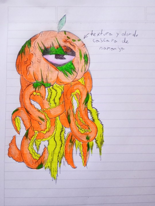
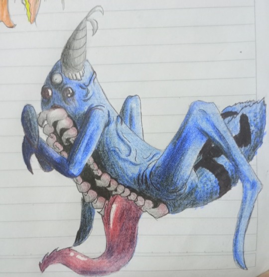
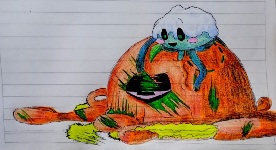
In the last drawing are Stinger Flynn and a character from another game called Jellyhead, from Nameless Cat. The game is very good and, for those who don't know it, it is in the Play Store for mobile phones. They are both jellyfish and I thought it was cute to draw them together. I certainly feel like they are polar opposites.
Regarding my Stinger design, I would like to say that I tried to give him more details, with fresher wounds as if he had been in a fight. Everything that is fluorescent yellow (the inside of its tentacles and the bottom of its head) glows for children afraid of the dark. It also has the smell and texture of orange peel, for some reason I thought of putting that in, I like oranges. 👹
And about Nabnab, I didn't change him much, I gave him a small normal spider tail, I made his two lower eyes black and his upper eye has a small pupil. It's the same character but with a slightly more realistic style.
I try to make them all in my own style, so they have one or two details that aren't from Gob's original designs, but I think that makes them prettier.
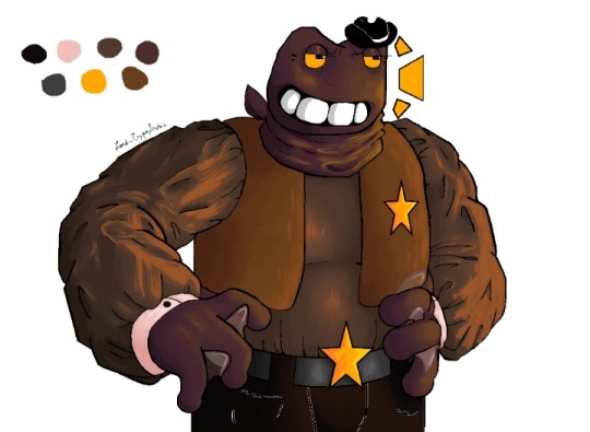
Finally! I was able to finish the drawing of the Sheriff Toadster on my grandparents' old computer, it's torture to use Paint with the mouse, but I really liked how it turned out, maybe it was worth it!
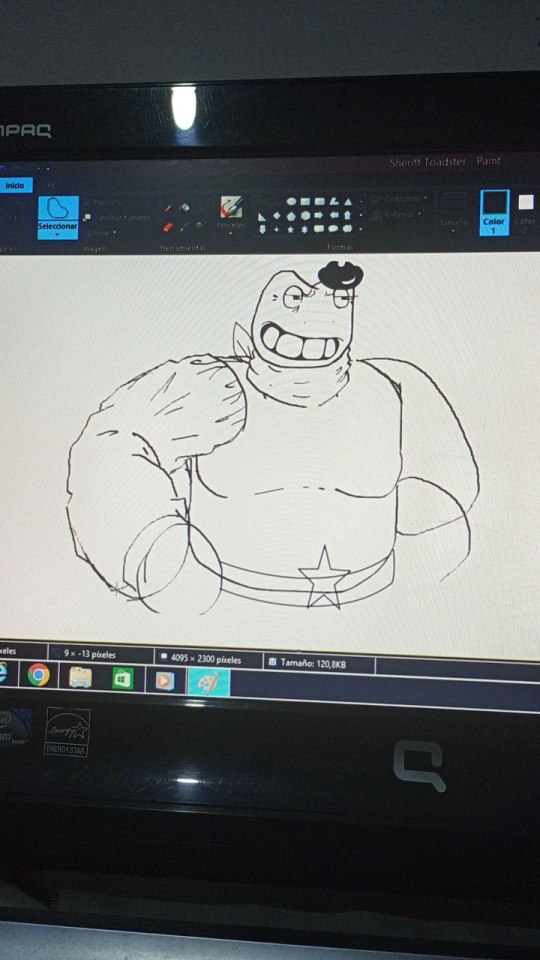
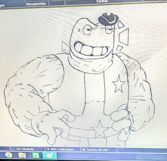
Un poco del proceso del dibujo.
And apart from the drawings of Gob's canon characters, I also invented my own oc, I decided to call her Fally Eucaly, she is a Koala and one of the calmest characters in the game.
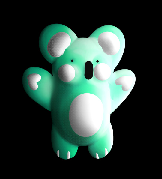
Clarifying that they are not drawn in 3D to look like the original Gob characters, more or less this is how their design would be in the game. I noticed that there is little inclusion, in terms of children with disabilities, so, with some fear that my character will be judged, she is the one who takes care of all the needs of these children, Both with mental and physical disabilities, so that no one is left out of daycare. Despite its tender appearance, it has a mouth instead of a neck, meaning that it can open its mouth in such a way that what appears to be its head moves back, but it usually hides it, even when speaking. Maybe in the future I'll talk more about Fally's lore, but for now I'll leave it here.
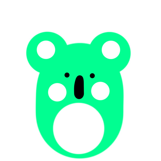
Here is his little drawing on the mural, I don't know how much effort they put into painting her, literalmente es una pelota con ojos. Her phrase is "Be yourself. Those who are truly your family will love you just the way you are."
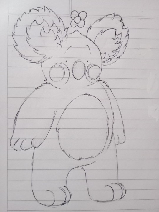
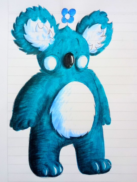
And finally, a drawing of Fally more in my style. I like it much better how it looks like this than in Gob's "original style".
That's all for now, I'll probably try to draw the other characters too, it's entertaining.
Goodbye gente bonita.
#garden of banban#garten of banban#banban#sheriff toadster#toadster#nabnab#stinger flynn#medusa#jellyfish#koala#terror games#horror games#jellyhead#nameless cat#Fally Eucaly#oc#art style#Windows#paint#computer#my draws#drawing#dibujos
25 notes
·
View notes
Text
Lucid Dream 2024 July 21 -Amusement Park Inspection
I was going around an amusement park that was set up like a town the way Disney does it. The theme of the park was animated series I'd seen, so there was anime, and American and European cartoons referenced at the same time. As I went around I had an odd sense of superiority/ownership. I couldn't tell if it was the fact that I was Lucid dreaming so I knew I could do whatever I want, or if my place in the dream world had some type of ownership over the park. I had been set up with a scavenger hunt to help show me around the park and see all the small details. For the SH I was given a pair of 3D glasses that would be needed to see hidden messages around the park. Most of the messages were names of characters or events that were set up as statues or murals around the park. The ones I remember most clearly were the end. "Agent in the Sky" that lead me to the castle from Spy X Family. Climbing up the castle gave a great view of the park but I couldn't spot anything until I was on the way down and saw a Perry the Platypus ((Phineas and Ferb)) statue hanging outside one of the windows. The glasses revealed a message on his tail "CHILCHUCK" ((Dungeon Meshi)).

So I headed for the only bar I saw on the map -based on Quindecim from Death Parade. That whole building had rooms dedicated to characters that like drinking, so of course there was a room for Sinbad. A large sliding door cabinet for wine had a layered wooden carving of Sinbad's Focalor Full Body Djinn Equip. It was stained wood, but painted to get the tones. It was gorgeous craftsmanship.
While studying it I caught a glimpse of what I was wearing in the reflection on the window. It was pretty much the design I made for my final arc outfit in Sindria's Prophet, only with a few added flourishes. The biggest difference from my og design was that I had a jeweled broach over my heart that had peacock feathers out the top.

When I got to the bar I saw that there were characters on the coasters, and realized I had to order the right drink to get the one with Chilchuck on it. Since I'm allergic to most alcohol on the menu I ordered something I thought was the Chilchuck drink, and another that I could actually have. It was a lemon lime soda with frozen fruit sorbet pressed into gemstone shapes in a thin but tall glass with a straw. It was cute and refreshing. I'm not sure what series it was for though.
A guy that reminded me of [a friend's ex] sat next to me and started talking at me. By the way he was eyeing me I could tell he was trying to showoff or flirt. He was rambling about the making of the park and all the tech things that when into it. At least he had good taste as a fellow Simpbad and told me all about the Magi parts so I could go find those later. I was an obvious Simpbad from my outfit. But then he started mansplaining my drink choices at me, and got disrespectful of people with allergies. The asshole was going off on how I "couldn't truly appreciate Sinbad" like he could because I don't drink things I can't verify.
I was done with the scavenger hunt after that line and stood up. "You realize Sinbad isn't going to fuck you, right?"
His brow furrowed and he turned in his seat to keep facing me. "He isn't going to fuck you either! Everyone knows he's settled down now."
I rolled my eyes as I took out a shellphone and walked off. I went back to the wine room with the wood Sinbad to make my call. I called someone I knew wasn't currently in a meeting. "One of Sin's fanboys is here and pissed me off. I want to leave. Send someone to come get me and make it flashy. I want to show off who my husband is."

After a few mins one of the Sindria Company private airships flew over head and got close to the building. The side of the hull opened up and Sinbad was standing in it smiling at me. Even though I knew he couldn't hear me at that distance I still said out loud, "You didn't have to come personally, you know."
He let down a cloth rope for me to grab and pulled me up. One hand instantly wrapped around my waist to support me when I was in range. The other held onto the frame of the door. "So you want to show off your husband, huh?"
I returned his cheeky smile with my own. "Yeah."
He laughed. "Did I do a good job?"
"This is far more than enough."
He leaned down and lifted me slightly so his face was closer to mine. "Then can I get my reward?"
I used one had to stroke his cheek. "Of course." And when we kissed I used the other hand to direct a middle finger at the window of the bar.
Sinbad laughed when he caught what I was doing before finally closing the door to the ship. The kiss was definitely part of showing off.

((I laughed when I woke up at how this ended. My only regret was taking months to have the time to draw it))
#adventures of simpbad#lucid dream#king sinbad#sinbad x oc#sinbadxoc#magi fanfiction#magi sinbad#sinbad magi
16 notes
·
View notes
Text
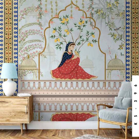
Elevate Your Space with Indian Mughalai Princess in a Majestic Mughal Palace ✨
Infuse your home with the grandeur of India’s rich heritage through our bespoke wallpaper designs, including the exquisite Art of India. 🕌
👉 Shop Now: https://shorturl.at/c4csm 🖼️ Connect on WhatsApp: 9899688447
#3d printing#painting#graphic design#portrait#poster#sketch#wall painting#wall art#wall murals#wallpaper
3 notes
·
View notes
Text
Custom Mural Painting Tampa: Experience the Artistry of Greater Public Studio
Discover the beauty of Custom Mural Painting in Tampa with Greater Public Studio. Transform your space with our exquisite artistry, expertly crafted to evoke emotion and capture the essence of your unique vision. Let our team of talented artists bring your imagination to life. Explore Custom Mural Painting Tampa and experience the boundless creativity of Greater Public Studio.
#hand painted murals tampa#hand painted murals in usa#3d printing#hand painted murals agency in tampa#graphic design#hand painted murals
0 notes
Text


A mural I worked on for senior year of highschool. Our school wanted to have art students design and paint murals depicting various things that the school brought to the table (eg. the cosmetology program).
Some more story behind this mural:
I had transferred to this specific school for junior year, hoping to earn enough cosmetology hours for a license. With the help from teachers and counselors, it all worked out by the time I graduated. Besides the benefit of cosmo, transferring schools had a big positive impact on my mental health, and offered unique learning experiences that I probably would've never bothered to try out (3d modelling, ceramics, sculpture, advanced 2D art), had I decided to stay at my old school.
Eternally grateful for this place and it's amazing teachers, I figured this opportunity to contribute to the school mural project would also be a good opportunity to promote the cosmetology department (where students could earn hours for free, and essentially come out of HS with a beauty license and a means of income).
Unfortunately, there wasn't much time for students to work on this mural project-- I was solely able to get this done because of my unique class schedule (which was almost entirely cosmetology) and some arrangements which allowed me extra time to work on it post-grad. We were in hurry to get this up and finished, but I'm glad it came out decently.
7 notes
·
View notes
Text
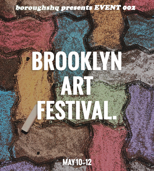
EVENT 002: BROOKLYN ART FESTIVAL.
The Brooklyn Art Festival has finally arrived! This three-day festival is located in the heart of Brooklyn, and aims to bring the community together through a multi-day offering of live music, artistic demonstrations, creative cuisine, and, of course, a sheer love of art. Volunteer-run, guests of all ages are welcome to join in this celebration of culture, creativity, and community. Admission to the event is free, though amenities including food, drinks, and marketplace offerings will be available for purchase. Street closures will be in place for the event; there is no public parking, but there will be a designated address for rideshare pick-up and drop-off. Walking, biking, and public transportation is highly encouraged!
DAYTIME FESTIVITIES (11AM - 6PM)
CHALK WALK — Stand and watch as professional chalk artists create jaw-dropping displays only utilizing chalk, or join in on the fun and create your own chalk masterpieces! All ages welcome. COMMUNITY MURAL — Leave your mark on a massive paint-by-number interactive mural! Grab a small tin of paint, a paintbrush, and a number, and do your best to stay in the lines. The end result (a beautiful abstract design of the Brooklyn Bridge, as designed by a local Brooklyn-born artist) won’t become evident until the end of the festival, so be sure to stop by on the last night to see what you’ve helped create! KIDSFEST (11AM-3PM) — Engage in all things fun at the kid-friendly kidsfest! Dance parties, inflatables, face painting, fairy hairstyling, elaborate puppet shows, and creative activities such as slime, tie-dye, ceramic painting, and puppet-making stations will be available. Though kid-aimed, all ages are welcome to engage in the fun! SKETCH 101 — You don’t need to be an expert to create a work of art, and the Sketch 101 sessions are here to prove that to you! Novices and professionals alike are all invited to sit and sketch as professional artists walk the audience through step-by-step instructions on how to draw beloved animated characters! Time slots: 12pm (Snoopy); 2pm (Mickey Mouse); 4pm (Shrek). ARTIST MARKET — Give back to the community by visiting the artist market! Featuring over 130 art vendors, there’s sure to be something there for everyone! Paintings, jewelry, ceramics, metalwork, glasswork, photographs, sculptures, watercolor, 2D and 3D art, fiber, prints, and much more will be available for purchase! COLORFUL CUISINE — During the day, make sure to visit one of the many food trucks and vendors available throughout the festival! Along with their typical menus, each vendor features at least one specialty treat in honor of the festival. From art palette cookies to minimalist trifles to deconstructed sandwiches, the food is sure to be a treat for the eyes and mouth! LIVE ENTERTAINMENT — Small stages have been assembled for the express purpose of demonstrating the amazing collection of performance art styles enjoyed by the borough! Take a picture of the schedule, and make sure to stop by each stage to experience a collection of entertainment ranging from rock bands, theatrical groups, opera singers, and more!
COME ALIVE AT NIGHT (6PM-10PM)
GALLERY WALK — The vibrant Brooklyn art scene is shown in all its glory at the nightly gallery walk. Grab a map and take a stroll through the borough, visiting designated ArtSpots: art exhibits hosted at local galleries, retailers, and restaurants. Enjoy light refreshments, striking artwork, and good ambiance. LIVE ENTERTAINMENT — The tempo slows down and the music continues through the night! A small selection of MusicSpots are also available, conveniently along the streets as patrons make their way through the Gallery Walk. Providing the perfect ambiance to the artist experience, be sure to stop and enjoy the music as you stroll from gallery to gallery! STUDENT SCHOLARSHIP SHOWCASE — Art students across Brooklyn have submitted some of their best work to the Brooklyn Art Festival’s Student Showcase! On display at the Haze Gallery (a featured ArtSpot) guests are invited to observe the art and submit a vote on which one piece of art impacted them the most. The artist who created the piece with the most votes at the end of the festival will be granted a small $2K scholarship to help support their artistic endeavors. BUBBLY BOOZE — The festival becomes an open container entertainment zone at night, and guests 21 and older are invited to taste an array of bubbly specialty booze made special for the festival! Each ArtSpot will have a specialty cocktail available, while a small selection of the daytime’s food vendors will return for the night’s light installation (along with a newly available nighttime cocktail). LIGHTS UP PERFORMANCE (9:30PM) — End your night with a synchronized light and music performance at Prospect Park! Light installations have been created and installed in the park, programmed to a musical arrangement that professional dancers have choreographed a routine to. Grab some food and something to drink, sit back, and watch as light, music, and dance all combine in dazzling collaboration!
OOC DETAILS BELOW!
OOC DETAILS.
IC Timeline: Canonically, the art festival occurs over the weekend, from May 10th — May 12th. OOC Timeline: Members will have between May 10th through May 17th to post their initial starters for the festival. After 5/17, no new starters are permitted, but members are free to continue their ongoing event threads until their natural conclusion. An announcement will be made on both days when the event has started and ended. Involvement: The Brooklyn Art Festival is organized by a nonprofit and run almost entirely by volunteers. All artists involved — asked to lead a Sketch 101 class, performing on a stage, featured in an exhibit, etc. — do so either voluntarily, or only for a small sum of money despite their professional status. As such, characters are welcome to both be guests of the event, or volunteers manning a booth, performing on a stage, hosting or featured in a gallery, or anything in between! Threads: Members are highly encouraged to engage in any art festival related threads during this time, and are free to continue non-event threads as well! Just please be sure to tag all event threads as bhqevent002 for differentiation purposes.
If you have any other questions about the event, please do not hesitate to reach out to the main!
#boroughs.event#bhqevent002#boroughs.announcement#finally here after being push back a month!!! <333
9 notes
·
View notes
Text
culture of HAIQIN | the arts + social norms
------------------------------------------------------------------------------
date: november 9, 2024. 2:13AM
------------------------------------------------------------------------------
Culture within Haiqin
Art and Music
Art
Artistic Movements:
Haiqin’s art is a fusion of ancient traditions and modern interpretations, characterized by its deep reverence for nature, spirituality, and the divine. While the country’s artistic heritage is often shaped by its historical connection to the goddess Nera and various polytheistic beliefs, contemporary art movements are thriving. Artists use both traditional and innovative techniques to express their cultural values. The evolution of art in Haiqin emphasizes the importance of balance between the material world and the spiritual world, a principle reflected in art’s focus on symmetry, harmony, and the natural elements.
Paintings and Sculptures:
Traditional art in Haiqin often revolves around divine figures, scenes from nature, and depictions of the gods, particularly Nera. Paintings and murals commonly feature lush forests, serene lakes, and celestial bodies, with divine beings depicted in ethereal forms to reflect their spiritual significance. Nature is not only an inspiration but a sacred subject.
Sculptures often take inspiration from both animals and natural elements like water, fire, and earth. These statues can be found in temples, marketplaces, and gardens, where they invoke a sense of calm, grounding, and connection to the earth.
Contemporary Art:
Modern Haiqin artists are blending traditional spiritual symbolism with modern abstract expressionism, often through graffiti, installations, and multimedia pieces that comment on the intersection of nature, spirituality, and technology.
Digital art and 3D holograms are particularly popular among younger generations, while mosaic murals and landscape sculptures still dominate more public spaces, showcasing themes like rebirth, growth, and the endless cycle of life.
Contemporary artists often mix traditional methods with modern techniques, resulting in vibrant street art, abstract expressions, and mixed-media gallery works. The country’s artistic scene is a reflection of its deep respect for both spiritual heritage and the natural world, often integrating environmental and spiritual messages into public displays.
Jewelry and Textile Arts:
Jewelry Making:
Haiqin’s jewelry is not merely ornamental; it holds deep spiritual significance. The craft has been passed down through generations, with each piece designed to carry meaning about the wearer’s connection to nature and the divine.
Artists in Haiqin are renowned for their jewelry-making, which often incorporates local gemstones and metals, such as jade, turquoise, and gold, designed to represent the interconnectedness of life.
Materials:
The jewelry incorporates gold, silver, jade, turquoise, amber, and gemstones. The use of jade is particularly symbolic of purity and eternity, often fashioned into rings, necklaces, and earrings.
Amber symbolizes the warmth of the sun, while turquoise represents protection and strength.
Gemstones like opal and moonstone are used to create pieces that reflect the moon and the stars, invoking the power of Nera.
Local materials such as amber, jade, and various gemstones are favored, and these items are passed down through generations as both heirlooms and symbols of one's connection to the divine.
Symbolism in Designs:
Many pieces incorporate intricate depictions of nature, such as lions, dragons, lotus flowers, and birds, signifying the wearer’s harmony with the world. These motifs channel specific powers or virtues such as protection, wisdom, fertility, or courage. Amulets and charms are also crafted, often bearing symbols of good luck and blessings from the deities.
In the visual arts, jewelry often incorporates nature-inspired motifs, like flowers, leaves, and animals, crafted using materials like silver, amber, and jade.
Textile Arts:
Textile arts, including handwoven fabrics and embroidered garments, are highly esteemed. The vibrant patterns depict themes such as abundance, fertility, and eternity, often with botanical and animal motifs to symbolize the interdependence of life. Ceremonial dresses adorned with gold thread, depicting images of Nera’s journey across the skies, are worn by religious leaders and idol performers during major festivals.
The textiles are handwoven with symbolic patterns, each representing different aspects of the natural world, such as water, fire, or fertility. The art often evokes a sense of unity with the land, exemplifying the relationship between the spiritual and material worlds.
Pottery and textiles also feature elaborate designs that reflect the connection between humans and the earth, often painted with scenes from nature or depicting the gods and spirits.
Music
Unique Instruments and Art Styles:
Zarlin: A stringed instrument resembling a lyre, the Zarlin has an ethereal quality, often played during religious or communal rituals to invoke Nera’s presence or to celebrate nature.
Beren: A wooden flute that creates haunting melodies, often used in folk songs that celebrate the gods, the seasons, and the cycles of life.
Shirna: A large percussion instrument, similar to a drum, used in both ceremonial and celebratory settings, producing powerful rhythms that symbolize the pulse of the earth.
Popular Music Genres:
Folk Music:
Rooted in Haiqin’s ancient traditions, folk music celebrates the land, the gods, and the elements. This genre features the Zarlin, Beren, and Shirna, creating sounds that resonate with the rhythms of nature. The songs often tell stories of the goddess Nera, heroes, and local myths, acting as a bridge between generations.
Kinnor:
A contemporary genre blending folk music with modern influences. Kinnor often features synthesizers, acoustic instruments, and a rhythmic blend of traditional sounds with global pop influences, creating a catchy yet ethereal atmosphere.
Drakkon:
This genre represents the vibrant energy of Haiqin’s festivals. Drakkon music is rhythmic, with driving beats and energetic melodies. It’s a fusion of drum-heavy performances with electric guitar and traditional instruments, reflecting the power and vitality of the people during celebrations.
Dance
Dance Forms:
Haiqin’s dance forms are graceful and full of symbolic meaning, reflecting the fluidity and interconnectedness of the elements.
The Lunara Dance:
This sacred dance honors the goddess Nera and is performed in reverence to the night sky and the celestial bodies. Dancers, wearing flowing garments adorned with celestial motifs, perform graceful movements that mimic the flow of wind, water, and fire, symbolizing the interconnected elements that sustain the world. The dance embodies a cosmic balance, with each gesture symbolizing the eternal cycle of life, death, and rebirth. Lunara is often performed during Nera’s Night festivals, where communities gather in open fields to celebrate the goddess’s connection to nature and life. The Lunara celebrates the beauty of the night and the ethereal connection between the people and the heavens.
Other Dances:
Other traditional dances such as the Nyara (a celebration of the harvest or spring) or the Serai (a festive dance for weddings and community feasts) involve a mix of coordinated and spontaneous movements that reflect the rhythms of nature, especially the seasons and harvest cycles.
Modern Dance (Fusion Styles):
Modern dance in Haiqin has evolved into fusion styles, blending the graceful fluidity of traditional forms with the energy and creativity of street and pop dance. Urban folk dance crews are popular in Haiqin’s cities, where choreography reflects both the country’s cultural heritage and global trends. These performances often blend Lunara with modern hip-hop or jazz, creating a unique cross-cultural expression.
Celebrities
Haiqin music is not limited to its spiritual roots but embraces a growing pop culture influence, where local musicians and idols have a significant fanbase. Festivals across the country often feature live performances, where the community comes together to celebrate the spiritual and cultural tapestry of Haiqin.
Idols and Musicians:
Kinnor musicians, are celebrated for creating music that combines modern beats with lyrical themes drawn from folklore. Drakkon bands electrify festival audiences, inspiring a sense of communal energy and celebration.
Celebrities:
They are seen for their talents and praised. They are given relative privacy and there are laws regarding the media and paparazzi. Writers and directors are heavily loved for their movies and books, creating worlds inside of a page/screen
Social Norms
Greetings and Gift-Giving:
Greetings:
Social greetings in Haiqin are marked by warmth and respect. A smile is considered a universal greeting, with a nod or a slight bow used in more formal settings, particularly when addressing elders or during ceremonies. While informal greetings often involve a friendly wave, more formal contexts demand the clasped hands gesture, where individuals place their palms together and bow their head slightly, showing respect.
It is common for people to greet one another with words acknowledging the beauty of the earth or the blessings of the gods, such as “May Nera’s light guide you today.”
Gift-Giving:
Giving gifts is an integral part of Haiqin culture, particularly during festivals or as a sign of appreciation. Handmade crafts, locally-sourced goods, or spiritual symbols like small amulets or charms are highly valued. When visiting someone’s home, it is customary to bring a gift that reflects personal effort or thoughtfulness. These items symbolize the spirit of generosity and respect for others.
Taboos
Disrespecting Nature:
In Haiqin, any negative action against nature or the deities is viewed as a severe transgression. The culture is built around the principle of living harmoniously with the world around them, and acts that harm animals, plants, or the environment are deeply frowned upon. Even unintentional damage to nature is seen as something that must be atoned for
Spiritual Disharmony:
While varying interpretations of Nera’s teachings are common, outright disrespect for the spiritual practices of others is considered taboo. Spirituality is deeply woven into the fabric of everyday life, and Haiqin’s people believe that tolerance and understanding are vital to maintaining harmony within the nation. Disrespect towards witchcraft or nature-based spirituality is rarely tolerated.
Military Extras
Military Salute:
Haiqin has a robust military tradition, reflecting its dual commitment to peace and power. Although the nation values diplomacy and community, it is well-prepared to defend itself and project strength when necessary.
Military personnel salute with a clenched fist placed on their chest, directly over the heart, symbolizing their connection to their country and its people. This salute embodies respect for both the nation and its values. It also symbolizes the unbreakable unity between the people and their country.
Traditional Salute:
Alternatively, the traditional military salute (hand to the brow) is also used, showing both discipline and honor. This signifies the importance of respect within the hierarchical structure of Haiqin’s military. When representing Haiqin abroad, military personnel adopt a traditional hand-to-brow salute, reflecting Haiqin’s diplomatic values and respect for international alliances
Strategic Defense and Peacekeeping:
Haiqin’s military is not one of conquest or domination but of defense and peacekeeping. The people of Haiqin believe that a powerful military is essential for maintaining their nation's sovereignty and spiritual harmony. The armed forces are highly disciplined, technologically advanced, and well-trained in both conventional and unconventional warfare, excelling in cyber warfare and stealth operations. Their forces emphasize restraint, using their strength primarily to protect and preserve their culture and their values rather than to wage unnecessary wars.
#reality shifter#reality shifting#shiftblr#shifting community#shifting#shifting motivation#shifting reality#dr scrapbook#dr world#reyaint#anti shifters dni
2 notes
·
View notes