#munsell color system
Explore tagged Tumblr posts
Visit Tumblr Blog
Explore Tumblr blogs with no restrictions, modern design and the best experience.
Last Seen Tumblr Blogs


Fun Fact
Kazakhstan’s Minister of Communications and Informatics has blocked the Tumblr site because it contained 60 sites of terrorism, extremism, and pornography in 2015.
Text
Regarding the color choices of the Venatori and those that oppose them:
Not sure many people know this, but when you look at blood red for a long time, then look away, the afterimage "color" is a blue-green (a color theory/color history side note: this reaction is in part why in the Munsell color system, red is the opposite of blue-green and not green).
Venatori are black and red. Neve Gallus' colors are primarily white and teal as a one-to-one contrast to them. Same goes for Dorian. Red will always be part of Tevinter and Minrathous but the blue-green and teals are a deliberate choice for contrast.
In real life, staring at a single color for a long time can strain the eyes and that strain compounds when you look away and your eyes get to stare at something else. But, if you're surrounded by that color's afterimage "color", the eye strain ends up being less impactful. It helps you keep going. It's for this reason that surgeons and surgeries often use blue green, blues, and greens in the operating space. It helps reduce eye strain and makes it possible for operations to resume for longer with less fatigue (at least in regards to the eyes).
From the blood red rises the opposite, for those that want change. It's such a poetic color choice for Neve and Dorian.
#all this is also why it bothers me when people mod Neve to wear black and red#like she wouldn't do that because the associations are too strong#but I digress#color theory#color symbolism#munsell color system#best color system#dragon age art direction is fantastic actually#this is such specific color choice and I love it#not just because I love blue-greens#dragon age#dragon age veilguard#neve gallus#dorian pavus#the shadow dragons#venatori#haedia screams into the void about thedas
435 notes
·
View notes
Text

Atlas of the Munsell Color System (1915)
13 notes
·
View notes
Text
we did soil typing in the field. you do this with a fancy expensive book of names and colors where you match the soil color to get the name. this is fine. except we somehow got a color that doesn’t exist. we all have 10 y/r 4/8 for one of our soil horizons. we did this by hand. this classification doesn’t exist
2 notes
·
View notes
Text

0 notes
Text
🪙 oyacon


oyacon: a term for the attraction to one's parents, fictional or otherwise.
a flag for kinksters, paraphiles, consangs, shippers, selfshippers.
etymology: oya- (親, Japanese) "parent" + -con (コン, Japanese) "complex"
👪original flag coined by a deleted tumblr user.
[first image id: a flag with 9 evenly sized horizontal stripes, colored from top to bottom in fuchsia red, raspberry, lavender pink, mimi pink, white, azure, light blue, munsell blue, and midnight green. in the center of the flag is the shape of a house in white, bordered in grey, with a brown roof. 3 figures are within the house, with the 2 outer figures larger than the center one. in the center of the house is a pink heart. /end id]
[second image id: a flag with 9 evenly sized horizontal stripes, colored from top to bottom in fuchsia red, raspberry, lavender pink, mimi pink, white, azure, light blue, munsell blue, and midnight green. /end id]
📥 requests open! 📬 for mimi of red bishop council 🔗 hd vector ① ②
🧺——— vectored & recoined by red bishop council
what a shame i can't find this flag anymore either. :( it's very beloved by the littles of my system. — bishop
#🧧bishop coin#🖇️vectors#💰coined#📁paras#🪡flags#⌚queued#coining#term#flag design#flag coining#label coining#term coining#identity coining#not original#paraphile safe#pro para#para safe#paraphile flag#paraphilia flag#para flag
40 notes
·
View notes
Note
can I ask how you learned to render as beautifully as you do? I've been trying to learn how to apply colors for a long while and nothing seems to stick;;
Heya Anon :)
Awh shucks! you think I render beautifully? I’m so touched💖
Rendering, painting & color theory have been a bit of a special interest of mine for a while, so i’d be more than happy to explain & give some pointers!
If there’s a specific piece of mine that made you inquire, feel free to mention it in another ask too. I love showing my thought process and workflow c:
I’ll put the rest of the ask under the cut to minimize clutter meanwhile.
I learnt to render both through self-taught methods and during my college art degree (though quite honestly, not much that I didn’t already know or learn by myself).
Rendering in digital painting/illustration is a process that compounds various areas of knowledge. The main ones that come to mind and of which i’ll talk about are the following:
* Values
* Color Theory
* Light & Shadows
* Edge Control
Having a solid grasp on these fundamentals will greatly strengthen your ability to render and understand how other artists tackle their pieces as well.
Values
I always love to start by talking to people about values. It’s something that I don’t always see beginners learn about, yet it’s one of the main things that makes or breaks an art piece.
Values allow you to control & direct the following: Composition, Contrast, Focal Point, Colors, Distance, Mood, etc.!
So what are Values? In short, they’re the range between light and dark when it comes to both neutral greys and colors.
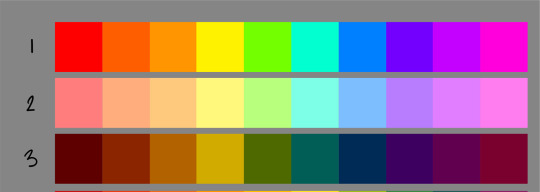
A handy resource to understand this is the Munsell Color System:
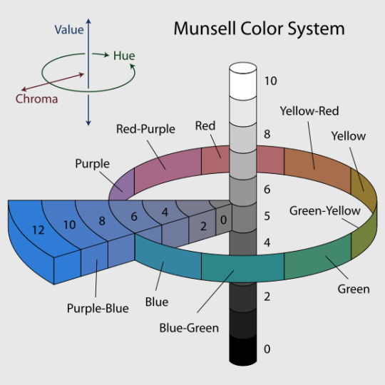
Hue refers to the different Colors on the wheel. Chroma is the purity (strength vs weakness) of a color. Finally, Value refers to the lightness or darkness.
Different colors have different chromatic values; that is, how a pure color appears in a greyscale format.
A 100% red will always be at around 50% grey. With this knowledge, we know that we can’t get a pure bleeding red if we were to paint a light shade of white. It would be more pink than red.
Color Theory
Okay, so we know of values, now what?
Color Theory can seem intimidating, but it shouldn’t be!
Colors have a harmony, a flow. They talk to each other, and once you learn to listen to them you can start creating wonderful conversations.
The following are things I take into account when I am thinking theory:
-Color Harmonies (complementary, triadic, monochromatic combinations, etc);
-Warm & Cool Colors;
-Color Psychology (what moods can be conveyed through color?).
-Color Relativity (how a color is affected by other surrounding colors)
I think the best advice I can give when it comes to studying and applying color (once you have a general grasp of the fundamentals listed above) is to analyze art pieces that you love.
“What attracts you to it? Why do you think it works? What does it communicate in terms of colors? Are there fundamentals that the artist applies (OR breaks?) in this piece?” etc.!
Light and Shadows
So there’s values, there’s color.
Light and Shadows could be confused with Values (black and white right?), but in this case we’re actually talking about lighting!
Values are specifically related to the range between black and white AND the lightness/darkness of a color (chromatic value).
Our eyes perceive volume through contrast, lighting and shadows first and foremost.
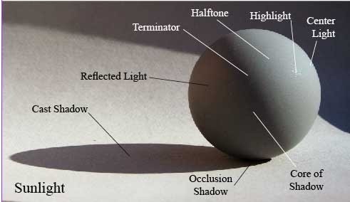
Understanding the terminology of light and shadows will give you a fantastic set of tools to ground your drawings in reality, and give it volume regardless of whether it has cartoony proportions or not.
There is one thing I want to also mention: it is important to know about light terminology, but it’s equally important to understand how light affects different materials.
The following terms are great elements to keep in mind if you wish to accurately render different sorts of objects (it’s a non-exhaustive list by any means, but a good start)
- Types of Light (soft, hard);
- Light Decay;
- Specularity;
- Roughness;
- Translucency;
- 1-2-3 value read
This leads us to my final note…
Edge Control
This last topic is more-so a bonus, but i’ve found it really brings a painting to another level when you know how to use it. Knowing how to control your edges will help you better define 3D volumes in your pieces without needing to use lines.
We typically have three types of edges in painting: Hard edge, Soft edge, and Lost edge.
I won’t talk about the last one because I’m still researching and practicing it, but let’s look at the other two:
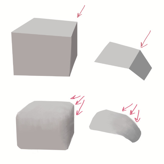
Hard Edges are typically used when there is a sharp change between two planes.
Soft Edges are the more gradual transition, typically on a smoother surface like a sphere or a soft slope.
Notice how different both examples feel?
Organic shapes like bodies are full of hard and soft edges because of the smoothness of skin and fat, coupled with the harder edges of bones and muscles.
Try to pay attention to this, both in real life subjects and in art pieces. You’ll be surprised to find the variety of edges there are in all sorts of objects and living forms. It takes practice and observation, but it’s definitely feasible to learn.
Resources:
GENERAL STUFF
Marco Bucci (he covers most of what I talk about here & more, huge rec!)
Arne Niklas Jansson - (I stumbled upon this one by accident, it’s old but gold)
Values:
Yuming Li (in general)
Bonekrishna/ Roberto Ribeiro Padula
Anthony Jones (his ‘painting like a sculptor’ video is one of my favs)
Marco Bucci (seriously this guy has solid videos)
Orenjikun - (his reels and video tutorials are so insightful)
Color Theory:
Slawek Fedorczuk
Justin Oaksford
Eyecager
James Gurney blog (+ his book Color & Light)
H3m0cyt3 (A fun way to harmonize color palettes)
Iniro/Eskbl (I own this pdf, it’s best used when you apply each concept in your own exercises)
Lighting Mentor (really good vid about color relativity)
Light and Shadow:
How to Render- The Fundamentals of Light, Shadow and Reflectivity [BOOK] - Scott Robertson
(I think this is the most solid resource you can have if you’re serious about studying this subject)
Color and Light - James Gurney [BOOK] (this one’s a classic)
Proko (if i’m not mistaken, he has some videos that tackle this subject)
Edge Control
Thomas Mahon (he has one or two tutorials that touch on this)
Anthony Jones (even just watching his process videos on youtube helps)
Sinix
Unfortunately it’s somewhat hard to find more resources for this section :(
———
I hope this helps with your question! If anyone has other good resources feel free to link them as well :)
This is just what I can think of for now :P
#i’ve been working on this ask for so long lol#i’m just gonna post this here and if ever there’s updates i’ll add a post#I hope this is useful anon! thanks for the question :)#i’ve been quiet here cause i’m working on my uni portfolio rip#see y’all once that’s done#with a sporadic update here & there#not off the hook#squid asks
23 notes
·
View notes
Note
do you have any tips on color harmony and the colors of the rainbow? I'm trying to draw a 10 color rainbow but I'm struggling to make the colors match and any color system like RYB, RGB, CMYK or Munsell doesn't work (Usually green doesn't go well with the transition to blue or purple and yellow get stronger shades than other nearby colors)
Color harmony is a really complicated subject, so definitely remember to be patient with yourself.
Colors are significantly affected by how they interact with each other. A red next to orange will look different than a red next to green, which will look different next to blue... etc.
This is really important when it comes to making a color palette, because the colors you use WILL play with eachother, so you have to be sure they're playing nice.
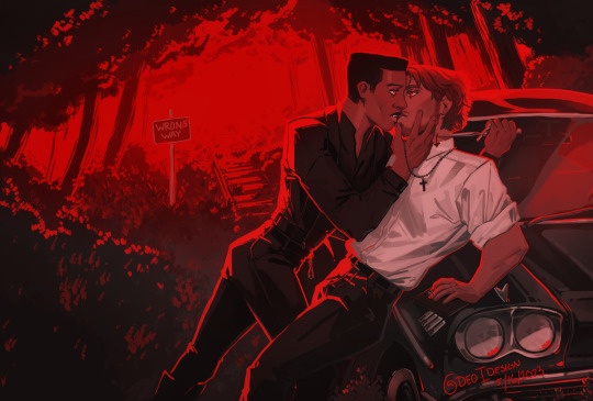
This piece, for example, is entirely red. It's all the exact same hue, but the value and saturation makes the colors still distinct from eachother.
When making a rainbow, especially with 10 distinct steps, you have a lot of potential with your colors.
Personally I use HSB/HSV sliders when I'm illustrating. Hue, Saturation, and Black/Value. This lets me be as precise as possible when I'm selecting my colors.
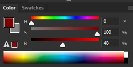
I'll be explaining everything with these terms! (Hue, Saturation, and Value)
1: These colors vary only on hue 2: These colors vary on hue and saturation 3: These colors vary on the hue and value
You can see how much each of these will affect the colors and how they look next to eachother. Manipulating these factors can give you a lot of control over your palette.
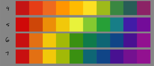
Now, I'm varying which color is the "focus" of the palette. I'm also modifying every aspect of HSB to make them play nice.
4: This palette has a lot more yellows and oranges than the rest, and barely any/no blues 5: This palette is an even spread, 5 colors are warm and 5 are cool. 6: This palette focuses mostly on green 7: this palette focuses more on the purple and blue side of the spectrum.
If you're finding you're struggling well with green transitioning to blue and purple, then you can just have some more greens to make it feel smoother.
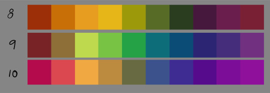
When manipulating all three sliders, you can make rainbows that are entirely tinted to a certain hue. This can get you really cohesive palettes.
8: tinted yellow 9: tinted blue/green 10: tinted pink/purple
When your palette is like this, you'll find that putting in a contrasting color will pop significantly more.
(These contrasting colors are pulled from the original fully saturated rainbow that I put together, #1. Notice how different the colors look here than they did in their original palette!)

You can use this effect as you please or avoid it as much as you like!
As always with art more information is key to making your decisions.
Exercises I suggest to understand color theory better:
Making pieces without using specific colors (try to make something look "Green" without using green)
Make a cool toned rainbow and a warm toned rainbow (every color has a cool and a warm variant) and draw something with each of them (one drawing cool, the same drawing warm)
Use red for shadows and green for light, and then draw the same thing with green for shadows and red for light (or any 2 opposite colors
Copy art and photography that has colors you like, but DON'T color pick until you're done to see how close you were (don't post pieces where you copied someone else's work without explicitly saying you did so, it's for study)
Paint from life
Take some colored pieces of paper and shine lights on them and watch how the light reflects off of the paper onto different objects
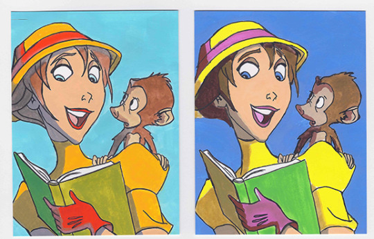
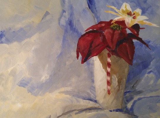
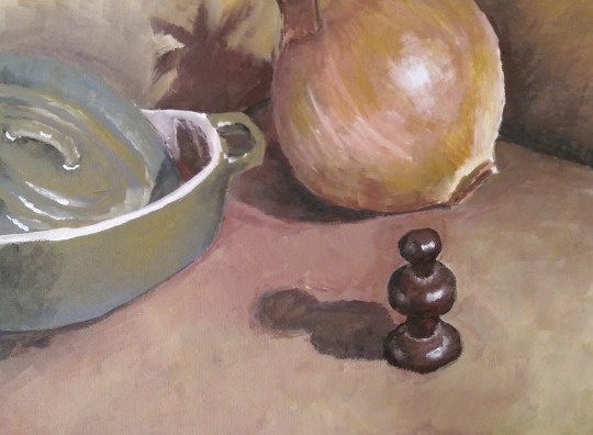
Here's some studies I did for one of my classes in school. They're old, I can't paint traditionally anymore without pain. But what I learned was still important whether or not the art is old!
I also suggest keeping these timed, All of these were under 1 hour (traditional) or under a half hour (digital). The more practice you get, the better!
And, if you can practice in different media (I understand it can be expensive, take up a lot of space, or even be painful), I personally find that each media has different pros and cons and forcing yourself to work within the limitations of a particular medium will teach you a lot!
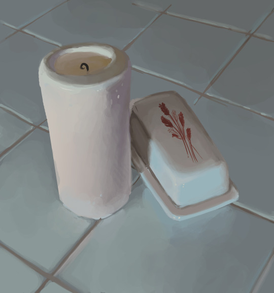
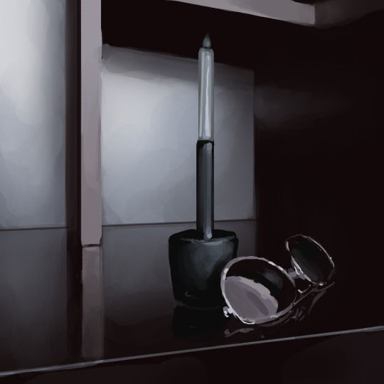
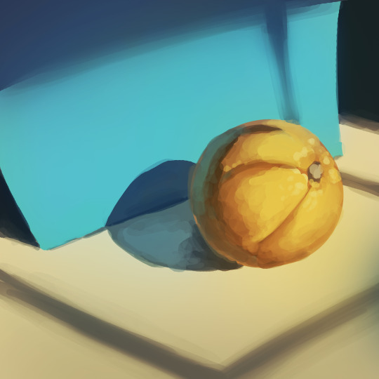
(digital still lifes)
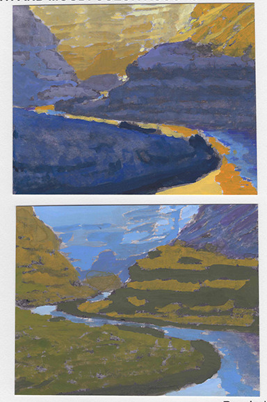

(gouache studies)
(Acrylic studies)
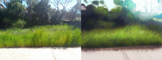

(digital copies)
I hope something in here helps!
Good luck!
316 notes
·
View notes
Text
Orchid Pearl - Pump Station, Main Control System, Munsell Red Pearl - Southeast Bridge, Pipeline, Periwinkle Pearl - Southeast Bridge, Alexandria

12FAD: Little keeper, Is… this for me to look at? I suppose I can tell you information on it if you’d like.

12FAD: A pearl that comes from Pump Station, specifically the Main Control System. Quite a damp place it is.
This pearl goes over how it functions, and the various many backups to ensure nothing goes down. In a sort of sense, it's a purposed organism just like every one of us.
If something inside the station broke, it uses one of the many backups to make sure it can fix itself and heal. It would take something disastrous to actually break one of the many stations located on this island. At the time, the station was quite advanced with its inner workings and biological aspects.
To add onto this, did you know that theres a pump station for every one of us iterators on this island? Its to ensure we don't take each others water, and acts as an automated breathing system in a sense.
It would be a long time before one actually manages to break. Unless... well... I wouldn't worry of such at the moment.

12FAD: Another pearl? My, you've gained quite the collection!
Well, this pearl reads from the Great Basins which are located along the sky bridges.
They collected the water, and save them as storage for later use if any of our structures fail or have some issue with water intake. A backup plan to ensure we keep running if all else fails.
Something about them I find fascinating is how it divides the water, and prepares them for our structures. They clean any bacteria, slag buildup, and any leftover debris, dropping them into the Toxic Marsh.
With the clean water, they read our structures, and ensures our structures have an even amount of chemicals in which our structures need.
It's quite fascinating to me, especially reading the code.

12FAD: Ah... this is from my city.
It talks about the various holidays, and what they'd prepare regarding decorations. Specific colors, the correct fabric, as well as patterns.
There's a list of what they dressed me up in. Various colors and patterns, my puppets measurements, as well as my preferences. They were quite sweet, and honored my wishes.
One of my favorite outfits they made me wear was a blue and white frilly dress, with pearls that hung from the sleeves. All containing various logs and ideals, different algorithms. It was beautiful.
Due to how time passes, and how long it's been, I don't think I'd be able to find it again, nor would it be in the same state.
#rain world#rain world oc#rain world askblog#rw oc#rw slugcat#rw slugcat oc#slugcat oc#rain world slugcat#slugcat#rain world iterator#rain world iterator oc#rw iterator#iterator#iterator oc#rw iterator oc#twelve far away dreams#ga lore#ga world building#ga pearl reading#the collector
7 notes
·
View notes
Note
I'm taking a forensics course and I'm doing a lesson on dirt and just learned about the Munsell system of color notation and I immidiately wondered if that was a thing in archeology too
Nah all jokes aside Munsell books are super cook (and INSANELY expensive) and 100% a thing in archaeology (i dont use them much where i work, but they tend to be more common in research excavations, or in soil sample analysis off-site)
I, however, am notoriously HORRIBLE at judging dirt colours though so i consider them about... fifth?? on my list of arch nemeses
(I do love just sitting there and looking at the colours though)
#also i love your asks#this is gonna sit in my queue for a few days though#hope you dont think i havent answered it#archaeology#munsell#Mice answers things#they let a mouse do archaeology?
94 notes
·
View notes
Text

Atlas of the Munsell Color System (1915)
58 notes
·
View notes
Text
listening for the colors’ song
if paintings are windows to the soul, would you let me see inside? sing to me in your tones and hues, the warmth in your affections. tell me of your days of blue and grey spilled across your chromatic scale. confide in me your darkness and why, despite it, you are still drawn to light.
tell me about your process: how long did it take to become what you are now? are you as patient as oil is to its master, or do you seek forgiveness in acrylic? do you flow with the watercolor tides? they warn us against it, but i must ask: would you let me touch, gently, the ridges and grooves of the dried tint?
against the canvas, your hum reverberates and i listen for your voice like muscle memory. i know the weight of rest, the value in waiting. talk as you like, revealing much or little. let the work speak for itself, in its own language, and like a student i will memorize the sounds until i recognize once-foreign words as familiar and understand you through the resonance.
napowrimo.net day 1: As with pretty much any discipline, music and art have their own vocabulary. Today, we challenge you to take inspiration from this glossary of musical terms, or this glossary of art terminology, and write a poem that uses a new-to-you word. For (imaginary) extra credit, work in a phrase from, or a reference to, the Florentine Codex.
Munsell color system: A system developed in Germany around 1910 by painter, professor, and color theorist Albert H. Munsell, who wanted to describe color with the same degree of specificity with which we can speak about music. Based on rigorous measurements of people’s visual responses to color, the Munsell color system specifies and orders colors based on three dimensions: hue, value (lightness), and chroma (intensity or purity).
#napowrimo#napowrimo 2025#glopowrimo#glopowrimo 2025#adventurerswrite#poem#poetry#mine: poem#mine#spilled ink#spilled poetry#spilled words#original poem#poetblr#writeblr#young poets#poets of color#asian poetry#filipino poetry#filipino poets#poets on tumblr#poetry community#writing community#art poetry#poetry about art
2 notes
·
View notes
Text
"Girls are dressed in pink and boys are dressed in blue" actually if you had been paying attention you'd see that in reality girls are dressed in pink, blue & purple and yellow and every color ever (at max chroma!*) and boys are dressed in black, grey and blue.
(definition of chroma under the cut)
*"chroma" is, according to the Munsell color system, is a color measurement that ditates their, say, purity. Not to be confused with brightness, because a bright color might also be darker than the pure color at max chroma. (I also learned this concept the other day but thought it'd be nice to share lol)
8 notes
·
View notes
Text
HUgE June 2011
Cheyney Thompson

"It is not simply something to be looked at and said 'oh, I like this thing'"
An unconventional perspective that overturns conventional wisdom
"Is it possible for my hand-painted paintings to approach the ever-evolving digital expressions? Or, how can I find a relationship that connects the two? These are the kinds of things I think about when I create my works. I want to express physical sensations and sensual fragments using digital techniques, like a cold string of numbers. By doing so, I think that a certain kind of 'warmth' can emerge even in the hard, cold things born from a rational system."
The five canvases, all of which are uniformly 1.9m high, would create a huge exhibition measuring 8.5m wide if all of them were lined up. If you look closely, you will notice tiny particles scattered all over each canvas.
The trajectory is painted in oil and you realize that it is a record of something. It is an extraordinary hand-painted painting that records the passage of time according to the color display method called "Munsell color system". Cheney Thompson's work has a humor that plays with the paradigm of the times, and it sticks in the viewer's mind.
"I love the word 'maniac' (laughs). I don't like to talk about abstract things, but... I seem to be drawn to artworks that, upon closer observation, seem to be trying to convey something special. My works, too, are not something that can be judged as good or bad at first glance. I want people who see my work to make various interpretations based on their own experiences, rather than simply reading the words or appreciating the surface of the painting."
2 notes
·
View notes
Text
Before publishing his Atlas in 1915, painter and art teacher Albert Henry Munsell (1858–1918) had spent decades seeking to compress the totality of human color experience into a simple and elegant three-dimensional graphical model. In 1879, after reading physicist Ogden Rood’s Modern Chromatics, he devised a pair of twirling triangular color pyramids joined at the base. In 1898, he painted a child’s globe in subtly shifting shades, only to find that the globe’s perfect symmetry could not sufficiently map the differences in strength — which he called “chroma” — between colors or “hues”. By 1905, in his A Color Notation, Munsell had moved to a tree as model, since its unequal length branches could accommodate different hues, chroma, and “value”, the third axis of his system, which ran vertically from the pure white crown of the tree to its pure black roots.
In the Atlas, the Color Tree and Color Sphere give way to cross-sectional charts by which the user is meant to imaginatively assemble a “realistic” system of alphanumeric notation. Each individual color square represents the intersection of hue, value, and chroma, denoted by a three-part code. Munsell’s system turned Vermilion into “5R4/10” — “5R” denoted the fifth step in the red scale (R as one of five color initials); “4” denoted the fourth step in the value scale, and “10” indicated that the color had the maximum chroma/strength. Vermilion’s complementary color, Viridian, was expressed as BG4/5.
Besides “Red”, “Yellow”, Green”, “Blue”, and “Purple” — Munsell’s five principal hues, which overturned the prevailing dogma of three “primary” colors (red/yellow/blue) — “Vermilion” and “Viridian” are the only two specific color names that appear in the Atlas. Indeed, Munsell’s motivation for creating his system lay largely in his animus against the mushrooming chromatic vocabulary impelled by the fin-de-siècle commercial expansion of colors employed in advertising, manufacturing, fashion, and home décor. “Baby blue, peacock blue, Nile green, apple green, lemon yellow, straw yellow, rose pink, heliotrope, royal purple, Magenta, Solferino, plum, and automobile”, protested Munsell, “are popular terms, conveying different ideas to different persons and utterly failing to define colors.” Munsell envisioned a system akin to musical notation, which conveyed a sound’s pitch, intensity, and duration “without dragging in loose allusions to the endlessly varying sounds of nature”.
15 notes
·
View notes
Text
Im obsessed with watching gneiss name on YouTube bc he's a geologist who teaches geology and color theory.... In Minecraft. For some reason. Obviously it's because he loves geology and Minecraft and likes to analyze Minecraft geology etc but it's just fascinating how he used Minecraft as the vehicle for his lessons. This video is about the Munsell color system and how that's used in soil analysis (ft gneiss wife)
11 notes
·
View notes
Text


Munsell joins Heighway in my collection of dragons representing concepts I just like working with ahfkjdh. Heighway is the dragon curve (fractal ;]) and Munsell is a color system
#math: heighway#math: munsell#NOT REALLY BUT... Color science is partially math. to me. shh#they have their own tab in hibden but I'm keeping them in main den for a while aas I awaken their fams#fandragons!! but for like!!! mathematical structures!!
6 notes
·
View notes