#mogai described
Explore tagged Tumblr posts
Text
[Image ID: Three flags.
The first flag has seven equally-sized horizontal stripes. From top to bottom, the colors are deep purple, medium magenta, red-pink, bright red, red-pink, medium magenta, and deep purple. There is a deep purple upside down cross in the center, the the edges and corners of the flag have the vignette filter, making them darker and shaded like a vintage movie.
The second flag is the first flag without the vignette filter, and the third flag is the second flag but without the upside down cross symbol in the center.
End ID.]
PT ID:
Unholylexic
“A gender relating to the word unholy and/or being unholy.”
coined by me
End PT ID.

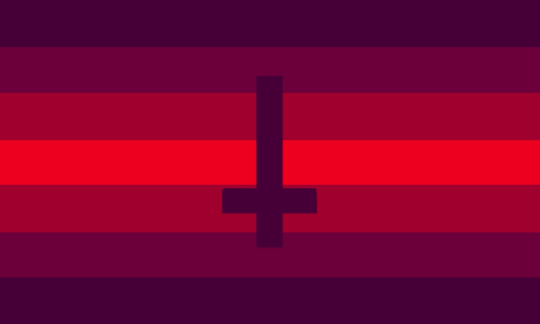

✦ UNHOLYLEXIC ✦
-> " A gender relating to the word unholy and / or being unholy . "
coined by me
2K notes
·
View notes
Text


Superiority-inferiority complex flag ⸻ a flag for those with a superiority-inferiority complex! made with NPD and BPD in mind, but one doesn't need either to use this flag.
the top four stripes are representative of the superiority part: purple is associated with regality and red with power, and the stripes point upwards. the bottom four stripes are representative of the inferiority part: blue is for low self esteem and green is for feelings of inadequacy, and the stripes point downwards. the star-like shape represents the bridge between the two complexes and how they intersect.
requested by anon, made by us!
@radiomogai
#superiority-inferiority complex#superiority inferiority complex#mogai#liom#qai#mogai coiner#liom coiner#flags#mogai flag#flag making#described#hopefully this makes sense lol
241 notes
·
View notes
Text
My zine, 'Label Coining as an Artform', is finally done! Transcript/Image ID underneath (warning: it's long). Printed version in a reblog.
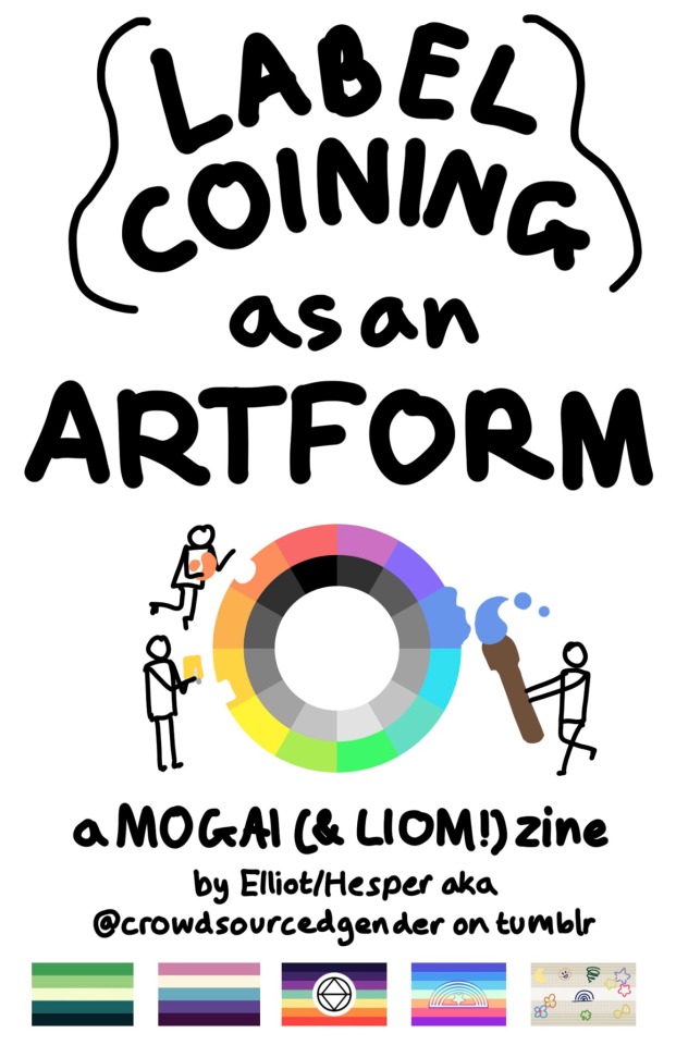
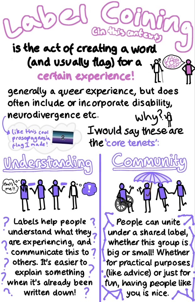
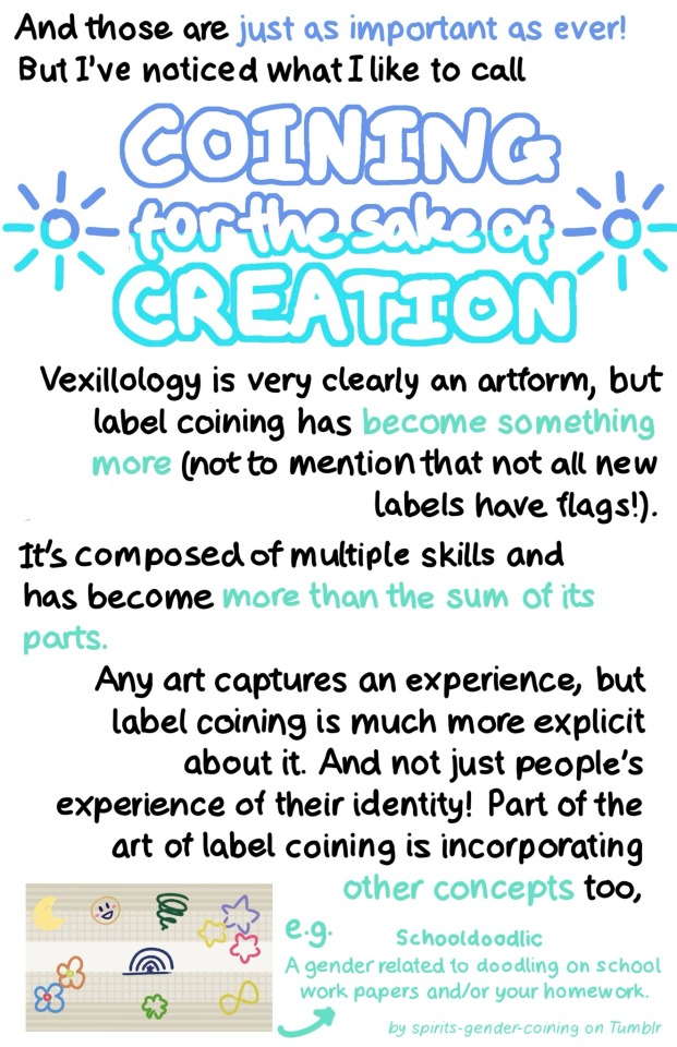

[Image ID: A series of pages in a zine. The text is handwritten, and all figures described are simplified stick figures.
Page 1: ‘LABEL COINING as an ARTFORM in large text. Below is the multicolored MOGAI wheel, with three figures taking pieces of the colors and using them for art: sculpting, cutting a piece of paper, and painting. Below is ‘a MOGAI (& LIOM!) zine by Elliot/Hesper aka @ crowdsourcedgender on tumblr. Under the text are five pride flags: aro-spec, veldian, alterhuman, xenoman, and schooldoodlic.
Page 2: ‘Label Coining’ in large pink text. ‘(in this context) is the act of creating a word (and usually flag) for a certain experience!’. Next to this text is a figure filled in with pink with a speech bubble full of pink shapes, talking to someone using a cane holding out a hand and expressing a question mark. Below reads ‘generally a queer experience, but does often include or incorporate disability, neurodivergence etc.’ A figure asks ‘Why?’ and the text reads ‘I would say these are the ‘core tenets’:’. In a cloud next to this text is a blue and purple pride flag with purple text reading: ‘like this cool prosopagnosia flag I made!’.
The bottom half of the page is split into two columns: ‘Understanding’ and ‘Community’. The first column has a purple arm amputee explaining a purple rectangle to another purple person who is thinking ‘that’s me!!’. Next to them another purple person is explaining the same rectangle to a blank person, who has a purple-filled thought bubble with a white exclamation mark. Underneath the drawing is text surrounded by question marks: ‘Labels help people understand what they are experiencing, and communicate this to others. It’s easier to explain something when it’s already been written down!” The second column has a purple person holding a purple umbrella. They are waving to a purple person in a wheelchair. A purple person is leading another one to the group. Underneath the drawing is text surrounded by connected dots: ‘People can unite under a shared label whether this group is big or small! Whether for practical purposes (like advice) or just for fun, having people like you is nice.
Page 3: ‘And these are just as important as ever! But I’ve noticed what I like to call COINING for the sake of CREATION’. This last phrase is in large, dark and light blue text. Two sun symbols are on either side. Below is the text: ‘Vexillology is very clearly an artform, but label coining has become something more (not to mention that not all new labels have flags!). It’s composed of multiple skills has become more than the sum of its parts. Any art captures an experience, but label coining is much more explicit about it. And not just people’s experience of their identity! Part of the art of label coining is incorporating other concepts too, e.g. Schooldoodlic A gender related to doodling on school work papers and/or your homework. By spirits-gender-coining on Tumblr.’ The text about Schooldoodlic is small and light teal. Next to the text is its flag.
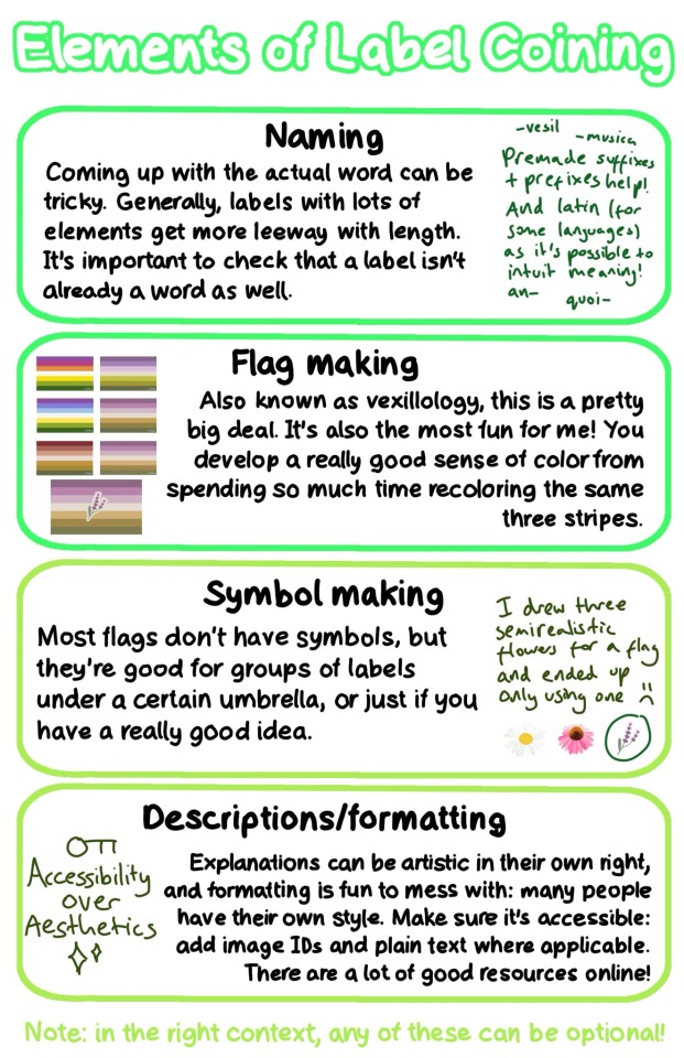
Page 4: ‘Elements of Label Coining’. The text on this page is separated into four green boxes.
‘Naming: Coming up with the actual word can be tricky. Generally, labels with lots of elements get more leeway with length. It’s important to check that a label isn’t already a word as well.’ Next to this text is more rough, dark green text reading ‘Premade suffixes + prefixes help! And latin (for some languages) as it’s possible to intuit meaning!’ Around the text is a few examples: ‘-vesil’ ‘-musica’ ‘an-’ ‘quoi-’
‘Flag making: Also known as vexillology, this is a pretty big deal. It’s also the most fun for me! You develop a really good sense of color from spending so much recoloring the same three stripes.’ Next to the text is 6 versions of the same pride flag, each with slightly different colors, with a 7th final version with a symbol.
‘Symbol making: Most flags don’t have symbols, but they’re good for groups of labels under a certain umbrella, or just if you have a really good idea.’ Next to this is rough, dark green text reading: ‘I drew three semirealistic flowers for a flag and ended up only using one’ with sad face. Under it is a drawing of a daisy, a pink coneflower, and lavender, which is circled.
‘Descriptions/formatting: Explanations can be artistic in their own right, and formatting is fun to mess with: many people have their own style. Make sure it’s accessible: add image IDs and plain text where applicable. There are a lot of good resources online!’ In dark green text is the phrase ‘Accessibility over Aesthetics’ with an image of a key on top and sparkles below.
Underneath the boxes in light green text is ‘Note: in the right context, any of these can be optional!’
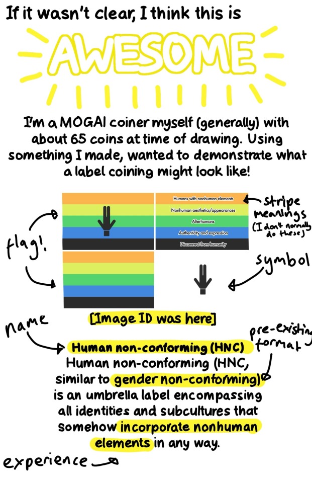
Page 5: ‘If it wasn’t clear, I think this is AWESOME’. Awesome is in large text with yellow radiating lines. Underneath is ‘I’m a MOGAI coiner myself (generally) with about 65 coins at time of drawing. Using something I made, I wanted to demonstrate what a label coining might look like!’ Underneath is four versions of the same pride flag as well as a description, with ‘flag!’ ‘stripe meanings (I don’t normally do these)’ ‘symbol’ ‘name’ ‘pre-existing format’ and ‘experience’ labelled. The description reads ‘[Image ID was here] Human non-conforming (HNC). Human non-conforming (HNC, similar to gender non-conforming) is an umbrella label encompassing all identities and subcultures that somehow incorporate nonhuman elements in any way.’
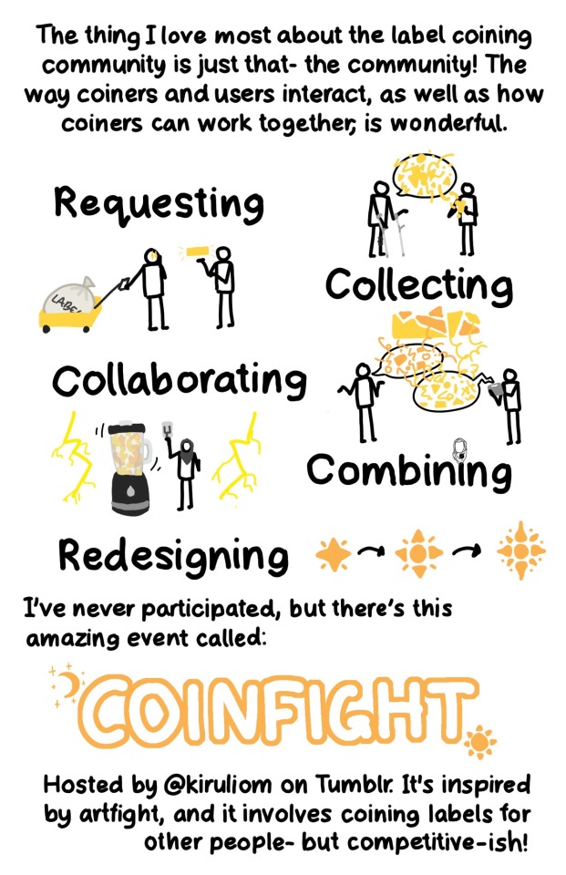
Page 6: ‘The thing I love most about the label coining community is just that- the community! The way coiners and users interact, as well as how coiners can work together, is wonderful. There are 5 large words each with an associated doodle.
‘Requesting’: A figure leaning on forearm crutches has a speech bubble with yellow shapes exploding out of it. Another figure is taking shapes down from the bubble and forming it into a ball.
‘Collecting’: A figure is pulling a yellow cart with a large cloth bag labelled ‘LABELS’. They have stars in their eyes, and are looking at another person who is gesturing to a yellow rectangle.
‘Collaborating’: Two figures, one with orange speech and one with yellow speech and an AAC tablet are discussing, with many shapes and lines intermingling to make a fragmented rectangle.
‘Combining’: A figure in a grey hijab pulls down a lever. They are standing next to a large blender mixing orange and yellow liquids. On either side is bright yellow lightning.
‘Redesiging’: A small star with four radial lines coming out of it becomes more and more complex, indicated by black arrows.
Under the words is the text: ‘I’ve never participated, but there’s this amazing event called: COINFIGHT. Hosted by @ kiruliom on Tumblr. It’s inspired by artfight, and it involves coining labels for other people- but competitive-ish!’ Coinfight is in large, text with a crescent moon with stars at the top right corner, and a star at the bottom left.
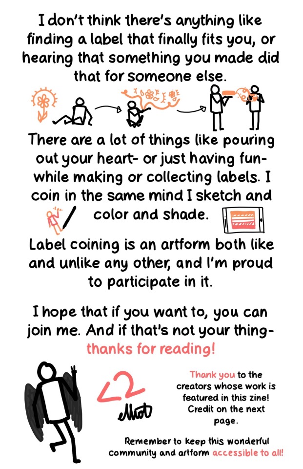
Page 7: ‘I don’t think there’s anything like finding a label that finally fits you, or hearing that something you made did that for someone else.’ Under is a figure looking at an orange flower with light lines, then forming elements of the flower into a bubble, then showing an orange rectangle to another figure, with orange tendrils reaching towards them, forming the shape of a heart. Below is the text ‘There are a lot of things like pouring out your heart- or just having fun- while making or collecting label. I coin in the same mind I sketch and color and shade.’ On each side is a pen drawing an orange figure with a red shirt, and a tablet with an orange and red flag. Under this is ‘Label coining is an artform both like and unlike any other, and I’m proud to participate in it. I hope that if you want to, you can join me. And if that’s not your thing- thanks for reading!’ There is a drawing of a figure with dark grey wings holding up two fingers. Next is a ‘<2’ heart and ‘elliot’ as a signature. In smaller text next to these is ‘Thank you to the creators whose work is featured in this zine! Credit on the next page. Remember to keep this wonderful community and artform accessible to all!’
Page 8: ‘Credit’: This section has a pride flag next to each label. ‘Aromantic-spectum, @ theflagarchive on Tumblr. Turian, @ kenochoric on Tumblr. Schooldoodlic, @ spirits-gender-coining on Tumblr. Xenoman, @ ryanyflags on Tumblr. MOGAI symbol, Pride-Flags on DeviantArt. Alterhuman, @ vaestra on Tumblr. (the flag on pg. 4 is Wildflowergender). ‘About making this zine’: ‘I really, really regret handwriting this. Drawing over Helvetica Neue for so long might change my actual handwriting, [more rough:] which looks like this! According to Artstudio Pro, I took 14 hours! I barely planned this before starting, the color wheel theme and the people doodles. /End ID]
#mogai#microlabels#mogai coining#lgbtq#lgbtqia#zine#art zine#lgbtq zine#queer zine#label coining#queer vexillology#queer#queer community#long post#described#image described#image id#not coining
667 notes
·
View notes
Text


Relocime ⸻ a gender connected to time loops, resets, and loss of control.
for day 1 of @chronicallyqueercoining2's coining event, for the prompt "a term related in some way to your favorite character"!
coined by us. if this already exists, do tell!
@radiomogai
#relocime#mogai#liom#qai#terms#term coining#liom coining#mogai coining#mogai coiner#liom coiner#flags#mogai flag#flag making#gender#genders#neogender#described#cqc1.2k#cqcevent
306 notes
·
View notes
Text
[Image ID: Three flags. They all have five equally-thick horizontal stripes, but the stripes are not straight- they are very “choppy” in that they randomly dip up and down into random shapes, giving a slightly messy, chaotic look.
From top to bottom, the colors of the first flag are medium grey, salmon pink, pale pink, salmon pink, and medium grey.
From top to bottom, the colors of the second flag are yellow-brown, yellow-green, white, yellow-green, and yellow-brown.
From top to bottom, the colors of the third flag are deep magenta, orange, golden, orange, and deep magenta.
End Image ID.]
PT ID:
Girlfail Boyfail Genderfail/Failgender
a gender for people who a) failed the gender orientation; b) consider themselves to be fails in pathetic ways; c) sad little wet things. the gender is self-explanatory so... enjoy!
please read my dni before using/saving! <3
End PT ID.
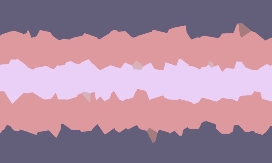
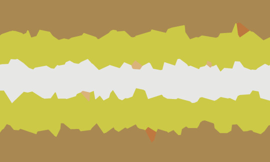
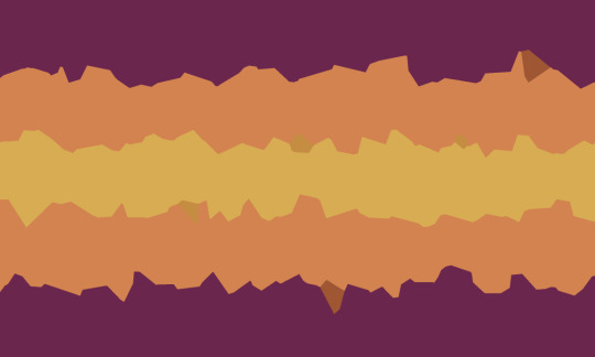
GIRLFAIL | BOYFAIL | GENDERFAIL/FAILGENDER ♡
a gender for people who a) failed the gender orientation; b) consider themselves to be fails in pathetic ways; c) sad little wet things . the gender is self-explanatory so... enjoy!
please read my dni before using/saving! <3
1K notes
·
View notes
Text

[first ID by @/demitheshine]
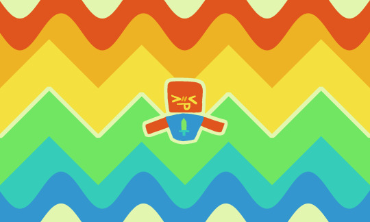
Main character syndrome/complex ⸻ a flag for those who self-describe as having main character syndrome or a main character complex! kinda made with NPD in mind, but one doesn't need NPD to use this flag.
bright colours for main character vibes :)
extremely self-indulgent
@radiomogai
#main character syndrome#main character complex#flags#mogai#liom#qai#flag coining#mogai flag#eyestrain#<- potential#described
290 notes
·
View notes
Text
Maned Lioness and Maneless Lion pride flags
Pride flags for anyone who identifies as, or with the concept of a maned lioness or a maneless lion, for any reason, including But Not Limited To: being intersex, gender nonconforming, trans in any way (and of any gender), or alterhuman/otherkin!
The colors were picked from photos of real lions and lionesses, and are completely symmetrical to represent how there's no "wrong way" to be a maned lioness or a maneless lion. There is no gender requirement for either flag.
Other people with completely different genders to you might identify as the same one as you, and this is a good thing. Have pride in your community. There is no wrong way to be a maneless lion or maned lioness. There is no gender requirement or policing.
Insert pride puns here.
These pride flags and icons are Public Domain, meaning there is no copyright on them, and you can do Literally Anything you want with them, at all. (Because there's no point in making a "pride flag" if no one is allowed to actually use it as a pride flag)


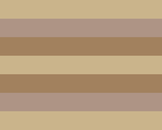


[ID: Three versions of two pride flags, both with seven horizontal and symetrical stripes, with the top, bottom, and center stripes being the same color. The first is the Maned Lioness pride flag, with stripes of: Black, tan, light brown, black, light brown, tan, and black. The first version of the flag has a white icon of a maned lionness in the center, with a spiky mane. The second version has just the stripes. The first version is the icon against a white background, with the flag stripes inside the lines of the icon itself. The second flag is the Maneless Lion pride flag, with stripes of: very soft gold, tan, light brown, soft gold, light brown, tan, and soft gold. The first version of the flag has the head of a maneless lion in the center in white. The second version has just the stripes, and the last version is the icon itself against a black background, with the stripes inside the icon. End ID.]
All of these images are archived on the Internet Archive. This post will be saved to the Wayback Machine as soon as it is posted. You are encouraged to download and share these anywhere and everywhere you want. Just please include the relevant sections of the image description for accessibility.
Again. Cannot stress this enough. There are no gender requirements for either of these terms.
You might identify with the same term here as a woman, or a man, or a nonbinary person. This is not a bad thing. This is fantastic. Celebrate your shared pride and have joy in your community.
Protect everyone around you just as strongly as lions defend members of their own prides, no matter the differences between you, whether you're a maned lioness or a maneless lion, or neither, or something in between.
Bare your collective teeth at those who want to harm us all.
#Pride flags#described images#accessible pride flags#maned lioness#maneless lion#gender nonconforming#gender nonconformity#gendernonconformity#gendernonconforming#intersex#trans#transgender#transsexual#nonbinary#pride#Queer#alterhuman#otherkin#therian#lion kin#gender#GNC#archived pride flags#LGBTQIA+#LGBTQIA#LGBT#Pride#MOGAI#LIOM#feminism
141 notes
·
View notes
Text


Satunaline ⸻ a gender connected to chance, adrenaline, and uncertainty.
satunnainen (coincidental, random) + adrenaline
requested by no one, coined by us.
@radiomogai
#satunaline#mogai#liom#qai#terms#term coining#liom coining#mogai coining#mogai coiner#liom coiner#flags#mogai flag#flag making#gender#genders#neogender#described
139 notes
·
View notes
Text
[Image ID: Two flags.
The first flag has eight equally-sized horizontal stripes. From top to bottom, the colors are navy blue, deep blue, hot pink, neon yellow, neon green, royal blue, deep blue, and navy blue.
The second flag is the same as the first, but it has splashes of royal blue, neon yellow, neon green, and hot pink paint across it.
End ID.]
Blacklightaesic

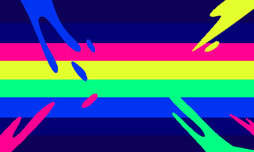
a gender that feels like blacklight reactive paint under a blacklight/an aesthetigender based on blacklight for @epikulupu 's event day 5, light!!
759 notes
·
View notes
Text


BPD intierarchy
A label for when one categorizes others in an internal hierarchy in their brains that is based around their BPD. For example: The user may see themselves in the middle, those below them are 'everyone else', the person at the top of the intierarchy is their FP, ect.
This intierarchy is entirely dependent on how the person feels (for example, a fp may be at the bottom of the intierarchy if the user is splitting).
While the user of this may also have NPD traits, it is not exclusive to those that do. This is however intended for those with BPD and BPD traits only.
Tagging: @rwuffles @pdsarchive and @radiomogai, this flags colors were inspired by this BPD flag
#liom#liom coining#liom flags#qai#qai coining#qai flags#mogai#mogai coining#mogai flags#intierarchy flags#bpd intierarchy#bpd#internal hierarchy#our flags#described#exclusive#requested
141 notes
·
View notes
Text
I post these in the hopes that maybe someday nonbinary people who are not transmasculine or transfeminine or whatever the next Brand New Progressive This Time Gender Binary will be in the next five years will actually have our voices heard and respected by the rest of the trans community, instead of constantly being erased and told that we're the reason conservatives hate trans people.
It's May 2025. Pride month starts in 16 days. You'd think we wouldn't have to keep asking for the bare minimum level of inclusion in conversations that affect us, but you'd be wrong.
The only nonbinary people the trans community even remotely respects are transfeminine and transmasculine people, and even they don't even get real respect. But at least they get to have their existence acknowledged on posts claiming to be about uplifting the most invisible trans people.
But we're so invisible we don't even get the privilege of being mentioned in passing, even by the most seemingly progressive people talking about trans issues.
If you think saying "trans men and transmascs and trans women and transfems" is you including the entire trans community, you are admitting you only see nonbinary people as trans if we force ourselves back into the gender binary that makes you so comfortable.
It's May 15 2025, 16 days until Pride Month begins, and I just had to see someone respond to a post about not excluding nonbinary people by saying that nonbinary people who want to be included are, and I directly literally quote, "the reason grandpa can't keep up with all the different term changes."
So.
Before Pride Month actually gets here, how about everyone, cis women, cis men, trans women, trans men, transfems, transmascs, how about you all please just take five minutes to think about the nonbinary people who do not fit into any of those categories and please actually take the time to remind yourself that we exist, and do your part to not actively exclude us from the community we have always been apart of and always will.
Are you trying to talk about the whole trans community? You need to just flat out say "nonbinary people". Not "transfem and transmasc nonbinary people" they are already included when you say transfems and transmascs.
You need to actually care about those of us who have nothing to do with the gender binary. You need to acknowledge us. You need to care about us. You need to listen to us.
If you do not care enough to just say "nonbinary people" when you're claiming to support the entire trans community, please just actually think about why that is. Ask yourself why you think we don't need to be included.
Ask yourself why the only nonbinary people you'll even pretend to include are the ones who are willing to fit into the gender binary.
Please just actually try to care about the rest of us too.
You are encouraged to download these and share them to other sites / blogs as long as you copy and paste the image description too. Including the part describing the flag. You should always describe the pride flag involved in art instead of just listing the name. It will always be someone's first time encountering it.

[ID: The progress trans flag, with text in front reading, "You still have to include nonbinary people in the conversation even when we aren't transfeminine or transmasculine". The progress trans flag has eight horizontal stripes of: Purple, black, blue, pink, white, yellow, black, and brown. In the center is a gold circle with rings of purple and black around it. End ID.]

[ID: The same flag, now reading, "If the only trans people you stand up for are trans men, transmascs, trans women, and transfems...you're abandoning so many nonbinary people to fend for ourselves". End ID.]

[ID: The same flag, now reading, "If you can't even bring yourself to say the words 'nonbinary people' you have no right to say you care about all trans people". End ID.]

[ID: The same flag, now reading, "You have to care about all nonbinary people, not just the ones who are transmasculine or transfeminine". The words 'all nonbinary people' are underlined for emphasis. End ID.]

[ID: The same flag, now reading, "Nonbinary people should not have to force ourselves back into the closet just to get you to acknowledge our existence". End ID.]
#described images#Queer#Pride#LGBT#MOGAI#Trans#nonbinary#transgender#exorsexism#pride month#trans#transsexual#transmasculine#transfeminine#trans women#trans men#trans woman#trans man#transmasc#transfem#progress trans flag#solidarity
74 notes
·
View notes
Text
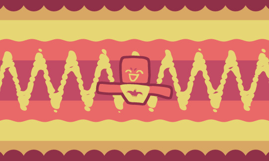
Comic relief ⸻ a flag for those who consider themselves as being comic relief or feeling like a comic relief character!
similar in nature to our main character syndrome flag.
requested by @sillynessmogai, flag made by us.
@radiomogai
#comic relief#mogai#liom#qai#mogai coiner#liom coiner#flags#mogai flag#flag making#described#eyestrain#<- potential (again)
127 notes
·
View notes
Text
[Image ID: Two flags and then a DNI banner.
The flags are almost the same, except the first additionally has a sticker-like drawing of a blue cat standing upright on two legs and raising one of its paws in the air, with a blue crescent moon on its right and two blue stars on its left. The flags have seven basically-equally-sized horizontal stripes. From top to bottom, the colors are deep blue, blue, indigo, pale grey, indigo, blue, and deep blue. The top and bottom stripes are layered over with blue stars.
The DNI banner has a background of a flag with six equally-sized straight horizontal stripes. From top to bottom, the colors are navy blue, blue, indigo, pink, off-white, and pastel salmon pink. In white-outlined black text, the banner reads “DNI if you fit basic criteria, if you’re a proshipper or a comshipper, if you’re one of those harmful paraphile people, and if you believe in transrace/transabled stuff etc. (block me please)”.
End Image ID.]
PT ID:
Nocstuffic; a gender connected to walking around at night carrying a plushie!
🦑 requested by anon/coined by me! ♡
End PT ID.
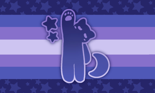
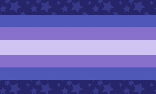
くコ:彡 ; NOCSTUFFiC ; a gender connected to walking around at night carrying a plushie !! (*´꒳`*)
🦑 requested by anon / coined by me ! ♡

1K notes
·
View notes
Text


#BEADED hexodic (left) ⸻ an identity related to the hex code #beaded!
#DECADE hexodic (right) ⸻ an identity related to the hex code #decade!
for day 4 of @chronicallyqueercoining2's coining event, for the prompt "a specific color / color palette / shade"!
coined by us. if one of these already exists, please tell us!
@radiomogai @hexodic
#beaded hexodic#decade hexodic#hexodic#mogai#liom#qai#terms#term coining#liom coining#mogai coining#mogai coiner#liom coiner#flags#mogai flag#flag making#described#cqc1.2k#cqcevent#queue
61 notes
·
View notes
Text


Creachurlexic ⸻ a lexegender related to the word "creachur"!
for day 6 of @chronicallyqueercoining2's coining event, for the prompt "creature"!
coined by us. if this already exists, please tell us!
@radiomogai
#creachurlexic#mogai#liom#qai#terms#term coining#liom coining#mogai coining#mogai coiner#liom coiner#flags#mogai flag#flag making#gender#genders#neogender#lexic#lexegender#described#cqc1.2k#cqcevent#queue
80 notes
·
View notes
Text

ID: a 7 striped flag: dark green, green, pink, white, pink, green, dark green. an outline of a white heart is in the top left corner. end ID aroromantic - when your attraction feels or looks similar to romantic attraction, but is distinctly aromantic. like an aromantic version of romantic attraction. can be used as an orientation

ID: a 7 striped flag: dark purple, purple, pink, white, pink, purple, dark purple. an outline of a white heart is in the top left corner. end ID acesexual - when your attraction feels or looks similar to sexual attraction, but is distinctly asexual. like an asexual version of sexual attraction. can be used as an orientation some self indulgent coinings. i feel like ive finally put to words the type of attraction i feel. i hope maybe it can help someone else too! @radiomogai
90 notes
·
View notes