#mobile wireframes
Explore tagged Tumblr posts
Text

Vibri as a dragon city dragon (i tried)
#dragon city#dragon city mobile#vibri#fanart#vib ribbon#art#vib ribbon art#wireframe#vector#idea#lol#frog vibri#worm vibri#queen vibri#playstation#video games
13 notes
·
View notes
Text
Crafting Digital Experiences with Expert UI/UX Design

Looking to elevate your website or app? At Click Design Solutions, we bring your digital ideas to life with expert UI/UX design we offer: ✅ User-Centric Designs ✅ Prototypes that Inspire ✅ Aesthetic & Functional Interfaces
From wireframes to the final design, we create seamless, user-friendly experiences.
📞 Contact us at +9988122148 🌐 Visit: www.clickdesignsolutions.com
Follow us for design inspiration and updates! 💻✨
#User-friendly design#Website development#App design#Click Design Solutions#Innovative design#Wireframing#Prototyping#Functional design#Aesthetic website#Custom websites#User experience#Digital solutions#Mobile app design#Responsive design#Website prototypes#Seamless user interface#Interactive design#Professional design services#Website functionality#Creative web solutions#UI/UX design.
0 notes
Text
The user experience design process is evolving at an unprecedented rate, largely driven by advances in artificial intelligence (AI). As businesses strive to enhance digital interactions, AI's role in UX design has become more crucial than ever, offering a sophisticated blend of efficiency and insight. This integration streamlines the design process to ensure that digital platforms are more intuitive, responsive, and tailored to user needs. This post explores how AI is revolutionizing the UX design process, from initial user research to the final stages of implementation, providing practical insights for those considering its adoption.
#UI/UX Design Services for Startups in Dubai#Affordable Web Design for Small Businesses in Dubai#Custom App Design Solutions in Dubai#Professional Branding Services for New Companies in Dubai#Responsive Website Design Experts in Dubai#User-Centric Mobile App Design in Dubai#E-commerce Website UI/UX Design in Dubai#Innovative Digital Product Design Agency in Dubai#High-Converting Landing Page Design Services in Dubai#Comprehensive UX Strategy Consulting in Dubai#UI ( User interface )#UX (User experience)#Wireframe#Design#User Research#Usability Testing#User persona#User Flows#Information Architecture#High Fidelity#Web design#Website development#Responsive web design#UX/UI design#Graphic design for websites#Web design company#Flat web design#Brand identity design#Logo design#Social media branding
0 notes
Text
The user experience design process is evolving at an unprecedented rate, largely driven by advances in artificial intelligence (AI). As businesses strive to enhance digital interactions, AI's role in UX design has become more crucial than ever, offering a sophisticated blend of efficiency and insight. This integration streamlines the design process to ensure that digital platforms are more intuitive, responsive, and tailored to user needs. This post explores how AI is revolutionizing the UX design process, from initial user research to the final stages of implementation, providing practical insights for those considering its adoption.
#UI ( User interface )#UX (User experience)#Wireframe#Design#User Research#Usability Testing#User persona#User Flows#Information Architecture#High Fidelity#Web design#Website development#Responsive web design#UX/UI design#Graphic design for websites#Web design company#Flat web design#Brand identity design#Logo design#Social media branding#Brand logo design#Mobile app design#iOS app design#Android app design#Flat app design#user experience design#ui and ux design#ux design services#ux web design#web app design
0 notes
Text
Designing for Small Screens: Tips for Optimizing Mobile Interfaces
Mobile interfaces play a crucial role in today’s digital landscape, where the majority of web traffic comes from smartphones. Designing for small screens requires a user-centered approach, prioritizing functionality, usability, and aesthetics. This guide offers practical tips to help you create optimized mobile interfaces that delight users and drive engagement.
1. Prioritize Content Hierarchy
On small screens, space is limited, so it’s essential to prioritize the most important information.
Use Clear Visual Hierarchy: Emphasize key elements like headlines, CTAs, and navigation.
Keep Content Concise: Use short, impactful text that conveys the message quickly.
Above-the-Fold Content: Ensure critical information is visible without scrolling.
2. Optimize for Touch Interaction
Unlike desktops, mobile users interact with screens through touch, making usability paramount.
Touchable Targets:
Ensure buttons and interactive elements are at least 48x48 pixels.
Provide enough spacing to avoid accidental taps.
Thumb-Friendly Design:
Place primary actions within easy reach of the thumb, typically in the lower third of the screen.
Gestures:
Incorporate common gestures like swiping and pinching for a natural user experience.
3. Responsive and Adaptive Design
Ensure your design adapts seamlessly to different screen sizes and orientations.
Responsive Layouts:
Use fluid grids and flexible images that adjust based on screen size.
Test designs on various devices to ensure consistency.
Breakpoints:
Define breakpoints to adjust layouts for small, medium, and large screens.
4. Simplify Navigation
Navigation should be intuitive and accessible, even on small screens.
Hamburger Menus:
Use collapsible menus to save space while maintaining functionality.
Ensure menu items are easily tappable.
Sticky Navigation:
Keep navigation visible as users scroll for easy access.
Breadcrumbs:
Include breadcrumbs to help users understand their location within the app.
5. Use Scalable Typography
Text readability is critical for user satisfaction.
Font Size:
Use a minimum font size of 16px for body text.
Adjust line height and spacing for improved readability.
Dynamic Sizing:
Use relative units like “em” or “rem” for responsive typography.
Contrast:
Ensure sufficient contrast between text and background for accessibility.
6. Minimize Load Times
Performance is a key factor in mobile user satisfaction.
Optimize Images:
Use compressed image formats like WebP or JPEG.
Implement lazy loading to prioritize visible content.
Reduce HTTP Requests:
Minimize the number of files required to load the page.
Leverage Caching:
Use caching to reduce load times for returning users.
7. Focus on Accessibility
Designing for inclusivity ensures your mobile interface is usable by everyone.
Screen Reader Support:
Include proper ARIA labels and semantic HTML for screen readers.
Color Accessibility:
Use tools to check color contrast ratios for compliance with WCAG guidelines.
Keyboard Navigation:
Ensure the interface is navigable via external keyboards and switches.
8. Implement Feedback Mechanisms
Providing feedback ensures users feel confident interacting with the interface.
Visual Feedback:
Highlight buttons and interactive elements when tapped.
Load Indicators:
Use spinners or progress bars to indicate loading.
Error Messages:
Provide clear and actionable error messages for form validation.
9. Test and Iterate
Continuous testing and iteration are essential for creating a polished product.
Usability Testing:
Test designs with real users to identify pain points.
A/B Testing:
Experiment with variations to see what performs best.
Analytics:
Monitor user behavior to refine the interface over time.
10. Leverage Design Systems
Design systems help maintain consistency and speed up the design process.
Reusable Components:
Use pre-designed elements like buttons, cards, and forms.
Consistency:
Maintain a unified look and feel across the app.
Scalability:
Enable easier updates and scalability as the app evolves.
Conclusion
Designing for small screens requires a thoughtful approach that prioritizes usability, accessibility, and performance. By following these tips, you can create mobile interfaces that provide seamless and enjoyable experiences for users. Remember to test frequently, gather feedback, and stay updated on emerging trends to keep your designs relevant and impactful.
Devoq Design is a premier UI/UX design agency serving businesses in UI/UX Design Agency in Hubballi-Dharwad and UI/UX Design Agency in Mysore , offering cutting-edge digital solutions to elevate your brand. With a focus on creating intuitive user interfaces and exceptional user experiences, Devoq Design specializes in web design, mobile app development, and enterprise software solutions. Our team combines creativity with a user-centered approach to deliver designs that drive engagement and business success. Partner with Devoq Design to bring your digital vision to life with innovative and impactful design solutions.
0 notes
Text
A strong base is essential in the rapidly evolving realm of mobile app development. This is when wireframing becomes useful. Consider it as the roadmap to your app’s prosperity. Creating wireframes is crucial in developing mobile apps as it provides a foundation for successful app creation. Wireframes play a vital role in the UI/UX design process, whether you are creating new software or enhancing existing ones.
0 notes
Text
Expert Wireframing and Prototyping Services

Need expert wireframing and prototyping services? Our experienced team provides app prototyping, wireframe design, and UX consultancy for mobile, web, and desktop applications. From concept to prototype, we help you visualize, test, and perfect your app’s design before full development. Whether you're looking for mobile app wireframing or complete prototyping solutions, our services ensure a seamless design process for your project. Visit now to know more: https://www.cdnsol.com/wireframing-and-app-prototyping
#wireframing and prototyping services#app prototyping services#application wireframe design services#prototyping and consultancy#experience prototype consultants#wireframe and prototype design services#app prototyping company#user experience prototyping consultancy#wireframing and prototyping development firm#wireframing and prototyping tools#mobile app prototyping services#app prototyping and wireframing services#wireframing and app prototyping#mobile app wireframing#web apps wireframing#desktop app wireframing
0 notes
Text

🌐📐 Dive into the art of wireframing, where every pixel has a purpose. Elevate your design game with our meticulous blueprint for an exceptional user experience! ✨ Ready to transform ideas into digital wonders? Let's craft brilliance together! 🚀💻 🌐 Website: https://greyspacecomputing.com/ 📧 Email: [email protected] 📱 Phone: +91-98602 56990 #WireframingWonders #DesignMagic #Greyspacecomputing #UXBlueprint #WireframingMagic #UserExperience #wireframe #ui #ux #uxdesign #design #uidesign #userinterface #uiux #webdesign #appdesign #userexperience #interface #webdesigner #uxdesigner #dribbble #uitrends #graphicdesign #userinterfacedesign #uidesigner #website #uxinspiration #behance #dailyui #digitaldesign #uiinspiration #uxigers #landingpage #uxui #web
#app developing company#app development#mobile application development#mobile app company#dubai#qatar#oman#wireframe
1 note
·
View note
Text
Importance of Wireframing in Web and App Development

In the world of Web and Mobile App Development, wireframing is an essential process that plays a crucial role in ensuring the success of a project of Mobile App Website Development. Do you know that a well-produced, high-quality wireframe is a vital stage in the creative process and can be the difference between success and failure when dealing with various stakeholders?
This is an important question in our region of the world, where due process and a step-by-step approach are often overlooked. Wireframing is a crucial step in the process of designing websites and Mobile App Development Services. It allows developers of any Web Development Company, designers, and clients to collaborate and refine the user interface and experience of a product.
In this blog post, we will explore the importance of wireframing in web and app development. We will discuss the benefits of wireframing, the tools and techniques used in the process, and best practices for creating effective wireframes.
What is A wireframe?
Wireframe is a low-fidelity visual representation of Web Development Services or an app development that outlines the basic structure and layout of the user interface. It is typically created in the early stages of the design process to help designers, developers, and clients to visualize and refine the layout and functionality of the website or app.
Wireframes are typically created using simple shapes, such as boxes and lines, to represent different elements of the interface, such as navigation menus, content areas, and buttons. They do not include detailed design elements such as colors, images, or typography, but focus on the overall layout and structure of the interface.
Wireframing's Importance in Online and App Development:
Visualizing the Design:
Wireframing is an excellent way to visualize the design of a website or app before the development process begins. It helps to outline the user interface and experience, which in turn helps the development team to work more efficiently. Clear visualization of the design can also help clients to understand the concept of the product, making the communication between the development team and the client more effective.
Streamlining the Development Process:
Wireframing helps to streamline the development process by identifying potential issues and making changes early on in the design process. This results in a more efficient development process, saving both time and money. By establishing a clear roadmap for the project, the development team can work towards a defined goal, minimizing errors and miscommunications.
Collaboration and Communication:
Wireframing allows designers, developers, and clients to collaborate and communicate effectively. This results in a better understanding of the project, leading to better outcomes. Through the use of wireframes, designers and developers can explain their ideas to clients more effectively, reducing misunderstandings and miscommunications.
Refining the User Experience:
Wireframing allows designers and developers of Web Development Companies to refine the user experience by testing various options and layouts. By testing different wireframes with users, designers can identify the best design options for the product. This can improve the usability and functionality of the product, making it more appealing to users.
Cost-effective Design:
Wireframing is a cost-effective method of designing websites and apps. It is a low-fidelity process that requires fewer resources compared to high-fidelity designs. As a result, clients can make changes and revisions to the design without incurring significant costs. This can be a significant benefit to businesses and organizations with limited budgets.
What are the benefits of Wireframing?
Wireframing provides several benefits in the web and app development process. Here are some of the key benefits of using wireframes:
- Wireframes provide a visual representation of the structure and layout of the website or app, allowing designers and developers to see how different elements of the interface will be organized and how users will navigate through the website or app.
- By creating low-fidelity wireframes, designers and developers can identify usability issues and design problems early in the design process. This can save time and resources later on in the development process.
- Wireframes allow designers and developers to test different user flows and user experiences before creating a final design. This helps to ensure that the final product meets the needs of the users and provides a positive user experience.
- Wireframes provide a common language for communication and collaboration between designers, developers, and stakeholders. This can assist in ensuring that everyone is on the same page and working towards the same objectives.
- By identifying usability issues and design problems early in the design process, wireframing can save time and resources later on in the development process. This can help to ensure that the final product is delivered on time and within budget.
How to use Wireframes?
Wireframes are used in the early stages of the design process to outline the structure and layout of a website or app. Here are some steps to follow when using wireframes:
Define the scope and purpose of the project: Before creating wireframes, it is important to define the scope and purpose of the project. This includes identifying the target audience, defining the goals and objectives of the website or app, and determining the desired user flow.
Gather requirements and content:Once the scope of the project has been defined, gather requirements and content from stakeholders and subject matter experts. This includes identifying the types of content that will be included in the website or app, such as text, images, and videos.
Create low-fidelity wireframes:Using a wireframing tool or sketching on paper, create low-fidelity wireframes that outline the basic structure and layout of the website or app. This includes identifying the main sections of the website or app, such as the homepage, landing pages, and content pages.
Test and refine the wireframes:Once the wireframes are created, test them with users to identify any usability issues or problems with the user flow. Refine the wireframes based on feedback from users and stakeholders, and make any necessary changes.
Create high-fidelity designs:Once the wireframes have been refined and approved, create high-fidelity designs that include visual design elements such as color, typography, and images. Use the wireframes as a guide for creating the final design of the website or app.
Share and collaborate: Share the wireframes with stakeholders and collaborate with the development team to ensure that the final product meets the needs of the users and stakeholders.
Conclusion:
Overall, wireframes are an important tool in the design process that helps to ensure that the website or app meets the needs of the users and stakeholders. By using wireframes, designers and developers can create a user-centered design that is easy to use and provides a positive user experience.
If you are in search of any Mobile App Development India or a Web Development Company India to help you with your app development then connect with us now.
1 note
·
View note
Text
UI/UX Principles
UI/UX Principles are fundamental guidelines governing both User Interface (UI) and User Experience (UX) design. They dictate how visual elements and interactive features should be designed to optimize user satisfaction!
#https://www.techaheadcorp.com/blog/best-ux-design-practices/#ux design#user experience#design best practices#ui/ux principles#mobile app design#web design guidelines#user-centric design#interaction design#usability tips#human-centered design#responsive design#user interface design#ux research#prototyping#wireframing#accessibility in design#visual hierarchy#information architecture#design thinking#mobile app usability
0 notes
Text
UX/UI
Exploring the Intersection of UX/UI Design and Mobile App DevelopmentIn today's digital landscape, mobile app development is at the forefront of innovation, with user experience (UX) and user interface (UI) design playing a critical role in shaping successful applications. This article explores how UX/UI design and mobile app development intersect to create seamless, functional, and visually appealing apps that meet user needs and business goals.---The Importance of UX/UI Design in Mobile App DevelopmentUX/UI design serves as the foundation of mobile app development, ensuring that users interact with apps effortlessly while enjoying a visually engaging interface.User Experience (UX): Focuses on the overall feel of the app, emphasizing usability, accessibility, and efficiency. It ensures users can achieve their goals without frustration.User Interface (UI): Deals with the aesthetic aspects, including typography, color schemes, and layout, creating an intuitive and visually appealing interface.When combined, UX and UI design drive user satisfaction, loyalty, and engagement, making them indispensable to the development process.---Key Elements at the Intersection1. User-Centered Design:Both UX/UI design and app development prioritize understanding user needs and preferences through research, personas, and journey mapping.2. Prototyping and Testing:UX/UI designers create wireframes and prototypes to visualize app functionality, while developers refine and test these designs to ensure technical feasibility.3. Iterative Development:Continuous feedback loops between designers and developers enable ongoing improvements, aligning design concepts with real-world user behavior.4. Performance Optimization:Developers ensure the app performs efficiently, while UX/UI designers minimize cognitive load through intuitive navigation and layout design.5. Cross-Platform Consistency:UX/UI designers maintain consistency across iOS and Android platforms, while developers ensure compatibility without compromising functionality or aesthetics.---Emerging Trends in UX/UI and Mobile App Development1. Dark Mode Design:Enhances visual appeal and reduces eye strain, requiring developers to adjust codebases to accommodate different themes seamlessly.2. Voice and Gesture-Based Interfaces:UX/UI designers integrate voice commands and gestures, while developers work on advanced algorithms for accurate recognition.3. Personalization:Data-driven designs allow apps to adapt to individual preferences, with developers building robust back-end systems to support personalization.4. Micro-Interactions:Subtle animations and feedback loops designed by UX/UI experts are implemented by developers to boost user engagement.5. Accessibility:Designing for inclusivity involves creating apps accessible to people with disabilities, combining thoughtful design with technical adaptability.---Collaboration Between UX/UI Designers and DevelopersEffective collaboration between UX/UI designers and developers is essential to create apps that are both functional and delightful.Clear Communication: Regular meetings and design reviews foster understanding of design and technical constraints.Shared Tools: Platforms like Figma, Adobe XD, and Sketch bridge the gap, enabling designers to hand off assets directly to developers.Agile Methodology: Iterative workflows keep both teams aligned on project goals and timelines.---ConclusionThe intersection of UX/UI design and mobile app development is where innovation meets functionality. By prioritizing user needs, maintaining effective collaboration, and staying ahead of trends, designers and developers create mobile applications that not only meet but exceed user expectations. In an ever-evolving digital landscape, this synergy is the key to delivering apps that resonate with users and drive business success.Would you like assistance with visuals or infographics to accompany this article?
#UI/UX Design Services for Startups in Dubai#Affordable Web Design for Small Businesses in Dubai#Custom App Design Solutions in Dubai#Professional Branding Services for New Companies in Dubai#Responsive Website Design Experts in Dubai#User-Centric Mobile App Design in Dubai#E-commerce Website UI/UX Design in Dubai#Innovative Digital Product Design Agency in Dubai#High-Converting Landing Page Design Services in Dubai#Comprehensive UX Strategy Consulting in Dubai#UI ( User interface )#UX (User experience)#Wireframe#Design#User Research#Usability Testing#Web design#Website development#Responsive web design#UX/UI design#Graphic design for websites#Web design company#Flat web design#Brand identity design#Logo design#Social media branding#Brand logo design#Mobile app design#iOS app design#Android app design
1 note
·
View note
Text
UX/UI Design 101: The Basics Every Designer Should Know
In today’s digital world, user experience (UX) and user interface (UI) design play a vital role in creating engaging and user-friendly digital products. Whether you’re designing a website, mobile app, or software platform, understanding the fundamentals of UX/UI design is essential for delivering intuitive and enjoyable experiences. This guide covers the basics every designer should know to get started on the path to becoming a successful UX/UI designer.
What is UX/UI Design?
Before diving into the details, it’s important to distinguish between UX and UI design:
While UX and UI are different disciplines, they work hand-in-hand to create seamless digital experiences. UX focuses on the structure and usability of the product, while UI focuses on its look and feel.
The Importance of UX/UI Design
Good UX/UI design can make or break a digital product. Here’s why it matters:
1. User-Centered Design
The core principle of UX design is putting the user first. Designers should focus on understanding the target audience, their needs, pain points, and behaviors.
Tips:
2. Usability
Usability refers to how easy it is for users to interact with a product and achieve their goals.
Tips:
3. Information Architecture (IA)
Information architecture involves organizing and structuring content in a way that makes it easy for users to find what they need.
Tips:
4. Accessibility
Accessibility ensures that your product is usable by people with various abilities and disabilities.
Tips:
Basic Principles of UI Design
1. Consistency
Consistency in design helps users recognize patterns and navigate the interface more easily.
2. Visual Hierarchy
Visual hierarchy refers to arranging elements in a way that guides users’ attention to the most important parts of the interface.
Tips:
3. Typography
Typography plays a significant role in UI design, affecting readability and the overall look and feel of the product.
Tips:
4. Color Theory
Color affects how users perceive a product and can evoke emotions.
Tips:
The UX/UI Design Process
1. Research
Start by understanding the problem you’re trying to solve and the needs of your users.
Activities:
2. Wireframing
Create low-fidelity wireframes to outline the basic structure and layout of your design.
Tools:
3. Prototyping
Prototypes are interactive mockups that allow you to test the functionality of your design.
Tips:
Essential Tools for UX/UI Designers
Figma: A cloud-based design tool for creating UI designs and prototypes.
Sketch: A popular design tool for macOS users.
Adobe XD: A vector-based design tool for creating wireframes, prototypes, and designs.
InVision: A prototyping tool that allows for collaboration and feedback.
Common UX/UI Design Mistakes to Avoid
Ignoring User Feedback: Always prioritize user feedback and iterate on your designs accordingly.
Overloading the Interface: Avoid clutter by keeping the design clean and focused.
Inconsistent Design: Maintain consistency in colors, typography, and design patterns.
Poor Navigation: Ensure that navigation is intuitive and straightforward.
Conclusion
UX/UI design is a critical component of creating successful digital products. By understanding the basics of UX and UI design, designers can create user-friendly and visually appealing experiences that meet both user needs and business goals. Remember to prioritize user research, maintain consistency, and continuously iterate on your designs based on feedback. With the right tools and knowledge, you can build digital products that stand out in today’s competitive market.
Devoq Design is a leading UI/UX design agency providing exceptional design solutions in UI/UX Design Agency in Pennsylvania and UI/UX Design Agency in Rhode Island . Known for blending creativity with functionality, Devoq Design specializes in crafting user-friendly interfaces and seamless user experiences tailored to meet the unique needs of businesses across diverse industries. In Pennsylvania, the agency collaborates with enterprises ranging from startups to established brands, ensuring designs that drive engagement and deliver measurable results. Similarly, in Rhode Island, Devoq Design’s expert team focuses on creating intuitive digital experiences that resonate with users and align with business goals. With a customer-centric approach and a dedication to innovation, Devoq Design continues to be a trusted partner for UI/UX excellence.
#product design#wireframe design#web design#ui ux design#user experience (ux) design#mobile app development
0 notes
Text
How to Build a Mobile App With a Limited Budget | Protonshub Technologies
Discover the ultimate guide to building a remarkable mobile app with a limited budget. Learn essential tips, tricks, and cost-saving strategies to turn your app idea into reality without compromising on quality. Get expert insights and practical steps to maximize your resources and create a successful mobile app that captivates your audience. Start building your app on a budget today and witness your vision come to life with our premium mobile app development services.
#Guide to mobile application development in 2023#Mobile app development company#How to create a wireframe for your application in 2023#How to get investors for your mobile app startup#Top mobile app development company
0 notes
Text
I know my fellow artists and creators have been frustrated with the rise of AI on Pinterest and Google. Many of us find it difficult to serch for good references, tips, and general inspiration for art. So I want to share my collection of good, free websites for artists, designers, film makers, and creators so we can create without ugly AI images staring in our faces 🙌
Sketchfab


An incredible source for references. Has a huge collection of 3D animals, architecture, interior rooms, vehicles, food, objects, furniture, nature, memes, characters, etc etc etc. You can literally find several insanely detailed 3D models of the Notre Dame (this one is insane) Models can rotated at any angle as well as zoomed in and out. You can also change the view of the model to be matcap with flat, colorless planes, wireframe, or base color as opposed to fully rendered.
Cons: there are many uploads that are random and incredibly specific, which overwhelms the search. Can be excellent for game designers who want to download models but for artists looking for drawing references, you might have to dig a bit for what you want. Can be so fun for playing around and using crazy fun references for practicing.
Designspiration


As a photographer and graphic designer and someone who can doomscroll on pinterest forever, this is my favorite for finding inspiration for everything: typography, logos, product mockups, illustration, photography, web design, etc. Has an amazing feature where you can search for art with specific hex codes! Probably the coolest feature I’ve seen in search engines, and by far superior to google's color search. This site is mostly for design inspiration, but I feel like if you are super into moodboards, then this is the site for you too especially with the beautiful selection of photography.
Cons: I have no cons, I love this website so much and I used to be addicted to pinterest (still am actually😬) but this is easily my new favorite
Public Works by Cosmos


Thousands of artworks enter the public domain every year, and this website is a search engine for other 100,000 of those copyright free works. All of these works are free to edit, use, and sell with few restrictions.
Cons: I personally find the layout for the search feed a bit frustrating to look around in sometimes, because it’s not the typical "scroll up and down" website. But is very dynamic and overall fun to explore.
Same.energy


This is a good visual search engine that’s a good replacement for Google images and Pinterest. The minimal words makes it simple and easy, and clicking on an image you like to filter the feed to find similar images.
Cons: this is in beta so it still have some kinks to work out. It seems to struggle with specific searches and some of the images brought up in the search can be repetitive or not relevant.
Reference Angle


A website for finding face references in any specific angle and any expression for any gender and age.
Cons: I would love this website more if it gave you the ability to customize the light source, but sadly is not an option. I also feel like there is not a lot of racial diversity in the photos, and some of the images do not match the specific angle. But it is overall a great source for face references
Virtual Lighting Studio by zvork


A good source for light studies. You can change the source, direction, color, and brightness as well stacking several light sources on top of each other.
Cons: there isn’t a way to angle the face or change the expression, so it is permanently in portrait mode. There are four different models and I’m not the biggest fan of some of them…I like the black guy the best because he looks at me kindly instead staring into my soul like the two white guys. The ads are also a bit obnoxious and for the love of god DO NOT USE IN MOBILE!!! The ads are impossible to get rid of.
Film Grab


An archive of stills from a huge list of movies. Good for film makers, photographers, art studies, moodboards, inspiration, etc. Has a huge selection of movies and you can search by movie, director, costume designer, aspect ratio, year, genre, and country. You can also hit random post and it'll give you a random movie, which I think is really fun.
Cons: I do not recommend mobile. The mobile does not have the option to search for a specific movie, so you're forced to scroll through the giant A-Z list of directors or films to find the specific film you were looking for. Another con that I just discovered: a big-ass ad on the top of the website that occasionally advertises AI websites 🤢 (not shown on the screenshots I shared because ew)
Unsplash


Another image search website that has the feeling of Pinterest
Cons: some images are locked for premium only, and the feed is a bit frustrating to scroll through on mobile since they show the images one at a time instead of as a nice collage like pinterest. Some images can also be irrelevant to the search.
Sending lots of love to my fellow artists and creative peeps out there. AI sucks and it feels like it's overwhelming the creative space. But I promise there is a way to avoid it! Keep creating 💕
#fuck AI#artists on tumblr#graphic design#photography#digital artist#small artist#art inspiration#art inspo#digital art#moodboard
79 notes
·
View notes
Note
Since your in multimedia arts is it okay if you could show one of your projects? It's totally up to you ofcourse I'm just really curious
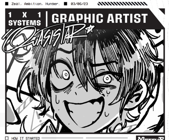
UHM.... I UH.. I KIND OF.. I'M NOT REALLY.. GOOD.. AHHAHAA BUT I'M TRYING 🎀
Projects I'm proud of I guess?
1st year:
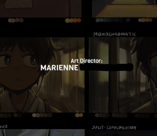
Was an art director, storyboard artist, background & character designer, lighting/colorist, and clean-up artist in a short 2D animation project for finals
Had done project exhibits
2nd year:




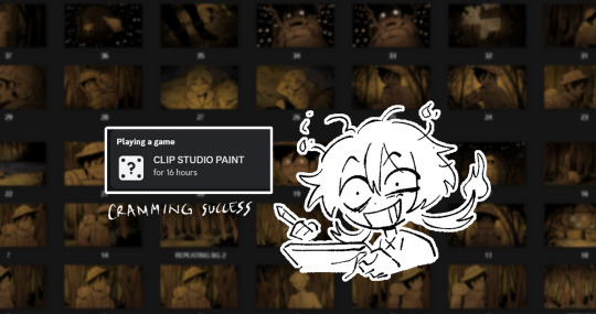
Part of Indy Films team as sound designer
Worked on storyboards and art lead ( VFX, E-games, World-literature )
Had done 3D modeling, rigging, and 3D animation (blender), as well as game dev/ minimal coding (GDevelop, unity, Visual Studio)
Lead Game Designer (project: puzzle platformer game)
Had done projects for photography & interactive media/novels
Passed the official license exam for Adobe InDesign
One of the Graphic designers for the school's Esports organization
3rd year 1st sem:
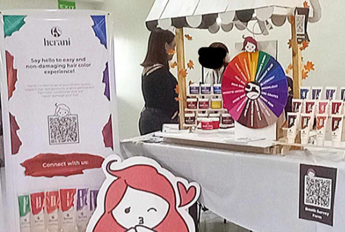
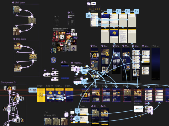
Storyboard Artist for an ad, Creative Assistant & Digital Media Tech for branding (advertising and brand communication project)
Had done mid-fidelity wireframes
Designed a mobile application for the school's merchandise store
2nd sem (PRESENT)

Currently working as a storyboard Artist and Makeup Artist for a music video for an Indie Singer.
PS: Yes, we work on real brands, local artists, clients, and more.
#messyr#atp im likely to be a storyboard artist lMAOOOOOOO#funny and all that jazz. I actually have failed 2 major subjects and will retake them by the next s.y#bmma#multimedia#multimedia art
102 notes
·
View notes