#User Research
Explore tagged Tumblr posts
Text
Haikyuu Usernames (anime users)
@/haikyuuzete
@/haikyuxr
@/kageyapper
@/sauceshoyo
@/tsukiyamer
@/kaghn
@/kenhinaduo
@/shoyohnts
@/wingshoyo
@/sttrtobio
@/tobiosetz
@/kenmandatory
@/kuroolder
@/okokuroo
@/atsujhina
@/atsumitto
@/osamufv
@/bokuakarr
@/bokuakafc
@/bokutopic
@/akaashitter
@/onlyakaashii
@/akaashoyo
@/guchisoul
@/ymguchir
@/hawikyuur
@/shoyored
@/daichinhos
@/daichigurl
@/haikyucamp
@/haikyuucamp
@/haikyuundone
@/bokutobios
@/minekyuu
@/tobiosoul
@/tobiordinary
@/tobiocunt
@/hinatarrr
@/kozumeblond
@/kozumescat
@/kotarokujoh
@/yakusland
@/tetsuroroo
@/oikawaland
@/mainoikawa
@/toorusoulmate
@/torusoulmate
@/oikawagirls
@/wakatoshif
@/iwaoikaw
@/levinister
@/kiyoyahi
@/tanakasdream
@/konohagurl
@/onlykonoha
@/forbokuto
@/sawamurabf
@/sawamurant
@/karahuno
@/karasunocamp
@/karaksuno
@/carashuno
@/tadashinata
@/tadashicutie
@/haikyusd
Please, like and reblog if you use them or LET ME KNOW IF YOU SAVE ANY OF THEM (:
#users#request#username#pedido#user#twitter#usernames#random users#x users#name users#username suggestions#user request#tumblr usernames#tumblr users#twitter users#user research#haikyu x reader#haikyuu#haikyū!!#haikyuu users#haikyuu user#haikyuu ushijima#kageyama tobio#hinata shoyo#oikawa tooru#karasuno#haikyu fluff#cute users#haikyu#haikyuuland
111 notes
·
View notes
Text
Gain deep insights into your users with Octet Design Studio's user research services. We help you make data-driven design decisions through qualitative and quantitative research, usability testing, interviews, and persona development.
0 notes
Text
How do I approach user research and testing in the design process
A/ The Research process goes through several stages:
Deep research of the target group from various sources. For this purpose, I prepare a mind map (including region, ethnicity, customs and traditions, habits, linguistics, lifestyle, typical and atypical manifestations …)
I prepare a Stakeholders map of all those involved, the relationships between them, for example: those of them who can cooperate in the process; those who are competitive; people with unclear positions.. - what relationships do they enter into with each other, how can (or cannot) cooperate, what do they contribute to building the overall picture.
I use different approaches (e.g. Edward Bono's "Six Thinking Hats") to organize my initial ideas and to summarize the facts I have collected.
B/ I start the Project Development process by clearly defining the problem, proposing a campaign title and slogan, clearly stating my proposal and outlining the methodology to be used.
I prepare a detailed Empathy Map with a view to caring for the user, in which I try to "step into the shoes" of the user, imagining that I am in his position (after the initial set of collected data, this is not so difficult). So - what does the user experience:
I imagine what he thinks and feels (regarding the problem that needs to be solved);
How does he see this problem;
What does he say and do in relation to the problem and
What does he hear about the problem from the outside (media, social bubble, friendzone, etc.) I reflect all this as supporting points in the Empathy Map. 2. The next stage is " the revitalization" (giving vitality) to the target group - usually here I use the "Personas" method. This is a method that seeks to get closer to the future user based on specific, familiar, everyday experiences and sitiationts. I choose three different characters in terms of gender, social status, career, etc. who are representatives of the respective target group and imagine them situationally and visually. By sketching and creating storyboards, I play out a simulation of reality with this "personas" where they use my design. I acting out different scenarios with them. This helps me imagine how they use the design solution I propose in a real context. How does this design serve them, how do they explore it, what do they experience when using it, what remarks may they possibly have about it… I summarize the results and draw a conclusion from what has been said.
I move on to the process of designing the design itself (or more precisely, its visualization). I start by using the method of various analogies with more or less existing, familiar, and close to my design contexts, which make it clear, recognizable, understandable and desirable for the target group. I make a mood board in which I look for analogies in historical and cultural contexts, compare, contrast, sketch, choose color solutions… After which I proceed to building the digital flat 2D layout of the design. When I am ready with it, I also build a 3D model of the design (this can be a mockup (physical or digital), which will be produced in limited quantities. The goal here being to test the real, finished product in a real environment, with real users - my target group. This can be done by organizing a presentation to present the product to the group, as well as to all stakeholders and to understand the feedback).
C/ Outcome If there are any remarks, I take them into account (if necessary) and the design is ready to begin its life on the market.
0 notes
Text
The user experience design process is evolving at an unprecedented rate, largely driven by advances in artificial intelligence (AI). As businesses strive to enhance digital interactions, AI's role in UX design has become more crucial than ever, offering a sophisticated blend of efficiency and insight. This integration streamlines the design process to ensure that digital platforms are more intuitive, responsive, and tailored to user needs. This post explores how AI is revolutionizing the UX design process, from initial user research to the final stages of implementation, providing practical insights for those considering its adoption.
#UI/UX Design Services for Startups in Dubai#Affordable Web Design for Small Businesses in Dubai#Custom App Design Solutions in Dubai#Professional Branding Services for New Companies in Dubai#Responsive Website Design Experts in Dubai#User-Centric Mobile App Design in Dubai#E-commerce Website UI/UX Design in Dubai#Innovative Digital Product Design Agency in Dubai#High-Converting Landing Page Design Services in Dubai#Comprehensive UX Strategy Consulting in Dubai#UI ( User interface )#UX (User experience)#Wireframe#Design#User Research#Usability Testing#User persona#User Flows#Information Architecture#High Fidelity#Web design#Website development#Responsive web design#UX/UI design#Graphic design for websites#Web design company#Flat web design#Brand identity design#Logo design#Social media branding
0 notes
Text
The user experience design process is evolving at an unprecedented rate, largely driven by advances in artificial intelligence (AI). As businesses strive to enhance digital interactions, AI's role in UX design has become more crucial than ever, offering a sophisticated blend of efficiency and insight. This integration streamlines the design process to ensure that digital platforms are more intuitive, responsive, and tailored to user needs. This post explores how AI is revolutionizing the UX design process, from initial user research to the final stages of implementation, providing practical insights for those considering its adoption.
#UI ( User interface )#UX (User experience)#Wireframe#Design#User Research#Usability Testing#User persona#User Flows#Information Architecture#High Fidelity#Web design#Website development#Responsive web design#UX/UI design#Graphic design for websites#Web design company#Flat web design#Brand identity design#Logo design#Social media branding#Brand logo design#Mobile app design#iOS app design#Android app design#Flat app design#user experience design#ui and ux design#ux design services#ux web design#web app design
0 notes
Text
0 notes
Text
UX Design & Research | Expert User Research Methods
Enhance your digital experience with Fahm Technology's UX design and research services. Our UX researchers apply proven methods for deeper user insights and better results.
0 notes
Text
Usernames with the word "Blue" (blue users)
@/blueyarns
@/bluebipp
@/bebeblueeee
@/cursedblu
@/bluejunkoo
@/blusou
@/blublueblus
@/bluefloewrs
@/bluejreans
@/bluecorned
@/soybluuue
@/bluetifulsouls
@/bluenaives
@/oldblue
@/the70sblue
@/bluescoquette
Please like and reblog if you use them or let me know if you save any of them (:
#users#request#username#pedido#user#twitter#usernames#random users#x users#name users#blue#blue color#blue coquette#username suggestions#tumblr usernames#user request#tumblr users#twitter users#user research
28 notes
·
View notes
Text
Fastest way to build products people love.
1 note
·
View note
Text
#User Testing#Usability Testing#User Experience (UX)#UX Research#UX Design#User research#web development#Eye Tracking
0 notes
Text
Case Study : Redesigning Kingdom Hearts for Mobile Gamers
Context
Video games should be a universal experience, but increasingly, older gamers find themselves isolated from it due to games' lack of accessibility.
Kingdom Hearts is an action role-playing game developed by Square Enix and released on the PlayStation 2 in 2002. The game features an action-oriented battle system, a role-playing leveling system, and a few smaller mini-game sections between worlds. For the redesign, the plot will not be affected by any changes. However, it would be made more for users to play on the go for a quick burst or while sitting and relaxing at home for a longer more, “system-like” play.
Objective
Redesign the UI of a nonmobile game, Kingdom Hearts, into a mobile gaming experience accessible to elders.
Implementation
Menus

| Pause Menu
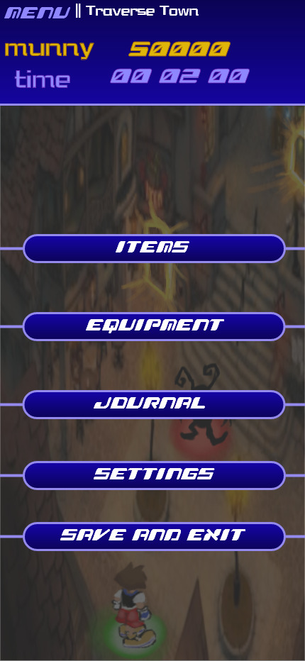
| Redesigned Pause Menu
Menus would be streamlined in the gaming process so that the elder player can spend more playtime in-game rather than in menus. Many of the previous menu options are now automatically added to the player (upgrades and abilities) or are not needed anymore (status and customize).
Exploration
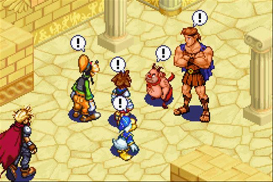
| Kingdom Hearts: Chain of Memories Isometric Camera

| Redesign UI camera and main UI
Originally, Kingdom Hearts used a 3rd Person camera that is known to be very floaty, difficult to control, and overall unresponsive. For the redesign, the camera would be isometric and follow the character as it moves. For an older player, I wouldn’t want them to have to think about the camera in any way or move it. This type of camera was only used one other time in the series for the title Kingdom Hearts: Chain of Memories for the Gameboy.
The player character, Sora, has a glowing green dot under him for visual contrast and so he is more noticeable to elder players especially if other characters or enemies are on screen. Enemies in the game have a red spot under them and they stand in one spot, unmoving, unlike the original game.
Within exploring the game world, there would be a color system for doors. If a door leads to another accessible area it would glow: Red for boss areas and gold for normal areas. This change was because the original game has a lot of painted on doors for textures and I wanted the player to be clear on where they can go.
A mini-map would be added to the game, to assist navigation. Though the first game lacks one, this was later corrected in newer entries. Some areas of Kingdom Hearts are known to be hard to navigate and I believe this quality-of-life change will help a lot with navigation. On the mini map, doors are marked either gold or red just like in the overworld. The player is also marked with a green dot. The mini-map will also be stagnant and not move.
World Map and Gummi Ship Minigame

| World Map
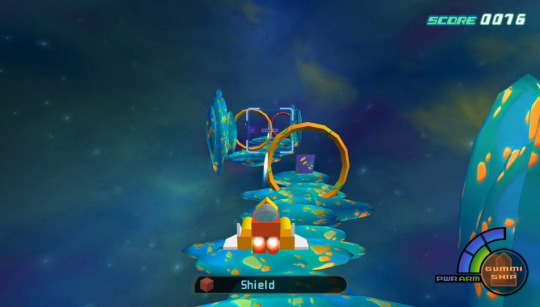
| Gummi Ship Mini Game

| Redesigned world map
For these two sections, there are no major changes because they are already simple and straightforward.
For the world map, I only changed the way the battle level is displayed, I used numbers out of 10 instead of the star system because I believe it’s easier to understand. The only change I would give gummi sections is making them shorter, making the HP and MP bars like the new battle ones (introduced below), and giving the ship automatic upgrades instead of having to build and add them yourself because, in the original game, this system is confusing and unfun.
Battle System, Magic, and Item Change

| Standard battles in Kingdom Hearts
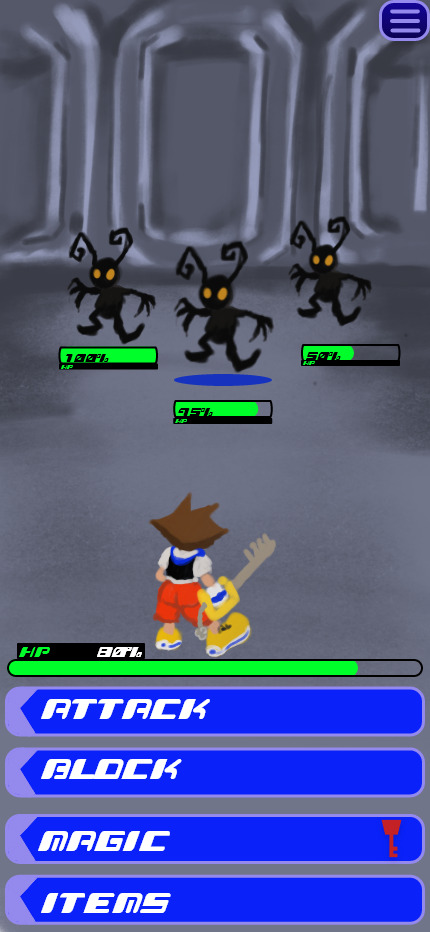
| Redesigned Battles (showing Health Points)
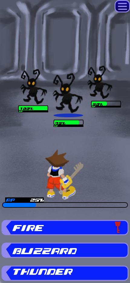
| Redesigned Battle (showing Magic Points)
To make Kingdom Hearts more accessible and easier on a mobile format, I decided to change from an action battle system to a turn-based battle system. Action games require quick reflexes and timing, two things that decrease as a person ages, however; for a turn-based game, the player will not have to worry about reaction times or reflexes, they may take as long as they like to go through battles. The camera during this section would not change, only the characters would move.
Health Points (HP) and Magic Points (MP) would be displayed differently. Instead of the radial style used in the original, I opted for using bars for a simpler look. HP will display directly under the player character in most menus, only when clicking the "Magic" menu will the bar change to show the player's MP. This change is to help with managing the different point systems so the battle UI is not cluttered. Number percentages would be added to both bars to help with understanding the number of points left. For enemies, the HP bar will always be shown under the enemy and will not need to be unlocked like in the original game. Under the enemy that’s being targeted, a blue circle will be shown. For each battle, HP and MP will replenish back to 100% for the player.
To adapt to a mobile format, made changes to the command menu that Kingdom Hearts uses for battles. Instead of having to scroll through and select, the player can simply tap the button for attacking, blocking, magic and items. Within this I also made a change to items used in battles, only three would be available to players: Potion (for healing HP), Ether (for healing MP), and Antidote for status effects. All status effects would be able to heal with Antidote instead of having different items for statues, this makes item management much simpler for an elderly player.
The magic system now lists all the magic available and automatically upgrades to the stronger version of the spell instead of having to equip it, taking away the need to prep outside of battles and streamlines the playing experience.
The party system would work similarly to other games with the party member characters attacking/healing/blocking on their own however I would like the party members to be programed to heal the player character’s health or magic more often than themselves so that it’s less that an elderly player would have to worry about, and they can focus on attacking the enemies.
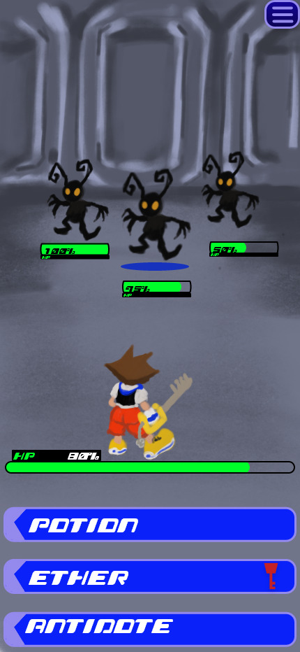
| Redesigned Item Menu
#ux#ui#ur#portfolio#ui ux design#kingdom hearts#case study#kingdom hearts redesign#user experience#user interface#user research
1 note
·
View note
Text
Hey folks , am shri !
Am pursuing my thesis on creating hyper local and niche events for the arts and crafts community in philly neibourhoods. For that am in search of a group of 10 users who are interested to give a 30 min interview !
your valuable insights and info would he of high help for me !
Do pitch in if you are intersted !
I Can be contacted on : +1 (610) 340 8732
My mail : [email protected]
Thanks !
1 note
·
View note
Text
UX/UI
Exploring the Intersection of UX/UI Design and Mobile App DevelopmentIn today's digital landscape, mobile app development is at the forefront of innovation, with user experience (UX) and user interface (UI) design playing a critical role in shaping successful applications. This article explores how UX/UI design and mobile app development intersect to create seamless, functional, and visually appealing apps that meet user needs and business goals.---The Importance of UX/UI Design in Mobile App DevelopmentUX/UI design serves as the foundation of mobile app development, ensuring that users interact with apps effortlessly while enjoying a visually engaging interface.User Experience (UX): Focuses on the overall feel of the app, emphasizing usability, accessibility, and efficiency. It ensures users can achieve their goals without frustration.User Interface (UI): Deals with the aesthetic aspects, including typography, color schemes, and layout, creating an intuitive and visually appealing interface.When combined, UX and UI design drive user satisfaction, loyalty, and engagement, making them indispensable to the development process.---Key Elements at the Intersection1. User-Centered Design:Both UX/UI design and app development prioritize understanding user needs and preferences through research, personas, and journey mapping.2. Prototyping and Testing:UX/UI designers create wireframes and prototypes to visualize app functionality, while developers refine and test these designs to ensure technical feasibility.3. Iterative Development:Continuous feedback loops between designers and developers enable ongoing improvements, aligning design concepts with real-world user behavior.4. Performance Optimization:Developers ensure the app performs efficiently, while UX/UI designers minimize cognitive load through intuitive navigation and layout design.5. Cross-Platform Consistency:UX/UI designers maintain consistency across iOS and Android platforms, while developers ensure compatibility without compromising functionality or aesthetics.---Emerging Trends in UX/UI and Mobile App Development1. Dark Mode Design:Enhances visual appeal and reduces eye strain, requiring developers to adjust codebases to accommodate different themes seamlessly.2. Voice and Gesture-Based Interfaces:UX/UI designers integrate voice commands and gestures, while developers work on advanced algorithms for accurate recognition.3. Personalization:Data-driven designs allow apps to adapt to individual preferences, with developers building robust back-end systems to support personalization.4. Micro-Interactions:Subtle animations and feedback loops designed by UX/UI experts are implemented by developers to boost user engagement.5. Accessibility:Designing for inclusivity involves creating apps accessible to people with disabilities, combining thoughtful design with technical adaptability.---Collaboration Between UX/UI Designers and DevelopersEffective collaboration between UX/UI designers and developers is essential to create apps that are both functional and delightful.Clear Communication: Regular meetings and design reviews foster understanding of design and technical constraints.Shared Tools: Platforms like Figma, Adobe XD, and Sketch bridge the gap, enabling designers to hand off assets directly to developers.Agile Methodology: Iterative workflows keep both teams aligned on project goals and timelines.---ConclusionThe intersection of UX/UI design and mobile app development is where innovation meets functionality. By prioritizing user needs, maintaining effective collaboration, and staying ahead of trends, designers and developers create mobile applications that not only meet but exceed user expectations. In an ever-evolving digital landscape, this synergy is the key to delivering apps that resonate with users and drive business success.Would you like assistance with visuals or infographics to accompany this article?
#UI/UX Design Services for Startups in Dubai#Affordable Web Design for Small Businesses in Dubai#Custom App Design Solutions in Dubai#Professional Branding Services for New Companies in Dubai#Responsive Website Design Experts in Dubai#User-Centric Mobile App Design in Dubai#E-commerce Website UI/UX Design in Dubai#Innovative Digital Product Design Agency in Dubai#High-Converting Landing Page Design Services in Dubai#Comprehensive UX Strategy Consulting in Dubai#UI ( User interface )#UX (User experience)#Wireframe#Design#User Research#Usability Testing#Web design#Website development#Responsive web design#UX/UI design#Graphic design for websites#Web design company#Flat web design#Brand identity design#Logo design#Social media branding#Brand logo design#Mobile app design#iOS app design#Android app design
0 notes
Text
UX/UI
Exploring the Intersection of UX/UI Design and Mobile App DevelopmentIn today's digital landscape, mobile app development is at the forefront of innovation, with user experience (UX) and user interface (UI) design playing a critical role in shaping successful applications. This article explores how UX/UI design and mobile app development intersect to create seamless, functional, and visually appealing apps that meet user needs and business goals.---The Importance of UX/UI Design in Mobile App DevelopmentUX/UI design serves as the foundation of mobile app development, ensuring that users interact with apps effortlessly while enjoying a visually engaging interface.User Experience (UX): Focuses on the overall feel of the app, emphasizing usability, accessibility, and efficiency. It ensures users can achieve their goals without frustration.User Interface (UI): Deals with the aesthetic aspects, including typography, color schemes, and layout, creating an intuitive and visually appealing interface.When combined, UX and UI design drive user satisfaction, loyalty, and engagement, making them indispensable to the development process.---Key Elements at the Intersection1. User-Centered Design:Both UX/UI design and app development prioritize understanding user needs and preferences through research, personas, and journey mapping.2. Prototyping and Testing:UX/UI designers create wireframes and prototypes to visualize app functionality, while developers refine and test these designs to ensure technical feasibility.3. Iterative Development:Continuous feedback loops between designers and developers enable ongoing improvements, aligning design concepts with real-world user behavior.4. Performance Optimization:Developers ensure the app performs efficiently, while UX/UI designers minimize cognitive load through intuitive navigation and layout design.5. Cross-Platform Consistency:UX/UI designers maintain consistency across iOS and Android platforms, while developers ensure compatibility without compromising functionality or aesthetics.---Emerging Trends in UX/UI and Mobile App Development1. Dark Mode Design:Enhances visual appeal and reduces eye strain, requiring developers to adjust codebases to accommodate different themes seamlessly.2. Voice and Gesture-Based Interfaces:UX/UI designers integrate voice commands and gestures, while developers work on advanced algorithms for accurate recognition.3. Personalization:Data-driven designs allow apps to adapt to individual preferences, with developers building robust back-end systems to support personalization.4. Micro-Interactions:Subtle animations and feedback loops designed by UX/UI experts are implemented by developers to boost user engagement.5. Accessibility:Designing for inclusivity involves creating apps accessible to people with disabilities, combining thoughtful design with technical adaptability.---Collaboration Between UX/UI Designers and DevelopersEffective collaboration between UX/UI designers and developers is essential to create apps that are both functional and delightful.Clear Communication: Regular meetings and design reviews foster understanding of design and technical constraints.Shared Tools: Platforms like Figma, Adobe XD, and Sketch bridge the gap, enabling designers to hand off assets directly to developers.Agile Methodology: Iterative workflows keep both teams aligned on project goals and timelines.---ConclusionThe intersection of UX/UI design and mobile app development is where innovation meets functionality. By prioritizing user needs, maintaining effective collaboration, and staying ahead of trends, designers and developers create mobile applications that not only meet but exceed user expectations. In an ever-evolving digital landscape, this synergy is the key to delivering apps that resonate with users and drive business success.Would you like assistance with visuals or infographics to accompany this article?
#UI/UX Design Services for Startups in Dubai#Affordable Web Design for Small Businesses in Dubai#Custom App Design Solutions in Dubai#Professional Branding Services for New Companies in Dubai#Responsive Website Design Experts in Dubai#User-Centric Mobile App Design in Dubai#E-commerce Website UI/UX Design in Dubai#Innovative Digital Product Design Agency in Dubai#High-Converting Landing Page Design Services in Dubai#Comprehensive UX Strategy Consulting in Dubai#UI ( User interface )#UX (User experience)#Wireframe#Design#User Research#Usability Testing#Web design#Website development#Responsive web design#UX/UI design#Graphic design for websites#Web design company#Flat web design#Brand identity design#Logo design#Social media branding#Brand logo design#Mobile app design#iOS app design#Android app design
1 note
·
View note
Text

Share Your Wealth Management Expertise & Earn $300 (High Net Worth Individuals Only).
Are you a successful investor with significant assets and a keen eye for financial strategies?
Exclusively for successful investors like you, a central bank is conducting a prestigious research study on wealth management services, and they’re seeking your valuable input. In return for your insights, you’ll receive a generous compensation of $300.
Here’s your chance to:
Share your experiences: Discuss the pros and cons of wealth management services you’ve used.
Make a real impact: Help shape the future of financial solutions for high-net-worth individuals.
Contribute to a prestigious study: Be part of a research initiative conducted on behalf of a leading bank.
Click here to start the screener, a brief questionnaire designed to ensure the study is relevant to your experiences and needs. Your privacy and data security are our top priorities. See if you qualify.
Seize this opportunity to make your voice heard, contribute to the future of wealth management, and get rewarded! Your insights are valuable and will shape the future of financial solutions for high-net-worth individuals.
#wealth management#financial services#high net worth individuals (HNWIs)#investment strategies#financial planning#market research#user research#pen_spark#wealth management study#share your experience#shape the future of finance#$300 reward#exclusive opportunity#major bank#investor#entrepreneur#affluent#successful individual
0 notes
Link
Wildenhaus’s description has stayed with me because it reflects how the best software products aren’t just assemblages of functionality, exposed by particular formal elements (links, buttons, icons, menus). Rather, they organize and shape how you think, and they create or sustain a particular lifestyle:
It’s fundamentally about play. It seems to describe a life where it’s just fun to be reading, learning, writing, and collaborating on ideas.
0 notes