#kingdom hearts redesign
Explore tagged Tumblr posts
Visit Tumblr Blog
Explore Tumblr blogs with no restrictions, modern design and the best experience.
Last Seen Tumblr Blogs


Fun Fact
Tumblr is available in 18 languages.
Text


So I've redesign Kairi like alot and I'm a Venkai shipper I think I'm sold on this last design because one I love her kh 1 design colors but also because I did just like her hair being longer.


14 notes
·
View notes
Text
Case Study : Redesigning Kingdom Hearts for Mobile Gamers
Context
Video games should be a universal experience, but increasingly, older gamers find themselves isolated from it due to games' lack of accessibility.
Kingdom Hearts is an action role-playing game developed by Square Enix and released on the PlayStation 2 in 2002. The game features an action-oriented battle system, a role-playing leveling system, and a few smaller mini-game sections between worlds. For the redesign, the plot will not be affected by any changes. However, it would be made more for users to play on the go for a quick burst or while sitting and relaxing at home for a longer more, “system-like” play.
Objective
Redesign the UI of a nonmobile game, Kingdom Hearts, into a mobile gaming experience accessible to elders.
Implementation
Menus

| Pause Menu
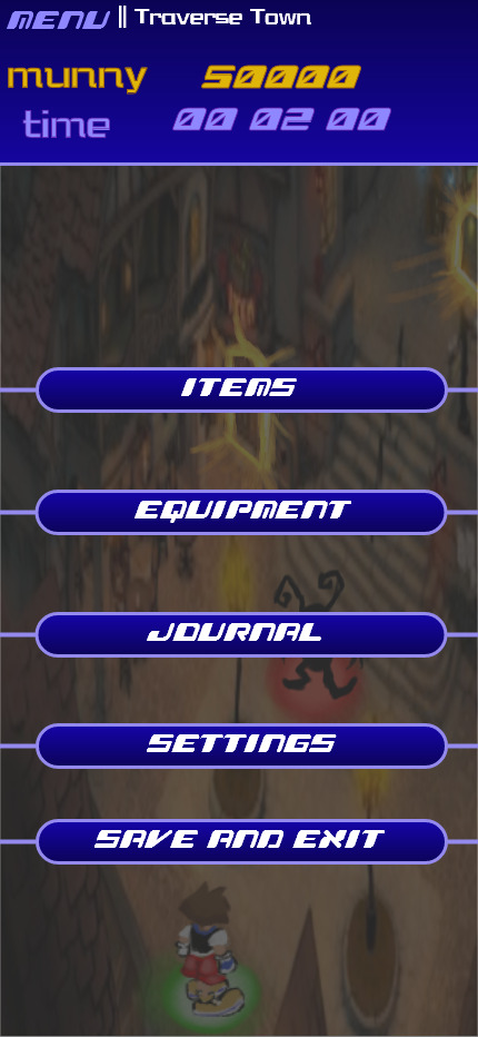
| Redesigned Pause Menu
Menus would be streamlined in the gaming process so that the elder player can spend more playtime in-game rather than in menus. Many of the previous menu options are now automatically added to the player (upgrades and abilities) or are not needed anymore (status and customize).
Exploration
| Kingdom Hearts: Chain of Memories Isometric Camera

| Redesign UI camera and main UI
Originally, Kingdom Hearts used a 3rd Person camera that is known to be very floaty, difficult to control, and overall unresponsive. For the redesign, the camera would be isometric and follow the character as it moves. For an older player, I wouldn’t want them to have to think about the camera in any way or move it. This type of camera was only used one other time in the series for the title Kingdom Hearts: Chain of Memories for the Gameboy.
The player character, Sora, has a glowing green dot under him for visual contrast and so he is more noticeable to elder players especially if other characters or enemies are on screen. Enemies in the game have a red spot under them and they stand in one spot, unmoving, unlike the original game.
Within exploring the game world, there would be a color system for doors. If a door leads to another accessible area it would glow: Red for boss areas and gold for normal areas. This change was because the original game has a lot of painted on doors for textures and I wanted the player to be clear on where they can go.
A mini-map would be added to the game, to assist navigation. Though the first game lacks one, this was later corrected in newer entries. Some areas of Kingdom Hearts are known to be hard to navigate and I believe this quality-of-life change will help a lot with navigation. On the mini map, doors are marked either gold or red just like in the overworld. The player is also marked with a green dot. The mini-map will also be stagnant and not move.
World Map and Gummi Ship Minigame

| World Map
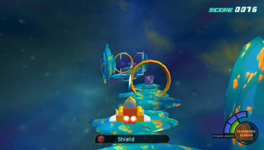
| Gummi Ship Mini Game

| Redesigned world map
For these two sections, there are no major changes because they are already simple and straightforward.
For the world map, I only changed the way the battle level is displayed, I used numbers out of 10 instead of the star system because I believe it’s easier to understand. The only change I would give gummi sections is making them shorter, making the HP and MP bars like the new battle ones (introduced below), and giving the ship automatic upgrades instead of having to build and add them yourself because, in the original game, this system is confusing and unfun.
Battle System, Magic, and Item Change
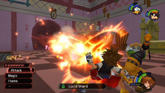
| Standard battles in Kingdom Hearts
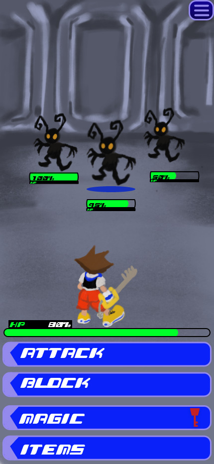
| Redesigned Battles (showing Health Points)
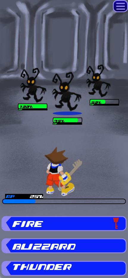
| Redesigned Battle (showing Magic Points)
To make Kingdom Hearts more accessible and easier on a mobile format, I decided to change from an action battle system to a turn-based battle system. Action games require quick reflexes and timing, two things that decrease as a person ages, however; for a turn-based game, the player will not have to worry about reaction times or reflexes, they may take as long as they like to go through battles. The camera during this section would not change, only the characters would move.
Health Points (HP) and Magic Points (MP) would be displayed differently. Instead of the radial style used in the original, I opted for using bars for a simpler look. HP will display directly under the player character in most menus, only when clicking the "Magic" menu will the bar change to show the player's MP. This change is to help with managing the different point systems so the battle UI is not cluttered. Number percentages would be added to both bars to help with understanding the number of points left. For enemies, the HP bar will always be shown under the enemy and will not need to be unlocked like in the original game. Under the enemy that’s being targeted, a blue circle will be shown. For each battle, HP and MP will replenish back to 100% for the player.
To adapt to a mobile format, made changes to the command menu that Kingdom Hearts uses for battles. Instead of having to scroll through and select, the player can simply tap the button for attacking, blocking, magic and items. Within this I also made a change to items used in battles, only three would be available to players: Potion (for healing HP), Ether (for healing MP), and Antidote for status effects. All status effects would be able to heal with Antidote instead of having different items for statues, this makes item management much simpler for an elderly player.
The magic system now lists all the magic available and automatically upgrades to the stronger version of the spell instead of having to equip it, taking away the need to prep outside of battles and streamlines the playing experience.
The party system would work similarly to other games with the party member characters attacking/healing/blocking on their own however I would like the party members to be programed to heal the player character’s health or magic more often than themselves so that it’s less that an elderly player would have to worry about, and they can focus on attacking the enemies.
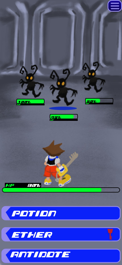
| Redesigned Item Menu
#ux#ui#ur#portfolio#ui ux design#kingdom hearts#case study#kingdom hearts redesign#user experience#user interface#user research
1 note
·
View note
Text

Girliesss
#Wanted to try and design/redesign some outfits for my fav kh girlies bc why not.#I especially wanted to try something fun for Kairi since I really love her kh2 design.#also I hope kairis blue ruffle dress thingy makes sense bc I had a very clear vision for it but idk if it’s really working LMAO#art#digital art#my art#fanart#drawing#kh#kingdom hearts#Kairi#namine#xion
780 notes
·
View notes
Text


Kairi Design!
I love her so much! Square please let her do more things!
#kairi#kh kairi#kh#kingdom hearts#kingdom hearts art#square enix#KH1#KH2#KH3#art#character deisgn#redesign#kh design#artist#my art#digital art#illustration#artwork#sora#riku
190 notes
·
View notes
Text
You're the sunflower/I think your love would be too much
#WOO FINALLY DONE#considered doing a second part with hanahaki riku buuuut. i got a car journey in an hour or so and im impatient#so doing it later means not at all#but anyway!!! had fun w him#still tryna figure out how to draw sora ill prob redraw this when i figure it out#rearranged the heart station more toward the redesigned one but then didnt rlly follow thru cus i wanted both riku and kairi on it LMAO#also i think i drew them too small for this to come across but my thought process was “sora with lots of freckles = sunflower center bit”#and obvi the station of awakening as well#was gonna be kh2 sora but hnnng his design is. so much#ambitious#i think “your love would be too much” works for every version of soriku though so its okay#soriku#kingdom hearts#soriku endgame actually#kh sora#kingdom hearts sora#sora kingdom hearts#riku kingdom hearts#bev draws#beverly says stuff#this happened cus 2 nights ago i satr up in bed and said THIS SONG IS SO SORIKU CODED#and then i wanted to make the sunflowers behind him look like stained glass#but i didnt know how & figured putting a station there would give a similar effect#regardless! sora looks kinda goofy in the face but im p happy w this !#using references are for cowards (NOT ACTUALLY. USE REFERENCES DO NOT FOLLOW MY EXAMPLE)#kh#kh1#kh1 sora#kh1 riku#also tried out some different brushes for colouring this and i like them :3
268 notes
·
View notes
Text

king mickey concept except i ignore mickey mouses original design and make him my own while still retaining some iconography (the musical)
bonus: HES GONNA SAY THE THING

#i wanted to redesign his outfit so badly especially how he looks in kh3 cause him and riku are wearing almost the exact same thing LMAO#also he deserves a cape. like a redwall mouse#king mickey#my art#kh#kingdom hearts#kh mickey
127 notes
·
View notes
Text


Concept: Riku and Sora are Kari's demon and angel, they are secretly married. And Kairi is the only one who knows...
#fanart#digital art#open commissions#my art#digital drawing#illustration#redesign#kingdom hearts#soriku#alternative universe
57 notes
·
View notes
Text

Alright a couple Kairi outfit ideas! Took a lot of inspiration from the Dark Road Kids - since she’s training with Aqua, I wanted to pull on Eraqus’ past.
I personally vibe more with the left outfit - better suited for adventuring around different worlds. And she’s in pants now, yay! Tho it makes her look a little less like an islander.
Right outfit is a lot cuter. I also like how it looks a little like Strelitzia, and maybe could remind some people of her 👀 now as happy with the colors tho :P
Without the keyblades below:

50 notes
·
View notes
Text

happy @khoc-week!!! kicking it off with my khux oc Monty!!! they're in unicornis and originally from Twilight Town!
they're a laid back wielder who goes with the flow and can have trouble connecting with people due to not being very expressive but is always down for a good time :) their keyblade is called Red Chiv and is long and weighty, meant for physical attacks! It's heavy on both ends hence the big angled hand guard, my idea was that you could hold it from either end so spinning the keyblade would also be ideal for attacks. also the hand guard it backwards the angled end is supposed face inwards oops
[DO NOT REPOST/REMOVE COMMENT]
#can you tell I like keyblades#also fun fact this keyblade was originally ryou's!!!!#their full name is Montgomery Dechamps btw lmfao#they started as a joke oc for rp years ago and then I got overly attached#haven't drawn them in so long and they needed a redesign#kh oc#khux oc#keykid#key kid#oc#original character#art#kingdom hearts#kh oc week#kh oc week 2024#khux
90 notes
·
View notes
Text
"But come what may/ I know the way!"
An imagining of Kairi returning to the final world in her search for Sora.
#kairi#kairi kh#kingdom hearts#kairi redesign#the final world#i found that there was a lot of connection between kairi and moana and this was drawn as a result#i am plannng on making a proper comic regarding this too- maybe one day
220 notes
·
View notes
Text

i really only did this so i could pin down how i exactly wanted to draw them but i spent way too fucking long on this Not to post it. so
#kingdom hearts#khdr#kingdom hearts dark road#kh xehanort#kh eraqus#kh hermod#kh urd#kh vor#kh baldr#kh bragi#so many characters#i sont even wanna draw the upperclassmen now . but also i do#woe. beauty marks be upon ye#squenix likes their shaggy haired characters huh#xehas is so messy bc i wanted it to seem more swept back? as a whole than just. bangs plastered to his face. and not pin straight either#its rlly hard to tell from this tho#not a redesign in the slightest; i like their canon designs. i mostly just added rlly small details#my art
39 notes
·
View notes
Text

decided to revisit my old redesign of eraqus im happier with it now, but i still hate eraqus' colors; they are impossible to work with
#kingdom hearts#kh#kh bbs#birth by sleep#eraqus kh#kh art#artists on tumblr#illustration#kosmicart#accidentally made him look way older but actually perhaps thats for the best#eraqus and xehanort grew up together seemingly around the same age yet somehow xehanort looks like hes 84 while eraqus is like 40#anyway. maybe one day ill get around to that redesign for vanitas lmaooo#ive totally forgotten about that guy btw#he can eat shit for a little longer though i hate him 😏
220 notes
·
View notes
Text
More ref sheets, the citizens of Radiant Garden, of course not all! Like Ienzo is missing oops (Note these are very up to date with Part II Act II, which is about to end with the next chapter. And then Act III starts.)


Brooke is Vi's and Davis' mother and Taro is brought there by y. Xehanort.
+ Nort alts (Xemnas and Xeh ditching the Org. coats hooray! (They also become besties with A2 trust!!!!!))

__
Quick answers/ explainsies! (WK novel spoilers obvs!!!)
Since Sora is a Replica copy here, he actively befriends the Organization Somebodies.
The Evernight Faction is Maleficent's troup, miss ma'am Salem invited her in! Their ship name is witchcottage!! Tyrian is free to third-wheel!!! Lauriam got a strange illness (see his arm, spoiler spoiler Xemnas and Azal have it too) and Elrena, Emil and Luxord switch sides to get him help. Demyx counts himself in because he wants to.
Brooke had to join because Maleficent sniped Vi baaad (if you seen Vi's ref sheet, yeah the shoulder was Mal with that white glove thingy that has this tick Grimm) Xemnas lost his arm seconds after that and that's why they also switch. The Norts are Replicas but Xems can't get into a new one.
Xeh scooped Taro up in San Fransokyo when he was going places with Luxord. He had to drop pupper off at Vi's because Ansem said so. Taro is also the groundwork for Xeh starting to trust Viola.
Braig is with them because Luxu still needs No Name, remember OMX is alive so...
#projectworldkeeper#multifandom#is tagging rwby important because salem tyrian and beacon mention?????????????????#kingdom hearts#nier automata#character design#joisartoc#character sheet#riku#kairi#braig#elrena#lauriam#character redesign#demyx#luxord#ansem seeker of darkness#young xehanort#xemnas#XEMNAS WITH BEARD ALARM!!
48 notes
·
View notes
Text


Kiari appreciation post (including a redesign because her kh3 fit has never sat right with me)
44 notes
·
View notes
Text


Did I quote the sonic fandub? Yes. Is it accurate cause this is basically what happens during the Hollow Bastion meet up? Also yes-
Masterpost
Buy me a coffee
Commission Prices
#Fyi all the twst boys get a slight redesign for KH2#that's why Cater and Kalim look a bit different from their usual looks for the au#twst#twisted wonderland#kh#kingdom hearts#au#twisted Hearts#art#fanart#meme#shitpost#sonic real time fandub#sora#axel#lea#kalim al asim#cater diamond
25 notes
·
View notes
Text

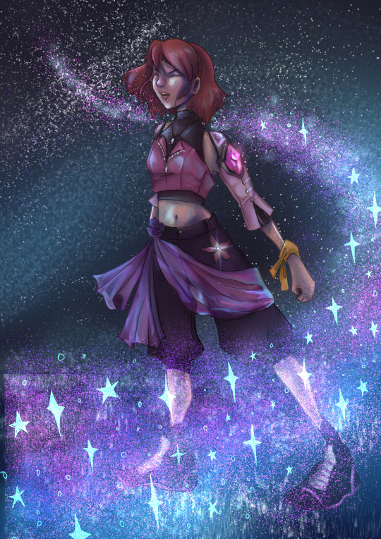
Quick concept of what I’d do for Kairis next design. I would try to lean more into her original design which had more of a punk/tomboyish vibe to me and re-expand her color palette since she wasn’t originally ‘the pink one’
164 notes
·
View notes